Embed Size (px)
Citation preview
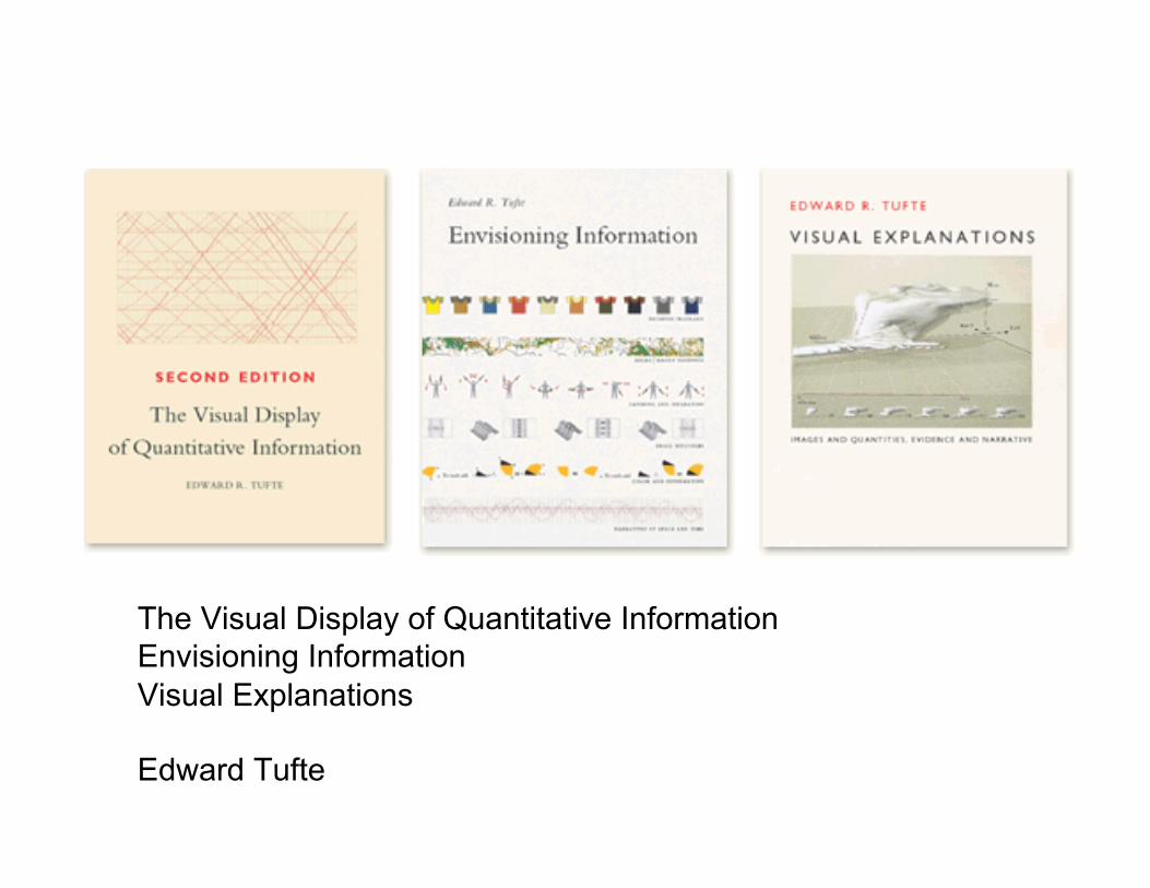
The Visual Display of Quantitative Information Envisioning Information Visual Explanations
Edward Tufte
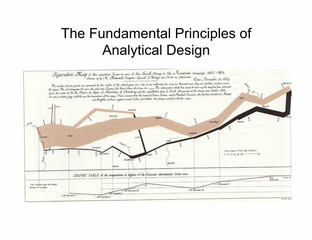
The Fundamental Principles of Analytical Design
The Story
• Charles Joseph Minard (1869) described the successive losses of lives in the French army during the invasion of Russia in 1812
• The best statistical graphics ever – Vivid historical content – Brilliant design
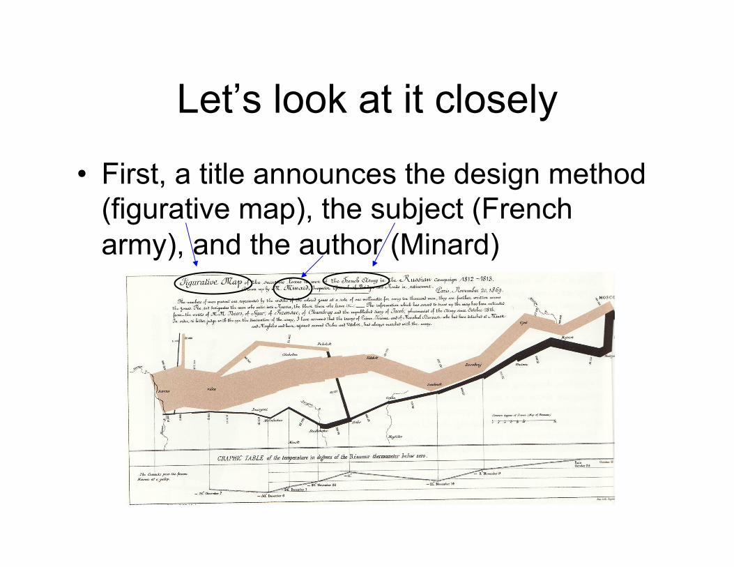
Let’s look at it closely
• First, a title announces the design method (figurative map), the subject (French army), and the author (Minard)
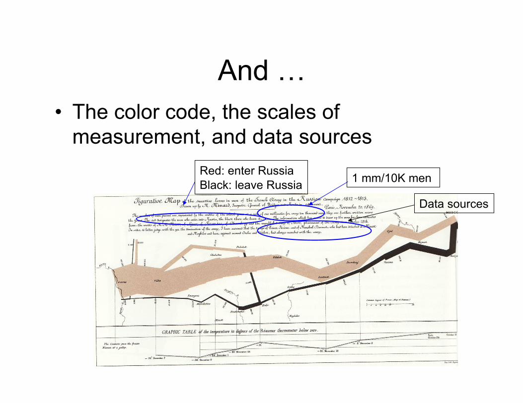
And … • The color code, the scales of
measurement, and data sources
1 mm/10K men Red: enter Russia Black: leave Russia
Data sources
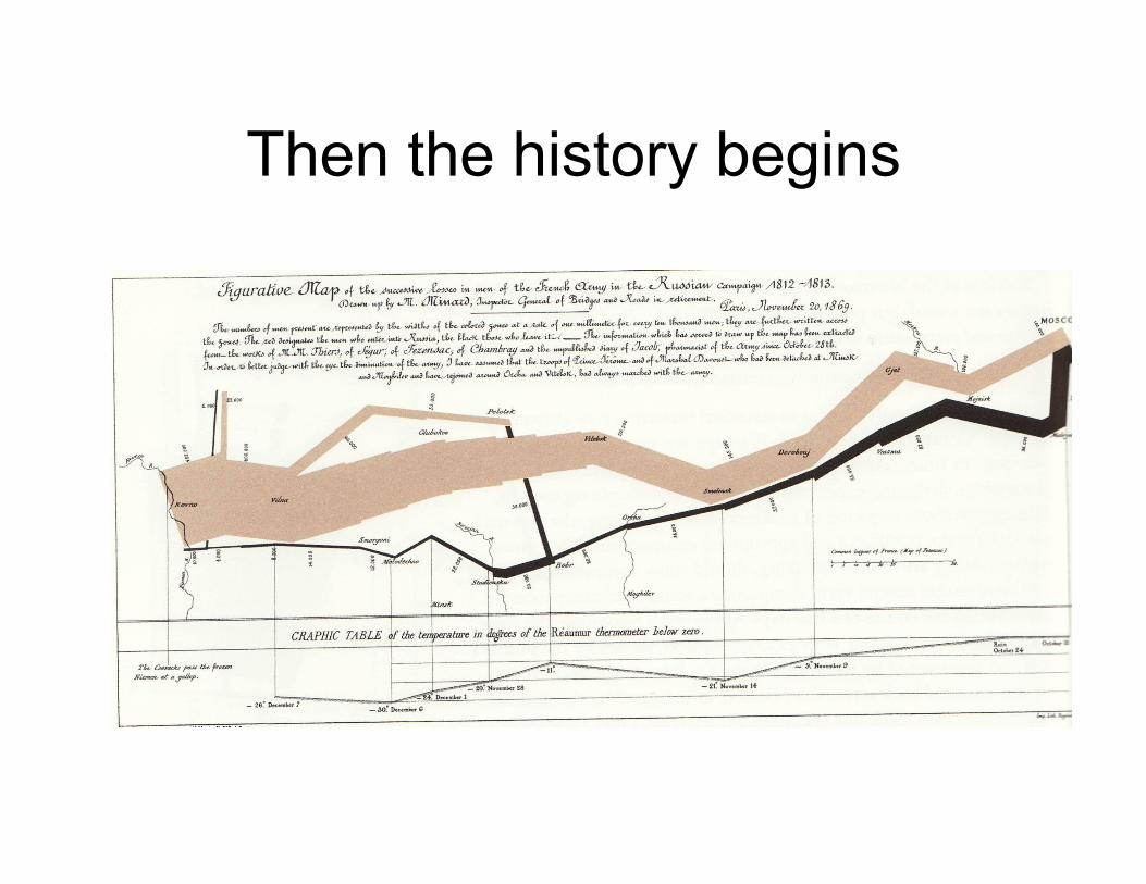
Then the history begins
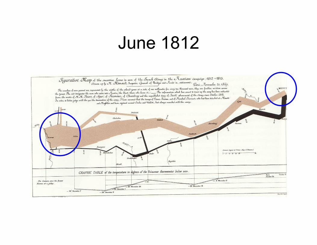
June 1812
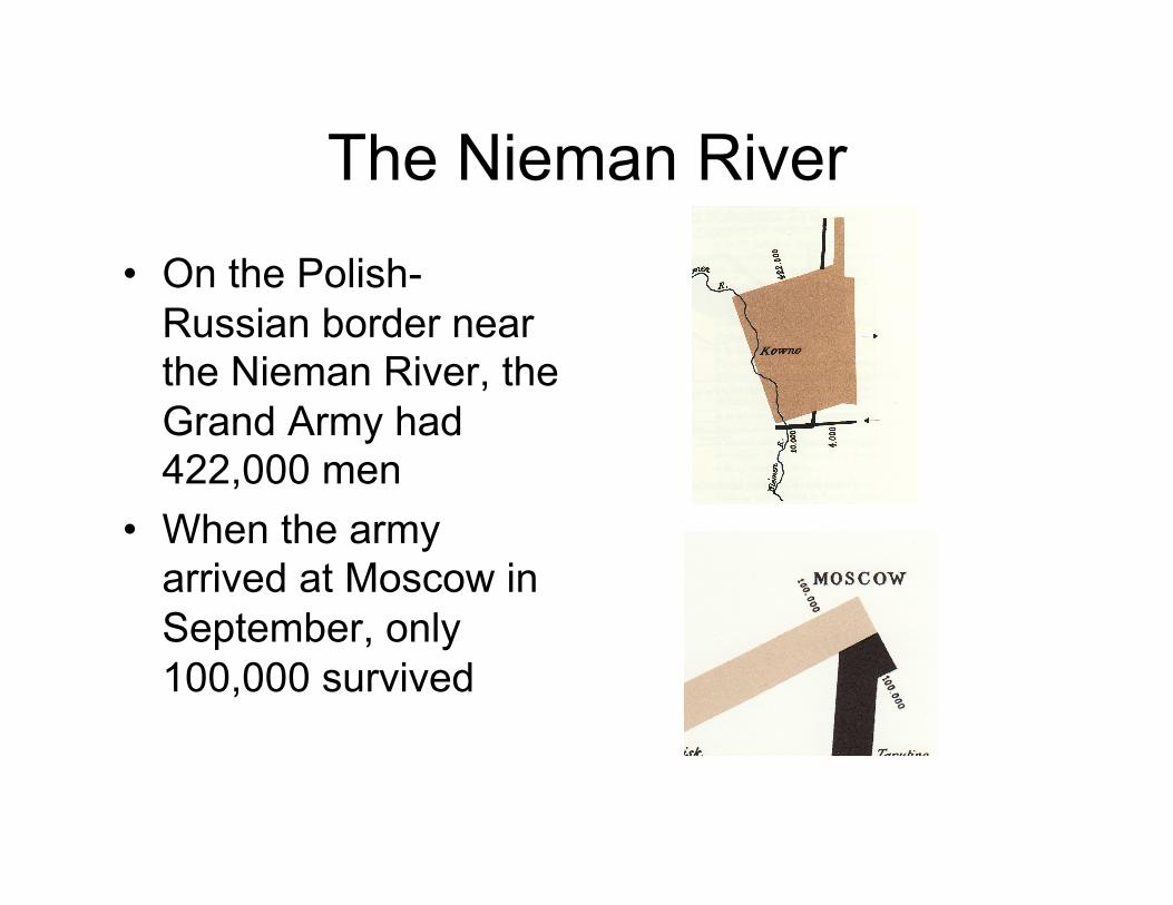
The Nieman River
• On the Polish-Russian border near the Nieman River, the Grand Army had 422,000 men
• When the army arrived at Moscow in September, only 100,000 survived
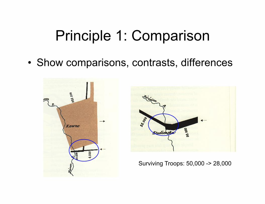
Principle 1: Comparison
• Show comparisons, contrasts, differences
Surviving Troops: 50,000 -> 28,000
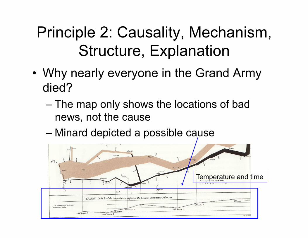
Principle 2: Causality, Mechanism, Structure, Explanation
• Why nearly everyone in the Grand Army died? – The map only shows the locations of bad
news, not the cause – Minard depicted a possible cause
Temperature and time
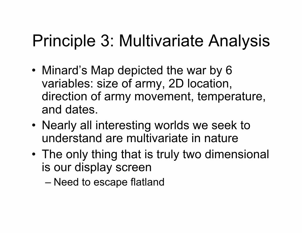
Principle 3: Multivariate Analysis
• Minard’s Map depicted the war by 6 variables: size of army, 2D location, direction of army movement, temperature, and dates.
• Nearly all interesting worlds we seek to understand are multivariate in nature
• The only thing that is truly two dimensional is our display screen – Need to escape flatland
Principle 4: Integration of Evidence
• Minard’s Map contains words, numbers, images, and diagrams, all integrated together – The number of troops, invasion flow-lines in
2D space, temperatures and dates, and description by words
• Use transparency overlays • What matters is the evidence, not a
particular mode of evidence
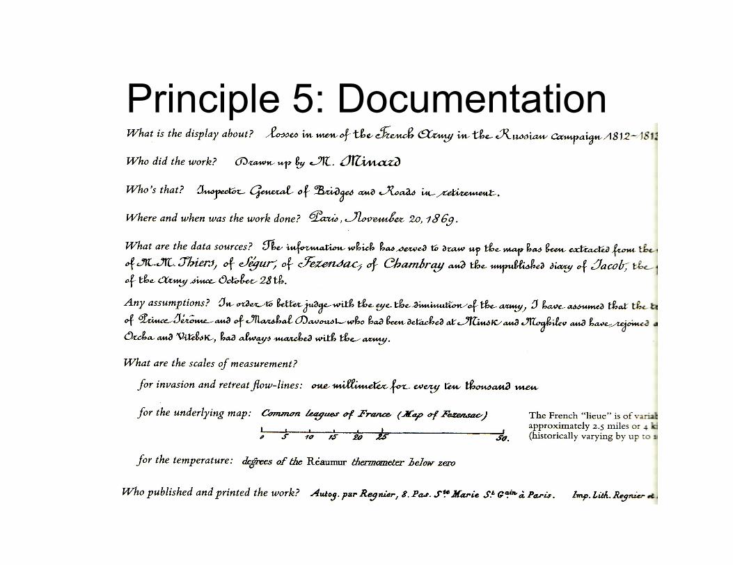
Principle 5: Documentation
Principle 6: Content Counts Most of All
• What matters the most: A good knowledge of the content and a deep caring about the substance
• The first question to ask: what are the content-reasoning tasks that this display is supposed to help with?
Principle 6: Content Counts Most of All
• What matters the most: A good knowledge of the content and a deep caring about the substance
• The most effective way to improve a presentation is to get better content!!
Recap of the principles
• Show comparisons • Show causality • Show multivariate data • Integrating relevant evidence • Documentation • Contents count most of all
The General Principle
The principles of analytical design are derived from the principles of analytical thinking