Embed Size (px)
Citation preview
1
Paper 3102-2015
SAS® Enterprise Guide® 5.1 and PROC GPLOT—the Power, the Glory
and the PROC-tical Limitations
Christopher S Klekar MPH, MBA, Gabriela Cantu-Perez MPH, Baylor Scott and White Health
ABSTRACT
Customer expectations are set high when Microsoft® Excel
® and PowerPoint
® are used to design reports.
Using SAS® for reporting has benefits because it generates plots directly from prepared datasets,
automates the plotting process, minimizes labor intensive manual construction using Microsoft products and does not compromise the presentation value. SAS Enterprise Guide 5.1
® (EG 5.1) has a powerful
point and click method that is quick and easy to use; however, it is limited in its ability to customize the output to mimic manually created Microsoft graphics. This paper will demonstrate how EG is the perfect starting point to create initial code for plots using the SAS/GRAPH
® point-and-click features and how the
code can be enhanced using established PROC GPLOT, ANNOTATE, and ODS options to recreate the look and feel of Excel and PowerPoint generated plots. Examples will show the generation of plots and tables using PROC TABULATE to embed the plot data into the graphical output. Additionally, tips will be given to overcome the ODS limitation of SAS 9.3, used by EG 5.1, to transfer the SAS graphical output to PowerPoint files. These 9.3 tips will be contrasted to the new SAS 9.4 ODS POWERPOINT features that allow direct PowerPoint file creation from code.
INTRODUCTION
The SAS System gives statisticians and analysts a powerful tool for statistical analysis, but not so long ago users had to write complex code in the SAS language to get results. Knowledgeable SAS users are able to write code that will manipulate data, run complex statistical analysis and modeling, generate reports and create graphical outputs. The advent of SAS Enterprise Guide 5.1 (EG 5.1) is a Windows
®
client application that has made all these jobs easier with a “point-and-click, menu and wizard-driven” interface that simplifies the tasks originally requiring numerous and complex lines of code. (1) While powerful, EG 5.1 is limited in its ability to customize output to mimic graphics manually created in Microsoft Excel and Microsoft PowerPoint. This paper will walk the reader through the steps used to take a formatted SAS dataset through plot generation and end-up with publication worthy graphics. All this by using EG 5.1, the GPLOT Procedure (PROC GPLOT) and ODS options to their fullest potential.
DEFINING THE CUSTOMER NEEDS
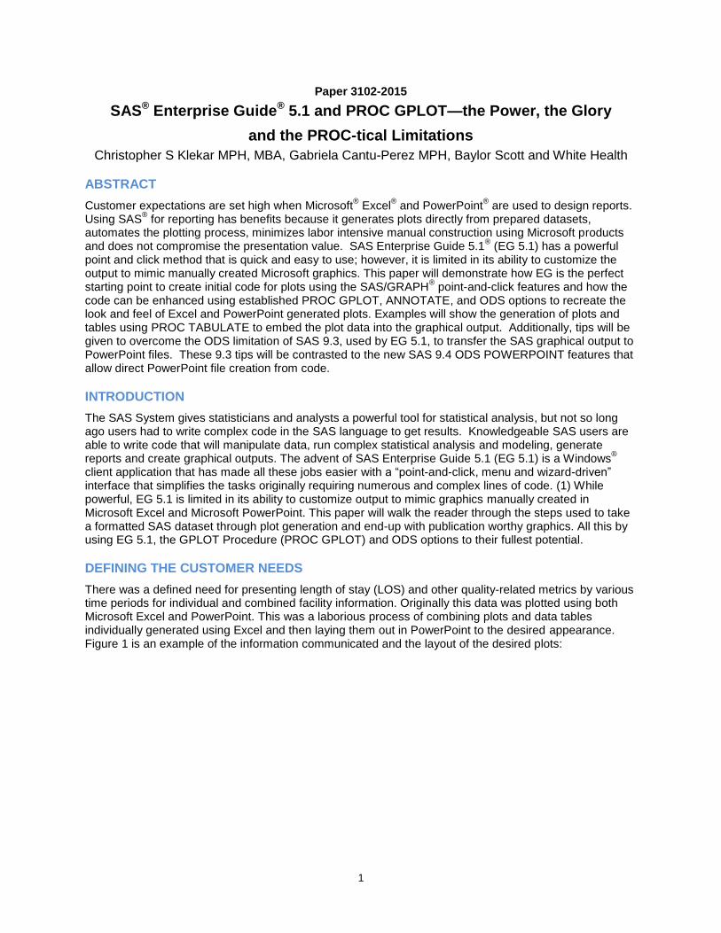
There was a defined need for presenting length of stay (LOS) and other quality-related metrics by various time periods for individual and combined facility information. Originally this data was plotted using both Microsoft Excel and PowerPoint. This was a laborious process of combining plots and data tables individually generated using Excel and then laying them out in PowerPoint to the desired appearance. Figure 1 is an example of the information communicated and the layout of the desired plots:
2
Figure 1 – Gold Standard Presentation Plot
While this manual process gives the desired look and feel, it was deemed unsustainable for the generation of 57 plots on a monthly basis from data gathered in a randomized controlled trial study. A SAS EG project was implemented to automate, or at least semi-automate, this plotting process. The lessons learned from this project are outlined in this paper. While the code details and tips for every plot done during this project will not be shared, the insight into the automation process for nine of the 57 plots will be outlined in this paper. Since this is a paper outlining SAS methods, the starting point for this automation project was EG 5.1, its Graphical User Interface (GUI) and the Line Plot Wizard found in EG 5.1.
PLOTTING WITH EG 5.1
SAS EG 5.1 POINT AND CLICK PLOTTING
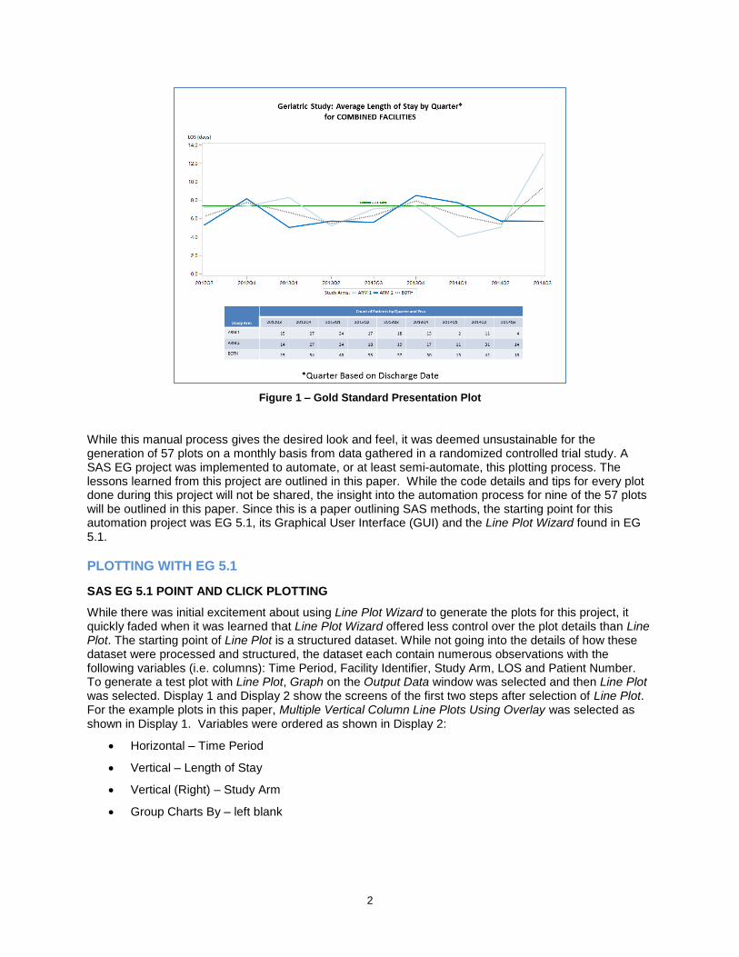
While there was initial excitement about using Line Plot Wizard to generate the plots for this project, it quickly faded when it was learned that Line Plot Wizard offered less control over the plot details than Line Plot. The starting point of Line Plot is a structured dataset. While not going into the details of how these dataset were processed and structured, the dataset each contain numerous observations with the following variables (i.e. columns): Time Period, Facility Identifier, Study Arm, LOS and Patient Number. To generate a test plot with Line Plot, Graph on the Output Data window was selected and then Line Plot was selected. Display 1 and Display 2 show the screens of the first two steps after selection of Line Plot. For the example plots in this paper, Multiple Vertical Column Line Plots Using Overlay was selected as shown in Display 1. Variables were ordered as shown in Display 2:
Horizontal – Time Period
Vertical – Length of Stay
Vertical (Right) – Study Arm
Group Charts By – left blank
3
Display 1 – Screen Shot of Plot Type Selection
Display 2 – Screen Shot of Data Assignment
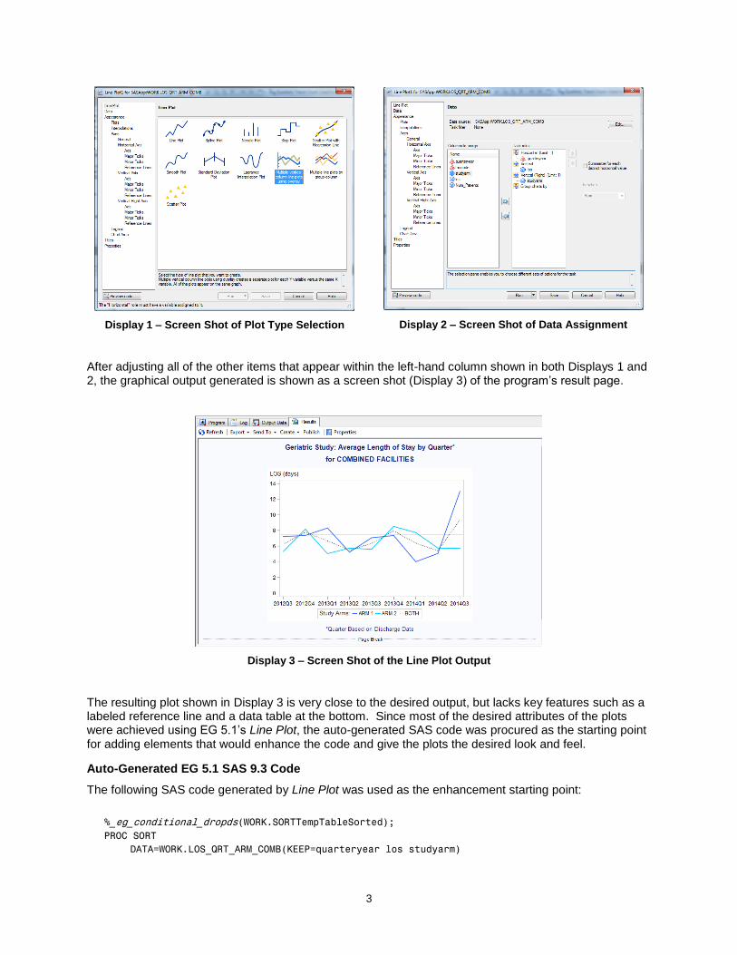
After adjusting all of the other items that appear within the left-hand column shown in both Displays 1 and 2, the graphical output generated is shown as a screen shot (Display 3) of the program‟s result page.
Display 3 – Screen Shot of the Line Plot Output
The resulting plot shown in Display 3 is very close to the desired output, but lacks key features such as a labeled reference line and a data table at the bottom. Since most of the desired attributes of the plots were achieved using EG 5.1‟s Line Plot, the auto-generated SAS code was procured as the starting point for adding elements that would enhance the code and give the plots the desired look and feel.
Auto-Generated EG 5.1 SAS 9.3 Code
The following SAS code generated by Line Plot was used as the enhancement starting point:
%_eg_conditional_dropds(WORK.SORTTempTableSorted);
PROC SORT
DATA=WORK.LOS_QRT_ARM_COMB(KEEP=quarteryear los studyarm)

4
OUT=WORK.SORTTempTableSorted
;
BY quarteryear;
RUN;
%_sas_pushchartsize(480,360);
SYMBOL1
INTERPOL=JOIN
HEIGHT=10pt
VALUE=NONE
LINE=1
WIDTH=2
CI=CX3366FF
CV = _STYLE_
;
SYMBOL2
INTERPOL=JOIN
HEIGHT=10pt
VALUE=NONE
LINE=1
WIDTH=2
CI=CX00CCFF
CV = _STYLE_
;
SYMBOL3
INTERPOL=JOIN
HEIGHT=10pt
VALUE=NONE
LINE=34
WIDTH=2
CI=BLACK
CV = _STYLE_
;
Legend1
FRAME
LABEL=("Study Arms:")
;
Axis1
STYLE=1
WIDTH=1
ORDER=(0.0 TO 14.0 BY 2.0)
MINOR=NONE
LABEL=( "LOS (days)")
;
Axis2
STYLE=1
WIDTH=1
MINOR=NONE
LABEL=NONE
;
TITLE;
TITLE1 "Geriatric Study: Average Length of Stay by Quarter*";
TITLE2 "for COMBINED FACILITIES";
FOOTNOTE;
FOOTNOTE1 "*Quarter Based on Discharge Date";
PROC GPLOT DATA = WORK.SORTTempTableSorted
;
PLOT los * quarteryear = studyarm
5
/ VAXIS=AXIS1
HAXIS=AXIS2
FRAME LVREF=1
CVREF=BLACK
VREF=7.4
LEGEND=LEGEND1
;
RUN; QUIT;
%_eg_conditional_dropds(WORK.SORTTempTableSorted);
TITLE; FOOTNOTE;
%_sas_popchartsize;
GOPTIONS RESET = SYMBOL;
ENHANCING THE EG 5.1 CODE
While the Line Plot’s point and click method added some of the desired enhancements, there were still these enhancements needs:
1. Generating multiple plots.
2. Varying the plot title.
3. Varying the Y-axis scale and ticks.
4. Auto-calculating the reference line value.
5. Drawing and labeling the reference line.
6. Specifying branding colors.
7. Adding associated data tables.
8. Transferring SAS output to Microsoft PowerPoint 2010.
ENHANCEMENT 1: GENERATING MULTIPLE PLOTS USING A MACRO STATEMENT
Adding the ability to generate multiple plots, for multiple facilities, was done by converting the auto-generated SAS code with very little modification into an executable MACRO. If unfamiliar with MACROS, read up on the technique. Make sure to structure the MACRO correctly with the beginning statement (%MACRO) defining the macro name (LINETREND) and the associated macro variables (&GFILE and &FAC). Close out the defined macro with an ending statement (%MEND) and be extra careful to embed the macro variables correctly into the code that falls between the beginning and ending statements.
Below are the beginning and ending MACRO statements used in enhanced code along with MACRO call statements used to execute the code:
%MACRO LINETREND (GFILE, FAC);
~~~~~~~~~~SAS CODE FOR PROC GPLOT AND PROC TABULATE WOULD GO HERE~~~~~~~~~~
%MEND LINETREND;
%LINETREND (LOS_QRT_HOS1, HOSPITAL 1);
%LINETREND (LOS_QRT_HOS2, HOSPITAL 2);
%LINETREND (LOS_QRT_ARM_COMB, COMBINED FACILITIES);
6
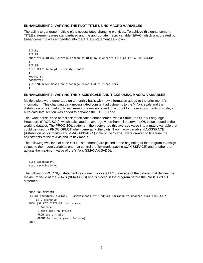
ENHANCEMENT 2: VARYING THE PLOT TITLE USING MACRO VARIABLES
The ability to generate multiple plots necessitated changing plot titles. To achieve this enhancement, TITLE statements were standardized and the appropriate macro variable (&FAC) which was created by Enhancement 1 was embedded into the TITLE2 statement as shown:
TITLE;
TITLE1
"Geriatric Study: Average Length of Stay by Quarter*" h=14 pt f="CALIBRI/Bold"
;
TITLE2
"for &FAC" h=14 pt f="calibri/bold"
;
FOOTNOTE;
FOOTNOTE1
j=C "*Quarter Based on Discharge Date" h=6 pt f="calibri"
;
ENHANCEMENT 3: VARYING THE Y-AXIS SCALE AND TICKS USING MACRO VARIABLES
Multiple plots were generated on a monthly basis with new information added to the prior month‟s information. This changing data necessitated constant adjustments to the Y-Axis scale and the distribution of tick marks. To minimize code revisions and to account for these adjustments in scale, an auto-calculate section was added to enhance the EG 5.1 code.
The “work horse” code of this tick modification enhancement was a Structured Query Language Procedure (PROC SQL), which calculated an average value from all observed LOS values found in the working dataset. The PROC SQL statement then converted this average value into a macro variable that could be used by PROC GPLOT when generating the plots. Two macro variable, &AXISSPACE (distribution of tick marks) and &MAXAXISADD (scale of the Y-axis), were created to fine tune the adjustments to the Y-Axis and its tick marks.
The following two lines of code (%LET statements) are placed at the beginning of the program to assign values to the macro variables one that control the tick mark spacing (&AXISSPACE) and another that adjusts the maximum value of the Y-Axis (&MAXAXISADD):
%let axisspace=2;
%let maxaxisadd=5;
The following PROC SQL statement calculates the overall LOS average of the dataset that defines the maximum value of the Y-Axis (&MAXAXIS) and is placed in the program before the PROC GPLOT statement:
PROC SQL NOPRINT;
SELECT round(max(avglos)) + &maxaxisadd /*<= Adjust &axisadd to desired plot results */
INTO :maxaxis
FROM (SELECT DISTINCT quarteryear
, faccode
, mean(los) AS avglos
FROM los_qrt_all
GROUP BY quarteryear, faccode);
QUIT;
7
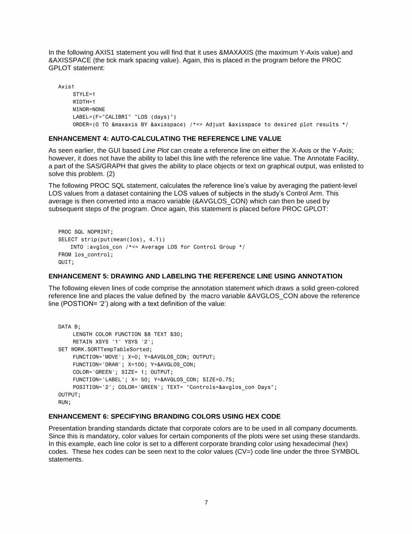
In the following AXIS1 statement you will find that it uses &MAXAXIS (the maximum Y-Axis value) and &AXISSPACE (the tick mark spacing value). Again, this is placed in the program before the PROC GPLOT statement:
Axis1
STYLE=1
WIDTH=1
MINOR=NONE
LABEL=(F="CALIBRI" "LOS (days)")
ORDER=(0 TO &maxaxis BY &axisspace) /*<= Adjust &axisspace to desired plot results */
ENHANCEMENT 4: AUTO-CALCULATING THE REFERENCE LINE VALUE
As seen earlier, the GUI based Line Plot can create a reference line on either the X-Axis or the Y-Axis; however, it does not have the ability to label this line with the reference line value. The Annotate Facility, a part of the SAS/GRAPH that gives the ability to place objects or text on graphical output, was enlisted to solve this problem. (2)
The following PROC SQL statement, calculates the reference line‟s value by averaging the patient-level LOS values from a dataset containing the LOS values of subjects in the study‟s Control Arm. This average is then converted into a macro variable (&AVGLOS_CON) which can then be used by subsequent steps of the program. Once again, this statement is placed before PROC GPLOT:
PROC SQL NOPRINT;
SELECT strip(put(mean(los), 4.1))
INTO :avglos_con /*<= Average LOS for Control Group */
FROM los_control;
QUIT;
ENHANCEMENT 5: DRAWING AND LABELING THE REFERENCE LINE USING ANNOTATION
The following eleven lines of code comprise the annotation statement which draws a solid green-colored reference line and places the value defined by the macro variable &AVGLOS_CON above the reference line (POSTION= „2‟) along with a text definition of the value:
DATA B;
LENGTH COLOR FUNCTION $8 TEXT $30;
RETAIN XSYS '1' YSYS '2';
SET WORK.SORTTempTableSorted;
FUNCTION='MOVE'; X=0; Y=&AVGLOS_CON; OUTPUT;
FUNCTION='DRAW'; X=100; Y=&AVGLOS_CON;
COLOR='GREEN'; SIZE= 1; OUTPUT;
FUNCTION='LABEL'; X= 50; Y=&AVGLOS_CON; SIZE=0.75;
POSITION='2'; COLOR='GREEN'; TEXT= "Controls=&avglos_con Days";
OUTPUT;
RUN;
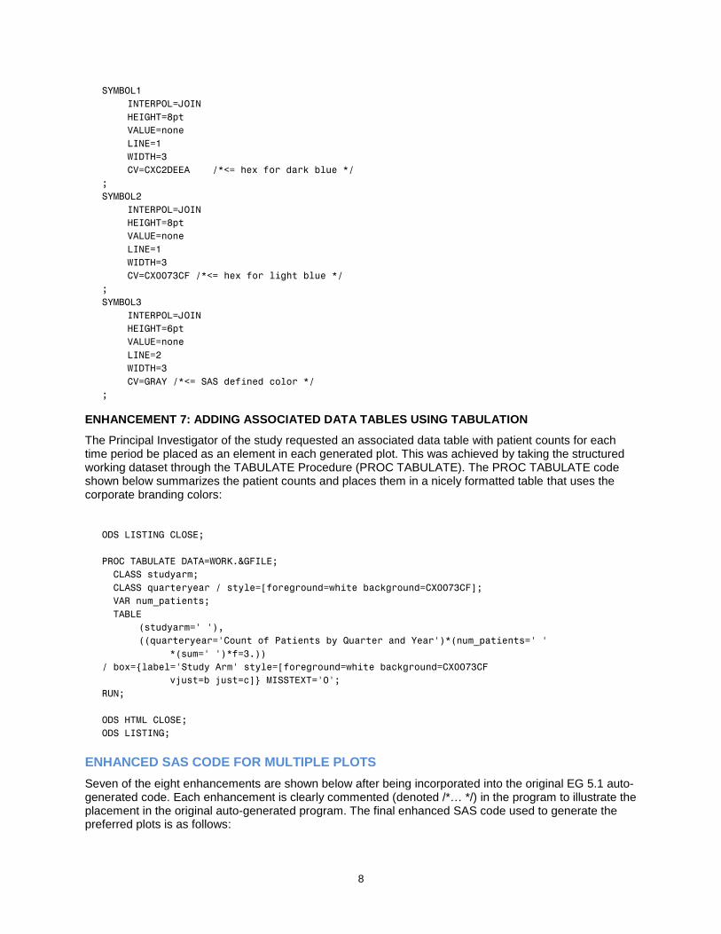
ENHANCEMENT 6: SPECIFYING BRANDING COLORS USING HEX CODE
Presentation branding standards dictate that corporate colors are to be used in all company documents. Since this is mandatory, color values for certain components of the plots were set using these standards. In this example, each line color is set to a different corporate branding color using hexadecimal (hex) codes. These hex codes can be seen next to the color values (CV=) code line under the three SYMBOL statements.
8
SYMBOL1
INTERPOL=JOIN
HEIGHT=8pt
VALUE=none
LINE=1
WIDTH=3
CV=CXC2DEEA /*<= hex for dark blue */
;
SYMBOL2
INTERPOL=JOIN
HEIGHT=8pt
VALUE=none
LINE=1
WIDTH=3
CV=CX0073CF /*<= hex for light blue */
;
SYMBOL3
INTERPOL=JOIN
HEIGHT=6pt
VALUE=none
LINE=2
WIDTH=3
CV=GRAY /*<= SAS defined color */
;
ENHANCEMENT 7: ADDING ASSOCIATED DATA TABLES USING TABULATION
The Principal Investigator of the study requested an associated data table with patient counts for each time period be placed as an element in each generated plot. This was achieved by taking the structured working dataset through the TABULATE Procedure (PROC TABULATE). The PROC TABULATE code shown below summarizes the patient counts and places them in a nicely formatted table that uses the corporate branding colors:
ODS LISTING CLOSE;
PROC TABULATE DATA=WORK.&GFILE;
CLASS studyarm;
CLASS quarteryear / style=[foreground=white background=CX0073CF];
VAR num_patients;
TABLE
(studyarm=' '),
((quarteryear='Count of Patients by Quarter and Year')*(num_patients=' '
*(sum=' ')*f=3.))
/ box={label='Study Arm' style=[foreground=white background=CX0073CF
vjust=b just=c]} MISSTEXT='0';
RUN;
ODS HTML CLOSE;
ODS LISTING;
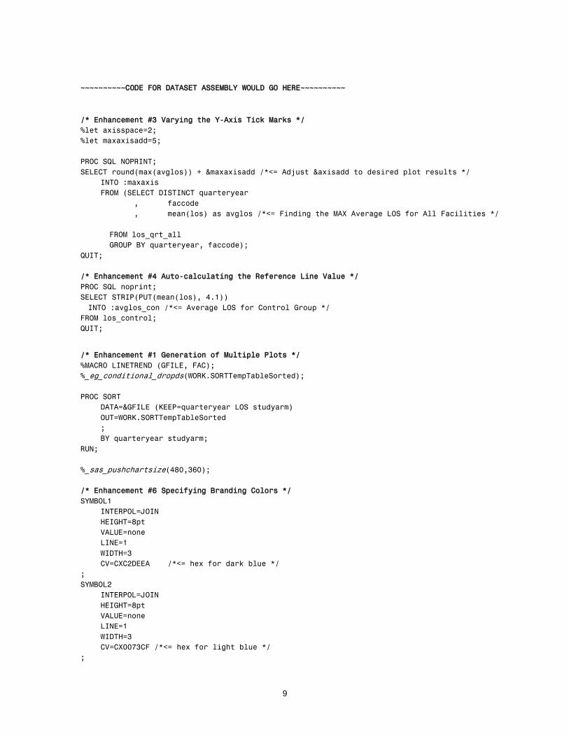
ENHANCED SAS CODE FOR MULTIPLE PLOTS
Seven of the eight enhancements are shown below after being incorporated into the original EG 5.1 auto-generated code. Each enhancement is clearly commented (denoted /*… */) in the program to illustrate the placement in the original auto-generated program. The final enhanced SAS code used to generate the preferred plots is as follows:
9
~~~~~~~~~~CODE FOR DATASET ASSEMBLY WOULD GO HERE~~~~~~~~~~
/* Enhancement #3 Varying the Y-Axis Tick Marks */
%let axisspace=2;
%let maxaxisadd=5;
PROC SQL NOPRINT;
SELECT round(max(avglos)) + &maxaxisadd /*<= Adjust &axisadd to desired plot results */
INTO :maxaxis
FROM (SELECT DISTINCT quarteryear
, faccode
, mean(los) as avglos /*<= Finding the MAX Average LOS for All Facilities */
FROM los_qrt_all
GROUP BY quarteryear, faccode);
QUIT;
/* Enhancement #4 Auto-calculating the Reference Line Value */
PROC SQL noprint;
SELECT STRIP(PUT(mean(los), 4.1))
INTO :avglos_con /*<= Average LOS for Control Group */
FROM los_control;
QUIT;
/* Enhancement #1 Generation of Multiple Plots */
%MACRO LINETREND (GFILE, FAC);
%_eg_conditional_dropds(WORK.SORTTempTableSorted);
PROC SORT
DATA=&GFILE (KEEP=quarteryear LOS studyarm)
OUT=WORK.SORTTempTableSorted
;
BY quarteryear studyarm;
RUN;
%_sas_pushchartsize(480,360);
/* Enhancement #6 Specifying Branding Colors */
SYMBOL1
INTERPOL=JOIN
HEIGHT=8pt
VALUE=none
LINE=1
WIDTH=3
CV=CXC2DEEA /*<= hex for dark blue */
;
SYMBOL2
INTERPOL=JOIN
HEIGHT=8pt
VALUE=none
LINE=1
WIDTH=3
CV=CX0073CF /*<= hex for light blue */
;
10
SYMBOL3
INTERPOL=JOIN
HEIGHT=6pt
VALUE=none
LINE=2
WIDTH=3
CV=GRAY /*<= SAS defined color */
;
Legend1
ACROSS=3
FRAME
POSITION= (BOTTOM CENTER OUTSIDE)
MODE=SHARE
VALUE=(H=9PT F="CALIBRI")
LABEL=("Study Arms:" H=9PT F="CALIBRI")
;
/* Enhancement #5 Drawing and Labeling the Reference Line */
DATA B;
LENGTH COLOR FUNCTION $8 TEXT $30;
RETAIN XSYS '1' YSYS '2';
SET WORK.SORTTempTableSorted;
FUNCTION='MOVE'; X=0; Y=&AVGLOS_CON; OUTPUT;
FUNCTION='DRAW'; X=100; Y=&AVGLOS_CON;
COLOR='GREEN'; SIZE=1; OUTPUT;
FUNCTION='LABEL'; X=50; Y=&AVGLOS_CON; SIZE=0.75;
POSITION='2'; COLOR='GREEN'; TEXT="Controls = &avglos_con Days"; output;
RUN;
/* Enhancement #3 Varying the Y-Axis Tick Marks */
Axis1
STYLE=1
WIDTH=1
MINOR=NONE
LABEL=(F="CALIBRI" "LOS (days)")
ORDER=(0 TO &maxaxis BY &axisspace) /*<= Adjust the macro to desired results */
;
Axis2
MINOR=NONE
LABEL=NONE
;
/* Enhancement #2 Varying the Plot Title */
TITLE;
TITLE1
"Geriatric Study: Average Length of Stay by Quarter*" h=14 pt f="CALIBRI/Bold"
;
TITLE2
"for &FAC" h=14 pt f="calibri/bold"
;
FOOTNOTE;
FOOTNOTE1
j=C "*Quarter Based on Discharge Date" h=6 pt f="calibri"
;
/* Creating the Trend Plots */
PROC GPLOT DATA = WORK.SORTTempTableSorted
;
11
PLOT LOS * quarteryear=studyarm /
VAXIS=AXIS1
HAXIS=AXIS2
anno=b
FRAME LVREF=1
LEGEND=LEGEND1
;
format LOS 4.1
;
RUN;
QUIT;
%_eg_conditional_dropds(WORK.SORTTempTableSorted);
TITLE; FOOTNOTE;
%_sas_popchartsize;
GOPTIONS RESET = SYMBOL;
/* Enhancement #7 Adding Associated Data Tables */
ODS LISTING CLOSE;
PROC TABULATE DATA=WORK.&GFILE;
CLASS studyarm;
CLASS quarteryear / style=[foreground=white background=CX0073CF];
VAR num_patients;
TABLE
(studyarm=' '),
((quarteryear='Count of Patients by Quarter and Year')*
(num_patients=' '*(sum=' ')*f=3.))
/ box={label='Study Arm' style=[foreground=white background=CX0073CF
vjust=b just=c]} MISSTEXT='0';
RUN;
ODS HTML CLOSE;
ODS LISTING;
/* Enhancement #1 Generation of Multiple Plots */
%MEND LINETREND;
%LINETREND (LOS_QRT_HOS1, HOSPITAL 1);
%LINETREND (LOS_QRT_HOS2, HOSPITAL 2);
%LINETREND (LOS_QRT_ARM_COMB, COMBINED FACILITIES);
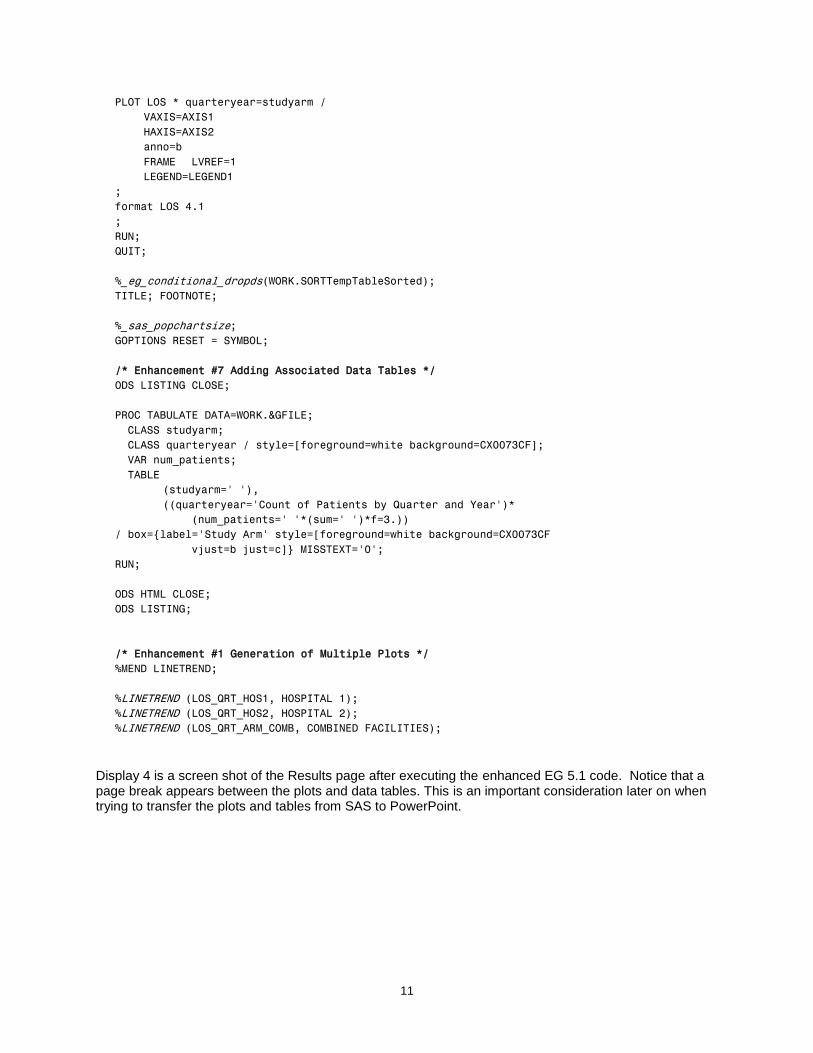
Display 4 is a screen shot of the Results page after executing the enhanced EG 5.1 code. Notice that a page break appears between the plots and data tables. This is an important consideration later on when trying to transfer the plots and tables from SAS to PowerPoint.
12
Display 4 – Screen Shot of the Enhanced Code Output
ENHANCEMENT 8: TRANSFERING SAS OUTPUT TO POWERPOINT
Enhancement 8 does not directly affect the code used to generate the multiple plots. This enhancement is the semi-automatic portion of the project since it requires two manual steps to initiate and complete the transfer of the SAS graphical output to PowerPoint and is outlined in the Add-In transfer section of this paper.
DIRECT TRANSFER FROM SAS TO POWERPOINT
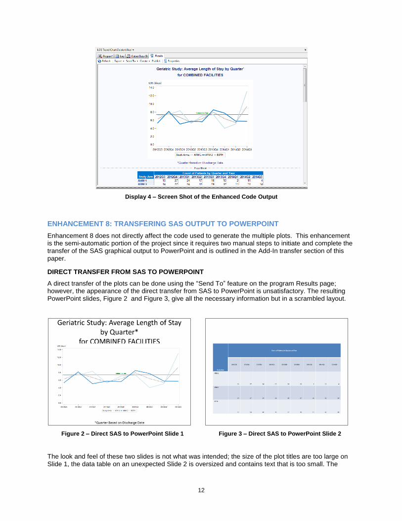
A direct transfer of the plots can be done using the “Send To” feature on the program Results page; however, the appearance of the direct transfer from SAS to PowerPoint is unsatisfactory. The resulting PowerPoint slides, Figure 2 and Figure 3, give all the necessary information but in a scrambled layout.
Figure 2 – Direct SAS to PowerPoint Slide 1
Figure 3 – Direct SAS to PowerPoint Slide 2
The look and feel of these two slides is not what was intended; the size of the plot titles are too large on Slide 1, the data table on an unexpected Slide 2 is oversized and contains text that is too small. The
13
unexpected separation of the plot and the table in the direct transfer is caused by the page breaks that are generated in the EG 5.1 graphical output.
CRITICAL REQUIREMENT FOR THE OUTPUT TRANSFER
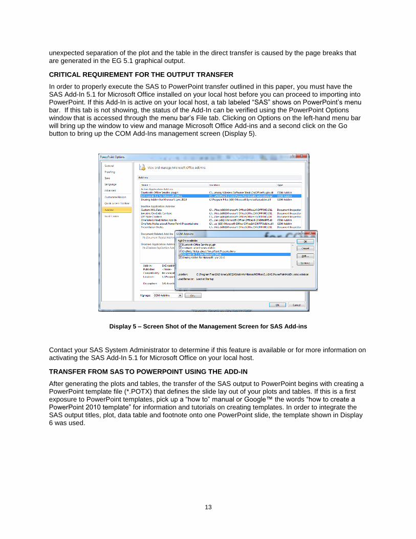
In order to properly execute the SAS to PowerPoint transfer outlined in this paper, you must have the SAS Add-In 5.1 for Microsoft Office installed on your local host before you can proceed to importing into PowerPoint. If this Add-In is active on your local host, a tab labeled “SAS” shows on PowerPoint‟s menu bar. If this tab is not showing, the status of the Add-In can be verified using the PowerPoint Options window that is accessed through the menu bar‟s File tab. Clicking on Options on the left-hand menu bar will bring up the window to view and manage Microsoft Office Add-ins and a second click on the Go button to bring up the COM Add-Ins management screen (Display 5).
Display 5 – Screen Shot of the Management Screen for SAS Add-ins
Contact your SAS System Administrator to determine if this feature is available or for more information on activating the SAS Add-In 5.1 for Microsoft Office on your local host.
TRANSFER FROM SAS TO POWERPOINT USING THE ADD-IN
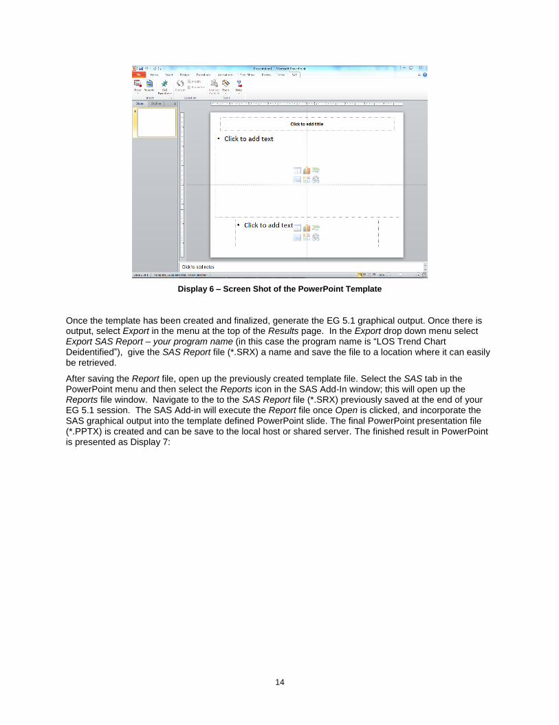
After generating the plots and tables, the transfer of the SAS output to PowerPoint begins with creating a PowerPoint template file (*.POTX) that defines the slide lay out of your plots and tables. If this is a first exposure to PowerPoint templates, pick up a “how to” manual or Google™ the words “how to create a PowerPoint 2010 template” for information and tutorials on creating templates. In order to integrate the SAS output titles, plot, data table and footnote onto one PowerPoint slide, the template shown in Display 6 was used.
14
Display 6 – Screen Shot of the PowerPoint Template
Once the template has been created and finalized, generate the EG 5.1 graphical output. Once there is output, select Export in the menu at the top of the Results page. In the Export drop down menu select Export SAS Report – your program name (in this case the program name is “LOS Trend Chart Deidentified”), give the SAS Report file (*.SRX) a name and save the file to a location where it can easily be retrieved.
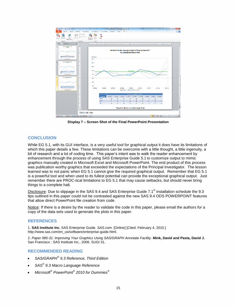
After saving the Report file, open up the previously created template file. Select the SAS tab in the PowerPoint menu and then select the Reports icon in the SAS Add-In window; this will open up the Reports file window. Navigate to the to the SAS Report file (*.SRX) previously saved at the end of your EG 5.1 session. The SAS Add-in will execute the Report file once Open is clicked, and incorporate the SAS graphical output into the template defined PowerPoint slide. The final PowerPoint presentation file (*.PPTX) is created and can be save to the local host or shared server. The finished result in PowerPoint is presented as Display 7:
15
Display 7 – Screen Shot of the Final PowerPoint Presentation
CONCLUSION
While EG 5.1, with its GUI interface, is a very useful tool for graphical output it does have its limitations of which this paper details a few. These limitations can be overcome with a little thought, a little ingenuity, a bit of research and a lot of coding time. This paper‟s intent was to walk the reader enhancement by enhancement through the process of using SAS Enterprise Guide 5.1
to customize output to mimic
graphics manually created in Microsoft Excel and Microsoft PowerPoint. The end product of this process was publication worthy graphics that exceeded the expectations of the Principal Investigator. The lesson learned was to not panic when EG 5.1 cannot give the required graphical output. Remember that EG 5.1 is a powerful tool and when used to its fullest potential can provide the exceptional graphical output. Just remember there are PROC-tical limitations to EG 5.1 that may cause setbacks, but should never bring things to a complete halt.
Disclosure: Due to slippage in the SAS 9.4 and SAS Enterprise Guide 7.1® installation schedule the 9.3
tips outlined in this paper could not be contrasted against the new SAS 9.4 ODS POWERPOINT features that allow direct PowerPoint file creation from code.
Notice: If there is a desire by the reader to validate the code in this paper, please email the authors for a copy of the data sets used to generate the plots in this paper.
REFERENCES
1. SAS Institute Inc. SAS Enterprise Guide. SAS.com. [Online] [Cited: February 4, 2015.]
http://www.sas.com/en_us/software/enterprise-guide.html.
2. Paper 085-31: Improving Your Graphics Using SAS/GRAPH Annotate Facility. Mink, David and Pasta, David J.
San Francisco : SAS Institute Inc., 2006. SUGI 31.
RECOMMENDED READING
SAS/GRAPH® 9.3 Reference, Third Edition
SAS® 9.3 Macro Language Reference
Microsoft® PowerPoint
® 2010 for Dummies
®

16
CONTACT INFORMATION
Your comments and questions are valued and encouraged. Contact the authors at:
Christopher Klekar Baylor Scott and White Health (214) 738-5659 [email protected]
Gabriela Cantu-Perez Baylor Scott and White Health (214) 265-5452 [email protected]
SAS and all other SAS Institute Inc. product or service names are registered trademarks or trademarks of SAS Institute Inc. in the USA and other countries. ® indicates USA registration.
Other brand and product names are trademarks of their respective companies.