Embed Size (px)
Citation preview
Energy in 2016: short-run
adjustments and long-run
transition
Spencer Dale
Group chief economist
London
13 June 2017
Spencer Dale, London, 13 June 2017 Page | 1
1. Introduction
This is the third Statistical Review that I have managed. And I must admit I approach the
task with equal amounts of honour and trepidation.
The Stats Review has a well-earned reputation, built up over many years, for being THE
reference source for comprehensive, accurate and timely global energy data.
It has been serving this role for far longer than I have been alive and will carry on long
after me.
My job is not to change or revamp the Stats Review; rather it’s to maintain the
commitment to accuracy and objectivity for which it has become known.
I saw an advert for an expensive watch recently, which had the tag line that “you never
actually own the watch, you merely look after it for the next generation”.
That’s exactly what it feels like leading the Stats Review. We may polish the face
occasionally or buy a new strap, but we don’t mess around with its core values and
purpose.
My role as guardian of this valued asset is made hugely easier by the work of the
Economics team who, as always, have worked tirelessly over the past couple of months
to produce this year’s Review.
And by the team from Heriot-Watt University, led by Mark Schaffer and Erkal Ersoy, who
yet again provided great help and support.
A huge thanks to all of them – this is very much a team effort.
Stability and energy markets don’t go together. It’s like England and summer or, perhaps
after last week, predictability and elections.
Booms and busts; rebounds and reversals are the norm.
But the movements and volatility seen last year in energy markets were particularly
interesting since they were driven by two separate forces: the continued adjustment to
the short-run – cyclical – shocks that have rocked energy markets in recent years;
overlaid by the growing gravitational pull from the longer-run energy transition that is
underway.
Spencer Dale, London, 13 June 2017 Page | 2
Short-run adjustments and long-run transition.
The need for near-term adjustment was most obvious within the oil market; the coal
market – as we shall see – also faced its own near-term surprises.
Documenting these adjustment processes, learning how industry and markets adapt and
adjust to these cyclical disturbances, is meat and drink to the Statistical Review. It’s
what we do.
But these cyclical adjustment mechanisms are being increasingly affected by the longer-
run transition that is shaping global energy markets. On the demand side: the shift in the
centre of gravity to fast-growing developing economies, led by China and India; together
with a slowing in overall energy growth as it is used ever more efficiently. And on the
supply side, the secular movement towards cleaner, lower-carbon energy, led by
renewable energy, driven by environmental needs and technological advances.
This year’s Stats Review shines a light on both factors driving energy markets in 2016:
short-run adjustments and long-run transition.
2. Key features of 2016
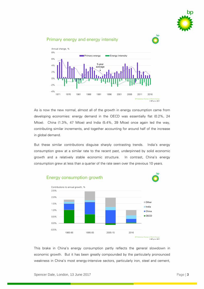
The confluence of these two forces can be seen clearly in the headline numbers.
Primary energy grew by just 1% (171 Mtoe) in 2016, almost half the average rate seen
over the previous 10 years.
Some of this weakness reflected short-run factors: global GDP grew by just 3% last year,
its slowest rate since 2002, other than at the time of the financial crisis, driven in part by
a slowdown in industrial production, the most energy-intensive sector of the economy.
But the weakness is also indicative of the longer-run trend towards slower energy
growth driven by gains in energy efficiency. This is the third consecutive year in which
energy consumption has grown by 1% or less, with the 5-year average growth rate at its
lowest level for over 20 years. This slowing has gone hand-in-hand with falls in energy
intensity – the average amount of energy needed to produce a unit of GDP – which has
also improved at historically rapid rates.
Spencer Dale, London, 13 June 2017 Page | 3
As is now the new normal, almost all of the growth in energy consumption came from
developing economies: energy demand in the OECD was essentially flat (0.2%, 24
Mtoe). China (1.3%, 47 Mtoe) and India (5.4%, 39 Mtoe) once again led the way,
contributing similar increments, and together accounting for around half of the increase
in global demand.
But these similar contributions disguise sharply contrasting trends. India’s energy
consumption grew at a similar rate to the recent past, underpinned by solid economic
growth and a relatively stable economic structure. In contrast, China’s energy
consumption grew at less than a quarter of the rate seen over the previous 10 years.
This brake in China’s energy consumption partly reflects the general slowdown in
economic growth. But it has been greatly compounded by the particularly pronounced
weakness in China’s most energy-intensive sectors, particularly iron, steel and cement,
© BP p.l.c. 2017
BP Statistical Review of World Energy
Primary energy and energy intensity
Annual change, %
-4%
-2%
0%
2%
4%
6%
8%
1971 1976 1981 1986 1991 1996 2001 2006 2011 2016
Primary energy Energy intensity
5-year average
© BP p.l.c. 2017
BP Statistical Review of World Energy
Energy consumption growth
-0.5%
0.0%
0.5%
1.0%
1.5%
2.0%
2.5%
1985-95 1995-05 2005-15 2016
Other
India
China
OECD
Contributions to annual growth, %
Spencer Dale, London, 13 June 2017 Page | 4
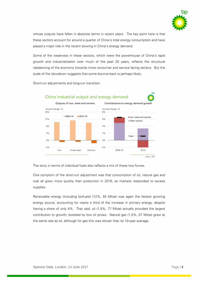
whose outputs have fallen in absolute terms in recent years. The key point here is that
these sectors account for around a quarter of China’s total energy consumption and have
played a major role in the recent slowing in China’s energy demand.
Some of the weakness in these sectors, which were the powerhouse of China’s rapid
growth and industrialization over much of the past 20 years, reflects the structural
rebalancing of the economy towards more consumer and service facing sectors. But the
scale of the slowdown suggests that some bounce-back is perhaps likely.
Short-run adjustments and long-run transition.
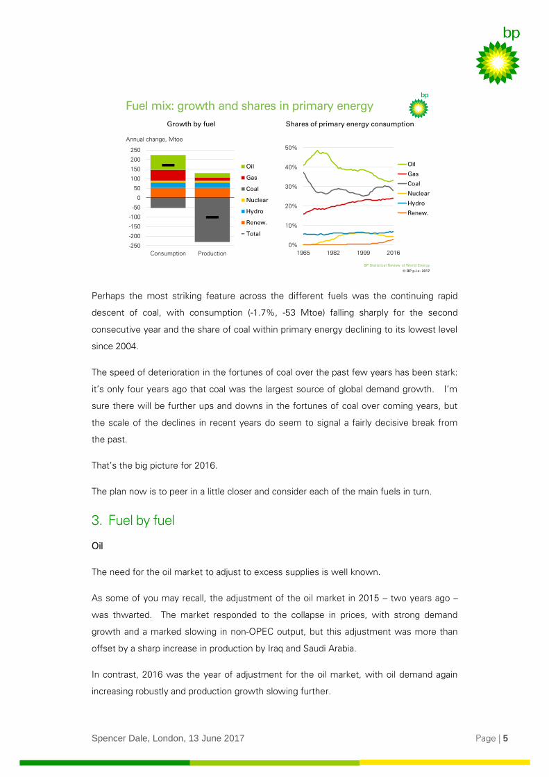
The story in terms of individual fuels also reflects a mix of these two forces.
One symptom of the short-run adjustment was that consumption of oil, natural gas and
coal all grew more quickly than production in 2016, as markets responded to excess
supplies.
Renewable energy (including biofuels) (12%, 55 Mtoe) was again the fastest growing
energy source, accounting for nearly a third of the increase in primary energy, despite
having a share of only 4%. That said, oil (1.5%, 77 Mtoe) actually provided the largest
contribution to growth, boosted by low oil prices. Natural gas (1.5%, 57 Mtoe) grew at
the same rate as oil, although for gas this was slower than its 10-year average.
© BP p.l.c. 2017
BP Statistical Review of World Energy
China industrial output and energy demand
16.3%
Contributions to energy demand growth Outputs of iron, steel and cement
-4%
0%
4%
8%
12%
16%
Iron Crude steel Cement
2004-14 2014-16
Annual change, %
-2%
0%
2%
4%
6%
8%
2004-14 2015
Iron, steel and cement
Other sectors
Annual change, %
Total
Source: Includes data from the National Bureau of Statistics of China
Spencer Dale, London, 13 June 2017 Page | 5
Perhaps the most striking feature across the different fuels was the continuing rapid
descent of coal, with consumption (-1.7%, -53 Mtoe) falling sharply for the second
consecutive year and the share of coal within primary energy declining to its lowest level
since 2004.
The speed of deterioration in the fortunes of coal over the past few years has been stark:
it’s only four years ago that coal was the largest source of global demand growth. I’m
sure there will be further ups and downs in the fortunes of coal over coming years, but
the scale of the declines in recent years do seem to signal a fairly decisive break from
the past.
That’s the big picture for 2016.
The plan now is to peer in a little closer and consider each of the main fuels in turn.
3. Fuel by fuel
Oil
The need for the oil market to adjust to excess supplies is well known.
As some of you may recall, the adjustment of the oil market in 2015 – two years ago –
was thwarted. The market responded to the collapse in prices, with strong demand
growth and a marked slowing in non-OPEC output, but this adjustment was more than
offset by a sharp increase in production by Iraq and Saudi Arabia.
In contrast, 2016 was the year of adjustment for the oil market, with oil demand again
increasing robustly and production growth slowing further.
© BP p.l.c. 2017
BP Statistical Review of World Energy
0%
10%
20%
30%
40%
50%
1965 1982 1999 2016
Oil
Gas
Coal
Nuclear
Hydro
Renew.
Fuel mix: growth and shares in primary energy
Annual change, Mtoe
Growth by fuel Shares of primary energy consumption
-250
-200
-150
-100
-50
0
50
100
150
200
250
Consumption Production
Oil
Gas
Coal
Nuclear
Hydro
Renew.
Total
Spencer Dale, London, 13 June 2017 Page | 6
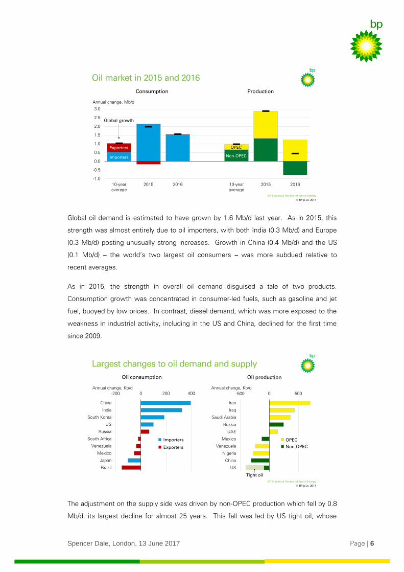
Global oil demand is estimated to have grown by 1.6 Mb/d last year. As in 2015, this
strength was almost entirely due to oil importers, with both India (0.3 Mb/d) and Europe
(0.3 Mb/d) posting unusually strong increases. Growth in China (0.4 Mb/d) and the US
(0.1 Mb/d) – the world’s two largest oil consumers – was more subdued relative to
recent averages.
As in 2015, the strength in overall oil demand disguised a tale of two products.
Consumption growth was concentrated in consumer-led fuels, such as gasoline and jet
fuel, buoyed by low prices. In contrast, diesel demand, which was more exposed to the
weakness in industrial activity, including in the US and China, declined for the first time
since 2009.
The adjustment on the supply side was driven by non-OPEC production which fell by 0.8
Mb/d, its largest decline for almost 25 years. This fall was led by US tight oil, whose
© BP p.l.c. 2017
BP Statistical Review of World Energy
Oil market in 2015 and 2016
-1.0
-0.5
0.0
0.5
1.0
1.5
2.0
2.5
3.0
10-yearaverage
2015 2016 10-yearaverage
2015 2016
Consumption Production
Annual change, Mb/d
Exporters
Importers
OPEC
Non-OPEC
Global growth
© BP p.l.c. 2017
BP Statistical Review of World Energy
-200 0 200 400
Brazil
Japan
Mexico
Venezuela
South Africa
Russia
US
South Korea
India
China
Largest changes to oil demand and supply
16.3%
Oil consumption
Annual change, Kb/d Annual change, Kb/d
Oil production
-500 0 500
US
China
Nigeria
Venezuela
Mexico
UAE
Russia
Saudi Arabia
Iraq
Iran
Tight oil
Importers
Exporters
OPEC
Non-OPEC
Spencer Dale, London, 13 June 2017 Page | 7
production fell by 0.3 Mb/d, a swing of almost 1 Mb/d relative to the growth seen in
2015. The other area of conspicuous weakness was China, which saw its largest ever
decline in oil production (-0.3 Mb/d).
In contrast, OPEC production recorded another year of solid growth (1.2 Mb/d), with Iran
(0.7 Mb/d), Iraq (0.4 Mb/d) and Saudi Arabia (0.4 Mb/d) more than accounting for the
increase. Iran’s production recovered more quickly following the lifting of international
sanctions than many commentators had expected, with its level of production and share
of OPEC output now back to around pre-sanction levels.
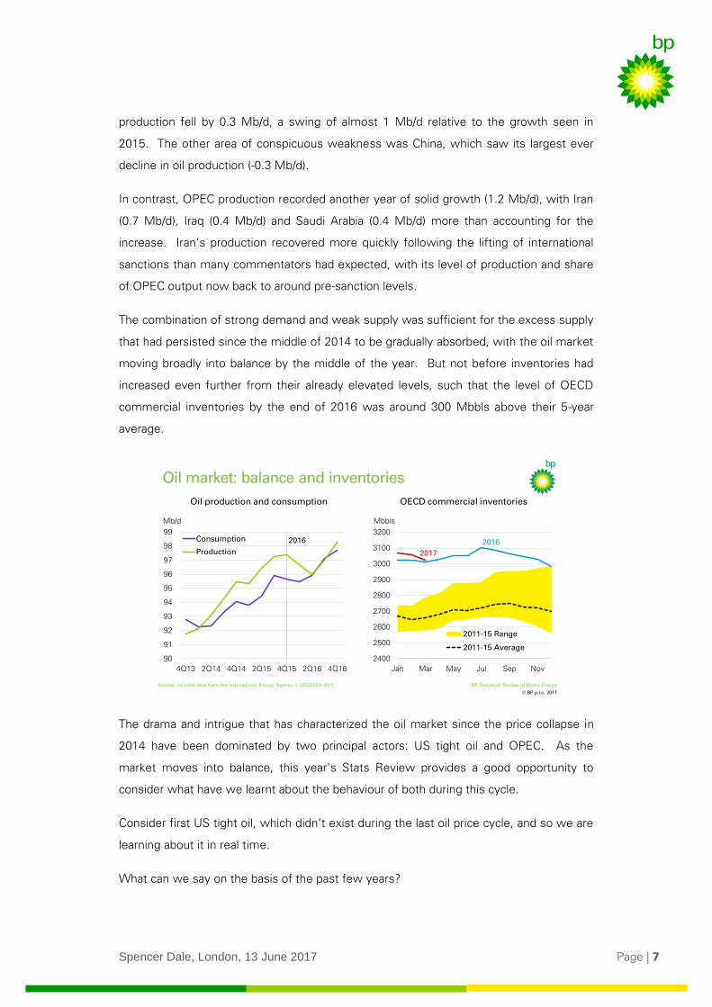
The combination of strong demand and weak supply was sufficient for the excess supply
that had persisted since the middle of 2014 to be gradually absorbed, with the oil market
moving broadly into balance by the middle of the year. But not before inventories had
increased even further from their already elevated levels, such that the level of OECD
commercial inventories by the end of 2016 was around 300 Mbbls above their 5-year
average.
The drama and intrigue that has characterized the oil market since the price collapse in
2014 have been dominated by two principal actors: US tight oil and OPEC. As the
market moves into balance, this year’s Stats Review provides a good opportunity to
consider what have we learnt about the behaviour of both during this cycle.
Consider first US tight oil, which didn’t exist during the last oil price cycle, and so we are
learning about it in real time.
What can we say on the basis of the past few years?
© BP p.l.c. 2017
BP Statistical Review of World Energy
2400
2500
2600
2700
2800
2900
3000
3100
3200
Jan Mar May Jul Sep Nov
2011-15 Range
2011-15 Average
OECD commercial inventories
Source: includes data from the International Energy Agency © OECD/IEA 2017
2017
2016
Oil market: balance and inventories
Oil production and consumption
Mb/d
90
91
92
93
94
95
96
97
98
99
4Q13 2Q14 4Q14 2Q15 4Q15 2Q16 4Q16
Consumption
Production
Mbbls
2016
Spencer Dale, London, 13 June 2017 Page | 8
Perhaps the most important thing is that there is no such thing as the behaviour of “US
tight oil”: the Permian is very different to Eagle Ford which is different to Bakken. So
beware generalizations.
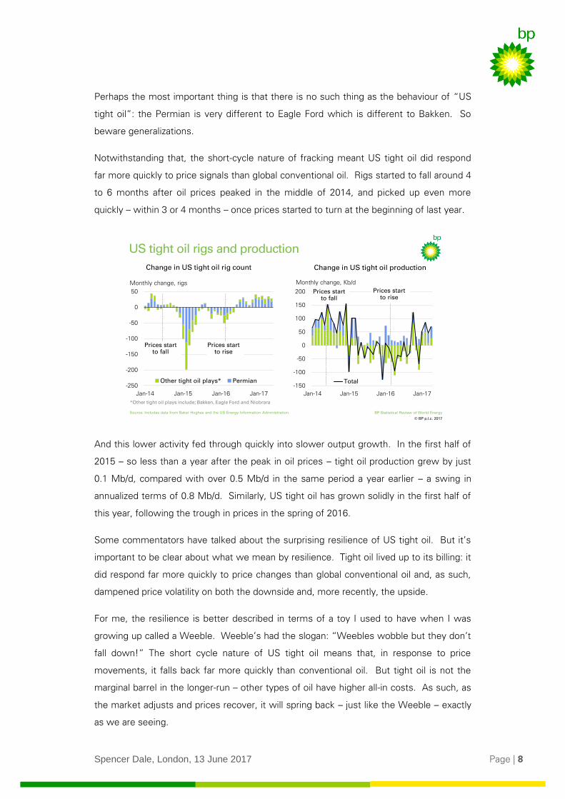
Notwithstanding that, the short-cycle nature of fracking meant US tight oil did respond
far more quickly to price signals than global conventional oil. Rigs started to fall around 4
to 6 months after oil prices peaked in the middle of 2014, and picked up even more
quickly – within 3 or 4 months – once prices started to turn at the beginning of last year.
And this lower activity fed through quickly into slower output growth. In the first half of
2015 – so less than a year after the peak in oil prices – tight oil production grew by just
0.1 Mb/d, compared with over 0.5 Mb/d in the same period a year earlier – a swing in
annualized terms of 0.8 Mb/d. Similarly, US tight oil has grown solidly in the first half of
this year, following the trough in prices in the spring of 2016.
Some commentators have talked about the surprising resilience of US tight oil. But it’s
important to be clear about what we mean by resilience. Tight oil lived up to its billing: it
did respond far more quickly to price changes than global conventional oil and, as such,
dampened price volatility on both the downside and, more recently, the upside.
For me, the resilience is better described in terms of a toy I used to have when I was
growing up called a Weeble. Weeble’s had the slogan: “Weebles wobble but they don’t
fall down!” The short cycle nature of US tight oil means that, in response to price
movements, it falls back far more quickly than conventional oil. But tight oil is not the
marginal barrel in the longer-run – other types of oil have higher all-in costs. As such, as
the market adjusts and prices recover, it will spring back – just like the Weeble – exactly
as we are seeing.
© BP p.l.c. 2017
BP Statistical Review of World Energy
US tight oil rigs and production
16.3%
Change in US tight oil rig count
Monthly change, rigs
-250
-200
-150
-100
-50
0
50
Jan-14 Jan-15 Jan-16 Jan-17
Other tight oil plays* Permian
Prices start to rise
Prices start to fall
-150
-100
-50
0
50
100
150
200
Jan-14 Jan-15 Jan-16 Jan-17
Total
Prices start to fall
Prices start to rise
Monthly change, Kb/d
Change in US tight oil production
Source: Includes data from Baker Hughes and the US Energy Information Administration.
*Other tight oil plays include; Bakken, Eagle Ford and Niobrara
Spencer Dale, London, 13 June 2017 Page | 9
That’s the resilience of tight oil: it may fall over but it will bounce back.
The final point to note about US tight oil is that the amazing gains in productivity that
have characterized these operations since the beginning of the shale revolution,
continued through the cycle, with new well production per rig increasing by around 40%
per year in both 2015 and 2016. Despite rigs in the Permian falling by over 75%, output
continued to grow. Put differently, a rig operating in the Permian today is equivalent to
more than 3 rigs at the end of 2014.
So what about the other principal actor in this drama: OPEC?
As with many great characters in literature, OPEC took some decisive actions which
caught many observers by surprise and dramatically changed the course of events. First
by not cutting production in November 2014, triggering a collapse in prices, and then last
November agreeing, along with ten non-OPEC producers, to a production cut totalling 1.8
Mb/d.
How should we think about these actions?
To cut or not to cut?
For me, the clearest explanation of these actions was given by HE Khalid Al-Falih, the
Saudi Arabian Minister for energy, industry and mineral resources. To quote Minister Al-
Falih:
“OPEC remains an important catalyst to the stability and sustainability of the
market….but history has also demonstrated that intervention in response to structural
shifts is largely ineffective… that’s why Saudi Arabia does not support OPEC intervening
to alleviate the impacts of long-term structural imbalances, as opposed to addressing
short-term aberrations….”
Speech given at CERAWeek, March 2017
To unpack this a bit: OPEC’s power stems from its ability to shift oil production from one
period to another. As such, it has the ability to smooth through the effects of temporary
shocks to the oil market, lowering or raising production until the shock subsides. But its
ability to respond to permanent or structural shocks is far more limited: shifting supply
from one period to another makes little difference if the underlying shock persists.
Consider, for example, the unsuccessful attempts by OPEC to support the oil market in
the first half of the 1980s as new structural sources of production from the North Sea,
Mexico and Alaska came on stream.
Spencer Dale, London, 13 June 2017 Page | 10
The underlying source of the supply imbalance that emerged in 2014 was the growth of
US tight oil. To use the Minister’s words, this was not a short-term aberration; it was the
emergence of a new source of intra-marginal supply – remember the Weeble.
In contrast, the focus of OPEC’s current actions is on increasing the pace at which oil
stocks return to more normal levels. This is exactly the type of temporary aberration in
which OPEC intervention can be effective – reducing supply until stocks have adjusted.
So perhaps like all the best stories, the actions of the main characters make perfect
sense when seen in the right context. It is understandable that OPEC didn’t cut in
November 2014 because the emergence of tight oil was a structural shock, over which it
had little power. In contrast, the most recent cuts are focussed on the temporary issue
of how quickly stocks unwind, where OPEC’s actions can be effective.
Finally for oil, what has all this meant for prices?
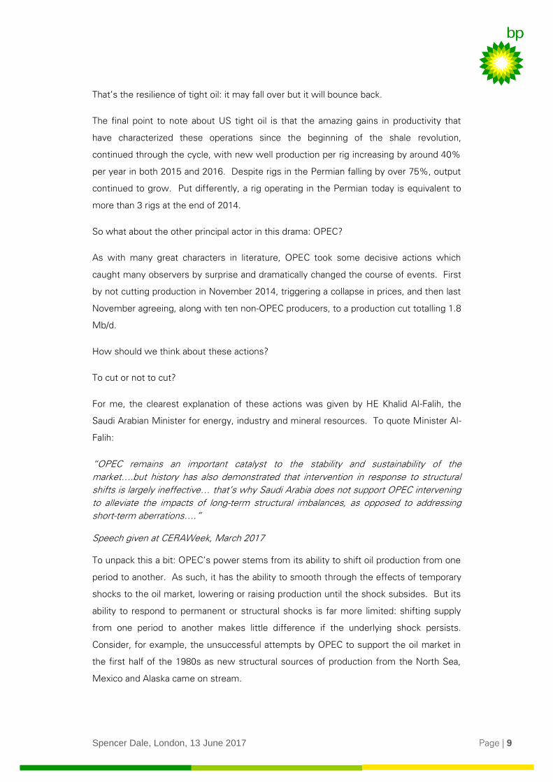
The persistent supply imbalance and growing inventory levels caused prices to fall
towards the end of 2015 and into 2016. Prices stabilized through the middle of the year
as the market moved into balance and inventories levelled off, before firming somewhat
towards the end of the year in the wake of the OPEC/non-OPEC agreement. Dated
Brent averaged $44 in 2016, down from $52 in 2015, its lowest (nominal) average since
2004. So far this year, prices have averaged about $53 as the OPEC cuts have started to
take effect, albeit partially offset by the strong recovery in US tight oil.
Refining
Refining is going through its own inventory adjustment.
© BP p.l.c. 2017
BP Statistical Review of World Energy
Oil prices
Source: includes data from Platts
20
40
60
80
100
120
140
160
2004 2005 2006 2007 2008 2009 2010 2011 2012 2013 2014 2015 2016 2017
Annual average
Dated Brent, $/bbl
Spencer Dale, London, 13 June 2017 Page | 11
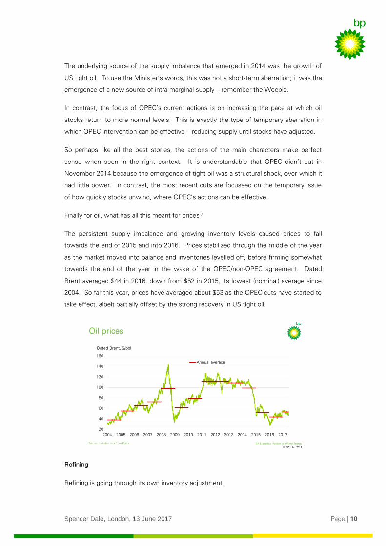
Inventories of products rose sharply in 2015, as refiners responded to near-record high
margins by increasing refinery throughput by 1.8 Mb/d, triple its 10-year average. But as
is so often the case, this splurge created its own downfall. The build-up of inventories
dampened margins in 2016 causing refineries to reduce the growth in crude runs to
more normal levels (0.6 Mb/d). After strong growth in 2015, European refiners, often the
marginal producers, reduced runs by close to 0.2 Mb/d, and multiple refinery shutdowns
in Mexico, Venezuela and Brazil caused throughput in these countries to fall by a
combined 0.4 Mb/d. India bucked the global trend, with its throughput rising by almost
0.4 Mb/d – more than China for the first time since 2001.
Despite the slower growth in crude runs, refinery utilization increased last year, as
refining capacity expanded by just 0.4 Mb/d, less than half its 10-year average. This was
the second successive year of weak growth in refining capacity, much of which can be
attributed to actions by China to limit the build-up of domestic spare refining capacity.
The lifting of the US export restrictions on US crude oil, combined with ample onshore
pipeline capacity, enabled US domestic crudes to be priced on a global basis. The Brent-
WTI differential narrowed to $0.4/bbl, down from $3.7/bbl in 2015. Although the
differential periodically widened sufficiently to encourage exports to Europe, the fall in
US crude production meant that US crude exports in 2016 were relatively unchanged
from the previous year.
Coal
As I mentioned, the fortunes of coal appear to have taken a decisive break from the past.
At the heart of this shift are structural, long-term, factors: the increasing availability and
competitiveness of natural gas and renewable energy; combined with mounting
© BP p.l.c. 2017
BP Statistical Review of World Energy
-1.0
-0.5
0.0
0.5
1.0
1.5
2.0
2.5
2015 2016
Latin America*
Other
Europe
US
India
China
Total
10-year average
Refinery throughput and capacity
16.3%
Refinery throughput
Annual change, Mb/d Annual change, Mb/d
Refining capacity
* S&C America and Mexico -1.0
-0.5
0.0
0.5
1.0
1.5
2.0
2.5
2010 2012 2014 2016
Other
Middle East
India
China
OECD
Total
Spencer Dale, London, 13 June 2017 Page | 12
government and societal pressure to shift away from coal towards cleaner, lower-carbon
fuels. These long-term forces in turn have given rise to policy responses that have often
added even greater momentum.
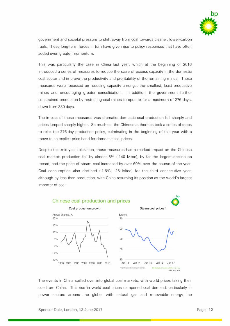
This was particularly the case in China last year, which at the beginning of 2016
introduced a series of measures to reduce the scale of excess capacity in the domestic
coal sector and improve the productivity and profitability of the remaining mines. These
measures were focussed on reducing capacity amongst the smallest, least productive
mines and encouraging greater consolidation. In addition, the government further
constrained production by restricting coal mines to operate for a maximum of 276 days,
down from 330 days.
The impact of these measures was dramatic: domestic coal production fell sharply and
prices jumped sharply higher. So much so, the Chinese authorities took a series of steps
to relax the 276-day production policy, culminating in the beginning of this year with a
move to an explicit price band for domestic coal prices.
Despite this mid-year relaxation, these measures had a marked impact on the Chinese
coal market: production fell by almost 8% (-140 Mtoe), by far the largest decline on
record; and the price of steam coal increased by over 60% over the course of the year.
Coal consumption also declined (-1.6%, -26 Mtoe) for the third consecutive year,
although by less than production, with China resuming its position as the world’s largest
importer of coal.
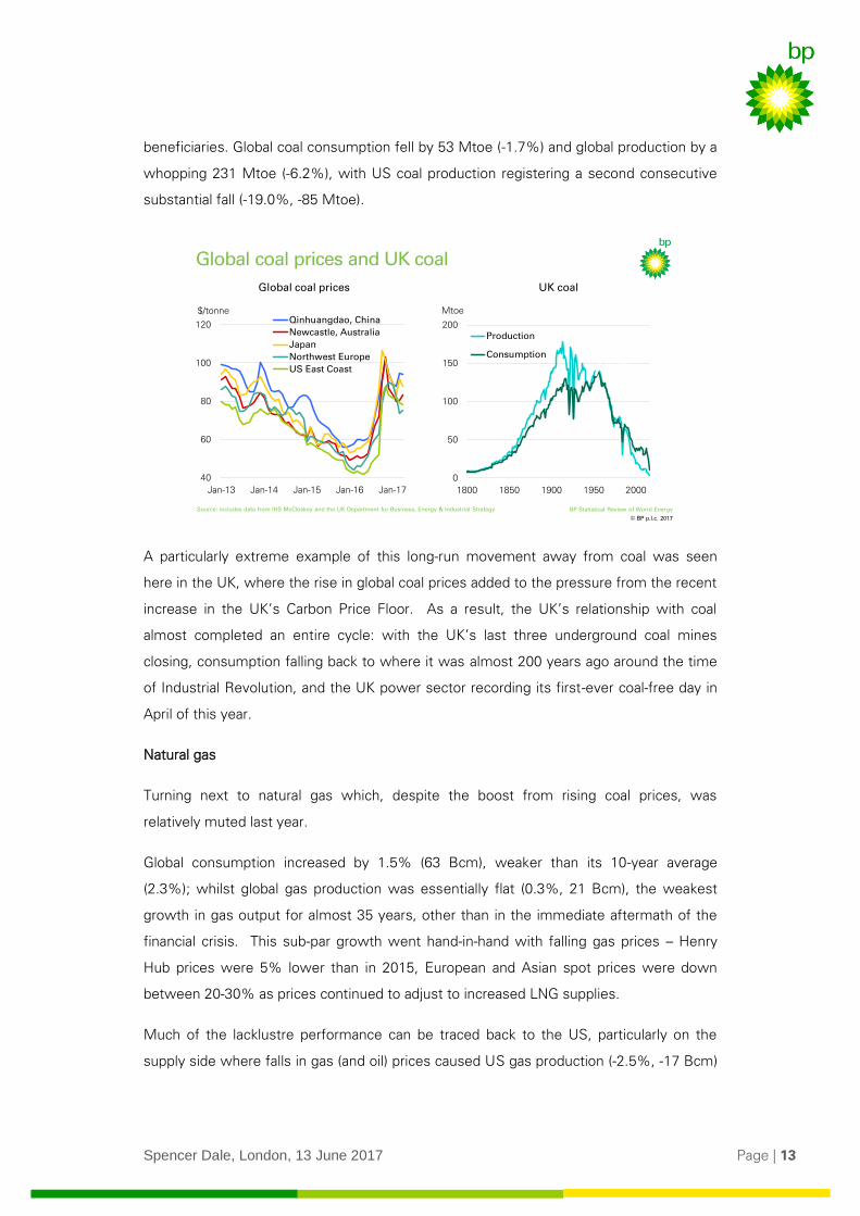
The events in China spilled over into global coal markets, with world prices taking their
cue from China. This rise in world coal prices dampened coal demand, particularly in
power sectors around the globe, with natural gas and renewable energy the
© BP p.l.c. 2017
BP Statistical Review of World Energy
-10%
-5%
0%
5%
10%
15%
20%
1986 1991 1996 2001 2006 2011 2016
Chinese coal production and prices
16.3%
40
60
80
100
120
Jan-13 Jan-14 Jan-15 Jan-16 Jan-17
Annual change, %
Steam coal prices*Coal production growth
$/tonne
* Qinhuangdao (5500 kcal/kg)
Spencer Dale, London, 13 June 2017 Page | 13
beneficiaries. Global coal consumption fell by 53 Mtoe (-1.7%) and global production by a
whopping 231 Mtoe (-6.2%), with US coal production registering a second consecutive
substantial fall (-19.0%, -85 Mtoe).
A particularly extreme example of this long-run movement away from coal was seen
here in the UK, where the rise in global coal prices added to the pressure from the recent
increase in the UK’s Carbon Price Floor. As a result, the UK’s relationship with coal
almost completed an entire cycle: with the UK’s last three underground coal mines
closing, consumption falling back to where it was almost 200 years ago around the time
of Industrial Revolution, and the UK power sector recording its first-ever coal-free day in
April of this year.
Natural gas
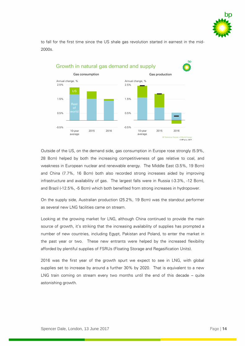
Turning next to natural gas which, despite the boost from rising coal prices, was
relatively muted last year.
Global consumption increased by 1.5% (63 Bcm), weaker than its 10-year average
(2.3%); whilst global gas production was essentially flat (0.3%, 21 Bcm), the weakest
growth in gas output for almost 35 years, other than in the immediate aftermath of the
financial crisis. This sub-par growth went hand-in-hand with falling gas prices – Henry
Hub prices were 5% lower than in 2015, European and Asian spot prices were down
between 20-30% as prices continued to adjust to increased LNG supplies.
Much of the lacklustre performance can be traced back to the US, particularly on the
supply side where falls in gas (and oil) prices caused US gas production (-2.5%, -17 Bcm)
© BP p.l.c. 2017
BP Statistical Review of World Energy
0
50
100
150
200
1800 1850 1900 1950 2000
Production
Consumption
Global coal prices and UK coal
16.3%
40
60
80
100
120
Jan-13 Jan-14 Jan-15 Jan-16 Jan-17
Qinhuangdao, China
Newcastle, Australia
Japan
Northwest Europe
US East Coast
UK coalGlobal coal prices
$/tonne Mtoe
Source: includes data from IHS McCloskey and the UK Department for Business, Energy & Industrial Strategy
Spencer Dale, London, 13 June 2017 Page | 14
to fall for the first time since the US shale gas revolution started in earnest in the mid-
2000s.
Outside of the US, on the demand side, gas consumption in Europe rose strongly (5.9%,
28 Bcm) helped by both the increasing competitiveness of gas relative to coal, and
weakness in European nuclear and renewable energy. The Middle East (3.5%, 19 Bcm)
and China (7.7%, 16 Bcm) both also recorded strong increases aided by improving
infrastructure and availability of gas. The largest falls were in Russia (-3.3%, -12 Bcm),
and Brazil (-12.5%, -5 Bcm) which both benefited from strong increases in hydropower.
On the supply side, Australian production (25.2%, 19 Bcm) was the standout performer
as several new LNG facilities came on stream.
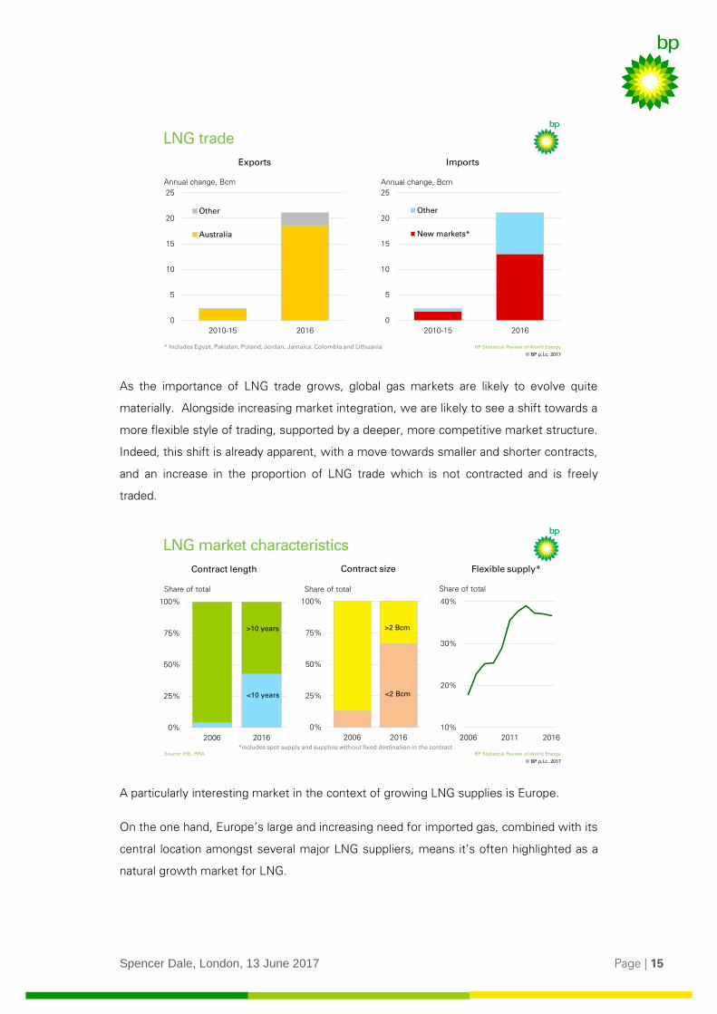
Looking at the growing market for LNG, although China continued to provide the main
source of growth, it’s striking that the increasing availability of supplies has prompted a
number of new countries, including Egypt, Pakistan and Poland, to enter the market in
the past year or two. These new entrants were helped by the increased flexibility
afforded by plentiful supplies of FSRUs (Floating Storage and Regasification Units).
2016 was the first year of the growth spurt we expect to see in LNG, with global
supplies set to increase by around a further 30% by 2020. That is equivalent to a new
LNG train coming on stream every two months until the end of this decade – quite
astonishing growth.
© BP p.l.c. 2017
BP Statistical Review of World Energy
Growth in natural gas demand and supply
16.3%
Gas consumption
-0.5%
0.5%
1.5%
2.5%
10-yearaverage
2015 2016
Restof
world
US
-0.5%
0.5%
1.5%
2.5%
10-yearaverage
2015 2016
Gas production
Annual change, % Annual change, %
Spencer Dale, London, 13 June 2017 Page | 15
As the importance of LNG trade grows, global gas markets are likely to evolve quite
materially. Alongside increasing market integration, we are likely to see a shift towards a
more flexible style of trading, supported by a deeper, more competitive market structure.
Indeed, this shift is already apparent, with a move towards smaller and shorter contracts,
and an increase in the proportion of LNG trade which is not contracted and is freely
traded.
A particularly interesting market in the context of growing LNG supplies is Europe.
On the one hand, Europe’s large and increasing need for imported gas, combined with its
central location amongst several major LNG suppliers, means it’s often highlighted as a
natural growth market for LNG.
© BP p.l.c. 2017
BP Statistical Review of World Energy
LNG trade
Annual change, Bcm Annual change, Bcm
ImportsExports
0
5
10
15
20
25
2010-15 2016
Other
Australia
0
5
10
15
20
25
2010-15 2016
Other
New markets*
* Includes Egypt, Pakistan, Poland, Jordan, Jamaica, Colombia and Lithuania
© BP p.l.c. 2017
BP Statistical Review of World Energy
LNG market characteristics
16.3%
Contract length
0%
25%
50%
75%
100%
2006 2016
Source: IHS, PIRA
Contract size
0%
25%
50%
75%
100%
2006 2016
Flexible supply*
10%
20%
30%
40%
2006 2011 2016
Share of totalShare of total Share of total
>10 years
<10 years
>2 Bcm
<2 Bcm
*includes spot supply and supplies without fixed destination in the contract
Spencer Dale, London, 13 June 2017 Page | 16
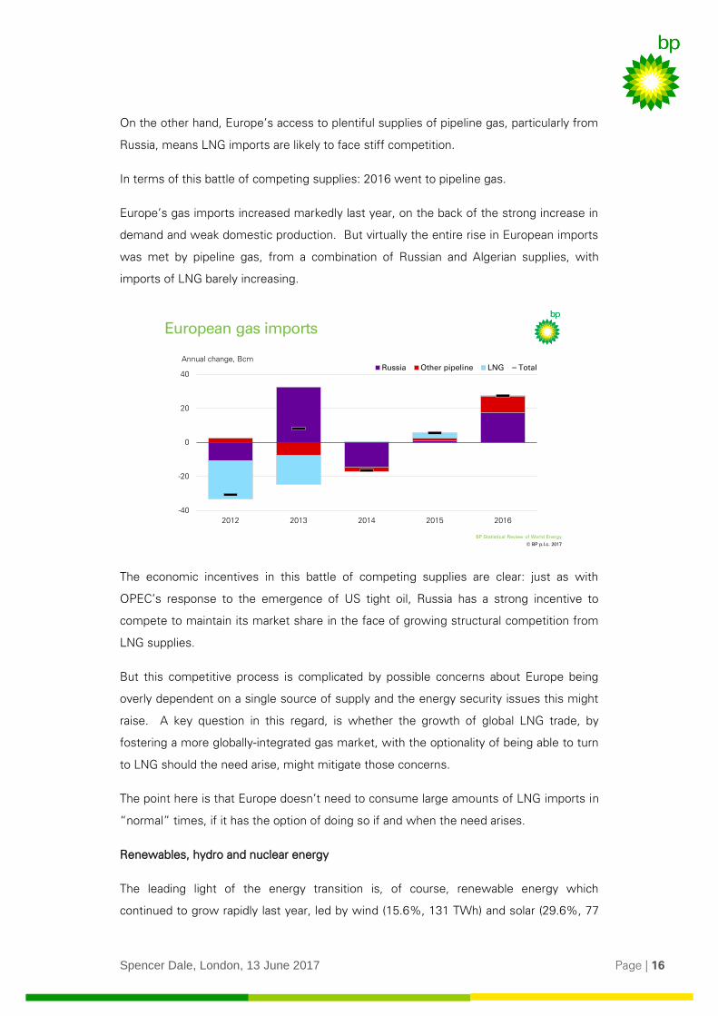
On the other hand, Europe’s access to plentiful supplies of pipeline gas, particularly from
Russia, means LNG imports are likely to face stiff competition.
In terms of this battle of competing supplies: 2016 went to pipeline gas.
Europe’s gas imports increased markedly last year, on the back of the strong increase in
demand and weak domestic production. But virtually the entire rise in European imports
was met by pipeline gas, from a combination of Russian and Algerian supplies, with
imports of LNG barely increasing.
The economic incentives in this battle of competing supplies are clear: just as with
OPEC’s response to the emergence of US tight oil, Russia has a strong incentive to
compete to maintain its market share in the face of growing structural competition from
LNG supplies.
But this competitive process is complicated by possible concerns about Europe being
overly dependent on a single source of supply and the energy security issues this might
raise. A key question in this regard, is whether the growth of global LNG trade, by
fostering a more globally-integrated gas market, with the optionality of being able to turn
to LNG should the need arise, might mitigate those concerns.
The point here is that Europe doesn’t need to consume large amounts of LNG imports in
“normal” times, if it has the option of doing so if and when the need arises.
Renewables, hydro and nuclear energy
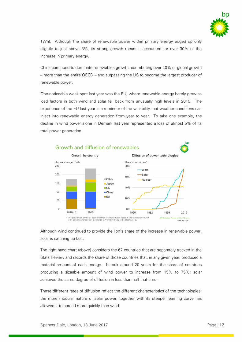
The leading light of the energy transition is, of course, renewable energy which
continued to grow rapidly last year, led by wind (15.6%, 131 TWh) and solar (29.6%, 77
© BP p.l.c. 2017
BP Statistical Review of World Energy
European gas imports
-40
-20
0
20
40
2012 2013 2014 2015 2016
Russia Other pipeline LNG TotalAnnual change, Bcm
US
Other
Spencer Dale, London, 13 June 2017 Page | 17
TWh). Although the share of renewable power within primary energy edged up only
slightly to just above 3%, its strong growth meant it accounted for over 30% of the
increase in primary energy.
China continued to dominate renewables growth, contributing over 40% of global growth
– more than the entire OECD – and surpassing the US to become the largest producer of
renewable power.
One noticeable weak spot last year was the EU, where renewable energy barely grew as
load factors in both wind and solar fell back from unusually high levels in 2015. The
experience of the EU last year is a reminder of the variability that weather conditions can
inject into renewable energy generation from year to year. To take one example, the
decline in wind power alone in Demark last year represented a loss of almost 5% of its
total power generation.
Although wind continued to provide the lion’s share of the increase in renewable power,
solar is catching up fast.
The right-hand chart (above) considers the 67 countries that are separately tracked in the
Stats Review and records the share of those countries that, in any given year, produced a
material amount of each energy. It took around 20 years for the share of countries
producing a sizeable amount of wind power to increase from 15% to 75%; solar
achieved the same degree of diffusion in less than half that time.
These different rates of diffusion reflect the different characteristics of the technologies:
the more modular nature of solar power, together with its steeper learning curve has
allowed it to spread more quickly than wind.
© BP p.l.c. 2017
BP Statistical Review of World Energy
14.1%
0%
20%
40%
60%
80%
1965 1982 1999 2016
Wind
Solar
Nuclear
0
50
100
150
200
250
2010-15 2016
Other
Japan
US
China
EU
Growth and diffusion of renewables
Growth by country Diffusion of power technologies
Annual change, TWh Share of countries*
* The proportion of the 67 countries that are individually listed in the Statistical Review with power generation of at least 50 GWh from the specified technology
Spencer Dale, London, 13 June 2017 Page | 18
In addition to these characteristics, the fact that the transfer of wind and solar technology
is not subject to onerous security restrictions has also greatly helped their rapid diffusion
relative to nuclear power, which plateaued at less than half the number of countries.
In terms of other non-fossil fuels: China provided the main source of world growth in
both hydro (2.8%, 120 TWh) and nuclear (1.3%, 41 TWh) power. Growth in China’s
hydro power has slowed sharply in recent years from the rapid rates of expansion that
characterized the latter part of the 2000s. In contrast, China’s nuclear programme is just
beginning to ramp up: it brought on five new reactors last year – the largest ever annual
increase in China’s nuclear history – and has more than 20 reactors currently under
construction.
That provides an overview of the different fuels. I want to conclude by considering how
these various developments came together in two key aspects of the global energy
system: the power sector and carbon emissions.
4. Power sector
The power sector plays a central role in the development of global energy markets. It’s
by far the single biggest market for energy: over 40% of primary energy went into the
power sector last year. Moreover, the power sector is at the leading edge of the energy
transition, in terms of both improvements in energy efficiency and the shift towards a
lower-carbon fuel mix.
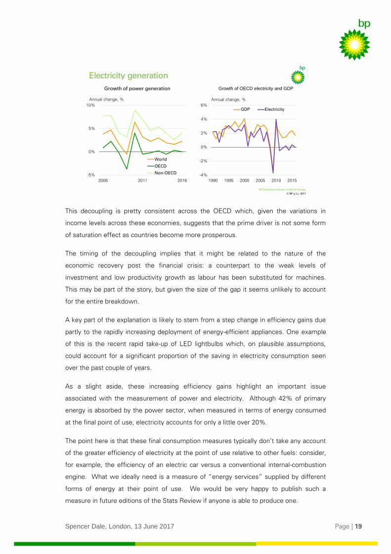
Power generation increased by 2.2% (601 TWh) in 2016, stronger than the previous year
(1.6%) but quite a bit below its historical average. Almost all of this growth came from
developing countries; power generation within the OECD was essentially flat. Indeed,
this continues a trend seen since around 2010, since when power generation in the
OECD has essentially flat-lined.
Some of this weakness in OECD power demand reflects slower rates of economic
growth, but the majority stems from an increasing gap between the growth of GDP and
power.
Spencer Dale, London, 13 June 2017 Page | 19
This decoupling is pretty consistent across the OECD which, given the variations in
income levels across these economies, suggests that the prime driver is not some form
of saturation effect as countries become more prosperous.
The timing of the decoupling implies that it might be related to the nature of the
economic recovery post the financial crisis: a counterpart to the weak levels of
investment and low productivity growth as labour has been substituted for machines.
This may be part of the story, but given the size of the gap it seems unlikely to account
for the entire breakdown.
A key part of the explanation is likely to stem from a step change in efficiency gains due
partly to the rapidly increasing deployment of energy-efficient appliances. One example
of this is the recent rapid take-up of LED lightbulbs which, on plausible assumptions,
could account for a significant proportion of the saving in electricity consumption seen
over the past couple of years.
As a slight aside, these increasing efficiency gains highlight an important issue
associated with the measurement of power and electricity. Although 42% of primary
energy is absorbed by the power sector, when measured in terms of energy consumed
at the final point of use, electricity accounts for only a little over 20%.
The point here is that these final consumption measures typically don’t take any account
of the greater efficiency of electricity at the point of use relative to other fuels: consider,
for example, the efficiency of an electric car versus a conventional internal-combustion
engine. What we ideally need is a measure of “energy services” supplied by different
forms of energy at their point of use. We would be very happy to publish such a
measure in future editions of the Stats Review if anyone is able to produce one.
© BP p.l.c. 2017
BP Statistical Review of World Energy
-5%
0%
5%
10%
2006 2011 2016
World
OECD
Non-OECD
Annual change, %
Electricity generation
-4%
-2%
0%
2%
4%
6%
1990 1995 2000 2005 2010 2015
GDP Electricity
Annual change, %
Growth of power generation Growth of OECD electricity and GDP
Spencer Dale, London, 13 June 2017 Page | 20
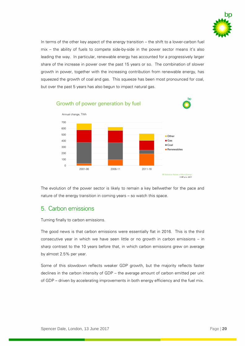
In terms of the other key aspect of the energy transition – the shift to a lower-carbon fuel
mix – the ability of fuels to compete side-by-side in the power sector means it’s also
leading the way. In particular, renewable energy has accounted for a progressively larger
share of the increase in power over the past 15 years or so. The combination of slower
growth in power, together with the increasing contribution from renewable energy, has
squeezed the growth of coal and gas. This squeeze has been most pronounced for coal,
but over the past 5 years has also begun to impact natural gas.
The evolution of the power sector is likely to remain a key bellwether for the pace and
nature of the energy transition in coming years – so watch this space.
5. Carbon emissions
Turning finally to carbon emissions.
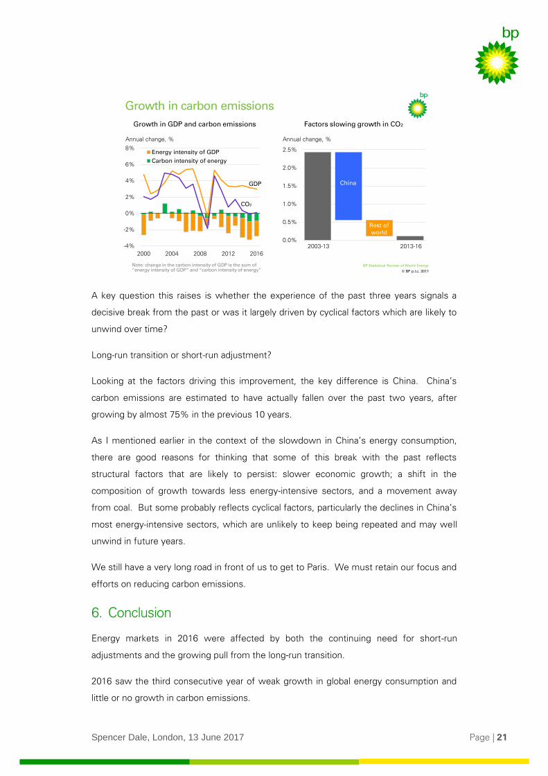
The good news is that carbon emissions were essentially flat in 2016. This is the third
consecutive year in which we have seen little or no growth in carbon emissions – in
sharp contrast to the 10 years before that, in which carbon emissions grew on average
by almost 2.5% per year.
Some of this slowdown reflects weaker GDP growth, but the majority reflects faster
declines in the carbon intensity of GDP – the average amount of carbon emitted per unit
of GDP – driven by accelerating improvements in both energy efficiency and the fuel mix.
© BP p.l.c. 2017
BP Statistical Review of World Energy
14.1%
0
100
200
300
400
500
600
700
2001-06 2006-11 2011-16
Other
Gas
Coal
Renewables
Growth of power generation by fuel
Annual change, TWh
Spencer Dale, London, 13 June 2017 Page | 21
A key question this raises is whether the experience of the past three years signals a
decisive break from the past or was it largely driven by cyclical factors which are likely to
unwind over time?
Long-run transition or short-run adjustment?
Looking at the factors driving this improvement, the key difference is China. China’s
carbon emissions are estimated to have actually fallen over the past two years, after
growing by almost 75% in the previous 10 years.
As I mentioned earlier in the context of the slowdown in China’s energy consumption,
there are good reasons for thinking that some of this break with the past reflects
structural factors that are likely to persist: slower economic growth; a shift in the
composition of growth towards less energy-intensive sectors, and a movement away
from coal. But some probably reflects cyclical factors, particularly the declines in China’s
most energy-intensive sectors, which are unlikely to keep being repeated and may well
unwind in future years.
We still have a very long road in front of us to get to Paris. We must retain our focus and
efforts on reducing carbon emissions.
6. Conclusion
Energy markets in 2016 were affected by both the continuing need for short-run
adjustments and the growing pull from the long-run transition.
2016 saw the third consecutive year of weak growth in global energy consumption and
little or no growth in carbon emissions.
© BP p.l.c. 2017
BP Statistical Review of World Energy
0.0%
0.5%
1.0%
1.5%
2.0%
2.5%
2013-16
Growth in carbon emissions
Annual change, %
Factors slowing growth in CO₂Growth in GDP and carbon emissions
2003-13
China
Rest of world
-4%
-2%
0%
2%
4%
6%
8%
2000 2004 2008 2012 2016
Energy intensity of GDP
Carbon intensity of energy
Annual change, %
Note: change in the carbon intensity of GDP is the sum of “energy intensity of GDP” and “carbon intensity of energy”
GDP
CO₂

Spencer Dale, London, 13 June 2017 Page | 22
Much of this slowing can be traced to the developments in China which – as we saw –
probably reflected a combination of a long-run transition to a more sustainable pattern of
growth as well as a near-term cyclical slowdown in key industries.
Some of the strength we saw in the demand for individual fuels, most notably oil, largely
reflected the adjustment to a period of excess supplies.
But the trends in some of the other fuels – most notably the contrasting fortunes of
renewables and coal – had much to do with the longer-run energy transition that is
underway.
The Stats Review is hugely valued.
It’s seen by many as a trusted and dependable guide.
It doesn’t try to predict the future, but it does give a timely and accurate reading of the
current situation.
And helps us make sense of what has happened and plan better for what lies ahead.
Indeed, just like a much-loved watch!
And, even better, unlike the watch, it’s available free from BP.com.