Embed Size (px)
Citation preview

#MuseumFromHome with the
Elmhurst Art Museum

COLOR
Color is produced when light, striking an object, is reflected back to the eye. In art and design, color has a slew of attributes which are primarily subjective. Those include characteristics such as
harmony — when two or more colors are brought together and produce a satisfying effective response; and temperature — a blue is considered warm or cool depending on whether it leans
towards purple or green and a red whether it leans towards yellow or blue.
Subjectively, then, color is a sensation, a human reaction to a hue arising in part from the optic nerve, and in part from education and exposure to color, and perhaps in the largest part, simply
from the human senses.
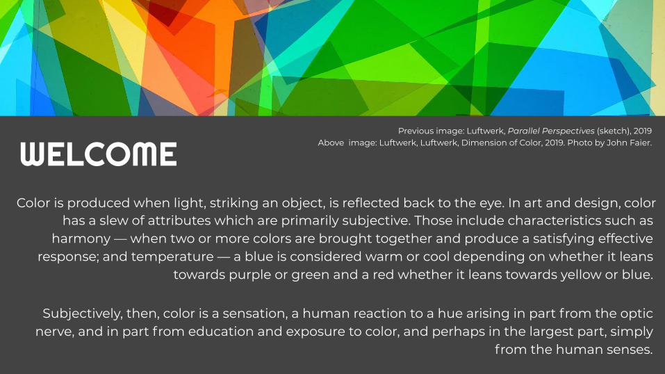
WELCOMEPrevious image: Luftwerk, Parallel Perspectives (sketch), 2019
Above image: Luftwerk, Luftwerk, Dimension of Color, 2019. Photo by John Faier.

Top Left: Unknown Designer, Scheme of teaching, from the publication “State Bauhaus Weimar 1919–1923, 1923” 1923, © Foto: ifa, A. Körner, bildhübsche Fotografie Bottom left: Colour star used by Itten as the basis of his teaching at the Bauhaus c. 1921, showing English translations of the 12 hue divisions he derived from his teacher Adolf Hoelzel..
The teachers of the Bauhaus created much of what we currently understand and believe about color. The teachings of these four
artists helps us understand not only the formation of modern color theory, but indeed how color theory is developed and transmitted.
Johannes Itten taught at the Bauhaus from 1919 until 1922, and he taught one of the fundamental preliminary courses that – among
other things – grappled with color theory. Itten gave us a color sphere comprised of twelve colors (three primary, three secondary,
and six tertiary) that shows the relationship among colors, as well as gradations of saturation. The influence of psychoanalysis is
apparent in Itten’s color theory, as he was one of the first to associate different colors with specific emotions and study the impact of color on our moods. He also studied how individuals
perceive color.
Modern Understanding of Color

Luftwerk, Sketches in the making of Parallel Perspectives, color gel and light, 2019
Inspired by concepts from Johannes Itten and the teachings from Bauhaus, modern artists
have embraced these ideas on color and applied to them to exhibitions, in particular, in
our McCormick House. These artists created immersive experiences in the McCormick House, using a variety of artistic materials,
light, and film. While color is relative, saturating an environment with color impacts how we interpret and see the space. Creating
such dynamic and dramatic environments enhance our understanding of color as the
subject matter as well as a method to communicate other ideas.

Manglano-Ovalle’s intervention Untitled Film (Red) radically altered the experience of the McCormick House and all its views to the exterior. Viewers were immersed in color saturation as their expectations of the house’s nuances are disrupted by a simple gesture of applying red celluloid to the glass curtain walls Mies van der Rohe is known for.
Iñigo MANGLANO-OVALLE
Iñigo Manglano-Ovalle, Untitled Film (Red), 2018Transparent, red colored polyester film

Red permeates the whole of the environment, including the visitor and their view of the exterior. It is a color with optical, emotive, psychological, social, as well as political connotations. Its meaning is filtered by a set of individual interpretations which in turn are colored by historical and cultural associations we assign to red.
Iñigo Manglano-Ovalle, Untitled Film (Red), 2018Transparent, red colored polyester film

Manglano-Ovalle’s architectural interventions have included projects at Mies’s Farnsworth House, Barcelona Pavilion, S.R. Crown Hall at IIT, and Neue National Galerie, Berlin, as well as the fabrication of the architect’s 1951 proposal for the as-yet-unbuilt House with Four Columns.
Iñigo Manglano-Ovalle, Untitled Film (Red), 2018Transparent, red colored polyester film

Parallel Perspectives used color and light interventions to activate and interpret the McCormick House (1952) designed by Mies van der Rohe. This installation by
Luftwerk—the Chicago-based collaborative of Petra Bachmaier and Sean Gallero—heightened the senses and altered the perception while celebrating the
mid-Century prefab prototype. The exhibition title referred to the paired prefab sections of the McCormick House, and the works in this show inspired by the
conceptual framework of Mies.
LUFTWERK: Parallel Perspectives
Angle of Reflection, 2019. Photo by John Faier.

Color was central to Luftwerk’s visual transformation of the architectural
nuances and the history of the house. In fact, the original
developers, Robert Hall McCormick and Herbert S. Greenwald, offered to
tint windows of the proposed prefabricated housing with “almost
any shade of the rainbow.”
Luftwerk, Luftwerk, Dimension of Color, 2019. Photo by John Faier.

The installation included several works with static and dynamic color
relationships, including an immersive light piece that transforms a bedroom, parallel
neon light pieces with mirrored effects, pulsing lightboxes, and a colorful glass
cube. The visual effects impacted the experiences and spatial perceptions of the
viewer throughout the domestic environment.
Luftwerk, One point Perspective Study No 1, 2019. Photograph by John Faier.


Luftwerk, One point Perspective Study No 1, 2019, Video by John Faier.
VIDEO

Why you decided to refer to the idea of the owner Robert Hall McCormick to tint windows
“almost any shade of the rainbow”?
Luftwerk: “almost any shade of the rainbow” is the bridge between our interest in working with
color and the McCormick House. It opens a space for the connection between Mies van der Rohe’s designed architecture to Bauhaus color studies,
like Johannes Itten and Josef Albers. We see Parallel Perspectives as site-specific exhibition
that articulates that connection.While developing the work we kept asking
ourselves: What would an architectural rainbow look like? This approach opened up a playful yet
structured platform to engage concepts of perception and color theory.Luftwerk, Spatial Animation No 1, 2019. Photo by John Faier.
Inspired by the Bauhaus

Luftwerk, Spatial Animation No 1, 2019. Video by John Faier.
VIDEO

“The kingdom of colors has within it multidimensional possibilities only partly to be reduced to simple order. Each individual color is a universe in itself.”- Johannes Itten

In this collaboration with the Fundació Mies van der Rohe, Elmhurst Art Museum/McCormick House, Farnsworth House, and MAS Context, we present images from light interventions and installations by Luftwerk on Facebook and Instagram, on June 28th at 3pm.
The online artist talk and discussion Luftwerk on Mies: Reinterpreting Space Through Light and Color is moderated by Iker Gil.
Artist Talk: Luftwerk on Mies RSVP HERESunday, June 28th at 3pm

Luftwerk: Parallel Perspectiveexhibition page
Luftwerk: Parallel Perspective exhibition brochure
More on Luftwerk, Inigo Manglano-Ovalle, and Bauhaus
Inigo Manglano-Ovalle artist page
Art21- More on Inigo Manglano-Ovalle
Chicago Bauhaus Beyond- McCormick House Revealed
Luftwerk artist page
Museum from Home- Bauhaus from Your House, online guide
Exhibition: The Whole World A Bauhaus, Elmhurst Art Museum

From Home Activity
CLICK HERE

Chicago Tribune “A less-is-more restoration of a Mies house expands our view of a little-known episode in the famed architect’s career” by Blair Kamin
New City “Design Top 5: June 2018“ by Vasia Rigou
Chicago Architect “Elmhurst Art Museum McCormick House Renovations: Liberating a Little-Known Mies House” by Chelsea Ross
Chicago Tribune “Elmhurst Art Museum opens Mies van der Rohe exhibit” by Graydon Megan
WDCB The Arts Section “Polishing An Architectural Gem” by Gary Zidek
Architect Magazine- A New Installation Covers Mies Van Der Rohe, Barcelona Pavilion
PRESSChicago Crusader- Elmhurst Art Museum announces spring and summer programming for With a Capital P: Selections by Six Painters group exhibition and Luftwerk: Parallel Perspectives color & light intervention in Mies’ McCormick House
ArchDaily- “Mies van der Rohe's McCormick House Transformed by Color Installation” by Niall Patrick Walsh
Colossal- Light Shines Through a Rainbow-Tinted Geometric Panel Installation by Art Duo Luftwerk by Andrew Lasane
Daily Herald- 'Luftwerk: Parallel Perspectives' visually transforms Mies' McCormick House with color and light interventions at Elmhurst Art Museum
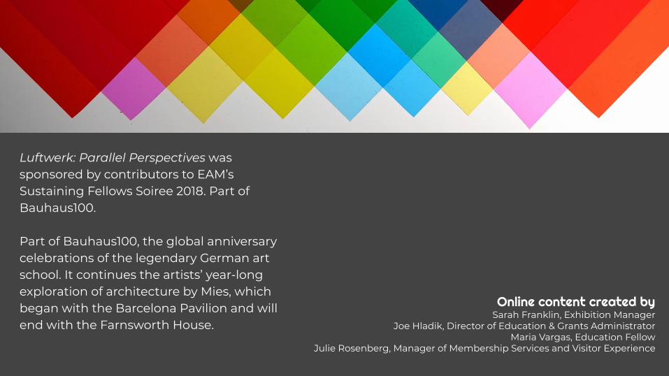
Luftwerk: Parallel Perspectives was sponsored by contributors to EAM’s Sustaining Fellows Soiree 2018. Part of Bauhaus100.
Part of Bauhaus100, the global anniversary celebrations of the legendary German art school. It continues the artists’ year-long exploration of architecture by Mies, which began with the Barcelona Pavilion and will end with the Farnsworth House.
Online content created bySarah Franklin, Exhibition Manager
Joe Hladik, Director of Education & Grants AdministratorMaria Vargas, Education Fellow
Julie Rosenberg, Manager of Membership Services and Visitor Experience