Embed Size (px)
Citation preview
1
COLLEGE OF ARTS AND SOCIAL SCIENCES
Research School of Humanities and the Arts
SCHOOL OF ART
VISUAL ARTS GRADUATE PROGRAM
DOCTOR OF PHILOSOPHY
ELISABETH CLAIRE BODEY
FIELDS OF RELATIONS, BOXES OF JEWELS: A PRACTICE LED
ENQUIRY INTO ASPECTS OF PLACE AS FOUNDATION FOR A NEW
LANGUAGE OF CULTURAL ABSTRACTION IN PAINTING
EXEGESIS SUBMITTED IN PART FULFILMENT FOR THE
DEGREE OF THE DOCTOR OF PHILOSOPHY OF
THE AUSTRALIAN NATIONAL UNIVERSITY
SEPTEMBER 2015

2
Acknowledgements
I would like to thank my supervisors: Ruth Waller and Gordon Bull and my advisor
Diana James, and also my supervisor in the early stages, Viv Binns.
I am particularly grateful to the people and the artists of Yuendumu NT, who
generously shared their stories and their culture. Also to the Warlukurlangu Artists
Aboriginal Corporation for allowing access to their archive.
As an external candidate I would like to thank Dr Penny Johnson and Professor Nick
Evans for generously providing a home base when visiting the University.
And finally, thanks to my partner Andy Smalley and my son Felix for their
unwavering support and encouragement throughout this project.
3
Declaration of Originality
I, Elisabeth Bodey ……………………………………………………..hereby declare
that the thesis here presented is the outcome of the research project undertaken during
my candidacy, that I am the sole author unless otherwise indicated, and that I have
fully documented the source of ideas, references, quotations and paraphrases
attributable to other authors.
4
CONTENTS
Abstract
List of Illustrations
Introduction
i. Origins and motivations driving my research
ii. From the northern hemisphere to central Australia
iii. Phenomenology and the trembling space
iv. Introducing the cross-cultural into thoughts about place
v. Colour, signs and musical structures as abstract forms in a cross-
cultural conversation
vi. How visual and musical forms from diverse traditions can contribute
to a cross-cultural conversation in painting.
Chapter One: Painting, culture and music as context for my project
i. Ideas and vocabulary of place
ii. Fieldwork and the experience of connecting to
surface and substance
iii. Musical performance, musical structure: touch and
rhythm as shared aspects of music and painting
iv. Painting: the beginnings
Chapter Two: Fields of relations and boxes of jewels: grids,
notations, colour, marks and sound as conversations about place.
i. Fields and lines: music and place
ii. From fields and lines: painting as manuscript
iii. Painting units, hearing dots
iv. Constructed paintings: ‘being’ in touch
5
Chapter Three: Space and the idea of relatedness
i. Developing the aesthetic of relatedness
ii. Mondrian and the primary grid
iii. Correspondences between colour and music
iv. Correspondences in the gridded field
v. Correspondences in action
Chapter Four: The grid as a space for correspondence and resonance
i. Mina Mina and Caress: a conversation
ii. Margarita Tupitsyn and the grid as a vehicle for
cultural interaction
Conclusion
Bibliography
6
Fields of relations, boxes of jewels: a practice-led enquiry
into aspects of place as foundation for a new language of
cultural abstraction in painting.
ABSTRACT
The early stages of my research had focussed on the general idea of place as
landscape in painting, centering on the Warlpiri country of the Central Desert.
This perspective on place was quickly challenged by ideas of, experiences in and
responses to those places I then visited as part of this research. My research
eventually became an investigation into the language of painting, informed by
ideas and different cultural forms and resulting in a one that has reconstructed
my practice.
I have explored how the contemporary language of abstract painting can engage
with the experience of different cultural contexts both western and indigenous,
specifically in the areas of visual art and music. Western artists I have considered
are Paul Klee and Piet Mondrian, Ellsworth Kelly, Richard Long, Yves Klein, Tim
Johnson and Jan Riske: the indigenous artists considered are the Martumili
women of Punmu, Joe Japanangka James, Shorty Jangala and Lady Nungurrayi
Robinson.
My conversation has evolved using newfound elements extending and deepening
my painting practice. My research has been enriched by fieldwork experiences
ranging from a retrospective of Piet Mondrian’s painting in Den Hague, attending
the Women’s Law and Culture Week in the Northern Territory and music
performances such as John Luther Adams composition Inuksuit and Morton
Feldman’s Patterns in a Chromatic Field.
My early readings were very much centred on the writings of anthropologists
such as Nancy Munn, Diana James, Christine Watson, Francois Dussart and
7
Yasmine Musharbash as they provided important context to my visits to
Yuendumu and my fieldwork at the Women’s Law and Culture Week.
In reflecting on my practice I have been influenced and informed by writers such
as Terry Smith and his revisiting of contemporaneity and connectivity in the
global community; by Yve-Alain Bois’ essay on Mondrian’s painting, The
Iconoclast and Maurice Merleau-Ponty regarding phenomenology and
perception. Finally, The Grid as a Checkpoint of Modernity by Margarita Tupitsyn
helped refine my focus, appearing to encapsulate much of what I had been
thinking.
I have come to recognise the phenomenological experience as key to all my
responses both as observer and as artist. In particular, the aspect of my research
focussing on the cultural forms of Central Desert communities, specifically
painting and the performance of songs has had an expansive effect on my
thinking and studio processes, contributing to a re-invention of my painting as
an abstract artist.
8
LIST OF ILLUSTRATIONS
All images not otherwise attributed are of the author’s own work.
Fig. 1. Amundurrgnu Boogie (2011). Watercolor, pencil and red sand on paper, 57 x
76 cm.
Fig. 2. Hills around Yuendumu, Northern Territory 2009. Authors photograph.
Fig. 3. Shorty Jangala painting at the Warlukurlangu Artists Centre, Yuendumu
2011.
Fig. 4. Jacob van Ruisdael, Landscape with a Wheatfield (late 1650’s - early
1660’s), oil on canvas, 40 x 45.7 cm. The J. Paul Getty Museum. Los Angeles, CA.
www.getty.edu (accessed November 2014)
Fig. 5. Untitled (2012). Watercolour and sand on khadi paper, 10 x 10 cm.
Fig. 6. Untitled (2013). Watercolor and sand on manuscript paper on linen, 50 x 40
cm.
Fig. 7. An example of the melodic descent form in Richard M. Moyle. Balgo: The
Musical Life of a Desert Community Nedlands, WA: Callaway International Resource
Centre for Music Education (CIRCME), 1997.
Fig. 8. Small Song No.1 (2013). Pencil, watercolour and sand on paper, 106 x 76 cm.
Fig. 9. Ngayarta Kujarra (2009). Collaborative work by eleven Martumili women
artists of Punmu, Western Australia. Synthetic polymer paint on canvas, 3 x 5 m.
Fig. 10. Joe Japanangka James, Wakurlyarri Jukurrpa (Rock Wallaby Dreaming)
(1986). Synthetic polymer paint on composition board, 120 x 270 cm. National
Gallery of Victoria.
Fig. 11. John Luther Adams, Stack 1. Suspended Cymbals and Tam-Tam. Manuscript
sheet from Inuksuit (2009).
Fig. 12. Untitled watercolour (2010). Watercolor on paper. 30 x 40 cm.
Fig. 13. Untitled watercolour (2010). Watercolor on paper. 30 x 40 cm.
Fig. 14. Discarded pots of primary colour.
Fig. 15. Ellsworth Kelly, Spectrum Colors arranged by Chance 111 (1951). Collage
on four sheets of paper, 38 ¼ x 38 ¼. MOMA, New York.
Fig. 16. Acrylic and watercolour serial painting with interruptions (2011)
Fig. 17. Studio wall in 2011.

9
Fig. 18. Mulga ant nest. Authors photograph 2009.
Fig. 19. Waterhole on rock face. Authors photograph 2009.
Fig. 20. Conversation 1 2011. Watercolor, synthetic polymer, sand and pencil on
paper.
Fig. 21. Shorty Jangala Robertson. Ngapa Jukurrpa (Water Dreaming) (2005).
Synthetic polymer paint on canvas, 183 x 122 cm. National Gallery of Australia,
Canberra.
Fig. 22. Lady Nungurrayi Robinson. Witi Jukurrpa – Yanjirlypirri (Ceremonial
Poles) (2006). Synthetic polymer on canvas. 30 x 122 cm. The authors’ collection.
Fig. 23. Richard Long. Five Stones. Iceland 1974. Black and white photograph, n.d.
http://www.richardlong.org/Sculptures/2011sculptures/fivestones.html.
Fig. 24. Warlpiri Ground Drawing. San Francisco Legion of Honor Museum.
Vegetal matter, white clay, red ochre, 1999.
http://www.aboriginalart.com/museum_pages/holter_15.html.
Fig. 25. Manuscript Painting no. 1 (2011). Watercolor, synthetic polymer with
pumice, pencil and digitally printed line work, 106 x 76 cm
Fig. 26. Manuscript painting no. 2 (2011). Watercolour, sand, pencil and digitally
printed line work, 106 x 76 cm.
Fig. 27. Untitled (2012). Synthetic polymer, sand, pencil on ply. 1 m x 57 cm.
Fig. 28. Untitled (2012). Synthetic polymer, sand, pencil on ply. 1 m x 57 cm.
Fig. 29. Graphic score for Ligeti’s Artikulation. Rainer Wehinger (2010).
http://www.musicmusic.nl/wordpress/?tag=rainer-wehinger
Fig. 30. David Young. Visual music score for Not Music Yet. Watercolor on paper,
102 x 68 cm (detail). Showing vertical mark-ups made by the pianist Zubin Kanga,
for performance (2012).
Fig. 31. Contrasting units from a Gerhardt Richter and a Central Desert painting.
Fig. 32. Descending 1 (2011). Pencil, watercolour, ink, sand, synthetic polymer on
paper.
Fig. 33. Descending 2 (2011). Pencil, watercolour, sand, synthetic polymer paint on
paper.
Fig. 34. Primary Grid (2012). Pencil, watercolour, ink, sand on paper.
Fig. 35. Tim Johnson, Three Worlds (1987). Colour screen print on paper. 65.4 x
47.4 cm image; 76.6 x 56.3 cm sheet. Art Gallery of New South Wales, Sydney.
www.artgallery.nsw.gov.au/collection/artist/johnson-tim/

10
Fig. 36. Tim Johnson, Karma Phuntsok, Brendan Smith, Lotus Born (2006).
Synthetic polymer paint on canvas, 9 panels, each 198 x 91.5 cm; 198 x 823.5 cm
overall. Art Gallery of new South Wales, Sydney.
www.artgallery.nsw.gov.au/collection/artist/johnson-tim/
Fig. 37. Circle grid (2011). Watercolour, synthetic polymer and sand on Khadi
paper, each 10 x 10 cm.
Fig. 38. Small blue palette (2012). Synthetic polymer on board, 15 x 20 cm.
Fig. 39. Red palette (2011). Sand on perspex on wood palette, 1.2 m x 80 cm.
Fig. 40. Yves Klein palette (2011). Sand, sponges and synthetic polymer on wooden
stretcher on ply, 40 cm dia. x 2 cm.
Fig. 41. Florentine palette (2011). Sand, gold oil paint and acrylic polymer on
Wooden stretcher on ply, 40 cm dia. x 2 cm.
Fig. 42. Lorenzo Ghiberti. “The Sacrifice of Isaac”. Bronze barbed quatrefoil with
relief mad for the North Doors of the Baptistery in Florence (1401). Bargello
Museum. www.wga.hu/frames-e.html?/html/g/ghiberti/1sacrifi.html
Fig. 43. Yuendumu wall map. (2009) Author’s photograph.
Fig. 44. Untitled (2012). Pencil, watercolour, ink, sand and synthetic polymer on
paper. 106.x 76 cm.
Fig. 45. Relational 2 (2013). Pencil and watercolour on 600 gr Arches paper. 76 x
106 cm.
Fig. 46. Small Songs (2012). Pencil, sand and watercolour on 600 gr Arches paper.
106 x 76 cm.
Fig. 47. Piet Mondrian. New York City 1 (1942). Oil on canvas. 119.3 x 114.2 cm.
Musee National d’Art Moderne, Paris.
www.wikiart.org/en/piet-mondrian/new-york-city-i-1942
Fig. 48. Piet Mondrian. Broadway Boogie Woogie (1942-3). Oil on canvas, 127 x
127 cm. Museum of Modern Art, New York. www.moma.org/
Fig. 49. Small Song 1 (2013). Watercolour, pencil, sand on 600 gr Arches paper,
106 x 76 cm.
Fig. 50. Small Song 2 (2013). Watercolour, pencil, sand on 600 gr Arches paper,
106 x 76 cm.
Fig. 51. John Hooper, To August Macke and To Double Autumn Ballet, Birtwhistle
(details) (n.d’s.). Both synthetic polymer on canvas, 46 x 36 cm.
Fig. 52. Jan Riske, Coloured Sounds (2008). Oil on canvas. 70 x 70 cm.

11
Fig. 53. Detail showing the deeply gridded layers of dabs of ‘flickering colour’ used
by Riske in his paintings.
Fig. 54. Mina Mina Jukurrpa (2009). Synthetic polymer on canvas, 61 x 61 cm:
Caress (2012). Sand on canvas, 51 x 41 cm.
Fig. 55. Manuscript Series 2: Descent (2014). Watercolor, pencil, sand, synthetic
polymer on 600 gr Arches paper, 106 x 76 cm.
Fig. 56. Manuscript Series 2: Clash (2014). Watercolor and pencil on 600 gr Arches
paper, 106 x 76 cm.
Fig. 57. Manuscript series 2: Of Time and Place (2014). Watercolor, pencil and sand
on 600 gr Lana paper. 95 x 152 cm.
Fig. 58. Manuscript series: Primary Beat (2014). Watercolor, pencil and sand on
600 gr Arches paper. 106 x 76 cm.
INTRODUCTION
12
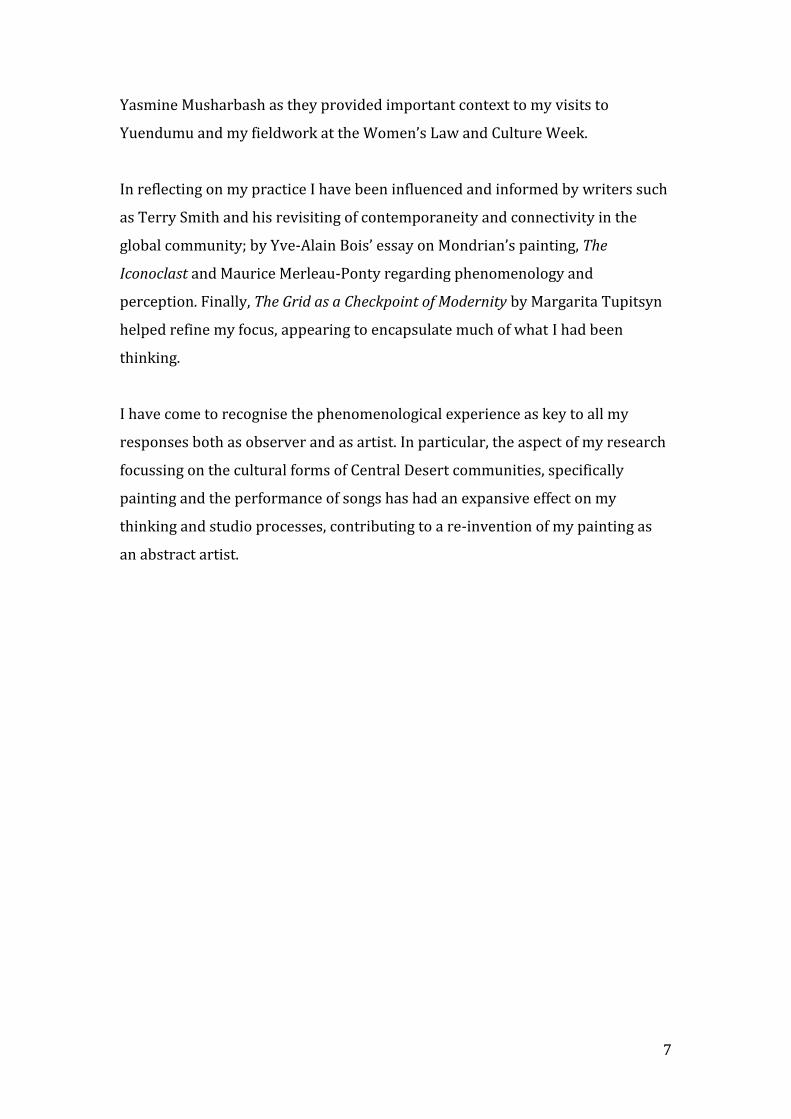
My Introduction gives a brief account of the origins and motivations for
my research, for the journey both geographic and conceptual from the
North to the South, to a cultural and phenomenological place of
experience.
Fig. 1. Amundurrgnu Boogie. (2011)
Reflection while painting Amundurrgnu Boogie 2011

13
I began my journey by swimming against my own tide of
thinking, arguing against established patterns of thought
that until recently had been located in a reverence for an
historic past of Northern traditions and all its places.
Though still respectful of these, I have found myself
headed in a different direction towards an expanded
cultural aesthetic, acknowledging and drawing on what
have become new horizons and alternative ways of
thinking.
It sometimes seems that to leave such a deep past is
simply too much of a challenge to the accepted,
comfortable yet hierarchical ways. However my
personal climate was changing as was becoming
apparent in my Melbourne exhibitions titled ‘The Idea of
North’ in 2001 and 2003. A sense of irritation was
forming to my constant deference to these northern
traditions. After all this had been a ‘true love’ story!
While in Central Australia, changing perceptions created
new spaces in my mind. No longer just topographic,
geographic or pictorial but now of connectedness,
relational places, time and people. I discovered a place
much closer to my being, of new visual languages
challenging accepted points of view, imbued with new
meanings via surface, sound, voice, space and distance.
Ancestral meaning. Of mind and body. Breathing in a
new and temporal sense of past, present and future.
Brush follows contours,
eye follows line, voice
follows memory across
time and place
From the landscapes of
Friedrich, his figure on
the ground, looking to
the distance
Country breathing the
past, present and future,
looking to the blue sky,
moving into pink,
travelling in orange
Thinking dirt,
this topographic line
sung across the surface,
600 grams
Feeling indentations on
a cultured land.

14
What I hear, touch, feel, what I see and experience of this
place now belongs to the work I am making today. In
earlier days I would see a landscape with a perspective
based on distant knowledge and memories from another
place to the north, a strange sense of longing for
something unattainable.
Desert. Tract. Field. Space. Surface as a field of colour.
A chromatic field whether out to the distance through
dust, scrub and hilltop or across the surface of my
canvas. Whether an area of discipline, a subject or a
scope in a field of vision, field experience has shown me
a new place of engagement with a new dialogue and a
deepening world view.
The topographic grid has become a lattice, a grid without
borders, expanding endlessly into space. Unending.
Moving beyond the edges of the paper, whatever surface
it lies upon, it’s an animated and garrulous place of
chromatic surfaces, enlivened colours and the senses
engaged. Surface as tract in an unending space moving
beyond my eyes’ capacity to see, feeling my way into this
imagined space, becoming real. Circles punctuate the
surface, places as sites of entry and exit to other
imagined places in this landscape.
Of imprint, mark and
indent, acrylic, grit and
sand wiped, stroked,
brushed, scratched,
Washed. Experienced,
hearing, tapping, feeling,
singing.
Hands drawing lines in
the sand. Lining, dotting
surfaces like membranes
between past, present
and future, voices
talking, in acrylic, sand
and paper
Making real spaces from
imagined places.

15
Fig. 2. Hills around Yuendumu, Northern Territory 2009.
Origins and motivations driving my research
Yuendumu is a remote community situated 300 kilometers west of Alice Springs on
the Tanami Road in the Northern Territory. Called Yurtumu by the Warlpiri people it
lies on the edge of Warlpiri land. The name for the settlement comes from the
Aboriginal word for a line of hills lying close to Yuendumu.
I worked at the Warlukurlangu Artists Centre several times, representing the
beginning of an ongoing relationship with the people and the place. My exegesis
considers the interweaving of the cultural, the conceptual and phenomenological
aspects of this experience and how they have contributed to the visual, material and
perceptual aspects explored in my painting.
In 2009 I viewed an exhibition at the University of Melbourne of works from Arnhem
Land collected by Donald Thompson in the mid-1900s. Looking at a rrark painting on
bark with its crosshatched design, I wondered how on earth the artist could arrive at
this particular representation of thunderclouds. How does thinking get to this point
and who decided this would be the proper depiction of rain clouds to be passed down
unchanged through very many generations? It was of course the artist’s totemic
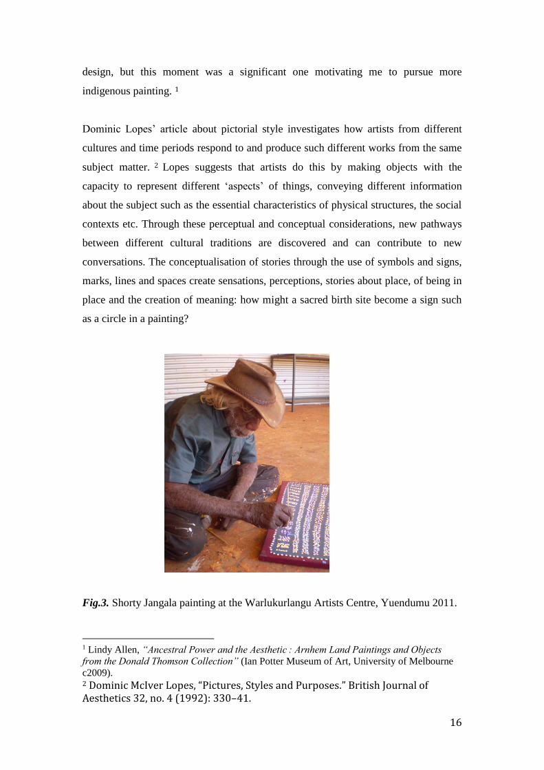
16
design, but this moment was a significant one motivating me to pursue more
indigenous painting. 1
Dominic Lopes’ article about pictorial style investigates how artists from different
cultures and time periods respond to and produce such different works from the same
subject matter. 2 Lopes suggests that artists do this by making objects with the
capacity to represent different ‘aspects’ of things, conveying different information
about the subject such as the essential characteristics of physical structures, the social
contexts etc. Through these perceptual and conceptual considerations, new pathways
between different cultural traditions are discovered and can contribute to new
conversations. The conceptualisation of stories through the use of symbols and signs,
marks, lines and spaces create sensations, perceptions, stories about place, of being in
place and the creation of meaning: how might a sacred birth site become a sign such
as a circle in a painting?
Fig.3. Shorty Jangala painting at the Warlukurlangu Artists Centre, Yuendumu 2011.
1 Lindy Allen, “Ancestral Power and the Aesthetic : Arnhem Land Paintings and Objects
from the Donald Thomson Collection” (Ian Potter Museum of Art, University of Melbourne
c2009). 2 Dominic McIver Lopes, “Pictures, Styles and Purposes.” British Journal of Aesthetics 32, no. 4 (1992): 330–41.
17
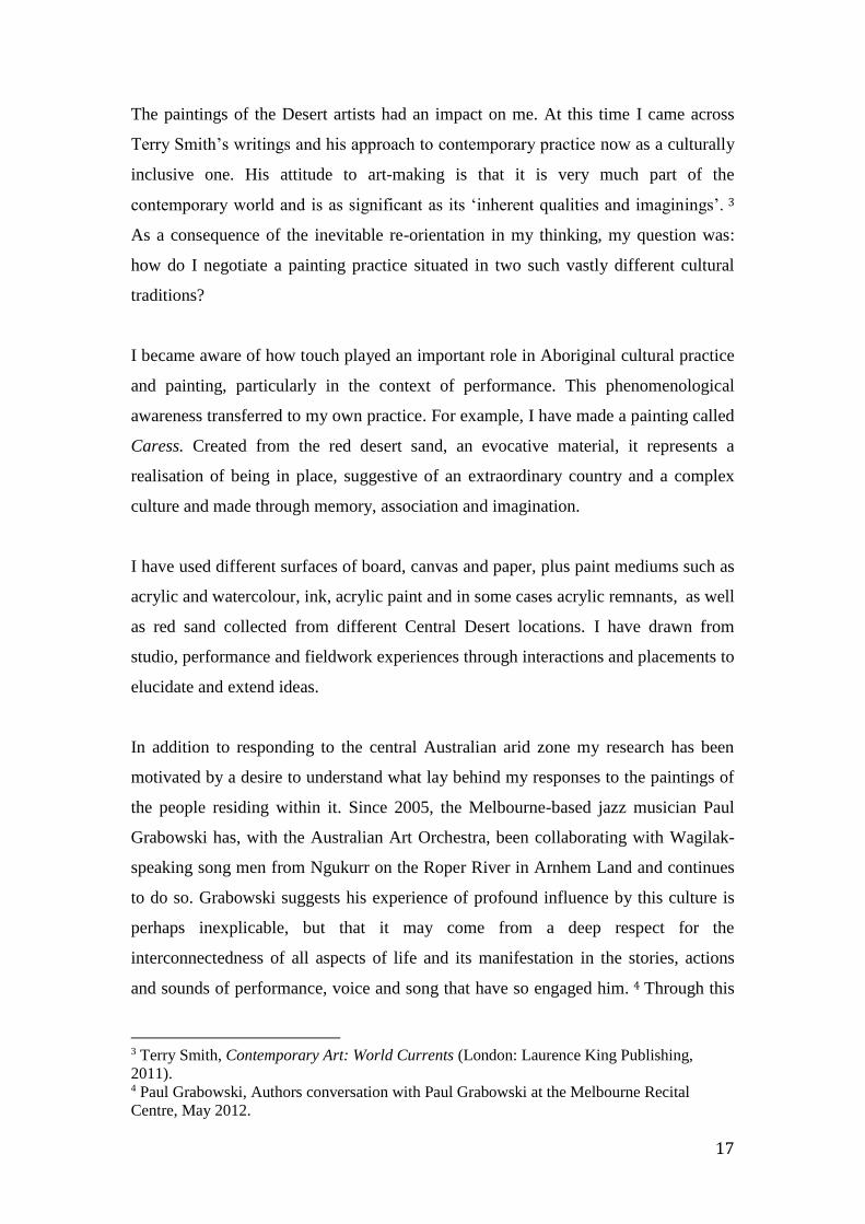
The paintings of the Desert artists had an impact on me. At this time I came across
Terry Smith’s writings and his approach to contemporary practice now as a culturally
inclusive one. His attitude to art-making is that it is very much part of the
contemporary world and is as significant as its ‘inherent qualities and imaginings’. 3
As a consequence of the inevitable re-orientation in my thinking, my question was:
how do I negotiate a painting practice situated in two such vastly different cultural
traditions?
I became aware of how touch played an important role in Aboriginal cultural practice
and painting, particularly in the context of performance. This phenomenological
awareness transferred to my own practice. For example, I have made a painting called
Caress. Created from the red desert sand, an evocative material, it represents a
realisation of being in place, suggestive of an extraordinary country and a complex
culture and made through memory, association and imagination.
I have used different surfaces of board, canvas and paper, plus paint mediums such as
acrylic and watercolour, ink, acrylic paint and in some cases acrylic remnants, as well
as red sand collected from different Central Desert locations. I have drawn from
studio, performance and fieldwork experiences through interactions and placements to
elucidate and extend ideas.
In addition to responding to the central Australian arid zone my research has been
motivated by a desire to understand what lay behind my responses to the paintings of
the people residing within it. Since 2005, the Melbourne-based jazz musician Paul
Grabowski has, with the Australian Art Orchestra, been collaborating with Wagilak-
speaking song men from Ngukurr on the Roper River in Arnhem Land and continues
to do so. Grabowski suggests his experience of profound influence by this culture is
perhaps inexplicable, but that it may come from a deep respect for the
interconnectedness of all aspects of life and its manifestation in the stories, actions
and sounds of performance, voice and song that have so engaged him. 4 Through this
3 Terry Smith, Contemporary Art: World Currents (London: Laurence King Publishing,
2011). 4 Paul Grabowski, Authors conversation with Paul Grabowski at the Melbourne Recital
Centre, May 2012.
18
research, I would like to provide some insight into this sense of the ‘unexplainable’ as
it has engaged many artists for a long time. I feel one answer lies in the way we live
in our cultural and topographic space and from which we can learn from others’
knowledge and sense of being. I would like my paintings to contribute to a more
nuanced awareness of this sense of place.
I have wanted to reconsider landscape and place in my practice, to rethink the
European foundations, as it was to the North that I had always directed my attention.
Revisiting these foundations changed ‘the view’ into country, making it both temporal
and cultured. I see place as part of a greater holistic space and in my painting, a
complex expansible structure creating a potentially unending lattice–like structure as
macrocosm consisting of chromatic fields of unitary colour with infinite potential;
repeating and changing yet always connected. It might be said that these represent a
continuum in time, and through their expansible nature, visual references to the
temporal and the cosmological idea of the Everywhen, the on-going past, present and
future as one state - a term coined by W. E. H. Stanner when discussing the Jukurrpa
or the Dreaming. 5 Terry Smith has aptly described this concept as one of narratives
of generation and continuity, integrating both natural and human phenomena. 6
In addition to this mapping of the vast expanse of place and sensation, place has also
been represented on a small scale as both the painted and the relational: a small part, a
microcosm of this expansible whole. The individual’s sense of ‘being’ in place is
informed by an awareness of ancestral presence. This micro sense of place is
suggested by smaller circular motifs, and continued with the construction of a series
of circular or oval palette paintings, blending acrylic paint, red dirt and other
materials such as wooden art stretchers, pegboard etc.
I have always been interested in conventional, often beautiful depictions of Australian
landscape and ‘the view’ of Australian artists such as W. C. Piguenit, Hans Heyson,
John Glover, Fred Williams and so on. I admired the ability to record what was seen,
5 W. E. H. Stanner, The Dreaming & Other Essays, Black Inc. Agenda Series (Melbourne:
Black Inc. Agenda, 2009), 58. 6 Terry Smith, Contemporary Art. World Currents (London: Laurence King Publishing,
2011), 203.
19
as if oblivious to the self. However the responses to and use of landscape by artists
such as Bea Maddock, Immants Tillers and Stephen Bush became more relevant and,
in turn, the ideas-based approach opened the way to the more conceptual Aboriginal
paintings of the Central and Western Desert of Australia where the artist’s subject
matter manifests in a perceptual and encultured form of abstraction.
In addition to experiences of the topographic and cultural, the temporal elements of
music, sound, song and notation became mediums of an indexical and abstract
language. In the early stages of this research, I experienced quite suddenly a sense
that marks and motifs in my paintings might be viewed as signs, replacements for the
earlier depiction of forms. Perhaps this began at the same time I was wondering how
an artist’s totemic clouds came to be the crosshatched shapes. The units of the grid,
colour, mark, the circle, the poured paint and line became indexical to place and space
and pointers to new pathways through landscape and country. This shift also
suggested aligning elements of painting with musical elements and compositional
structures, a natural progression from my own personal interests and experiences. It
was possible to merge different aspects of different cultures and create something
new.
From the northern hemisphere to Central Australia
The following section outlines my ‘journey’ to Central Australia and the reframing of
my practice to the place I have arrived.
This ‘journey’ started well before I commenced my research, beginning in Germany,
then Italy and after that The Netherlands, and formed my perceptions of my own
place and landscape. I originally saw landscape as a ‘view’ containing objects, trees
and hills. However Casper David Friedrich’s painting introduced a new awareness of
the resonant experience of place, in addition to the traditions of picturing embedded in
history and the depiction of illusionistic spaces of the near and far. The memory of
these works of the Romantic sublime were then almost assaulted by my experience of
the extroverted Italian Renaissance and post Renaissance paintings.
20
These depictions of landscape introduced mythological, religious and historical
scenes into the context of place. Often visually extravagant, they told stories and
provided compositional examples guaranteed to convey their sometimes
overwhelming didacticism, so then when first encountering Dutch painting of the
similar period I could appreciate their sense of clarity and repose. A refreshing
experience of a measured world of land and place, sky, town and village was being
offered in its place.
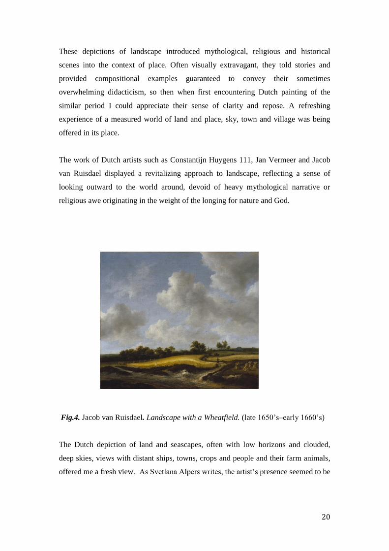
The work of Dutch artists such as Constantijn Huygens 111, Jan Vermeer and Jacob
van Ruisdael displayed a revitalizing approach to landscape, reflecting a sense of
looking outward to the world around, devoid of heavy mythological narrative or
religious awe originating in the weight of the longing for nature and God.
Fig.4. Jacob van Ruisdael. Landscape with a Wheatfield. (late 1650’s–early 1660’s)
The Dutch depiction of land and seascapes, often with low horizons and clouded,
deep skies, views with distant ships, towns, crops and people and their farm animals,
offered me a fresh view. As Svetlana Alpers writes, the artist’s presence seemed to be
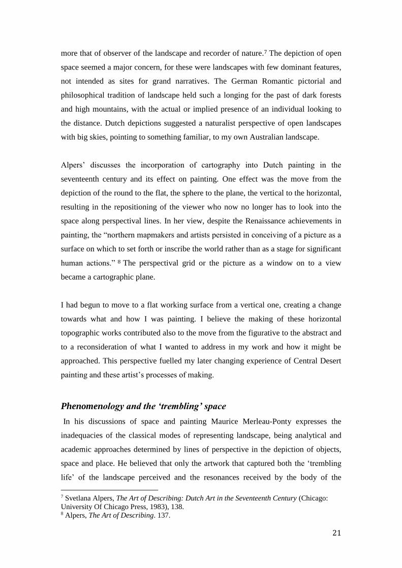
21
more that of observer of the landscape and recorder of nature.7 The depiction of open
space seemed a major concern, for these were landscapes with few dominant features,
not intended as sites for grand narratives. The German Romantic pictorial and
philosophical tradition of landscape held such a longing for the past of dark forests
and high mountains, with the actual or implied presence of an individual looking to
the distance. Dutch depictions suggested a naturalist perspective of open landscapes
with big skies, pointing to something familiar, to my own Australian landscape.
Alpers’ discusses the incorporation of cartography into Dutch painting in the
seventeenth century and its effect on painting. One effect was the move from the
depiction of the round to the flat, the sphere to the plane, the vertical to the horizontal,
resulting in the repositioning of the viewer who now no longer has to look into the
space along perspectival lines. In her view, despite the Renaissance achievements in
painting, the “northern mapmakers and artists persisted in conceiving of a picture as a
surface on which to set forth or inscribe the world rather than as a stage for significant
human actions.” 8 The perspectival grid or the picture as a window on to a view
became a cartographic plane.
I had begun to move to a flat working surface from a vertical one, creating a change
towards what and how I was painting. I believe the making of these horizontal
topographic works contributed also to the move from the figurative to the abstract and
to a reconsideration of what I wanted to address in my work and how it might be
approached. This perspective fuelled my later changing experience of Central Desert
painting and these artist’s processes of making.
Phenomenology and the ‘trembling’ space
In his discussions of space and painting Maurice Merleau-Ponty expresses the
inadequacies of the classical modes of representing landscape, being analytical and
academic approaches determined by lines of perspective in the depiction of objects,
space and place. He believed that only the artwork that captured both the ‘trembling
life’ of the landscape perceived and the resonances received by the body of the
7 Svetlana Alpers, The Art of Describing: Dutch Art in the Seventeenth Century (Chicago:
University Of Chicago Press, 1983), 138. 8 Alpers, The Art of Describing. 137.
22
perceiver in its engagement with place, could only then truly acknowledge this
experience of place. While not denying that the painter is deeply engaged with her
subject matter, Merleau-Ponty felt that the reliance on draftsmanship in the depiction
of forms caused a separation of the artist from her subject, a disembodiment of the
subject to the object “rather than that of a being which dwells in a space relating to its
natural habitat”. 9 This idea was to become relevant for me after being at Yuendumu
and thinking about what might constitute being in such a place and beyond this, what
might constitute being in the world. How might painting re-stage such insights?
I had used topographic maps during walks in southern New South Wales and through
the East and West MacDonnell Ranges. Later in my studio I incorporated the
patterning of contour lines into paintings as a process of reimagining. I had also begun
reading about the belief systems and stories of the Arrernte and Warlpiri people,
matching places I had visited with those I had read about. I was interested in the
indigenous ‘mapping’ of ancestral country through the mnemonic practice of using
song to find one’s way creating mnemonic pathways through ancestral country,
painting contour lines and the spaces in between. As I painted I felt I was walking the
contours of the land, retracing my steps. How might I now approach the problem of
depicting landscape and place in my painting? The answer has come from experience
and affect, confronting conceptions of place and introducing new processes of
working within the idea of relatedness. As Merleau-Ponty believed, to be in or dwell
in a place entailed a sense of the self as one embodied in that place. 10
Introducing the cross-cultural into thoughts about place
When working on the Warlukurlangu Archive of artists paintings, I was able to
familiarise myself with paintings, prints and drawings going back to 1972. The dots,
lines and signs, paw prints, sticks and dirt, bright acrylic colour on canvas became
echoes of actions performed, sung and drawn on the ground, body and object. These
aspects of ‘country’ were painted on surfaces, with meaning sung into them by artists
as they performed their country. I began to revise my narrative of pictorial space to
9 Maurice Merleau-Ponty, The World of Perception. Translated by Oliver Davis. With a
Foreword by Stephanie Menase and an Introduction by Thomas Baldwin. (London ; New
York: Routledge, 2004), 42. 10 Maurice Merleau-Ponty, The World of Perception. Translated by Oliver Davis. With a
Foreword by Stephanie Menase and an Introduction by Thomas Baldwin.

23
now incorporate the cultural and the abstract via the material. Thinking, feeling and
talking place expanded language, but language can also be a restricting factor as I
discovered in the early days of my research.
We usually use the word landscape to refer to the view across the countryside,
mountains or desert, but it’s an inadequate term when considering the Aboriginal
sense of place as ‘country’. In the early stages, during a discussion about my painting
and connected ideas, I used the word ‘landscape’ in reference to this Central
Australian place. In a discussion with colleagues I was attempting to respond to
questioning and suggestions about how I might make my works look more like
landscape, as this was how I was talking and what people were expecting. However it
had not been my intention to depict it in this way, and I realised I hadn’t given
consideration to the limitations or expectations of that particular word. In fact I had
not been thinking about what it looked like, yet I had been creating expectations of
some sort of familiar representational form or mark in the paintings that would
instantly tell them they were about landscape. I then decided that the word ‘place’
would be more appropriate conceptually – that place was becoming one of fields of
resonant sites, signs and marks.
With this move from the topographic and the physical to a more conceptual place of
culture and interrelatedness, I began to look further afield for a framework to engage
with the cultural and cross-cultural in art. Howard Morphy and Terry Smith both
address cross-cultural art discourses, Morphy from an anthropological perspective and
Smith from an art historical position.
I was drawn to the writings of Terry Smith in Contemporary Art and his
acknowledgment of contextual forces in the situating of contemporary art works, in
addition to the consideration of their inherent elements and qualities. His writings
encouraged a recognition of art as being truly of the world, “coming from the whole
world”, seeing it as part of a differentiated yet connected whole. 11
He suggests the following qualities are evidence for what is contemporary in art, thus
connecting Aboriginal art to the realm of the contemporary: he cites qualities of
11 Smith, Contemporary Art, 8.
24
“freshness, recentness, uniqueness and surprise” as indicators of contemporaneity.
Another indicator is the feeling that something significant is being shared with the
world. What do these paintings and objects engender? What is their meaning? I felt
this to be important, as it is what the Aboriginal artists I met with had all wished for
and enthusiastically conveyed to me. Smith uses the word ‘vivid’ to describe the
experience of shared belonging to our times, particularly “where we recognize that the
work we are looking at has been made by someone with a different perspective on the
world today…from another country or culture…” 12 Aboriginal painting is
contemporaneousness as coexistence; of difference but also of sharing in our time
now, and this openness in turn necessarily engenders generosity.
Howard Morphy raises many interesting questions about the position of Aboriginal art
in the current global context of art practice. 13 For example, how do we consider
innovative western art practices beside Aboriginal art making, as being based on an
“ideology of continuity in the production of collective forms?” This question alone
raises many issues around objects and their culture, authorship and interpretation, as
they exist within a wider context, but the different cultural contexts need always to be
respected and incorporated into the conversation. Morphy suggests the definition of
art needs to broaden to encompass our cultural diversity, to become aware of the
conceptual similarities and differences in each culturally different artist’s work, to
examine ontological concepts and their relationship to practice. 14 I hope that my
project will contribute in some way to an expanded understanding of these.
Both writers became important to me in the early days of my research. Their
questions and propositions have helped to create a new context for my practice in the
wake of changing perceptions from a northern European academic focus, to one
located in the south, situated in both aesthetic experience and cultural context.
12 Ibid., 9. 13 Howard Morphy, “Art Theory and Art Discourse across Cultures: The Yolgnu and
Kunwinjku Compared.,” in Between Indigenous Australia and Europe : John Mawurndjul :
Art Histories in Context / Claus Volkenandt, Christian Kaufmann (eds.). (Canberra:
Aboriginal Studies Press, 2009). 14 Ibid., 81.
25
Colour, signs and musical structures as abstract forms in a cross-
cultural conversation.
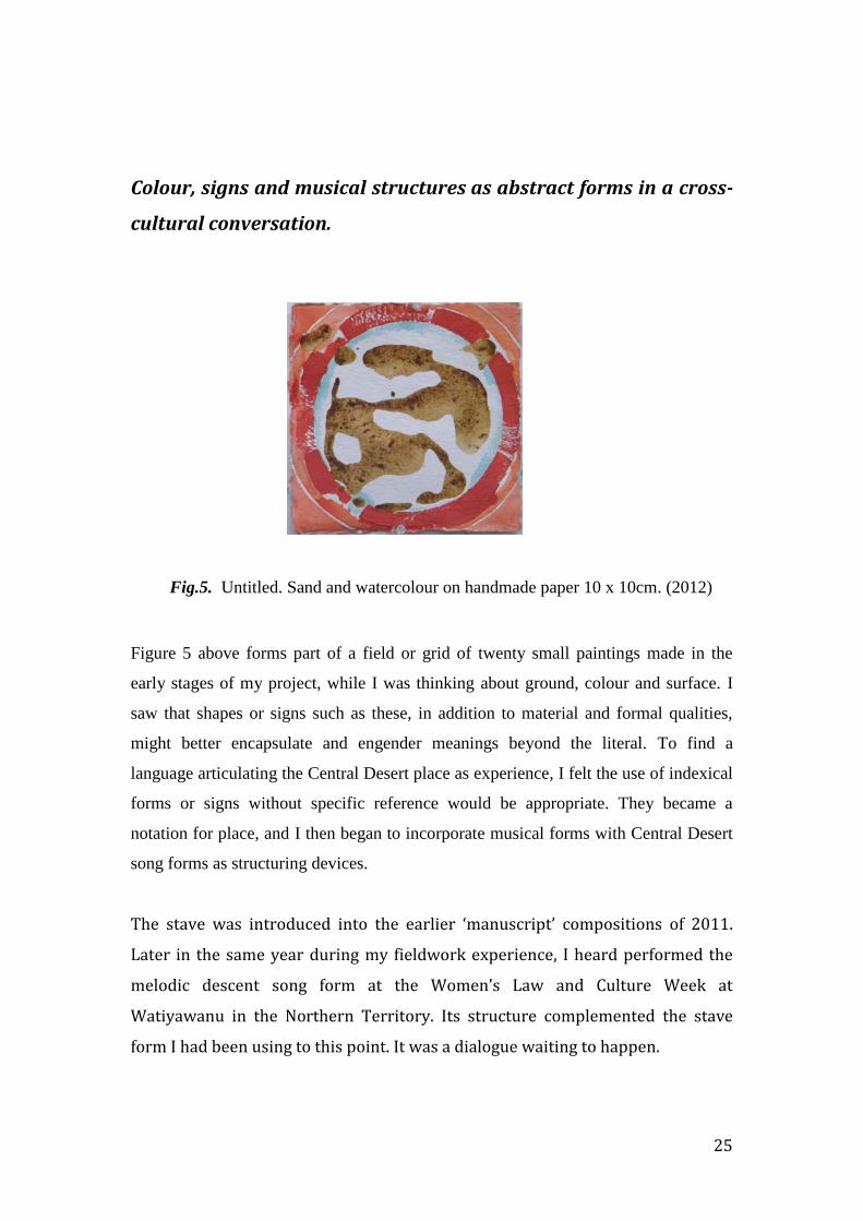
Fig.5. Untitled. Sand and watercolour on handmade paper 10 x 10cm. (2012)
Figure 5 above forms part of a field or grid of twenty small paintings made in the
early stages of my project, while I was thinking about ground, colour and surface. I
saw that shapes or signs such as these, in addition to material and formal qualities,
might better encapsulate and engender meanings beyond the literal. To find a
language articulating the Central Desert place as experience, I felt the use of indexical
forms or signs without specific reference would be appropriate. They became a
notation for place, and I then began to incorporate musical forms with Central Desert
song forms as structuring devices.
The stave was introduced into the earlier ‘manuscript’ compositions of 2011.
Later in the same year during my fieldwork experience, I heard performed the
melodic descent song form at the Women’s Law and Culture Week at
Watiyawanu in the Northern Territory. Its structure complemented the stave
form I had been using to this point. It was a dialogue waiting to happen.
26
The stave is a structure for organising musical sound in time and space, just as
notation is for the melodic descent form. As a compositional device it is indexical
to cultural meanings, as is the descent form. Together they act as reference
points for experiences of sensation and perception, in association with the units
of colour and varying textures of dirt, pencil, watercolour and acrylic paint, lines
and circles.
During performances at the Women’s Week, short three-lined ‘verses’ were sung
like blocks of sound and with little variation. The repetition of sounds and words
seemed an auditory manifestation of the iterative lining and dotting of Central
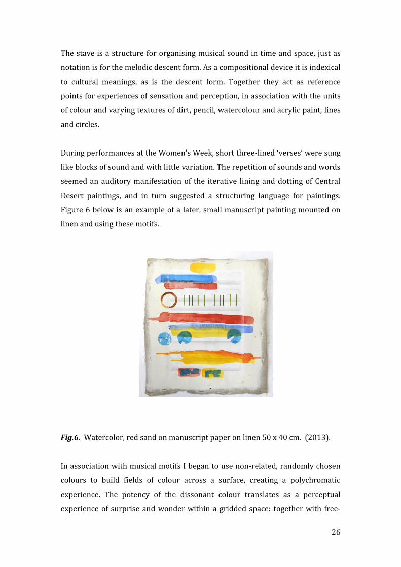
Desert paintings, and in turn suggested a structuring language for paintings.
Figure 6 below is an example of a later, small manuscript painting mounted on
linen and using these motifs.
Fig.6. Watercolor, red sand on manuscript paper on linen 50 x 40 cm. (2013).
In association with musical motifs I began to use non-related, randomly chosen
colours to build fields of colour across a surface, creating a polychromatic
experience. The potency of the dissonant colour translates as a perceptual
experience of surprise and wonder within a gridded space: together with free-
27
flowing poured lines of red sand as contrasting elements between the structures
of the grid and stave on the one hand, and the arbitrary colour on the other. This
process forged connections between culture, painting and musical aspects such as
improvisation. I decided to start from the beginning.
Prior to my Fieldwork, I had read about this vocal form specific to the Central
Desert.15 When I heard it sung in the context of performance, I realised its relevance
as a cultural connector. It contributed to the formality of performance, giving order to
the women’s voices as they sang in unison, moving from the high to low registers.
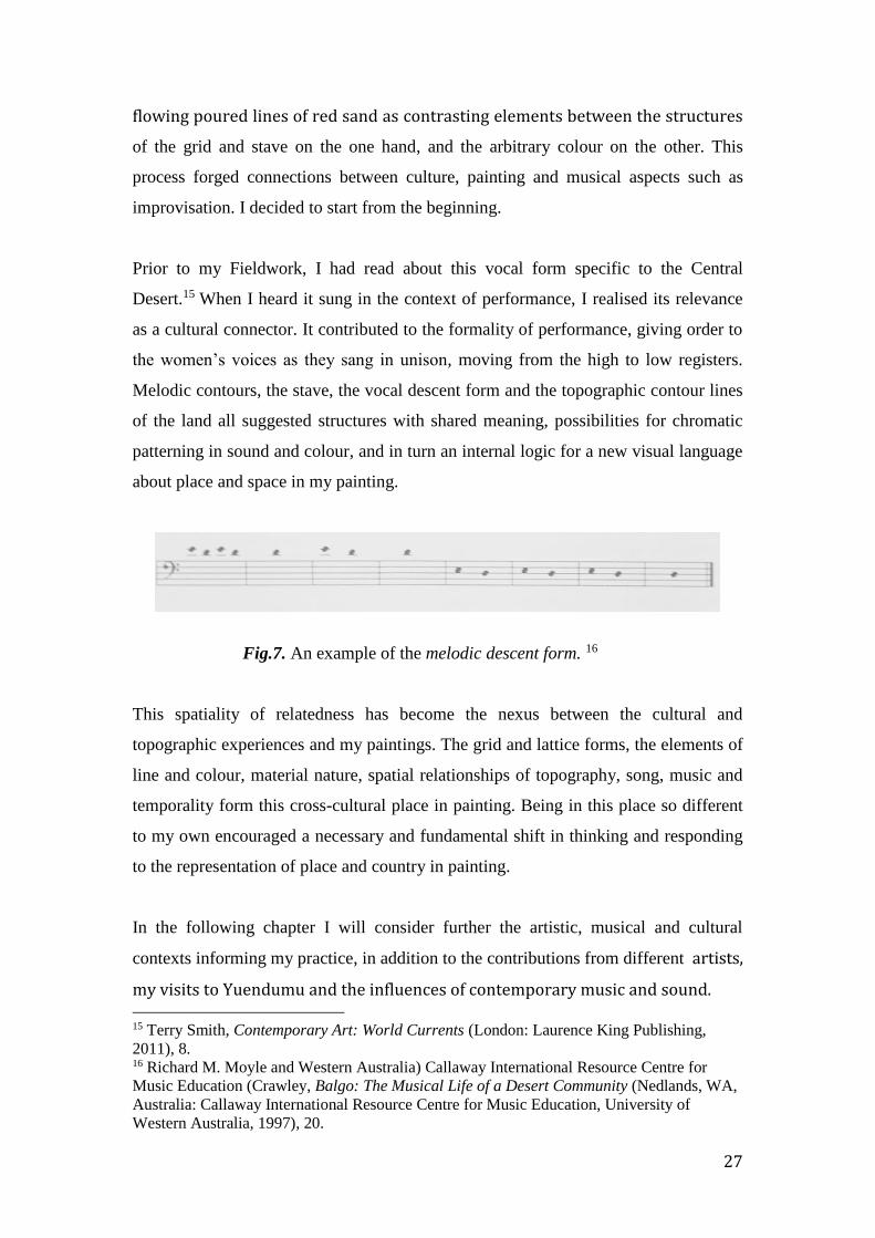
Melodic contours, the stave, the vocal descent form and the topographic contour lines
of the land all suggested structures with shared meaning, possibilities for chromatic
patterning in sound and colour, and in turn an internal logic for a new visual language
about place and space in my painting.
Fig.7. An example of the melodic descent form. 16
This spatiality of relatedness has become the nexus between the cultural and
topographic experiences and my paintings. The grid and lattice forms, the elements of
line and colour, material nature, spatial relationships of topography, song, music and
temporality form this cross-cultural place in painting. Being in this place so different
to my own encouraged a necessary and fundamental shift in thinking and responding
to the representation of place and country in painting.
In the following chapter I will consider further the artistic, musical and cultural
contexts informing my practice, in addition to the contributions from different artists,
my visits to Yuendumu and the influences of contemporary music and sound. 15 Terry Smith, Contemporary Art: World Currents (London: Laurence King Publishing,
2011), 8. 16 Richard M. Moyle and Western Australia) Callaway International Resource Centre for
Music Education (Crawley, Balgo: The Musical Life of a Desert Community (Nedlands, WA,
Australia: Callaway International Resource Centre for Music Education, University of
Western Australia, 1997), 20.

28
It is not necessary to discard long-held criteria in determining success in painting, but
it is apparent that broadening the context from which we speak allows an expanded
consciousness and a generosity into the making, critiquing and acceptance of art
works. With a greater understanding of inhered meanings, and of cultural and
temporal contexts in the making and critiquing of art works, the conditions for what
Terry Smith has referred to as a ‘thickened dialogue’ necessary for the process and
progress of cultural and artistic negotiation, can occur. This has been my experience
throughout this research.
Finally, to the artists whom I’ve consulted since I first set out on this journey, from
the well known to those less so, I have considered both Aboriginal and western artists.
I was interested in the conceptual and cultural aspects of specific paintings and their
material and perceptual qualities. I have already mentioned the Aboriginal artists
whose paintings have expanded my thinking; also those non-indigenous artists whose
work I have considered: Piet Mondrian, Bridget Riley, Victor Vassarely, Yves Klein,
Paul Klee and Gerhardt Richter, John Hooper, Roy de Maistre and Roland Wakelin,
Godfrey Miller, Tim Johnson, Jan Riske and Immants Tillers.
In addition to these visual sources are the musical works. The most significant
primary musical source was the traditional Aboriginal vocal form called the melodic
descent, specific to the Central and Western Desert and heard during ceremonies at
the Women’s Law and Culture Week at Watiyawanu in 2011. This experience was
followed by two other performances of contemporary or New Music, Inuksuit by John
Luther Adams and Patterns in a Chromatic Field by Morton Feldman. The
Aboriginal women’s song forms of voice and clap stick rhythms and the Feldman
Patterns were both strongly visual, as well as aural experiences. Inuksuit embodied
aspects of both, performed in the late afternoon at the time of the setting of the sun.
29
How visual and musical forms from diverse cultural traditions can contribute to a
cross-cultural conversation in painting.
My answer lies in the following: through an exploration and interweaving of those
visual and perceptual aspects of place, space and culture, constituting an embedded
place; through the framework of the phenomenological in the realms of painting and
music; and through a visual language of cultural abstraction as informed by the
merging of cross-cultural aspects.
In Chapter One I shall explore ideas of place and how the significance of the
interweaving of place, painting and music was crystallised during my fieldwork
experience: how these merge with painting to form a cultural abstraction through a
relational conversation in painting.
Chapter Two looks at the origins of motifs and specific elements such as the melodic
descent, notation, colour, marks, lines and signs used in my paintings. I then present
the constructed paintings made following my visit to the Women’s Week at
Watiyawanu.
Chapter Three explores space and the idea of relatedness as a concept fundamental to
notions of cultural abstraction, and how the grid contributes to this as an armature for
relatedness in fields of painting and music.
Chapter Four brings my question to the fore, with the proposition that cultural
abstraction can bring abstraction in painting beyond the territory of the merely
formalist to one that engages with the external and contemporary world.

30
CHAPTER ONE
Painting, culture and music as context for my project.
Ideas and vocabulary of place:
Since the outset of this research project on place my perception of landscape has
changed from one of the view or what is in the sight of the viewer, to one of
perception, experiences and resonances of place, what these are and how they might
be represented. It was once caught up in representations and expectations of beauty
and longing, originating in Eurocentric and Romantic points of view. Personal
experience, history, cultural knowledge, topography, people, and cosmology then
began to influence my perceptions after the shift to a more southern perspective. The
idea of place rather than the view began to form my thinking, that is, what might lie
within and beneath what we see when looking at a landscape.
My paintings are evocations of place, not depictions of landscape. They are the result
of the experience of being in the central desert region of Australia, whose resonances
from weather, topography, flora and fauna, people and their cultural forms are
reflected back through sounds and colours, as surface, line, texture and substance,
materials and space.
‘Landscape’, ‘place’ and ‘country’ have multiple meanings depending on the physical
and cultural contexts. ‘The country’, ‘the bush’, the ‘landscape’ or ‘view’ depict an
area of countryside in the genre of landscape painting, or maybe as some place I
might travel through. The term ‘landscape’ can bring with it multiple meanings from
different historical, political, cultural and visual contexts, but in this exegesis I use it
in reference to the painted ‘-scape’, or to those country views in conventional visual
representations or the place I am actually looking at. For Indigenous people,
‘country’ refers to camp, country, home, the belonging to place of community,
ancestors and all attendant relationships and responsibilities, the interconnectedness
of everything. 17 This concept of interrelatedness is reflected widely in different
Aboriginal languages. The Eastern and Central Arrernte to English Dictionary cites
17 W J Pawu-Kurlpurlurnu, M Holmes and L Box, “Ngurra-Kurlu: A Way of Working with
Warlpiri People” (Alice Springs: Desert Knowledge CRC, 2008), 17.

31
apmere, pmere as meaning ‘country, land, region’; ‘camp’; ‘home, house’; ‘place,
location and site’. It is not merely a physical location. 18 Ngurra is the Warlpiri word
for ‘camp’, ‘home’ or ‘residence’, and implies relationships, engagement and
belonging, that my sense of home gives me. The word ‘country’ can be interpreted as
ngurra, camp and home, and also as walya, literally the ‘earth’ but more usually
‘family’ or ‘kin relation’. It encompasses the broader Warlpiri community, ancestral
beings and sites of action, animals and the earth as a place they live with, of
geographic location and people.19
‘Place’ in my own language has acquired many meanings for me. In the course of this
research my idea and sense of place has been enriched to include the knowledge and
appreciation of both the cultural and the topographic place. It has become
multilayered, of two and three-dimensional places, geographic, social, cultural,
temporal and conceptual. Lucy Lippard refers to it as “temporal and spatial, personal
and political...about connections, what surrounds it, what formed it, what happened
there, what will happen there.” 20 It is the Aboriginal context of place and its
reflections in the language of their painting and cultural practices that reinforces
connections, drawing me into a more layered experience of what ties people closer to
what is their place. Relationship suggests deep-rooted connection.
In Place and Experience, J.E. Malpas sees the notion of place as “a frame within
which experience or the capacities to think, feel, act, grasp etc. can be understood and
identity discovered.” Place is the sum of multiple experiences. 21 Throughout this
research journey I grew to realise how appropriate this statement was to what was
unfolding for me, that this could well encompass all that has taken place. My journey
in painting has been to find a way to somehow reflect these capacities and the
cultural/relational nature of these in place.
18 John Henderson and Veronica Dobson, ed., Eastern and Central Arrernte to English
Dictionary (Alice Springs: IAD Press, 1994), 187. 19 W J Pawu-Kurlpurlurnu, M Holmes and L Box, “Ngurra-Kurlu: A Way of Working with
Warlpiri People,” 16. 20 Lucy R. Lippard (Lucy Rowland), The Lure of the Local : Senses of Place in a Multi
Centered Society. (New York: The New Press, 1997). 21 J. E. Malpas, Place and Experience : A Philosophical Topography (Cambridge University
Press, 1999), 16.
32
Integral to the Aboriginal idea of place and country is the concept of the Everywhen.
Early in this research and at about the time I began to use the stave, I became
interested in this evocative notion, a term coined by the Australian anthropologist W.
E. H. Stanner (1905-1981) to describe the Tjukurpa or Dreaming. It is perceived as an
“heroic time of the indefinitely remote past” but which is also in a sense, “still part of
the present. One cannot ‘fix’ the Dreaming in time: it was, and is, Everywhen…a kind
of logos or principle of order transcending everything significant for Aboriginal man”
22 It is also a cosmology; an account or theory of how what was created became an
ordered system. I found this conveyed beautifully the concept of the past, present and
future but also in a quite profound way, the essence of the experience of being in
country.
Diana James writes evocatively, calling the painting of the Tjukurpa a “continuum of
the creative performance of dance and song” and that the painting of it
“metamorphoses the flesh of the Tjukurpa from aural tones into the bright tones of
acrylic paint that dance before the eye of the beholder enticing them to listen to the
ancient rhythms of the land.” She writes, “the land is perceived as a tonal liminal
landscape shifting between the tangible and intangible tones of the physical and
metaphysical ground of being. These tones are absorbed through all the senses…” 23
Song, she says, opens the doors of perception to “the spirit of the Tjukurpa in the
land.” 24 These words provide a beautiful sense of the fundamental interrelatedness
that lies at the heart of Aboriginal metaphysics, and I shall discuss this in relation to
my own work in following chapters. I hope to have for always absorbed this notion.
When I am in Central Australia, the landscape gives a sense of no beginning and no
end. Through the whole of the arid zone of Australia, my experience is of one vast
open space enveloped in a sense of endlessness. My first real experience of this was
in the early morning just as night was merging into dawn. I walked to the top of
Rwetyepme (Roo-chooip-na), or Mount Sonder, at the western end of the MacDonnell
Ranges, west of Alice Springs. It took three hours before I reached the point of not
22 W. E. H. Stanner (William Edward Hanley), The Dreaming & Other Essays, 2nd ed. (Black
Inc. 2011), 58. 23 James, Diana, Painting the Song: Kaltjiti Artists of the Sand Dune Country
(McCulloch&McCulloch, 2009), 11. 24 Ibid., 13.
33
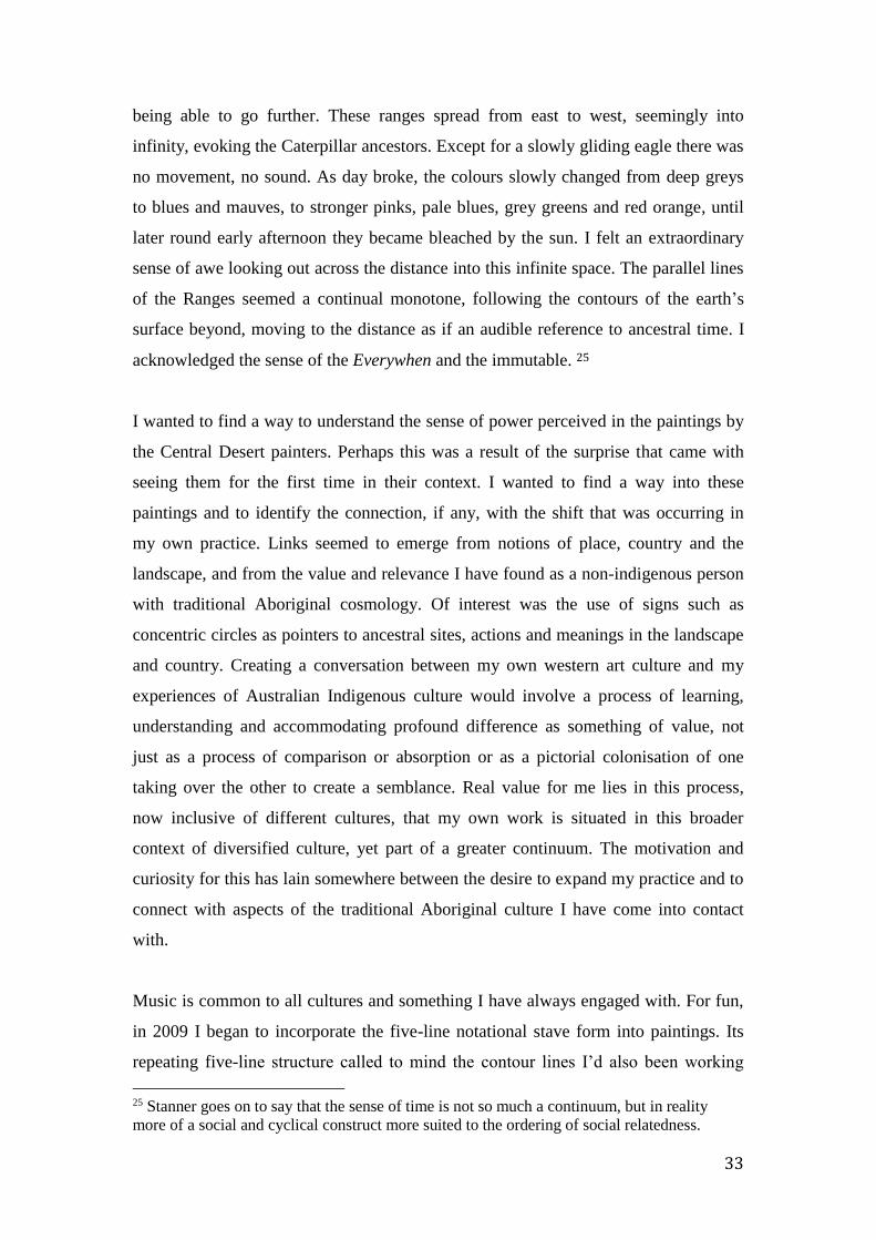
being able to go further. These ranges spread from east to west, seemingly into
infinity, evoking the Caterpillar ancestors. Except for a slowly gliding eagle there was
no movement, no sound. As day broke, the colours slowly changed from deep greys
to blues and mauves, to stronger pinks, pale blues, grey greens and red orange, until
later round early afternoon they became bleached by the sun. I felt an extraordinary
sense of awe looking out across the distance into this infinite space. The parallel lines
of the Ranges seemed a continual monotone, following the contours of the earth’s
surface beyond, moving to the distance as if an audible reference to ancestral time. I
acknowledged the sense of the Everywhen and the immutable. 25
I wanted to find a way to understand the sense of power perceived in the paintings by
the Central Desert painters. Perhaps this was a result of the surprise that came with
seeing them for the first time in their context. I wanted to find a way into these
paintings and to identify the connection, if any, with the shift that was occurring in
my own practice. Links seemed to emerge from notions of place, country and the
landscape, and from the value and relevance I have found as a non-indigenous person
with traditional Aboriginal cosmology. Of interest was the use of signs such as
concentric circles as pointers to ancestral sites, actions and meanings in the landscape
and country. Creating a conversation between my own western art culture and my
experiences of Australian Indigenous culture would involve a process of learning,
understanding and accommodating profound difference as something of value, not
just as a process of comparison or absorption or as a pictorial colonisation of one
taking over the other to create a semblance. Real value for me lies in this process,
now inclusive of different cultures, that my own work is situated in this broader
context of diversified culture, yet part of a greater continuum. The motivation and
curiosity for this has lain somewhere between the desire to expand my practice and to
connect with aspects of the traditional Aboriginal culture I have come into contact
with.
Music is common to all cultures and something I have always engaged with. For fun,
in 2009 I began to incorporate the five-line notational stave form into paintings. Its
repeating five-line structure called to mind the contour lines I’d also been working
25 Stanner goes on to say that the sense of time is not so much a continuum, but in reality
more of a social and cyclical construct more suited to the ordering of social relatedness.
34
with, the association continuing with the poured lines of red sand used later in my
paintings. I felt the stave could contribute to the conceptualisation of place as one
resonant with ongoing performative meanings. As a structure used to organise sounds
into meaningful temporal compositions, it could sit between both classical (or
western) and indigenous cultures and bring together visual and auditory elements into
a space that becomes place.
In June 2011 when attending the Women’s Law and Culture Week at Watiyawanu, I
heard the vocal melodic descent song form in one of the women’s songs. In time to
the beat of clap sticks, voices began to sing on a single note then the pitch was raised
to a very high note so only one or two voices could sing at this point. Others joined in
as the voices descended, then withdrew as the voices reached the lowest pitch which
only one or two could reach. Hearing this form provided me with the necessary link
between our two cultures; connecting visual and vocal elements, performance,
cultural practices, music and time both real and metaphoric. I felt these could merge
into a new visual abstract language. It connected visually with the manuscript sheets
and associated drawings made in my studio.
The lines of the stave are arranged as a set of five parallel lines with spaces between
them, on and within which notes of different temporal values are written to indicate
their pitch and to structure the sounds, the beat, rhythm etc. into a composition. Pitch
is the auditory attribute of sound, ordered by each line and space, creating a scale of
sound from a higher pitch above and on the higher lines of the stave, and descending
to the lowest notes or sounds on the lower lines and spaces below these.
It is a structure that not only organises vertical pitch and tone into horizontal musical
time, but which I felt could visually reflect through structures of line and colour, the
resonances and relatedness absorbed and experienced in this place.
Richard Moyle is an ethno-musicologist who has studied the music of the Central
Desert, particularly of the Balgo communities. He writes about the sense of
relatedness reflected in the music of Aboriginal communities, of community

35
performances as group statements of identity.26 I connected this in a visual sense with
the lines of stories as songlines moving across country, with the lines of the
topographic contours and the landscape and later, with the lines of the stave in this
process of translation as it was occurring in my painting. It was as if these lines
represented in a metaphysical and temporal sense the mutuality of all life’s aspects.
I had read Moyle’s references to the melodic descent vocal form prior to taking up my
fieldwork. It brought to mind colour, line and substance, connecting me to the context
as well as the processes of painting, opening the way to a language of abstract
structures.
When incorporated into my compositions with its open-ended format of the stave’s
repetition of line space line, this structure seemed to suggest aspects of the landscape.
The horizontal movement of the eye left, right, left as if following pathways across
the surface of the land, appeared also like contour lines on a topographic map. The
spaces between the lines were like spaces in the landscape. Whether between
landforms or between musical notes, they evoked the greater spaces of the landscape,
an awareness of it as a place of sound and no sound, colour and no colour. This aural
space carries cultural meanings like the lines across space becoming ancestral stories
sung across country bringing life to its forms. I’d like to think my paintings explore
the resonances of these many meanings and experiences.
The Romanian-born Hungarian composer Gyorgy Ligeti (1923-2006) suggested that
notation in music is like a field of relations. I felt this strongly visual description
could encompass all those fields I was exploring: the cultural, the visual and the aural.
The Australian conductor Richard Gill described how music is part of our vocabulary
of ideas. 27 He says “music is organised vocal and/or instrumental sound which is
firstly aurally perceived. The sounds are temporal, passing through time and
depending exclusively on time for comprehension. The sounds are abstract,
intangible, incapable of describing things, having no specific meaning in and of
26 Richard M. Moyle. Balgo: The Musical Life of a Desert Community. Nedlands, W.A.,
Callaway International Resource Centre for Music Education, University of Western
Australia, 1997. 27 “NAPLAN Is the Enemy of Creativity,” Arts Hub Australia, accessed February 22, 2013,
http://www.artshub.com.au/news-article/opinions/arts/naplan-is-the-enemy-of-creativity-
194217.

36
themselves, but yet are capable of evoking strong and powerful independent reactions
in listeners.” Painting is also capable of evoking such reactions and in the same way
can contribute to the evolution of ideas, becoming, as Gill says, part of our
“vocabulary of ideas”. So musical forms became part of my visual vocabulary of
place, and his description of an abstract vocabulary as consisting of ideas and
evocations is particularly appropriate. In my painting these evolve through the
manipulation of materials, textures, colours, shapes and surfaces. This combined
vocabulary of cultural, musical and painting forms can create strong reactions from its
organisation of parts, evoking feelings of surprise and wonder.
In her Moving the Water project River Fugues, the American artist Margaret Cogswell
uses the musical structure of the fugue, noting “in its most general aspect it involves
musical lines that sound different and move independently of each other but sound
harmonious when played simultaneously”. As a conceptual framework it has
flexibility “which can be applied to any set of components one is trying to integrate,
be they sounds or images.” 28
When I integrate musical forms or structures in paintings I am not illustrating,
interpreting or composing music or making a visual music. They are not guides to
playing music, but both music and painting have a shared ground of composition,
where artists explore in a performative way ‘fields of relations’ that is, relations
between structures, language and effect. I am making painted compositions informed
by aural and visual patterns and perceptions, forms and signs, colours and structures.
Through relations of contrast or of counterpoint evoking place, I wanted to make
more dynamic my two-dimensional structures and spaces.
Reflecting relatedness of place, the musical practice of counterpoint and notable
contrasts, where different melodies can be played together, suggests painterly
opportunities. Two or more simultaneous and independent melodic lines or voices
could combine and establish a harmonic relationship consisting of contrasting but
parallel elements or themes. This has contributed to the composition of my own
28 “Margaret Cogswell’s ‘River Fugues: Moving the Water(s)’ Opens at the CUE Art
Foundation,” Artdaily.org, n.d., http://artdaily.com/news/69692/Margaret-Cogswell-s--River-
Fugues--Moving-the-Water-s---opens-at-the-CUE-Art-Foundation#.VGnYKFeUduD.
37
paintings when using the metaphor of musical structure. I have used different qualities
of mark and material, directions and types of line to suggest possible difference,
simultaneity or complementarity of the two different cultural contexts. Individual
lines can be seen as the presence of different voices together forming an overall unity,
and these linear relationships can be seen in the Small Song group of paintings such as
Small Song No. 1. I shall discuss these paintings and their context in chapter two, but
it is possible to see in this painting the relationship between the narrow gridded
vertical linear forms or pitch forms and the horizontal freely moving poured dirt lines,
as if the horizontal and vertical movements are performing in counterpoint to each
other within the greater coloured field.
Composition in western music considers among many things, the affective nature of
sound, its moods, feelings and attitudes, and to such purpose, organises the notation
required to perform these affects. The very different role of Aboriginal traditional
song and sound is to inscribe the Tjukurrpa or law during ceremonial performance,
using the affective nature of sound to dramatic effect. Both western and Aboriginal
song forms are created for multiple purposes, ceremonial and otherwise. The stave
form interests me as a metaphorical device to construct my two-way conversation, to
talk about sensations and evocations of place in both contexts, merging them into
painted compositions of line, texture and colour, fields of sound and colour. In my
thinking I could combine both these cultural and musical origins to create a visual
language to speak about an informed abstract spatiality underlying them both. This
brings to mind a conversation I had in 2014 with Tim Dargaville, the Melbourne
composer and musician who focuses on diversity of style and experience, on music
from different cultures. 29 He is researching, among other things, Indian drumming
and is concerned with how he as a musician can engage in cross-cultural research and
compose new works that engage with this context. We realised we were both looking
for structures to express a synthesis of our cultural knowledge, to form new
compositions, to create a third way.
29 Tim Dargaville, Australian Music Centre, n.d.,
http://www.australianmusiccentre.com.au/search?q=tim+dargeville&x=0&y=0#.
38
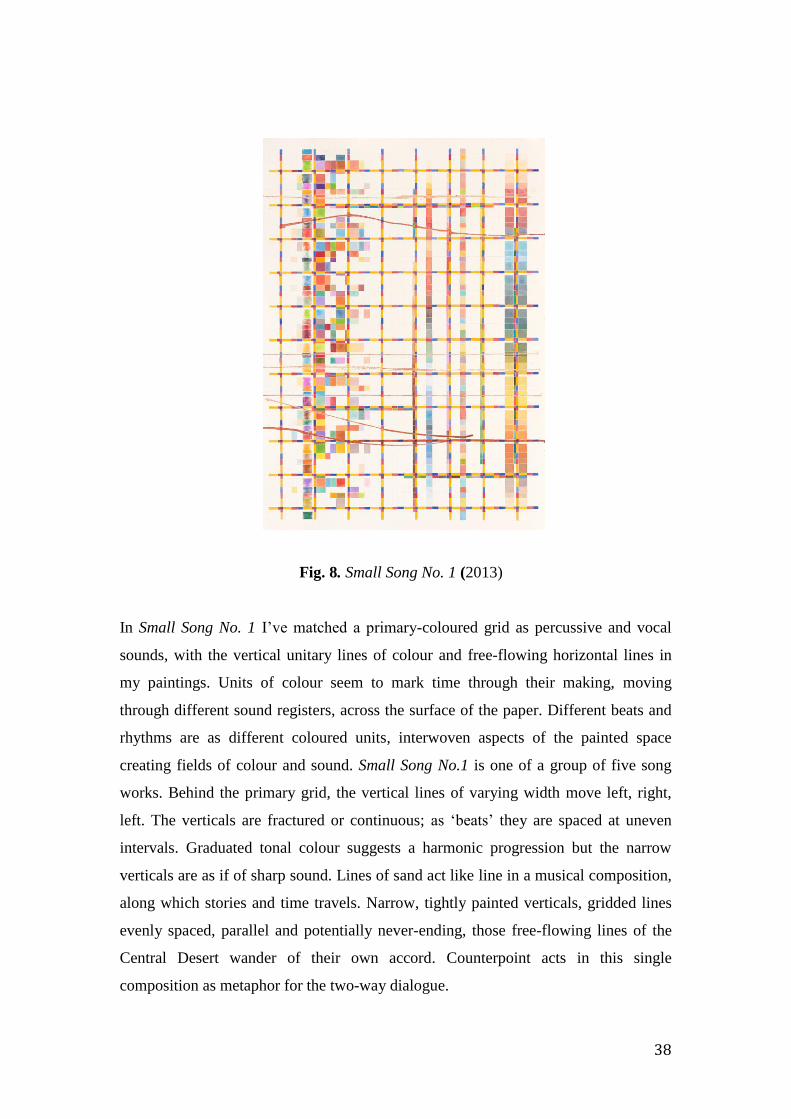
Fig. 8. Small Song No. 1 (2013)
In Small Song No. 1 I’ve matched a primary-coloured grid as percussive and vocal
sounds, with the vertical unitary lines of colour and free-flowing horizontal lines in
my paintings. Units of colour seem to mark time through their making, moving
through different sound registers, across the surface of the paper. Different beats and
rhythms are as different coloured units, interwoven aspects of the painted space
creating fields of colour and sound. Small Song No.1 is one of a group of five song
works. Behind the primary grid, the vertical lines of varying width move left, right,
left. The verticals are fractured or continuous; as ‘beats’ they are spaced at uneven
intervals. Graduated tonal colour suggests a harmonic progression but the narrow
verticals are as if of sharp sound. Lines of sand act like line in a musical composition,
along which stories and time travels. Narrow, tightly painted verticals, gridded lines
evenly spaced, parallel and potentially never-ending, those free-flowing lines of the
Central Desert wander of their own accord. Counterpoint acts in this single
composition as metaphor for the two-way dialogue.

39
Fieldwork and the experience of connecting to surface and substance
The sense that a place might be able to nourish and sustain us and effect major change
in thinking and perceptions is inspiring. After time spent in the West MacDonnell
Ranges just prior to beginning this project, I read Nourishing Terrains by Deborah
Bird Rose. 30 This significant book gave me my first real understanding of the
importance of place for Indigenous communities and in turn for us all. Rose’s
perceptions of place and country showed me a mindfulness for all its aspects
including the respect for and inclusion of cultural knowledge.
The experience of accompanying the Walpiri women from Yuendumu to the
Women’s Law and Culture Week at Watiyawanu, Mt Liebig, which I outline below,
became a defining moment for my research. On hearing the vocal melodic descent
form typical of the songs of the central desert region, as a painter, I visualised it,
seeing how it could embody a cross-cultural dialogue in painting.
Women from communities across the Territory had gathered for five days of
ceremony, learning the Law and family ‘catch-up’. The site had been graded to clear
all scrub and was about the size of two football ovals, beyond which clearings had
been made for camps amongst the low-lying trees. In the distance were low tree-
covered hills, a significant ochre collection point from where in the past it had been
traded across country.
On the day of arrival and for a period of 24 hours the women erected a group of seven
short poles decorated with ochre, string and feathers. This was at the site where the
ceremonies were to take place, the focal point for the five days of actions. The poles
represented the women and children who’d passed away and the stories of each of the
communities present. The momentum of the event built over the week, culminating in
30 Department of the Environment, “Nourishing Terrains,” Text, (April 24, 2008),
http://www.environment.gov.au/resource/nourishing-terrains.
40
the final night of dancing with a moving ceremonial ‘goodbye to country’ on the
following day of departure.
While participating with the Yuendumu women in their Ngatijirri or budgerigar
ceremonies, I was painted with designs of this Tjukurrpa, with accompanying singing
to encourage the ancestral spirits. This painting process took several hours but
dancing was a series of brief actions directed by one or two senior women.
Ceremonies were performed over the next five days. The brevity and formality of the
dances within the ceremonies is a continuing memory of these events.
The significance of the physical ground in ceremony was made apparent during this
week. Marks were made in the sand with hands while in conversation or by the feet
with movements of the body in performance, creating patterns in the dirt only to be
cleared away at the end of the movements. These patterned marks constituted an
important part of these rituals, heightening the awareness of surface and the design
impressed upon it, and this came to be transferred later to the making of the palette
works and my paintings.
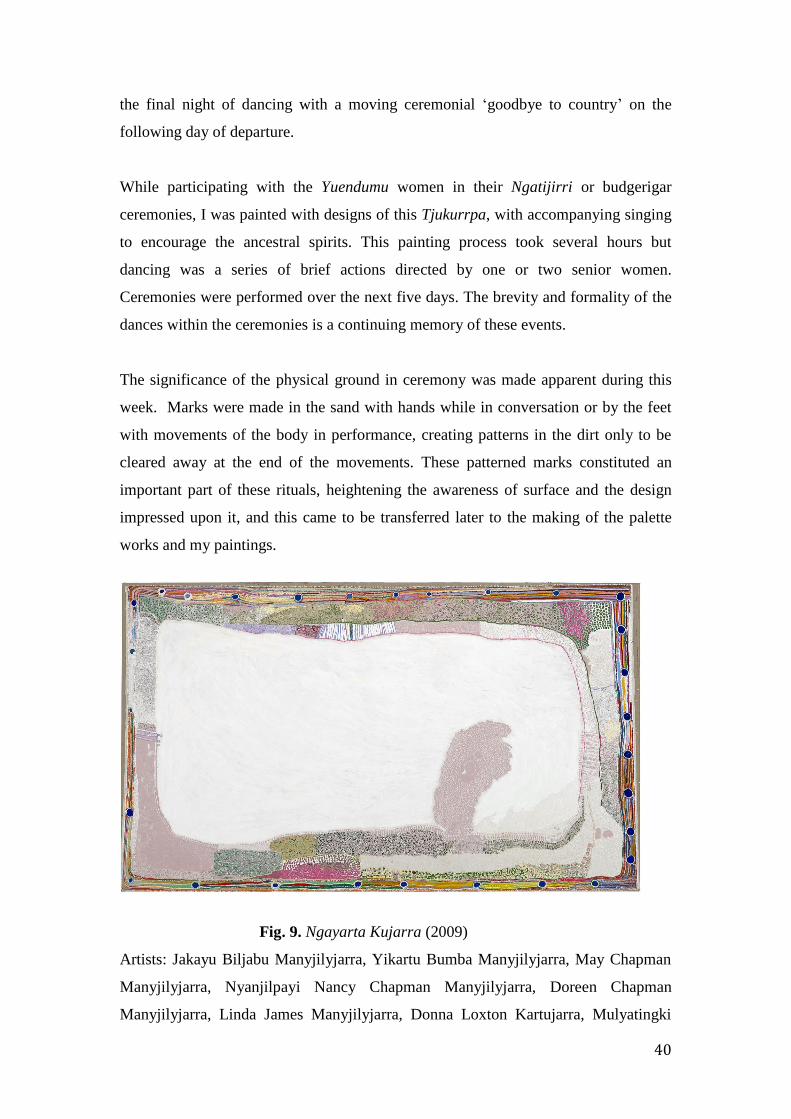
Fig. 9. Ngayarta Kujarra (2009)
Artists: Jakayu Biljabu Manyjilyjarra, Yikartu Bumba Manyjilyjarra, May Chapman
Manyjilyjarra, Nyanjilpayi Nancy Chapman Manyjilyjarra, Doreen Chapman
Manyjilyjarra, Linda James Manyjilyjarra, Donna Loxton Kartujarra, Mulyatingki
41
Marney Manyjilyjarra, Reena Rogers Manyjilyjarra, Beatrice Simpson Manyjilyjarra,
Ronelle Simpson Manyjilyjarra, Muntararr Rosie Williams Manyjilyjarra.
Immediately after returning to Melbourne from the Women’s Week in July 2011, I
visited the National Gallery of Victoria’s collection of Aboriginal paintings at
Federation Square. An extraordinary painting had just been hung as part of a new
exhibition called Living Water. Contemporary Art of the Western Desert, curated by
Judith Ryan. 31 This very large three-by-five metre synthetic polymer on canvas
collaborative painting is called Ngayarta Kujarra and was painted in 2009 by eleven
Martumili women artists of Punmu in the Western Desert of Western Australia. It is
not like most other Central Desert Aboriginal paintings as, when viewed from a
distance, it is minimal with little detail. Up close, its dotted surface comes alive. I had
entered the gallery space and abruptly come face-to-face with its dazzling opalescent
whiteness, roughly brushed to create the salt lakes surface. This brilliant white
stillness ringed with lines and circles of dotted colour created an impact, and its
evocation of the vast space of the salt lake brought to mind the large, open ceremonial
space at Watiyawanu ringed by mountain ranges, that I had just returned from. This
depiction of such uninterrupted openness, of the presence of voices, but also the
silence present in such places was unexpected. The seemingly arbitrary placement of
a pale pink shape intruding into the dazzling opalescent space at the centre of the
painting reinforced this unexpectedness.
The moment of surprise I experienced at this time was significant. Martin Seel
describes it as a moment of intense aesthetic perception, or perhaps vividly, as Mark
Paterson refers to Walter Benjamin’s metaphor, the sense of being ‘assailed’ when
affected in a palpable manner by a viewing experience. 32 It was a moment of bodily
connection with a visual language originating in a different cultural tradition,
conveyed through signs and spaces telling stories of country, community and
connection, and providing insights into the experience of being in a different space
and expanding my perceptual world.
31 Judith Ryan, Living Water: Contemporary Art of the Far Western Desert (Melbourne:
National Gallery of Victoria, 2011). 32 Martin Seel, Aesthetics of Appearing, Cultural Memory in the Present (Stanford, Calif:
Stanford University Press, 2005), 9.

42
Ngayarta Kujarra represents an immense warla or salt lake called Punmu or Lake
Dora in north central Western Australia. It is an evocation of emptiness, of crystalline
whiteness, of deep silence broken only by voices talking and singing, and reflected in
the delicate edge patterning of dotted coloured lines joining blue circles like
waterholes, sites of belonging. The delicate tracery of line work around the perimeter
of the painting, as if embroidered, protects the space and those who belong to it,
enclosing the centrally placed shimmering opalescent salt lake. As a viewer I can
attempt to engage with the sense of being in a distant past and present, recalling the
women at the Culture Week celebrating and reaffirming connections. Through the pre-
conditions of ceremony, through the process of making and the singing of ancestors
into it, the painting ‘re-stages’ the women’s experience of being in their ancestral place
- so paintings such as these seem extensions of the body.
The painting is an expression of the women’s deep connection and attachment to the
place. When returning to the site with the painting completed, they situated the
painting in their world and in the land they hold close by performing the inhered
songs and dances. 33 I could almost hear the celebratory songs, the laughter and joy.
Though I haven’t visited the lake at Punmu I have walked on Kati Thanda or Lake
Eyre and experienced the dazzling shimmering whiteness of the merging of sky and
land into one all-enveloping shimmering space. I’ve experienced its extraordinary
emptiness, the deep silence and the sense it gave me of being elsewhere, but I realise
I’m not able to feel and know a place such as this as the Martumili women have
experienced and revealed in their painting.
When studying this painting I thought about the role of perception in painting, of
affective resonances received when in the presence of such significant works.
Understandings of the cultural context of such paintings can expand meanings in a
potent manner for the viewer and offer further depth to perceptual experience and
meaning beyond the purely formal and abstract. As with multi-layered designs being
indexical to ancestral actions, Martin Seel states that paintings such as these articulate
themselves through the interaction of their supporting parts. In such works I believe
33 Ryan, Living Water.

43
the cultural context takes on this supporting role in the experiencing of the work for
the viewer. The aesthetic of dazzling whiteness and the delicate, detailed ‘tracery’ of
the significant waterhole sites around the perimeter of the painting express the artists’
interconnected respect and affection for this place, once their ngurra or home. But I
need to ask myself, as a result of these interactions, what do I see when looking at this
painting? Does it make me see or realize something else? What do paintings such as
this reveal to me?
Fig.10. Joe Japanangka James, Wakurlyarri Jukurrpa (Rock Wallaby Dreaming)
(1986)
The National Gallery of Victoria at Federation Square has in its collection another
painting with a very different design, predominantly of lines and circles, v-shaped
marks and dabs of colour. Joe Japanangka James from Lajamanu in the Northern
Territory painted Wakurlyarri Jukurrpa in 1986. Both this painting on board and the
Martumili painting on stretched canvas are very much of the place and the people
whose story it tells. The detail and the structured composition of Japanangka’s
painting tells his own story showing the actions in ceremony of the two related skin
groups Japanangka and Japangardi. This painting is for him like a specific text,
demonstrating the complex interrelationships between him, his family, skin group and
ancestors, those people and places of his country. Its structure sets the pattern for day-
to-day living.
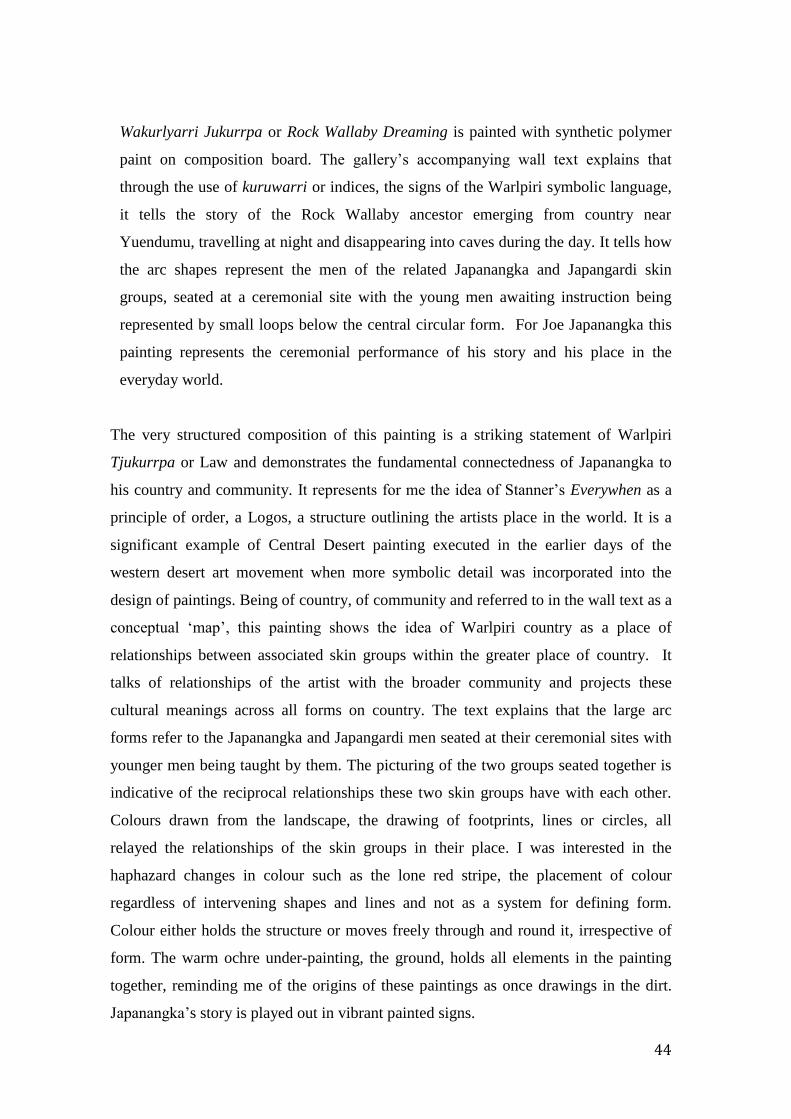
44
Wakurlyarri Jukurrpa or Rock Wallaby Dreaming is painted with synthetic polymer
paint on composition board. The gallery’s accompanying wall text explains that
through the use of kuruwarri or indices, the signs of the Warlpiri symbolic language,
it tells the story of the Rock Wallaby ancestor emerging from country near
Yuendumu, travelling at night and disappearing into caves during the day. It tells how
the arc shapes represent the men of the related Japanangka and Japangardi skin
groups, seated at a ceremonial site with the young men awaiting instruction being
represented by small loops below the central circular form. For Joe Japanangka this
painting represents the ceremonial performance of his story and his place in the
everyday world.
The very structured composition of this painting is a striking statement of Warlpiri
Tjukurrpa or Law and demonstrates the fundamental connectedness of Japanangka to
his country and community. It represents for me the idea of Stanner’s Everywhen as a
principle of order, a Logos, a structure outlining the artists place in the world. It is a
significant example of Central Desert painting executed in the earlier days of the
western desert art movement when more symbolic detail was incorporated into the
design of paintings. Being of country, of community and referred to in the wall text as a
conceptual ‘map’, this painting shows the idea of Warlpiri country as a place of
relationships between associated skin groups within the greater place of country. It
talks of relationships of the artist with the broader community and projects these
cultural meanings across all forms on country. The text explains that the large arc
forms refer to the Japanangka and Japangardi men seated at their ceremonial sites with
younger men being taught by them. The picturing of the two groups seated together is
indicative of the reciprocal relationships these two skin groups have with each other.
Colours drawn from the landscape, the drawing of footprints, lines or circles, all
relayed the relationships of the skin groups in their place. I was interested in the
haphazard changes in colour such as the lone red stripe, the placement of colour
regardless of intervening shapes and lines and not as a system for defining form.
Colour either holds the structure or moves freely through and round it, irrespective of
form. The warm ochre under-painting, the ground, holds all elements in the painting
together, reminding me of the origins of these paintings as once drawings in the dirt.
Japanangka’s story is played out in vibrant painted signs.

45
I was particularly interested in this painting’s structure with its parallel lines and
two sets of circular forms at either end. It shows in a diagrammatic style the clear
connection the individuals have to each other and to the ritual taking place in their
ancestral country. It reinforces connections and relatedness. Japanangka’s wallaby
ancestor leaves the marks of footprints as it travels over the surface creating an
active, patterned effect. The structure of the painting conveys effectively the
subject: cultural relationships, the Law, the stories, the ceremonial actions of the
wallaby ancestor. It is a didactic painting.
This painting reflects ancestral ceremony, with its focus being the set of parallel lines
connecting the two skin groups. It seems as if an order placed almost literally upon
the land. When looked at horizontally in the landscape format, I imagine the musical
stave as part of a greater manuscript for the notation of new performances. One form
of knowledge connected to another and this ladder-like structure of parallel lines with
the notation-like placement of footprints and the circular forms at either end
suggesting musical notation and temporal actions. It demonstrates the performative
space with parallel lines carrying knowledge through song across country. Like a
manuscript this painting sets down the pattern for the performance of the artists’
ancestral actions.
Musical performance, musical structure: touch and rhythm as shared
aspects of music and painting:
I shall discuss how these have contributed to the process of exploration in my
painting. In 2011 and 2012 three musical performances provided the opportunity to
experience perceptual and metaphorical aspects of place in the broader context of
music and culture. Each contributed in some way to my understandings of music and
painting’s common qualities, such as the temporal and the chromatic aspects of their
composition and provided the opportunity to explore further the relation between
painting and music from both contemporary western and indigenous traditions.
a. Hearing the vocal melodic descent form at the Women’s Law and Culture
Week in June 2011 at Amundurrgnu, Mt Liebig in the Northern Territory.
46
b. John Luther Adams 1953- . Inuksuit -“to act in the capacity of the human…”
For nine to ninety percussionists, originally commissioned by the Banff Centre,
Muzik3 Foundation, and Furman University. 34 This work was performed in
Melbourne in 2012 during the Metropolis festival. Adams is a composer living in
Alaska. Place and the environment are the drivers for his work.
c. Morton Feldman 1926 – 1987. Patterns in a Chromatic Field/Untitled
Composition for Cello and Piano 1981 Also performed in Melbourne 2012 during
the Metropolis music festival.
a. Song and the vocal melodic descent form:
The vocal descent form is a beautiful temporal expression of place by many voices,
part of the linear ancestral song story evoking connections and movements through
ancestral country from site to site. This tiered vocal structure covered the high down
to low registers in one movement. Such song items might only last a minute or so but
the voices and the accompanying repetitive clap stick beating provided urgency to the
moment and emphasized for all the knowledge being sung.
I transcribed this form as I visualised it onto manuscript sheets. Sharing a vertical
movement from top to bottom and from left to right to left, they later became like
visual equivalents of the song form, metaphors for an engagement and a two-ways
conversation. Reflecting the horizontal, parallel five-lined stave they in turn reflect
the landscape from which the songs emerged. These small song units build stories,
and so build the tjukurrpa.
Women’s culture or inma in Aboriginal ceremonial situations includes all the
practices of song and musical accompaniment, dance and the painting of object and
body with sacred designs. Inma performs the tjukurrpa or Dreaming. 35 It is also a
term used to define the small unit of musical structure, the ‘small song’ or inma
tjukutjuku. When at the Women’s Week, inma demonstrated to me the connections
existing between voice, sound, movement and painted mark. To my mind, their ritual
34 John Luther Adams, “Inuksuit: (‘--to Act in the Capacity of the Human--’): For Nine to
Ninety-Nine Percussionists” (Fairbanks, Alaska, 2009). 35 Willowra Songlines. Women’s budgerigar and rain songs performed at Willowra,
April/June 2009. DVD recording of performances of Ngatijirri Tjukurrpa by Mary Loughren,
Myfany Turpin, Helen Napurrurla Morton. Given to the author by Mary Loughren.

47
formality and brevity conjured up touch, marks, signs that could create a third
language to introduce into my painting.
In Aboriginal Music Catherine Ellis notes these small songs collectively recount the
long myths of the story lines, that the forms of the landscape in which inma takes
place are the embodiment of past ancestral actions. Through performance the
participants become embedded in that sense of that past, the present and the future
and sustain their ancestral connections. The musical instruments of voice and
clapstick iterate, reiterate these tjukurrpa relations. 36
Being accustomed to the closed-in and busy spaces of city living, sound seems
affective, allowing a focusing quality when heard in the enormousness of these
seemingly empty spaces. I found that when observing inma the mind becomes more
attentive to individual sounds simply because it is able. Empty noiseless space is
interrupted by snatches of sound. Sounds seemed to manifest as single units of
different pitches or changing colour within a greater space, emphasising the vastness.
The occasional bird song, the stop-start sounds of trucks delivering food and water,
the chopping of wood, the occasional howl of a dingo and resulting yells and shrieks,
the emphatic beating of clap sticks bringing you to attention, voices talking, laughing,
singing, arguing: these sounds are like pinpoints spread across the landscape, only to
disappear into the enveloping red and dusty silence of quiet. This perception of sound
was further accentuated at night when the only sounds would be voices spoken or
sung, maybe the rhythm of clapsticks set in the blackness of the night and punctuated
by a hundred or so small flickering campfire lights reflecting the infinite number of
stars above.
The Dutch writer Cees Nooteboom’s recollection of his own experience of ‘being’ in
the desert regions of Australia provided me with a link with the past of different
places.37 In his text Lost Paradise he says that for the first time, when in the silence of
the outback, he realised what he is, and that he was in “a profound place, both
physical and mental”, that he was one small part of the stillness, the sand and the
36 Catherine J. Ellis (Catherine Joan), Aboriginal Music : Education for Living (University of
Queensland Press, 1989).

48
starry sky, conscious that one day he would disappear from it all. He felt the place and
that if he were an instrument he would produce the most beautiful music. He says “for
the first time in my life I understood what they meant in the Middle Ages by ‘the
harmony of the spheres’. “When I stand outside here, I do not just see the stars, I hear
them”. His perceptions of such harmony connected him to the cosmos and so
connects us perhaps to Stanner’s Everywhen.
John Luther Adams:
Part of the Melbourne Metropolis program of American Minimalist music was the
Inuksuit by John Luther Adams, performed in mid-winter for one and a half hours in
the grand courtyard at the University of Melbourne at its proscribed time during the
late afternoon and into the early evening. Inuksuit is an Innuit word, translating
literally as “to act in the capacity of the human”. The music was originally composed
specifically for the Arctic site. It was created for nine to ninety nine percussionists,
and is to be played in the landscape at the time of late afternoon to that of the setting
sun, just as the birds return to their roosts for the night.
Inuksuit was originally performed in the Canadian forests at the edge of the Arctic
Circle, its intention being to heighten our awareness of the sights and sounds of the
Arctic we would be immersed in as audience if we were present. By creating and
being immersed in an overall field of sound Adams felt we would deepen our
experience of this environment. He asks in the performance notes accompanying the
score: “how does where we are define what we do and who we are?” 38 I feel my own
cultural experience of time and place at Amundurrgnu has spoken in a similar way,
and defines the point at which I have arrived in my practice.
The title Inuksuit refers to the tall stone markers or sentinels the Inuit people of
Alaska originally used to orient them in the Arctic landscape. ‘To act in the capacity
of the human’ says Adams, reflects his feelings about music. The intention of this
work as one of environmental significance is to deepen our experience and
understanding of the environment through sound. I understand Adams’ attentiveness
to the sensations of being in place. Though these experiences were musically and
culturally so different, both seemed as cultural markers of time in the landscape when,
38 John Luther Adams, “Inuksuit: ("--to act in the capacity of the human--") : for nine to
ninety-nine percussionists ” Fairbanks, Alaska : Taiga Press, c2009

49
as Adams has said, you could hear what you could see and for me, see what I could
hear, and where you could deepen your perceptions of the experience. It is about
understanding how it touches you through the resonances received, the meeting of
seeing and listening, consciousness and awareness.
Adams has noted how the structures of his compositions for the musical scores for
Inuksuit such as in figure 11 Stack 1. Suspended cymbals and Tam-Tam, often mimic
the shape of the rock sentinels made by the Inuit as directional markers in their
country. These were the inspiration for the Inuksuit. When I viewed the scores, the
notation for the scores Breathing and Waves in Group 1, with their horizontal
patterning of undulating lines, suggested movement across the landscape. It seemed
possible that lines and units of colour might have a similar notational function, to
represent the resonances of a place in the same way that notes are used to represent
how music or sounds might be heard and perceived. The annotation of the score as
pyramidal structure and as for Double Windows, the Pyramids and Stacks in Group
Two reflect the table-like stone Inuit markers in the landscape.
Fig. 11. John Luther Adams, Stack 1. Suspended Cymbals and Tam-Tam
I was interested in his visualisation of the score as pyramidal features in the
landscape, directly linking the notation to its topographic source. They are beautiful
50
formations creating the aural resonances of the Arctic tundra. Others such as Wind are
in the shape of an inverted pyramid and intended for the playing of triangle or small
bells. There is a strong resonance between place, the notational structure and the
instruments chosen to respond. All give form to sensations and resonance of place:
schematic forms for place.
Adam’s compositions are about the primary experience of being in this place, paying
attention to what surrounds you, understanding how it touches you, so therefore how
the music touches you. Music is not a literal representation or a reproduction of
experiences or literally what he hears and sees, but is about resonances i.e. the
meeting of listening, consciousness, and awareness, like making a tone painting. It is
as if the tonal space of a musical piece might be saturated from the lowest lows to the
highest highs. The density of saturation, the noise and colour are primary
considerations. Though I am not making tone paintings, they are still saturated which
to me is what the central desert is about, intense, saturated with light and colour and a
great silence.
In the cover notes to the recording of his Strange and Sacred Noise Adams talks about
the relentless noise and the silence converging in his compositions. 39 I too have
wondered about the purpose and experience of silence and how I might reference this
important aspect in a visual two-dimensional work. In my early research while
looking at reproductions of Bridget Riley’s wall paintings of 2012, I noticed the
unpainted spaces Colin Wiggins refers to in his essay about the work of Bridget Riley.
He refers to them in some of her wall paintings as ‘la reserve’, where the open space
of the wall intrudes into her compositions, remaining unpainted yet still part of the
composition. 40 In his email to me Wiggins said this term refers to an unpainted
section in a painting as being reserved. It is also a printmaking term where the etching
plate is left unbitten, also referred to as reserved. In my paintings the unpainted,
gridded spaces are as if to emphasize open space and silence, like the space around a
single musical note or a unit of colour, or feature in a landscape.
39 John Luther Adams, Strange and Sacred Noise, audio recording cd (Mode, 2005).
John Luther Adams Strange and Sacred Noise 40 Bridget Riley, Bridget Riley : Paintings and Related Work (National Gallery Co;
Distributed by Yale University Press, 2010), 16.
51
Morton Feldman:
I recall experiencing a sense of auditory space when at a performance of Morton
Feldman’s Patterns in a Chromatic Field in the intimate space of The Salon at the
Melbourne Recital Centre in 2012. 41 When hearing Patterns performed I had the
sense that I could actually walk into and around that space surrounding each single
note and feel each as it was played in the field of sound. It was tangible, as if each
carefully pronounced note was literally being played on my body. This piece consists
of slow and deliberately played notes of cello and piano in duet with each other. Each
single note felt like a separate unit of colour and, though performed in a very small
and low-lit performance space for just over an hour, it seemed the equivalent to
sounds heard in the enormousness of the silence of the landscape at Amundurrgnu, an
equally colourful space. Feldman’s notational field of articulate rhythmic shapes
evoked memories of other chromatic fields, the small spaces of painting in the vast
open spaces of country. The shared aspect was the almost tangible sensations of each
individual note or voice and the physical space around each sound. These fields of
merging sound and silence translated into fields of units of colour and unpainted
space and still and moving lines.
In the program notes to this recording is a quote from Feldman’s Essays of 1985. His
ideas for this composition came from the material qualities of his Teppich rug where
the wool had, prior to weaving, been dyed only in small quantities called ‘abrash’.
When woven into the rugs, a patchwork, microtonal hue across the surface is created
due to slight colour variations in each separately dyed quantity of wool. When
following up this performance with an investigation into Feldman’s music I was
interested to find black and white gridded visual renditions of his piano studies had
closely recalled the patterns of his rug. I had responded similarly in my mind to his
compositions. I had heard each separate note as a single unit of colour. It was as if I
was hearing my own gridded compositions as I had imagined them. As with Feldman
I was also interested in the asymmetrical and a lack of centering in my compositions.
41 Morton Feldman, Patterns in a Chromatic Field for Violoncello and Piano: (1981)
(Vienna: Universal Edition, 2008).
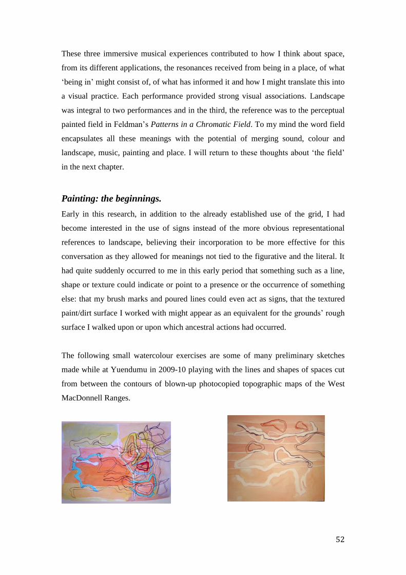
52
These three immersive musical experiences contributed to how I think about space,
from its different applications, the resonances received from being in a place, of what
‘being in’ might consist of, of what has informed it and how I might translate this into
a visual practice. Each performance provided strong visual associations. Landscape
was integral to two performances and in the third, the reference was to the perceptual
painted field in Feldman’s Patterns in a Chromatic Field. To my mind the word field
encapsulates all these meanings with the potential of merging sound, colour and
landscape, music, painting and place. I will return to these thoughts about ‘the field’
in the next chapter.
Painting: the beginnings.
Early in this research, in addition to the already established use of the grid, I had
become interested in the use of signs instead of the more obvious representational
references to landscape, believing their incorporation to be more effective for this
conversation as they allowed for meanings not tied to the figurative and the literal. It
had quite suddenly occurred to me in this early period that something such as a line,
shape or texture could indicate or point to a presence or the occurrence of something
else: that my brush marks and poured lines could even act as signs, that the textured
paint/dirt surface I worked with might appear as an equivalent for the grounds’ rough
surface I walked upon or upon which ancestral actions had occurred.
The following small watercolour exercises are some of many preliminary sketches
made while at Yuendumu in 2009-10 playing with the lines and shapes of spaces cut
from between the contours of blown-up photocopied topographic maps of the West
MacDonnell Ranges.
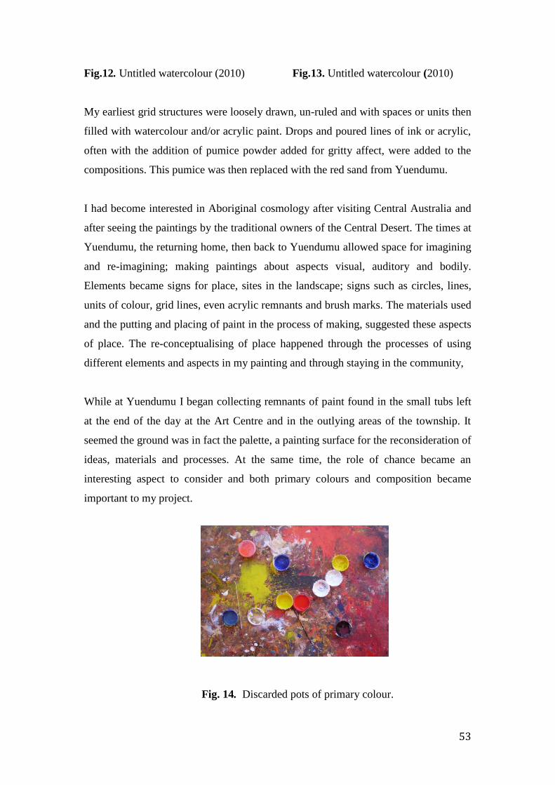
53
Fig.12. Untitled watercolour (2010) Fig.13. Untitled watercolour (2010)
My earliest grid structures were loosely drawn, un-ruled and with spaces or units then
filled with watercolour and/or acrylic paint. Drops and poured lines of ink or acrylic,
often with the addition of pumice powder added for gritty affect, were added to the
compositions. This pumice was then replaced with the red sand from Yuendumu.
I had become interested in Aboriginal cosmology after visiting Central Australia and
after seeing the paintings by the traditional owners of the Central Desert. The times at
Yuendumu, the returning home, then back to Yuendumu allowed space for imagining
and re-imagining; making paintings about aspects visual, auditory and bodily.
Elements became signs for place, sites in the landscape; signs such as circles, lines,
units of colour, grid lines, even acrylic remnants and brush marks. The materials used
and the putting and placing of paint in the process of making, suggested these aspects
of place. The re-conceptualising of place happened through the processes of using
different elements and aspects in my painting and through staying in the community,
While at Yuendumu I began collecting remnants of paint found in the small tubs left
at the end of the day at the Art Centre and in the outlying areas of the township. It
seemed the ground was in fact the palette, a painting surface for the reconsideration of
ideas, materials and processes. At the same time, the role of chance became an
interesting aspect to consider and both primary colours and composition became
important to my project.
Fig. 14. Discarded pots of primary colour.

54
At this stage I was beginning to use a more random, all-over colour use with the
separate grid units in a more considered way. There were two aspects to the use of
chance in the early stages of my working process; the decision to use whatever
colours I happened to pick up from the box of paints beside me, and the unplanned
action of putting and placing colour into the gridded units. I liked the way chance
could play with the formality of the grid in a contradictory relationship of control plus
freedom. This connected with the improvisatory in music where exploratory freedoms
can hint at pre-existing structures and forms. This colour use also suggested a sense of
dissonance, of atonality and a deliberate lack of form. Similarly, the early modernist
composers, eschewing conventional harmonic relationships, had made their works
deliberately sound unconventional in their structure.
Exploring chance in working practices has been the concern of many artists. In his
writings The Daily Practice of Painting Gerhard Richter noted that his colour chart
paintings begun in 1966, such as the 124 Colour Series of 1974, had been made
through a randomised process generated by computer, through “blind, motor activity”
without subjectivity and representing the idea alone. His intention was to make these
works as undirected and unplanned as possible. 42 Though computer generated, they
connected with my own colour practice of painting units randomly within a grid.
Damian Hirst also used chance in his spot paintings beginning in 1986. In these works
assistants made the paintings from the artists directions; the space between the spots
was to be equal to the size of the spot, the colours were to be distributed randomly
and no colour was to be used twice. 43
42 Gerhard Richter, The Daily Practice of Painting: Writings and interviews, 1962-1993, 1st
U. S. ed (Cambridge, Mass: MIT Press, 1995). P 78 43 Yasmine B. Sanderson, “Color Charts, Esthetics, and Subjective Randomness,” Cognitive
Science 36, no. 1 (February 2012): 142–49.
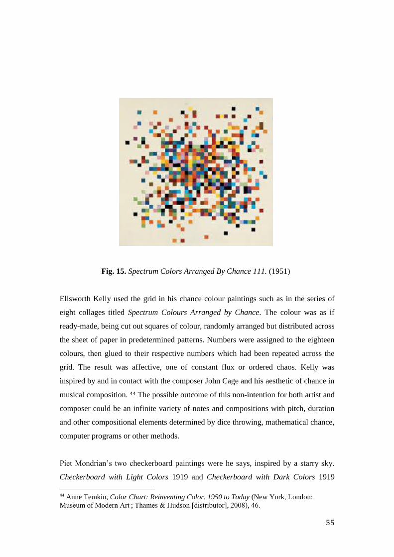
55
Fig. 15. Spectrum Colors Arranged By Chance 111. (1951)
Ellsworth Kelly used the grid in his chance colour paintings such as in the series of
eight collages titled Spectrum Colours Arranged by Chance. The colour was as if
ready-made, being cut out squares of colour, randomly arranged but distributed across
the sheet of paper in predetermined patterns. Numbers were assigned to the eighteen
colours, then glued to their respective numbers which had been repeated across the
grid. The result was affective, one of constant flux or ordered chaos. Kelly was
inspired by and in contact with the composer John Cage and his aesthetic of chance in
musical composition. 44 The possible outcome of this non-intention for both artist and
composer could be an infinite variety of notes and compositions with pitch, duration
and other compositional elements determined by dice throwing, mathematical chance,
computer programs or other methods.
Piet Mondrian’s two checkerboard paintings were he says, inspired by a starry sky.
Checkerboard with Light Colors 1919 and Checkerboard with Dark Colors 1919
44 Anne Temkin, Color Chart: Reinventing Color, 1950 to Today (New York, London:
Museum of Modern Art ; Thames & Hudson [distributor], 2008), 46.

56
were both evenly gridded paintings, that is of ‘one measure’ with units the same size
but with subtle variations in contrasting colour to soften the effect of the perceived
rigidity of the grid. These two paintings generated some debate at the time between
Mondrian and his colleagues; about position and measure, about whether the artist
should take nature such as the starry sky as a point of departure. It seemed in doing so
Mondrian was working in a way counter to his own stated abstract principles. 45
My interest however, in playing with the possibilities of chance in painting seemed
incompatible with another method I tried at this time with units of colour and the grid.
I had been looking at the work of the Hungarian-French artist Victor Vassarely.
Initially I was interested in his early gridded paintings such as Supernovae 1959-1961
and Bitlinko 1956 that conveyed perceptual experiences within gridded structures;
actions that disrupted the grid and drew attention to the single units within it. He also
used an ordering principle of cyclical or serial sequences of form and colour
combinations. Vasarely’s repetition and pattern of units and colours created a sense of
expectation predictability unlike that based on chance. Serial repetition denied any
expectation of formal colour relationships, such as of tonal progression. However I
didn’t want the predictability of repetitive groupings.
I have listened to the repetitively structured compositions of minimalist composers
such as Steve Reich, Terry Riley and Philip Glass. Again the expectations that come
with the patterning of repeating structures within their compositions can create the
same effect as in painting, but the auditory and temporally repetitive forms of
minimalism have greater options for an exploration of expanding, intricate rhythms. I
realized this when listening to the Steve Reich composition Drumming (1974).
45 Piet Mondrian et al., eds., Piet Mondrian, 1872-1944, 1st ed (Boston: Bulfinch Press,
1995), 190.

57
Fig.16. Untitled. Acrylic and watercolour serial painting with interruptions (2011)
In the painting above I decided to use a repeating colour structure of seven different
colours. My strong gut response to the predictability of this small work told me this
wasn’t the way forward. The unplanned, organic approach to the evolving
composition was too liberating an experience.
In early 2012 I decided to make the grid a more active painting space, dividing it into
a series of evenly repeating, increasing and diminishing units across the surface. The
varying grid spaces across the surface determined it would be more animated,
expansive, suggesting space beyond the perimeter of the work. As noted earlier, I
began to think about structuring compositions in colour to suggest the musical idea of
counterpoint or the method of combining different melodic lines in a composition
consisting of the vertical or harmony, and the horizontal or melody, consonances
(stability and repose) and dissonances (tension or clash). This seemed to fit with the
possibilities offered by the gridded form.
My use of colour followed no particular rules, literally choosing colour from those
tubes closest to me at the worktable and then filling each unit, giving no consideration
to colour association or to reactions with neighbouring colours etc. I found pleasure in
the effects of surprise and the luminosity and the brilliance of each unit of colour, and
the relations between these fields of colour as places of continuous flux as influenced
by the prevailing conditions of light and materiality. I was pleased to discover that
Joseph Albers declared that the greatest excitement in colour “lies beyond its’ rules

58
and canons”. 46 As with music, harmonious relations are not the only option in colour;
dissonance and atonality are also desirable. Albers had articulated what European
music had been doing for well over a century and these are the qualities I have found
exciting. Dissonance was then liberated within a new organising structure called
serialism and with another structural principle called the interval, to create a fresh
post-tonal language.
At the same time the potential relations of edges, boundaries and open spaces became
interesting considerations for me. These fields of colour composed by chance,
generated perceptions and sensations, resonant of place. Spaces of colour as coloured
fields later became units in a musical field of small songs like song sets performed
across country.
I don’t expect to imbue the colours, shapes or signs in my painting with the intent of
Central Desert painters, but I feel the circles, poured lines or even the units of colour
can represent a dialogue with this place through the evocative use of substances like
sand and paint. The way stories, and the events and sites in these stories, are painted
as organic and linear symbols offered me alternative forms of conversation about
place and landscape through a language of signs. In the handling of paint, I began to
feel that not only brush marks but the element of touch and other forms of marks
signal our intentions through the act of painting. Marks such as finger marks, brush
strokes, changes from wet to dry, heavy or loose coverings of pigment, hard or soft
boundaries and edges or none, are all potentially significant.
This chapter has identified the key themes and conceptual influences of my project. I
have described how musical forms can act as structures and metaphors for inter-
cultural conversation and negotiation and how my fieldwork experience contributed
to this focus. The following chapter will introduce the early paintings, the
groundwork, leading to those constituting the final outcome of my research. I will
discuss my working processes and their development and elaborate further on the
conceptual, philosophical and aesthetic underpinnings of my research and those artists
whose work has been influential.
46 Albers, Josef, Interaction of Colour (Conn.): Yale University Press, in association with The
Joseph and Anni Albers Foundation, c2009), 60–62.

59
CHAPTER TWO
Fields of relations and boxes of jewels: grids, notation, colour, marks
and sound as conversations about place
Fig. 17. Studio wall March 2011
Fields and lines: music and place
The contemporary composer Gyorgy Ligeti (1923-2006) described musical notation
as being like ‘fields of relations’. On Andrew Ford’s The Music Show on ABC Radio
National, the British composer Thomas Ades described the space between the bar
lines on the stave as ‘a container for precious jewels’.47 Both these beautiful and
poetic descriptions visually evoke notions I have explored in the course of this
research. The term ‘field’ suggests spaces either intimate, like the container, or large
scale as with landscape: fields of materiality, fields of colour, of sounds and
landscape. It also suggests the temporal as Ligeti suggested, with the structuring of
47 Thomas Ades, The Music Show with Andrew Ford, ABC Radio National, April 2013,
abc.net.au.
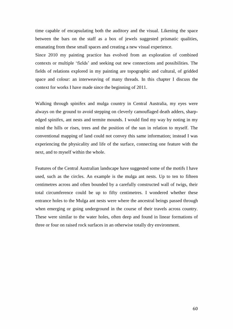
60
time capable of encapsulating both the auditory and the visual. Likening the space
between the bars on the staff as a box of jewels suggested prismatic qualities,
emanating from these small spaces and creating a new visual experience.
Since 2010 my painting practice has evolved from an exploration of combined
contexts or multiple ‘fields’ and seeking out new connections and possibilities. The
fields of relations explored in my painting are topographic and cultural, of gridded
space and colour: an interweaving of many threads. In this chapter I discuss the
context for works I have made since the beginning of 2011.
Walking through spinifex and mulga country in Central Australia, my eyes were
always on the ground to avoid stepping on cleverly camouflaged death adders, sharp-
edged spinifex, ant nests and termite mounds. I would find my way by noting in my
mind the hills or rises, trees and the position of the sun in relation to myself. The
conventional mapping of land could not convey this same information; instead I was
experiencing the physicality and life of the surface, connecting one feature with the
next, and to myself within the whole.
Features of the Central Australian landscape have suggested some of the motifs I have
used, such as the circles. An example is the mulga ant nests. Up to ten to fifteen
centimetres across and often bounded by a carefully constructed wall of twigs, their
total circumference could be up to fifty centimetres. I wondered whether these
entrance holes to the Mulga ant nests were where the ancestral beings passed through
when emerging or going underground in the course of their travels across country.
These were similar to the water holes, often deep and found in linear formations of
three or four on raised rock surfaces in an otherwise totally dry environment.
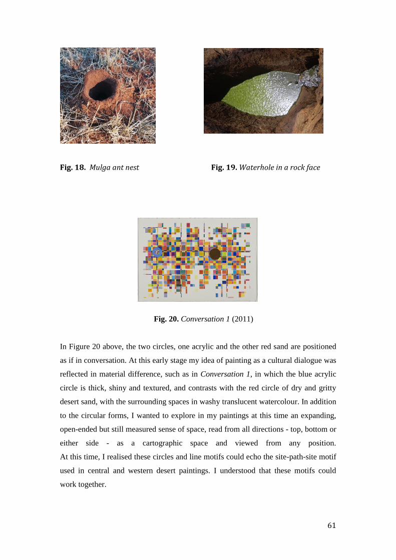
61
Fig. 18. Mulga ant nest Fig. 19. Waterhole in a rock face
Fig. 20. Conversation 1 (2011)
In Figure 20 above, the two circles, one acrylic and the other red sand are positioned
as if in conversation. At this early stage my idea of painting as a cultural dialogue was
reflected in material difference, such as in Conversation 1, in which the blue acrylic
circle is thick, shiny and textured, and contrasts with the red circle of dry and gritty
desert sand, with the surrounding spaces in washy translucent watercolour. In addition
to the circular forms, I wanted to explore in my paintings at this time an expanding,
open-ended but still measured sense of space, read from all directions - top, bottom or
either side - as a cartographic space and viewed from any position.
At this time, I realised these circles and line motifs could echo the site-path-site motif
used in central and western desert paintings. I understood that these motifs could
work together.

62
Fig. 21. Shorty Jangala Robertson, Ngapa Jukurrpa (Water Dreaming) (2005)
The Yuendumu artist Shorty Jangala Robertson (c.1928-2014) like Japanangka had
always used a grid-like form to situate his place in his country to tell his story. I met
him first in 2010 where he appeared with his dogs every day without fail, to paint for
about four to five hours at the Warlukurlangu Artists Centre in Yuendumu, doing so
with a sense of conviction I greatly admired. Jangala painted about his Ngapa (water)
Dreaming such as in Ngapa Jukurrpa below, a painting of Jila on his country at
Puyurru in the Northern Territory. The long lines in his paintings represent lightening
and water flowing, with groups of short parallel bars as rain and clouds.
Such structures convey a sense of the artist’s world order and a sense of belief in his
place within it. I watched Jangala making his paintings, quietly singing, imbuing his
forms with such significance and respect.
In Yuendumu in 2011 I bought an acrylic painting by the Warlpiri artist Lady
Nungurrayi Robinson, painted in 2006. It was this painting that first suggested to me
the possibilities of symbolic language and the use of signs in painting. I wondered
what this might mean for me as a non-Aboriginal person. I understood these motifs as

63
symbols in ancestral stories but as a non-Aboriginal person I was not privy to their
meanings, so they became signs. At this time, I began to see the marks, shapes and
lines in my own paintings as signs or pointers to meanings less apparent. In this way,
becoming familiar with Warlpiri and other Indigenous visual languages became like a
stepping-stone to a new way of imagining not tied to the representational and one also
more embedded in a sense of process.
The following painting shows the story of the Witi Jukurrpa or Ceremonial Poles at
Yanjirlypirri, west of Yuendumu where there is a low hill and water soakage. It is a
significant young men’s initiation site. Reflecting aspects of the original ceremonies
held there, the two circles in the painting represent stars or yanjirlypirri and sacred
sites such as Yanjirlypirri. During a ceremony, these are painted on the bodies of
participants and wooden carved stars are laid out in the sand. Snake vine or ngalyipi is
used to tie the poles to the legs of the dancing initiates. Lady Nungurrayi’s painting
below shows the traditional depiction of the witi poles.
Fig. 22. Lady Nungurrayi Robinson, Witi Jukurrpa – Yanjirlypirri (2006)
The depiction of the pole motif in Nungurrayi’s painting suggested to me another
traditional design being the site-path-site/circle-line-circle motif. It has been set in a
textured shimmering, vibrating linear orange, pink, yellow, and white ground. The
central black pole line has circles at either end. One circle is mainly white with a
black outline, the other mainly black with a small white centre. Parallel on either side
of the central black line are two wavy black lines, the snake vine. When I first viewed
this painting, I didn’t know the artist’s story and I imagined it as a horizontal image. It
seemed to represent a sense of balance and harmony in a metaphysical sense and still
holds this power for me five years later.
64
This painting has many meanings connecting it to its ancestral source but also
transcending it at the same time. The still but moving lines, and the quivering sense of
touch from the dotting of paint in the process of its making, make for the ‘being’ in
the trembling place of landscape. In my thinking, these sinuous shimmering lines
could have originated in contour lines, merging with the ground as if skeins on the
surface and together with the grid lines forming a metaphor for ideas of
interconnectedness.
The yanjirlypirri or stars in Nungurrayi’s story reminded me of the harmony of the
spheres and the ontological resonances received by Cees Nooteboom as he reflected
on the vast and starry night skies while visiting Central Australia. With the
ceremonial use of the carved and painted star forms, Nungurrayi’s stories may have
brought further into focus these shared and metaphysical correspondences with the
spheres and the Everywhen, so I’ll digress briefly and refer briefly to Yve-Alain Bois’
writings about an aspect of the work of Piet Mondrian whose work I will discuss
further in the following chapter.
In his discussion about the development of repetition in his early paintings, Yve-Alain
Bois refers to Mondrian’s comments about a painting of a ‘starry sky’, which relate to
Nooteboom and Nungurrayi’s night skies. He questions what motivated Mondrian to
pursue an idea, and whether it came from some starting point in nature. Coming from
a Theosophical position, it was the relations between things and knowing what it was
that linked things together and to the world as a whole that Mondrian considered
important, but to appreciate this it was necessary to be able to visualise clearly these
relations. When referring to this painting of the night sky, it was not as Nooteboom or
Nungurrayi perceived it. Rather, Mondrian’s vision of the starry sky was as a totality
of relatedness with no particular point of view. As Mondrian stated, it was without a
given in nature, which Bois then described as an ‘afocal’ field of repetition or
multiplicity, with the stars being merely points accentuating relationships not forms.
48
48 Piet Mondrian et al., eds. Piet Mondrian, 1872-1944, 1st ed (Boston: Bulfinch Press, 1995),
318.
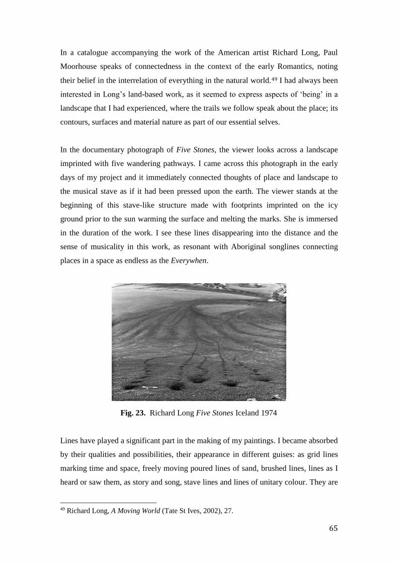
65
In a catalogue accompanying the work of the American artist Richard Long, Paul
Moorhouse speaks of connectedness in the context of the early Romantics, noting
their belief in the interrelation of everything in the natural world.49 I had always been
interested in Long’s land-based work, as it seemed to express aspects of ‘being’ in a
landscape that I had experienced, where the trails we follow speak about the place; its
contours, surfaces and material nature as part of our essential selves.
In the documentary photograph of Five Stones, the viewer looks across a landscape
imprinted with five wandering pathways. I came across this photograph in the early
days of my project and it immediately connected thoughts of place and landscape to
the musical stave as if it had been pressed upon the earth. The viewer stands at the
beginning of this stave-like structure made with footprints imprinted on the icy
ground prior to the sun warming the surface and melting the marks. She is immersed
in the duration of the work. I see these lines disappearing into the distance and the
sense of musicality in this work, as resonant with Aboriginal songlines connecting
places in a space as endless as the Everywhen.
Fig. 23. Richard Long Five Stones Iceland 1974
Lines have played a significant part in the making of my paintings. I became absorbed
by their qualities and possibilities, their appearance in different guises: as grid lines
marking time and space, freely moving poured lines of sand, brushed lines, lines as I
heard or saw them, as story and song, stave lines and lines of unitary colour. They are
49 Richard Long, A Moving World (Tate St Ives, 2002), 27.
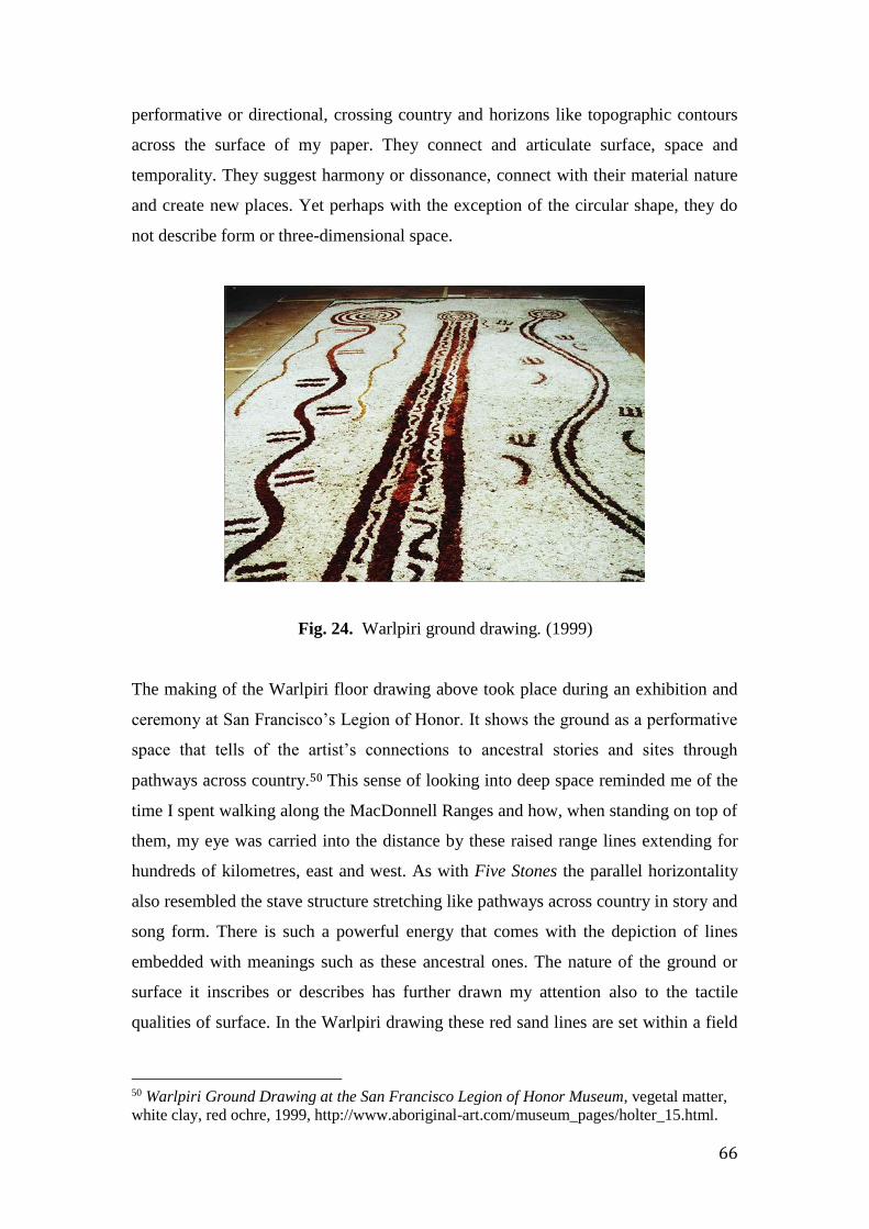
66
performative or directional, crossing country and horizons like topographic contours
across the surface of my paper. They connect and articulate surface, space and
temporality. They suggest harmony or dissonance, connect with their material nature
and create new places. Yet perhaps with the exception of the circular shape, they do
not describe form or three-dimensional space.
Fig. 24. Warlpiri ground drawing. (1999)
The making of the Warlpiri floor drawing above took place during an exhibition and
ceremony at San Francisco’s Legion of Honor. It shows the ground as a performative
space that tells of the artist’s connections to ancestral stories and sites through
pathways across country.50 This sense of looking into deep space reminded me of the
time I spent walking along the MacDonnell Ranges and how, when standing on top of
them, my eye was carried into the distance by these raised range lines extending for
hundreds of kilometres, east and west. As with Five Stones the parallel horizontality
also resembled the stave structure stretching like pathways across country in story and
song form. There is such a powerful energy that comes with the depiction of lines
embedded with meanings such as these ancestral ones. The nature of the ground or
surface it inscribes or describes has further drawn my attention also to the tactile
qualities of surface. In the Warlpiri drawing these red sand lines are set within a field
50 Warlpiri Ground Drawing at the San Francisco Legion of Honor Museum, vegetal matter,
white clay, red ochre, 1999, http://www.aboriginal-art.com/museum_pages/holter_15.html.

67
of soft white plant down collected from the country the drawing represents. We know
where we are.
Catherine de Zegher suggests that current conceptions of drawing stress “reciprocity
and empowerment.” 51 Her comments could well be applied to this floor drawing, a
very contemporary work that nevertheless derives from long traditions. From the
interdependency of all art forms and their connection to different disciplines, De
Zegher indicates that line can now “challenge and change the understanding of the
ground itself.” This comment might also be applied to the other examples above, with
the lines as stave lines on manuscript paper, on the ground or on other surfaces,
perhaps even carrying the songs of the traditional owners of the land. Whether applied
to the ground or paintings, or carried into ceremonial forms, they suggest a powerful
musical life.
Yves Klein said that “line can only suggest while colour is”, colour inhabits space but
line is ‘breadthless space’. 52 Yet perhaps he was unaware of the power of suggestion,
of how line can play a part in the life of a work of art. Klein saw colour as infinite,
line merely travelling through space, whereas colour inhabits space. I disagree with
his statement. In Aboriginal ground drawings such as the one above, line inhabits
space through its embedded meanings and through its physical qualities and
dimensions. Line can translate, be perceived as sound in space - as droning sounds or
single tones - and have such immersive qualities. At that time when I was walking
along the top of the MacDonnell Ranges in Central Australia, it seemed as if I could
‘hear’ the sight of these ranges as a monotone and an enduring linear form in space.
This equation of sight with sound transferred to manuscript sheets, to paper and
board. The lines of my grids suggest this projection into space as I experienced it, as
an extension beyond the edges and as Cornelia Butler has described, “a kind of
reaching out into the world beyond representation”. 53 This world beyond might also
be that of the Everywhen.
51 Cornelia H. Butler, On Line: Drawing through the Twentieth Century (New York : London:
Museum of Modern Art ; Thames & Hudson [distributor], 2010), 108. 52 Yves Klein in Colour after Klein : Rethinking Colour in Modern and Contemporary Art,
Jane Alison, Nuit Banai, Barbican Gallery (Black Dog Publishing, 2005). 27. 53 Butler, On Line, 184.
68
Line as free flowing or line as ruled on the plane, defining and defined by its two-
dimensional space: the world beyond and the world within the plane, one
metaphysical, and the other rational. I have found myself participating through line in
a conversation between two different modes: the first is the graphic and rational:
intersecting grid lines reinforcing the sense of the flat plane and creating open units
either to be filled with colour or left vacant. Through its dissonance and random
nature, colour as well as freely flowing lines of desert sand break the predictability of
this gridded surface.
The second mode is of sensation and experience. The combination of both ruled and
flowing lines offers a sense of interweaving: of the phenomenological with the
abstract, and the consideration that the phenomenological can also include cultural
aspects. An example of this came to mind in my observation of the paintings of Piet
Mondrian, as will be discussed in further detail in Chapter Three. I have long been
interested in his gridded compositions, the horizontal and vertical spatial dynamics of
lines and spaces of colour, like the idea of counterpoint in music. More recently I
became interested in the punctuating nature of the abrupt transitions in colour from
one unit to the next, particularly in his later works. This effect reminded me of the
repetition and rhythms I was drawn to at the Women’s Week and at the music
performances in Melbourne that followed it. The single units of colour such as in
Victory Boogie Woogie (1944) assume a life of their own, with the brush marks
reflecting the touch of the hand, and in turn connect to the pulse of the rhythm and the
sound of the pulse and, for me, to songs and ceremonies.
In agreement with Yves Klein, Jane Alison says that colour has a sense of
immanence, a quality of Being. 54 As an inhered presence, colour is about awareness
through the senses, a “chromatic experience” capable of provoking all senses and so
creating a freshness of vision. 55 A prismatic sense of colour can represent the sense I
have of ‘being in’ these places I have been. It’s the attendant feeling of exhilaration
and surprise experienced when seeing paintings for the first time at Yuendumu within
the context of country. I would like this freshness and immediacy to be transferred to
my paintings.
54 Jane Alison, Nuit Banai, and Barbican Art Gallery, Colour after Klein, 32. 55 Ibid., 8.

69
ii. From fields and lines: painting as manuscript
The following manuscript paintings below were made just prior to my fieldwork
experience, connecting place and sound or music through material affect. The threads
were already there, and the fieldwork experience provided the necessary moment for
them to come together via the singing of the vocal melodic descent form. These
paintings below, from this earlier group, incorporated the digitally printed stave
within the composition.
Fig. 25. Manuscript Painting no. 1 (2011) Fig. 26. Manuscript Painting no. 2
(2011)
The works are two of five watercolour and acrylic paintings on rough 600gram
Arches paper. The stave lines were digitally printed before drawing up the grid and
commencing painting. I also printed an additional larger sheet, one and a half metres
in length, smooth and neither cold-pressed nor heavy, but I later discarded it as its
texture and weight did not have the right feel for the sense of surface required.
I decided to digitally print the stave lines to give a formal sense to the musical
reference. I also felt the units of colour to have a life indexical to sound, and when in
a horizontal linear form suggesting not only conventional harmonies and rhythms but
also reference the Indigenous song cycles traditionally performed across country.

70
Line is fundamental to these works, more oriented towards the construction of a
schema rather than towards form. Working on the flat surface, I have used multiple
forms; pencil-ruled grid lines, lines of colour units, digitally printed stave lines; and if
held vertically, free-flowing straight or curving, viscous or thin, gritty acrylic or sand
lines suggestive of the land, its enduring horizon and country. In addition, the process
of drawing or making different forms of line suggested not just surface and place but
also the sounds of these spaces, as something reinforced by the rhythmic filling-in
action of painting and, through its qualities, the interconnections between experience,
place, mind and memory.
In 2012 I decided to change the surface I was working on, and so moved to plywood
with a clearly grained pattern suggesting topographic aspects. Four untitled paintings
of 2012 (two of which are below) were painted on five-millimetre plywood measuring
one meter by seventy centimetres. Like the paper works, they were gridded with
pencil. I then poured lines of red sand one by one onto the surfaces, allowing them to
run while holding the boards vertically. I was interested in making contrasting linear
elements with the left-right-left verticals as rhythmic beats or as spaces of sound, with
colour as musical patterns of graduated tones mixed with random colour units:
ambling horizontal sand lines like free gestures across a measured surface, contrasting
in texture to the warm white units on the grainy surface behind. The units and lines of
colour appear detached from the surface as if suspended in space, like Morton
Feldman’s notes in his chromatic field.

71
Fig. 27. Untitled (2012) Fig. 28. Untitled (2012)
With their hard timber surface, these paintings seemed to emphasise the flatness of
the grid across it. In combination with acrylic paint I found this surface hard and
unresponsive, so moved back to the more accepting, absorbent and rough surface of
paper and the translucency of watercolour.
It seemed a natural progression to move on from these early ‘manuscript’ pieces of
units of colour and ruled or freely moving lines, to the fascinating world of graphic
and pictorial notation used by composers in musical compositions. This form of
notation is defined as visual symbols not part of the conventional music notation. It
has become a way to extend compositional and performance techniques, making for
both improvisatory and collaborative practices in the production of performance.
These notations called to mind the signs and symbols of Central Desert iconography.
Responding to the theories of Denise Schmandt-Besserat about the common origins of
arithmetic, language and images, James Elkins writes of the connections between
picturing, writing, number and notation, saying that they have common origins; that
western image-making began “in a welter of artefacts that were sometimes
72
inextricably picture, texts, and notations.”56 I found this an interesting proposition
which seemed to support the sense of affinity I felt between the various threads of my
research: my paintings, the musical graphic notation and performance, and those
indexical paintings of the Central Desert artists. I have come to sense deeper and
fundamental relationships that connect all these languages. The connections began
with the act of marking, with the putting and placing of paint, and experiencing the
immersive role of gesture, of making, and were further sparked by an event - that is,
hearing the vocal melodic descent.
I have seen these relationships existing between the elements of surface and colour,
linear structures, pictograms, contours, shapes, textures, lines and marks and how, in
both painting and music, they can be open to performative interpretations. In keeping
with Elkins observations, in my work the placement of units across the surface, the
randomness of multiple chance colours, the graphic notational effect and the painted
marks and wandering lines generates a ‘welter’ of elements. I was interested in
extending these possibilities, as reflections of inhered qualities and evocative of aural
experiences. So, could my paintings be open to interpretation or realisation as musical
scores and with this in mind, and what implications would this have for the ‘making’
of a painting? I see my works as sites for action. This was originally suggested by the
Central Desert site-path-site motif and indicated in later paintings, such as in Of Time
and Place painted in 2014. I then decided to look at forms of notation used by
different composers.
I admire both the music and graphic notation of many composers particularly of
Gyorgy Ligeti (1923-2006) so have included the following graphic in Figure 29
showing two sections of the visual score for his Artikulation (1958) created by Rainer
Wehinger. 57 Rather like mapping, Wehinger has scanned this notation, matching
56 James Elkins, “The Common Origin of Pictures, Writing and Notation,” in On Pictures and
Words That Fail Them (Academic, 2011), 348,
http://www.academia.edu/3125416/On_Pictures_and_the_Words_That_Fail_Them_chapter_
5_The_Common_Origin_of_Pictures_Writing_and_Notation_. 57 “Graphic Music Scores - in Pictures,” The Guardian, October 14, 2013,
http://www.theguardian.com/music/gallery/2013/oct/04/graphic-music-scores-in-
pictures#/?picture=418979755&index=0.

73
it with the music and it is possible to view the animation on his blog site. 58 In
scores such as this, the placement of signs for the different sounds suggests the
signs for sites depicted in Central Desert paintings, such as the site-path-site
motif. Both these musical scores and the symbols in these paintings seem to
share common sonic and performative elements. Both are manuscripts with sites
for actions.
Fig. 29. Graphic score For Ligeti’s Artikulation by Rainer Wehinger (2010)
The Australian composer David Young refers to the elements in his own graphic
notation as trigger points, such as in the Wehinger score above, which the performer
then interprets. In the Peter Humble recording called David Young/Yung? Young
discusses his approaches to composition and shows examples of his graphic works
such as Thousands of Bundled Straw, his Val Camonica graphic score and others. 59
His compositional thinking recalls Elkins article above. Young prefers the freedom of
more nuanced readings of graphic scores, such as through watercolour paintings as
opposed to conventional notation, having been inspired by sources such as rock
58 Rainer Wehinger, “Ligeti Artikulation,” Musicmusic, November 13, 2010,
http://www.musicmusic.nl/wordpress/?tag=rainer-wehinger. 59 Peter Humble, David Young (Yung?): A Portrait of Melbourne Composer/artistic Director
David Young as He Embarks on a Project Uncovering the Mysteries of His Paternal
Ancestry, Artist Profile #2, https://vimeo.com/39470453. 2012
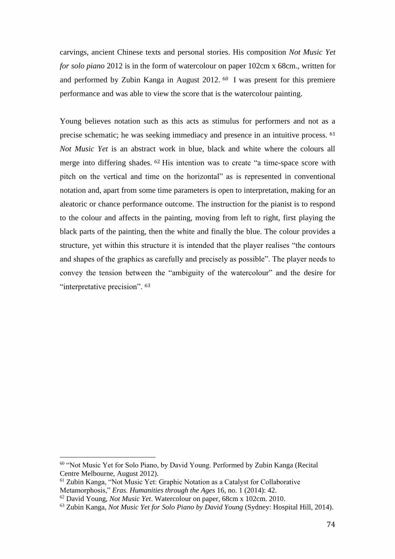
74
carvings, ancient Chinese texts and personal stories. His composition Not Music Yet
for solo piano 2012 is in the form of watercolour on paper 102cm x 68cm., written for
and performed by Zubin Kanga in August 2012. 60 I was present for this premiere
performance and was able to view the score that is the watercolour painting.
Young believes notation such as this acts as stimulus for performers and not as a
precise schematic; he was seeking immediacy and presence in an intuitive process. 61
Not Music Yet is an abstract work in blue, black and white where the colours all
merge into differing shades. 62 His intention was to create “a time-space score with
pitch on the vertical and time on the horizontal” as is represented in conventional
notation and, apart from some time parameters is open to interpretation, making for an
aleatoric or chance performance outcome. The instruction for the pianist is to respond
to the colour and affects in the painting, moving from left to right, first playing the
black parts of the painting, then the white and finally the blue. The colour provides a
structure, yet within this structure it is intended that the player realises “the contours
and shapes of the graphics as carefully and precisely as possible”. The player needs to
convey the tension between the “ambiguity of the watercolour” and the desire for
“interpretative precision”. 63
60 “Not Music Yet for Solo Piano, by David Young. Performed by Zubin Kanga (Recital
Centre Melbourne, August 2012). 61 Zubin Kanga, “Not Music Yet: Graphic Notation as a Catalyst for Collaborative
Metamorphosis,” Eras. Humanities through the Ages 16, no. 1 (2014): 42. 62 David Young, Not Music Yet. Watercolour on paper, 68cm x 102cm. 2010. 63 Zubin Kanga, Not Music Yet for Solo Piano by David Young (Sydney: Hospital Hill, 2014).
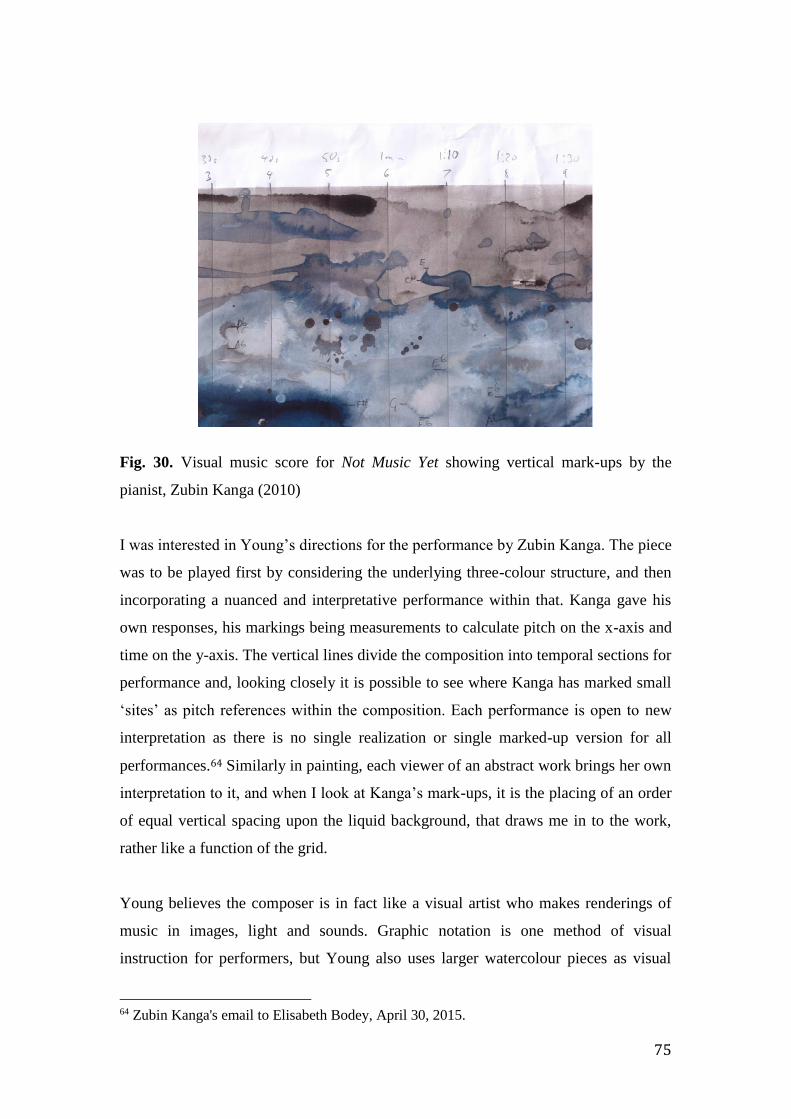
75
Fig. 30. Visual music score for Not Music Yet showing vertical mark-ups by the
pianist, Zubin Kanga (2010)
I was interested in Young’s directions for the performance by Zubin Kanga. The piece
was to be played first by considering the underlying three-colour structure, and then
incorporating a nuanced and interpretative performance within that. Kanga gave his
own responses, his markings being measurements to calculate pitch on the x-axis and
time on the y-axis. The vertical lines divide the composition into temporal sections for
performance and, looking closely it is possible to see where Kanga has marked small
‘sites’ as pitch references within the composition. Each performance is open to new
interpretation as there is no single realization or single marked-up version for all
performances.64 Similarly in painting, each viewer of an abstract work brings her own
interpretation to it, and when I look at Kanga’s mark-ups, it is the placing of an order
of equal vertical spacing upon the liquid background, that draws me in to the work,
rather like a function of the grid.
Young believes the composer is in fact like a visual artist who makes renderings of
music in images, light and sounds. Graphic notation is one method of visual
instruction for performers, but Young also uses larger watercolour pieces as visual
64 Zubin Kanga's email to Elisabeth Bodey, April 30, 2015.

76
music. In Minotaur The Labyrinth in 18 Cantos he takes this further and larger
watercolour pieces became part of the set for this performance. 65
Painting units, hearing dots:
Fig. 31. Contrasting ‘units’ from a Gerhardt Richter and Central Desert painting.
Above is one of many small collages I have made putting different textures together,
in this case the dotted and performative marks of an Aboriginal painting with Gerhard
Richter’s geometric units. This alignment seemed important at the time. Richter’s grid
on the left, divided by units of colour, is an independent place. The colours used came
from a computer-generated pattern made with the multiplier of four and painted flat,
side by side, with no relationship to each other or anything else in the painting but to
the computer program he was using. Richter’s surface, the picture plane, is unlike that
of the neighbouring dotted surface. He called his works paintings of chance, finding
their “artificial naturalism” fascinating. The overall effect in these large paintings is
architectural due to the scale, with their measured spatiality and repeating units of
arbitrarily placed colour. Richter believed in the value of arbitrary practice, seeing
this as an issue central to both abstract and representational painting. With
arbitrariness “anything is possible”. 66 The divided, gridded space, the uniformity of
line and use of colour unrelated to form or light produced a completely independent
space of opportunity.
65 David Young, Festival TV - The Minotaur Trilogy, 2012,
https://www.youtube.com/watch?v=V6QIHLgtGOQ. 66 Richter, The Daily Practice of Painting, 87.

77
Figure 31 is an example of such oppositions. On the right the dots, or circles of
colour, have been painted side by side in a slow and meditative action, creating layers
as they have been placed on top of each other and forming parallel lines of different
colour. The interactions played out create an active and patterned surface that reflects,
indeed is indexical to, the hand, or hands, that painted it. There is a strong sense of the
individual making these marks.
This small collage represented a dilemma for me. The ordered grid with no trace of
the artists’ hand on the left side provides an attractive proposition but then so does the
strong sense of the artists touch - the phenomenal self - on the right. I wondered
whether the loose, washy translucent colour infill in my grid was just a compromise,
yet these different materialities became integral to my conceptual and abstract
language and I believed this was something to exploit. The ‘minimal touch’ of the
artificially constructed could sit together quite happily with the material sense of the
artists’ hand. The differences might even be encouraged.
After completing this group of five manuscript paintings I decided to introduce a
more complex gridding system to lend a potentially greater sense of animation to the
work. Each square unit was then divided sequentially into quarters, halves, then three
quarters. This process was repeated across both the vertical and horizontal lengths of
the paper, and marked the beginning of a group of three Descending paintings in
2011.
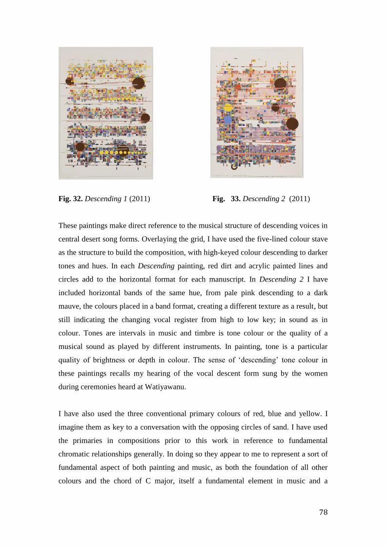
78
Fig. 32. Descending 1 (2011) Fig. 33. Descending 2 (2011)
These paintings make direct reference to the musical structure of descending voices in
central desert song forms. Overlaying the grid, I have used the five-lined colour stave
as the structure to build the composition, with high-keyed colour descending to darker
tones and hues. In each Descending painting, red dirt and acrylic painted lines and
circles add to the horizontal format for each manuscript. In Descending 2 I have
included horizontal bands of the same hue, from pale pink descending to a dark
mauve, the colours placed in a band format, creating a different texture as a result, but
still indicating the changing vocal register from high to low key; in sound as in
colour. Tones are intervals in music and timbre is tone colour or the quality of a
musical sound as played by different instruments. In painting, tone is a particular
quality of brightness or depth in colour. The sense of ‘descending’ tone colour in
these paintings recalls my hearing of the vocal descent form sung by the women
during ceremonies heard at Watiyawanu.
I have also used the three conventional primary colours of red, blue and yellow. I
imagine them as key to a conversation with the opposing circles of sand. I have used
the primaries in compositions prior to this work in reference to fundamental
chromatic relationships generally. In doing so they appear to me to represent a sort of
fundamental aspect of both painting and music, as both the foundation of all other
colours and the chord of C major, itself a fundamental element in music and a
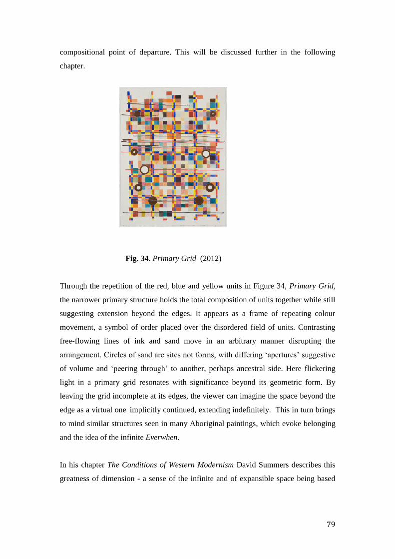
79
compositional point of departure. This will be discussed further in the following
chapter.
Fig. 34. Primary Grid (2012)
Through the repetition of the red, blue and yellow units in Figure 34, Primary Grid,
the narrower primary structure holds the total composition of units together while still
suggesting extension beyond the edges. It appears as a frame of repeating colour
movement, a symbol of order placed over the disordered field of units. Contrasting
free-flowing lines of ink and sand move in an arbitrary manner disrupting the
arrangement. Circles of sand are sites not forms, with differing ‘apertures’ suggestive
of volume and ‘peering through’ to another, perhaps ancestral side. Here flickering
light in a primary grid resonates with significance beyond its geometric form. By
leaving the grid incomplete at its edges, the viewer can imagine the space beyond the
edge as a virtual one implicitly continued, extending indefinitely. This in turn brings
to mind similar structures seen in many Aboriginal paintings, which evoke belonging
and the idea of the infinite Everwhen.
In his chapter The Conditions of Western Modernism David Summers describes this
greatness of dimension - a sense of the infinite and of expansible space being based

80
on the notion of the sublime that he equates with ideas of reason. 67 Writing about the
paintings of Casper David Friedrich, Summers refers to the viewers’ space and that of
the landscapes depicted, suggesting that all landscapes are viewer’s spaces and that
virtual space lying beyond the edges of the frame is implicitly continued into infinity
by the sight lines of perspective. Though I had conceived of the space of my gridded
surfaces and their extension beyond the edges as cartographic as this was its origin, I
also connected it conceptually to the human ‘greatness of dimension’ and to the
Romantic sublime as it was now informing the space in my paintings.
Summers’ belief is that the sublime is “gathered from the world and from nature, is
the transcendence of nature…a resemblance of the soul and God.” 68
An appreciation of the sublime encompassed not just the longing for these conditions
but also the weight of the “pervasive religious awe and dread” of Romanticism, of
artists such as Friedrich who represented the notion of the sublime that was once so
relevant for me. However as a result of my recent experiences I now believe this
‘awe’ has been replaced by an appreciation of both the metaphysical and the ancestral
Everywhen, through the wonder of nature and the phenomenal world that is now
signified in an expansible gridded structure. The ‘phenomenal’ became for me the
connector between self, culture and its forms.
I believe the paintings of Tim Johnson, as perceptual experiences of the metaphysical
world, express something of this. These experiences have been explored through
colour, the repetition of dotting and the placement of small signs like sites or
happenings as focal points across his compositions. His paintings are like expanding
veils of cultured spaces, vast places for stories that seem to derive from a similar
sense of wonder - not with the weight of Romanticism but with the freshness of
different cultural narratives conveyed through his processes of painting. Having
embraced the metaphysics of different cultures such as Aboriginal, Buddhist, Tibetan
and Japanese, he has placed them against the background of his own experience: as
67 David Summers, Real Spaces: World Art History and the Rise of Western Modernism
(London: Phaidon, 2003), 586. 68 Ibid. 588.

81
Roger Benjamin has described as “an optimistic dream”. 69 I imagine them as part of
that ‘greatness of dimension’ we exist in.
Fig. 35. Tim Johnson, Three Worlds (1987)
Johnson began collaborations with the Papunya Tula artists in 1980, combining
lyrical, acrylic opalescent colour and dotting in combination with the use of small
images: figures, objects or abstract shapes and marks. With his placement of these
fragments, or as Benjamin calls them ‘ciphers of experience’ such as ‘white fella’
marks, figures, Aboriginal signs, flowers, temples, Buddhist symbols etcetera, he
created metaphysical spaces in his paintings. In Figure 19, the motifs represented are
predominantly Aboriginal figures and signs such as the Asboriginal flag in a field of
randomly placed dots on a red ground. His iconography then expanded to include
Chinese, Tibetan, Japanese and American Indian art. A more recent example of his
work is Lotus Born (2006) held in the Art Gallery of New South Wales Collection.
Its metaphysical and floating quality has been achieved by covering the coloured
ground with dotted marks in tightly concentric circles, arranged in and around the
small images and signs. This work consists of nine panels, each 198 x 91.5 cm. Its
scale accentuates the painted space as a metaphysical and abstract place and is
69 Roger Benjamin, “Collector’s Dossier: Tim Johnson,” Art Collector, no. 52 (June 2010).
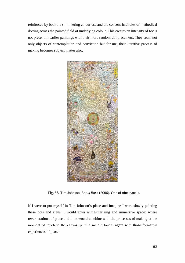
82
reinforced by both the shimmering colour use and the concentric circles of methodical
dotting across the painted field of underlying colour. This creates an intensity of focus
not present in earlier paintings with their more random dot placement. They seem not
only objects of contemplation and conviction but for me, their iterative process of
making becomes subject matter also.
Fig. 36. Tim Johnson, Lotus Born (2006). One of nine panels.
If I were to put myself in Tim Johnson’s place and imagine I were slowly painting
these dots and signs, I would enter a mesmerizing and immersive space: where
reverberations of place and time would combine with the processes of making at the
moment of touch to the canvas, putting me ‘in touch’ again with those formative
experiences of place.
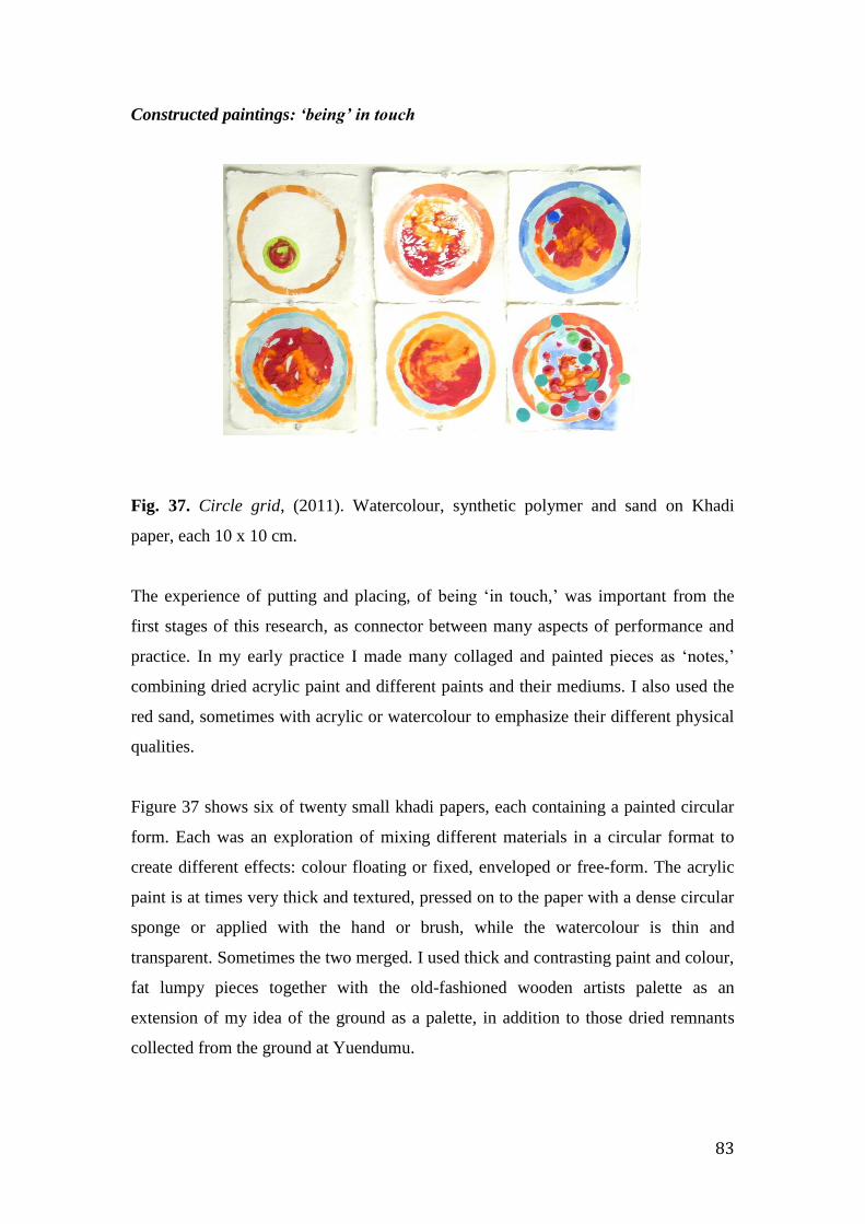
83
Constructed paintings: ‘being’ in touch
Fig. 37. Circle grid, (2011). Watercolour, synthetic polymer and sand on Khadi
paper, each 10 x 10 cm.
The experience of putting and placing, of being ‘in touch,’ was important from the
first stages of this research, as connector between many aspects of performance and
practice. In my early practice I made many collaged and painted pieces as ‘notes,’
combining dried acrylic paint and different paints and their mediums. I also used the
red sand, sometimes with acrylic or watercolour to emphasize their different physical
qualities.
Figure 37 shows six of twenty small khadi papers, each containing a painted circular
form. Each was an exploration of mixing different materials in a circular format to
create different effects: colour floating or fixed, enveloped or free-form. The acrylic
paint is at times very thick and textured, pressed on to the paper with a dense circular
sponge or applied with the hand or brush, while the watercolour is thin and
transparent. Sometimes the two merged. I used thick and contrasting paint and colour,
fat lumpy pieces together with the old-fashioned wooden artists palette as an
extension of my idea of the ground as a palette, in addition to those dried remnants
collected from the ground at Yuendumu.
84
At this time I began to construct a series of palette paintings, not intended as the
conventional palette surface for the mixing of colours. They were made with a variety
of materials such as acrylic paint, red sand, peg-board and circular or oval wooden
stretchers. Through their material nature, they became in my mind conversation
pieces between Western and Aboriginal artists.
Through the mixing and placing of material and colour, I began to sense that these
actions incorporating the element of touch, suggested the play of rhythm and
movement. Sound was suggested through the accompanying memories of voice and
song, heard during the Yuendumu artist’s actions of painting. I became aware of the
long association between colour and sound when reading John Gage’s book Colour
and Culture. One of his many references was to a pamphlet written by J. L. Hoffman
written in 1786, suggesting the mixing of colours on the palette could be likened to
the tuning of an orchestra and the colours could be seen as equivalents of individual
instruments. 70
Using desert sand, acrylic paint scraps, sponge, gold paint, peg-board and wooden
round and oval stretchers, palettes and perspex pieces cut to the shapes of enlarged
paint remnants, I made objects that could, through their materiality, reflect cultural,
topographic and personal aspects of place. Figure 38 below includes some of these
found remnants. The flat wooden palette symbolizes conventional western painting
practice. The red-sand-on-perspex shape in figure 39 is the same shape as one of the
found remnants from Yuendumu, traced, enlarged and laser-cut, then placed over a
flat wooden palette.
70 Quoted by John Gage in Colour and Culture: Practice and Meaning from Antiquity to
Abstraction (London: Thames and Hudson, 1993), 236.

85
Fig. 38. Small Blue Palette (2012) Fig. 39. Red Palette (2011)
This shape is as if it were the ground, attached to a plywood palette and implied a
dialogue through different materials. Placing together the gritty, deep red irregular
shape and the smoothly machined oval wooden palette also suggested a conversation
between cultural meanings and practices.
Fig. 40. Yves Klein palette (2011)
In all my palettes I drew not only from the materiality of the Yuendumu artists but
also from that of western artists such as Yves Klein. In my Yves Klein palette I have
referenced his many Blue Sponge Relief paintings, first exhibited in the1950’s. I
wished for my blue sponge palette to convey the same ‘impregnated’ sense Klein had
wished for, to transfer to and inhabit the space of the viewer. I wished the same for
my gritty red sand and acrylic palettes.
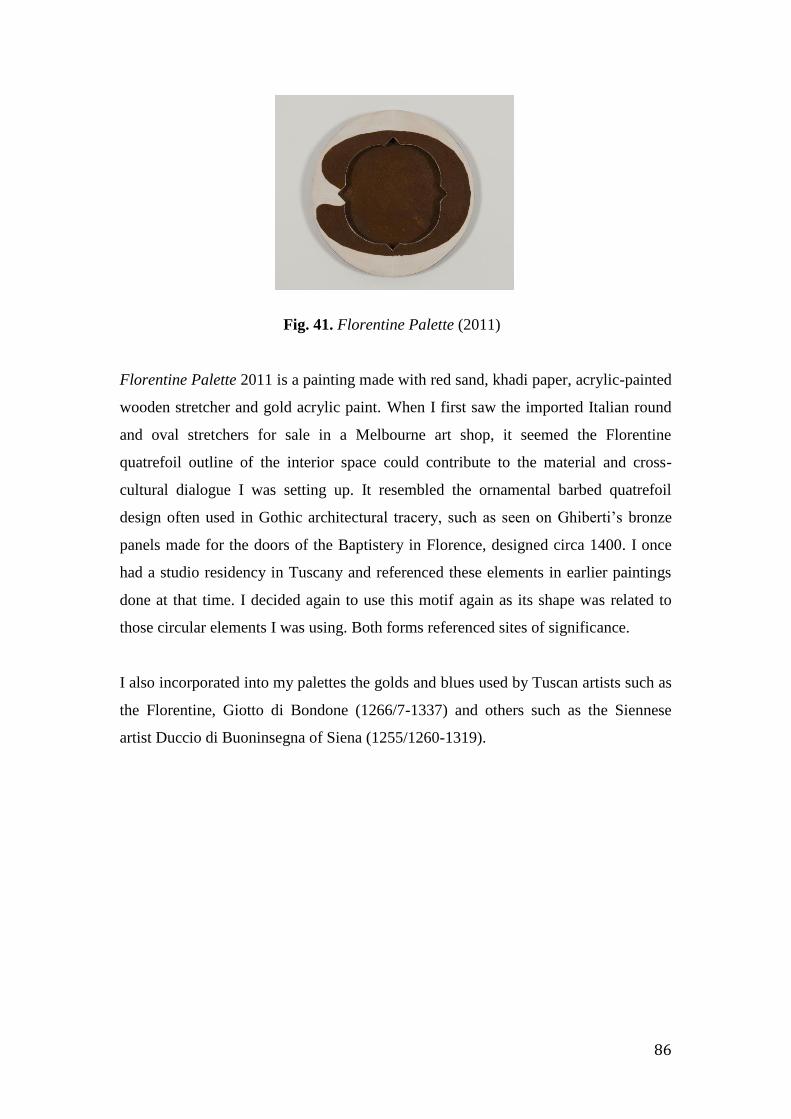
86
Fig. 41. Florentine Palette (2011)
Florentine Palette 2011 is a painting made with red sand, khadi paper, acrylic-painted
wooden stretcher and gold acrylic paint. When I first saw the imported Italian round
and oval stretchers for sale in a Melbourne art shop, it seemed the Florentine
quatrefoil outline of the interior space could contribute to the material and cross-
cultural dialogue I was setting up. It resembled the ornamental barbed quatrefoil
design often used in Gothic architectural tracery, such as seen on Ghiberti’s bronze
panels made for the doors of the Baptistery in Florence, designed circa 1400. I once
had a studio residency in Tuscany and referenced these elements in earlier paintings
done at that time. I decided again to use this motif again as its shape was related to
those circular elements I was using. Both forms referenced sites of significance.
I also incorporated into my palettes the golds and blues used by Tuscan artists such as
the Florentine, Giotto di Bondone (1266/7-1337) and others such as the Siennese
artist Duccio di Buoninsegna of Siena (1255/1260-1319).
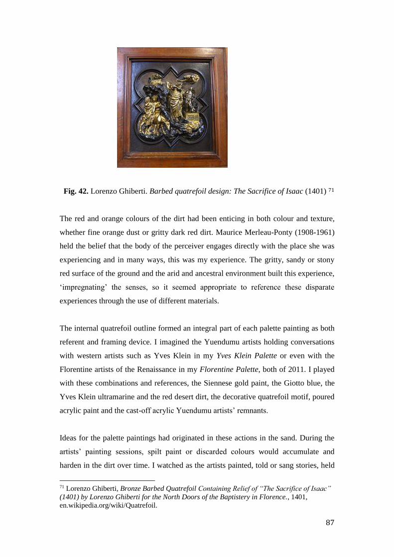
87
Fig. 42. Lorenzo Ghiberti. Barbed quatrefoil design: The Sacrifice of Isaac (1401) 71
The red and orange colours of the dirt had been enticing in both colour and texture,
whether fine orange dust or gritty dark red dirt. Maurice Merleau-Ponty (1908-1961)
held the belief that the body of the perceiver engages directly with the place she was
experiencing and in many ways, this was my experience. The gritty, sandy or stony
red surface of the ground and the arid and ancestral environment built this experience,
‘impregnating’ the senses, so it seemed appropriate to reference these disparate
experiences through the use of different materials.
The internal quatrefoil outline formed an integral part of each palette painting as both
referent and framing device. I imagined the Yuendumu artists holding conversations
with western artists such as Yves Klein in my Yves Klein Palette or even with the
Florentine artists of the Renaissance in my Florentine Palette, both of 2011. I played
with these combinations and references, the Siennese gold paint, the Giotto blue, the
Yves Klein ultramarine and the red desert dirt, the decorative quatrefoil motif, poured
acrylic paint and the cast-off acrylic Yuendumu artists’ remnants.
Ideas for the palette paintings had originated in these actions in the sand. During the
artists’ painting sessions, spilt paint or discarded colours would accumulate and
harden in the dirt over time. I watched as the artists painted, told or sang stories, held
71 Lorenzo Ghiberti, Bronze Barbed Quatrefoil Containing Relief of “The Sacrifice of Isaac”
(1401) by Lorenzo Ghiberti for the North Doors of the Baptistery in Florence., 1401,
en.wikipedia.org/wiki/Quatrefoil.
88
conversations, drew designs in the dirt and quickly smoothed them out and when
finished, were replaced by the next drawing. Sometimes the artists’ would dance
making sweeping movements with their feet as during ceremonial actions. The
ground is the artists’ painting surface, the place for collecting and mixing materials
and knowledge, a surface for actions, a palette for materials with which
communication is made, a site for talks and engagement felt in the actions of making.
So did these constructed paintings come to represent my cultural exchange.
The palette paintings called on past experiences and traditions and in their final form
provided the opportunity to experience them again in a new and concrete format as a
new conversation. It was a physical engagement with place: manipulating materials,
exploring the relationship between touch, sound, sight, hearing and memory; of
echoing sensations and the rhythms of touch and sound experienced while watching
the actions of painters. From early on, resonances, experiences and the performative
connections materialises in the ‘putting and placing’ of units of colour and the
pouring and painting of line. The surface of a work became a place to relive
experience.
This material response as part of the phenomenal was the connector between the
Central Desert artists’ knowledge as painting, my own experiences and that of my
painting. Building on this, chapter three looks at the concept of relatedness as a space
of ideas and how it has contributed to the notion of cultural abstraction.
89
CHAPTER THREE
Space and the Idea of Relatedness
Fig. 43. Map on a wall at Yuendumu situating its relation to outlying communities.
Developing the aesthetic of relatedness
This chapter continues the exploration of elements constituting place in my paintings,
particularly as informed by the early palette works discussed in the previous chapter,
which had served to extend my thinking about what place means. This chapter will
explore how the notion of relatedness has informed the consideration of space in my
painting and how the grid has become the field for correspondences.
The awareness of place and the connections experienced by Cees Nooteboom had
highlighted the significance of the notions of relatedness and correspondences
perceived through experience.
Making paintings is about making sense of the universe, living in a world of multiple
meanings and devising a language of signs through cultural interactions to find
coherence and connectivity. While at the Women’s Week I experienced the
complexity behind Indigenous visual language whereby meaning comes from the
inter-relatedness to all aspects of life and identity and is learnt and reinforced through
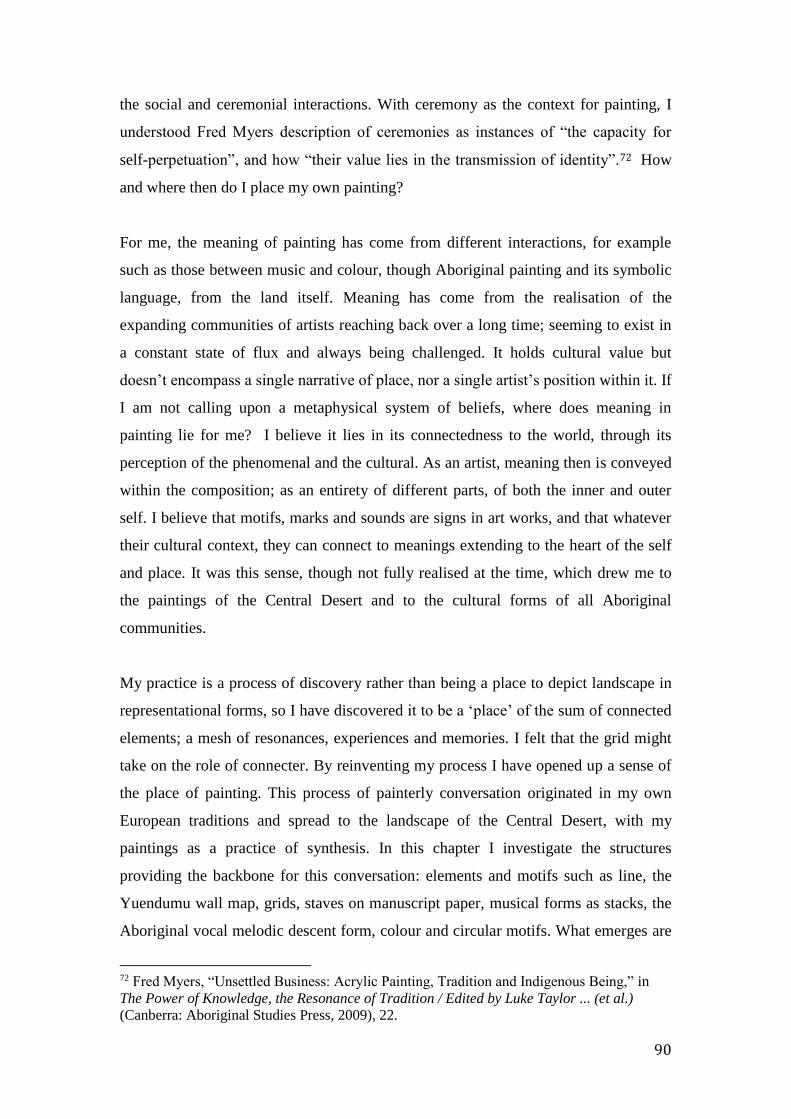
90
the social and ceremonial interactions. With ceremony as the context for painting, I
understood Fred Myers description of ceremonies as instances of “the capacity for
self-perpetuation”, and how “their value lies in the transmission of identity”.72 How
and where then do I place my own painting?
For me, the meaning of painting has come from different interactions, for example
such as those between music and colour, though Aboriginal painting and its symbolic
language, from the land itself. Meaning has come from the realisation of the
expanding communities of artists reaching back over a long time; seeming to exist in
a constant state of flux and always being challenged. It holds cultural value but
doesn’t encompass a single narrative of place, nor a single artist’s position within it. If
I am not calling upon a metaphysical system of beliefs, where does meaning in
painting lie for me? I believe it lies in its connectedness to the world, through its
perception of the phenomenal and the cultural. As an artist, meaning then is conveyed
within the composition; as an entirety of different parts, of both the inner and outer
self. I believe that motifs, marks and sounds are signs in art works, and that whatever
their cultural context, they can connect to meanings extending to the heart of the self
and place. It was this sense, though not fully realised at the time, which drew me to
the paintings of the Central Desert and to the cultural forms of all Aboriginal
communities.
My practice is a process of discovery rather than being a place to depict landscape in
representational forms, so I have discovered it to be a ‘place’ of the sum of connected
elements; a mesh of resonances, experiences and memories. I felt that the grid might
take on the role of connecter. By reinventing my process I have opened up a sense of
the place of painting. This process of painterly conversation originated in my own
European traditions and spread to the landscape of the Central Desert, with my
paintings as a practice of synthesis. In this chapter I investigate the structures
providing the backbone for this conversation: elements and motifs such as line, the
Yuendumu wall map, grids, staves on manuscript paper, musical forms as stacks, the
Aboriginal vocal melodic descent form, colour and circular motifs. What emerges are
72 Fred Myers, “Unsettled Business: Acrylic Painting, Tradition and Indigenous Being,” in
The Power of Knowledge, the Resonance of Tradition / Edited by Luke Taylor ... (et al.)
(Canberra: Aboriginal Studies Press, 2009), 22.
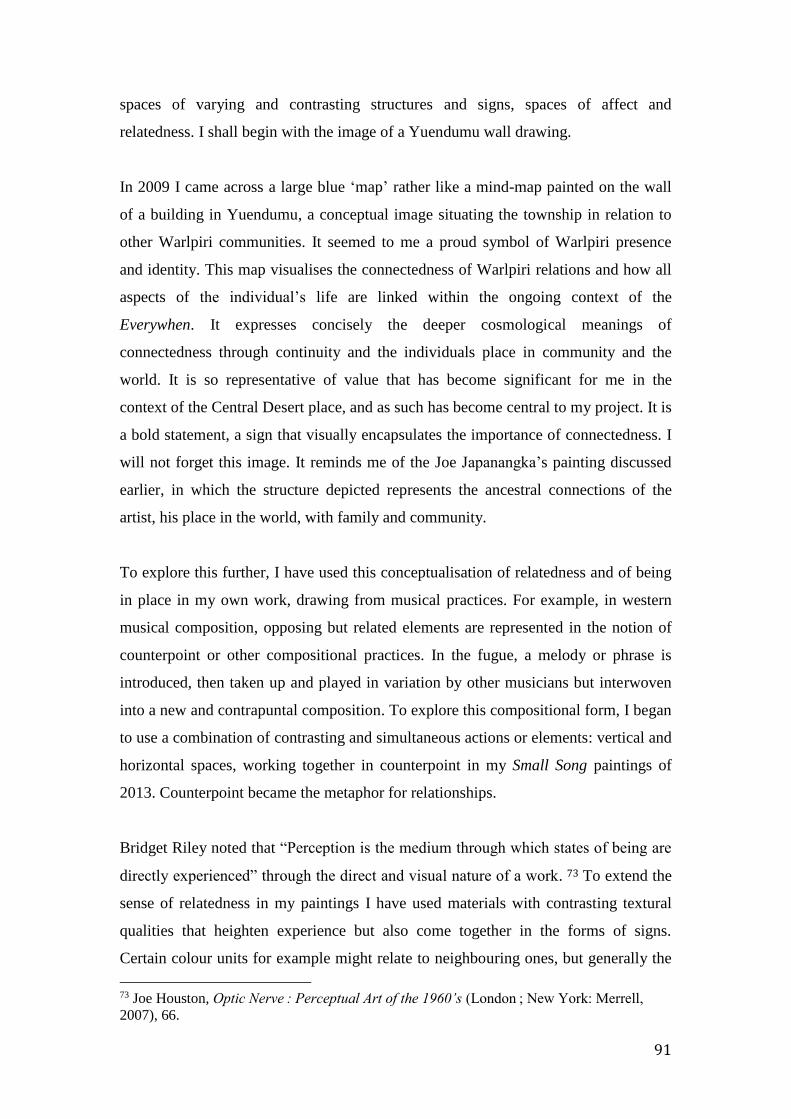
91
spaces of varying and contrasting structures and signs, spaces of affect and
relatedness. I shall begin with the image of a Yuendumu wall drawing.
In 2009 I came across a large blue ‘map’ rather like a mind-map painted on the wall
of a building in Yuendumu, a conceptual image situating the township in relation to
other Warlpiri communities. It seemed to me a proud symbol of Warlpiri presence
and identity. This map visualises the connectedness of Warlpiri relations and how all
aspects of the individual’s life are linked within the ongoing context of the
Everywhen. It expresses concisely the deeper cosmological meanings of
connectedness through continuity and the individuals place in community and the
world. It is so representative of value that has become significant for me in the
context of the Central Desert place, and as such has become central to my project. It is
a bold statement, a sign that visually encapsulates the importance of connectedness. I
will not forget this image. It reminds me of the Joe Japanangka’s painting discussed
earlier, in which the structure depicted represents the ancestral connections of the
artist, his place in the world, with family and community.
To explore this further, I have used this conceptualisation of relatedness and of being
in place in my own work, drawing from musical practices. For example, in western
musical composition, opposing but related elements are represented in the notion of
counterpoint or other compositional practices. In the fugue, a melody or phrase is
introduced, then taken up and played in variation by other musicians but interwoven
into a new and contrapuntal composition. To explore this compositional form, I began
to use a combination of contrasting and simultaneous actions or elements: vertical and
horizontal spaces, working together in counterpoint in my Small Song paintings of
2013. Counterpoint became the metaphor for relationships.
Bridget Riley noted that “Perception is the medium through which states of being are
directly experienced” through the direct and visual nature of a work. 73 To extend the
sense of relatedness in my paintings I have used materials with contrasting textural
qualities that heighten experience but also come together in the forms of signs.
Certain colour units for example might relate to neighbouring ones, but generally the
73 Joe Houston, Optic Nerve : Perceptual Art of the 1960’s (London ; New York: Merrell,
2007), 66.

92
effect is dissonant due to the use of random or chance colour. Vertical and horizontal
linear elements such as columns and spaces emerge from or retreat into the gridded
space. Lines of red sand create a roving, melodic sense in opposition to the effects of
colour and grid, yet these relations between colour and line together create resonances
of being in a place of both painting and country.
Amundurrgnu Boogie, painted after visiting the Women’s Law and Culture Week in
2011, is a landscape of signs: grids, paint materials and red sand, motifs such as ruled
and free-flowing lines, circles and attendant units of colour. I reference Mondrian’s
Broadway Boogie Woogie (1942-3) combining the jangly rhythms of the blues music
of the 1940’s with the voices, songs and percussive clapstick rhythms of the Northern
Territory’s Aboriginal women. I was struck by the formality and brevity of the ritual
dance movements and to my mind, these brief performative experiences translated
into diagrammatic forms suggesting structures and motifs to frame responses.
Mondrian’s red, blue and yellow grid, the Central Desert melodic descent form and
later the five-lined stave, suggested conceptual and visual structures that as with
Japanangka’s form, created compositional frameworks for exchange.
Paul Klee in The Thinking Eye likened the notations of motifs and themes as
analogous to those of composition in music. 74 He believed that temporal and spatial
movements combined to form dynamic relations, with the graphic elements
expressing time and movement as the essence of graphic notation. 75 He considered
marks or signs as the best way to express ideas. My painted marks are not descriptive,
as if creating a form or shape, but signify something else: abstract structures reflecting
things cultural, visual or musical and forming sites in the field into a whole.
74 Paul Klee, The Thinking Eye (Lund Humphries, 1961), 89. 75 Ibid., 392.

93
Fig. 45. Relational 2 (2013)
Fig. 44. Untitled (2012)
Figure 44 presents a continuous field of units and in Figure 45 the ground is a
pathway of colour between open sites.
In Figure 44, I have left the structuring grid without colour. The effect is to emphasize
the centrality of colour and the opening up on all sides into the space beyond.
Horizontal ink and dirt lines flow like song lines across the gridded field. In the centre
of the painting is an impasto acrylic circle sitting in line with an equal-sized circle of
sand: different materials, different cultural referents in conversation. I aimed to extend
the idea of spatiality, to see the surface as not just a gridded pattern but as one both
visual and conceptual.
In Figure 45 the primary red, blue and yellow grid forms a solid framework. At the
perimeter, the fine pencil-lined unpainted spaces offer a visual silence adjacent to the
more frenetic spaces of secondary and tertiary colour. In another painting in this
series I had also used a secondary and tertiary mix of colour to give a harmonious feel
and the suggestion of a layered pictorial space in the conventional sense. This was a
new possibility to consider but as with earlier works using sequential colour, I thought
this harmonious and tonal colour might mean a step back towards conventional
pictorial colour use. But would this be a problem? Without this spatiality I might
consider more what happens within each unit, rather than how they sit together within
a larger area.

94
My interest in the idea of relatedness began while reading about Aboriginal
metaphysics: how culture reflected the interconnectedness between people, place,
time and country; and how ceremonial songs traditionally had a mnemonic function,
guiding people along the story lines of their country, visually represented in symbolic
form. Such signs reminded me of the earliest forms of western musical notation being
small repeating units or signs (neumes) on parchment with a mnemonic purpose;
visual reminders to the singer as to what note to sing and at what pitch. Like paintings
and petroglyphs, these manuscripts were also forms of communication made as aids
to memory. Simple and repeating signs represented sounds for the production of
stories or music. Further to Elkins discussion of the common roots for numbering,
picturing and painting, I see these signs that breakup time and space as the nexus
between the forms of music, painting, dance and those of place and country. Set
within the grid as if a temporal structure, these signs, marks or notations make both
painting and music perceptual, perpetual places, as are their sources.
With this in mind, I liken dotting, tapping, clapping and vocal sounds to the brushing
of colour and the pouring or dabbing of the sand onto the painting surface. I
understand the connection with each painted mark on body and object as a notational
one, seen/heard as marks and heard/seen as sounds, but also as referents to
relationships with landscape and ancestral place. I don’t presume to take on
Aboriginal symbolic meaning but these considerations of notational forms connect me
to the metaphysical notion of the Everywhen: through the repetitive mode of
application and placement to reinforce the cultural experience; through iteration that
reinforces connection and makes paintings cultural manuscripts.

95
Fig. 46. Small Songs (2012)
Small Songs (2012) in Figure 46 suggests the Yuendumu wall map with the circles of
sand connected by the central X form. The underlying grid structure is a framework
clear of colour and the overall colour pattern is again a random one, but with tonal
change emphasising the central form. There are five narrow horizontal lines of
complementary colours and parallel to these are another five where paint has been
applied wet into wet, allowing merging colour to create an alternative watery effect.
Following these works I began to investigate the gridded compositions of Piet
Mondrian.
Mondrian and the primary grid
Joseph Albers remarks that the greatest excitement in colour “lies beyond rules and
canons” and that dissonance is “as desirable as its opposite” express what I love most
about what colour can do. 76 It is this element of surprise that I have exploited from
the outset through my own random or chance use of colour. Albers might well have
appreciated the colour use of the Yuendumu artists. His observations also apply to the
chromatic experience (unexpected pitch combinations) of the aleatoric or chance in
sound and music. Using line and colour in space together to explore cultural and
76 Albers, Josef, Interaction of Colour, 60.

96
topographic considerations, I explore conceptual meanings and associations. Thus the
grid signifies place and the idea of relatedness both culturally and aesthetically.
Mondrian believed that the spirit constructs and composes and this is intensified in
painting when its materiality is reduced. 77 His reductive worldview was informed by
Theosophy and it seemed to me that his grids could also be viewed also as signs of
place as they too were imbued with spirit and matter. Mondrian believed life was
governed by this duality and was best exemplified by straight lines and perpendicular
oppositions. 78 The Dutch artist Ad Dekkers wrote that Mondrian’s aesthetic brought
together problems of system or a set of things working together to make a complex
whole, intuition or the ability to understand without conscious reasoning, and
structure or the arrangement of relations between parts or elements of something
greater to form nature or what he called “the laws that control the world”. 79 The
relatedness of these parts together formed something ‘greater.’ Any additional visual
representations of these connections such as marks and lines from our known world
are held firm by the underlying grid of the conceptual and metaphysical worlds.
My interest in Mondrian goes back to visiting a retrospective exhibition of his
paintings, Piet Mondrian 1872-1944 at the Gemeentemuseum Den Haag in 1994
showing the evolution of his forms, the depiction of his early landscapes and still life
paintings to his deconstructed landscape and tree forms, and to his final gridded
paintings. The spaces between branches of trees, waves on the sea or between
architectural spaces, ultimately became reductive fields of relations between the
formal grid and units of pure colour. In his final works the gridded primary coloured
units seemed - as the title of Broadway Boogie Woogie suggests – like units of sound
and time referencing both the blues and jazz of the 1940s and the layout of New
York’s streets.
77 Piet Mondrian, The New Art--the New Life: The Collected Writings of Piet Mondrian,
Documents of Twentieth Century Art (Boston: G.K. Hall, 1986), 218. 78 Ibid., 17. 79 Peter Howard Selz and Kristine Stiles, Theories and Documents of Contemporary Art : A
Sourcebook of Artists’ Writings, 2nd ed., rev. and expanded. (University of California Press,
2012), 81.

97
With a sense of the structure of the grid as a meaningful form as depicted in the
paintings of Jangala and other desert artists, the associated musical references also
brought Mondrian to my attention. Mondrian wrote that his need to break from
dimensional form was matched with the new music of Jazz, forming oppositions like
those of his verticals and horizontals and a rhythm based on openness and opposites,
of non-equivalence. Just as the rhythm of the cadence of straight lines in
rectangular opposition revealed art’s rhythm, this musical rhythm revealed a
profound oneness of existence. 80 Such, too, is the rhythm of the putting and
placing of units and dots.
I was also drawn to Mondrian’s asymmetrical spatiality particularly in the paintings
made in his later years in the United States. When thinking about his creating these
works I also imagined his rhythmic process as one of marking time, each section a
moment with touch as the connector. In the later paintings such as New York City
1(1942), Broadway Boogie Woogie (1942-3) and Victory Boogie Woogie (1944) the
lines of primary colours made the static, fixed compositions appear dynamic with the
clarity of percussive sounds of performance in the ‘rhythm of the cadence’ with
straight lines in rectangular opposition.
While investigating Mondrian’s schema, it had occurred to me that the three-
primaries grid could be regarded as a schema for my own purposes, using colour and
its interconnectedness posed by the vertical and horizontal parts, but also as a cultural
factor. This extension of meaning was suggested by the symbolic significance of his
primary colours: red as an ‘outward’ colour and blue and yellow being more spiritual
or ‘inward.’ Mondrian’s thinking about colour was guided by theosophy and the
theories of Goethe. He saw red as the noblest of colours and that all colours derive
from red, blue and yellow and the fundamental oppositions of light and dark. In his
discussion of the significance of primary colours, John Gage suggests the sense of
primariness of Mondrian and the Dutch de Stijl painters to be the result of the
“reductive and symmetrical colour systems of the nineteenth century.” 81 I later took
80 Piet Mondrian, The New Art--the New Life, 254. 81 John Gage, Colour and Meaning: Art, Science and Symbolism (London, England: Thames
and Hudson, 1999), 245.
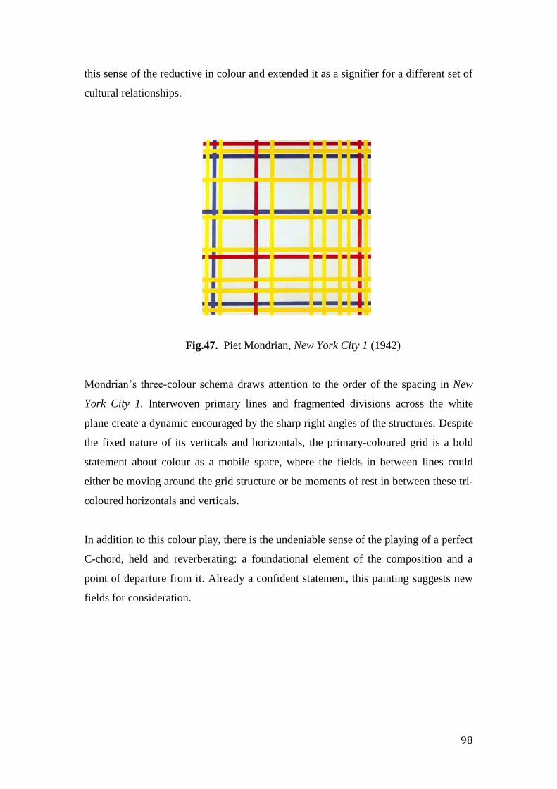
98
this sense of the reductive in colour and extended it as a signifier for a different set of
cultural relationships.
Fig.47. Piet Mondrian, New York City 1 (1942)
Mondrian’s three-colour schema draws attention to the order of the spacing in New
York City 1. Interwoven primary lines and fragmented divisions across the white
plane create a dynamic encouraged by the sharp right angles of the structures. Despite
the fixed nature of its verticals and horizontals, the primary-coloured grid is a bold
statement about colour as a mobile space, where the fields in between lines could
either be moving around the grid structure or be moments of rest in between these tri-
coloured horizontals and verticals.
In addition to this colour play, there is the undeniable sense of the playing of a perfect
C-chord, held and reverberating: a foundational element of the composition and a
point of departure from it. Already a confident statement, this painting suggests new
fields for consideration.
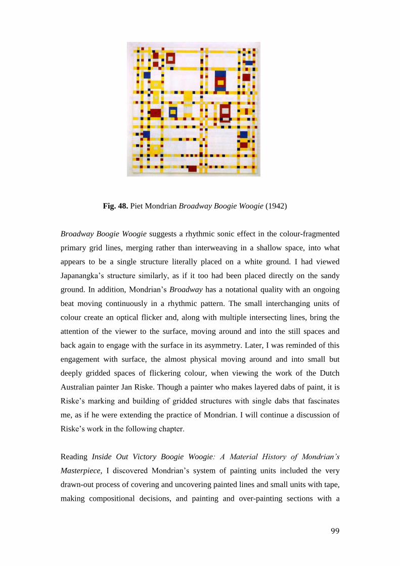
99
Fig. 48. Piet Mondrian Broadway Boogie Woogie (1942)
Broadway Boogie Woogie suggests a rhythmic sonic effect in the colour-fragmented
primary grid lines, merging rather than interweaving in a shallow space, into what
appears to be a single structure literally placed on a white ground. I had viewed
Japanangka’s structure similarly, as if it too had been placed directly on the sandy
ground. In addition, Mondrian’s Broadway has a notational quality with an ongoing
beat moving continuously in a rhythmic pattern. The small interchanging units of
colour create an optical flicker and, along with multiple intersecting lines, bring the
attention of the viewer to the surface, moving around and into the still spaces and
back again to engage with the surface in its asymmetry. Later, I was reminded of this
engagement with surface, the almost physical moving around and into small but
deeply gridded spaces of flickering colour, when viewing the work of the Dutch
Australian painter Jan Riske. Though a painter who makes layered dabs of paint, it is
Riske’s marking and building of gridded structures with single dabs that fascinates
me, as if he were extending the practice of Mondrian. I will continue a discussion of
Riske’s work in the following chapter.
Reading Inside Out Victory Boogie Woogie: A Material History of Mondrian’s
Masterpiece, I discovered Mondrian’s system of painting units included the very
drawn-out process of covering and uncovering painted lines and small units with tape,
making compositional decisions, and painting and over-painting sections with a

100
precise putting and placing of touch within a tiny field.82 Though he was doing this
for compositional and technical reasons, the iterative process again focused on
phenomenal aspects. Metaphysical and theosophical laws guided Mondrian’s
connectedness with his painting so, in turn, his grid could be seen as a signifier for his
place in the world.
In Painting as Model Yves-Alain Bois talks of this ‘process of work as a place of
formation’, making a place of affects. He quotes Hubert Damisch as describing the
moment of making as one of touch and gesture, as “the epistemological moment of
technique where thought and invention take place”. 83 This description echoes my
experience, with moments of touch in the putting and placing of units of colour being
those of knowing as opposed to recognition only. Further, this was how I had
personally experienced it while I was being painted up for ceremony at Watiyawanu:
actions accompanied by song reinforcing stories through line, mark and touch.
Correspondences between colour and music
Correspondences between colour and music are evident in aural, tangible and
perceptual ways. As my project has progressed, this specific correspondence has
become one aspect of painting as a place embedded. Another aspect is that of
spirituality. My own use of colour and structure doesn’t have any particular spiritual
origin as it did with the artists such as Piet Mondrian and the Australian artist Roy de
Maistre. Rather, I adhere more to a metaphysical sense of being and knowing, of time
and space and how my abstract structures with all their aspects might contribute to
understandings of place and self. However, being positioned in a cross-cultural
conversation, this has been informed by a deep respect for the Aboriginal idea of the
ancestral Everywhen that presides over time and place.
Artists, composers and musicians have long explored correspondences between
colour and music using instruments and light, various representations of colour,
musical structures, polyphony and counterpoint. Kenneth Peacock reminds us that
82 Maarten van Bommel, Hans Janssen, Ron Spronk (eds.), Inside out Victory Boogie Woogie,
Cultural Heritage Agency of the Netherlands Series ((Amsterdam): Amsterdam University
Press, 2012). 83 Yve-Alain Bois, Painting as Model, An October Book (Cambridge, Mass: MIT Press,
c1990), 250.

101
since before the time of Aristotle, ancient philosophers believed “harmony to be the
union of varied coloured things”. He notes that in the eleventh century, before the
development of musical staves, red and yellow lines indicated the pitches F and C,
and he goes on to state that these comparisons between music and colour have always
seemed a natural human activity.84
There have long been efforts to establish and develop connections between music and
colour, explored from both visual and scientific perspectives. As far back as 1704 in
his publication Opticks Sir Isaac Newton created the seven-colour rainbow, a
metaphor for musical scales. He represented the basic key as a primary chord of red,
blue and yellow; his correspondences of colour to music tone were red to the note of
C, orange to D, yellow to E, green to F, blue to G, indigo to A and violet to B. 85
Johannes Itten, a master at the Bauhaus from 1919-23, used the twelve colour
divisions on the colour wheel with each colour being a semi-tone note of the musical
scale. Systems such as these were then applied to compositions in painting. The
Australian artist Roy de Maistre aligned the white notes on the keyboard to his colour
chart with pitch corresponding to different hues. He also likened the three primary
colours to a musical chord. This analogy seemed appropriate when seeing these three
colours used in relationship to each other such as in Mondrian’s painting New York
City. They seemed to share the same elemental quality that the note of middle C has
for me: centrally placed on the piano keyboard and representing the departure point
from which compositions, improvisations and colours spring. It is the key of C major
that the conventional system of western musical notation uses as foundational, with
all other keys being deviations from it. 86
Tonal colour schemes have often been created to match musical tones in the making
of visual compositions, yet I felt that the ‘purpose-built’ use of colour in this manner
would be too prescriptive, going against the necessity I felt for chance and the
improvisatory in composition. I have not equated pitch with hue in my paintings in
84 Kenneth Peacock, “Instruments to Perform Color-Music: Two Centuries of Technological
Experimentation,” Leonardo 21, no. 4 (January 1, 1988): 398. 85 Prasid Bokil, “Functions of Grid, a Key for Flexibility in Framework,” Design Thoughts 2
(2009): 42. 86 Simon Miller, Visible Deeds of Music: Art and Music from Wagner to Cage (New Haven:
Yale University Press, 2002).
102
any particular way but it is easy to make the connection generally between higher
pitch and high-keyed colour. My colour use is not meant for the transcription of
musical compositions nor to liken colours to specific instruments. Rather, I prefer the
possibility of rhythmic placements and ‘affects’ in painting having musical or
sonorous qualities through elements of touch and mark, spacing and line, and textures
and substance, as well through perceptions of colour.
Though a term initially used in relation to the primary colours, primariness seems to
encapsulate essential relationships of form and the cultural through affect, and
through touch, mark, colour, line, painted and unpainted spaces, and texture. The
primary colour scheme in all its variations can be seen as a cultural sign that is
utilised in varying contexts. It focuses the grid in the eyes of the viewer as a conveyor
of meaning through affect.
The sense of correspondence between the three primary colours of red, blue and
yellow in painting and the C chord on the keyboard has also extended the meaning of
the primary grid from its origin as a reductive form to one that is a signifier for a new
set of cultural relations in music and painting. Both are foundations for composition
and together with perspectives gained from my engagement with Aboriginal culture
have opened up new dimensions to my practice.
There is however more to the primaries than just the mixing of colour. There was the
exercising of touch and the iterative use of colour units in the foundational grid that
reflected perceptual moments in both music and painting. It was in Primary Grid
(2012) shown in Chapter Two, that I first suggested this. The random placement of
colours into units, non-relational and unconnected to the spectrum of the colour wheel
and its harmonies, was an early step towards seeing primary colours as somehow
essential or fundamental. Ann Temkin quotes John Gage, who calls this their sense of
‘primariness’. 87 As well as having a foundational position on the colour wheel, this
concerns qualities such as the saturation of colour, the sensations of each separate
primary hue and colour relations. As a fundamental element in a composition,
87 Temkin, Color Chart.

103
primariness became an important connector to the wider cultural conversation and in
a philosophical sense, it connected to the phenomenal in painting.
Correspondences in the gridded field
The inclusion of tonal and graduated colour occurred first with the group of five
paintings called Small Songs 1 – 5. I had until then resisted using tonality, as units of
single colour seemed preferable and had a life of their own. However I decided that
the use of tone would extend the function of colour, alluding to an aural affect as well
as the illusory affect of spatial recession in addition to intensity and dissonance.
Vertical bands of graduated colour sit beside bands of colour units in unpainted
spaces, creating atmospheric sensations like wavelengths of sound in a greater silence.
I had been feeling that any use of tonal colour would automatically suggest or imply
three-dimensional form but this colour use related more to performative musical
affects.
I also became interested in introducing the idea of counterpoint as a compositional
element. In music, different melodies can be played together, providing notable
contrasts while together forming a coherent composition. I have combined vertical
columns of painted units, the equivalent of pitch, with horizontal linear elements, the
equivalent of melody, in the form of painted units or free-flowing dirt lines. The title
refers to the very short vocal forms sung during performances such as I had heard at
Watiyawanu. These are often very brief and accompany the formal movements of
these ritual performances, so I had wanted this group of paintings to reflect those
qualities. They are not descriptions of specific songs heard but rather about the
context as meaningful space, with the resonances received and transferred to the
surface of the paper.

104
Fig. 49. Small Song 1 (2013)
In the first of the 2013 series Small Song 1, a lattice-like primary-coloured grid
stretches across the paper’s surface to each of the four sides and is built around
running dirt lines. Behind this structure is a combination of units of colour and pencil-
lined, divided and unpainted spaces. The units are either fixed with larger blocks of
varying colour forming vertical columns, or are single units randomly placed in a
vertical orientation. Horizontal scratchy dirt lines flow with a free movement, left to
right, right to left, rising and dipping across the surface and interrupting the lay of the
underlying forms. Some were added while the primary grid was being painted,
merging then veering away from each other. The three-primary grid lines articulate
the overall space, with the even repetition like temporal divisions: the process of
painting resembling the marking of time with units of colour. Scattered or neat rows
of units contrast with each other: the wider, tonally graduated ‘slide’ on the right
creating an alternative smooth movement in pitch or tone, up and down and
counteracted by the percussive irregular placement of units of colour on the left.
In Small Songs 2 the central mass of colour resembles a bank of discordant sound,
like an eruption in open space. The movement outwards of the random colour units to
the left is contrasted with the verticals to the right. The central tonal ‘slide’ holds firm
against the percussive sounds. Each unit of shimmering colour is an independent one
suggesting sound as a note or a group of notes. The vertical lines to the right suggest

105
graduated tones or, with the narrower two, discordant durations - short, sharp but
lasting. Dirt lines waver over the surface as if mediating affect. They deny the
measured sense of space and counteract the certainty of the grid: like improvisations
they have a different sense of time.
Fig. 50. Small Song 2 (2013)
Lines such as these have acquired new meanings since the beginning of this research:
from the prior lines of my lacework threads, to those of contour maps, then as story or
songlines through country and along the surface of the land like contours. Now they
are stave lines, notating pitch and marking time in space. It has been an evolutionary
process.
The lines of the grid provide certainty in the composition but also new possibilities.
With colour they are an inducement for the viewer to engage further. Colour
communicates through its edges and spaces and through those of the grid: iterative,
arbitrary, definitely bold, performative in nature; of sombre quietude or a chattering
garrulous noise in fields of intensity; timbre and chroma, high key and low.

106
Correspondences in action
The work of the following two artists is grid-based with an emphasis on textured
gridded surfaces of rectangular units of colour. Both connect with the fundamental
aspects I have been engaged with in my own painting
While in London in September 2014, I wandered into the London Art Fair. Walking
through stalls of hundreds of paintings, two quite small paintings came to my
attention. They were by the English artist John Hooper. I was immediately intrigued
by the gridded surfaces of colour and the addition of notations on the sides of his
canvasses. These were dates, spots of colour used in the work and references to
literary or musical works such as Midsummer Night’s Dream. I wondered about a
possible musical role in his ‘putting and placing’ of paint and colour in his process of
making. I later discovered after contact with his gallery that these notes referred to
what he was listening to or reading at the time of painting.
Fig. 51. John Hooper. To Auguste Macke (above) and To Double Autumn Ballet,
Birtwhistle (below) (n.d’s)
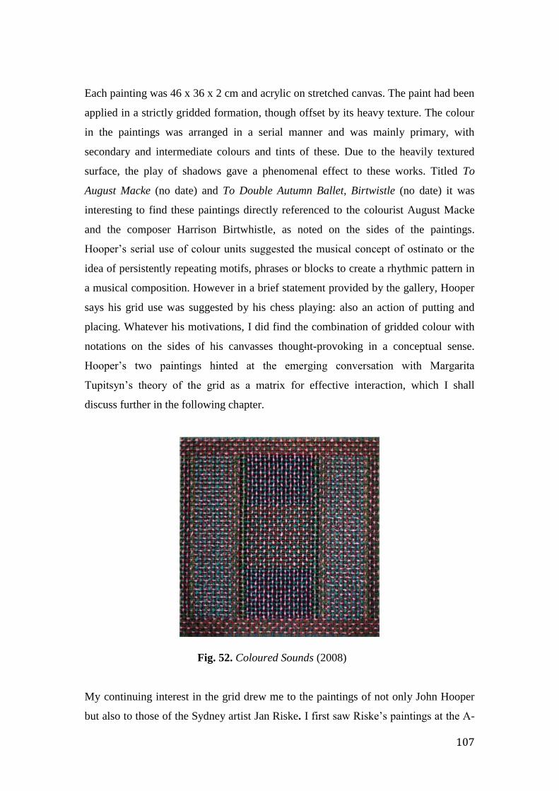
107
Each painting was 46 x 36 x 2 cm and acrylic on stretched canvas. The paint had been
applied in a strictly gridded formation, though offset by its heavy texture. The colour
in the paintings was arranged in a serial manner and was mainly primary, with
secondary and intermediate colours and tints of these. Due to the heavily textured
surface, the play of shadows gave a phenomenal effect to these works. Titled To
August Macke (no date) and To Double Autumn Ballet, Birtwistle (no date) it was
interesting to find these paintings directly referenced to the colourist August Macke
and the composer Harrison Birtwhistle, as noted on the sides of the paintings.
Hooper’s serial use of colour units suggested the musical concept of ostinato or the
idea of persistently repeating motifs, phrases or blocks to create a rhythmic pattern in
a musical composition. However in a brief statement provided by the gallery, Hooper
says his grid use was suggested by his chess playing: also an action of putting and
placing. Whatever his motivations, I did find the combination of gridded colour with
notations on the sides of his canvasses thought-provoking in a conceptual sense.
Hooper’s two paintings hinted at the emerging conversation with Margarita
Tupitsyn’s theory of the grid as a matrix for effective interaction, which I shall
discuss further in the following chapter.
Fig. 52. Coloured Sounds (2008)
My continuing interest in the grid drew me to the paintings of not only John Hooper
but also to those of the Sydney artist Jan Riske. I first saw Riske’s paintings at the A-

108
M Gallery in Sydney in 2014. It was the process of making, the putting and placing in
a rhythmic ordering of layers of dabs of thick graduated colour into a richly gridded
format rather like rugged terrain that interested me. Looking closely, it seems possible
to count each single dab of colour, as each conveys the sense of its own separateness.
The painted terrain consists of units of flickering colour forming deep cavities, giving
the paintings a very visceral quality and enticing the viewer to almost literally explore
inside each neatly built unit. The physical sense of the terrain with its dabs of colour,
almost as acrylic dots, referred me back to the origins and material nature of the
paintings of the Central Desert artists: perception as connection with wider contexts.
In a statement on his website Riske says precision is fundamental to his placement of
points of colour into the layers, with the darkest underneath moving to the lightest
above. He refers to these points as particles or units. Riske wants these paintings to
encapsulate light as if in the presence of a light raking across the surface and, with
their tight structure, this makes his paintings, as he says, ‘traps for perception’. This
was my experience of them. 88
Fig. 53. Detail showing the deeply gridded layers of dabs of ‘flickering colour’ used
by Riske in his paintings.
88 Jan Riske, excerpts from an interview, December, 1992, Amsterdam, 1992,
http://www.janriske.com/Inter/Inter0.html.

109
It was particularly intriguing to view recently a painting of Riske’s held in the Heide
Museum of Modern Art. This work was made in the 1960’s and is approximately 80 x
100 x 3 cm. Though in serious need of a clean, it was a valuable experience to view
this work, heavy in both weight and substance but also in significance: in particular,
to see how this presentation of paint in its pure material and free form has evolved
into what he called ‘gridded perceptual traps’ over the length of the artist’s lifetime.
As with my early palette paintings, I enjoyed its intensely material quality.
In this chapter I have shown how purpose, meaning and understanding expand when
different cultural aspects come into play. The grid as a field has become an inherently
fascinating and significant structure. It is able to acquire new meaning through
processes undertaken and the inclusion of aspects absorbed from wider contexts. In
this way it takes on aesthetic and cultural meanings pertinent to the contemporary
world.
Prasad Bokil offers a final observation in his article Functions of the Grid. 89
Referring to its uses throughout history and from the perspective of his own Indian
culture, he sees its use as originally like an interface between the physical and super-
physical’ worlds. In India, the grid has always been part of India’s tradition,
“practised with the faith to the extent of religious doctrine”. 90
Now he says, it has become the interface between the physical world and its
perception in a rational world. The grid has become for me a structure with the
capacity to explore and represent these cultural worlds and perceptual experiences. In
doing so, I have situated my painting within it.
89 Prasid Bokil, “Functions of Grid, a Key for Flexibility in Framework,” 42. 90 Ibid.
110
CHAPTER FOUR
The grid as a space for correspondence and resonance.
This chapter brings my exegesis to its resolution. In its early stages I had many ideas I
believed at the time to be important, yet as my practice has evolved some have
become less significant, were necessarily abandoned or were superseded. Over time,
my ideas about and the use of the grid have expanded also, becoming a ground for
multiple interactions. Margarita Tupitsyn’s concept of the grid as a matrix for
interactions has furthered my own ideas about contemporary abstraction and brought
them into the world of painting as a place for the manifestation of interactions, a
place of affects. Her theory has suggested the merging of culture and place in the
specifics of the grid and in turn, consolidates its place in the twenty-first century
conversation.
At the beginning of this project mine was a more simplified idea of place, of
landscapes situated in the western tradition. The two paintings below, Mina Mina by
Paddy Japanangka and my painting Caress, were originally two separate works but
are now one and titled Mina Mina with Caress. Together they represent what place
has become for me: one of different conversations brought together through shared
resonance and correspondence. They act as a metaphor for this resolution, through the
elements of touch and materiality and the transformation of these into painting. From
the Western art historical traditions to Central Desert ancestral mythology and culture,
to the practices of painting and music, the grid structure has become a matrix for both
a cross-cultural and a multidisciplinary exploration. Place has become an interwoven
mesh and the grid, a schema for what is essential about place.

111
Mina Mina with Caress: a conversation
Fig. 54. Mina Mina Jukurrpa (2009) with Caress (2012)
For about four years I have had in my living room a painting of the Mina Mina
Jukurrpa by the Warlpiri artist Paddy Japanangka Lewis (circa 1925 – 2011) painted
in 2009. Beside it is my oval shaped painting called Caress made in 2012. Each
painting has an essential and material beauty so in 2014 I decided to place them
together. I realised how paintings from different contexts can sit in mutual
conversation and by doing so, can extend the conversations around painting.
Being a Japanangka man, Paddy was a custodian for the Mina Mina country west of
Yuendumu. All Napangardi/Napanangka women and Japangardi/Japanangka men
share the care for this country. Both paintings are on stretched canvas; one oval-
shaped and covered in a thick layer of red gritty dirt and sand, the other rectangular
with a black ground, then painted in red ochre acrylic and covered with parallel white

112
thickly dotted, quavering lines. In the directness and linearity of the design Paddy’s
statement is a concise one.
When making Caress I built layers of thick, rich red dirt covering the canvas surface,
using spray or painted acrylic adhesive in and between the layers. In the fine and not
so fine dirt you can see the presence of tiny stones, bits of dried grass, a few small
drops of paint, spaces where stones have dislodged. One adhesive layer was sprayed
over the final surface forcing larger stones toward the edges, as if a frame. Creating
this work in my studio in Melbourne connected my memories and experiences
through touch and materiality. Mina Mina Jukurrpa and Caress are also united by
their materiality and represent the merging and interweaving of correspondences and
resonances that have arisen in my conversations.
Margarita Tupitsyn and the grid as a vehicle for cultural interaction
It has become apparent how the language of abstraction is informed by and formed
through material and cultural thinking and practice and, in turn, offers potential that is
not present in the basic understanding of the grid as merely a self-reflective,
autonomous form, as suggested by its Modernist exponents such as Rosalind Krauss.
Krauss’ attitude can now be looked upon with an historical perspective. Entertaining
such a perspective I revisited the sixteenth century, when in 1525 Albrecht Durer
devised a grid structure for artists to use as a device for transferral of visual
experience onto the canvas, in the pursuit of perspectival accuracy. The world was
outlined through the gridded structure. In a Pace Gallery publication published in
1980, Krauss referred to the grid as a form turning its back on nature, a closed and
mute form. 91 I had earlier been drawn to this approach and to the grid works of
Agnes Martin with their seeming purity, perfection and inwardness. Though not to be
taken too literally, I eventually found it difficult to sympathise with her need to turn
her back on the world. 92 I believed abstraction could never be a mute or hermetic
form as an artist’s practice is inevitably informed by the context in which she works.
91 Krauss, Rosalind E, Grids : Format and Image in 20th Century Art / Essay by Rosalind
Krauss (New York: Pace Gallery, 1980). 92 Mary Lance Documentary, Agnes Martin: With My back to the World, NTSC (New Deal
Films, 2003), newdealfilms.com/.../agnes-martin-with-my-back-to-the-world.
113
Building on my own experiences, and understanding the limitations of these two
perspectives of the literal context and the later hermetic one, I believed the grid could
embrace the self-reflective individual within a broader context. Along with the
Central Desert vocal descent form and the stave, the grid became a signifier of my
cross-cultural conversation. Together they became reference points for ideas and
process. It was in the later stages of this project that I discovered Tupitsyn’s article
advocating for an extended meaning for the grid in the twenty-first century. I felt this
perspective could only derive from someone located outside the American theoretical
context and from within a socio-political environment, such as the one from which
Tupitsyn had come.
In The Grid as a Checkpoint of Modernity Margarita Tupitsyn argued that the grid
was a social construct and “a matrix for an effective interaction”. 93 This upheld my
sense of the grid as a structure for ideas, contributing to a practice about place. It
would be an armature for meaning. As such, her grid takes on the contemporary,
paving the way for an engagement with the cross-cultural, enabling reflection on
one’s practice of painting as in a journey through time, triggered by the cultural as
well as the material and the visual aspects. Like Krauss, Tupitsyn makes reference to
the early use of the grid as a “perspective lattice on the depicted world, as the
armature of its (the world’s) organization,” just as the Renaissance artists had
transcribed the view that was the subject matter before them, unit by unit onto their
two-dimensional working surface.
The suggestion that the grid could act as an armature transcribing cultural meanings
and proposing metaphysical options had connected with my earlier perceptions of
Japanangka James’s painting and others like it, as being a representation of his
cultural context. Further to this I was reminded of the work of the Uruguayan artist
Joaquin Torres-Garcia (1874-1949). Torres-Garcia left Uruguay and moved to Paris
between 1926 and 1932 and was in contact with Mondrian and Van Doesburg. In
paintings such as Color Structure (1930) he briefly incorporated in his paintings the
93 Tupitsyn, Margarita, “The Grid as a Checkpoint of Modernity. Tate Papers Issue 12 2009,”
2009, http://www.tate.org.uk/research/publications/tate-papers/grid-checkpoint-modernity.
114
use of the three primary colours within the grid in his paintings, though not with the
same purity as the Paris artists. 94
Upon his return to Montevideo in 1934, Torres-Garcia devised his theory of
Constructive Universalism in order to promote and integrate pre-Hispanic art into his
practice, to bridge the divide between the European art of the North and that of the
South. His later works were based on gridded structures and the integration of
pictographic signs, in the belief that they could convey a sense of universal order.
Constructive Composition (1943) represents the realisation of his ideas, combining
neo-Plasticist influences of grid and primary colour with the symbols from ancient
American artwork. 95
It has been important to explore examples of art works containing gridded fields from
different cultures. When the grid arises from or is situated in a different cultural
context to my own, these powerful resonances inevitably enrich the perceptions of my
own gridded structures. Another such example dates back approximately twenty five
to thirty thousand years ago when local indigenous people inscribed gridded designs
on to what is thought to be stone navigational markers or pillars. Only one now
remains upright and is one of several found on the Burrup Peninsula in Western
Australia.96 One side has been carved with what looks like notational signs, a lined
grid work with rows of small circles and notches. I can imagine the people inscribing
onto pillars these marks as abstract patterns, accompanying story and song mapping
their journeys across country and coast. These navigational markers connected
metaphorically to my own journey in practice.
In a catalogue to accompany an exhibition of paintings by the Warlpiri artist Dorothy
Napangardi in 2003 at the Museum of Contemporary Art in Sydney called Dancing
Up Country. The Art of Dorothy Napangardi, Vivienne Webb’s essay ‘Form and
94 Joaquin Torres-Garcia, Color Structure, oil on canvas, 1930, Painting and Sculpture,
MOMA. 95 Kishan Mistry, Constellations. Past, Present, and Future Direction at the Art Museum of
the Americas, 2012, constellations.artinterp.org. 96 Robin Chapple, A Special Place, DVD (An Entity Media Production, 2009).
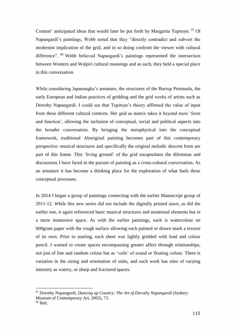
115
Content’ anticipated ideas that would later be put forth by Margarita Tupitsyn. 97 Of
Napangardi’s paintings, Webb noted that they “directly contradict and subvert the
modernist implication of the grid, and in so doing confront the viewer with cultural
difference”. 98 Webb believed Napangardi’s paintings represented the intersection
between Western and Walpiri cultural meanings and as such, they held a special place
in this conversation.
While considering Japanangka’s armature, the structures of the Burrup Peninsula, the
early European and Indian practices of gridding and the grid works of artists such as
Dorothy Napangardi, I could see that Tupitsyn’s theory affirmed the value of input
from these different cultural contexts. Her grid as matrix takes it beyond mere ‘form
and function’, allowing the inclusion of conceptual, social and political aspects into
the broader conversation. By bringing the metaphysical into the conceptual
framework, traditional Aboriginal painting becomes part of this contemporary
perspective: musical structures and specifically the original melodic descent form are
part of this frame. This ‘living ground’ of the grid encapsulates the dilemmas and
discussions I have faced in the pursuit of painting as a cross-cultural conversation. As
an armature it has become a thinking place for the exploration of what fuels these
conceptual processes.
In 2014 I began a group of paintings connecting with the earlier Manuscript group of
2011-12. While this new series did not include the digitally printed stave, as did the
earlier one, it again referenced basic musical structures and notational elements but in
a more immersive space. As with the earlier paintings, each is watercolour on
600gram paper with the rough surface allowing each painted or drawn mark a texture
of its own. Prior to starting, each sheet was lightly gridded with lead and colour
pencil. I wanted to create spaces encompassing greater affect through relationships,
not just of line and random colour but as ‘veils’ of sound or floating colour. There is
variation in the sizing and orientation of units, and each work has sites of varying
intensity as watery, or sharp and fractured spaces.
97 Dorothy Napangardi, Dancing up Country: The Art of Dorothy Napangardi (Sydney:
Museum of Contemporary Art, 2002), 73. 98 Ibid.

116
Fig. 55. Manuscript Series 2:Descent (2014) Fig.56. Manuscript Series 2:Clash
(2104)
Figure 55 is the first painting to move in this direction. Though still depicted as filled
units, the grey tones suggest a sense of depth that is most pronounced in the centre
and accentuates the floating colour forms in this illusory deep space. I had felt
uncomfortable with the suggestion of illusory space, seeing it as contradicting my
desire to paint units of colour as independent forms with no particular purpose. I had
been arguing for the abstract plane of the grid as one of flat units of colour, of
autonomous spaces in the shallow space of the ground or picture surface, yet I also
began to imagine a space of sound, immersive and more fluid, rather like the space
around the notes in Morton Feldman’s Patterns in a Chromatic Field.
Shapes and the application of colour in space suggest aural resonances. I don’t think
that specific sounds or instruments can represent individual colours but colours high
and low key might suggest pitch for example. Many artists have made transcriptions
of music into colour and paintings as depictions of musical scores. Roy de Maistre
and others devised colour systems and charts to aid this process, taking the connection
to the point where particular colours represented specific notes, tones and shades as

117
being lower or higher pitch. I felt this was far too literal an outcome for me, risking
the sense of painting as realistic representation. 99
Is it tension or a sense of exhilaration in the interactions between colours and their
application in the units and in the spaces between colours? In several paintings I
decided to divide the units into halves or quarters; assertive and sharp, rectangular and
triangular shapes of colour, at times motionless and at others in flux. Potent sites are
the focus in Manuscript Series 2: Clash (2014). Harsh sounds and veils of immersive
sound sit within the underlying structure, with units of colour inserted into sections of
unpainted space creating a central fabric of broken percussive sounds as if flung to the
edges of the paper. These paintings aren’t musical scores. They are places for the
experience of resonance, revealing the painted space as a place with sound
materialised into forms and material relationships.
In my large work Of Time and Place (2014) below, tonal bands interweave
throughout the composition. With the spatial arrangement of the three sites it is
possible to see a correlation with the Yuendumu wall map. The grid acts as a
contextual matrix: the three sites as three places of action in a field of forces. It is a
place of time in painting: visual artists, like composers and musicians use the
manipulation of materials or motifs to explore temporality.
99 Heather Johnson, Roy de Maistre. The English Years 1930-1968 (Craftsman House, 1995),
88.
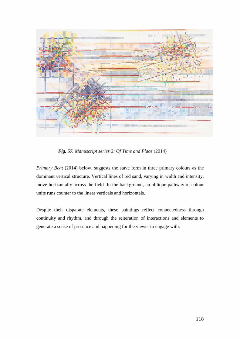
118
Fig. 57. Manuscript series 2: Of Time and Place (2014)
Primary Beat (2014) below, suggests the stave form in three primary colours as the
dominant vertical structure. Vertical lines of red sand, varying in width and intensity,
move horizontally across the field. In the background, an oblique pathway of colour
units runs counter to the linear verticals and horizontals.
Despite their disparate elements, these paintings reflect connectedness through
continuity and rhythm, and through the reiteration of interactions and elements to
generate a sense of presence and happening for the viewer to engage with.
119
Fig. 58. Manuscript series: Primary Beat (2014)
The consideration of aspects from different contexts expands our understanding of
things that are new or challenging. Since the beginning of this project, while playing
with unrelated units of colour within a loose grid form and at the same time searching
the Central Desert and its culture for clues as to why I was drawn to that place, I have
realised that through the action of touch, substance and knowledge have come
together. They have communicated those abstract aspects of place such as music and
sound that have become an essential part of my practice. These paintings are fields of
affect for the both the eye and the mind to ‘graze over’, creating an enriched context
for an expanded conversation about abstraction.100
100 Mark Wrathall, “The Phenomenological Relevance of Art,” in Art and Phenomenology
(London ; New York: Routledge, 2011), 25.
120
CONCLUSION
My research project grew out of a fascination with the Australian Central Desert
landscape and an interest in the cultural practices of the Warlpiri people. This
approach increasingly challenged the very Eurocentric (northern) foundations of
my practice. My prior understandings of place and landscape in painting were
changing and I needed to understand why these foundations no longer seemed
as relevant and what the implications might be for my own practice.
I began by considering the origins of my practice and the sense that, perhaps
temporarily, I would put these aside and find new ways to imagine place and
landscape. I wondered how this might then situate my practice.
I first read The Art of Describing by Svetlana Alpers quite a few years ago while
travelling in Europe. In retrospect I can see that reading it contributed to the
thinking that set me on the pathway to the Centre. Exploring aspects and ideas of
European, particularly Dutch, landscape, and specifically the mapping impulse in
seventeenth century Dutch art, provided the departure point I needed. 101 At the
same time as returning to Alpers’ book, I began reading the work of
anthropologists writing on the Aboriginal culture of Central Australia, including
Nancy Munn, Christine Nicholls and Diana James. I was interested in exploring
Central Desert Aboriginal beliefs and practices, and connecting with the
Yuendumu community I had already begun to visit.
I began by making works on paper informed by earlier gridded, topographic
paintings, moving from the grid as a mapping structure to one as a form
encapsulating conceptually an expanding concept of what place might represent.
During this early stage while working in my studio, my thinking began to be
challenged by two altered ways of perceiving colour and elements such as units,
lines, marks etc.
101 Alpers, The Art of Describing. Op cit.
121
The first was the chance use of colour. Each colour used bore no relation to those
beside it or to any reference point. I used watercolour directly from the tube,
randomly placing it into the units of the grid. This method did alter gradually
over time but the process of ‘putting and placing’ together with the lack of
conscious decision-making in what became an immersive process of making,
became integral to my practice.
I also began to think more about the affect of colour. The filling in with random
colours removed any possibility of specific meaning being attached to individual
colours and allowed chance to take over, providing a sense of freedom from any
final determination by preconceived ideas as to the end stage of a painting.
Secondly, I also experienced a change in the way I perceived the lines, marks and
even materials used in my paintings. I began to see these as signs that could
convey not literal meanings or figurative forms, but rather ones indexical to
aspects of things, and that their interweaving would mesh within the conceptual
structure that was the grid. I wondered whether this change in perception was
the result of my research into Central Desert cultural forms and metaphysics,
that this engagement had altered the way I would now perceive my own forms.
I also explored other cross-cultural and cross-disciplinary practices and in the
second year of this project, my fieldwork at the Women’s Law and Culture Week
in the Northern Territory confirmed my connections with music, though already
apparent. Both music and painting merged through the element of touch. United
through their phenomenological context, aspects of musical forms, from the
melodic descent form of the Central Desert women’s songs, from New Music and
from Jazz, all contributed to my new perceptions of both place and painting.
A renewed interest in materiality focussed these aspects, transferring them to
the surface of my paintings. The inherent value and qualities of surface and
texture, acrylic and watercolour paint, ink and red sand, pencil and colour were
joined by touch in the exploration of those meanings outlined above.
122
My initial research question asked how I might engage my practice with two
such different cultural contexts. I was also concerned with how such an
engagement might be situated beyond that of my own practice; how it might
contribute to the general conversations being pursued in painting.
I was interested in the meanings of symbols and signs of Indigenous Australian
culture. How might I approach the use of similar shapes and spaces, how might
such elements speak of relatedness and connection via the phenomenological
and the metaphysical, and in doing so, provide a new frame for abstraction.
The grid has been fundamental to this research, yet I was concerned that it not
be merely a formalist device but would be a structure with meaning beyond just
its form. How was this to be expressed? I wanted these different cultural
contexts to inform abstract painting as something beyond mere ‘zombie
formalism’. 102
The implications of this research for my practice have been significant. I am keen
to pursue these themes further.
My painting has become a conversation framed by the grid and informed by
phenomenological, cultural and conceptual aspects of place. It contributes to a
wider notion of abstraction as a cultural form and therefore as a relevant
practice in painting today. This context informs my practice and, continuing in
the same generous spirit of those artists I engaged with at Yuendumu, I hope it
provides meaningful encounters for all who engage with it.
102 David Geers, “Formal Affairs,” Frieze Magazine, March 2015,
www.frieze.com/issue/article/formal-affairs/.
123
BIBLIOGRAPHY
A Special Place. DVD. Directed by Robin Chapple. Bassendean, W.A. An Entity Media
Production, 2009.
Adams, John Luther. Winter Music: Composing the North. Middletown, CT: Wesleyan
University Press, 2004.
Adams, John Luther. Inuksuit: (‘--to Act in the Capacity of the Human--’): For Nine to
Ninety-Nine Percussionists. Brooklyn, NY: Cantaloupe Music, 2009.
———. Strange and Sacred Noise. Audio recording cd. Mode, 2005.
Agnes Martin: With My Back to the World, DVD, directed by Mary Lance and Steve
Peters, Corrales, NM: New Deal Films, 2003.
Albers, Josef. Interaction of Color. 2 vols. New Haven, Conn.: Yale University Press, in
association with The Joseph and Anni Albers Foundation, c. 2009.
Alexander, George. “Tim Johnson. Lotus Born. Art Gallery of New South Wales
Collection Notes.” Art Gallery of New South Wales, 2009.
http://www.artgallery.nsw.gov.au/collection/works/317.2006.a-i/.
Alison, Jane, Nuit Banai, and Barbican Art Gallery, et. al. Colour after Klein: Rethinking
Colour in Modern and Contemporary Art. London: Black Dog Publishing, 2005.
Allen, Lindy. Ancestral Power and the Aesthetic: Arnhem Land Paintings and Objects
from the Donald Thomson Collection. Melbourne: Ian Potter Museum of Art, 2009.
Alpers, Svetlana. The Art of Describing: Dutch Art in the Seventeenth Century. Chicago:
University Of Chicago Press, 1983.
Awelye akwelye: Kaytetye women’s traditional songs from Arnerre, Central Australia /
The Singers. Tennant Creek, NT: Papulu Aparr-Kari Language and Culture Centre,
2003.
Benjamin, Roger. “Collector’s Dossier: Tim Johnson.” Art Collector, April-June 2010,
http://www.artcollector.net.au/CollectorsDossierTimJohnson.
Between Indigenous Australia and Europe: John Mawurndjul. (eds) Claus Wolkenandt,
Christian Kaufmann. Canberra: Aboriginal Studies Press, 2009.
Bois, Yve-Alain. Painting as Model. An October Book. Cambridge, Mass: MIT Press,
c.1990.
Bokil, Prasid. “Functions of Grid, a Key for Flexibility in Framework.” Design Thoughts 2
(2009): 42–48.
124
Bommel, Maarten van, Hans Janssen, Ron Spronk (eds.). Inside Out Victory Boogie
Woogie. Cultural Heritage Agency of the Netherlands Series. Amsterdam: Amsterdam
University Press, 2012.
Butler, Cornelia H. On Line: Drawing through the Twentieth Century. New York :
London: Museum of Modern Art; Thames & Hudson [distributor], 2010.
Butler, Rex. “What Is Abstract Expressionism? Abstract Expressionism after Aboriginal
Art.” Australian and New Zealand Journal of Art 14, no. 1 (2014): 76–91.
Crowther, Paul. Phenomenologies of Art and Vision: a Post-Analytic Turn. London:
Bloomsbury, 2013.
Department of the Environment. “Nourishing Terrains.” Text, April 24, 2008.
http://www.environment.gov.au/resource/nourishing-terrains.
Dussart, Francoise. “What an Acrylic Can Mean: On the Meta-Ritualistic Resonances of
Central Desert Painting” in H. Morphy and M. Smith Boles (eds), Art from the Land:
Dialogues with the Kluge-Ruhe Collection of Australian Aboriginal Art.
Charlottesville: University of Virginia, 1999.
Elkins, James. “The Common Origin of Pictures, Writing and Notation,” in Elkins, On
Pictures and the Words That Fail Them. Cambridge: Cambridge University Press,
1998.
Ellis, Catherine J. (Joan). Aboriginal Music: Education for Living. St. Lucia, Qld:
University of Queensland Press, 1989.
Feldman, Morton. Patterns in a Chromatic Field for Violoncello and Piano: (1981).
Vienna: Universal Edition, 2008.
Fox, Robin. “Music and Sound in How to Feel: The Promise of Emotion Lecture Series.”
Centre for Contemporary Photography, Melbourne, August 21, 2013.
Gage, John. Colour and Culture: Practice and Meaning from Antiquity to Abstraction.
London: Thames and Hudson, 1993.
Gage, John. Colour and Meaning: Art, Science and Symbolism. London: Thames and
Hudson, 1999.
Geers, David. “Formal Affairs.” Frieze Magazine, March 2015.
www.frieze.com/issue/article/formal-affairs/.
Ghiberti, Lorenzo. Bronze Barbed Quatrefoil Containing Relief of “The Sacrifice of Isaac”
(1401) by Lorenzo Ghiberti for the North Doors of the Baptistery in Florence. 1401.
en.wikipedia.org/wiki/Quatrefoil.

125
Grabowski, Paul. Author's conversation with Paul Grabowski at the Melbourne Recital
Centre, May 2012.
“Graphic Music Scores – in Pictures.” The Guardian, October 14, 2013.
http://www.theguardian.com/music/gallery/2013/oct/04/graphic-music-scores-in-
pictures#/? Picture=418979755&index=0.
Henderson, John and Veronica Dobson, eds. Eastern and Central Arrernte to English
Dictionary. Alice Springs: IAD Press, 1994.
Houston, Joe. Optic Nerve: Perceptual Art of the 1960’s. London; New York: Merrell,
2007.
Humble, Peter. David Young (Yung?): A Portrait of Melbourne Composer/artistic Director
David Young as He Embarks on a Project Uncovering the Mysteries of His Paternal
Ancestry. Artist Profile #2, https://vimeo.com/39470453. (accessed April 4, 2015).
James, Diana. Painting the Song: Kaltjiti Artists of the Sand Dune Country. Fitzroy, Vic:
McCulloch & McCulloch, 2009.
Gavin Jantjes, “To paint in the face of doubt”. November 2014. An Appetite for Painting.
Contemporary painting 2000-2014. Museum of Contemporary Art, Oslo.
Johnson, Heather. Roy de Maistre. The English Years 1930-1968. Sydney, Craftsman
House, 1995.
Kanga, Zubin.
———. April 30, 2015. Email to the author
———.“Not Music Yet: Graphic Notation as a Catalyst for Collaborative
Metamorphosis.” Eras. Humanities through the Ages 16, no. 1 (2014): 37–58.
Kassler, Jamie C., Jill Stubington (eds) Problems and Solutions: Occasional Essays in
Musicology presented to Alice M. Moyle. Sydney: Hale & Iremonger, 1984.
Klee, Paul. The Thinking Eye. London: Lund Humphries, 1961.
Krauss, Rosalind E. Grids: Format and Image in 20th Century Art / Essay by Rosalind
Krauss. New York: Pace Gallery, 1980.
Krauss, Rosalind E. The Originality of the Avant-Garde and Other Modernist Myths.
Cambridge, Mass: MIT Press, 1985.
Lady Nungurrayi Robinson. Witi Jukurrpa (Ceremonial Poles). Acrylic on canvas, 2006.
Ingold, Tim. Lines. A Brief History. London; New York: Routledge, 2007.
Lippard, Lucy R. (Lucy Rowland). The Lure of the Local : Senses of Place in a
Multicentered Society. New York: The New Press, 1997.
Long, Richard. A Moving World. St Ives: Tate St Ives, 2002.
126
———. Five Stones. Iceland 1974. Black and white photograph, n.d.
http://www.richardlong.org/Sculptures/2011sculptures/fivestones.html.
Lopes, Dominic McIver. “Pictures, Styles and Purposes.” British Journal of Aesthetics 32,
no. 4 (1992): 330-41.
Malpas, J. E. Place and Experience: A Philosophical Topography. Cambridge: Cambridge
University Press, 1999.
“Margaret Cogswell’s ‘River Fugues: Moving the Water(s)’ Opens at the CUE Art
Foundation.” Artdaily.org, n.d. http://artdaily.com/news/69692/Margaret-Cogswell-s-
-River-Fugues--Moving-the-Water-s---opens-at-the-CUE-Art-
Foundation#.VGnYKFeUduD.
McDonnell, Maura. “Visual Music.” 2007.
http://www.academia.edu/525310/Visual_Music. First published in the Visual Music
Marathon Program Catalog, April 28, 2007.
Merleau-Ponty, Maurice. The World of Perception. Translated by Oliver Davis. With a
Foreword by Stephanie Menase and an Introduction by Thomas Baldwin. London;
New York: Routledge, 2004.
Miller, Simon. Visible Deeds of Music: Art and Music from Wagner to Cage. New Haven:
Yale University Press, 2002.
Mistry, Kishan. Constellations. Past, Present, and Future Direction at the Art Museum of
the Americas, 2012. constellations.artinterp.org.
Mondrian, Piet, Yve-Alain Bois, Haags Gemeentemuseum, National Gallery of Art (U.S.),
and Museum of Modern Art (New York, N.Y.), eds. Piet Mondrian, 1872-1944. 1st
ed. Boston: Bulfinch Press, 1995.
Mondrian, Piet. The New Art--the New Life: The Collected Writings of Piet Mondrian.
Documents of Twentieth Century Art. Boston: G.K. Hall, 1986.
Morphy, Howard. “Art Theory and Art Discourse across Cultures: The Yolgnu and
Kunwinjku Compared.” In Claus Volkenandt, Christian Kaufmann (eds.). Between
Indigenous Australia and Europe : John Mawurndjul: Art Histories in Context.
Canberra: Aboriginal Studies Press, 2009.
Moyle, Richard M., and Australian Institute of Aboriginal Studies. Alyawarra Music:
Songs and Society in a Central Australian Community. AIAS New Series, no. 48.
Canberra: Australian Institute of Aboriginal Studies, 1983.
Moyle, Richard M., Balgo: The Musical Life of a Desert Community. Nedlands, W.A.,
Callaway International Resource Centre for Music Education, 1997.

127
Myers, Fred. “Unsettled Business: Acrylic Painting, Tradition and Indigenous Being,” in
Luke Taylor, et. al., The Power of Knowledge, the Resonance of Tradition, 3-32.
Canberra: Aboriginal Studies Press, 2009.
Napangardi, Dorothy. Dancing up Country: The Art of Dorothy Napangardi. Sydney:
Museum of Contemporary Art, 2002.
“NAPLAN Is the Enemy of Creativity.” ArtsHub Australia. Accessed February 22, 2013.
http://www.artshub.com.au/news-article/opinions/arts/naplan-is-the-enemy-of-
creativity-194217.
Nooteboom, Cees. Lost Paradise. London: Vintage Books, 2008.
“Not Music Yet for Solo Piano by David Young. Performed by Zubin Kanga.” Recital
Centre Melbourne, August 2012.
Pawu-Kurlpurlurnu, W J, M Holmes and L Box. Ngurra-Kurlu: A Way of Working with
Warlpiri People. Alice Springs: Desert Knowledge CRC, 2008.
Peacock, Kenneth. “Instruments to Perform Colour-Music: Two Centuries of
Technological Experimentation.” Leonardo 21, no. 4 (January 1, 1988): 397–406.
Richter, Gerhard. The Daily Practice of Painting: Writings and Interviews, 1962-1993. 1st
U. S. ed. Cambridge, Mass: MIT Press, 1995.
Riley, Bridget. Bridget Riley: Paintings and Related Work. National Gallery Co;
Distributed by Yale University Press, 2010.
Riske, Jan. "Excerpts from an Interview," December 24, 1992, Amsterdam, 1992,
http://www.janriske.com/Inter/Inter0.html.
Robinson, Walter. “Flipping and the Rise of Zombie Formalism.” Artspace, April 3, 2014.
www.artspace.com/magazine/contributors/the_rise_of_zombie_formalism.
Ross, Alex. “Video: John Luther Adams’s ‘Inuksuit.’” The New Yorker, September 2,
2009.http://www.newyorker.com/news/news-desk/video-john-luther-adamss-inuksuit.
Ross, Margaret Clunies; Donaldson, Tamsin; Wild, Stephen A. (eds) Songs of Aboriginal
Australia. Oceania Monographs, no. 32. Sydney: University of Sydney, 1987.
Ruisdael, Jacob van. Landscape with a Wheatfield, 1650-1660s, oil on canvas,
www.getty.edu.
Ryan, Judith. Living Water: Contemporary Art of the Far Western Desert. Melbourne:
National Gallery of Victoria, 2011.
Sanderson, Yasmine B. “Colour Charts, Aesthetics, and Subjective Randomness.”
Cognitive Science 36, no. 1 (February 2012): 142–49.

128
Seel, Martin. Aesthetics of Appearing, Cultural Memory in the Present. Stanford, Calif:
Stanford University Press, 2005.
Selz, Peter Howard and Kristine Stiles. Theories and Documents of Contemporary Art : A
Sourcebook of Artists’ Writings. 2nd ed., rev. and expanded. Berkeley: University of
California Press, 2012.
Shusterman, Richard. “On the Scope of Aesthetic Experience.” In Aesthetic Experience,
edited by Adele Richard Shusterman and Adele Tomlin. New York: Routledge, 2008.
Smith, Terry. Contemporary Art: World Currents. London: Laurence King Publishing,
2011.
Sprague, Quentin. “Painting Form and Memory” in Groundwork: the Ian Potter Museum
of Art, the University of Melbourne, 30 July to 23 October 2011. Melbourne: Ian
Potter Museum of Art, 2011.
Stanhope, Zara. Good Vibrations: The Legacy of Op Art in Australia. Bulleen, Vic: Heide
Museum of Modern Art, 2002.
Stanner, W. E. H. (William Edward Hanley). The Dreaming & Other Essays. 2nd ed.
Black Inc, 2011.
Summers, David. Real Spaces: World Art History and the Rise of Western Modernism.
London: Phaidon, 2003.
Temkin, Anne. Colour Chart: Reinventing Colour, 1950 to Today. New York: London:
Museum of Modern Art; Thames & Hudson [distributor], 2008.
The Farthest Place: the Music of John Luther Adams. Edited by Bernd Herzogenrath.
Boston: Northeastern University press, c2012.
Thomas Adès, The Music Show with Andrew Ford, podcast audio, April 20, 2013,
www.abc.net.au/radionational/.../musicshow/thomas-ades/5149916.
Tupitsyn, Margarita. “The Grid as a Checkpoint of Modernity.” Tate Papers Issue 12,
2009. http://www.tate.org.uk/research/publications/tate-papers/grid-checkpoint-
modernity.
Watson, Christine. Piercing the Ground: Balgo Women’s Image Making and Relationship
to Country. Freemantle, WA: Fremantle Arts Centre Press, 2003.
Wehinger, Rainer. “Ligeti Artikulation,” Musicmusic, November 13, 2010,
http://www.musicmusic.nl/wordpress/?tag=rainer-wehinger.
Volkenandt, Claus and Christian Kaufmann (eds.). Between Indigenous Australia and
Europe : John Mawurndjul: Art Histories in Context / Canberra: Aboriginal Studies
Press, 2009.

129
Wierzbicka, Anna. “There Are No ‘Colour Universals’ but There Are Universals of Visual
Semantics.” Anthropological Linguistics 47, no. 2 (July 1, 2005): 217–44.
———. “Why There Are No ‘Colour Universals’ in Language and Thought.” Journal of
the Royal Anthropological Institute 14, no. 2 (June 2008): 407–25.
Wiggins, Colin. Email to author. September 2013.
Williamson, Jack H. “The Grid: History, Use and Meaning.” Design Issues 3, no. 2
(Autumn 1986): 15–30.
Willowra Songlines. Women’s budgerigar and rain songs performed at Willowra,
April/June 2009. DVD recording of performances of Ngatijirri Tjukurrpa by Mary
Loughren, Myfany Turpin, Helen Napurrurla Morton. Given to the author by Mary
Loughren.
Wrathall, Mark. “The Phenomenological Relevance of Art.” In Art and Phenomenology,
London; New York: Routledge, 2011.
Young, David. Not Music Yet for Solo Piano by David Young (2012). Sydney: Hospital
Hill, 2014. CD.
Festival TV - The Minotaur Trilogy, 2012.
https://www.youtube.com/watch?v=V6QIHLgtGOQ.
i