Embed Size (px)
Citation preview
8/8/2019 Elements v01
http://slidepdf.com/reader/full/elements-v01 1/70
Digital Painting Tutorial Series : Volume One
8/8/2019 Elements v01
http://slidepdf.com/reader/full/elements-v01 2/70
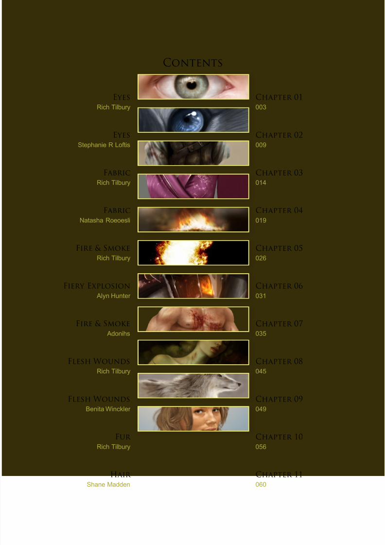
Contents
Eyes
Rich Tilbury
Eyes
Stephanie R Loftis
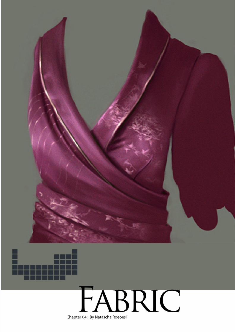
Fabric
Rich Tilbury
Fabric
Natasha Roeoesli
Fire & Smoke
Rich Tilbury
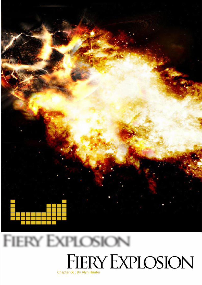
Fiery ExplosionAlyn Hunter
Fire & Smoke
Adonihs
Flesh Wounds
Rich Tilbury
Flesh Wounds
Benita Winckler
Fur
Rich Tilbury
Hair
Shane Madden
Chapter 01
003
Chapter 02
009
Chapter 03
014
Chapter 04
019
Chapter 05
026
Chapter 06031
Chapter 07
035
Chapter 08
045
Chapter 09
049
Chapter 10
056
Chapter 11
060
8/8/2019 Elements v01
http://slidepdf.com/reader/full/elements-v01 3/70
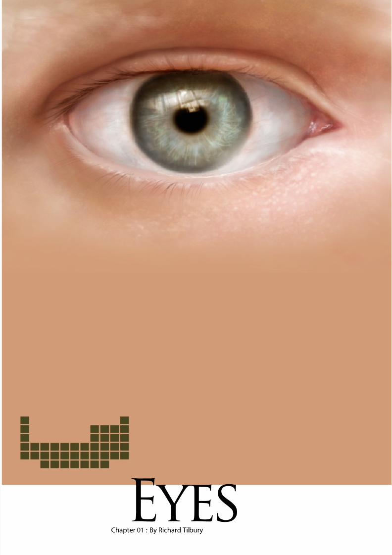
Chapter 01 : By Richard TilburyEyes
8/8/2019 Elements v01
http://slidepdf.com/reader/full/elements-v01 4/70
Elements v1 : Eyeswww.2dartistmag.com
elementsEyes
page
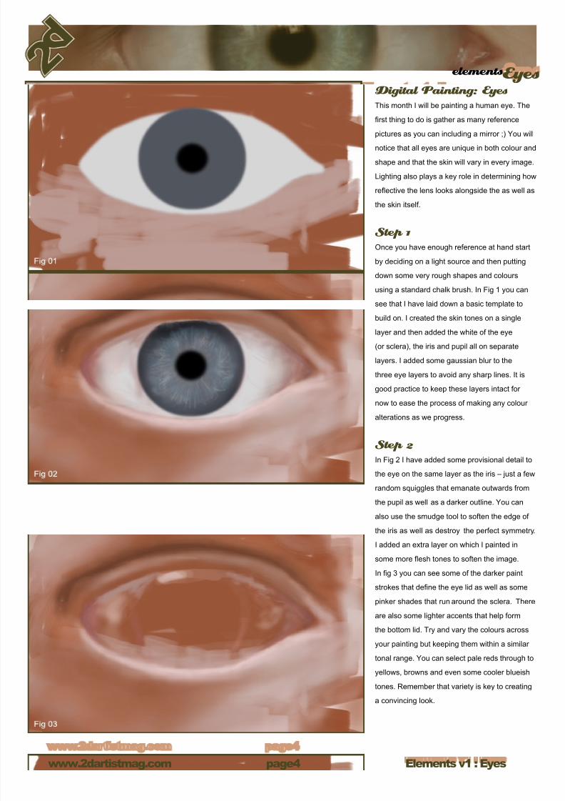
Digital Painting: EyesThis month I will be painting a human eye. The
rst thing to do is gather as many reference
pictures as you can including a mirror ;) You will
notice that all eyes are unique in both colour and
shape and that the skin will vary in every image.
Lighting also plays a key role in determining how
reective the lens looks alongside the as well as
the skin itself.
Step 1Once you have enough reference at hand start
by deciding on a light source and then putting
down some very rough shapes and colours
using a standard chalk brush. In Fig 1 you can
see that I have laid down a basic template to
build on. I created the skin tones on a single
layer and then added the white of the eye
(or sclera), the iris and pupil all on separate
layers. I added some gaussian blur to the
three eye layers to avoid any sharp lines. It is
good practice to keep these layers intact for
now to ease the process of making any colour
alterations as we progress.
Step 2In Fig 2 I have added some provisional detail to
the eye on the same layer as the iris – just a few
random squiggles that emanate outwards from
the pupil as well as a darker outline. You can
also use the smudge tool to soften the edge of
the iris as well as destroy the perfect symmetry.
I added an extra layer on which I painted in
some more esh tones to soften the image.In g 3 you can see some of the darker paint
strokes that dene the eye lid as well as some
pinker shades that run around the sclera. There
are also some lighter accents that help form
the bottom lid. Try and vary the colours across
your painting but keeping them within a similar
tonal range. You can select pale reds through to
yellows, browns and even some cooler blueish
tones. Remember that variety is key to creating
a convincing look.
8/8/2019 Elements v01
http://slidepdf.com/reader/full/elements-v01 5/70
elementsEyes
Elements v1 : Eyeswww.2dartistmag.com page
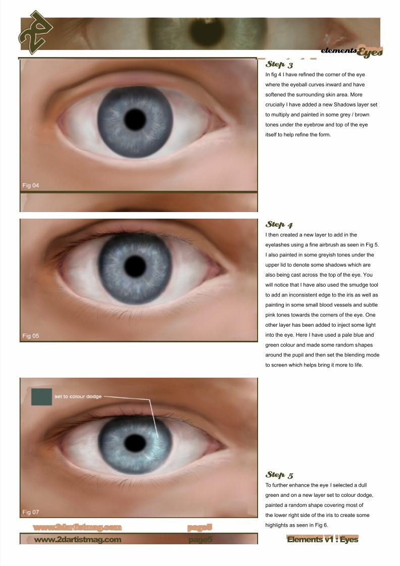
Step 3In g 4 I have rened the corner of the eye
where the eyeball curves inward and have
softened the surrounding skin area. More
crucially I have added a new Shadows layer set
to multiply and painted in some grey / brown
tones under the eyebrow and top of the eye
itself to help rene the form.
Step 4I then created a new layer to add in the
eyelashes using a ne airbrush as seen in Fig 5.
I also painted in some greyish tones under the
upper lid to denote some shadows which are
also being cast across the top of the eye. You
will notice that I have also used the smudge tool
to add an inconsistent edge to the iris as well aspainting in some small blood vessels and subtle
pink tones towards the corners of the eye. One
other layer has been added to inject some light
into the eye. Here I have used a pale blue and
green colour and made some random shapes
around the pupil and then set the blending mode
to screen which helps bring it more to life.
Step 5To further enhance the eye I selected a dull
green and on a new layer set to colour dodge,
painted a random shape covering most of
the lower right side of the iris to create some
highlights as seen in Fig 6.
8/8/2019 Elements v01
http://slidepdf.com/reader/full/elements-v01 6/70
Elements v1 : Eyeswww.2dartistmag.com
elementsEyes
page
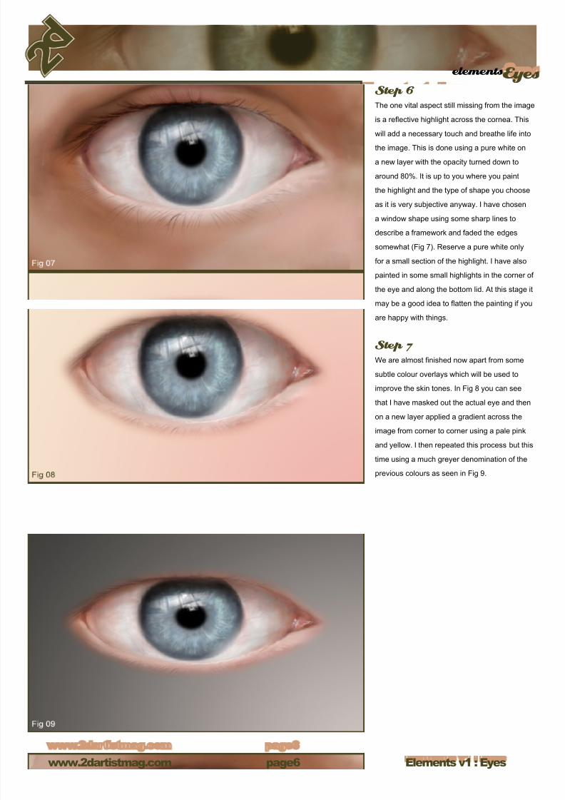
Step 6The one vital aspect still missing from the image
is a reective highlight across the cornea. This
will add a necessary touch and breathe life into
the image. This is done using a pure white on
a new layer with the opacity turned down to
around 80%. It is up to you where you paint
the highlight and the type of shape you choose
as it is very subjective anyway. I have chosen
a window shape using some sharp lines to
describe a framework and faded the edges
somewhat (Fig 7). Reserve a pure white only
for a small section of the highlight. I have also
painted in some small highlights in the corner of
the eye and along the bottom lid. At this stage it
may be a good idea to atten the painting if you
are happy with things.
Step 7We are almost nished now apart from some
subtle colour overlays which will be used to
improve the skin tones. In Fig 8 you can see
that I have masked out the actual eye and then
on a new layer applied a gradient across theimage from corner to corner using a pale pink
and yellow. I then repeated this process but this
time using a much greyer denomination of the
previous colours as seen in Fig 9.
8/8/2019 Elements v01
http://slidepdf.com/reader/full/elements-v01 7/70
elementsEyes
Elements v1 : Eyeswww.2dartistmag.com page
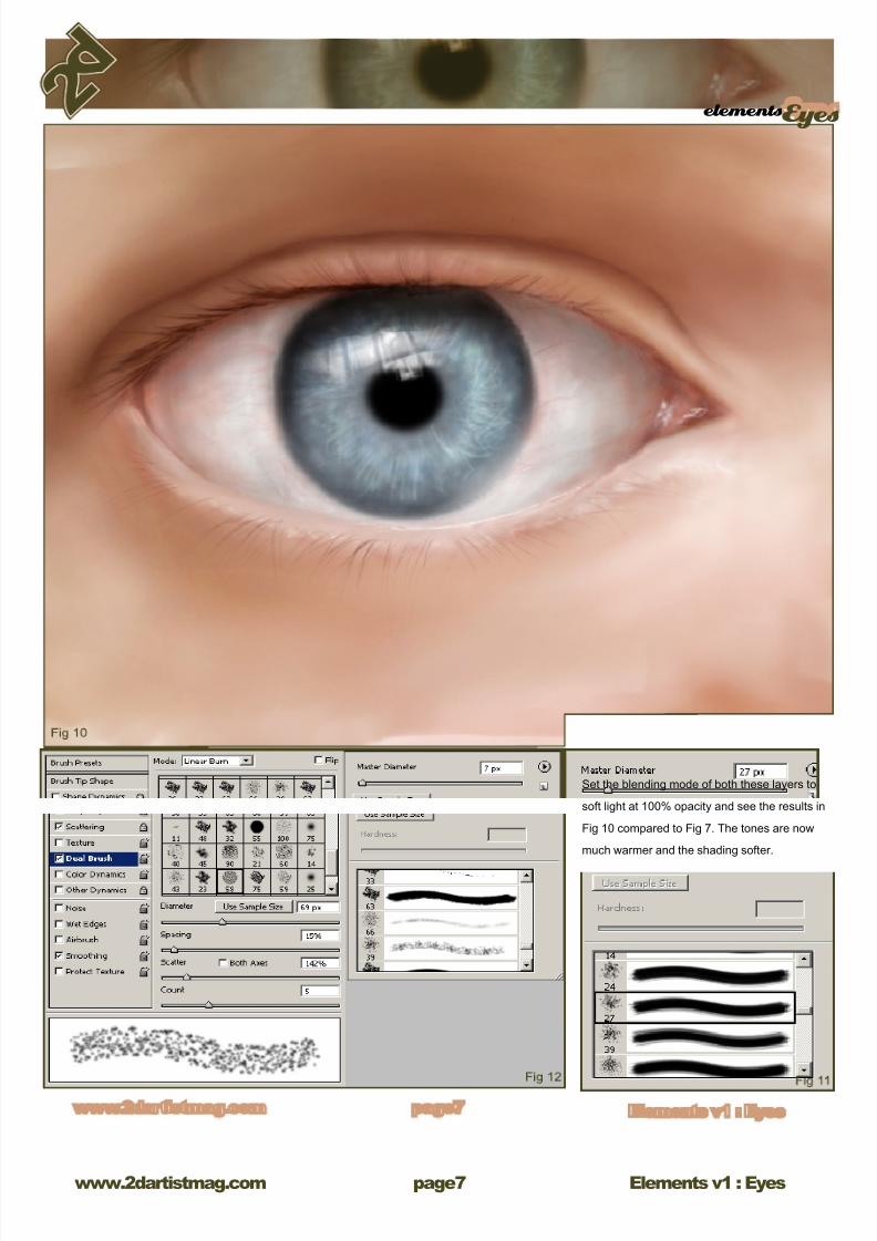
Set the blending mode of both these layers to
soft light at 100% opacity and see the results in
Fig 10 compared to Fig 7. The tones are now
much warmer and the shading softer.
8/8/2019 Elements v01
http://slidepdf.com/reader/full/elements-v01 8/70
Elements v1 : Eyeswww.2dartistmag.com
elementsEyes
page
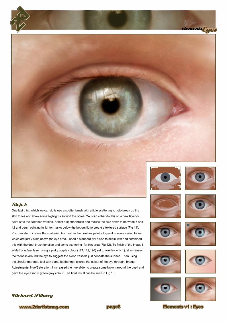
Step 8One last thing which we can do is use a spatter brush with a little scattering to help break up the
skin tones and show some highlights around the pores. You can either do this on a new layer or
paint onto the attened version. Select a spatter brush and reduce the size down to between 7 and
12 and begin painting in lighter marks below the bottom lid to create a textured surface (Fig 11).
You can also increase the scattering from within the brushes palette to paint in some varied tones
which are just visible above the eye area. I used a standard dry brush to begin with and combined
this with the dual brush function and some scattering for this area (Fig 12). To nish of the image I
added one nal layer using a pinky purple colour (171,112,126) set to overlay which just increases
the redness around the eye to suggest the blood vessels just beneath the surface. Then using
the circular marquee tool with some feathering I altered the colour of the eye through, Image-
Adjustments- Hue/Saturation. I increased the hue slider to create some brown around the pupil and
gave the eye a more green grey colour. The nal result can be seen in Fig 13.
Richard Tilbury
8/8/2019 Elements v01
http://slidepdf.com/reader/full/elements-v01 9/70
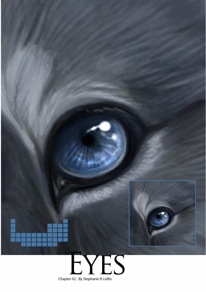
Chapter 02 : By Stephanie R. LoftisEyes
8/8/2019 Elements v01
http://slidepdf.com/reader/full/elements-v01 10/70
v1 Elements : Eyeswww.2dartistmag.com
elementsEyes
page10
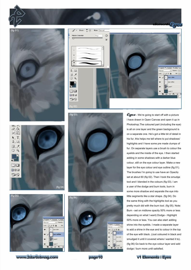
Eyes - We’re going to start off with a picture
I have drawn in Open Canvas and open it up in
Photoshop.The coloured part (including the eye)
is all on one layer and the green background is
on a separate one. He’s got a little bit of detail in
his fur, this helps me tell where to put shadows/
highlights and I have some pre made clumps of
fur. On separate layers use a brush to colour the
eyelids and the inside of the eye. I then started
adding in some shadows with a darker blue
colour, still on the eye colour layer. Make a new
layer for the eye colour and eye outline (g 01).
The brushes I’m going to use have an Opacity
set at about 60 (g 02). Then I took the smudge
tool and I blended in the colours (g 03). I am
a user of the dodge and burn tools, burn in
some more shadow and separate the eye into
little segments like a star shape. (g 04). Do
the same thing with the highlights tool as you
pretty much did with the burn tool. (g 05). Note:
Burn - set on midtone opacity 50% more or less
depending on what I want) Dodge - Highlight
50% more or less. You can also start adding
shine into the eyelids. I made a separate layer
to add a shine in the eye and to colour in the top
of the eye with black. (Just coloured in black and
smudged it until it covered where I wanted it to).
(g 06) Go back to the eye colour layer and add
dodge / burn more until satised.
8/8/2019 Elements v01
http://slidepdf.com/reader/full/elements-v01 11/70
elementsEyes
v1 Elements : Eyeswww.2dartistmag.com page11
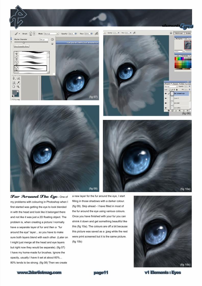
a new layer for the fur around the eye, I start
lling in those shadows with a darker colour.
(g 09). Skip ahead - I have lled in most of
the fur around the eye using various colours.
Once you have nished with your fur you can
shrink it down and get something beautiful like
this (g 10a). The colours are off a bit because
this picture was saved as a .jpeg while the rest
were print screened but it is the same picture.
(g 10b)
Fur Around The Eye - One of
my problems with colouring in Photoshop when I
rst started was getting the eye to look blended
in with the head and look like it belonged there
and not like it was just a 2D oating object. The
problem is, when creating a picture I normally
have a separate layer of fur and then a “fur
around the eye” layer... so you have to make
sure both layers blend with each other. (Later on
I might just merge all the head and eye layers
but right now they would be separate). (g 07)
I have my home-made fur brushes. Ignore the
opacity, usually I have it set at about 60%...
80% tends to be strong. (g 08) Then we create
8/8/2019 Elements v01
http://slidepdf.com/reader/full/elements-v01 12/70
v1 Elements : Eyeswww.2dartistmag.com
elementsEyes
page12
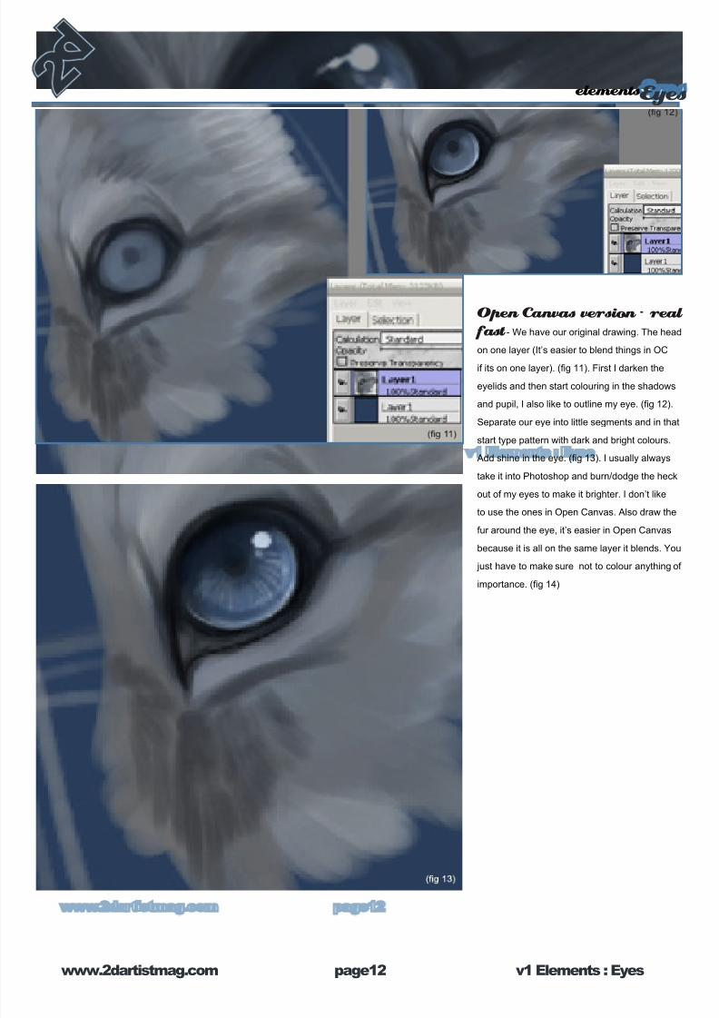
Open Canvas version - real fast - We have our original drawing. The head
on one layer (It’s easier to blend things in OC
if its on one layer). (g 11). First I darken the
eyelids and then start colouring in the shadows
and pupil, I also like to outline my eye. (g 12).
Separate our eye into little segments and in that
start type pattern with dark and bright colours.
Add shine in the eye. (g 13). I usually always
take it into Photoshop and burn/dodge the heck
out of my eyes to make it brighter. I don’t like
to use the ones in Open Canvas. Also draw the
fur around the eye, it’s easier in Open Canvasbecause it is all on the same layer it blends. You
just have to make sure not to colour anything of
importance. (g 14)
8/8/2019 Elements v01
http://slidepdf.com/reader/full/elements-v01 13/70
elementsEyes
v1 Elements : Eyeswww.2dartistmag.com page13
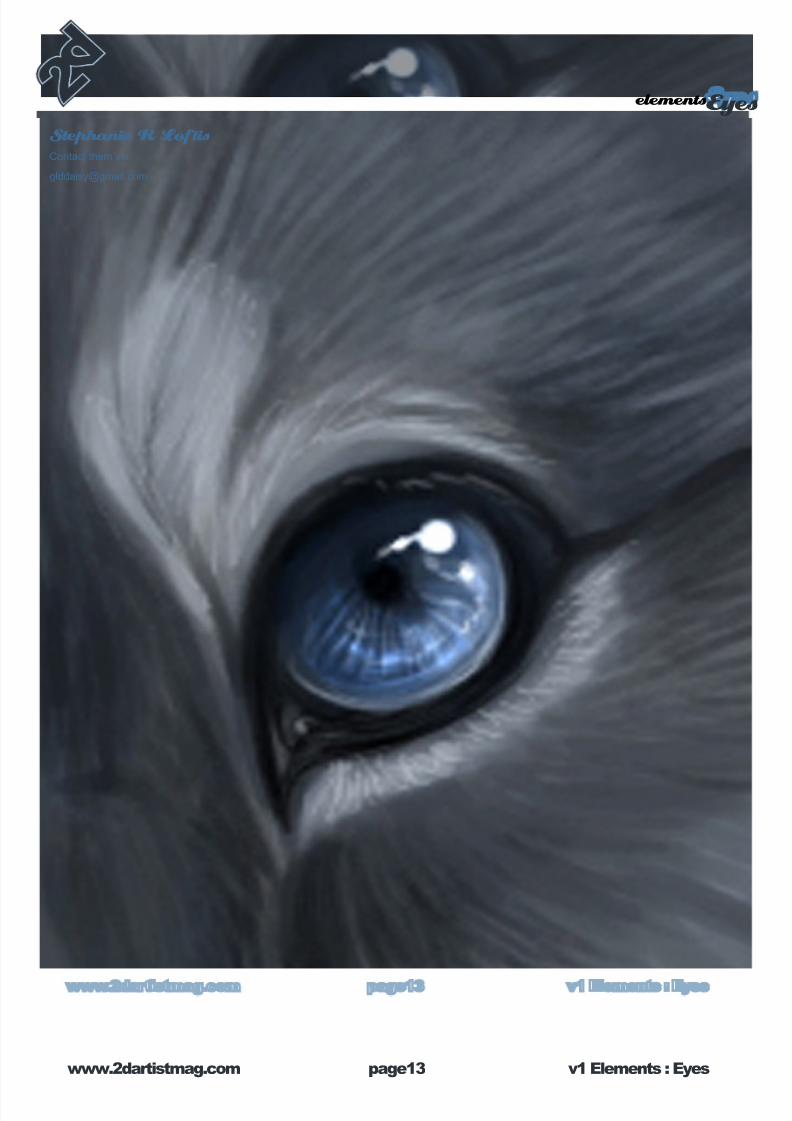
Stephanie R LoftisContact them via:
8/8/2019 Elements v01
http://slidepdf.com/reader/full/elements-v01 14/70
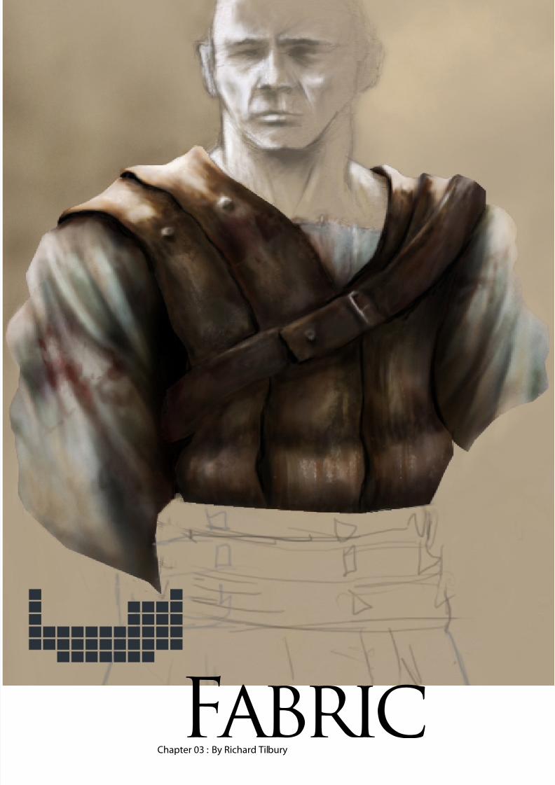
Chapter 03 : By Richard TilburyFabric
8/8/2019 Elements v01
http://slidepdf.com/reader/full/elements-v01 15/70
elementsFabric
v1 Elements : Fabricwww.2dartistmag.com page1
Painting worn leather and cloth
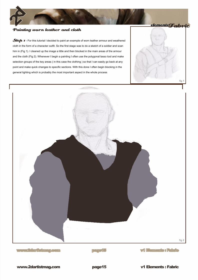
Step 1 - For this tutorial I decided to paint an example of worn leather armour and weathered
cloth in the form of a character outt. So the rst stage was to do a sketch of a soldier and scan
him in (Fig 1). I cleaned up the image a little and then blocked in the main areas of the armour
and the cloth (Fig 2). Whenever I begin a painting I often use the polygonal lasso tool and make
selection groups of the key areas ( in this case the clothing ) so that I can easily go back at any
point and make quick changes to specic sections. With this done I often begin blocking in the
general lighting which is probably the most important aspect in the whole process
8/8/2019 Elements v01
http://slidepdf.com/reader/full/elements-v01 16/70
v1 Elements : Fabricwww.2dartistmag.com page1
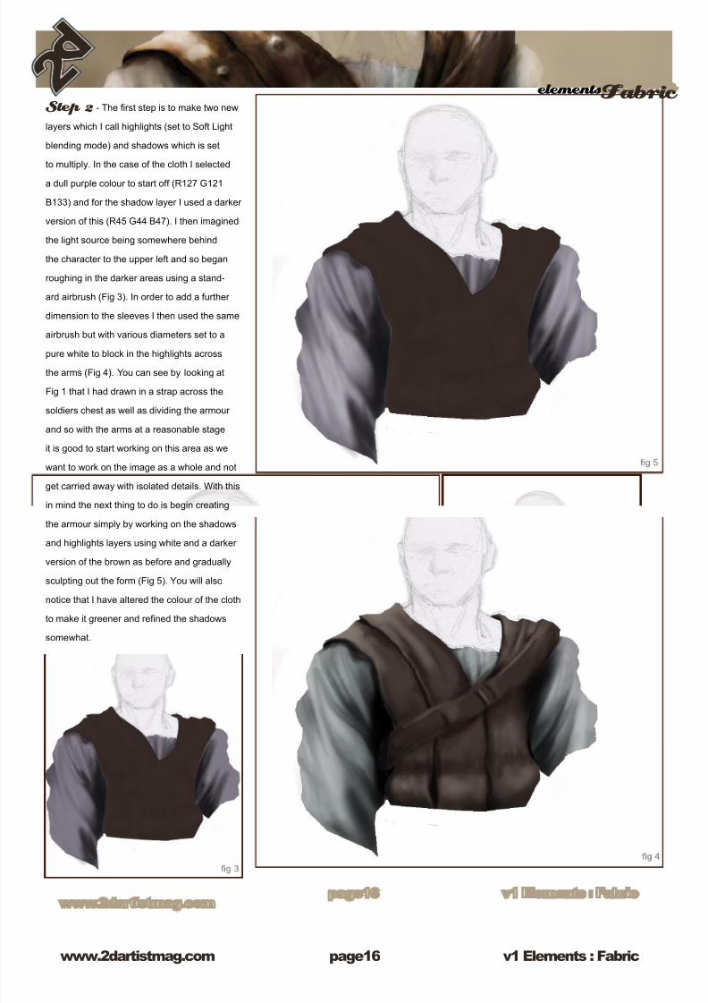
elementsFabric Step 2 - The rst step is to make two new
layers which I call highlights (set to Soft Light
blending mode) and shadows which is set
to multiply. In the case of the cloth I selected
a dull purple colour to start off (R127 G121
B133) and for the shadow layer I used a darker
version of this (R45 G44 B47). I then imagined
the light source being somewhere behind
the character to the upper left and so began
roughing in the darker areas using a stand-
ard airbrush (Fig 3). In order to add a further
dimension to the sleeves I then used the same
airbrush but with various diameters set to a
pure white to block in the highlights across
the arms (Fig 4). You can see by looking at
Fig 1 that I had drawn in a strap across the
soldiers chest as well as dividing the armour
and so with the arms at a reasonable stage
it is good to start working on this area as we
want to work on the image as a whole and not
get carried away with isolated details. With this
in mind the next thing to do is begin creating
the armour simply by working on the shadows
and highlights layers using white and a darker
version of the brown as before and gradually
sculpting out the form (Fig 5). You will also
notice that I have altered the colour of the cloth
to make it greener and rened the shadows
somewhat.
8/8/2019 Elements v01
http://slidepdf.com/reader/full/elements-v01 17/70
elementsFabric
v1 Elements : Fabricwww.2dartistmag.com page1
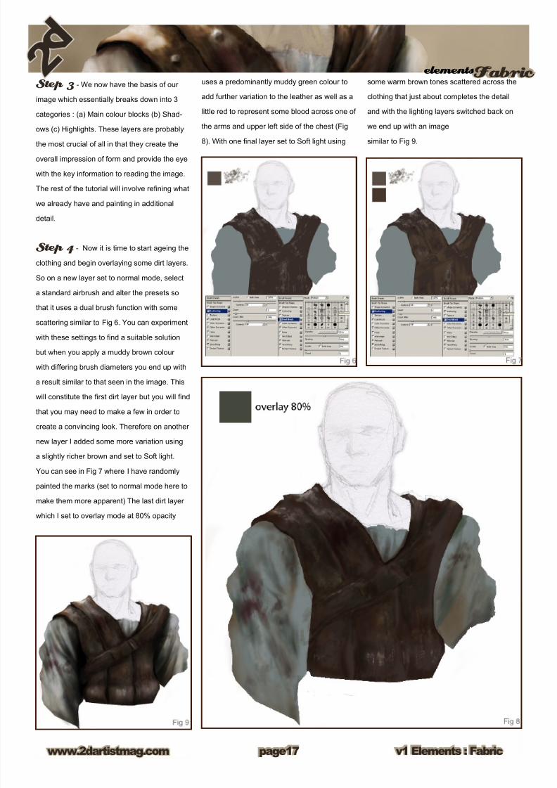
Step 3 - We now have the basis of our
image which essentially breaks down into 3
categories : (a) Main colour blocks (b) Shad-
ows (c) Highlights. These layers are probably
the most crucial of all in that they create the
overall impression of form and provide the eye
with the key information to reading the image.
The rest of the tutorial will involve rening what
we already have and painting in additional
detail.
Step 4 - Now it is time to start ageing the
clothing and begin overlaying some dirt layers.
So on a new layer set to normal mode, select
a standard airbrush and alter the presets so
that it uses a dual brush function with some
scattering similar to Fig 6. You can experiment
with these settings to nd a suitable solution
but when you apply a muddy brown colour
with differing brush diameters you end up with
a result similar to that seen in the image. This
will constitute the rst dirt layer but you will nd
that you may need to make a few in order to
create a convincing look. Therefore on another
new layer I added some more variation using
a slightly richer brown and set to Soft light.
You can see in Fig 7 where I have randomly
painted the marks (set to normal mode here to
make them more apparent) The last dirt layer
which I set to overlay mode at 80% opacity
uses a predominantly muddy green colour to
add further variation to the leather as well as a
little red to represent some blood across one of
the arms and upper left side of the chest (Fig
8). With one nal layer set to Soft light using
some warm brown tones scattered across the
clothing that just about completes the detail
and with the lighting layers switched back on
we end up with an image
similar to Fig 9.
8/8/2019 Elements v01
http://slidepdf.com/reader/full/elements-v01 18/70
v1 Elements : Fabricwww.2dartistmag.com page1
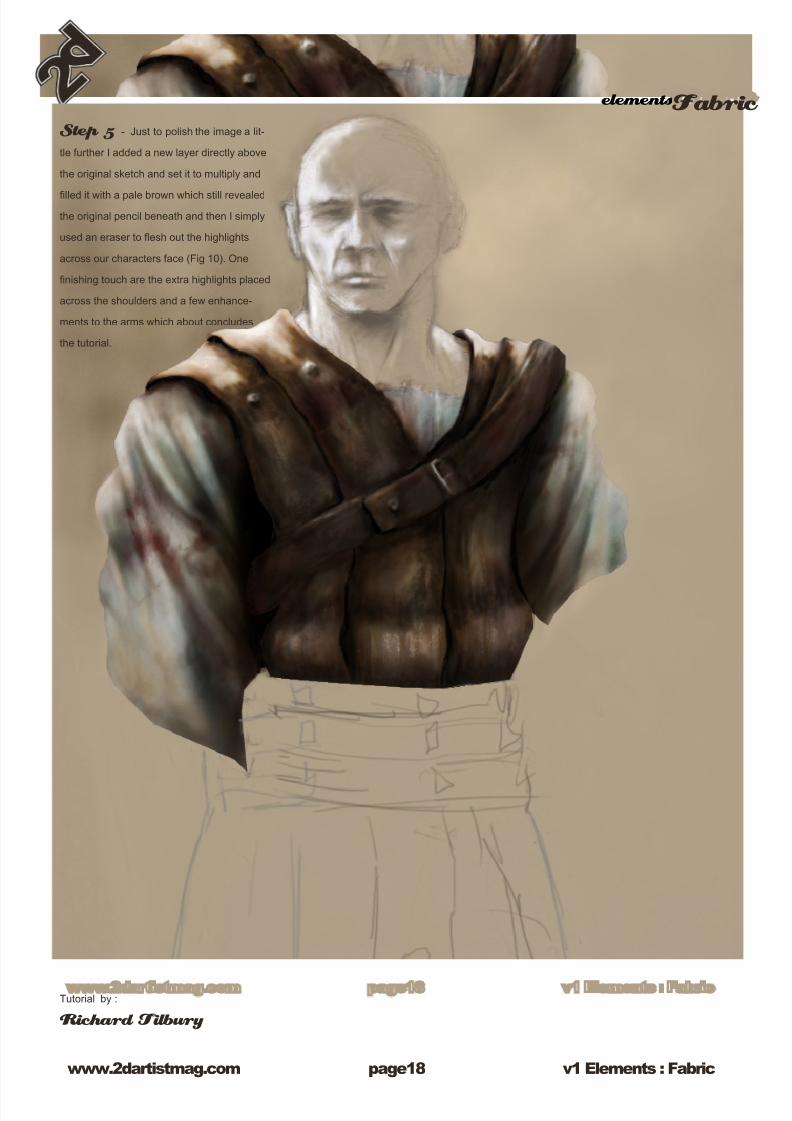
elementsFabric Step 5 - Just to polish the image a lit-
tle further I added a new layer directly above
the original sketch and set it to multiply and
lled it with a pale brown which still revealed
the original pencil beneath and then I simply
used an eraser to esh out the highlights
across our characters face (Fig 10). One
nishing touch are the extra highlights placed
across the shoulders and a few enhance-
ments to the arms which about concludes
the tutorial.
Tutorial by :
Richard Tilbury
8/8/2019 Elements v01
http://slidepdf.com/reader/full/elements-v01 19/70
8/8/2019 Elements v01
http://slidepdf.com/reader/full/elements-v01 20/70
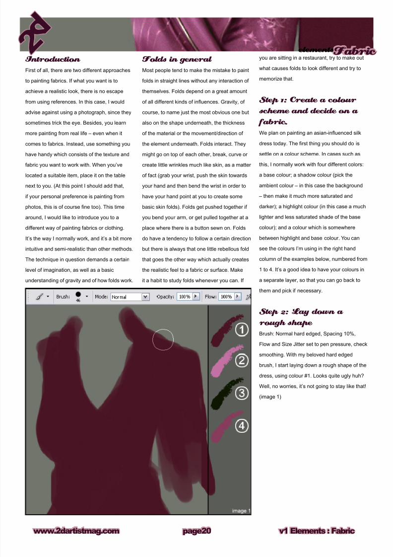
Introduction
First of all, there are two different approaches
to painting fabrics. If what you want is to
achieve a realistic look, there is no escape
from using references. In this case, I would
advise against using a photograph, since they
sometimes trick the eye. Besides, you learn
more painting from real life – even when it
comes to fabrics. Instead, use something you
have handy which consists of the texture and
fabric you want to work with. When you’ve
located a suitable item, place it on the table
next to you. (At this point I should add that,
if your personal preference is painting from
photos, this is of course ne too). This time
around, I would like to introduce you to a
different way of painting fabrics or clothing.
It’s the way I normally work, and it’s a bit more
intuitive and semi-realistic than other methods.
The technique in question demands a certain
level of imagination, as well as a basic
understanding of gravity and of how folds work.
Folds in general
Most people tend to make the mistake to paint
folds in straight lines without any interaction of
themselves. Folds depend on a great amount
of all different kinds of inuences. Gravity, of
course, to name just the most obvious one but
also on the shape underneath, the thickness
of the material or the movement/direction of
the element underneath. Folds interact. They
might go on top of each other, break, curve or
create little wrinkles much like skin, as a matter
of fact (grab your wrist, push the skin towards
your hand and then bend the wrist in order to
have your hand point at you to create some
basic skin folds). Folds get pushed together if
you bend your arm, or get pulled together at a
place where there is a button sewn on. Folds
do have a tendency to follow a certain direction
but there is always that one little rebellous fold
that goes the other way which actually creates
the realistic feel to a fabric or surface. Make
it a habit to study folds whenever you can. If
you are sitting in a restaurant, try to make out
what causes folds to look different and try to
memorize that.
Step 1: Create a colour scheme and decide on a
fabric.
We plan on painting an asian-inuenced silk
dress today. The rst thing you should do is
settle on a colour scheme. In cases such as
this, I normally work with four different colors:
a base colour; a shadow colour (pick the
ambient colour – in this case the background
– then make it much more saturated and
darker); a highlight colour (in this case a much
lighter and less saturated shade of the base
colour); and a colour which is somewhere
between highlight and base colour. You can
see the colours I’m using in the right hand
column of the examples below, numbered from
1 to 4. It’s a good idea to have your colours in
a separate layer, so that you can go back to
them and pick if necessary.
Step 2: Lay down a
rough shape
Brush: Normal hard edged, Spacing 10%,
Flow and Size Jitter set to pen pressure, check
smoothing. With my beloved hard edged
brush, I start laying down a rough shape of the
dress, using colour #1. Looks quite ugly huh?
Well, no worries, it’s not going to stay like that!
(image 1)
v1 Elements : Fabricwww.2dartistmag.com
elementsFabric
page20
8/8/2019 Elements v01
http://slidepdf.com/reader/full/elements-v01 21/70
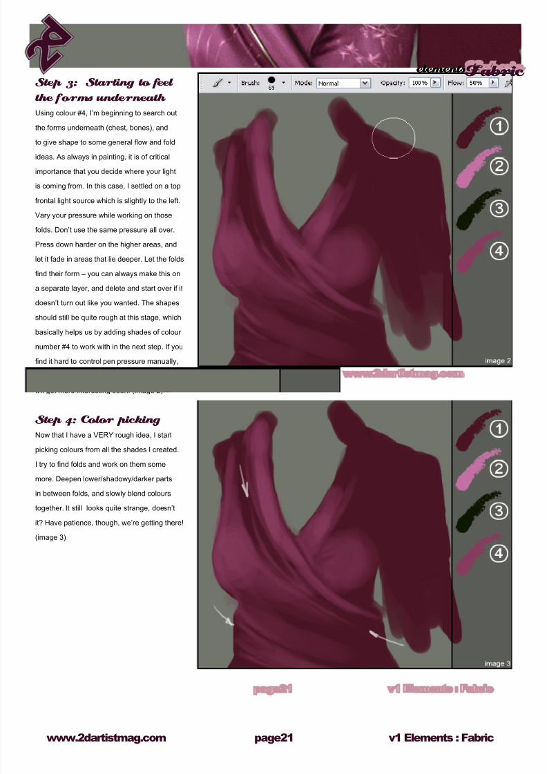
Step 3: Starting to feel
the forms underneath
Using colour #4, I’m beginning to search out
the forms underneath (chest, bones), and
to give shape to some general ow and fold
ideas. As always in painting, it is of critical
importance that you decide where your light
is coming from. In this case, I settled on a top
frontal light source which is slightly to the left.
Vary your pressure while working on those
folds. Don’t use the same pressure all over.
Press down harder on the higher areas, and
let it fade in areas that lie deeper. Let the folds
nd their form – you can always make this on
a separate layer, and delete and start over if it
doesn’t turn out like you wanted. The shapes
should still be quite rough at this stage, which
basically helps us by adding shades of colour
number #4 to work with in the next step. If you
nd it hard to control pen pressure manually,
you can lower the ow to 50%. Still with me?
It’ll get more interesting soon. (image 2)
Step 4: Color picking
Now that I have a VERY rough idea, I start
picking colours from all the shades I created.
I try to nd folds and work on them some
more. Deepen lower/shadowy/darker parts
in between folds, and slowly blend colours
together. It still looks quite strange, doesn’t
it? Have patience, though, we’re getting there!
(image 3)
elementsFabric
v1 Elements : Fabricwww.2dartistmag.com page21
8/8/2019 Elements v01
http://slidepdf.com/reader/full/elements-v01 22/70
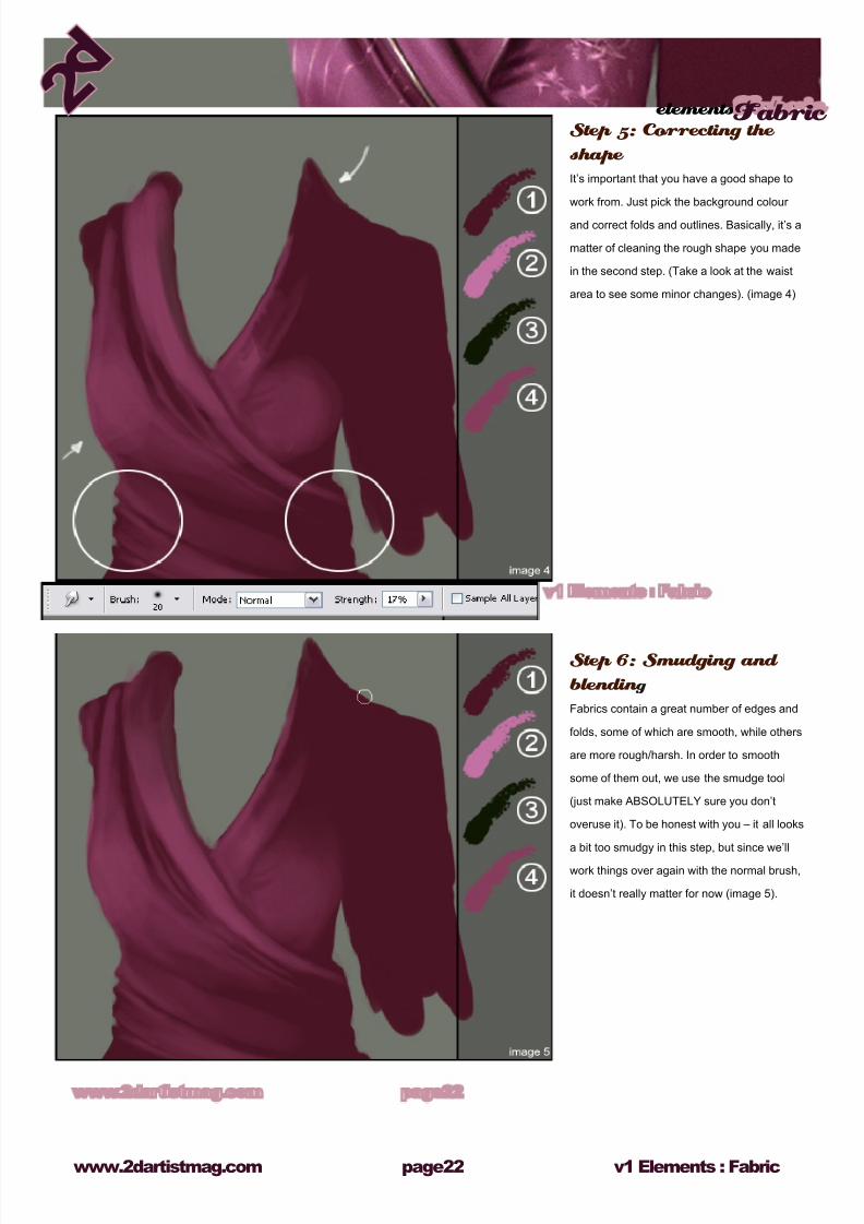
Step 5: Correcting the
shape
It’s important that you have a good shape to
work from. Just pick the background colour
and correct folds and outlines. Basically, it’s a
matter of cleaning the rough shape you made
in the second step. (Take a look at the waist
area to see some minor changes). (image 4)
Step 6: Smudging and
blendin g
Fabrics contain a great number of edges and
folds, some of which are smooth, while others
are more rough/harsh. In order to smooth
some of them out, we use the smudge tool
(just make ABSOLUTELY sure you don’t
overuse it). To be honest with you – it all looks
a bit too smudgy in this step, but since we’ll
work things over again with the normal brush,
it doesn’t really matter for now (image 5).
v1 Elements : Fabricwww.2dartistmag.com
elementsFabric
page22
8/8/2019 Elements v01
http://slidepdf.com/reader/full/elements-v01 23/70
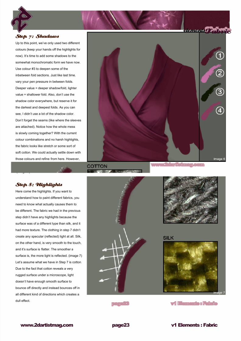
Step 7: Shadows
Up to this point, we’ve only used two different
colours (keep your hands off the highlights for
now). It’s time to add some shadows to the
somewhat monochromatic form we have now.
Use colour #3 to deepen some of the
inbetween fold sections. Just like last time,
vary your pen pressure in between folds.
Deeper value = deeper shadow/fold, lighter
value = shallower fold. Also, don’t use the
shadow color everywhere, but reserve it for
the darkest and deepest folds. As you can
see, I didn’t use a lot of the shadow color.
Don’t forget the seams (like where the sleeves
are attached). Notice how the whole mess
is slowly coming together? With the current
colour combinations and no harsh highlights,
the fabric looks like stretch or some sort of
soft cotton. We could actually settle down with
those colours and rene from here. However,
our plan was to paint silk, right? Right
(image 6).
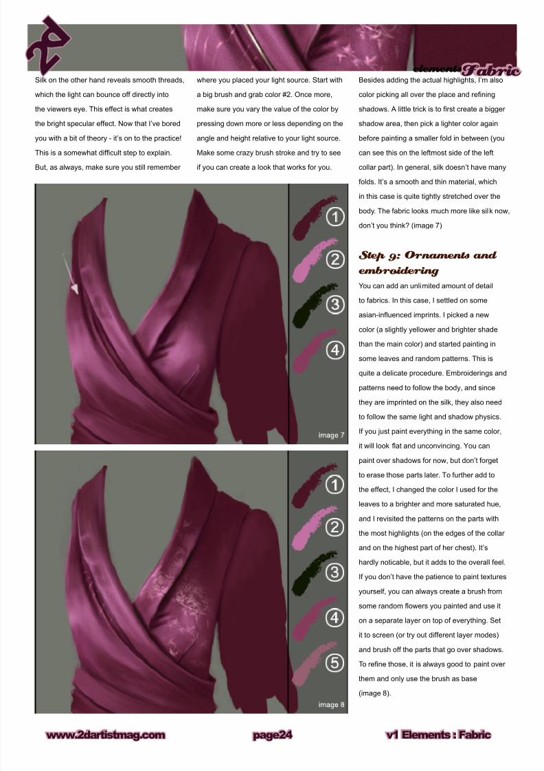
Step 8: Highlights
Here come the highlights. If you want to
understand how to paint different fabrics, you
need to know what actually causes them to
be different. The fabric we had in the previous
step didn’t have any highlights because the
surface was of a different type than silk, and it
had more texture. The clothing in step 7 didn’t
create any specular (reected) light at all. Silk,
on the other hand, is very smooth to the touch,
and it’s surface is atter. The smoother a
surface is, the more light is reected. (image 7)
Let’s assume what we have in Step 7 is cotton.
Due to the fact that cotton reveals a very
rugged surface under a microscope, light
doesn’t have enough smooth surface to
bounce off directly and instead bounces off in
all different kind of directions which creates a
dull effect.
elementsFabric
v1 Elements : Fabricwww.2dartistmag.com page23
8/8/2019 Elements v01
http://slidepdf.com/reader/full/elements-v01 24/70
where you placed your light source. Start with
a big brush and grab color #2. Once more,
make sure you vary the value of the color by
pressing down more or less depending on the
angle and height relative to your light source.
Make some crazy brush stroke and try to see
if you can create a look that works for you.
Besides adding the actual highlights, I’m also
color picking all over the place and rening
shadows. A little trick is to rst create a bigger
shadow area, then pick a lighter color again
before painting a smaller fold in between (you
can see this on the leftmost side of the left
collar part). In general, silk doesn’t have many
folds. It’s a smooth and thin material, which
in this case is quite tightly stretched over the
body. The fabric looks much more like silk now,
don’t you think? (image 7)
Step 9: Ornaments and
embroidering You can add an unlimited amount of detail
to fabrics. In this case, I settled on some
asian-inuenced imprints. I picked a new
color (a slightly yellower and brighter shade
than the main color) and started painting in
some leaves and random patterns. This is
quite a delicate procedure. Embroiderings and
patterns need to follow the body, and since
they are imprinted on the silk, they also need
to follow the same light and shadow physics.
If you just paint everything in the same color,
it will look at and unconvincing. You can
paint over shadows for now, but don’t forget
to erase those parts later. To further add to
the effect, I changed the color I used for the
leaves to a brighter and more saturated hue,
and I revisited the patterns on the parts with
the most highlights (on the edges of the collar
and on the highest part of her chest). It’s
hardly noticable, but it adds to the overall feel.
If you don’t have the patience to paint textures
yourself, you can always create a brush from
some random owers you painted and use it
on a separate layer on top of everything. Set
it to screen (or try out different layer modes)
and brush off the parts that go over shadows.
To rene those, it is always good to paint over
them and only use the brush as base
(image 8).
Silk on the other hand reveals smooth threads,
which the light can bounce off directly into
the viewers eye. This effect is what creates
the bright specular effect. Now that I’ve bored
you with a bit of theory - it’s on to the practice!
This is a somewhat difcult step to explain.
But, as always, make sure you still remember
v1 Elements : Fabricwww.2dartistmag.com
elementsFabric
page2
8/8/2019 Elements v01
http://slidepdf.com/reader/full/elements-v01 25/70
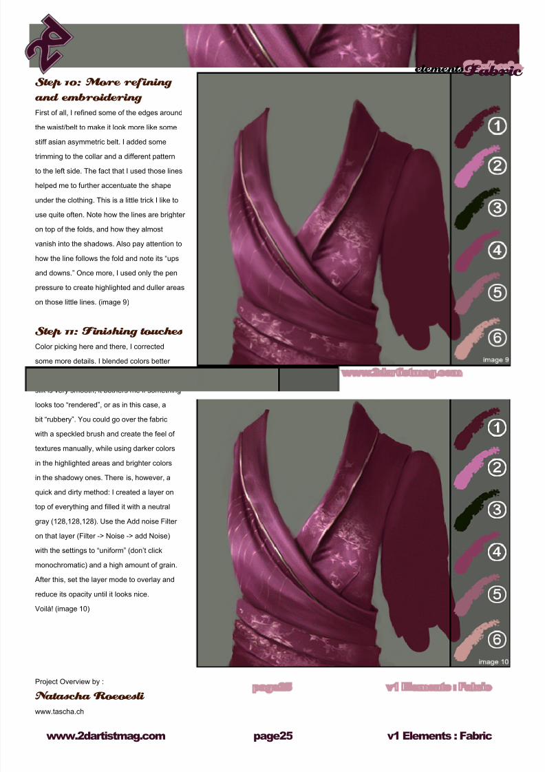
Step 10: More refining
and embroidering
First of all, I rened some of the edges around
the waist/belt to make it look more like some
stiff asian asymmetric belt. I added some
trimming to the collar and a different pattern
to the left side. The fact that I used those lines
helped me to further accentuate the shape
under the clothing. This is a little trick I like to
use quite often. Note how the lines are brighter
on top of the folds, and how they almost
vanish into the shadows. Also pay attention to
how the line follows the fold and note its “ups
and downs.” Once more, I used only the pen
pressure to create highlighted and duller areas
on those little lines. (image 9)
Step 11: Finishing touches
Color picking here and there, I corrected
some more details. I blended colors better
and deepened some shadows. Even though
silk is very smooth, it bothers me if something
looks too “rendered”, or as in this case, a
bit “rubbery”. You could go over the fabric
with a speckled brush and create the feel of
textures manually, while using darker colors
in the highlighted areas and brighter colors
in the shadowy ones. There is, however, a
quick and dirty method: I created a layer on
top of everything and lled it with a neutral
gray (128,128,128). Use the Add noise Filter
on that layer (Filter -> Noise -> add Noise)
with the settings to “uniform” (don’t click
monochromatic) and a high amount of grain.
After this, set the layer mode to overlay and
reduce its opacity until it looks nice.
Voilà! (image 10)
Project Overview by :
Natascha Roeoesli
www.tascha.ch
elementsFabric
v1 Elements : Fabricwww.2dartistmag.com page2
8/8/2019 Elements v01
http://slidepdf.com/reader/full/elements-v01 26/70
Chapter 05 : By Richard Tilbury
Fire & Smoke
8/8/2019 Elements v01
http://slidepdf.com/reader/full/elements-v01 27/70
elementsFire and Smoke
www.2dartistmag.com page2 v1 Elements : Fire and Smoke
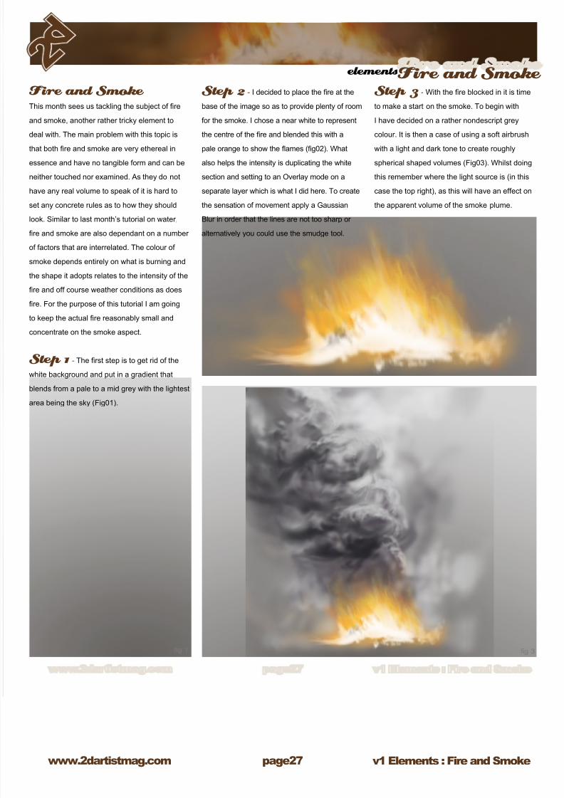
Fire and Smoke This month sees us tackling the subject of re
and smoke, another rather tricky element to
deal with. The main problem with this topic is
that both re and smoke are very ethereal in
essence and have no tangible form and can be
neither touched nor examined. As they do not
have any real volume to speak of it is hard to
set any concrete rules as to how they should
look. Similar to last month’s tutorial on water,
re and smoke are also dependant on a number
of factors that are interrelated. The colour of
smoke depends entirely on what is burning and
the shape it adopts relates to the intensity of there and off course weather conditions as does
re. For the purpose of this tutorial I am going
to keep the actual re reasonably small and
concentrate on the smoke aspect.
Step 1 - The rst step is to get rid of the
white background and put in a gradient that
blends from a pale to a mid grey with the lightest
area being the sky (Fig01).
Step 2 - I decided to place the re at the
base of the image so as to provide plenty of room
for the smoke. I chose a near white to represent
the centre of the re and blended this with a
pale orange to show the ames (g02). What
also helps the intensity is duplicating the white
section and setting to an Overlay mode on a
separate layer which is what I did here. To create
the sensation of movement apply a Gaussian
Blur in order that the lines are not too sharp or
alternatively you could use the smudge tool.
Step 3 - With the re blocked in it is time
to make a start on the smoke. To begin with
I have decided on a rather nondescript grey
colour. It is then a case of using a soft airbrush
with a light and dark tone to create roughly
spherical shaped volumes (Fig03). Whilst doing
this remember where the light source is (in this
case the top right), as this will have an effect on
the apparent volume of the smoke plume.
8/8/2019 Elements v01
http://slidepdf.com/reader/full/elements-v01 28/70
v1 Elements : Fire and Smokewww.2dartistmag.com
elementsFire and Smoke
page2
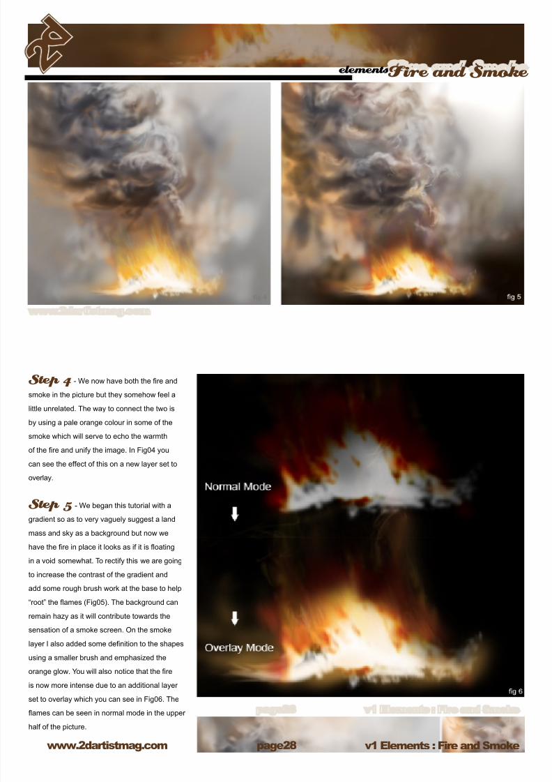
Step 4 - We now have both the re and
smoke in the picture but they somehow feel a
little unrelated. The way to connect the two isby using a pale orange colour in some of the
smoke which will serve to echo the warmth
of the re and unify the image. In Fig04 you
can see the effect of this on a new layer set to
overlay.
Step 5 - We began this tutorial with a
gradient so as to very vaguely suggest a land
mass and sky as a background but now we
have the re in place it looks as if it is oating
in a void somewhat. To rectify this we are going
to increase the contrast of the gradient and
add some rough brush work at the base to help
“root” the ames (Fig05). The background can
remain hazy as it will contribute towards the
sensation of a smoke screen. On the smoke
layer I also added some denition to the shapes
using a smaller brush and emphasized the
orange glow. You will also notice that the re
is now more intense due to an additional layer
set to overlay which you can see in Fig06. The
ames can be seen in normal mode in the upper
half of the picture.
8/8/2019 Elements v01
http://slidepdf.com/reader/full/elements-v01 29/70
elementsFire and Smoke
www.2dartistmag.com page29 v1 Elements : Fire and Smoke
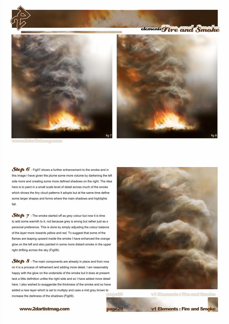
Step 6 - Fig07 shows a further enhancement to the smoke and in
this image I have given the plume some more volume by darkening the left
side more and creating some more dened shadows on the right. The idea
here is to paint in a small scale level of detail across much of the smoke
which shows the tiny cloud patterns it adopts but at the same time dene
some larger shapes and forms where the main shadows and highlights
fall.
Step 7 - The smoke started off as grey colour but now it is time
to add some warmth to it, not because grey is wrong but rather just as a
personal preference. This is done by simply adjusting the colour balance
of the layer more towards yellow and red. To suggest that some of the
ames are leaping upward inside the smoke I have enhanced the orange
glow on the left and also painted in some more distant smoke in the upper
right drifting across the sky (Fig08).
Step 8 - The main components are already in place and from now
on it is a process of renement and adding more detail. I am reasonably
happy with the glow on the underside of the smoke but it does at present
lack a little denition unlike the right side and so I have added more detail
here. I also wished to exaggerate the thickness of the smoke and so have
added a new layer which is set to multiply and uses a mid grey brown to
increase the darkness of the shadows (Fig09).
8/8/2019 Elements v01
http://slidepdf.com/reader/full/elements-v01 30/70
v1 Elements : Fire and Smokewww.2dartistmag.com
elementsFire and Smoke
page30
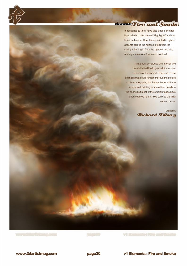
In response to this I have also added another
layer which I have named “Highlights” and set
to normal mode. Here I have painted in lighter
accents across the right side to reect the
sunlight ltering in from the right corner, also
adding some more drama and contrast.
That about concludes this tutorial and
hopefully it will help you paint your own
versions of the subject. There are a few
changes that could further improve the picture
such as integrating the ames better with the
smoke and painting in some ner details in
the plume but most of the crucial stages havebeen covered I think. You can see the nal
version below.
Tutorial by
Richard Tilbury
8/8/2019 Elements v01
http://slidepdf.com/reader/full/elements-v01 31/70
Chapter 06 : By Alyn Hunter
Fiery Explosion
8/8/2019 Elements v01
http://slidepdf.com/reader/full/elements-v01 32/70
v1 Elements: Fiery Explosionwww.2dartistmag.com
elementsFiery Explosion
page32
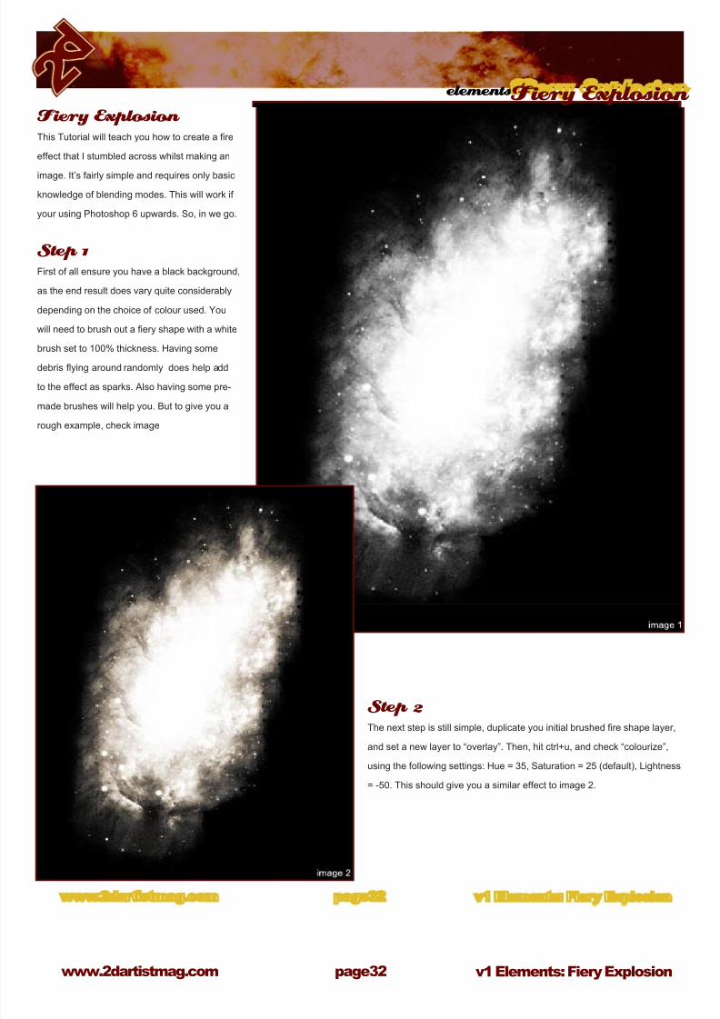
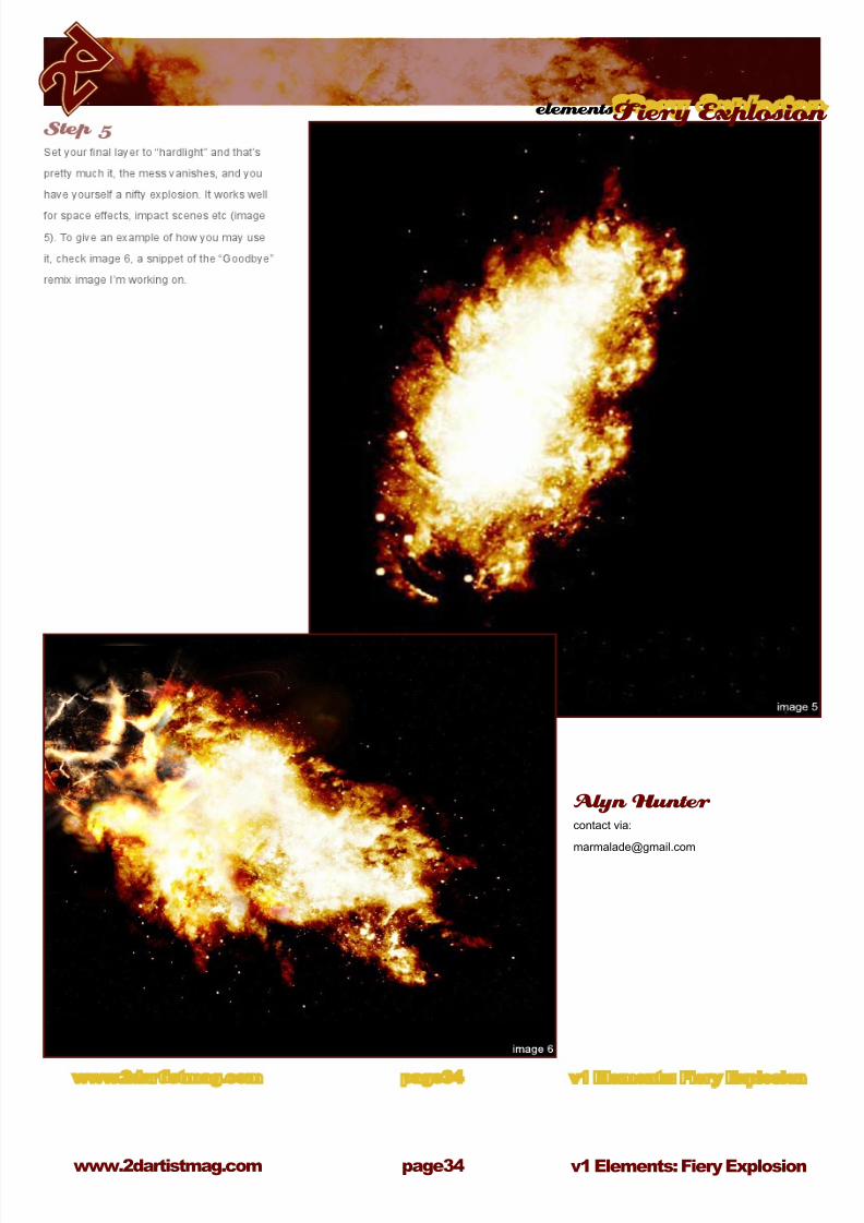
Step 2The next step is still simple, duplicate you initial brushed re shape layer,
and set a new layer to “overlay”. Then, hit ctrl+u, and check “colourize”,
using the following settings: Hue = 35, Saturation = 25 (default), Lightness
= -50. This should give you a similar effect to image 2.
Fiery Explosion This Tutorial will teach you how to create a re
effect that I stumbled across whilst making an
image. It’s fairly simple and requires only basic
knowledge of blending modes. This will work if
your using Photoshop 6 upwards. So, in we go.
Step 1First of all ensure you have a black background,
as the end result does vary quite considerably
depending on the choice of colour used. You
will need to brush out a ery shape with a white
brush set to 100% thickness. Having some
debris ying around randomly does help add
to the effect as sparks. Also having some pre-
made brushes will help you. But to give you a
rough example, check image

8/8/2019 Elements v01
http://slidepdf.com/reader/full/elements-v01 33/70
elementsFiery Explosion
www.2dartistmag.com page33 v1 Elements: Fiery Explosion
Step 3Another simple step is to just duplicate your
overlay layer and set it to colour burn as you can
see in image 3.
Step 4In this step we will be going over what we’ve done before. So follow steps
2 and steps 3 through one more time, duplicating your layer, overlay, hue,
duplicate, burn, new set, merge down etc. Just follow 2 and 3 again with
this new layer and all is well. Hopefully you should achieve this messy
object, which is all you want really as seen in image 4. The following
step will show you the nished product! Now you could leave it there, if
you want to ( merge all layers, except black layer, and set to hard light),
however I continued. Since the effect can be enhanced. Create a layer set
using the folder icon at the bottom of the layers box. In the correct order,
put the three layers you have into the set. Select the set, and hit “ctrl+e”
thus making one new layer.
8/8/2019 Elements v01
http://slidepdf.com/reader/full/elements-v01 34/70
v1 Elements: Fiery Explosionwww.2dartistmag.com
elementsFiery Explosion
page3
Alyn Hunter contact via:

8/8/2019 Elements v01
http://slidepdf.com/reader/full/elements-v01 35/70
Chapter 07 : By Daniel LuVisi
Fire & Smoke
8/8/2019 Elements v01
http://slidepdf.com/reader/full/elements-v01 36/70
v1 Elements : Fire and Smokewww.2dartistmag.com
elementsFire and Smoke
page3
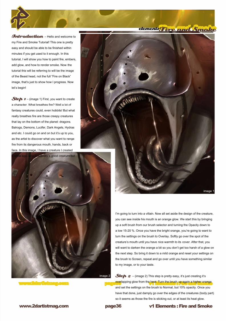
Introduction – Hello and welcome to
my Fire and Smoke Tutorial! This one is pretty
easy and should be able to be nished within
minutes if you get used to it enough. In this
tutorial, I will show you how to paint re, embers,
add glow, and how to render smoke. Now the
tutorial this will be referring to will be the image
of the Beast head, not the full “Fire on Black”
image, that’s just to show how I progress. Now
let’s begin!
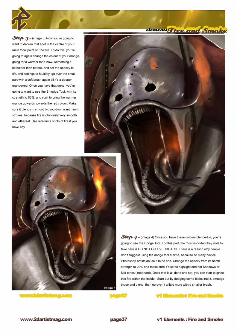
Step 1 – (image 1) First, you want to create
a character. What breathes re? Well a lot of
fantasy creatures could, even hobbits! But what
really breathes re are those creepy creatures
that lay on the bottom of the planet: dragons,
Balrogs, Demons, Lucifer, Dark Angels, Hydras
and etc. I could go on and on but it’s up to you,
as the artist to discover what you want to range
re from its dangerous mouth, hands, back or
face. In this image, I have a creature I created
a while ago, who is actually a good creature but
I’m going to turn into a villain. Now all set aside the design of the creature,
you can see inside his mouth is an orange glow. We start this by bringing
up a soft brush from our brush selector and turning the Opacity down to
a low 15-20 %. Once you have the bright orange, you’re going to want to
turn the settings on the brush to Overlay. Softly go over the spot of the
creature’s mouth until you have nice warmth to its cover. After that, you
will want to darken the orange a bit so you don’t get too harsh of a glow on
the next step. So bring it down to a mild orange and reset your settings on
the brush to Screen, repeat and go over until you have something similar
to my image, or to your taste.
Step 2 – (image 2) This step is pretty easy, it’s just creating it’s
overlapping glow from the heat. Turn the brush up again a higher orange
and set the settings on the brush to Normal, but 10% opacity. Once you
have that done, just damply go over the edges of the creatures (body part)
so it seems as those the re is sticking out, or at least its heat glow.
8/8/2019 Elements v01
http://slidepdf.com/reader/full/elements-v01 37/70
8/8/2019 Elements v01
http://slidepdf.com/reader/full/elements-v01 38/70
v1 Elements : Fire and Smokewww.2dartistmag.com
elementsFire and Smoke
page3
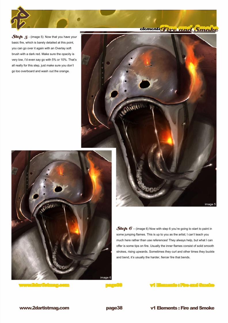
Step 5 - (image 5) Now that you have your
basic re, which is barely detailed at this point,
you can go over it again with an Overlay soft
brush with a dark red. Make sure the opacity is
very low, I’d even say go with 5% or 10%. That’s
all really for this step, just make sure you don’t
go too overboard and wash out the orange.
Step 6 – (image 6) Now with step 6 you’re going to start to paint in
some jumping ames. This is up to you as the artist; I can’t teach you
much here rather than use references! They always help, but what I can
offer is some tips on re. Usually the inner ames consist of solid smooth
strokes, rising upwards. Sometimes they curl and other times they buckle
and bend, it’s usually the harder, ercer re that bends.
8/8/2019 Elements v01
http://slidepdf.com/reader/full/elements-v01 39/70
elementsFire and Smoke
www.2dartistmag.com page39 v1 Elements : Fire and Smoke
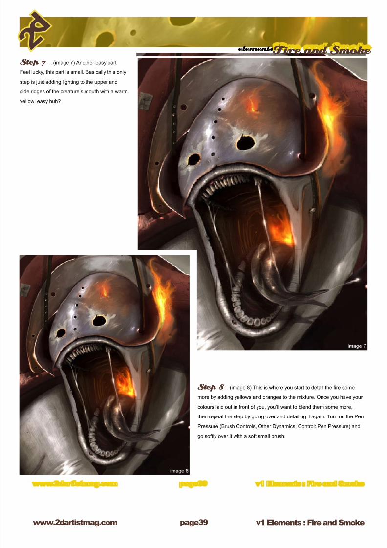
Step 7 – (image 7) Another easy part!
Feel lucky, this part is small. Basically this only
step is just adding lighting to the upper and
side ridges of the creature’s mouth with a warm
yellow, easy huh?
Step 8 – (image 8) This is where you start to detail the re some
more by adding yellows and oranges to the mixture. Once you have your
colours laid out in front of you, you’ll want to blend them some more,
then repeat the step by going over and detailing it again. Turn on the Pen
Pressure (Brush Controls, Other Dynamics, Control: Pen Pressure) and
go softly over it with a soft small brush.
8/8/2019 Elements v01
http://slidepdf.com/reader/full/elements-v01 40/70
v1 Elements : Fire and Smokewww.2dartistmag.com
elementsFire and Smoke
page0
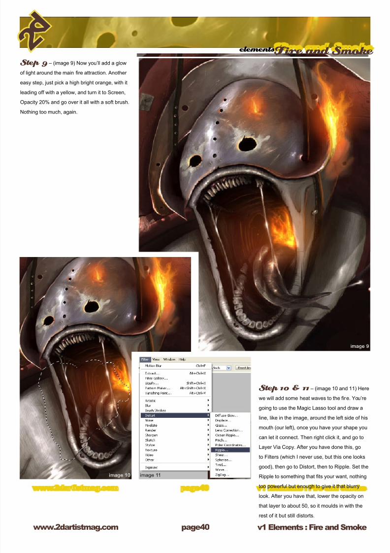
Step 9 – (image 9) Now you’ll add a glow
of light around the main re attraction. Another
easy step, just pick a high bright orange, with it
leading off with a yellow, and turn it to Screen,
Opacity 20% and go over it all with a soft brush.
Nothing too much, again.
Step 10 & 11 – (image 10 and 11) Here
we will add some heat waves to the re. You’re
going to use the Magic Lasso tool and draw a
line, like in the image, around the left side of his
mouth (our left), once you have your shape you
can let it connect. Then right click it, and go to
Layer Via Copy. After you have done this, go
to Filters (which I never use, but this one looks
good), then go to Distort, then to Ripple. Set the
Ripple to something that ts your want, nothing
too powerful but enough to give it that blurry
look. After you have that, lower the opacity on
that layer to about 50, so it moulds in with the
rest of it but still distorts.
8/8/2019 Elements v01
http://slidepdf.com/reader/full/elements-v01 41/70
elementsFire and Smoke
www.2dartistmag.com page1 v1 Elements : Fire and Smoke
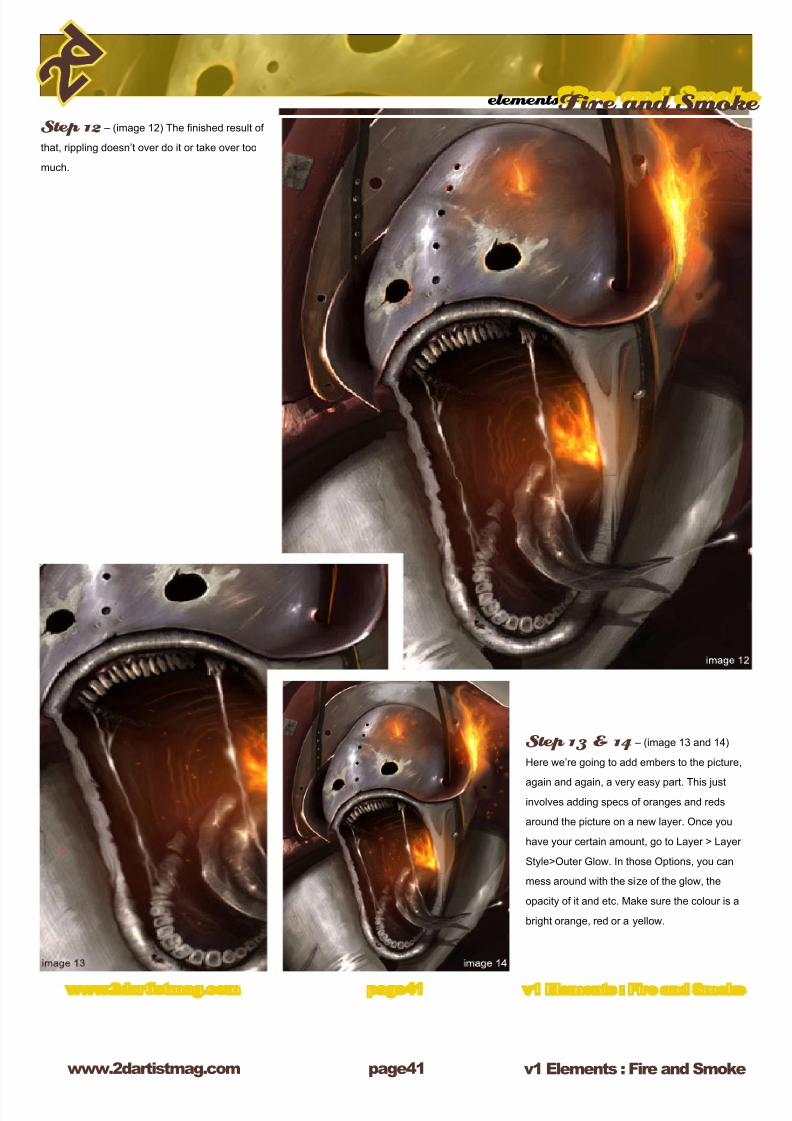
Step 12 – (image 12) The nished result of
that, rippling doesn’t over do it or take over too
much.
Step 13 & 14 – (image 13 and 14)
Here we’re going to add embers to the picture,
again and again, a very easy part. This justinvolves adding specs of oranges and reds
around the picture on a new layer. Once you
have your certain amount, go to Layer > Layer
Style>Outer Glow. In those Options, you can
mess around with the size of the glow, the
opacity of it and etc. Make sure the colour is a
bright orange, red or a yellow.

8/8/2019 Elements v01
http://slidepdf.com/reader/full/elements-v01 42/70
v1 Elements : Fire and Smokewww.2dartistmag.com
elementsFire and Smoke
page2
Smoke – Step 1 (smoke 1) – Here
we go with the smoke. Now this is my rst time
teaching smoke, so ill try to make it easy. Here’s
a new way I did it, I thought I would experiment
with my own brushes. Make a new canvas, and
with a size 1 hard brush, just draw a blob like
I did. With that done, then go to Edit>Dene
Brush Preset, and voila! Rename it to Smoke
Brush, and it should save automatically and also
turn it into the brush.
Smoke - Step 2 (smoke 2) With your custom brush now, turn
the opacity down to 40% and just mess with it on a new Canvas. Go for
some grey colours and just do whatever you want! Even turn on pen
pressure for some more fun! Ok! But now no more fun, back to painting!
On the image, make it a new layer on top of the re, and lower the opacity
to 20%. Remember this is your base layer so all you have to do is just go
over it softly, you can always erase it and not worry about the rest.
Smoke – Step 3 (smoke 3) This is where you’ll start to
lighten the smoke, which is an easy step. Duplicate the layer by going
to Layer>Duplicate Layer. After that, lower the opacity of the layer in the
Layer Tools to 25-30%. Then set the layer to screen to add more volume
to it. After this, merge the two layers together as one.

8/8/2019 Elements v01
http://slidepdf.com/reader/full/elements-v01 43/70
elementsFire and Smoke
www.2dartistmag.com page3 v1 Elements : Fire and Smoke
Smoke – Step 4 (smoke 4) Since
smoke is kind of transparent, you’re going to
be able to see the lighting from the re popping
through. Grab your custom smoke brush again
and change its colour to a mild orange. Make
sure your opacity is low (just to make the record,
when doing smoke; make sure the opacity is
ALWAYS low) and start to dab the orange softly
onto the smoke layer. You should be able to
make the smoke turn from a pasty white, to a
white-orange mist.
Smoke – Step 5 (smoke 5) This part I started to cut around
the smoke, breaking it down so it doesn’t get too thick. I used my custom
smoke tool as an eraser and started to slowly just itch away at the smoke.
You should turn down the ow and opacity at 45% when erasing, and just
dab at it. Don’t put in hard strokes and totally deplete the smoke.
8/8/2019 Elements v01
http://slidepdf.com/reader/full/elements-v01 44/70
v1 Elements : Fire and Smokewww.2dartistmag.com
elementsFire and Smoke
page
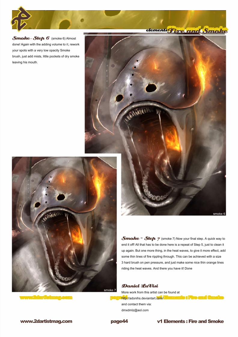
Smoke – Step 6 (smoke 6) Almost
done! Again with the adding volume to i t, rework
your spots with a very low opacity Smoke
brush, just add mists, little pockets of dry smoke
leaving his mouth.
Smoke – Step 7 (smoke 7) Now your nal step. A quick way to
end it off! All that has to be done here is a repeat of Step 5, just to clean it
up again. But one more thing, in the heat waves, to give it more effect, add
some thin lines of re rippling through. This can be achieved with a size
3 hard brush on pen pressure, and just make some nice thin orange lines
riding the heat waves. And there you have it! Done
Daniel LuVisi More work from this artist can be found at
http://adonihs.deviantart.com/
and contact them via:
8/8/2019 Elements v01
http://slidepdf.com/reader/full/elements-v01 45/70
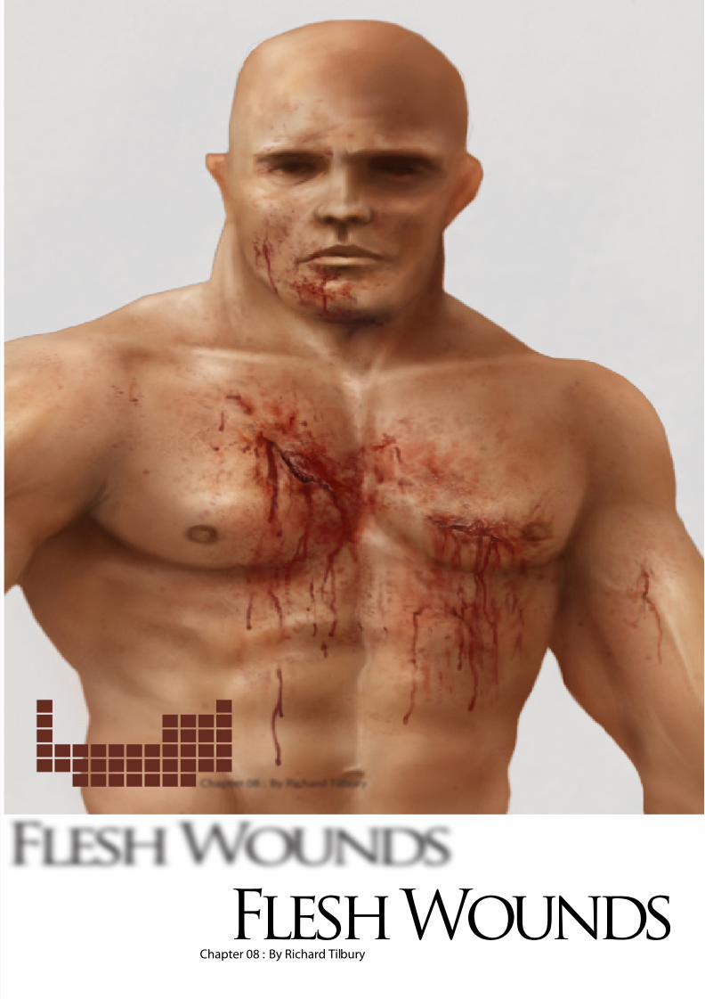
Chapter 08 : By Richard Tilbury
Flesh Wounds
8/8/2019 Elements v01
http://slidepdf.com/reader/full/elements-v01 46/70
v1 Elements : Flesh Woundswww.2dartistmag.com
Elements Flesh Wounds
page
This months’ tutorial will conclude the series
by nishing with esh wounds as the subject.
As last months’ dealt with skin I will use that
as a starting point and paint a wound over the
image to save time. As usual I did a search for
as much reference material as I could muster
and decided to have a go at painting a deep
laceration across the chest area as though our
character had been struck by a sword. Whilst
looking through the reference pictures I noticed
how the numerous shades of red that surround
a wound. Not only do you have the very dark
red of the puncture and thicker blood but the
skin around it also appears more red as blood
gathers under the surface of the skin. As it clots
it also appears darker and so you end up with a
varying tonal range dependant on the area.
Step 1The rst stage is to decide on where the
laceration will be (the chest in this case). On a
new layer I painted in two slashes using one of
the standard hard round airbrushes with various
widths and using a dark red (R53,G13,B10) as
seen in Fig.1. This will determine the actual cut
and utilise the darkest colour. Because I am
attempting to paint a wound inicted by a sword
it is important not to make the wound to big. A
blade is relatively thin and so even though a
stab/slash may be deep, the puncture may in
fact appear quite small on the skin. The bleeding
around it will eventually help determine the
extent of the damage – after all a small shallow
cut will bleed far less than the severing of an
artery for example.
Step 2On another new layer set to Soft Light and using
a slightly lighter shade of red (R88,G33,B35) I
began adding some redness around the cuts to
help relate them better with the skin. You can
see in Fig.2 that the marks are quite rough at
this stage and a few around the left cut use a
standard chalk brush to add some randomness
to the marks.
8/8/2019 Elements v01
http://slidepdf.com/reader/full/elements-v01 47/70
Elements Flesh Wounds
v1 Elements : Flesh Woundswww.2dartistmag.com page
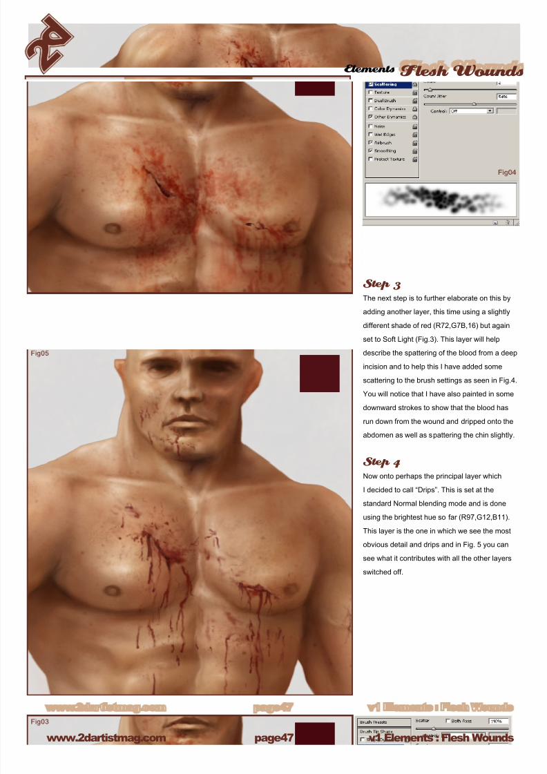
Step 3The next step is to further elaborate on this by
adding another layer, this time using a slightly
different shade of red (R72,G7B,16) but again
set to Soft Light (Fig.3). This layer will help
describe the spattering of the blood from a deep
incision and to help this I have added some
scattering to the brush settings as seen in Fig.4.
You will notice that I have also painted in some
downward strokes to show that the blood has
run down from the wound and dripped onto the
abdomen as well as spattering the chin slightly.
Step 4
Now onto perhaps the principal layer which
I decided to call “Drips”. This is set at the
standard Normal blending mode and is done
using the brightest hue so far (R97,G12,B11).
This layer is the one in which we see the most
obvious detail and drips and in Fig. 5 you can
see what it contributes with all the other layers
switched off.
8/8/2019 Elements v01
http://slidepdf.com/reader/full/elements-v01 48/70
v1 Elements : Flesh Woundswww.2dartistmag.com
Elements Flesh Wounds
page
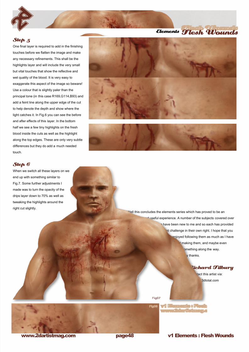
Step 5One nal layer is required to add in the nishing
touches before we atten the image and make
any necessary renements. This shall be the
highlights layer and will include the very small
but vital touches that show the reective and
wet quality of the blood. It is very easy to
exaggerate this aspect of the image so beware!
Use a colour that is slightly paler than the
principal tone (in this case R169,G114,B93) and
add a feint line along the upper edge of the cut
to help denote the depth and show where the
light catches it. In Fig.6 you can see the before
and after effects of this layer. In the bottom
half we see a few tiny highlights on the fresh
blood inside the cuts as well as the highlight
along the top edges. These are only very subtle
differences but they do add a much needed
touch.
Step 6When we switch all these layers on we
end up with something similar to
Fig.7. Some further adjustments Imade was to turn the opacity of the
drips layer down to 70% as well as
tweaking the highlights around the
right cut slightly.Well this concludes the elements series which has proved to be an
interesting and useful experience. A number of the subjects covered over
the last year or so have been new to me and so each has provided
a different challenge in their own right. I hope that you
have enjoyed following them as much as I have
enjoyed making them, and maybe even
learnt something along the way.
Many thanks,
Richard Tilbury Contact this artist via:
8/8/2019 Elements v01
http://slidepdf.com/reader/full/elements-v01 49/70
Chapter 09 : By Benita Winckler
Flesh Wounds
8/8/2019 Elements v01
http://slidepdf.com/reader/full/elements-v01 50/70
v1 Elements : Flesh Woundswww.2dartistmag.com
Elements Flesh Wounds
page0
Introduction When I heard about this topic my rst thoughts were: Ummm... wounds. This sounds like an
unidentiable topic to spend my time with. Giving it a bit more thought I suddenly noticed that this
could be a nice excuse to paint a vampire lady. So in this tutorial we will use Photoshop to develop
the image of a lady who just got bitten by, well: a vampire.
Concept and Inspiration A nice new project should start with an inspiring idea. Thinking about vampires I knew that in the
end this image will look mainly dark with her pearly white skin being lit by a hidden light source
accentuating the bow of her neck. Red hues dominating the image and some small touches of
turquoise as a complementary colour contrast in the centre of interest. The bite wound unobtrusive,
maybe something you might notice rather on second glance. With her pose conveying most of the
feeling - not the blood.
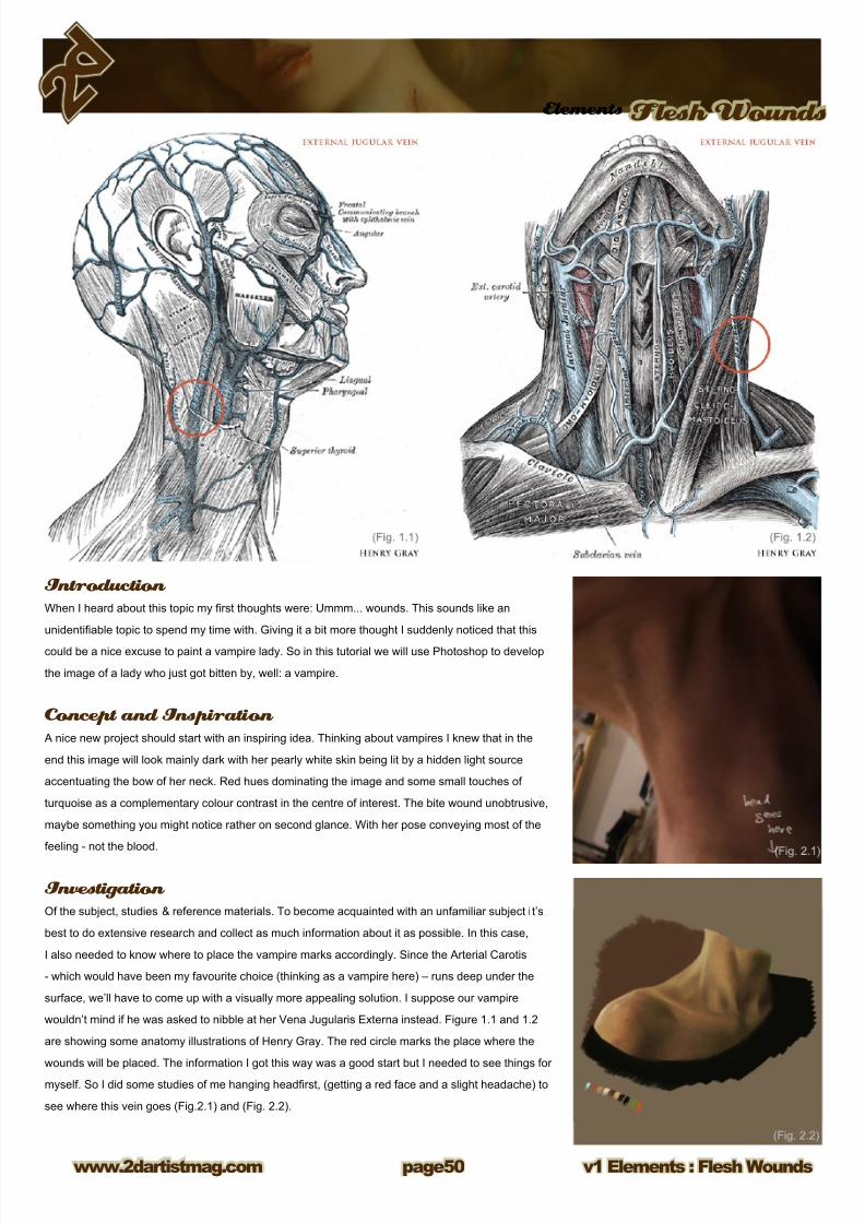
Investigation Of the subject, studies & reference materials. To become acquainted with an unfamiliar subject i t’s
best to do extensive research and collect as much information about it as possible. In this case,
I also needed to know where to place the vampire marks accordingly. Since the Arterial Carotis
- which would have been my favourite choice (thinking as a vampire here) – runs deep under the
surface, we’ll have to come up with a visually more appealing solution. I suppose our vampire
wouldn’t mind if he was asked to nibble at her Vena Jugularis Externa instead. Figure 1.1 and 1.2
are showing some anatomy illustrations of Henry Gray. The red circle marks the place where the
wounds will be placed. The information I got this way was a good start but I needed to see things for
myself. So I did some studies of me hanging headrst, (getting a red face and a slight headache) to
see where this vein goes (Fig.2.1) and (Fig. 2.2).
8/8/2019 Elements v01
http://slidepdf.com/reader/full/elements-v01 51/70
Elements Flesh Wounds
v1 Elements : Flesh Woundswww.2dartistmag.com page1
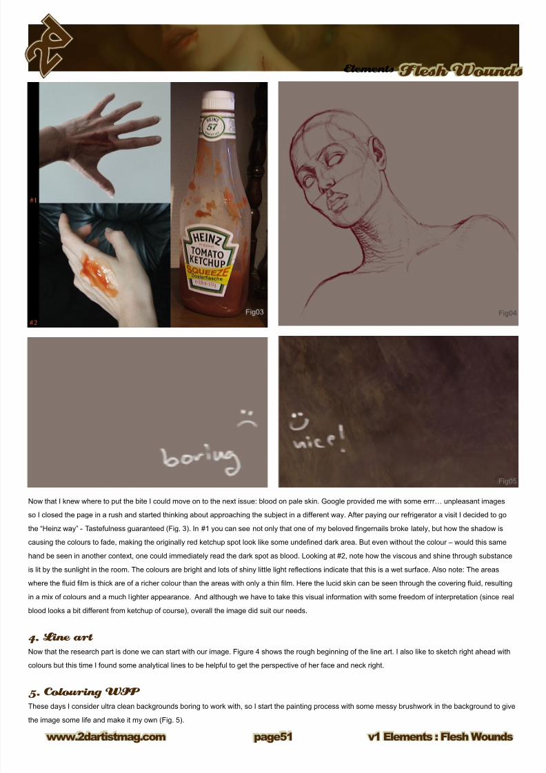
Now that I knew where to put the bite I could move on to the next issue: blood on pale skin. Google provided me with some errr… unpleasant images
so I closed the page in a rush and started thinking about approaching the subject in a different way. After paying our refrigerator a visit I decided to go
the “Heinz way” - Tastefulness guaranteed (Fig. 3). In #1 you can see not only that one of my beloved ngernails broke lately, but how the shadow is
causing the colours to fade, making the originally red ketchup spot look like some undened dark area. But even without the colour – would this same
hand be seen in another context, one could immediately read the dark spot as blood. Looking at #2, note how the viscous and shine through substance
is lit by the sunlight in the room. The colours are bright and lots of shiny little light reections indicate that this is a wet surface. Also note: The areas
where the uid lm is thick are of a richer colour than the areas with only a thin lm. Here the lucid skin can be seen through the covering uid, resulting
in a mix of colours and a much l ighter appearance. And although we have to take this visual information with some freedom of interpretation (since real
blood looks a bit different from ketchup of course), overall the image did suit our needs.
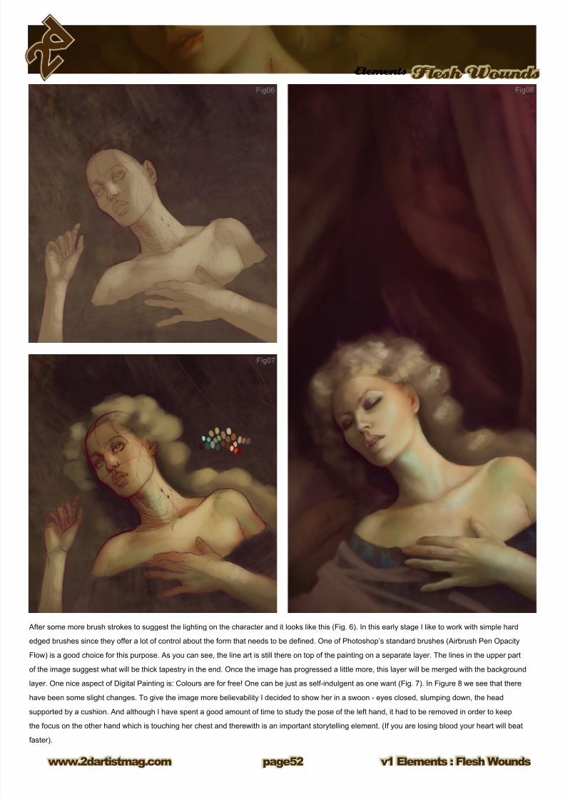
4. Line art Now that the research part is done we can start with our image. Figure 4 shows the rough beginning of the line art. I also like to sketch right ahead with
colours but this time I found some analytical lines to be helpful to get the perspective of her face and neck right.
5. Colouring WIP These days I consider ultra clean backgrounds boring to work with, so I start the painting process with some messy brushwork in the background to give
the image some life and make it my own (Fig. 5).
8/8/2019 Elements v01
http://slidepdf.com/reader/full/elements-v01 52/70
8/8/2019 Elements v01
http://slidepdf.com/reader/full/elements-v01 53/70
Elements Flesh Wounds
v1 Elements : Flesh Woundswww.2dartistmag.com page3
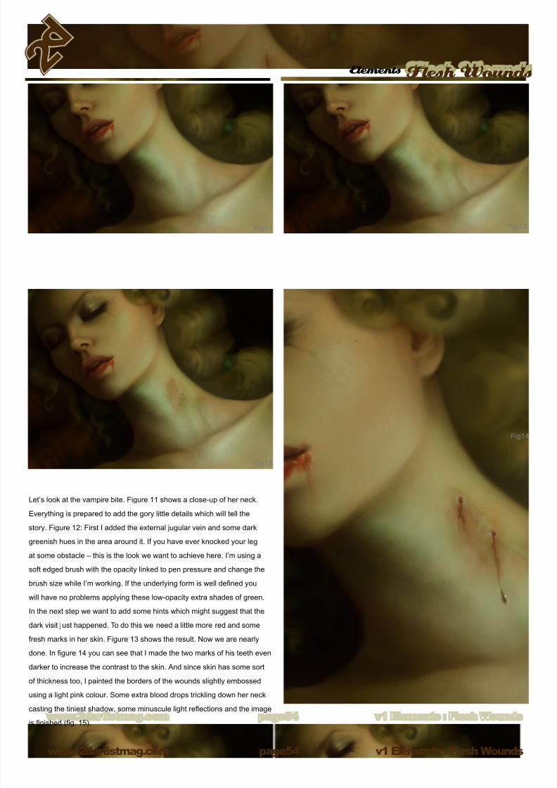
Figure 9: Working on the whole image, I darkened the background so that her white neck would become more prominent. I wanted it to look as if
someone would hold up a small light, like a candle for example. Note the intense green-blue tone on her neck where the bite will be placed and how the
lace on her shoulder leads the view to the area of her heart. A bit more painting on the overall image - introducing even more green hues as a colour
contrast to the red of the wound - and we are halfway ready to start working on the vampire marks. But before we go there, let me show you a quick
example of how value can inuence our perception. In the left image of gure 10 I have chosen a dark red hue to paint some bloodstains on the corner
of her mouth. Compare this image with the one on the right side and note how the left image gives the impression of a wound rather than just some
bloodstains. These dark spots create much more contrast, than the ones on the right side. Hence they make for a more dramatic look. The lighter red
spots in the right image could of course be mistaken for signs of bad table manners, or smudged lipstick instead of bloodstains. But they look far less
dramatic. One can see the skin beneath the uid and it appears to be intact. Looking at the left image again, it could just be dried blood since there are
no obvious light reections, but there could also be a deep cut or something – we don’t know, the colours are too dark to be at ease. (Fig. 10).
8/8/2019 Elements v01
http://slidepdf.com/reader/full/elements-v01 54/70
v1 Elements : Flesh Woundswww.2dartistmag.com
Elements Flesh Wounds
page
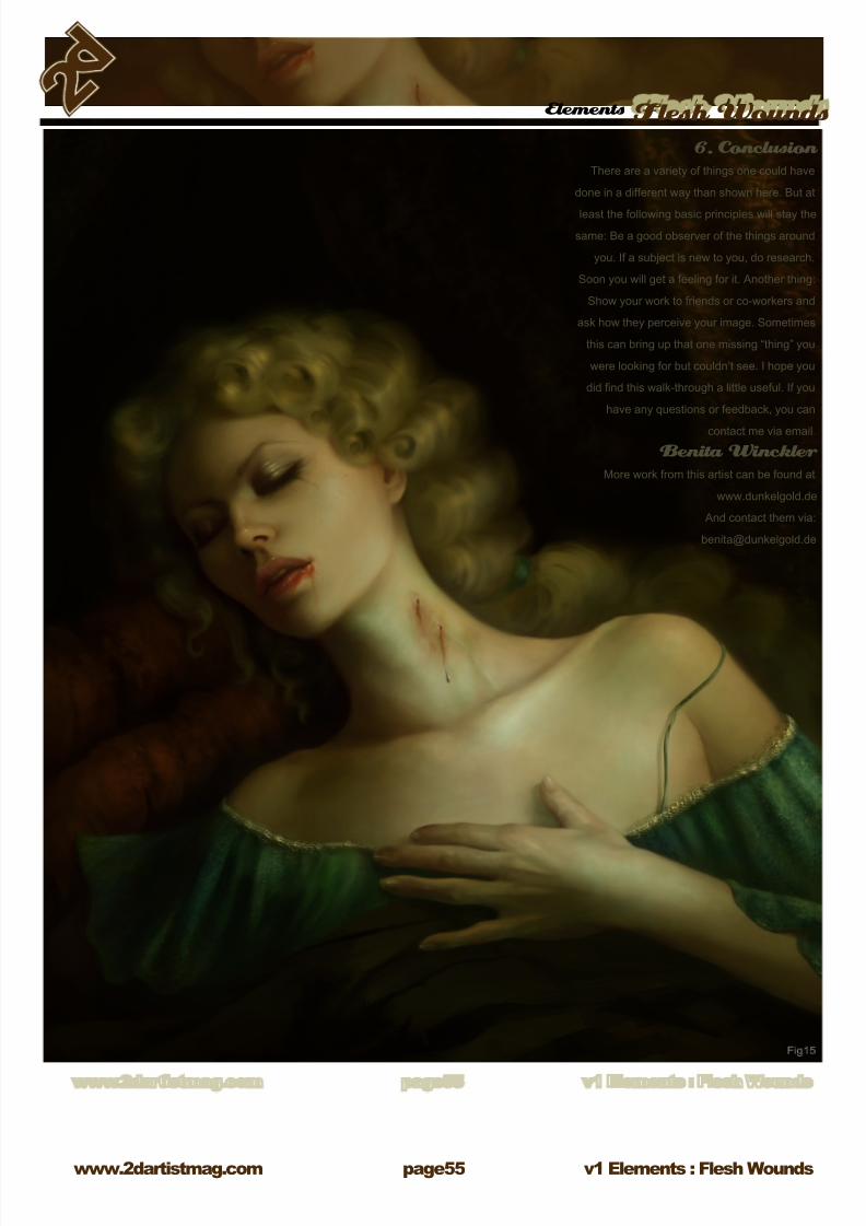
Let’s look at the vampire bite. Figure 11 shows a close-up of her neck.
Everything is prepared to add the gory little details which will tell the
story. Figure 12: First I added the external jugular vein and some dark
greenish hues in the area around it. If you have ever knocked your leg
at some obstacle – this is the look we want to achieve here. I’m using a
soft edged brush with the opacity linked to pen pressure and change the
brush size while I’m working. If the underlying form is well dened you
will have no problems applying these low-opacity extra shades of green.
In the next step we want to add some hints which might suggest that the
dark visit just happened. To do this we need a little more red and some
fresh marks in her skin. Figure 13 shows the result. Now we are nearly
done. In gure 14 you can see that I made the two marks of his teeth even
darker to increase the contrast to the skin. And since skin has some sort
of thickness too, I painted the borders of the wounds slightly embossed
using a light pink colour. Some extra blood drops trickling down her neck
casting the tiniest shadow, some minuscule light reections and the image
is nished (g. 15).
8/8/2019 Elements v01
http://slidepdf.com/reader/full/elements-v01 55/70
Elements Flesh Wounds
v1 Elements : Flesh Woundswww.2dartistmag.com page
6. Conclusion There are a variety of things one could have
done in a different way than shown here. But at
least the following basic principles will stay the
same: Be a good observer of the things around
you. If a subject is new to you, do research.
Soon you will get a feeling for it. Another thing:
Show your work to friends or co-workers and
ask how they perceive your image. Sometimes
this can bring up that one missing “thing” you
were looking for but couldn’t see. I hope you
did nd this walk-through a little useful. If you
have any questions or feedback, you can
contact me via email.
Benita Winckler More work from this artist can be found at
www.dunkelgold.de
And contact them via:
8/8/2019 Elements v01
http://slidepdf.com/reader/full/elements-v01 56/70
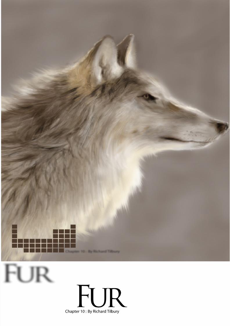
Chapter 10 : By Richard TilburyFur
8/8/2019 Elements v01
http://slidepdf.com/reader/full/elements-v01 57/70
elementsFur
v1 Elements : Fur www.2dartistmag.com page
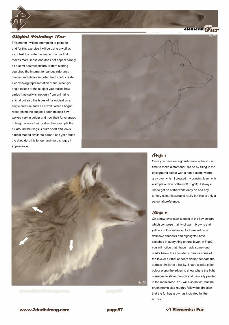
Digital Painting: Fur This month I will be attempting to paint fur
and for this exercise I will be using a wolf as
a context to create the image in order that it
makes more sense and does not appear simply
as a semi-abstract picture. Before starting I
searched the internet for various reference
images and photos in order that I could create
a convincing representation of fur. When you
begin to look at the subject you realise how
varied it actually is, not only from animal to
animal but also the types of fur evident on a
single creature such as a wolf. When I began
researching the subject I soon noticed how
wolves vary in colour and how their fur changes
in length across their bodies. For example the
fur around their legs is quite short and looks
almost matted similar to a bear, and yet around
the shoulders it is longer and more shaggy in
appearance.
Step 1
Once you have enough reference at hand it is
time to make a start and I did so by lling in the
background colour with a non-descript warm
grey over which I created my drawing layer with
a simple outline of the wolf (Fig01). I always
like to get rid of the white early on and any
tertiary colour is suitable really but this is only a
personal preference.
Step 2
On a new layer start to paint in the key colours
which compose mainly of warm browns and
yellows in this instance. As there will be no
denitive shadows and highlights I have
sketched in everything on one layer. In Fig02
you will notice that I have made some rough
marks below the shoulder to denote some of
the thicker fur that appears darker beneath the
surface similar to a husky. I have used a paler
colour along the edges to show where the light
manages to show through and basically painted
in the main areas. You will also notice that the
brush marks also roughly follow the direction
that the fur has grown as indicated by the
arrows.
8/8/2019 Elements v01
http://slidepdf.com/reader/full/elements-v01 58/70
v1 Elements : Fur www.2dartistmag.com
elementsFur
page
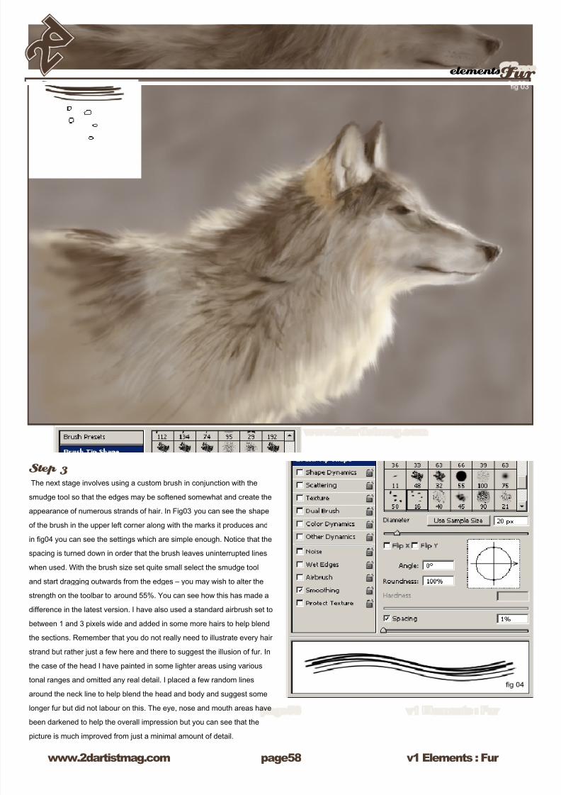
Step 3The next stage involves using a custom brush in conjunction with the
smudge tool so that the edges may be softened somewhat and create the
appearance of numerous strands of hair. In Fig03 you can see the shape
of the brush in the upper left corner along with the marks it produces and
in g04 you can see the settings which are simple enough. Notice that the
spacing is turned down in order that the brush leaves uninterrupted lineswhen used. With the brush size set quite small select the smudge tool
and start dragging outwards from the edges – you may wish to alter the
strength on the toolbar to around 55%. You can see how this has made a
difference in the latest version. I have also used a standard airbrush set to
between 1 and 3 pixels wide and added in some more hairs to help blend
the sections. Remember that you do not really need to illustrate every hair
strand but rather just a few here and there to suggest the illusion of fur. In
the case of the head I have painted in some lighter areas using various
tonal ranges and omitted any real detail. I placed a few random lines
around the neck line to help blend the head and body and suggest somelonger fur but did not labour on this. The eye, nose and mouth areas have
been darkened to help the overall impression but you can see that the
picture is much improved from just a minimal amount of detail.
8/8/2019 Elements v01
http://slidepdf.com/reader/full/elements-v01 59/70
elementsFur
v1 Elements : Fur www.2dartistmag.com page9
Step 4
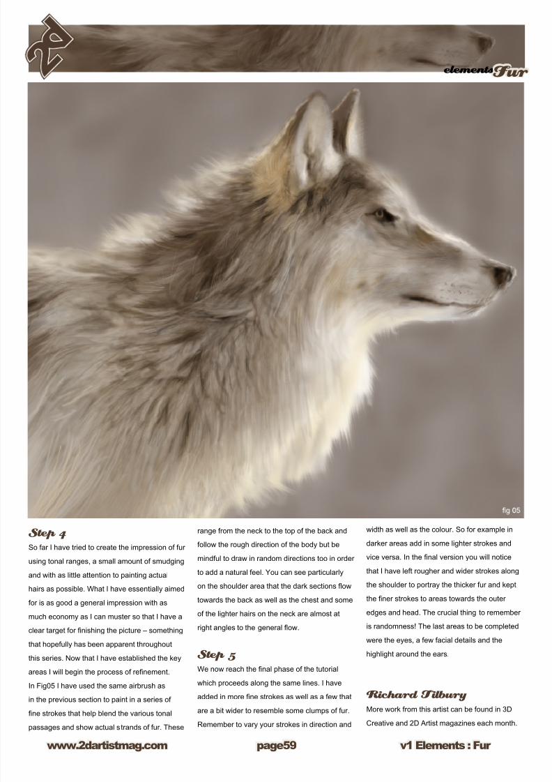
So far I have tried to create the impression of fur
using tonal ranges, a small amount of smudging
and with as little attention to painting actual
hairs as possible. What I have essentially aimed
for is as good a general impression with as
much economy as I can muster so that I have a
clear target for nishing the picture – something
that hopefully has been apparent throughout
this series. Now that I have established the key
areas I will begin the process of renement.
In Fig05 I have used the same airbrush as
in the previous section to paint in a series of
ne strokes that help blend the various tonal
passages and show actual strands of fur. These
range from the neck to the top of the back and
follow the rough direction of the body but bemindful to draw in random directions too in order
to add a natural feel. You can see particularly
on the shoulder area that the dark sections ow
towards the back as well as the chest and some
of the lighter hairs on the neck are almost at
right angles to the general ow.
Step 5
We now reach the nal phase of the tutorial
which proceeds along the same lines. I haveadded in more ne strokes as well as a few that
are a bit wider to resemble some clumps of fur.
Remember to vary your strokes in direction and
width as well as the colour. So for example in
darker areas add in some lighter strokes and
vice versa. In the nal version you will notice
that I have left rougher and wider strokes along
the shoulder to portray the thicker fur and kept
the ner strokes to areas towards the outer
edges and head. The crucial thing to remember
is randomness! The last areas to be completed
were the eyes, a few facial details and the
highlight around the ears.
Richard Tilbury More work from this artist can be found in 3D
Creative and 2D Artist magazines each month.
8/8/2019 Elements v01
http://slidepdf.com/reader/full/elements-v01 60/70
Chapter 06 : By Shane MaddenHair
8/8/2019 Elements v01
http://slidepdf.com/reader/full/elements-v01 61/70
elementsHair
v1 Elements : Hair www.2dartistmag.com page1
In this tutorial we are going to look at rendering
hair in Photoshop. As always there are a
hundred and one ways to paint hair, here is
just my way of doing it and hopefully it will help
spur some people on if they get stuck. I have
a traditional media background so most of my
techniques and thought patterns come from
years of using non digital media, which I’ve
transferred over to the computer. Working digital
just allows me to repair my mistakes faster.
That being said, I try to render effects and not
use tools like smudge, because there is now
ctrl-z when working with traditional media and
when working commercially you need to keep
the artwork as clean as possible. I want to take
a minute to talk about my set-up specically
using a Wacom tablet. Without one you’re going
to have a very hard time following with this
tutorial. Personally I only have a 6x9 intuos2,
and it serves my needs plenty. You can probably
pick up an older one pretty cheap these days. If
you’re at all serious about working digitally you
need to have one in your arsenal. It won’t make
your work better… but it will make it easier and
faster!! I think of it as just another paintbrush,
another tool of the trade. Here are a few things
to keep in mind about hair before we start
rendering. Hair is never straight, no matter how
hard people try to straighten they’re hair! Be
sensitive to the undulating patterns of the hair
whether it is really curly or generally “straight”.
Hair comes in many different colours. Black
hair should never be rendered as black. Add a
colour to it like red or blue to either warm it up
or cool it down. Also blonde is never yellow. Use
light browns instead and adjust the tint, shade
and hue accordingly. Hair is 3 dimensional. That
is not to say that we are not going to render
each hair with highlights and shadows, but the
whole bulk of the hair should have lots of depth.
Hair tends to move in shapes and tends to
stick together. Don’t try to render every single
hair. Hair can be rendered realistically strand
by strand. But, you will drive yourself bananas
doing it and if you are working commercially, you
will waste time and money on an effect you can
get by easier ways. Don’t ght your tools, use
them to your advantage. Reference, reference,
reference… I can’t stress this enough. Never
try to make things up as you go. Always base it
on something real. Hair is real, it reacts certain
ways. You need to at the very least be sensitive
to that. Ok, where do we start? First of I like to
create some custom brushes. These will help
make life easier when rendering rather than
going strand by strand. We do this by adding a
new layer, which we will call “Hair Brush”. Next
we take our normal circular brush, add a bit of
feather to it to soften the edge, and make some
dots of the appropriate scale for the hair in your
image. Then we make a selection around all of
the dots. Next we go to the Edit menu and select
Dene Brush Preset and name the brush.
Personally I like to repeat these steps a coupletimes in order to have a variety of brushes to
make the hair more random. Before using the
brushes we need to make sure a few settings
are selected. First thing, because we are using
a tablet I would prefer my pressure to not control
the size of the brush so I take off the size jitter.
For the Minimum Diameter, Sometimes I take
it off completely or sometimes I control it just
to add some randomness and sensitivity to my
strokes. Under the Brush Tip Shape menu I
change the Spacing to zero. This causes my
brush to make the strands of hair rather than
lots of points.
8/8/2019 Elements v01
http://slidepdf.com/reader/full/elements-v01 62/70
v1 Elements : Hair www.2dartistmag.com
elementsHair and Fur
page2
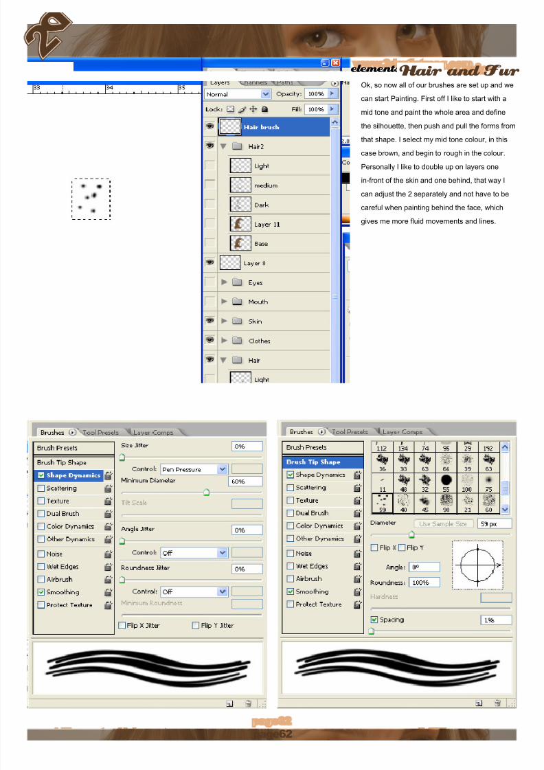
Ok, so now all of our brushes are set up and we
can start Painting. First off I like to start with a
mid tone and paint the whole area and dene
the silhouette, then push and pull the forms from
that shape. I select my mid tone colour, in this
case brown, and begin to rough in the colour.
Personally I like to double up on layers one
in-front of the skin and one behind, that way I
can adjust the 2 separately and not have to be
careful when painting behind the face, which
gives me more uid movements and lines.
8/8/2019 Elements v01
http://slidepdf.com/reader/full/elements-v01 63/70
elementsHair
v1 Elements : Hair www.2dartistmag.com page3
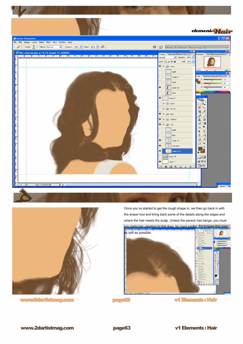
Once you’ve started to get the rough shape in, we then go back in with
the eraser tool and bring back some of the details along the edges and
where the hair meets the scalp. Unless the person has bangs, you must
pay particular attention to this area. No hard edges. Try to keep this area
as soft as possible.

8/8/2019 Elements v01
http://slidepdf.com/reader/full/elements-v01 64/70
v1 Elements : Hair www.2dartistmag.com
elementsHair and Fur
page
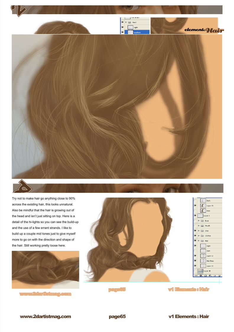
So now we have a blob of brown on the persons
head. We need to start to bring up form. I like to
start with the hi-lights rst. The only thing that
I would suggest is to make separate layers for
both hi-lights and darks, on top of your mid-tone
layer with the highlights being on the very top.
Reason being, shadows never cross over light
areas. Use the custom brushes that you created
to create the hi-lights. Hi-lights are what really
dene the colour of the hair, but use them
sparingly; too much makes the hair look very
unnatural. We want to let the eye create strands
without us having to render them. A few strands
drawn in with a single point Brush will give a
touch more realism. I like to use an opacity of
around 30% and just build up the colour without
getting too strong too quick. Always keep in
mind the shape and direction in which the hair is
falling. This will govern the direction and ow of
your brush strokes.
8/8/2019 Elements v01
http://slidepdf.com/reader/full/elements-v01 65/70
elementsHair
v1 Elements : Hair www.2dartistmag.com page
Try not to make hair go anything close to 90%
across the existing hair, this looks unnatural.
Also be mindful that the hair is growing out of
the head and isn’t just sitting on top. Here is a
detail of the hi-lights so you can see the build-up
and the use of a few errant strands. I like to
build up a couple mid tones just to give myself
more to go on with the direction and shape of
the hair. Still working pretty loose here.
8/8/2019 Elements v01
http://slidepdf.com/reader/full/elements-v01 66/70
v1 Elements : Hair www.2dartistmag.com
elementsHair and Fur
page
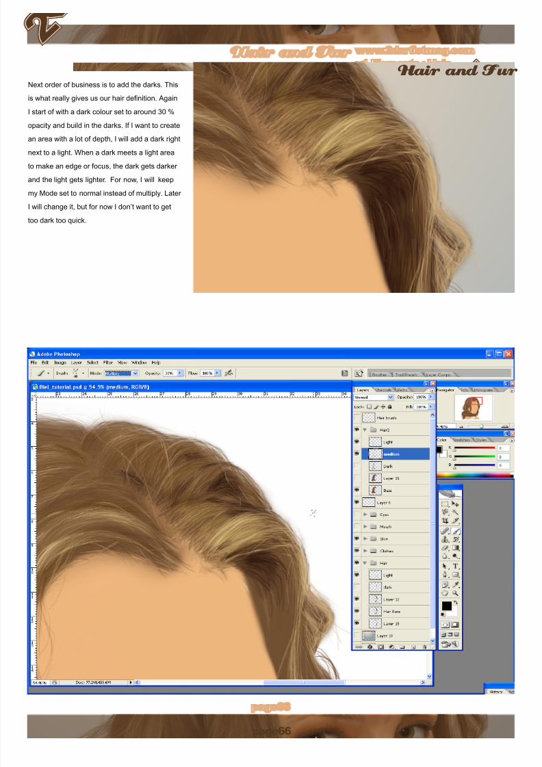
Next order of business is to add the darks. This
is what really gives us our hair denition. Again
I start of with a dark colour set to around 30 %
opacity and build in the darks. If I want to create
an area with a lot of depth, I will add a dark right
next to a light. When a dark meets a light area
to make an edge or focus, the dark gets darker
and the light gets lighter. For now, I will keep
my Mode set to normal instead of multiply. Later
I will change it, but for now I don’t want to get
too dark too quick.
8/8/2019 Elements v01
http://slidepdf.com/reader/full/elements-v01 67/70
elementsHair
v1 Elements : Hair www.2dartistmag.com page
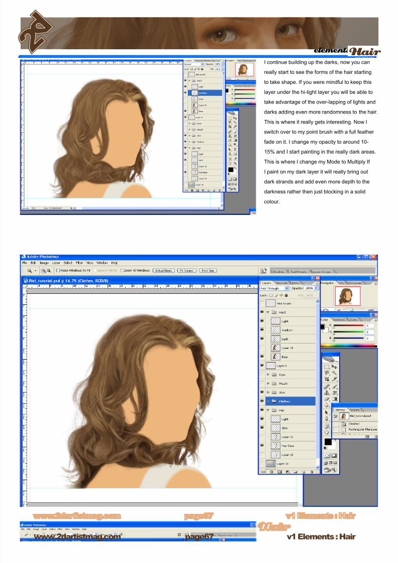
I continue building up the darks, now you can
really start to see the forms of the hair starting
to take shape. If you were mindful to keep this
layer under the hi-light layer you will be able to
take advantage of the over-lapping of lights and
darks adding even more randomness to the hair.
This is where it really gets interesting. Now I
switch over to my point brush with a full feather
fade on it. I change my opacity to around 10-
15% and I start painting in the really dark areas.
This is where I change my Mode to Multiply If
I paint on my dark layer it will really bring out
dark strands and add even more depth to the
darkness rather then just blocking in a solid
colour.
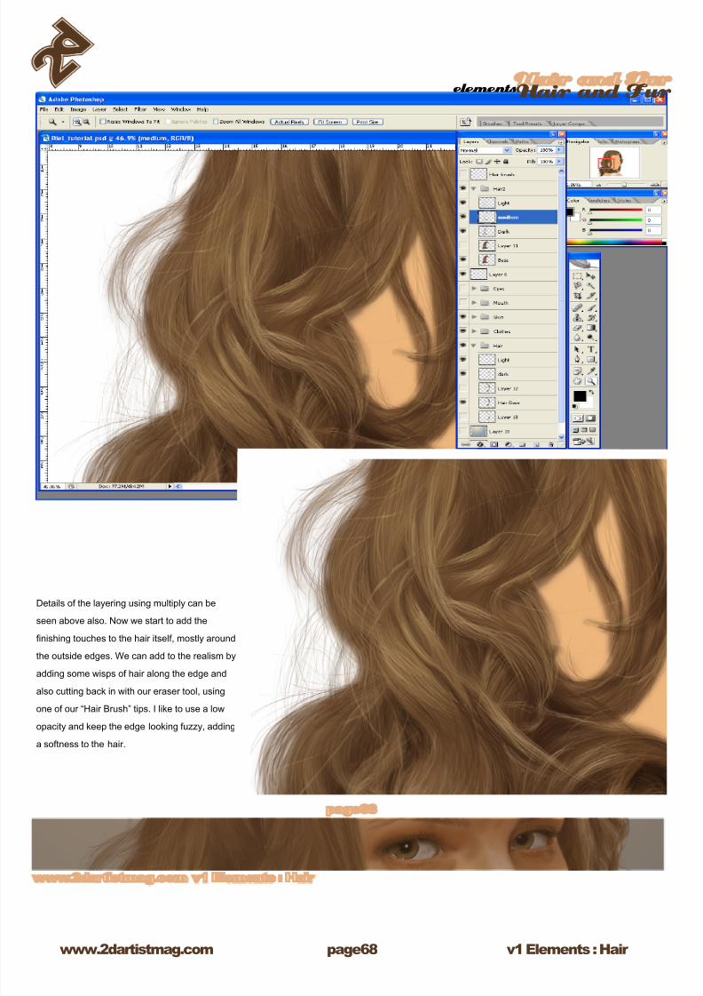
8/8/2019 Elements v01
http://slidepdf.com/reader/full/elements-v01 68/70
v1 Elements : Hair www.2dartistmag.com
elementsHair and Fur
page
Details of the layering using multiply can be
seen above also. Now we start to add the
nishing touches to the hair itself, mostly around
the outside edges. We can add to the realism by
adding some wisps of hair along the edge and
also cutting back in with our eraser tool, using
one of our “Hair Brush” tips. I like to use a low
opacity and keep the edge looking fuzzy, adding
a softness to the hair.
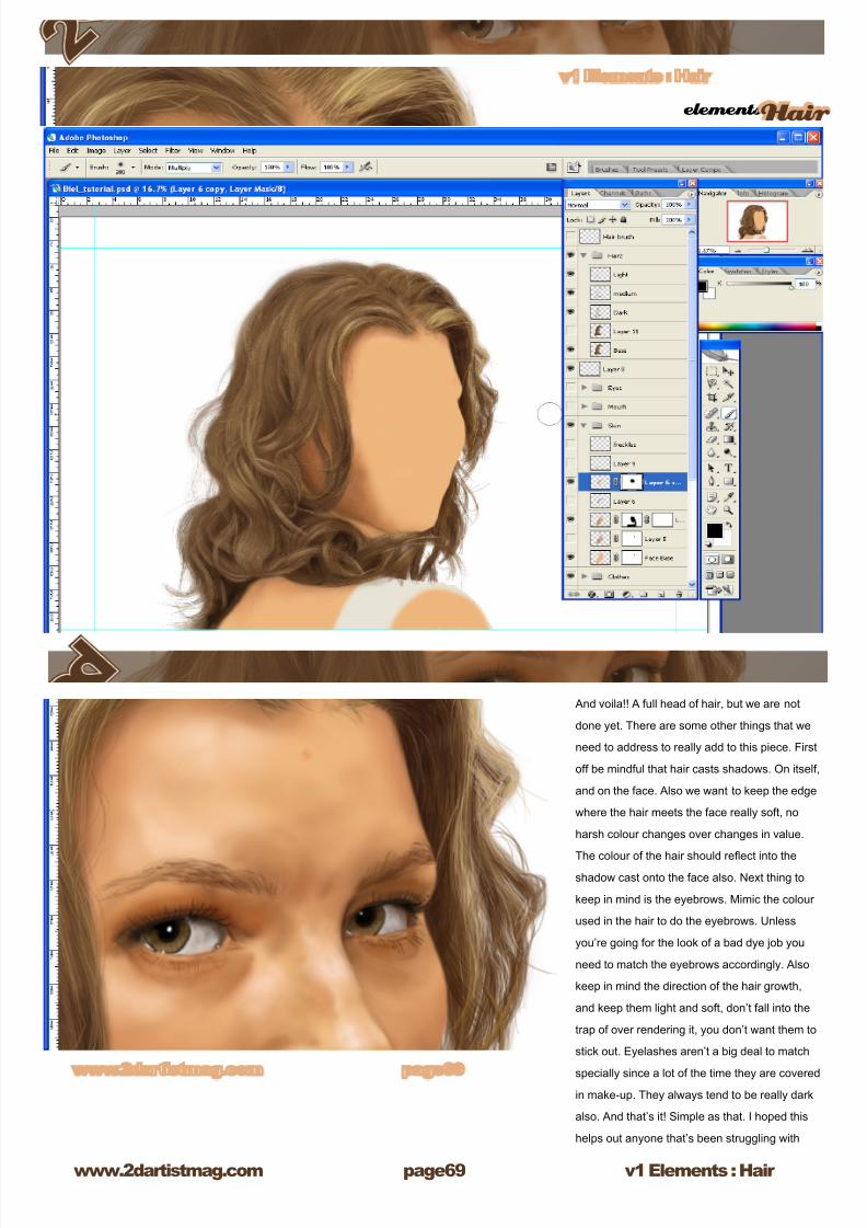
8/8/2019 Elements v01
http://slidepdf.com/reader/full/elements-v01 69/70
elementsHair
v1 Elements : Hair www.2dartistmag.com page9
And voila!! A full head of hair, but we are not
done yet. There are some other things that we
need to address to really add to this piece. First
off be mindful that hair casts shadows. On itself,
and on the face. Also we want to keep the edge
where the hair meets the face really soft, no
harsh colour changes over changes in value.
The colour of the hair should reect into theshadow cast onto the face also. Next thing to
keep in mind is the eyebrows. Mimic the colour
used in the hair to do the eyebrows. Unless
you’re going for the look of a bad dye job you
need to match the eyebrows accordingly. Also
keep in mind the direction of the hair growth,
and keep them light and soft, don’t fall into the
trap of over rendering it, you don’t want them to
stick out. Eyelashes aren’t a big deal to match
specially since a lot of the time they are covered
in make-up. They always tend to be really dark
also. And that’s it! Simple as that. I hoped this
helps out anyone that’s been struggling with
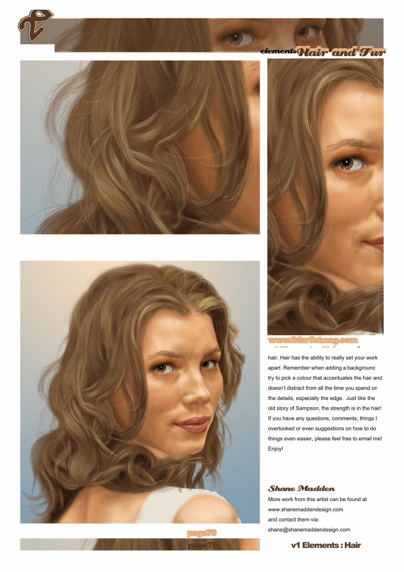
8/8/2019 Elements v01
http://slidepdf.com/reader/full/elements-v01 70/70