Embed Size (px)
Citation preview

Elements and Principles of Graphic Design
Communications Technology 11

1. Point• The first element is the point. A point is a single spot on a page. A point
can be typographic, like a period or punctuation mark, or it can be a graphic element, and it doesn’t have to be circular in form. It can serve as a foundation or building block for a design. The natural tendency is to put a point in the center of the design, to become the focal point. Moving the point off-center, however, shifts the focus to wherever the point is.

2. Line• Lines are another design element that can be used to show direction—
where you want the eye to go—and movement. Vertical lines give elegance and elongation to the page, while horizontal lines create a more relaxed feel; curved lines suggest an organic theme. Repetition of lines, or other elements, can be used to also create patterns.

3. Shape• A shape is exactly what it sounds like: circles, squares, rectangles, and
triangles are all design building blocks. Repeating shapes or grouping them in an organized method works to create patterns, too.

4. Form• Form is another design element that has to do with the appearance of
depth. Form gives a three-dimensional perspective—sometimes through drop shadows and tone—while physically occupying space or giving the illusion of occupied space in a flat, two-dimensional surface.
• Form is the shape of text, images, and white space—also called void—on a page. By using graphic elements or white space the designer can lead a viewer around a page. Because we are so accustomed to getting information quickly, form can help a viewer see pertinent elements.

5. Tone• When adding tone to a design, you’re adding a sense of lightness and
darkness. The most common way to do this is through gradients, where an area goes from light to dark or from darker to lighter color. Using shadowing and patterns in a lighter tint can also add tone—the overall goal is to add depth to a piece. But be judicial in your use; to overuse these techniques looks amateurish.

6. Texture• Another design tool is texture, which officially is defined as the character
of a surface. Texture on paper adds dimension, through repeated dots or lines, for example. Be careful when selecting textures; decide if you’re using a textured paper or adding it in the design. Using many different textures can be confusing and work against the overall design of a piece.

7. Color• Any kind of color adds impact and interest to objects and design. Brighter
colors make elements of a design seem larger, while cooler colors make them seem smaller.
• While there are thousands of shades of color, designers approach them in three major categories:
• Primary colors—red, yellow, and blue• Secondary colors—green, purple, and orange• Tertiary colors—all the colors between the secondary colors on the color
wheel
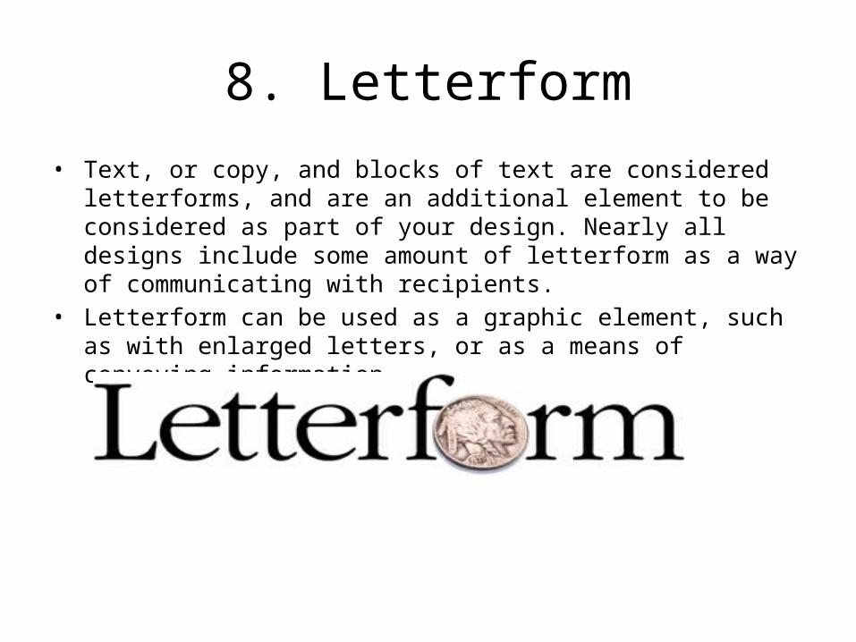
8. Letterform• Text, or copy, and blocks of text are considered letterforms, and are an
additional element to be considered as part of your design. Nearly all designs include some amount of letterform as a way of communicating with recipients.
• Letterform can be used as a graphic element, such as with enlarged letters, or as a means of conveying information.
Principles
Communications Technology

1. Figure Ground• The first principle is figure-ground: the figure refers to the main focus
within your design, and the ground is the area that surrounds the figure. Either one can be dominant, depending on where you want the viewer’s eye to focus.

2. Balance• Elements in a design can either be symmetrical or asymmetrical.
Large or small, all work in this principle. For example, when using a large object and small object together on the same page, the proximity to one another can be well-balanced or poorly balanced. By placing them close together, the balance is poor. If you allow more space between the objects the balance is more even.
• Asymmetrical elements are often used to create visual excitement, by calling attention to certain elements. Designs that are asymmetrical are generally divided into thirds, rather than halves.
• When using tone to create asymmetrical balance, use the rule of thirds for your composition. By that we mean, the tone or pattern should be anywhere from ⅓ to ⅔ of the design—one third of the design might be colored darkly where the other third would be lightly colored.

3. Contrast• Contrast refers to the relationship between the elements of design. The
greater the difference between the two elements, the greater the contrast, as in the case of size—big versus little. Colors can provide contrast, too, with complementary colors—opposites on the color wheel—providing the greatest contrast, and coordinating colors having the least contrast. In the next figure, the color yellow works better with the purple color because the contrast is greater than with the green color. The green text block is more difficult to read because the green and yellow are too similar in contrast.

4. Cropping• Although we most often hear the term cropping with respect to
photography, it really refers to the process of selecting the elements of design we want the user to see. It’s generally used to zero in on the most important subject within an image.

5. Hierarchy• Although we most often hear the term cropping with respect to
photography, it really refers to the process of selecting the elements of design we want the user to see. It’s generally used to zero in on the most important subject within an image.

6. Scale• You most often see scale used for exaggeration, such as in caricatures,
where certain features of a politician, for example, might be disproportionate to his or her body. Scale refers to how large an object is in relation to other objects in the design, and is often used to inject humor, by making smaller objects oversized, for example. Scale can also be used to show intricate detail that is not easily seen at a 1:1 ratio, but is also a technique used in technical drawings that show an “exploded” or enlarged section.

7. Proportion• Proportion within a design deals with the relationship between various
elements and whether they are pleasing to the eye. It comes down to a mathematical formula, with four ratios being the most pleasing:
• 3:2• 5:2• 8:5• 1:1.62These are guidelines and can be kept in mind when visually assessing your design. Most designers do not use rulers or other measuring devices to guarantee these proportions, but they are rules learned and practiced over time.

8. Pattern • As it suggests, the principle of pattern deals with the repetition of
elements, such as lines, points, or shapes, as you saw previously. If you add patterned paper, don’t forget to count that as well. Patterns, if over used, are not attractive and show the mark of an amateur.