Embed Size (px)
Citation preview
Effective Use of User Interface and User Experience in an mHealth Application
Wonchan Choi Robert A. Foisie School of Business
Worcester Polytechnic Institute [email protected]
Bengisu Tulu Robert A. Foisie School of Business
Worcester Polytechnic Institute [email protected]
Abstract The effect of user interface (UI) design decisions on
system usability has been discussed in information system literature. These discussions evolved into investigating the effectiveness of UI and how it affects a system user’s performance, as well as his or her perception of the system as a whole. This paper investigates the role of UI design on facilitating effective use in the context of mobile applications. Based on the Effective Use Theory, we test four different UIs developed for frequent data input tasks in a mobile platform using a controlled experiment and a follow-up survey. Our findings indicate that UI design in terms of touch technique (tap vs. slide) and target direction (vertical vs. horizontal) has a significant impact on the task completion time, as well as the app UIs’ perceived usability and likability. We discuss both theoretical and empirical implications of the results and suggest future research directions. 1. Introduction
As of 2015, nearly two-thirds of American adults (64%) who are 18 years old or older own a smartphone [1]. In comparison with the figures reported in previous years—58% in 2014; 45% in 2012; 35% in 2011 [1, 2]—smartphone ownership has been growing steadily over the past few years. About 62% of owners use their phones to access health-related information, as of 2015 [1]. With the increasing smartphone penetration rate and owners’ interests in health-related topics, mobile health applications (mHealth apps) have gained ground as tools for health information seeking, as well as for monitoring various health- and wellness-related activities in their everyday lives such as eating, exercising, and sleeping [3]. Furthermore, mHealth apps have the potential to work as a vehicle to deliver customized health interventions to patients who are suffering from mental health disorders such as
depression and stress [4] and prevalent physical health conditions such as diabetes, hearing loss, and low vision [5].
Although advanced health information technologies (HITs) adopted in mHealth apps provide users (patients) with useful functionalities for self-management of their health conditions, keeping users engaged with the apps remains to be a challenge that deserve attention from researchers. When it comes to mHealth apps that require users to input health-related personal data frequently and repeatedly (e.g., asking users to provide stress data three times on a daily basis), the more effort data entry requires, the less likely they are to take the time to interact with the apps. This lack of adherence to data entry becomes an issue when the apps collect data for predictive algorithms that are expected to inform behavioral modification interventions. User interface (UI), “the physical representations and procedures that are provided for viewing and interacting with the system functionality” [6, p. 80], is a crucial component of any application, including such mHealth apps, as UI directly affects the user–app interaction, which then determines the concrete user experience with the app [6]. Given that a user’s effective use of a system influences not only the user’s performance, but also his or her perception about the system [7], the goal of this study is to make this data entry process as effective and as efficient as possible through design manipulations.
The purpose of the study presented in this paper is to examine the effects of UI data entry types on user experience within the context of a mobile app designed for Android smartphones. 2. Background
In this section, we present our testable hypotheses based on the Effective Use Theory [7]. As this theory lays the groundwork for designing our study and guides the interpretation of study findings, we first provide an overview of the theory followed by a discussion of how we identified and operationalized
3803
Proceedings of the 50th Hawaii International Conference on System Sciences | 2017
URI: http://hdl.handle.net/10125/41618ISBN: 978-0-9981331-0-2CC-BY-NC-ND
our variables (UI type, performance, and perceptions) based on the literature.
2.1. Effective use theory
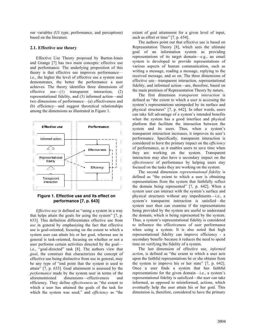
Effective Use Theory proposed by Burton-Jones and Grange [7] has two main concepts: effective use and performance. The underlying proposition of this theory is that effective use improves performance—i.e., the higher the level of effective use a system user demonstrates, the better the performance a user achieves. The theory identifies three dimensions of effective use—(1) transparent interaction, (2) representational fidelity, and (3) informed action—and two dimensions of performance—(a) effectiveness and (b) efficiency—and suggest theoretical relationships among the dimensions as illustrated in Figure 1.
Figure 1. Effective use and its effect on
performance [7, p. 643]
Effective use is defined as “using a system in a way that helps attain the goals for using the system” [7, p. 633]. This definition differentiates effective use from use in general by emphasizing the fact that effective use is goal-oriented, focusing on the extent to which a system user can attain his or her goal, whereas use in general is task-oriented, focusing on whether or not a user performs certain activities directed by the goal—i.e., “goal-directed” task [8]. The authors view that goal, the construct that characterizes the concept of effective use being distinctive from use in general, may be any type of “end point that the system is used to attain” [7, p. 633]. Goal attainment is assessed by the performance made by the system user in terms of the aforementioned dimensions—effectiveness and efficiency. They define effectiveness as “the extent to which a user has attained the goals of the task for which the system was used,” and efficiency as “the
extent of goal attainment for a given level of input, such as effort or time” [7, p. 654].
The authors point out that effective use is based on Representation Theory [8], which sees the ultimate goal of an information system as providing representations of its target domain—e.g., an email system is developed to provide representations of various aspects of human communication, such as writing a message, reading a message, replying to the received message, and so on. The three dimensions of effective use—transparent interaction, representational fidelity, and informed action—are, therefore, based on the main premises of Representation Theory by nature.
The first dimension transparent interaction is defined as “the extent to which a user is accessing the system’s representations unimpeded by its surface and physical structures” [7, p. 642]. In other words, users can take full advantage of a system’s intended benefits when the system has a good interface and physical platform that facilitate the interaction between the system and its users. Thus, when a system’s transparent interaction increases, it improves its user’s performance. Specifically, transparent interaction is considered to have the primary impact on the efficiency of performance, as it enables users to save time when they are working on the system. Transparent interaction may also have a secondary impact on the effectiveness of performance by helping users stay focused on the tasks they are working on the system.
The second dimension representational fidelity is defined as “the extent to which a user is obtaining representations from the system that faithfully reflect the domain being represented” [7, p. 642]. When a system user can interact with the system’s surface and physical structures without any impediments—i.e., a system’s transparent interaction is satisfied—the system user then can examine if the representations being provided by the system are useful to understand the domain, which is being represented by the system. Thus, a system’s representational fidelity is considered to influence the effectiveness of user performance when using a system. It is also noted that high representational fidelity can improve efficiency - a secondary benefit- because it reduces the need to spend time on verifying the fidelity of a system.
The last dimension of effective use, informed action, is defined as “the extent to which a user acts upon the faithful representations he or she obtains from the system to improve his or her state” [7, p. 642]. Once a user finds a system that has faithful representations for the given domain—i.e., a system’s representational fidelity is satisficed—the user can take informed, as opposed to misinformed, actions, which eventually help the user attain his or her goal. This dimension is, therefore, considered to have the primary
3804
impact on the effectiveness dimension and a secondary impact on the efficiency dimension of performance—informed action saves the potential recovery time that a user has to be spent if he or she makes any errors due to misinformed actions using a system.
From a higher-level perspective, Effective Use Theory is based on a framework that considers creating and using information systems as an iterative process. The framework explains that people initiate the process by taking actions to create and use systems that are intended to be better than existing ones. They then evaluate the consequences of creating and using the systems based on their perceptions. Depending on the perceived discrepancy between the consequences from the present systems and their goals, they go back to the initial phase of the process to improve the systems—this process is called a negative feedback loop, as it functions to decrease the discrepancy [9]. Thus, users’ perceptions of the systems and the performances from using the systems play an instrumental role in the process of systems design and use. 2.2. Effective use and performance
Based on the definitions of the three dimensions of effective use, UI is the crucial component of any information system that affects transparent interaction, which is mainly concerned with the surface and physical features of a system. Manipulating a system’s UI, therefore, would change the level of transparent interaction, which then affects the other two dimensions of effective use, representational fidelity and informed action. Thus, when controlling for the variances in these two dimensions—representational fidelity and informed action—we can manipulate the level of effective use by UI type and examine its impact on performance.
Human-computer interaction (HCI) literature identifies the factors affecting user performance while interacting with touchscreen interfaces, such as touch technique (e.g., tap, slide, push, pinch, etc.) [10-14]; target direction (e.g., vertical, horizontal, and radial tap position) [10, 15]; and target size [11, 15, 16]. Studies reported that these factors affected not only performance in terms of task completion time and error rate, but also users’ perceptions about the system [10-12].
Our study focuses on (a) touch technique and (b) target direction as the independent variables of the experiment. We control for the potential effect of target size by using the targets that were larger than 8 millimeters (mm) on the physical screens of the study smartphones—8 mm in size is the threshold of which the smaller sizes are likely to decrease the speed and increase the error rates when tapping buttons on
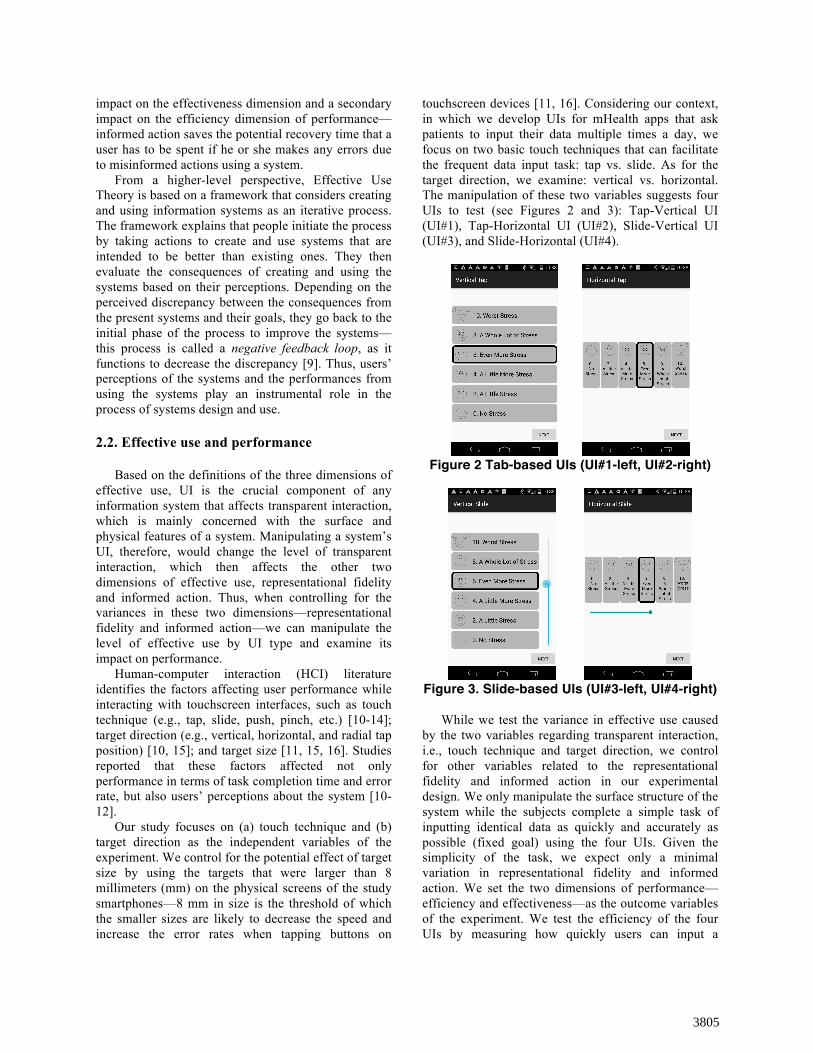
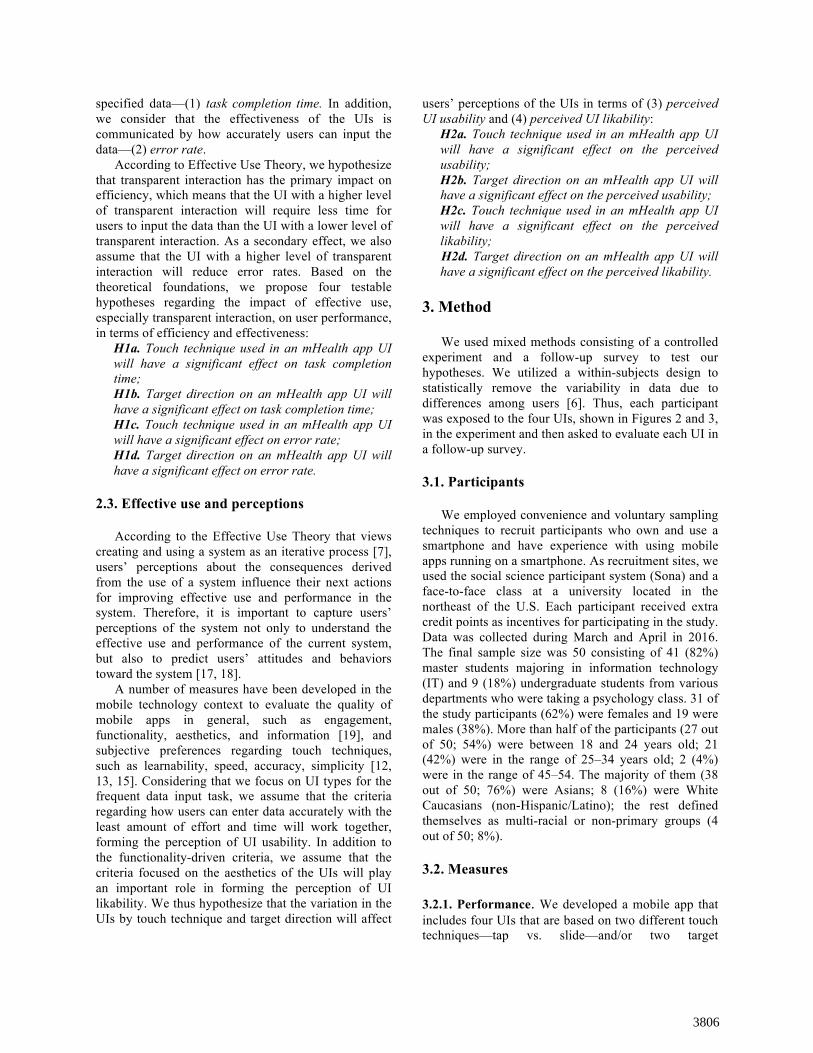
touchscreen devices [11, 16]. Considering our context, in which we develop UIs for mHealth apps that ask patients to input their data multiple times a day, we focus on two basic touch techniques that can facilitate the frequent data input task: tap vs. slide. As for the target direction, we examine: vertical vs. horizontal. The manipulation of these two variables suggests four UIs to test (see Figures 2 and 3): Tap-Vertical UI (UI#1), Tap-Horizontal UI (UI#2), Slide-Vertical UI (UI#3), and Slide-Horizontal (UI#4).
Figure 2 Tab-based UIs (UI#1-left, UI#2-right)
Figure 3. Slide-based UIs (UI#3-left, UI#4-right)
While we test the variance in effective use caused by the two variables regarding transparent interaction, i.e., touch technique and target direction, we control for other variables related to the representational fidelity and informed action in our experimental design. We only manipulate the surface structure of the system while the subjects complete a simple task of inputting identical data as quickly and accurately as possible (fixed goal) using the four UIs. Given the simplicity of the task, we expect only a minimal variation in representational fidelity and informed action. We set the two dimensions of performance—efficiency and effectiveness—as the outcome variables of the experiment. We test the efficiency of the four UIs by measuring how quickly users can input a
3805
specified data—(1) task completion time. In addition, we consider that the effectiveness of the UIs is communicated by how accurately users can input the data—(2) error rate.
According to Effective Use Theory, we hypothesize that transparent interaction has the primary impact on efficiency, which means that the UI with a higher level of transparent interaction will require less time for users to input the data than the UI with a lower level of transparent interaction. As a secondary effect, we also assume that the UI with a higher level of transparent interaction will reduce error rates. Based on the theoretical foundations, we propose four testable hypotheses regarding the impact of effective use, especially transparent interaction, on user performance, in terms of efficiency and effectiveness:
H1a. Touch technique used in an mHealth app UI will have a significant effect on task completion time; H1b. Target direction on an mHealth app UI will have a significant effect on task completion time; H1c. Touch technique used in an mHealth app UI will have a significant effect on error rate; H1d. Target direction on an mHealth app UI will have a significant effect on error rate.
2.3. Effective use and perceptions According to the Effective Use Theory that views
creating and using a system as an iterative process [7], users’ perceptions about the consequences derived from the use of a system influence their next actions for improving effective use and performance in the system. Therefore, it is important to capture users’ perceptions of the system not only to understand the effective use and performance of the current system, but also to predict users’ attitudes and behaviors toward the system [17, 18].
A number of measures have been developed in the mobile technology context to evaluate the quality of mobile apps in general, such as engagement, functionality, aesthetics, and information [19], and subjective preferences regarding touch techniques, such as learnability, speed, accuracy, simplicity [12, 13, 15]. Considering that we focus on UI types for the frequent data input task, we assume that the criteria regarding how users can enter data accurately with the least amount of effort and time will work together, forming the perception of UI usability. In addition to the functionality-driven criteria, we assume that the criteria focused on the aesthetics of the UIs will play an important role in forming the perception of UI likability. We thus hypothesize that the variation in the UIs by touch technique and target direction will affect
users’ perceptions of the UIs in terms of (3) perceived UI usability and (4) perceived UI likability:
H2a. Touch technique used in an mHealth app UI will have a significant effect on the perceived usability; H2b. Target direction on an mHealth app UI will have a significant effect on the perceived usability; H2c. Touch technique used in an mHealth app UI will have a significant effect on the perceived likability; H2d. Target direction on an mHealth app UI will have a significant effect on the perceived likability.
3. Method We used mixed methods consisting of a controlled
experiment and a follow-up survey to test our hypotheses. We utilized a within-subjects design to statistically remove the variability in data due to differences among users [6]. Thus, each participant was exposed to the four UIs, shown in Figures 2 and 3, in the experiment and then asked to evaluate each UI in a follow-up survey.
3.1. Participants
We employed convenience and voluntary sampling
techniques to recruit participants who own and use a smartphone and have experience with using mobile apps running on a smartphone. As recruitment sites, we used the social science participant system (Sona) and a face-to-face class at a university located in the northeast of the U.S. Each participant received extra credit points as incentives for participating in the study. Data was collected during March and April in 2016. The final sample size was 50 consisting of 41 (82%) master students majoring in information technology (IT) and 9 (18%) undergraduate students from various departments who were taking a psychology class. 31 of the study participants (62%) were females and 19 were males (38%). More than half of the participants (27 out of 50; 54%) were between 18 and 24 years old; 21 (42%) were in the range of 25–34 years old; 2 (4%) were in the range of 45–54. The majority of them (38 out of 50; 76%) were Asians; 8 (16%) were White Caucasians (non-Hispanic/Latino); the rest defined themselves as multi-racial or non-primary groups (4 out of 50; 8%).
3.2. Measures 3.2.1. Performance. We developed a mobile app that includes four UIs that are based on two different touch techniques—tap vs. slide—and/or two target
3806
directions—vertical vs. horizontal: Tap-Vertical UI (UI#1); Tap-Horizontal UI (UI#2); Slide-Vertical UI (UI#3); and Slide-Horizontal UI (UI#4). The app was designed to randomly assign the order of the four UIs. The first outcome variable task completion time was measured by calculating the difference between the times when users enter and leave each data input page (i.e., UI). Task completion times were recorded in milliseconds. The second outcome variable error rate was measured by counting the cases where users failed to input the specified level of data—“6-Even More Stress.”
3.2.2. Perceptions. We developed a survey questionnaire consisting of eight questions, which were derived from the two existing scales: Criteria for measuring users’ perceptions of mobile touch techniques [12]; and the Mobile App Rating Scale (MARS) [19]. The eight questions, presented in Table 1, were based on the 5-point Likert type scale ranging from 1 being “Strongly Disagree” to 5 being “Strongly Agree.”
Table 1. Survey questions
Criteria Item wording Roudaut et al. [12]
Fun “The interface is fun to use.” Learnability “The interface is easy to learn.” Pleasantness “The interface is pleasant.” Simplicity “The interface is simple.” Accuracy “I can input data accurately
using the interface.” Speed “I can input data quickly using
the interface.” Stoyanov et al. [19]
Ease of use “The interface is easy to use.” Visual appeal “The interface is visually
appealing.”
3.3. Data collection procedures We designed this study as a within-subjects
experiment to examine the use of mobile interfaces for frequent data entry. Each study session was held in a conference room on-campus and had up to six participants. At the beginning of each session, the principal investigator (PI) explained participants the study objectives and procedures.
Each participant was then given a study smartphone and asked to input a specified level of data across the four UIs under investigation (Figures 2 and 3), as quickly and as accurately as they could. In this study, we specified the data to input as “6-Even More Stress” in order to control for the time for choosing, as
opposed to inputting data. In addition, we randomly showed the UIs to remove the potential bias generated by the order of UIs assignment.
Once they finished the data input task, we asked them to fill out a survey questionnaire asking about their perceptions of usability and likability of the UIs they tested in the experiment. Each participant was asked to answer the same set of questions for four times to evaluate each of the four UIs. In the survey, participants were allowed to go back and forth to make comparative evaluations on the four UIs. Table 1 shows the design of the survey questionnaire.
3.4. Data analysis
We used two-way repeated measures analyses of variance (ANOVAs) to examine the effects of UI design in terms of touch technique and target direction on task completion time and error rates (i.e., performance), as well as perceived usability and likability of the UIs. IBM statistical package for the social sciences (SPSS) version 19 was used for data analysis.
Before we analyzed the perception data, we conducted an exploratory factor analysis (EFA) on the eight items used in the perception survey to identify the factor structure that fits the dataset, as well as to exclude any test item(s) that are not strongly correlated to the scale we develop [20]. We used the principal axis factoring as the extraction technique with the Varimax rotation. The results of Kaiser-Meyer-Olkin measure of sampling (.83) and the Bartlett’s test of sphericity (< .001) indicated that the data we collected were adequate for an EFA.
4. Results
Overall, the study data showed that variation in the UI design in terms of touch technique—tap vs. slide—and target direction—vertical vs. horizontal—had significant effects on the task completion time. The UI effect was also influential to user perception regarding UI usability and likability; however, significant interaction effects indicated that the main effects of touch technique and target direction on user perception were conditional. In the following sub-sections, we report on those main effects and interactions in detail.
4.1. Performance
Participants spent the shortest time for completing the data input task when using the Tap-Horizontal UI (UI#2), Mean = 2863.5, SD = 867.8 in milliseconds (ms), followed by the Tap-Vertical UI (UI#1), Mean =
3807
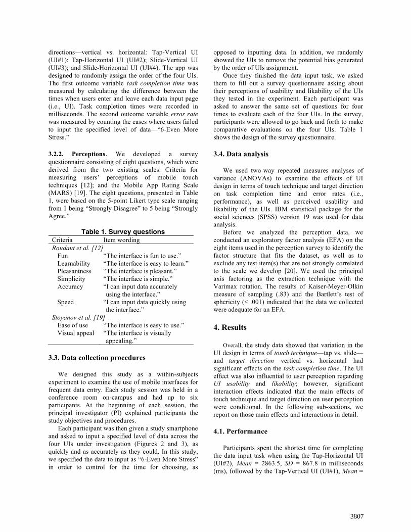
2912.3, SD = 980.4; the Slide-Horizontal UI (UI#4), Mean = 3399.3, SD = 1163.3; and the Slide-Horizontal UI (UI#3), Mean = 3591.8, SD = 1317.1 (Table 2).
Table 2. Descriptive statistics of task
completion time by UI type UI type n Mean (ms) SD (ms) Tap-V (UI#1) 50 2912.3 980.4 Tap-H (UI#2) 50 2863.5 867.8 Slide-V(UI#3) 50 3591.8 1317.1 Slide-H (UI#4) 50 3399.3 1163.3
The two-way repeated ANOVA results showed a
statistically significant main effect of touch technique (i.e., tap vs. slide) on the task completion time, F(1, 49) = 19.385, p < .001. Specifically, the tap-based UIs—UI#1 and UI#2—facilitated significantly faster data input compared to slide-based UIs—UI#3 and UI#4. On the other hand, we did not observe any significant differences in task completion time by target direction (i.e., vertical vs. horizontal), F(1, 49) = 1.598, p = .212. Moreover, there was no significant interaction effect between touch technique and target direction, either, F(1, 49) = .290, p = .592. These results support our first hypothesis that touch technique has a significant effect on task completion time (H1a), but reject our second hypothesis regarding the effect of target direction on task completion time (H1b). Figure 4 plots the task completion times by touch technique and target direction.
Figure 4. Task completion time by UI touch
technique and target direction Of the 200 data entries by 50 participants, there was
no error made. In other words, participants entered the required data—“6-Even More Stress”—accurately using the four UIs. This result, therefore, rejected H1c and H1d, which hypothesized that the UI type would affect error rate.
4.2. Perceptions The EFA results identified two factors, namely: (1)
perceived UI usability, consisting of Easy-to-use, Simplicity, Learnability, Accuracy, and Speed; (2) perceived UI likability, consisting of Fun, Pleasantness, and Visual appeal (Table 3). Overall, the two-factor model accounted for 67.5% of the variance. Using Cronbach’s Alpha (α), the internal consistency coefficient for the five items in the first factor—perceived UI usability—was .92 indicating “excellent” reliability; and the coefficient for the three items in the second factor—perceived UI likability—was .81 indicating “good” reliability [21].
Table 3. Factor loadings of perception items
Factor 1 2
Fun .099 .759 Learnability .819 .169 Pleasantness .284 .764 Simplicity .812 .280 Accuracy .828 .185 Speed .811 .240 Ease of use .639 .541 Visual appeal .219 .627
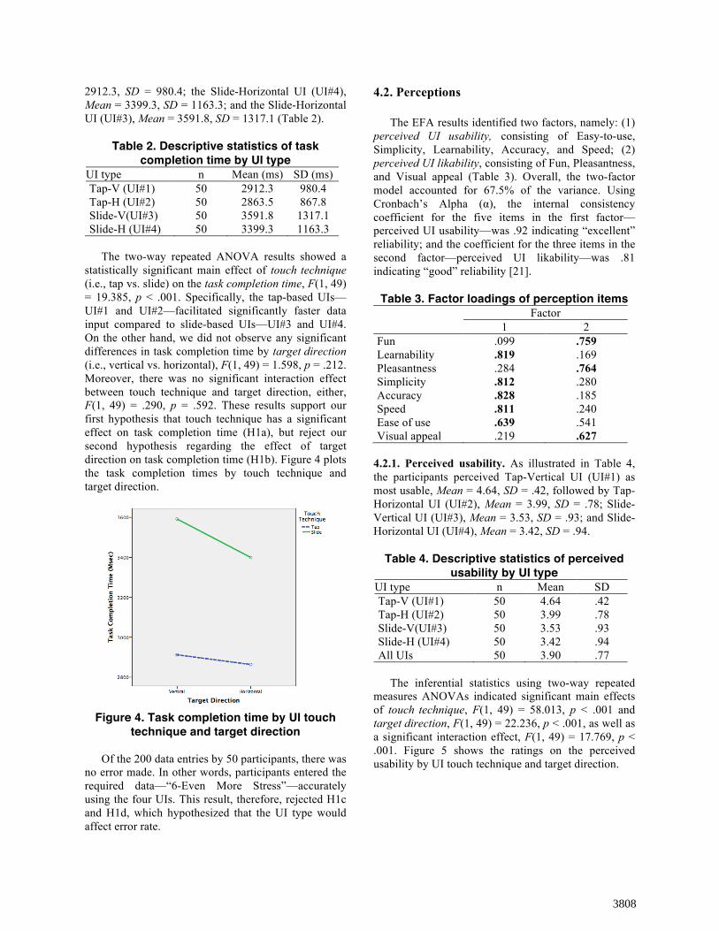
4.2.1. Perceived usability. As illustrated in Table 4, the participants perceived Tap-Vertical UI (UI#1) as most usable, Mean = 4.64, SD = .42, followed by Tap-Horizontal UI (UI#2), Mean = 3.99, SD = .78; Slide-Vertical UI (UI#3), Mean = 3.53, SD = .93; and Slide- Horizontal UI (UI#4), Mean = 3.42, SD = .94.
Table 4. Descriptive statistics of perceived
usability by UI type UI type n Mean SD Tap-V (UI#1) 50 4.64 .42 Tap-H (UI#2) 50 3.99 .78 Slide-V(UI#3) 50 3.53 .93 Slide-H (UI#4) 50 3.42 .94 All UIs 50 3.90 .77
The inferential statistics using two-way repeated
measures ANOVAs indicated significant main effects of touch technique, F(1, 49) = 58.013, p < .001 and target direction, F(1, 49) = 22.236, p < .001, as well as a significant interaction effect, F(1, 49) = 17.769, p < .001. Figure 5 shows the ratings on the perceived usability by UI touch technique and target direction.
3808
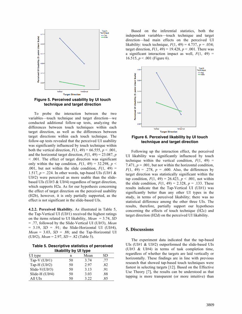
Figure 5. Perceived usability by UI touch
technique and target direction
To probe the interaction between the two variables—touch technique and target direction—we conducted additional follow-up tests, analyzing the differences between touch techniques within each target direction, as well as the differences between target directions within each touch technique. The follow-up tests revealed that the perceived UI usability was significantly influenced by touch technique within both the vertical direction, F(1, 49) = 66.555, p < .001, and the horizontal target direction, F(1, 49) = 23.087, p < .001. The effect of target direction was significant only within the tap condition, F(1, 49) = 32.298, p < .001, but not within the slide condition, F(1, 49) = 1.517, p = .224. In other words, tap-based UIs (UI#1 & UI#2) were perceived as more usable than the slide-based UIs (UI#3 & UI#4) regardless of target direction, which supports H2a. As for our hypothesis concerning the effect of target direction on the perceived usability (H2b), however, it is only partially supported, as the effect is not significant in the slide-based UIs.
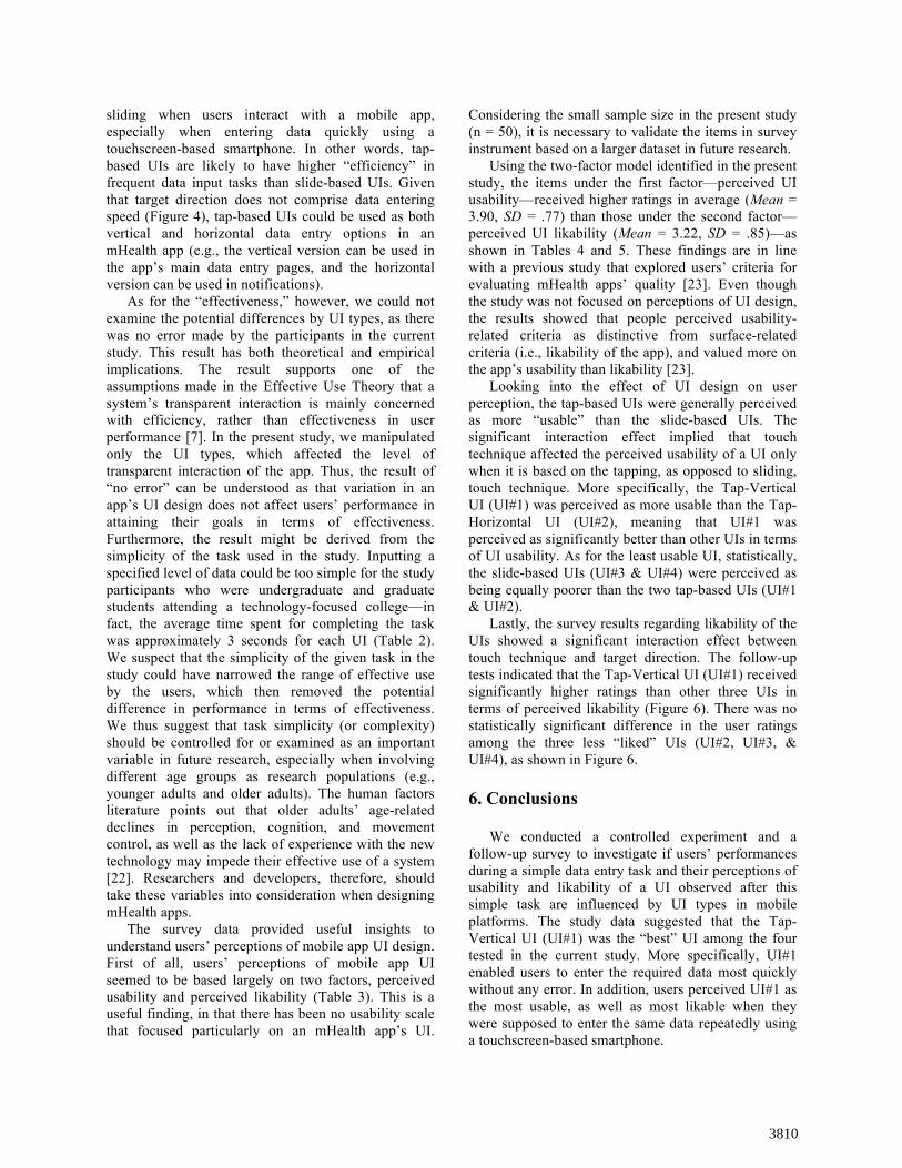
4.2.2. Perceived likability. As illustrated in Table 5, the Tap-Vertical UI (UI#1) received the highest ratings on the items related to UI likability, Mean = 3.74, SD = .77, followed by the Slide-Vertical UI (UI#3), Mean = 3.19, SD = .91; the Slide-Horizontal UI (UI#4), Mean = 3.03, SD = .88; and the Tap-Horizontal UI (UI#2), Mean = 2.97, SD = .82 (Table 5).
Table 5. Descriptive statistics of perceived likability by UI type
UI type n Mean SD Tap-V (UI#1) 50 3.74 .77 Tap-H (UI#2) 50 2.97 .82 Slide-V(UI#3) 50 3.13 .91 Slide-H (UI#4) 50 3.03 .88 All UIs 50 3.22 .85
Based on the inferential statistics, both the independent variables—touch technique and target direction—had main effects on the perceived UI likability: touch technique, F(1, 49) = 4.737, p = .034; target direction, F(1, 49) = 19.428, p < .001. There was a significant interaction impact as well, F(1, 49) = 16.515, p < .001 (Figure 6).
Figure 6. Perceived likability by UI touch
technique and target direction
Following up the interaction effect, the perceived UI likability was significantly influenced by touch technique within the vertical condition, F(1, 49) = 7.471, p = .001, but not within the horizontal condition, F(1, 49) = .278, p = .600. Also, the differences by target direction was statistically significant within the tap condition, F(1, 49) = 26.423, p < .001, not within the slide condition, F(1, 49) = 2.328, p = .133. These results indicate that the Tap-Vertical UI (UI#1) was significantly better than any other UI types in the study, in terms of perceived likability; there was no statistical difference among the other three UIs. The results, therefore, partially support our hypotheses concerning the effects of touch technique (H2c) and target direction (H2d) on the perceived UI likability.
5. Discussions
The experiment data indicated that the tap-based UIs (UI#1 & UI#2) outperformed the slide-based UIs (UI#3 & UI#4) in terms of task completion time, regardless of whether the targets are laid vertically or horizontally. These findings are in line with previous research that showed tap-based touch techniques were fastest in selecting targets [12]. Based on the Effective Use Theory [7], the results can be understood as that tapping is more transparent (or more intuitive) than
3809
sliding when users interact with a mobile app, especially when entering data quickly using a touchscreen-based smartphone. In other words, tap-based UIs are likely to have higher “efficiency” in frequent data input tasks than slide-based UIs. Given that target direction does not comprise data entering speed (Figure 4), tap-based UIs could be used as both vertical and horizontal data entry options in an mHealth app (e.g., the vertical version can be used in the app’s main data entry pages, and the horizontal version can be used in notifications).
As for the “effectiveness,” however, we could not examine the potential differences by UI types, as there was no error made by the participants in the current study. This result has both theoretical and empirical implications. The result supports one of the assumptions made in the Effective Use Theory that a system’s transparent interaction is mainly concerned with efficiency, rather than effectiveness in user performance [7]. In the present study, we manipulated only the UI types, which affected the level of transparent interaction of the app. Thus, the result of “no error” can be understood as that variation in an app’s UI design does not affect users’ performance in attaining their goals in terms of effectiveness. Furthermore, the result might be derived from the simplicity of the task used in the study. Inputting a specified level of data could be too simple for the study participants who were undergraduate and graduate students attending a technology-focused college—in fact, the average time spent for completing the task was approximately 3 seconds for each UI (Table 2). We suspect that the simplicity of the given task in the study could have narrowed the range of effective use by the users, which then removed the potential difference in performance in terms of effectiveness. We thus suggest that task simplicity (or complexity) should be controlled for or examined as an important variable in future research, especially when involving different age groups as research populations (e.g., younger adults and older adults). The human factors literature points out that older adults’ age-related declines in perception, cognition, and movement control, as well as the lack of experience with the new technology may impede their effective use of a system [22]. Researchers and developers, therefore, should take these variables into consideration when designing mHealth apps.
The survey data provided useful insights to understand users’ perceptions of mobile app UI design. First of all, users’ perceptions of mobile app UI seemed to be based largely on two factors, perceived usability and perceived likability (Table 3). This is a useful finding, in that there has been no usability scale that focused particularly on an mHealth app’s UI.
Considering the small sample size in the present study (n = 50), it is necessary to validate the items in survey instrument based on a larger dataset in future research.
Using the two-factor model identified in the present study, the items under the first factor—perceived UI usability—received higher ratings in average (Mean = 3.90, SD = .77) than those under the second factor—perceived UI likability (Mean = 3.22, SD = .85)—as shown in Tables 4 and 5. These findings are in line with a previous study that explored users’ criteria for evaluating mHealth apps’ quality [23]. Even though the study was not focused on perceptions of UI design, the results showed that people perceived usability-related criteria as distinctive from surface-related criteria (i.e., likability of the app), and valued more on the app’s usability than likability [23].
Looking into the effect of UI design on user perception, the tap-based UIs were generally perceived as more “usable” than the slide-based UIs. The significant interaction effect implied that touch technique affected the perceived usability of a UI only when it is based on the tapping, as opposed to sliding, touch technique. More specifically, the Tap-Vertical UI (UI#1) was perceived as more usable than the Tap-Horizontal UI (UI#2), meaning that UI#1 was perceived as significantly better than other UIs in terms of UI usability. As for the least usable UI, statistically, the slide-based UIs (UI#3 & UI#4) were perceived as being equally poorer than the two tap-based UIs (UI#1 & UI#2).
Lastly, the survey results regarding likability of the UIs showed a significant interaction effect between touch technique and target direction. The follow-up tests indicated that the Tap-Vertical UI (UI#1) received significantly higher ratings than other three UIs in terms of perceived likability (Figure 6). There was no statistically significant difference in the user ratings among the three less “liked” UIs (UI#2, UI#3, & UI#4), as shown in Figure 6. 6. Conclusions
We conducted a controlled experiment and a follow-up survey to investigate if users’ performances during a simple data entry task and their perceptions of usability and likability of a UI observed after this simple task are influenced by UI types in mobile platforms. The study data suggested that the Tap-Vertical UI (UI#1) was the “best” UI among the four tested in the current study. More specifically, UI#1 enabled users to enter the required data most quickly without any error. In addition, users perceived UI#1 as the most usable, as well as most likable when they were supposed to enter the same data repeatedly using a touchscreen-based smartphone.
3810
The results of this study is promising, in that, using Effective Use Theory as a theoretical foundation could produce useful information that advances our understanding of how users interact with a system, particularly in mobile platforms. We find that the surface features of an mHealth app, such as touch techniques and target directions, may affect user performance and perception. Further research is needed to examine the effects of the other two dimensions of effective use, representational fidelity and informed action, which were controlled for in the present study. Investigating the relationships between the three dimensions of effective use and the two dimensions of performance in the mobile context will provide useful insights to design mHealth apps and test the effectiveness of those apps in empirical studies. Beyond the relationship between effective use and performance, it is also important to examine how effective use and performance influence users’ perceptions and their behaviors as to whether they keep engaged with or quit using the app. 7. References [1] A. Smith, U.S. smartphone use in 2015, Pew Internet & American Life Project, Washington, DC, 2015. [2] S. Fox, and M. Duggan, Health online 2013, Pew Internet & American Life Project, Washington, DC, 2013. [3] S. Fox, and M. Duggan, Mobile health 2012, Pew Internet & American Life Project, Washington, DC, 2012. [4] T. Donker, K. Petrie, J. Proudfoot, J. Clarke, M. R. Birch, and H. Christensen, “Smartphones for smarter delivery of mental health programs: A systematic review,” Journal of Medical Internet Research, vol. 15, no. 11, pp. e247, 2013. [5] B. Martinez-Perez, I. de la Torre-Diez, and M. Lopez-Coronado, “Mobile health applications for the most prevalent conditions by the World Health Organization: Review and analysis,” Journal of Medical Internet Research, vol. 15, no. 6, pp. e120, 2013. [6] M. B. Rosson, and J. M. Carroll, Usability engineering: Scenario-based development of human-computer interaction, San Francisco, CA: Morgan Kaufmann, 2002. [7] A. Burton-Jones, and C. Grange, “From use to effective use: A representation theory perspective,” Information Systems Research, vol. 24, no. 3, pp. 632-658, 2013. [8] A. Burton-Jones, and D. W. Straub, “Reconceptualizing system usage: An approach and empirical test,” Information Systems Research, vol. 17, no. 3, pp. 228-246, 2006.
[9] H. Liang, and Y. Xue, “Avoidance of information technology threats: A theoretical perspective,” MIS Quarterly, vol. 33, no. 1, pp. 71-90, 2009. [10] A. Cockburn, D. Ahlström, and C. Gutwin, “Understanding performance in touch selections: Tap, drag and radial pointing drag with finger, stylus and mouse,” International Journal of Human-Computer Studies, vol. 70, no. 3, pp. 218-233, 2012. [11] M. Kobayashi, A. Hiyama, T. Miura, C. Asakawa, M. Hirose, and T. Ifukube, "Elderly user evaluation of mobile touchscreen interactions," Human-Computer Interaction—INTERACT 2011, Lecture Notes in Computer Science P. Campos, N. Graham, J. Jorge, N. Nunes, P. Palanque and M. Winckler, eds., pp. 83-99: Springer Berlin Heidelberg, 2011. [12] A. Roudaut, S. Huot, and E. Lecolinet, “TapTap and MagStick: Improving one-handed target acquisition on small touch-screens,” in Proceedings of the Working Conference on Advanced Visual Interfaces (AVI'08), Napoli, Italy, 2008, pp. 146-153. [13] C. Stößel, and L. Blessing, “Mobile device interaction gestures for older users,” in Proceedings of the 6th Nordic Conference on Human-Computer Interaction (NordiCHI2010), Reykjavik, Iceland, 2010, pp. 793-796. [14] C. Stößel, and L. Blessing, “Tap, swipe & pinch: Designing suitable multi-touch gestures for older users,” in Proceedings of the International Design Conference (DESIGN2010), Dubrovnik, Croatia, 2010. [15] P. Parhi, A. K. Karlson, and B. B. Bederson, “Target size study for one-handed thumb use on small touchscreen devices,” in Proceedings of the 8th Conference on Human-Computer Interaction with Mobile Devices and Services (MobileHCI'06), Helsinki, Finland, 2006, pp. 203-210. [16] S. Lee, and S. Zhai, “The performance of touch screen soft buttons,” in Proceedings of the SIGCHI Conference on Human Factors in Computing Systems (CHI'09), Boston, MA, 2009, pp. 309-318. [17] F. D. Davis, “Perceived usefulness, perceived ease of use, and user acceptance of information technology,” MIS Quarterly, vol. 13, no. 3, pp. 319-340, 1989. [18] F. D. Davis, R. P. Bagozzi, and P. R. Warshaw, “User acceptance of computer technology: A comparison of two theoretical models,” Management Science, vol. 35, no. 8, pp. 982-1003, 1989. [19] S. R. Stoyanov, L. Hides, D. J. Kavanagh, O. Zelenko, D. Tjondronegoro, and M. Mani, “Mobile app rating scale: a new tool for assessing the quality of health mobile apps,” JMIR Mhealth Uhealth, vol. 3, no. 1, pp. e27, 2015. [20] N. Abell, D. W. Springer, and A. Kamata, Developing and validating rapid assessment instruments, New York, NY: Oxford University Press Inc. , 2009.
3811
[21] J. A. Gliem, and R. R. Gliem, “Calculating, interpreting, and reporting Cronbach's alpha reliability coefficient for Likert-type scales,” Midwest Research to Practice Conference in Adult, Continuing, and Community Education, pp. 82-88, 2003. [22] A. D. Fisk, W. A. Rogers, N. Charness, S. J. Czaja, and J. Sharit, Designing for older adults: Principles and creative human factors approaches, 2 ed., Boca Raton, FL: CRC Press, 2009. [23] B. Stvilia, and W. Choi, “Mobile wellness application-seeking behavior by college students: An exploratory study,” Library & Information Science Research, vol. 37, no. 3, pp. 201-208, 2015.
3812