Embed Size (px)
Citation preview

Dynamic Networks Analysis and Visualization through Spatiotemporal Link
Segmentation
Ting Li, Qi Liao
Department of Computer Science
Central Michigan University
Mount Pleasant, Michigan 48859, USA
e-mail: {li2t, liao1q}@cmich.edu
Abstract—Big network data analysis has become a challenging
task not only due to increasing large volume but the
appearance of dynamic spatial-temporal relationship. Both
network topologies and their link properties are constantly
changing as a result of newly established and torn connections.
Traditional data mining techniques in large-scale dynamic
networks are either incapable or computationally expensive.
To that end, we developed a dynamic network analysis and
visualization (DNAV) tool. One major component of DNAV is
a dynamic graph in which links are divided according to their
temporal dimensions. Each segment on network edges
represents the dynamic network temporal evolution of graph
properties, e.g., locations where the communications occur.
Unlike animation approaches, the proposed static view of
dynamic networks does not rely deeply on human cognitive
ability on remembering changes over different time slots, thus
dramatically simplifying the visual analytic process for
dynamic networks. To further improve scalability of rendering
large networks, data filtering modules such as time selection,
hops settings, entities selection, and edge weight thresholds, are
adopted in the visualization. Case study demonstrates the
effectiveness of DNAV tool in understanding the dynamic
network patterns and trends and the potential to analyze
anomalies in dynamic communication networks.
Keywords-dynamic network; spatiotemporal visualization;
link segmentation
I. INTRODUCTION
As we move to big data era, the data is not only getting much bigger but more complex and dynamic as well. In facing with internet of things (IoT) and mobile social networks, as the number of nodes and their connection magnitude grow exponentially, their interactions are becoming more dynamic. Network connections can be established and torn down at any moment. The characteristics or properties of the network links can evolve with time. Examples of dynamic networks include wireless and mobile communication network, social network, IoT, sensor network, etc. Dynamic networks [1] are known for their temporally changing topology as a result of on/off patterns of network connectivity. The challenges in analyzing dynamic networks lie in the
constantly changing spatial-temporal properties and
complex event interactions in large networks. While there
have been data mining approaches [2] to analyze dynamic
networks, the complexity is usually high to consider all
possibilities for large networks. Visual analysis [3] of
dynamic networks can be helpful sometime since patterns
can be quickly examined by human therefore eliminating
exhaustive search by data mining and machine learning
process. Small multiples and animation are two typical
visualization methods for dynamic network analysis, but it
is difficult to track changes over time due to limitation of
human cognition ability. While other visual methods such as
multiple dimension visualizations [4]-[6] exist, there is
generally a shortage of visualization readability and
preservation of mental map [7]. As we transit to the world
of big data, how to analyze large dynamic networks scalably
and effectively remains a challenging research area. Despite the challenges, we develop a relatively
lightweight visual analytic tool that allows researchers and network operators to analyze patterns in their dynamic networks. Notably, some changes in dynamic networks are considered normal while other changes are not (i.e., anomalies). It is our intention to allow human investigators to understand the patterns/trends and detect those abnormal changes in highly dynamic networks. One major component of the Dynamic Network Analysis and Visualization (DNAV) tool is the dynamic graph view. The graph is a node-link diagram and we use it by taking advantage of people's familiarity with the graph. However, the dynamic graphs differ from traditional graphs in that a novel scheme is adopted to encode spatiotemporal information on the network connections themselves. The links in our dynamic graphs are divided into segments by their temporal dimension based on users' selection of edge properties. Each segment can be further divided if there are multiple status values within one time slot. Different colors are utilized to show dynamic edge property evolution over time. By dividing links into segments, we accomplish the goal of showing dynamic network in one single static view without requiring users to remember changes as in the animation schemes.
To improve our dynamic graphs' scalability, we have implemented multiple interactive functions, such as a time selection bar, which allows investigators to analyze the dynamic graphs only within certain time period. Another
209
2016 IEEE International Conference on Cloud Computing and Big Data Analysis
978-1-5090-2593-0/16/$31.00 ©2016 IEEE

feature is the maximum hop setting, which enables analysts to choose how many hops from a selected node in the graph. The resulting smaller subgraphs allow scalable visualization of large networks. In addition, edge filtering by edge weights (e.g., number of connections) is included to address scalability issues. We evaluate the DNAV tool over publicly available datasets that contain over four million communication records. The proposed dynamic graph visualization effectively identifies the time and location of anomalous changes in network communication patterns.
II. RELATED WORK
Understanding the dynamics of large complex networks has been a challenging yet important task. Traditionally, dynamic networks can be analyzed and visualized through animation. For example, GraphDiaries [8] tries to explore dynamic networks along three dimensions - time (when), graph elements (where) and type of change (what) - through interactive staged animated transition that highlights changes from one time step to another. However, animation approaches are limited by human cognition ability. Our approach seeks to analyze dynamic graphs in a static view thus is easier for users to preserve mental map.
Networks are commonly represented as node-link graphs. The underlying graph representation, i.e., adjacency matrix, however, can be used directly for analysis. The 3D matrix cubes [9] resulting from stacking adjacency matrix at each time slice are better for analyzing dense networks. In addition, Massive Sequence View (MSV) may be used to analyze temporal and structural aspects of dynamic networks. In this way, time ordering between node connections can be clearly viewed. However, as with any MSV, visual clutter can be a problem with large graphs. Circular MSV [3] may reduce clutter for better scalability.
Time-varying graphs can also be structured and visualized using the parallel edge splatting techniques and Rapid Serial Visualization Presentation (RSVP) [10]. The technique is a typical representation of juxtaposed visualization, in which, a dynamic graph is mapped on a sequence of parallel vertical lines with fixed vertical vertex positions in all of the graphs. Subgraphs between each two parallel vertical lines are used to represent one equal time period's data. While the method shows some usefulness in dynamic network analysis, it may have a high perceptual ability requirement for analysts to explore the whole network as there are so many subgraphs, and entities can be shown in the graph are also limited: too many vertexes on one vertical line will decrease the graph's readability.
For node-link graphs, research [11] shows that classic force-directed layout algorithm is suitable for time-varying graphs by using nodes and edges filter based on graph hierarchy. However, there exist other layout choices. For example, hyperbolic temporal layout method [12] was proposed to analyze large sparse temporal social network datasets. It uses topology-based-edge-clustering algorithms. Another example is TimeRadarTrees [13], [14], which use radial tree layout to draw the hierarchy, and utilizes circle sectors to represent the temporal dynamics of links in the graph. The layout has the benefit of reducing visual clutter
comparing to node-link graph representation, but is not as easy as node-link graphs for people to understand as it does not have intuitional topological representation.
Large ego-centered networks can be divided into small graphs [15]. As general graph drawing techniques, different shapes, colors and filling may be used for rendering nodes and edges. 1.5D visualization design using temporal trend glyph for the focus node can be useful in analyzing egocentric dynamic network. 2.5D visualization or slice technique allows the analysis of both static snapshots of networks and their dynamics. Preserving mental map between consecutive timeslices is important. Multidimensional Scaling (MDS) [16] as a network layout method can be used for mental map preservation. Furthermore, Degree-of-interest (DoI) functions [17] can be defined to direct which areas need to be shown as global overview or at individual detailed level. Subgraphs' density can be encoded with node glyph.
Despite the above approaches, Dynamic Network Analysis (DNA) remains a hard research field. Such research is even more important and challenging when considering the unprecedented amount, complexity and dynamics of large network communication as we enter the big data era. This research looks at embedding spatiotemporal information into network links in dynamic communication network analysis and visualization.
III. VISUAL ANALYTIC DESIGN OF DYNAMIC
COMMUNICATION NETWORKS
Figure 1 illustrates an overview of the Dynamic Network Analysis and Visualization (DNAV) tool. The tool is designed to help investigators to understand and identify patterns from a dynamic communication network by iterative exploration. The main view is the dynamic graph based on node-link diagram to intuitively show the relationship among entities for communication networks. The dynamic graph view presents communication networks' dynamic topologies and properties over time in a static view. This is achieved through link segmentation with spatiotemporal property information, which is to be discussed in detail in following sections.
The dynamic graph view supports zoom and pan that allow detailed view and whole network view. The mouseover event on nodes will highlight a focus node and its surrounding neighbors with changing shape sizes and colors. The mouseover event on edges will show information about each individual link, i.e., the details of link property value changes over time. The color legend above the dynamic graph illustrates the color codes used and their meaning for easy lookup.
A. Dynamic Graph
A dynamic communication network can be represented by a time-varying graph 𝐺𝑇 = < 𝑉𝑇 , 𝐸𝑇 > , in which T represents the entire time period of analysis, 𝑉𝑇 and 𝐸𝑇 signify the network entity set and related communication set.
Due to the nature that most networks are large, we design four mechanisms to address scalability. The first mechanism is a time selection option through a double-end time slider
210

bar (bottom of Figure 1), with which analysts can choose a customized time slice t from T to analyze dynamic graphs.
The second mechanism is a maximal hop selection (dropdown menu next to minimal connection text box) on top of the dynamic graph view. In our dynamic graph, each selected network entity 𝑣𝑖 (𝑣𝑖 ∈ 𝑣𝑡 ) is regarded as root entity. Network entities which communicate with the root entity directly are considered to be within one hop of the root entity, and are referred as first hop entities. Similarly, entities which communicate with the first hop entities directly are within two hops of the root entity and so on. Once analysts set the hops value, the selected root entities along with entitles which are within the hops value of each root entity 𝑣𝑖 , and their related communications will be added into graph 𝐺𝑡 = < 𝑉𝑡 , 𝐸𝑡 > , in which t represents the selected time slice; 𝑉𝑡 includes the selected root entities and entities which are within the selected hops value of each root entity; 𝐸𝑡 signifies the related communication set of 𝑉𝑡.
The third mechanism is a node filtering by node weight (degrees) as illustrated in the node selection pool on the
upper-left of the tool (see Figure 1). The nodes are sorted by their connectivity degrees (either weighted by considering connection magnitude or unweighted). Node degrees can be a relevant metric to measure the importance of nodes with which one may begin investigation. With the node selection pool, analysts can either type in one particular node ID or use mouse to select single or multiple nodes (entity set 𝑣𝑡 (𝑣𝑡 ∈𝑉𝑡)) to analyze in the dynamic graph.
The fourth mechanism is to perform filtering based on edge weight as shown above the color legend in Figure 1. We add a minimal connection threshold input field for dynamic graphs. Once analysts input a minimal threshold value, we calculate the communication records that each merged communication 𝑒 (𝑒 ∈ 𝐸𝑡
𝑚)contains. Only merged communications whose communication records are more than the input minimal threshold value, along with their related entities will be added into 𝐺𝑡
𝑤 = < 𝑉𝑡𝑤, 𝐸𝑡
𝑤 > , in which 𝐸𝑡
𝑤 signifies merged communications whose communication records are more than the minimal threshold value and 𝑉𝑡
𝑤 includes the related entities.
Figure 1. Overview of the Dynamic Network Analysis and Visualization (DNAV) tool. Graph links are used to encode temporal dimension to analyze the
spatial-temporal dynamics of network link properties.
B. Link Segmentation Algorithm
The dynamics in large communication networks not only reflect in their topology, i.e., entities may come and go and links may be created and torn down constantly, but also reflect in their communication properties 𝑃𝐸𝑡
and dynamic
changes of values for each property 𝑃𝐸𝑡𝑖 ∈ 𝑃𝐸𝑡. To show
these two types of dynamics, we merge communication records (belong to Et) with same entities but different timestamps, and divide the related link in a dynamic graph into 𝑘 (𝑘 > 1) main segments, each main segment
represents communication information in one sub time period t′, 𝑡′ = 𝑡/(𝑘 − 1).
Links in our design of dynamic graphs are divided into k time segments (Figure 2). Different colors are used to encode spatiotemporal information. For example, the first start time segment is denoted with black color. For the k-1 segments, if communication disconnects during (𝑖 − 1) ∗ 𝑡′ (2 ≤ 𝑖 ≤ 𝑘), the ith segment will be denoted with light gray color. Other customizable colors (except black and light gray) are used to show the dynamics of communications' property values, which also implicitly indicate that the related communications are connected during that time period.
211

Figure 2. Dynamic graph links are used as a time dimensional axis and are
divided into k segments, which may be further divided by multiple property values. Color coding: black (start time), light gray (no activity), others (link
property values).
If two entities contact each other in the (𝑖 − 1) ∗ 𝑡′ (2 ≤ 𝑖 ≤ 𝑘) time period, and their communication property has only one value, then we will denote the 𝑖𝑡ℎ segment with one specific color (e.g., the (𝑘 − 1)𝑡ℎ and 𝑘𝑡ℎ segments in Figure 2. However, if during ( 𝑖 − 1) ∗ 𝑡′ time period a communication property has multiple values, we will further divide the ith segment into subsegments by the number of property values. For example, as shown in Figure 2, when 𝑖 = 2 , the second segment is further divided into two subsegments denoted with different colors. Suppose the property chosen is the location, the two subsegments indicate that during this time slice, the communication has occurred at two different places. In our design, for simplicity and better visibility, the ith segment will be equally divided into multiple subsegments no matter how many times each property value appears.
As discussed above, we now demonstrate the details of our link division algorithm (Algorithm 1). For 𝑒′ ∈ 𝐸𝑡
𝑤 (𝑡𝑥 ≤ 𝑡 ≤ 𝑡𝑦) , we will iterate each of its
communication records. Assume one of its communication records has a timestamp value of 𝑡𝑖 we will first find out 𝑡𝑖’s time_ratio (proportion of t) value by using the following equation:
𝑡𝑖𝑚𝑒 _ 𝑟𝑎𝑡𝑖𝑜 =𝑡𝑖 − 𝑡𝑥
𝑡𝑦 − 𝑡𝑥
(1)
As we have to keep the first main segment for start time notation, there will be only (𝑘 − 1) main segments on each link to show topology and property dynamics, so we need to normalize the time_ratio value into segment_ratio (1/𝑘 ≤ 𝑠𝑒𝑔𝑚𝑒𝑛𝑡_𝑟𝑎𝑡𝑖𝑜 ≤ 1, [0,1/𝑘) is kept for start time) . The normalization equation is shown as follows:
𝑠𝑒𝑔𝑚𝑒𝑛𝑡 _ 𝑟𝑎𝑡𝑖𝑜 = 𝑡𝑖𝑚𝑒 _ 𝑟𝑎𝑡𝑖𝑜 ∗ (1 −1
𝑘) +
1
𝑘 (2)
Once we get the segment_ratio value for communication record with a timestamp of 𝑡𝑖, we will check which segment the communication record with 𝑡𝑖 timestamp value belongs to, and calculate the number of property values that the related communication has in the segment by using binning method in data mining.
During (𝑖 − 1) ∗ (𝑡𝑦 − 𝑡𝑥) / (𝑘 − 1) (2 ≤ 𝑖 ≤ 𝑘)
time period, if one communication link does not have any property value (i.e., the communication does not appear), the related link's ith segment will be denoted with gray color. If one communication appears and has only one property value, the ith main segment will be denoted with one specific color according to its property value. Otherwise if the communication has multiple property values during (𝑖 − 1) ∗ (𝑡𝑦 − 𝑡𝑥)/(𝑘 − 1) , we will further divide the
related link’s ith segment into subsegments according to how many property values that communication has during (𝑖 − 1) ∗ (𝑡𝑦 − 𝑡𝑥)/(𝑘 − 1). The dynamic graph after link
division and color arrangement can be represented by 𝐺𝑡𝑑 =
< 𝑉𝑡𝑑 , 𝐸𝑡
𝑑 >. One example of such dynamic graph is shown in Figure 3.
C. Implementations
We develop the DNAV tool based on the server-client model rather than a desktop application by taking advantage of scalability, accessibility and convenience. An investigator can analyze and visualize his network from anywhere in the world with the Internet and a web browser by visiting a URL.
As for data processing, given a communication network dataset, essential attributes are first extracted. Typically, the significant attributes that we will look for include timestamp, source ID, destination ID, and all relevant property information, e.g., location where the communication occurs, etc. The well-formatted data are stored in database server.
On the client side, the views are implemented using JavaScript with D3, JQuery and JQrangslides libraries. As users switch between views, move the time bar, or make filtering and selection, the operation will be transmitted under the AJAX mechanism to the server side asynchronously. On the server side, web service is set up to host user analytic requests from a client machine. When users interact with the DNAV tool in their web browser (e.g., select certain period of time or certain network entities), the request is sent back to the web server, on which the PHP processes query the database server and perform the dynamic graph construction, communication record merge, and link segmentation as discussed in the early sections. The results
212

are then written to JSON files and sent back to the clients for their visual analysis in the dynamic graph view.
IV. CASE STUDY
For preliminary results, we evaluate the DNAV tool over a large communication network dataset from Mini-Challenge 2 (MC2) of VAST 2015. The data is gathered at a theme park (DinoFun World) during 2014-06-06 to 2014-06-08 (Friday, Saturday and Sunday) to honor a famous soccer star (Scott Jones). However, a vandalism occurs sometime during the weekend. There is a need to analyze and understand the communication patterns in the park and when/where the vandalism occurs. MC2 data set contains 9,410 IDs (visitors or park services) and 4,153,329 communications. All visitors
use a mobile application to check in rides and communicate with fellow visitors.
We extract the four attributes, i.e., time, from (sender ID), to (recipient ID), and location. Values for location can be Coaster Alley, Kiddle Land, Wet Land, Tundra Land and Entry Corridor. After loading the data into the DNAV tool, we find that the park was open around 8 AM and closed around 12 AM on each day. We move the time bar to select the whole investigation period (Friday - Sunday), and select “weighted degree” as the sorting option for entities. There are three IDs which stand out for their large volume of communications (highlighted with red rectangle in Figure 1), i.e., ID 1278894 (degree of 380254), ID 839736 (degree of 121630) and external IDs, denoted by -1 (degree of 62076). We choose these three IDs as starting points for analysis.
Figure 3. An example of dynamic graph visualization showing two top IDs communicating with others at different times at various locations.
Figure 4. Communication patterns suggest ID 1278894 always starts at
Entry Corridor (purple color) and bidirectional request-reply trend.
From Figures 3 and 4, communications of ID 1278894 always starts at Entry Corridor (purple color). This pattern implies that ID 1278894 is associated with park services, and visitors use the app to check into the park at Entry Corridor. Different from ID 1278894, ID 839736 communicates with other IDs at different locations but mostly ends at Entry Corridor. Similarly, its communication shows forward and back trend, i.e., other IDs always communicate with it first and it replies back. Based on these patterns, it is reasonable to assume ID 839736 may be one of other park services such as Information Desk in the theme park located at Entry Corridor.
The investigator moves the time bar to explore the dynamic graphs at different time slots. Figure 5 suggests that many IDs began frequently communicating with ID 839736 and external IDs (-1) at location Wet Land (green color) since 2014-06-08 11:52:38. Compared with Figure 3, neither ID 839736 nor external IDs exhibit similar communication pattern during other time periods. The investigator concludes that the vandalism was discovered in park around noon on 2014-06-08, when visitors began to frequently contact ID
213
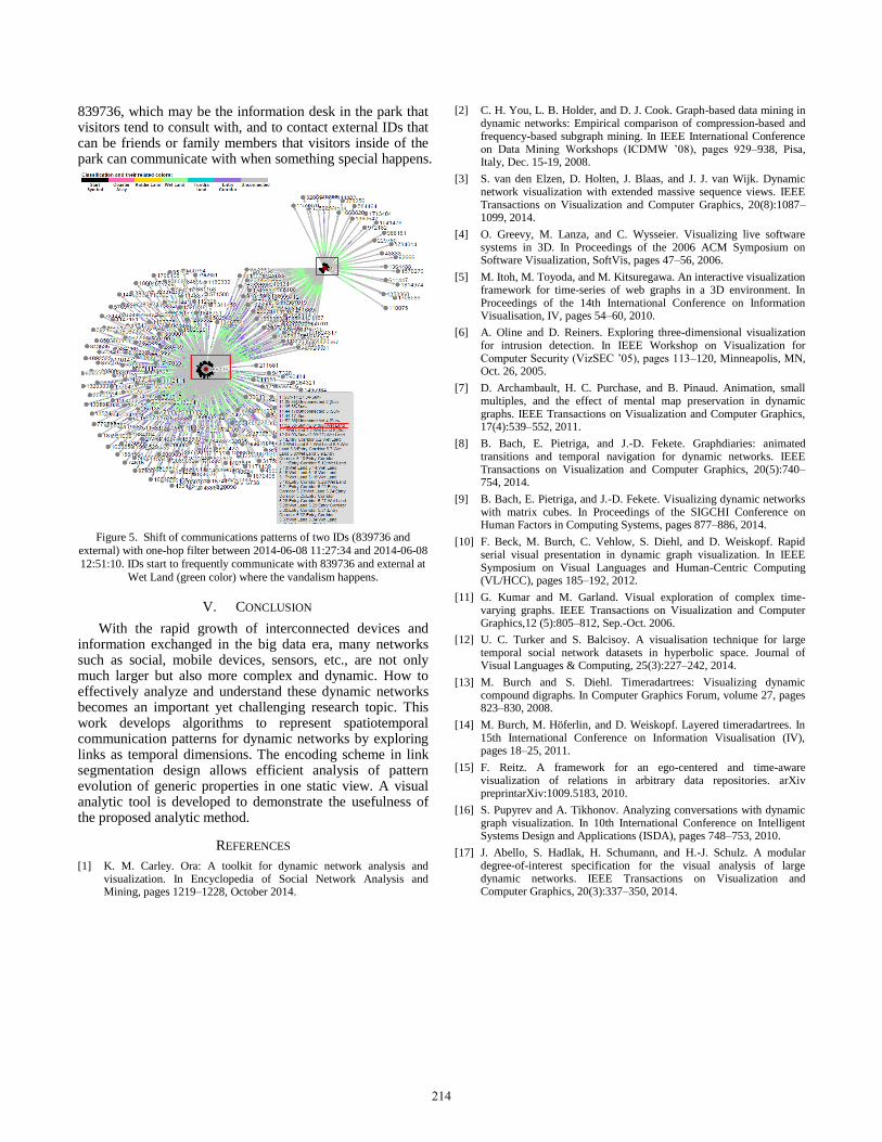
839736, which may be the information desk in the park that visitors tend to consult with, and to contact external IDs that can be friends or family members that visitors inside of the park can communicate with when something special happens.
Figure 5. Shift of communications patterns of two IDs (839736 and
external) with one-hop filter between 2014-06-08 11:27:34 and 2014-06-08
12:51:10. IDs start to frequently communicate with 839736 and external at
Wet Land (green color) where the vandalism happens.
V. CONCLUSION
With the rapid growth of interconnected devices and information exchanged in the big data era, many networks such as social, mobile devices, sensors, etc., are not only much larger but also more complex and dynamic. How to effectively analyze and understand these dynamic networks becomes an important yet challenging research topic. This work develops algorithms to represent spatiotemporal communication patterns for dynamic networks by exploring links as temporal dimensions. The encoding scheme in link segmentation design allows efficient analysis of pattern evolution of generic properties in one static view. A visual analytic tool is developed to demonstrate the usefulness of the proposed analytic method.
REFERENCES
[1] K. M. Carley. Ora: A toolkit for dynamic network analysis and visualization. In Encyclopedia of Social Network Analysis and Mining, pages 1219–1228, October 2014.
[2] C. H. You, L. B. Holder, and D. J. Cook. Graph-based data mining in dynamic networks: Empirical comparison of compression-based and frequency-based subgraph mining. In IEEE International Conference on Data Mining Workshops (ICDMW ’08), pages 929–938, Pisa, Italy, Dec. 15-19, 2008.
[3] S. van den Elzen, D. Holten, J. Blaas, and J. J. van Wijk. Dynamic network visualization with extended massive sequence views. IEEE Transactions on Visualization and Computer Graphics, 20(8):1087–1099, 2014.
[4] O. Greevy, M. Lanza, and C. Wysseier. Visualizing live software systems in 3D. In Proceedings of the 2006 ACM Symposium on Software Visualization, SoftVis, pages 47–56, 2006.
[5] M. Itoh, M. Toyoda, and M. Kitsuregawa. An interactive visualization framework for time-series of web graphs in a 3D environment. In Proceedings of the 14th International Conference on Information Visualisation, IV, pages 54–60, 2010.
[6] A. Oline and D. Reiners. Exploring three-dimensional visualization for intrusion detection. In IEEE Workshop on Visualization for Computer Security (VizSEC ’05), pages 113–120, Minneapolis, MN, Oct. 26, 2005.
[7] D. Archambault, H. C. Purchase, and B. Pinaud. Animation, small multiples, and the effect of mental map preservation in dynamic graphs. IEEE Transactions on Visualization and Computer Graphics, 17(4):539–552, 2011.
[8] B. Bach, E. Pietriga, and J.-D. Fekete. Graphdiaries: animated transitions and temporal navigation for dynamic networks. IEEE Transactions on Visualization and Computer Graphics, 20(5):740–754, 2014.
[9] B. Bach, E. Pietriga, and J.-D. Fekete. Visualizing dynamic networks with matrix cubes. In Proceedings of the SIGCHI Conference on Human Factors in Computing Systems, pages 877–886, 2014.
[10] F. Beck, M. Burch, C. Vehlow, S. Diehl, and D. Weiskopf. Rapid serial visual presentation in dynamic graph visualization. In IEEE Symposium on Visual Languages and Human-Centric Computing (VL/HCC), pages 185–192, 2012.
[11] G. Kumar and M. Garland. Visual exploration of complex time-varying graphs. IEEE Transactions on Visualization and Computer Graphics,12 (5):805–812, Sep.-Oct. 2006.
[12] U. C. Turker and S. Balcisoy. A visualisation technique for large temporal social network datasets in hyperbolic space. Journal of Visual Languages & Computing, 25(3):227–242, 2014.
[13] M. Burch and S. Diehl. Timeradartrees: Visualizing dynamic compound digraphs. In Computer Graphics Forum, volume 27, pages 823–830, 2008.
[14] M. Burch, M. Höferlin, and D. Weiskopf. Layered timeradartrees. In 15th International Conference on Information Visualisation (IV), pages 18–25, 2011.
[15] F. Reitz. A framework for an ego-centered and time-aware visualization of relations in arbitrary data repositories. arXiv preprintarXiv:1009.5183, 2010.
[16] S. Pupyrev and A. Tikhonov. Analyzing conversations with dynamic graph visualization. In 10th International Conference on Intelligent Systems Design and Applications (ISDA), pages 748–753, 2010.
[17] J. Abello, S. Hadlak, H. Schumann, and H.-J. Schulz. A modular degree-of-interest specification for the visual analysis of large dynamic networks. IEEE Transactions on Visualization and Computer Graphics, 20(3):337–350, 2014.
214
![IEEE TRANSACTIONS ON VISUALIZATION AND COMPUTER …people.cst.cmich.edu/liao1q/papers/tvcg_2014.pdf · heterogeneity in the topology and temporal aspect of the network data [2][3]](https://img.pdfslide.us/doc/110x75/5ec6792663b878764040c4b5/ieee-transactions-on-visualization-and-computer-heterogeneity-in-the-topology-and.jpg)