Embed Size (px)
DESCRIPTION
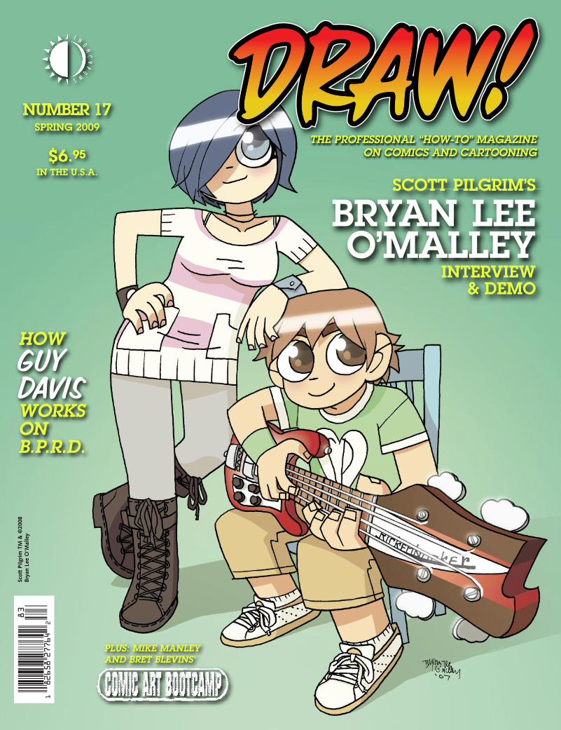
DRAW! #17 (80 pages with color, $6.95) goes behind the pages of the hit series of graphic novels starring Scott Pilgrim—a slacker hero and wannabe rock star—with his creator and artist, Bryan Lee O'Malley, to see how he creates the acclaimed series! Then, learn how B.P.R.D.’s Guy Davis works on that series in an exclusive tutorial! Plus, there’s the latest installment of Comic Art Bootcamp, this time on “Learning from The Great Cartoonists” by Bret Blevins and Mike Manley! All this, plus reviews, resources for artists, and more! Edited by Mike Manley.
Citation preview
THE PROFESSIONAL “HOW-TO” MAGAZINEON COMICS AND CARTOONING
SCOTT PILGRIM’S
BRYAN LEEO’MALLEY
INTERVIEW& DEMO
$6.95IN THE U.S.A.
NUMBER 17SPRING 2009
HOWGGUUYY DDAAVVIISSWORKSONB.P.R.D.
PLUS: MIKE MANLEY AND BRET BLEVINS’
Scot
t Pi
lgri
m T
M &
©20
08B
ryan
Lee
O’M
alle
y
NEW STUFF FROM TWOMORROWS!1
8265827764
2
83
SPRING 2009
VOL. 1, NO. 17
THE PROFESSIONAL“HOW-TO” MAGAZINE ONCOMICS & CARTOONING
Editor-in Chief • Michael ManleyDesigner • Eric Nolen-WeathingtonPublisher • John MorrowLogo Design • John CostanzaProofreader • Eric Nolen-WeathingtonTranscription • Steven TiceFront Cover Illustration • Bryan Lee O’Malley
CONTENTS
The Super-AwesomeBRYAN LEE O’MALLEY Interview!!!Interview with the creator of Scott Pilgrim3
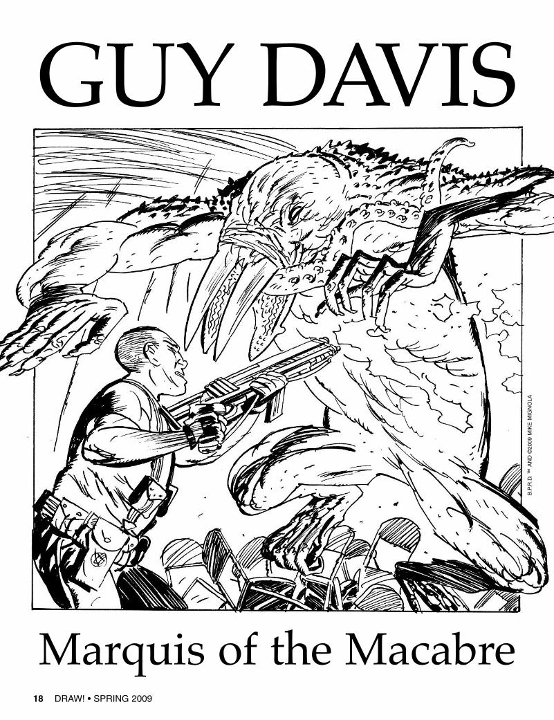
GUY DAVISMarquis of the MacabreInterview with the artist of B.P.R.D.18
The Super-AwesomeBRYAN LEE O’MALLEY GalleryFull color gallery38
WWW.DRAWMAGAZINE.COM
COMIC ART BOOTCAMP“Breaking Down the Masters”by Mike Manley50
DRAW! Spring 2009, Vol. 1, No. 17 was producedby Action Planet, Inc. and published byTwoMorrows Publishing. Michael Manley, Editor,John Morrow, Publisher. Editorial Address is P.O. Box2129, Upper Darby, PA 19082. Subscription Address:TwoMorrows Publishing, 10407 Bedfordtown Dr.,Raleigh, NC 27614. DRAW! and its logo are trade-marks of Action Planet, Inc. All contributions hereinare copyright 2009 by their respective contributors.Action Planet, Inc. and TwoMorrows Publishingaccept no responsibility for unsolicited submissions.All artwork herein is copyright the year of production,its creator (if work-for-hire, the entity which contract-ed said artwork); the characters featured in said art-work are trademarks or registered trademarks oftheir respective owners; and said artwork or othertrademarked material is printed in these pages withthe consent of the copyright holder and/or for journal-istic, educational and historical purposes with noinfringement intended or implied. Envy Adams, Lostat Sea, Scott Pilgrim, and all related characters ™and ©2009 Scott Pilgrim • B.P.R.D., Hellboy and allrelated characters ™ and ©2009 Mike Mignola • RedRaja ™ and ©2009 Guy Davis • Metropol ™ and©2009 Ted McKeever • Batgirl, Batman, Dr. Sivana,Mary Marvel, Supergirl ™ and ©2009 DC Comics •Captain America, Daredevil, Nova, Silver Surfer,Spider-Man, The Thing, Wolverine, X-Men ™ and©2009 Marvel Characters, Inc. • Flash Gordon,Johnny Hazard, Secret Agent X-9 ™ and ©2009King Features Syndicate, Inc. • Conan ™ and ©2009Conan Properties International, LLC • Tarzan ™ and©2009 ERB, Inc. • Fafhrd and the Gray Mouser ™and ©2009 Fritz Leiber • Pan’s Labyrinth ™ and©2009 Picturehouse • This entire issue is © 2009Action Planet, Inc. and TwoMorrows Publishing andmay not be reprinted or retransmitted without writtenpermission of the copyright holders.
ISSN 1932-6882.Printed in Canada.FIRST PRINTING.
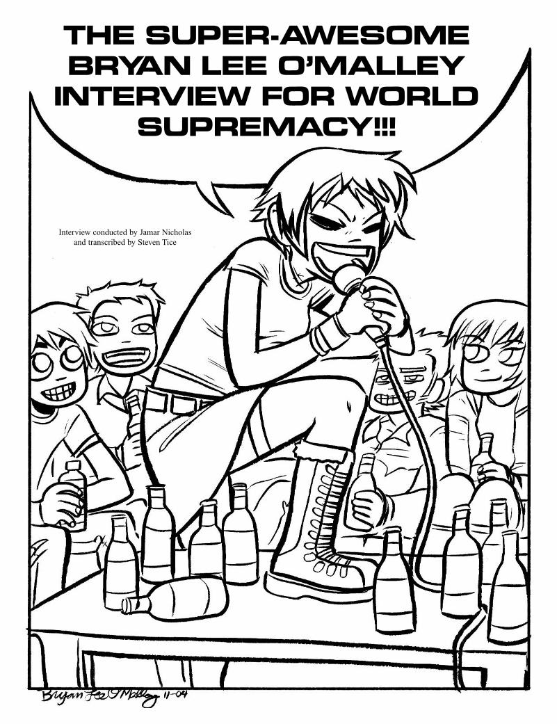
THE SUPER-AWESOMEBRYAN LEE O’MALLEY
INTERVIEW FOR WORLDSUPREMACY!!!
Interview conducted by Jamar Nicholasand transcribed by Steven Tice
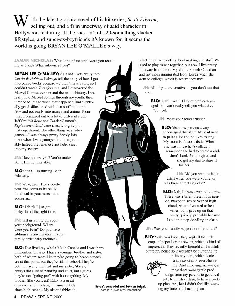
JAMAR NICHOLAS:What kind of material were you read-ing as a kid? What influenced you?
BRYAN LEE O’MALLEY: As a kid I was really intoCalvin & Hobbes. I always tell the story of how I gotinto comic books because we didn’t have cable, so Icouldn’t watch Transformers, and I discovered theMarvel Comics version and the rest is history. I wasreally into Marvel comics through my youth, thenjumped to Image when that happened, and eventu-ally got disillusioned with that stuff in the mid-’90s and got really into manga and anime. Fromthere I branched out to a lot of different stuff.Jeff Smith’s Bone and Zander Cannon’sReplacement God were a really big help inthat department. The other thing was videogames—I was always pretty deeply intothem when I was younger, and that prob-ably helped the Japanese aesthetic creepinto my system..
JN: How old are you? You’re under30, if I’m not mistaken.
BLO:Yeah, I’m turning 28 inFebruary.
JN:Wow, man. That’s prettyneat. You seem to be reallyfar ahead in your career at ayoung age.
BLO: I think I just gotlucky, hit at the right time.
JN: Tell us a little bit aboutyour background. Wherewere you born? Do you havesiblings? Is anyone else in yourfamily artistically inclined?
BLO: I’ve lived my whole life in Canada and I was bornin London, Ontario. I have a younger brother and sister,both of whom seem like they’re going to become teach-ers at this point, but they’re still in school. They’reboth musically inclined and my sister, Stacey,always did a lot of painting and stuff, but I guessthey’re not “going pro” with it or anything. Mybrother (the youngest) Eddy is a greatdrummer and has taught drums to kidssince high school. My sister dabbles in
electric guitar, painting, bookmaking and stuff. Weused to play music together, but now I live prettyfar away from them. My dad is French-Canadianand my mom immigrated from Korea when shewent to college, which is where they met.
JN: All of you are creatives—you don’t see thata lot.
BLO: Uhh... yeah. They’re both college-aged, so I can’t really tell you what they“do” yet.
JN:Were your folks artistic?
BLO:Yeah, my parents alwaysencouraged that stuff. My dad usedto paint a lot and he likes to sing.My mom isn’t too artistic. Whenshe was in teacher’s college Iremember she had to create a chil-dren’s book for a project, and
she got my dad to draw itfor her.
JN: Did you want to be anartist when you were young, or
was there something else?
BLO: Nah, I always wanted to draw.There was a brief, pretentious peri-od, maybe in senior year of highschool, where I wanted to be awriter, but I gave up on thatpretty quickly, probably because
I couldn’t stop doodling in class.
JN:Was your family supportive of your art?
BLO:Yeah, you know, they kept all the littlescraps of paper I ever drew on, which is kind ofimpressive. They recently brought all that stuffout to my house so it wouldn’t be cluttering up
theirs anymore, which is niceand also kind of overwhelm-ing. And annoying. Anyway, atmost there were gentle prod-
dings from my parents to get a realjob, to finish college, to have a back-
up plan, etc., but I didn’t feel like wast-ing my time on a backup plan.
4 DRAW! • SPRING 2009
ith the latest graphic novel of his hit series, Scott Pilgrim,selling out, and a film underway of said character in
Hollywood featuring all the rock ’n’ roll, 20-something slackerlifestyles, and super-ex-boyfriends it’s known for, it seems theworld is going BRYAN LEE O’MALLEY’s way.
W
Bryan’s somewhat mod take on Batgirl.BATGIRL ™ AND ©2009 DC COMICS
JN: Did you go to art school? If so, where and what kind ofexperience was it for you?
BLO: I didn’t go to art school. I went to university for FilmStudies, which I thought might be applicable to my studies ofcomics, but it didn’t really pan out for me. I couldn’t stop doo-dling in class, so I failed all my tests, and I wasn’t interested inthe college social life, so eventually I left.The way I look at it is, I gave up on everything else except
drawing comics. I’ve been drawing comics since I was a reallylittle kid. I always finagled it so I could do comics for projectsin school, instead of whatever. I remember filling an entirenotebook with a long fairy-tale comic in third grade, and I wasstill substituting weird art-comics for film projects in university.But I was a bad student in university, and I dropped out afterless than two years. I actually quit after my first year, then Itried again a year later and only lasted three months or so.
JN: How was your family about that? Did they support that?
BLO: They’ve always been supportive. After I dropped out thesecond time, I told them I was going to California to hang outwith my comics-making friends, and they were okay with that,too. I stayed there for about six months in 2001 working on
Last Shot and some Udon stuff.
JN: Seems like you were spared the “you'll be eating dinnerout of the dumpster,” hard-luck horror tales that most familieshave in those situations.
BLO:Yeah, I had a good family to help me out along the way.They helped out with the tuition and stuff even though Idropped out, and I tried not to lean on them much during mystarving-wannabe-comic-artist years.
BREAKING IN
JN: So when did you officially start doing comics work? 2001?
BLO:Yeah, I lettered Last Shot, which came out throughImage, and I did some mostly-uncredited ghost work for Udon,and then I got introduced to the Oni Press guys and startedworking my way up.
JN:You were lettering at Oni too, right?
BLO:Yeah, I still am! I’m lettering Local. I think that’s the lastone, though. Brian Wood asked for me and Hope [Larson] to do
DRAW! • SPRING 2009 5
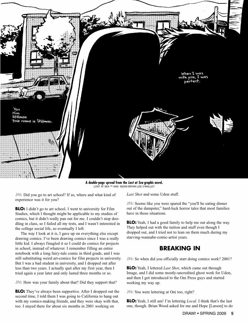
A double-page spread from the Lost at Sea graphic novel.LOST AT SEA ™ AND ©2009 BRYAN LEE O’MALLEY
DRAW! • SPRING 2009 11
and I like the line they give me, so I keep using them.
JN: I think Erik Larsen uses Pilot Razor pens for linework. I’malso digging those little [Faber-Castell] Pitt pens lately.Recently, I found these jewels in an art supply catalog, Marvybrushpens, that have a disposable tip, but they can’t hold up toreal battle. You ever try messing with crowquills?
BLO:Yeah, I have some Japanese replaceable-nib felt pens, butthey seem so fragile. I use them for things like ruled lines thathave to taper. I tried it in high school, but I gave up. Now Hopeis addicted to the Deleter G-pen nibs, and she says I’m notallowed to use them right now, so I defer to her.
JN: Ha! Are you hard on your tools?
BLO: Nah, I’m good, it’s just that she doesn’t want me to becopying her. She’s very protective. I’ll use them in a few yearsafter she’s dominated the field, you know?
JN: Remind me later, I’ll get to talking about you two as aworking couple. That’s interesting. Anyway, I think I tried thoseDeleter nibs before. I know I really dug the inks. I got a coupleof bottles at some anime con here in the States.
BLO:Yeah, I used to be addicted to the Deleter inks, but Ieventually gave up on them because they’re a pain to procure.The Koh-i-noor gave me a similar finish to the Deleter 1 ink,and the Pelikan is kind of along those lines, too. I like a slightlythin, matte ink.
JN: Can you explain the numbers on the Deleter ink? I neverfigured it out.
BLO: I can’t remember. There was a description somewhere.The 1 is matte and thin, the 2 was thicker and shiny. I can’tremember what the 3 was like, and I never tried the others. Ithink I did a lot of kinda dry-brushy stuff with the 3, actually.
JN:What are you doing your finished pages on? Plate Bristol?Give us names, too—the process junkies like name-drops.
BLO: Just the Strathmore stuff, the smooth in the yellow pads.I’m a cheapskate. They started doing this wind-power enviro-friendly stuff too.
JN: The green pad!
BLO:Yeah, the green with the wind thingy on it. We have abunch of those, and a bunch of the yellow, too. We actually
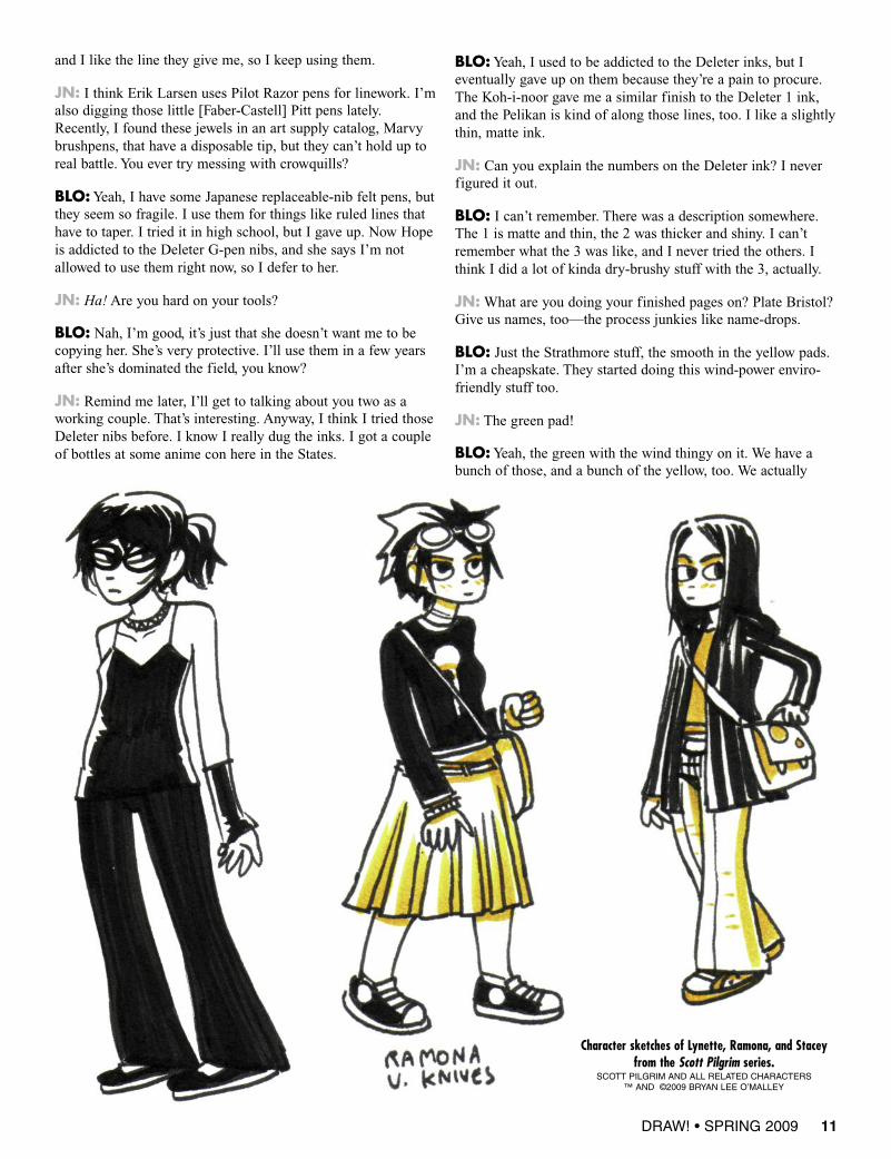
Character sketches of Lynette, Ramona, and Staceyfrom the Scott Pilgrim series.
SCOTT PILGRIM AND ALL RELATED CHARACTERS™ AND ©2009 BRYAN LEE O’MALLEY
then I can kind of plan the scene around the angles Iknow I’ve got down. But there are also plenty of loca-tions that are totally fictional. Most of the characters’apartments and stuff are kind of cobbled together fromvarious pieces of my old apartments and friends’places, so that’s half and half.
JN: Do you consider yourself a “modern” cartoonistor a traditional, “old school” type?
BLO: I think I’m somewhere on the cusp, because Ikind of scoff at the kids drawing comics with theirtablet PCs, and I’m always talking about how you gottause a real brush and real ink if you want to be serious.But I don’t know. I’m somewhere in the middle. I usethe computer almost all the time, but I generally likehaving my pages inked on the paper, as close to fin-ished as possible.
JN: If you don’t mind, take us through the process ofcreating a 200+ page graphic novel. Is your procedurethe same for say, a 24-page floppy? That’s a lot ofpages to juggle, so walk us through that if you could.
BLO: It really is too much to hold in your head at onetime. What I’m learning now is to break it down intomanageable chunks, as if I was actually doing issues.My chapters in Scott Pilgrim tend to be around 30pages, so that works for me.If you’re looking at the whole thing as one big job,
it’s exciting at first, but after 40-50 pages it becomestotally overwhelming and you just start to shut down.It’s like you’re pushing a broom down a hall that goesas far as the eye can see in either direction.I think as more people start doing longform graphic
novels we’ll come up with more and better copingstrategies, but right now I’m just learning by trial anderror.
JN: So, are you beginning with a full typed script? Doyou work with strips of ideas then begin the writingprocess? Plot outlines into thumbs? Also, since yousaid you’re finding yourself working chapters at atime, are you finishing the pages then, or doing every-thing in stages?
BLO: I’ve always used a full script. With each book,the scriptwriting process becomes more developed—more thought, more drafts, more editing. As a result,each one has taken longer to write. My current scriptstyle is pretty much exactly like a film screenplay,focused on dialogue with pretty basic descriptions ofsetting and action.On the new book—Scott Pilgrim Vol. 5—I’m
breaking down each chapter into pages on a printout ofthe script, then doing thumbs and pencils for the whole30-page-ish chapter over a period of two weeks or so.Then I spend another couple weeks inking, then I goback to the script and start again on the next chapter.That’s the theory, anyway. So far it’s working out, but
14 DRAW! • SPRING 2009
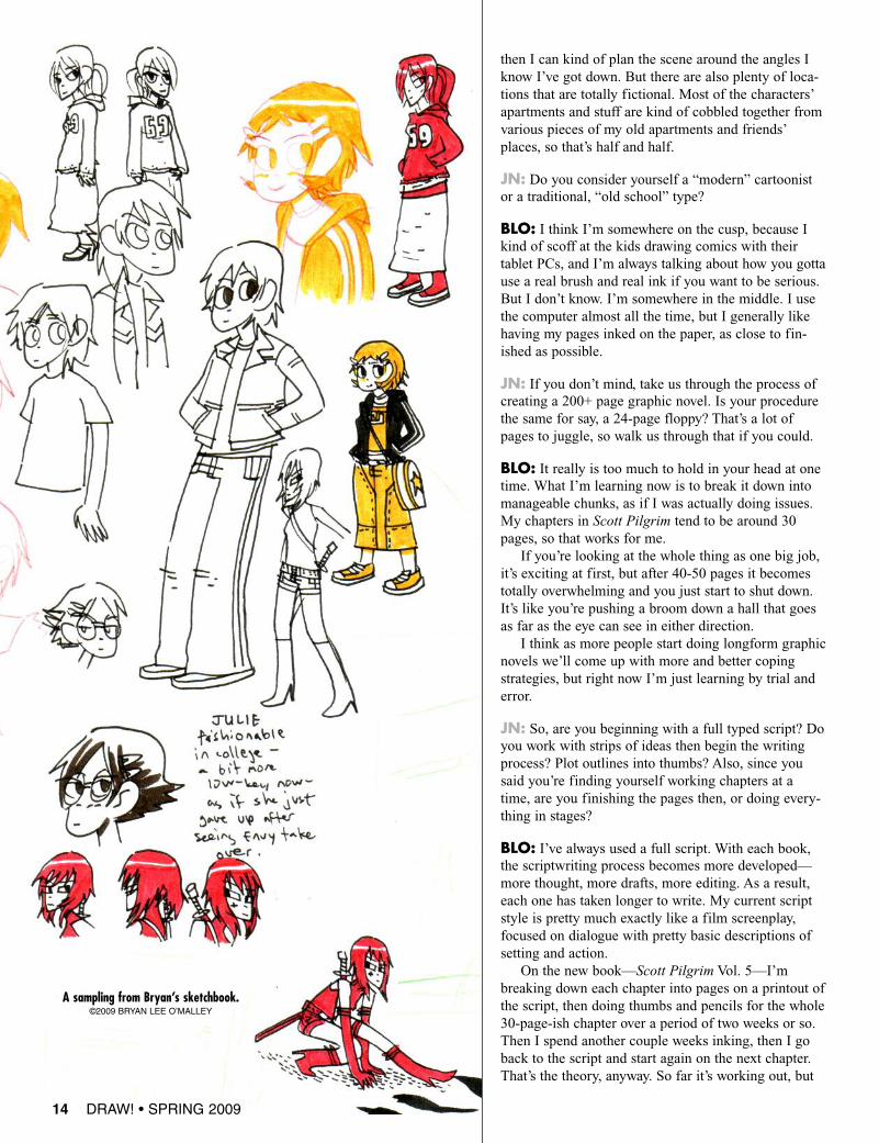
A sampling from Bryan’s sketchbook.©2009 BRYAN LEE O’MALLEY
18 DRAW! • SPRING 2009
GUY DAVIS
Marquis of the Macabre
B.P.R.D.™
AND©2009
MIKEMIGNOLA
Interview conducted by Mike Manleyand transcribed by Steven Tice
DRAW!:What are you working on today?
GUY DAVIS: Today I’m inking the first issue of the newB.P.R.D. storyline, “The Garden of Souls” and it’s turning out tobe my favorite B.P.R.D. series to work on yet—but then Ialways say that with each new storyline.
DRAW!: Tell us a bit about growing up and how you becameinterested in drawing comics for a living.
GD: I guess I was always scribbling and drawing when I wasyoung. My father did painting and sculpture as a hobby so Igrew up with artwork being done around me, and my parentswere always very encouraging and supportive of me drawing allthe time. When I graduated in ’84 I wasn’t really sure of what Iwanted to do with myself—just that I wanted to do somethingwith my artwork. I thought about looking into storyboard workor film design, but around that time I started working on a localfanzine (Fantastic Fanzine) and they became Arrow Comicswhich led to my first job penciling a fantasy comic called “TheRealm.” So I just sort of fell into drawing comics, and eachcompany and project sort of opened doors for another and Ikept at it for 20 years now professionally.
DRAW!: Did you go to college or have art training or art-relat-ed jobs before comics?
GD: No, there was no outside schooling or art-related jobsbefore I started doing comic work. I’m pretty much self-taught;the only art classes I had were in high school and they were alluseless. I learned the most just by jumping into doing comicsfrom start to finish and then learning by seeing my mistakesglaring back at me in print.
DRAW!: Our mutual buddy—and your writer on B.P.R.D.—John Arcudi, tells me you are a really fast artist, churning outseveral pages a day. Is this true? I know maybe you won’t wantto really truthfully answer,as an editor might be read-ing this interview. [laughs]
GD: John’s a great guy (andwriter), but I can’t reallychurn out seven finishedpages a day. I can pencilcomfortably four pages aday and in a pinch anywherefrom six to eight, but I pen-cil for myself, so it’s loosework. Inking takes melonger and I like to try to doat least two finished inkedpages a day, more if dead-lines are knocking. Butthese are on separate days,not all in one! Penciling oneday, inks the next.
I’m sure there are a lot of faster artists out there—and I'm inno race. I just try to get done what has to be done for deadlines.I actually have slowed down a bit, but I can’t spend too long ona page or I feel the art gets stiff or overworked if you knowwhat I mean.
DRAW!: So what B.P.R.D. are you doing right now?
GD: Right now I’m working on The Black Goddess. I’m fin-ishing that up, which is the one that starts this month, so I had apretty good lead-time on it. This starts next week, actually. Thisweek was the first of The Wild Hunt #2. I did a back-up in that,which Mike wrote. And then I’m doing two other back-ups inissues #3 and #4.
DRAW!: And that’s for the Hellboy miniseries that Mike’sdrawing now?
GD: No, it’s for the Hellboy that Duncan’s drawing, The WildHunt.
DRAW!: Duncan Fegredo. The first issue of that miniseries iscoming out, so, since we’re conducting this in January, it willbe out in January.
GD:Yeah, that’s coming out on the 14th, so I guess you wantme to mention what I’m working on; it would be finishing upBlack Goddess.
DRAW!: I’d like to talk more specifically about your workingmethods. You pencil, obviously, more pages in a day than youink. I was just wondering if, when you did that, if you tried tobreak it down, like, “I’ll do this sequence this day,” or, “I’ll dothis sequence or section this day”?
GD:Yeah. Y’know, I always jump around when I pencil, andwhen I ink. In laying out that I do it in the order of pages. Imean, if I take too much time at the beginning, it’s going tolook rushed at the end if I’m running out of time, whereas, if Istart or end with the middle, or this or that, it sort of all mixes
DRAW! • SPRING 2009 19
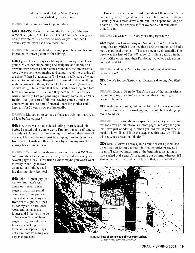
B.P.R.D.’s base of operations in the Colorado Rockies.B.P.R.D. ™ AND ©2009 MIKE MIGNOLA
together when it’s finished. I actually don’t sit down and say,“Okay, this I’ll pencil.” A lot of times it’s just whatever page Iseem inspired by to draw. Like, “Oh, today I feel like drawingapes, so I’ll draw a couple of ape pages,” or, “I’m gettingbehind, so where’s Johann? He’s easy. I’ll do him real quick.”
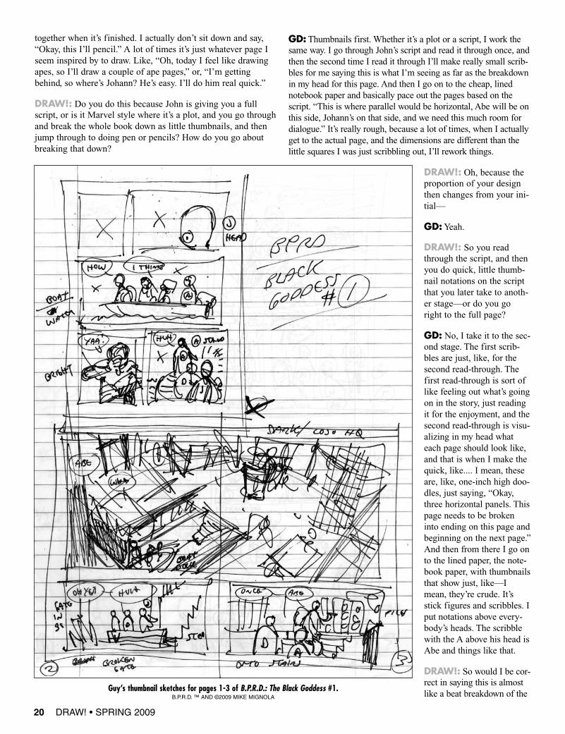
DRAW!: Do you do this because John is giving you a fullscript, or is it Marvel style where it’s a plot, and you go throughand break the whole book down as little thumbnails, and thenjump through to doing pen or pencils? How do you go aboutbreaking that down?
GD: Thumbnails first. Whether it’s a plot or a script, I work thesame way. I go through John’s script and read it through once, andthen the second time I read it through I’ll make really small scrib-bles for me saying this is what I’m seeing as far as the breakdownin my head for this page. And then I go on to the cheap, linednotebook paper and basically pace out the pages based on thescript. “This is where parallel would be horizontal, Abe will be onthis side, Johann’s on that side, and we need this much room fordialogue.” It’s really rough, because a lot of times, when I actuallyget to the actual page, and the dimensions are different than thelittle squares I was just scribbling out, I’ll rework things.
DRAW!: Oh, because theproportion of your designthen changes from your ini-tial—
GD:Yeah.
DRAW!: So you readthrough the script, and thenyou do quick, little thumb-nail notations on the scriptthat you later take to anoth-er stage—or do you goright to the full page?
GD: No, I take it to the sec-ond stage. The first scrib-bles are just, like, for thesecond read-through. Thefirst read-through is sort oflike feeling out what’s goingon in the story, just readingit for the enjoyment, and thesecond read-through is visu-alizing in my head whateach page should look like,and that is when I make thequick, like.... I mean, theseare, like, one-inch high doo-dles, just saying, “Okay,three horizontal panels. Thispage needs to be brokeninto ending on this page andbeginning on the next page.”And then from there I go onto the lined paper, the note-book paper, with thumbnailsthat show just, like—Imean, they’re crude. It’sstick figures and scribbles. Iput notations above every-body’s heads. The scribblewith the A above his head isAbe and things like that.
DRAW!: So would I be cor-rect in saying this is almostlike a beat breakdown of the
20 DRAW! • SPRING 2009
Guy’s thumbnail sketches for pages 1-3 of B.P.R.D.: The Black Goddess #1.B.P.R.D. ™ AND ©2009 MIKE MIGNOLA
script, so X amount of pages, X amount of panels, this is who isin the panel, who has to speak first?
GD:Yes. And then that’s always approved through everybody. Isend those notebook sketches to Scott Allie, Mike and John.And they go through it and they say, “Well,maybe take a look at the layout for this,”or, “This is fine.” It’s prettystraightforward.
DRAW!: How muchfeedback do youget from Mike onthe book?
GD: On B.P.R.D.proper, I mean,Mike looks it over, but usuallyhe gives more feedback on thepencils and inks. Scott andJohn will give feedback onactual layouts and stuff. ButMike sees everything. If hesees something, “Make sure thatyou do...,” like for The BlackGoddess we have these monstersthat we’ve seen before. “Make sure theymatch the cover that I did for TheWarning,” and this orthat. So he’ll chime in. And, obviously, when he sees the inks, if Imissed a detail, he’ll let me know. A lot of times something thatMike and I go back and forth on is the initial design, because
when I get the start of a series, I get to have a breakdown of whathappens in the five issues. With TheWarning, there were thegiant robot monsters that destroy Germany. I knew those werecoming up, so I’d start sketching those out, and then I’d sendthem to everybody, and some to Mike, and Mike will say, “Oh,
maybe go this direction with it.” He’ll send me thesescribbles through a fax. I’ll do these designs, and I’llbe, like, “Brilliant!” And then I’ll throw them to Mikeand he’ll go, “Well, how about this direction?” And it’s
a totally oppositedirection, or it takesmy designs in adifferent direction.And they’re per-fect. He’s got sucha great imagina-tion. I just hitmyself in thehead, “Why did-n’t I think of that?”
DRAW!: How is that? I mean,you’ve been in comics for awhile. How is it working on aproperty that was created byanother artist? Mike’s a great
artist, and he’s still active and involved in theproperty. It’d be like if you took over the Fantastic Four, StanLee and Jack Kirby are no longer writing or drawing thebook, but you’re sending them your layouts. How does thataffect your process or your thinking?
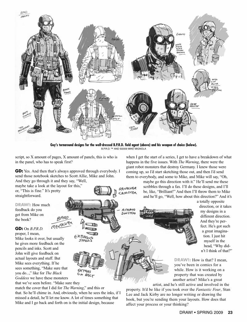
Guy’s turnaround designs for the well-dressed B.P.R.D. field agent (above) and his weapon of choice (below).B.P.R.D. ™ AND ©2009 MIKE MIGNOLA
DRAW! • SPRING 2009 23
24 DRAW! • SPRING 2009
GD:You know, I don’t know how it affects my process from thebeginning. I don’t do things thinking, “Okay, this has to be....”It’s not like there’s pressure, “Okay, I can’t screw this up. Thiswill just have to be something that Mike will love.” I just gothrough and, when I read a description of something that needsto be done, I give it what I think it should look like. I try tokeep it, obviously, in the realm of Mike’s universe. I’m notgoing to treat it like The Marquis as far as monsters, because Iknow how his designs and stuff have that Hellboy Universe feel.I think it’s great that he, obviously, goes over all this and chimesin, because it makes it stronger and it gives it his stamp ofapproval. I give it his look, which it should have. Mike’s greatto work with. He’s very open-minded about the direction of cer-tain things. And if he doesn’t like a certain thing, then he’sright. It’s usually wrong, and then we work it out, and it’salways a stronger design. But I like the fact that he’s hands-onwith these designs and the book.
DRAW!: That must be gratifying—I mean, it’s always gratify-ing as an artist to have another artist look at your work, becauseit’s great to have a fan appreciate your work, and it’s great tohave editors appreciate your work, but I know I always feel like,when another artist really appreciates those little things that youreally tried hard on, you really feel like the hard work paid off.
You know what I mean? That person’s really connecting in away that, I don’t know, with some background or somethingthat the average person might not have seen that little battlewon. They read it and enjoy it, but they don’t necessarily noticethose little nuances that go into it. So, yeah, I would imagine itwould be gratifying to have the guy who created Hellboy likeyour stuff.
GD: Oh, yeah. Like I said, he’s got an amazing imagination,because if you even look at, like, in the back of the trade paper-backs, we start putting out all these design sketches for stuff. Iknow with Garden of Souls with the Victorian cyborg, that wasone of the designs that went through the most that we’ve everdone back and forth, where I’d do a sketch, and he’d say, “Well,try this.” And I would try something else, and it goes back andforth. Just like evolution. You can see when you start seeingMike’s sketches, it’s just, here’s something of mine, if it’s tap-ping into that well of imagination that you just then run with.You’re like, “Okay, now I see what you’re saying as far as theshape,” and then I can just pick it up from there.
DRAW!: Right. Well, it’s pretty obvious is that your creativeprocess working on this book is a collaborative one—it’s reallyvery liquid—whereas, very often, if you’re doing your standard
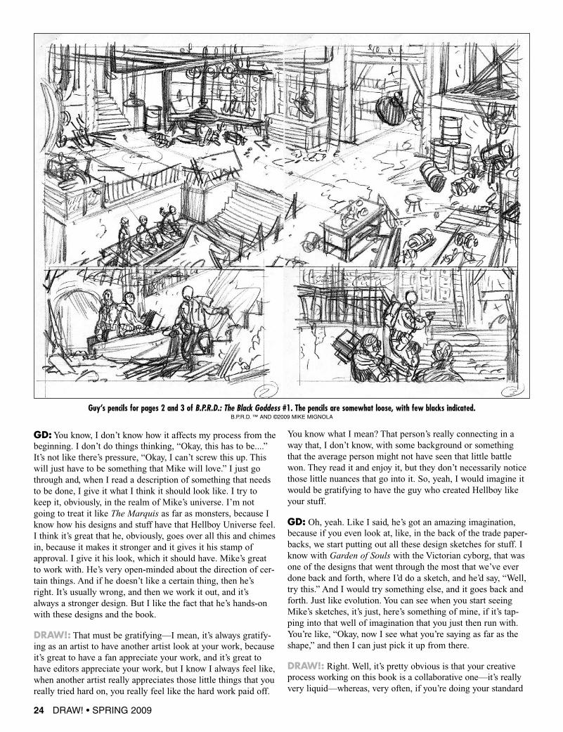
Guy’s pencils for pages 2 and 3 of B.P.R.D.: The Black Goddess #1. The pencils are somewhat loose, with few blacks indicated.B.P.R.D. ™ AND ©2009 MIKE MIGNOLA

interpret. When I first started doing stuff, Ialways hated the idea of putting whiteout ona page. Although that’s ridiculous, becausewho cares? So once I got over the fear ofactually making a mistake with the inks andgoing back and redoing it just to get it right,that was fine.
DRAW!:Yeah, some artists don’t likewhiteout. I know Al Williamson andRicardo Villagran, who I’m friends with,both those guys, they would use a razor.They didn’t like to use whiteout. Theywould take a razor and take off whatevermistake—an electric razor or a straightrazor—and they would basically just scrapethe surface. But you had to have a reallygood piece of paper in order to do that. Ifyou used a student grade or something likethat, the paper would probably just tear.
GD: I’ve seen Dave Cooper originals—Imean, that guy doesn’t even make mistakes.It’s just amazing that there’s all that fluidity tohis line and there’s no whiteout. At least on thepages I saw. Maybe a few have whiteout onthem.
DRAW!: How long does it usually take youto go through and pencil the whole book onceyou’ve laid it all out, and you go back andstart doing your figures?
GD: Usually the notebook thing takes a day,the blacking out and just saying, “This iswhat the layout looks like.” I’ll do that in aday. The actual penciling, a good pace, Icould pencil all 24 pages in four days, fivedays, at a comfortable pace. If things aretight—I mean, one issue of Garden ofSouls I did in two days. That’s not reallycutting any corners, that’s just staying upa lot later than I want.
In the above cover design for B.P.R.D.: Killing Ground#1, Daimio is front and center, but is reliant on ared tone to separate him from the rest of the cast.In the final design (right), he looms large in the
background, and while the background remains redand the other cast members are still in tones of blue,Daimio is colored in his normal manner, which notonly separates him from the cast but also prevents
him from blending into the background.B.P.R.D. ™ AND ©2009 MIKE MIGNOLA
DRAW! • SPRING 2009 27
36 DRAW! • SPRING 2009
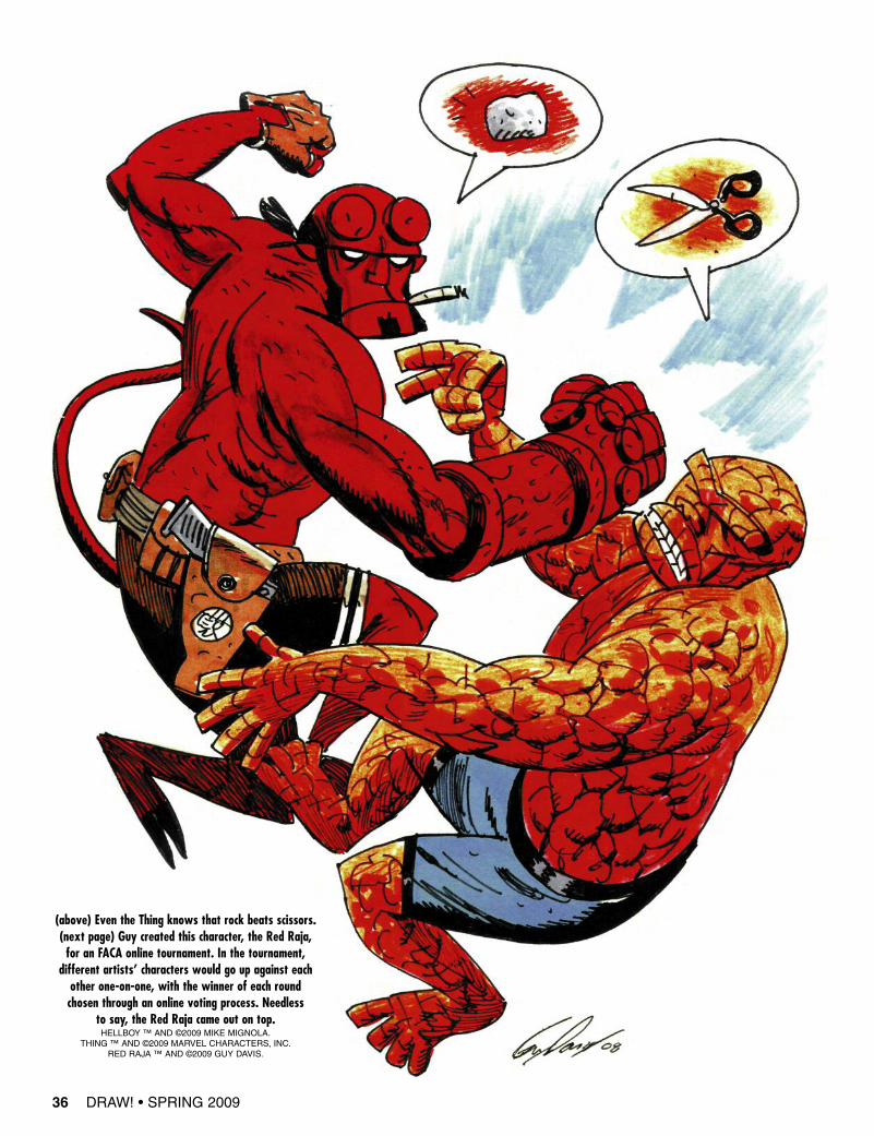
(above) Even the Thing knows that rock beats scissors.(next page) Guy created this character, the Red Raja,for an FACA online tournament. In the tournament,
different artists’ characters would go up against eachother one-on-one, with the winner of each roundchosen through an online voting process. Needless
to say, the Red Raja came out on top.HELLBOY ™ AND ©2009 MIKE MIGNOLA.
THING ™ AND ©2009 MARVEL CHARACTERS, INC.RED RAJA ™ AND ©2009 GUY DAVIS.

38 DRAW! • FALL 2008
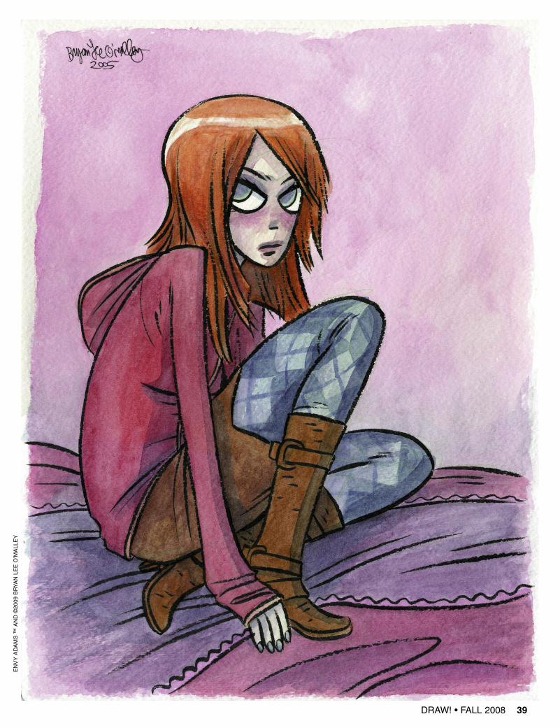
ENVY ADAMS ™ AND ©2009 BRYAN LEE O’MALLEY
THE SUPER-AWESOME
BRYAN LEEO’MALLEY
ART GALLERY!!!
DRAW! • FALL 2008 39
ENVYADAMS™
AND©2009
BRYA
NLE
EO’MALLEY
Welcome to another installment of“ComicArt Bootcamp.” In thisvisit to our basic training camp we
are going to study the work of some MasterCartoonists to analyze formal aspects andfundamentals of their approach to the art andcraft of cartooning to see where they havecommonalties and differences in the way theyapproach their work. The hope and purposeof this exercise is that we will begin to beable to take apart the work of these great car-toonists, find out why what these artists havedone works, and learn how to take what theydo and add it to our work to make it better.This is something I did as a young artist,though not in as clear and cut a fashion attimes.Several years ago I read an interview
with Jack Kirby, the Godfather of comics,and in that interview one thing he said real-ly, really stood out to me. He said, “Oneman can be a school for another.” What agreat and true statement; it rang so true tome as a young cartoonist, as I was always studying other cartoon-ists, like one would study subjects like math or English forschool. I was very serious about it; I really tried to pick apart thework of the artists I admired—my “art heroes,” as it were. Theywere really my main education, along with any good book oncartooning or drawing I could find, such as the long out of printbooks on drawing by Andrew Loomis. I had no real art teachersto teach me anything about comics or even figure drawing, so itwas the self-study course of hard knocks. I spent a lot of my time
hunting in the old comic shops, used bookstores, and librariesaround Ann Arbor, where I grew up, in search of any kind ofbook with info on how to be a better artist, drawing lessons, etc.As I began to very seriously study artists, I came to see how
they fell into very clear camps or styles, and how one artistused the same sort of way of drawing or inking, etc., or wasclearly influenced by another, though I had never thought to putit in such a succinct and crystal clear statement as Kirby’s. Forinstance, it was very evident to see how the artists working at
DRAW! • SPRING 2009 51
BREAKINGDOWN THEMASTERSBy Mike Manley
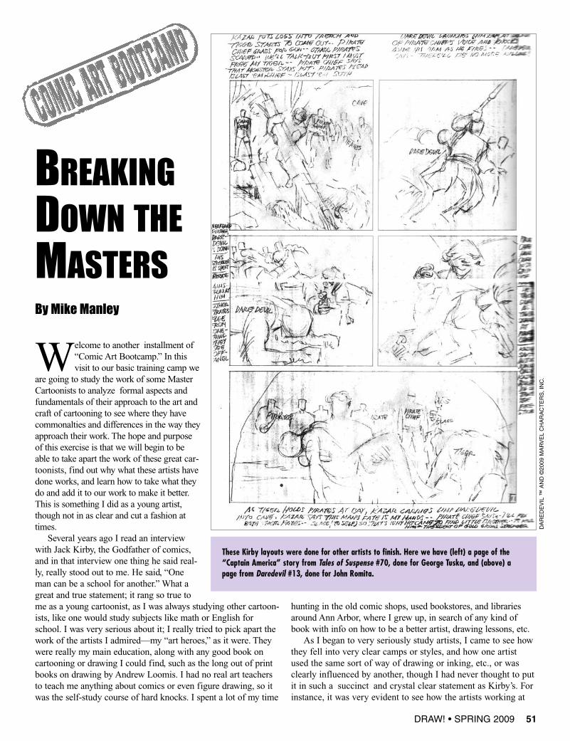
These Kirby layouts were done for other artists to finish. Here we have (left) a page of the“Captain America” story from Tales of Suspense #70, done for George Tuska, and (above) apage from Daredevil #13, done for John Romita.
DAREDEVIL
™AND©2009
MARVELCHARACTERS,INC.
Marvel all worked in a way that tried to emulate the ener-gy that Kirby had in his work, the clear staging anddynamic acting and figure work. One would never confuseGene Colan’s work or Gil Kane’s or John Buscema’s forthat of Kirby, but you can clearly see that they were alsosort of speaking the same language. I think Buscemaspoke the closest to Kirby’s voice, though with much morenaturalistic drawing, and he was coached by Stan Lee todo so. In fact, he worked over Kirby’s layouts in his earlyreturn to Marvel in the ’60s.In this article I have picked artists I really admire and in
some cases continue to learn from to this day. Comics, likeany popular art form, is not immune from the fashion of theday, the flashy current style or new wave of what’s hot. In the’90s it was the Image style which came in and in manyplaces unseated the styles of drawing and storytelling whichhad been standard since the ’50s and Marvel’s rise to popu-larity in the ’60s. As a commercial artist it’s impossible tototally ignore the waves in the pool.You have to navigate thechoppy commercial waters. The danger is that one can loseone’s sense of direction and base, then you operate in thefickle current, pulled along chasing this way or that. Theresult is usually an art disaster and burn-out for most—orworse, that uncertainty of how to do the job, how to proceed.As a young cartoonist I had to navigate these choppy
waters and often chased and grasped at false things in myquest to be a professional and earn my way—make mybones, as they say. But I always came back at the end ofthe day to the artists I admired, as they seemed to be ableto tackle every problem. And then there were a handful ofnew artists coming up, contemporaries who also seemed tobe drawing from these same root sources. My hope is thatyou will be able to use this article as a way to start yourown quest of discovery of the roots and fundamentals inyour work and the work of the artists you admire andstudy, using them as Kirby stated, as a school for your owneducation.
52 DRAW! • SPRING 2009
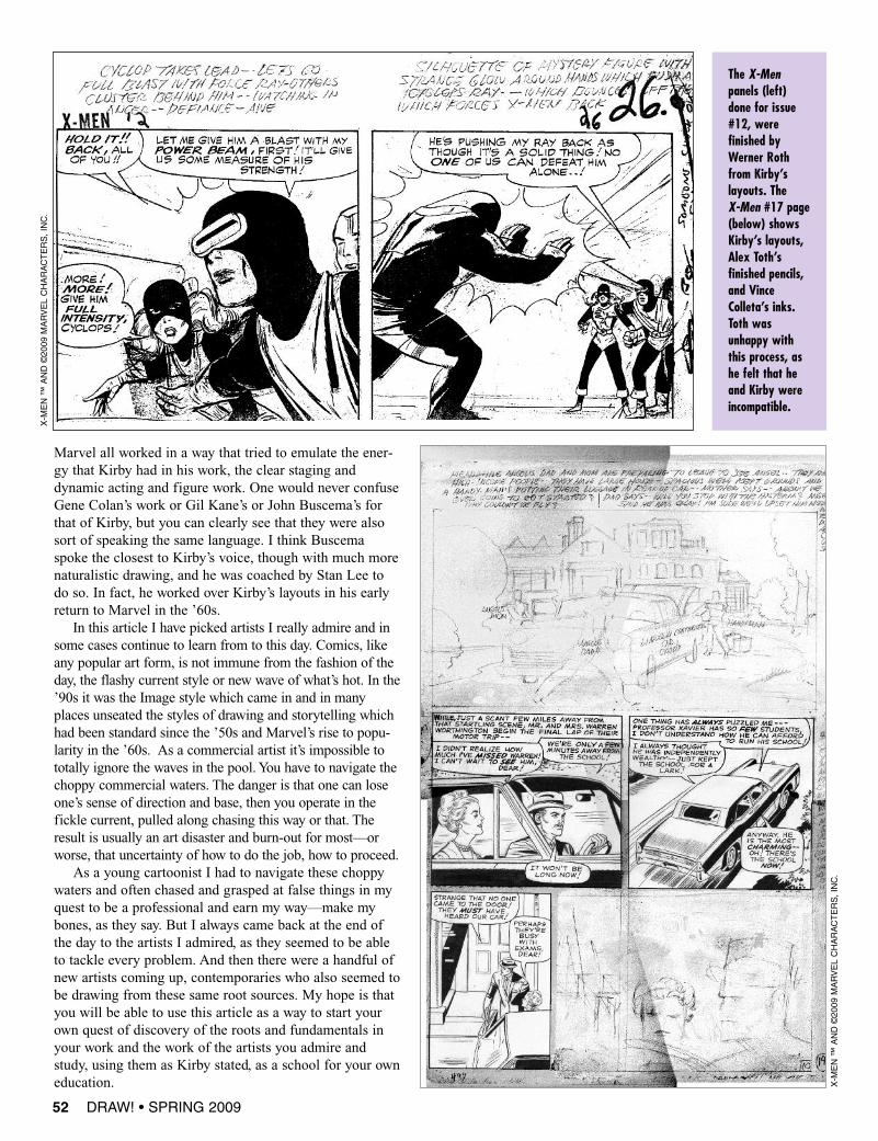
The X-Menpanels (left)done for issue#12, werefinished byWerner Rothfrom Kirby’slayouts. TheX-Men #17 page(below) showsKirby’s layouts,Alex Toth’sfinished pencils,and VinceColleta’s inks.Toth wasunhappy withthis process, ashe felt that heand Kirby wereincompatible.
X-M
EN™
AND©2009
MARVELCHARACTERS,INC.
X-M
EN™
AND©2009
MARVELCHARACTERS,INC.

DRAW! • SPRING 2009 55
METROPOL™
AND©2009
TEDMCKEEVER
There is not much to say about Mike other than Hellboy, hiscrowning creation to date. Mike has always been on my shortlist of contemporary cartoonists whose work I must buy, and Iadmire his work greatly. His work, like that of Toth, might seemso easy to some, but that ease also comes from hard work. Iremember bumping into Mike at the DC offices one day backin the ’90s just after his latest book, Gotham by Gaslight, cameout, and he was showing me a bunch of great pages. I was real-ly struck by this one page and a pose of Batman, and Mike toldme, “I drew that damn cape 20 times to get it right.”
One of my favorite jobs Mignola worked on was the seriesof back-up stories he did in the Metropol series at Marvel. Ithink Mignola was really working here stylistically towardswhat he world perfect later on Hellboy: the heavy chiaroscurobalanced against the white and the thin pen line and very littlerendering or turning of form. The work was very open, yet full,and if we can look at it in some regards as being similar in linelanguage to what Toth was doing—thin contour, bold blacks.For instance, though the hand firing the gun in the second panelis closer to us than the figure’s face, Mignola didn’t alter the
line weight by making it bolder to pushit closer to us as one might convention-ally in comics. Instead he took a moregraphic approach and eliminated theblacks from within the gun flash.Though the black patterns are bold andpowerful, it’s the white that makes thispage. Mignola didn’t think of the whiteas simply empty space—his white areasor space have just as much weight asthe black. The white space is “filled”space. That is design taken to a higherlevel.
MIKE MIGNOLA
If you simplify this page down to basicshapes, you’ll notice how boldly thedesign of the eye path is.
DRAW! • SPRING 2009 57
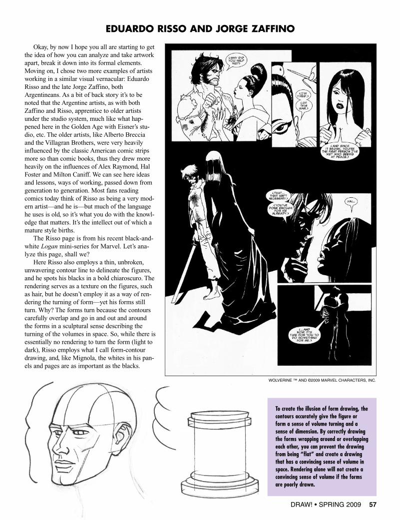
EDUARDO RISSO AND JORGE ZAFFINO
Okay, by now I hope you all are starting to getthe idea of how you can analyze and take artworkapart, break it down into its formal elements.Moving on, I chose two more examples of artistsworking in a similar visual vernacular: EduardoRisso and the late Jorge Zaffino, bothArgentineans. As a bit of back story it’s to benoted that the Argentine artists, as with bothZaffino and Risso, apprentice to older artistsunder the studio system, much like what hap-pened here in the Golden Age with Eisner’s stu-dio, etc. The older artists, like Alberto Brecciaand the Villagran Brothers, were very heavilyinfluenced by the classic American comic stripsmore so than comic books, thus they drew moreheavily on the influences of Alex Raymond, HalFoster and Milton Caniff. We can see here ideasand lessons, ways of working, passed down fromgeneration to generation. Most fans readingcomics today think of Risso as being a very mod-ern artist—and he is—but much of the languagehe uses is old, so it’s what you do with the knowl-edge that matters. It’s the intellect out of which amature style births.The Risso page is from his recent black-and-
white Logan mini-series for Marvel. Let’s ana-lyze this page, shall we?Here Risso also employs a thin, unbroken,
unwavering contour line to delineate the figures,and he spots his blacks in a bold chiaroscuro. Therendering serves as a texture on the figures, suchas hair, but he doesn’t employ it as a way of ren-dering the turning of form—yet his forms stillturn. Why? The forms turn because the contourscarefully overlap and go in and out and aroundthe forms in a sculptural sense describing theturning of the volumes in space. So, while there isessentially no rendering to turn the form (light todark), Risso employs what I call form-contourdrawing, and, like Mignola, the whites in his pan-els and pages are as important as the blacks.
To create the illusion of form drawing, thecontours accurately give the figure orform a sense of volume turning and asense of dimension. By correctly drawingthe forms wrapping around or overlappingeach other, you can prevent the drawingfrom being “flat” and create a drawingthat has a convincing sense of volume inspace. Rendering alone will not create aconvincing sense of volume if the formsare poorly drawn.
WOLVERINE ™ AND ©2009 MARVEL CHARACTERS, INC.
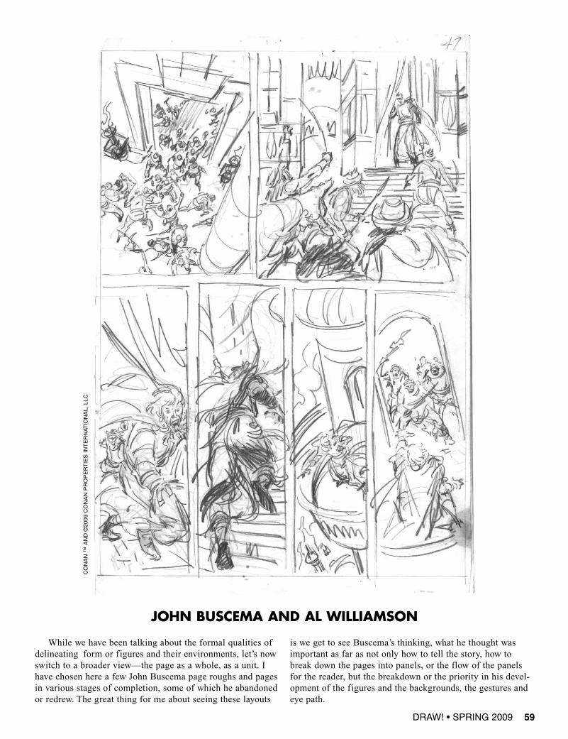
While we have been talking about the formal qualities ofdelineating form or figures and their environments, let’s nowswitch to a broader view—the page as a whole, as a unit. Ihave chosen here a few John Buscema page roughs and pagesin various stages of completion, some of which he abandonedor redrew. The great thing for me about seeing these layouts
is we get to see Buscema’s thinking, what he thought wasimportant as far as not only how to tell the story, how tobreak down the pages into panels, or the flow of the panelsfor the reader, but the breakdown or the priority in his devel-opment of the figures and the backgrounds, the gestures andeye path.
DRAW! • SPRING 2009 59
JOHN BUSCEMA AND AL WILLIAMSON
CONAN™
AND©2009
CONANPROPERTIESINTERNAT
IONAL,
LLC
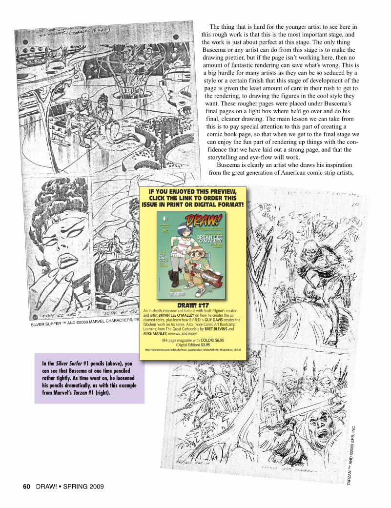
The thing that is hard for the younger artist to see here inthis rough work is that this is the most important stage, andthe work is just about perfect at this stage. The only thingBuscema or any artist can do from this stage is to make thedrawing prettier, but if the page isn’t working here, then noamount of fantastic rendering can save what’s wrong. This isa big hurdle for many artists as they can be so seduced by astyle or a certain finish that this stage of development of thepage is given the least amount of care in their rush to get tothe rendering, to drawing the figures in the cool style theywant. These rougher pages were placed under Buscema’sfinal pages on a light box where he’d go over and do hisfinal, cleaner drawing. The main lesson we can take fromthis is to pay special attention to this part of creating acomic book page, so that when we get to the final stage wecan enjoy the fun part of rendering up things with the con-fidence that we have laid out a strong page, and that thestorytelling and eye-flow will work.
Buscema is clearly an artist who draws his inspirationfrom the great generation of American comic strip artists,
In the Silver Surfer #1 pencils (above), youcan see that Buscema at one time penciledrather tightly. As time went on, he loosenedhis pencils dramatically, as with this examplefrom Marvel’s Tarzan #1 (right).
60 DRAW! • SPRING 2009
SILVER SURFER ™ AND ©2009 MARVEL CHARACTERS, INC.
TARZAN™
AND©2009
ERB,INC.
DRAW! #17An in-depth interview and tutorial with Scott Pilgrim’s creatorand artist BRYAN LEE O’MALLEY on how he creates the ac-claimed series, plus learn how B.P.R.D.’s GUY DAVIS creates thefabulous work on his series. Also, more Comic Art Bootcamp:Learning from The Great Cartoonists by BRET BLEVINS andMIKE MANLEY, reviews, and more!
(84-page magazine with COLOR) $6.95 (Digital Edition) $3.95
http://twomorrows.com/index.php?main_page=product_info&cPath=98_59&products_id=732
IF YOU ENJOYED THIS PREVIEW,CLICK THE LINK TO ORDER THIS
ISSUE IN PRINT OR DIGITAL FORMAT!


![[ 17] How To Draw Manga Guns & Military Volume 2](https://img.pdfslide.us/doc/110x75/6182b5ee946c3907721e1d45/-17-how-to-draw-manga-guns-amp-military-volume-2.jpg)