Embed Size (px)
Citation preview
Doodles & Drawings
– an introduction to zero art asset mapmaking
through faux aquarelle in Campaign Cartographer 3
Doodles & Drawings Anders Bergström
A while back, it was suggested that I write an article about the train of thought and process
of using Campaign Cartographer in what has to be among the least time-efficient ways
possible. That is, using it to the best of my abilities. Not too long after, there was also a
request for a tutorial being made and while a completely different script was already in
the making for the first article, I figured I might as well splice thoughts and ideas. Then, a
third request for popping the hood of my faux hand-drawn endeavours prompted yet
another consideration of focus and approach and – would you believe it – a third iteration
seemed more appropriate after all.
Anyway, here is the rather lengthy introduction. Don’t worry: there will also be some kind-
of-technical stuff further down the line. And that stuff is going to be rather lengthy as well,
I guess.
A quick detour with that train, if you will My grasp of vector graphics encompasses that it has to do with plotting nodes in a co-ordinate system
between which shapes are drawn – by the software – according to technical specifications. That is to
say no editing of colours with a paintbrush emulating tool, making a line of pixels look like – well – a
line made by said imaginary paintbrush; just two nodes between which the software does the rest.
Between those technical specifications and a whole bunch of placeable objects (symbols, that is),
Campaign Cartographer offers some rather powerful tools to design maps for an artistically challenged
individual such as myself.
Because actual painting, on the other hand, as a form of visual art requires some degree of
understanding how to apply paint and colour on a surface to achieve a sought-after visual
representation. There are different types of paint which will have their own unique chemical/physical
qualities which inform the style or physical technique of painting itself. Not to mention the fabric of
the canvas and properties of the brush or whatever the method of application is…
NONE OF WHICH WE NEED TO WORRY ABOUT, INCIDENTALLY
In our CAD environment we can focus entirely on design composition if we wanted to. Because we
have access to readily available styles – prefabricated means of colour application, if you will.
Yes, we have to get past the “how” to apply these nodes and define the borders of these shapes we
use. But the quality of the work comes down to whether or not we put stuff in the “right” places. The
rest is really just technical specifications at work – execution of shape, colour, and effects etc. And by
quality, I mean of course the extent to which the end result corresponds with our intent and ambitions.
There is absolutely a common ground with regards to aesthetics where we can sort of pretend to
approximate the objectively splendid-looking. There is also, undeniably, a wealth of scientific
disciplines to draw from with regards to what makes sense in a map. The entire discussion about the
Mordor mountain ranges, for instance, is nothing short of fantastic: we can enjoy some very sound
arguments there - both for and against said imaginary mountains as credible geological phenomena.
On the other hand, the Mordor mountain ranges came into being as the result of spirits singing songs.
Ultimately, there is the crayons-and-beer grade quality to the Bayeux Tapestry – but there is also that
side of the Bayeux napkin that is what it represents. The meaning we give it in the context we look at
or use it. What it invokes.
That being said, if I have the style package and intent to recreate something like the Bayeux or Tabula
Peutingeriana but end up short of that template – I very much objectively have failed.
Doodles & Drawings Anders Bergström
So, it is – in a sense – absolutely possible to objectively fail even with art. And it is in that failure, or
ability to fail – and make mistakes – which Campaign Cartographer really is showing off its strength in
my opinion. Because even if there is a template, we can deviate from it – if not outright discard most
of it – if we wanted to. To my understanding, far from all dedicated map-making software offer this
level of flexibility.
But enough with the sales-pitch already: for all the convenience the style templates bring to the table,
they are just samples of what we can do – more so than instructions for what we have to do.
Making maps to the best of my ability essentially means, then, that I use Campaign Cartographer within
the permitted level of failure. And – seeing as the sky is apparently the limit – therein of course lies the
loss of speed that can be attributed to not relying on symbols or dedicated textures for making maps.
And I don’t mind: however time-consuming, trial and error is just a more efficient way to spell potential
for personal development.
Very well – this was the grand tour of what I understand Campaign Cartographer to be. We’re arrived
at the central station. Let’s grab a connecting train and see what it can allow us to do!
Part 1: Packing There is a guide out there for the purpose of creating a custom style wizard already, and I strongly
suggest that you do read Ralf’s article on the subject matter. While such a custom environment is in
fact being created in writing it, this article is itself not going to dwell too much on the logistics and
practicalities with regards to how that is done – merely its contents.
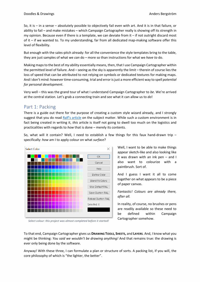
So, what will it contain? Well, I need to establish a few things for this faux hand-drawn trip –
specifically: how am I to apply colour on what surface?
Well, I want to be able to make things
appear sketch-like and also looking like
it was drawn with an ink pen – and I
also want to colourize with a
paintbrush. Sort of.
And I guess I want it all to come
together on what appears to be a piece
of paper canvas.
Fantastic! Colours are already there,
after all.
In reality, of course, no brushes or pens
are readily available so these need to
be defined within Campaign
Cartographer somehow.
To that end, Campaign Cartographer gives us DRAWING TOOLS, SHEETS, and LAYERS. And, I know what you
might be thinking: You said we wouldn’t be drawing anything! And that remains true: the drawing is
ever only being done by the software.
Anyway! With these three, I can formulate a plan or structure of sorts. A packing list, if you will, the
core philosophy of which is “the lighter, the better”.
Select colour: this project was almost completed before it started!
Doodles & Drawings Anders Bergström
And by lighter, I mean keeping the number of DRAWING TOOLS to a necessary minimum. The exact
mileage will vary with each prefab style package, but a two-digit set seems more or less the gold
standard. And for very good reasons.
Single-purpose tools have tremendous value for speed of work in an environment which relies on any
measure of elaborate structure or combinations of textures of any kind etc. In other words: this is the
grass texture, and this is the tool which applies it in its designated sheet - where the appropriate effects
will allow it to do its visual thing as intended within the larger context of other shapes in other sheets
and, also, symbols. And so on and so forth.
At the core, of course, any tool is just a means of defining boundaries of
a particular shape: a circle or ellipse, a smooth polygon, a line etc. And
this means I will just need a handful of them: something to do sketch
and ink lines, and colour fields respectively. Hence the light travel bag.
So, this is probably a good time to briefly reiterate the very basics [Sic!]
of the Advanced section under drawing tools selection, as I think it will
make more sense – to the newer user – of what follows.
In defining a custom DRAWING TOOL, you essentially instruct the software
what shapes to draw between NODES and also how to draw them.
Colour, fill style, line width – even outlining – can all be given a custom
default setting to speed things up. Furthermore, you can instruct the
tool to put the shape in a default SHEET and/or LAYER – giving the
aforementioned outlining a similar treatment. The Grass Tool is not just
what, but also where.
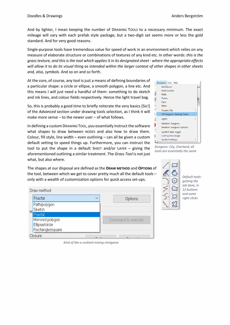
The shapes at our disposal are defined as the DRAW METHOD and OPTIONS of
the tool, between which we get to cover pretty much all the default tools –
only with a wealth of customization options for quick access set-ups.
Dungeon, City, Overland; all tools are essentially the same
Kind of like a cocktail-mixing minigame
Default tools: getting the job done, in 12 buttons and some right-clicks
Doodles & Drawings Anders Bergström
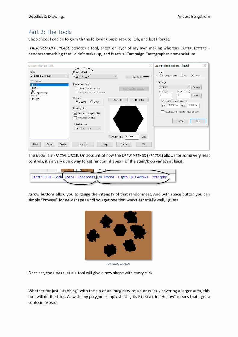
Part 2: The Tools Choo choo! I decide to go with the following basic set-ups. Oh, and lest I forget:
ITALICIZED UPPERCASE denotes a tool, sheet or layer of my own making whereas CAPITAL LETTERS –
denotes something that I didn’t make up, and is actual Campaign Cartographer nomenclature.
The BLOB is a FRACTAL CIRCLE. On account of how the DRAW METHOD (FRACTAL) allows for some very neat
controls, it’s a very quick way to get random shapes – of the stain/blob variety at least:
Arrow buttons allow you to gauge the intensity of that randomness. And with space button you can
simply “browse” for new shapes until you get one that works especially well, I guess.
Once set, the FRACTAL CIRCLE tool will give a new shape with every click:
Whether for just “stabbing” with the tip of an imaginary brush or quickly covering a larger area, this
tool will do the trick. As with any polygon, simply shifting its FILL STYLE to “Hollow” means that I get a
contour instead.
Probably useful!
Doodles & Drawings Anders Bergström
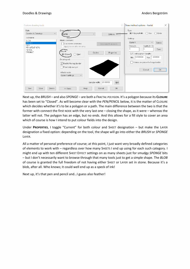
Next up, the BRUSH – and also SPONGE – are both a FRACTAL POLYGON. It’s a polygon because its CLOSURE
has been set to “Closed”. As will become clear with the PEN/PENCIL below, it is the matter of CLOSURE
which decides whether it’s to be a polygon or a path. The main difference between the two is that the
former with connect the first NODE with the very last one – closing the shape, as it were – whereas the
latter will not. The polygon has an edge, but no ends. And this allows for a fill style to cover an area
which of course is how I intend to put colour fields into the design.
Under PROPERTIES, I toggle “Current” for both colour and SHEET designation – but make the LAYER
designation a fixed option: depending on the tool, the shape will go into either the BRUSH or SPONGE
LAYER.
All a matter of personal preference of course; at this point, I just want very broadly defined categories
of elements to work with – regardless over how many SHEETS I end up using for each such category. I
might end up with ten different SHEET EFFECT settings on as many sheets just for smudgy SPONGE bits
– but I don’t necessarily want to browse through that many tools just to get a simple shape. The BLOB
of course is granted the full freedom of not having either SHEET or LAYER set in stone. Because it’s a
blob, after all. Who knows; it could well end up as a speck of ink!
Next up, it’s that pen and pencil and…I guess also feather!
Doodles & Drawings Anders Bergström
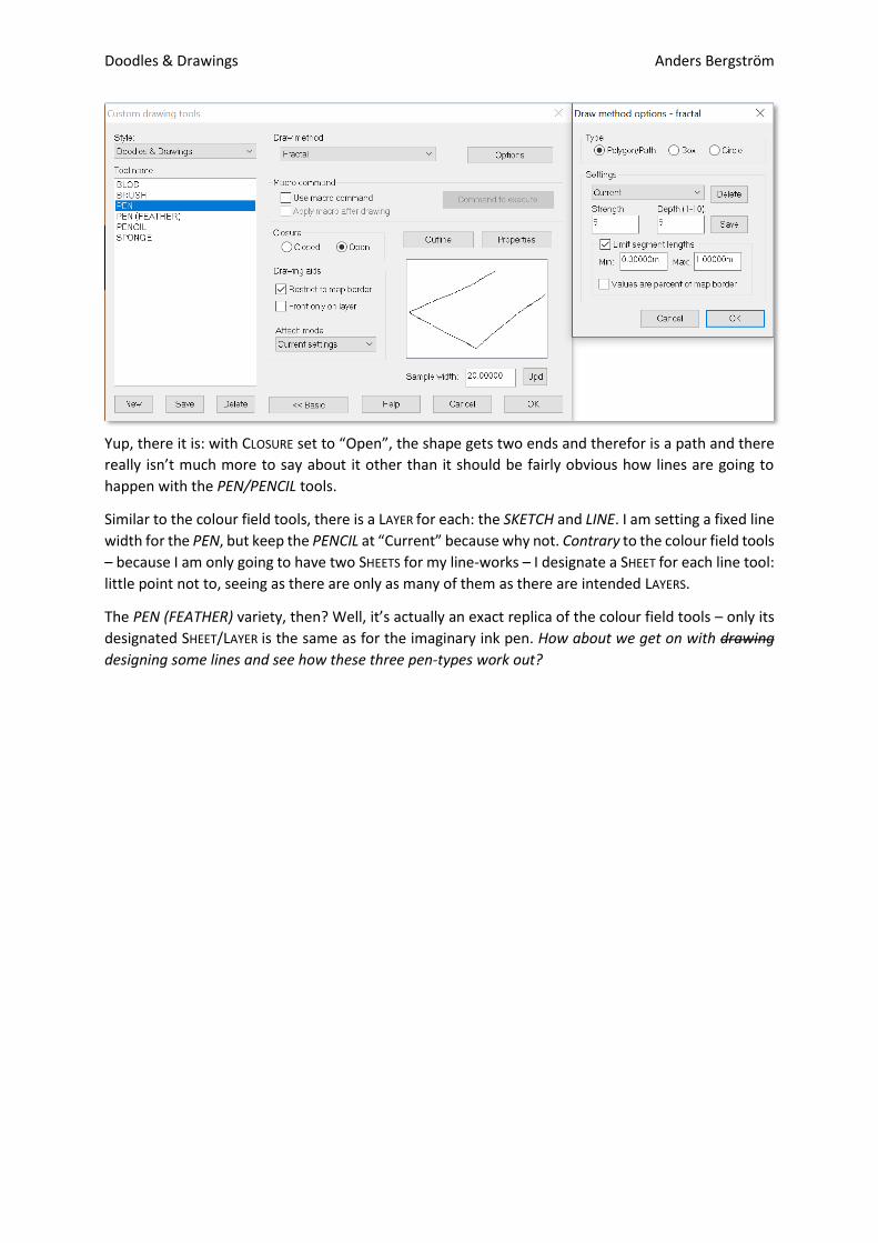
Yup, there it is: with CLOSURE set to “Open”, the shape gets two ends and therefor is a path and there
really isn’t much more to say about it other than it should be fairly obvious how lines are going to
happen with the PEN/PENCIL tools.
Similar to the colour field tools, there is a LAYER for each: the SKETCH and LINE. I am setting a fixed line
width for the PEN, but keep the PENCIL at “Current” because why not. Contrary to the colour field tools
– because I am only going to have two SHEETS for my line-works – I designate a SHEET for each line tool:
little point not to, seeing as there are only as many of them as there are intended LAYERS.
The PEN (FEATHER) variety, then? Well, it’s actually an exact replica of the colour field tools – only its
designated SHEET/LAYER is the same as for the imaginary ink pen. How about we get on with drawing
designing some lines and see how these three pen-types work out?
Doodles & Drawings Anders Bergström
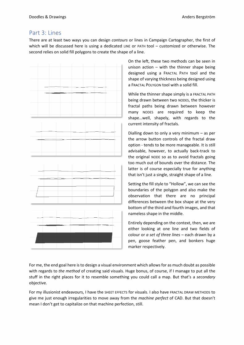
Part 3: Lines There are at least two ways you can design contours or lines in Campaign Cartographer, the first of
which will be discussed here is using a dedicated LINE or PATH tool – customized or otherwise. The
second relies on solid fill polygons to create the shape of a line.
On the left, these two methods can be seen in
unison action – with the thinner shape being
designed using a FRACTAL PATH tool and the
shape of varying thickness being designed using
a FRACTAL POLYGON tool with a solid fill.
While the thinner shape simply is a FRACTAL PATH
being drawn between two NODES, the thicker is
fractal paths being drawn between however
many NODES are required to keep the
shape…well, shapely, with regards to the
current intensity of fractals.
Dialling down to only a very minimum – as per
the arrow button controls of the fractal draw
option - tends to be more manageable. It is still
advisable, however, to actually back-track to
the original NODE so as to avoid fractals going
too much out of bounds over the distance. The
latter is of course especially true for anything
that isn’t just a single, straight shape of a line.
Setting the fill style to “Hollow”, we can see the
boundaries of the polygon and also make the
observation that there are no principal
differences between the box shape at the very
bottom of the third and fourth images, and that
nameless shape in the middle.
Entirely depending on the context, then, we are
either looking at one line and two fields of
colour or a set of three lines – each drawn by a
pen, goose feather pen, and bonkers huge
marker respectively.
For me, the end goal here is to design a visual environment which allows for as much doubt as possible
with regards to the method of creating said visuals. Huge bonus, of course, if I manage to put all the
stuff in the right places for it to resemble something you could call a map. But that’s a secondary
objective.
For my illusionist endeavours, I have the SHEET EFFECTS for visuals. I also have FRACTAL DRAW METHODS to
give me just enough irregularities to move away from the machine perfect of CAD. But that doesn’t
mean I don’t get to capitalize on that machine perfection, still.
Doodles & Drawings Anders Bergström
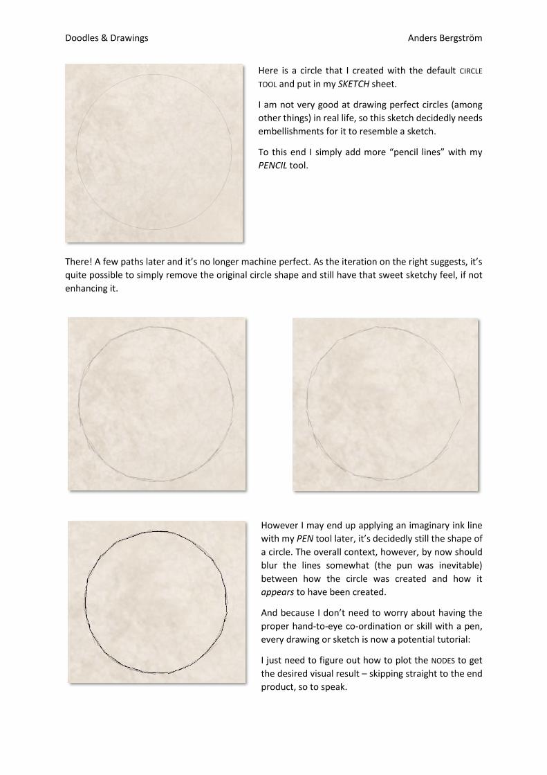
Here is a circle that I created with the default CIRCLE
TOOL and put in my SKETCH sheet.
I am not very good at drawing perfect circles (among
other things) in real life, so this sketch decidedly needs
embellishments for it to resemble a sketch.
To this end I simply add more “pencil lines” with my
PENCIL tool.
There! A few paths later and it’s no longer machine perfect. As the iteration on the right suggests, it’s
quite possible to simply remove the original circle shape and still have that sweet sketchy feel, if not
enhancing it.
However I may end up applying an imaginary ink line
with my PEN tool later, it’s decidedly still the shape of
a circle. The overall context, however, by now should
blur the lines somewhat (the pun was inevitable)
between how the circle was created and how it
appears to have been created.
And because I don’t need to worry about having the
proper hand-to-eye co-ordination or skill with a pen,
every drawing or sketch is now a potential tutorial:
I just need to figure out how to plot the NODES to get
the desired visual result – skipping straight to the end
product, so to speak.
Doodles & Drawings Anders Bergström
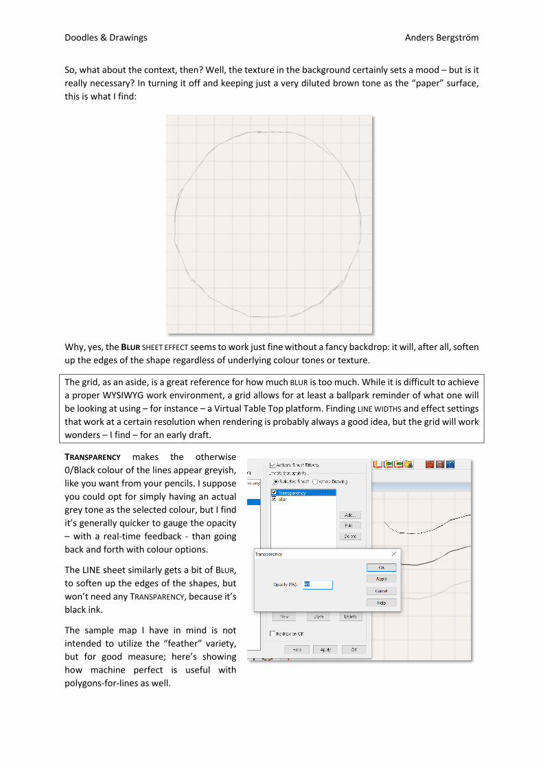
So, what about the context, then? Well, the texture in the background certainly sets a mood – but is it
really necessary? In turning it off and keeping just a very diluted brown tone as the “paper” surface,
this is what I find:
Why, yes, the BLUR SHEET EFFECT seems to work just fine without a fancy backdrop: it will, after all, soften
up the edges of the shape regardless of underlying colour tones or texture.
The grid, as an aside, is a great reference for how much BLUR is too much. While it is difficult to achieve
a proper WYSIWYG work environment, a grid allows for at least a ballpark reminder of what one will
be looking at using – for instance – a Virtual Table Top platform. Finding LINE WIDTHS and effect settings
that work at a certain resolution when rendering is probably always a good idea, but the grid will work
wonders – I find – for an early draft.
TRANSPARENCY makes the otherwise
0/Black colour of the lines appear greyish,
like you want from your pencils. I suppose
you could opt for simply having an actual
grey tone as the selected colour, but I find
it’s generally quicker to gauge the opacity
– with a real-time feedback - than going
back and forth with colour options.
The LINE sheet similarly gets a bit of BLUR,
to soften up the edges of the shapes, but
won’t need any TRANSPARENCY, because it’s
black ink.
The sample map I have in mind is not
intended to utilize the “feather” variety,
but for good measure; here’s showing
how machine perfect is useful with
polygons-for-lines as well.
Doodles & Drawings Anders Bergström
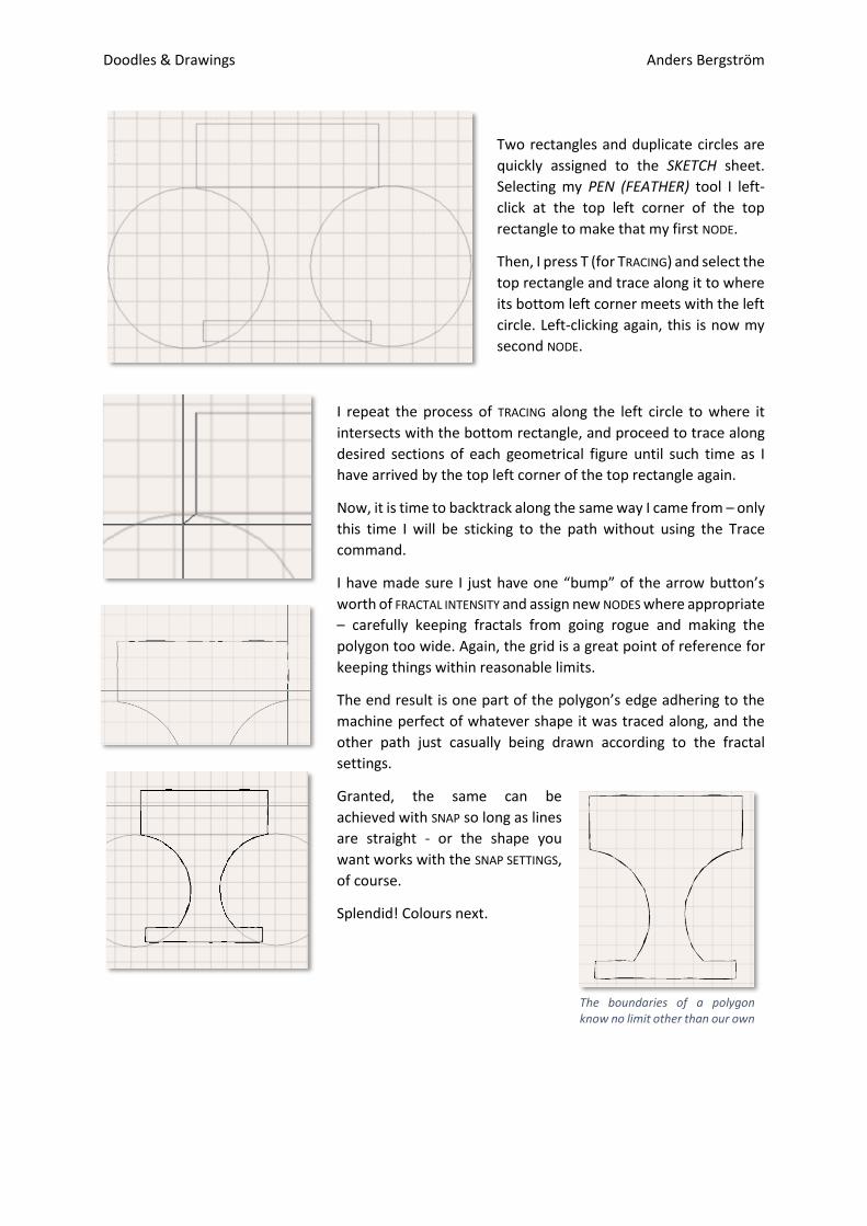
Two rectangles and duplicate circles are
quickly assigned to the SKETCH sheet.
Selecting my PEN (FEATHER) tool I left-
click at the top left corner of the top
rectangle to make that my first NODE.
Then, I press T (for TRACING) and select the
top rectangle and trace along it to where
its bottom left corner meets with the left
circle. Left-clicking again, this is now my
second NODE.
I repeat the process of TRACING along the left circle to where it
intersects with the bottom rectangle, and proceed to trace along
desired sections of each geometrical figure until such time as I
have arrived by the top left corner of the top rectangle again.
Now, it is time to backtrack along the same way I came from – only
this time I will be sticking to the path without using the Trace
command.
I have made sure I just have one “bump” of the arrow button’s
worth of FRACTAL INTENSITY and assign new NODES where appropriate
– carefully keeping fractals from going rogue and making the
polygon too wide. Again, the grid is a great point of reference for
keeping things within reasonable limits.
The end result is one part of the polygon’s edge adhering to the
machine perfect of whatever shape it was traced along, and the
other path just casually being drawn according to the fractal
settings.
Granted, the same can be
achieved with SNAP so long as lines
are straight - or the shape you
want works with the SNAP SETTINGS,
of course.
Splendid! Colours next.
The boundaries of a polygon know no limit other than our own
Doodles & Drawings Anders Bergström
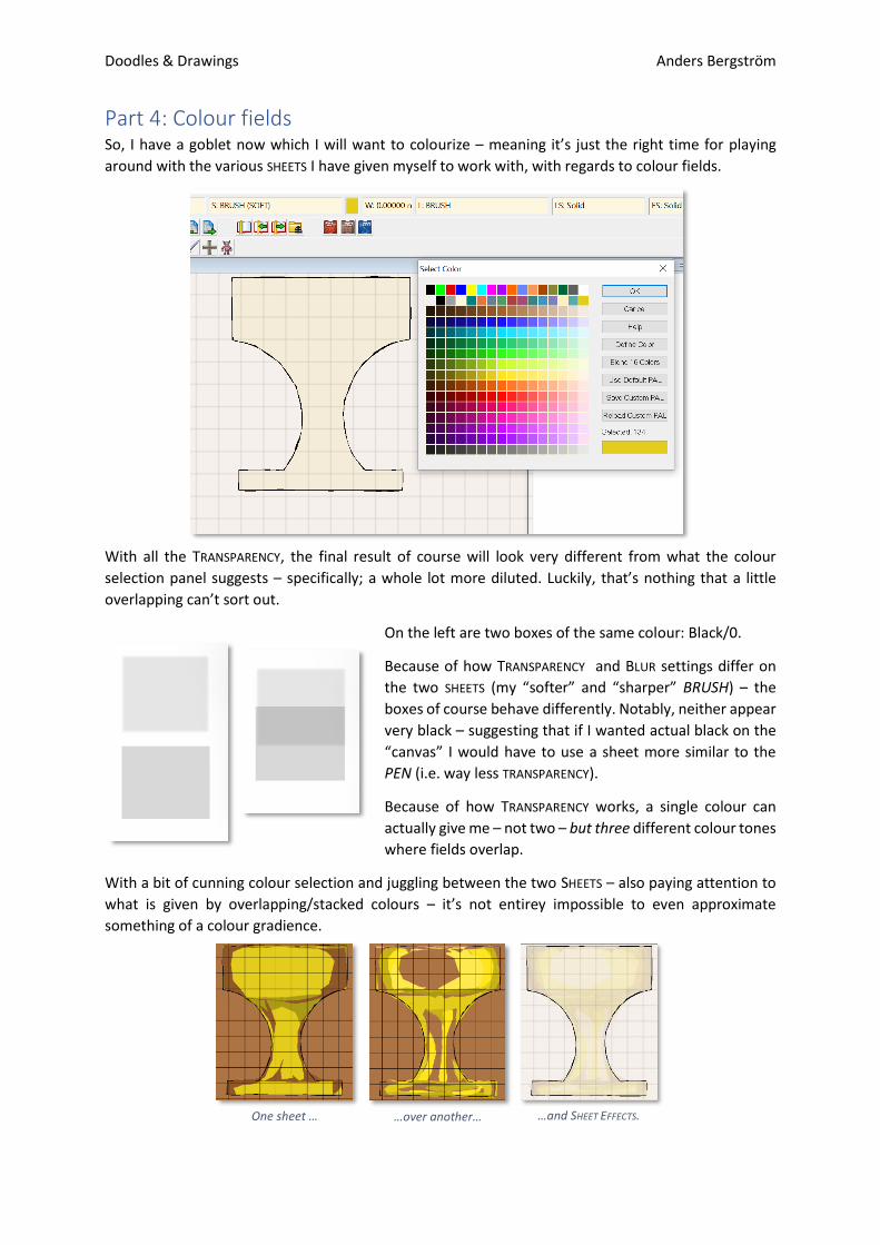
Part 4: Colour fields So, I have a goblet now which I will want to colourize – meaning it’s just the right time for playing
around with the various SHEETS I have given myself to work with, with regards to colour fields.
With all the TRANSPARENCY, the final result of course will look very different from what the colour
selection panel suggests – specifically; a whole lot more diluted. Luckily, that’s nothing that a little
overlapping can’t sort out.
On the left are two boxes of the same colour: Black/0.
Because of how TRANSPARENCY and BLUR settings differ on
the two SHEETS (my “softer” and “sharper” BRUSH) – the
boxes of course behave differently. Notably, neither appear
very black – suggesting that if I wanted actual black on the
“canvas” I would have to use a sheet more similar to the
PEN (i.e. way less TRANSPARENCY).
Because of how TRANSPARENCY works, a single colour can
actually give me – not two – but three different colour tones
where fields overlap.
With a bit of cunning colour selection and juggling between the two SHEETS – also paying attention to
what is given by overlapping/stacked colours – it’s not entirey impossible to even approximate
something of a colour gradience.
One sheet … …over another… …and SHEET EFFECTS.
Doodles & Drawings Anders Bergström
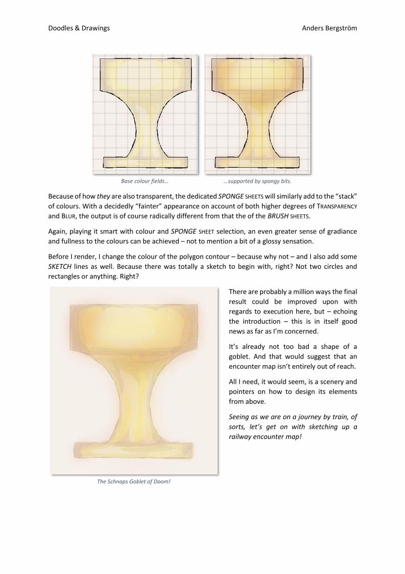
Because of how they are also transparent, the dedicated SPONGE SHEETS will similarly add to the “stack”
of colours. With a decidedly “fainter” appearance on account of both higher degrees of TRANSPARENCY
and BLUR, the output is of course radically different from that the of the BRUSH SHEETS.
Again, playing it smart with colour and SPONGE SHEET selection, an even greater sense of gradiance
and fullness to the colours can be achieved – not to mention a bit of a glossy sensation.
Before I render, I change the colour of the polygon contour – because why not – and I also add some
SKETCH lines as well. Because there was totally a sketch to begin with, right? Not two circles and
rectangles or anything. Right?
There are probably a million ways the final
result could be improved upon with
regards to execution here, but – echoing
the introduction – this is in itself good
news as far as I’m concerned.
It’s already not too bad a shape of a
goblet. And that would suggest that an
encounter map isn’t entirely out of reach.
All I need, it would seem, is a scenery and
pointers on how to design its elements
from above.
Seeing as we are on a journey by train, of
sorts, let’s get on with sketching up a
railway encounter map!
Base colour fields… …supported by spongy bits.
The Schnaps Goblet of Doom!
Doodles & Drawings Anders Bergström
Part 5: Making the map The basic map settings are that of the metric system, but I am keeping the standard 5 ft. squares for
my grid as a bit of a visual reference – not only for tool and SHEET EFFECT settings. This way I get to use
measurements that makes sense to me as a human being, and as a gamer at the same time. I want the
map to behave as well as possible within a gridded VTT environment, without gravitating towards the
1.524 m wide doorways trap. Because those doorways seldom measure 1.524 m.
Funny enough, however, the standard railway track gauge adopted in the 19th century measures 1.435
m over the insides of the rails…and 1.524 m over the outside. If there was a good time to use the 5 ft
standard grid environment, then, it probably was in designing maps with railways.
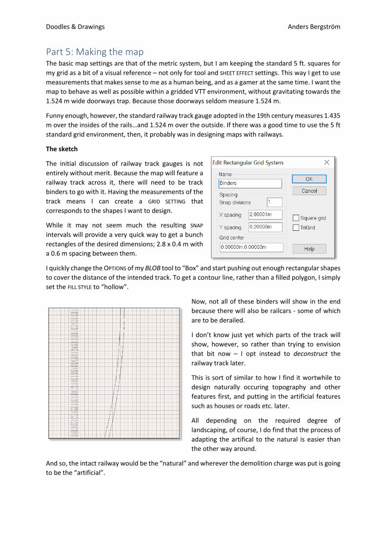
The sketch
The initial discussion of railway track gauges is not
entirely without merit. Because the map will feature a
railway track across it, there will need to be track
binders to go with it. Having the measurements of the
track means I can create a GRID SETTING that
corresponds to the shapes I want to design.
While it may not seem much the resulting SNAP
intervals will provide a very quick way to get a bunch
rectangles of the desired dimensions; 2.8 x 0.4 m with
a 0.6 m spacing between them.
I quickly change the OPTIONS of my BLOB tool to “Box” and start pushing out enough rectangular shapes
to cover the distance of the intended track. To get a contour line, rather than a filled polygon, I simply
set the FILL STYLE to “hollow”.
Now, not all of these binders will show in the end
because there will also be railcars - some of which
are to be derailed.
I don’t know just yet which parts of the track will
show, however, so rather than trying to envision
that bit now – I opt instead to deconstruct the
railway track later.
This is sort of similar to how I find it wortwhile to
design naturally occuring topography and other
features first, and putting in the artificial features
such as houses or roads etc. later.
All depending on the required degree of
landscaping, of course, I do find that the process of
adapting the artifical to the natural is easier than
the other way around.
And so, the intact railway would be the “natural” and wherever the demolition charge was put is going
to be the “artificial”.
Doodles & Drawings Anders Bergström
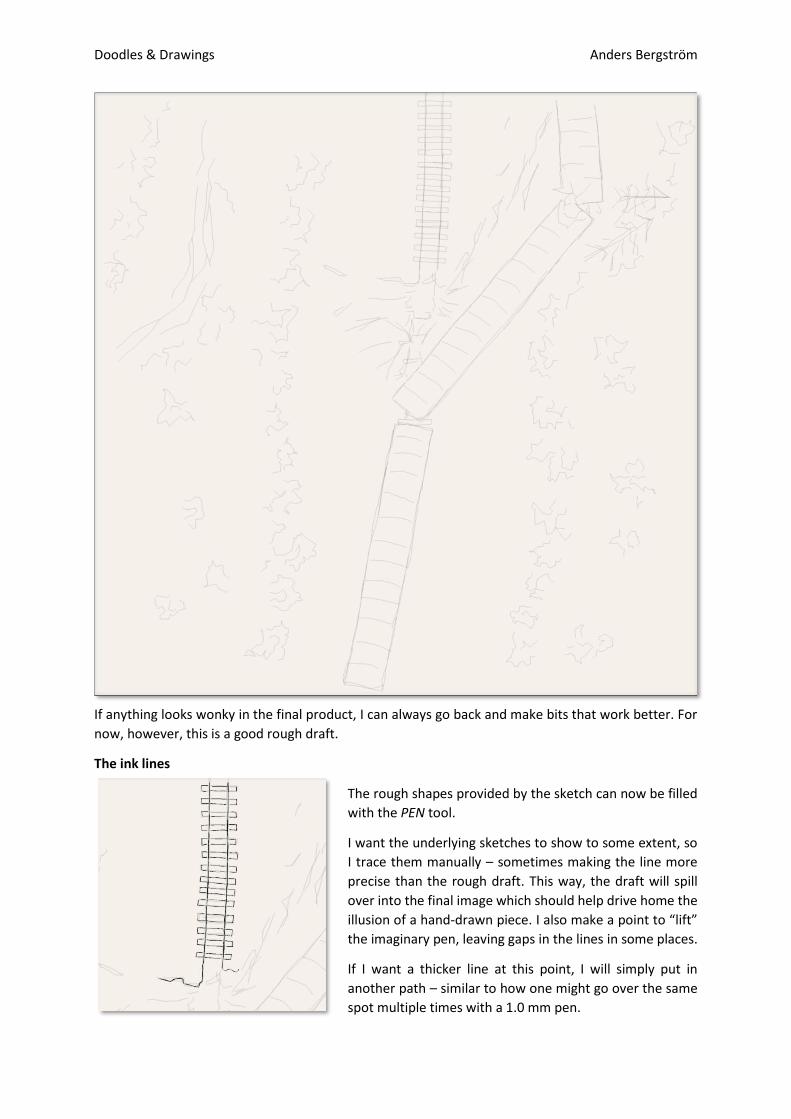
If anything looks wonky in the final product, I can always go back and make bits that work better. For
now, however, this is a good rough draft.
The ink lines
The rough shapes provided by the sketch can now be filled
with the PEN tool.
I want the underlying sketches to show to some extent, so
I trace them manually – sometimes making the line more
precise than the rough draft. This way, the draft will spill
over into the final image which should help drive home the
illusion of a hand-drawn piece. I also make a point to “lift”
the imaginary pen, leaving gaps in the lines in some places.
If I want a thicker line at this point, I will simply put in
another path – similar to how one might go over the same
spot multiple times with a 1.0 mm pen.
Doodles & Drawings Anders Bergström
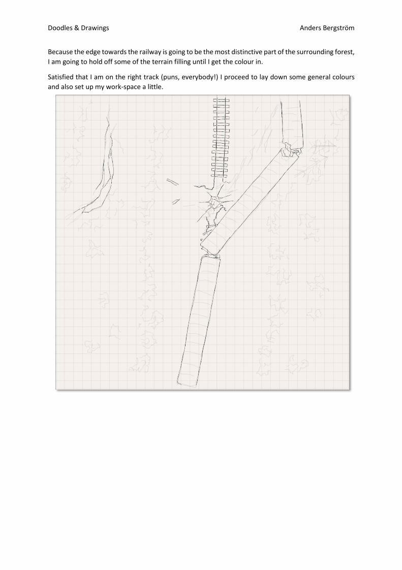
Because the edge towards the railway is going to be the most distinctive part of the surrounding forest,
I am going to hold off some of the terrain filling until I get the colour in.
Satisfied that I am on the right track (puns, everybody!) I proceed to lay down some general colours
and also set up my work-space a little.
Doodles & Drawings Anders Bergström
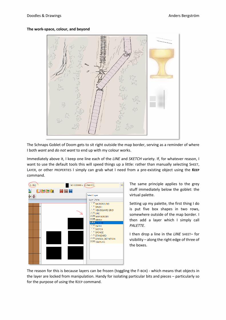
The work-space, colour, and beyond
The Schnaps Goblet of Doom gets to sit right outside the map border, serving as a reminder of where
I both want and do not want to end up with my colour works.
Immediately above it, I keep one line each of the LINE and SKETCH variety. If, for whatever reason, I
want to use the default tools this will speed things up a little: rather than manually selecting SHEET,
LAYER, or other PROPERTIES I simply can grab what I need from a pre-existing object using the KEEP
command.
The same principle applies to the grey
stuff immediately below the goblet: the
virtual palette.
Setting up my palette, the first thing I do
is put five box shapes in two rows,
somewhere outside of the map border. I
then add a layer which I simply call
PALETTE.
I then drop a line in the LINE SHEET– for
visibility – along the right edge of three of
the boxes.
The reason for this is because layers can be frozen (toggling the F-BOX) - which means that objects in
the layer are locked from manipulation. Handy for isolating particular bits and pieces – particularly so
for the purpose of using the KEEP command.
Doodles & Drawings Anders Bergström
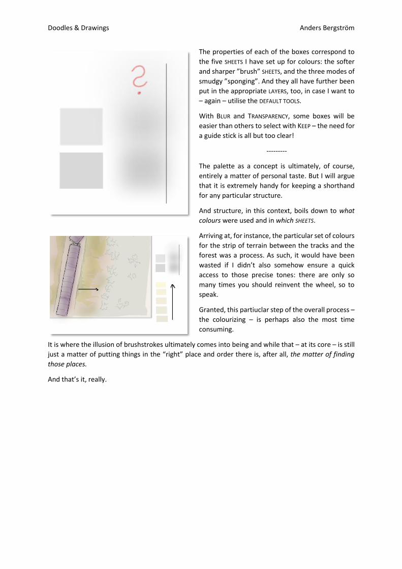
The properties of each of the boxes correspond to
the five SHEETS I have set up for colours: the softer
and sharper ”brush” SHEETS, and the three modes of
smudgy ”sponging”. And they all have further been
put in the appropriate LAYERS, too, in case I want to
– again – utilise the DEFAULT TOOLS.
With BLUR and TRANSPARENCY, some boxes will be
easier than others to select with KEEP – the need for
a guide stick is all but too clear!
---------
The palette as a concept is ultimately, of course,
entirely a matter of personal taste. But I will argue
that it is extremely handy for keeping a shorthand
for any particular structure.
And structure, in this context, boils down to what
colours were used and in which SHEETS.
Arriving at, for instance, the particular set of colours
for the strip of terrain between the tracks and the
forest was a process. As such, it would have been
wasted if I didn’t also somehow ensure a quick
access to those precise tones: there are only so
many times you should reinvent the wheel, so to
speak.
Granted, this partiuclar step of the overall process –
the colourizing – is perhaps also the most time
consuming.
It is where the illusion of brushstrokes ultimately comes into being and while that – at its core – is still
just a matter of putting things in the “right” place and order there is, after all, the matter of finding
those places.
And that’s it, really.

Doodles & Drawings Anders Bergström