Embed Size (px)
Citation preview

Quaderni di Venezia Arti 4ISBN [ebook] 978-88-6969-462-2 | ISBN [print] 978-88-6969-463-9
Open access 243Published 2020-12-22© 2020 Creative Commons 4.0 Attribution aloneDOI 10.30687/978-88-6969-462-2/012
Taking and DenyingChallenging Canons in Arts and Philosophyedited by Giovanni Argan, Maria Redaelli, Alexandra Timonina
EdizioniCa’FoscariEdizioniCa’Foscari
Dispute of Canons: Book Design Traditions at the Beginning of the 20th CenturyEngland vs FranceDmitry LebedevState Institute of Art Studies (SIAS), Moscow, Russia
Abstract The end of the 19th century in England and France was a time of active growth for publishing houses, newspapers, magazines, and printed materials in general. This contributed to the emergence of a huge number of artists who specialised and oc-casionally participated in the design of books. These artists won their places through constant competition based on the quality of their drawings. England and France were the centres of the new art of the book, but the views and approaches of representatives of this type of graphics differed from each other in these countries. Thus, the purpose of this report is to demonstrate the difference between the canons and principles of English and French book design at the turn of the twentieth century.
Keywords Livre d’artiste. Edwardian gift book. Art Nouveau. Book illustration. Nine-teenth-century editions.
Summary 1 Introduction. – 2 Art Nouveau in Book Design. – 3 France at the Beginning of the Twentieth Century. – 4 England at the Beginning of the Twentieth Century. – 5 Conclusion.
1 Introduction
The problem of canon in the design of Western European book editions at the turn of the twentieth century is rarely considered by experts as a contrast be-tween two specific traditions: the English and the French. Meanwhile, it is on their example that we can analyse the differences in the evolution of book il-lustration and design of unique publications since this field especially devel-oped during this period. A comparative analysis of various editions and the

Quaderni di Venezia Arti 4 244Taking and Denying, 243-254
illustrative cycles of the most prominent masters would be carried out through specific examples, enabling us to trace the trends in the development of book graphics and design in both countries during the period considered.
The first part of the article is dedicated to the end of the nine-teenth century, because the traditions of book design at the turn of the century in both countries originated in the Art Nouveau style that emerged in the 1880s and 1890s: in France in the illustrations of Eu-gène Grasset (1845-1917) and Alphonse Mucha (1860-1939), in Eng-land in the editions designed by William Morris (1834-96) and Au-brey Beardsley (1872-98). The second part is dedicated to the early French Livre d’artiste editions and artists who worked on their dec-oration: Pierre Bonnard (1867-1947), Maurice Denis (1870-1943), Au-guste Rodin (1840-1917) and others at the beginning of the twenti-eth century. The third part presents Edwardian gift book illustrators: Arthur Rackham (1867-1939), Edmund Dulac (1882-1953) and others with an explanation of their particular qualities.
2 Art Nouveau in Book Design
In the 1880s and 1890s, several bibliophile societies were formed in France to produce unique, limited-edition books. The designers of such publications were often fascinated by one specific book, that played the role of the best example for them – The Four Sons of Aymon (Les quatre fils d’Aymon), which Eugène Grasset illustrated in 1883 [fig. 1]. In general, it is a richly ornamented edition, decorated with more than a hundred small or full-page illustrations in a yellow and grey soft palette. Grasset, obviously, borrowed some features from the marginal drawings of old manuscripts, because he illustrated the medieval plot. Here you can find romantic landscapes, battle scenes, and abstract ornaments that resemble Celtic patterns.
However, as researcher David Bland thought, in this edition the colours were presented in a dull, monotonous way, only occasionally with simple tone gradations. He considered this book
a ghastly example of what can happen when the decoration as-sumes more importance than the book itself. (Bland 1969, 297)
Nevertheless, this edition is thought to be the forerunner of Art Nou-veau in French book graphics, and Eugène Grasset became one of the key representatives of this style. In England in the same period, sim-ilar editions were published with illustrations by Walter Crane, Kate Greenaway, and Randolph Caldecott (their illustrations are not yet characteristic examples of the Art Nouveau style but precede it and
Dmitry LebedevDispute of Canons: Book Design Traditions at the Beginning of the 20th Century. England vs France

Dmitry LebedevDispute of Canons: Book Design Traditions at the Beginning of the 20th Century. England vs France
Quaderni di Venezia Arti 4 245Taking and Denying, 243-254
belong to the Arts and Crafts movement). These were small brightly decorated books, often containing a short fairy tale, where the text played a secondary role in relation to patterns and drawings. An ex-ample of such English children’s book is the 1875 edition of Beauty and the Beast, illustrated by W. Crane in the best traditions of the Arts and Crafts movement.
The idea of perceiving a book as a work of art was the basis of book design by William Morris, the founder of the English publish-ing house Kelmscott Press, which existed between 1892 and 1898. Working with his friend and artist Edward Burne-Jones, Morris cre-ated a universal example of English book design, which became the quintessence of the Arts and Crafts movement: it was the specific 1896 edition called The Works of Geoffrey Chaucer Now Newly Im-printed. 87 woodcuts by Burne-Jones, stylistically similar to draw-ings from medieval illuminated manuscripts, but refined in the spirit of the Pre-Raphaelite Brotherhood, as well as numerous ornamental frames and letters designed by Morris, combined with a specially de-veloped Chaucer type, became a clear example for the design of such publications to follow in England (the style was perceived and embod-ied in its way by Aubrey Beardsley, Charles Ricketts, Laurence Hous-man and many other masters). Famous Irish playwright George Ber-nard Shaw even equated that Kelmscott publication with the works of Auguste Rodin in importance, presenting it to the French sculp-tor as a gift:
I have seen two masters at work, Morris who made this book,The other Rodin the Great, who fashioned my head in clay:I give the book to Rodin, scrawling my name in a nookOf the shrine their works shall hallow when mine are dust by the way. (Pearson 2001, 274)
Figure 1 Eugene Grasset. Illustrations from the edition of The four Sons of Aymon (Les Quatre Fils Aymon). 1883. Colour lithographs made with the help of the gillotage process

Quaderni di Venezia Arti 4 246Taking and Denying, 243-254
In the 1890s in France, along with Grasset, the most popular illus-trator who worked in the Art Nouveau style was Alphonse Mucha. Mucha’s colour lithographs for Ilsee, Princess of Tripoli (Ilsee, Prin-cesse de Tripoli) (1897) by Robert de Flers are brilliant examples of the main idea of books designed in the Art Nouveau style, their em-bodiment in the form of an undivided integral work of art. Mucha perfectly combined white, yellow, grey and green colours in illus-trations, rhythmically arranged ornaments and patterns were inter-twined with each other, creating frames for small illustrations of var-ious formats. Filling space on each paper is similar to the design of The Four Sons of Aymon by Eugène Grasset, but it is more aestheti-cally attractive due to the lack of sharp corners in the patterns and nature-like ornaments – the key features of Art Nouveau style.
In England at the same time, Aubrey Beardsley became famous. The best examples of Beardsley’s illustrations can be found in his outstanding debut, The Death of Arthur (La morte d’Arthur) (1893-4), which included 560 black and white illustrations, vignettes and oth-er graphic decorations. The most accurate general impression of his illustrations for The Death of Arthur was described by the already mentioned W. Crane in his book The Decorative Illustration of Books:
There appears to be a strong medieval decorative feeling, mixed with a curious weird Japanese-like spirit of diablerie and gro-tesque, as of the opium-dream, about his work. (Crane 1901, 221)
Another (apart from Japanese prints) special source of influence on Beardsley’s illustrations was the black-figure pottery painting of an-cient Greek vases from the collection of the British Museum, “which he carefully studied” (Ross 1909, 45).
At the end of the century, book design, although different in Eng-land and France, was still comparable in certain features, among which in the first place was the interest in ornaments and linear inter-pretation of space, dictated by a common passion for Japanese prints, and, in close connection with this, the emergence in both countries of the Art Nouveau style (as well as, separately in England, the ideals of the Arts and Crafts movement). At the same time, the key differ-ence between French and English book graphics of the last decade of the nineteenth century was the love of colour among the French (A. Mucha, E. Grasset, K. Schwabe, B. de Monvel) and the complete rejection of it by the English (W. Morris, E. Burne-Jones, A. Beards-ley, C. Ricketts, L. Housman, R. A. Bell).
Dmitry LebedevDispute of Canons: Book Design Traditions at the Beginning of the 20th Century. England vs France

Dmitry LebedevDispute of Canons: Book Design Traditions at the Beginning of the 20th Century. England vs France
Quaderni di Venezia Arti 4 247Taking and Denying, 243-254
3 France at the Beginning of the Twentieth Century
With the beginning of the new century, book design has moved to the next stage of development and the key person who brought new publications designed by leading artists in France was the collec-tor, art dealer and publisher Ambroise Vollard (1866-1939). The first book published by him, which later became a striking example of a new design, was a collection of poems, Parallèlement, by the French poet Paul Verlaine, illustrated by the artist Pierre Bonnard. Bon-nard’s one-colour illustrations resemble preparatory drawings for large canvases; in fact, they are sketches, sometimes playing the role of marginalia [fig. 2]. Probably, this freedom of visualisation was al-lowed by the format of the publication itself: numerous poems, each providing the artist with its own plot and idea, often with erotic con-tent, due to which sometimes the artist’s sketches are distinguished by an oriental view. This publication is considered the first example to which the term Livre d’artiste can be fully attributed. As the re-searcher Irina М. Sakhno states:
Unique features of the new book [Livre d’artiste] were determined by the formation of a unique author’s style, experimental tech-niques and innovative graphic design. (Sakhno 2016, 94)
All these features are present in the book designed by Bonnard.Vollard’s next publication was Octave Mirbeau’s The Torture Gar-
den (Le jardin des supplies) (1902), where the publisher used a com-pletely new approach. Taking twenty lithographs [fig. 3] by famous sculptor Auguste Rodin, Vollard placed them at the end of the book in the form of a sketchbook appendix – it is especially important that these drawings had nothing to do with the text. Vollard’s idea was to show Rodin’s work to a circle of admirers as wide as possible, which served as an advertisement for the artist’s style and skill.
On the border between French Art Nouveau and Livre d’artiste books, incorporating features of both trends of book design, were editions of the 1890s and 1900s, designed by one of the Nabis paint-ers Maurice Denis.
Denis’s decorative planar black-and-white and colour lithographs and woodcuts were harmoniously inserted in the editions of Urien’s Voyage (Le voyage d’Urien) (1893) by André Gide, The Imitation of Christ (L’imitation de Jésus-Christ) (1903) by Thomas a Kempis and The New Life (Vita Nova) (1907) by Dante Alighieri, published by Librairie de l’art indépendant, Vollard and Le livre contemporain, respectively. Denis, who was a prominent representative of Symbolism in France, was significantly influenced by Japanese art and was close to the Art Nouveau style in his interpretations of space – in particular, the sil-houette of characters and the unnatural decorative flatness of land-

Quaderni di Venezia Arti 4 248Taking and Denying, 243-254
Figure 2 Pierre Bonnard. Drawing for the poem A madame *** used in the edition of Parallelement
by Paul Verlaine. 1900. One-colour lithography
Figure 3 Auguste Rodin. Untitled drawing used in the edition of The Torture Garden (Le Jardin des supplies) by
Octave Mirbeau. 1902. Colour lithography
scapes – and nearly the same features are related to the most famous English graphic artist of the 1890s, A. Beardsley. At the same time, Denis’s elegant compositions in soft colours with their contour and al-most no small details (which was no longer similar to Beardsley) re-semble the canvases of the Symbolist Pierre Puvis de Chavannes, who also significantly influenced the famous English graphic artist and publisher of the turn of the century Charles Ricketts. Thus, despite the apparent difference between the English and French illustrative traditions, this indicates the presence of separate parallels in them, which, however, led to different results. Urien’s Voyage is a publica-tion that should be considered a successful product of collaboration between the writer and the artist. Denis’s drawings for this book and The Imitation of Christ probably influenced the style of some of the graphic cycles of Edmund Dulac, who became one of the most famous British illustrators in the 1900s after moving to London from Toulouse. In the last of these editions, Denis used his knowledge of Italian fres-coes (he visited Tuscany and Umbria in 1903) and, in particular, the works of Giotto and Fra’ Angelico, whose compositions he used while working on 35 of his illustrations for Dante’s book.
Many representatives of French modernist movements, thanks to Ambroise Vollard and other similar publishers, demonstrated their
Dmitry LebedevDispute of Canons: Book Design Traditions at the Beginning of the 20th Century. England vs France
Dmitry LebedevDispute of Canons: Book Design Traditions at the Beginning of the 20th Century. England vs France
Quaderni di Venezia Arti 4 249Taking and Denying, 243-254
skills not only in painting but also in book design. So, the fauvists Andre Derain and Raoul Dufy embodied their pictorial ideas in their black-and-white illustrations for the books written by French poet Guillaume Apollinaire The Rotting Sorcerer (L’enchanteur pourris-sant) (1909) and The Bestiary, or Procession of Orpheus (Le bestiaire ou Cortège d’Orphée) (1911). Even though the fauvists’ key principle of creativity was based on ‘wild’ colour schemes, in book graphics, they tried to convey an equally ‘wild’ atmosphere through lines and compositions made in the technique of woodcut. Later in France, Pa-blo Picasso, Joan Miró, Henri Matisse, Salvador Dalí, Marc Chagall and many other outstanding artists of the first half of the twentieth century worked in the Livre d’artiste genre.
According to the researcher Elza Adamowicz, definitions of Livre d’artiste were “(tirelessly) questioned” (Adamowicz 2009, 197) during the twentieth century. It is important that this term continues to be discussed among the researchers of different countries even today, because the boundaries of Livre d’artiste are still blurred.
4 England at the Beginning of the Twentieth Century
At the beginning of not only a new century for England but also the next after the Victorian-Edwardian era, black-and-white drawings gave way to colour illustrations. This period of English book design is considered the highest point of the Golden Age of British book il-lustration.
Gift-books of the Edwardian era were always issued in two dif-ferent formats (as a limited edition and a less expensive trade one):
They were intended to play the role of high-quality exquisite sou-venirs, often presented at Christmas to intelligent and rich Lon-don families. […] These editions (most often containing famous classic or children’s literature) were not just books for reading, but unique leather-bound portfolios of illustrators popular in these years who worked on their design, decoration and the illustrations inside. (Lebedev 2020, 223)
The style of most of these illustrations was dictated by the time, ac-cording to the remark of the researcher John Russell Taylor concern-ing graphic artists of the Edwardian era:
[a]ll bear the marks of art nouveau in the details of their forms and compositions, though none can be said to adhere to it whole-heartedly. (Taylor 1980, 142)
Quaderni di Venezia Arti 4 250Taking and Denying, 243-254
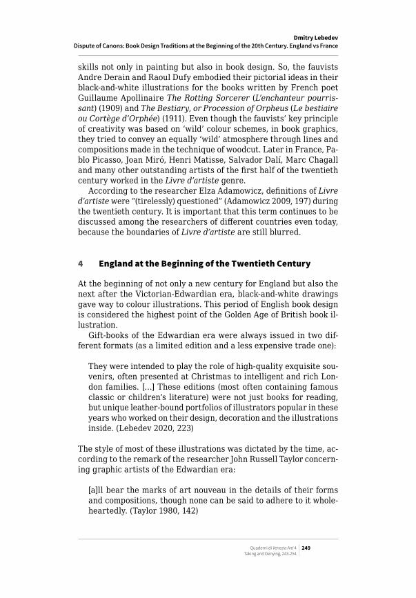
A special feature of Edwardian illustration was the interest of Brit-ish masters in caricature and grotesque depiction of characters. The main reason is that English graphic artists worked as both cartoon-ists (often for magazines such as Punch) and illustrators. A striking example of such a combination is Arthur Rackham, the most famous illustrator of the Edwardian era. Rackham’s series of colour draw-ings for Rip van Winkle (1905) [fig. 4], Peter Pan in Kensington Gardens (1906), Alice in Wonderland (1907), Midsummer Night’s Dream (1908), etc. are considered classic embodiments of Art Nouveau style in its mixture with the traditions of the Pre-Raphaelite Brotherhood, the Arts and Crafts movement, and British newspaper cartoons. Their key features are a confident linear graphic drawing, muted tones, a lot of small details, grotesque, the ability to capture the writer’s at-mosphere and numerous quotes from the history of art. One of the peculiarities of Rackham’s graphic art was the ability to anthropo-morphise nature through techniques developed by the illustrator in the 1890s when he worked extensively as a cartoonist for leading London newspapers.
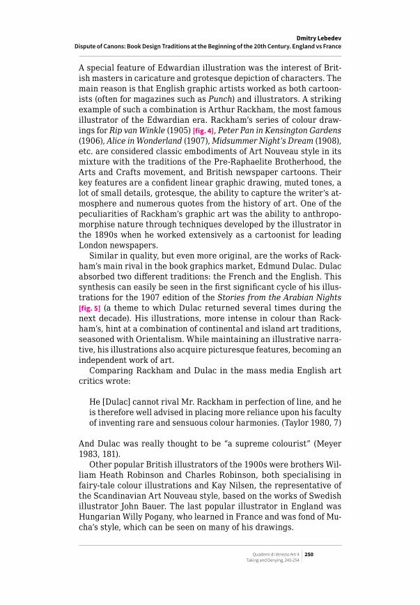
Similar in quality, but even more original, are the works of Rack-ham’s main rival in the book graphics market, Edmund Dulac. Dulac absorbed two different traditions: the French and the English. This synthesis can easily be seen in the first significant cycle of his illus-trations for the 1907 edition of the Stories from the Arabian Nights [fig. 5] (a theme to which Dulac returned several times during the next decade). His illustrations, more intense in colour than Rack-ham’s, hint at a combination of continental and island art traditions, seasoned with Orientalism. While maintaining an illustrative narra-tive, his illustrations also acquire picturesque features, becoming an independent work of art.
Comparing Rackham and Dulac in the mass media English art critics wrote:
He [Dulac] cannot rival Mr. Rackham in perfection of line, and he is therefore well advised in placing more reliance upon his faculty of inventing rare and sensuous colour harmonies. (Taylor 1980, 7)
And Dulac was really thought to be “a supreme colourist” (Meyer 1983, 181).
Other popular British illustrators of the 1900s were brothers Wil-liam Heath Robinson and Charles Robinson, both specialising in fairy-tale colour illustrations and Kay Nilsen, the representative of the Scandinavian Art Nouveau style, based on the works of Swedish illustrator John Bauer. The last popular illustrator in England was Hungarian Willy Pogany, who learned in France and was fond of Mu-cha’s style, which can be seen on many of his drawings.
Dmitry LebedevDispute of Canons: Book Design Traditions at the Beginning of the 20th Century. England vs France

Dmitry LebedevDispute of Canons: Book Design Traditions at the Beginning of the 20th Century. England vs France
Quaderni di Venezia Arti 4 251Taking and Denying, 243-254
Figure 5 Edmund Dulac. Illustrations from the edition of Stories from the Arabian Nights retold by Laurence Housman. 1907. Ink and watercolour drawings reproduced by photomechanical three-colour process
Figure 4 Arthur Rackham. Illustrations from the edition of Rip van Winkle by Washington Irving. 1905. Ink and watercolour drawings reproduced by photomechanical three-colour process
Quaderni di Venezia Arti 4 252Taking and Denying, 243-254
5 Conclusion
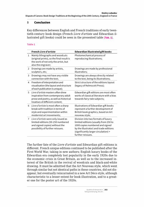
Key differences between English and French traditions of early twen-tieth-century book design (French Livre d’artiste and Edwardian il-lustrated gift books) could be seen in the presented table [Tab. 1].
Table 1
French Livre d’artiste Edwardian illustrated gift books1 Mainly lithographs and woodcuts
(original prints), so the final result is the work of not only the artist, but also the engraver;
Photomechanical process of reproducing illustrations;
2 Drawings are made by artists, sculptors, etc;
Drawings are made by professional illustrators;
3 Drawings may not have any visible connection with the text;
Drawings are always directly related to the text, being its illustrations;
4 Freedom of interpretation and visualisation (the layout and structure of each publication is unique);
Strict structure of the editions layout (legacy of Kelmscott Press);
5 Livre d’artiste masters often drew inspiration from contemporary adult prose and poetry, as well as historical treatises of different content;
Edwardian gift editions are most often works of classical literature with a bias towards fairy-tale subjects;
6 Livre d’artiste is most often a sharp break with tradition in terms of style and experimentation within modernist art movements;
Illustrations of Edwardian gift books represent a further development of British book graphics, based on Art nouveau style;
7 Livre d’artiste were only issued as limited editions (50-250 numbered and signed copies) without the possibility of further reissues.
Division into two formats of luxury limited editions (usually from 250 to 1000 copies numbered and signed by the Illustrator) and trade editions (significantly larger circulation) + further reissues.
The further fate of the Livre d’artiste and Edwardian gift editions is different. French unique editions continued to be published after the First World War, taking in new authors; English luxury books of the Edwardian era completely lost popularity in the early 1920s due to the economic crisis in Great Britain, as well as to the increased in-terest of the British in the revival of woodcuts and black-and-white drawing. It must be admitted that the Art Nouveau style, which went through similar but not identical paths in these countries, did not dis-appear, but eventually reincarnated in a new Art Déco style, although characteristic to a lesser extent for book illustration, and to a great-er one for the poster art of the 1920s.
Dmitry LebedevDispute of Canons: Book Design Traditions at the Beginning of the 20th Century. England vs France

Dmitry LebedevDispute of Canons: Book Design Traditions at the Beginning of the 20th Century. England vs France
Quaderni di Venezia Arti 4 253Taking and Denying, 243-254
Bibliography
Adamowicz, E. (2009). “Etat présent. The Livre d’artiste in Twentieth-Centu-ry France”. French Studies, LXIII(2), 189-98. https://doi.org/10.1093/fs/knp061.
Bland, D. (1969). A History of Book Illustration. Los Angeles: University of Cal-ifornia Press.
Crane, W. (1901). The Decorative Illustration of Books. London: George Bell & Sons.
Lebedev, D. (2020). “British Book Illustration of the 1900-1910s. Sources of Inspiration”. Atlantis Press. Advances in Social Science, Education and Hu-manities Research = Proceedings of the 4th International Conference on Art Studies. Science, Experience, Education, 469, 222-31. https://dx.doi.org/10.2991/assehr.k.200907.040.
Meyer, S. (1983). A Treasury of the Great Children’s Book Illustrators. New York: Harry N. Abrams.
Pearson, H. (2001). Bernard Shaw. His Life and Personality. Looe, UK: House of Stratus.
Ross, R. (1909). Aubrey Beardsley. London: John Lane.Sakhno, I. (2016). “Livre d’artiste as an Isoverbal Text in the Culture of Symbol-
ism”. Art and Literature Scientific and Analytical Journal Texts, 2, 92-109.Taylor, J. (1980). The Art Nouveau Book in Britain. New York: Taplinger Pub-
lishing.