Embed Size (px)
Citation preview
Discovering Business Intelligence Using Treemap Visualizations Page 1
Discovering Business Intelligence Using Treemap Visualizations Ben Shneiderman April 11, 2006
Alert naturalists scan the forests and the trees, taking in the overview and noticing seasonal changes while being on the lookout for fires. They also are watching for insect invasions that could damage trees, and they consider sites for controlled burns to reinvigorate the forest. Alert naturalists know what to look for and are quick to spot surprises.
In a similar manner, alert managers do more than recognize expected patterns in sales cycles, movements in supply chains, or yields in manufacturing. Successful managers are skillful at spotting exceptional events, identifying emerging fashions, and noticing what is missing. When problems develop, they take prompt action to keep plans on schedule. When novel trends emerge, they change plans to take advantage of opportunities.
Making confident, correct, and bold decisions is a challenge, especially when the volume and pace of activity are high. Experience and intuition remain important, but generating reasonable alternatives based on accurate information is necessary. The 30-year emergence of computerized databases and data warehouses from internal and external sources provides the business intelligence that is needed to spot trends, notice outliers, and identify gaps. Early relational database systems with SQL queries were a great step forward, and then business intelligence tools provided still easier access for some kinds of data exploration; but these point-and-click interfaces still produced tabular results or static graphics. Software that produces visual displays of search results with interactive exploration has only recently become widely available.
One family of new tools are the organization-wide and manager-specific information dashboards that help ensure daily or even minute-by-minute situation awareness by presenting current status and alerts. These dashboards employ spatial presentations, color-coded meters, and iconic markers to provide at-a-glance information that indicates all is well or that action is needed.
A second family of new tools is the more powerful information visualization and visual analytic software that supports ambitious exploration of mission-critical data resources. Well-designed visual presentations make behavioral patterns, temporal trends, correlations, clusters, gaps, and outliers visible in seconds. Since scanning tabular data is time-consuming and difficult, effective visual presentations are becoming highly valued.
Training and experience in using these new tools are important to derive the maximum benefit. Organizations are learning how a few statistical or data analysis professionals can develop displays that hundreds of managers can use effectively. This strategy is supported by commercial software developers who provide powerful studio toolkits for designers to make simplified displays that serve the needs of specific managers. The good news is that appropriate user interface designs can integrate data mining with information visualization so users can make influential discoveries and bold decisions.
Discovering Business Intelligence Using Treemap Visualizations Page 2
Introducing Treemaps
Among the growing family of visual analytic tools, treemaps are flourishing in organizations that require daily monitoring of complex activities with thousands of products, projects, or salespeople. Tabular reports, bar charts, line graphs, and scattergrams are important tools, but for complex activities where there are numerous sales regions, manufacturing plants, or product lines the hierarchical structures provided by treemaps can be helpful. While tabular displays and spreadsheets can show 30-60 rows at a time on typical displays, the colorful presentations in treemaps can accommodate hundreds or thousands of items in a meaningfully organized display that allows patterns and exceptions to be spotted in seconds.
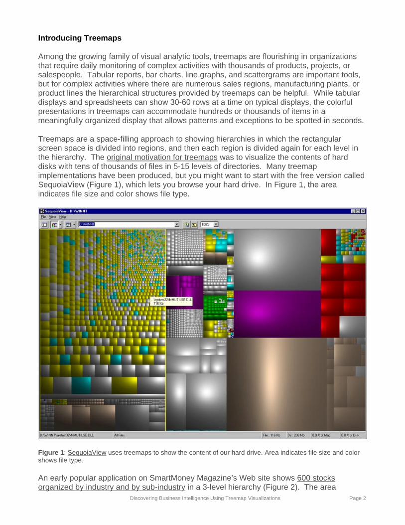
Treemaps are a space-filling approach to showing hierarchies in which the rectangular screen space is divided into regions, and then each region is divided again for each level in the hierarchy. The original motivation for treemaps was to visualize the contents of hard disks with tens of thousands of files in 5-15 levels of directories. Many treemap implementations have been produced, but you might want to start with the free version called SequoiaView (Figure 1), which lets you browse your hard drive. In Figure 1, the area indicates file size and color shows file type.
Figure 1: SequoiaView uses treemaps to show the content of our hard drive. Area indicates file size and color shows file type.
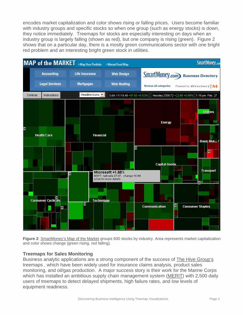
An early popular application on SmartMoney Magazine’s Web site shows 600 stocks organized by industry and by sub-industry in a 3-level hierarchy (Figure 2). The area
Discovering Business Intelligence Using Treemap Visualizations Page 3
encodes market capitalization and color shows rising or falling prices. Users become familiar with industry groups and specific stocks so when one group (such as energy stocks) is down, they notice immediately. Treemaps for stocks are especially interesting on days when an industry group is largely falling (shown as red), but one company is rising (green). Figure 2 shows that on a particular day, there is a mostly green communications sector with one bright red problem and an interesting bright green stock in utilities.
Figure 2: SmartMoney’s Map of the Market groups 600 stocks by industry. Area represents market capitalization and color shows change (green rising, red falling).
Treemaps for Sales Monitoring Business analytic applications are a strong component of the success of The Hive Group’s treemaps , which have been widely used for insurance claims analysis, product sales monitoring, and oil/gas production. A major success story is their work for the Marine Corps which has installed an ambitious supply chain management system (MERIT) with 2,500 daily users of treemaps to detect delayed shipments, high failure rates, and low levels of equipment readiness.
Discovering Business Intelligence Using Treemap Visualizations Page 4
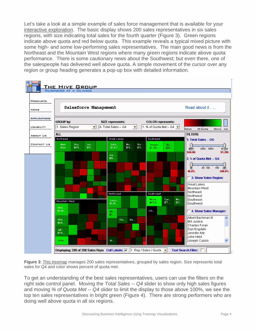
Let’s take a look at a simple example of sales force management that is available for your interactive exploration. The basic display shows 200 sales representatives in six sales regions, with size indicating total sales for the fourth quarter (Figure 3). Green regions indicate above quota and red below quota. This example reveals a typical mixed picture with some high- and some low-performing sales representatives. The main good news is from the Northeast and the Mountain West regions where many green regions indicate above quota performance. There is some cautionary news about the Southwest; but even there, one of the salespeople has delivered well above quota. A simple movement of the cursor over any region or group heading generates a pop-up box with detailed information.
Figure 3: This treemap manages 200 sales representatives, grouped by sales region. Size represents total sales for Q4 and color shows percent of quota met.
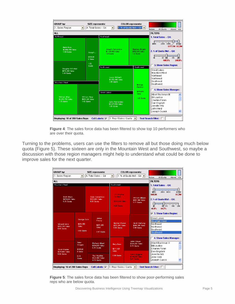
To get an understanding of the best sales representatives, users can use the filters on the right side control panel. Moving the Total Sales -- Q4 slider to show only high sales figures and moving % of Quota Met -- Q4 slider to limit the display to those above 100%, we see the top ten sales representatives in bright green (Figure 4). There are strong performers who are doing well above quota in all six regions.
Discovering Business Intelligence Using Treemap Visualizations Page 5
Figure 4: The sales force data has been filtered to show top 10 performers who are over their quota.
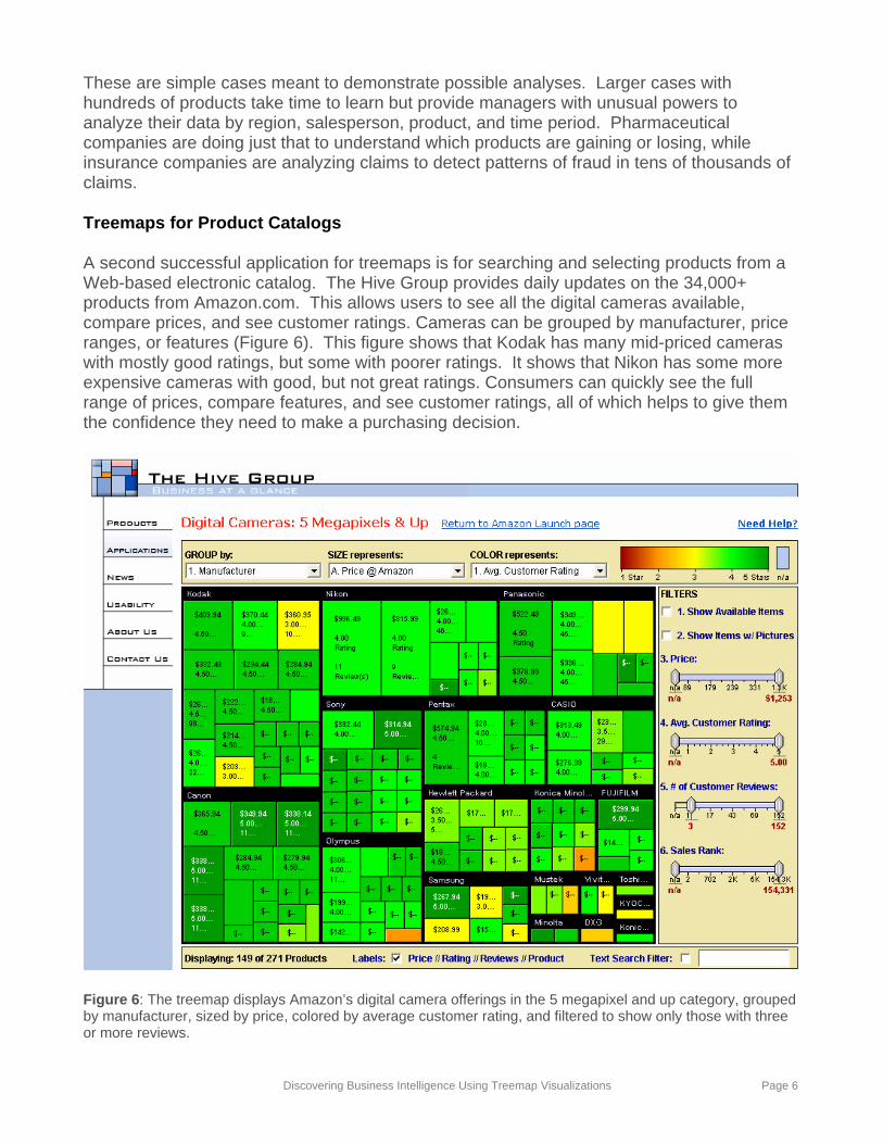
Turning to the problems, users can use the filters to remove all but those doing much below quota (Figure 5). These sixteen are only in the Mountain West and Southwest, so maybe a discussion with those region managers might help to understand what could be done to improve sales for the next quarter.
Figure 5: The sales force data has been filtered to show poor-performing sales reps who are below quota.
Discovering Business Intelligence Using Treemap Visualizations Page 6
These are simple cases meant to demonstrate possible analyses. Larger cases with hundreds of products take time to learn but provide managers with unusual powers to analyze their data by region, salesperson, product, and time period. Pharmaceutical companies are doing just that to understand which products are gaining or losing, while insurance companies are analyzing claims to detect patterns of fraud in tens of thousands of claims.
Treemaps for Product Catalogs
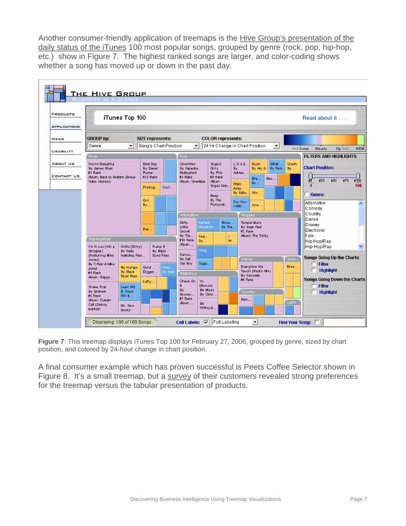
A second successful application for treemaps is for searching and selecting products from a Web-based electronic catalog. The Hive Group provides daily updates on the 34,000+ products from Amazon.com. This allows users to see all the digital cameras available, compare prices, and see customer ratings. Cameras can be grouped by manufacturer, price ranges, or features (Figure 6). This figure shows that Kodak has many mid-priced cameras with mostly good ratings, but some with poorer ratings. It shows that Nikon has some more expensive cameras with good, but not great ratings. Consumers can quickly see the full range of prices, compare features, and see customer ratings, all of which helps to give them the confidence they need to make a purchasing decision.
Figure 6: The treemap displays Amazon’s digital camera offerings in the 5 megapixel and up category, grouped by manufacturer, sized by price, colored by average customer rating, and filtered to show only those with three or more reviews.
Discovering Business Intelligence Using Treemap Visualizations Page 7
Another consumer-friendly application of treemaps is the Hive Group’s presentation of the daily status of the iTunes 100 most popular songs, grouped by genre (rock, pop, hip-hop, etc.) show in Figure 7. The highest ranked songs are larger, and color-coding shows whether a song has moved up or down in the past day.
Figure 7: This treemap displays iTunes Top 100 for February 27, 2006, grouped by genre, sized by chart position, and colored by 24-hour change in chart position.
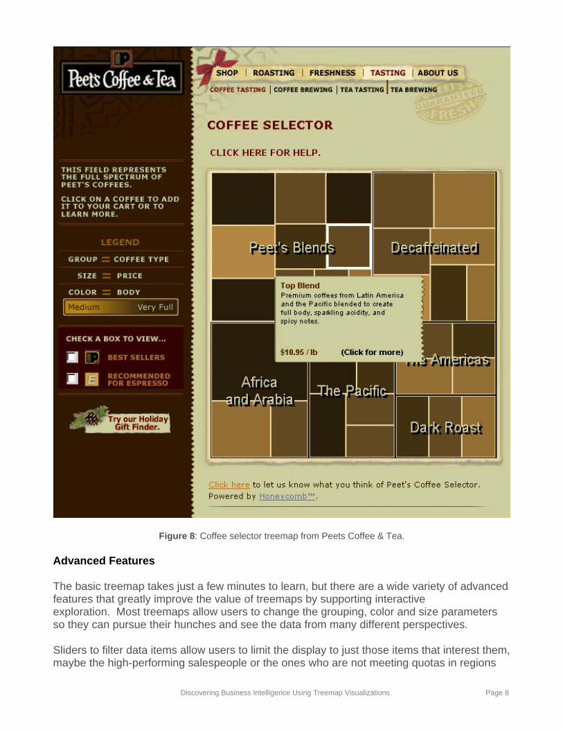
A final consumer example which has proven successful is Peets Coffee Selector shown in Figure 8. It’s a small treemap, but a survey of their customers revealed strong preferences for the treemap versus the tabular presentation of products.
Discovering Business Intelligence Using Treemap Visualizations Page 8
Figure 8: Coffee selector treemap from Peets Coffee & Tea.
Advanced Features
The basic treemap takes just a few minutes to learn, but there are a wide variety of advanced features that greatly improve the value of treemaps by supporting interactive exploration. Most treemaps allow users to change the grouping, color and size parameters so they can pursue their hunches and see the data from many different perspectives.
Sliders to filter data items allow users to limit the display to just those items that interest them, maybe the high-performing salespeople or the ones who are not meeting quotas in regions

Discovering Business Intelligence Using Treemap Visualizations Page 9
where most salespeople are above quota. Another way of zooming in on sections is to use the entire display to show just some branches of the hierarchy.
The treemap algorithm used in many commercial applications is based on the squarified strategy that makes each box as square as possible, usually placing the large squares in the upper left and the small squares in the lower right. This is visually appealing and helpful in understanding the range of size differences. Sometimes it is important to keep the items in order by name or date, in which case the order-preserving treemap algorithms such as slice-and-dice or strip treemaps are helpful.
Supportive evidence comes from a recent controlled experiment comparing spreadsheets to the Hive Group software. This study by Oracle found that treemaps were significantly faster for all eight tasks tested. The author concluded: "These results suggest that treemaps should be included as a standard graphical component in enterprise-level data analysis and monitoring applications."
Improvements are inevitable as users apply treemaps for ever wider sets of problems. The good news is that new ideas and applications for treemaps are emerging weekly. One that I like especially was the cleverly designed newsmap that shows news stories from around the world in a way that makes prominent stories more visible. I wonder what business or consumer application will be the next one to cause excitement on the Web – maybe it will be yours.
_________________________________________________________________________
About the Author Ben Shneiderman, the originator of treemaps, is a professor of computer science at the University of Maryland and a technical advisor to The Hive Group. This article originally appeared on the Business Intelligence Network (www.b-eye-network.com) as one of Stephen Few’s guest articles. A library of Stephen Few’s articles, as well as other guest articles, is available at www.perceptualedge.com.