Embed Size (px)
Citation preview
DISCLAIMER -- The following training materials were compiled
from multiple referenced sources and developed into student
products by the Defense Information School for the sole purpose
of supporting its educational curriculum for military public
affairs and visual information professionals. These documents
were provided to the US Navy to support its professional
education, qualification and training program for the Mass
Communication Specialist community. Any further use beyond
the scope outlined here or distribution beyond the Navy public
affairs audience is prohibited.


Table of Contents
Origins of the Aphabet . . . . . . . . . . . . . . . . . . . . . . . . . . . . . . . . . . . . . 3Anatomy of Type . . . . . . . . . . . . . . . . . . . . . . . . . . . . . . . . . . . . . . . . . 7Categories of Type . . . . . . . . . . . . . . . . . . . . . . . . . . . . . . . . . . . . . . . 17Fundamentals of Text Layout . . . . . . . . . . . . . . . . . . . . . . . . . . . . . . 22
1

ORIGINS OF THE ALPHABET
3
TypographyAlmost everything we know in the world can be described in just 26 letters—isn’t that amazing? Yet this
most visible art—which we see all around us each day—has long been invisible in most people’s minds . Part of this was intentional— because the content, not the type, is the message . Type adds to everything we read in subliminal and powerful ways .
Type is everywhere and serves many purposes . Look around you at publications, billboards, bus boards, packaging, TV, anywhere type is used . You’ll quickly see that type is used to do more than spell words .
Typography is the study and process of typefaces; how to select, size, arrange, and use them in general . In modern terms, typography includes computer display and output . Traditionally, typography was the use of metal types with raised letterforms that were inked and then pressed onto paper. The influence of typography extends far beyond printing with type . However, many of the terms used in typography have their roots in terms associated with metal type .
All books and magazines, all the advertisements, posters, record sleeves, soup can labels - every thing we might come into contact with has been printed . Every visual expression of words, with or without accompanying pictures or decoration becomes an optical image. The visual impact of images embodying words is definitely affected by style, arrangement, and appearance .
In a time when computers have made typography a thing anyone can use and abuse, it is a matter of survival for typographic art that users should have a fair knowledge and understanding of typography . This section deals with the fundamentals and principles of typography by discussing the origins of the alphabet, the anatomy of type, categories of type, and the fundamentals of text layout .
Typography deals with typefaces, and to begin to design successfully with type you have to know the variety of typefaces available; how they are measured, classified and spaced; which type are suitable for which jobs, and how they look in the design or on the page . Before proceeding with the more practical aspects of typography, it would be helpful to understand how we arrived at the twenty-six symbols we call our alphabet .
The Origins of the Alphabet
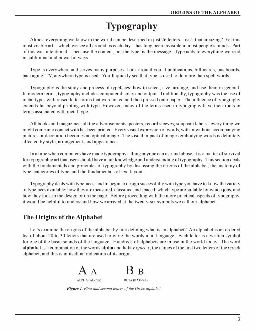
Let’s examine the origins of the alphabet by first defining what is an alphabet? An alphabet is an ordered list of about 20 to 30 letters that are used to write the words in a language . Each letter is a written symbol for one of the basic sounds of the language . Hundreds of alphabets are in use in the world today . The word alphabet is a combination of the words alpha and beta Figure 1, the names of the first two letters of the Greek alphabet, and this is in itself an indication of its origin .
BETA (BAY-tuh)ALPHA (AL-fuh)
Figure 1. First and second letters of the Greek alphabet.
βaa B
ORIGINS OF THE ALPHABET
�
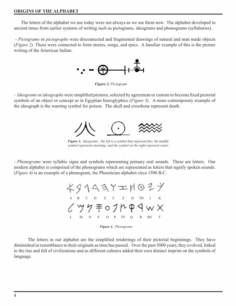
The letters of the alphabet we use today were not always as we see them now . The alphabet developed in ancient times from earlier systems of writing such as pictograms, ideograms and phonograms (syllabaries) .
- Pictograms or pictographs were disconnected and fragmented drawings of natural and man made objects (Figure 2). These were connected to form stories, songs, and epics . A familiar example of this is the picture writing of the American Indian .
- Ideograms or ideographs were simplified pictures, selected by agreement or custom to become fixed pictorial symbols of an object or concept as in Egyptian hieroglyphics (Figure 3). A more contemporary example of the ideograph is the warning symbol for poison . The skull and crossbone represent death .
- Phonograms were syllabic signs and symbols representing primary oral sounds . These are letters . Our modern alphabet is comprised of the phonograms which are represented as letters that signify spoken sounds . (Figure 4) is an example of a phonogram, the Phoenician alphabet circa 1500 B .C .
The letters in our alphabet are the simplified renderings of their pictorial beginnings. They have diminished in resemblance to their originals as time has passed . Over the past 5000 years, they evolved, linked to the rise and fall of civilizations and as different cultures added their own distinct imprint on the symbols of language .
Figure 3. Ideograms: the left is a symbol that represent fire; the middle symbol represents morning; and the symbol on the right represent water.
Figure 4. Phonograms
A B C D E F Z H TH I K
L M N S O P TS Q R SH T
Figure 2. Pictogram

ORIGINS OF THE ALPHABET
5
History of the Alphabet
By about 3000 B .C . the Egyptians were using 2� signs representing consonant sounds in combination with more than �00 picto-ideographic hieroglyphics . Sometime around 1000 B .C . the Greeks adopted a Semitic alphabet of 22 letters, probably from the Phoenicians, a Semitic people who traded throughout the Aegean area . The alphabet the Greeks acquired had no vowels, only consonant sounds; eventually, the Greeks gave vowel sounds to five of the unused consonant signs - creating the first true alphabet.
It was an earlier form of the alphabet that Greek colonists in southern Italy passed on to the Etruscans in the north . The Etruscans conquered Rome in the seventh century B .C . and left the alphabet as a legacy of their rule. Thirteen letters were accepted unchanged from the Greek: A, B, E, I, K, M, N, O, T, X, Y, Z. Eight letters were revised: C, D, G, L, P, R, S, V. Two letters were added: F and Q. These gave the Romans a total of twenty-three letters . The letters U and W were added to the alphabet about a thousand years ago, and J was added five hundred years after that. Today, the Roman alphabet (Figure 6) is used by half the people in the world. An infinite number of words can be formed from its 26 letters.
Figure 7 is a simplified family tree of aphabets. Linguists have tried to make connections between different alphabets by showing their comman origins and where they separated . All of our alphabets can be traced back to the same beginnings .
Figure 6. Roman alphabet adapted from the Greek.
Figure 7. Family tree of the world’s alphabets.
SUMERIAN CUNEIFORM
EGYPTIAN HIEROGLYPHS
PROTO-SINAITIC
NORTH SEMITIC
SOUTH SEMITIC
ARABIAN SCRIPTS
ETHIOPICSCRIPTS
PERSIAN
PHOENICIANARAMAIC
ARABIC
INDIANSCRIPTS
KOREAN
HEBREWSCRIPTS
INDONESIAN
NORTH ETRUSCAN
ETRUS-GERMANIC
RUNICROMAN
CYRILLIC
BULGARIAN
CROATIAN
EARLY SLAVONIC
GREEK
Figure 5. Evolution of letterforms.
Egyptian
3500 B.C.phoEniCian
1000 B.C.grEEk
600 B.C.roman
114 a.D.hEBrEw
1500 B.C.
ORIGINS OF THE ALPHABET
6
Typography has a long history going back to before the time of the Egyptians pyramids. Generations of artists and scribes have drawn, shaped, and slowly changed the characters until they now bear little resemblance to the pictures they once were .
History of Type
From the middle of the fifteenth century to the middle of the twentieth, most Roman letters were printed by a technique rooted in sculpture . Before the printing press, books were produced by scribes . Hand composition was tedious and time consuming . This remained true until the invention of movable type between 1��0 and 1450, the perfection of which is attributed to Johannes Gutenberg of Mainz, Germany.
The modern history of type begins in the 15th century, when the first examples of the fonts Old Style appeared . During the centuries prior to that time, the prevalent style of letterforms was the Blackletter, or “Old English .”
As a result of the invention of the Linotype and Monotype machines, typesetting became automated in the late 1800’s . Hand composition was then used only for setting small amounts of type . The Roman type design, belonging to the 18th century, was transitional because of its intermediate position between the Old style and Modern styles . Here belong such faces as Times Roman and Baskerville .
Modern or New Antiqua (German for Roman) font design was created at the very end of 18th century. Modern has in fact served as a base for several design variations created throughout the 19th century . The most notable Modern offsprings are slab serif fonts . Modern faces were so popular by 1805 that few printers cast old-style types for the next 50 years . Both classic Modern faces and their derivatives pretty much dominated the typography scene in the 19th---and well into the 20th---centuries .
The first half of the 20th century is the end of the Modern era, the moment when revived typefaces were flooding the typography mainstream. It was the time when a completely different font design was booming, called sans serif (which is French for “without serifs”). When the first examples of sans serif fonts finally appeared, they seemed so controversial that the first name given to them was “grotesque,” and they were very rarely used except in advertising . Although they appeared in the 19th century, they only really became popular in the 1920’s and 30’s. The most influential type design of that epoch was the Futura font created in Germany in 1928 .
The serif faces have gone from arty and liberal Old Style, through neutral Transitional design, to the rigid, mannered Modern typefaces . Here’s a list of some of the individuals who, through their creative drive and passion for their craft, formed the world of type as we know it today:
Johannes Gutenberg (1398-1�68) William Caxton (1�22-1�91) Aldus Manutius (1�50-1515) William Caslon (1692-1766) John Baskerville (1706-1775) Giambattista Bodini (17�0-1813) Frederic W. Goudy (1865-19�7) Eric Gill (1882-19�0) Jan Tschichold (1902-197�)

ANATOMY OF TYPE
7
Because we tend to see words in terms of the information they convey, we are rarely aware of the actual appearance of the individual letter .
Anatomy of Type
The first thing you need to learn in the world of typography is the anatomy of type. It is important to understand the construction of the letters, if you are going to use typography to any degree of success . Like other manufactured objects, letterforms have names for their dimensions and components .
Letter Space
Each letter in a typeface has its own little space . The main geometry of the letter space is delimited by horizontal and vertical boundaries . Figure 8 shows some of the common dimensions . These are listed below:
Body size (1) - The size of the type being used; measured from the top of the tallest letterform to the bottom of the lowest one . It is divided into 3 zones such as the x-height, acsender height and descender depth .
Cap line (2) - The imaginary line marking the height of the uppercase letters within a font .
Cap height (3) or cap size - The height of the uppercase letters measured from the baseline within a font . (The distance from the capline to the baseline) .
X-height (4) - The height of lowercases without ascenders or descenders (like a, e, o, n, m, etc . . .) measured by the letter x . It is also called the average height . There are some lowercases, like c or o, that have different heights than the X-height. It affects the feel of a typeface, how many characters fit on a line, and depending on how the type is set, how easily your text can be read .
Baseline (5) - The imaginary line along which the bases of all capital letters and most lowercase letters are positioned .
Meanline or X-line (6) - The imaginary line marking the top of those lowercase letters that have no ascender such as x, also the upper boundry of x height .
Ascender height or Ascent (7) - The height of the part of a letter rising above the x-height .
Descender depth or Descent (8) - The measurement of the part of a letter that falls below the baseline .
Figure 8. Basic anatomy of type
4
3
1
9
10
5
26
11
8
7
Bod
y Si
ze
Cap Height Set Width
Descender
AscenderAscender Line
Cap LineMean Line
x-height
Base Line
Descender Line

ANATOMY OF TYPE
8
Ascender line (9) - The imaginary line extending just above the cap line .
Descender line (10) - The imaginary line marking the lowest point of the descenders within a font .
The letter space also have a set width (Figure 9), also named character’s width or character’s space - The complete width of a character including sidebearings . This is the width allowed for each letter which varies between letters and type faces . This is the width from which a letter cannot extend, and no other letter placed near it can get in, unless it is a kern, which is the part of the letterform part that extend from the character’s space .
Body width (12) - the width of the letter itself excluding the sidebearings . It is also called Em space, a name that comes from the fact that no letter was supposed to be wider than the capital M .
Side bearings (13) or kerning space is the width on each side of the letterform . The width depends on the form of the letter; it is a tool for the typographer that allows you to reduce or increase the space between a letter that does not homogenicaly occupy the space (like A, T, V, etc . . .), with others adjacent letters .
Character’s origin (14) is the reference point of the letterform, and is situated where the baseline hits the left edge of the character space . (The place from where the letter is measured .)
And finally, there is also an imaginary boundary below the bottom of the Body height, that defines the leading, this line marks the minimal recommended vertical space (15) between two lines of text .
Letter Shape
Now that we know the main geometry of the letter space, let’s see how we fill it with forms and the names of these. Different parts of letters have unusual names for identification purposes, some are straight forward, others are more abstract .
The first distinction between type is between capital letters and small letters. Capital letters (1) are referred
to as caps or upper case . (See Figure 10) Uppercase letters fill the distance between the capline and baseline. Occasionally, letters between the meanline and baseline may appear as capital letters; they are smaller versions of regular capital letters called small caps .
Small letters are referred to as lowercase letters (2) . (See Figure 10) Lowercase letters are non capital letters such as a, b, c, etc ., whose main body lies between the baseline and the meanline . The form of lower case letters is often altered from that of the cap . Lower case letters may extend from the line of ascent to the line of descent as in letters like i, j, k, l, etc .
The terms uppercase and lowercase are derived from early days of printing, when type was set by hand, it was kept in wooden trays called cases . The cases are about an inch deep and divided into compartments, or boxes, of various sizes . A complete font required two such trays, usually placed one above the other on a sloping frame . The upper case held the capitals, the lower case the small letters . This position of the trays led printers to refer to capital letters as uppercase and small letters as lowercase .
Figure 9. Set Width.
Set Width
12
O14
13 13 }15
ANATOMY OF TYPE
9
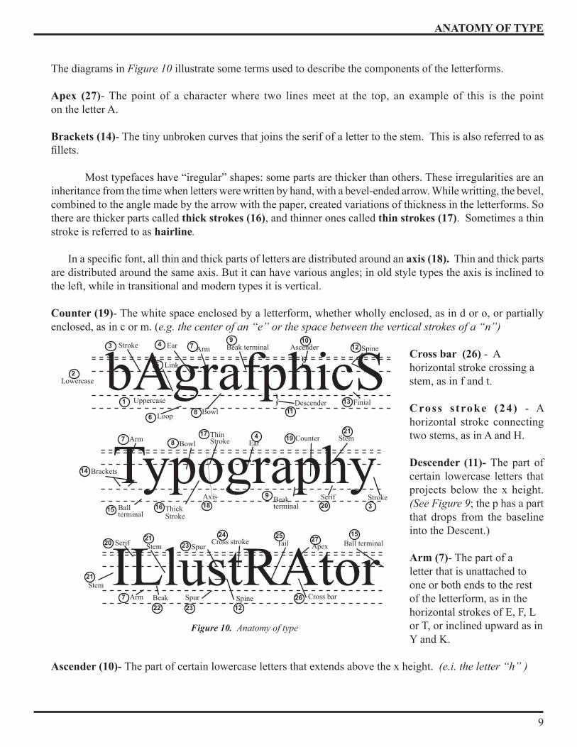
The diagrams in Figure 10 illustrate some terms used to describe the components of the letterforms .
Apex (27)- The point of a character where two lines meet at the top, an example of this is the point on the letter A .
Brackets (14)- The tiny unbroken curves that joins the serif of a letter to the stem . This is also referred to as fillets.
Most typefaces have “iregular” shapes: some parts are thicker than others. These irregularities are an inheritance from the time when letters were written by hand, with a bevel-ended arrow . While writting, the bevel, combined to the angle made by the arrow with the paper, created variations of thickness in the letterforms . So there are thicker parts called thick strokes (16), and thinner ones called thin strokes (17) . Sometimes a thin stroke is referred to as hairline.
In a specific font, all thin and thick parts of letters are distributed around an axis (18). Thin and thick parts are distributed around the same axis . But it can have various angles; in old style types the axis is inclined to the left, while in transitional and modern types it is vertical .
Counter (19)- The white space enclosed by a letterform, whether wholly enclosed, as in d or o, or partially enclosed, as in c or m . (e.g. the center of an “e” or the space between the vertical strokes of a “n”)
Cross bar (26) - A horizontal stroke crossing a stem, as in f and t .
Cross s troke (24) - A horizontal stroke connecting two stems, as in A and H .
Descender (11)- The part of certain lowercase letters that projects below the x height . (See Figure 9; the p has a part that drops from the baseline into the Descent .)
Arm (7)- The part of a letter that is unattached to one or both ends to the rest of the letterform, as in the horizontal strokes of E, F, L or T, or inclined upward as in Y and K .
Ascender (10)- The part of certain lowercase letters that extends above the x height . (e.i. the letter “h” )
Figure 10. Anatomy of type
Tail
ILlustRAtorCross bar
Cross strokeSpur Apex
Spur SpineArm
Serif Stem
Stem
Ball terminal
Beak
20
21
227
23
23 12
1527
26
252421
bAgrafphicS} Descender
Ascender
}Arm
Finial
Link
Beak terminal Spine
Bowl
Stroke Ear
Loop
1
2
3 4
5
68
79
1113
1210
Lowercase
Uppercase
Counter
AxisBallterminal
EarArm
Serif Stroke
Stem
ThickStroke
ThinStrokeBowl
Brackets
Beakterminal
Typography14
7
15 16
8
18
17 21
20 3
194
9

ANATOMY OF TYPE
10
Ball terminal (15)- The circular form at the end of some letters like a, c, f, j, r or y .
Beak (22) - The big brother to the spur and can be found on the L, T and E .
Beak terminal (9) - The rectangular form at the end of a letterform . (On the f, the right-edge of a, the upper right edge of c, the upper left edge of j, etc .)
Bowl or a double story (8) - The part of a letterform that includes a counter .
Ear (4) - The decorative handle attached to the bowl projected from the upper right corner of the letter g .
Finial (13) - The open end of a loop in a letterform, i.e. the bottom right finish on the c or e.
Link (5) - The part of a letter which joins the two parts of g .
Loop (6) - In the particular case of the letter g, the part that wraps around the bottom counter .
Serif (20)- The decorative fine line or stroke at the top and bottom of the main strokes. (See Figure 9) The serif, probably dates from early Rome, when the Roman masons terminated each stroke with a serif to correct the uneven appearance made by their tools . Some printed letters have no serif at all, these letterforms are called sans serif (without serif) . Serif, or Roman, types are useful in text because the serifs help distinguish individual letters and provide continuity for the reader’s eye . Serifs come in many styles . (See Figure 10)
Stem (21)- A main stroke that is more or less straight, not part of a bowl . For example the letter “o” has no stem, and the letter “l” consists of a stem alone . (See Figure 9)
Spur (23)- The shape that finishs the top or bottom of C, c, S, and s. (See Figure 9; the stem that curves from left to right in the capital S and lowercase s.)
Spine (12)- The main stroke of the letters S, and s, curved from left to right . (See Figure 9)
Stroke (3)- The straight diagonal part of a type character . (See Figure 9)
Tail (25)- The descending stroke of the Q or the strong diagonal stroke of R, k and K . (See Figure 7-12)
Typographic Terms
Every serious subject has a language of its own . Typography is no exception . Knowledge of the terminology associated with typography is important . Understanding industry standard terms greatly increases your ability to effectively communicate lettering requirements to subordinates and any commercial shops .
Figure 11. Varieties of serif
serified sanserif wedgefullbracket
finebracket
slab hairline
ANATOMY OF TYPE
11
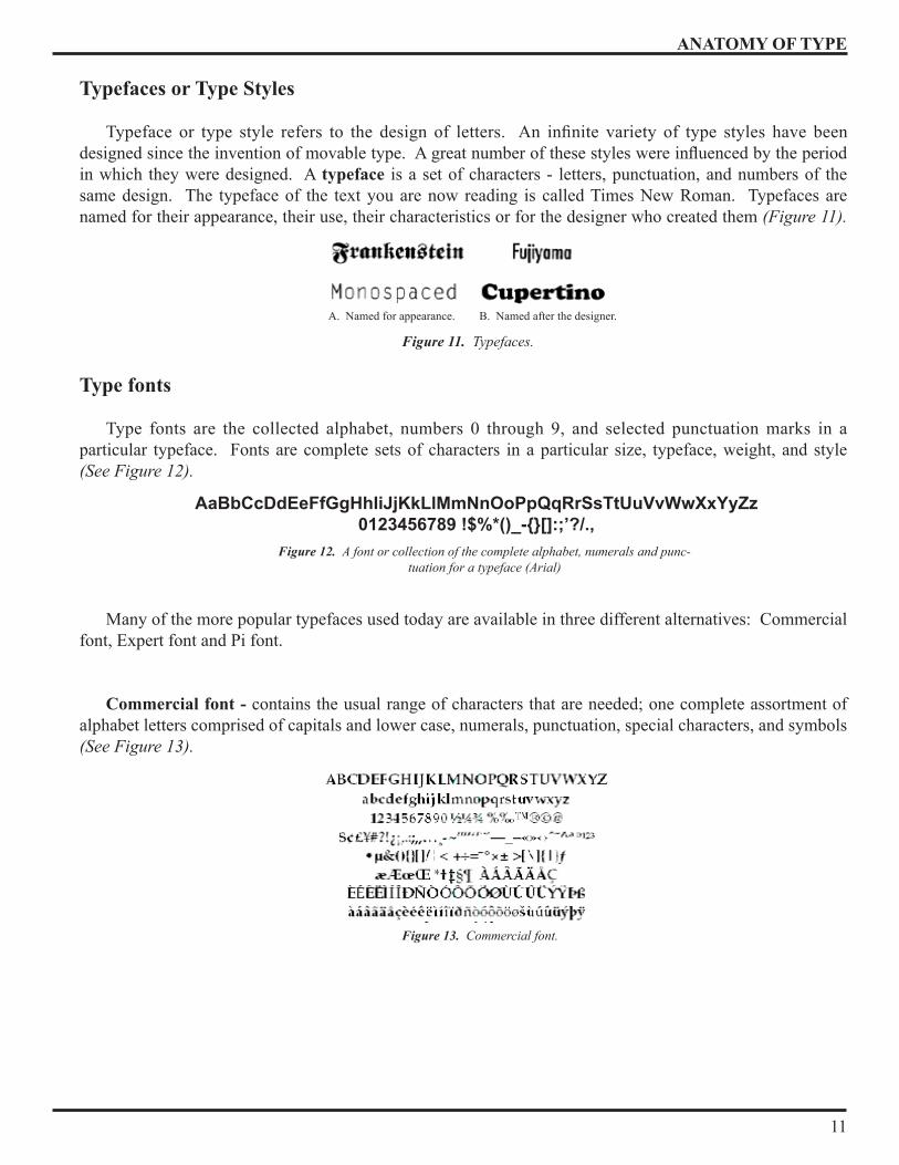
Typefaces or Type Styles
Typeface or type style refers to the design of letters. An infinite variety of type styles have been designed since the invention of movable type. A great number of these styles were influenced by the period in which they were designed . A typeface is a set of characters - letters, punctuation, and numbers of the same design . The typeface of the text you are now reading is called Times New Roman . Typefaces are named for their appearance, their use, their characteristics or for the designer who created them (Figure 11).
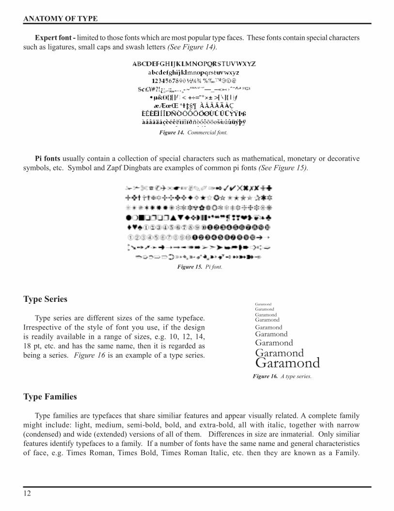
Type fonts
Type fonts are the collected alphabet, numbers 0 through 9, and selected punctuation marks in a particular typeface . Fonts are complete sets of characters in a particular size, typeface, weight, and style (See Figure 12).
Many of the more popular typefaces used today are available in three different alternatives: Commercial font, Expert font and Pi font .
Commercial font - contains the usual range of characters that are needed; one complete assortment of alphabet letters comprised of capitals and lower case, numerals, punctuation, special characters, and symbols (See Figure 13).
A . Named for appearance . B . Named after the designer .
Figure 11. Typefaces.
AaBbCcDdEeFfGgHhIiJjKkLlMmNnOoPpQqRrSsTtUuVvWwXxYyZz0123456789 !$%*()_-{}[]:;’?/.,
Figure 12. A font or collection of the complete alphabet, numerals and punc-tuation for a typeface (Arial)
Figure 13. Commercial font.
ANATOMY OF TYPE
12
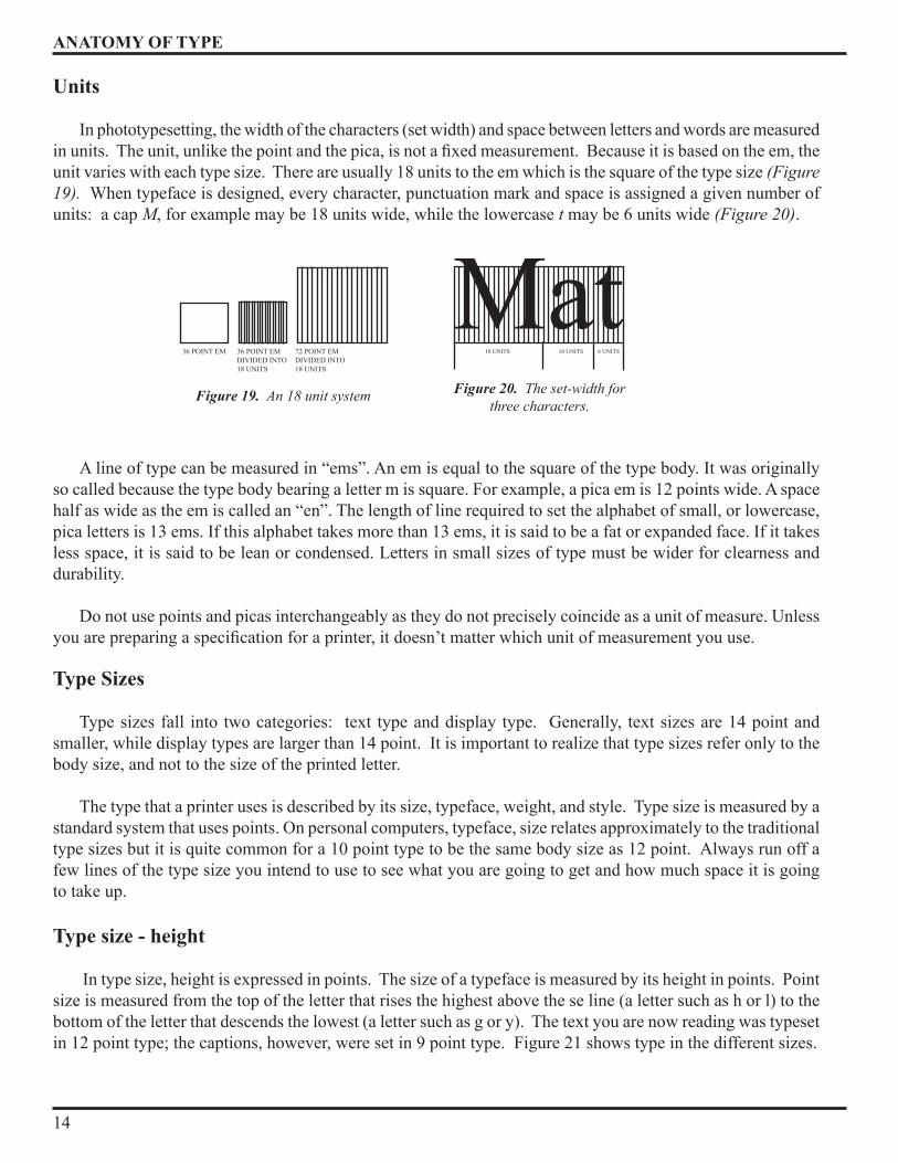
Expert font - limited to those fonts which are most popular type faces . These fonts contain special characters such as ligatures, small caps and swash letters (See Figure 14).
Pi fonts usually contain a collection of special characters such as mathematical, monetary or decorative symbols, etc . Symbol and Zapf Dingbats are examples of common pi fonts (See Figure 15).
Type Series
Type series are different sizes of the same typeface . Irrespective of the style of font you use, if the design is readily available in a range of sizes, e .g . 10, 12, 1�, 18 pt, etc . and has the same name, then it is regarded as being a series . Figure 16 is an example of a type series .
Type Families
Type families are typefaces that share similiar features and appear visually related . A complete family might include: light, medium, semi-bold, bold, and extra-bold, all with italic, together with narrow (condensed) and wide (extended) versions of all of them . Differences in size are inmaterial . Only similiar features identify typefaces to a family . If a number of fonts have the same name and general characteristics of face, e .g . Times Roman, Times Bold, Times Roman Italic, etc . then they are known as a Family .
Figure 15. Pi font.
GaramondGaramondGaramondGaramondGaramondGaramondGaramondGaramondGaramond
Figure 16. A type series.
Figure 14. Commercial font.

ANATOMY OF TYPE
13
The majority of fonts in common use have at least four variants, i .e . normal, italic, bold, and bold italic . However, many families have been designed to include variation in weight from ultra light to ultra black; variation in width from condensed to extended; multiple character sets, such as small capitals, titling capitals, swash capitals, old style figures, alternates, and more. The variety enables you to achieve just the look you want and allows for a good deal of flexibility.
The popular type design, Helvetica, has a family of over 50 varients, whereas many decorative and script style fonts, such as Algerian, do not have a range of different variations and is usually restricted to a single font . Different variations in weight and widths will be discussed later in the section .
Type MeasurementTo understand how type works, you must know how it is measured . Basically,
typefaces can be measured in two ways: height and width. Traditionally, type sizes and all typographical specifications have been measured in “points.” In earlier times when type was molded out of metal, it was sold in discrete sizes that were measured in points . This is part of the printing terminology which has been carried over into the technology of the personal computer . Originally the point size referred to the size of the type “body”; that is, the depth of the piece of type metal on which the “face” of the type was fitted. So the size of the printed “face” depends on it proportion on the “body” (See Figure 17).
There are three basic type measurements with which the designer must be familiar: Points, picas, and units. Points and Picas apply to all typesetting methods, while the term units applies to phototypesetting . Points and Picas
Points are used to measure typesize, or point size, while picas are used to measure the line length . There are 12 points to one pica and 6 picas to one inch . In Figure 18 you can see just how small a point is and how it relates to both the pica and the inch .
A point is a unit of measurement that approximates one seventy-second of an inch (1/72) . It equals one twelth of a pica (12 points = 1 pica), and 6 picas = 1 inch . There are approximately 72 points to an inch . But you should be careful, there are other units of measurement named “point” .
- The Pica point is the most used . It represents about 0 .35135 mm, or .01383 of an inch; it is divided into 12 picas .
- The Didot point is the European unit . It represents 0 .3759 mm . It is divided in 12 ciceros (also named “douze,” which is French for 12) .
The length of a line is measured in picas . Picas are also used to measure the width and length of pages and columns .
POINT SIZEOR
BODY SIZE(DEPTH)
FACE(PRINTINGSURFACE)
SET(WIDTH)
TYPE -HIGH.918”
(HEIGHT)
Figure 17. Enlarged type with its most important features.
Figure 18. There are 12 points in one pica and 6 picas
in one inch.
ANATOMY OF TYPE
1�
Units
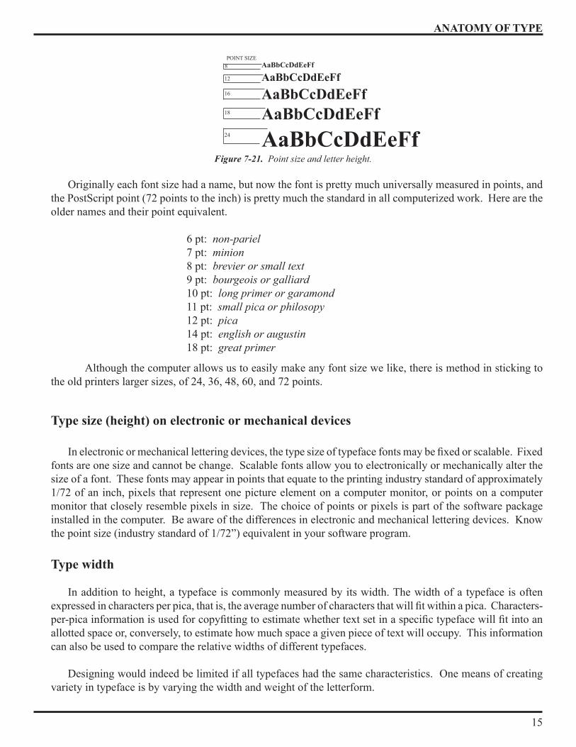
In phototypesetting, the width of the characters (set width) and space between letters and words are measured in units. The unit, unlike the point and the pica, is not a fixed measurement. Because it is based on the em, the unit varies with each type size . There are usually 18 units to the em which is the square of the type size (Figure 19). When typeface is designed, every character, punctuation mark and space is assigned a given number of units: a cap M, for example may be 18 units wide, while the lowercase t may be 6 units wide (Figure 20) .
A line of type can be measured in “ems” . An em is equal to the square of the type body . It was originally so called because the type body bearing a letter m is square . For example, a pica em is 12 points wide . A space half as wide as the em is called an “en” . The length of line required to set the alphabet of small, or lowercase, pica letters is 13 ems . If this alphabet takes more than 13 ems, it is said to be a fat or expanded face . If it takes less space, it is said to be lean or condensed . Letters in small sizes of type must be wider for clearness and durability .
Do not use points and picas interchangeably as they do not precisely coincide as a unit of measure . Unless you are preparing a specification for a printer, it doesn’t matter which unit of measurement you use.
Type Sizes
Type sizes fall into two categories: text type and display type. Generally, text sizes are 14 point and smaller, while display types are larger than 1� point . It is important to realize that type sizes refer only to the body size, and not to the size of the printed letter .
The type that a printer uses is described by its size, typeface, weight, and style . Type size is measured by a standard system that uses points . On personal computers, typeface, size relates approximately to the traditional type sizes but it is quite common for a 10 point type to be the same body size as 12 point . Always run off a few lines of the type size you intend to use to see what you are going to get and how much space it is going to take up .
Type size - height
In type size, height is expressed in points . The size of a typeface is measured by its height in points . Point size is measured from the top of the letter that rises the highest above the se line (a letter such as h or l) to the bottom of the letter that descends the lowest (a letter such as g or y) . The text you are now reading was typeset in 12 point type; the captions, however, were set in 9 point type . Figure 21 shows type in the different sizes .
36 POINT EM 36 POINT EM DIVIDED INTO 18 UNITS
72 POINT EM DIVIDED INTO 18 UNITS
Figure 19. An 18 unit system Figure 20. The set-width for three characters.
Mat18 UNITS 10 UNITS 6 UNITS
ANATOMY OF TYPE
15
Originally each font size had a name, but now the font is pretty much universally measured in points, and the PostScript point (72 points to the inch) is pretty much the standard in all computerized work . Here are the older names and their point equivalent . 6 pt: non-pariel 7 pt: minion 8 pt: brevier or small text 9 pt: bourgeois or galliard 10 pt: long primer or garamond 11 pt: small pica or philosopy 12 pt: pica 14 pt: english or augustin 18 pt: great primer
Although the computer allows us to easily make any font size we like, there is method in sticking to the old printers larger sizes, of 2�, 36, �8, 60, and 72 points .
Type size (height) on electronic or mechanical devices
In electronic or mechanical lettering devices, the type size of typeface fonts may be fixed or scalable. Fixed fonts are one size and cannot be change . Scalable fonts allow you to electronically or mechanically alter the size of a font . These fonts may appear in points that equate to the printing industry standard of approximately 1/72 of an inch, pixels that represent one picture element on a computer monitor, or points on a computer monitor that closely resemble pixels in size . The choice of points or pixels is part of the software package installed in the computer . Be aware of the differences in electronic and mechanical lettering devices . Know the point size (industry standard of 1/72”) equivalent in your software program .
Type width
In addition to height, a typeface is commonly measured by its width . The width of a typeface is often expressed in characters per pica, that is, the average number of characters that will fit within a pica. Characters-per-pica information is used for copyfitting to estimate whether text set in a specific typeface will fit into an allotted space or, conversely, to estimate how much space a given piece of text will occupy . This information can also be used to compare the relative widths of different typefaces .
Designing would indeed be limited if all typefaces had the same characteristics . One means of creating variety in typeface is by varying the width and weight of the letterform .
8POINT SIZE
16
18
2�
12
Figure 7-21. Point size and letter height.
AaBbCcDdEeFf
AaBbCcDdEeFf AaBbCcDdEeFf
AaBbCcDdEeFf AaBbCcDdEeFf
ANATOMY OF TYPE
16
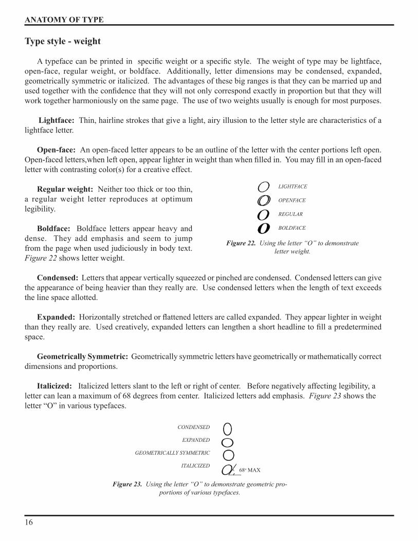
Type style - weight
A typeface can be printed in specific weight or a specific style. The weight of type may be lightface, open-face, regular weight, or boldface . Additionally, letter dimensions may be condensed, expanded, geometrically symmetric or italicized . The advantages of these big ranges is that they can be married up and used together with the confidence that they will not only correspond exactly in proportion but that they will work together harmoniously on the same page . The use of two weights usually is enough for most purposes . Lightface: Thin, hairline strokes that give a light, airy illusion to the letter style are characteristics of a lightface letter .
Open-face: An open-faced letter appears to be an outline of the letter with the center portions left open . Open-faced letters,when left open, appear lighter in weight than when filled in. You may fill in an open-faced letter with contrasting color(s) for a creative effect .
Regular weight: Neither too thick or too thin, a regular weight letter reproduces at optimum legibility .
Boldface: Boldface letters appear heavy and dense . They add emphasis and seem to jump from the page when used judiciously in body text . Figure 22 shows letter weight .
Condensed: Letters that appear vertically squeezed or pinched are condensed . Condensed letters can give the appearance of being heavier than they really are . Use condensed letters when the length of text exceeds the line space allotted .
Expanded: Horizontally stretched or flattened letters are called expanded. They appear lighter in weight than they really are. Used creatively, expanded letters can lengthen a short headline to fill a predetermined space .
Geometrically Symmetric: Geometrically symmetric letters have geometrically or mathematically correct dimensions and proportions .
Italicized: Italicized letters slant to the left or right of center . Before negatively affecting legibility, a letter can lean a maximum of 68 degrees from center . Italicized letters add emphasis . Figure 23 shows the letter “O” in various typefaces .
Figure 22. Using the letter “O” to demonstrate letter weight.
LIGHTFACE
OPENFACE REGULAR BOLDFACE
Figure 23. Using the letter “O” to demonstrate geometric pro-portions of various typefaces.
CONDENSED
EXPANDED
GEOMETRICALLY SYMMETRIC
ITALICIZED68o MAX
CATEGORIES OF TYPE
17
Typefaces The style of a typeface can greatly affect the appearance of a document . The hundreds of typefaces available
can make the choice seem very complicated . For most operators the choice is limited by what is available on their machine, but there are usually some decisions to be made . This section deals with the basic elements of typeface design which will influence those decisions.
Typeface design
Typeface design is an extremely skilled and subtle art . Very slight differences in a curve or weight of line can change the entire character of a letterform and profoundly affect its legibility .
What makes the difference? Many of the typefaces available may seem superficially similar but there are some basic distinctions which clearly differentiate one group of typefaces from another .
Printers and academic students of typography have for many years been trying to evolve systems for categorizing typefaces. The problem is that very few types fit comfortably and completely into any one category but have characteristics which give them a partial place in another .
Very broadly there are four basic features which are fundamental to the character of a typeface . 1. Whether or not it has finishing strokes (serifs) at the end of the stems, arms and tails of the letters (serifed or sanserif) .
2 . The form of the serifs (if it has them) .
3 . The amount of change from thick to thin in the strokes of the letter and the abruptness of that change .
� . The stress of the heavy part of the letter from vertical to oblique .
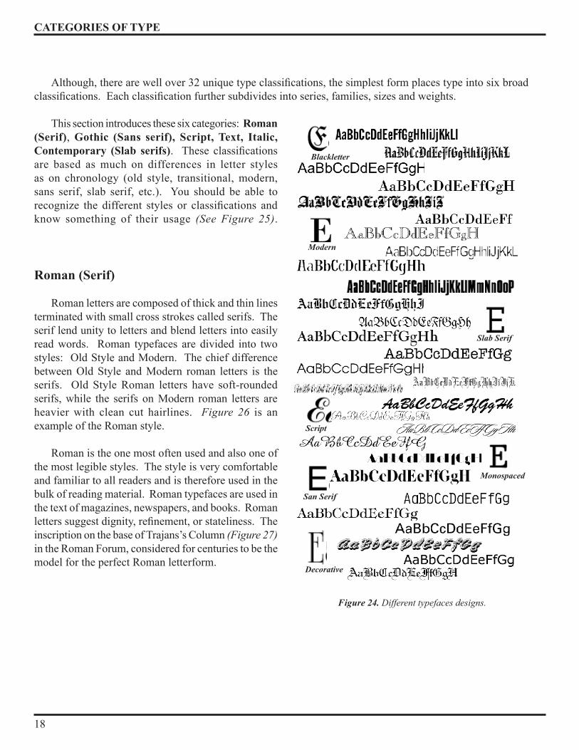
Figure 24 illustrates some of the many different typefaces . Categories of Type
There are thousands and thousands of typefaces on the market today, and each one fits into a general type style or class. Creating new classifications of fonts has always been a compulsive need for most typographers. But the evolution of typography has also made it a requirement .
Historians of typography, like teachers of typography, have found it useful to set up other classifications. Unfortunately, they have not found it possible to agree on a system of classification. Some classifications systems add a decorative, stylized, or novelty category for the wide range of fanciful type styles that defy categorization. Today these classifications span 300 years of typefaces.
CATEGORIES OF TYPE
18
Although, there are well over 32 unique type classifications, the simplest form places type into six broad classifications. Each classification further subdivides into series, families, sizes and weights.
This section introduces these six categories: Roman (Serif), Gothic (Sans serif), Script, Text, Italic, Contemporary (Slab serifs). These classifications are based as much on differences in letter styles as on chronology (old style, transitional, modern, sans serif, slab serif, etc .) . You should be able to recognize the different styles or classifications and know something of their usage (See Figure 25) .
Roman (Serif)
Roman letters are composed of thick and thin lines terminated with small cross strokes called serifs . The serif lend unity to letters and blend letters into easily read words . Roman typefaces are divided into two styles: Old Style and Modern. The chief difference between Old Style and Modern roman letters is the serifs . Old Style Roman letters have soft-rounded serifs, while the serifs on Modern roman letters are heavier with clean cut hairlines . Figure 26 is an example of the Roman style .
Roman is the one most often used and also one of the most legible styles . The style is very comfortable and familiar to all readers and is therefore used in the bulk of reading material . Roman typefaces are used in the text of magazines, newspapers, and books . Roman letters suggest dignity, refinement, or stateliness. The inscription on the base of Trajans’s Column (Figure 27) in the Roman Forum, considered for centuries to be the model for the perfect Roman letterform .
Script
Slab Serif
Blackletter
Decorative
Modern
San Serif
Monospaced
Figure 24. Different typefaces designs.

CATEGORIES OF TYPE
19
The Roman Serif type face is then further classified into Humanist, Garalde, Transitional and Didone, according to their stress and serif-form as follows: ROMAN
Humanist faces: Stemple, Schneidler, Centaur, Italia, ITC BerkeleyGeralde faces: Bembo, Garamond, Plantin. Transitional faces: Times New Roman, Lucida, Baskerville .Didone faces: Bodoni, Walbaum, Americana .
Gothic (San serif)
The Gothic letters, sometimes called block letters, are constructed of strokes relatively even in weight . Slightly thinner strokes join main stems and curves to avoid giving the letter a dense look . There are no serifs on gothic letters . A letter without serifs is referred to as sans serif (sans meaning without) . However because of the absence of serifs, they are not recommended for large areas of solid text setting but can be used for headlines without any problems . Sans serif letters of even weight also belong to the Contemporary letter grouping . They possess simplicity and neatness since there is little variation in the thickness and weight of the letter strokes. Gothic style letters are used for letterheads, envelopes, cards, announcements, and many kinds of office forms.
Roman Gothic Script
Text Italic Contemporary
Figure 25. Major type classifications
OLD STYLE ROMAN
EEMODERN ROMAN
Figure 26. The Roman letter style.
Figure 28. Gothic letter group.
Figure 27. Inscription on Trajan’s Column.
CATEGORIES OF TYPE
20
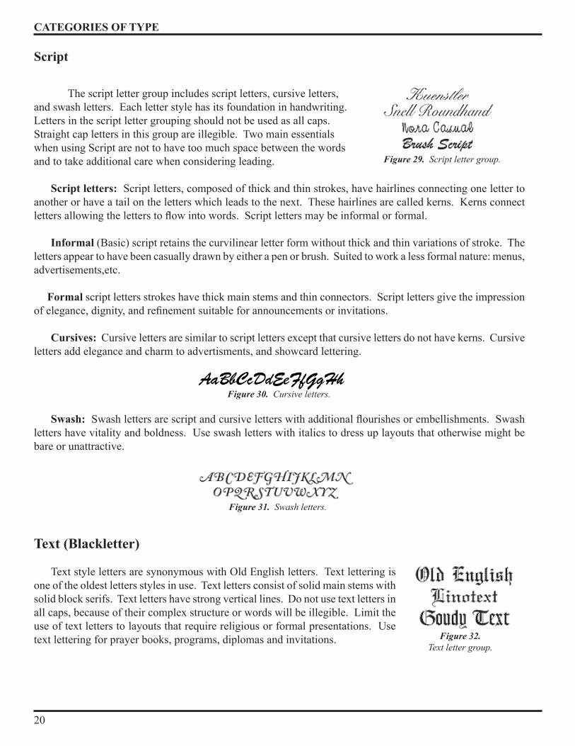
Script The script letter group includes script letters, cursive letters, and swash letters . Each letter style has its foundation in handwriting . Letters in the script letter grouping should not be used as all caps . Straight cap letters in this group are illegible . Two main essentials when using Script are not to have too much space between the words and to take additional care when considering leading .
Script letters: Script letters, composed of thick and thin strokes, have hairlines connecting one letter to another or have a tail on the letters which leads to the next . These hairlines are called kerns . Kerns connect letters allowing the letters to flow into words. Script letters may be informal or formal. Informal (Basic) script retains the curvilinear letter form without thick and thin variations of stroke . The letters appear to have been casually drawn by either a pen or brush. Suited to work a less formal nature: menus, advertisements,etc .
Formal script letters strokes have thick main stems and thin connectors . Script letters give the impression of elegance, dignity, and refinement suitable for announcements or invitations.
Cursives: Cursive letters are similar to script letters except that cursive letters do not have kerns . Cursive letters add elegance and charm to advertisments, and showcard lettering .
Swash: Swash letters are script and cursive letters with additional flourishes or embellishments. Swash letters have vitality and boldness . Use swash letters with italics to dress up layouts that otherwise might be bare or unattractive .
Text (Blackletter)
Text style letters are synonymous with Old English letters . Text lettering is one of the oldest letters styles in use . Text letters consist of solid main stems with solid block serifs . Text letters have strong vertical lines . Do not use text letters in all caps, because of their complex structure or words will be illegible . Limit the use of text letters to layouts that require religious or formal presentations . Use text lettering for prayer books, programs, diplomas and invitations .
Figure 29. Script letter group.
Figure 30. Cursive letters.
Figure 31. Swash letters.
Figure 32. Text letter group.
CATEGORIES OF TYPE
21
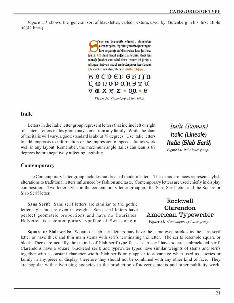
Figure 33 shows the general sort of blackletter, called Textura, used by Gutenberg in his first Bible of (�2 lines) .
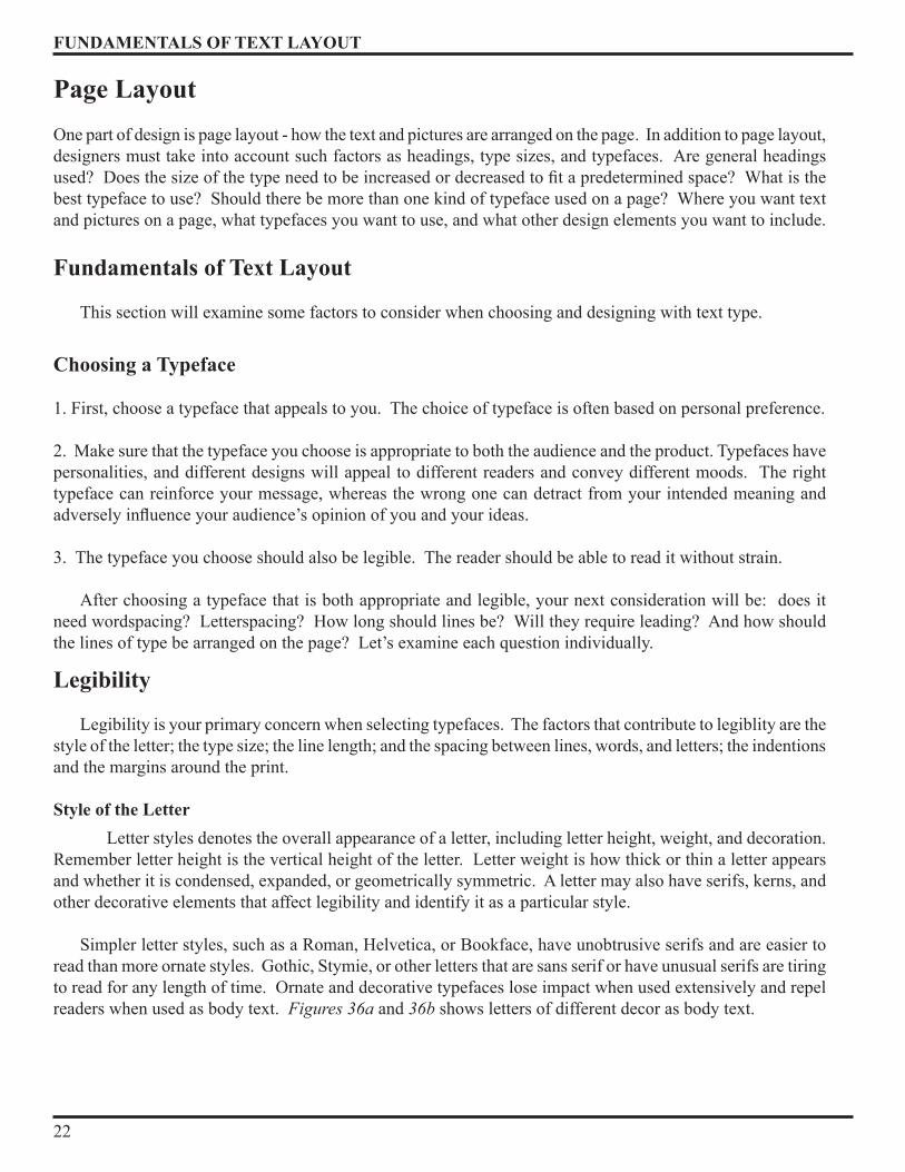
Italic
Letters in the Italic letter group represent letters that incline left or right of center . Letters in this group may come from any family . While the slant of the italic will vary, a good standard is about 78 degrees . Use italic letters to add emphasis to information or the impression of speed . Italics work well in any layout . Remember, the maximum angle italics can lean is 68 degrees before negatively affecting legibility .
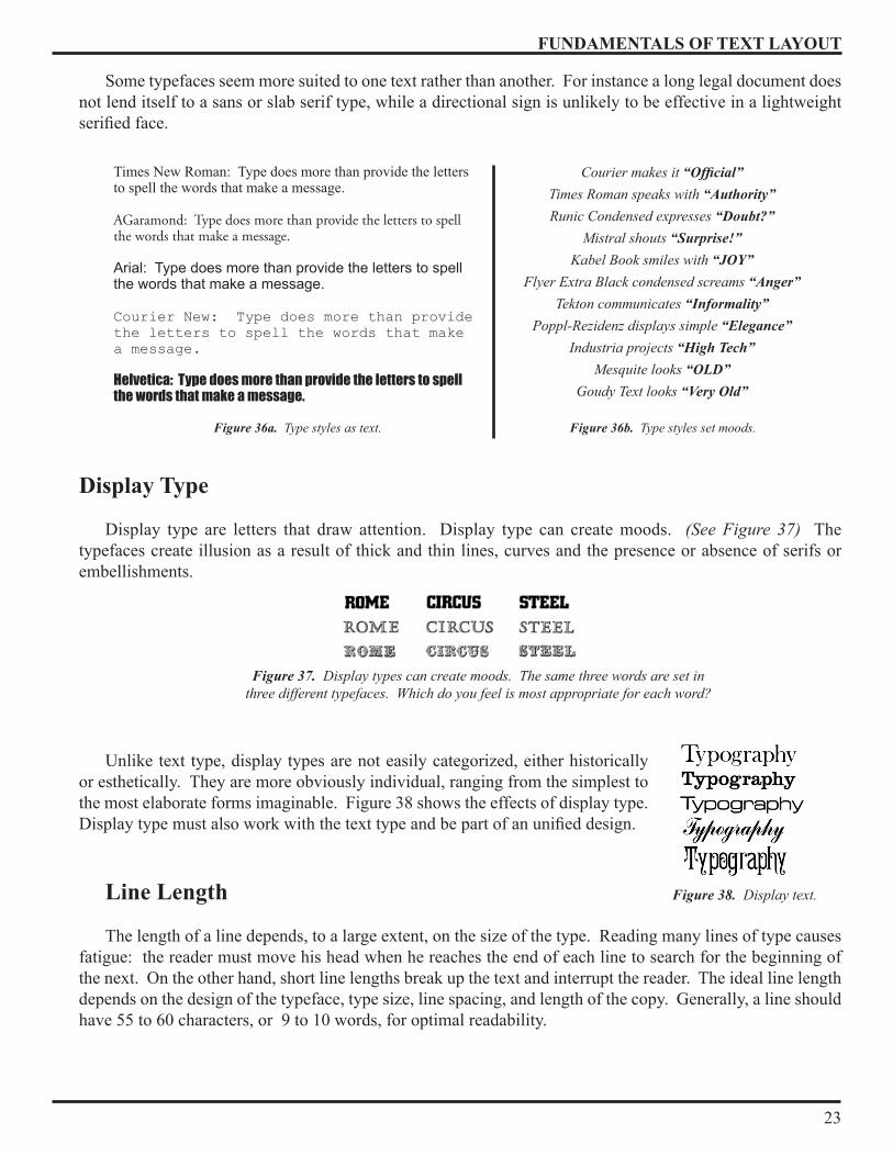
Contemporary
The Contemporary letter group includes hundreds of modern letters . These modern faces represent stylish alterations to traditional letters influenced by fashion and taste. Contemporary letters are used chiefly in display composition . Two letter styles in the contemporary letter group are the Sans Serif letter and the Square or Slab Serif letter .
Sans Serif: Sans serif letters are similiar to the gothic letter style but are even in weight . Sans serif letters have perfect geometric proportions and have no flourishes . Helvetica is a contemporary typeface of Swiss origin . Square or Slab serifs: Square or slab serif letters may have the same even strokes as the sans serif letter or have thick and thin main stems with serifs terminating the letter . The serifs resemble square or block. There are actually three kinds of Slab serif type faces: slab serif have square, unbracketed serif; Clarendons have a square, bracketed serif; and typewriter types have similar weights of stems and serifs together with a constant character width . Slab serifs only appear to advantage when used as a series or family in any piece of display, therefore they should not be combined with any other kind of face . They are popular with advertising agencies in the production of advertisements and other publicity work .
Figure 34. Italic letter group.
Figure 35. Contemporary letter group.
Figure 33. Gutenberg 42 line bible.
FUNDAMENTALS OF TEXT LAYOUT
22
Page Layout
One part of design is page layout - how the text and pictures are arranged on the page . In addition to page layout, designers must take into account such factors as headings, type sizes, and typefaces . Are general headings used? Does the size of the type need to be increased or decreased to fit a predetermined space? What is the best typeface to use? Should there be more than one kind of typeface used on a page? Where you want text and pictures on a page, what typefaces you want to use, and what other design elements you want to include .
Fundamentals of Text Layout
This section will examine some factors to consider when choosing and designing with text type .
Choosing a Typeface
1 . First, choose a typeface that appeals to you . The choice of typeface is often based on personal preference .
2 . Make sure that the typeface you choose is appropriate to both the audience and the product . Typefaces have personalities, and different designs will appeal to different readers and convey different moods . The right typeface can reinforce your message, whereas the wrong one can detract from your intended meaning and adversely influence your audience’s opinion of you and your ideas.
3 . The typeface you choose should also be legible . The reader should be able to read it without strain .
After choosing a typeface that is both appropriate and legible, your next consideration will be: does it need wordspacing? Letterspacing? How long should lines be? Will they require leading? And how should the lines of type be arranged on the page? Let’s examine each question individually .
Legibility
Legibility is your primary concern when selecting typefaces . The factors that contribute to legiblity are the style of the letter; the type size; the line length; and the spacing between lines, words, and letters; the indentions and the margins around the print . Style of the Letter Letter styles denotes the overall appearance of a letter, including letter height, weight, and decoration . Remember letter height is the vertical height of the letter . Letter weight is how thick or thin a letter appears and whether it is condensed, expanded, or geometrically symmetric . A letter may also have serifs, kerns, and other decorative elements that affect legibility and identify it as a particular style .
Simpler letter styles, such as a Roman, Helvetica, or Bookface, have unobtrusive serifs and are easier to read than more ornate styles. Gothic, Stymie, or other letters that are sans serif or have unusual serifs are tiring to read for any length of time . Ornate and decorative typefaces lose impact when used extensively and repel readers when used as body text . Figures 36a and 36b shows letters of different decor as body text .
FUNDAMENTALS OF TEXT LAYOUT
23
Some typefaces seem more suited to one text rather than another . For instance a long legal document does not lend itself to a sans or slab serif type, while a directional sign is unlikely to be effective in a lightweight serified face.
Display Type
Display type are letters that draw attention . Display type can create moods . (See Figure 37) The typefaces create illusion as a result of thick and thin lines, curves and the presence or absence of serifs or embellishments .
Unlike text type, display types are not easily categorized, either historically or esthetically . They are more obviously individual, ranging from the simplest to the most elaborate forms imaginable . Figure 38 shows the effects of display type . Display type must also work with the text type and be part of an unified design.
Line Length
The length of a line depends, to a large extent, on the size of the type . Reading many lines of type causes fatigue: the reader must move his head when he reaches the end of each line to search for the beginning of the next . On the other hand, short line lengths break up the text and interrupt the reader . The ideal line length depends on the design of the typeface, type size, line spacing, and length of the copy. Generally, a line should have 55 to 60 characters, or 9 to 10 words, for optimal readability .
Figure 38. Display text.
Figure 37. Display types can create moods. The same three words are set in three different typefaces. Which do you feel is most appropriate for each word?
Figure 36a. Type styles as text.
Times New Roman: Type does more than provide the letters to spell the words that make a message .
AGaramond: Type does more than provide the letters to spell the words that make a message.
Arial: Type does more than provide the letters to spell the words that make a message.
Courier New: Type does more than provide the letters to spell the words that make a message.
Helvetica: Type does more than provide the letters to spell the words that make a message.
Courier makes it “Official”Times Roman speaks with “Authority”Runic Condensed expresses “Doubt?”
Mistral shouts “Surprise!”Kabel Book smiles with “JOY”
Flyer Extra Black condensed screams “Anger”Tekton communicates “Informality”
Poppl-Rezidenz displays simple “Elegance”Industria projects “High Tech”
Mesquite looks “OLD”Goudy Text looks “Very Old”
Figure 36b. Type styles set moods.
FUNDAMENTALS OF TEXT LAYOUT
2�
Spacing Spacing between letters, words and lines affect legibility .
Letterspacing is the placement of extra space between the letters of words to improve or balance the type . Divide the spacing evenly between letters and words to maintain visual balance .
Many letter combinations, particularly words in capitals, do not look right together unless they are kerned .
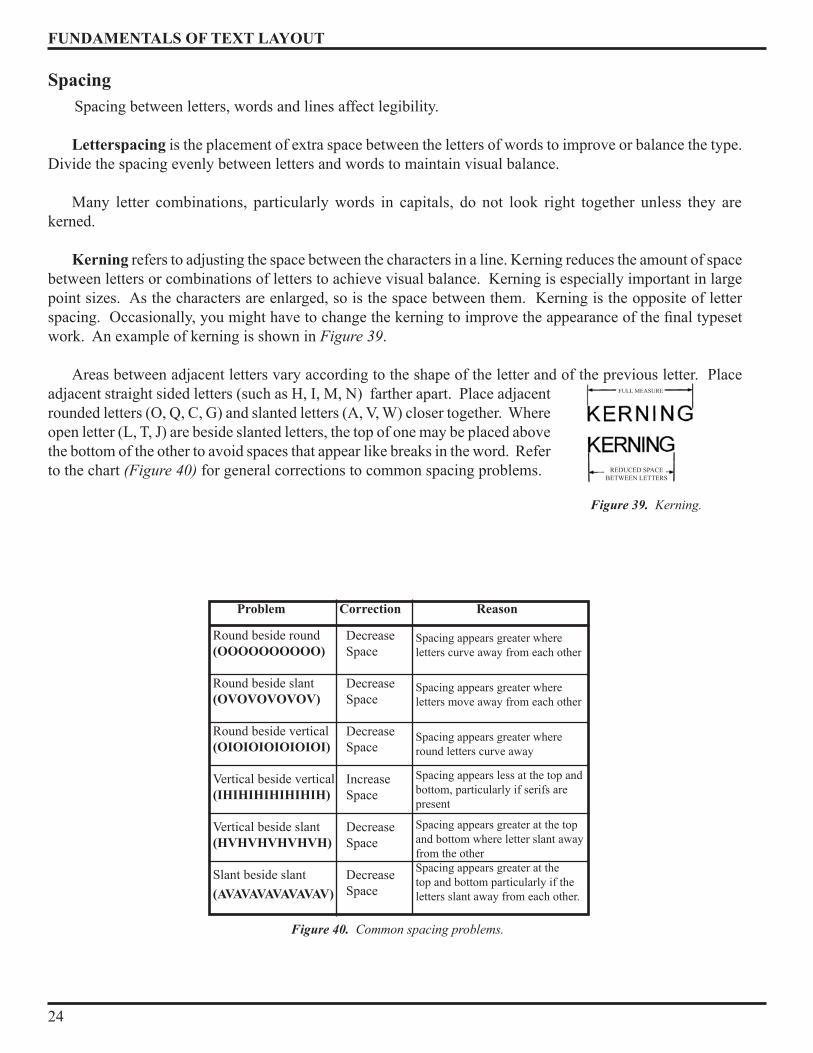
Kerning refers to adjusting the space between the characters in a line . Kerning reduces the amount of space between letters or combinations of letters to achieve visual balance . Kerning is especially important in large point sizes . As the characters are enlarged, so is the space between them . Kerning is the opposite of letter spacing. Occasionally, you might have to change the kerning to improve the appearance of the final typeset work . An example of kerning is shown in Figure 39 .
Areas between adjacent letters vary according to the shape of the letter and of the previous letter . Place adjacent straight sided letters (such as H, I, M, N) farther apart . Place adjacent rounded letters (O, Q, C, G) and slanted letters (A, V, W) closer together. Where open letter (L, T, J) are beside slanted letters, the top of one may be placed above the bottom of the other to avoid spaces that appear like breaks in the word . Refer to the chart (Figure 40) for general corrections to common spacing problems .
Round beside round(OOOOOOOOOO)
Round beside slant(OVOVOVOVOV)
Round beside vertical(OIOIOIOIOIOIOI)
Vertical beside vertical(IHIHIHIHIHIHIH)
Vertical beside slant(HVHVHVHVHVH)
Slant beside slant(AVAVAVAVAVAVAV)
Decrease Space
Decrease Space
Decrease Space
Increase Space
Decrease Space
Decrease Space
Spacing appears greater where letters curve away from each other
Spacing appears greater where letters move away from each other
Spacing appears greater where round letters curve away
Spacing appears less at the top and bottom, particularly if serifs are present
Spacing appears greater at the top and bottom where letter slant away from the otherSpacing appears greater at the top and bottom particularly if the letters slant away from each other .
Problem Correction Reason
Figure 40. Common spacing problems.
Figure 39. Kerning.
FULL MEASURE
REDUCED SPACEBETWEEN LETTERS
FUNDAMENTALS OF TEXT LAYOUT
25
Word spacing is the adjustment of spaces between words to shorten or extend a line of type . This is often used to justify text . It is important to keep word spacing as consistent as possible, often with the use of hyphenation to aid readability . Tight wordspacing lets you place more text on the page but can make it difficult to distinguish words from each other. Loose word spacing fills up a page with small amounts of text, but becomes harder to read as words begin to look disconnected .
- Justification is the alignment of both the right and left margins to a predetermined length. Each line starts and stops on the same margin line as every other line . Although symmetrical in appearance, overuse of this technique becomes monotonous .
- Lettering set flush left or right have a common beginning (flush left) or end (Flush right). Flush set lettering is very effective and offers an asymmetrical balance more typical of informal layouts .
- Mechanical word spacing uses an em space (discussed earlier) . Too much space in between words cause a disturbing visual break in composition by creating rivers of white space on the printed page .
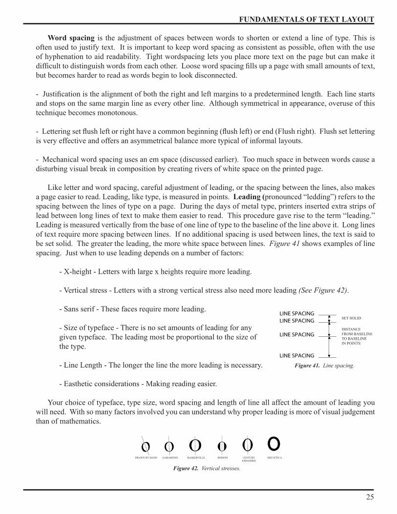
Like letter and word spacing, careful adjustment of leading, or the spacing between the lines, also makes a page easier to read . Leading, like type, is measured in points . Leading (pronounced “ledding”) refers to the spacing between the lines of type on a page . During the days of metal type, printers inserted extra strips of lead between long lines of text to make them easier to read . This procedure gave rise to the term “leading .” Leading is measured vertically from the base of one line of type to the baseline of the line above it . Long lines of text require more spacing between lines . If no additional spacing is used between lines, the text is said to be set solid . The greater the leading, the more white space between lines . Figure 41 shows examples of line spacing. Just when to use leading depends on a number of factors:
- X-height - Letters with large x heights require more leading.
- Vertical stress - Letters with a strong vertical stress also need more leading (See Figure 42) .
- Sans serif - These faces require more leading .
- Size of typeface - There is no set amounts of leading for any given typeface . The leading most be proportional to the size of the type .
- Line Length - The longer the line the more leading is necessary .
- Easthetic considerations - Making reading easier .
Your choice of typeface, type size, word spacing and length of line all affect the amount of leading you will need . With so many factors involved you can understand why proper leading is more of visual judgement than of mathematics .
Figure 41. Line spacing.
LINE SPACINGLINE SPACING
LINE SPACING
LINE SPACING
SET SOLID
DISTANCEFROM BASELINETO BASELINEIN POINTS
Figure 42. Vertical stresses.
DRAWN BY HAND BASKERVILLEGARAMOND HELVETICACENTURY EXPANDED
BODONI

FUNDAMENTALS OF TEXT LAYOUT
26
Layout is the process of arranging the text on the page . Text can be laid out in different ways . The arrangement, which makes the text readable and creates formal qualities, can be achieved by spacing, by emphasising certain groups of letters or words, or by suppressing the effect of others . Different options are available, and should be chosen according to the context and aesthetic requirements of the text, never because of formalistic considerations alone . With an understanding of word spacing, line length, and leading we can now consider ways of arranging lines of type on a page .
Justified
Justified is the most familiar method of type arrangement, especially for books, magazines, and newspapers.
The lines of type are kept all the same length so that the lines are flush left and right. In order to make the lines equal, the word spacing is adjusted so that each line fills the entire measure (See Figure 43).
Advantages - This arrangement is best suited for sustained reading comfort .
- The pages assume a quiet look and do not distract the reader .
- It allows the reader to concentrate on the content rather than the design .
Disadvantages - If the line measure is too narrow there could be a risk of poor word spacing .
- Words may be poorly hyphenated at the end of lines .
Range Left
This arrangement is the second most widely used method for composition; most poetry and typewritten copy appears this way . The type is set with even word spacing and each of the lines will vary in length . (See Figure 44)
Advantages -The even word spacing creates a uniform overall texture .
- It is ideal for setting type in narrow columns . - Hyphenation of words is at a minimum .
Figure 43. Justified setting.
The beauty of type is that it is ready made for you to select according to your requirements and it comes in all manner of visual styles enabling you to create
FUNDAMENTALS OF TEXT LAYOUT
27
- The risk of rivers of white flowing down the page is eliminated.
- Lines can run either long or short; hyphenated words are virtually unnecessary .
- The ragged edge of the right adds visual interest to the page .
Disadvantages - If lines are set the same approximate length it can be a disturbing factor in the design . - It is important that the ragged edge should create a pleasing silhouette, convex rather than concave .
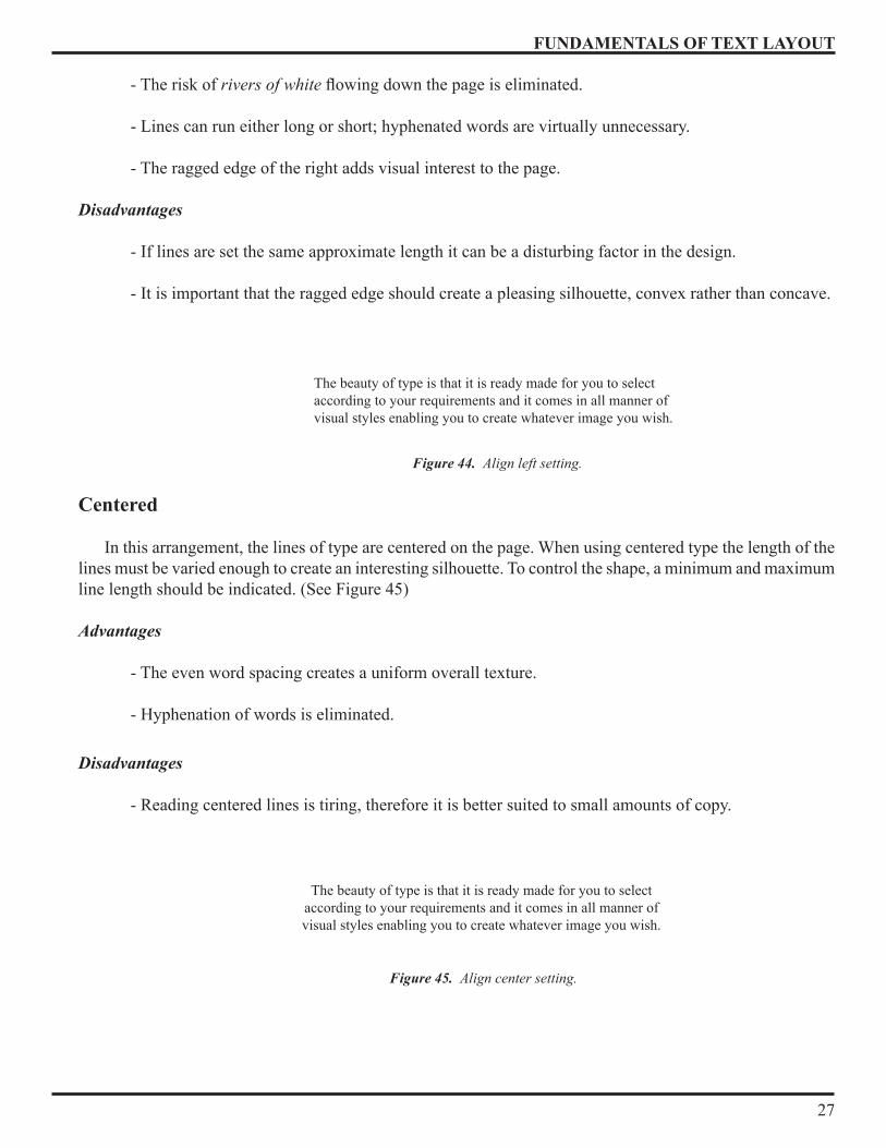
Centered
In this arrangement, the lines of type are centered on the page . When using centered type the length of the lines must be varied enough to create an interesting silhouette . To control the shape, a minimum and maximum line length should be indicated . (See Figure �5)
Advantages - The even word spacing creates a uniform overall texture .
- Hyphenation of words is eliminated .
Disadvantages
- Reading centered lines is tiring, therefore it is better suited to small amounts of copy .
Figure 44. Align left setting.
The beauty of type is that it is ready made for you to select according to your requirements and it comes in all manner of visual styles enabling you to create whatever image you wish .
Figure 45. Align center setting.
The beauty of type is that it is ready made for you to select according to your requirements and it comes in all manner of visual styles enabling you to create whatever image you wish .
FUNDAMENTALS OF TEXT LAYOUT
28
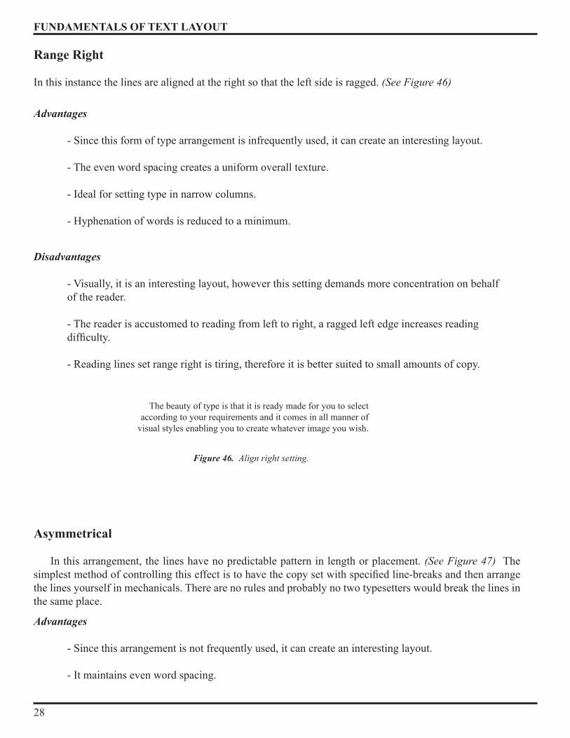
Range Right In this instance the lines are aligned at the right so that the left side is ragged . (See Figure 46)
Advantages
- Since this form of type arrangement is infrequently used, it can create an interesting layout .
- The even word spacing creates a uniform overall texture .
- Ideal for setting type in narrow columns .
- Hyphenation of words is reduced to a minimum .
Disadvantages - Visually, it is an interesting layout, however this setting demands more concentration on behalf of the reader .
- The reader is accustomed to reading from left to right, a ragged left edge increases reading difficulty.
- Reading lines set range right is tiring, therefore it is better suited to small amounts of copy .
Asymmetrical
In this arrangement, the lines have no predictable pattern in length or placement . (See Figure 47) The simplest method of controlling this effect is to have the copy set with specified line-breaks and then arrange the lines yourself in mechanicals . There are no rules and probably no two typesetters would break the lines in the same place .
Advantages - Since this arrangement is not frequently used, it can create an interesting layout .
- It maintains even word spacing .
Figure 46. Align right setting.
The beauty of type is that it is ready made for you to select according to your requirements and it comes in all manner of
visual styles enabling you to create whatever image you wish .
FUNDAMENTALS OF TEXT LAYOUT
29
Disadvantages - Visually it is an interesting layout, however this arrangement demands more concentration on behalf of the reader .
- Reading lines set asymmetrically is tiring, therefore it is better suited to small amounts of copy .
Setting the type
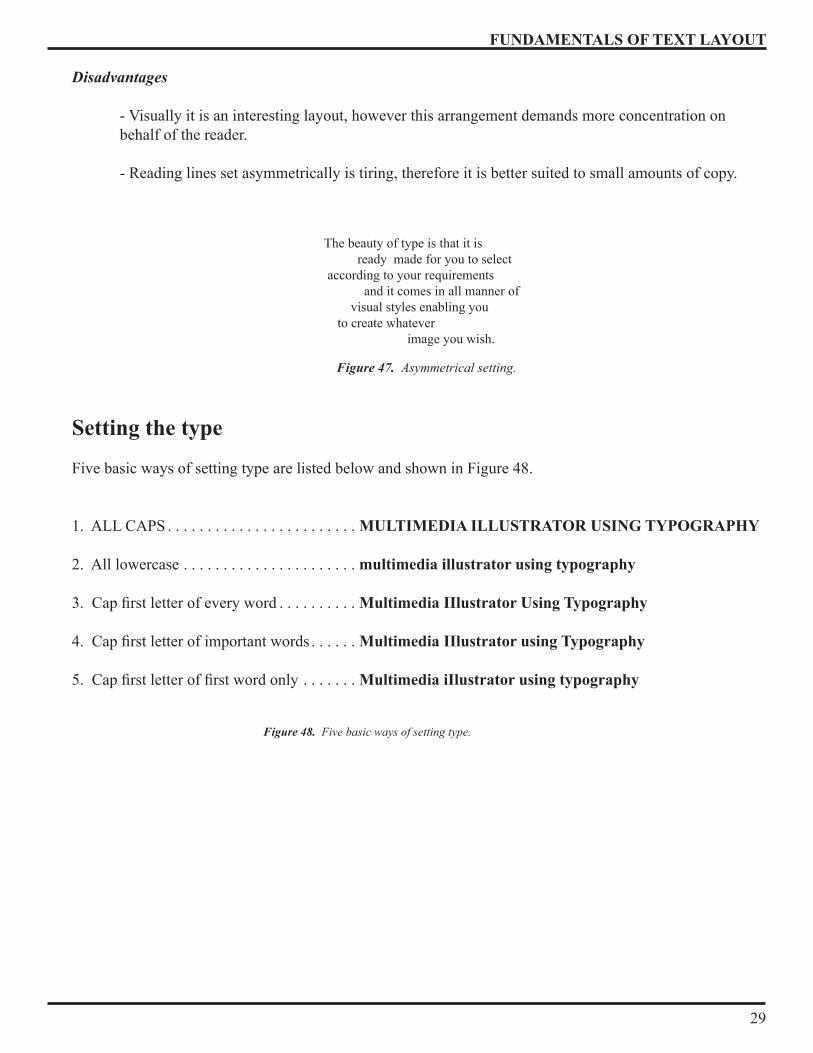
Five basic ways of setting type are listed below and shown in Figure �8 .
1 . ALL CAPS . . . . . . . . . . . . . . . . . . . . . . . . MULTIMEDIA ILLUSTRATOR USING TYPOGRAPHY
2 . All lowercase . . . . . . . . . . . . . . . . . . . . . . multimedia illustrator using typography
3. Cap first letter of every word . . . . . . . . . . Multimedia IIlustrator Using Typography
4. Cap first letter of important words . . . . . . Multimedia IIlustrator using Typography
5. Cap first letter of first word only . . . . . . . Multimedia iIlustrator using typography
Figure 47. Asymmetrical setting.
The beauty of type is that it is ready made for you to select according to your requirements and it comes in all manner of visual styles enabling you to create whatever image you wish .
Figure 48. Five basic ways of setting type.
FUNDAMENTALS OF TEXT LAYOUT
30
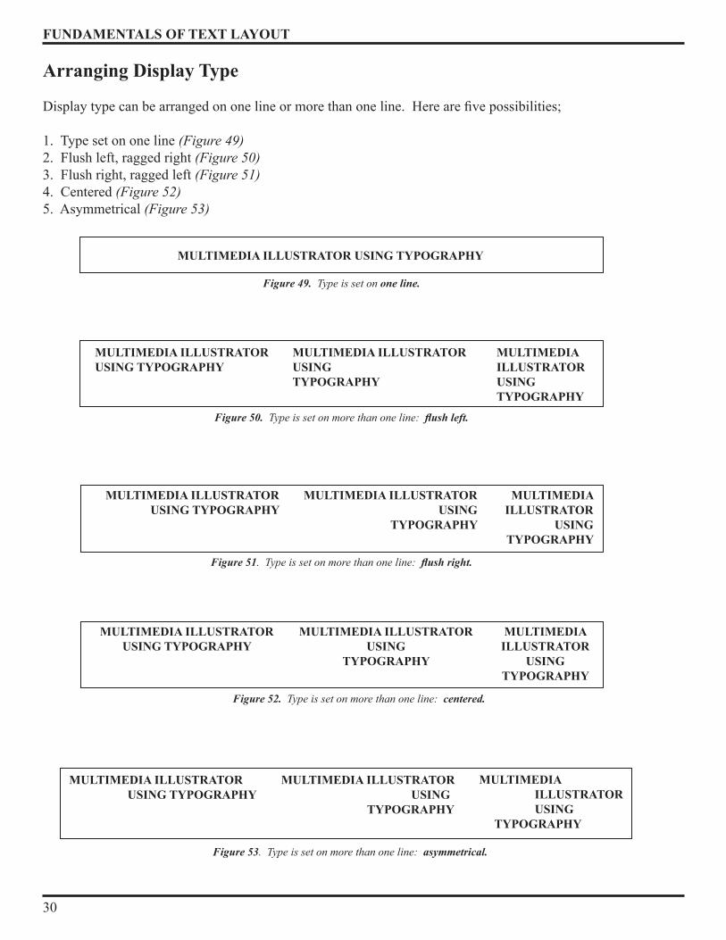
Arranging Display Type
Display type can be arranged on one line or more than one line. Here are five possibilities;
1 . Type set on one line (Figure 49)2 . Flush left, ragged right (Figure 50)3 . Flush right, ragged left (Figure 51)� . Centered (Figure 52)5 . Asymmetrical (Figure 53)
MULTIMEDIA ILLUSTRATOR USING TYPOGRAPHY
Figure 49. Type is set on one line.
MULTIMEDIA ILLUSTRATOR USING TYPOGRAPHY
MULTIMEDIA ILLUSTRATOR USINGTYPOGRAPHY
MULTIMEDIA ILLUSTRATOR USINGTYPOGRAPHY
Figure 50. Type is set on more than one line: flush left.
MULTIMEDIA ILLUSTRATOR USING TYPOGRAPHY
MULTIMEDIA ILLUSTRATOR USING
TYPOGRAPHY
MULTIMEDIA ILLUSTRATOR
USINGTYPOGRAPHY
Figure 51. Type is set on more than one line: flush right.
MULTIMEDIA ILLUSTRATORUSING TYPOGRAPHY
MULTIMEDIA ILLUSTRATORUSING
TYPOGRAPHY
MULTIMEDIAILLUSTRATOR
USINGTYPOGRAPHY
Figure 52. Type is set on more than one line: centered.
MULTIMEDIA ILLUSTRATOR USING TYPOGRAPHY
MULTIMEDIA ILLUSTRATOR USING TYPOGRAPHY
MULTIMEDIA ILLUSTRATOR USING TYPOGRAPHY
Figure 53. Type is set on more than one line: asymmetrical.

FUNDAMENTALS OF TEXT LAYOUT
31
Text Type on a Page
Figure 54 illustrates some basic ways of placing text type on a page .
Display Type on a Page
Figure 55 illustrates some of the possible ways of arranging display type on a page
Text Type and Display Type on a Page
Figure 56 illustrates some of the possiblilities of small block of text type and two lines of display type .So you see that within a single line of type, using the same typeface in the same size you have five alternative for setting and five more for arranging.
Figure 54. Eight possible ways of placing text on a page.
Figure 55. Eight possible ways of placing display type on a page.
Figure 56. Eight possible ways of placing text and display type on a page.
FUNDAMENTALS OF TEXT LAYOUT
32
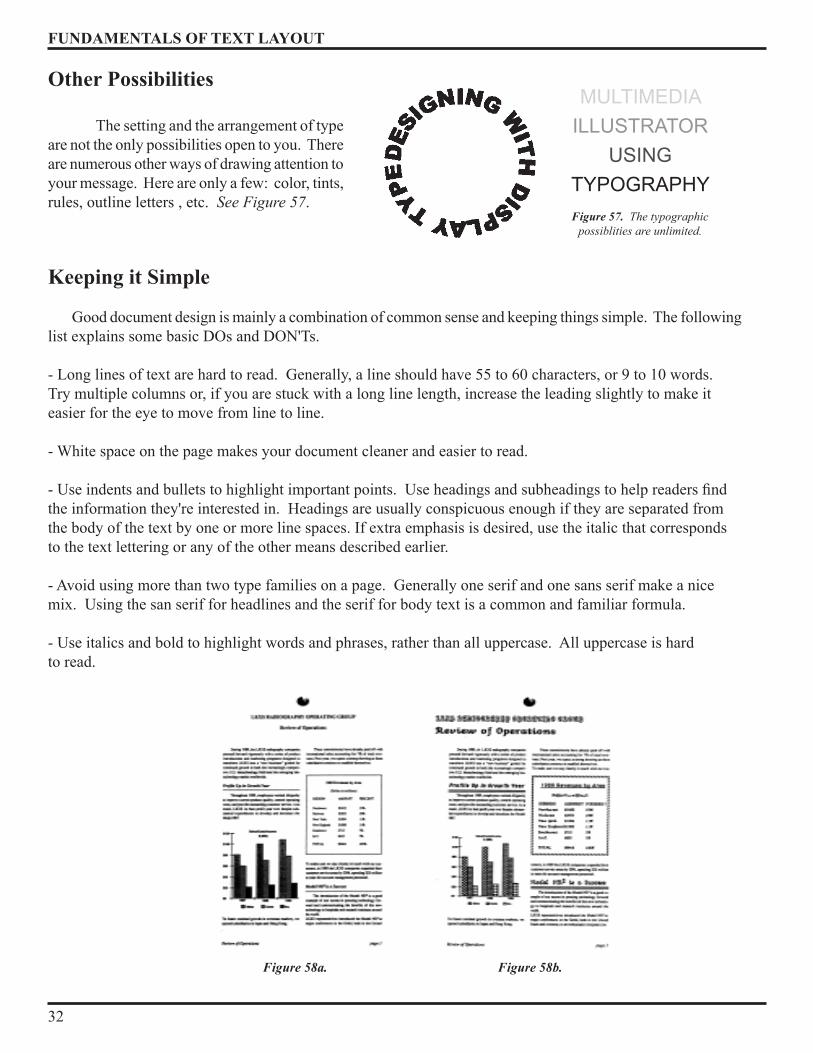
Other Possibilities
The setting and the arrangement of type are not the only possibilities open to you . There are numerous other ways of drawing attention to your message. Here are only a few: color, tints, rules, outline letters , etc . See Figure 57 .
Keeping it Simple
Good document design is mainly a combination of common sense and keeping things simple. The following list explains some basic DOs and DON'Ts .
- Long lines of text are hard to read. Generally, a line should have 55 to 60 characters, or 9 to 10 words. Try multiple columns or, if you are stuck with a long line length, increase the leading slightly to make it easier for the eye to move from line to line .
- White space on the page makes your document cleaner and easier to read .
- Use indents and bullets to highlight important points. Use headings and subheadings to help readers find the information they're interested in . Headings are usually conspicuous enough if they are separated from the body of the text by one or more line spaces . If extra emphasis is desired, use the italic that corresponds to the text lettering or any of the other means described earlier .
- Avoid using more than two type families on a page. Generally one serif and one sans serif make a nice mix . Using the san serif for headlines and the serif for body text is a common and familiar formula .
- Use italics and bold to highlight words and phrases, rather than all uppercase . All uppercase is hard to read .
Figure 58a. Figure 58b.
Figure 57. The typographic possiblities are unlimited.
MULTIMEDIAILLUSTRATOR
USING TYPOGRAPHY
FUNDAMENTALS OF TEXT LAYOUT
33
- Left justification can be easier to read and looks less formal than full justification. Pick the one matching the tone of your document. Graphs, pictures, and charts add interest to documents and clarify the text. Horizontal and vertical lines can be used sparingly to break up blocks of text .
- To create emphasis use letters of different sizes or weights . Single lines can be executed in full-size capitals or in small capitals . In longer texts it is better to emphasize sections by using italic .
- Lowercase letters should not be spaced extra-wide under most circumstances . As shown in Figure 58a,varying the size and style of the type can improve the appearance of a page and draw attention to the most important sections . However using too many different fonts or using clashing fonts can create a page that is unattractive and hard to read (Figure 58b) . When preparing a layout using words, you need to be familiar with the available typefaces . There is an enormous range of typeface styles available to you, giving you tremendous creative freedom to express your ideas . The beauty of type is that it is ready-made to select according to your requirements, and it comes in all manner of visual styles, enabling you to create whatever image you wish .
INSTRUCTIONAL REFERENCES
3�
- Student Study Guide, Extension Course Institute Air University CDC 3V051 – U.S. Air Force
- Soldier’s Manual and Trainer’s Guide MOS 25M STP 11-25M13-SM-7G, Multimedia Illustrator – U .S . Army
- Illustrator Draftsman (DM) Training Manual (TRAMAN), NAVEDTRA 12722 – U.S. Navy
- Working with Style, West
- Using Type Right, Brady
- Designing with Type: A Basic Course in Typography, Craig
- Typefaces for Desktop Publishing: a User Guide, Black .
- Using Type Right: 121 Basic No-Nonsense Rules for Working with Type, Brady .
- The Elements of Typographic Style, Bringhurst .
- In Print: Text and Type in the Age of Desktop Publishing, Brown .
- The Origin of the Serif: Brush Writing & Lamp; Roman Letters (second edition), Catich .
- Collier’s Rules for Desktop Design and Typography, Collier
- Letters, Hutchinson
- Writing: The Story of Alphabets and Scripts, Jean
- The Thames and Hudson Manual of Typography, McLean
- Design for Desktop Publishing, a Guide to Layout and Typography on the Personal Computer, Miles
- Looking Good in Print: a Guide to Basic Design for Desktop Publishing, Parker
- Find Out How Type Works, Spiekermann
- Graphic Design for the Electronic Age, White


http://www.dinfos.osd.mil/dinfosweb/