Embed Size (px)
Citation preview
Developing Mobile Applications withADOBE® FLEX® 4.6 andADOBE® FLASH® BUILDER TM 4.6

Last updated 11/21/2011
Legal notices
Legal noticesFor legal notices, see http://help.adobe.com/en_US/legalnotices/index.html.
iii
Last updated 11/21/2011
Contents
Chapter 1: Getting started
Getting started with mobile applications . . . . . . . . . . . . . . . . . . . . . . . . . . . . . . . . . . . . . . . . . . . . . . . . . . . . . . . . . . . . . . . . . . . . . . . . . . . . . . . 1
Differences in mobile, desktop, and browser application development . . . . . . . . . . . . . . . . . . . . . . . . . . . . . . . . . . . . . . . . . . . . . . . . . . 4
Chapter 2: Development environment
Create an Android application in Flash Builder . . . . . . . . . . . . . . . . . . . . . . . . . . . . . . . . . . . . . . . . . . . . . . . . . . . . . . . . . . . . . . . . . . . . . . . . . 8
Create an iOS application in Flash Builder . . . . . . . . . . . . . . . . . . . . . . . . . . . . . . . . . . . . . . . . . . . . . . . . . . . . . . . . . . . . . . . . . . . . . . . . . . . . . 10
Create a BlackBerry Tablet OS application in Flash Builder . . . . . . . . . . . . . . . . . . . . . . . . . . . . . . . . . . . . . . . . . . . . . . . . . . . . . . . . . . . . . . 10
Create an ActionScript mobile project . . . . . . . . . . . . . . . . . . . . . . . . . . . . . . . . . . . . . . . . . . . . . . . . . . . . . . . . . . . . . . . . . . . . . . . . . . . . . . . . 11
Use native extensions . . . . . . . . . . . . . . . . . . . . . . . . . . . . . . . . . . . . . . . . . . . . . . . . . . . . . . . . . . . . . . . . . . . . . . . . . . . . . . . . . . . . . . . . . . . . . . . . 11
Set mobile project preferences . . . . . . . . . . . . . . . . . . . . . . . . . . . . . . . . . . . . . . . . . . . . . . . . . . . . . . . . . . . . . . . . . . . . . . . . . . . . . . . . . . . . . . . 13
Connect Google Android devices . . . . . . . . . . . . . . . . . . . . . . . . . . . . . . . . . . . . . . . . . . . . . . . . . . . . . . . . . . . . . . . . . . . . . . . . . . . . . . . . . . . . . 16
Apple iOS development process using Flash Builder . . . . . . . . . . . . . . . . . . . . . . . . . . . . . . . . . . . . . . . . . . . . . . . . . . . . . . . . . . . . . . . . . . . 18
Chapter 3: User interface and layout
Lay out a mobile application . . . . . . . . . . . . . . . . . . . . . . . . . . . . . . . . . . . . . . . . . . . . . . . . . . . . . . . . . . . . . . . . . . . . . . . . . . . . . . . . . . . . . . . . . . 23
Handle user input in a mobile application . . . . . . . . . . . . . . . . . . . . . . . . . . . . . . . . . . . . . . . . . . . . . . . . . . . . . . . . . . . . . . . . . . . . . . . . . . . . . 29
Define a mobile application and a splash screen . . . . . . . . . . . . . . . . . . . . . . . . . . . . . . . . . . . . . . . . . . . . . . . . . . . . . . . . . . . . . . . . . . . . . . . 31
Define views in a mobile application . . . . . . . . . . . . . . . . . . . . . . . . . . . . . . . . . . . . . . . . . . . . . . . . . . . . . . . . . . . . . . . . . . . . . . . . . . . . . . . . . . 36
Define tabs in a mobile application . . . . . . . . . . . . . . . . . . . . . . . . . . . . . . . . . . . . . . . . . . . . . . . . . . . . . . . . . . . . . . . . . . . . . . . . . . . . . . . . . . . 45
Create multiple panes in a mobile application . . . . . . . . . . . . . . . . . . . . . . . . . . . . . . . . . . . . . . . . . . . . . . . . . . . . . . . . . . . . . . . . . . . . . . . . . 47
Define navigation, title, and action controls in a mobile application . . . . . . . . . . . . . . . . . . . . . . . . . . . . . . . . . . . . . . . . . . . . . . . . . . . . 56
Use scroll bars in a mobile application . . . . . . . . . . . . . . . . . . . . . . . . . . . . . . . . . . . . . . . . . . . . . . . . . . . . . . . . . . . . . . . . . . . . . . . . . . . . . . . . . 61
Define menus in a mobile application . . . . . . . . . . . . . . . . . . . . . . . . . . . . . . . . . . . . . . . . . . . . . . . . . . . . . . . . . . . . . . . . . . . . . . . . . . . . . . . . . 67
Display the busy indicator for long-running activity in a mobile application . . . . . . . . . . . . . . . . . . . . . . . . . . . . . . . . . . . . . . . . . . . . 71
Add a toggle switch to a mobile application . . . . . . . . . . . . . . . . . . . . . . . . . . . . . . . . . . . . . . . . . . . . . . . . . . . . . . . . . . . . . . . . . . . . . . . . . . . 73
Add a callout container to a mobile application . . . . . . . . . . . . . . . . . . . . . . . . . . . . . . . . . . . . . . . . . . . . . . . . . . . . . . . . . . . . . . . . . . . . . . . 75
Define transitions in a mobile application . . . . . . . . . . . . . . . . . . . . . . . . . . . . . . . . . . . . . . . . . . . . . . . . . . . . . . . . . . . . . . . . . . . . . . . . . . . . . 88
Select dates and times in a mobile application . . . . . . . . . . . . . . . . . . . . . . . . . . . . . . . . . . . . . . . . . . . . . . . . . . . . . . . . . . . . . . . . . . . . . . . . 93
Use a spinner list in a mobile application . . . . . . . . . . . . . . . . . . . . . . . . . . . . . . . . . . . . . . . . . . . . . . . . . . . . . . . . . . . . . . . . . . . . . . . . . . . . . 104
Chapter 4: Application design and workflow
Enable persistence in a mobile application . . . . . . . . . . . . . . . . . . . . . . . . . . . . . . . . . . . . . . . . . . . . . . . . . . . . . . . . . . . . . . . . . . . . . . . . . . . 118
Support multiple screen sizes and DPI values in a mobile application . . . . . . . . . . . . . . . . . . . . . . . . . . . . . . . . . . . . . . . . . . . . . . . . . . 122
Chapter 5: Text
Use text in a mobile application . . . . . . . . . . . . . . . . . . . . . . . . . . . . . . . . . . . . . . . . . . . . . . . . . . . . . . . . . . . . . . . . . . . . . . . . . . . . . . . . . . . . . . 136
User interactions with text in a mobile application . . . . . . . . . . . . . . . . . . . . . . . . . . . . . . . . . . . . . . . . . . . . . . . . . . . . . . . . . . . . . . . . . . . . 145
Use the soft keyboard in a mobile application . . . . . . . . . . . . . . . . . . . . . . . . . . . . . . . . . . . . . . . . . . . . . . . . . . . . . . . . . . . . . . . . . . . . . . . . 146
Embed fonts in a mobile application . . . . . . . . . . . . . . . . . . . . . . . . . . . . . . . . . . . . . . . . . . . . . . . . . . . . . . . . . . . . . . . . . . . . . . . . . . . . . . . . . 158
ivDEVELOPING MOBILE APPLICATIONS WITH FLEX AND FLASH BUILDER 4.6
Contents
Last updated 11/21/2011
Chapter 6: Skinning
Basics of mobile skinning . . . . . . . . . . . . . . . . . . . . . . . . . . . . . . . . . . . . . . . . . . . . . . . . . . . . . . . . . . . . . . . . . . . . . . . . . . . . . . . . . . . . . . . . . . . . 160
Create skins for a mobile application . . . . . . . . . . . . . . . . . . . . . . . . . . . . . . . . . . . . . . . . . . . . . . . . . . . . . . . . . . . . . . . . . . . . . . . . . . . . . . . . . 164
Apply a custom mobile skin . . . . . . . . . . . . . . . . . . . . . . . . . . . . . . . . . . . . . . . . . . . . . . . . . . . . . . . . . . . . . . . . . . . . . . . . . . . . . . . . . . . . . . . . . . 172
Chapter 7: Test and debug
Manage launch configurations . . . . . . . . . . . . . . . . . . . . . . . . . . . . . . . . . . . . . . . . . . . . . . . . . . . . . . . . . . . . . . . . . . . . . . . . . . . . . . . . . . . . . . . 174
Test and debug a mobile application on the desktop . . . . . . . . . . . . . . . . . . . . . . . . . . . . . . . . . . . . . . . . . . . . . . . . . . . . . . . . . . . . . . . . . 174
Test and debug a mobile application on a device . . . . . . . . . . . . . . . . . . . . . . . . . . . . . . . . . . . . . . . . . . . . . . . . . . . . . . . . . . . . . . . . . . . . . 175
Chapter 8: Install on devices
Install an application on a Google Android device . . . . . . . . . . . . . . . . . . . . . . . . . . . . . . . . . . . . . . . . . . . . . . . . . . . . . . . . . . . . . . . . . . . . 179
Install an application on an Apple iOS device . . . . . . . . . . . . . . . . . . . . . . . . . . . . . . . . . . . . . . . . . . . . . . . . . . . . . . . . . . . . . . . . . . . . . . . . . 179
Chapter 9: Package and export
Package and export a mobile application to an online store . . . . . . . . . . . . . . . . . . . . . . . . . . . . . . . . . . . . . . . . . . . . . . . . . . . . . . . . . . . 181
Export Android APK packages for release . . . . . . . . . . . . . . . . . . . . . . . . . . . . . . . . . . . . . . . . . . . . . . . . . . . . . . . . . . . . . . . . . . . . . . . . . . . . . 181
Export Apple iOS packages for release . . . . . . . . . . . . . . . . . . . . . . . . . . . . . . . . . . . . . . . . . . . . . . . . . . . . . . . . . . . . . . . . . . . . . . . . . . . . . . . 182
Create, test, and deploy using the command line . . . . . . . . . . . . . . . . . . . . . . . . . . . . . . . . . . . . . . . . . . . . . . . . . . . . . . . . . . . . . . . . . . . . . 183
1
Last updated 11/21/2011
Chapter 1: Getting started
Getting started with mobile applications
Adobe Flex brings Flex and Adobe Flash Builder to smartphones and tablets. Leveraging Adobe AIR, you can now
develop mobile applications in Flex with the same ease and quality as on desktop platforms.
Many existing Flex components have been extended to work on mobile devices, including the addition of support for
touch-based scrolling. Flex also contains a set of new components designed to make it easy to build applications that
follow standard design patterns for phones and tablets.
Flash Builder has also been updated to add new features to support application development for mobile devices. With
Flash Builder, you can develop, test, and debug applications on the desktop, or directly on your mobile device.
Adobe Evangelist Mark Doherty posted a video about building applications for the desktop, mobile phones, and
tablets.
Adobe Evangelist James Ward posted a video about Building Mobile Apps with Flex.
Adobe Community Professional Joseph Labrecque blogged about a Mobile Flex Demonstration.
Flash developer Fabio Biondi created an AIR-based YouTube Player for Android devices using Flash Builder.
Design a mobile application
Because of the smaller screen sizes available on mobile devices, mobile applications typically follow different design
patterns from browser-based applications. When developing for mobile applications, you typically divide the content
into a series of views for display on a mobile device.
Each view contains components that are focused on a single task or that contain a single set of information. The user
typically “drills down”, or changes, from one view to another by tapping components in the view. The user can then
use the device’s back button to return to a previous view, or build navigation into the application.
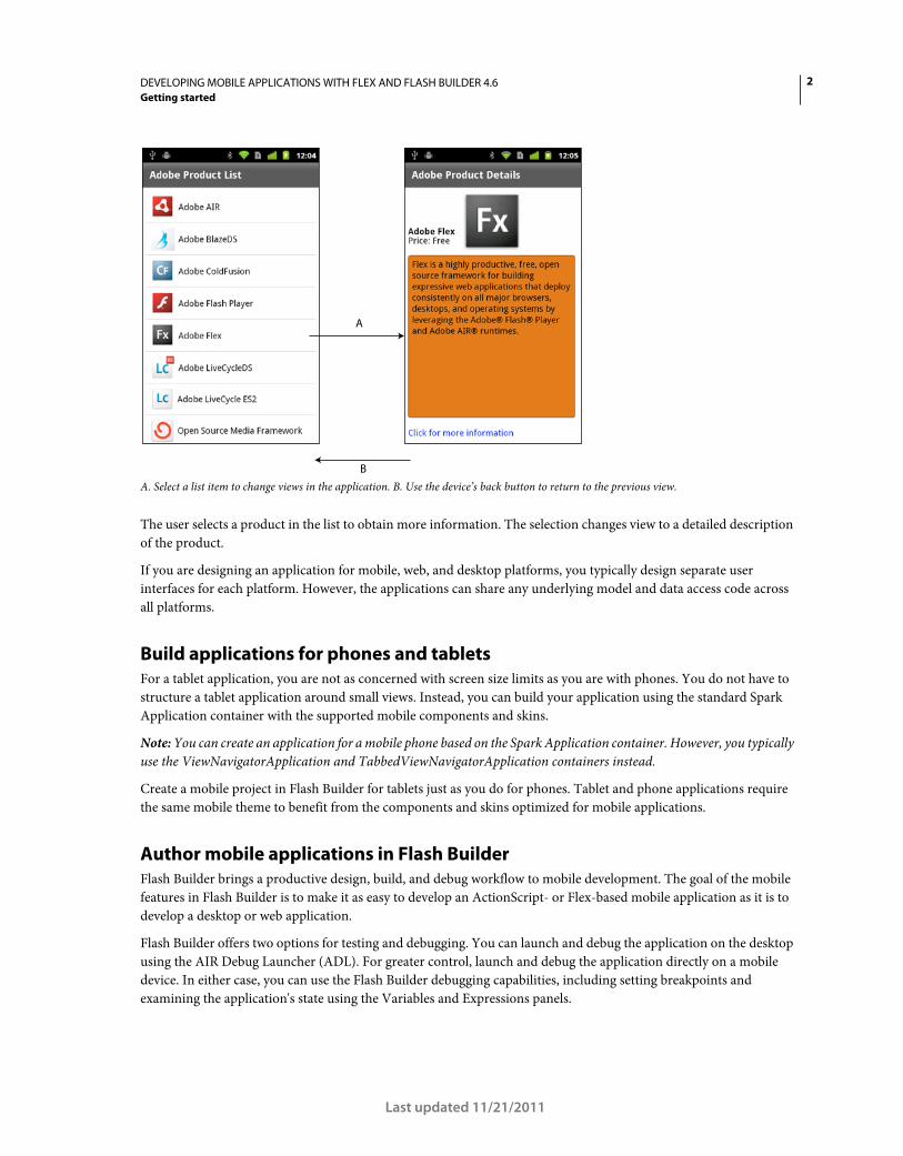
In the following example, the initial view of the application shows a list of products:
2DEVELOPING MOBILE APPLICATIONS WITH FLEX AND FLASH BUILDER 4.6
Getting started
Last updated 11/21/2011
A. Select a list item to change views in the application. B. Use the device’s back button to return to the previous view.
The user selects a product in the list to obtain more information. The selection changes view to a detailed description
of the product.
If you are designing an application for mobile, web, and desktop platforms, you typically design separate user
interfaces for each platform. However, the applications can share any underlying model and data access code across
all platforms.
Build applications for phones and tablets
For a tablet application, you are not as concerned with screen size limits as you are with phones. You do not have to
structure a tablet application around small views. Instead, you can build your application using the standard Spark
Application container with the supported mobile components and skins.
Note: You can create an application for a mobile phone based on the Spark Application container. However, you typically
use the ViewNavigatorApplication and TabbedViewNavigatorApplication containers instead.
Create a mobile project in Flash Builder for tablets just as you do for phones. Tablet and phone applications require
the same mobile theme to benefit from the components and skins optimized for mobile applications.
Author mobile applications in Flash Builder
Flash Builder brings a productive design, build, and debug workflow to mobile development. The goal of the mobile
features in Flash Builder is to make it as easy to develop an ActionScript- or Flex-based mobile application as it is to
develop a desktop or web application.
Flash Builder offers two options for testing and debugging. You can launch and debug the application on the desktop
using the AIR Debug Launcher (ADL). For greater control, launch and debug the application directly on a mobile
device. In either case, you can use the Flash Builder debugging capabilities, including setting breakpoints and
examining the application's state using the Variables and Expressions panels.
A
B
3DEVELOPING MOBILE APPLICATIONS WITH FLEX AND FLASH BUILDER 4.6
Getting started
Last updated 11/21/2011
When your application ready for deployment, use the Export Release Build process, just as you would to prepare
desktop and web applications. The main difference is that when you export a release build of a mobile project, Flash
Builder packages the build as a native installer, not as an .air file. For example, on Android, Flash Builder produces an
.apk file that looks the same as a native Android application package. The native installer enables AIR-based
applications to be distributed the same way as native applications on each platform.
Deploy mobile applications in AIR
Deploy mobile applications built in Flex using Adobe AIR for mobile devices. Any device on which you want to deploy
a mobile application must support AIR.
Your applications can take full advantage of the integration of AIR with the mobile platform. For example, a mobile
application can handle a hardware back and menu button, and access local storage. You can also take advantage of all
features that AIR offers for mobile devices. These features include geolocation, accelerometer, and camera integration.
On a mobile device, it is not necessary to install AIR before you run an application built in Flex. The first time a user
runs an application built in Flex, the user is prompted to download AIR.
To familiarize yourself with AIR, and for more information on the capabilities of AIR, see the following:
• About Adobe AIR
• AIR application invocation and termination
• Working with AIR runtime and operating system information
• Working with AIR native windows
• Working with local SQL databases in AIR
When developing mobile applications, you cannot use the following Flex components for AIR: WindowedApplication
and Window. Instead, use the ViewNavigatorApplication and TabbedViewNavigatorApplication containers. When
developing mobile applications for tablets, you can also use the Spark Application container.
For more information, see Using the Flex AIR components and “Define a mobile application and a splash screen” on
page 31.
Use the Mobile theme in your application
A theme defines the look and feel of an application’s visual components. A theme can define something as simple as
the color scheme or common font for an application, or it can define a complete reskinning of all the components used
by the application.
You can set CSS styles on Flex components only if the current theme includes those styles. To determine if the current
theme supports the CSS style, view the style’s entry in ActionScript 3.0 Reference for the Adobe Flash Platform.
Flex supports three primary themes: Mobile, Spark, and Halo. The Mobile theme defines the default appearance of Flex
components when you create a mobile application. To make some Flex components compatible with the Mobile
theme, Adobe created new skins for the components. Therefore, some components have skins specific to a theme.
Applications built with Flex can target different mobile devices, each with different screen sizes and resolutions. Flex
simplifies the process of producing resolution-independent applications by providing DPI-independent skins for
mobile components. For more information on mobile skins, see “Basics of mobile skinning” on page 160.
For more information about styles and themes, see Styles and themes and “Mobile styles” on page 160.
4DEVELOPING MOBILE APPLICATIONS WITH FLEX AND FLASH BUILDER 4.6
Getting started
Last updated 11/21/2011
Community resources
Read about the new features in Flex and Flash Builder in:
• Introducing Adobe Flex SDK by Adobe Product Manager, Deepa Subramaniam
• Mobile development using Adobe Flex SDK and Flash Builder by Adobe Product Designer, Narciso Jaramillo.
• What's new in Flex 4.6 SDK by Adobe Product Manager Jacob Surber and What's New in Flash Builder 4.6 by
Adobe Product Manager Adam Lehman.
The Flex Developer Center contains many resources that can help you start building mobile applications using Flex:
• Getting Started articles, links, and tutorials
• Samples of real applications built in Flex
• The Flex Cookbook, which contains answers to common coding problems
• Links to the Flex community and to other sites devoted to Flex
Another resource is Adobe TV, which contains videos by Adobe engineers, product evangelists, and customers about
application development in Flex. One of the videos available is Build your first mobile application in Flash Builder.
Differences in mobile, desktop, and browser application development
Use Flex to develop applications for the following deployment environments:
Browser Deploy the application as a SWF file for use in Flash Player running in a browser.
Desktop Deploy a standalone AIR application for a desktop computer, such as a Windows computer or Macintosh.
Mobile Deploy a standalone AIR application for a mobile device, such as a phone or a tablet.
The Flash Player and AIR runtimes are similar. You can perform most of the same operations in either runtime.
Besides allowing you to deploy standalone applications outside a browser, AIR provides close integration with the host
platform. This integration enables such features as access to the file system of the device, the ability to create and work
with local SQL databases, and more.
Considerations in designing and developing mobile applications
Applications for mobile touchscreen devices differ from desktop and browser applications in several ways:
• To allow for easy manipulation by touch input, mobile components generally have larger hit areas than they do in
desktop or browser applications.
• The interaction patterns for actions like scrolling are different on touchscreen devices.
• Because of the limited screen area, mobile applications are typically designed with only a small amount of the user
interface visible on the screen at one time.
• User interface designs must take into account differences in screen resolution across devices.
• CPU and GPU performance is more limited on phones and tablets than on desktop devices.
• Owing to the limited memory available on mobile devices, applications must be careful to conserve memory.
• Mobile applications can be quit and restarted at any time, such as when the device receives a call or text message.
5DEVELOPING MOBILE APPLICATIONS WITH FLEX AND FLASH BUILDER 4.6
Getting started
Last updated 11/21/2011
Therefore, building an application for a mobile device is not just a matter of scaling down a desktop application to a
different screen size. Flex lets you create separate user interfaces appropriate for each form factor, while sharing
underlying model and data access code among mobile, browser, and desktop projects.
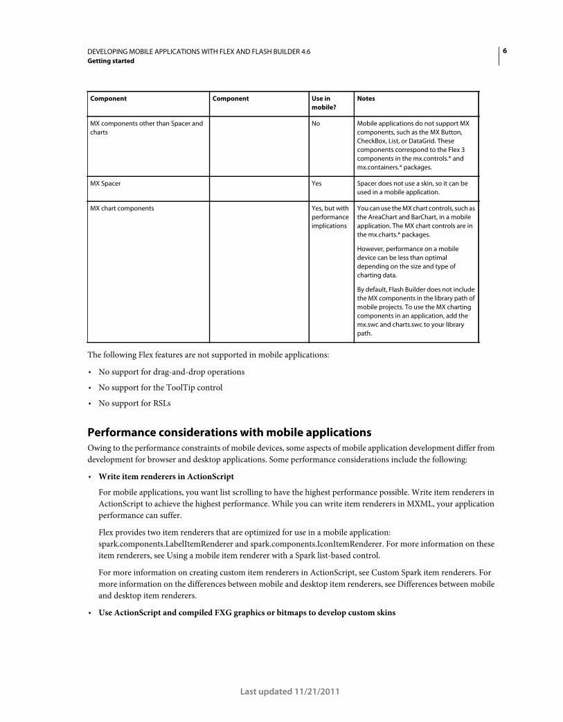
Restrictions on using Spark and MX components in a mobile application
Use the Spark component set when creating mobile applications in Flex. The Spark components are defined in the
spark.components.* packages. However, for performance reasons or because not all Spark components have skins for
the Mobile theme, mobile applications do not support the entire Spark component set.
Except for the MX charting controls and the MX Spacer control, mobile applications do not support the MX
component set defined in the mx.* packages.
The following table lists the components that you can use, that you cannot use, or that require care to use in a mobile
application:
Component Component Use in
mobile?
Notes
Spark ActionBar
Spark BusyIndicator
Spark Callout
Spark CalloutButton
Spark DateSpinner
Spark SpinnerList
Spark SpinnerListContainer
Spark TabbedViewNavigator
Spark
TabbedViewNavigatorApplicati
on
Spark ToggleSwitch
Spark View
Spark ViewMenu
Spark ViewNavigator
Spark ViewNavigatorApplication
Yes These new components support mobile
applications.
Spark Button
Spark CheckBox
Spark DataGroup
Spark Group/HGroup/VGroup/TileGroup
Spark Image/BitmapImage
Spark Label
Spark List
Spark
RadioButton/RadioButtonGroup
Spark SkinnableContainer
Spark Scroller
Spark TextArea
Spark TextInput
Yes Most of these components have skins for
the Mobile theme. Label, Image, and
BitmapImage can be used even though
they do not have a mobile skin.
Some Spark layout containers, such as
Group and its subclasses, do not have
skins. Therefore, you can use them in a
mobile application.
Other Spark skinnable components Discouraged Skinnable Spark components other than
the ones listed above are discouraged
because they do not have a skin for the
Mobile theme. If the component does not
have a skin for the Mobile theme, you can
create one for your application.
Spark DataGrid Spark RichEditableText
Spark RichText
Discouraged These components are discouraged for
performance reasons. While you can use
them in a mobile application, doing so
can affect performance.
For the DataGrid control, performance is
based on the amount of data that you
render. For the RichEditableText and
RichText controls, performance is based
on the amount of text, and the number of
controls in the application.
6DEVELOPING MOBILE APPLICATIONS WITH FLEX AND FLASH BUILDER 4.6
Getting started
Last updated 11/21/2011
The following Flex features are not supported in mobile applications:
• No support for drag-and-drop operations
• No support for the ToolTip control
• No support for RSLs
Performance considerations with mobile applications
Owing to the performance constraints of mobile devices, some aspects of mobile application development differ from
development for browser and desktop applications. Some performance considerations include the following:
• Write item renderers in ActionScript
For mobile applications, you want list scrolling to have the highest performance possible. Write item renderers in
ActionScript to achieve the highest performance. While you can write item renderers in MXML, your application
performance can suffer.
Flex provides two item renderers that are optimized for use in a mobile application:
spark.components.LabelItemRenderer and spark.components.IconItemRenderer. For more information on these
item renderers, see Using a mobile item renderer with a Spark list-based control.
For more information on creating custom item renderers in ActionScript, see Custom Spark item renderers. For
more information on the differences between mobile and desktop item renderers, see Differences between mobile
and desktop item renderers.
• Use ActionScript and compiled FXG graphics or bitmaps to develop custom skins
MX components other than Spacer and
charts
No Mobile applications do not support MX
components, such as the MX Button,
CheckBox, List, or DataGrid. These
components correspond to the Flex 3
components in the mx.controls.* and
mx.containers.* packages.
MX Spacer Yes Spacer does not use a skin, so it can be
used in a mobile application.
MX chart components Yes, but with
performance
implications
You can use the MX chart controls, such as
the AreaChart and BarChart, in a mobile
application. The MX chart controls are in
the mx.charts.* packages.
However, performance on a mobile
device can be less than optimal
depending on the size and type of
charting data.
By default, Flash Builder does not include
the MX components in the library path of
mobile projects. To use the MX charting
components in an application, add the
mx.swc and charts.swc to your library
path.
Component Component Use in
mobile?
Notes
7DEVELOPING MOBILE APPLICATIONS WITH FLEX AND FLASH BUILDER 4.6
Getting started
Last updated 11/21/2011
The mobile skins shipped with Flex are written in ActionScript with compiled FXG graphics to provide the highest
performance. You can write skins in MXML, but your application performance can suffer depending on the
number of components that use MXML skins. For the highest performance, write skins in ActionScript and use
compiled FXG graphics. For more information, see Spark Skinning and FXG and MXML graphics.
• Use text input components that use StageText
When adding text input components such as TextInput and TextArea, use the defaults. These controls use
StageText as the underlying mechanism for text input, which hooks into the native text input classes. This gives you
better performance and access to native features such as auto-correction, auto-capitalization, text restriction, and
custom soft keyboards.
There are some drawbacks to using StageText including not being able to scroll the view that the controls are in. In
addition, you can’t use embedded fonts or use custom sizing for the StageText-based controls. If these are necessary,
you can use text input controls based on the TextField class.
For more information, see “Use text in a mobile application” on page 136.
• Take care when using MX chart components in a mobile application
You can use the MX chart controls, such as the AreaChart and BarChart controls, in a mobile application. However,
they can affect performance depending on the size and type of charting data.
Blogger Nahuel Foronda created a series of articles on Mobile ItemRenderer in ActionScript.
Blogger Rich Tretola created a cookbook entry on Creating a List with an ItemRenderer for a mobile application.
8
Last updated 11/21/2011
Chapter 2: Development environment
Create an Android application in Flash Builder
Here is a general workflow for creating a Flex mobile application for the Google Android platform. This workflow
assumes that you have already designed your mobile application. See “Design a mobile application” on page 1for more
information.
Adobe evangelist Mike Jones shares some lessons learned while developing a multi-platform game Mode by
offering 10 tips when developing for multiple devices.
AIR requirements
Flex mobile projects and ActionScript mobile projects require AIR 2.6 or a higher version. You can run mobile projects
on physical devices that support AIR 2.6 or a higher version of AIR.
You can install AIR 2.6 or a higher version only on supported Android devices that run Android 2.2 or a higher
version. For the complete list of supported Android devices, see Certified Devices. Also, review the minimum system
requirements to run Adobe AIR on Android devices at Mobile System Requirements.
Note: If you do not have a device that supports AIR 2.6 or a higher version of AIR, you can use Flash Builder to launch
and debug mobile applications on the desktop.
Each version of the Flex SDK includes the required Adobe AIR version. If you have installed mobile applications on a
device from an earlier version of the Flex SDK, uninstall AIR from the device. Flash Builder installs the correct version
of AIR when you run or debug a mobile application on a device.
Create an application
1 In Flash Builder, select File > New > Flex Mobile Project.
A Flex Mobile Project is a special type of AIR project. Follow the prompts in the new project wizard as you would
for any other AIR project in Flash Builder. For more information, see Flex mobile projects.
To set Android-specific mobile preferences, see “Set mobile project preferences” on page 13.
When you create a Flex Mobile Project, Flash Builder generates the following files for the project:
• ProjectName.mxml
The default application file for the project.
By default, Flash Builder names this file with the same name as the project. If the project name contains illegal
ActionScript characters, Flash Builder names this file Main.mxml. This MXML file contains the base Spark
application tag for the project. The base Spark application tag can be ViewNavigatorApplication or
TabbedViewNavigatorApplication.
Typically, you do not add content to the default application file directly, other than ActionBar content that is
displayed in all views. To add content to the ActionBar, set the navigatorContent, titleContent, or
actionContent properties.
• ProjectNameHomeView.mxml
9DEVELOPING MOBILE APPLICATIONS WITH FLEX AND FLASH BUILDER 4.6
Development environment
Last updated 11/21/2011
The file representing the initial view for the project. Flash Builder places the file in a views package. The
firstView attribute of the ViewNavigatorApplication tag in ProjectName.mxml specifies this file as the default
opening view of the application.
For more information on defining views, see “Define views in a mobile application” on page 36.
You can also create an ActionScript-only mobile project. See “Create an ActionScript mobile project” on page 11.
2 (Optional) Add content to the ActionBar of the main application file.
The ActionBar displays content and functionality that apply to the application or to the current view of the
application. Here, add content that you want to display in all views of the application. See “Define navigation, title,
and action controls in a mobile application” on page 56.
3 Lay out the content of the initial view of your application.
Use Flash Builder in Design mode or Source mode to add components to a view.
Only use components that Flex supports for mobile development. In both Design mode and Source mode, Flash
Builder guides you to use supported components. See “User interface and layout” on page 23.
Within the view, add content to the ActionBar that is visible only in that view.
4 (Optional) Add any other views that you want to include in your application.
In the Flash Builder Package Explorer, from the context menu for the views package in your project, select New
MXML Component. The New MXML Component wizard guides you as you create the view.
For more information on views, see “Define views in a mobile application” on page 36.
5 (Optional) Add mobile-optimized item renderers for List components.
Adobe provides IconItemRenderer, an ActionScript-based item renderer for use with mobile applications. See
Using a mobile item renderer with a Spark list-based control.
6 Configure launch configurations to run and debug the application.
You can run or debug the application on the desktop or on a device.
A launch configuration is required to run or debug an application from Flash Builder. The first time you run or
debug a mobile application, Flash Builder prompts you to configure a launch configuration.
When running or debugging a mobile application on a device, Flash Builder installs the application on the device.
See “Test and debug” on page 174.
7 Export the application as an installer package.
Use Export Release Build to create packages that can be installed on mobile devices. Flash Builder creates packages
for platform you select for export. See “Export Android APK packages for release” on page 181.
Adobe Certified Expert in Flex, Brent Arnold, created the following video tutorials that can help you:
•Create a Flex mobile application with multiple views
• Create a Flex mobile application using a Spark-based List control
10DEVELOPING MOBILE APPLICATIONS WITH FLEX AND FLASH BUILDER 4.6
Development environment
Last updated 11/21/2011
Create an iOS application in Flash Builder
Here is a general workflow for creating a mobile application for the Apple iOS platform.
1 Before you begin creating the application, ensure that you follow the steps at “Apple iOS development process using
Flash Builder” on page 18.
2 In Flash Builder, select File > New > Flex Mobile Project.
Select the target platform as Apple iOS, and set the mobile project settings.
Follow the prompts in the new-project wizard as you would for any other project-building wizard in Flash Builder.
For more information, see “Create an application” on page 8.
You can also create an ActionScript-only mobile project. For more information, see Create ActionScript mobile
projects.
3 Configure launch configurations to run and debug the application. You can run or debug the application on the
desktop or on a connected device.
For more information, see “Debug an application on an Apple iOS device” on page 178.
4 Export the application to the Apple App Store or deploy the iOS package application (IPA) on a device.
For more information, see “Export Apple iOS packages for release” on page 182 and “Install an application on an
Apple iOS device” on page 179.
More Help topics
Beginning a Mobile Application (video)
Create a BlackBerry Tablet OS application in Flash Builder
Flash Builder includes a plug-in from Research In Motion (RIM) that lets you create and package both Flex and
ActionScript applications for the BlackBerry® Tablet OS.
Create an application
Here is a general workflow to create applications for the BlackBerry Tablet OS.
1 Before you begin creating the mobile application, install the BlackBerry Tablet OS SDK for AIR from the
BlackBerry Tablet OS Application Development site.
The BlackBerry Tablet OS SDK for AIR provides APIs that let you create AIR-based Flex and ActionScript
applications.
For more information on installing the BlackBerry Tablet OS SDK, see the BlackBerry Tablet OS Getting Started
Guide.
2 To create a Flex-based AIR application, in Flash Builder, select File > New > Flex Mobile Project.
Follow the prompts in the new project wizard as you would for any other AIR project in Flash Builder. Ensure that
you select BlackBerry Tablet OS as the target platform.
For more information, see Flex mobile projects
11DEVELOPING MOBILE APPLICATIONS WITH FLEX AND FLASH BUILDER 4.6
Development environment
Last updated 11/21/2011
3 To create an ActionScript-based AIR application, in Flash Builder, select File > New > ActionScript Mobile Project.
Follow the prompts in the new project wizard as you would for any other AIR project in Flash Builder. Ensure that
you select BlackBerry Tablet OS as the target platform.
For more information, see Create ActionScript mobile projects.
Sign, package, and deploy an application
For information on signing, packaging, and deploying the application, see the BlackBerry Tablet OS SDK for Adobe
AIR Development Guide by RIM.
You can find several additional resources for BlackBerry Tablet OS development from both Adobe and RIM at Adobe
Developer Connection.
Create an ActionScript mobile project
Use Flash Builder to create an ActionScript mobile application. The application that you create is based on the Adobe
AIR API.
1 Select File > New > ActionScript Mobile Project.
2 Enter a project name and location. The default location is the current workspace.
3 Use the default Flex 4.6 SDK that supports mobile application development.
Click Next.
4 Select the target platforms for your application, and specify mobile project settings for each platform.
For more information on mobile project settings, see “Set mobile project preferences” on page 13.
5 Click Finish, or click Next to specify additional configuration options and build paths.
For more information on the project configuration options and build paths, see Build paths, native extensions, and
other project configuration options.
Use native extensions
Native extensions let you include native platform capabilities into your mobile application.
A native extension contains ActionScript classes and native code. Native code implementation lets you access device-
specific features, which cannot be accessed using pure ActionScript classes. For example, accessing the device's
vibration functionality.
Native code implementation can be defined as the code that executes outside the AIR runtime. You define platform-
specific ActionScript classes and native code implementation in the extension. The ActionScript extension classes
access and exchange data with the native code using the ActionScript class ExtensionContext.
Extensions are specific to a device's hardware platform. You can create platform-specific extensions or you can create
a single extension that targets multiple platforms. For example, you can create a native extension that targets both
Android and iOS platforms. Native extensions are supported by the following mobile devices:
• Android devices running Android 2.2 or a later version
• iOS devices running iOS 4.0 or a later version
12DEVELOPING MOBILE APPLICATIONS WITH FLEX AND FLASH BUILDER 4.6
Development environment
Last updated 11/21/2011
For detailed information on creating cross-platform native extensions, see Developing Native Extensions for Adobe AIR.
For a collection of native extension samples, contributed by Adobe and the community, see Native extensions for
Adobe AIR.
Package native extensions
To provide your native extension to application developers, you package all the necessary files into an ActionScript
Native Extension (ANE) file by following these steps:
1 Build the extension’s ActionScript library into a SWC file.
2 Build the extension’s native libraries. If the extension has to support multiple platforms, build one library for each
target platform.
3 Create a signed certificate for your extension. If the extension is not signed, Flash Builder displays a warning when
you add the extension to your project.
4 Create an extension descriptor file.
5 Include any external resources for the extension, such as images.
6 Create the extension package using the Air Developer Tool. For more information, see the AIR documentation.
For detailed information on packaging ActionScript extensions, see Developing Native Extensions for Adobe AIR.
Add native extensions to a project
You include an ActionScript Native Extension (ANE) file in the project’s build path the same way as you would include
a SWC file.
1 In Flash Builder, when you create a Flex mobile project, select the Native Extensions tab in the Build Paths settings
page.
You can also add extensions from the Project Properties dialog box by selecting Flex Build Path.
2 Browse to the ANE file or the folder containing the ANE files to add to the project. When you add an ANE file, the
extension ID is added to the project’s application descriptor file (project name-app.xml) by default.
Flash Builder displays an error symbol for the added extension in the following scenarios:
• The AIR runtime version of the extension is later than the application’s runtime version.
• The extension does not include all the selected platforms that the application is targeting.
Note: You can create an ActionScript native extension that targets multiple platforms. To test an application that
includes this ANE file on your development computer using the AIR Simulator, ensure that the ANE file supports the
computer’s platform. For example, to test the application using the AIR Simulator on Windows, ensure that the ANE file
supports Windows.
Include ActionScript native extensions in an application package
When you use the Export Release Build feature to export the mobile application, the extensions used in the project are
included within the application package by default.
To change the default selection, follow these steps:
1 In the Export Release Build dialog box, select the Native Extensions tab under Package Settings.
2 The ActionScript native extension files referenced in your project are listed, indicating if the ANE file is used in the
project or not.
13DEVELOPING MOBILE APPLICATIONS WITH FLEX AND FLASH BUILDER 4.6
Development environment
Last updated 11/21/2011
If the ANE file is used in the project, it is selected by default in the application package.
If the ANE file is included in the project but not used, the compiler does not recognize the ANE file. It is then not
included in the application package. To include the ANE file in the application package, do the following:
a In the Project Properties dialog box, select Flex Build Packaging and the required platform.
b Select the extensions that you want to include in the application package.
Support for iOS5 native extensions
To package native extensions that use iOS5 SDK features, the AIR Developer Tool (ADT) requires the location of the
iOS5 SDK.
On Mac OS, Flash Builder lets you select the location of the iOS5 SDK using the Package Settings dialog. After you
select the location of the iOS SDK, the selected location is passed through the -platformsdk ADT command.
Note: This functionality is currently not supported on Windows.
For more information, see Developing Native Extensions for Adobe AIR.
Set mobile project preferences
Set device configurations
Flash Builder uses device configurations to display device screen size previews in Design View or to launch
applications on the desktop using the AIR Debug Launcher (ADL). See “Configure device information for desktop
preview” on page 175.
To set device configurations, open Preferences and select Flash Builder > Device Configurations.
Flash Builder provides several default device configurations. You can add, edit, or remove additional device
configurations. You cannot modify the default configurations that Flash Builder provides.
Clicking the Restore Defaults button restores default device configurations but does not remove any configurations
that you have added. Also, if you added a device configuration with a name that matches one of the defaults, Flash
Builder overrides the added configuration with the default settings.
Device configurations contain the following properties:
Choose target platforms
Flash Builder supports target platforms based on the application type.
Property Description
Device Name A unique name for the device.
Platform Device platform. Select a platform from the list of supported platforms.
Full Screen Size Width and height of the device’s screen.
Usable Screen Size The standard size of an application on the device. This size is the expected size of an application launched in
non-full screen mode, accounting for system chrome, such as the status bar.
Pixels per Inch Pixels per inch on the device’s screen.
14DEVELOPING MOBILE APPLICATIONS WITH FLEX AND FLASH BUILDER 4.6
Development environment
Last updated 11/21/2011
To select a platform, open Preferences and select Flash Builder > Target Platforms.
For all third-party plug-ins, see the associated documentation.
Choose an application template
When you create a mobile application, you can select from the following application templates:
Blank Uses the Spark Application tag as the base application element.
Use this option if you want to create a custom application without using the standard view navigation.
View-Based Application Uses the Spark ViewNavigatorApplication tag as the base application element to create an
application with a single view.
You can specify the name of the initial view.
Tabbed Application Uses the Spark TabbedViewNavigatorApplication tag as the base application element to create a
tab-based application.
To add a tab, enter a name for the tab, and click Add. You can change the order of the tabs by clicking Up and Down.
To remove a tab from the application, select a tab and click Remove.
The name of the view is the tab name with "View" appended. For example, if you name a tab as FirstTab, Flash Builder
generates a view named FirstTabView.
For each tab that you create, a new MXML file is generated in the "views" package.
Note: The package name is not configurable through the Flex Mobile Project wizard.
The MXML files are generated according to the following rules:
• If the tab name is a valid ActionScript class name, Flash Builder generates the MXML file using the tab name with
"View" appended.
• If the tab name is not a valid class name, Flash Builder modifies the tab name by removing invalid characters and
inserting valid starting characters. If the modified name is unacceptable, Flash Builder changes the MXML filename
to "ViewN", where N is the position of the view, starting with N=1.
Adobe Certified Expert in Flex, Brent Arnold, created a video tutorial about using the Tabbed Application
template.
Choose mobile application permissions
When you create a mobile application, you can specify or change the default permissions for a target platform. The
permissions are specified at the time of compiling, and they cannot be changed at runtime.
First select the target platform, and then set the permissions for each platform, as required. You can edit the
permissions later in the application descriptor XML file.
Third-party plug-ins provide additional platform support for both Flex and ActionScript projects. For platform-
specific permissions, see the device's associated documentation.
Permissions for the Google Android platform
For the Google Android platform, you can set the following permissions:
INTERNET Allows network requests and remote debugging
The INTERNET permission is selected by default. If you deselect this permission, you cannot debug your application
on a device.
15DEVELOPING MOBILE APPLICATIONS WITH FLEX AND FLASH BUILDER 4.6
Development environment
Last updated 11/21/2011
WRITE_EXTERNAL_STORAGE Allows writing to an external device
Select this permission to let the application write to an external memory card on the device.
READ_PHONE_STATE Mutes the audio during an incoming call
Select this permission to let the application mute the audio during phone calls. For example, you can select this
permission if your application plays audio in the background.
ACCESS_FINE_LOCATION Allows access to a GPS location
Select this permission to let the application access GPS data using the Geolocation class.
DISABLE_KEYGUARD and WAKE_LOCK Disallows sleep mode on the device
Select this permission to prevent the device from going to sleep using the SystemIdleMode class settings.
CAMERA Allows access to a camera
Select this permission to let the application access a camera.
RECORD_AUDIO Allows access to a microphone
Select this permission to let the application access a microphone.
ACCESS_NETWORK_STATE and ACCESS_WIFI_STATE Allows access to information about network interfaces
associated with the device
Select this permission to let the application access network information using the NetworkInfo class.
For more information about setting mobile application properties, see the Adobe AIR documentation.
Permissions for the Apple iOS platform
The Apple iOS platform uses runtime validation for permissions instead of predefined permissions. That is, if an
application wants to access a specific feature of the Apple iOS platform that requires user permission, a pop-up appears
requesting permission.
Choose platform settings
Platform settings let you select a target device family. Depending on the platform that you select, you can select the
target device or a target device family. You can select a specific device or all the devices that the platform supports.
Third-party plug-ins provide additional platform support for both Flex and ActionScript projects. For platform-
specific settings, see the device's associated documentation.
Platform settings for the Google Android platform
There are no platform-specific settings for the Google Android platform.
Platform settings for the Apple iOS platform
For a Flex mobile project or an ActionScript mobile project, you can specify the following target devices for the Apple
iOS platform:
iPhone/iPod Touch Applications using this target family are listed as compatible with only iPhone and iPod Touch
devices in the Apple App store.
iPad Applications using this target family are listed as compatible only with iPad devices in the Apple App store.
All Applications using this target family are listed as compatible with both iPhone or iPod Touch, and iPad devices in
the Apple App store. This option is the default.
16DEVELOPING MOBILE APPLICATIONS WITH FLEX AND FLASH BUILDER 4.6
Development environment
Last updated 11/21/2011
Choose application settingsAutomatically Reorient Rotates the application when the user rotates the device. When this setting is not enabled, your
application always appears in a fixed orientation.
Full Screen Displays your application in fullscreen mode on the device. When this setting is enabled, the device’s status
bar does not appear above your application. Your application fills the entire screen.
If you want to target your application across multiple device types with varying screen densities, select Automatically
Scale Application For Different Screen Densities. Selecting this option automatically scales the application and handles
density changes, as required, for the device. See “Set application scaling” on page 16.
Set application scaling
You use mobile application scaling to build a single mobile application that is compatible with devices with different
screen sizes and densities.
Mobile device screens have varying screen densities, or DPI (dots per inch). You can specify the DPI value as 160, 240,
or 320, depending on the screen density of the target device. When you enable automatic scaling, Flex optimizes the
way it displays the application for the screen density of each device.
For example, suppose that you specify the target DPI value as 160 and enable automatic scaling. When you run the
application on a device with a DPI value of 320, Flex automatically scales the application by a factor of 2. That is, Flex
magnifies everything by 200%.
To specify the target DPI value, set it as the applicationDPI property of the <s:ViewNavigatorApplication> tag
or <s:TabbedViewNavigatorApplication> tag in the main application file:
<s:ViewNavigatorApplication xmlns:fx="http://ns.adobe.com/mxml/2009" xmlns:s="library://ns.adobe.com/flex/spark" firstView="views.HomeView" applicationDPI="160">
If you choose to not auto-scale your application, you must handle the density changes for your layout manually, as
required. However, Flex adapts the skins to the density of each device.
For more information about creating density-independent mobile applications, see “Support multiple screen sizes and
DPI values in a mobile application” on page 122.
Connect Google Android devices
You can connect a Google Android device to your development computer to preview or debug the application on the
Android device.
Supported Android devices
Flex mobile projects and ActionScript mobile projects require AIR 2.6 or a higher version of AIR. You can run or
debug mobile projects only on physical devices that support AIR 2.6 or a higher version.
You can install AIR 2.6 on supported Android devices running Android 2.2 or a higher version. For a list of supported
devices, see http://www.adobe.com/flashplatform/certified_devices/. Also, review the minimum system requirements
to run Adobe AIR on Android devices at Mobile System Requirements.
17DEVELOPING MOBILE APPLICATIONS WITH FLEX AND FLASH BUILDER 4.6
Development environment
Last updated 11/21/2011
Configure Android devices
To run and debug Flex mobile applications from an Android device, enable USB debugging as indicated below:
1 On the device, follow these steps to ensure that USB debugging is enabled:
a Tap the Home button to display the home screen.
b Go to Settings, and select Applications > Development.
c Enable USB debugging.
2 Connect the device to your computer with a USB cable.
3 Pull down the notification area at the top of the screen. You see either USB Connected or USB Connection.
a Tap USB Connected or USB Connection.
b If a set of options appears that includes Charge Only mode, select Charge Only and tap OK.
c If you see a button for turning off mass storage mode, click the button to turn off mass storage.
4 (Windows only) Install the appropriate USB driver for your device. See “Install USB device drivers for Android
devices (Windows)” on page 17.
5 Pull down the notification area at the top of the screen.
If USB Debugging does not appear as an entry, check the USB mode as described in step 3 above. Make sure that
the USB mode is not set to PC Mode.
Note: Additional configuration is needed when debugging. See “Test and debug a mobile application on a device” on
page 175.
Install USB device drivers for Android devices (Windows)
Device drivers and configurations
Windows platforms require installation of a USB driver to connect an Android device to your development computer.
Flash Builder provides a device driver and configuration for several Android devices.
These device driver configurations are listed in the android_winusb.inf. Windows Device Manager accesses this file
when installing the device driver. Flash Builder installs android_winusb.inf at the following location:
<Adobe Flash Builder 4.6 Home>\utilities\drivers\android\android_winusb.inf
For the complete list of supported devices, see Certified devices. For Android devices that are not listed, you can update
android_winusb.inf with USB drivers. See “Add Android USB device driver configurations” on page 18.
Install USB device driver
1 Connect your Android device to your computer’s USB port.
2 Go to the following location:
<Flash Builder>/utilities/drivers/android/
Install the USB driver using either the Windows Found New Hardware wizard or the Windows Device Manager.
Important: If Windows is still unable to recognize your device, you need to install the appropriate USB driver from your
device manufacturer. See OEM USB drivers for links to the websites of several device manufacturers from where you can
download the appropriate USB driver for your device.
18DEVELOPING MOBILE APPLICATIONS WITH FLEX AND FLASH BUILDER 4.6
Development environment
Last updated 11/21/2011
Add Android USB device driver configurations
If you have a supported Android device not listed in “Install USB device drivers for Android devices (Windows)” on
page 17, update the android_winusb.inf file to include the device.
1 Plug the device into a USB port of your computer. Windows informs you that it cannot find the driver.
2 Using the Windows Device Manager, open the Details tab of the device properties.
3 Select the Hardware IDs property to view the hardware ID.
4 Open android_winusb.inf in a text editor. Find android_winusb.inf at the following location:
<Adobe Flash Builder 4.6 Home>\utilities\drivers\android\android_winusb.inf
5 Note the listings in the file that apply to your architecture, either [Google.NTx86] or [Google.NTamd64]. The
listings contain a descriptive comment and one or more lines with the hardware ID, as shown here:
. . . [Google.NTx86] ; HTC Dream %CompositeAdbInterface% = USB_Install, USB\VID_0BB4&PID_0C02&MI_01 . . .
6 Copy and paste a comment and hardware listing. For the device driver you want to add, edit the listing as follows:
a For the comment, specify the name of the device.
b Replace the hardware ID with the hardware ID identified in Step 3 above.
For example:
. . . [Google.NTx86] ; NEW ANDROID DEVICE %CompositeAdbInterface% = USB_Install, NEW HARDWARE ID . . .
7 Use the Windows Device Manager to install the device, as described in “Install USB device drivers for Android
devices (Windows)” on page 17 above.
During the installation, Windows displays a warning that the driver is from an unknown publisher. However, the
driver allows Flash Builder to access your device.
Apple iOS development process using Flash Builder
Before developing an iOS application using Flash Builder, it is important to understand the iOS development process
and how to obtain the required certificates from Apple.
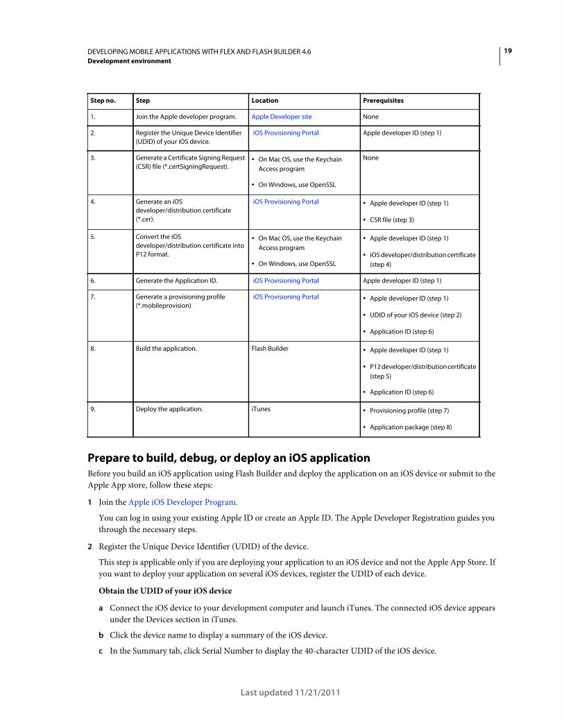
Overview of the iOS development and deployment process
This table provides a quick list of steps in the iOS development process, how to obtain the required certificates, and
prerequisites to each step.
For detailed information on each of these steps, see “Prepare to build, debug, or deploy an iOS application” on page 19.
19DEVELOPING MOBILE APPLICATIONS WITH FLEX AND FLASH BUILDER 4.6
Development environment
Last updated 11/21/2011
Prepare to build, debug, or deploy an iOS application
Before you build an iOS application using Flash Builder and deploy the application on an iOS device or submit to the
Apple App store, follow these steps:
1 Join the Apple iOS Developer Program.
You can log in using your existing Apple ID or create an Apple ID. The Apple Developer Registration guides you
through the necessary steps.
2 Register the Unique Device Identifier (UDID) of the device.
This step is applicable only if you are deploying your application to an iOS device and not the Apple App Store. If
you want to deploy your application on several iOS devices, register the UDID of each device.
Obtain the UDID of your iOS device
a Connect the iOS device to your development computer and launch iTunes. The connected iOS device appears
under the Devices section in iTunes.
b Click the device name to display a summary of the iOS device.
c In the Summary tab, click Serial Number to display the 40-character UDID of the iOS device.
Step no. Step Location Prerequisites
1. Join the Apple developer program. Apple Developer site None
2. Register the Unique Device Identifier
(UDID) of your iOS device.
iOS Provisioning Portal Apple developer ID (step 1)
3. Generate a Certificate Signing Request
(CSR) file (*.certSigningRequest).• On Mac OS, use the Keychain
Access program
• On Windows, use OpenSSL
None
4. Generate an iOS
developer/distribution certificate
(*.cer).
iOS Provisioning Portal • Apple developer ID (step 1)
• CSR file (step 3)
5. Convert the iOS
developer/distribution certificate into
P12 format.
• On Mac OS, use the Keychain
Access program
• On Windows, use OpenSSL
• Apple developer ID (step 1)
• iOS developer/distribution certificate
(step 4)
6. Generate the Application ID. iOS Provisioning Portal Apple developer ID (step 1)
7. Generate a provisioning profile
(*.mobileprovision)
iOS Provisioning Portal • Apple developer ID (step 1)
• UDID of your iOS device (step 2)
• Application ID (step 6)
8. Build the application. Flash Builder • Apple developer ID (step 1)
• P12 developer/distribution certificate
(step 5)
• Application ID (step 6)
9. Deploy the application. iTunes • Provisioning profile (step 7)
• Application package (step 8)
20DEVELOPING MOBILE APPLICATIONS WITH FLEX AND FLASH BUILDER 4.6
Development environment
Last updated 11/21/2011
You can copy the UDID from iTunes using the keyboard shortcut Ctrl+C (Windows) or Cmd+C (Mac).
Register the UDID of your device
Log in to the iOS Provisioning Portal using your Apple ID and register the device’s UDID.
3 Generate a Certificate Signing Request (CSR) file (*.certSigningRequest).
You generate a CSR to obtain a iOS developer/distribution certificate. You can generate a CSR by using Keychain
Access on Mac or OpenSSL on Windows. When you generate a CSR you only provide your user name and email
address; you don’t provide any information about your application or device.
Generating a CSR creates a public key and a private key as well as a *.certSigningRequest file. The public key is
included in the CSR, and the private key is used to sign the request.
For more information on generating a CSR, see Generating a certificate signing request.
4 Generate an iOS developer certificate or an iOS distribution certificate (*.cer), as required.
Note: To deploy an application to a device, you need a developer certificate. To deploy the application to the Apple
App Store, you need a distribution certificate.
Generate an iOS developer certificate
a Log in to the iOS Provisioning Portal using your Apple ID, and select the Development tab.
b Click Request Certificate and browse to the CSR file that you generated and saved on your computer (step 3).
c Select the CSR file and click Submit.
d On the Certificates page, click Download.
e Save the downloaded file (*.developer_identity.cer).
Generate an iOS distribution certificate
f Log in to the iOS Provisioning Portal using your Apple ID, and select the Distribution tab
g Click Request Certificate and browse to the CSR file that you generated and saved on your computer (step 3).
h Select the CSR file and click Submit.
i On the Certificates page, click Download.
j Save the downloaded file (*.distribution_identity.cer).
5 Convert the iOS developer certificate or the iOS distribution certificate to a P12 file format (*.p12).
You convert the iOS developer or iOS distribution certificate to a P12 format so that Flash Builder can digitally sign
your iOS application. Converting to a P12 format combines your iOS developer/distribution certificate and the
associated private key into a single file.
Note: If you are testing the application on the desktop using the AIR Debug Launcher (ADL), you don’t have to convert
the iOS developer/distribution certificate into a P12 format.
Use Keychain Access on Mac or OpenSSL on Windows to generate a Personal Information Exchange (*.p12) file.
For more information, see Convert a developer certificate into a P12 file.
6 Generate the Application ID by following these steps:
a Log in to the iOS Provisioning Portal using your Apple ID.
b Go to the App IDs page, and click New App ID.
21DEVELOPING MOBILE APPLICATIONS WITH FLEX AND FLASH BUILDER 4.6
Development environment
Last updated 11/21/2011
c In the Manage tab, enter a description for your application, generate a new Bundle Seed ID, and enter a Bundle
Identifier.
Every application has a unique Application ID, which you specify in the application descriptor XML file. An
Application ID consists of a ten-character "Bundle Seed ID" that Apple provides and a "Bundle Identifier" suffix
that you specify. The Bundle Identifier you specify must match the application ID in the application descriptor
file. For example, if your Application ID is com.myDomain.*, the ID in the application descriptor file must start
with com.myDomain.
Important: Wildcard Bundle Identifiers are good for developing and testing iOS applications but can't be used to
deploy applications to the Apple App Store.
7 Generate a Developer Provisioning Profile file or a Distribution Provisioning Profile File (*.mobileprovision).
Note: To deploy an application to a device, you need a Developer Provisioning Profile. To deploy the application to
the Apple App Store, you need a Distribution Provisioning Profile. You use a Distribution Provisioning Profile to sign
your application.
Generate a Developer Provisioning Profile
a Log in to the iOS Provisioning Portal using your Apple ID.
b Go to Certificate > Provisioning, and click New Profile.
c Enter a profile name, select the iOS developer certificate, the App ID, and the UDIDs on which you want to
install the application.
d Click Submit.
e Download the generated Developer Provisioning Profile file (*.mobileprovision)and save it on your computer.
Generate a Distribution Provisioning Profile
f Log in to the iOS Provisioning Portal using your Apple ID.
g Go to Certificate > Provisioning, and click New Profile.
h Enter a profile name, select the iOS distribution certificate and the App ID. If you want to test the application
before deployment, specify the UDIDs of the devices on which you want to test.
i Click Submit.
j Download the generated Provisioning Profile file (*.mobileprovision)and save it on your computer.
More Help topics
“Create an iOS application in Flash Builder” on page 10
Files to select when you test, debug, or install an iOS application
To run, debug, or install an application for testing on an iOS device, you select the following files in the Run/Debug
Configurations dialog box:
• iOS developer certificate in P12 format (step 5)
• Application descriptor XML file that contains the Application ID (step 6)
• Developer Provisioning Profile (step 7)
For more information, see “Debug an application on an Apple iOS device” on page 178 and “Install an application on
an Apple iOS device” on page 179.
22DEVELOPING MOBILE APPLICATIONS WITH FLEX AND FLASH BUILDER 4.6
Development environment
Last updated 11/21/2011
Files to select when you deploy an application to the Apple App Store
To deploy an application to the Apple App Store, select the Package Type in the Export Release Build dialog box as
Final Release Package For Apple App Store, and select the following files:
• iOS distribution certificate in P12 format (step 5)
• Application descriptor XML file that contains the Application ID (step 6).
Note: You can’t use a wildcard Application ID while submitting an application to the Apple App Store.
• Distribution Provisioning Profile (step 7)
For more information, see “Export Apple iOS packages for release” on page 182.
23
Last updated 11/21/2011
Chapter 3: User interface and layout
Lay out a mobile application
Use views and sections to lay out a mobile application
A mobile application is made up of one or more screens, or views. For example, mobile application could have three
views:
1 A home view that lets you add contact information
2 A contacts view containing a list of existing contacts
3 A search view to search your list of contacts
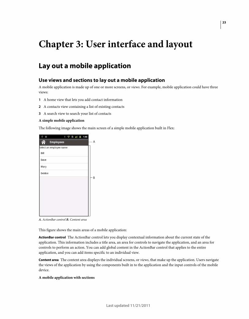
A simple mobile application
The following image shows the main screen of a simple mobile application built in Flex:
A. ActionBar control B. Content area
This figure shows the main areas of a mobile application:
ActionBar control The ActionBar control lets you display contextual information about the current state of the
application. This information includes a title area, an area for controls to navigate the application, and an area for
controls to perform an action. You can add global content in the ActionBar control that applies to the entire
application, and you can add items specific to an individual view.
Content area The content area displays the individual screens, or views, that make up the application. Users navigate
the views of the application by using the components built in to the application and the input controls of the mobile
device.
A mobile application with sections
A
B
24DEVELOPING MOBILE APPLICATIONS WITH FLEX AND FLASH BUILDER 4.6
User interface and layout
Last updated 11/21/2011
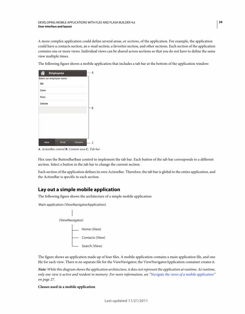
A more complex application could define several areas, or sections, of the application. For example, the application
could have a contacts section, an e-mail section, a favorites section, and other sections. Each section of the application
contains one or more views. Individual views can be shared across sections so that you do not have to define the same
view multiple times.
The following figure shows a mobile application that includes a tab bar at the bottom of the application window:
A. ActionBar control B. Content area C. Tab bar
Flex uses the ButtonBarBase control to implement the tab bar. Each button of the tab bar corresponds to a different
section. Select a button in the tab bar to change the current section.
Each section of the application defines its own ActionBar. Therefore, the tab bar is global to the entire application, and
the ActionBar is specific to each section.
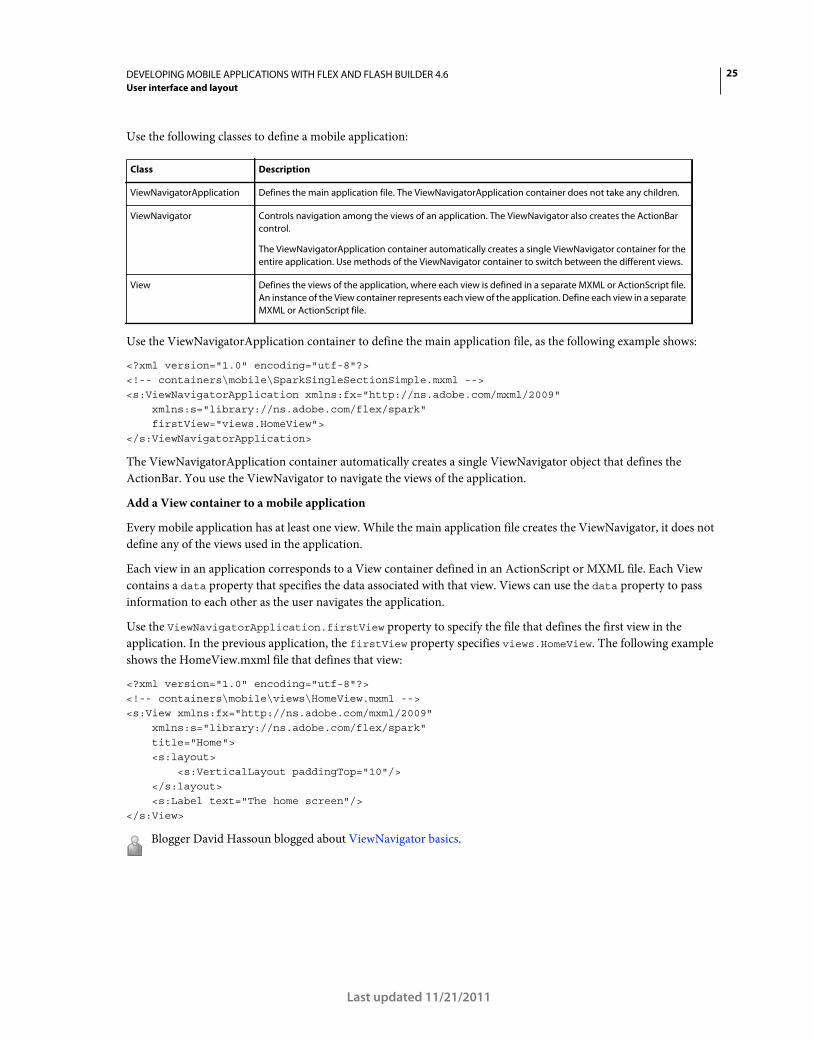
Lay out a simple mobile application
The following figure shows the architecture of a simple mobile application:
The figure shows an application made up of four files. A mobile application contains a main application file, and one
file for each view. There is no separate file for the ViewNavigator; the ViewNavigatorApplication container creates it.
Note: While this diagram shows the application architecture, it does not represent the application at runtime. At runtime,
only one view is active and resident in memory. For more information, see “Navigate the views of a mobile application”
on page 27.
Classes used in a mobile application
C
A
B
Main application (ViewNavigatorApplication)
(ViewNavigator)
Contacts (View)
Home (View)
Search (View)
25DEVELOPING MOBILE APPLICATIONS WITH FLEX AND FLASH BUILDER 4.6
User interface and layout
Last updated 11/21/2011
Use the following classes to define a mobile application:
Use the ViewNavigatorApplication container to define the main application file, as the following example shows:
<?xml version="1.0" encoding="utf-8"?> <!-- containers\mobile\SparkSingleSectionSimple.mxml --> <s:ViewNavigatorApplication xmlns:fx="http://ns.adobe.com/mxml/2009" xmlns:s="library://ns.adobe.com/flex/spark" firstView="views.HomeView"> </s:ViewNavigatorApplication>
The ViewNavigatorApplication container automatically creates a single ViewNavigator object that defines the
ActionBar. You use the ViewNavigator to navigate the views of the application.
Add a View container to a mobile application
Every mobile application has at least one view. While the main application file creates the ViewNavigator, it does not
define any of the views used in the application.
Each view in an application corresponds to a View container defined in an ActionScript or MXML file. Each View
contains a data property that specifies the data associated with that view. Views can use the data property to pass
information to each other as the user navigates the application.
Use the ViewNavigatorApplication.firstView property to specify the file that defines the first view in the
application. In the previous application, the firstView property specifies views.HomeView. The following example
shows the HomeView.mxml file that defines that view:
<?xml version="1.0" encoding="utf-8"?> <!-- containers\mobile\views\HomeView.mxml --> <s:View xmlns:fx="http://ns.adobe.com/mxml/2009" xmlns:s="library://ns.adobe.com/flex/spark" title="Home"> <s:layout> <s:VerticalLayout paddingTop="10"/> </s:layout> <s:Label text="The home screen"/> </s:View>
Blogger David Hassoun blogged about ViewNavigator basics.
Class Description
ViewNavigatorApplication Defines the main application file. The ViewNavigatorApplication container does not take any children.
ViewNavigator Controls navigation among the views of an application. The ViewNavigator also creates the ActionBar
control.
The ViewNavigatorApplication container automatically creates a single ViewNavigator container for the
entire application. Use methods of the ViewNavigator container to switch between the different views.
View Defines the views of the application, where each view is defined in a separate MXML or ActionScript file.
An instance of the View container represents each view of the application. Define each view in a separate
MXML or ActionScript file.
26DEVELOPING MOBILE APPLICATIONS WITH FLEX AND FLASH BUILDER 4.6
User interface and layout
Last updated 11/21/2011
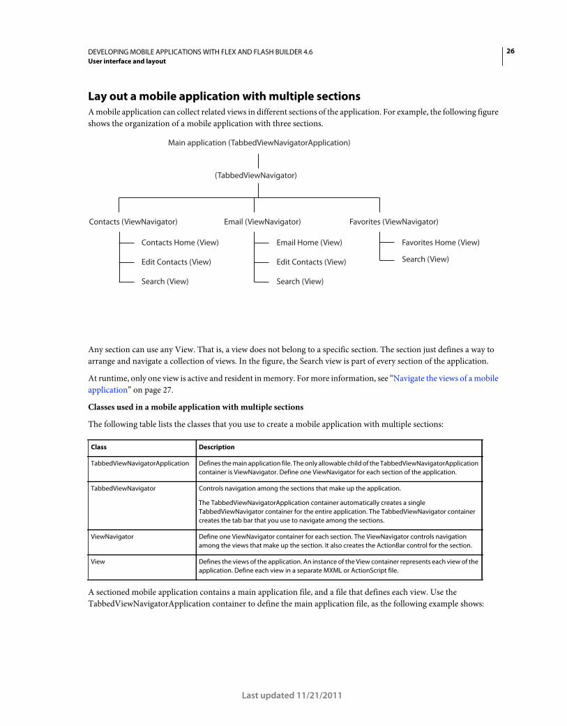
Lay out a mobile application with multiple sections
A mobile application can collect related views in different sections of the application. For example, the following figure
shows the organization of a mobile application with three sections.
Any section can use any View. That is, a view does not belong to a specific section. The section just defines a way to
arrange and navigate a collection of views. In the figure, the Search view is part of every section of the application.
At runtime, only one view is active and resident in memory. For more information, see “Navigate the views of a mobile
application” on page 27.
Classes used in a mobile application with multiple sections
The following table lists the classes that you use to create a mobile application with multiple sections:
A sectioned mobile application contains a main application file, and a file that defines each view. Use the
TabbedViewNavigatorApplication container to define the main application file, as the following example shows:
Class Description
TabbedViewNavigatorApplication Defines the main application file. The only allowable child of the TabbedViewNavigatorApplication
container is ViewNavigator. Define one ViewNavigator for each section of the application.
TabbedViewNavigator Controls navigation among the sections that make up the application.
The TabbedViewNavigatorApplication container automatically creates a single
TabbedViewNavigator container for the entire application. The TabbedViewNavigator container
creates the tab bar that you use to navigate among the sections.
ViewNavigator Define one ViewNavigator container for each section. The ViewNavigator controls navigation
among the views that make up the section. It also creates the ActionBar control for the section.
View Defines the views of the application. An instance of the View container represents each view of the
application. Define each view in a separate MXML or ActionScript file.
Main application (TabbedViewNavigatorApplication)
Contacts (ViewNavigator)
Edit Contacts (View)
Contacts Home (View)
Search (View)
Email (ViewNavigator)
Edit Contacts (View)
Email Home (View)
Search (View)
Favorites (ViewNavigator)
Favorites Home (View)
Search (View)
(TabbedViewNavigator)
27DEVELOPING MOBILE APPLICATIONS WITH FLEX AND FLASH BUILDER 4.6
User interface and layout
Last updated 11/21/2011
<?xml version="1.0" encoding="utf-8"?> <!-- containers\mobile\SparkMultipleSectionsSimple.mxml --> <s:TabbedViewNavigatorApplication xmlns:fx="http://ns.adobe.com/mxml/2009" xmlns:s="library://ns.adobe.com/flex/spark"> <s:ViewNavigator label="Contacts" firstView="views.ContactsHome"/> <s:ViewNavigator label="Email" firstView="views.EmailHome"/> <s:ViewNavigator label="Favorites" firstView="views.FavoritesHome"/> </s:TabbedViewNavigatorApplication>
Use the ViewNavigator in an application with multiple sections
The only allowable child component of the TabbedViewNavigatorApplication container is ViewNavigator. Each
section of the application corresponds to a different ViewNavigator container.
Use the ViewNavigator container to navigate the views of each section, and to define the ActionBar control for the
section. Use the ViewNavigator.firstView property to specify the file that defines the first view in the section.
Use the TabbedViewNavigator in an application with multiple sections
The TabbedViewNavigatorApplication container automatically creates a single container of type
TabbedViewNavigator. The TabbedViewNavigator container then creates a tab bar at the bottom of the application.
You do not have to add logic to the application to navigate among the sections.
Navigate the views of a mobile application
A stack of View objects controls navigation in a mobile application. The top View object on the stack defines the
currently visible view.
The ViewNavigator container maintains the stack. To change views, push a new View object onto the stack, or pop the
current View object off the stack. Popping the currently visible View object off the stack destroys the View object and
returns the user to the previous view on the stack.
In an application with sections, use the tab bar to navigate the sections. Because a different ViewNavigator defines each
section, changing sections corresponds to changing the current ViewNavigator and stack. The View object at the top
of the stack of the new ViewNavigator becomes the current view.
To conserve memory, by default the ViewNavigator ensures that only one view is in memory at a time. However, it
maintains the data for previous views on the stack. Therefore, when the user navigates back to the previous view, the
view can be reinstantiated with the appropriate data.
Note: The View container defines the destructionPolicy property. If set to auto, the default, the ViewNavigator
destroys the view when it is not active. If set to none, the view is cached in memory.
Blogger Mark Lochrie blogged about ViewNavigator.
ViewNavigator navigation methods
Use the following methods of the ViewNavigator class to control navigation:
pushView() Push a View object onto the stack. The View passed as an argument to the pushView() method becomes
the current view.
popView() Pop the current View object off the navigation stack and destroy the View object. The previous View object
on the stack becomes the current view.
popToFirstView() Pop all View objects off the stack and destroy them, except for the first View object on the stack. The
first View object on the stack becomes the current view.
popAll() Empty the stack of the ViewNavigator, and destroy all View objects. Your application displays a blank view.
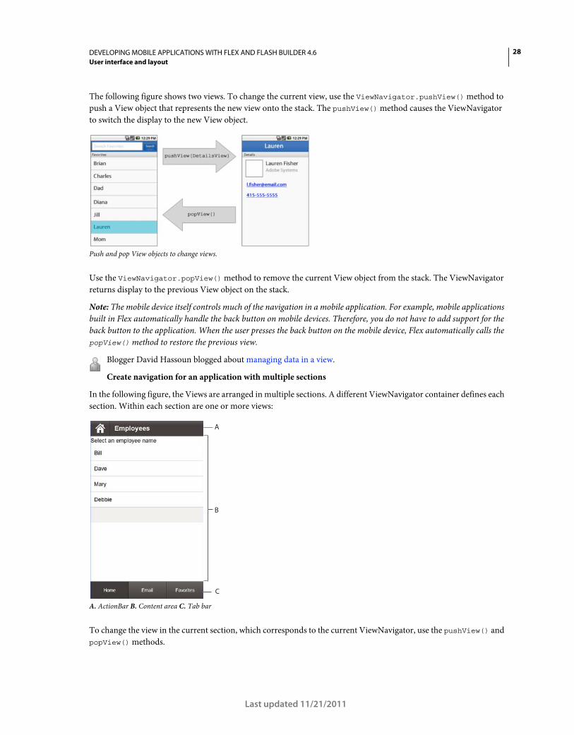
28DEVELOPING MOBILE APPLICATIONS WITH FLEX AND FLASH BUILDER 4.6
User interface and layout
Last updated 11/21/2011
The following figure shows two views. To change the current view, use the ViewNavigator.pushView() method to
push a View object that represents the new view onto the stack. The pushView() method causes the ViewNavigator
to switch the display to the new View object.
Push and pop View objects to change views.
Use the ViewNavigator.popView() method to remove the current View object from the stack. The ViewNavigator
returns display to the previous View object on the stack.
Note: The mobile device itself controls much of the navigation in a mobile application. For example, mobile applications
built in Flex automatically handle the back button on mobile devices. Therefore, you do not have to add support for the
back button to the application. When the user presses the back button on the mobile device, Flex automatically calls the
popView() method to restore the previous view.
Blogger David Hassoun blogged about managing data in a view.
Create navigation for an application with multiple sections
In the following figure, the Views are arranged in multiple sections. A different ViewNavigator container defines each
section. Within each section are one or more views:
A. ActionBar B. Content area C. Tab bar
To change the view in the current section, which corresponds to the current ViewNavigator, use the pushView() and
popView() methods.
C
A
B
29DEVELOPING MOBILE APPLICATIONS WITH FLEX AND FLASH BUILDER 4.6
User interface and layout
Last updated 11/21/2011
To change the current section, use the tab bar. When you switch sections, you switch to the ViewNavigator container
of the new section. The display changes to show the View object currently at the top of the stack for the new
ViewNavigator.
You can also change sections programmatically by using the TabbedViewNavigator.selectedIndex property. This
property contains the 0-based index of the selected view navigator.
Handle user input in a mobile application
User input requires different handling in a mobile application compared to a desktop or browser application. In a
desktop application built for AIR, or in a browser application built for Flash Player, the primary input devices are a
mouse and a keyboard. For mobile devices, the primary input device is a touch screen. A mobile device often has some
type of keyboard, and some devices also include a five-way directional input method (left, right, up, down, and select).
The mx.core.UIComponent class defines the interactionMode style property that you use to configure components
for the type of input used in the application. For the Halo and Spark themes, the default value is mouse to indicate that
the mouse is the primary input device. For the Mobile theme, the default value is touch to indicate that the primary
input device is the touch screen.
Hardware key support in a mobile application
Applications defined by the ViewNavigatorApplication or TabbedViewNavigatorApplication containers respond to
the back and menu hardware keys of a device. When the user presses the back key, the application navigates to the
previous view. If there is no previous view, the application exits and displays the home screen of the device.
When the user presses the back button, the active view of the application receives a backKeyPressed event. You can
cancel the action of the back key by calling preventDefault() in the event handler for the backKeyPressed event.
When the user presses the menu button, the current view’s ViewMenu container appears, if defined. The ViewMenu
container defines a menu at the bottom of a View container. Each View container defines its own menu specific to that
view.
The current View container dispatches a menuKeyPressed event when the user presses the menu key. To cancel the
action of the menu button, and prevent the ViewMenu from appearing, call the preventDefault() method in the
event handler for the menuKeyPressed event.
For more information, see “Define menus in a mobile application” on page 67.
Handle hardware keyboard events in a mobile application
In a mobile application built in Flex, you can detect when the user presses a hardware key on a mobile device. For
example, on an Android device you can detect when the user presses the Home button, Back button, or Menu button.
To detect when the user presses a hardware key, create an event handlers for the KEY_UP or KEY_DOWN event. Typically,
you attach the event handlers to the application object as defined by the Application, ViewNavigatorApplication, or
TabbedViewNavigatorApplication containers.
The Stage object defines the drawing area of an application. Each application has one Stage object. Therefore, an
application container is actually a child container of the Stage object.
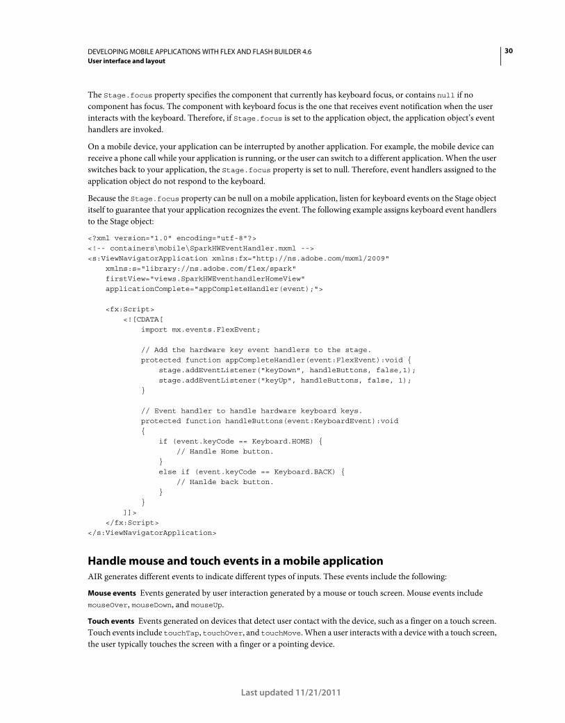
30DEVELOPING MOBILE APPLICATIONS WITH FLEX AND FLASH BUILDER 4.6
User interface and layout
Last updated 11/21/2011
The Stage.focus property specifies the component that currently has keyboard focus, or contains null if no
component has focus. The component with keyboard focus is the one that receives event notification when the user
interacts with the keyboard. Therefore, if Stage.focus is set to the application object, the application object’s event
handlers are invoked.
On a mobile device, your application can be interrupted by another application. For example, the mobile device can
receive a phone call while your application is running, or the user can switch to a different application. When the user
switches back to your application, the Stage.focus property is set to null. Therefore, event handlers assigned to the
application object do not respond to the keyboard.
Because the Stage.focus property can be null on a mobile application, listen for keyboard events on the Stage object
itself to guarantee that your application recognizes the event. The following example assigns keyboard event handlers
to the Stage object:
<?xml version="1.0" encoding="utf-8"?> <!-- containers\mobile\SparkHWEventHandler.mxml --> <s:ViewNavigatorApplication xmlns:fx="http://ns.adobe.com/mxml/2009" xmlns:s="library://ns.adobe.com/flex/spark" firstView="views.SparkHWEventhandlerHomeView" applicationComplete="appCompleteHandler(event);"> <fx:Script> <![CDATA[ import mx.events.FlexEvent; // Add the hardware key event handlers to the stage. protected function appCompleteHandler(event:FlexEvent):void { stage.addEventListener("keyDown", handleButtons, false,1); stage.addEventListener("keyUp", handleButtons, false, 1); } // Event handler to handle hardware keyboard keys. protected function handleButtons(event:KeyboardEvent):void { if (event.keyCode == Keyboard.HOME) { // Handle Home button. } else if (event.keyCode == Keyboard.BACK) { // Hanlde back button. } } ]]> </fx:Script> </s:ViewNavigatorApplication>
Handle mouse and touch events in a mobile application
AIR generates different events to indicate different types of inputs. These events include the following:
Mouse events Events generated by user interaction generated by a mouse or touch screen. Mouse events include
mouseOver, mouseDown, and mouseUp.
Touch events Events generated on devices that detect user contact with the device, such as a finger on a touch screen.
Touch events include touchTap, touchOver, and touchMove. When a user interacts with a device with a touch screen,
the user typically touches the screen with a finger or a pointing device.
31DEVELOPING MOBILE APPLICATIONS WITH FLEX AND FLASH BUILDER 4.6
User interface and layout
Last updated 11/21/2011
Gesture events Events generated by multi-touch interactions, such as pressing two fingers on a touch screen at the
same time. Gesture events include gesturePan, gestureRotate, and gestureZoom. For example, on some devices
you can use a pinch gesture to zoom out from an image.
Built in support for mouse events
The Flex framework and the Flex component set have built-in support for mouse events, but not for touch or gesture
events. For example, the user interacts with Flex components in a mobile application by using the touch screen. The
components respond to mouse events, such as mouseDown and mouseOver, but not to touch or gesture events.
For example, the user presses the touch screen to select the Flex Button control. The Button control uses the mouseUp
and mouseDown events to signal that the user has interacted with the control. The Scroller control uses the mouseMove
and mouseUp events to indicate that the user is scrolling the display.
Adobe Developer Evangelist Paul Trani explains handling touch and gesture events in Touch Events and Gesture
on Mobile.
Control events generated by AIR
The flash.ui.Multitouch.inputMode property controls the events generated by AIR and Flash Player. The
flash.ui.Multitouch.inputMode property can have one of the following values:
• MultitouchInputMode.NONE AIR dispatches mouse events, but not touch or gesture events.
• MultitouchInputMode.TOUCH_POINT AIR dispatches mouse and touch events, but not gesture events. In this
mode, the Flex framework receives the same mouse events as it does for MultitouchInputMode.NONE.
• MultitouchInputMode.GESTURE AIR dispatches mouse and gesture events, but not touch events. In this mode,
the Flex framework receives the same mouse events as it does for MultitouchInputMode.NONE.
As the list shows, regardless of the setting of the flash.ui.Multitouch.inputMode property, AIR always dispatches
mouse events. Therefore, Flex components can always respond to user interactions made by using a touch screen.
Flex lets you use any value of flash.ui.Multitouch.inputMode property in your application. Therefore, while the
Flex components do not respond to touch and gesture events, you can add functionality to your application to respond
to any event. For example, you can add an event handler to the Button control to handle touch events, such as the
touchTap, touchOver, and touchMove events.
The ActionScript 3.0 Developer’s Guide provides an overview of handling user input on different devices, and on
working with touch, multitouch, and gesture input. For more information, see:
• Basics of user interaction
• Touch, multitouch and gesture input
Define a mobile application and a splash screen
Create a mobile application container
The first tag in a mobile application is typically one of the following:
• The <s:ViewNavigatorApplication> tag defines a mobile application with a single section.
• The <s:TabbedViewNavigatorApplication> tag defines a mobile application with multiple sections.
When you develop applications for a tablet, screen size limits are not as important as they are with phones. Therefore,
for a tablet, you do not have to structure your application around small views. Instead, you can build your application
using the standard Spark Application container with the supported mobile components and skins.
32DEVELOPING MOBILE APPLICATIONS WITH FLEX AND FLASH BUILDER 4.6
User interface and layout
Last updated 11/21/2011
Note: When developing any mobile application, you can use the Spark Application container, even for phones. However,
the Spark Application container does not include support for view navigation, data persistence, and the device’s back and
menu buttons. For more information, see “Differences between the mobile application containers and the Spark
Application container” on page 32About the Application container.
The mobile application containers have the following default characteristics:
Differences between the mobile application containers and the Spark
Application container
The Spark mobile application containers have much of the same functionality as the Spark Application container. For
example, you apply styles to the mobile application containers in the same way that you apply them to the Spark
Application container.
The Spark mobile application containers have several characteristics that differ from the Spark Application container:
• Support for persistence
Supports data storage to and loading from a disk. Persistence lets users interrupt a mobile application, for example
to answer a phone call, and then restore the state of the application when the call ends.
• Support for view navigation
The ViewNavigatorApplication container automatically creates a single ViewNavigator container to control
navigation among views.
The TabbedViewNavigatorApplication container automatically creates a single TabbedViewNavigator container
to control navigation among sections.
• Support for the device’s back and menu buttons
When the user presses the back button, the application navigates back to the previous view on the stack. When the
user presses the menu button, the current view’s ViewMenu container appears, if defined.
For more information on the Spark application container, see About the Application container.
Handle application-level events
The NativeApplication class represents an AIR application. It provides application information and application-wide
functions, and it dispatches application-level events. You can access the instance of the NativeApplication class that
corresponds to your mobile application by using the static property NativeApplication.nativeApplication.
For example, the NativeApplication class defines the invoke and exiting events that you can handle in your mobile
application. The following example references the NativeApplication class to define an event handler for the exiting
event:
Characteristic Spark ViewNavigatorApplication and TabbedViewNavigatorApplication containers
Default size 100% high and 100% wide to take up all available screen space.
Child layout Defined by the individual View containers that make up the views of the application.
Default padding 0 pixels.
Scroll bars None. If you add scroll bars to the application container’s skin, users can scroll the entire application. That
includes the ActionBar and tab bar area of the application. You typically do not want those areas of the
view to scroll. Therefore, add scroll bars to the individual View containers of the application, rather than
to the application container’s skin.
33DEVELOPING MOBILE APPLICATIONS WITH FLEX AND FLASH BUILDER 4.6
User interface and layout
Last updated 11/21/2011
<?xml version="1.0" encoding="utf-8"?> <!-- containers\mobile\SparkNativeApplicationEvent.mxml --> <s:ViewNavigatorApplication xmlns:fx="http://ns.adobe.com/mxml/2009" xmlns:s="library://ns.adobe.com/flex/spark" firstView="views.EmployeeMainView" creationComplete="creationCompleteHandler(event);"> <fx:Script> <![CDATA[ import mx.events.FlexEvent; protected function creationCompleteHandler(event:FlexEvent):void { // Reference NativeApplication to assign the event handler. NativeApplication.nativeApplication.addEventListener(Event.EXITING, myExiting); } protected function myExiting(event:Event):void { // Handle exiting event. } ]]> </fx:Script> </s:ViewNavigatorApplication>
Notice that you access the ViewNavigator by using the ViewNavigatorApplication.navigator property.
Add a splash screen to an application
The Spark Application container is a base class for the ViewNavigatorApplication and
TabbedViewNavigatorApplication containers. When used with the Spark theme, the Spark Application container
supports an application preloader to show the download and initialization progress of an application SWF file.
When used with the Mobile theme, you can display a splash screen instead. The splash screen appears during
application startup.
Note: To use the splash screen in a desktop application, set the Application.preloader property to
spark.preloaders.SplashScreen. Also add the frameworks\libs\mobile\mobilecomponents.swc to the library path of the
application.
Blogger Joseph Labrecque blogged about AIR for Android Splash Screen with Flex.
Blogger Brent Arnold created a video about adding a splash screen to an Android application.
Add a splash screen from an image file
You can load a splash screen directly from an image file. To configure the splash screen, you use the
splashScreenImage, splashScreenScaleMode, and splashScreenMinimumDisplayTime properties of the
application class.
For example, the following example loads a splash screen from a JPG file using the letterbox format:
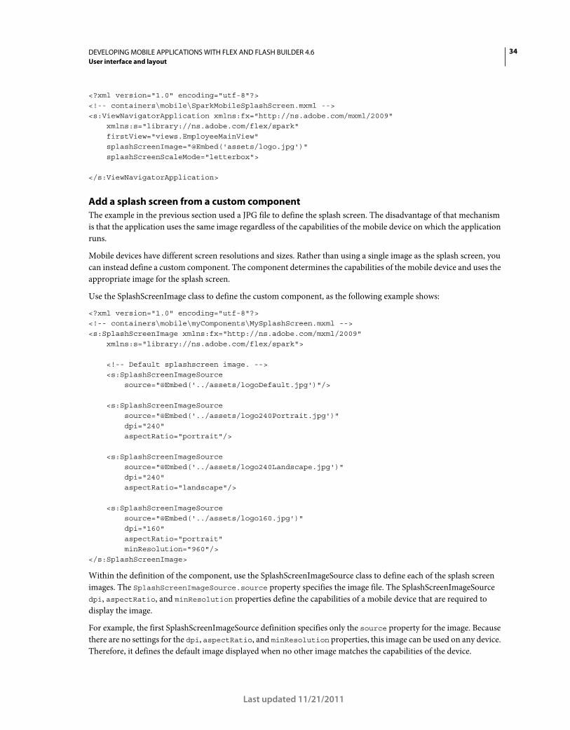
34DEVELOPING MOBILE APPLICATIONS WITH FLEX AND FLASH BUILDER 4.6
User interface and layout
Last updated 11/21/2011
<?xml version="1.0" encoding="utf-8"?> <!-- containers\mobile\SparkMobileSplashScreen.mxml --> <s:ViewNavigatorApplication xmlns:fx="http://ns.adobe.com/mxml/2009" xmlns:s="library://ns.adobe.com/flex/spark" firstView="views.EmployeeMainView" splashScreenImage="@Embed('assets/logo.jpg')" splashScreenScaleMode="letterbox"> </s:ViewNavigatorApplication>
Add a splash screen from a custom component
The example in the previous section used a JPG file to define the splash screen. The disadvantage of that mechanism
is that the application uses the same image regardless of the capabilities of the mobile device on which the application
runs.
Mobile devices have different screen resolutions and sizes. Rather than using a single image as the splash screen, you
can instead define a custom component. The component determines the capabilities of the mobile device and uses the
appropriate image for the splash screen.
Use the SplashScreenImage class to define the custom component, as the following example shows:
<?xml version="1.0" encoding="utf-8"?> <!-- containers\mobile\myComponents\MySplashScreen.mxml --> <s:SplashScreenImage xmlns:fx="http://ns.adobe.com/mxml/2009" xmlns:s="library://ns.adobe.com/flex/spark"> <!-- Default splashscreen image. --> <s:SplashScreenImageSource source="@Embed('../assets/logoDefault.jpg')"/> <s:SplashScreenImageSource source="@Embed('../assets/logo240Portrait.jpg')" dpi="240" aspectRatio="portrait"/> <s:SplashScreenImageSource source="@Embed('../assets/logo240Landscape.jpg')" dpi="240" aspectRatio="landscape"/> <s:SplashScreenImageSource source="@Embed('../assets/logo160.jpg')" dpi="160" aspectRatio="portrait" minResolution="960"/> </s:SplashScreenImage>
Within the definition of the component, use the SplashScreenImageSource class to define each of the splash screen
images. The SplashScreenImageSource.source property specifies the image file. The SplashScreenImageSource
dpi, aspectRatio, and minResolution properties define the capabilities of a mobile device that are required to
display the image.
For example, the first SplashScreenImageSource definition specifies only the source property for the image. Because
there are no settings for the dpi, aspectRatio, and minResolution properties, this image can be used on any device.
Therefore, it defines the default image displayed when no other image matches the capabilities of the device.
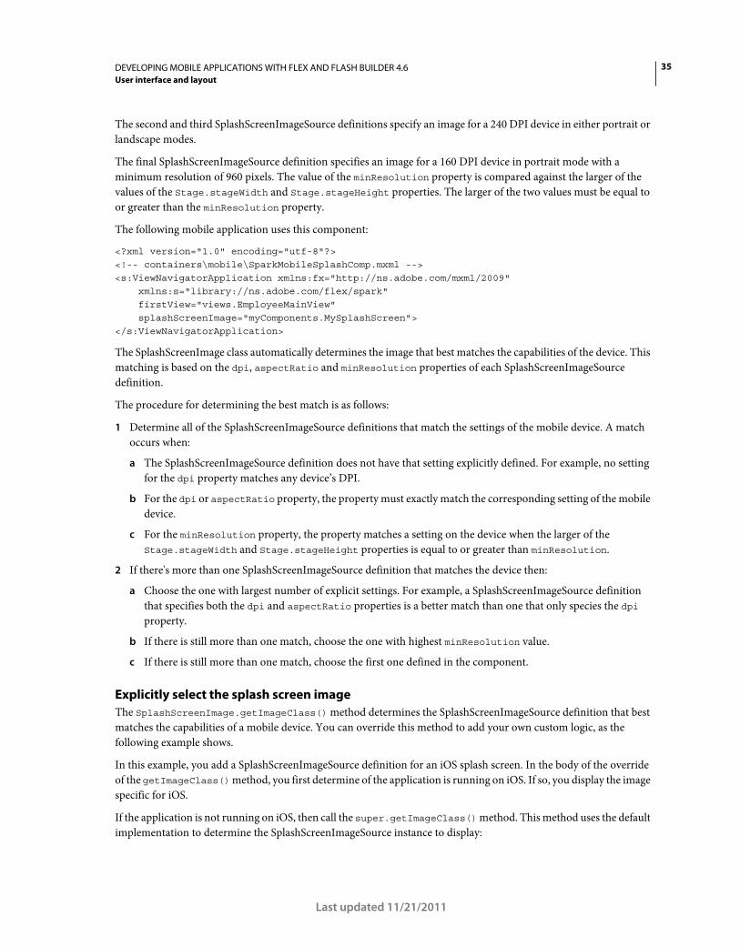
35DEVELOPING MOBILE APPLICATIONS WITH FLEX AND FLASH BUILDER 4.6
User interface and layout
Last updated 11/21/2011
The second and third SplashScreenImageSource definitions specify an image for a 240 DPI device in either portrait or
landscape modes.
The final SplashScreenImageSource definition specifies an image for a 160 DPI device in portrait mode with a
minimum resolution of 960 pixels. The value of the minResolution property is compared against the larger of the
values of the Stage.stageWidth and Stage.stageHeight properties. The larger of the two values must be equal to
or greater than the minResolution property.
The following mobile application uses this component:
<?xml version="1.0" encoding="utf-8"?> <!-- containers\mobile\SparkMobileSplashComp.mxml --> <s:ViewNavigatorApplication xmlns:fx="http://ns.adobe.com/mxml/2009" xmlns:s="library://ns.adobe.com/flex/spark" firstView="views.EmployeeMainView" splashScreenImage="myComponents.MySplashScreen"> </s:ViewNavigatorApplication>
The SplashScreenImage class automatically determines the image that best matches the capabilities of the device. This
matching is based on the dpi, aspectRatio and minResolution properties of each SplashScreenImageSource
definition.
The procedure for determining the best match is as follows:
1 Determine all of the SplashScreenImageSource definitions that match the settings of the mobile device. A match
occurs when:
a The SplashScreenImageSource definition does not have that setting explicitly defined. For example, no setting
for the dpi property matches any device’s DPI.
b For the dpi or aspectRatio property, the property must exactly match the corresponding setting of the mobile
device.
c For the minResolution property, the property matches a setting on the device when the larger of the
Stage.stageWidth and Stage.stageHeight properties is equal to or greater than minResolution.
2 If there's more than one SplashScreenImageSource definition that matches the device then:
a Choose the one with largest number of explicit settings. For example, a SplashScreenImageSource definition
that specifies both the dpi and aspectRatio properties is a better match than one that only species the dpi
property.
b If there is still more than one match, choose the one with highest minResolution value.
c If there is still more than one match, choose the first one defined in the component.
Explicitly select the splash screen image
The SplashScreenImage.getImageClass() method determines the SplashScreenImageSource definition that best
matches the capabilities of a mobile device. You can override this method to add your own custom logic, as the
following example shows.
In this example, you add a SplashScreenImageSource definition for an iOS splash screen. In the body of the override
of the getImageClass() method, you first determine of the application is running on iOS. If so, you display the image
specific for iOS.
If the application is not running on iOS, then call the super.getImageClass() method. This method uses the default
implementation to determine the SplashScreenImageSource instance to display:
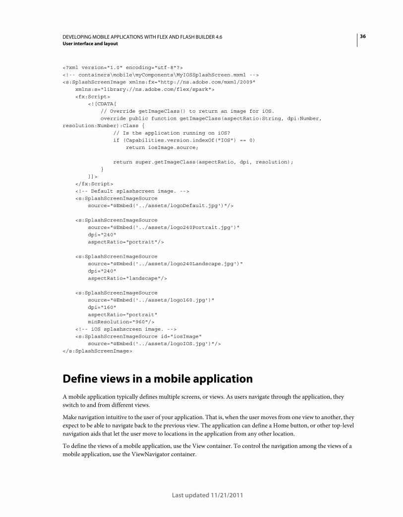
36DEVELOPING MOBILE APPLICATIONS WITH FLEX AND FLASH BUILDER 4.6
User interface and layout
Last updated 11/21/2011
<?xml version="1.0" encoding="utf-8"?> <!-- containers\mobile\myComponents\MyIOSSplashScreen.mxml --> <s:SplashScreenImage xmlns:fx="http://ns.adobe.com/mxml/2009" xmlns:s="library://ns.adobe.com/flex/spark"> <fx:Script> <![CDATA[ // Override getImageClass() to return an image for iOS. override public function getImageClass(aspectRatio:String, dpi:Number, resolution:Number):Class { // Is the application running on iOS? if (Capabilities.version.indexOf("IOS") == 0) return iosImage.source; return super.getImageClass(aspectRatio, dpi, resolution); } ]]> </fx:Script> <!-- Default splashscreen image. --> <s:SplashScreenImageSource source="@Embed('../assets/logoDefault.jpg')"/> <s:SplashScreenImageSource source="@Embed('../assets/logo240Portrait.jpg')" dpi="240" aspectRatio="portrait"/> <s:SplashScreenImageSource source="@Embed('../assets/logo240Landscape.jpg')" dpi="240" aspectRatio="landscape"/> <s:SplashScreenImageSource source="@Embed('../assets/logo160.jpg')" dpi="160" aspectRatio="portrait" minResolution="960"/> <!-- iOS splashscreen image. --> <s:SplashScreenImageSource id="iosImage" source="@Embed('../assets/logoIOS.jpg')"/> </s:SplashScreenImage>
Define views in a mobile application
A mobile application typically defines multiple screens, or views. As users navigate through the application, they
switch to and from different views.
Make navigation intuitive to the user of your application. That is, when the user moves from one view to another, they
expect to be able to navigate back to the previous view. The application can define a Home button, or other top-level
navigation aids that let the user move to locations in the application from any other location.
To define the views of a mobile application, use the View container. To control the navigation among the views of a
mobile application, use the ViewNavigator container.
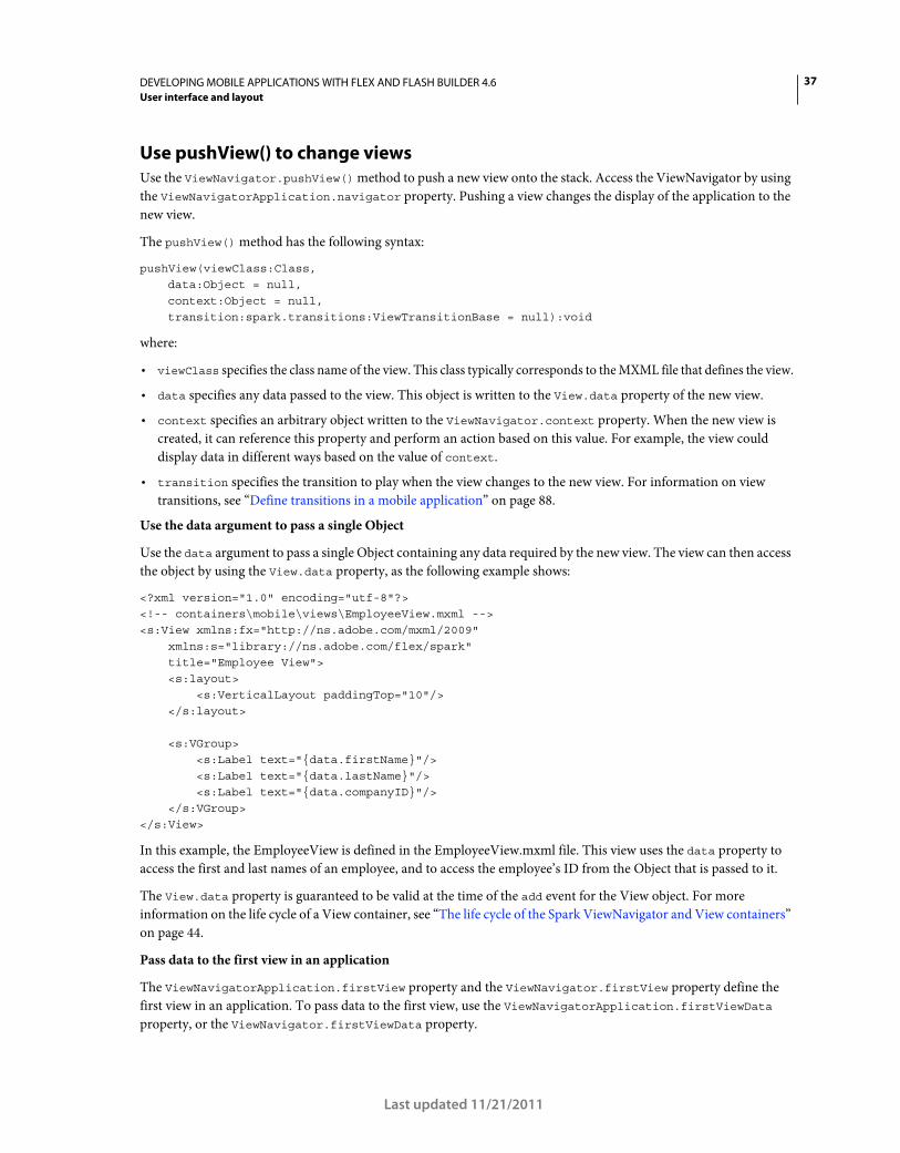
37DEVELOPING MOBILE APPLICATIONS WITH FLEX AND FLASH BUILDER 4.6
User interface and layout
Last updated 11/21/2011
Use pushView() to change views
Use the ViewNavigator.pushView() method to push a new view onto the stack. Access the ViewNavigator by using
the ViewNavigatorApplication.navigator property. Pushing a view changes the display of the application to the
new view.
The pushView() method has the following syntax:
pushView(viewClass:Class, data:Object = null, context:Object = null, transition:spark.transitions:ViewTransitionBase = null):void
where:
• viewClass specifies the class name of the view. This class typically corresponds to the MXML file that defines the view.
• data specifies any data passed to the view. This object is written to the View.data property of the new view.
• context specifies an arbitrary object written to the ViewNavigator.context property. When the new view is
created, it can reference this property and perform an action based on this value. For example, the view could
display data in different ways based on the value of context.
• transition specifies the transition to play when the view changes to the new view. For information on view
transitions, see “Define transitions in a mobile application” on page 88.
Use the data argument to pass a single Object
Use the data argument to pass a single Object containing any data required by the new view. The view can then access
the object by using the View.data property, as the following example shows:
<?xml version="1.0" encoding="utf-8"?> <!-- containers\mobile\views\EmployeeView.mxml --> <s:View xmlns:fx="http://ns.adobe.com/mxml/2009" xmlns:s="library://ns.adobe.com/flex/spark" title="Employee View"> <s:layout> <s:VerticalLayout paddingTop="10"/> </s:layout> <s:VGroup> <s:Label text="{data.firstName}"/> <s:Label text="{data.lastName}"/> <s:Label text="{data.companyID}"/> </s:VGroup> </s:View>
In this example, the EmployeeView is defined in the EmployeeView.mxml file. This view uses the data property to
access the first and last names of an employee, and to access the employee’s ID from the Object that is passed to it.
The View.data property is guaranteed to be valid at the time of the add event for the View object. For more
information on the life cycle of a View container, see “The life cycle of the Spark ViewNavigator and View containers”
on page 44.
Pass data to the first view in an application
The ViewNavigatorApplication.firstView property and the ViewNavigator.firstView property define the
first view in an application. To pass data to the first view, use the ViewNavigatorApplication.firstViewData
property, or the ViewNavigator.firstViewData property.
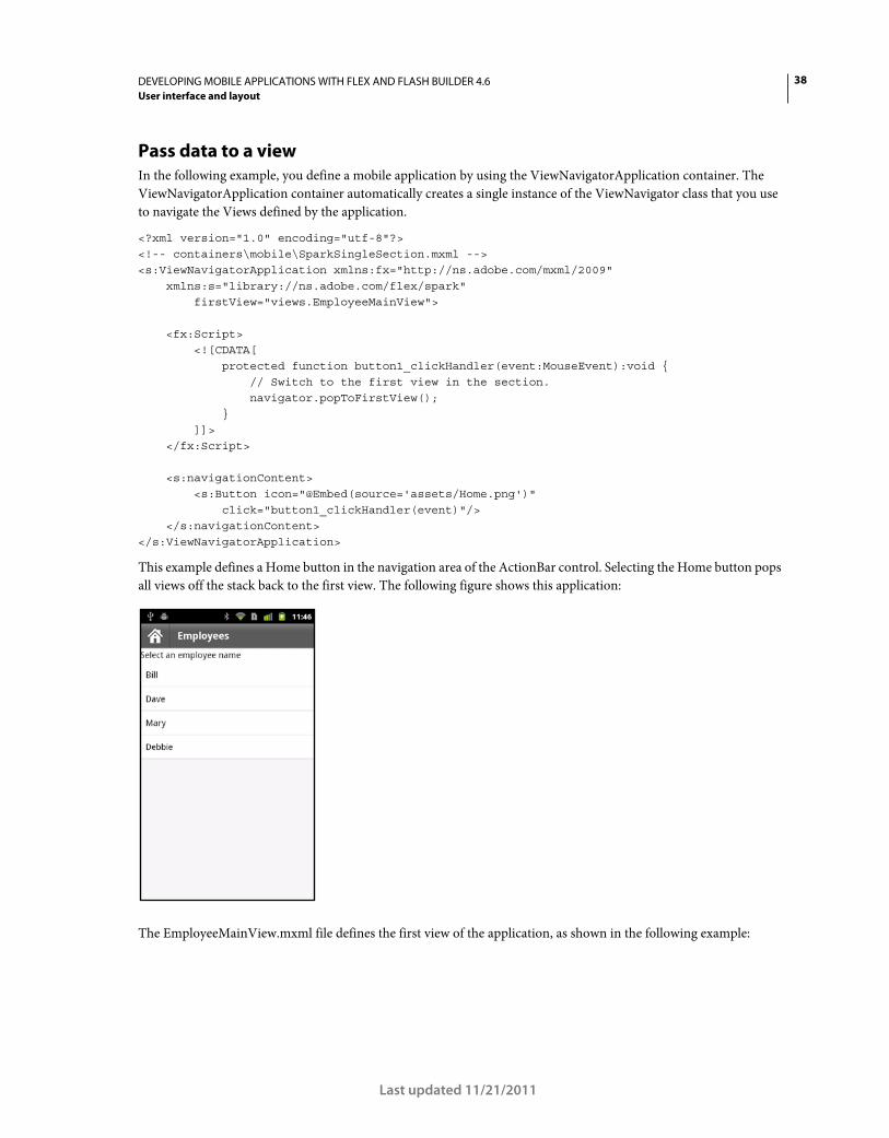
38DEVELOPING MOBILE APPLICATIONS WITH FLEX AND FLASH BUILDER 4.6
User interface and layout
Last updated 11/21/2011
Pass data to a view
In the following example, you define a mobile application by using the ViewNavigatorApplication container. The
ViewNavigatorApplication container automatically creates a single instance of the ViewNavigator class that you use
to navigate the Views defined by the application.
<?xml version="1.0" encoding="utf-8"?> <!-- containers\mobile\SparkSingleSection.mxml --> <s:ViewNavigatorApplication xmlns:fx="http://ns.adobe.com/mxml/2009" xmlns:s="library://ns.adobe.com/flex/spark" firstView="views.EmployeeMainView"> <fx:Script> <![CDATA[ protected function button1_clickHandler(event:MouseEvent):void { // Switch to the first view in the section. navigator.popToFirstView(); } ]]> </fx:Script> <s:navigationContent> <s:Button icon="@Embed(source='assets/Home.png')" click="button1_clickHandler(event)"/> </s:navigationContent> </s:ViewNavigatorApplication>
This example defines a Home button in the navigation area of the ActionBar control. Selecting the Home button pops
all views off the stack back to the first view. The following figure shows this application:
The EmployeeMainView.mxml file defines the first view of the application, as shown in the following example:
39DEVELOPING MOBILE APPLICATIONS WITH FLEX AND FLASH BUILDER 4.6
User interface and layout
Last updated 11/21/2011
<?xml version="1.0" encoding="utf-8"?> <!-- containers\mobile\views\EmployeeMainView.mxml --> <s:View xmlns:fx="http://ns.adobe.com/mxml/2009" xmlns:s="library://ns.adobe.com/flex/spark" title="Employees"> <s:layout> <s:VerticalLayout paddingTop="10"/> </s:layout> <fx:Script> <![CDATA[ import spark.events.IndexChangeEvent; protected function myList_changeHandler(event:IndexChangeEvent):void { navigator.pushView(views.EmployeeView,myList.selectedItem); } ]]> </fx:Script> <s:Label text="Select an employee name"/> <s:List id="myList" width="100%" height="100%" labelField="firstName" change="myList_changeHandler(event)"> <s:ArrayCollection> <fx:Object firstName="Bill" lastName="Smith" companyID="11233"/> <fx:Object firstName="Dave" lastName="Jones" companyID="13455"/> <fx:Object firstName="Mary" lastName="Davis" companyID="11543"/> <fx:Object firstName="Debbie" lastName="Cooper" companyID="14266"/> </s:ArrayCollection> </s:List> </s:View>
This view defines a List control that lets the user select an employee name. Selecting a name causes the event handler
for the change event to push an instance of a different view onto the stack, named EmployeeView. Pushing an instance
of EmployeeView causes the application to change to the EmployeeView view.
The pushView() method in this example takes two arguments: the new view and an Object that defines the data to
pass to the new view. In this example, you pass the data object corresponding to the currently selected item in the List
control.
The following example shows the definition of EmployeeView:
<?xml version="1.0" encoding="utf-8"?> <!-- containers\mobile\views\EmployeeView.mxml --> <s:View xmlns:fx="http://ns.adobe.com/mxml/2009" xmlns:s="library://ns.adobe.com/flex/spark" title="Employee View"> <s:layout> <s:VerticalLayout paddingTop="10"/> </s:layout> <s:VGroup> <s:Label text="{data.firstName}"/> <s:Label text="{data.lastName}"/> <s:Label text="{data.companyID}"/> </s:VGroup> </s:View>
40DEVELOPING MOBILE APPLICATIONS WITH FLEX AND FLASH BUILDER 4.6
User interface and layout
Last updated 11/21/2011
The EmployeeView displays the three fields from the data provider of the List control. EmployeeView accesses the data
passed to it by using the View.data property.
Blogger Steve Mathews created a cookbook entry on Passing data between Views.
Return data from a view
The ViewNavigator.popView() method returns control from the current view back to the previous view on the
stack. When the popView() method executes, the current view is destroyed and the previous View on the stack is
restored. Restoring the previous View includes resetting its data property from the stack,
For a complete description of the life cycle of a view, including events dispatched during creation, see “The life cycle
of the Spark ViewNavigator and View containers” on page 44.
The new view is restored with the original data object at the time it was deactivated. Therefore, you do not typically
use the original data object to pass data back from the old view to the new view. Instead, you override the
createReturnObject() method of the old view. The createReturnObject() method returns a single Object.
Return object type
The Object returned by the createReturnObject() method is written to the
ViewNavigator.poppedViewReturnedObject property. The data type of the poppedViewReturnedObject
property is ViewReturnObject.
ViewReturnObject defines two properties, context and object. The object property contains the Object returned
by the createReturnObject() method. The context property contains the value of the context argument that was
passed to the view when the view was pushed onto the navigation stack using pushView().
The poppedViewReturnedObject property is guaranteed to be set in the new view before the view receives the add
event. If the poppedViewReturnedObject.object property is null, no data was returned.
Example: Passing data to a view
The following example, SelectFont.mxml, shows a view that lets you set a font size. The override of the
createReturnObject() method returns the value as a Number. The fontSize field of the data property passed in
from the previous view sets the initial value of the TextInput control:
<?xml version="1.0" encoding="utf-8"?> <!-- containers\mobile\views\SelectFont.mxml --> <s:View xmlns:fx="http://ns.adobe.com/mxml/2009" xmlns:s="library://ns.adobe.com/flex/spark" title="Select Font Size" add="addHandler(event);"> <s:layout> <s:VerticalLayout paddingTop="10" paddingLeft="10" paddingRight="10"/> </s:layout> <fx:Script> <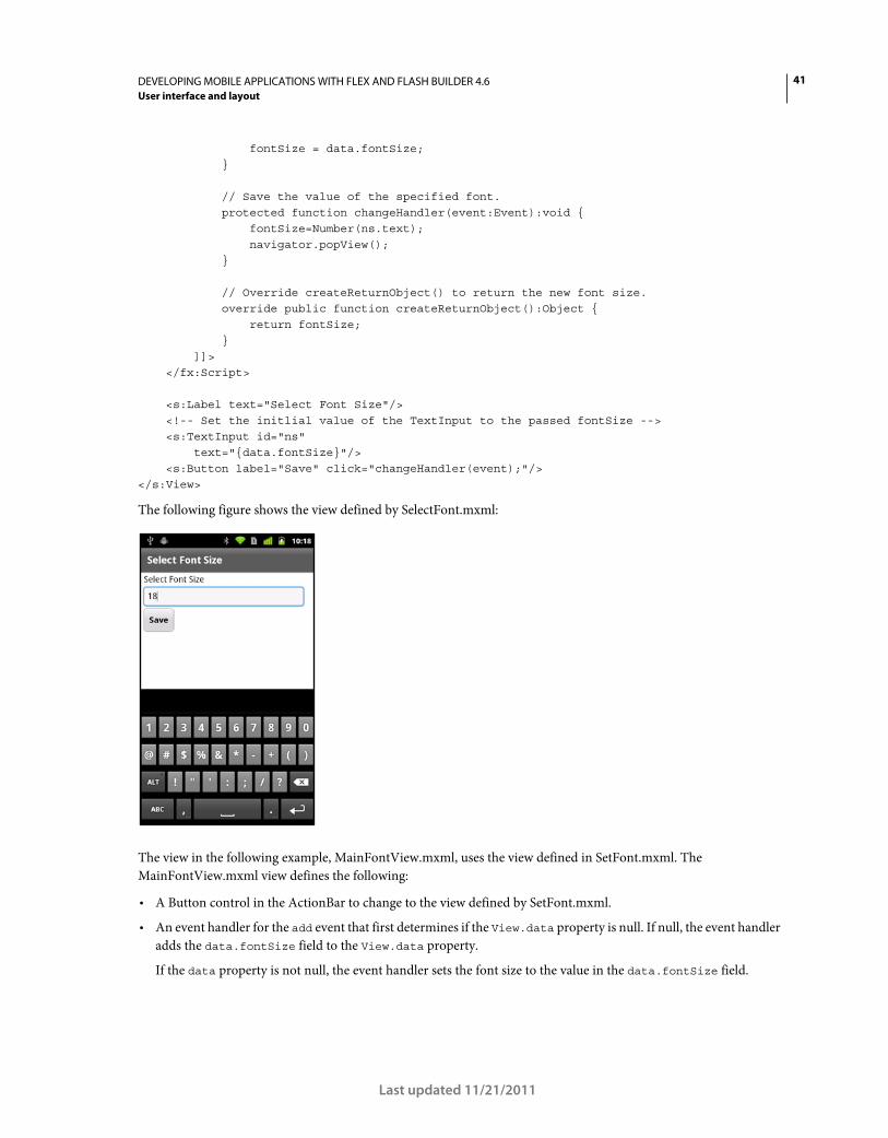
41DEVELOPING MOBILE APPLICATIONS WITH FLEX AND FLASH BUILDER 4.6
User interface and layout
Last updated 11/21/2011
fontSize = data.fontSize; } // Save the value of the specified font. protected function changeHandler(event:Event):void { fontSize=Number(ns.text); navigator.popView(); } // Override createReturnObject() to return the new font size. override public function createReturnObject():Object { return fontSize; } ]]> </fx:Script> <s:Label text="Select Font Size"/> <!-- Set the initlial value of the TextInput to the passed fontSize --> <s:TextInput id="ns" text="{data.fontSize}"/> <s:Button label="Save" click="changeHandler(event);"/> </s:View>
The following figure shows the view defined by SelectFont.mxml:
The view in the following example, MainFontView.mxml, uses the view defined in SetFont.mxml. The
MainFontView.mxml view defines the following:
• A Button control in the ActionBar to change to the view defined by SetFont.mxml.
• An event handler for the add event that first determines if the View.data property is null. If null, the event handler
adds the data.fontSize field to the View.data property.
If the data property is not null, the event handler sets the font size to the value in the data.fontSize field.
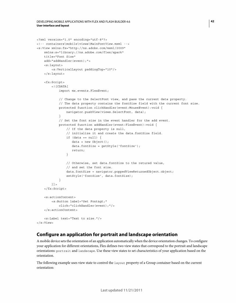
42DEVELOPING MOBILE APPLICATIONS WITH FLEX AND FLASH BUILDER 4.6
User interface and layout
Last updated 11/21/2011
<?xml version="1.0" encoding="utf-8"?> <!-- containers\mobile\views\MainFontView.mxml --> <s:View xmlns:fx="http://ns.adobe.com/mxml/2009" xmlns:s="library://ns.adobe.com/flex/spark" title="Font Size" add="addHandler(event);"> <s:layout> <s:VerticalLayout paddingTop="10"/> </s:layout> <fx:Script> <![CDATA[ import mx.events.FlexEvent; // Change to the SelectFont view, and pass the current data property. // The data property contains the fontSize field with the current font size. protected function clickHandler(event:MouseEvent):void { navigator.pushView(views.SelectFont, data); } // Set the font size in the event handler for the add event. protected function addHandler(event:FlexEvent):void { // If the data property is null, // initialize it and create the data.fontSize field. if (data == null) { data = new Object(); data.fontSize = getStyle('fontSize'); return; } // Otherwise, set data.fontSize to the retured value, // and set the font size. data.fontSize = navigator.poppedViewReturnedObject.object; setStyle('fontSize', data.fontSize); } ]]> </fx:Script> <s:actionContent> <s:Button label="Set Font>" click="clickHandler(event);"/> </s:actionContent> <s:Label text="Text to size."/> </s:View>
Configure an application for portrait and landscape orientation
A mobile device sets the orientation of an application automatically when the device orientation changes. To configure
your application for different orientations, Flex defines two view states that correspond to the portrait and landscape
orientations: portrait and landscape. Use these view states to set characteristics of your application based on the
orientation.
The following example uses view state to control the layout property of a Group container based on the current
orientation:
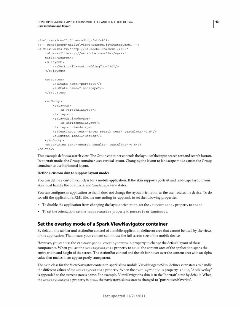
43DEVELOPING MOBILE APPLICATIONS WITH FLEX AND FLASH BUILDER 4.6
User interface and layout
Last updated 11/21/2011
<?xml version="1.0" encoding="utf-8"?> <!-- containers\mobile\views\SearchViewStates.mxml --> <s:View xmlns:fx="http://ns.adobe.com/mxml/2009" xmlns:s="library://ns.adobe.com/flex/spark" title="Search"> <s:layout> <s:VerticalLayout paddingTop="10"/> </s:layout> <s:states> <s:State name="portrait"/> <s:State name="landscape"/> </s:states> <s:Group> <s:layout> <s:VerticalLayout/> </s:layout> <s:layout.landscape> <s:HorizontalLayout/> </s:layout.landscape> <s:TextInput text="Enter search text" textAlpha="0.5"/> <s:Button label="Search"/> </s:Group> <s:TextArea text="search results" textAlpha="0.5"/> </s:View>
This example defines a search view. The Group container controls the layout of the input search text and search button.
In portrait mode, the Group container uses vertical layout. Changing the layout to landscape mode causes the Group
container to use horizontal layout.
Define a custom skin to support layout modes
You can define a custom skin class for a mobile application. If the skin supports portrait and landscape layout, your
skin must handle the portrait and landscape view states.
You can configure an application so that it does not change the layout orientation as the user rotates the device. To do
so, edit the application’s XML file, the one ending in -app.xml, to set the following properties:
• To disable the application from changing the layout orientation, set the <autoOrients> property to false.
• To set the orientation, set the <aspectRatio> property to portrait or landscape.
Set the overlay mode of a Spark ViewNavigator container
By default, the tab bar and ActionBar control of a mobile application define an area that cannot be used by the views
of the application. That means your content cannot use the full screen size of the mobile device.
However, you can use the ViewNavigator.overlayControls property to change the default layout of these
components. When you set the overlayControls property to true, the content area of the application spans the
entire width and height of the screen. The ActionBar control and the tab bar hover over the content area with an alpha
value that makes them appear partly transparent.
The skin class for the ViewNavigator container, spark.skins.mobile.ViewNavigatorSkin, defines view states to handle
the different values of the overlayControls property. When the overlayControls property is true, "AndOverlay"
is appended to the current state’s name. For example, ViewNavigator's skin is in the "portrait" state by default. When
the overlayControls property is true, the navigator's skin's state is changed to "portraitAndOverlay".
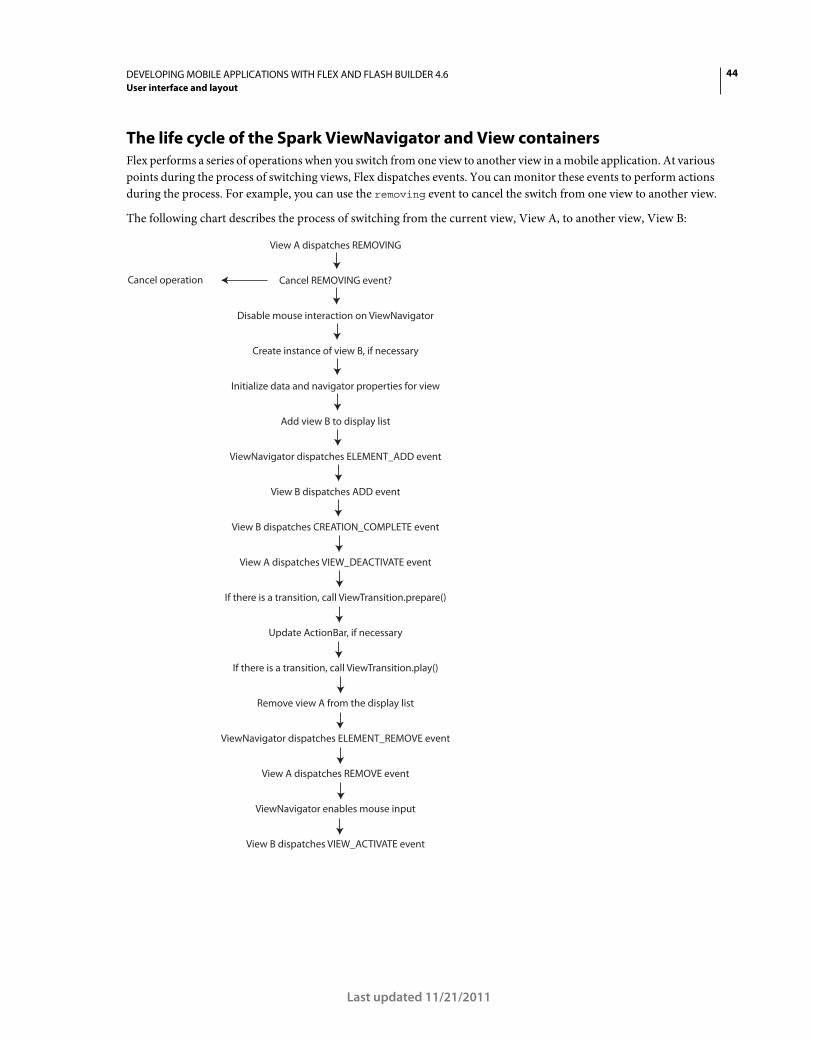
44DEVELOPING MOBILE APPLICATIONS WITH FLEX AND FLASH BUILDER 4.6
User interface and layout
Last updated 11/21/2011
The life cycle of the Spark ViewNavigator and View containers
Flex performs a series of operations when you switch from one view to another view in a mobile application. At various
points during the process of switching views, Flex dispatches events. You can monitor these events to perform actions
during the process. For example, you can use the removing event to cancel the switch from one view to another view.
The following chart describes the process of switching from the current view, View A, to another view, View B:
View A dispatches REMOVING
Cancel REMOVING event?Cancel operation
Disable mouse interaction on ViewNavigator
Create instance of view B, if necessary
Initialize data and navigator properties for view
Add view B to display list
ViewNavigator dispatches ELEMENT_ADD event
View B dispatches ADD event
View B dispatches CREATION_COMPLETE event
View A dispatches VIEW_DEACTIVATE event
If there is a transition, call ViewTransition.prepare()
Update ActionBar, if necessary
If there is a transition, call ViewTransition.play()
Remove view A from the display list
ViewNavigator dispatches ELEMENT_REMOVE event
View A dispatches REMOVE event
ViewNavigator enables mouse input
View B dispatches VIEW_ACTIVATE event
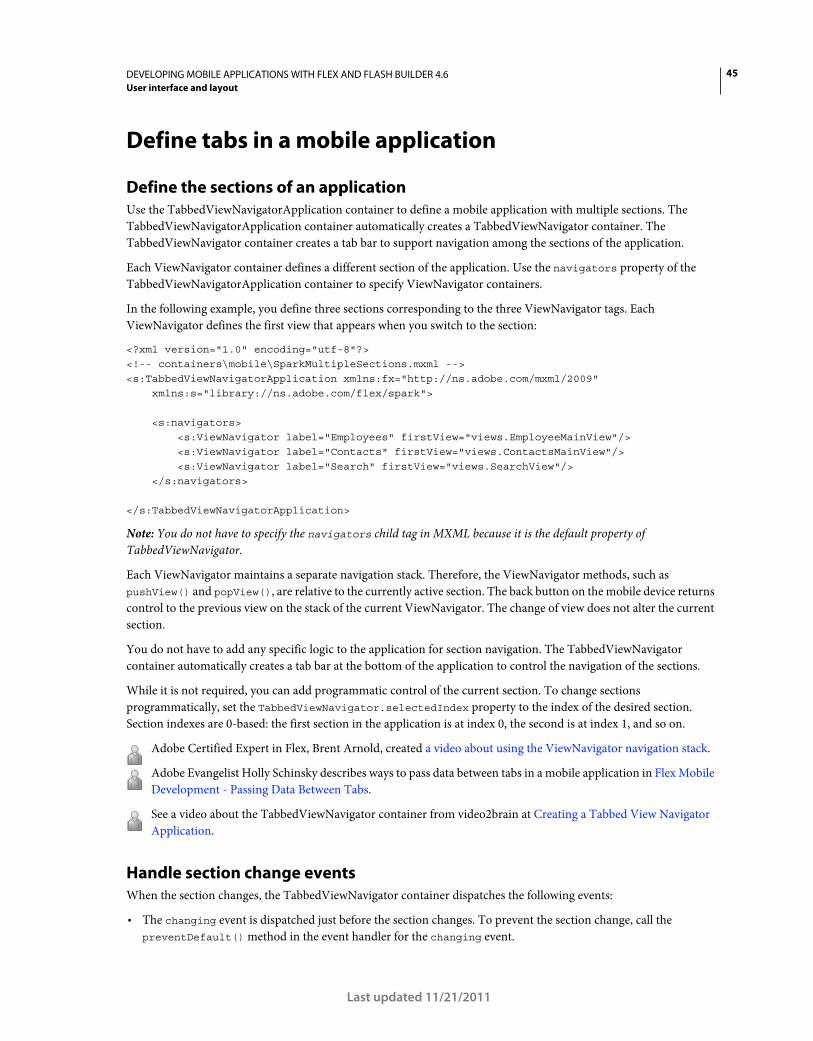
45DEVELOPING MOBILE APPLICATIONS WITH FLEX AND FLASH BUILDER 4.6
User interface and layout
Last updated 11/21/2011
Define tabs in a mobile application
Define the sections of an application
Use the TabbedViewNavigatorApplication container to define a mobile application with multiple sections. The
TabbedViewNavigatorApplication container automatically creates a TabbedViewNavigator container. The
TabbedViewNavigator container creates a tab bar to support navigation among the sections of the application.
Each ViewNavigator container defines a different section of the application. Use the navigators property of the
TabbedViewNavigatorApplication container to specify ViewNavigator containers.
In the following example, you define three sections corresponding to the three ViewNavigator tags. Each
ViewNavigator defines the first view that appears when you switch to the section:
<?xml version="1.0" encoding="utf-8"?> <!-- containers\mobile\SparkMultipleSections.mxml --> <s:TabbedViewNavigatorApplication xmlns:fx="http://ns.adobe.com/mxml/2009" xmlns:s="library://ns.adobe.com/flex/spark"> <s:navigators> <s:ViewNavigator label="Employees" firstView="views.EmployeeMainView"/> <s:ViewNavigator label="Contacts" firstView="views.ContactsMainView"/> <s:ViewNavigator label="Search" firstView="views.SearchView"/> </s:navigators> </s:TabbedViewNavigatorApplication>
Note: You do not have to specify the navigators child tag in MXML because it is the default property of
TabbedViewNavigator.
Each ViewNavigator maintains a separate navigation stack. Therefore, the ViewNavigator methods, such as
pushView() and popView(), are relative to the currently active section. The back button on the mobile device returns
control to the previous view on the stack of the current ViewNavigator. The change of view does not alter the current
section.
You do not have to add any specific logic to the application for section navigation. The TabbedViewNavigator
container automatically creates a tab bar at the bottom of the application to control the navigation of the sections.
While it is not required, you can add programmatic control of the current section. To change sections
programmatically, set the TabbedViewNavigator.selectedIndex property to the index of the desired section.
Section indexes are 0-based: the first section in the application is at index 0, the second is at index 1, and so on.
Adobe Certified Expert in Flex, Brent Arnold, created a video about using the ViewNavigator navigation stack.
Adobe Evangelist Holly Schinsky describes ways to pass data between tabs in a mobile application in Flex Mobile
Development - Passing Data Between Tabs.
See a video about the TabbedViewNavigator container from video2brain at Creating a Tabbed View Navigator
Application.
Handle section change events
When the section changes, the TabbedViewNavigator container dispatches the following events:
• The changing event is dispatched just before the section changes. To prevent the section change, call the
preventDefault() method in the event handler for the changing event.
46DEVELOPING MOBILE APPLICATIONS WITH FLEX AND FLASH BUILDER 4.6
User interface and layout
Last updated 11/21/2011
• The change event is dispatched just after the section changes.
Configure the ActionBar with multiple sections
An ActionBar control is associated with a ViewNavigator. Therefore, you can configure the ActionBar for each section
when you define the section’s ViewNavigator. In the following example, you configure the ActionBar separately for
each ViewNavigator container that defines the three different sections of the application:
<?xml version="1.0" encoding="utf-8"?> <!-- containers\mobile\SparkMultipleSectionsAB.mxml --> <s:TabbedViewNavigatorApplication xmlns:fx="http://ns.adobe.com/mxml/2009" xmlns:s="library://ns.adobe.com/flex/spark"> <fx:Script> <![CDATA[ protected function button1_clickHandler(event:MouseEvent):void { // Switch to the first section in the application. tabbedNavigator.selectedIndex = 0; // Switch to the first view in the section. ViewNavigator(tabbedNavigator.selectedNavigator).popToFirstView(); } ]]> </fx:Script> <s:navigators> <s:ViewNavigator label="Employees" firstView="views.EmployeeMainView"> <s:navigationContent> <s:Button icon="@Embed(source='assets/Home.png')" click="button1_clickHandler(event)"/> </s:navigationContent> </s:ViewNavigator> <s:ViewNavigator label="Contacts" firstView="views.ContactsMainView"> <s:navigationContent> <s:Button icon="@Embed(source='assets/Home.png')" click="button1_clickHandler(event)"/> </s:navigationContent> </s:ViewNavigator> <s:ViewNavigator label="Search" firstView="views.SearchView"> <s:navigationContent> <s:Button icon="@Embed(source='assets/Home.png')" click="button1_clickHandler(event)"/> </s:navigationContent> </s:ViewNavigator> </s:navigators> </s:TabbedViewNavigatorApplication>
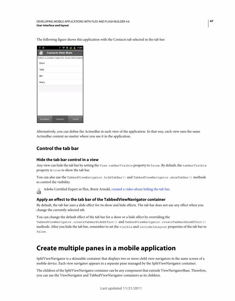
47DEVELOPING MOBILE APPLICATIONS WITH FLEX AND FLASH BUILDER 4.6
User interface and layout
Last updated 11/21/2011
The following figure shows this application with the Contacts tab selected in the tab bar:
Alternatively, you can define the ActionBar in each view of the application. In that way, each view uses the same
ActionBar content no matter where you use it in the application.
Control the tab bar
Hide the tab bar control in a view
Any view can hide the tab bar by setting the View.tabBarVisible property to false. By default, the tabBarVisible
property is true to show the tab bar.
You can also use the TabbedViewNavigator.hideTabBar() and TabbedViewNavigator.showTabBar() methods
to control the visibility.
Adobe Certified Expert in Flex, Brent Arnold, created a video about hiding the tab bar.
Apply an effect to the tab bar of the TabbedViewNavigator container
By default, the tab bar uses a slide effect for its show and hide effects. The tab bar does not use any effect when you
change the currently selected tab.
You can change the default effect of the tab bar for a show or a hide effect by overriding the
TabbedViewNavigator.createTabBarHideEffect() and TabbedViewNavigator.createTabBarShowEffect()
methods. After you hide the tab bar, remember to set the visible and includeInLayout properties of the tab bar to
false.
Create multiple panes in a mobile application
SplitViewNavigator is a skinnable container that displays two or more child view navigators in the same screen of a
mobile device. Each view navigator appears in a separate pane managed by the SplitViewNavigator container.
The children of the SplitViewNavigator container can be any component that extends ViewNavigatorBase. Therefore,
you can use the ViewNavigator and TabbedViewNavigator containers as its children.
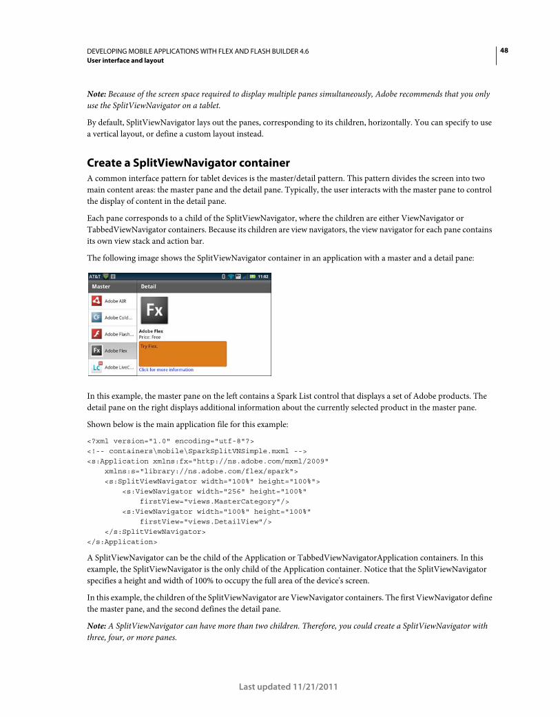
48DEVELOPING MOBILE APPLICATIONS WITH FLEX AND FLASH BUILDER 4.6
User interface and layout
Last updated 11/21/2011
Note: Because of the screen space required to display multiple panes simultaneously, Adobe recommends that you only
use the SplitViewNavigator on a tablet.
By default, SplitViewNavigator lays out the panes, corresponding to its children, horizontally. You can specify to use
a vertical layout, or define a custom layout instead.
Create a SplitViewNavigator container
A common interface pattern for tablet devices is the master/detail pattern. This pattern divides the screen into two
main content areas: the master pane and the detail pane. Typically, the user interacts with the master pane to control
the display of content in the detail pane.
Each pane corresponds to a child of the SplitViewNavigator, where the children are either ViewNavigator or
TabbedViewNavigator containers. Because its children are view navigators, the view navigator for each pane contains
its own view stack and action bar.
The following image shows the SplitViewNavigator container in an application with a master and a detail pane:
In this example, the master pane on the left contains a Spark List control that displays a set of Adobe products. The
detail pane on the right displays additional information about the currently selected product in the master pane.
Shown below is the main application file for this example:
<?xml version="1.0" encoding="utf-8"?> <!-- containers\mobile\SparkSplitVNSimple.mxml --> <s:Application xmlns:fx="http://ns.adobe.com/mxml/2009" xmlns:s="library://ns.adobe.com/flex/spark"> <s:SplitViewNavigator width="100%" height="100%"> <s:ViewNavigator width="256" height="100%" firstView="views.MasterCategory"/> <s:ViewNavigator width="100%" height="100%" firstView="views.DetailView"/> </s:SplitViewNavigator> </s:Application>
A SplitViewNavigator can be the child of the Application or TabbedViewNavigatorApplication containers. In this
example, the SplitViewNavigator is the only child of the Application container. Notice that the SplitViewNavigator
specifies a height and width of 100% to occupy the full area of the device's screen.
In this example, the children of the SplitViewNavigator are ViewNavigator containers. The first ViewNavigator define
the master pane, and the second defines the detail pane.
Note: A SplitViewNavigator can have more than two children. Therefore, you could create a SplitViewNavigator with
three, four, or more panes.
49DEVELOPING MOBILE APPLICATIONS WITH FLEX AND FLASH BUILDER 4.6
User interface and layout
Last updated 11/21/2011
Access the panes and views of a SplitViewNavigator container
The SplitViewNavigator container defines methods and properties that you use to access its children. For example, use
the SplitViewNavigator.numViewNavigators property to determine the number of child view navigators of the
SplitViewNavigator.
Use the SplitViewNavigator.getViewNavigatorAt() method to access the children of the SplitViewNavigator
based on the child’s index. In the example above, the ViewNavigator of the master pane is at index 0, and the
ViewNavigator of the detail pane is at index 1.
Note: The SplitViewNavigator container inherits the getElementAt() and getElementIndex() methods. Do not use those
methods with SplitViewNavigator. Instead, use getViewNavigatorAt().
From a reference to the ViewNavigator for an individual pane, the SplitViewNavigator can access the individual views
of the pane.
Access the SplitViewNavigator container from a child by using the parentNavigator property of the child. For
example, ViewNavigator.parentNavigator contains a reference to the parent SplitViewNavigator container.
A View container accesses its parent view navigator by using the View.navigator property. Therefore, a view can
access the SplitViewNavigator by using View.navigator.parentNavigator.
In the example above, the ViewNavigator for the master pane specifies as its first view MasterCategory. That view is
defined in the MasterCategory.mxml file, as shown below:
<?xml version="1.0" encoding="utf-8"?> <!-- containers\mobile\views\MasterCategory.mxml --> <s:View xmlns:fx="http://ns.adobe.com/mxml/2009" xmlns:s="library://ns.adobe.com/flex/spark" title="Master"> <fx:Script> <![CDATA[ import spark.components.SplitViewNavigator; import spark.components.ViewNavigator; import spark.events.IndexChangeEvent; protected function myList_changeHandler(event:IndexChangeEvent):void { // Create a reference to the SplitViewNavigator. var splitNavigator:SplitViewNavigator = navigator.parentNavigator as SplitViewNavigator; // Create a reference to the ViewNavigator for the Detail frame. var detailNavigator:ViewNavigator = splitNavigator.getViewNavigatorAt(1) as ViewNavigator; // Change the view of the Detail frame based on the selected List item. detailNavigator.pushView(DetailView, myList.selectedItem); } ]]> </fx:Script> <s:List width="100%" height="100%" id="myList" change="myList_changeHandler(event);"> <s:dataProvider> <s:ArrayCollection> <fx:Object Product="Adobe AIR" Price="11.99" Image="@Embed(source='../assets/air_icon_sm.jpg')" Description="Try AIR." Link="air"/> <fx:Object Product="Adobe ColdFusion" Price="11.99"
50DEVELOPING MOBILE APPLICATIONS WITH FLEX AND FLASH BUILDER 4.6
User interface and layout
Last updated 11/21/2011
Image="@Embed(source='../assets/coldfusion_icon_sm.jpg')" Description="Try ColdFusion." Link="coldfusion"/> <fx:Object Product="Adobe Flash Player" Price="11.99" Image="@Embed(source='../assets/flashplayer_icon_sm.jpg')" Description="Try Flash." Link="flashplayer"/> <fx:Object Product="Adobe Flex" Price="Free" Image="@Embed(source='../assets/flex_icon_sm.jpg')" Description="Try Flex." Link="flex.html"/> <fx:Object Product="Adobe LiveCycleDS" Price="11.99" Image="@Embed(source='../assets/livecycleds_icon_sm.jpg')" Description="Try LiveCycle DS." Link="livcycle"/> <fx:Object Product="Adobe LiveCycle ES2" Price="11.99" Image="@Embed(source='../assets/livecyclees_icon_sm.jpg')" Description="Try LiveCycle ES." Link="livcycle"/> </s:ArrayCollection> </s:dataProvider> <s:itemRenderer> <fx:Component> <s:IconItemRenderer labelField="Product" iconField="Image"/> </fx:Component> </s:itemRenderer> </s:List> </s:View>
MasterCategory.mxml defines a single List control that contains information about Adobe products. The List control
uses a custom item renderer to display a label and an icon for each product. For more information about defining item
renderers, see Using a mobile item renderer with a Spark list-based control.
The List control in the master pane uses the change event to update the detail pane in response to a user action. The
event handler first obtains a reference to the SplitViewNavigator container. From that reference, it obtains a reference
to the ViewNavigator of the detail frame.
Finally, the event handler calls the push()method on the ViewNavigator of the detail frame. The push() method takes
two arguments, the view pushed onto the stack of the ViewNavigator, and an object containing information about the
selected List item.
Update the detail pane of a SplitViewNavigator container
The detail pane of the example above displays information about the selected item in the List control of the master
pane. The detail pane is named DetailView, and is defined in the DetailView.mxml file, as shown below:
51DEVELOPING MOBILE APPLICATIONS WITH FLEX AND FLASH BUILDER 4.6
User interface and layout
Last updated 11/21/2011
<?xml version="1.0" encoding="utf-8"?> <!-- containers\mobile\views\DetailView.mxml --> <s:View xmlns:fx="http://ns.adobe.com/mxml/2009" xmlns:s="library://ns.adobe.com/flex/spark" title="Detail"> <s:layout> <s:VerticalLayout paddingTop="10" paddingLeft="10" paddingRight="10"/> </s:layout> <fx:Script> <![CDATA[ // Use navigateToURL() to open a link to the product page. protected function label1_clickHandler(event:MouseEvent):void { var destinationURL:String = "http://www.adobe.com/products/" + data.Link; navigateToURL(new URLRequest(destinationURL)); } ]]> </fx:Script> <s:VGroup width="461" height="670"> <s:Image source="{data.Image}" height="176" width="169" horizontalCenter="0" top="0"/> <s:Label text="{data.Product}" fontSize="24" fontWeight="bold" top="100" left="0"/> <s:Label text="Price: {data.Price}" top="125" left="0"/> <s:TextArea y="174" width="100%" height="20%" contentBackgroundColor="0xCC6600" text="{data.Description}"/> <s:Label text="Click for more information" color="#0000FF" click="label1_clickHandler(event)"/> </s:VGroup> </s:View>
The master pane passes an object to the DetailView.mxml file corresponding to the selected item in the List control.
The detail pane accesses that data by using the View.data property. The detail pane then displays the product’s image,
information about the product, and creates a hyperlink to a page with more information about the product.
For more information about passing data to a View container, see “Pass data to a view” on page 38.
Display panes based on device orientation
When developing an application for a tablet, you can use a different layout based on the orientation of the tablet. For
example, in landscape mode, the tablet has a wide screen area that can easily display multiple panes. In portrait layout,
where the screen is narrow, you can choose to hide a pane because of the reduced width of the screen.
The SplitViewNavigator container defines the autoHideFirstViewNavigator property that you use to control the
visibility of the first pane for different orientations. By default, autoHideFirstViewNavigator is false so that the
container shows the first pane regardless of orientation.
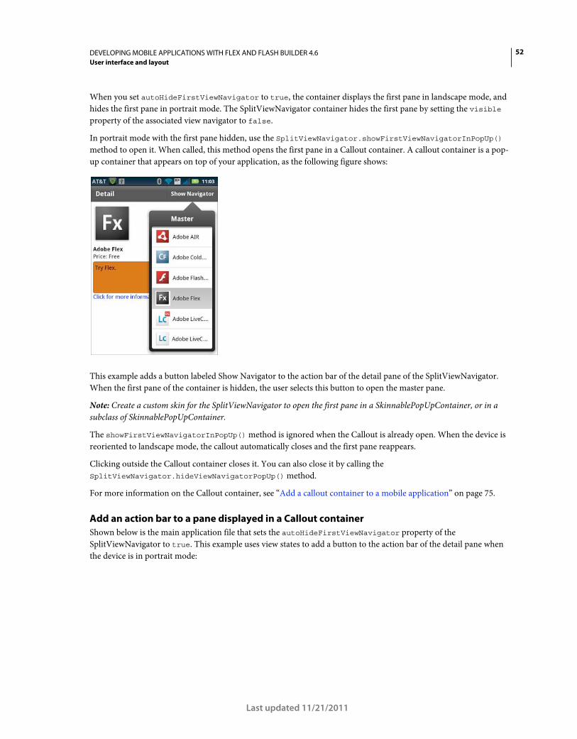
52DEVELOPING MOBILE APPLICATIONS WITH FLEX AND FLASH BUILDER 4.6
User interface and layout
Last updated 11/21/2011
When you set autoHideFirstViewNavigator to true, the container displays the first pane in landscape mode, and
hides the first pane in portrait mode. The SplitViewNavigator container hides the first pane by setting the visible
property of the associated view navigator to false.
In portrait mode with the first pane hidden, use the SplitViewNavigator.showFirstViewNavigatorInPopUp()
method to open it. When called, this method opens the first pane in a Callout container. A callout container is a pop-
up container that appears on top of your application, as the following figure shows:
This example adds a button labeled Show Navigator to the action bar of the detail pane of the SplitViewNavigator.
When the first pane of the container is hidden, the user selects this button to open the master pane.
Note: Create a custom skin for the SplitViewNavigator to open the first pane in a SkinnablePopUpContainer, or in a
subclass of SkinnablePopUpContainer.
The showFirstViewNavigatorInPopUp() method is ignored when the Callout is already open. When the device is
reoriented to landscape mode, the callout automatically closes and the first pane reappears.
Clicking outside the Callout container closes it. You can also close it by calling the
SplitViewNavigator.hideViewNavigatorPopUp() method.
For more information on the Callout container, see “Add a callout container to a mobile application” on page 75.
Add an action bar to a pane displayed in a Callout container
Shown below is the main application file that sets the autoHideFirstViewNavigator property of the
SplitViewNavigator to true. This example uses view states to add a button to the action bar of the detail pane when
the device is in portrait mode:
53DEVELOPING MOBILE APPLICATIONS WITH FLEX AND FLASH BUILDER 4.6
User interface and layout
Last updated 11/21/2011
<?xml version="1.0" encoding="utf-8"?> <!-- containers\mobile\SparkSVNOrient.mxml --> <s:Application xmlns:fx="http://ns.adobe.com/mxml/2009" xmlns:s="library://ns.adobe.com/flex/spark" resize="resizeHandler(event);"> <fx:Script> <![CDATA[ import mx.events.ResizeEvent; // Update the state based on the orientation of the device. protected function resizeHandler(event:ResizeEvent):void { currentState = aspectRatio; } ]]> </fx:Script> <s:states> <s:State name="portrait"/> <s:State name="landscape"/> </s:states> <s:SplitViewNavigator id="splitNavigator" width="100%" height="100%" autoHideFirstViewNavigator="true"> <s:ViewNavigator width="256" height="100%" firstView="views.MasterCategoryOrient"/> <s:ViewNavigator width="100%" height="100%" firstView="views.DetailView"> <s:actionContent.portrait> <s:Button id="navigatorButton" label="Show Navigator" click="splitNavigator.showFirstViewNavigatorInPopUp(navigatorButton);"/> </s:actionContent.portrait> </s:ViewNavigator> </s:SplitViewNavigator> </s:Application>
The application adds an event handler for the resize event on the Application container. Flex dispatches the resize
event when the orientation of the tablet changes. In the event handler for the resize event, you set the view state of the
application based on the current orientation. For more information on view states, see View states.
The view navigator for the detail pane uses the current state to control the appearance of a Button control in the action
bar. In landscape mode, the button is hidden because the master pan is visible.
In portrait mode, when the master pane is hidden, the Button control is visible in the action bar of the detail pane. The
user then selects the Button control to open the Callout containing the master pane.
Pass a reference to the Button control as the argument to the showFirstViewNavigatorInPopUp() method. This
argument specifies the host of the Callout container, meaning that the Callout is positioned relative to the Button
control.
Close the SplitViewNavigator callout in response to a user action
Clicking outside the Callout container closes it. By default however, clicking within the Callout container does not
close it.
54DEVELOPING MOBILE APPLICATIONS WITH FLEX AND FLASH BUILDER 4.6
User interface and layout
Last updated 11/21/2011
This example closes the Callout when the user selects a List item by calling the
SplitViewnavigator.hideViewNavigatorPopUp() method. You call this method in the event handler of the
change event of the List control, as the following example shows:
<?xml version="1.0" encoding="utf-8"?> <!-- containers\mobile\views\MasterCategoryOrient.mxml --> <s:View xmlns:fx="http://ns.adobe.com/mxml/2009" xmlns:s="library://ns.adobe.com/flex/spark" title="Master"> <fx:Script> <![CDATA[ import mx.events.FlexEvent; import spark.components.SplitViewNavigator; import spark.components.ViewNavigator; import spark.events.IndexChangeEvent; protected function myList_changeHandler(event:IndexChangeEvent):void { // Create a reference to the SplitViewNavigator. var splitNavigator:SplitViewNavigator = navigator.parentNavigator as SplitViewNavigator; // Create a reference to the ViewNavigator for the Detail frame. var detailNavigator:ViewNavigator = splitNavigator.getViewNavigatorAt(1) as ViewNavigator; // Change the view of the Detail frame based on the selected List item. detailNavigator.pushView(DetailView, myList.selectedItem); // If the Master is open in a callout, close it. // Otherwise, this method does nothing. splitNavigator.hideViewNavigatorPopUp(); } ]]> </fx:Script> <s:List width="100%" height="100%" id="myList" change="myList_changeHandler(event);"> <s:dataProvider> <s:ArrayCollection> <fx:Object Product="Adobe AIR" Price="11.99" Image="@Embed(source='../assets/air_icon_sm.jpg')" Description="Try AIR." Link="air"/> <fx:Object Product="Adobe ColdFusion" Price="11.99" Image="@Embed(source='../assets/coldfusion_icon_sm.jpg')" Description="Try ColdFusion." Link="coldfusion"/> <fx:Object Product="Adobe Flash Player" Price="11.99" Image="@Embed(source='../assets/flashplayer_icon_sm.jpg')" Description="Try Flash." Link="flashplayer"/>
55DEVELOPING MOBILE APPLICATIONS WITH FLEX AND FLASH BUILDER 4.6
User interface and layout
Last updated 11/21/2011
<fx:Object Product="Adobe Flex" Price="Free" Image="@Embed(source='../assets/flex_icon_sm.jpg')" Description="Try Flex." Link="flex.html"/> <fx:Object Product="Adobe LiveCycleDS" Price="11.99" Image="@Embed(source='../assets/livecycleds_icon_sm.jpg')" Description="Try LiveCycle DS." Link="livcycle"/> <fx:Object Product="Adobe LiveCycle ES2" Price="11.99" Image="@Embed(source='../assets/livecyclees_icon_sm.jpg')" Description="Try LiveCycle ES." Link="livcycle"/> </s:ArrayCollection> </s:dataProvider> <s:itemRenderer> <fx:Component> <s:IconItemRenderer labelField="Product" iconField="Image"/> </fx:Component> </s:itemRenderer> </s:List> </s:View>
Implementing persistence for the SplitViewNavigator container
An application for a mobile device is often interrupted by other actions, such as a text message, a phone call, or other
mobile applications. Typically, when an interrupted application is relaunched, the user expects the previous state of
the application to be restored. The persistence mechanism allows the device to restore the application to its previous
state. For more information, see “Enable persistence in a mobile application” on page 118.
SplitViewNavigator implement the loadViewData() and saveViewData() methods that it inherits from the
ViewNavigatorBase base class. Therefore, the SplitViewNavigator can serialize and deserialize the navigation stack and
view data for each of its child navigators.
However, you must manually call these methods when your application is interrupted, as the following example show:
<?xml version="1.0" encoding="utf-8"?> <!-- containers\mobile\SparkSplitVNPersist.mxml --> <s:Application xmlns:fx="http://ns.adobe.com/mxml/2009" xmlns:s="library://ns.adobe.com/flex/spark" initialize="initializeHandler(event);"> <fx:Script> <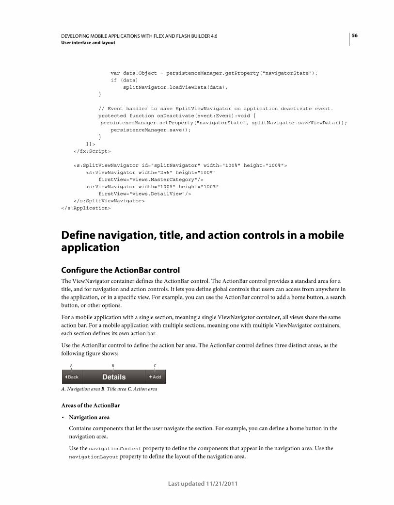
56DEVELOPING MOBILE APPLICATIONS WITH FLEX AND FLASH BUILDER 4.6
User interface and layout
Last updated 11/21/2011
var data:Object = persistenceManager.getProperty("navigatorState"); if (data) splitNavigator.loadViewData(data); } // Event handler to save SplitViewNavigator on application deactivate event. protected function onDeactivate(event:Event):void { persistenceManager.setProperty("navigatorState", splitNavigator.saveViewData()); persistenceManager.save(); } ]]> </fx:Script> <s:SplitViewNavigator id="splitNavigator" width="100%" height="100%"> <s:ViewNavigator width="256" height="100%" firstView="views.MasterCategory"/> <s:ViewNavigator width="100%" height="100%" firstView="views.DetailView"/> </s:SplitViewNavigator> </s:Application>
Define navigation, title, and action controls in a mobile application
Configure the ActionBar control
The ViewNavigator container defines the ActionBar control. The ActionBar control provides a standard area for a
title, and for navigation and action controls. It lets you define global controls that users can access from anywhere in
the application, or in a specific view. For example, you can use the ActionBar control to add a home button, a search
button, or other options.
For a mobile application with a single section, meaning a single ViewNavigator container, all views share the same
action bar. For a mobile application with multiple sections, meaning one with multiple ViewNavigator containers,
each section defines its own action bar.
Use the ActionBar control to define the action bar area. The ActionBar control defines three distinct areas, as the
following figure shows:
A. Navigation area B. Title area C. Action area
Areas of the ActionBar
• Navigation area
Contains components that let the user navigate the section. For example, you can define a home button in the
navigation area.
Use the navigationContent property to define the components that appear in the navigation area. Use the
navigationLayout property to define the layout of the navigation area.
A B C
57DEVELOPING MOBILE APPLICATIONS WITH FLEX AND FLASH BUILDER 4.6
User interface and layout
Last updated 11/21/2011
• Title area
Contains either a String containing title text, or components. If you specify components, you cannot specify a title
String.
Use the title property to specify the String to appear in the title area. Use the titleContent property to define
the components that appear in the title area. Use the titleLayout property to define the layout of the title area. If
you specify a value for the titleContent property, the ActionBar skin ignores the title property.
• Action area
Contains components that define actions the user can take in a view. For example, you can define a search or refresh
button as part of the action area.
Use the actionContent property to define the components that appear in the action area. Use the actionLayout
property to define the layout of the action area.
While Adobe recommends that you use the navigation, title, and action areas as described, there are no restrictions on
the components you place in these areas.
Set ActionBar properties in the ViewNavigatorApplication, ViewNavigator, or View container
You can set the properties that define the contents of the ActionBar control in the ViewNavigatorApplication
container, in the ViewNavigator container, or in individual View containers. The View container has the highest
priority, followed by the ViewNavigator, then the ViewNavigatorApplication container. Therefore, the properties that
you set in the ViewNavigatorApplication container apply to the entire application, but you can override them in the
ViewNavigator or View container.
Note: An ActionBar control is associated with a ViewNavigator, so it is specific to a single section of a mobile application.
Therefore, you cannot configure an ActionBar from the TabbedViewNavigatorApplication and TabbedViewNavigator
containers.
Example: Customize a Spark ActionBar control at the application level
The following example shows main application file of a mobile application:
<?xml version="1.0" encoding="utf-8"?> <!-- containers\mobile\SparkActionBarSimple.mxml --> <s:ViewNavigatorApplication xmlns:fx="http://ns.adobe.com/mxml/2009" xmlns:s="library://ns.adobe.com/flex/spark" firstView="views.MobileViewHome"> <fx:Script> <![CDATA[ protected function button1_clickHandler(event:MouseEvent):void { // Perform a refresh } ]]> </fx:Script> <s:navigationContent> <s:Button label="Home" click="navigator.popToFirstView();"/> </s:navigationContent> <s:actionContent> <s:Button label="Refresh" click="button1_clickHandler(event);"/> </s:actionContent> </s:ViewNavigatorApplication>
58DEVELOPING MOBILE APPLICATIONS WITH FLEX AND FLASH BUILDER 4.6
User interface and layout
Last updated 11/21/2011
This example defines a Home button in the navigation content area of the ActionBar control, and a Refresh button in
the action content area.
The following example defines the MobileViewHome View container that defines the first view of the application. The
View container defines a title string, “Home View”, but does not override either the navigation content or action
content areas of the ActionBar control:
<?xml version="1.0" encoding="utf-8"?> <!-- containers\mobile\views\MobileViewHome.mxml --> <s:View xmlns:fx="http://ns.adobe.com/mxml/2009" xmlns:s="library://ns.adobe.com/flex/spark" title="Home View"> <s:layout> <s:VerticalLayout paddingTop="10"/> </s:layout> <s:Label text="Home View"/> <s:Button label="Submit"/> </s:View>
Example: Customize an ActionBar control in a View container
This example uses a main application file with a single section that defines a Home button in the navigation area of the
ViewNavigatorApplication container. It also defines a Search button in the action area:
<?xml version="1.0" encoding="utf-8"?> <!-- containers\mobile\SparkActionBarOverride.mxml --> <s:ViewNavigatorApplication xmlns:fx="http://ns.adobe.com/mxml/2009" xmlns:s="library://ns.adobe.com/flex/spark" firstView="views.MobileViewHomeOverride"> <fx:Script> <![CDATA[ protected function button1_clickHandler(event:MouseEvent):void { navigator.popToFirstView(); } protected function button2_clickHandler(event:MouseEvent):void { // Handle search } ]]> </fx:Script> <s:navigationContent> <s:Button icon="@Embed(source='assets/Home.png')" click="button1_clickHandler(event);"/> </s:navigationContent> <s:actionContent> <s:Button icon="@Embed(source='assets/Search.png')" click="button2_clickHandler(event);"/> </s:actionContent> </s:ViewNavigatorApplication>
The first view of this application is the MobileViewHomeOverride view. The MobileViewHomeOverride view defines
a Button control to navigate to a second View container that defines a Search page:
59DEVELOPING MOBILE APPLICATIONS WITH FLEX AND FLASH BUILDER 4.6
User interface and layout
Last updated 11/21/2011
<?xml version="1.0" encoding="utf-8"?> <!-- containers\mobile\views\MobileViewHomeOverride.mxml --> <s:View xmlns:fx="http://ns.adobe.com/mxml/2009" xmlns:s="library://ns.adobe.com/flex/spark" title="Home View"> <s:layout> <s:VerticalLayout paddingTop="10"/> </s:layout> <fx:Script> <![CDATA[ // Navigate to the Search view. protected function button1_clickHandler(event:MouseEvent):void { navigator.pushView(SearchViewOverride); } ]]> </fx:Script> <s:Label text="Home View"/> <s:Button label="Search" click="button1_clickHandler(event)"/> </s:View>
The View container that defines the Search page overrides the title area and action area of the ActionBar control, as
shown below:
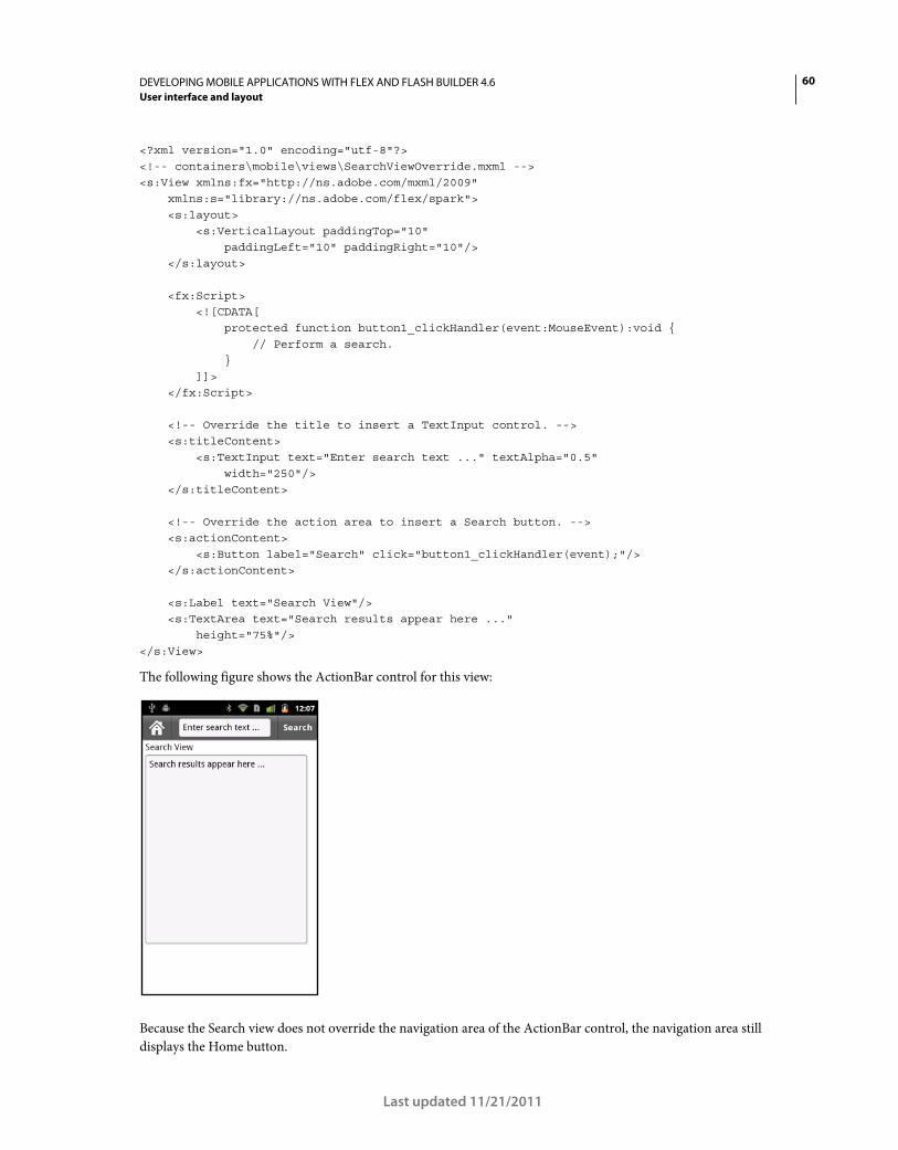
60DEVELOPING MOBILE APPLICATIONS WITH FLEX AND FLASH BUILDER 4.6
User interface and layout
Last updated 11/21/2011
<?xml version="1.0" encoding="utf-8"?> <!-- containers\mobile\views\SearchViewOverride.mxml --> <s:View xmlns:fx="http://ns.adobe.com/mxml/2009" xmlns:s="library://ns.adobe.com/flex/spark"> <s:layout> <s:VerticalLayout paddingTop="10" paddingLeft="10" paddingRight="10"/> </s:layout> <fx:Script> <![CDATA[ protected function button1_clickHandler(event:MouseEvent):void { // Perform a search. } ]]> </fx:Script> <!-- Override the title to insert a TextInput control. --> <s:titleContent> <s:TextInput text="Enter search text ..." textAlpha="0.5" width="250"/> </s:titleContent> <!-- Override the action area to insert a Search button. --> <s:actionContent> <s:Button label="Search" click="button1_clickHandler(event);"/> </s:actionContent> <s:Label text="Search View"/> <s:TextArea text="Search results appear here ..." height="75%"/> </s:View>
The following figure shows the ActionBar control for this view:
Because the Search view does not override the navigation area of the ActionBar control, the navigation area still
displays the Home button.
61DEVELOPING MOBILE APPLICATIONS WITH FLEX AND FLASH BUILDER 4.6
User interface and layout
Last updated 11/21/2011
Hide the ActionBar control
You can hide the ActionBar control in any view by setting the View.actionBarVisible property to false. By
default, the actionBarVisible property is true to show the ActionBar control.
Use the ViewNavigator.hideActionBar() method to hide the ActionBar control for all views controlled by the
ViewNavigator, as the following example shows:
<?xml version="1.0" encoding="utf-8"?> <!-- containers\mobile\SparkSingleSectionNoAB.mxml --> <s:ViewNavigatorApplication xmlns:fx="http://ns.adobe.com/mxml/2009" xmlns:s="library://ns.adobe.com/flex/spark" firstView="views.HomeView" creationComplete="creationCompleteHandler(event);"> <fx:Script> <![CDATA[ import mx.events.FlexEvent; protected function creationCompleteHandler(event:FlexEvent):void { // Access the ViewNavigator using the ViewNavigatorApplication.navigator property. navigator.hideActionBar(); } ]]> </fx:Script> </s:ViewNavigatorApplication>
You can define a custom effect for the ActionBar when the ActionBar is hidden, or when it is made visible. By default,
the ActionBar uses the Animate effect on a show or hide. Change the default effect by overriding the
ViewNavigator.createActionBarHideEffect() and ViewNavigator.createActionBarShowEffect()
methods. After playing an effect that hides the ActionBar, set its visible and includeInLayout properties to false
so that it is no longer included in the layout of the view.
Use scroll bars in a mobile application
Considerations when using scroll bars in a mobile application
Typically, if content takes up more than the visible area of the screen, the application displays scroll bars. Use the
Scroller control to add scroll bars to your application. Some components, such as the Spark List control, support
scrolling without the need of using the Scroller component. For more information, see Scrolling Spark containers.
The hit area of a scroll bar is the area of the screen in which you position the mouse to perform a scroll. In a desktop
or browser-based application, the hit area is the visible area of the scroll bar. In a mobile application, scroll bars are
hidden even when the content is larger than the visible area of the screen. Hiding the scroll bars enables the application
to use the full width and height of the screen.
A mobile application must differentiate between when the user interacts with a control, such as by selecting a Button
control, from when the user wants to scroll. One consideration with scroll bars in a mobile application is that Flex
components often change their appearance in response to a user interaction.
For example, when the user presses a Button control, the button changes its appearance to indicate that it is selected.
When the user releases the button, the button changes its appearance back to the deselected state. However, when
scrolling, if the user touches the screen over the Button, you do not want the button to change its appearance.
62DEVELOPING MOBILE APPLICATIONS WITH FLEX AND FLASH BUILDER 4.6
User interface and layout
Last updated 11/21/2011
Adobe engineer Steven Shongrunden shows an example of working with scroll bars in Saving scroll position
between views in a mobile Flex Application.
Scrolling terms
The following terms are used to describe scrolling in a mobile application:
Content For a scrollable component, such as a Group container or List control, the entire area of the component.
Depending on the screen size and application layout, only a subset of the content might be visible.
Viewport The subset of the content area of a component that is currently visible.
Drag A touch gesture that occurs when the user touches a scrollable area and then moves their finger so that the
content moves along with the gesture.
Velocity The rate and direction of movement of a drag gesture. Measured in pixels-per-millisecond along the X and
Y axis.
Throw A drag gesture where the user lifts their finger once the drag gesture has reached a certain velocity, and the
scrollable content continues to move.
Bounce A drag or throw gesture can move the viewport of a scrollable component outside the component’s content.
The viewport then displays an empty area. When you release your finger, or the velocity of a throw reaches zero, the
viewport bounces back to its resting point with the viewport filled with content. The movement slows as the viewport
reaches the resting point so that it comes to a smooth stop.
Scrolling modes in a mobile application
Scrollable components, such as List and Scroller, support different types of scrolling based on the setting of the
pageScrollingEnabled and scrollSnappingMode properties of the component. These properties are only valid
when the interactionMode style is set to touch.
The following table describes the scrolling modes:
pageScrollingEnabled scrollSnappingMode Mode
false (default) none (default) By default, scrolling is pixel-based. The final scroll position is any pixel location
based on the drag or throw gesture. For example, you scroll a List control.
Scrolling ends when you lift your finger even if a partial List item is visible.
63DEVELOPING MOBILE APPLICATIONS WITH FLEX AND FLASH BUILDER 4.6
User interface and layout
Last updated 11/21/2011
Scrolling examples in a mobile application
In the following example, you use a Scroller component to wrap a Group container in a mobile application. The Group
container has as its child an Image control containing a large image. By wrapping the Group container in the Scroller,
you can scroll the image:
<?xml version="1.0" encoding="utf-8"?> <!-- containers\mobile\views\SparkMobilePixelScrollerHomeView.mxml --> <s:View xmlns:fx="http://ns.adobe.com/mxml/2009" xmlns:s="library://ns.adobe.com/flex/spark" title="HomeView"> <s:Scroller width="200" height="200"> <s:Group> <s:Image width="300" height="400" source="@Embed(source='../assets/logo.jpg')"/> </s:Group> </s:Scroller> </s:View>
Notice that in this example, you omit any settings for of the pageScrollingEnabled and scrollSnappingMode
properties. Therefore, this example uses the default pixel scrolling mode, and you can scroll to any pixel location in the
image.
The next example shows a List control that sets the pageScrollingEnabled and scrollSnappingMode properties:
false leadingEdge, center,
trailingEdge
Scrolling is pixel-based, but the content snaps to a final position based on the
value of scrollSnappingMode.
For example, you scroll a List vertically with scrollSnappingMode set to a
value of leadingEdge. The List control snaps to a final scroll position where
the top list element is aligned to the top of the list.
true none Scrolling is page-based. The size of the viewport of the scrollable component
determines the size of the page. You can only scroll a single page at a time,
regardless of the gesture.
Scroll at least 50% of the visible area of the component to cause the page to
scroll to the next page. If you scroll less than 50%, the component remains on
the current page. Alternatively, if the velocity of the scroll is high enough, the
next page displays. If the velocity is not high enough, the component remains
on the current page.
When content size is not an exact multiple of the viewport size, additional
padding is added to the last page to make it fit completely in the viewport.
true leadingEdge, center,
trailingEdge
Scrolling is page-based, but the component snaps to a final position based on
the value of scrollSnappingMode. To guarantee that the snapping mode is
respected, the scrolling distance is not always exactly equal to the size of the
page.
pageScrollingEnabled scrollSnappingMode Mode
64DEVELOPING MOBILE APPLICATIONS WITH FLEX AND FLASH BUILDER 4.6
User interface and layout
Last updated 11/21/2011
<?xml version="1.0" encoding="utf-8"?> <!-- containers\mobile\views\SparkMobilePageScrollHomeView.mxml --> <s:View xmlns:fx="http://ns.adobe.com/mxml/2009" xmlns:s="library://ns.adobe.com/flex/spark" title="Adobe Product List"> <s:layout> <s:VerticalLayout paddingTop="10" paddingLeft="10" paddingRight="10"/> </s:layout> <fx:Script> <![CDATA[ import spark.events.IndexChangeEvent; protected function myList_changeHandler(event:IndexChangeEvent):void { navigator.pushView(views.ProductPricelView,myList.selectedItem); } ]]> </fx:Script> <s:List id="myList" labelField="Product" height="200" width="100%" borderVisible="true" scrollSnappingMode="leadingEdge" pageScrollingEnabled="true" change="myList_changeHandler(event);"> <s:dataProvider> <s:ArrayCollection> <fx:Object Product="Adobe AIR" Price="11.99"/> <fx:Object Product="Adobe BlazeDS" Price="11.99"/> <fx:Object Product="Adobe ColdFusion" Price="11.99"/> <fx:Object Product="Adobe Flash Player" Price="11.99"/> <fx:Object Product="Adobe Flex" Price="Free"/> <fx:Object Product="Adobe LiveCycleDS" Price="11.99"/> <fx:Object Product="Adobe LiveCycle ES2" Price="11.99"/> <fx:Object Product="Open Source Media Framework"/> <fx:Object Product="Adobe Photoshop" Price="11.99"/> <fx:Object Product="Adobe Illustrator" Price="11.99"/> <fx:Object Product="Adobe Reader" Price="11.99"/> <fx:Object Product="Adobe Acrobat" Price="11.99"/> <fx:Object Product="Adobe InDesign" Price="Free"/> <fx:Object Product="Adobe Connect" Price="11.99"/> <fx:Object Product="Adobe Dreamweaver" Price="11.99"/> <fx:Object Product="Open Framemaker"/> </s:ArrayCollection> </s:dataProvider> </s:List> </s:View>
This example uses page scrolling with a snap setting of leadingEdge. Therefore, as you scroll the List, the List can
scroll a single page at a time. On a change of page, the control snaps to a final scroll position where the top list element
is aligned to the top of the list.
65DEVELOPING MOBILE APPLICATIONS WITH FLEX AND FLASH BUILDER 4.6
User interface and layout
Last updated 11/21/2011
Scrolling considerations with StageText
StageText lets you use native text inputs in a mobile application, rather than using the standard text field controls.
However, a scrollable container cannot hold a text input control, such as the TextInput or Text Area control, that uses
StageText. Therefore, to use a text input control in a scrollable container, reskin the control so it does not use
StageText.
Flex ships with skins for the TextInput and TextArea controls that do not rely on StageText. Use the following skins
with these controls in a scrollable container:
• spark.skins.mobile.TextInputSkin Skin for TextInput that does not use StageText.
• spark.skins.mobile.TextAreaSkin Skin for TextArea that does not use StageText.
The following example shows a View container that uses a TextInput and TextArea control in a scrollable container:
<?xml version="1.0" encoding="utf-8"?> <!-- containers\mobile\SparkMobileStageTextScrollHomeView.mxml --> <s:View xmlns:fx="http://ns.adobe.com/mxml/2009" xmlns:s="library://ns.adobe.com/flex/spark" title="HomeView"> <s:layout> <s:VerticalLayout/> </s:layout> <!-- Create CSS class selectors that reference the skins that do not rely on StageText. --> <fx:Style> @namespace s "library://ns.adobe.com/flex/spark"; .myTextInputStyle { skinClass: ClassReference("spark.skins.mobile.TextInputSkin"); } .myTextAreaStyle { skinClass: ClassReference("spark.skins.mobile.TextAreaSkin"); } </fx:Style> <!-- Apply the class selectors to the TextInput and TextArea controls. --> <s:Scroller width="100%" height="100%"> <s:VGroup height="250" width="100%" paddingTop="10" paddingLeft="5" paddingRight="10"> <s:HGroup verticalAlign="middle"> <s:Label text="Text Input 1: " fontWeight="bold"/> <s:TextInput width="225" styleName="myTextInputStyle"/> </s:HGroup> <s:HGroup verticalAlign="middle"> <s:Label text="Text Input 2: " fontWeight="bold"/> <s:TextInput width="225" styleName="myTextInputStyle"/> </s:HGroup> <s:HGroup verticalAlign="middle">
66DEVELOPING MOBILE APPLICATIONS WITH FLEX AND FLASH BUILDER 4.6
User interface and layout
Last updated 11/21/2011
<s:Label text="Text Input 3: " fontWeight="bold"/> <s:TextInput width="225" styleName="myTextInputStyle"/> </s:HGroup> <s:HGroup verticalAlign="middle"> <s:Label text="Text Input 4: " fontWeight="bold"/> <s:TextInput width="225" styleName="myTextInputStyle"/> </s:HGroup> <s:HGroup verticalAlign="middle"> <s:Label text="TextArea 1: " fontWeight="bold"/> <s:TextArea width="225" height="100" styleName="myTextAreaStyle "/> </s:HGroup> </s:VGroup> </s:Scroller> </s:View>
Events and scroll bars
Flex components rely on events to indicate that a user interaction has occurred. In response to the user interaction, the
component can then change its appearance, or perform some other action.
Application developers rely on events to handle user interaction. For example, you typically use the Button control’s
click event to run an event handler in response to the user selecting the button. Use the List control’s change event
to run an event handler when the user selects an item in the List.
The Flex scrolling mechanism relies on the mouseDown event. That means the scrolling mechanism listens for
mouseDown events to determine if a scroll operation is to be initiated.
Interpret a user gesture as a scroll operation
An application consists of multiple Button controls in a scrollable container:
1 Use your finger to press a Button control. The button dispatches a mouseDown event.
2 Flex delays responding to the user interaction for a predefined time period. The delay period ensures that the user
is selecting the button and not attempting to scroll the screen.
If, during the delay period, you move your finger more than a predefined amount, Flex interprets that gesture as a
scroll action. The distance that you have to move your finger for the gesture to be interpreted as a scroll is
approximately 0.08 inches. This distance corresponds to about 20 pixels on a 252 DPI device.
Because you moved your finger before the delay period expires, the Button control never recognizes the interaction.
The button never dispatches an event or changes its appearance.
3 After the delay period expires, the Button control recognizes the user interaction. The button changes its
appearance to indicate that it has been selected.
Use the touchDelay property of the control to configure the duration of the delay. The default value is 100 ms. If
you set the touchDelay property to 0, there is no delay and scrolling is initiated immediately.
4 After the delay period expires and Flex has dispatched the mouse events, you then move your finger more than 20
pixels. The Button control returns to the normal state, and the scroll action is initiated.
67DEVELOPING MOBILE APPLICATIONS WITH FLEX AND FLASH BUILDER 4.6
User interface and layout
Last updated 11/21/2011
In this case, the button changed its appearance because the delay period expired. However, once you move your
finger more than 20 pixels, even after the delay period expires, Flex interprets the gesture as a scroll action.
Note: Flex components support many different types of events besides mouse events. When working with components, you
decide how your application reacts to these events. At the time of the mouseDown event, the intended behavior of the user
is ambiguous. The user could intend to interact with the component or they could scroll. Because of this ambiguity, Adobe
recommends listening for click or mouseUp events instead of the mouseDown event.
Handle scroll events in a mobile application
To signal the beginning of a scroll operation, the component that dispatches the mouseDown event dispatches a
bubbling touchInteractionStarting event. If that event is not canceled, the component dispatches a bubbling
touchInteractionStart event.
When a component detects a touchInteractionStart event, it must not attempt to respond to the user gesture. For
example, when a Button control detects a touchInteractionStart event, it turns off any visual indicators that it set
based on the initial mouseDown event.
If a component does not want to allow the scroll to start, the component can call the preventDefault() method in
the event handler for the touchInteractionStarting event.
When the scroll operation completes, the component that dispatches the mouseDown event dispatches a bubbling
touchInteractionEnd event.
Scroll behavior based on the initial touch point
The following table describes the way scrolling is handled based on the location of the initial touch point:
Define menus in a mobile application
The ViewMenu container defines a menu at the bottom of a View container in a mobile application. Each View
container defines its own menu specific to that view.
Selected item Behavior
Empty space,
noneditable text,
unselectable text
No component recognizes the gesture. The Scroller waits for the user to move the touch point more
than 20 pixels before initiating scrolling.
Item in a List control After the delay period, the item renderer for the selected item changes the display to the selected
state. However, if at any time the user moves more than 20 pixels, then the item changes its
appearance to the normal state and scrolling is initiated.
Button,
CheckBox,
RadioButton,
DropDownList
After the delay period expires, show its mouseDown state. However, if the user moves the touch point
more than 20 pixels, then the control changes its appearance to the normal state and initiates
scrolling.
Button component inside a List
item renderer
The item renderer never highlights. The Button or the Scroller handles the gesture, the same as the
normal Button case.
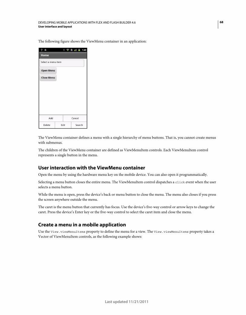
68DEVELOPING MOBILE APPLICATIONS WITH FLEX AND FLASH BUILDER 4.6
User interface and layout
Last updated 11/21/2011
The following figure shows the ViewMenu container in an application:
The ViewMenu container defines a menu with a single hierarchy of menu buttons. That is, you cannot create menus
with submenus.
The children of the ViewMenu container are defined as ViewMenuItem controls. Each ViewMenuItem control
represents a single button in the menu.
User interaction with the ViewMenu container
Open the menu by using the hardware menu key on the mobile device. You can also open it programmatically.
Selecting a menu button closes the entire menu. The ViewMenuItem control dispatches a click event when the user
selects a menu button.
While the menu is open, press the device’s back or menu button to close the menu. The menu also closes if you press
the screen anywhere outside the menu.
The caret is the menu button that currently has focus. Use the device’s five-way control or arrow keys to change the
caret. Press the device’s Enter key or the five-way control to select the caret item and close the menu.
Create a menu in a mobile application
Use the View.viewMenuItems property to define the menu for a view. The View.viewMenuItems property takes a
Vector of ViewMenuItem controls, as the following example shows:
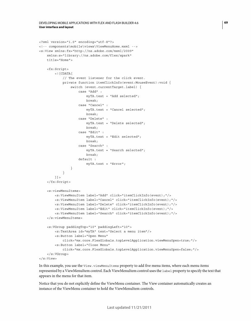
69DEVELOPING MOBILE APPLICATIONS WITH FLEX AND FLASH BUILDER 4.6
User interface and layout
Last updated 11/21/2011
<?xml version="1.0" encoding="utf-8"?> <!-- components\mobile\views\ViewMenuHome.mxml --> <s:View xmlns:fx="http://ns.adobe.com/mxml/2009" xmlns:s="library://ns.adobe.com/flex/spark" title="Home"> <fx:Script> <![CDATA[ // The event listener for the click event. private function itemClickInfo(event:MouseEvent):void { switch (event.currentTarget.label) { case "Add" : myTA.text = "Add selected"; break; case "Cancel" : myTA.text = "Cancel selected"; break; case "Delete" : myTA.text = "Delete selected"; break; case "Edit" : myTA.text = "Edit selected"; break; case "Search" : myTA.text = "Search selected"; break; default : myTA.text = "Error"; } } ]]> </fx:Script> <s:viewMenuItems> <s:ViewMenuItem label="Add" click="itemClickInfo(event);"/> <s:ViewMenuItem label="Cancel" click="itemClickInfo(event);"/> <s:ViewMenuItem label="Delete" click="itemClickInfo(event);"/> <s:ViewMenuItem label="Edit" click="itemClickInfo(event);"/> <s:ViewMenuItem label="Search" click="itemClickInfo(event);"/> </s:viewMenuItems> <s:VGroup paddingTop="10" paddingLeft="10"> <s:TextArea id="myTA" text="Select a menu item"/> <s:Button label="Open Menu" click="mx.core.FlexGlobals.topLevelApplication.viewMenuOpen=true;"/> <s:Button label="Close Menu" click="mx.core.FlexGlobals.topLevelApplication.viewMenuOpen=false;"/> </s:VGroup> </s:View>
In this example, you use the View.viewMenuItems property to add five menu items, where each menu items
represented by a ViewMenuItem control. Each ViewMenuItem control uses the label property to specify the text that
appears in the menu for that item.
Notice that you do not explicitly define the ViewMenu container. The View container automatically creates an
instance of the ViewMenu container to hold the ViewMenuItem controls.
70DEVELOPING MOBILE APPLICATIONS WITH FLEX AND FLASH BUILDER 4.6
User interface and layout
Last updated 11/21/2011
Use the ViewMenuItem control’s icon style
The ViewMenuItem control defines the icon style property that you can use to include an image. You can use the icon
style with or without the label property.
Handle the ViewMenuItem control’s click event
Each ViewMenuItem control also defines an event handler for the click event. The ViewMenuItem control
dispatches the click event when the user selects the item. In this example, all menu items use the same event handler.
However, you can choose to define a separate event handler for each click event.
Open the ViewMenuItem control programmatically
You open the menu by using the hardware menu key on your device. This application also defines two Button controls
to open and close the menu programmatically.
To open the menu programmatically, set the viewMenuOpen property of the application container to true. To close
the menu, set the property to false. The viewMenuOpen property is defined in the ViewNavigatorApplicationBase
class, the base class of the ViewNavigatorApplication and TabbedViewNavigatorApplication containers.
Apply a skin to the ViewMenu and ViewMenuItem components
Use skins to control the appearance of the ViewMenu and ViewMenuItem components. The default ViewMenu skin
class is spark.skins.mobile.ViewMenuSkin. The default ViewMenuItem skin class is
spark.skins.mobile.ViewMenuItemSkin.
Blogger Daniel Demmel shows how to skin the ViewMenu control to look like Gingerbread black.
The skin classes use skin states, such as normal, closed, and disabled, to control the appearance of the skin. The
skins also define transitions to control the appearance of the menu as it changes view state.
For more information, see “Basics of mobile skinning” on page 160.
Set the layout of a ViewMenu container
The ViewMenuLayout class defines the layout of the view menu. The menu can have multiple rows depending on the
number of menu items.
ViewMenuItem layout rules
The requestedMaxColumnCount property of the ViewMenuLayout class defines the maximum number of menu
items in a row. By default, the requestedMaxColumnCount property is set to three.
The following rules define how the ViewMenuLayout class performs the layout:
• If you define three or fewer menu items, where the requestedMaxColumnCount property contains the default value
of three, the menu items are displayed in a single row. Each menu item has the same size.
If you define four or more menu items, meaning more menu items than specified by the
requestedMaxColumnCount property, the ViewMenu container creates multiple rows.
• If the number of menu items is evenly divisible by the requestedMaxColumnCount property, each row contains
the same number of menu items. Each menu item is the same size.
For example, the requestedMaxColumnCount property is set to the default value of three, and you define six menu
items. The menu displays two rows, each containing three menu items.
• If the number of menu items is not evenly divisible by the requestedMaxColumnCount property, rows can contain
a different number of menu items. The size of the menu items depends on the number of menu items in the row.
71DEVELOPING MOBILE APPLICATIONS WITH FLEX AND FLASH BUILDER 4.6
User interface and layout
Last updated 11/21/2011
For example, the requestedMaxColumnCount property is set to the default value of three, and you define eight
menu items. The menu displays three rows. The first row contains two menu items. The second and third rows each
contain three items.
Create a custom ViewMenuItem layout
The ViewMenuLayout class contains properties to let you modify the gaps between menu items and the default
number of menu items in each row. You can also create your own custom layout for the menu by creating your own
layout class.
By default, the spark.skins.mobile.ViewMenuSkin class defines the skin for the ViewMenu container. To apply a
customized ViewMenuLayout class to the ViewMenu container, define a new skin class for the ViewMenu container.
The default ViewMenuSkin class includes a definition for a Group container named contentGroup, as the following
example shows:
... <s:Group id="contentGroup" left="0" right="0" top="3" bottom="2"
minWidth="0" minHeight="0"> <s:layout>
<s:ViewMenuLayout horizontalGap="2" verticalGap="2" id="contentGroupLayout" requestedMaxColumnCount="3" requestedMaxColumnCount.landscapeGroup="6"/>
</s:layout> </s:Group>
...
Your skin class must also define a container named contentGroup. That container uses the layout property to specify
your customized layout class.
You can then apply your custom skin class in the application, as the following example shows:
<?xml version="1.0" encoding="utf-8"?> <!-- components\mobile\ViewMenuSkin.mxml --> <s:ViewNavigatorApplication xmlns:fx="http://ns.adobe.com/mxml/2009" xmlns:s="library://ns.adobe.com/flex/spark" firstView="views.ViewMenuHome"> <fx:Style> @namespace s "library://ns.adobe.com/flex/spark"; s|ViewMenu { skinClass: ClassReference("skins.MyVMSkin"); } </fx:Style> </s:ViewNavigatorApplication>
Display the busy indicator for long-running activity in a mobile application
The Spark BusyIndicator control displays a rotating spinner with 12 spokes. You use the BusyIndicator control to
provide a visual indication that a long-running operation is in progress.
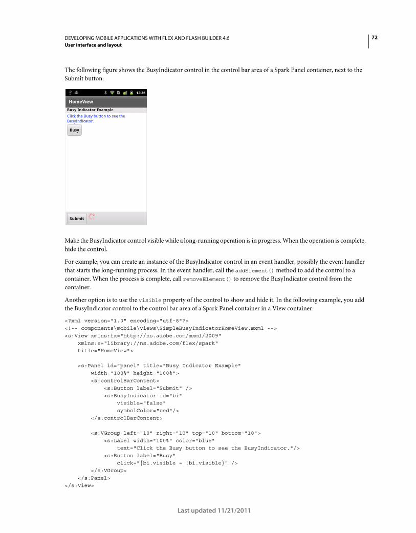
72DEVELOPING MOBILE APPLICATIONS WITH FLEX AND FLASH BUILDER 4.6
User interface and layout
Last updated 11/21/2011
The following figure shows the BusyIndicator control in the control bar area of a Spark Panel container, next to the
Submit button:
Make the BusyIndicator control visible while a long-running operation is in progress. When the operation is complete,
hide the control.
For example, you can create an instance of the BusyIndicator control in an event handler, possibly the event handler
that starts the long-running process. In the event handler, call the addElement() method to add the control to a
container. When the process is complete, call removeElement() to remove the BusyIndicator control from the
container.
Another option is to use the visible property of the control to show and hide it. In the following example, you add
the BusyIndicator control to the control bar area of a Spark Panel container in a View container:
<?xml version="1.0" encoding="utf-8"?> <!-- components\mobile\views\SimpleBusyIndicatorHomeView.mxml --> <s:View xmlns:fx="http://ns.adobe.com/mxml/2009" xmlns:s="library://ns.adobe.com/flex/spark" title="HomeView"> <s:Panel id="panel" title="Busy Indicator Example" width="100%" height="100%"> <s:controlBarContent> <s:Button label="Submit" /> <s:BusyIndicator id="bi" visible="false" symbolColor="red"/> </s:controlBarContent> <s:VGroup left="10" right="10" top="10" bottom="10"> <s:Label width="100%" color="blue" text="Click the Busy button to see the BusyIndicator."/> <s:Button label="Busy" click="{bi.visible = !bi.visible}" /> </s:VGroup> </s:Panel> </s:View>
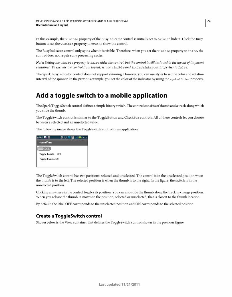
73DEVELOPING MOBILE APPLICATIONS WITH FLEX AND FLASH BUILDER 4.6
User interface and layout
Last updated 11/21/2011
In this example, the visible property of the BusyIndicator control is initially set to false to hide it. Click the Busy
button to set the visible property to true to show the control.
The BusyIndicator control only spins when it is visible. Therefore, when you set the visible property to false, the
control does not require any processing cycles.
Note: Setting the visible property to false hides the control, but the control is still included in the layout of its parent
container. To exclude the control from layout, set the visible and includeInLayout properties to false.
The Spark BusyIndicator control does not support skinning. However, you can use styles to set the color and rotation
interval of the spinner. In the previous example, you set the color of the indicator by using the symbolColor property.
Add a toggle switch to a mobile application
The Spark ToggleSwitch control defines a simple binary switch. The control consists of thumb and a track along which
you slide the thumb.
The ToggleSwitch control is similar to the ToggleButton and CheckBox controls. All of these controls let you choose
between a selected and an unselected value.
The following image shows the ToggleSwitch control in an application:
The ToggleSwitch control has two positions: selected and unselected. The control is in the unselected position when
the thumb is to the left. The selected position is when the thumb is to the right. In the figure, the switch is in the
unselected position.
Clicking anywhere in the control toggles its position. You can also slide the thumb along the track to change position.
When you release the thumb, it moves to the position, selected or unselected, that is closest to the thumb location.
By default, the label OFF corresponds to the unselected position and ON corresponds to the selected position.
Create a ToggleSwitch control
Shown below is the View container that defines the ToggleSwitch control shown in the previous figure:
74DEVELOPING MOBILE APPLICATIONS WITH FLEX AND FLASH BUILDER 4.6
User interface and layout
Last updated 11/21/2011
<?xml version="1.0" encoding="utf-8"?> <!-- components\mobile\views\ToggleSwitchSimpleHomeView.mxml --> <s:View xmlns:fx="http://ns.adobe.com/mxml/2009" xmlns:s="library://ns.adobe.com/flex/spark" title="HomeView"> <s:layout> <s:VerticalLayout paddingTop="10" paddingLeft="5"/> </s:layout> <s:ToggleSwitch id="ts" slideDuration="1000"/> <s:Form> <s:FormItem label="Toggle Label: "> <s:Label text="{ts.selected ? 'ON' : 'OFF'}"/> </s:FormItem> <s:FormItem label="Toggle Position: "> <s:Label text="{ts.thumbPosition}"/> </s:FormItem> </s:Form> </s:View>
In this example, you display ON or OFF in the first Label control based on the thumb position. The second label
control displays the current thumb position as a value between 0.0 (unselected0 and 1.0 (selected).
This example also sets the slideDuration style to 1000. This style determines the duration, in milliseconds, for an
animation of the thumb as it slides between the selected and unselected positions.
Shown below is the main application file:
<?xml version="1.0" encoding="utf-8"?> <!-- components\mobile\ToggleSwitchSimple.mxml --> <s:ViewNavigatorApplication xmlns:fx="http://ns.adobe.com/mxml/2009" xmlns:s="library://ns.adobe.com/flex/spark" firstView="views.ToggleSwitchSimpleHomeView"> </s:ViewNavigatorApplication>
Change the default callout of a ToggleSwitch control
In the previous example, the ToggleSwitch control uses the default values for the unselected and selected labels: OFF
(unselected) and ON (selected). To customize the labels or other visual characteristics of the control, define a skin class
as a subclass of spark.skins.mobile.ToggleSwitchSkin or create your own skin class.
The following skin class changes the labels to Yes and No:
75DEVELOPING MOBILE APPLICATIONS WITH FLEX AND FLASH BUILDER 4.6
User interface and layout
Last updated 11/21/2011
package skins // components\mobile\skins\MyToggleSwitchSkin.as { import spark.skins.mobile.ToggleSwitchSkin; public class MyToggleSwitchSkin extends ToggleSwitchSkin { public function MyToggleSwitchSkin() { super(); // Set properties to define the labels // for the selected and unselected positions. selectedLabel="Yes"; unselectedLabel="No"; } } }
The following View container uses this skin class:
<?xml version="1.0" encoding="utf-8"?> <!-- components\mobile\views\ToggleSwitchSkinHomeView.mxml --> <s:View xmlns:fx="http://ns.adobe.com/mxml/2009" xmlns:s="library://ns.adobe.com/flex/spark" title="HomeView"> <s:layout> <s:VerticalLayout paddingTop="10" paddingLeft="5"/> </s:layout> <s:ToggleSwitch id="ts" slideDuration="1000" skinClass="skins.MyToggleSwitchSkin"/> <s:Form> <s:FormItem label="Toggle Label: "> <s:Label text="{ts.selected ? 'Yes' : 'No'}"/> </s:FormItem> <s:FormItem label="Toggle Position: "> <s:Label text="{ts.thumbPosition}"/> </s:FormItem> </s:Form> </s:View>
Add a callout container to a mobile application
In a mobile application, a callout is a container that pops up on top of the application. The container can hold one or
more components, and supports different types of layouts.
A callout container can be modal or nonmodal. A modal container takes all keyboard and mouse input until it is
closed. A nonmodal container allows other components in the application to accept input while the container is open.
Flex provides two components that you can use to add callout containers to a mobile application: CalloutButton and
Callout.
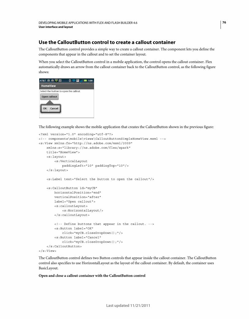
76DEVELOPING MOBILE APPLICATIONS WITH FLEX AND FLASH BUILDER 4.6
User interface and layout
Last updated 11/21/2011
Use the CalloutButton control to create a callout container
The CalloutButton control provides a simple way to create a callout container. The component lets you define the
components that appear in the callout and to set the container layout.
When you select the CalloutButton control in a mobile application, the control opens the callout container. Flex
automatically draws an arrow from the callout container back to the CalloutButton control, as the following figure
shows:
The following example shows the mobile application that creates the CalloutButton shown in the previous figure:
<?xml version="1.0" encoding="utf-8"?> <!-- components\mobile\views\CalloutButtonSimpleHomeView.mxml --> <s:View xmlns:fx="http://ns.adobe.com/mxml/2009" xmlns:s="library://ns.adobe.com/flex/spark" title="HomeView"> <s:layout> <s:VerticalLayout paddingLeft="10" paddingTop="10"/> </s:layout> <s:Label text="Select the button to open the callout"/> <s:CalloutButton id="myCB" horizontalPosition="end" verticalPosition="after" label="Open callout"> <s:calloutLayout> <s:HorizontalLayout/> </s:calloutLayout> <!-- Define buttons that appear in the callout. --> <s:Button label="OK" click="myCB.closeDropDown();"/> <s:Button label="Cancel" click="myCB.closeDropDown();"/> </s:CalloutButton> </s:View>
The CalloutButton control defines two Button controls that appear inside the callout container. The CalloutButton
control also specifies to use HorizontalLayout as the layout of the callout container. By default, the container uses
BasicLayout.
Open and close a callout container with the CalloutButton control
77DEVELOPING MOBILE APPLICATIONS WITH FLEX AND FLASH BUILDER 4.6
User interface and layout
Last updated 11/21/2011
The callout container opens when the user selects the CalloutButton control, or when you call the
CalloutButton.openDropDown() method. The horizontalPosition and verticalPosition properties
determine the position of the callout container relative to the CalloutButton control. For an example, see “Size and
position a callout container” on page 86.
The callout container opened by the CalloutButton is always nonmodal. That means other components in the
application can receive input while the callout is open. Use the Callout container to create a modal callout.
The callout container stays open until you click outside the callout container, or you call the
CalloutButton.closeDropDown() method. In this example, you call the closeDropDown() method in the event
handler for the click event for the two Button controls in the callout container.
Use the Callout container to create a callout
The CalloutButton control encapsulates in a single control the callout container and all of the logic necessary to open
and close the callout. The CalloutButton control is then said to be the host of the callout container.
You can also use the Callout container in a mobile application. The advantage of a Callout container is that it is not
associated with a single host, and is therefore reusable anywhere in the application.
Use the Callout.open() and Callout.close() methods to open a Callout container, typically in response to an
event. When you call the open() method, you can pass an optional argument to specify that the callout container is
modal. By default, the callout container is nonmodal.
The position of the callout container is relative to the host component. The horizontalPosition and
verticalPosition properties determine the container’s location relative to the host. For an example, see “Size and
position a callout container” on page 86.
Because it is a pop-up, you do not create a Callout container as part of the normal MXML layout code of your
application. Instead, you define the Callout container as a custom MXML component in an MXML file.
In the following example, define a Callout container in the file MyCallout.mxml in the comps directory of your
application:
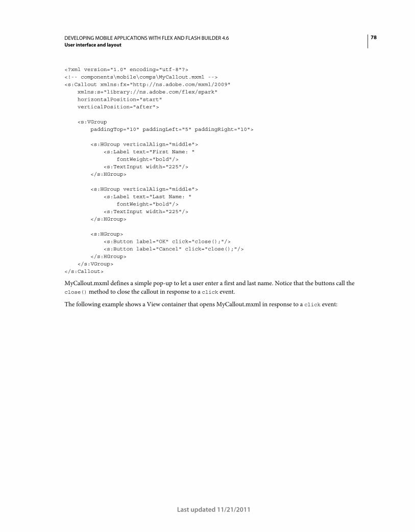
78DEVELOPING MOBILE APPLICATIONS WITH FLEX AND FLASH BUILDER 4.6
User interface and layout
Last updated 11/21/2011
<?xml version="1.0" encoding="utf-8"?> <!-- components\mobile\comps\MyCallout.mxml --> <s:Callout xmlns:fx="http://ns.adobe.com/mxml/2009" xmlns:s="library://ns.adobe.com/flex/spark" horizontalPosition="start" verticalPosition="after"> <s:VGroup paddingTop="10" paddingLeft="5" paddingRight="10"> <s:HGroup verticalAlign="middle"> <s:Label text="First Name: " fontWeight="bold"/> <s:TextInput width="225"/> </s:HGroup> <s:HGroup verticalAlign="middle"> <s:Label text="Last Name: " fontWeight="bold"/> <s:TextInput width="225"/> </s:HGroup> <s:HGroup> <s:Button label="OK" click="close();"/> <s:Button label="Cancel" click="close();"/> </s:HGroup> </s:VGroup> </s:Callout>
MyCallout.mxml defines a simple pop-up to let a user enter a first and last name. Notice that the buttons call the
close() method to close the callout in response to a click event.
The following example shows a View container that opens MyCallout.mxml in response to a click event:
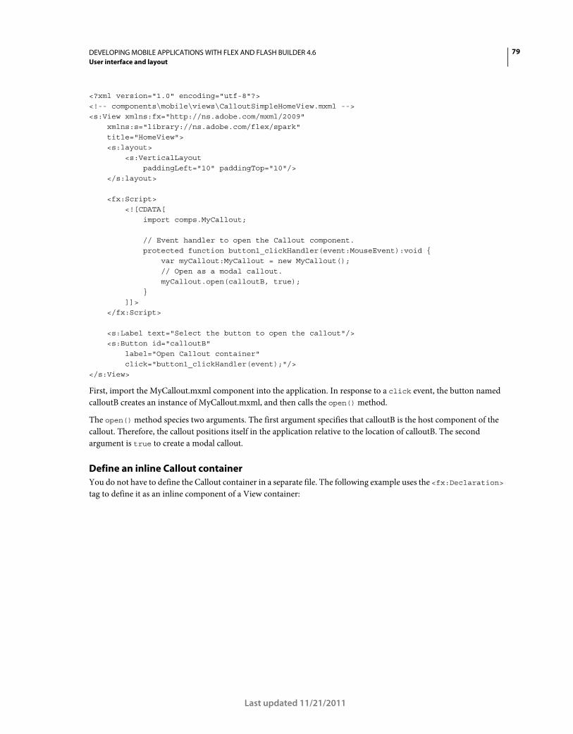
79DEVELOPING MOBILE APPLICATIONS WITH FLEX AND FLASH BUILDER 4.6
User interface and layout
Last updated 11/21/2011
<?xml version="1.0" encoding="utf-8"?> <!-- components\mobile\views\CalloutSimpleHomeView.mxml --> <s:View xmlns:fx="http://ns.adobe.com/mxml/2009" xmlns:s="library://ns.adobe.com/flex/spark" title="HomeView"> <s:layout> <s:VerticalLayout paddingLeft="10" paddingTop="10"/> </s:layout> <fx:Script> <![CDATA[ import comps.MyCallout; // Event handler to open the Callout component. protected function button1_clickHandler(event:MouseEvent):void { var myCallout:MyCallout = new MyCallout(); // Open as a modal callout. myCallout.open(calloutB, true); } ]]> </fx:Script> <s:Label text="Select the button to open the callout"/> <s:Button id="calloutB" label="Open Callout container" click="button1_clickHandler(event);"/> </s:View>
First, import the MyCallout.mxml component into the application. In response to a click event, the button named
calloutB creates an instance of MyCallout.mxml, and then calls the open() method.
The open() method species two arguments. The first argument specifies that calloutB is the host component of the
callout. Therefore, the callout positions itself in the application relative to the location of calloutB. The second
argument is true to create a modal callout.
Define an inline Callout container
You do not have to define the Callout container in a separate file. The following example uses the <fx:Declaration>
tag to define it as an inline component of a View container:
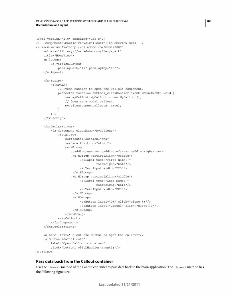
80DEVELOPING MOBILE APPLICATIONS WITH FLEX AND FLASH BUILDER 4.6
User interface and layout
Last updated 11/21/2011
<?xml version="1.0" encoding="utf-8"?> <!-- components\mobile\views\CalloutInlineHomeView.mxml --> <s:View xmlns:fx="http://ns.adobe.com/mxml/2009" xmlns:s="library://ns.adobe.com/flex/spark" title="HomeView"> <s:layout> <s:VerticalLayout paddingLeft="10" paddingTop="10"/> </s:layout> <fx:Script> <![CDATA[ // Event handler to open the Callout component. protected function button1_clickHandler(event:MouseEvent):void { var myCallout:MyCallout = new MyCallout(); // Open as a modal callout. myCallout.open(calloutB, true); } ]]> </fx:Script> <fx:Declarations> <fx:Component className="MyCallout"> <s:Callout horizontalPosition="end" verticalPosition="after"> <s:VGroup paddingTop="10" paddingLeft="5" paddingRight="10"> <s:HGroup verticalAlign="middle"> <s:Label text="First Name: " fontWeight="bold"/> <s:TextInput width="225"/> </s:HGroup> <s:HGroup verticalAlign="middle"> <s:Label text="Last Name: " fontWeight="bold"/> <s:TextInput width="225"/> </s:HGroup> <s:HGroup> <s:Button label="OK" click="close();"/> <s:Button label="Cancel" click="close();"/> </s:HGroup> </s:VGroup> </s:Callout> </fx:Component> </fx:Declarations> <s:Label text="Select the button to open the callout"/> <s:Button id="calloutB" label="Open Callout container" click="button1_clickHandler(event);"/> </s:View>
Pass data back from the Callout container
Use the close() method of the Callout container to pass data back to the main application. The close() method has
the following signature:
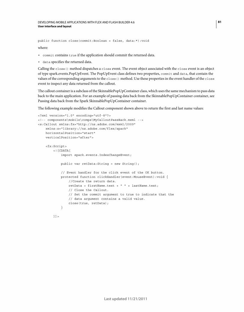
81DEVELOPING MOBILE APPLICATIONS WITH FLEX AND FLASH BUILDER 4.6
User interface and layout
Last updated 11/21/2011
public function close(commit:Boolean = false, data:*):void
where:
• commit contains true if the application should commit the returned data.
• data specifies the returned data.
Calling the close() method dispatches a close event. The event object associated with the close event is an object
of type spark.events.PopUpEvent. The PopUpEvent class defines two properties, commit and data, that contain the
values of the corresponding arguments to the close() method. Use these properties in the event handler of the close
event to inspect any data returned from the callout.
The callout container is a subclass of the SkinnablePopUpContainer class, which uses the same mechanism to pass data
back to the main application. For an example of passing data back from the SkinnablePopUpContainer container, see
Passing data back from the Spark SkinnablePopUpContainer container.
The following example modifies the Callout component shown above to return the first and last name values:
<?xml version="1.0" encoding="utf-8"?> <!-- components\mobile\comps\MyCalloutPassBack.mxml --> <s:Callout xmlns:fx="http://ns.adobe.com/mxml/2009" xmlns:s="library://ns.adobe.com/flex/spark" horizontalPosition="start" verticalPosition="after"> <fx:Script> <![CDATA[ import spark.events.IndexChangeEvent; public var retData:String = new String(); // Event handler for the click event of the OK button. protected function clickHandler(event:MouseEvent):void { //Create the return data. retData = firstName.text + " " + lastName.text; // Close the Callout. // Set the commit argument to true to indicate that the // data argument contains a valid value. close(true, retData); } ]]>
82DEVELOPING MOBILE APPLICATIONS WITH FLEX AND FLASH BUILDER 4.6
User interface and layout
Last updated 11/21/2011
</fx:Script> <s:VGroup paddingTop="10" paddingLeft="5" paddingRight="10"> <s:HGroup verticalAlign="middle"> <s:Label text="First Name: " fontWeight="bold"/> <s:TextInput id="firstName" width="225"/> </s:HGroup> <s:HGroup verticalAlign="middle"> <s:Label text="Last Name: " fontWeight="bold"/> <s:TextInput id="lastName" width="225"/> </s:HGroup> <s:HGroup> <s:Button label="OK" click="clickHandler(event);"/> <s:Button label="Cancel" click="close();"/> </s:HGroup> </s:VGroup> </s:Callout>
In this example, you create a String to return the first and last names in response to the user selecting the OK button.
The View container then uses the close event on the Callout to display the returned data:
<?xml version="1.0" encoding="utf-8"?> <!-- components\mobile\views\CalloutPassBackDataHomeView.mxml --> <s:View xmlns:fx="http://ns.adobe.com/mxml/2009" xmlns:s="library://ns.adobe.com/flex/spark" title="HomeView"> <s:layout> <s:VerticalLayout paddingLeft="10" paddingTop="10"/> </s:layout> <fx:Script> <
83DEVELOPING MOBILE APPLICATIONS WITH FLEX AND FLASH BUILDER 4.6
User interface and layout
Last updated 11/21/2011
// If commit is false, no data is returned. if (!event.commit) return; // Write the returned Data to the TextArea control. myTA.text = String(event.data); // Remove the event handler. myCallout.removeEventListener('close', closeHandler); } ]]> </fx:Script> <s:Label text="Select the button to open the callout"/> <s:Button id="calloutB" label="Open Callout container" click="clickHandler(event);"/> <s:TextArea id="myTA"/> </s:View>
Add a ViewNavigator to a Callout
You can use a ViewNavigator in a Callout container. The ViewNavigator lets you add an action bar and multiple views
to the callout.
For example, the following View opens a Callout container defined in the file MyCalloutPassBackVN:
<?xml version="1.0" encoding="utf-8"?> <!-- components\mobile\views\CalloutPassBackDataHomeView.mxml --> <s:View xmlns:fx="http://ns.adobe.com/mxml/2009" xmlns:s="library://ns.adobe.com/flex/spark" title="HomeView"> <s:layout> <s:VerticalLayout paddingLeft="10" paddingTop="10"/> </s:layout> <fx:Script> <
84DEVELOPING MOBILE APPLICATIONS WITH FLEX AND FLASH BUILDER 4.6
User interface and layout
Last updated 11/21/2011
} // Handle the close event from the Callout. protected function closeHandler(event:PopUpEvent):void { if (!event.commit) return; myTA.text = String(event.data); myCallout.removeEventListener('close', closeHandler); } ]]> </fx:Script> <s:Label text="Select the Open button to open the callout"/> <s:TextArea id="myTA"/> <s:actionContent> <s:Button id="calloutB" label="Open" click="clickHandler(event);"/> </s:actionContent> </s:View>
The MyCalloutPassBackVN.mxml file defines the Callout container that holds a ViewNavigator container:
85DEVELOPING MOBILE APPLICATIONS WITH FLEX AND FLASH BUILDER 4.6
User interface and layout
Last updated 11/21/2011
<?xml version="1.0" encoding="utf-8"?> <!-- components\mobile\comps\MyCalloutVN.mxml --> <s:Callout xmlns:fx="http://ns.adobe.com/mxml/2009" xmlns:s="library://ns.adobe.com/flex/spark" contentBackgroundAppearance="none" horizontalPosition="start" verticalPosition="after"> <fx:Script> <![CDATA[ import mx.events.FlexMouseEvent; import views.SettingsView; protected function done_clickHandler(event:MouseEvent):void { // Create an instance of SettingsView, and // initialize it as a copy of the current View of the ViewNavigator. var settings:SettingsView = (viewNav.activeView as SettingsView); // Create the String to represent the returned data. var retData:String = new String(); // Initialze the String from the current View. retData = settings.firstName.text + " " + settings.lastName.text; // Close the Callout and return thhe data. this.close(true, retData); } ]]> </fx:Script> <s:ViewNavigator id="viewNav" width="100%" height="100%" firstView="views.SettingsView"> <s:navigationContent> <s:Button label="Cancel" click="close(false)"/> </s:navigationContent> <s:actionContent> <s:Button id="done" label="OK" emphasized="true" click="done_clickHandler(event);"/> </s:actionContent> </s:ViewNavigator> </s:Callout>
In MyCalloutPassBackVN.mxml, you specify that the first view of the ViewNavigator is SettingsView. SettingsView
defines TextInput controls for a users first and last name. When the user selects the OK button, you close the Callout
and pass back any returned data to MyCalloutPassBackVN.
Note: When a ViewNavigator appears in a Callout container, the ActionBar has a transparent background color. In this
example, you set the contentBackgroundAppearance to none on the Callout container. This setting prevents the
default white contentBackgroundColor of the Callout from appearing in the area of the transparent ActionBar.
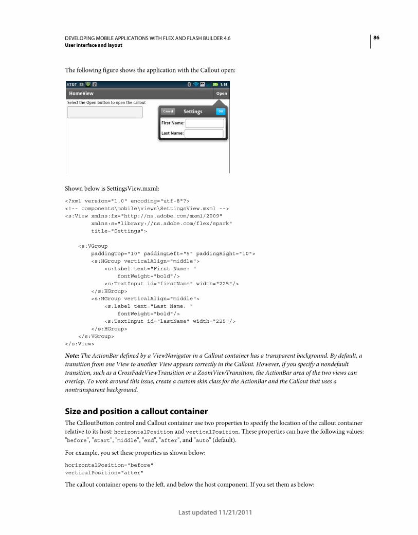
86DEVELOPING MOBILE APPLICATIONS WITH FLEX AND FLASH BUILDER 4.6
User interface and layout
Last updated 11/21/2011
The following figure shows the application with the Callout open:
Shown below is SettingsView.mxml:
<?xml version="1.0" encoding="utf-8"?> <!-- components\mobile\views\SettingsView.mxml --> <s:View xmlns:fx="http://ns.adobe.com/mxml/2009" xmlns:s="library://ns.adobe.com/flex/spark" title="Settings"> <s:VGroup paddingTop="10" paddingLeft="5" paddingRight="10"> <s:HGroup verticalAlign="middle"> <s:Label text="First Name: " fontWeight="bold"/> <s:TextInput id="firstName" width="225"/> </s:HGroup> <s:HGroup verticalAlign="middle"> <s:Label text="Last Name: " fontWeight="bold"/> <s:TextInput id="lastName" width="225"/> </s:HGroup> </s:VGroup> </s:View>
Note: The ActionBar defined by a ViewNavigator in a Callout container has a transparent background. By default, a
transition from one View to another View appears correctly in the Callout. However, if you specify a nondefault
transition, such as a CrossFadeViewTransition or a ZoomViewTransition, the ActionBar area of the two views can
overlap. To work around this issue, create a custom skin class for the ActionBar and the Callout that uses a
nontransparent background.
Size and position a callout container
The CalloutButton control and Callout container use two properties to specify the location of the callout container
relative to its host: horizontalPosition and verticalPosition. These properties can have the following values:
"before", "start", "middle", "end", "after", and "auto" (default).
For example, you set these properties as shown below:
horizontalPosition="before" verticalPosition="after"
The callout container opens to the left, and below the host component. If you set them as below:
87DEVELOPING MOBILE APPLICATIONS WITH FLEX AND FLASH BUILDER 4.6
User interface and layout
Last updated 11/21/2011
horizontalPosition="middle" verticalPosition="middle"
The callout container opens on top of the host component with the center of the callout aligned to the center of the
host component.
Draw an arrow from the callout to the host
For all but five combinations of the horizontalPosition and verticalPosition properties, the callout draws an
arrow pointing to the host. The positions where no arrow appears are when the callout is centered over the middle of
the host, and when it is in a corner. The following combinations show no arrow:
// Centered horizontalPosition="middle" verticalPosition="middle" // Upper-left corner horizontalPosition="before" verticalPosition="before" // Lower-left corner horizontalPosition="before" verticalPosition="after" // Upper-right corner horizontalPosition="after" verticalPosition="before" // Lower-right corner horizontalPosition="after" verticalPosition="after"
For the Callout container, the horizontalPosition and verticalPosition properties also determine the value of
the read-only Callout.arrowDirection property. The position of the callout container relative to the host
determines the value of the arrowDirection property. Possible values are "up", "left", and others.
The Callout.arrow skin part uses the value of the arrowDirection property to draw the arrow based on the position
of the callout.
Manage memory for a callout container
One consideration when using a callout container is how to manage the memory used by the callout. For example, if
you want to reduce the memory used of the application, create an instance of the callout each time it opens. The callout
is then destroyed when it closes. However, make sure to remove all references to the callout, especially event handlers,
or else the callout is not destroyed.
Alternatively, if the callout container is relatively small, you can reuse the same callout multiple times in the
application. In this configuration, the application creates a single instance of the callout. It then reuses that instance
and the callout stays in memory between uses. This configuration reduces execution time in the application because
the application does not have to re-create the callout every time it is opened.
Manage memory with the CalloutButton control
To configure the callout used by the CalloutButton control, set the CalloutButton.calloutDestructionPolicy
property. A value of "auto" configures the control to destroy the callout when it is closed. A value of "never"
configures the control to cache the callout in memory.
Manage memory with the Callout container
88DEVELOPING MOBILE APPLICATIONS WITH FLEX AND FLASH BUILDER 4.6
User interface and layout
Last updated 11/21/2011
The Callout container does not define the calloutDestructionPolicy property. Instead, control its memory use by
how you create an instance of the callout container in your application. In the following example, you create an
instance of the callout container every time you open it:
protected function button1_clickHandler(event:MouseEvent):void { // Create a new instance of the callout container every time you open it. var myCallout:MyCallout = new MyCallout(); myCallout.open(calloutB, true);
}
Alternatively, you can define a single instance of the callout container that you reuse every time you open it:
// Create a single instance of the callout container. public var myCallout:MyCallout = new MyCallout(); protected function button1_clickHandler(event:MouseEvent):void {
myCallout.open(calloutB, true); }
Define transitions in a mobile application
Spark view transitions define how a change from one View container to another appears as it occurs on the screen.
Transitions work by applying an animation during the view change. Use transitions to create compelling interfaces for
your mobile applications.
By default, the existing View container slides off the screen as the new view slides onto the screen. Alternatively, you
can customize the change. For example, your application defines a form in a View container that shows only a few
fields, but a subsequent View container shows additional fields. Rather than sliding from view to view, you can use a
flip or fade transition.
Flex supplies the following view transition classes that you can use when changing View containers:
Note: View transitions in mobile applications are not related to standard Flex transitions. Standard Flex transitions
define the effects played during a change of state. Navigation operations of the ViewNavigator container trigger View
transitions. View transitions cannot be defined in MXML, and they do not interact with states.
Apply a transition
You apply a transition when you change the active View container. Because view transitions occur when you change
View containers, you control them through the ViewNavigator container.
Transition Description
CrossFadeViewTransition Performs a crossfade transition between the existing and new views. The the existing view fades out as
the new view fades in.
FlipViewTransition Performs a flip transition between the existing and new views. You can define the flip direction and type.
SlideViewTransition Performs a slide transition between the existing and new views. The existing view slides out as the new
view slides in. You can control the slide direction and type. This transition is the default view transition
used by Flex.
ZoomViewTransition Performs a zoom transition between the existing and new views. You can either zoom out the existing
view or zoom in to the new view.
89DEVELOPING MOBILE APPLICATIONS WITH FLEX AND FLASH BUILDER 4.6
User interface and layout
Last updated 11/21/2011
For example, you can use the following methods of the ViewNavigator class to change the current view:
• pushView()
• popView()
• popToFirstView()
• popAll()
• replaceView()
These methods all take an optional argument that defines the transition to play when changing views.
You can also change the current view by using hardware navigation keys on your device, such as the back button.
When you change the view by using a hardware key, the ViewNavigator uses the default transitions defined by the
ViewNavigator.defaultPopTransition and ViewNavigator.defaultPushTransition properties. By default,
these properties specify to use the SlideViewTransition class.
The following example shows the main application file that initializes the defaultPopTransition and
defaultPushTransition properties to use a FlipViewTransition:
<?xml version="1.0" encoding="utf-8"?> <!-- containers\mobile\SparkViewTrans.mxml --> <s:ViewNavigatorApplication xmlns:fx="http://ns.adobe.com/mxml/2009" xmlns:s="library://ns.adobe.com/flex/spark" firstView="views.EmployeeMainViewTrans" creationComplete="creationCompleteHandler(event);"> <fx:Script> <![CDATA[ import mx.events.FlexEvent; import spark.transitions.FlipViewTransition; // Define a flip transition. public var flipTrans:FlipViewTransition = new FlipViewTransition(); // Set the default push and pop transitions of the navigator // to use the flip transition. protected function creationCompleteHandler(event:FlexEvent):void { navigator.defaultPopTransition = flipTrans; navigator.defaultPushTransition = flipTrans; } protected function button1_clickHandler(event:MouseEvent):void { // Switch to the first view in the section. // Use the default pop view transition defined by // the ViewNavigator.defaultPopTransition property. navigator.popToFirstView(); } ]]> </fx:Script> <s:navigationContent> <s:Button icon="@Embed(source='assets/Home.png')" click="button1_clickHandler(event)"/> </s:navigationContent> </s:ViewNavigatorApplication>
90DEVELOPING MOBILE APPLICATIONS WITH FLEX AND FLASH BUILDER 4.6
User interface and layout
Last updated 11/21/2011
The first view, the EmployeeMainViewTrans.mxml, defines a CrossFadeViewTransition. It then passes the
CrossFadeViewTransition as an argument to the pushView() method on a change to the EmployeeView:
<?xml version="1.0" encoding="utf-8"?> <!-- containers\mobile\views\EmployeeMainViewTrans.mxml --> <s:View xmlns:fx="http://ns.adobe.com/mxml/2009" xmlns:s="library://ns.adobe.com/flex/spark" title="Employees"> <s:layout> <s:VerticalLayout paddingTop="10"/> </s:layout> <fx:Script> <![CDATA[ import spark.events.IndexChangeEvent; import spark.transitions.CrossFadeViewTransition; // Define two transitions: a cross fade and a flip. public var xFadeTrans:CrossFadeViewTransition = new CrossFadeViewTransition(); // Use the cross fade transition on a push(), // with a duration of 100 ms. protected function myList_changeHandler(event:IndexChangeEvent):void { xFadeTrans.duration = 1000; navigator.pushView(views.EmployeeView, myList.selectedItem, null, xFadeTrans); } ]]> </fx:Script> <s:Label text="Select an employee name"/> <s:List id="myList" width="100%" height="100%" labelField="firstName" change="myList_changeHandler(event);"> <s:ArrayCollection> <fx:Object firstName="Bill" lastName="Smith" companyID="11233"/> <fx:Object firstName="Dave" lastName="Jones" companyID="13455"/> <fx:Object firstName="Mary" lastName="Davis" companyID="11543"/> <fx:Object firstName="Debbie" lastName="Cooper" companyID="14266"/> </s:ArrayCollection> </s:List> </s:View>
The EmployeeView is defined in the file EmployeeView.mxml, as shown in the following example:
91DEVELOPING MOBILE APPLICATIONS WITH FLEX AND FLASH BUILDER 4.6
User interface and layout
Last updated 11/21/2011
<?xml version="1.0" encoding="utf-8"?> <!-- containers\mobile\views\EmployeeView.mxml --> <s:View xmlns:fx="http://ns.adobe.com/mxml/2009" xmlns:s="library://ns.adobe.com/flex/spark" title="Employee View"> <s:layout> <s:VerticalLayout paddingTop="10"/> </s:layout> <s:VGroup> <s:Label text="{data.firstName}"/> <s:Label text="{data.lastName}"/> <s:Label text="{data.companyID}"/> </s:VGroup> </s:View>
Apply a transition to the ActionBar control
By default, the ActionBar is not included in the transition from one view to another. Instead, the ActionBar control
uses a slide transition when the view changes, regardless of the specified transition. To include the ActionBar in the
transition when the view changes, set the transitionControlsWithContent property of the transition class to true.
Use an easing class with a transition
A transition plays in two phases: an acceleration phase followed by a deceleration phase. You can change the
acceleration and deceleration properties of a transition by using an easing class. With easing, you can create a more
realistic rate of acceleration and deceleration. You can also use an easing class to create a bounce effect or control other
types of motion.
Flex supplies the Spark easing classes in the spark.effects.easing package. This package includes classes for the most
common types of easing, including Bounce, Linear, and Sine easing. For more information on using these classes, see
the Using Spark easing classes.
The following example shows a modification to the application defined in the previous section. This version adds a
Bounce easing class to the FlipViewTransition:
<?xml version="1.0" encoding="utf-8"?> <!-- containers\mobile\SparkViewTransEasier.mxml --> <s:ViewNavigatorApplication xmlns:fx="http://ns.adobe.com/mxml/2009" xmlns:s="library://ns.adobe.com/flex/spark" firstView="views.EmployeeMainViewTransEaser" creationComplete="creationCompleteHandler(event);"> <fx:Script> <
92DEVELOPING MOBILE APPLICATIONS WITH FLEX AND FLASH BUILDER 4.6
User interface and layout
Last updated 11/21/2011
flipTrans.duration = 1000; navigator.defaultPopTransition = flipTrans; navigator.defaultPushTransition = flipTrans; } protected function button1_clickHandler(event:MouseEvent):void { // Switch to the first view in the section. // Use the default pop view transition defined by // the ViewNavigator.defaultPopTransition property. navigator.popToFirstView(); } ]]> </fx:Script> <fx:Declarations> <s:Bounce id="bounceEasing"/> </fx:Declarations> <s:navigationContent> <s:Button icon="@Embed(source='assets/Home.png')" click="button1_clickHandler(event)"/> </s:navigationContent> </s:ViewNavigatorApplication>
To see the bounce, make sure to use the back button on the device.
View transition lifecycle
A view transition goes through two main phases during execution: the preparation phase and the execution phase.
Three methods of the transition class define the preparation phase. These methods are called in the following order:
1 captureStartValues()
When this method is called, the ViewNavigator has created the new view but has not validated the new view or
updated the content of the ActionBar control and the tab bar. Use this method to capture the start values for the
components that play a role in the transition.
2 captureEndValues()
When this method is called, the new view has been fully validated, and the ActionBar control and the tab bar reflect
the state of the new view. The transition can use this method to capture any values it requires from the new view.
3 prepareForPlay()
This method lets the transition initialize the effect instance that is used to animate the components of the transition.
The execution phase begins when the ViewNavigator calls the transition’s play() method. At this time, the new view
has been created and validated, and the ActionBar control and the tab bar have been initialized. The transition
dispatches a start event, and any effect instances created during the preparation phase are now invoked by calling the
effect’s play() method.
When the view transition completes, the transition dispatches an end event. The transitions base class,
ViewTransitionBase, defines the transitionComplete() method that you can call to dispatch the end event. It is
important that the transition cleans up any temporary objects and remove listeners that it has created before
dispatching the completion event.
After the call to the transitionComplete() method, the ViewNavigator finalizes the view changing process and
resets the transition to its uninitialized state.
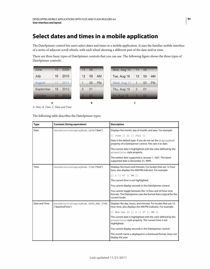
93DEVELOPING MOBILE APPLICATIONS WITH FLEX AND FLASH BUILDER 4.6
User interface and layout
Last updated 11/21/2011
Select dates and times in a mobile application
The DateSpinner control lets users select dates and times in a mobile application. It uses the familiar mobile interface
of a series of adjacent scroll wheels, with each wheel showing a different part of the date and/or time.
There are three basic types of DateSpinner controls that you can use. The following figure shows the three types of
DateSpinner controls:
A. Date. B. Time. C. Date and Time
The following table describes the DateSpinner types:
Type Constant (String equivalent) Description
Date DateSelectorDisplayMode.DATE (“date”) Displays the month, day of month, and year. For example:
|| June || 11 || 2011 ||
Date is the default type. If you do not set the displayMode
property of a DateSpinner control, Flex sets it to date.
The current date is highlighted with the color defined by the
accentColor style property.
The earliest date supported is January 1, 1601. The latest
supported date is December 31, 9999.
Time DateSelectorDisplayMode.TIME (“time”) Displays the hours and minutes. For locales that use 12-hour
time, also displays the AM/PM indicator. For example:
|| 2 || 57 || PM ||
The current time is not highlighted.
You cannot display seconds in the DateSpinner control.
You cannot toggle between the 12 hour and 24 hour time
formats. The DateSpinner uses the format that is typical for the
current locale.
Date and Time DateSelectorDisplayMode.DATE_AND_TIME
(“dateAndTime”)
Displays the day, hours, and minutes. For locales that use 12-
hour time, also displays the AM/PM indicator. For example:
|| Mon Jun 13 || 2 || 57 || PM ||
The current date is highlighted with the color defined by the
accentColor style property. The current time is not
highlighted.
You cannot display seconds in the DateSpinner control.
The month name is displayed in a shortened format. Does not
display the year.
A B C
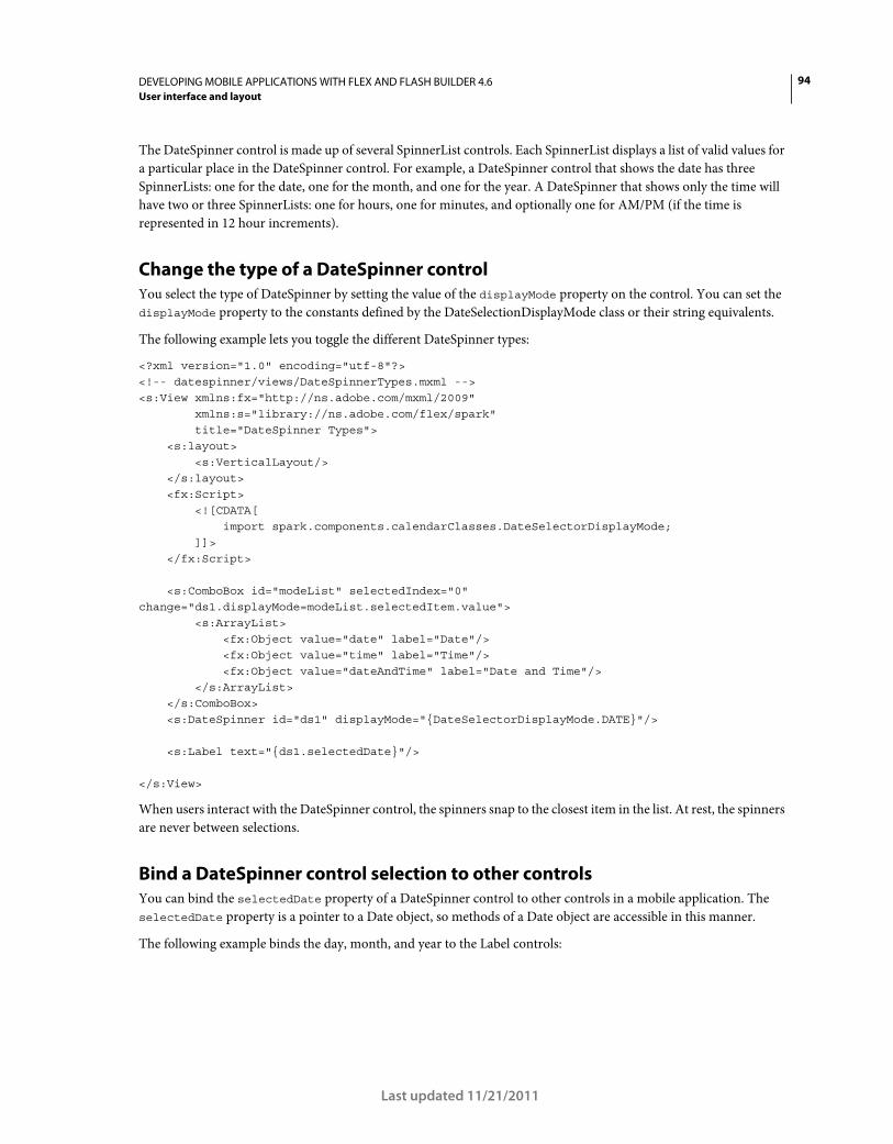
94DEVELOPING MOBILE APPLICATIONS WITH FLEX AND FLASH BUILDER 4.6
User interface and layout
Last updated 11/21/2011
The DateSpinner control is made up of several SpinnerList controls. Each SpinnerList displays a list of valid values for
a particular place in the DateSpinner control. For example, a DateSpinner control that shows the date has three
SpinnerLists: one for the date, one for the month, and one for the year. A DateSpinner that shows only the time will
have two or three SpinnerLists: one for hours, one for minutes, and optionally one for AM/PM (if the time is
represented in 12 hour increments).
Change the type of a DateSpinner control
You select the type of DateSpinner by setting the value of the displayMode property on the control. You can set the
displayMode property to the constants defined by the DateSelectionDisplayMode class or their string equivalents.
The following example lets you toggle the different DateSpinner types:
<?xml version="1.0" encoding="utf-8"?> <!-- datespinner/views/DateSpinnerTypes.mxml --> <s:View xmlns:fx="http://ns.adobe.com/mxml/2009" xmlns:s="library://ns.adobe.com/flex/spark" title="DateSpinner Types"> <s:layout> <s:VerticalLayout/> </s:layout> <fx:Script> <![CDATA[ import spark.components.calendarClasses.DateSelectorDisplayMode; ]]> </fx:Script> <s:ComboBox id="modeList" selectedIndex="0" change="ds1.displayMode=modeList.selectedItem.value"> <s:ArrayList> <fx:Object value="date" label="Date"/> <fx:Object value="time" label="Time"/> <fx:Object value="dateAndTime" label="Date and Time"/> </s:ArrayList> </s:ComboBox> <s:DateSpinner id="ds1" displayMode="{DateSelectorDisplayMode.DATE}"/> <s:Label text="{ds1.selectedDate}"/> </s:View>
When users interact with the DateSpinner control, the spinners snap to the closest item in the list. At rest, the spinners
are never between selections.
Bind a DateSpinner control selection to other controls
You can bind the selectedDate property of a DateSpinner control to other controls in a mobile application. The
selectedDate property is a pointer to a Date object, so methods of a Date object are accessible in this manner.
The following example binds the day, month, and year to the Label controls:
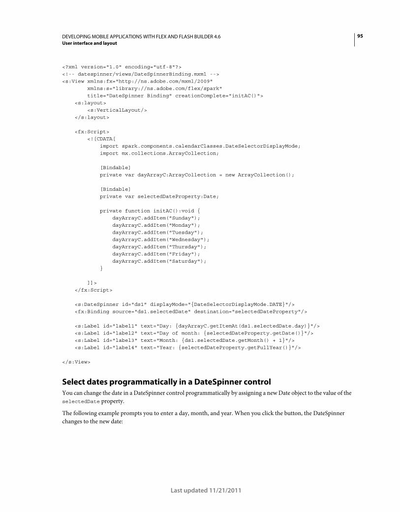
95DEVELOPING MOBILE APPLICATIONS WITH FLEX AND FLASH BUILDER 4.6
User interface and layout
Last updated 11/21/2011
<?xml version="1.0" encoding="utf-8"?> <!-- datespinner/views/DateSpinnerBinding.mxml --> <s:View xmlns:fx="http://ns.adobe.com/mxml/2009" xmlns:s="library://ns.adobe.com/flex/spark" title="DateSpinner Binding" creationComplete="initAC()"> <s:layout> <s:VerticalLayout/> </s:layout> <fx:Script> <![CDATA[ import spark.components.calendarClasses.DateSelectorDisplayMode; import mx.collections.ArrayCollection; [Bindable] private var dayArrayC:ArrayCollection = new ArrayCollection(); [Bindable] private var selectedDateProperty:Date; private function initAC():void { dayArrayC.addItem("Sunday"); dayArrayC.addItem("Monday"); dayArrayC.addItem("Tuesday"); dayArrayC.addItem("Wednesday"); dayArrayC.addItem("Thursday"); dayArrayC.addItem("Friday"); dayArrayC.addItem("Saturday"); } ]]> </fx:Script> <s:DateSpinner id="ds1" displayMode="{DateSelectorDisplayMode.DATE}"/> <fx:Binding source="ds1.selectedDate" destination="selectedDateProperty"/> <s:Label id="label1" text="Day: {dayArrayC.getItemAt(ds1.selectedDate.day)}"/> <s:Label id="label2" text="Day of month: {selectedDateProperty.getDate()}"/> <s:Label id="label3" text="Month: {ds1.selectedDate.getMonth() + 1}"/> <s:Label id="label4" text="Year: {selectedDateProperty.getFullYear()}"/> </s:View>
Select dates programmatically in a DateSpinner control
You can change the date in a DateSpinner control programmatically by assigning a new Date object to the value of the
selectedDate property.
The following example prompts you to enter a day, month, and year. When you click the button, the DateSpinner
changes to the new date:
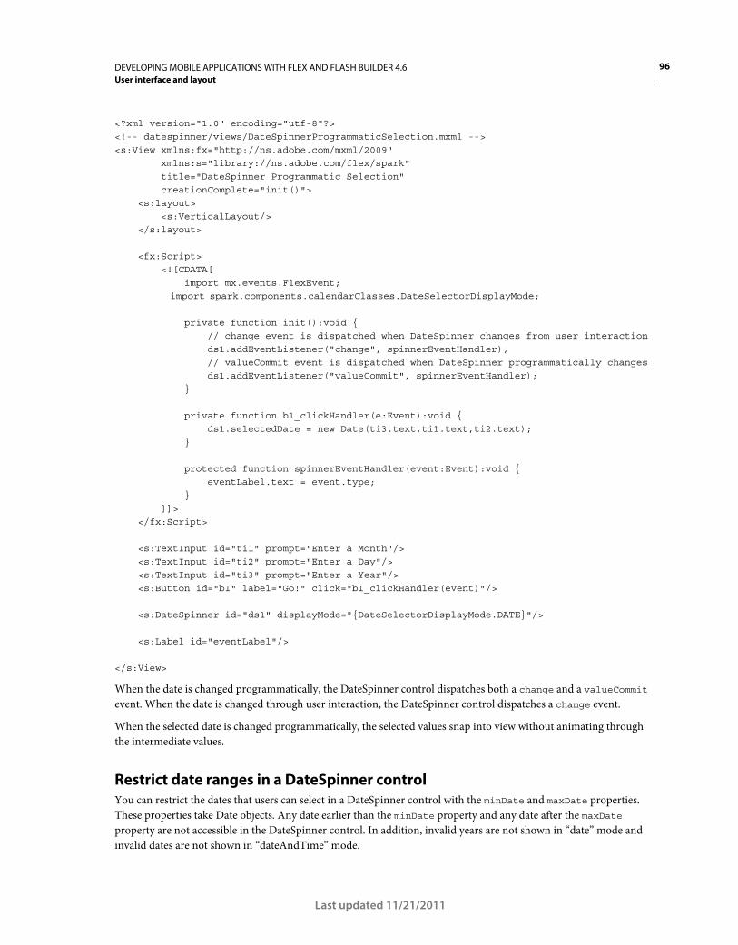
96DEVELOPING MOBILE APPLICATIONS WITH FLEX AND FLASH BUILDER 4.6
User interface and layout
Last updated 11/21/2011
<?xml version="1.0" encoding="utf-8"?> <!-- datespinner/views/DateSpinnerProgrammaticSelection.mxml --> <s:View xmlns:fx="http://ns.adobe.com/mxml/2009" xmlns:s="library://ns.adobe.com/flex/spark" title="DateSpinner Programmatic Selection" creationComplete="init()"> <s:layout> <s:VerticalLayout/> </s:layout> <fx:Script> <![CDATA[ import mx.events.FlexEvent; import spark.components.calendarClasses.DateSelectorDisplayMode; private function init():void { // change event is dispatched when DateSpinner changes from user interaction ds1.addEventListener("change", spinnerEventHandler); // valueCommit event is dispatched when DateSpinner programmatically changes ds1.addEventListener("valueCommit", spinnerEventHandler); } private function b1_clickHandler(e:Event):void { ds1.selectedDate = new Date(ti3.text,ti1.text,ti2.text); } protected function spinnerEventHandler(event:Event):void { eventLabel.text = event.type; } ]]> </fx:Script> <s:TextInput id="ti1" prompt="Enter a Month"/> <s:TextInput id="ti2" prompt="Enter a Day"/> <s:TextInput id="ti3" prompt="Enter a Year"/> <s:Button id="b1" label="Go!" click="b1_clickHandler(event)"/> <s:DateSpinner id="ds1" displayMode="{DateSelectorDisplayMode.DATE}"/> <s:Label id="eventLabel"/> </s:View>
When the date is changed programmatically, the DateSpinner control dispatches both a change and a valueCommit
event. When the date is changed through user interaction, the DateSpinner control dispatches a change event.
When the selected date is changed programmatically, the selected values snap into view without animating through
the intermediate values.
Restrict date ranges in a DateSpinner control
You can restrict the dates that users can select in a DateSpinner control with the minDate and maxDate properties.
These properties take Date objects. Any date earlier than the minDate property and any date after the maxDate
property are not accessible in the DateSpinner control. In addition, invalid years are not shown in “date” mode and
invalid dates are not shown in “dateAndTime” mode.
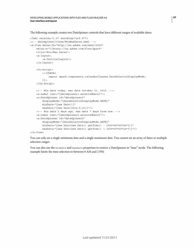
97DEVELOPING MOBILE APPLICATIONS WITH FLEX AND FLASH BUILDER 4.6
User interface and layout
Last updated 11/21/2011
The following example creates two DateSpinner controls that have different ranges of available dates:
<?xml version="1.0" encoding="utf-8"?> <!-- datespinner/views/MinMaxDates.mxml --> <s:View xmlns:fx="http://ns.adobe.com/mxml/2009" xmlns:s="library://ns.adobe.com/flex/spark" title="Min/Max Dates"> <s:layout> <s:VerticalLayout/> </s:layout> <fx:Script> <![CDATA[ import spark.components.calendarClasses.DateSelectorDisplayMode; ]]> </fx:Script> <!-- Min date today, max date October 31, 2012. --> <s:Label text="{dateSpinner1.selectedDate}"/> <s:DateSpinner id="dateSpinner1" displayMode="{DateSelectorDisplayMode.DATE}" minDate="{new Date()}" maxDate="{new Date(2012,9,31)}"/> <!-- Min date 3 days ago, max date 7 days from now. --> <s:Label text="{dateSpinner2.selectedDate}"/> <s:DateSpinner id="dateSpinner2" displayMode="{DateSelectorDisplayMode.DATE}" minDate="{new Date(new Date().getTime() - 1000*60*60*24*3)}" maxDate="{new Date(new Date().getTime() + 1000*60*60*24*7)}"/> </s:View>
You can only set a single minimum date and a single maximum date. You cannot set an array of dates or multiple
selection ranges.
You can also use the minDate and maxDate properties to restrict a DateSpinner in “time” mode. The following
example limits the time selection to between 8 AM and 2 PM:
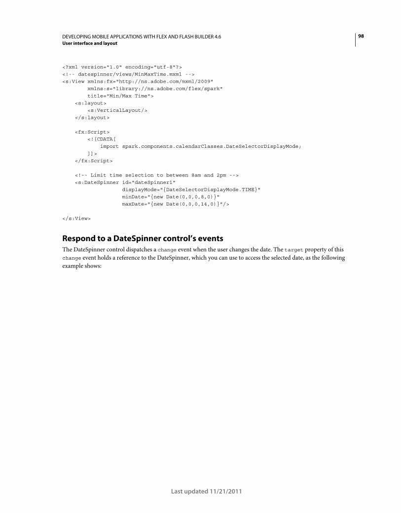
98DEVELOPING MOBILE APPLICATIONS WITH FLEX AND FLASH BUILDER 4.6
User interface and layout
Last updated 11/21/2011
<?xml version="1.0" encoding="utf-8"?> <!-- datespinner/views/MinMaxTime.mxml --> <s:View xmlns:fx="http://ns.adobe.com/mxml/2009" xmlns:s="library://ns.adobe.com/flex/spark" title="Min/Max Time"> <s:layout> <s:VerticalLayout/> </s:layout> <fx:Script> <![CDATA[ import spark.components.calendarClasses.DateSelectorDisplayMode; ]]> </fx:Script> <!-- Limit time selection to between 8am and 2pm --> <s:DateSpinner id="dateSpinner1" displayMode="{DateSelectorDisplayMode.TIME}" minDate="{new Date(0,0,0,8,0)}" maxDate="{new Date(0,0,0,14,0)}"/> </s:View>
Respond to a DateSpinner control’s events
The DateSpinner control dispatches a change event when the user changes the date. The target property of this
change event holds a reference to the DateSpinner, which you can use to access the selected date, as the following
example shows:
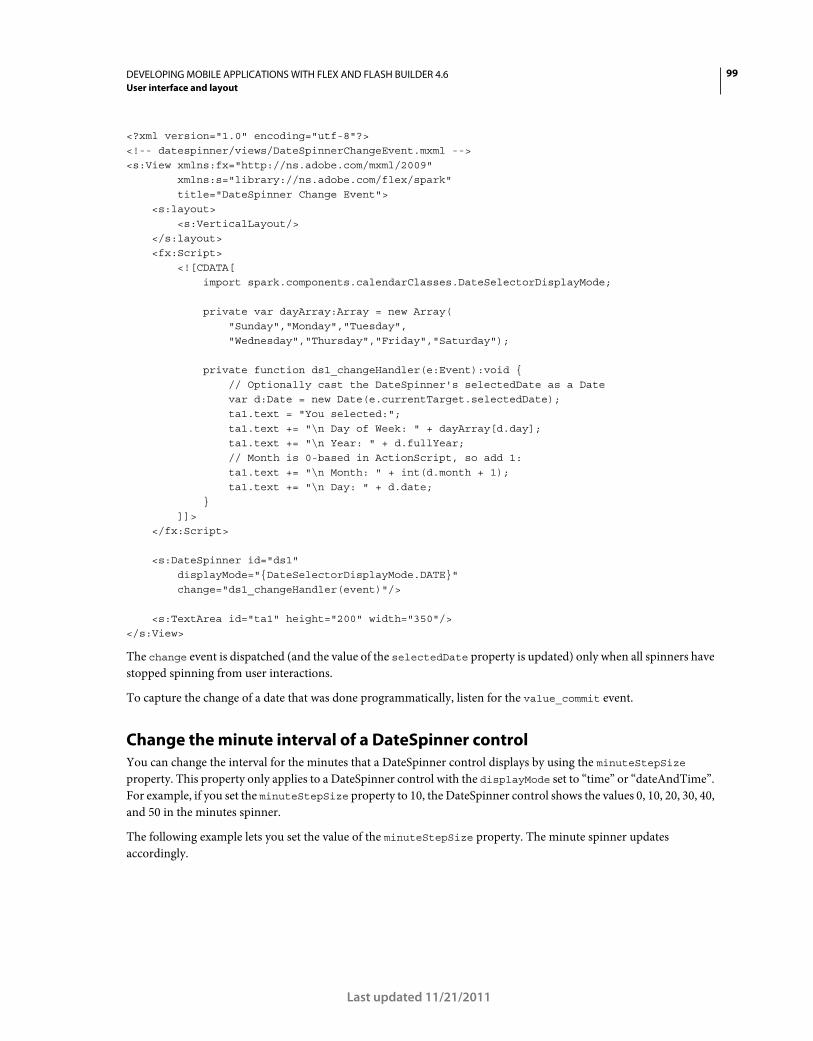
99DEVELOPING MOBILE APPLICATIONS WITH FLEX AND FLASH BUILDER 4.6
User interface and layout
Last updated 11/21/2011
<?xml version="1.0" encoding="utf-8"?> <!-- datespinner/views/DateSpinnerChangeEvent.mxml --> <s:View xmlns:fx="http://ns.adobe.com/mxml/2009" xmlns:s="library://ns.adobe.com/flex/spark" title="DateSpinner Change Event"> <s:layout> <s:VerticalLayout/> </s:layout> <fx:Script> <![CDATA[ import spark.components.calendarClasses.DateSelectorDisplayMode; private var dayArray:Array = new Array( "Sunday","Monday","Tuesday", "Wednesday","Thursday","Friday","Saturday"); private function ds1_changeHandler(e:Event):void { // Optionally cast the DateSpinner's selectedDate as a Date var d:Date = new Date(e.currentTarget.selectedDate); ta1.text = "You selected:"; ta1.text += "\n Day of Week: " + dayArray[d.day]; ta1.text += "\n Year: " + d.fullYear; // Month is 0-based in ActionScript, so add 1: ta1.text += "\n Month: " + int(d.month + 1); ta1.text += "\n Day: " + d.date; } ]]> </fx:Script> <s:DateSpinner id="ds1" displayMode="{DateSelectorDisplayMode.DATE}" change="ds1_changeHandler(event)"/> <s:TextArea id="ta1" height="200" width="350"/> </s:View>
The change event is dispatched (and the value of the selectedDate property is updated) only when all spinners have
stopped spinning from user interactions.
To capture the change of a date that was done programmatically, listen for the value_commit event.
Change the minute interval of a DateSpinner control
You can change the interval for the minutes that a DateSpinner control displays by using the minuteStepSize
property. This property only applies to a DateSpinner control with the displayMode set to “time” or “dateAndTime”.
For example, if you set the minuteStepSize property to 10, the DateSpinner control shows the values 0, 10, 20, 30, 40,
and 50 in the minutes spinner.
The following example lets you set the value of the minuteStepSize property. The minute spinner updates
accordingly.
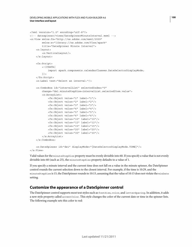
100DEVELOPING MOBILE APPLICATIONS WITH FLEX AND FLASH BUILDER 4.6
User interface and layout
Last updated 11/21/2011
<?xml version="1.0" encoding="utf-8"?> <!-- datespinner/views/DateSpinnerMinuteInterval.mxml --> <s:View xmlns:fx="http://ns.adobe.com/mxml/2009" xmlns:s="library://ns.adobe.com/flex/spark" title="DateSpinner Minute Interval"> <s:layout> <s:VerticalLayout/> </s:layout> <fx:Script> <![CDATA[ import spark.components.calendarClasses.DateSelectorDisplayMode; ]]> </fx:Script> <s:Label text="Select an interval:"/> <s:ComboBox id="intervalList" selectedIndex="0" change="ds1.minuteStepSize=intervalList.selectedItem.value"> <s:ArrayList> <fx:Object value="1" label="1"/> <fx:Object value="2" label="2"/> <fx:Object value="3" label="3"/> <fx:Object value="4" label="4"/> <fx:Object value="5" label="5"/> <fx:Object value="6" label="6"/> <fx:Object value="10" label="10"/> <fx:Object value="12" label="12"/> <fx:Object value="15" label="15"/> <fx:Object value="20" label="20"/> <fx:Object value="30" label="30"/> </s:ArrayList> </s:ComboBox> <s:DateSpinner id="ds1" displayMode="{DateSelectorDisplayMode.TIME}"/> </s:View>
Valid values for the minuteStepSize property must be evenly divisible into 60. If you specify a value that is not evenly
divisible into 60 (such as 25), the minuteStepSize property defaults to a value of 1.
If you specify a minute interval and the current time does not fall on a value in the minute spinner, the DateSpinner
control rounds the current selection down to the closest interval. For example, if the time is 10:29, and the
minuteStepSize is 15, the DateSpinner rounds to 10:15, assuming that the value of 10:15 does not violate the minDate
setting.
Customize the appearance of a DateSpinner control
The DateSpinner control supports most text styles such as fontSize, color, and letterSpacing. In addition, it adds
a new style property called accentColor. This style changes the color of the current date or time in the spinner lists.
The following example sets this color to red:
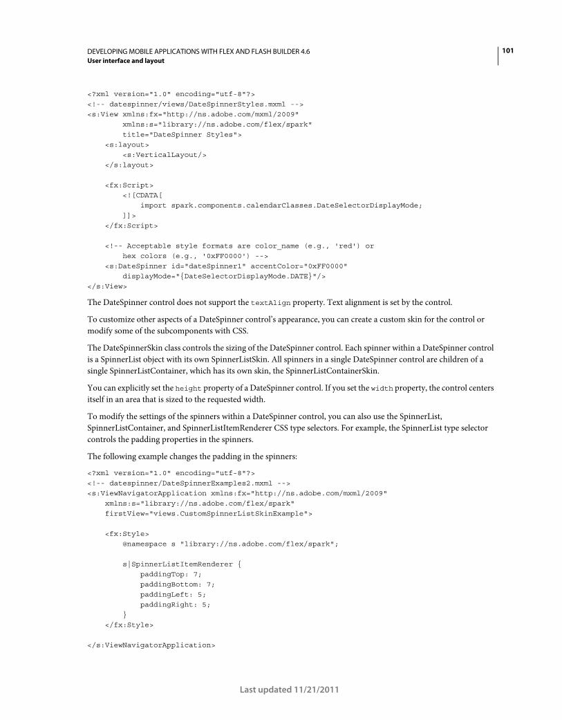
101DEVELOPING MOBILE APPLICATIONS WITH FLEX AND FLASH BUILDER 4.6
User interface and layout
Last updated 11/21/2011
<?xml version="1.0" encoding="utf-8"?> <!-- datespinner/views/DateSpinnerStyles.mxml --> <s:View xmlns:fx="http://ns.adobe.com/mxml/2009" xmlns:s="library://ns.adobe.com/flex/spark" title="DateSpinner Styles"> <s:layout> <s:VerticalLayout/> </s:layout> <fx:Script> <![CDATA[ import spark.components.calendarClasses.DateSelectorDisplayMode; ]]> </fx:Script> <!-- Acceptable style formats are color_name (e.g., 'red') or hex colors (e.g., '0xFF0000') --> <s:DateSpinner id="dateSpinner1" accentColor="0xFF0000" displayMode="{DateSelectorDisplayMode.DATE}"/> </s:View>
The DateSpinner control does not support the textAlign property. Text alignment is set by the control.
To customize other aspects of a DateSpinner control’s appearance, you can create a custom skin for the control or
modify some of the subcomponents with CSS.
The DateSpinnerSkin class controls the sizing of the DateSpinner control. Each spinner within a DateSpinner control
is a SpinnerList object with its own SpinnerListSkin. All spinners in a single DateSpinner control are children of a
single SpinnerListContainer, which has its own skin, the SpinnerListContainerSkin.
You can explicitly set the height property of a DateSpinner control. If you set the width property, the control centers
itself in an area that is sized to the requested width.
To modify the settings of the spinners within a DateSpinner control, you can also use the SpinnerList,
SpinnerListContainer, and SpinnerListItemRenderer CSS type selectors. For example, the SpinnerList type selector
controls the padding properties in the spinners.
The following example changes the padding in the spinners:
<?xml version="1.0" encoding="utf-8"?> <!-- datespinner/DateSpinnerExamples2.mxml --> <s:ViewNavigatorApplication xmlns:fx="http://ns.adobe.com/mxml/2009" xmlns:s="library://ns.adobe.com/flex/spark" firstView="views.CustomSpinnerListSkinExample"> <fx:Style> @namespace s "library://ns.adobe.com/flex/spark"; s|SpinnerListItemRenderer { paddingTop: 7; paddingBottom: 7; paddingLeft: 5; paddingRight: 5; } </fx:Style> </s:ViewNavigatorApplication>
102DEVELOPING MOBILE APPLICATIONS WITH FLEX AND FLASH BUILDER 4.6
User interface and layout
Last updated 11/21/2011
In mobile applications, type selectors must be in the top-level application file and not in a child view of the application.
If you try to set the SpinnerListItemRenderer type selector in a style block inside a view, Flex throws a compiler
warning.
You can extend the SpinnerListContainerSkin class to further customize the appearance of the spinners in a
DateSpinner control. The following example applies a custom skin to the SpinnerListContainer:
<?xml version="1.0" encoding="utf-8"?> <!-- datespinner/DateSpinnerExamples3.mxml --> <s:ViewNavigatorApplication xmlns:fx="http://ns.adobe.com/mxml/2009" xmlns:s="library://ns.adobe.com/flex/spark" firstView="views.CustomSpinnerListSkinExample"> <fx:Style> @namespace s "library://ns.adobe.com/flex/spark"; /* Change SpinnerListContainer for all DateSpinner controls */ s|SpinnerListContainer { skinClass: ClassReference("customSkins.CustomSpinnerListContainerSkin"); } /* Change padding for all DateSpinner controls */ s|SpinnerListItemRenderer { paddingTop: 7; paddingBottom: 7; paddingLeft: 5; paddingRight: 5; fontSize: 12; } </fx:Style> </s:ViewNavigatorApplication>
The following CustomSpinnerListContainerSkin class reduces the size of the “selection indicator” so that it more
closely reflects the new size of the fonts and padding in the rows of the spinner:
// datespinner/customSkins/CustomSpinnerListContainerSkin.as package customSkins { import mx.core.DPIClassification; import spark.skins.mobile.SpinnerListContainerSkin; import spark.skins.mobile.supportClasses.MobileSkin; import spark.skins.mobile160.assets.SpinnerListContainerBackground; import spark.skins.mobile160.assets.SpinnerListContainerSelectionIndicator; import spark.skins.mobile160.assets.SpinnerListContainerShadow; import spark.skins.mobile240.assets.SpinnerListContainerBackground; import spark.skins.mobile240.assets.SpinnerListContainerSelectionIndicator; import spark.skins.mobile240.assets.SpinnerListContainerShadow; import spark.skins.mobile320.assets.SpinnerListContainerBackground; import spark.skins.mobile320.assets.SpinnerListContainerSelectionIndicator; import spark.skins.mobile320.assets.SpinnerListContainerShadow; public class CustomSpinnerListContainerSkin extends SpinnerListContainerSkin { public function CustomSpinnerListContainerSkin() { super(); switch (applicationDPI)
103DEVELOPING MOBILE APPLICATIONS WITH FLEX AND FLASH BUILDER 4.6
User interface and layout
Last updated 11/21/2011
{ case DPIClassification.DPI_320: { borderClass = spark.skins.mobile320.assets.SpinnerListContainerBackground; selectionIndicatorClass = spark.skins.mobile320.assets.SpinnerListContainerSelectionIndicator; shadowClass = spark.skins.mobile320.assets.SpinnerListContainerShadow; cornerRadius = 10; borderThickness = 2; selectionIndicatorHeight = 80; // was 120 break; } case DPIClassification.DPI_240: { borderClass = spark.skins.mobile240.assets.SpinnerListContainerBackground; selectionIndicatorClass = spark.skins.mobile240.assets.SpinnerListContainerSelectionIndicator; shadowClass = spark.skins.mobile240.assets.SpinnerListContainerShadow; cornerRadius = 8; borderThickness = 1; selectionIndicatorHeight = 60; // was 90 break; } default: // default DPI_160 { borderClass = spark.skins.mobile160.assets.SpinnerListContainerBackground; selectionIndicatorClass = spark.skins.mobile160.assets.SpinnerListContainerSelectionIndicator; shadowClass = spark.skins.mobile160.assets.SpinnerListContainerShadow; cornerRadius = 5; borderThickness = 1; selectionIndicatorHeight = 40; // was 60 break; } } } } }
For more information about skinning mobile components, see “Basics of mobile skinning” on page 160.
Use localized dates and times with a DateSpinner control
The DateSpinner control supports all locales supported by the device on which the application is running. If you set
the locale to ja-JP, then the DateSpinner changes to represent dates in the standard of the Japanese locale.
You can set the locale property on the DateSpinner control directly, or you can set it on a container, such as the
Application. The DateSpinner control inherits the value of this property. The default locale is the locale of the device
on which the application is running, unless you override it with the locale property.
The following example sets the default locale to “ja-JP”. You can select a locale to change the format of the
DateSpinner:
104DEVELOPING MOBILE APPLICATIONS WITH FLEX AND FLASH BUILDER 4.6
User interface and layout
Last updated 11/21/2011
<?xml version="1.0" encoding="utf-8"?> <!-- datespinner/LocalizedDateSpinner.mxml --> <s:View xmlns:fx="http://ns.adobe.com/mxml/2009" xmlns:s="library://ns.adobe.com/flex/spark" title="Localized DateSpinner" locale="ja_JP"> <s:layout> <s:VerticalLayout/> </s:layout> <fx:Script> <![CDATA[ private function localeChangeHandler():void { ds1.setStyle('locale',localeSelector.selectedItem); } ]]> </fx:Script> <s:ComboBox id="localeSelector" change="localeChangeHandler()"> <s:ArrayList> <fx:String>en-US</fx:String> <fx:String>en-UK</fx:String> <fx:String>es-AR</fx:String> <fx:String>he-IL</fx:String> <fx:String>ko-KR</fx:String> <fx:String>ja-JP</fx:String> <fx:String>vi-VN</fx:String> <fx:String>zh-CN</fx:String> <fx:String>zh-TW</fx:String> </s:ArrayList> </s:ComboBox> <s:DateSpinner id="ds1" displayMode="dateAndTime"/> </s:View>
Use a spinner list in a mobile application
The SpinnerList component is a specialized List that is typically used for data selection in mobile applications. By
default, as the user scrolls through the list items, the items wrap after the user reaches the end of the list. The
SpinnerList control is commonly used as a numeric stepper component in mobile applications.
The following image shows what a typical SpinnerList control looks like in a mobile application:
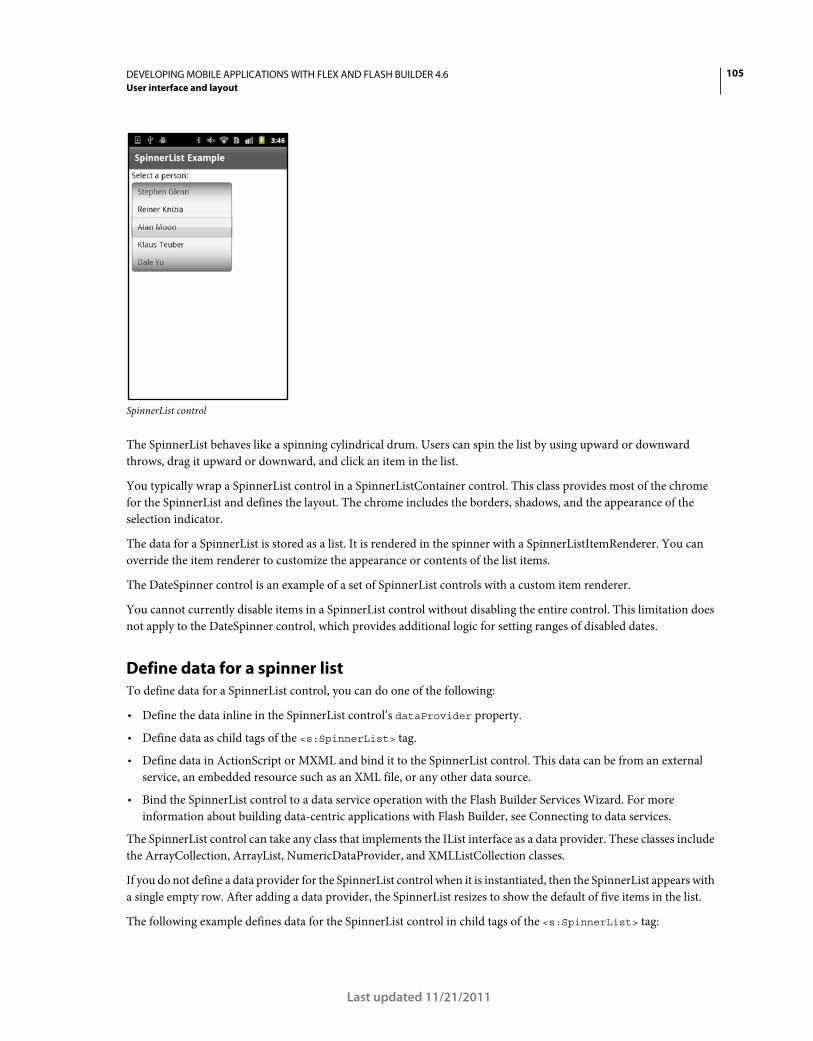
105DEVELOPING MOBILE APPLICATIONS WITH FLEX AND FLASH BUILDER 4.6
User interface and layout
Last updated 11/21/2011
SpinnerList control
The SpinnerList behaves like a spinning cylindrical drum. Users can spin the list by using upward or downward
throws, drag it upward or downward, and click an item in the list.
You typically wrap a SpinnerList control in a SpinnerListContainer control. This class provides most of the chrome
for the SpinnerList and defines the layout. The chrome includes the borders, shadows, and the appearance of the
selection indicator.
The data for a SpinnerList is stored as a list. It is rendered in the spinner with a SpinnerListItemRenderer. You can
override the item renderer to customize the appearance or contents of the list items.
The DateSpinner control is an example of a set of SpinnerList controls with a custom item renderer.
You cannot currently disable items in a SpinnerList control without disabling the entire control. This limitation does
not apply to the DateSpinner control, which provides additional logic for setting ranges of disabled dates.
Define data for a spinner list
To define data for a SpinnerList control, you can do one of the following:
• Define the data inline in the SpinnerList control’s dataProvider property.
• Define data as child tags of the <s:SpinnerList> tag.
• Define data in ActionScript or MXML and bind it to the SpinnerList control. This data can be from an external
service, an embedded resource such as an XML file, or any other data source.
• Bind the SpinnerList control to a data service operation with the Flash Builder Services Wizard. For more
information about building data-centric applications with Flash Builder, see Connecting to data services.
The SpinnerList control can take any class that implements the IList interface as a data provider. These classes include
the ArrayCollection, ArrayList, NumericDataProvider, and XMLListCollection classes.
If you do not define a data provider for the SpinnerList control when it is instantiated, then the SpinnerList appears with
a single empty row. After adding a data provider, the SpinnerList resizes to show the default of five items in the list.
The following example defines data for the SpinnerList control in child tags of the <s:SpinnerList> tag:
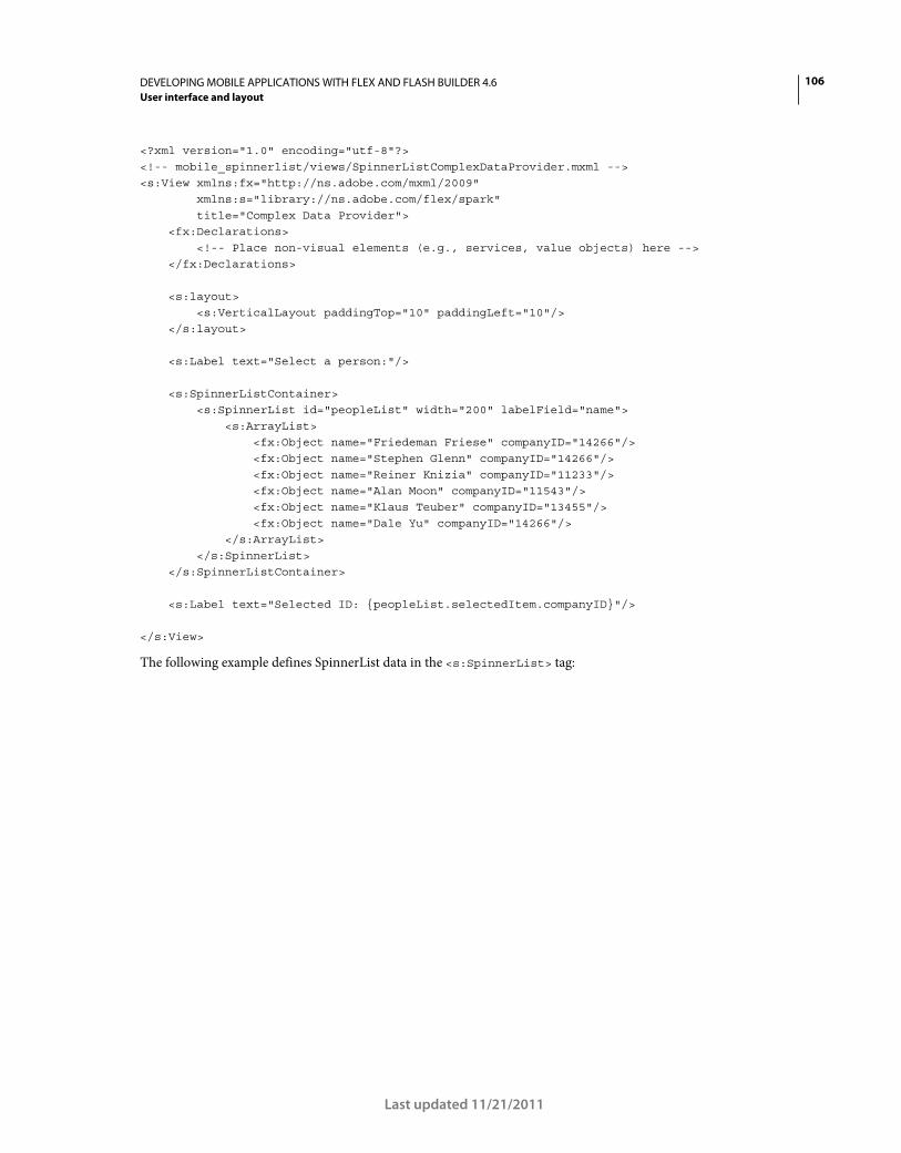
106DEVELOPING MOBILE APPLICATIONS WITH FLEX AND FLASH BUILDER 4.6
User interface and layout
Last updated 11/21/2011
<?xml version="1.0" encoding="utf-8"?> <!-- mobile_spinnerlist/views/SpinnerListComplexDataProvider.mxml --> <s:View xmlns:fx="http://ns.adobe.com/mxml/2009" xmlns:s="library://ns.adobe.com/flex/spark" title="Complex Data Provider"> <fx:Declarations> <!-- Place non-visual elements (e.g., services, value objects) here --> </fx:Declarations> <s:layout> <s:VerticalLayout paddingTop="10" paddingLeft="10"/> </s:layout> <s:Label text="Select a person:"/> <s:SpinnerListContainer> <s:SpinnerList id="peopleList" width="200" labelField="name"> <s:ArrayList> <fx:Object name="Friedeman Friese" companyID="14266"/> <fx:Object name="Stephen Glenn" companyID="14266"/> <fx:Object name="Reiner Knizia" companyID="11233"/> <fx:Object name="Alan Moon" companyID="11543"/> <fx:Object name="Klaus Teuber" companyID="13455"/> <fx:Object name="Dale Yu" companyID="14266"/> </s:ArrayList> </s:SpinnerList> </s:SpinnerListContainer> <s:Label text="Selected ID: {peopleList.selectedItem.companyID}"/> </s:View>
The following example defines SpinnerList data in the <s:SpinnerList> tag:
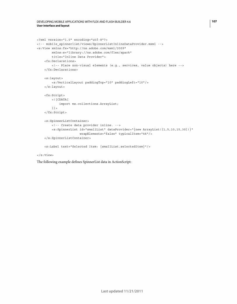
107DEVELOPING MOBILE APPLICATIONS WITH FLEX AND FLASH BUILDER 4.6
User interface and layout
Last updated 11/21/2011
<?xml version="1.0" encoding="utf-8"?> <!-- mobile_spinnerlist/views/SpinnerListInlineDataProvider.mxml --> <s:View xmlns:fx="http://ns.adobe.com/mxml/2009" xmlns:s="library://ns.adobe.com/flex/spark" title="Inline Data Provider"> <fx:Declarations> <!-- Place non-visual elements (e.g., services, value objects) here --> </fx:Declarations> <s:layout> <s:VerticalLayout paddingTop="10" paddingLeft="10"/> </s:layout> <fx:Script> <![CDATA[ import mx.collections.ArrayList; ]]> </fx:Script> <s:SpinnerListContainer> <!-- Create data provider inline. --> <s:SpinnerList id="smallList" dataProvider="{new ArrayList([1,5,10,15,30])}" wrapElements="false" typicalItem="44"/> </s:SpinnerListContainer> <s:Label text="Selected Item: {smallList.selectedItem}"/> </s:View>
The following example defines SpinnerList data in ActionScript:
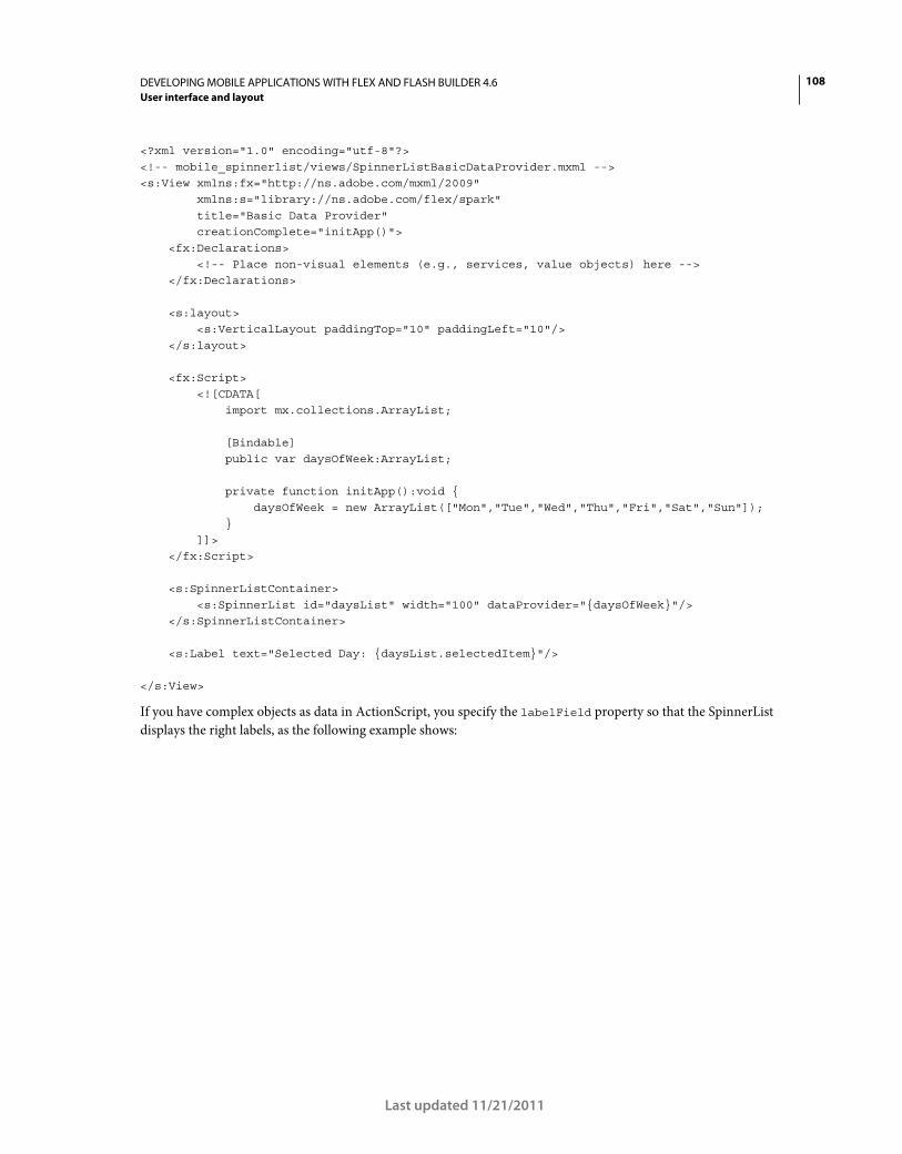
108DEVELOPING MOBILE APPLICATIONS WITH FLEX AND FLASH BUILDER 4.6
User interface and layout
Last updated 11/21/2011
<?xml version="1.0" encoding="utf-8"?> <!-- mobile_spinnerlist/views/SpinnerListBasicDataProvider.mxml --> <s:View xmlns:fx="http://ns.adobe.com/mxml/2009" xmlns:s="library://ns.adobe.com/flex/spark" title="Basic Data Provider" creationComplete="initApp()"> <fx:Declarations> <!-- Place non-visual elements (e.g., services, value objects) here --> </fx:Declarations> <s:layout> <s:VerticalLayout paddingTop="10" paddingLeft="10"/> </s:layout> <fx:Script> <![CDATA[ import mx.collections.ArrayList; [Bindable] public var daysOfWeek:ArrayList; private function initApp():void { daysOfWeek = new ArrayList(["Mon","Tue","Wed","Thu","Fri","Sat","Sun"]); } ]]> </fx:Script> <s:SpinnerListContainer> <s:SpinnerList id="daysList" width="100" dataProvider="{daysOfWeek}"/> </s:SpinnerListContainer> <s:Label text="Selected Day: {daysList.selectedItem}"/> </s:View>
If you have complex objects as data in ActionScript, you specify the labelField property so that the SpinnerList
displays the right labels, as the following example shows:
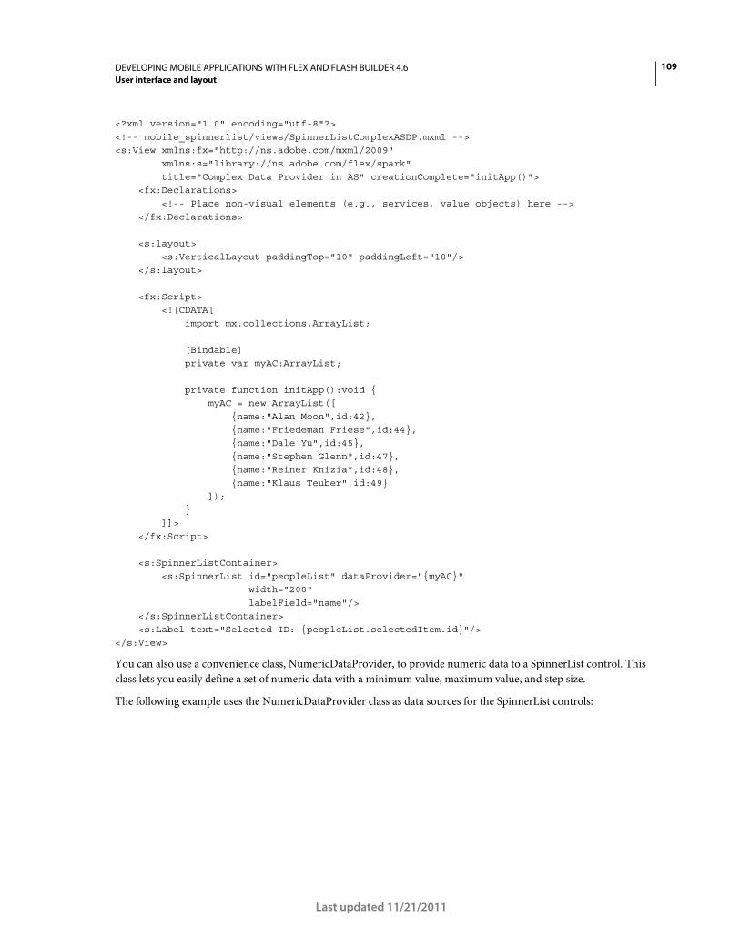
109DEVELOPING MOBILE APPLICATIONS WITH FLEX AND FLASH BUILDER 4.6
User interface and layout
Last updated 11/21/2011
<?xml version="1.0" encoding="utf-8"?> <!-- mobile_spinnerlist/views/SpinnerListComplexASDP.mxml --> <s:View xmlns:fx="http://ns.adobe.com/mxml/2009" xmlns:s="library://ns.adobe.com/flex/spark" title="Complex Data Provider in AS" creationComplete="initApp()"> <fx:Declarations> <!-- Place non-visual elements (e.g., services, value objects) here --> </fx:Declarations> <s:layout> <s:VerticalLayout paddingTop="10" paddingLeft="10"/> </s:layout> <fx:Script> <![CDATA[ import mx.collections.ArrayList; [Bindable] private var myAC:ArrayList; private function initApp():void { myAC = new ArrayList([ {name:"Alan Moon",id:42}, {name:"Friedeman Friese",id:44}, {name:"Dale Yu",id:45}, {name:"Stephen Glenn",id:47}, {name:"Reiner Knizia",id:48}, {name:"Klaus Teuber",id:49} ]); } ]]> </fx:Script> <s:SpinnerListContainer> <s:SpinnerList id="peopleList" dataProvider="{myAC}" width="200" labelField="name"/> </s:SpinnerListContainer> <s:Label text="Selected ID: {peopleList.selectedItem.id}"/> </s:View>
You can also use a convenience class, NumericDataProvider, to provide numeric data to a SpinnerList control. This
class lets you easily define a set of numeric data with a minimum value, maximum value, and step size.
The following example uses the NumericDataProvider class as data sources for the SpinnerList controls:
110DEVELOPING MOBILE APPLICATIONS WITH FLEX AND FLASH BUILDER 4.6
User interface and layout
Last updated 11/21/2011
<?xml version="1.0" encoding="utf-8"?> <!-- mobile_spinnerlist/views/MinMaxSpinnerList.mxml --> <s:View xmlns:fx="http://ns.adobe.com/mxml/2009" xmlns:s="library://ns.adobe.com/flex/spark" title="Min/Max SpinnerLists" backgroundColor="0x000000"> <fx:Script> <![CDATA[ import mx.collections.ArrayList; ]]> </fx:Script> <s:SpinnerListContainer top="10" left="10"> <s:SpinnerList typicalItem="100"> <s:dataProvider> <s:NumericDataProvider minimum="0" maximum="23" stepSize="1"/> </s:dataProvider> </s:SpinnerList> <s:SpinnerList typicalItem="100"> <s:dataProvider> <s:NumericDataProvider minimum="0" maximum="59" stepSize="1"/> </s:dataProvider> </s:SpinnerList> <s:SpinnerList typicalItem="100"> <s:dataProvider> <s:NumericDataProvider minimum="0" maximum="59" stepSize="1"/> </s:dataProvider> </s:SpinnerList> <s:SpinnerList typicalItem="100" dataProvider="{new ArrayList(['AM','PM'])}" wrapElements="false"/> </s:SpinnerListContainer> </s:View>
The value of the stepSize property can be a negative number. In this case, the maximum value is the first value
displayed. The spinner starts are the maximum value and steps to the minimum value.
Select items in a spinner list
The SpinnerList control supports selecting only a single item at a time. The selected item is always in the center of the
component and, by default, is displayed under the selection indicator. When not spinning, the SpinnerList must always
have an item selected. You cannot select a disabled item or a line with no item.
To get the currently selected item in a SpinnerList control, you access the control’s selectedIndex or selectedItem
properties.
To set the currently selected item in a SpinnerList control, you set the value of the selectedIndex or selectedItem
properties. You typically set these properties on the <s:SpinnerList> tag so that the item is selected when the
SpinnerList is created.
If you do not explicitly set the value of the selectedIndex or selectedItem properties on the SpinnerList, the default
selected item is the first item in the list.
111DEVELOPING MOBILE APPLICATIONS WITH FLEX AND FLASH BUILDER 4.6
User interface and layout
Last updated 11/21/2011
You can use the selectedIndex or selectedItem properties to programmatically change the selected item in the
spinner. When you set one of these properties, the control snaps to the item; it does not animate (or “spin”) the spinner
to the item.
The following example uses the SpinnerList control as a countdown timer. The Timer object changes the selected item
in the spinner by changing the value of the selectedIndex property every second:
<?xml version="1.0" encoding="utf-8"?> <!-- mobile_spinnerlist/views/SpinnerListCountdownTimer.mxml --> <s:View xmlns:fx="http://ns.adobe.com/mxml/2009" xmlns:s="library://ns.adobe.com/flex/spark" title="Countdown Timer" creationComplete="initApp()"> <fx:Declarations> <!-- Place non-visual elements (e.g., services, value objects) here --> </fx:Declarations> <fx:Script> <![CDATA[ private var myTimer:Timer; private function initApp():void { myTimer = new Timer(1000, 0); // 1 second myTimer.addEventListener(TimerEvent.TIMER, changeSpinner); myTimer.start(); } private function changeSpinner(e:Event):void { secList.selectedIndex = secList.selectedIndex - 1; } ]]> </fx:Script> <s:SpinnerListContainer left="50" top="50"> <s:SpinnerList id="secList" width="100" selectedIndex="60"> <s:dataProvider> <s:NumericDataProvider minimum="0" maximum="60" stepSize="1"/> </s:dataProvider> </s:SpinnerList> </s:SpinnerListContainer> </s:View>
User interactions and events with a spinner list
When the selected item in a SpinnerList control changes, the control dispatches change and valueCommit events. This
is typically in reaction to user interaction such as a swipe. If a user selects an item by touching that item, the control
dispatches a click event as well as change and valueCommit events.
When the selected item changes programmatically, the SpinnerList control dispatches only a valueCommit event.
When the SpinnerList control is spinning, it does not dispatch events for each item it passes. It only dispatches events
such as change or valueCommit when it comes to rest on a new item.
When the SpinnerList control is first instantiated with a data provider, it dispatches both the change and
valueCommit events.
The following example shows the common events that are dispatched when using the SpinnerList control:
112DEVELOPING MOBILE APPLICATIONS WITH FLEX AND FLASH BUILDER 4.6
User interface and layout
Last updated 11/21/2011
<?xml version="1.0" encoding="utf-8"?> <!-- mobile_spinnerlist/views/SpinnerListEvents.mxml --> <s:View xmlns:fx="http://ns.adobe.com/mxml/2009" xmlns:s="library://ns.adobe.com/flex/spark" title="SpinnerList Events" creationComplete="initApp()"> <s:layout> <s:VerticalLayout paddingTop="10" paddingLeft="10" paddingRight="10" paddingBottom="10"/> </s:layout> <fx:Script> <![CDATA[ import mx.collections.ArrayList; [Bindable] public var daysOfWeek:ArrayList; private function initApp():void { daysOfWeek = new ArrayList(["Mon","Tue","Wed","Thu","Fri","Sat","Sun"]); } private function eventHandler(e:Event):void { ta1.text += "Event: " + e.type + " (selectedItem: " + e.currentTarget.selectedItem + ")\n"; } ]]> </fx:Script> <s:SpinnerListContainer> <s:SpinnerList id="daysList" width="300" dataProvider="{daysOfWeek}" change="eventHandler(event)" gestureSwipe="eventHandler(event)" click="eventHandler(event)" gestureZoom="eventHandler(event)" /> </s:SpinnerListContainer> <s:TextArea id="ta1" width="100%" height="100%"/> </s:View>
The following image shows the output after interacting with the SpinnerList control:
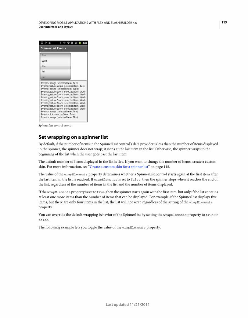
113DEVELOPING MOBILE APPLICATIONS WITH FLEX AND FLASH BUILDER 4.6
User interface and layout
Last updated 11/21/2011
SpinnerList control events
Set wrapping on a spinner list
By default, if the number of items in the SpinnerList control’s data provider is less than the number of items displayed
in the spinner, the spinner does not wrap; it stops at the last item in the list. Otherwise, the spinner wraps to the
beginning of the list when the user goes past the last item.
The default number of items displayed in the list is five. If you want to change the number of items, create a custom
skin. For more information, see “Create a custom skin for a spinner list” on page 115.
The value of the wrapElements property determines whether a SpinnerList control starts again at the first item after
the last item in the list is reached. If wrapElements is set to false, then the spinner stops when it reaches the end of
the list, regardless of the number of items in the list and the number of items displayed.
If the wrapElements property is set to true, then the spinner starts again with the first item, but only if the list contains
at least one more items than the number of items that can be displayed. For example, if the SpinnerList displays five
items, but there are only four items in the list, the list will not wrap regardless of the setting of the wrapElements
property.
You can override the default wrapping behavior of the SpinnerList by setting the wrapElements property to true or
false.
The following example lets you toggle the value of the wrapElements property:
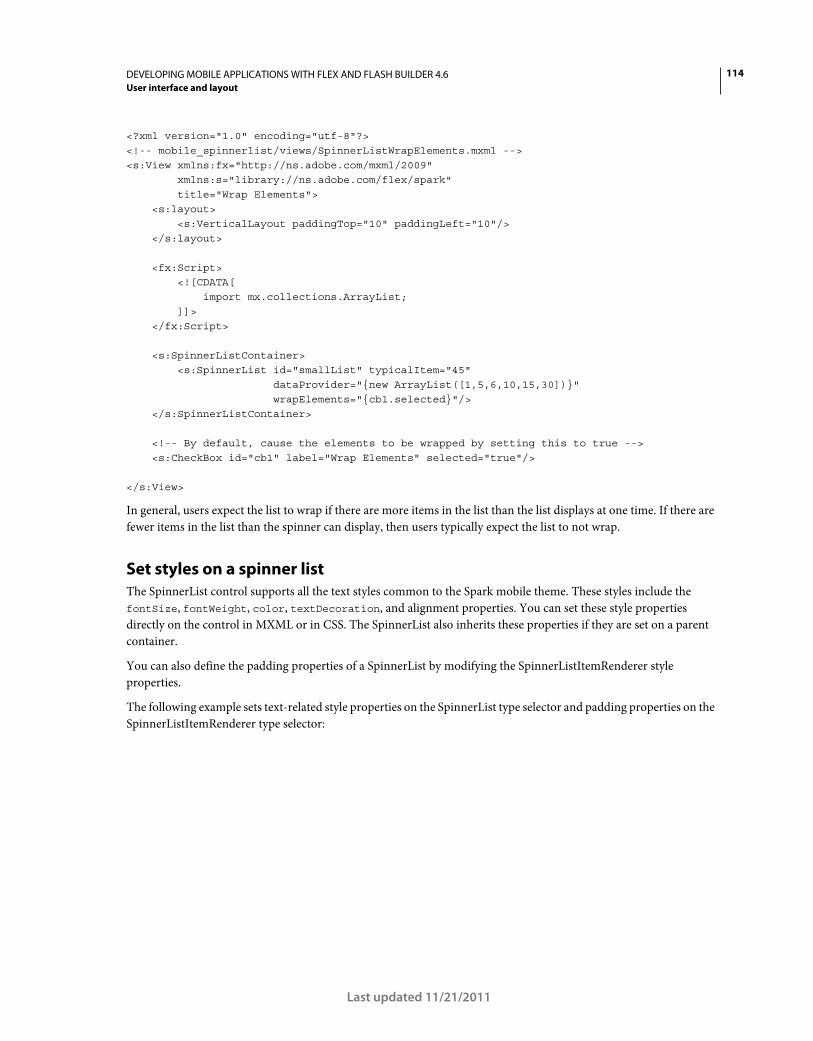
114DEVELOPING MOBILE APPLICATIONS WITH FLEX AND FLASH BUILDER 4.6
User interface and layout
Last updated 11/21/2011
<?xml version="1.0" encoding="utf-8"?> <!-- mobile_spinnerlist/views/SpinnerListWrapElements.mxml --> <s:View xmlns:fx="http://ns.adobe.com/mxml/2009" xmlns:s="library://ns.adobe.com/flex/spark" title="Wrap Elements"> <s:layout> <s:VerticalLayout paddingTop="10" paddingLeft="10"/> </s:layout> <fx:Script> <![CDATA[ import mx.collections.ArrayList; ]]> </fx:Script> <s:SpinnerListContainer> <s:SpinnerList id="smallList" typicalItem="45" dataProvider="{new ArrayList([1,5,6,10,15,30])}" wrapElements="{cb1.selected}"/> </s:SpinnerListContainer> <!-- By default, cause the elements to be wrapped by setting this to true --> <s:CheckBox id="cb1" label="Wrap Elements" selected="true"/> </s:View>
In general, users expect the list to wrap if there are more items in the list than the list displays at one time. If there are
fewer items in the list than the spinner can display, then users typically expect the list to not wrap.
Set styles on a spinner list
The SpinnerList control supports all the text styles common to the Spark mobile theme. These styles include the
fontSize, fontWeight, color, textDecoration, and alignment properties. You can set these style properties
directly on the control in MXML or in CSS. The SpinnerList also inherits these properties if they are set on a parent
container.
You can also define the padding properties of a SpinnerList by modifying the SpinnerListItemRenderer style
properties.
The following example sets text-related style properties on the SpinnerList type selector and padding properties on the
SpinnerListItemRenderer type selector:
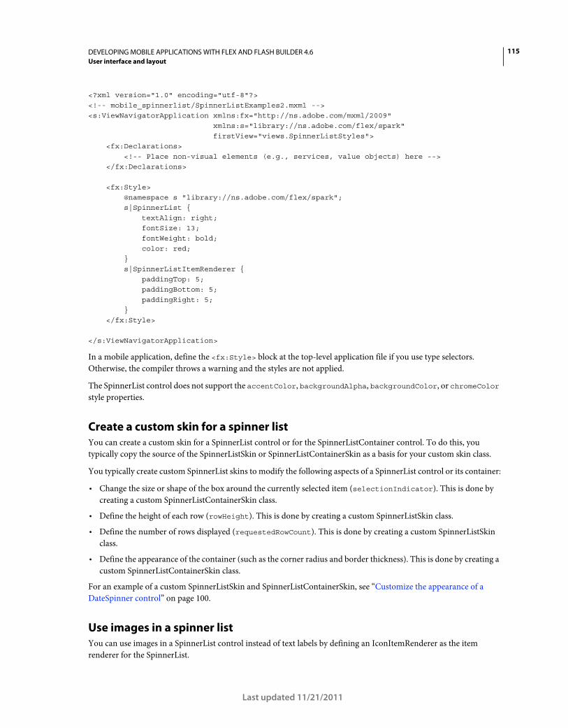
115DEVELOPING MOBILE APPLICATIONS WITH FLEX AND FLASH BUILDER 4.6
User interface and layout
Last updated 11/21/2011
<?xml version="1.0" encoding="utf-8"?> <!-- mobile_spinnerlist/SpinnerListExamples2.mxml --> <s:ViewNavigatorApplication xmlns:fx="http://ns.adobe.com/mxml/2009" xmlns:s="library://ns.adobe.com/flex/spark" firstView="views.SpinnerListStyles"> <fx:Declarations> <!-- Place non-visual elements (e.g., services, value objects) here --> </fx:Declarations> <fx:Style> @namespace s "library://ns.adobe.com/flex/spark"; s|SpinnerList { textAlign: right; fontSize: 13; fontWeight: bold; color: red; } s|SpinnerListItemRenderer { paddingTop: 5; paddingBottom: 5; paddingRight: 5; } </fx:Style> </s:ViewNavigatorApplication>
In a mobile application, define the <fx:Style> block at the top-level application file if you use type selectors.
Otherwise, the compiler throws a warning and the styles are not applied.
The SpinnerList control does not support the accentColor, backgroundAlpha, backgroundColor, or chromeColor
style properties.
Create a custom skin for a spinner list
You can create a custom skin for a SpinnerList control or for the SpinnerListContainer control. To do this, you
typically copy the source of the SpinnerListSkin or SpinnerListContainerSkin as a basis for your custom skin class.
You typically create custom SpinnerList skins to modify the following aspects of a SpinnerList control or its container:
• Change the size or shape of the box around the currently selected item (selectionIndicator). This is done by
creating a custom SpinnerListContainerSkin class.
• Define the height of each row (rowHeight). This is done by creating a custom SpinnerListSkin class.
• Define the number of rows displayed (requestedRowCount). This is done by creating a custom SpinnerListSkin
class.
• Define the appearance of the container (such as the corner radius and border thickness). This is done by creating a
custom SpinnerListContainerSkin class.
For an example of a custom SpinnerListSkin and SpinnerListContainerSkin, see “Customize the appearance of a
DateSpinner control” on page 100.
Use images in a spinner list
You can use images in a SpinnerList control instead of text labels by defining an IconItemRenderer as the item
renderer for the SpinnerList.
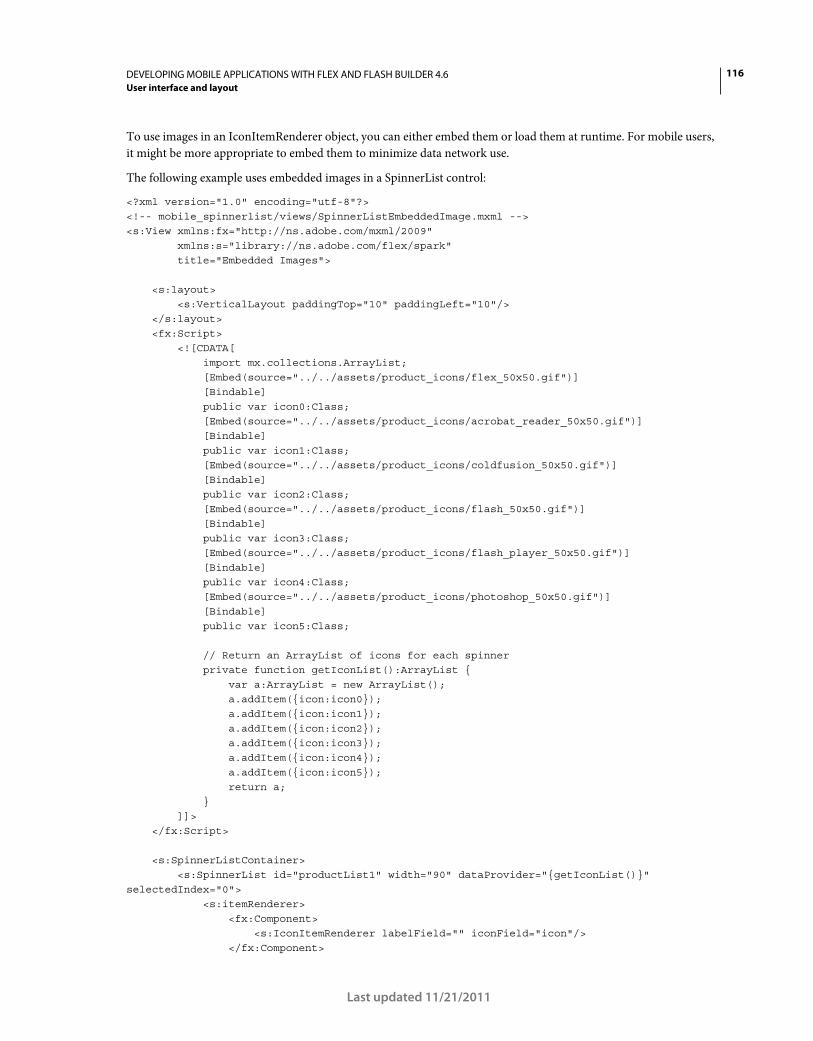
116DEVELOPING MOBILE APPLICATIONS WITH FLEX AND FLASH BUILDER 4.6
User interface and layout
Last updated 11/21/2011
To use images in an IconItemRenderer object, you can either embed them or load them at runtime. For mobile users,
it might be more appropriate to embed them to minimize data network use.
The following example uses embedded images in a SpinnerList control:
<?xml version="1.0" encoding="utf-8"?> <!-- mobile_spinnerlist/views/SpinnerListEmbeddedImage.mxml --> <s:View xmlns:fx="http://ns.adobe.com/mxml/2009" xmlns:s="library://ns.adobe.com/flex/spark" title="Embedded Images"> <s:layout> <s:VerticalLayout paddingTop="10" paddingLeft="10"/> </s:layout> <fx:Script> <![CDATA[ import mx.collections.ArrayList; [Embed(source="../../assets/product_icons/flex_50x50.gif")] [Bindable] public var icon0:Class; [Embed(source="../../assets/product_icons/acrobat_reader_50x50.gif")] [Bindable] public var icon1:Class; [Embed(source="../../assets/product_icons/coldfusion_50x50.gif")] [Bindable] public var icon2:Class; [Embed(source="../../assets/product_icons/flash_50x50.gif")] [Bindable] public var icon3:Class; [Embed(source="../../assets/product_icons/flash_player_50x50.gif")] [Bindable] public var icon4:Class; [Embed(source="../../assets/product_icons/photoshop_50x50.gif")] [Bindable] public var icon5:Class; // Return an ArrayList of icons for each spinner private function getIconList():ArrayList { var a:ArrayList = new ArrayList(); a.addItem({icon:icon0}); a.addItem({icon:icon1}); a.addItem({icon:icon2}); a.addItem({icon:icon3}); a.addItem({icon:icon4}); a.addItem({icon:icon5}); return a; } ]]> </fx:Script> <s:SpinnerListContainer> <s:SpinnerList id="productList1" width="90" dataProvider="{getIconList()}" selectedIndex="0"> <s:itemRenderer> <fx:Component> <s:IconItemRenderer labelField="" iconField="icon"/> </fx:Component>
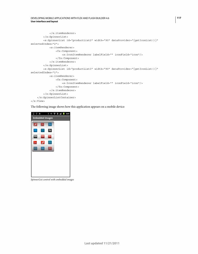
117DEVELOPING MOBILE APPLICATIONS WITH FLEX AND FLASH BUILDER 4.6
User interface and layout
Last updated 11/21/2011
</s:itemRenderer> </s:SpinnerList> <s:SpinnerList id="productList2" width="90" dataProvider="{getIconList()}" selectedIndex="2"> <s:itemRenderer> <fx:Component> <s:IconItemRenderer labelField="" iconField="icon"/> </fx:Component> </s:itemRenderer> </s:SpinnerList> <s:SpinnerList id="productList3" width="90" dataProvider="{getIconList()}" selectedIndex="1"> <s:itemRenderer> <fx:Component> <s:IconItemRenderer labelField="" iconField="icon"/> </fx:Component> </s:itemRenderer> </s:SpinnerList> </s:SpinnerListContainer> </s:View>
The following image shows how this application appears on a mobile device:
SpinnerList control with embedded images
118
Last updated 11/21/2011
Chapter 4: Application design and workflow
Enable persistence in a mobile application
An application for a mobile device is often interrupted by other actions, such as a text message, a phone call, or other
mobile applications. Typically, when an interrupted application is relaunched, the user expects the previous state of
the application to be restored. The persistence mechanism allows the device to restore the application to its previous
state.
The Flex framework provides two kinds of persistence for mobile application. In-memory persistence saves view data
as the user navigates the application. Session persistence restores data if the user quits the application and then restarts
it. Session persistence is important in mobile applications because a mobile operating system can quit applications at
any time (for example, when memory is low).
Blogger Steve Mathews created a cookbook entry on simple data persistence in a Flex mobile application.
Blogger Holly Schinsky blogged about persistence and data handling in Flex Mobile Data Handling.
In-memory persistence
View containers support in-memory persistence by using the View.data property. An existing view’s data property
is automatically saved when the selected section changes or when a new view is pushed onto the ViewNavigator stack,
causing the existing view to be destroyed. The data property of the view is restored when control returns to the view
and the view is re-instantiated and activated. Therefore, in-memory persistence lets you maintain state information of
a view at runtime.
Session persistence
Session persistence maintains application state information between application executions. The
ViewNavigatorApplication and TabbedViewNavigatorApplication containers define the persistNavigatorState
property to implement session persistence. Set persistNavigatorState to true to enable session persistence. By
default, persistNavigatorState is false.
When enabled, session persistence writes the state of the application to disk using a local shared object named
FxAppCache. Your application can also use methods of the spark.managers.PersistenceManager to write additional
information to the local shared object.
ViewNavigator session persistence
The ViewNavigator container supports session persistence by saving the state of its view stack to disk when the
application quits. This save includes the data property of the current View.
When the application restarts, the stack of the ViewNavigator is reinitialized and the user sees the same view and
content visible when the application quit. Because the stack contains a copy of the data property for each view,
previous views on the stack can be recreated as they become active.
TabbedViewNavigator session persistence
119DEVELOPING MOBILE APPLICATIONS WITH FLEX AND FLASH BUILDER 4.6
Application design and workflow
Last updated 11/21/2011
For the TabbedViewNavigator container, session persistence saves the currently selected tab of the tab bar when the
application quits. The tab corresponds to the ViewNavigator and view stack that defines the tab. Included in the save
is the data property of the current View. Therefore, when the application restarts, the active tab and associated
ViewNavigator is set to the state that it had when the application quit.
Note: For an application defined by the TabbedViewNavigatorApplication container, only the stack for the current
ViewNavigator is saved. Therefore, when the application restarts, only the state of the current ViewNavigator is restored.
Session persistence data representation
The persistence mechanism used by Flex is not encrypted or protected. Therefore, persisted data is stored in a format
that can be interpreted by another program or user. Do not persist sensitive information, such as user credentials,
using this mechanism. You have the option of writing your own persistence manager that provides better protection.
For more information, see “Customize the persistence mechanism” on page 121.
Use session persistence
The following example sets the persistNavigatorState property to true for an application to enable session
persistence:
<?xml version="1.0" encoding="utf-8"?> <!-- containers\mobile\SparkSingleSectionPersist.mxml --> <s:ViewNavigatorApplication xmlns:fx="http://ns.adobe.com/mxml/2009" xmlns:s="library://ns.adobe.com/flex/spark" firstView="views.EmployeeMainView" persistNavigatorState="true"> <fx:Script> <![CDATA[ protected function button1_clickHandler(event:MouseEvent):void { // Switch to the first view in the section. navigator.popToFirstView(); } ]]> </fx:Script> <s:navigationContent> <s:Button icon="@Embed(source='assets/Home.png')" click="button1_clickHandler(event)"/> </s:navigationContent> </s:ViewNavigatorApplication>
This application uses EmployeeMainView.mxml as its first view. EmployeeMainView.mxml defines a List control that
lets you select a user name:
120DEVELOPING MOBILE APPLICATIONS WITH FLEX AND FLASH BUILDER 4.6
Application design and workflow
Last updated 11/21/2011
<?xml version="1.0" encoding="utf-8"?> <!-- containers\mobile\views\EmployeeMainView.mxml --> <s:View xmlns:fx="http://ns.adobe.com/mxml/2009" xmlns:s="library://ns.adobe.com/flex/spark" title="Employees"> <s:layout> <s:VerticalLayout paddingTop="10"/> </s:layout> <fx:Script> <![CDATA[ import spark.events.IndexChangeEvent; protected function myList_changeHandler(event:IndexChangeEvent):void { navigator.pushView(views.EmployeeView,myList.selectedItem); } ]]> </fx:Script> <s:Label text="Select an employee name"/> <s:List id="myList" width="100%" height="100%" labelField="firstName" change="myList_changeHandler(event)"> <s:ArrayCollection> <fx:Object firstName="Bill" lastName="Smith" companyID="11233"/> <fx:Object firstName="Dave" lastName="Jones" companyID="13455"/> <fx:Object firstName="Mary" lastName="Davis" companyID="11543"/> <fx:Object firstName="Debbie" lastName="Cooper" companyID="14266"/> </s:ArrayCollection> </s:List> </s:View>
To see session persistence, open the application, and then select “Dave” in the List control to navigate to the
EmployeeView.mxml view:
<?xml version="1.0" encoding="utf-8"?> <!-- containers\mobile\views\EmployeeView.mxml --> <s:View xmlns:fx="http://ns.adobe.com/mxml/2009" xmlns:s="library://ns.adobe.com/flex/spark" title="Employee View"> <s:layout> <s:VerticalLayout paddingTop="10"/> </s:layout> <s:VGroup> <s:Label text="{data.firstName}"/> <s:Label text="{data.lastName}"/> <s:Label text="{data.companyID}"/> </s:VGroup> </s:View>
The EmployeeView.mxml view displays the data about “Dave”. Then, quit the application. When you restart the
application, you again see the EmployeeView.mxml view displaying the same data as when you quit the application.
121DEVELOPING MOBILE APPLICATIONS WITH FLEX AND FLASH BUILDER 4.6
Application design and workflow
Last updated 11/21/2011
Access data in a local shared object
Information in a local shared object is saved as a key:value pair. The methods of the PeristenceManager, such as
setPropery() and getProperty(), rely on the key to access the associated value in the local shared object.
You can use the setProperty() method to write your own key:value pairs to the local shared object. The
setProperty() method has the following signature:
setProperty(key:String, value:Object):void
Use the getProperty() method to access the value for a specific key. The getProperty() method has the following
signature:
getProperty(key:String):Object
When the persistNavigatorState property is true, the persistence manager automatically saves two key:value
pairs to the local shared object when the application quits:
• applicationVersion
The version of the application as described by the application.xml file.
• navigatorState
The view state of the navigator, corresponding to the stack of the current ViewNavigator.
Perform manual persistence
When the persistNavigatorState property is true, Flex automatically performs session persistence. You can still
persist application data when the persistNavigatorState property is false. In that situation, implement your own
persistence mechanism by using methods of the PeristenceManager.
Use the setProperty() and getProperty() methods to write and read infomration in the local shared object. Call
the load() method to initialize the PeristenceManager. Call the save() methods to write any data to disk.
Note: When the persistNavigatorState property is false, Flex does not automatically save the view stack of the
current ViewNavigator when the aplication quits, or restore it when the application starts.
Handle persistence events
You can use the following events of the mobile application containers to develop a custom persistence mechanism:
• navigatorStateSaving
• navigatorStateLoading
You can cancel the saving of an applications state to disk by calling the preventDefault() method in the handler for
the navigatorStateSaving event. Cancel application loading on restart by calling the preventDefault() method
in the handler for the navigatorStateLoading event.
Customize the persistence mechanism
When session persistence is enabled, the application opens to the view that was displayed when the application quit.
You must store enough information in the view’s data property, or elsewhere such as in a shared object, to be able to
completely restore the application state.
For example, the restored view might have to perform calculations based on the view’s data property. Your application
must then recognize when the application restarts, and perform the necessary calcualtions. One option is to override
the serializeData() and deserializePersistedData() methods of the View to perform your own actions when
the application quits or restarts.
Built-in data type support for session persistence
122DEVELOPING MOBILE APPLICATIONS WITH FLEX AND FLASH BUILDER 4.6
Application design and workflow
Last updated 11/21/2011
The persistence mechanism automatically supports all built-in data types, including: Number, String, Array, Vector,
Object, uint, int, and Boolean. These data types are automatically saved by the persistence mechanism.
Custom class support for session persistence
Many applications use custom classes to define data. If a custom class contains properties defined by the built-in data
types, the persistence mechanism can automatically save and load the class. However, you must first register the class
with the persistence mechanism by calling the flash.net.registerClassAlias() method. Typically you call this method in
the preinitialize event of the application, before the persistence storage is initialized or any data is saved to it.
If you define a complex class, one that uses data types other than the built-in data types, you must convert that data to
a supported type, such as a String. Also, if the class defines any private variables, they are not automatically persisted.
To support the complex class in the persistence mechanism, the class must implement the flash.utils.IExternalizable
interface. This interface requires that the class implements the writeExternal() and readExternal() methods to
save and restore an instance of the class.
Support multiple screen sizes and DPI values in a mobile application
Guidelines for supporting multiple screen sizes and DPI values
To develop an application that is platform independent, be aware of different output devices. Devices can have
different screen sizes or resolutions and different DPI values, or densities.
Flex engineer Jason SJ describes two approaches to creating resolution-independent mobile applications on his blog.
Terminology
Resolution is the number of pixels high by the number of pixels wide: that is, the total number of pixels that a device
supports.
DPI is the number of dots per square inch: that is, the density of pixels on a device’s screen. The term DPI is used
interchangeably with PPI (pixels per inch).
Flex support for DPIs
The following flex features simplify the process of producing resolution- and DPI-independent applications:
Skins DPI-aware skins for mobile components. The default mobile skins do not need additional coding to scale well
for most devices’ resolutions.
applicationDPI A property that defines the size for which your custom skins are designed. Suppose that you set this
property at some DPI value, and a user runs the application on a device with a different DPI value. Flex scales
everything in the application to the DPI of the device in use.
The default mobile skins are DPI-independent, both with and without DPI scaling. As a result, if you do not use
components with static sizes or custom skins, you typically do not need to set the applicationDPI property.
Dynamic layouts
Dynamic layouts help you overcome differences in resolution. For example, setting a control’s width to 100% always
fills the width of the screen, whether the resolution is 480x854 or 480x800.
Set applicationDPI property
123DEVELOPING MOBILE APPLICATIONS WITH FLEX AND FLASH BUILDER 4.6
Application design and workflow
Last updated 11/21/2011
When you create density-independent applications, you can set the target DPI on the root application tag. (For mobile
applications, the root tag is <s:ViewNavigatorApplication>, <s:TabbedViewNavigatorApplication>, or
<s:Application>.)
You set the value of the applicationDPI property to 160, 240, or 320, depending on the approximate resolution of
your target device. For example:
<s:ViewNavigatorApplication xmlns:fx="http://ns.adobe.com/mxml/2009" xmlns:s="library://ns.adobe.com/flex/spark" firstView="views.DensityView1" applicationDPI="320">
When you set the applicationDPI property, you effectively define a scale for the application when it is compared to
the target device’s actual resolution (the runtimeDPI) at runtime. For example, if you set the applicationDPI
property to 160 and the target device has a runtimeDPI of 160, the scale factor is 1 (no scaling). If you set the
applicationDPI property to 240, the scale factor is 1.5 (Flex magnifies everything by 150%). At 320, the scale factor
is 2, so Flex magnifies everything by 200%.
In some cases, non-integer scaling can result in undesirable artifacts due to interpolation, such as blurred lines.
Disable DPI scaling
To disable DPI scaling for the application, do not set the value of the applicationDPI property.
Understand applicationDPI and runtimeDPI
The following table describes two properties of the Application class that are integral to working with applications at
different resolutions:
Create resolution- and DPI-independent applications
Resolution- and DPI-independent applications have the following characteristics:
Images Vector images scale smoothly to match the target device’s actual resolution. Bitmaps, on the other hand, do
not always scale as well. In these cases, you can load bitmaps at different resolutions, depending on the device
resolution by using the MultiDPIBitmapSource class.
Text The font size of text (not the text itself) is scaled to match the resolution.
Property Description
applicationDPI The target density or DPI of the application.
When you specify a value for this property, Flex applies a scale factor to the root application. The result is an
application designed for one DPI value scales to look good on another device with a different DPI value.
The scale factor is calculated by comparing the value of this property with the runtimeDPI property. This scale
factor is applied to the entire application, including the preloader, pop-ups, and all components on the stage.
When not specified, this property returns the same value as the runtimeDPI property.
This property cannot be set in ActionScript; it can only be set in MXML. You cannot change the value of this
property at runtime.
runtimeDPI The density or DPI value of the device that the application is currently running on.
Returns the value of the Capabilities.screenDPI property, rounded to one of the constants defined by the
DPIClassification class.
This property is read-only.
124DEVELOPING MOBILE APPLICATIONS WITH FLEX AND FLASH BUILDER 4.6
Application design and workflow
Last updated 11/21/2011
Layouts Use dynamic layouts to ensure that the application looks good when scaled. In general, avoid using
constraint-based layouts where you specify pixel boundaries with absolute values. If you do use constraints, use the
value of the applicationDPI property to account for scaling.
Scaling Do not use the scaleX and scaleY properties on the Application object. When you set the applicationDPI
property, Flex does the scaling for you.
Styles You can use stylesheets to customize style properties for the target device’s OS and the application DPI settings.
Skins The Flex skins in the mobile theme use the application DPI value to determine which assets to use at runtime.
All visual skin assets defined by FXG files are suited to the target device.
Application size Do not explicitly set the height and width of the application. Also, when calculating sizes of custom
components or popups, do not use the stageWidth and stageHeight properties. Instead, use the
SystemManager.screen property.
Determine runtime DPI
When your application starts, your application gets the value of the runtimeDPI property from the
Capabilities.screenDPI Flash Player property. This property is mapped to one of the constants defined by the
DPIClassification class. For example, a Droid running at 232 DPI is mapped to the 240 runtime DPI value. Device DPI
values do not always exactly match the DPIClassification constants (160, 240, or 320). Instead, they are mapped to
those classifications, based on a range of target values.
The mappings are as follows:
You can customize these mappings to override the default behavior or to adjust devices that report their own DPI value
incorrectly. For more information, see “Override the default DPI” on page 133.
Choose autoscaling or non-autoscaling
Choosing to use autoscaling (by setting the value of the applicationDPI property) is a tradeoff between convenience
and pixel-accurate visual fidelity. If you set the applicationDPI property to scale your application automatically, Flex
uses skins targeted at the applicationDPI. Flex scales the skins up or down to fit the device’s actual density. Other
assets in your application and layout positions are scaled as well.
If you want to use autoscaling, and you are creating your own skins or assets targeted at a single DPI value, you typically
do the following:
• Create a single set of skins and view/component layouts that are targeted at the applicationDPI you specify.
• Create multiple versions of any bitmap asset used in your skins or elsewhere in your application, and specify them
using the MultiDPIBitmapSource class. Vector assets and text in your skins do not need to be density-aware if you
are autoscaling.
• Don’t use the @media rule in your stylesheets, because your application only considers a single target DPI value.
• Test your application on devices of different densities to ensure that the appearance of the scaled application is
acceptable on each device. In particular, check devices that cause scaling by a non-integer factor. For example, if
applicationDPI is 160, test your application on 240-DPI devices.
DPIClassification constant 160 DPI 240 DPI 320 DPI
Actual device DPI <200 >=200 and <280 >=280

125DEVELOPING MOBILE APPLICATIONS WITH FLEX AND FLASH BUILDER 4.6
Application design and workflow
Last updated 11/21/2011
If you choose not to use autoscaling (by leaving the applicationDPI property unset), get the applicationDPI value.
Use this property to determine the actual DPI classification of the device, and adapt your application at runtime by
doing the following:
• Make multiple sets of skins and layouts targeted at each runtime DPI classification, or make a single set of skins and
layouts that dynamically adapts to different densities. (The built-in Flex skins take the latter approach—each skin
class checks the applicationDPI property and sets itself up appropriately.)
• Use @media rules in your stylesheets to filter CSS rules based on the device’s DPI classification. Typically, you
customize font sizes and padding values for each DPI value.
• Test your application on devices of different densities to ensure that your skins and layouts are properly adapting.
Select styles based on DPI
Flex includes support for applying styles based on the target OS and application DPI value in CSS. You apply styles
with the @media rule in your stylesheet. The @media rule is part of the CSS specification; Flex extends this rule to
include additional properties: application-dpi and os-platform. You use these properties to apply styles
selectively based on the application DPI and the platform on which the application is running.
The following example sets the Spark Button control’s default fontSize style property to 12. If the device uses 240
DPI and is running on the Android operating system, the fontSize property is 10.
<?xml version="1.0" encoding="utf-8"?> <!-- mobile_skins/MediaQueryValuesMain.mxml --> <s:ViewNavigatorApplication xmlns:fx="http://ns.adobe.com/mxml/2009" xmlns:s="library://ns.adobe.com/flex/spark" applicationDPI="320"> <fx:Style> @namespace s "library://ns.adobe.com/flex/spark"; @namespace mx "library://ns.adobe.com/flex/mx"; s|Button { fontSize: 12; } @media (os-platform: "Android") and (application-dpi: 240) { s|Button { fontSize: 10; } } </fx:Style> </s:ViewNavigatorApplication>
Values for application-dpi property
The application-dpi CSS property is compared against the value of the applicationDPI style property that is set
on the root application. The following are valid values for the application-dpi CSS property:
• 160
• 240
• 320
Each of the supported values for application-dpi has a corresponding constant in the DPIClassification class.
Values for the os-platform property
126DEVELOPING MOBILE APPLICATIONS WITH FLEX AND FLASH BUILDER 4.6
Application design and workflow
Last updated 11/21/2011
The os-platform CSS property is matched to the value of the flash.system.Capabilities.version property of
Flash Player. The following are valid values for the os-platform CSS property:
• Android
• iOS
• Macintosh
• Linux
• QNX
• Windows
The matching is not case sensitive.
If none of the entries match, then Flex seeks a secondary match by comparing the first three characters to the list of
supported platforms.
Defaults for application-dpi and os-platform properties
If you do not explicitly define an expression containing the application-dpi or os-platform properties, then all
expressions are assumed to match.
Operators in the @media rule
The @media rule supports the common operators “and” and “not”. It also supports comma-separated lists. Separating
expressions by a comma implies an “or” condition.
When you use the “not” operator, the “not” must be the first keyword in the expression. This operator negates the
entire expression, not just the property that follows the “not”. Because of bug SDK-29191, the “not” operator must be
followed by a media type, such as “all”, before one or more expressions.
The following example shows how to use some of these common operators:
<?xml version="1.0" encoding="utf-8"?> <!-- mobile_skins/MediaQueryValuesMain.mxml --> <s:ViewNavigatorApplication xmlns:fx="http://ns.adobe.com/mxml/2009" xmlns:s="library://ns.adobe.com/flex/spark" applicationDPI="320"> <fx:Style> @namespace s "library://ns.adobe.com/flex/spark"; @namespace mx "library://ns.adobe.com/flex/mx"; /* Every os-platform @ 160dpi */ @media (application-dpi: 160) { s|Button { fontSize: 10; } } /* IOS only @ 240dpi */ @media (application-dpi: 240) and (os-platform: "IOS") { s|Button { fontSize: 11; } } /* IOS at 160dpi or Android @ 160dpi */ @media (os-platform: "IOS") and (application-dpi:160), (os-platform: "ANDROID") and
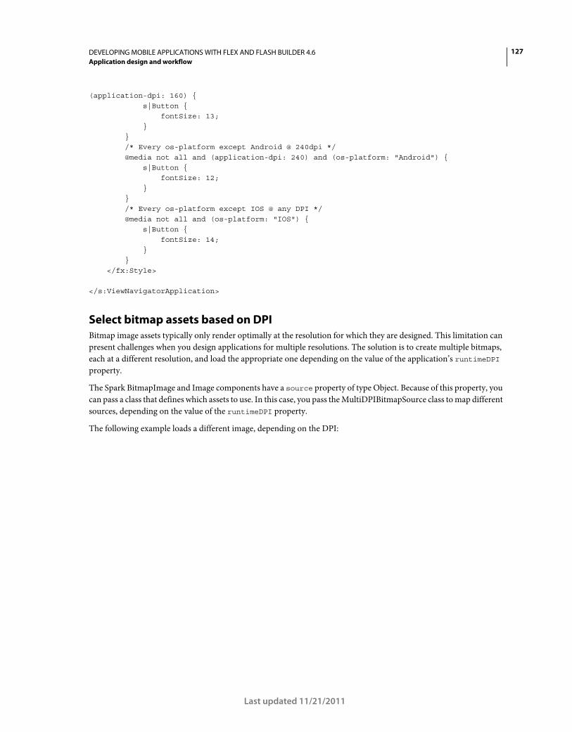
127DEVELOPING MOBILE APPLICATIONS WITH FLEX AND FLASH BUILDER 4.6
Application design and workflow
Last updated 11/21/2011
(application-dpi: 160) { s|Button { fontSize: 13; } } /* Every os-platform except Android @ 240dpi */ @media not all and (application-dpi: 240) and (os-platform: "Android") { s|Button { fontSize: 12; } } /* Every os-platform except IOS @ any DPI */ @media not all and (os-platform: "IOS") { s|Button { fontSize: 14; } } </fx:Style> </s:ViewNavigatorApplication>
Select bitmap assets based on DPI
Bitmap image assets typically only render optimally at the resolution for which they are designed. This limitation can
present challenges when you design applications for multiple resolutions. The solution is to create multiple bitmaps,
each at a different resolution, and load the appropriate one depending on the value of the application’s runtimeDPI
property.
The Spark BitmapImage and Image components have a source property of type Object. Because of this property, you
can pass a class that defines which assets to use. In this case, you pass the MultiDPIBitmapSource class to map different
sources, depending on the value of the runtimeDPI property.
The following example loads a different image, depending on the DPI:
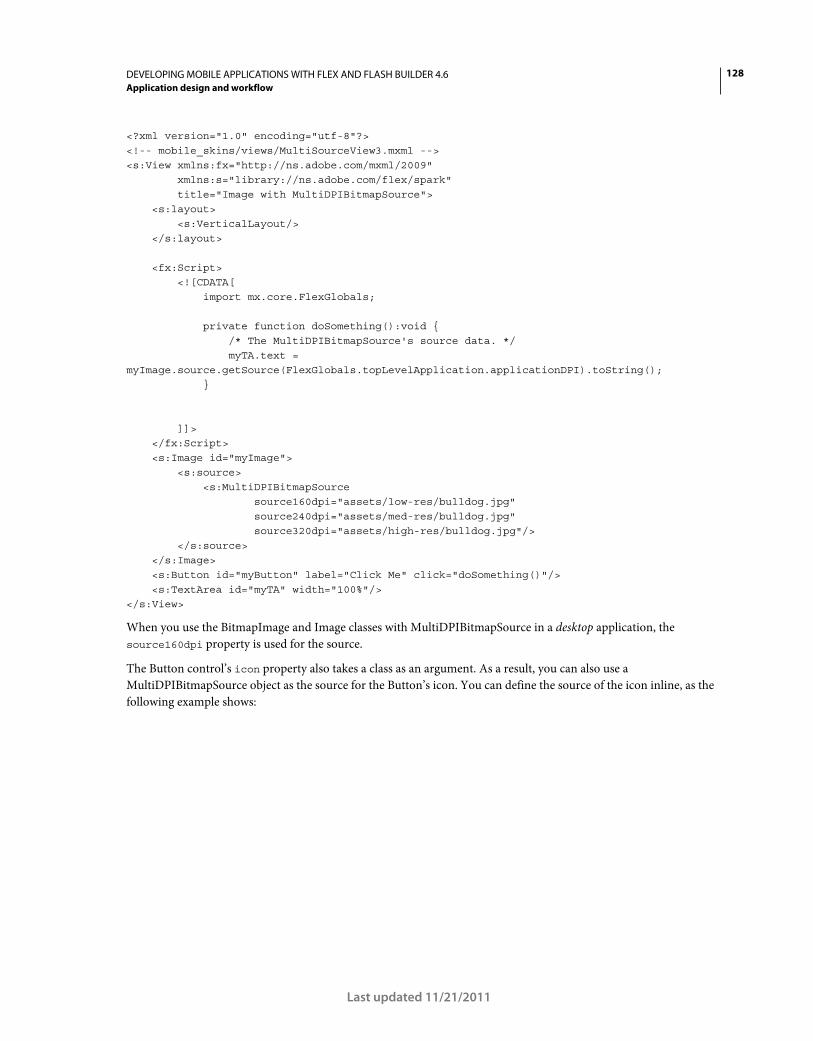
128DEVELOPING MOBILE APPLICATIONS WITH FLEX AND FLASH BUILDER 4.6
Application design and workflow
Last updated 11/21/2011
<?xml version="1.0" encoding="utf-8"?> <!-- mobile_skins/views/MultiSourceView3.mxml --> <s:View xmlns:fx="http://ns.adobe.com/mxml/2009" xmlns:s="library://ns.adobe.com/flex/spark" title="Image with MultiDPIBitmapSource"> <s:layout> <s:VerticalLayout/> </s:layout> <fx:Script> <![CDATA[ import mx.core.FlexGlobals; private function doSomething():void { /* The MultiDPIBitmapSource's source data. */ myTA.text = myImage.source.getSource(FlexGlobals.topLevelApplication.applicationDPI).toString(); } ]]> </fx:Script> <s:Image id="myImage"> <s:source> <s:MultiDPIBitmapSource source160dpi="assets/low-res/bulldog.jpg" source240dpi="assets/med-res/bulldog.jpg" source320dpi="assets/high-res/bulldog.jpg"/> </s:source> </s:Image> <s:Button id="myButton" label="Click Me" click="doSomething()"/> <s:TextArea id="myTA" width="100%"/> </s:View>
When you use the BitmapImage and Image classes with MultiDPIBitmapSource in a desktop application, the
source160dpi property is used for the source.
The Button control’s icon property also takes a class as an argument. As a result, you can also use a
MultiDPIBitmapSource object as the source for the Button’s icon. You can define the source of the icon inline, as the
following example shows:
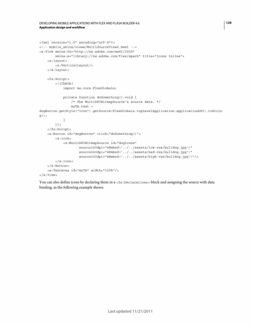
129DEVELOPING MOBILE APPLICATIONS WITH FLEX AND FLASH BUILDER 4.6
Application design and workflow
Last updated 11/21/2011
<?xml version="1.0" encoding="utf-8"?> <!-- mobile_skins/views/MultiSourceView2.mxml --> <s:View xmlns:fx="http://ns.adobe.com/mxml/2009" xmlns:s="library://ns.adobe.com/flex/spark" title="Icons Inline"> <s:layout> <s:VerticalLayout/> </s:layout> <fx:Script> <![CDATA[ import mx.core.FlexGlobals; private function doSomething():void { /* The MultiDPIBitmapSource's source data. */ myTA.text = dogButton.getStyle("icon").getSource(FlexGlobals.topLevelApplication.applicationDPI).toString(); } ]]> </fx:Script> <s:Button id="dogButton" click="doSomething()"> <s:icon> <s:MultiDPIBitmapSource id="dogIcons" source160dpi="@Embed('../../assets/low-res/bulldog.jpg')" source240dpi="@Embed('../../assets/med-res/bulldog.jpg')" source320dpi="@Embed('../../assets/high-res/bulldog.jpg')"/> </s:icon> </s:Button> <s:TextArea id="myTA" width="100%"/> </s:View>
You can also define icons by declaring them in a <fx:Declarations> block and assigning the source with data
binding, as the following example shows:
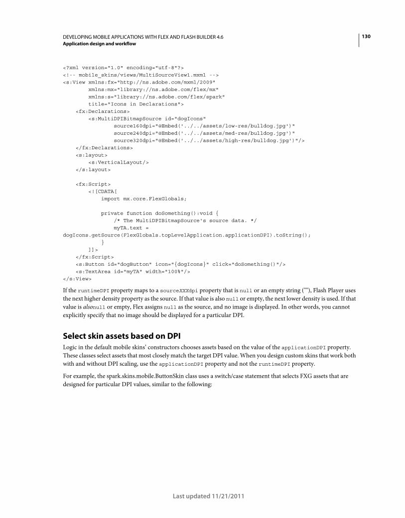
130DEVELOPING MOBILE APPLICATIONS WITH FLEX AND FLASH BUILDER 4.6
Application design and workflow
Last updated 11/21/2011
<?xml version="1.0" encoding="utf-8"?> <!-- mobile_skins/views/MultiSourceView1.mxml --> <s:View xmlns:fx="http://ns.adobe.com/mxml/2009" xmlns:mx="library://ns.adobe.com/flex/mx" xmlns:s="library://ns.adobe.com/flex/spark" title="Icons in Declarations"> <fx:Declarations> <s:MultiDPIBitmapSource id="dogIcons" source160dpi="@Embed('../../assets/low-res/bulldog.jpg')" source240dpi="@Embed('../../assets/med-res/bulldog.jpg')" source320dpi="@Embed('../../assets/high-res/bulldog.jpg')"/> </fx:Declarations> <s:layout> <s:VerticalLayout/> </s:layout> <fx:Script> <![CDATA[ import mx.core.FlexGlobals; private function doSomething():void { /* The MultiDPIBitmapSource's source data. */ myTA.text = dogIcons.getSource(FlexGlobals.topLevelApplication.applicationDPI).toString(); } ]]> </fx:Script> <s:Button id="dogButton" icon="{dogIcons}" click="doSomething()"/> <s:TextArea id="myTA" width="100%"/> </s:View>
If the runtimeDPI property maps to a sourceXXXdpi property that is null or an empty string (""), Flash Player uses
the next higher density property as the source. If that value is also null or empty, the next lower density is used. If that
value is alsonull or empty, Flex assigns null as the source, and no image is displayed. In other words, you cannot
explicitly specify that no image should be displayed for a particular DPI.
Select skin assets based on DPI
Logic in the default mobile skins’ constructors chooses assets based on the value of the applicationDPI property.
These classes select assets that most closely match the target DPI value. When you design custom skins that work both
with and without DPI scaling, use the applicationDPI property and not the runtimeDPI property.
For example, the spark.skins.mobile.ButtonSkin class uses a switch/case statement that selects FXG assets that are
designed for particular DPI values, similar to the following:
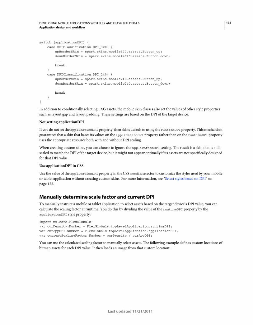
131DEVELOPING MOBILE APPLICATIONS WITH FLEX AND FLASH BUILDER 4.6
Application design and workflow
Last updated 11/21/2011
switch (applicationDPI) { case DPIClassification.DPI_320: {
upBorderSkin = spark.skins.mobile320.assets.Button_up; downBorderSkin = spark.skins.mobile320.assets.Button_down; ... break;
} case DPIClassification.DPI_240: {
upBorderSkin = spark.skins.mobile240.assets.Button_up; downBorderSkin = spark.skins.mobile240.assets.Button_down; ... break;
} }
In addition to conditionally selecting FXG assets, the mobile skin classes also set the values of other style properties
such as layout gap and layout padding. These settings are based on the DPI of the target device.
Not setting applicationDPI
If you do not set the applicationDPI property, then skins default to using the runtimeDPI property. This mechanism
guarantees that a skin that bases its values on the applicationDPI property rather than on the runtimeDPI property
uses the appropriate resource both with and without DPI scaling.
When creating custom skins, you can choose to ignore the applicationDPI setting. The result is a skin that is still
scaled to match the DPI of the target device, but it might not appear optimally if its assets are not specifically designed
for that DPI value.
Use applicationDPI in CSS
Use the value of the applicationDPI property in the CSS @media selector to customize the styles used by your mobile
or tablet application without creating custom skins. For more information, see “Select styles based on DPI” on
page 125.
Manually determine scale factor and current DPI
To manually instruct a mobile or tablet application to select assets based on the target device’s DPI value, you can
calculate the scaling factor at runtime. You do this by dividing the value of the runtimeDPI property by the
applicationDPI style property:
import mx.core.FlexGlobals; var curDensity:Number = FlexGlobals.topLevelApplication.runtimeDPI; var curAppDPI:Number = FlexGlobals.topLevelApplication.applicationDPI; var currentScalingFactor:Number = curDensity / curAppDPI;
You can use the calculated scaling factor to manually select assets. The following example defines custom locations of
bitmap assets for each DPI value. It then loads an image from that custom location:
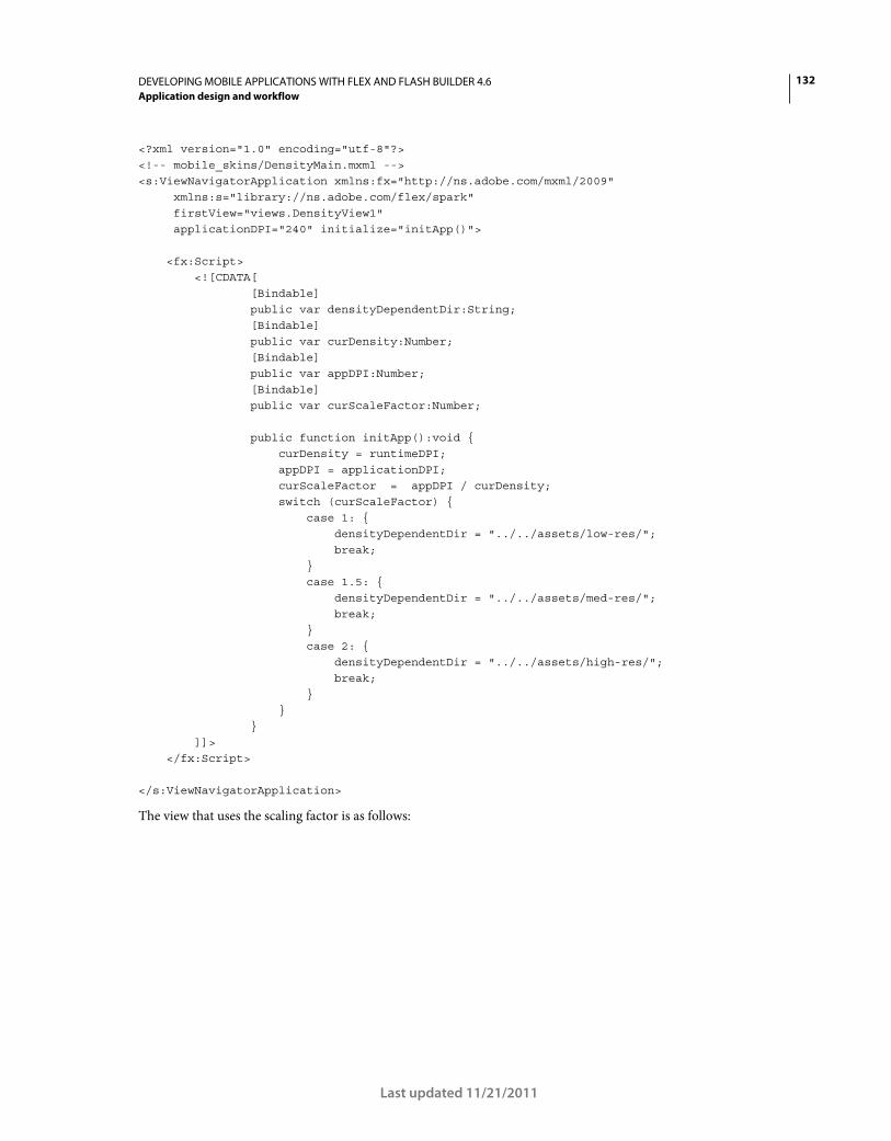
132DEVELOPING MOBILE APPLICATIONS WITH FLEX AND FLASH BUILDER 4.6
Application design and workflow
Last updated 11/21/2011
<?xml version="1.0" encoding="utf-8"?> <!-- mobile_skins/DensityMain.mxml --> <s:ViewNavigatorApplication xmlns:fx="http://ns.adobe.com/mxml/2009" xmlns:s="library://ns.adobe.com/flex/spark" firstView="views.DensityView1" applicationDPI="240" initialize="initApp()"> <fx:Script> <![CDATA[ [Bindable] public var densityDependentDir:String; [Bindable] public var curDensity:Number; [Bindable] public var appDPI:Number; [Bindable] public var curScaleFactor:Number; public function initApp():void { curDensity = runtimeDPI; appDPI = applicationDPI; curScaleFactor = appDPI / curDensity; switch (curScaleFactor) { case 1: { densityDependentDir = "../../assets/low-res/"; break; } case 1.5: { densityDependentDir = "../../assets/med-res/"; break; } case 2: { densityDependentDir = "../../assets/high-res/"; break; } } } ]]> </fx:Script> </s:ViewNavigatorApplication>
The view that uses the scaling factor is as follows:
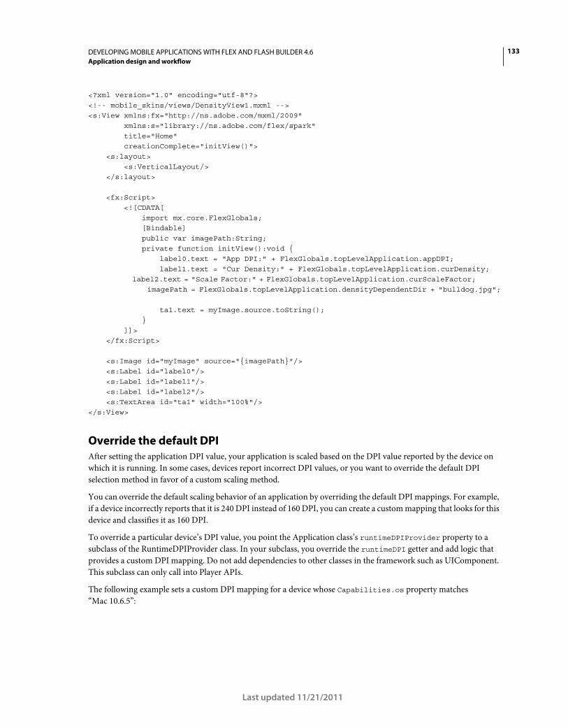
133DEVELOPING MOBILE APPLICATIONS WITH FLEX AND FLASH BUILDER 4.6
Application design and workflow
Last updated 11/21/2011
<?xml version="1.0" encoding="utf-8"?> <!-- mobile_skins/views/DensityView1.mxml --> <s:View xmlns:fx="http://ns.adobe.com/mxml/2009" xmlns:s="library://ns.adobe.com/flex/spark" title="Home" creationComplete="initView()"> <s:layout> <s:VerticalLayout/> </s:layout> <fx:Script> <![CDATA[ import mx.core.FlexGlobals; [Bindable] public var imagePath:String; private function initView():void { label0.text = "App DPI:" + FlexGlobals.topLevelApplication.appDPI; label1.text = "Cur Density:" + FlexGlobals.topLevelApplication.curDensity; label2.text = "Scale Factor:" + FlexGlobals.topLevelApplication.curScaleFactor; imagePath = FlexGlobals.topLevelApplication.densityDependentDir + "bulldog.jpg"; ta1.text = myImage.source.toString(); } ]]> </fx:Script> <s:Image id="myImage" source="{imagePath}"/> <s:Label id="label0"/> <s:Label id="label1"/> <s:Label id="label2"/> <s:TextArea id="ta1" width="100%"/> </s:View>
Override the default DPI
After setting the application DPI value, your application is scaled based on the DPI value reported by the device on
which it is running. In some cases, devices report incorrect DPI values, or you want to override the default DPI
selection method in favor of a custom scaling method.
You can override the default scaling behavior of an application by overriding the default DPI mappings. For example,
if a device incorrectly reports that it is 240 DPI instead of 160 DPI, you can create a custom mapping that looks for this
device and classifies it as 160 DPI.
To override a particular device’s DPI value, you point the Application class’s runtimeDPIProvider property to a
subclass of the RuntimeDPIProvider class. In your subclass, you override the runtimeDPI getter and add logic that
provides a custom DPI mapping. Do not add dependencies to other classes in the framework such as UIComponent.
This subclass can only call into Player APIs.
The following example sets a custom DPI mapping for a device whose Capabilities.os property matches
“Mac 10.6.5”:
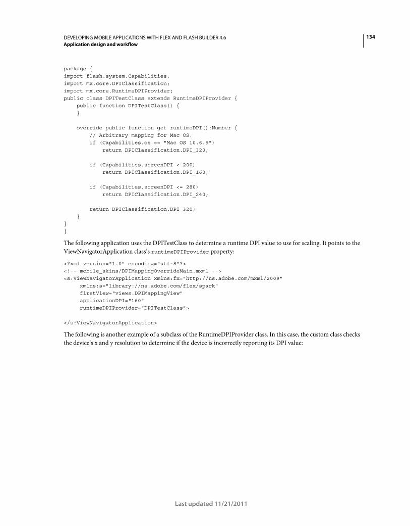
134DEVELOPING MOBILE APPLICATIONS WITH FLEX AND FLASH BUILDER 4.6
Application design and workflow
Last updated 11/21/2011
package { import flash.system.Capabilities; import mx.core.DPIClassification; import mx.core.RuntimeDPIProvider; public class DPITestClass extends RuntimeDPIProvider { public function DPITestClass() { } override public function get runtimeDPI():Number { // Arbitrary mapping for Mac OS. if (Capabilities.os == "Mac OS 10.6.5") return DPIClassification.DPI_320; if (Capabilities.screenDPI < 200) return DPIClassification.DPI_160; if (Capabilities.screenDPI <= 280) return DPIClassification.DPI_240; return DPIClassification.DPI_320; } } }
The following application uses the DPITestClass to determine a runtime DPI value to use for scaling. It points to the
ViewNavigatorApplication class’s runtimeDPIProvider property:
<?xml version="1.0" encoding="utf-8"?> <!-- mobile_skins/DPIMappingOverrideMain.mxml --> <s:ViewNavigatorApplication xmlns:fx="http://ns.adobe.com/mxml/2009" xmlns:s="library://ns.adobe.com/flex/spark" firstView="views.DPIMappingView" applicationDPI="160" runtimeDPIProvider="DPITestClass"> </s:ViewNavigatorApplication>
The following is another example of a subclass of the RuntimeDPIProvider class. In this case, the custom class checks
the device’s x and y resolution to determine if the device is incorrectly reporting its DPI value:
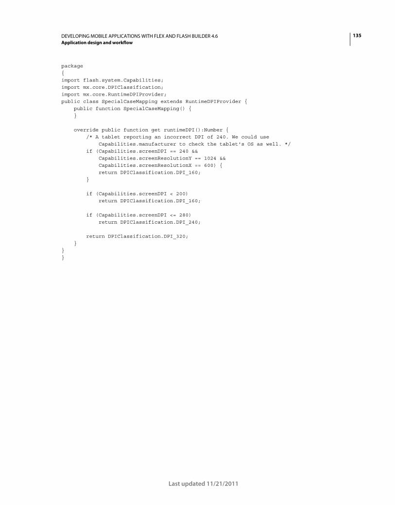
135DEVELOPING MOBILE APPLICATIONS WITH FLEX AND FLASH BUILDER 4.6
Application design and workflow
Last updated 11/21/2011
package { import flash.system.Capabilities; import mx.core.DPIClassification; import mx.core.RuntimeDPIProvider; public class SpecialCaseMapping extends RuntimeDPIProvider { public function SpecialCaseMapping() { } override public function get runtimeDPI():Number { /* A tablet reporting an incorrect DPI of 240. We could use Capabilities.manufacturer to check the tablet's OS as well. */ if (Capabilities.screenDPI == 240 && Capabilities.screenResolutionY == 1024 && Capabilities.screenResolutionX == 600) { return DPIClassification.DPI_160; } if (Capabilities.screenDPI < 200) return DPIClassification.DPI_160; if (Capabilities.screenDPI <= 280) return DPIClassification.DPI_240; return DPIClassification.DPI_320; } } }
136
Last updated 11/21/2011
Chapter 5: Text
Use text in a mobile application
Guidelines for text in a mobile application
Some Spark text controls have been optimized for use in mobile applications. When possible, use the following text
controls:
• Spark TextArea
• Spark TextInput
• Spark Label
The text controls that allow user interaction (TextArea and TextInput) use the StageText class as the underlying input
mechanism. StageText hooks into the native text controls of the underlying OS. As a result, these text controls behave
like native controls rather than typical Flex controls.
The benefits of using StageText include the following on devices that support them:
• Native performance and look and feel of the soft keyboard
• Auto-completion
• Auto-correction
• Touch-based text selection
• Customizable soft keyboards
• Key restrictions
Adobe evangelist Christian Cantrell describes the advantages and disadvantages of using StageText-based controls.
TextField-based versions of the TextArea and TextInput control are also available. You can use these versions to
embed fonts or use some other functionality that is not available on the StageText-based versions.
Skins for mobile text controls
When you create a mobile application, Flex automatically applies the mobile theme. As a result, the Spark TextInput
and TextArea controls use the following StageText-based mobile skins by default:
• StageTextAreaSkin
• StageTextInputSkin
The StageTextAreaSkin and StageTextInputSkin classes are optimized for mobile applications and are based on the
StageTextSkinBase class. They act as a wrapper around the native text input classes. However, they do not support the
following features of the non-TextField-based skins:
137DEVELOPING MOBILE APPLICATIONS WITH FLEX AND FLASH BUILDER 4.6
Text
Last updated 11/21/2011
Some of these limitations can be worked around by using the TextField-based versions. To use the TextField-based
versions of the text input controls, point their skin classes to the TextField versions, TextInputSkin and TextAreaSkin;
for example:
<s:TextInput skinClass="spark.skins.mobile.TextInputSkin" text="TextField-based Skin"/>
The Spark Label control does not use a skin, but also does not use TLF.
TLF in a mobile application
In general, avoid text controls that use Text Layout Framework (TLF) in mobile applications. The mobile skins of the
TextArea and TextInput controls are optimized for mobile applications and do not use TLF as their desktop and web-
based counterparts do. TLF is used in applications for providing a rich set of controls over text rendering.
Avoid the following text controls in a mobile application, because they use TLF and their skins are not optimized for
mobile applications:
• Spark RichText
• Spark RichEditableText
Input with soft keyboards
When a user places the focus on a text control that takes input, mobile devices without keyboards display a soft
keyboard. You have some control over the available keys and other properties of the soft keyboard. For example, you
can enable auto-correction and auto-capitalization, and you can select among several predetermined keyboard layouts.
For more information, see “Use the soft keyboard in a mobile application” on page 146.
Scrolling with text input controls
The default mobile skins for the TextInput and TextArea controls do not support scrolling forms. In other words, you
cannot display these controls in forms or views that require the control to scroll. If you do, visual artifacts appear that
are a result of the way the controls are implemented.
To use text input controls in a scrolling container, use the TextField-based skins rather than the StageText-based skins.
For more information, see “Scrolling considerations with StageText” on page 65.
Transitions with text input controls
To animate smoothly, the runtime replace StageText controls with bitmaps captured from them whenever an
animation plays. This can cause a slight delay at the beginning of transition animations and can also cause some visual
artifacts at the beginning and the end of the animations.
The slight delay is the time taken to capture bitmap representations of the text in the components. This delay increases
as the area and number of StageText-based controls increases. To reduce the delay, avoid animating large or numerous
StageText-based components.
Supported by TextField-based controls Not supported by TextField-based controls either
Scrolling forms
Text measurement
Clipping
Embedded fonts
Fractional alpha values
Flash Text Engine (FTE)
Access to low-level keyboard events such as keyUp and keyDown
Text Layout Framework (TLF)
Bi-directionality and mirroring
Compact Font Format (CFF)
RichEditableText for text rendering
HTML text
138DEVELOPING MOBILE APPLICATIONS WITH FLEX AND FLASH BUILDER 4.6
Text
Last updated 11/21/2011
Popups with text input controls
StageText-based text inputs outside of the topmost popup are replaced with bitmap representations when a popup
appears. As a result:
• Use modal popups rather than non-modal popups. When a modal popup is shown, components outside of the
popup are expected to lose their interactivity. In these cases, the replacement of StageTexts with bitmaps is less
noticeable.
• StageText-based components should only be used inside popups that implement the IFocusManagerContainer
interface. For example, use SkinnableContainer or one of its derivatives as the basis for popups.
• Use a Callout container when text components in lower layers should remain active. If a text component owns a
callout, the text component remains active and sets the callout’s arrow to point to that text component. This is a
natural cue to the user that the text component can still be used.
• Avoid using multiple popups simultaneously. When more than one popup is visible at one time, only the topmost
popup is interactive. If popups do not overlap, however, users will not be able to determine which popup is topmost.
• When non-modal popups overlap text controls, position the popup so that the overlap is near-total. If the user
cannot see the text, they will be less likely to assume that the text control should still be interactive.
Embed fonts in a mobile application
You cannot use embedded fonts in a text input control that uses StageText. Instead, use the TextField-based skins for
the text input controls. You also cannot use the Label control with embedded fonts because it uses FTE, which requires
CFF-based fonts. CFF fonts do not perform well in mobile applications.
For more information, see “Embed fonts in a mobile application” on page 158.
StageText control class hierarchy
The StageText classes (TextInput and TextArea) have a complex class hierarchy. The base classes themselves have the
following hierarchy:
UIComponent | SkinnableComponent | SkinnableTextBase | TextInput/TextArea
As with all Spark classes, the skin classes have their own hierarchy:
UIComponent | MobileSkin StyleableStageText | | StageTextSkinBase: textDisplay | StageTextInputSkin/StageTextAreaSkin
In the base skin class, the textDisplay property provides the hook to the native text input as a StyleableStageText
object. This class is also responsible for defining which styles are available on the StageText-based text input controls.
Use a Label control in a mobile application
The Spark Label control is ideally suited to single lines of non-editable, non-selectable text.
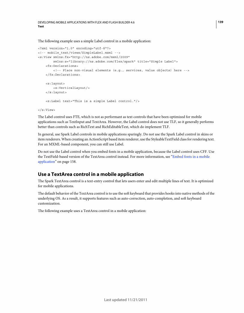
139DEVELOPING MOBILE APPLICATIONS WITH FLEX AND FLASH BUILDER 4.6
Text
Last updated 11/21/2011
The following example uses a simple Label control in a mobile application:
<?xml version="1.0" encoding="utf-8"?> <!-- mobile_text/views/SimpleLabel.mxml --> <s:View xmlns:fx="http://ns.adobe.com/mxml/2009" xmlns:s="library://ns.adobe.com/flex/spark" title="Simple Label"> <fx:Declarations> <!-- Place non-visual elements (e.g., services, value objects) here --> </fx:Declarations> <s:layout> <s:VerticalLayout/> </s:layout> <s:Label text="This is a simple Label control."/> </s:View>
The Label control uses FTE, which is not as performant as text controls that have been optimized for mobile
applications such as TextInput and TextArea. However, the Label control does not use TLF, so it generally performs
better than controls such as RichText and RichEditableText, which do implement TLF.
In general, use Spark Label controls in mobile applications sparingly. Do not use the Spark Label control in skins or
item renderers. When creating an ActionScript based item renderer, use the StyleableTextField class for rendering text.
For an MXML-based component, you can still use Label.
Do not use the Label control when you embed fonts in a mobile application, because the Label control uses CFF. Use
the TextField-based version of the TextArea control instead. For more information, see “Embed fonts in a mobile
application” on page 158.
Use a TextArea control in a mobile application
The Spark TextArea control is a text-entry control that lets users enter and edit multiple lines of text. It is optimized
for mobile applications.
The default behavior of the TextArea control is to use the soft keyboard that provides hooks into native methods of the
underlying OS. As a result, it supports features such as auto-correction, auto-completion, and soft keyboard
customization.
The following example uses a TextArea control in a mobile application:
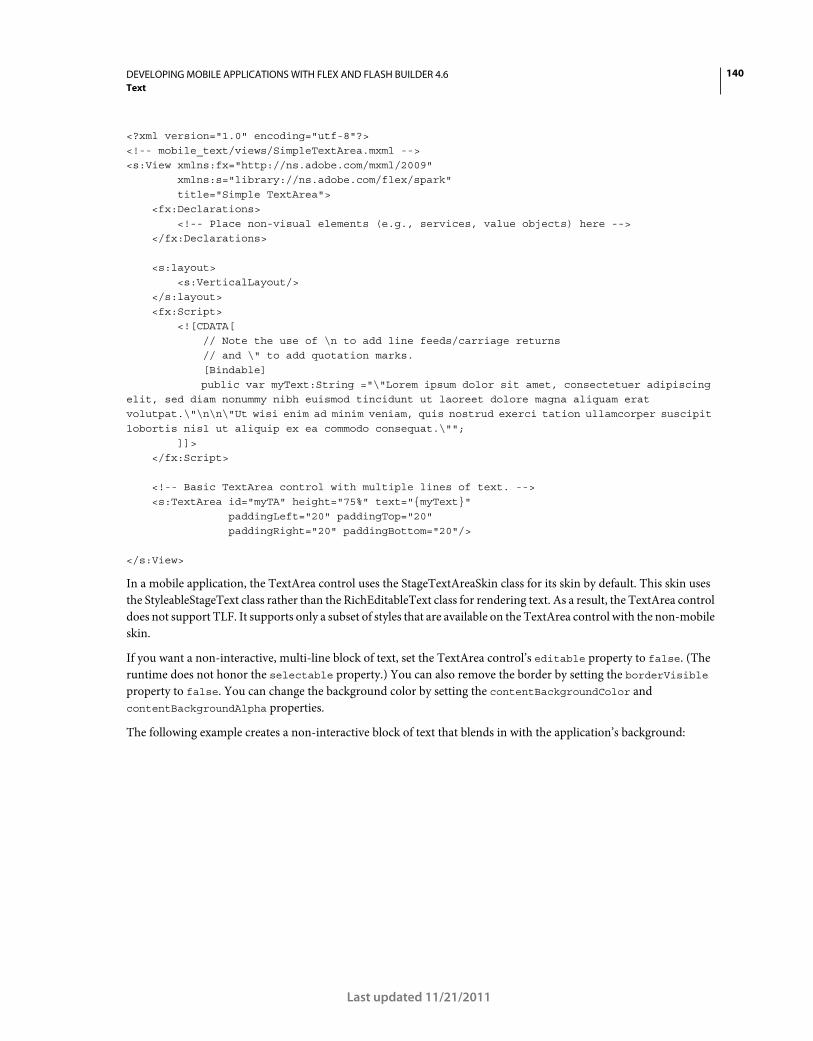
140DEVELOPING MOBILE APPLICATIONS WITH FLEX AND FLASH BUILDER 4.6
Text
Last updated 11/21/2011
<?xml version="1.0" encoding="utf-8"?> <!-- mobile_text/views/SimpleTextArea.mxml --> <s:View xmlns:fx="http://ns.adobe.com/mxml/2009" xmlns:s="library://ns.adobe.com/flex/spark" title="Simple TextArea"> <fx:Declarations> <!-- Place non-visual elements (e.g., services, value objects) here --> </fx:Declarations> <s:layout> <s:VerticalLayout/> </s:layout> <fx:Script> <![CDATA[ // Note the use of \n to add line feeds/carriage returns // and \" to add quotation marks. [Bindable] public var myText:String ="\"Lorem ipsum dolor sit amet, consectetuer adipiscing elit, sed diam nonummy nibh euismod tincidunt ut laoreet dolore magna aliquam erat volutpat.\"\n\n\"Ut wisi enim ad minim veniam, quis nostrud exerci tation ullamcorper suscipit lobortis nisl ut aliquip ex ea commodo consequat.\""; ]]> </fx:Script> <!-- Basic TextArea control with multiple lines of text. --> <s:TextArea id="myTA" height="75%" text="{myText}" paddingLeft="20" paddingTop="20" paddingRight="20" paddingBottom="20"/> </s:View>
In a mobile application, the TextArea control uses the StageTextAreaSkin class for its skin by default. This skin uses
the StyleableStageText class rather than the RichEditableText class for rendering text. As a result, the TextArea control
does not support TLF. It supports only a subset of styles that are available on the TextArea control with the non-mobile
skin.
If you want a non-interactive, multi-line block of text, set the TextArea control’s editable property to false. (The
runtime does not honor the selectable property.) You can also remove the border by setting the borderVisible
property to false. You can change the background color by setting the contentBackgroundColor and
contentBackgroundAlpha properties.
The following example creates a non-interactive block of text that blends in with the application’s background:
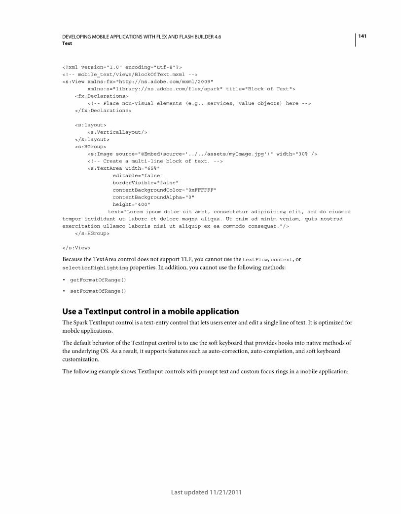
141DEVELOPING MOBILE APPLICATIONS WITH FLEX AND FLASH BUILDER 4.6
Text
Last updated 11/21/2011
<?xml version="1.0" encoding="utf-8"?> <!-- mobile_text/views/BlockOfText.mxml --> <s:View xmlns:fx="http://ns.adobe.com/mxml/2009" xmlns:s="library://ns.adobe.com/flex/spark" title="Block of Text"> <fx:Declarations> <!-- Place non-visual elements (e.g., services, value objects) here --> </fx:Declarations> <s:layout> <s:VerticalLayout/> </s:layout> <s:HGroup> <s:Image source="@Embed(source='../../assets/myImage.jpg')" width="30%"/> <!-- Create a multi-line block of text. --> <s:TextArea width="65%" editable="false" borderVisible="false" contentBackgroundColor="0xFFFFFF" contentBackgroundAlpha="0" height="400" text="Lorem ipsum dolor sit amet, consectetur adipisicing elit, sed do eiusmod tempor incididunt ut labore et dolore magna aliqua. Ut enim ad minim veniam, quis nostrud exercitation ullamco laboris nisi ut aliquip ex ea commodo consequat."/> </s:HGroup> </s:View>
Because the TextArea control does not support TLF, you cannot use the textFlow, content, or
selectionHighlighting properties. In addition, you cannot use the following methods:
• getFormatOfRange()
• setFormatOfRange()
Use a TextInput control in a mobile application
The Spark TextInput control is a text-entry control that lets users enter and edit a single line of text. It is optimized for
mobile applications.
The default behavior of the TextInput control is to use the soft keyboard that provides hooks into native methods of
the underlying OS. As a result, it supports features such as auto-correction, auto-completion, and soft keyboard
customization.
The following example shows TextInput controls with prompt text and custom focus rings in a mobile application:
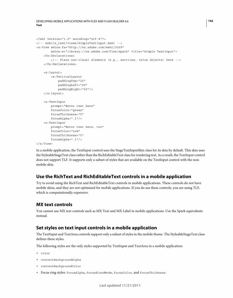
142DEVELOPING MOBILE APPLICATIONS WITH FLEX AND FLASH BUILDER 4.6
Text
Last updated 11/21/2011
<?xml version="1.0" encoding="utf-8"?> <!-- mobile_text/views/SimpleTextInput.mxml --> <s:View xmlns:fx="http://ns.adobe.com/mxml/2009" xmlns:s="library://ns.adobe.com/flex/spark" title="Simple TextInput"> <fx:Declarations> <!-- Place non-visual elements (e.g., services, value objects) here --> </fx:Declarations> <s:layout> <s:VerticalLayout paddingTop="20" paddingLeft="20" paddingRight="20"/> </s:layout> <s:TextInput prompt="Enter text here" focusColor="green" focusThickness="5" focusAlpha=".1"/> <s:TextInput prompt="Enter text here, too" focusColor="red" focusThickness="5" focusAlpha=".1"/> </s:View>
In a mobile application, the TextInput control uses the StageTextInputSkin class for its skin by default. This skin uses
the StyleableStageText class rather than the RichEditableText class for rendering text. As a result, the TextInput control
does not support TLF. It supports only a subset of styles that are available on the TextInput control with the non-
mobile skin.
Use the RichText and RichEditableText controls in a mobile application
Try to avoid using the RichText and RichEditableText controls in mobile applications. These controls do not have
mobile skins, and they are not optimized for mobile applications. If you do use these controls, you are using TLF,
which is computationally expensive.
MX text controls
You cannot use MX text controls such as MX Text and MX Label in mobile applications. Use the Spark equivalents
instead.
Set styles on text input controls in a mobile application
The TextInput and TextArea controls support only a subset of styles in the mobile theme. The StyleableStageText class
defines these styles.
The following styles are the only styles supported by TextInput and TextArea in a mobile application:
• color
• contentBackgroundAlpha
• contentBackgroundColor
• Focus ring styles: focusAlpha, focusBlendMode, focusColor, and focusThickness
143DEVELOPING MOBILE APPLICATIONS WITH FLEX AND FLASH BUILDER 4.6
Text
Last updated 11/21/2011
• fontFamily
• fontStyle
• fontSize
• fontWeight
• locale
• Padding styles: paddingBottom, paddingLeft, paddingRight, and paddingTop
• showPromptWhenFocused
• textAlign
In a mobile application, the Label control supports these styles, plus the textDecoration style.
Use the fontFamily style
In the default mobile skins, the fontFamily property does not support a comma-separated list of fonts. Instead, you
can specify only one font, and the runtime tries to map that font to a font that exists on the device.
For example, if you specify “Arial”, the device renders the text in Arial if that font is available. The runtime makes a
best guess to determine what type of font to substitute if the font is not available. If you specify a font name that the
runtime does not recognize, then the device renders the text in its default font. The default on a mobile device is usually
a sans-serif font.
You can specify _sans, _serif, or _typewriter to always get a sans-serif, serif, or code font on a mobile device,
respectively.
The following example shows how the text is rendered based on the value of the fontFamily style:
<?xml version="1.0" encoding="utf-8"?> <!-- mobile_text/views/FontFamilyExample.mxml --> <s:View xmlns:fx="http://ns.adobe.com/mxml/2009" xmlns:s="library://ns.adobe.com/flex/spark" title="The fontFamily style"> <fx:Declarations> <!-- Place non-visual elements (e.g., services, value objects) here --> </fx:Declarations> <s:layout> <s:VerticalLayout/> </s:layout> <s:TextInput prompt="This is _sans" fontSize="14" fontFamily="_sans"/> <s:TextInput prompt="This is _serif" fontSize="14" fontFamily="_serif"/> <s:TextInput prompt="This is _typewriter" fontSize="14" fontFamily="_typewriter"/> <s:TextInput prompt="This is Arial" fontSize="14" fontFamily="arial"/> <s:TextInput prompt="This is Times" fontSize="14" fontFamily="times"/> <s:TextInput prompt="This is Times New Roman" fontSize="14" fontFamily="Times New Roman"/> <!-- Try a gibberish font name to see what the device's default font is: --> <s:TextInput prompt="This is bugblatter" fontSize="14" fontFamily="bugblatter"/> </s:View>
Create a custom mobile skin on a text input control
By using MXML and ActionScript, you can control some of the visual appearance and behavior of text input controls
in a mobile application. For example, you can set the border color or toggle the appearance of the borders on the
TextArea and TextInput controls. In some cases, you must create a custom skin to change the appearance of certain
parts of the text controls.
144DEVELOPING MOBILE APPLICATIONS WITH FLEX AND FLASH BUILDER 4.6
Text
Last updated 11/21/2011
The StageTextAreaSkin and StageTextInputSkin classes define the default TextInput and TextArea skins in the mobile
theme. These skins get most of their layout and chrome logic from the StageTextSkinBase class.
To create a custom skin, create a custom StageTextSkinBase class that defines the new appearance. Then create a
custom StageTextAreaSkin or StageTextInputSkin class that extends this custom class.
For more information about creating custom skins for the mobile theme, see “Basics of mobile skinning” on page 160.
Restrict keys in a text input control
When you use StageText-based skins for text input controls, you can restrict the characters that are allowed by using
the restrict property of the TextInput or TextArea controls.
The default value of the restrict property is null, which means the user can enter any character by default.
The restrict property takes a string of allowed characters. For ranges, use the hyphen (-). Do not separate ranges
with a space, comma, or other character, unless you want to include that character in the definition. The following
example shows several examples of using the restriction syntax:
<?xml version="1.0" encoding="utf-8"?> <!-- mobile_text/views/RestrictStrings.mxml --> <s:View xmlns:fx="http://ns.adobe.com/mxml/2009" xmlns:s="library://ns.adobe.com/flex/spark" title="Examples of restrict"> <fx:Declarations> <!-- Place non-visual elements (e.g., services, value objects) here --> </fx:Declarations> <s:layout> <s:VerticalLayout paddingTop="20" paddingLeft="20" paddingRight="20"/> </s:layout> <s:TextInput prompt="Alpha-numeric only" restrict="a-zA-Z0-9"/> <s:TextInput prompt="Numbers only" restrict="0-9"/> <s:TextInput prompt="All chars, only uppercase alpha" restrict="^a-z"/> <!-- ASCII chars 32 (space) through 126 (tilde) only: --> <s:TextInput prompt="" restrict="\u0020-\u007E"/> <s:TextInput prompt="All chars but not the caret or hyphen" restrict="^\^\-"/> </s:View>
The string value of the restrict property is read left to right; all characters following a caret (^) are disallowed. For
example:
ta1.restrict = "A-Z^Q"; // All uppercase alpha characters, but exclude Q
If the first character in the string is a caret (^), then all characters are allowed except characters that follow the caret.
For example:
ta1.restrict = "^a-z"; // All characters, but exclude lowercase alpha
You can use the backslash character to escape special characters. For example, to restrict the use of the caret character:
ta1.restrict = "^\^"; // All characters, but exclude the caret
You can use \u to enter ASCII key codes; for example:
ta1.restrict = "\u0020-\u007E"; // ASCII chars 32 through 126 only
145DEVELOPING MOBILE APPLICATIONS WITH FLEX AND FLASH BUILDER 4.6
Text
Last updated 11/21/2011
User interactions with text in a mobile application
You can use gestures such as swipe with text controls. The following example listens for a swipe event, and tells you in
which direction the swipe occurred:
<?xml version="1.0" encoding="utf-8"?> <!-- mobile_text/views/TextAreaEventsView.mxml --> <s:View xmlns:fx="http://ns.adobe.com/mxml/2009" xmlns:s="library://ns.adobe.com/flex/spark" title="TextArea swipe event" viewActivate="view1_viewActivateHandler()"> <fx:Declarations> <!-- Place non-visual elements (e.g., services, value objects) here --> </fx:Declarations> <fx:Script> <![CDATA[ import flash.events.TransformGestureEvent; import mx.events.FlexEvent; protected function swipeHandler(event:TransformGestureEvent):void { // event.offsetX shows the horizontal direction of the swipe (1 is right, -1 is left) swipeEvent.text = event.type + " " + event.offsetX; if (swipeText.text.length == 0) { swipeText.text = "Swipe again to make text go away." } else { swipeText.text = ""; } } protected function view1_viewActivateHandler():void { swipeText.addEventListener(TransformGestureEvent.GESTURE_SWIPE,swipeHandler); } ]]> </fx:Script> <s:VGroup> <s:TextArea id="swipeText" height="379" editable="false" selectable="false" text="Swipe to make text go away."/> <s:TextInput id="swipeEvent" /> </s:VGroup> </s:View>
Touch+drag gestures always select text, but only if the text control is selectable or editable. In some cases, you might
not want to select text when the user performs a touch+drag or swipe gesture on a text control. In this case, either set
the selectable and editable properties to false or reset the selection with a call to the selectRange(0,0) method
in the swipe event handler.
If the text is inside a Scroller, the Scroller will only scroll if the gesture is outside the text component.
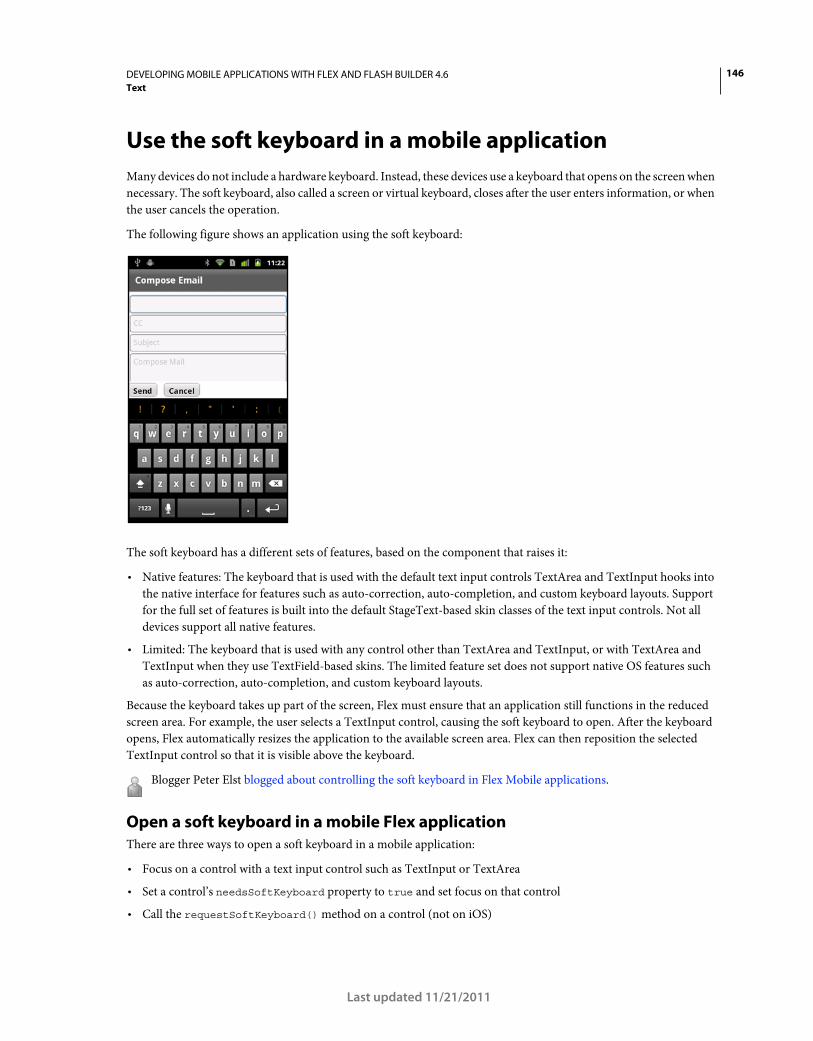
146DEVELOPING MOBILE APPLICATIONS WITH FLEX AND FLASH BUILDER 4.6
Text
Last updated 11/21/2011
Use the soft keyboard in a mobile application
Many devices do not include a hardware keyboard. Instead, these devices use a keyboard that opens on the screen when
necessary. The soft keyboard, also called a screen or virtual keyboard, closes after the user enters information, or when
the user cancels the operation.
The following figure shows an application using the soft keyboard:
The soft keyboard has a different sets of features, based on the component that raises it:
• Native features: The keyboard that is used with the default text input controls TextArea and TextInput hooks into
the native interface for features such as auto-correction, auto-completion, and custom keyboard layouts. Support
for the full set of features is built into the default StageText-based skin classes of the text input controls. Not all
devices support all native features.
• Limited: The keyboard that is used with any control other than TextArea and TextInput, or with TextArea and
TextInput when they use TextField-based skins. The limited feature set does not support native OS features such
as auto-correction, auto-completion, and custom keyboard layouts.
Because the keyboard takes up part of the screen, Flex must ensure that an application still functions in the reduced
screen area. For example, the user selects a TextInput control, causing the soft keyboard to open. After the keyboard
opens, Flex automatically resizes the application to the available screen area. Flex can then reposition the selected
TextInput control so that it is visible above the keyboard.
Blogger Peter Elst blogged about controlling the soft keyboard in Flex Mobile applications.
Open a soft keyboard in a mobile Flex application
There are three ways to open a soft keyboard in a mobile application:
• Focus on a control with a text input control such as TextInput or TextArea
• Set a control’s needsSoftKeyboard property to true and set focus on that control
• Call the requestSoftKeyboard() method on a control (not on iOS)
147DEVELOPING MOBILE APPLICATIONS WITH FLEX AND FLASH BUILDER 4.6
Text
Last updated 11/21/2011
The keyboard stays open until one of the following actions occurs:
• The user moves focus to a control that does not receive text input. This can happen when the user manually points
to another text input control, or if the user presses the return key on the keyboard and the application moves the
focus to another control.
If focus moves to another text input control, or to a control with needsSoftKeyboard set to true, the keyboard
stays open.
• The user cancels input by pressing the back button on the device.
• You programmatically change focus to a non-interactive control or set stage.focus to null.
Present a user with a text input control
If you present a user with a text input control, a soft keyboard appears when the user focuses on that control unless the
editable property is set to false.
The default behavior of the TextInput and TextArea controls is to use the StageText class for rendering text. As a result,
the keyboard that is displayed for these controls supports native features such as auto-correction, auto-capitalization,
and keyboard types. Not all features are supported on all devices.
If you change the skin classes to use the TextField-based skins for the text input controls, then the features are limited.
The keyboard itself is the same, but it does not support the native features.
Set the needsSoftKeyboard property
You can configure non-input controls to open the soft keyboard, such as a Button or ButtonBar control. To open the
keyboard when a control other than a text input control receives focus, set the control’s needsSoftKeyboard property
to true. All Flex components inherit this property from the InteractiveObject class.
The keyboard that opens for any control other than TextInput and TextArea does not support the native features such
as auto-capitalization, auto-correction, and customizable keyboard types.
Note: The text input controls always open the keyboard when receiving focus. They ignore the needsSoftKeyboard
property, and setting it has no effect on the text input controls.
Call the requestSoftKeyboard() method
To programmatically raise a soft keyboard, you can call the requestSoftKeyboard() method. The object that calls
this method must also have the needsSoftKeyboard property set to true. This method changes focus to the object
that called the method and raises a soft keyboard if the device does not have a hardware keyboard.
The InteractiveObject class defines the requestSoftKeyboard() method. As a result, you can call this method on any
component that is a subclass of InteractiveObject.
If you call the requestSoftKeyboard() method on the TextArea or TextInput control, then the native keyboard
features such as auto-correction and auto-capitalization are supported (if the device supports them).
The requestSoftKeyboard() method does not work on iOS devices.
Use native features with a soft keyboard
The StageTextInputSkin and StageTextAreaSkin classes define the skins for the TextInput and TextArea controls in a
mobile application. These skins use the StageText class to render text and hook into the native features of the soft
keyboard. These features include:
• Auto-correction
• Auto-capitalization
148DEVELOPING MOBILE APPLICATIONS WITH FLEX AND FLASH BUILDER 4.6
Text
Last updated 11/21/2011
• Custom return key labels
• Custom keyboard types
Text input controls can also use the TextField-based skins for text rendering. These skins do not support the native
features. They do, however, provide additional functionality for the underlying text control such as support for
scrolling forms, embedding fonts, access to the keyUp and keyDown events, clipping, text measurement, and fractional
alpha values.
To use the TextField-based skins, set the text input control’s skinClass property to point to the TextInputSkin and
TextAreaSkin classes. For example:
<s:TextInput skinClass="spark.skins.mobile.TextInputSkin"/> <s:TextArea skinClass="spark.skins.mobile.TextAreaSkin"/>
Use auto-correction for soft keyboards in a Flex mobile application
Auto-correction is a behavior of the OS that attempts to fix spelling mistakes and apply predictive typing to a user’s
input. Depending on the device, the behavior can be implemented as a bubble over the text, an extension of the soft
keyboard, or in some other way.
You can use auto-correction for soft keyboards in a mobile application by setting the text input control’s autoCorrect
property to true. This is the default value.
The following example lets you toggle auto-correction on and off:
<?xml version="1.0" encoding="utf-8"?> <!-- mobile_keyboard/views/AutoCorrectionExample.mxml --> <s:View xmlns:fx="http://ns.adobe.com/mxml/2009" xmlns:s="library://ns.adobe.com/flex/spark" title="Auto-Correction"> <fx:Declarations> <!-- Place non-visual elements (e.g., services, value objects) here --> </fx:Declarations> <s:layout> <s:VerticalLayout/> </s:layout> <s:TextInput prompt="Enter your text" autoCorrect="{myCB.selected}"/> <s:CheckBox id="myCB" label="Enable auto-correct" enabled="true"/> </s:View>
Not all devices support auto-correction. If you enable or disable the autoCorrect property on a device that does not
support it, the runtime ignores the value and uses the device’s default behavior.
Use auto-capitalization for soft keyboards in a Flex mobile application
Auto-capitalization is a setting that instructs the text input control to capitalize certain words or letters when the user
enters text. For example, you can have all letters capitalized, or you can have just the first word of each sentence
capitalized automatically. It is a convenience for the user to not have to worry about capitalization while entering text
in a mobile application.
You use auto-capitalization in soft keyboards by setting the value of the autoCapitalize property on the text input
control. The possible values are none, word, sentence, and all. The AutoCapitalize class defines the possible values.
The default value is none.
The following example lets you select different values for auto-capitalization:
149DEVELOPING MOBILE APPLICATIONS WITH FLEX AND FLASH BUILDER 4.6
Text
Last updated 11/21/2011
<?xml version="1.0" encoding="utf-8"?> <!-- mobile_keyboard/views/AutoCapitalizeExample.mxml --> <s:View xmlns:fx="http://ns.adobe.com/mxml/2009" xmlns:s="library://ns.adobe.com/flex/spark" title="Auto-Capitalization"> <fx:Declarations> <!-- Place non-visual elements (e.g., services, value objects) here --> </fx:Declarations> <s:layout> <s:VerticalLayout/> </s:layout> <s:Label text="Select a capitalization setting:"/> <s:SpinnerListContainer> <s:SpinnerList id="capTypeList" width="300" labelField="name" fontSize="12"> <s:ArrayCollection> <fx:Object name="All" value="all"/> <fx:Object name="None" value="none"/> <fx:Object name="Sentence" value="sentence"/> <fx:Object name="Word" value="word"/> </s:ArrayCollection> </s:SpinnerList> </s:SpinnerListContainer> <s:TextInput autoCapitalize="{capTypeList.selectedItem.value}"/> </s:View>
Not all devices support auto-capitalization. If you set the value of the autoCapitalize property on a device that does
not support it, the runtime ignores the value and uses the device’s default.
Change soft keyboard types in a Flex mobile application
The SoftKeyboardType class defines the types of soft keyboards for mobile applications. You select the keyboard type
with the softKeyboardType property on the text input control.
The differences among most of the keyboards such as email and contact are only slight. For example, the email
keyboard presents the user with all the same keys as the contact keyboard, except replaces the microphone with the
“@” symbol. The url keyboard uses the “/” symbol. The exception to this is the number keyboard. This keyboard looks
like a calculator screen with a focus on numbers and operators.
The following example shows the different types of soft keyboards that are available:
150DEVELOPING MOBILE APPLICATIONS WITH FLEX AND FLASH BUILDER 4.6
Text
Last updated 11/21/2011
<?xml version="1.0" encoding="utf-8"?> <!-- mobile_keyboard/views/KeyboardTypes.mxml --> <s:View xmlns:fx="http://ns.adobe.com/mxml/2009" xmlns:s="library://ns.adobe.com/flex/spark" title="Keyboard Types"> <fx:Declarations> <!-- Place non-visual elements (e.g., services, value objects) here --> </fx:Declarations> <s:layout> <s:VerticalLayout/> </s:layout> <s:Label text="Select a keyboard type:"/> <s:SpinnerListContainer> <s:SpinnerList id="keyboardTypeList" width="300" labelField="name"> <s:ArrayCollection> <fx:Object name="Contact" value="contact"/> <fx:Object name="Default" value="default"/> <fx:Object name="Email" value="email"/> <fx:Object name="Number" value="number"/> <fx:Object name="Punctuation" value="punctuation"/> <fx:Object name="URL" value="url"/> </s:ArrayCollection> </s:SpinnerList> </s:SpinnerListContainer> <s:TextInput softKeyboardType="{keyboardTypeList.selectedItem.value}" text=""/> </s:View>
Not all soft keyboard types are supported on all devices. If you specify a type that is not supported, then the runtime
ignores the value and uses the device’s default.
Change return key labels on a soft keyboard in a Flex mobile application
When the soft keyboard pops up and a user enters text, there must be a way for the user to indicate that they are done
and that they want to move to the next field or submit the entered data. On a soft keyboard, this is usually accomplished
with the “return” key. This key does not enter a character in the text input, but rather signals to the text input control
that the user is done entering text.
The ReturnKeyLabel class defines the possible labels for the return key. The possible values are default, done, go,
next, and search. You specify the return key label with the returnKeyLabel property on the text input control.
The following example lets you select different return key labels:
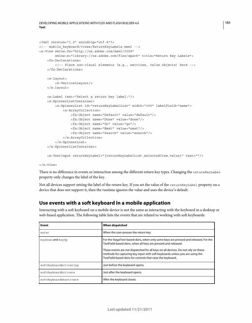
151DEVELOPING MOBILE APPLICATIONS WITH FLEX AND FLASH BUILDER 4.6
Text
Last updated 11/21/2011
<?xml version="1.0" encoding="utf-8"?> <!-- mobile_keyboard/views/ReturnKeyLabels.mxml --> <s:View xmlns:fx="http://ns.adobe.com/mxml/2009" xmlns:s="library://ns.adobe.com/flex/spark" title="Return Key Labels"> <fx:Declarations> <!-- Place non-visual elements (e.g., services, value objects) here --> </fx:Declarations> <s:layout> <s:VerticalLayout/> </s:layout> <s:Label text="Select a return key label:"/> <s:SpinnerListContainer> <s:SpinnerList id="returnKeyLabelList" width="300" labelField="name"> <s:ArrayCollection> <fx:Object name="Default" value="default"/> <fx:Object name="Done" value="done"/> <fx:Object name="Go" value="go"/> <fx:Object name="Next" value="next"/> <fx:Object name="Search" value="search"/> </s:ArrayCollection> </s:SpinnerList> </s:SpinnerListContainer> <s:TextInput returnKeyLabel="{returnKeyLabelList.selectedItem.value}" text=""/> </s:View>
There is no difference in events or interaction among the different return key types. Changing the returnKeyLabel
property only changes the label of the key.
Not all devices support setting the label of the return key. If you set the value of the returnKeyLabel property on a
device that does not support it, then the runtime ignores the value and uses the device’s default.
Use events with a soft keyboard in a mobile application
Interacting with a soft keyboard on a mobile device is not the same as interacting with the keyboard in a desktop or
web-based application. The following table lists the events that are related to working with soft keyboards:
Event When dispatched
enter When the user presses the return key.
keyDown and keyUp For the StageText-based skins, when only some keys are pressed and released. For the
TextField-based skins, when all keys are pressed and released.
These events are not dispatched for all keys on all devices. Do not rely on these
methods for capturing key input with soft keyboards unless you are using the
TestField-based skins for controls that raise the keyboard.
softKeyboardActivating Just before the keyboard opens.
softKeyboardActivate Just after the keyboard opens.
softKeyboardDeactivate After the keyboard closes.
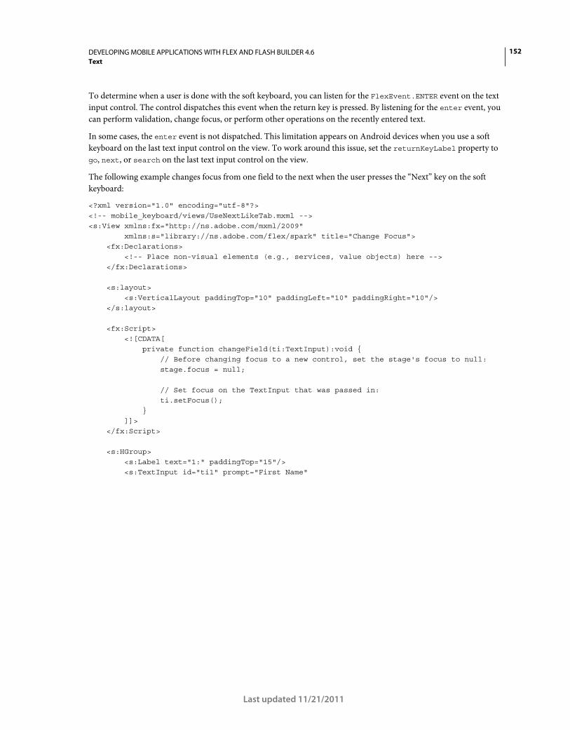
152DEVELOPING MOBILE APPLICATIONS WITH FLEX AND FLASH BUILDER 4.6
Text
Last updated 11/21/2011
To determine when a user is done with the soft keyboard, you can listen for the FlexEvent.ENTER event on the text
input control. The control dispatches this event when the return key is pressed. By listening for the enter event, you
can perform validation, change focus, or perform other operations on the recently entered text.
In some cases, the enter event is not dispatched. This limitation appears on Android devices when you use a soft
keyboard on the last text input control on the view. To work around this issue, set the returnKeyLabel property to
go, next, or search on the last text input control on the view.
The following example changes focus from one field to the next when the user presses the “Next” key on the soft
keyboard:
<?xml version="1.0" encoding="utf-8"?> <!-- mobile_keyboard/views/UseNextLikeTab.mxml --> <s:View xmlns:fx="http://ns.adobe.com/mxml/2009" xmlns:s="library://ns.adobe.com/flex/spark" title="Change Focus"> <fx:Declarations> <!-- Place non-visual elements (e.g., services, value objects) here --> </fx:Declarations> <s:layout> <s:VerticalLayout paddingTop="10" paddingLeft="10" paddingRight="10"/> </s:layout> <fx:Script> <![CDATA[ private function changeField(ti:TextInput):void { // Before changing focus to a new control, set the stage's focus to null: stage.focus = null; // Set focus on the TextInput that was passed in: ti.setFocus(); } ]]> </fx:Script> <s:HGroup> <s:Label text="1:" paddingTop="15"/> <s:TextInput id="ti1" prompt="First Name"
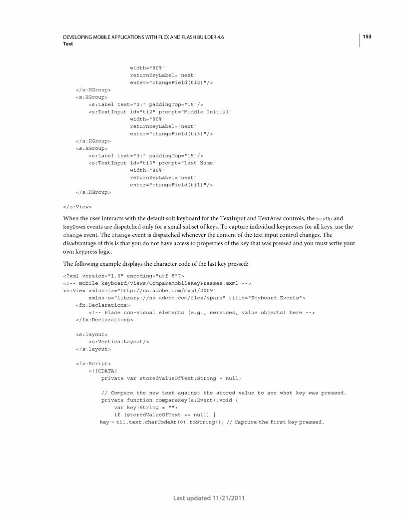
153DEVELOPING MOBILE APPLICATIONS WITH FLEX AND FLASH BUILDER 4.6
Text
Last updated 11/21/2011
width="80%" returnKeyLabel="next" enter="changeField(ti2)"/> </s:HGroup> <s:HGroup> <s:Label text="2:" paddingTop="15"/> <s:TextInput id="ti2" prompt="Middle Initial" width="80%" returnKeyLabel="next" enter="changeField(ti3)"/> </s:HGroup> <s:HGroup> <s:Label text="3:" paddingTop="15"/> <s:TextInput id="ti3" prompt="Last Name" width="80%" returnKeyLabel="next" enter="changeField(ti1)"/> </s:HGroup> </s:View>
When the user interacts with the default soft keyboard for the TextInput and TextArea controls, the keyUp and
keyDown events are dispatched only for a small subset of keys. To capture individual keypresses for all keys, use the
change event. The change event is dispatched whenever the content of the text input control changes. The
disadvantage of this is that you do not have access to properties of the key that was pressed and you must write your
own keypress logic.
The following example displays the character code of the last key pressed:
<?xml version="1.0" encoding="utf-8"?> <!-- mobile_keyboard/views/CompareMobileKeyPresses.mxml --> <s:View xmlns:fx="http://ns.adobe.com/mxml/2009" xmlns:s="library://ns.adobe.com/flex/spark" title="Keyboard Events"> <fx:Declarations> <!-- Place non-visual elements (e.g., services, value objects) here --> </fx:Declarations> <s:layout> <s:VerticalLayout/> </s:layout> <fx:Script> <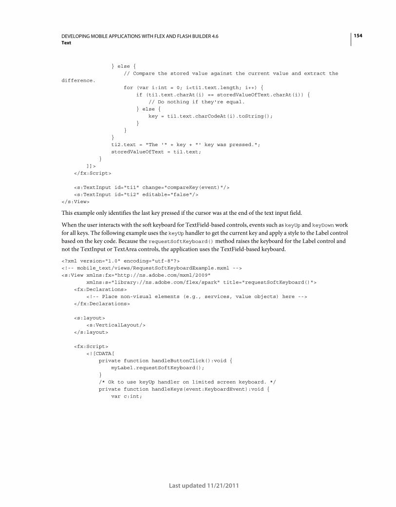
154DEVELOPING MOBILE APPLICATIONS WITH FLEX AND FLASH BUILDER 4.6
Text
Last updated 11/21/2011
} else { // Compare the stored value against the current value and extract the difference. for (var i:int = 0; i<ti1.text.length; i++) { if (ti1.text.charAt(i) == storedValueOfText.charAt(i)) { // Do nothing if they're equal. } else { key = ti1.text.charCodeAt(i).toString(); } } } ti2.text = "The '" + key + "' key was pressed."; storedValueOfText = ti1.text; } ]]> </fx:Script> <s:TextInput id="ti1" change="compareKey(event)"/> <s:TextInput id="ti2" editable="false"/> </s:View>
This example only identifies the last key pressed if the cursor was at the end of the text input field.
When the user interacts with the soft keyboard for TextField-based controls, events such as keyUp and keyDown work
for all keys. The following example uses the keyUp handler to get the current key and apply a style to the Label control
based on the key code. Because the requestSoftKeyboard() method raises the keyboard for the Label control and
not the TextInput or TextArea controls, the application uses the TextField-based keyboard.
<?xml version="1.0" encoding="utf-8"?> <!-- mobile_text/views/RequestSoftKeyboardExample.mxml --> <s:View xmlns:fx="http://ns.adobe.com/mxml/2009" xmlns:s="library://ns.adobe.com/flex/spark" title="requestSoftKeyboard()"> <fx:Declarations> <!-- Place non-visual elements (e.g., services, value objects) here --> </fx:Declarations> <s:layout> <s:VerticalLayout/> </s:layout> <fx:Script> <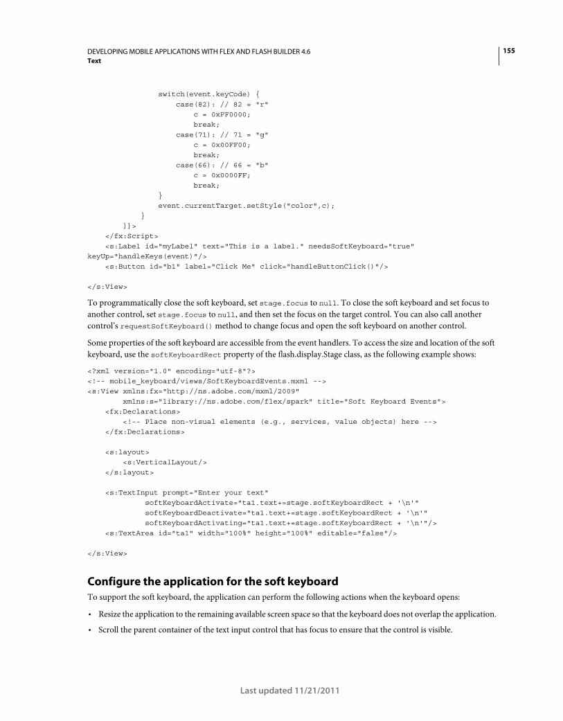
155DEVELOPING MOBILE APPLICATIONS WITH FLEX AND FLASH BUILDER 4.6
Text
Last updated 11/21/2011
switch(event.keyCode) { case(82): // 82 = "r" c = 0xFF0000; break; case(71): // 71 = "g" c = 0x00FF00; break; case(66): // 66 = "b" c = 0x0000FF; break; } event.currentTarget.setStyle("color",c); } ]]> </fx:Script> <s:Label id="myLabel" text="This is a label." needsSoftKeyboard="true" keyUp="handleKeys(event)"/> <s:Button id="b1" label="Click Me" click="handleButtonClick()"/> </s:View>
To programmatically close the soft keyboard, set stage.focus to null. To close the soft keyboard and set focus to
another control, set stage.focus to null, and then set the focus on the target control. You can also call another
control’s requestSoftKeyboard() method to change focus and open the soft keyboard on another control.
Some properties of the soft keyboard are accessible from the event handlers. To access the size and location of the soft
keyboard, use the softKeyboardRect property of the flash.display.Stage class, as the following example shows:
<?xml version="1.0" encoding="utf-8"?> <!-- mobile_keyboard/views/SoftKeyboardEvents.mxml --> <s:View xmlns:fx="http://ns.adobe.com/mxml/2009" xmlns:s="library://ns.adobe.com/flex/spark" title="Soft Keyboard Events"> <fx:Declarations> <!-- Place non-visual elements (e.g., services, value objects) here --> </fx:Declarations> <s:layout> <s:VerticalLayout/> </s:layout> <s:TextInput prompt="Enter your text" softKeyboardActivate="ta1.text+=stage.softKeyboardRect + '\n'" softKeyboardDeactivate="ta1.text+=stage.softKeyboardRect + '\n'" softKeyboardActivating="ta1.text+=stage.softKeyboardRect + '\n'"/> <s:TextArea id="ta1" width="100%" height="100%" editable="false"/> </s:View>
Configure the application for the soft keyboard
To support the soft keyboard, the application can perform the following actions when the keyboard opens:
• Resize the application to the remaining available screen space so that the keyboard does not overlap the application.
• Scroll the parent container of the text input control that has focus to ensure that the control is visible.
156DEVELOPING MOBILE APPLICATIONS WITH FLEX AND FLASH BUILDER 4.6
Text
Last updated 11/21/2011
Configure your system for the soft keyboard
The soft keyboard is not supported in applications running in full screen mode. Therefore, in your app.xml file, ensure
that the <fullScreen> attribute is set to false, the default value.
Ensure that the rendering mode of the application is set to CPU mode. The rendering mode is controlled in the
application’s app.xml descriptor file by the <renderMode> attribute. Ensure that the <renderMode> attribute is set to
cpu, the default value, and not to gpu.
Note: The <renderMode> attribute is not included by default in the app.xml file. To change its setting, add it as an entry
in the <initialWindow> attribute. If it is not included in the app.xml file, then it has the default value of cpu.
Scroll the parent container when the soft keyboard opens
The resizeForSoftKeyboard property of the Application container determines the application resizing behavior. If
the resizeForSoftKeyboard property is false, the default value, the keyboard can appear on top of the application.
If the value is true, then the application is resized to subtract the size of the keyboard.
To support scrolling, the text input controls must use the TextField-based skins and not the StageText-based skins.
You do this by pointing the TextInput or TextArea control’s skinClass property to the TextInputSkin or
TextAreaSkin class, respectively.
To scroll, wrap the parent container of any text input controls in a Scroller component. When a component that opens
the keyboard gets focus, the Scroller automatically scrolls the component into view. The component can also be the
child of multiple, nested containers of the Scroller component.
The parent container must be a GroupBase or SkinnableContainer class, or a subclass of GroupBase or
SkinnableContainer. The component gaining focus must implement the IVisualElement interface, and must be
focusable.
By wrapping the parent container in a Scroller component, you can scroll the container while the keyboard is open.
For example, a container holds multiple text input controls. You then scroll to each text input control to enter data.
When the keyboard closes, the parent container can be smaller than the available screen space. If the container is
smaller than the available screen space, then the Scroller restores the scroll positions to 0, the top of the container.
The following example shows a View container with multiple TextInput controls and a Scroller component:
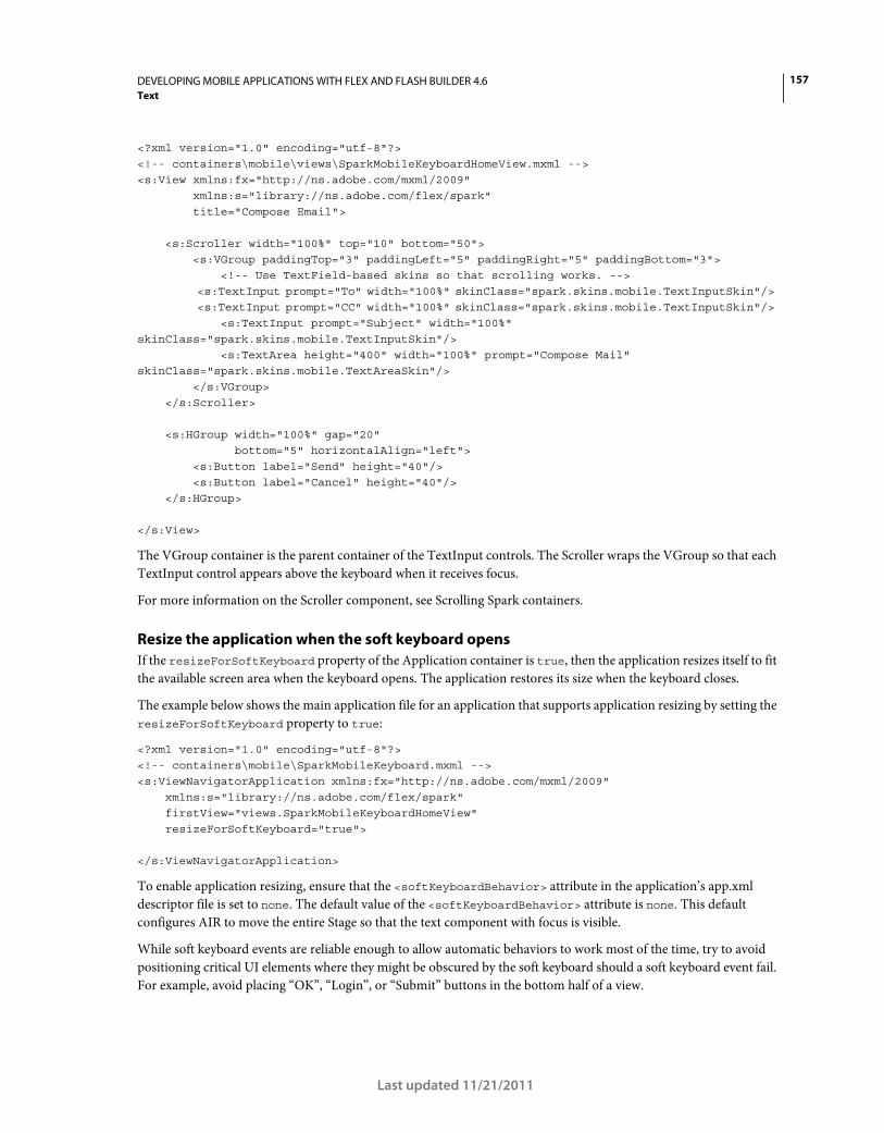
157DEVELOPING MOBILE APPLICATIONS WITH FLEX AND FLASH BUILDER 4.6
Text
Last updated 11/21/2011
<?xml version="1.0" encoding="utf-8"?> <!-- containers\mobile\views\SparkMobileKeyboardHomeView.mxml --> <s:View xmlns:fx="http://ns.adobe.com/mxml/2009" xmlns:s="library://ns.adobe.com/flex/spark" title="Compose Email"> <s:Scroller width="100%" top="10" bottom="50"> <s:VGroup paddingTop="3" paddingLeft="5" paddingRight="5" paddingBottom="3"> <!-- Use TextField-based skins so that scrolling works. --> <s:TextInput prompt="To" width="100%" skinClass="spark.skins.mobile.TextInputSkin"/> <s:TextInput prompt="CC" width="100%" skinClass="spark.skins.mobile.TextInputSkin"/> <s:TextInput prompt="Subject" width="100%" skinClass="spark.skins.mobile.TextInputSkin"/> <s:TextArea height="400" width="100%" prompt="Compose Mail" skinClass="spark.skins.mobile.TextAreaSkin"/> </s:VGroup> </s:Scroller> <s:HGroup width="100%" gap="20" bottom="5" horizontalAlign="left"> <s:Button label="Send" height="40"/> <s:Button label="Cancel" height="40"/> </s:HGroup> </s:View>
The VGroup container is the parent container of the TextInput controls. The Scroller wraps the VGroup so that each
TextInput control appears above the keyboard when it receives focus.
For more information on the Scroller component, see Scrolling Spark containers.
Resize the application when the soft keyboard opens
If the resizeForSoftKeyboard property of the Application container is true, then the application resizes itself to fit
the available screen area when the keyboard opens. The application restores its size when the keyboard closes.
The example below shows the main application file for an application that supports application resizing by setting the
resizeForSoftKeyboard property to true:
<?xml version="1.0" encoding="utf-8"?> <!-- containers\mobile\SparkMobileKeyboard.mxml --> <s:ViewNavigatorApplication xmlns:fx="http://ns.adobe.com/mxml/2009" xmlns:s="library://ns.adobe.com/flex/spark" firstView="views.SparkMobileKeyboardHomeView" resizeForSoftKeyboard="true"> </s:ViewNavigatorApplication>
To enable application resizing, ensure that the <softKeyboardBehavior> attribute in the application’s app.xml
descriptor file is set to none. The default value of the <softKeyboardBehavior> attribute is none. This default
configures AIR to move the entire Stage so that the text component with focus is visible.
While soft keyboard events are reliable enough to allow automatic behaviors to work most of the time, try to avoid
positioning critical UI elements where they might be obscured by the soft keyboard should a soft keyboard event fail.
For example, avoid placing “OK”, “Login”, or “Submit” buttons in the bottom half of a view.
158DEVELOPING MOBILE APPLICATIONS WITH FLEX AND FLASH BUILDER 4.6
Text
Last updated 11/21/2011
When a StageText-based control is animated or participates in an animation, the runtime temporarily replaces it with
a bitmap so that the text moves in sync with other items. If the control has focus, this causes the control to temporarily
lose focus. In some cases, the soft keyboard hides or triggers a softKeyboardDeactivate event without hiding the
soft keyboard.
This can be especially problematic when programmatically setting focus to StageText-based components inside
popups, which animate changes in size caused by the soft keyboard. To avoid this, try to use StageText-based
components in popups that do not resize because of the soft keyboard.
If you must use StageText-based components in popups that resize, try to show the soft keyboard first and wait for the
popup’s animation to complete before programmatically setting focus to the StageText-based component. As an
alternative, avoid setting focus programmatically inside popups.
Configure a popup for use with the soft keyboard
A Callout container appears as a popup on top of a mobile application. The Callout container can hold one or more
components that take keyboard input. For more information on the Callout container, see “Use the Callout container
to create a callout” on page 77.
Use properties of the SkinnablePopUpContainer container, the parent class of Callout, to configure the popup’s
interaction with a keyboard:
moveForSoftKeyboard If true, the default value, the popup moves above the keyboard when the keyboard opens.
resizeForSoftKeyboard If true, the default value, the popup resizes to the available space above the keyboard when
the keyboard opens.
If a SkinnablePopUpContainer’s moveForSoftKeyboard or resizeForSoftKeyboard properties are set to true, the
container might move or resize whenever the soft keyboard’s visibility changes. Both of these automatic behaviors can
cause other components to change size or move.
The simplest way to avoid this scenario is to not set resizeForSoftKeyboard to true. If the application does not
resize for the soft keyboard, the soft keyboard cannot cause a component to move out from under a user’s finger.
However, this can cause the soft keyboard to hide some of the application’s UI.
If your application requires automatic resizing, place interactive components so that changes in soft keyboard visibility
do not cause them to move away from the user’s finger when targeted. Techniques to do this include:
• Do not give buttons, checkboxes, or other small targets bottom constraints or place them below other components
with percent heights.
• Try to design your layout so that the top of the bottommost component remains stationary when the keyboard
shows or hides.
• On platforms that lack a built-in affordance for hiding the soft keyboard, provide a stationary UI element to do so.
This could be a button dedicated to hiding the soft keyboard or just a stationary blank margin large enough to tap
on to remove focus from a text component.
• Do not vertically arrange components that might move. Doing so can cause gestures to find the wrong target when
the soft keyboard changes visibility.
Embed fonts in a mobile application
You can embed fonts for use in mobile applications with some restrictions.
159DEVELOPING MOBILE APPLICATIONS WITH FLEX AND FLASH BUILDER 4.6
Text
Last updated 11/21/2011
Because the Label control uses FTE (and therefore CFF fonts), use the TextArea or TextInput controls with their
TextField-based skins when embedding fonts in a mobile application. You cannot embed fonts with StageText-based
skins. In general, avoid using FTE in a mobile application.
In your CSS, set embedAsCFF to false and apply the TextField-based skin, as the following example shows:
<?xml version="1.0" encoding="utf-8"?> <!-- mobile_text/Main.mxml --> <s:ViewNavigatorApplication xmlns:fx="http://ns.adobe.com/mxml/2009" xmlns:s="library://ns.adobe.com/flex/spark" firstView="views.EmbeddingFontsView"> <fx:Style> @namespace s "library://ns.adobe.com/flex/spark"; @font-face { src: url("../assets/MyriadWebPro.ttf"); fontFamily: myFontFamily; embedAsCFF: false; } .customStyle { fontFamily: myFontFamily; fontSize: 24; skinClass: ClassReference("spark.skins.mobile.TextAreaSkin"); } </fx:Style> </s:ViewNavigatorApplication>
The TextArea control in the EmbeddingFontView view applies the type selector:
<?xml version="1.0" encoding="utf-8"?> <!-- mobile_text/EmbeddingFontsView.mxml --> <s:View xmlns:fx="http://ns.adobe.com/mxml/2009" xmlns:s="library://ns.adobe.com/flex/spark" title="Embedded Fonts"> <s:layout> <s:VerticalLayout paddingTop="20" paddingLeft="20" paddingRight="20"/> </s:layout> <s:TextArea id="ta1" width="100%" styleName="customStyle" text="This is a TextArea control that uses an embedded font."/> <s:TextArea id="ta2" width="100%" text="This TextArea control does not use an embedded font."/> </s:View>
If you use class selectors (such as s|TextArea) to apply styles (or to embed fonts), define the class selector in the main
application file. You cannot define class selectors in a view of a mobile application.
For more information, see Embed fonts.
160
Last updated 11/21/2011
Chapter 6: Skinning
Basics of mobile skinning
Compare desktop and mobile skins
Mobile skins are more lightweight than their desktop counterparts. As a result, they have many differences; for
example:
• Mobile skins are written in ActionScript. ActionScript-only skins provide the best performance on mobile devices.
• Mobile skins extend the spark.skins.mobile.supportClasses.MobileSkin class. This class extends UIComponent, as
compared to the SparkSkin class which extends the Skin class.
• Mobile skins use compiled FXG or simple ActionScript drawing for their graphical assets to improve performance.
Skins for desktop applications, by contrast, typically use MXML graphics for much of their drawing.
• Mobile skins do not need to declare any of the skin states. Because the skins are written in ActionScript, states must
be implemented procedurally.
• Mobile skins do not support state transitions.
• Mobile skins are laid out manually. Because mobile skins do not extend Group, they do not support the Spark
layouts. As a result, their children are positioned manually in ActionScript.
• Mobile skins do not support all styles. The mobile theme omits some styles based on performance or other
differences in the mobile skins.
In addition to performance-related differences, Flash Builder also uses some mobile skin files differently. This is
especially true of mobile themes used on library projects. Blogger Jeffry Houser describes how to fix this.
Mobile host component
Mobile skins typically declare a public hostComponent property. This property is not required, but is recommended.
The hostComponent property must be of the same type as the component that uses the skin. For example, the
ActionBarSkin declares the hostComponent to be of type ActionBar:
public var hostComponent:ActionBar;
Flex sets the value of the hostComponent property when the component first loads the skin.
As with desktop skins, you can use the host component to access properties and methods of the component to which
the skin is attached. For example, you could access the host component’s public properties or add an event listener to
the host component from within the skin class.
Mobile styles
Mobile skins support a subset of style properties that their desktop counterparts support. The mobile theme defines
this set of styles.
The following table defines the style properties available to components when using the mobile theme:
161DEVELOPING MOBILE APPLICATIONS WITH FLEX AND FLASH BUILDER 4.6
Skinning
Last updated 11/21/2011
Text-based components also support the standard text styles such as fontFamily, fontSize, and fontWeight.
To see whether the mobile theme supports a style property, open the component’s description in the ActionScript
Language Reference. Many of these style limitations are because text-based mobile components do not use TLF (Text
Layout Framework). Instead, the mobile skins replace TLF-based text controls with more lightweight components. For
more information, see “Use text in a mobile application” on page 136.
The mobile theme does not support the rollOverColor, cornerRadius, and dropShadowVisible style properties.
Flex engineer Jason SJ describes styles and themes for mobile applications in his blog.
Mobile skin parts
For skin parts, mobile skins must adhere to the same skinning contract as desktop skins. If a component has a required
skin part, then the mobile skin must declare a public property of the appropriate type.
Exceptions
Not all skin parts are required. For example, the Spark Button has optional iconDisplay and labelDisplay skin
parts. As a result, the mobile ButtonSkin class can declare an iconDisplay property of type BitmapImage. It can also
declare a labelDisplay property of type StyleableTextField.
Style Property Supported By Inheriting/Non-inheriting
accentColor Button, ActionBar, ButtonBar Inheriting
backgroundAlpha ActionBar Non-inheriting
backgroundColor Application Non-inheriting
borderAlpha List Non-inheriting
borderColor List Non-inheriting
borderVisible List Non-inheriting
chromeColor ActionBar, Button, ButtonBar, CheckBox, HSlider,
RadioButton
Inheriting
color All components with text Inheriting
contentBackgroundAlpha TextArea, TextInput Inheriting
contentBackgroundColor TextArea, TextInput Inheriting
focusAlpha All focusable components Non-inheriting
focusBlendMode All focusable components Non-inheriting
focusColor All focusable components Inheriting
focusThickness All focusable components Non-inheriting
locale All components Inheriting
paddingBottom TextArea, TextInput Non-inheriting
paddingLeft TextArea, TextInput Non-inheriting
paddingRight TextArea, TextInput Non-inheriting
paddingTop TextArea, TextInput Non-inheriting
selectionColor ViewMenuItem Inheriting
162DEVELOPING MOBILE APPLICATIONS WITH FLEX AND FLASH BUILDER 4.6
Skinning
Last updated 11/21/2011
The labelDisplay part does not set an id property because the styles it uses are all inheriting text styles. Also, the
StyleableTextField is not a UIComponent and therefore does not have an id property. The iconDisplay part does not
support styles so it does not set an id property either.
Set styles with advanced CSS
If you want to set styles on the skin part with the advanced CSS id selector, the skin must also set the skin part’s id
property. For example, the ActionBar’stitleDisplay skin part sets an id property so that it can be styled with
advanced CSS; for example:
@namespace s "library://ns.adobe.com/flex/spark"; s|ActionBar #titleDisplay {
color:red; }
Mobile theme
The mobile theme determines which styles a mobile application supports. The number of styles that are available with
the mobile theme is a subset of the Spark theme (with some minor additions). You can see a complete list of styles
supported by the mobile theme in “Mobile styles” on page 160.
Default theme for mobile applications
The theme for mobile applications is defined in the themes/Mobile/mobile.swc file. This file defines the global styles
for mobile applications, as well as the default settings for each of the mobile components. Mobile skins in this theme
file are defined in the spark.skins.mobile.* package. This package includes the MobileSkin base class.
The mobile.swc theme file is included in Flash Builder mobile projects by default, but the SWC file does not appear in
the Package Explorer.
When you create a new mobile project in Flash Builder, this theme is applied by default.
Change the theme
To change the theme, use the theme compiler argument to specify the new theme; for example:
-theme+=myThemes/NewMobileTheme.swc
For more information on themes, see About themes.
Flex engineer Jason SJ describes how to create and overlay a theme in a mobile application on his blog.
Mobile skin states
The MobileSkin class overrides the states mechanism of the UIComponent class and does not use the view states
implementation of desktop applications. As a result, mobile skins only declare the host component’s skin states that
the skin implements. They change state procedurally, based only on the state name. By contrast, desktop skins must
declare all states, regardless of whether they are used. Desktop skins also use the classes in the mx.states.* package to
change states.
Most mobile skins implement fewer states than their desktop counterparts. For example, the
spark.skins.mobile.ButtonSkin class implements the up, down and disabled states. The spark.skins.spark.ButtonSkin
implements all of these states and the over state. The mobile skin does not define behavior for the over state because
that state would not commonly be used on a touch device.
commitCurrentState() method
163DEVELOPING MOBILE APPLICATIONS WITH FLEX AND FLASH BUILDER 4.6
Skinning
Last updated 11/21/2011
The mobile skin classes define their state behaviors in the commitCurrentState() method. You can add behavior to
a mobile skin to support additional states by editing the commitCurrentState() method in your custom skin class.
currentState property
The appearance of a skin depends on the value of the currentState property. For example, in the mobile ButtonSkin
class, the value of the currentState property determines which FXG class is used as the border class:
if (currentState == "down") return downBorderSkin;
else return upBorderSkin;
For more information about the currentState property, see Create and apply view states.
Mobile graphics
Mobile skins typically use compiled FXG for their graphical assets. Skins for desktop applications, by contrast, typically
use MXML graphics for much of their drawing.
Embedded bitmap graphics
You can use embedded bitmap graphics in your classes, which generally perform well. However, bitmaps do not always
scale well for multiple screen densities. Creating several different assets, one for each screen density, can scale better.
Graphics in the default mobile theme
The mobile skins in the default mobile theme use FXG graphics that are optimized for the target device’s DPI. The
skins load graphics depending on the value of the root application’s applicationDPI property. For example, when a
CheckBox control is loaded on a device with a DPI of 320, the CheckBoxSkin class uses the
spark.skins.mobile320.assets.CheckBox_up.fxg graphic for the upIconClass property. At 160 DPI, it uses the
spark.skins.mobile160.assets.CheckBox_up.fxg graphic.
The following desktop example shows the different graphics used by the CheckBox skin at different DPIs:
<?xml version="1.0"?> <!-- mobile_skins/ShowCheckBoxSkins.mxml --> <s:Application xmlns:fx="http://ns.adobe.com/mxml/2009" xmlns:s="library://ns.adobe.com/flex/spark" xmlns:mx="library://ns.adobe.com/flex/mx" xmlns:skins160="spark.skins.mobile160.assets.*" xmlns:skins240="spark.skins.mobile240.assets.*" xmlns:skins320="spark.skins.mobile320.assets.*"> <s:layout> <s:VerticalLayout/> </s:layout> <!-- NOTE: You must add the mobile theme directory to source path to compile this example. For example: mxmlc -source-path+=\frameworks\projects\mobiletheme\src\ ShowCheckBoxSkins.mxml --> <s:Label text="160 DPI" fontSize="24" fontWeight="bold"/> <s:HGroup> <skins160:CheckBox_down/> <skins160:CheckBox_downSymbol/>
164DEVELOPING MOBILE APPLICATIONS WITH FLEX AND FLASH BUILDER 4.6
Skinning
Last updated 11/21/2011
<skins160:CheckBox_downSymbolSelected/> <skins160:CheckBox_up/> <skins160:CheckBox_upSymbol/> <skins160:CheckBox_upSymbolSelected/> </s:HGroup> <mx:Spacer height="30"/> <s:Label text="240 DPI" fontSize="24" fontWeight="bold"/> <s:HGroup> <skins240:CheckBox_down/> <skins240:CheckBox_downSymbol/> <skins240:CheckBox_downSymbolSelected/> <skins240:CheckBox_up/> <skins240:CheckBox_upSymbol/> <skins240:CheckBox_upSymbolSelected/> </s:HGroup> <mx:Spacer height="30"/> <s:Label text="320 DPI" fontSize="24" fontWeight="bold"/> <s:HGroup> <skins320:CheckBox_down/> <skins320:CheckBox_downSymbol/> <skins320:CheckBox_downSymbolSelected/> <skins320:CheckBox_up/> <skins320:CheckBox_upSymbol/> <skins320:CheckBox_upSymbolSelected/> </s:HGroup> <s:Label text="down, downSymbol, downSymbolSelected, up, upSymbol, upSymbolSelected"/> </s:Application>
For more information about resolutions and DPIs in mobile applications, see “Support multiple screen sizes and DPI
values in a mobile application” on page 122.
In ActionScript skins, you can also use vectors cached as bitmaps. The only drawback is that you cannot use any
transitions that require the pixels to be redrawn, such as alpha transitions. For more information, see
www.adobe.com/devnet/air/flex/articles/writing_multiscreen_air_apps.html.
Create skins for a mobile application
When customizing mobile skins, you create a custom mobile skin class. In some cases, you also edit the assets that a
mobile skin class uses.
When you edit a mobile skin class, you can change state-based interactions, implement support for new styles, or add
or remove child components to the skin. You typically start with the source code of an existing skin and save it as a
new class.
You can also edit the assets used by mobile skins to change the visual properties of the skin, such as size, color, or
gradients and backgrounds. In this case, you also edit the FXG assets used by the skins. The source *.fxg files used by
mobile skins are located in the spark/skins/mobile/assets directory.
Not all visual properties for mobile skins are defined in *.fxg files. For example, the Button skin’s background color is
defined by the chromeColor style property in the ButtonSkin class. It is not defined in an FXG asset. In this case, you
would edit the skin class to change the background color.
165DEVELOPING MOBILE APPLICATIONS WITH FLEX AND FLASH BUILDER 4.6
Skinning
Last updated 11/21/2011
Create a mobile skin class
When creating a custom mobile skin class, the easiest approach is to use an existing mobile skin class as a base. Then
change that class and use it as a custom skin.
To create a custom skin class:
1 Create a directory in your project (for example, customSkins). This directory is the package name for your custom
skins. While creating a package is not required, it’s a good idea to organize custom skins in a separate package.
2 Create a custom skin class in the new directory. Name the new class whatever you want, such as
CustomButtonSkin.as.
3 Copy the contents of the skin class that you are using as a base for the new class. For example, if you are using
ButtonSkin as a base class, copy the contents of the spark.skins.mobile.ButtonSkin file into the new custom skin
class.
4 Edit the new class. For example, make the following minimum changes to the CustomButtonSkin class:
• Change the package location:
package customSkins //was: package spark.skins.mobile
• Change the name of the class in the class declaration. Also, extend the class your new skin is based on, not the
base skin class:
public class CustomButtonSkin extends ButtonSkin // was: public class ButtonSkin extends ButtonSkinBase
• Change the class name in the constructor:
public function CustomButtonSkin() //was: public function ButtonSkin()
5 Change the custom skin class. For example, add support for additional states or new child components. Also, some
graphical assets are defined in the skin class itself, so you can change some assets.
To make your skin class easier to read, you typically remove any methods from the custom skin that you do not
override.
The following custom skin class extends ButtonSkin and replaces the drawBackground() method with custom
logic. It replaces the linear gradient with a radial gradient for the background fill.
166DEVELOPING MOBILE APPLICATIONS WITH FLEX AND FLASH BUILDER 4.6
Skinning
Last updated 11/21/2011
package customSkins { import mx.utils.ColorUtil; import spark.skins.mobile.ButtonSkin; import flash.display.GradientType; import spark.skins.mobile.supportClasses.MobileSkin; import flash.geom.Matrix; public class CustomButtonSkin extends ButtonSkin { public function CustomButtonSkin() { super(); } private static var colorMatrix:Matrix = new Matrix(); private static const CHROME_COLOR_ALPHAS:Array = [1, 1]; private static const CHROME_COLOR_RATIOS:Array = [0, 127.5]; override protected function drawBackground(unscaledWidth:Number, unscaledHeight:Number):void { super.drawBackground(unscaledWidth, unscaledHeight); var chromeColor:uint = getStyle("chromeColor"); /* if (currentState == "down") { graphics.beginFill(chromeColor); } else { */ var colors:Array = []; colorMatrix.createGradientBox(unscaledWidth, unscaledHeight, Math.PI / 2, 0, 0); colors[0] = ColorUtil.adjustBrightness2(chromeColor, 70); colors[1] = chromeColor; graphics.beginGradientFill(GradientType.RADIAL, colors, CHROME_COLOR_ALPHAS, CHROME_COLOR_RATIOS, colorMatrix); // } graphics.drawRoundRect(layoutBorderSize, layoutBorderSize, unscaledWidth - (layoutBorderSize * 2), unscaledHeight - (layoutBorderSize * 2), layoutCornerEllipseSize, layoutCornerEllipseSize); graphics.endFill(); } } }
6 In your application, apply the custom skin by using one of the methods that are described in “Apply a custom
mobile skin” on page 172. The following example uses the skinClass property on the component tag to apply the
customSkins.CustomButtonSkin skin:
<?xml version="1.0" encoding="utf-8"?> <!-- mobile_skins/views/CustomButtonSkinView.mxml --> <s:View xmlns:fx="http://ns.adobe.com/mxml/2009" xmlns:s="library://ns.adobe.com/flex/spark" title="Home"> <fx:Declarations> <!-- Place non-visual elements (e.g., services, value objects) here --> </fx:Declarations> <s:Button label="Click Me" skinClass="customSkins.CustomButtonSkin"/> </s:View>
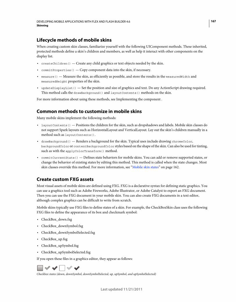
167DEVELOPING MOBILE APPLICATIONS WITH FLEX AND FLASH BUILDER 4.6
Skinning
Last updated 11/21/2011
Lifecycle methods of mobile skins
When creating custom skin classes, familiarize yourself with the following UIComponent methods. These inherited,
protected methods define a skin’s children and members, as well as help it interact with other components on the
display list.
• createChildren() — Create any child graphics or text objects needed by the skin.
• commitProperties() — Copy component data into the skin, if necessary.
• measure() — Measure the skin, as efficiently as possible, and store the results in the measuredWidth and
measuredHeight properties of the skin.
• updateDisplayList() — Set the position and size of graphics and text. Do any ActionScript drawing required.
This method calls the drawBackground() and layoutContents() methods on the skin.
For more information about using these methods, see Implementing the component .
Common methods to customize in mobile skins
Many mobile skins implement the following methods:
• layoutContents() — Positions the children for the skin, such as dropshadows and labels. Mobile skin classes do
not support Spark layouts such as HorizontalLayout and VerticalLayout. Lay out the skin’s children manually in a
method such as layoutContents().
• drawBackground() — Renders a background for the skin. Typical uses include drawing chromeColor,
backgroundColor or contentBackgroundColor styles based on the shape of the skin. Can also be used for tinting,
such as with the applyColorTransform() method.
• commitCurrentState() — Defines state behaviors for mobile skins. You can add or remove supported states, or
change the behavior of existing states by editing this method. This method is called when the state changes. Most
skin classes override this method. For more information, see “Mobile skin states” on page 162.
Create custom FXG assets
Most visual assets of mobile skins are defined using FXG. FXG is a declarative syntax for defining static graphics. You
can use a graphics tool such as Adobe Fireworks, Adobe Illustrator, or Adobe Catalyst to export an FXG document.
Then you can use the FXG document in your mobile skin. You can also create FXG documents in a text editor,
although complex graphics can be difficult to write from scratch.
Mobile skins typically use FXG files to define states of a skin. For example, the CheckBoxSkin class uses the following
FXG files to define the appearance of its box and checkmark symbol:
• CheckBox_down.fxg
• CheckBox_downSymbol.fxg
• CheckBox_downSymbolSelected.fxg
• CheckBox_up.fxg
• CheckBox_upSymbol.fxg
• CheckBox_upSymbolSelected.fxg
If you open these files in a graphics editor, they appear as follows:
Checkbox states (down, downSymbol, downSymbolSelected, up, upSymbol, and upSymbolSelected)
168DEVELOPING MOBILE APPLICATIONS WITH FLEX AND FLASH BUILDER 4.6
Skinning
Last updated 11/21/2011
FXG files for multiple resolutions
Most mobile skins have three sets of FXG graphics files, one for each default target resolution. For example, different
versions of all six CheckBoxSkin classes appear in the spark/skins/mobile160, spark/skins/mobile240, and
spark/skins/mobile320 directories.
When you create a custom skin, you can do one of the following:
• Use one of default skins as a base (usually 160 DPI). Add logic that scales the custom skin to fit the device the
application is running on by setting the applicationDPI property on the Application object.
• Create all three versions of the custom skin (160, 240, and 320 DPI) for optimal display.
Some mobile skins use a single set of FXG files for their graphical assets and do not have DPI-specific graphics. These
assets are stored in the spark/skins/mobile/assets directory. For example, the ViewMenuItem skins and
TabbedViewNavigator button bar skins do not have DPI-specific versions, so all of their FXG assets are stored in this
directory.
Customize FXG file
You can open an existing FXG file and customize it, or create one and export it from a graphics editor such as Adobe
Illustrator. After you edit the FXG file, apply it to your skin class.
To create a custom skin by modifying an FXG file:
1 Create a custom skin class and put it in the customSkins directory, as described in “Create a mobile skin class” on
page 165.
2 Create a subdirectory under the customSkins directory; for example, assets. Creating a subdirectory is optional, but
helps to organize your FXG files and skin classes.
3 Create a file in the assets directory and copy the contents of an existing FXG file into it. For example, create a file
named CustomCheckBox_upSymbol.fxg. Copy the contents of the
spark/skins/mobile160/assets/CheckBox_upSymbol.fxg into the new CustomCheckBox_upSymbol.fxg file.
4 Change the new FXG file. For example, replace the logic that draws a check with an “X” filled with gradient entries:
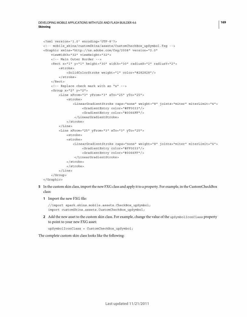
169DEVELOPING MOBILE APPLICATIONS WITH FLEX AND FLASH BUILDER 4.6
Skinning
Last updated 11/21/2011
<?xml version='1.0' encoding='UTF-8'?> <!-- mobile_skins/customSkins/assets/CustomCheckBox_upSymbol.fxg --> <Graphic xmlns="http://ns.adobe.com/fxg/2008" version="2.0" viewWidth="32" viewHeight="32"> <!-- Main Outer Border --> <Rect x="1" y="1" height="30" width="30" radiusX="2" radiusY="2"> <stroke> <SolidColorStroke weight="1" color="#282828"/> </stroke> </Rect> <!-- Replace check mark with an "x" --> <Group x="2" y="2"> <Line xFrom="3" yFrom="3" xTo="25" yTo="25"> <stroke> <LinearGradientStroke caps="none" weight="8" joints="miter" miterLimit="4"> <GradientEntry color="#FF0033"/> <GradientEntry color="#0066FF"/> </LinearGradientStroke> </stroke> </Line> <Line xFrom="25" yFrom="3" xTo="3" yTo="25"> <stroke> <stroke> <LinearGradientStroke caps="none" weight="8" joints="miter" miterLimit="4"> <GradientEntry color="#FF0033"/> <GradientEntry color="#0066FF"/> </LinearGradientStroke> </stroke> </stroke> </Line> </Group> </Graphic>
5 In the custom skin class, import the new FXG class and apply it to a property. For example, in the CustomCheckBox
class:
1 Import the new FXG file:
//import spark.skins.mobile.assets.CheckBox_upSymbol; import customSkins.assets.CustomCheckBox_upSymbol;
2 Add the new asset to the custom skin class. For example, change the value of the upSymbolIconClass property
to point to your new FXG asset:
upSymbolIconClass = CustomCheckBox_upSymbol;
The complete custom skin class looks like the following:
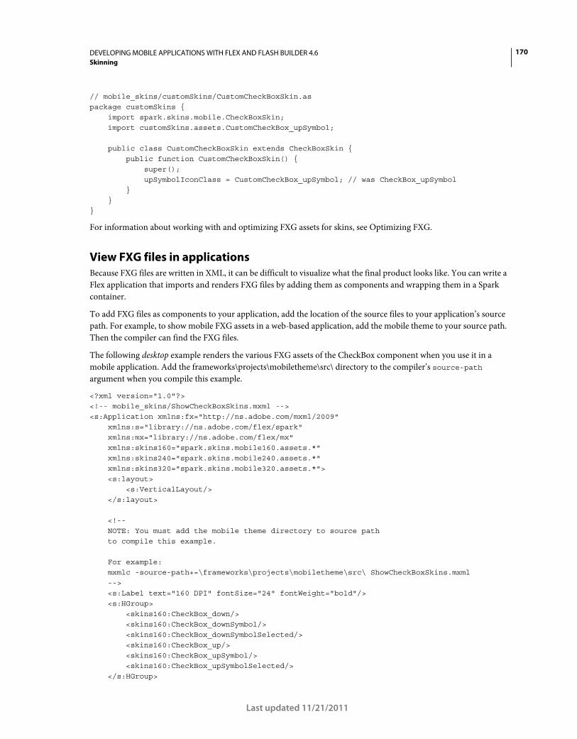
170DEVELOPING MOBILE APPLICATIONS WITH FLEX AND FLASH BUILDER 4.6
Skinning
Last updated 11/21/2011
// mobile_skins/customSkins/CustomCheckBoxSkin.as package customSkins { import spark.skins.mobile.CheckBoxSkin; import customSkins.assets.CustomCheckBox_upSymbol; public class CustomCheckBoxSkin extends CheckBoxSkin { public function CustomCheckBoxSkin() { super(); upSymbolIconClass = CustomCheckBox_upSymbol; // was CheckBox_upSymbol } } }
For information about working with and optimizing FXG assets for skins, see Optimizing FXG.
View FXG files in applications
Because FXG files are written in XML, it can be difficult to visualize what the final product looks like. You can write a
Flex application that imports and renders FXG files by adding them as components and wrapping them in a Spark
container.
To add FXG files as components to your application, add the location of the source files to your application’s source
path. For example, to show mobile FXG assets in a web-based application, add the mobile theme to your source path.
Then the compiler can find the FXG files.
The following desktop example renders the various FXG assets of the CheckBox component when you use it in a
mobile application. Add the frameworks\projects\mobiletheme\src\ directory to the compiler’s source-path
argument when you compile this example.
<?xml version="1.0"?> <!-- mobile_skins/ShowCheckBoxSkins.mxml --> <s:Application xmlns:fx="http://ns.adobe.com/mxml/2009" xmlns:s="library://ns.adobe.com/flex/spark" xmlns:mx="library://ns.adobe.com/flex/mx" xmlns:skins160="spark.skins.mobile160.assets.*" xmlns:skins240="spark.skins.mobile240.assets.*" xmlns:skins320="spark.skins.mobile320.assets.*"> <s:layout> <s:VerticalLayout/> </s:layout> <!-- NOTE: You must add the mobile theme directory to source path to compile this example. For example: mxmlc -source-path+=\frameworks\projects\mobiletheme\src\ ShowCheckBoxSkins.mxml --> <s:Label text="160 DPI" fontSize="24" fontWeight="bold"/> <s:HGroup> <skins160:CheckBox_down/> <skins160:CheckBox_downSymbol/> <skins160:CheckBox_downSymbolSelected/> <skins160:CheckBox_up/> <skins160:CheckBox_upSymbol/> <skins160:CheckBox_upSymbolSelected/> </s:HGroup>
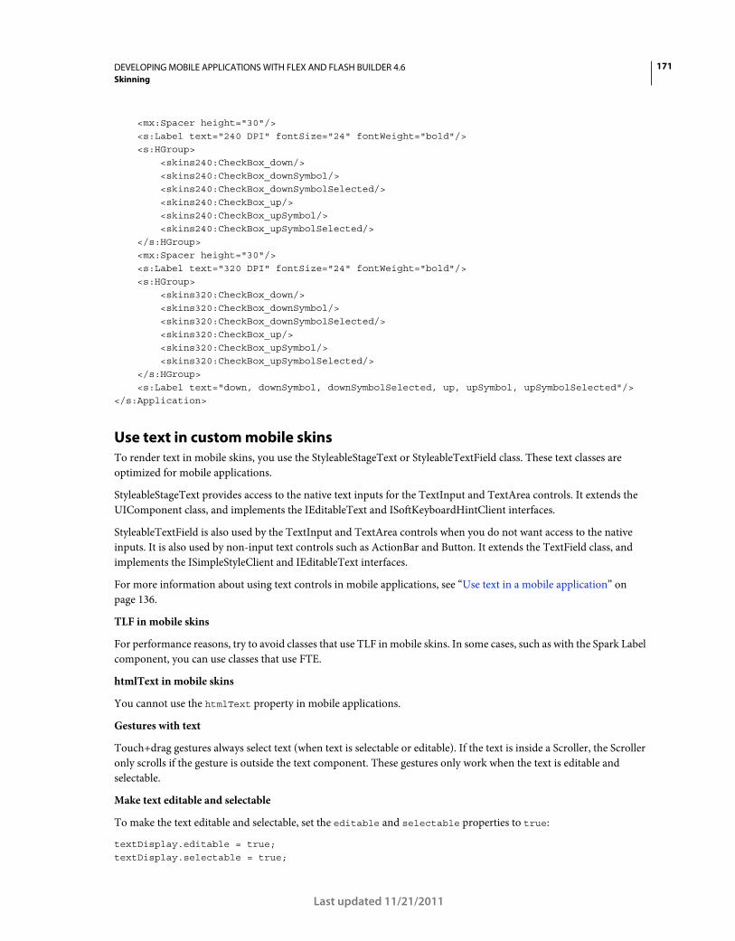
171DEVELOPING MOBILE APPLICATIONS WITH FLEX AND FLASH BUILDER 4.6
Skinning
Last updated 11/21/2011
<mx:Spacer height="30"/> <s:Label text="240 DPI" fontSize="24" fontWeight="bold"/> <s:HGroup> <skins240:CheckBox_down/> <skins240:CheckBox_downSymbol/> <skins240:CheckBox_downSymbolSelected/> <skins240:CheckBox_up/> <skins240:CheckBox_upSymbol/> <skins240:CheckBox_upSymbolSelected/> </s:HGroup> <mx:Spacer height="30"/> <s:Label text="320 DPI" fontSize="24" fontWeight="bold"/> <s:HGroup> <skins320:CheckBox_down/> <skins320:CheckBox_downSymbol/> <skins320:CheckBox_downSymbolSelected/> <skins320:CheckBox_up/> <skins320:CheckBox_upSymbol/> <skins320:CheckBox_upSymbolSelected/> </s:HGroup> <s:Label text="down, downSymbol, downSymbolSelected, up, upSymbol, upSymbolSelected"/> </s:Application>
Use text in custom mobile skins
To render text in mobile skins, you use the StyleableStageText or StyleableTextField class. These text classes are
optimized for mobile applications.
StyleableStageText provides access to the native text inputs for the TextInput and TextArea controls. It extends the
UIComponent class, and implements the IEditableText and ISoftKeyboardHintClient interfaces.
StyleableTextField is also used by the TextInput and TextArea controls when you do not want access to the native
inputs. It is also used by non-input text controls such as ActionBar and Button. It extends the TextField class, and
implements the ISimpleStyleClient and IEditableText interfaces.
For more information about using text controls in mobile applications, see “Use text in a mobile application” on
page 136.
TLF in mobile skins
For performance reasons, try to avoid classes that use TLF in mobile skins. In some cases, such as with the Spark Label
component, you can use classes that use FTE.
htmlText in mobile skins
You cannot use the htmlText property in mobile applications.
Gestures with text
Touch+drag gestures always select text (when text is selectable or editable). If the text is inside a Scroller, the Scroller
only scrolls if the gesture is outside the text component. These gestures only work when the text is editable and
selectable.
Make text editable and selectable
To make the text editable and selectable, set the editable and selectable properties to true:
textDisplay.editable = true; textDisplay.selectable = true;
172DEVELOPING MOBILE APPLICATIONS WITH FLEX AND FLASH BUILDER 4.6
Skinning
Last updated 11/21/2011
Bi-directionality
Bi-directionality is not supported for text in the StyleableStageText or StyleableTextField class.
Apply a custom mobile skin
You can apply a custom skin to your mobile component in the same way that you apply a custom skin to a component
in a desktop application.
Apply a skin in ActionScript
// Call the setStyle() method: myButton.setStyle("skinClass", "MyButtonSkin");
Apply a skin in MXML
<!-- Set the skinClass property: --> <s:Button skinClass="MyButtonSkin"/>
Apply a skin in CSS
// Use type selectors for mobile skins, but only in the root document: s|Button {
skinClass: ClassReference("MyButtonSkin"); }
or
// Use class selectors for mobile skins in any document: .myStyleClass {
skinClass: ClassReference("MyButtonSkin"); }
Example of applying a custom mobile skin
The following example shows all three methods of applying a custom mobile skin to mobile components:
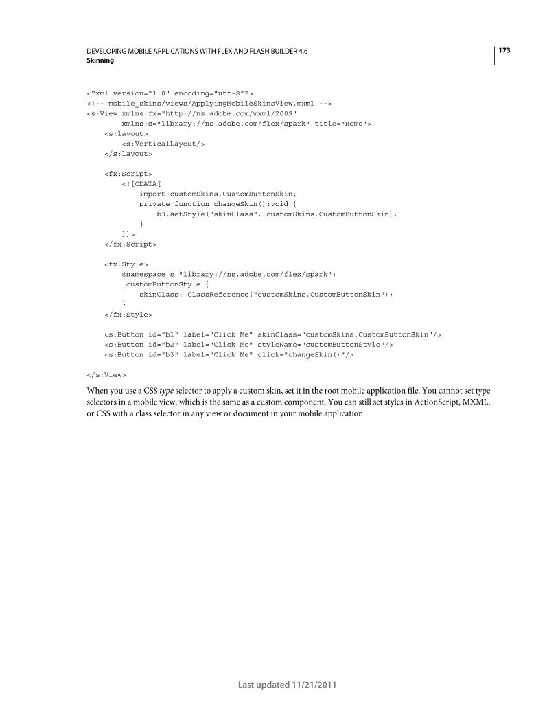
173DEVELOPING MOBILE APPLICATIONS WITH FLEX AND FLASH BUILDER 4.6
Skinning
Last updated 11/21/2011
<?xml version="1.0" encoding="utf-8"?> <!-- mobile_skins/views/ApplyingMobileSkinsView.mxml --> <s:View xmlns:fx="http://ns.adobe.com/mxml/2009" xmlns:s="library://ns.adobe.com/flex/spark" title="Home"> <s:layout> <s:VerticalLayout/> </s:layout> <fx:Script> <![CDATA[ import customSkins.CustomButtonSkin; private function changeSkin():void { b3.setStyle("skinClass", customSkins.CustomButtonSkin); } ]]> </fx:Script> <fx:Style> @namespace s "library://ns.adobe.com/flex/spark"; .customButtonStyle { skinClass: ClassReference("customSkins.CustomButtonSkin"); } </fx:Style> <s:Button id="b1" label="Click Me" skinClass="customSkins.CustomButtonSkin"/> <s:Button id="b2" label="Click Me" styleName="customButtonStyle"/> <s:Button id="b3" label="Click Me" click="changeSkin()"/> </s:View>
When you use a CSS type selector to apply a custom skin, set it in the root mobile application file. You cannot set type
selectors in a mobile view, which is the same as a custom component. You can still set styles in ActionScript, MXML,
or CSS with a class selector in any view or document in your mobile application.
174
Last updated 11/21/2011
Chapter 7: Test and debug
Manage launch configurations
Flash Builder uses launch configurations when you run or debug mobile applications. You can specify whether to
launch the application on the desktop or on a device connected to your computer.
To create a launch configuration, follow these steps:
1 Select Run > Run Configurations to open the Run Configurations dialog.
To open the Debug Configurations dialog, select Run > Debug Configurations. See “Test and debug a mobile
application on a device” on page 175.
You can also access the Run or Debug Configurations in the drop-down list of the Run button or the Debug button
in the Flash Builder toolbar.
2 Expand the Mobile Application node. Click the New Launch Configuration button in the dialog toolbar.
3 Specify a target platform in the drop-down list.
4 Specify a launch method:
• On Desktop
Runs or debugs the application on your desktop using the AIR Debug Launcher (ADL), according to a device
configuration that you have specified. This launch method is not a true emulation of the application running on
a device. However, it does let you view the application layout and interact with the application. See “Preview
applications with ADL” on page 175.
Click Configure to edit device configurations. See “Configure device information for desktop preview” on
page 175.
• On Device
Installs and runs the application on the device.
For the Google Android platform, Flash Builder installs the application on your device and launches the
application. Flash Builder accesses the device connected to your computer’s USB port. See “Test and debug a
mobile application on a device” on page 175 for more information.
Windows requires a USB driver to connect an Android device to your computer. For more information, see
“Install USB device drivers for Android devices (Windows)” on page 17.
5 Specify whether to clear application data on each launch, if applicable.
Test and debug a mobile application on the desktop
For initial testing or debugging, or if you don’t have a mobile device, Flash Builder lets you test and debug applications
on the desktop using the AIR Debug Launcher (ADL).
Before you test or debug a mobile application for the first time, you define a launch configuration. Specify the target
platform and On Desktop as the launch method. See “Manage launch configurations” on page 174.
175DEVELOPING MOBILE APPLICATIONS WITH FLEX AND FLASH BUILDER 4.6
Test and debug
Last updated 11/21/2011
Configure device information for desktop preview
The properties of a device configuration determine how the application appears in the ADL and in Flash Builder
Design mode.
“Set device configurations” on page 13 lists the supported configurations. Device configurations do not affect the
application’s appearance on the device.
Screen density
You can preview your application on your development desktop or view the layout of the application in Flash Builder
Design mode. Flash Builder uses a screen density of 240 DPI. An application’s appearance during preview sometimes
differs from its appearance on a device that supports a different pixel density.
Preview applications with ADL
When you preview applications on the desktop, Flash Builder launches the application using the ADL. The ADL
provides a Device menu with corresponding shortcuts to emulate buttons on the device.
For example, to emulate the back button on a device, select Device > Back. Select Device > Rotate Left or Device >
Rotate Right to emulate rotating the device. Rotate options are disabled if you have not selected auto orientation.
Drag in a list to emulate scrolling the list on a device.
Adobe Certified Expert in Flex, Brent Arnold, created a video tutorial on using ADL to preview a mobile
application on the desktop.
Test and debug a mobile application on a device
You can use Flash Builder to test or debug a mobile application from your development desktop or from a device.
You test and debug applications based on a launch configuration that you define. Flash Builder shares the launch
configuration between running and debugging the application. When you use Flash Builder to debug an application
on a device, Flash Builder installs a debug version of the application on the device.
Note: If you export a release build to a device, you install a non-debug version of the application. The non-debug version
is not suitable for debugging.
For more information, see Manage launch configurations.
Debug an application on a Google Android device
On an Android device, debugging requires Android 2.2 or later.
You can debug in either of the following scenarios:
Debug over USB To debug an application over a USB connection, you connect the device to the host machine via a
USB port. When you debug over USB, Flash Builder always packages the application, then installs and launches it on
the device before the debugging starts. Ensure that your device is connected to the host machine’s USB port during the
entire debugging session.
Debug over a network When you debug an application over the network, the device and the host machine must be on
the same network. The device and the host machine can be connected to the network via Wi-Fi, ethernet, or Bluetooth.
176DEVELOPING MOBILE APPLICATIONS WITH FLEX AND FLASH BUILDER 4.6
Test and debug
Last updated 11/21/2011
When you debug over a network, Flash Builder lets you debug an application that is already installed on a connected
device without reinstalling the application. Connect the device to the host machine via a USB port only during
packaging and while installing the application on the device. You can unplug the device from the USB port during
debugging. However, ensure that there is a network connection between the device and the host machine during the
entire debugging session.
Prepare to debug the application
Before you begin debugging over USB or over a network, follow these steps:
1 (Windows) Ensure that the proper USB driver is installed.
On Windows, install the Android USB driver. See the documentation accompanying the Android SDK build for
more information. For more information, see “Install USB device drivers for Android devices (Windows)” on
page 17.
2 Ensure that USB debugging is enabled on your device.
In device Settings, go to Applications > Development, and enable USB debugging.
Check for connected devices
When you run or debug a mobile application on a device, Flash Builder checks for connected devices. If Flash Builder
finds a single connected device online, Flash Builder deploys and launches the application. Otherwise, Flash Builder
launches the Choose Device dialog for these scenarios:
• No connected device found
• Single connected device found that is offline or its OS version is not supported
• Multiple connected devices found
If multiple devices are found, the Choose Device dialog lists the devices and their state (online or offline). Select the
device to launch.
The Choose Device dialog lists the OS version and the AIR version. If Adobe AIR is not installed on the device, Flash
Builder installs it automatically.
Configure network debugging
Follow these steps only if you debug an application over a network.
Prepare to debug over the network
Before you debug an application over the network, follow these steps:
1 On Windows, open port 7935 (Flash Player debugger port) and port 7 (echo/ping port).
For detailed instructions, see this Microsoft TechNet article.
On Windows Vista, deselect the Wireless Network Connection in Windows Firewall > Change Settings >
Advanced.
2 On your device, configure wireless settings in Settings > Wireless and Network.
177DEVELOPING MOBILE APPLICATIONS WITH FLEX AND FLASH BUILDER 4.6
Test and debug
Last updated 11/21/2011
Select a primary network interface
Your host machine can be connected to multiple network interfaces simultaneously. However, you can select a
primary network interface to use for debugging. You select this interface by adding a host address in the Android APK
package file.
1 In Flash Builder, open Preferences.
2 Select Flash Builder > Target Platforms.
The dialog lists all the network interfaces available on the host machine.
3 Select the network interface that you want to embed in the Android APK package.
Ensure that the selected network interface is accessible from the device. If the device cannot access the selected network
interface while it establishes a connection, Flash Builder displays a dialog requesting the IP address of the host
machine.
Debug the application
1 Connect the device over a USB port or over a network connection.
2 Select Run > Debug Configurations to configure a launch configuration for debugging.
• For the Launch Method, select On Device.
• Select Debug via USB or Debug via Network.
The first time that you debug the application over a network, you can install the application on the device over
USB. To do so, select Install The Application On The Device Over USB, and connect the device to the host
machine via a USB port.
Once the application is installed, if you don’t want to connect over USB for subsequent debugging sessions,
deselect Install The Application On The Device Over USB.
• (Optional) Clear application data on each launch.
Select this option if you want to keep the state of the application for each debugging session. This option applies
only if sessionCachingEnabled is set to True in your application.
3 Select Debug to begin a debugging session.
The debugger launches and waits for the application to start. The debugging session starts when the debugger
establishes a connection with the device.
When you try to debug on a device over a network, the application sometimes displays a dialog requesting an IP
address. This dialog indicates that the debugger could not connect. Ensure that the device is properly connected to
the network, and that the computer running Flash Builder is accessible from that network.
Note: On a corporate, hotel, or other guest network, sometimes the device cannot connect to the computer, even if the
two are on the same network.
If you are debugging via network, and the application was previously installed on the device, start debugging by
typing the IP address of the host machine.
Adobe Certified Expert in Flex, Brent Arnold, created a video tutorial about debugging an application over USB
for an Android device.
More Help topics
Debug and Package Apps for Devices (video)
178DEVELOPING MOBILE APPLICATIONS WITH FLEX AND FLASH BUILDER 4.6
Test and debug
Last updated 11/21/2011
Debug an application on an Apple iOS device
To debug an application on an Apple iOS device, deploy and install your debug iOS package (IPA file) on the iOS
device manually. Auto-deployment is not supported for the Apple iOS platform.
Important: Before you debug an application on an iOS device, ensure that you follow the steps described in “Prepare to
build, debug, or deploy an iOS application” on page 19.
1 Connect the Apple iOS device to your development computer.
2 Launch iTunes on your iOS device.
Note: You need iTunes to install your application on your iOS device and to obtain the device ID of your iOS device.
3 In Flash Builder, select Run > Debug Configurations.
4 In the Debug Configurations dialog, follow these steps:
a Select the application that you want to debug.
b Select the target platform as Apple iOS.
c Select the launch method as On Device.
d Select one of the following packaging methods:
Standard Use this method to package a release-quality version of your application that can run on Apple iOS
devices. The application performance with this method is similar to the performance of the final release package
and can be submitted to the Apple App Store.
However, this method of creating a debug iOS (IPA) file takes several minutes.
Fast Use this method to create an IPA file quickly, and then run and debug the file on the device. This method
is suitable for application testing purposes. The application performance with this method is not release quality,
and it is not suitable for submission to the Apple App Store.
e Click Configure to select the appropriate code signing certificate, provisioning file, and package contents.
f Click Configure Network Debugging to select the network interface that you want to add in the debug iOS
package.
Note: Your host machine can be connected to multiple network interfaces simultaneously. However, you can select
a primary network interface to use for debugging.
g Click Debug. Flash Builder displays a dialog requesting for a password. Enter your P12 certificate password.
Flash Builder generates the debug IPA file and places it in the bin-debug folder.
5 On your iOS device, follow these steps:
1 (Optional) In iTunes, select File > Add To Library, and browse to the mobile provisioning profile file
(.mobileprovision filename extension) that you obtained from Apple.
2 In iTunes, select File > Add To Library, and browse to the debug IPA file that you generated in step 4.
3 Sync your iOS device with iTunes by selecting File > Sync.
4 Flash Builder attempts connection to the host address specified in the debug IPA file. If the application cannot
connect to the host address, Flash Builder displays a dialog requesting the IP address of the host machine.
Note: If you have not changed your code or assets since the last debug IPA package was generated, Flash Builder skips
the packaging and debugs the application. That is, you can launch the installed application on your device and click
Debug to connect to the Flash Builder debugger. This way, you can debug repeatedly without packaging the
application every time.
179
Last updated 11/21/2011
Chapter 8: Install on devices
Install an application on a Google Android device
During the development, testing, and deployment phases of your project, you can install your application directly on
a device.
You can use Flash Builder to install an application directly on an Android device. When you install a package on a
device on which Adobe AIR is not installed, Flash Builder installs AIR automatically.
1 Connect the Google Android device to your development computer.
Flash Builder accesses the device connected to your computer’s USB port. Ensure that you have configured the
necessary USB device drivers. See “Connect Google Android devices” on page 16
2 In Flash Builder, select Run > Run Configurations. In the Run Configurations dialog box, select the mobile
application that you want to deploy.
3 Select the launch configuration method as On Device.
4 (Optional) Specify whether to clear application data on each launch.
5 Click Apply.
Flash Builder installs and launches the application on your Android device. If you installed the package on a device on
which Adobe AIR is not installed, Flash Builder installs AIR automatically.
Adobe Certified Expert in Flex, Brent Arnold, created a video tutorial on setting up and running your application
on an Android device.
Install an application on an Apple iOS device
On an iOS device, you install an application (IPA file) manually, because the Apple iOS platform does not support
auto-deployment.
Important: Before you install an application on an iOS device, you need the Apple iOS development certificate (in P12
format) and a development-version of the provisioning profile. Ensure that you follow the steps described in “Prepare to
build, debug, or deploy an iOS application” on page 19.
1 Connect the Apple iOS device to your development computer.
2 Launch iTunes on your development computer.
Note: You need iTunes to install your application on your iOS device and to obtain the Unique Device Identifier
(UDID) of your iOS device.
3 In Flash Builder, select Run > Run Configurations.
4 In the Run Configurations dialog, follow these steps:
a Select the application that you want to install.
b Select the target platform as Apple iOS.
c Select the launch method as On Device.
180DEVELOPING MOBILE APPLICATIONS WITH FLEX AND FLASH BUILDER 4.6
Install on devices
Last updated 11/21/2011
d Select one of the following packaging methods:
Standard Use this method to package a release-quality version of your application that can run on Apple iOS
devices.
The Standard method of packaging translates the bytecode of the application's SWF file into ARM instructions
before packaging. Because of this additional translation step before packaging, this method of creating an
application (IPA) file takes several minutes. The Standard method takes longer than the Fast method. However,
the application performance with the Standard method is release-quality, and it is suitable for submission to the
Apple App Store.
Fast Use this method to create an IPA file quickly.
The Fast method of packaging bypasses the translation of bytecode and just bundles the application SWF file
and assets with the pre-compiled AIR runtime. The Fast method of packaging is quicker than the Standard
method. However, the application performance with the Fast method is not release-quality, and it is not suitable
for submission to the Apple App Store.
Note: There are no runtime or functional differences between the Standard and Fast methods of packaging.
e Click Configure to select the appropriate code signing certificate, provisioning file, and package contents.
f Click Run. Flash Builder displays a dialog requesting a password. Enter your P12 certificate password.
Flash Builder generates the IPA file and places it in the bin-debug folder.
5 On your development computer, follow these steps:
1 In iTunes, select File > Add To Library, and browse to the mobile provisioning profile file (.mobileprovision
filename extension) that you obtained from Apple.
You can also drag-and-drop the mobile provisioning profile file into iTunes.
2 In iTunes, select File > Add To Library, and browse to the IPA file that you generated in step 4.
You can also drag-and-drop the IPA file into iTunes.
3 Sync your iOS device with iTunes by selecting File > Sync.
The application is deployed on your iOS device and you can launch it.
181
Last updated 11/21/2011
Chapter 9: Package and export
Package and export a mobile application to an online store
Use Flash Builder’s Export Release Build feature to package and export the release build of a mobile application. A
release build is generally the final version of the application that you want to upload to an online store like, the Android
Market, Amazon Appstore, or Apple’s App store.
When exporting an application, you can choose to install the application on a device. If the device is connected to your
computer during export, Flash Builder installs the application on the device. You can also choose to export a platform-
specific application package for later installation on a device. The resulting package can be deployed and installed in
the same way as a native application.
For detailed information on exporting an Android application to the Android Market or Amazon App Store, see
“Export Android APK packages for release” on page 181.
For detailed information on exporting an iOS application to the Apple App store, see “Export Apple iOS packages for
release” on page 182.
Exporting the application with captive runtime
When you use the Export Release Build feature to export a mobile application, you can choose to embed the AIR
runtime within the application package.
Users can then run the application even on a device that does not already have AIR installed on it. Depending on the
platform to which you are exporting the package, you can use a captive runtime or a shared runtime.
Export Android APK packages for release
Before you export a mobile application, you can customize the Android permissions. Customize the settings manually
in the application descriptor file. These settings are in the <android> block of the bin-debug/app_name-app.xml file.
For more information, see Setting AIR application properties.
If you export the application for later installation on a device, install the application package using the tools provided
by the device’s OS provider.
1 In Flash Builder, select Project > Export Release Build.
2 Select the project and application that you want to export.
3 Select the target platforms and the location to export the project.
4 Export and sign a platform-specific application package.
You can package your application with a digital signature for each target platform or as a digitally signed AIR
application for the desktop.
You can also export the application as intermediate AIRI file that can be signed later. If you select that option, use
the AIR adt command line tool later to package the AIRI as an APK file. Then install the APK file on the device
using platform-specific tools (for example, with the Android SDK, use adb). For information on using command
line tools to package your application, see “Create, test, and deploy using the command line” on page 183.
182DEVELOPING MOBILE APPLICATIONS WITH FLEX AND FLASH BUILDER 4.6
Package and export
Last updated 11/21/2011
5 On the Packaging Settings page, you can select the digital certificate, package contents, and any native extensions.
Deployment If you also want to install the application on a device, click the Deployment page and select Install And
Launch Application On Any Connected Devices. Ensure that you have connected one or more devices to your
computer’s USB ports.
• Export application with captive runtime
Select this option if you want to embed the AIR runtime within the APK file while exporting the application
package. Users can then run the application even on a device that does not have AIR already installed on it.
• Export application that uses a shared runtime
Select this option if you do not want to embed the AIR runtime within the APK file while exporting the
application package. You can select or specify a URL to download Adobe AIR for the application package if AIR
is not already installed on a user’s device.
The default URL points to the Android Market. You can, however, override the default URL and select the URL
that points to a location on the Amazon Appstore, or enter your own URL.
Digital Signature Click the Digital Signature tab to create or browse to a digital certificate that represents the
application publisher’s identity. You can also specify a password for the selected certificate.
If you create a certificate, the certificate is self-signed. You can obtain a commercially signed certificate from a
certificate provider. See Digitally sign your AIR applications.
Package Contents (Optional) Click the Package Contents tab to specify which files to include in the package.
Native Extensions (Optional) Select the native extensions that you want to include in the application package.
For more information about native extensions, see “Use native extensions” on page 11.
6 Click Finish.
Flash Builder creates ApplicationName.apk in the directory specified in the first panel (the default is the top level
of your project). If the device was connected to your computer during export, Flash Builder installs the application
on the device.
Export Apple iOS packages for release
You can create and export an iOS package for ad hoc distribution or for submission to the Apple App Store.
Important: Before exporting an iOS package, ensure that you obtain the required certificates and a distribution
provisioning profile from Apple. To do so, follow the steps described in “Prepare to build, debug, or deploy an iOS
application” on page 19.
1 In Flash Builder, select Project > Export Release Build.
2 Select Apple iOS as the target platform to export and sign an IPA package.
Click Next.
3 Select the P12 certificate and the distribution provisioning profile that you obtained from Apple.
4 On the Packaging Settings page, you can select the provisioning certificate, digital certificate, package contents, and
any native extensions.
Deployment When you export an iOS package, the AIR runtime is embedded within the IPA file by default.
Digital Signature Select the P12 certificate and the distribution provisioning profile that you obtained from Apple.
183DEVELOPING MOBILE APPLICATIONS WITH FLEX AND FLASH BUILDER 4.6
Package and export
Last updated 11/21/2011
You can select one of the following package types:
• Ad Hoc Distribution For Limited Distribution For a limited distribution of the application
• Final Release Package For Apple App Store To submit the application to the Apple App Store
Package Contents (Optional) Click the Package Contents tab to specify which files to include in the package.
Native Extensions (Optional) Select the native extensions that you want to include in the application package.
If the native extension uses iOS5 SDK features, select the location of the iOS SDK. For more information, see
“Support for iOS5 native extensions” on page 13.
5 Click Finish.
Flash Builder validates the configuration of the package settings and then compiles the application. Once the
packaging is complete, you can install the IPA file on a connected Apple iOS device or submit to the Apple App
Store.
To package the IPA file using the AIR Developer Tool (ADT), see iOS packages in Building AIR Applications.
Create, test, and deploy using the command line
You can create a mobile application without Flash Builder. You use the mxmlc, adl, and adt command line tools
instead.
Here is the general process for developing and installing a mobile application on a device using command line tools.
Each of these steps is described in more detail later:
1 Compile the application with the mxmlc tool.
mxmlc +configname=airmobile MyMobileApp.mxml
This step requires that you pass the configname parameter set to “airmobile”.
2 Test the application in AIR Debug Launcher (ADL) with the adl tool.
adl MyMobileApp-app.xml -profile mobileDevice
This step requires that you create an application descriptor file and pass it as an argument to the adl tool. You also
specify the mobileDevice profile.
3 Package the application using the adt tool.
adt -package -target apk SIGN_OPTIONS MyMobileApp.apk MyMobileApp-app.xml MyMobileApp.swf
This step requires that you first create a certificate.
4 Install the application on your mobile device. To install your application on an Android device, you use the adb tool.
adb install -r MyMobileApp.apk
This step requires that you first connect your mobile device to your computer via USB.
5 Deploy the mobile application to online stores.
Compile a mobile application with mxmlc
You can compile mobile applications with the mxmlc command-line compiler. To use mxmlc, pass the configname
parameter the value airmobile; for example:
mxmlc +configname=airmobile MyMobileApp.mxml
184DEVELOPING MOBILE APPLICATIONS WITH FLEX AND FLASH BUILDER 4.6
Package and export
Last updated 11/21/2011
By passing +configname=airmobile, you instruct the compiler to use the airmobile-config.xml file. This file is in the
sdk/frameworks directory. This file performs the following tasks:
• Applies the mobile.swc theme.
• Makes the following library path changes:
• Removes libs/air from the library path. Mobile applications do not support the Window and
WindowedApplication classes.
• Removes libs/mx from the library path. Mobile applications do not support MX components (other than
charts).
• Adds libs/mobile to the library path.
• Removes the ns.adobe.com/flex/mx and www.adobe.com/2006/mxml namespaces. Mobile applications do not
support MX components (other than charts).
• Disables accessibility.
• Removes RSL entries; mobile applications do not support RSLs.
The mxmlc compiler generates a SWF file.
Test a mobile application with adl
You can use AIR Debug Launcher (ADL) to test a mobile application. You use ADL to run and test an application
without having to first package and install it on a device.
Debug with the adl tool
ADL prints trace statements and runtime errors to the standard output, but does not support breakpoints or other
debugging features. You can use an integrated development environment such as Flash Builder for complex debugging
issues.
Launch the adl tool
To launch the adl tool from the command line, pass your mobile application’s application descriptor file and set the
profile parameter to mobileDevice, as the following example shows:
adl MyMobileApp-app.xml -profile mobileDevice
The mobileDevice profile defines a set of capabilities for applications that are installed on mobile devices. For specific
information about the mobileDevice profile, see Capabilities of different profiles.
Create an application descriptor
If you did not use Flash Builder to compile your application, you create the application descriptor file manually. You
can use the /sdk/samples/descriptor-sample.xml file as a base. In general, at a minimum, make the following changes:
• Point the <initialWindow><content> element to the name of your mobile application’s SWF file:
<initialWindow> <content>MyMobileApp.swf</content>
... </initialWindow>
• Change the title of the application, because that is how it appears under the application’s icon on your mobile
device. To change the title, edit the <name><text> element:
<name> <text xml:lang="en">MyMobileApp by Nick Danger</text>
</name>
185DEVELOPING MOBILE APPLICATIONS WITH FLEX AND FLASH BUILDER 4.6
Package and export
Last updated 11/21/2011
• Add an <android> block to set Android-specific permissions for the application. Depending on what services your
device uses, you can often use the following permission:
<application> ... <android>
<manifestAdditions> <![CDATA[<manifest>
<uses-permission android:name="android.permission.INTERNET"/> </manifest>]]>
</manifestAdditions> </android>
</application>
You can also use the descriptor file to set the height and width of the application, the location of icon files, versioning
information, and other details about the installation location.
For more information about creating and editing application descriptor files, see AIR application descriptor files.
Package a mobile application with adt
You use AIR Developer Tool (ADT) to package mobile applications on the command line. The adt tool can create an
APK file that you can deploy to a mobile Android device.
Create a certificate
Before you can create an APK file, create a certificate. For development purposes, you can use a self-signed certificate.
You can create a self-signed certificate with the adt tool, as the following example shows:
adt -certificate -cn SelfSign -ou QE -o "Example" -c US 2048-RSA newcert.p12 password
The adt tool creates the newcert.p12 file in the current directory. You pass this certificate to adt when you package your
application. Do not use self-signed certificates for production applications. They only provide limited assurance to
users. For information on signing your AIR installation files with a certificate issued by a recognized certification
authority, see Signing AIR applications.
Create the package file
To create the APK file for Android, pass the details about the application to the adt tool, including the certificate, as
the following example shows:
adt -package -target apk -storetype pkcs12 -keystore newcert.p12 -keypass password MyMobileApp.apk MyMobileApp-app.xml MyMobileApp.swf
The output of the adt tool is an appname.apk file.
Package for iOS
To package mobile applications for iOS, you must get a developer certificate from Apple, as well as a provisioning file.
This requires that you join Apple’s developer program. For more information, see “Prepare to build, debug, or deploy
an iOS application” on page 19.
Flex evangelist Piotr Walczyszyn explains how to package the application with ADT using Ant for iOS devices.
Blogger Valentin Simonov provides additional information about how to publish your application on iOS.
186DEVELOPING MOBILE APPLICATIONS WITH FLEX AND FLASH BUILDER 4.6
Package and export
Last updated 11/21/2011
Install a mobile application on a device with adb
You use Android Debug Bridge (adb) to install the application (APK file) on a mobile device running Android. The
adb tool is part of the Android SDK.
Connect the device to a computer
Before you can run adb to install the APK file on your mobile device, connect the device to your computer. On
Windows and Linux systems, connecting a device requires the USB drivers.
For information on installing USB drivers for your device, see Using Hardware Devices.
Install the application on a connected device
After you connect the device to your computer, you can install the application to the device. To install the application
with the adb tool, use the install option and pass the name of your APK file, as the following example shows:
adb install -r MyMobileApp.apk
Use the -r option to overwrite the application if you have previously installed it. Otherwise, you must uninstall the
application each time you want to install a newer version to the mobile device.
More Help topics
Android Debug Bridge
Deploy the application to online stores
You can deploy your application to online app stores like, the Android Market, Amazon Appstore, or Apple’s App
store.
Lee Brimlow shows how to deploy a new AIR for Android application to the Android Market.
Christian Cantrell explains how to deploy the application to the Amazon Appstore for Android.