Embed Size (px)
Citation preview
Name ____________________________
HONORS ACTIVITY #2
EXPONENTIAL GROWTH & DEVELOPING A MODEL
SECTION I: A SIMPLE MODEL FOR POPULATION GROWTH
Goal: This activity introduces the concept of a model using the example of a simple population growth
process. It also explores the nature of exponential growth and the implications of this kind of growth
for global population issues.
After completing this activity, you should:
understand the concept, causes, and implications of exponential growth
be able to interpret the meaning of a data relationship plotted on arithmetic and semi-log graphs
PART I-A: WHAT IS EXPONENTIAL GROWTH?
Human populations grow exponentially. What exactly do we mean by this? Why does it happen? How
can exponential growth be depicted in a figure or graph? Finally, what are the implications of exponential
growth? And why should we be concerned about it? The following exercise will allow you to discover the
answers to these questions.
***************************
First, let's think about what it means for something to grow. "To grow" is to increase in size by
assimilating material into a living organism or by adding or accreting more material to the original mass of some
entity (e.g., world population). Growth takes place in time, so we can describe the amount of growth that takes
place as a growth rate, or an increment of growth which takes place during a specified period of time. Growth
over time can be depicted graphically by plotting the magnitude or size of whatever is growing against time on
two axes of a graph.
When we try to think about the size of the world's population (about 5.7 billion in mid-1995) and then
try to imagine it growing even larger, it is hard for us to grasp such huge numbers. So let's start examining the
concept of growth with something very familiar. Instead of looking at the growth in size of an entity composed
of many organisms (like world population) we'll look at the growth of a single organism -- your own body's
height and how your height has grown over time.
Graphing Growth -- an Introduction
In this activity you will construct a rough graph of your own growth (change in height) -- and expected
growth -- from the day you were born (age 0) to your projected height at age 40. To do this you'll need to make
some rough (but reasonable) guesses of about how tall you were (or will be) at different points in time: as a
newborn, at 6 months, 1 year, 2 years, 5 years, 10 years, and so on.
[Fill in this table with your height estimates, then plot the data in the table on the graph below
and smoothly connect each data point with a line.]
Age (years) 0 6 mo 1 2 5 10 15 20 25 30 35 40
Height (inches)
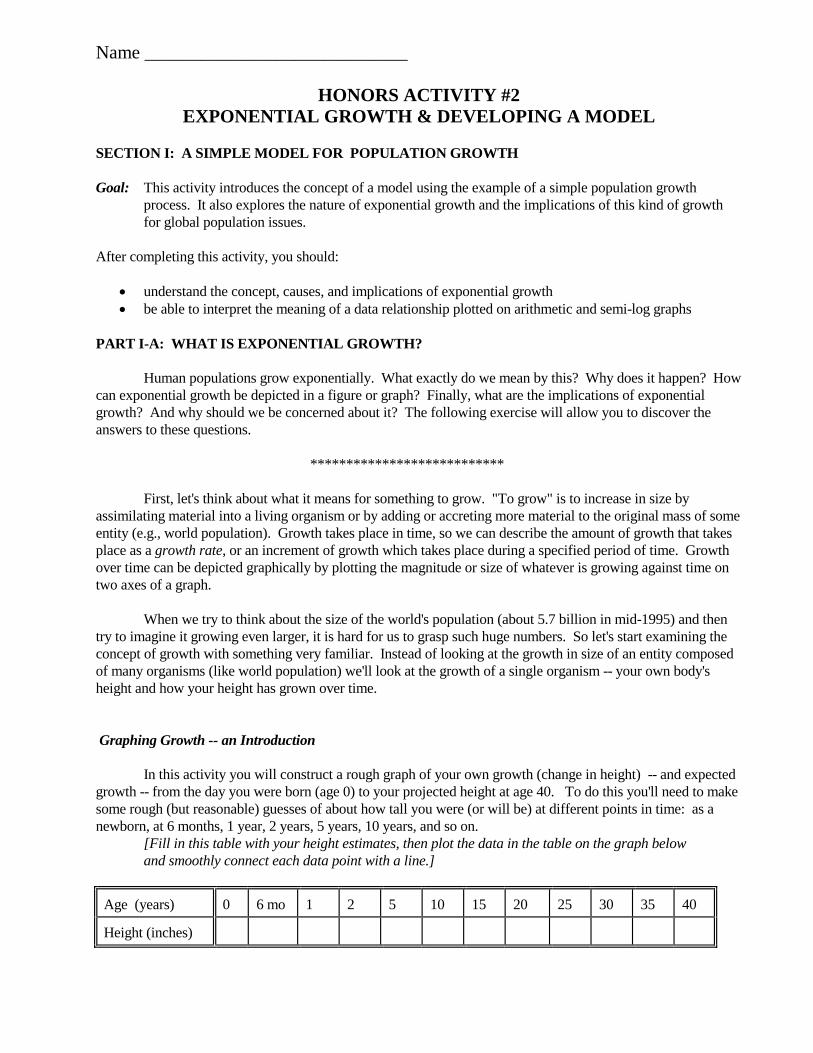
Graph for plotting height / age data from table on previous page:
1. Is it possible to draw a single straight line through all 12 of the data points?_________
2. Some portions of the line you have drawn are more vertical and some more horizontal. What do these
portions of the graph reveal about your rate of growth at these points in time?
The graph you have just constructed illustrates a growth process that is characterized by varying growth rates at
different points in time. Your height increased in spurts during some periods of time, increased more gradually
during others, and leveled off in growth during some years. In fact, as you eventually enter into your golden
years, you might even find that your height begins to decrease a bit (or experience "negative" growth).
Answer the following:
3. Which segments of the graph represent the fastest growth rates?_______________________
4. Which represent the slowest growth rates?__________________________________
5. If you extend the graph into your future at age 80, what will the growth curve probably look like?
__________________________________________________________________
6. Propose some explanations for the varying shapes of the different segments of your height growth curve
over time.
2.
6.
Linear and Nonlinear Changes
7. If babies, children, teens, adults, and the elderly all grew at exactly the same rate for each increment of time
throughout a human life cycle (e.g., 2 inches every year), describe in words how the graph would differ from the
one you just drew and make a small sketch of what it would look like:
In humans, a constant growth rate of 2 inches per year is not realistic. However, if we assume such a rate we
can easily describe in words the relationship between age and height for a constant growth rate of 2 inches per
year:
In words: "Your height after a specified number of years (age) is equal to your initial 'newborn' height
(when age = 0), plus 2 inches for each additional year of growth."
In equation form: height in inches = initial height in inches + (age in yrs x 2 inches per yr)
In symbols: y = a + bx where y is height in inches
x is age in years
a is your initial height (in inches) as a newborn
b is the growth rate in inches/years, b = 2 in our example
8. You've demonstrated in your graph that people do not grow taller continuously over time at a constant
growth rate, hence our equation y = a + 2x is an unrealistic one. To illustrate how unrealistic it is, use it to
calculate your height (y) at age x = 60, if you were born having an initial height of a = 12 inches.
Your answer: _________ inches = _________ feet!!
We say that growth is linear when the change in magnitude each year is directly proportional to the
change in time, and we describe such a relationship between time and growth as a linear relationship. However,
as seen on the graph you produced, the actual growth of a baby to adulthood cannot be depicted with a perfectly
straight line or by a simple linear equation. Hence we call it a nonlinear relationship. The growth rate varies
over time, making it difficult to predict future growth either graphically or by using an equation.
The same cautions apply when trying to project future growth in world population. Determining the
causes for different growth rates of the world's population at different times in history is even more problematic
because of all of the variables that are involved. Later we will speculate on some possible causes of changing
rates of world population growth, but first we need to familiarize ourselves with how a population grows and
what a graph of population growth looks like.
Exponential Growth (Read pp 152 -156 in SGC-II Hobson (second half of the SGC textbook) on "Resources
Use and Exponential Growth")
Some things grow, not by adding the same amount of growth over each increment of time arithmetically, but by
adding an amount of growth that is based on a percentage of the entity's magnitude at each point in time. This is
called exponential growth and anything that grows by a percentage of its starting amount will grow
exponentially. Human populations, like savings accounts, grow exponentially. In 1995 world population was
growing at a rate of about 1.5% annually, with less developed countries growing at a rate of about 2.2% and
more developed countries growing at a rate of only 0.2% A two percent population growth per year doesn't
sound like much, but over a period of 250 years, a human population growing at that rate will multiply its
original size 141 times!
7.
We'll now use a very simple example with manageable quantities to illustrate and graph how a population
grows exponentially.
Exponential Growth of an Imaginary Population
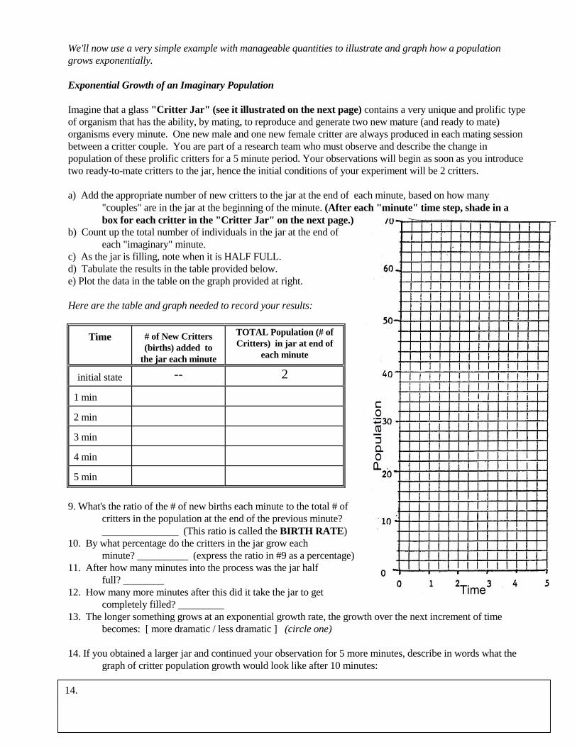
Imagine that a glass "Critter Jar" (see it illustrated on the next page) contains a very unique and prolific type
of organism that has the ability, by mating, to reproduce and generate two new mature (and ready to mate)
organisms every minute. One new male and one new female critter are always produced in each mating session
between a critter couple. You are part of a research team who must observe and describe the change in
population of these prolific critters for a 5 minute period. Your observations will begin as soon as you introduce
two ready-to-mate critters to the jar, hence the initial conditions of your experiment will be 2 critters.
a) Add the appropriate number of new critters to the jar at the end of each minute, based on how many
"couples" are in the jar at the beginning of the minute. (After each "minute" time step, shade in a
box for each critter in the "Critter Jar" on the next page.)
b) Count up the total number of individuals in the jar at the end of
each "imaginary" minute.
c) As the jar is filling, note when it is HALF FULL.
d) Tabulate the results in the table provided below.
e) Plot the data in the table on the graph provided at right.
Here are the table and graph needed to record your results:
Time # of New Critters
(births) added to
the jar each minute
TOTAL Population (# of
Critters) in jar at end of
each minute
initial state -- 2
1 min
2 min
3 min
4 min
5 min
9. What's the ratio of the # of new births each minute to the total # of
critters in the population at the end of the previous minute?
_______________ (This ratio is called the BIRTH RATE)
10. By what percentage do the critters in the jar grow each
minute? __________ (express the ratio in #9 as a percentage)
11. After how many minutes into the process was the jar half
full? ________
12. How many more minutes after this did it take the jar to get
completely filled? _________
13. The longer something grows at an exponential growth rate, the growth over the next increment of time
becomes: [ more dramatic / less dramatic ] (circle one)
14. If you obtained a larger jar and continued your observation for 5 more minutes, describe in words what the
graph of critter population growth would look like after 10 minutes:
14.
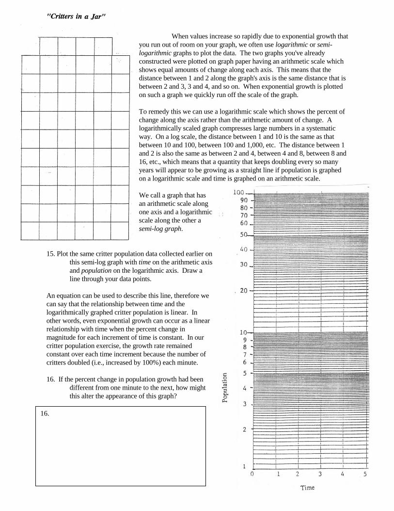
When values increase so rapidly due to exponential growth that
you run out of room on your graph, we often use logarithmic or semi-
logarithmic graphs to plot the data. The two graphs you've already
constructed were plotted on graph paper having an arithmetic scale which
shows equal amounts of change along each axis. This means that the
distance between 1 and 2 along the graph's axis is the same distance that is
between 2 and 3, 3 and 4, and so on. When exponential growth is plotted
on such a graph we quickly run off the scale of the graph.
To remedy this we can use a logarithmic scale which shows the percent of
change along the axis rather than the arithmetic amount of change. A
logarithmically scaled graph compresses large numbers in a systematic
way. On a log scale, the distance between 1 and 10 is the same as that
between 10 and 100, between 100 and 1,000, etc. The distance between 1
and 2 is also the same as between 2 and 4, between 4 and 8, between 8 and
16, etc., which means that a quantity that keeps doubling every so many
years will appear to be growing as a straight line if population is graphed
on a logarithmic scale and time is graphed on an arithmetic scale.
We call a graph that has
an arithmetic scale along
one axis and a logarithmic
scale along the other a
semi-log graph.
15. Plot the same critter population data collected earlier on
this semi-log graph with time on the arithmetic axis
and population on the logarithmic axis. Draw a
line through your data points.
An equation can be used to describe this line, therefore we
can say that the relationship between time and the
logarithmically graphed critter population is linear. In
other words, even exponential growth can occur as a linear
relationship with time when the percent change in
magnitude for each increment of time is constant. In our
critter population exercise, the growth rate remained
constant over each time increment because the number of
critters doubled (i.e., increased by 100%) each minute.
16. If the percent change in population growth had been
different from one minute to the next, how might
this alter the appearance of this graph?
16.
SECTION II: EXPLORING THE HOW AND WHY OF GLOBAL POPULATION CHANGE:
SIMPLE MODELS . . . COMPLEX REALITY
Goal: This activity introduces a simple analog model of population change using dynamic systems
modeling terminology and diagrams. It can be a launching point for discovery and exploration of
the complexity of variables, models, theories, and solutions that surround global population issues.
Learning Outcomes:
After completing this you should:
understand the concept of a model and be able to critique the usefulness and limitations of modeling
be able to construct and explain a simple conceptual model of population change using dynamic
systems modeling diagrams (i.e., "Stella" diagrams)
be familiar with the basic terminology and variables that describe population change
be cognizant of, and sensitive to, the complexity of variables involved in real-world population
change, and recognize the variables needed to construct more sophisticated models of population
PART II-A: MAKING A "SYSTEM DIAGRAM" OF POPULATION GROWTH
What is a Model?
The "Critters in a Jar" exercise you did in Section I was actually a type of modeling activity. What is a
model? The concept has many dictionary definitions, but the kind of model used in scientific studies is
typically one that is "a description or analogy to help visualize something that cannot be directly observed,"
or "a system of postulates, data, and inferences presented as a mathematical description of an entity or state
of affairs." The imaginary process of "reproducing critters" was represented with a jar sketched on paper,
shaded-in boxes to symbolize each critter, and a time period (a minute) to represent time steps of change in
the population growth process. Through this combination of symbols and steps you were able to construct
an analogy, or an analogue model, of a controlled exponential population growth process. Section I also
showed you that the critter's exponential growth could be represented graphically with a straight line on
logarithmic paper -- another way of modeling the process. An equation for that line is also a model because
it is a mathematical description of the exponential growth process. One advantage of modeling is that future
growth can be predicted by either extending the line or using the equation to compute new values along the
line. Another advantage of modeling is that it allows you to understand the system you are analyzing in an
entirely new way, i.e., by breaking it into its component parts and figuring out how these parts of the system
work together. It is here that exciting discoveries can be made. The real value of modeling is as an
investigative technique. In Global Change studies in particular, models are often used to test the effects of
changes in individual system components on the overall behavior of a dynamically changing system.
System -- A selected set of interacting components usually small enough that its behavior
can be understood or modeled. (after Few, 1991)
System model -- A set of assumptions or rules, data, and inferences that define all of the
interactions among the components of a system and the significant interactions between the
system and the "universe" outside the system. (after Few, 1991)
One other way of modeling a dynamic process -- such as population growth -- is to diagram the process or
system. To do this, various symbols are used to represent different elements or components of the system,
as well as the connections between these elements.
System diagram -- A diagram of a system that uses graphic symbols or icons to represent
system components in a depiction of how a system works. (after Few, 1991).
Thinking About the Components of the Model
To gain an understanding of the modeling process, we will start with the very simple example of the
"Critters in a Jar" and construct a model of that system using diagrams. In this activity you'll use a set of
diagramming symbols that were first developed by Jay Forrester at the Massachusetts Institute of
Technology.1
First, go back and review the directions for the Critters-in-a-Jar exercise and fill in the following
information which will allow you to pinpoint the main components and variables of the critter's population
growth system:
17. As you did the exercise, what two components of the system changed over time (i.e., what was
"added to the jar" each minute; what did you count up and graph at the end of each minute?)
__________________________ & ________________________
18. What was the time step of this change? (i.e. how often did you make an observation?) ___________
19. What assumption, or "rule" was used to determine how much change occurred at each time step?
20. What were the initial conditions of the jar? _______________
21. What was the critter birth rate? (birth rate = ) ___________ (see # 9)
22. Did the BIRTH RATE of the critters change from minute to minute? _________
23. Write an equation in words to describe how you figured out the number of new critters (critter
births) to add at the beginning of each new time step (e.g. "critter births = _______ * ________")
_____________________________________________________________________________
24. Write an equation in words to describe how you figured out the TOTAL number of critters (critter
population) in the jar at the end of each time step (e.g. "critter population = ________+ _______ ")
_____________________________________________________________________________
Expressing the Model Components in a SYSTEM DIAGRAM:
Thinking about the basic steps and parts of the critter exercise allows you to conceptualize it in model form.
The population (the number of critters in the jar at each point in time) is one main system component which
changed or varied over time. This population component can be viewed as a stock or reservoir that stores
or accumulates quantities of critters. We can symbolize the population stock in our exercise as a box
symbol which can store or accumulate critters:
POPULATION
1 These symbols have been modified and incorporated into a software program called STELLA
© (High
Performance Systems, Inc.) so that model diagrams can be transformed easily into working computer models.
See their website at: http://www.hps-inc.com/STELLAdemo.htm#
19.
The population of critters inside the jar changed over time. This part of the critter system can be viewed as
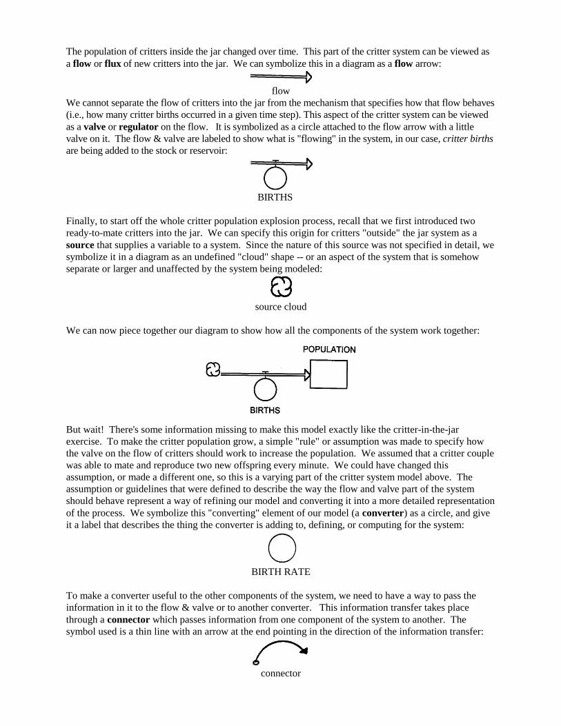
a flow or flux of new critters into the jar. We can symbolize this in a diagram as a flow arrow:
flow
We cannot separate the flow of critters into the jar from the mechanism that specifies how that flow behaves
(i.e., how many critter births occurred in a given time step). This aspect of the critter system can be viewed
as a valve or regulator on the flow. It is symbolized as a circle attached to the flow arrow with a little
valve on it. The flow & valve are labeled to show what is "flowing" in the system, in our case, critter births
are being added to the stock or reservoir:
BIRTHS
Finally, to start off the whole critter population explosion process, recall that we first introduced two
ready-to-mate critters into the jar. We can specify this origin for critters "outside" the jar system as a
source that supplies a variable to a system. Since the nature of this source was not specified in detail, we
symbolize it in a diagram as an undefined "cloud" shape -- or an aspect of the system that is somehow
separate or larger and unaffected by the system being modeled:
source cloud
We can now piece together our diagram to show how all the components of the system work together:
But wait! There's some information missing to make this model exactly like the critter-in-the-jar
exercise. To make the critter population grow, a simple "rule" or assumption was made to specify how
the valve on the flow of critters should work to increase the population. We assumed that a critter couple
was able to mate and reproduce two new offspring every minute. We could have changed this
assumption, or made a different one, so this is a varying part of the critter system model above. The
assumption or guidelines that were defined to describe the way the flow and valve part of the system
should behave represent a way of refining our model and converting it into a more detailed representation
of the process. We symbolize this "converting" element of our model (a converter) as a circle, and give
it a label that describes the thing the converter is adding to, defining, or computing for the system:
BIRTH RATE
To make a converter useful to the other components of the system, we need to have a way to pass the
information in it to the flow & valve or to another converter. This information transfer takes place
through a connector which passes information from one component of the system to another. The
symbol used is a thin line with an arrow at the end pointing in the direction of the information transfer:
connector
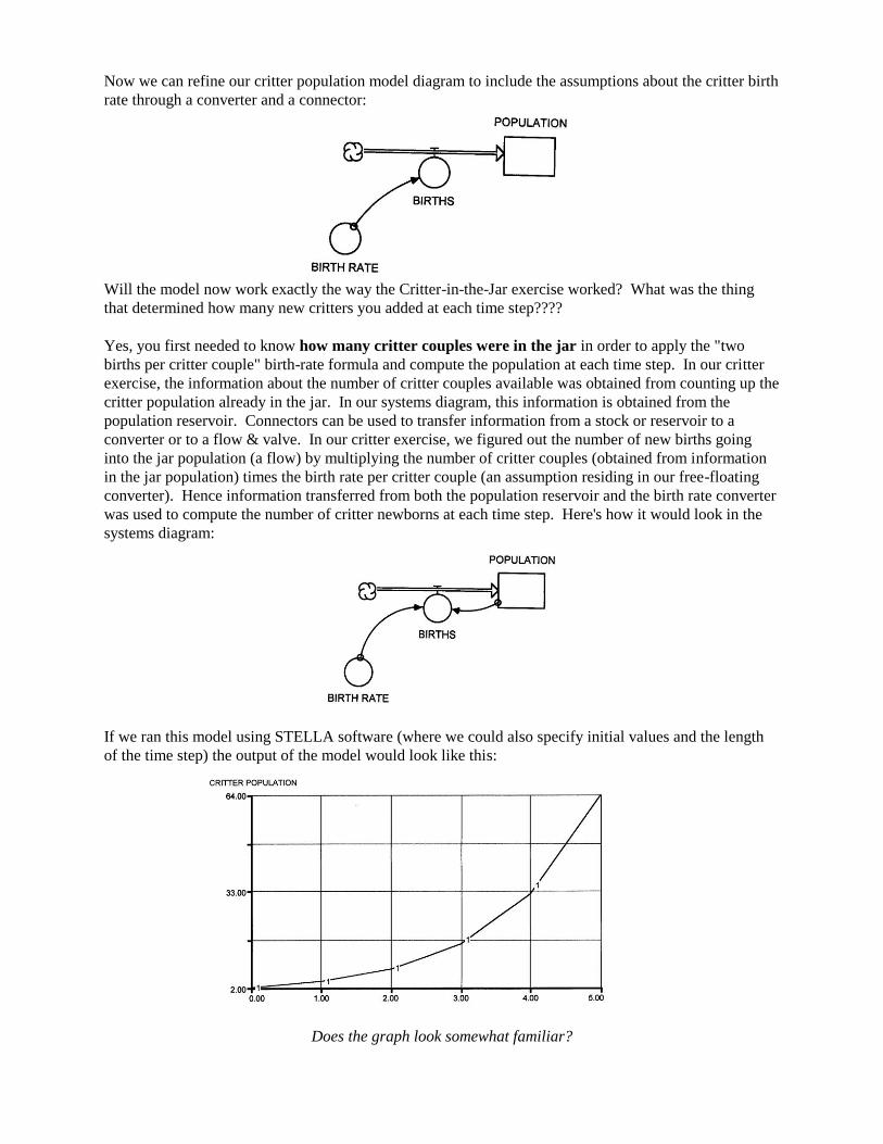
Now we can refine our critter population model diagram to include the assumptions about the critter birth
rate through a converter and a connector:
Will the model now work exactly the way the Critter-in-the-Jar exercise worked? What was the thing
that determined how many new critters you added at each time step????
Yes, you first needed to know how many critter couples were in the jar in order to apply the "two
births per critter couple" birth-rate formula and compute the population at each time step. In our critter
exercise, the information about the number of critter couples available was obtained from counting up the
critter population already in the jar. In our systems diagram, this information is obtained from the
population reservoir. Connectors can be used to transfer information from a stock or reservoir to a
converter or to a flow & valve. In our critter exercise, we figured out the number of new births going
into the jar population (a flow) by multiplying the number of critter couples (obtained from information
in the jar population) times the birth rate per critter couple (an assumption residing in our free-floating
converter). Hence information transferred from both the population reservoir and the birth rate converter
was used to compute the number of critter newborns at each time step. Here's how it would look in the
systems diagram:
If we ran this model using STELLA software (where we could also specify initial values and the length
of the time step) the output of the model would look like this:
Does the graph look somewhat familiar?
Critiquing the Simple Model
As with the critters-in-the-jar analogue, there are some major problems with so simple a model. As you
noted in Section I, probably the most severe critique of the model is that -- unlike the real world -- none
of the critters die!
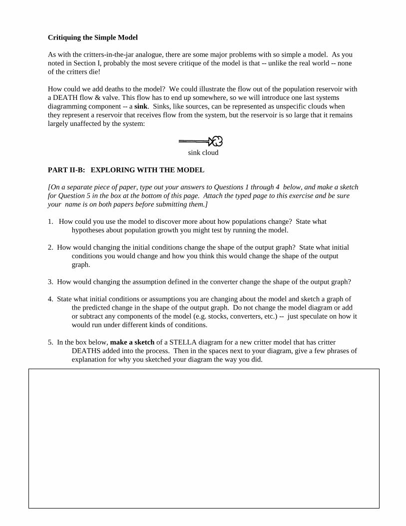
How could we add deaths to the model? We could illustrate the flow out of the population reservoir with
a DEATH flow & valve. This flow has to end up somewhere, so we will introduce one last systems
diagramming component -- a sink. Sinks, like sources, can be represented as unspecific clouds when
they represent a reservoir that receives flow from the system, but the reservoir is so large that it remains
largely unaffected by the system:
sink cloud
PART II-B: EXPLORING WITH THE MODEL
[On a separate piece of paper, type out your answers to Questions 1 through 4 below, and make a sketch
for Question 5 in the box at the bottom of this page. Attach the typed page to this exercise and be sure
your name is on both papers before submitting them.]
1. How could you use the model to discover more about how populations change? State what
hypotheses about population growth you might test by running the model.
2. How would changing the initial conditions change the shape of the output graph? State what initial
conditions you would change and how you think this would change the shape of the output
graph.
3. How would changing the assumption defined in the converter change the shape of the output graph?
4. State what initial conditions or assumptions you are changing about the model and sketch a graph of
the predicted change in the shape of the output graph. Do not change the model diagram or add
or subtract any components of the model (e.g. stocks, converters, etc.) -- just speculate on how it
would run under different kinds of conditions.
5. In the box below, make a sketch of a STELLA diagram for a new critter model that has critter
DEATHS added into the process. Then in the spaces next to your diagram, give a few phrases of
explanation for why you sketched your diagram the way you did.