Embed Size (px)
Citation preview
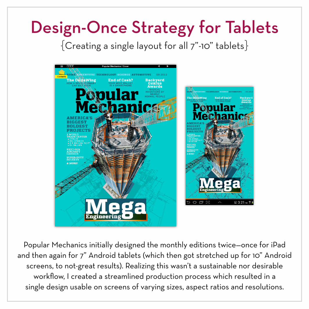
Design-Once Strategy for Tablets{Creating a single layout for all 7”-10” tablets}
Popular Mechanics initially designed the monthly editions twice—once for iPad and then again for 7” Android tablets (which then got stretched up for 10” Android
screens, to not-great results). Realizing this wasn’t a sustainable nor desirable workflow, I created a streamlined production process which resulted in a
single design usable on screens of varying sizes, aspect ratios and resolutions.
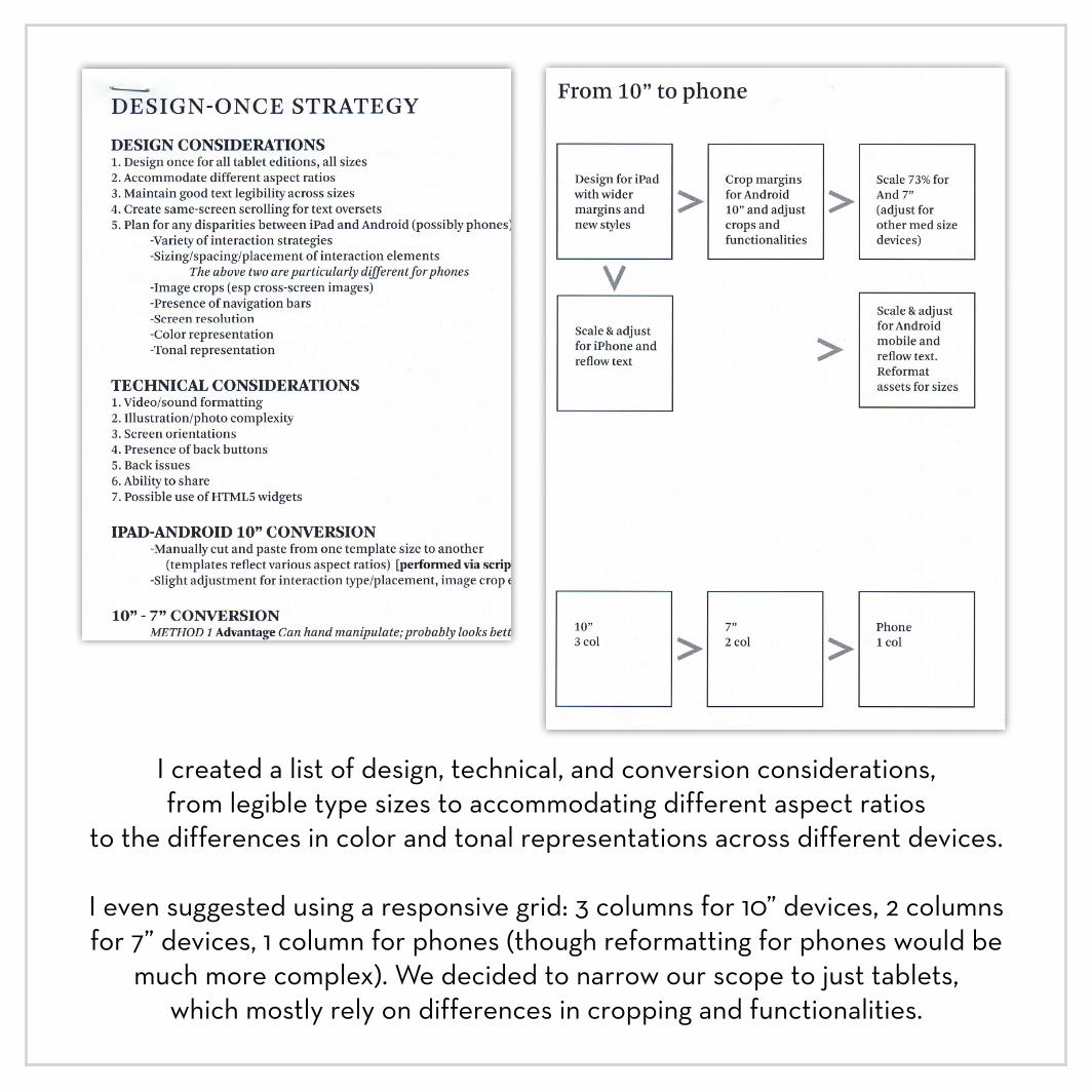
I created a list of design, technical, and conversion considerations, from legible type sizes to accommodating different aspect ratios
to the differences in color and tonal representations across different devices.
I even suggested using a responsive grid: 3 columns for 10” devices, 2 columnsfor 7” devices, 1 column for phones (though reformatting for phones would be
much more complex). We decided to narrow our scope to just tablets, which mostly rely on differences in cropping and functionalities.
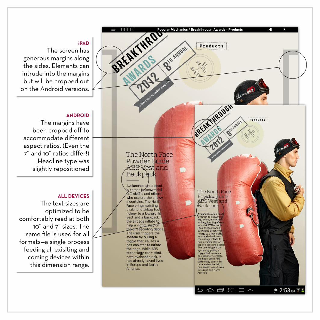
iPADThe screen has
generous margins along the sides. Elements can intrude into the margins but will be cropped out
on the Android versions.
ALL DEVICESThe text sizes are
optimized to be comfortably read at both
10” and 7” sizes. The same file is used for all
formats—a single process feeding all exisiting and
coming devices within this dimension range.
ANDROIDThe margins have
been cropped off to accommodate different aspect ratios. (Even the 7” and 10” ratios differ!)
Headline type was slightly repositioned
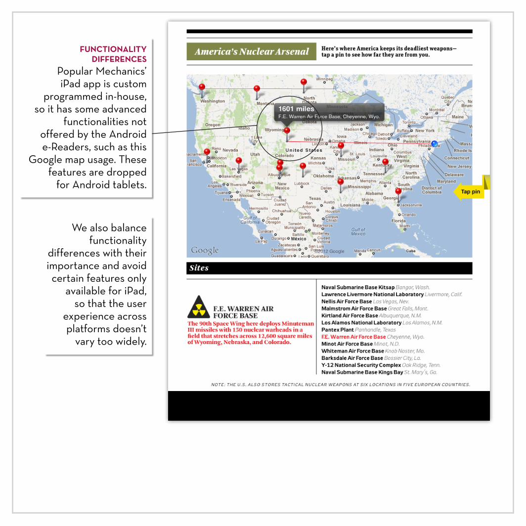
We also balance functionality
differences with their importance and avoid certain features only
available for iPad, so that the user
experience across platforms doesn’t
vary too widely.
FUNCTIONALITY DIFFERENCES
Popular Mechanics’ iPad app is custom
programmed in-house, so it has some advanced
functionalities not offered by the Android e-Readers, such as this
Google map usage. These features are dropped
for Android tablets.