Embed Size (px)
Citation preview
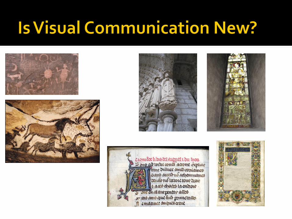
Designing Posters, Brochures and PowerPoint Presentations May 16, 2011
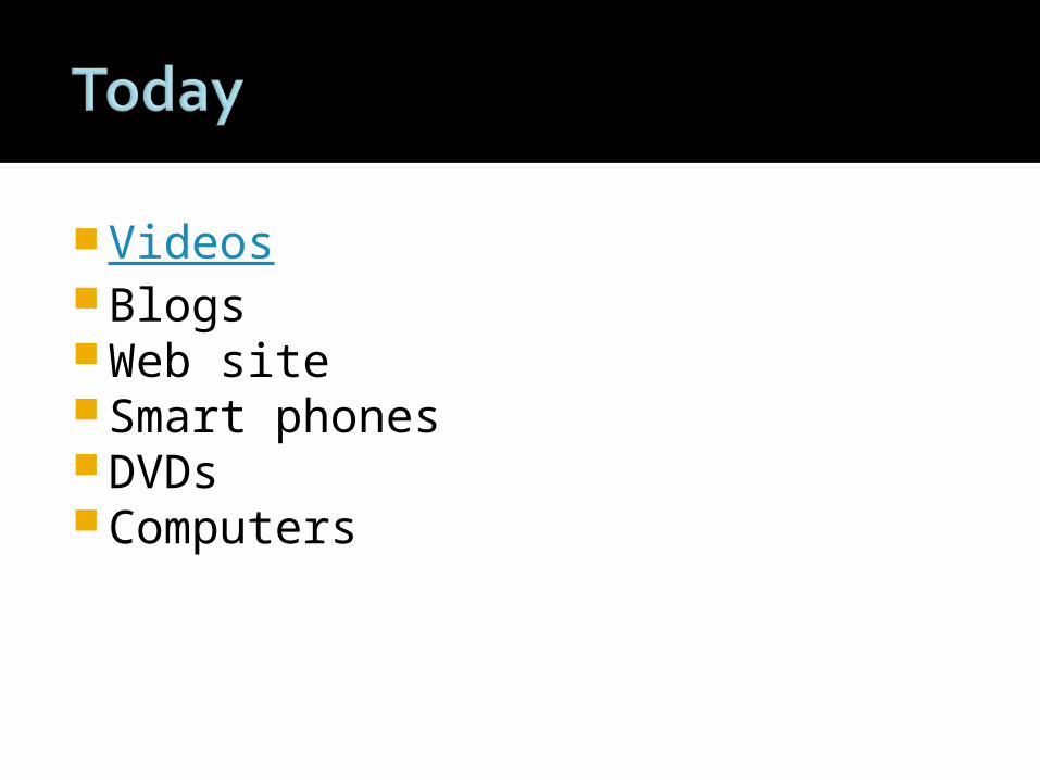
VideosBlogsWeb siteSmart phonesDVDsComputers
RhetoricVisual RhetoricDocument DesignLegibility, Readability, Usability Visual Noise
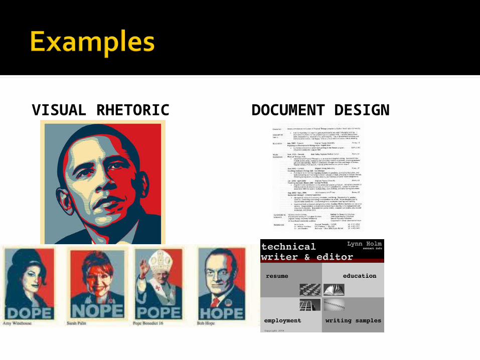
VISUAL RHETORIC DOCUMENT DESIGN
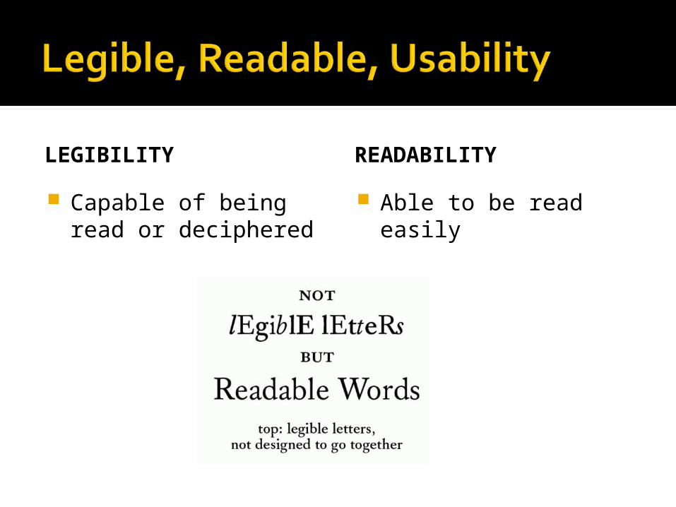
LEGIBILITY
Capable of being read or deciphered
READABILITY
Able to be read easily
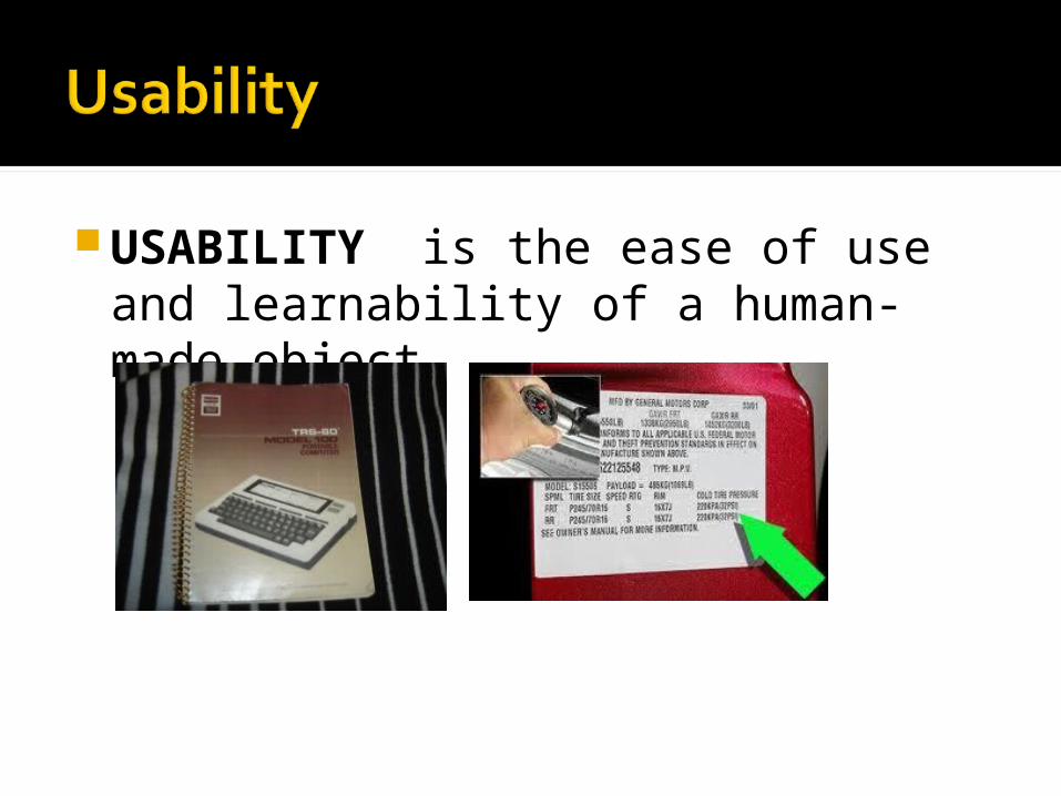
USABILITY is the ease of use and learnability of a human-made object.

TOO MUCH TOO MANY
The rhetoric of visuals vary by discipline, purpose, audience, message, medium
Working in pair, analyze the journal pages you brought to the workshop. Make a note of any disciplinary similarities or differences you notice.
What visual elements do you see here? What purpose do these visual
elements serve?
How effectively do they serve that purpose?
Are they connected to the text?
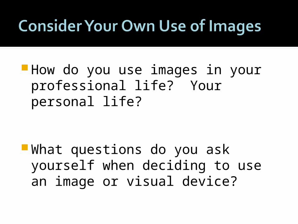
How do you use images in your professional life? Your personal life?
What questions do you ask yourself when deciding to use an image or visual device?
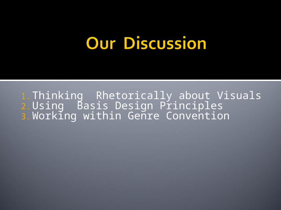
1. Thinking Rhetorically about Visuals2. Using Basis Design Principles3. Working within Genre Convention
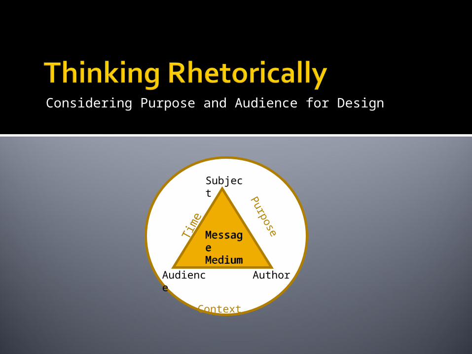
Considering Purpose and Audience for Design
Subject
Audience Author
MessageMedium
MessageMedium
Tim
e
Purpose
Context
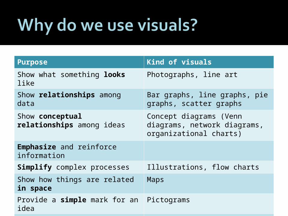
Purpose Kind of visuals
Show what something looks like Photographs, line art
Show relationships among data Bar graphs, line graphs, pie graphs, scatter graphs
Show conceptual relationships among ideas
Concept diagrams (Venn diagrams, network diagrams, organizational charts)
Emphasize and reinforce information
Simplify complex processes Illustrations, flow charts
Show how things are related in space
Maps
Provide a simple mark for an idea
Pictograms
Add interest/ Establish a visual tone
Decorative graphics
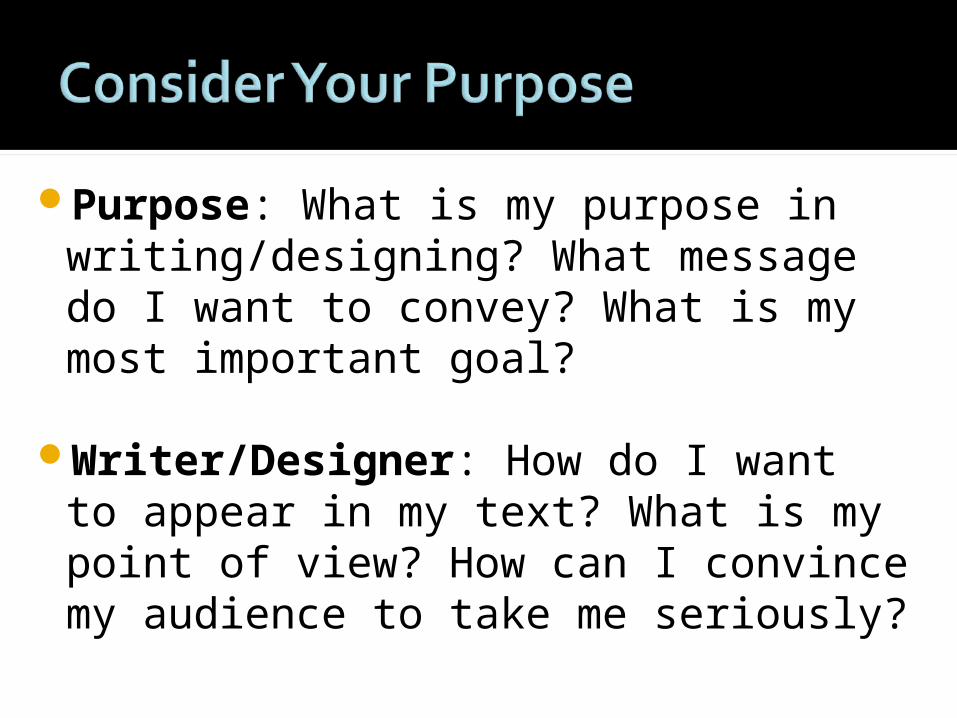
Purpose: What is my purpose in writing/designing? What message do I want to convey? What is my most important goal?
Writer/Designer: How do I want to appear in my text? What is my point of view? How can I convince my audience to take me seriously?
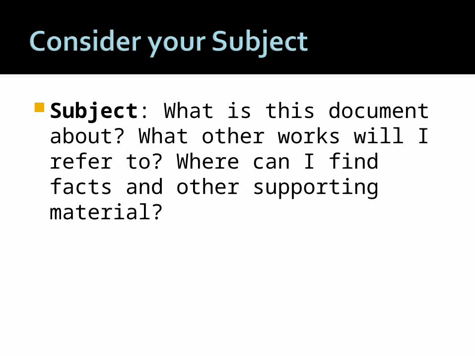
Subject: What is this document about? What other works will I refer to? Where can I find facts and other supporting material?
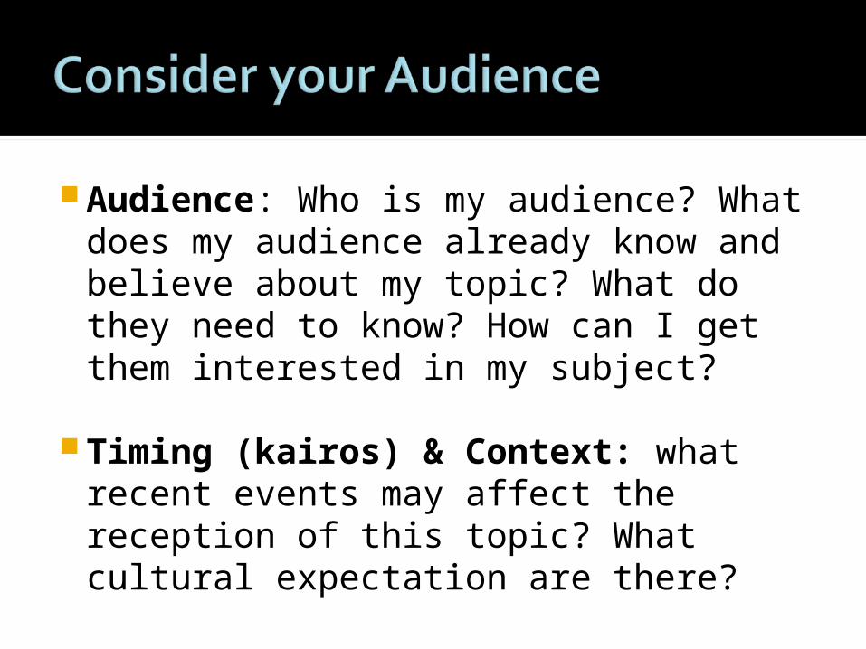
Audience: Who is my audience? What does my audience already know and believe about my topic? What do they need to know? How can I get them interested in my subject?
Timing (kairos) & Context: what recent events may affect the reception of this topic? What cultural expectation are there?
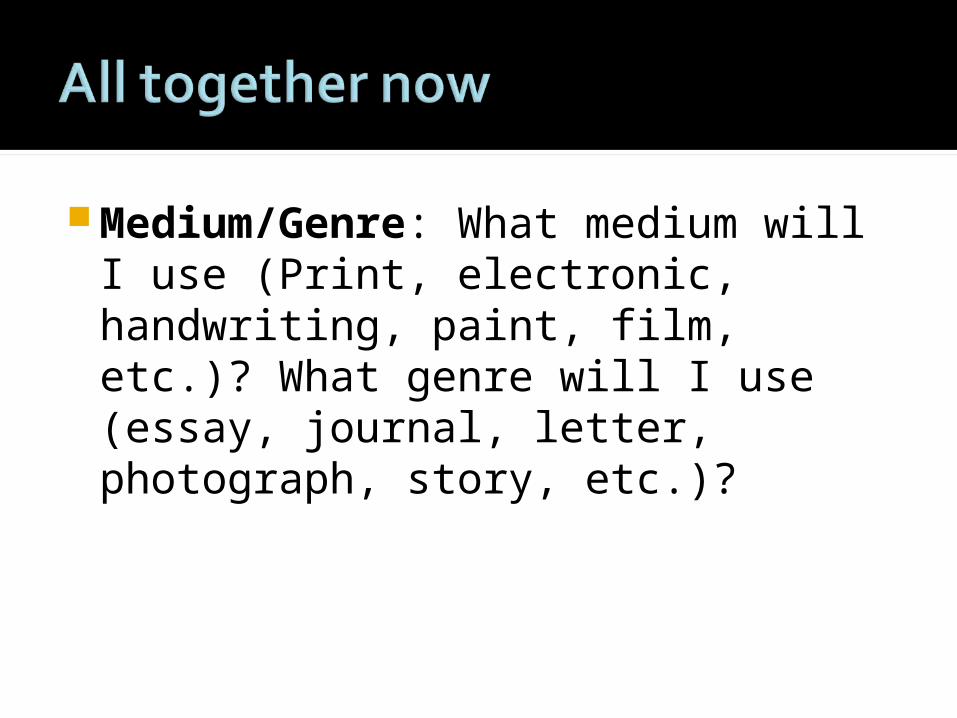
Medium/Genre: What medium will I use (Print, electronic, handwriting, paint, film, etc.)? What genre will I use (essay, journal, letter, photograph, story, etc.)?
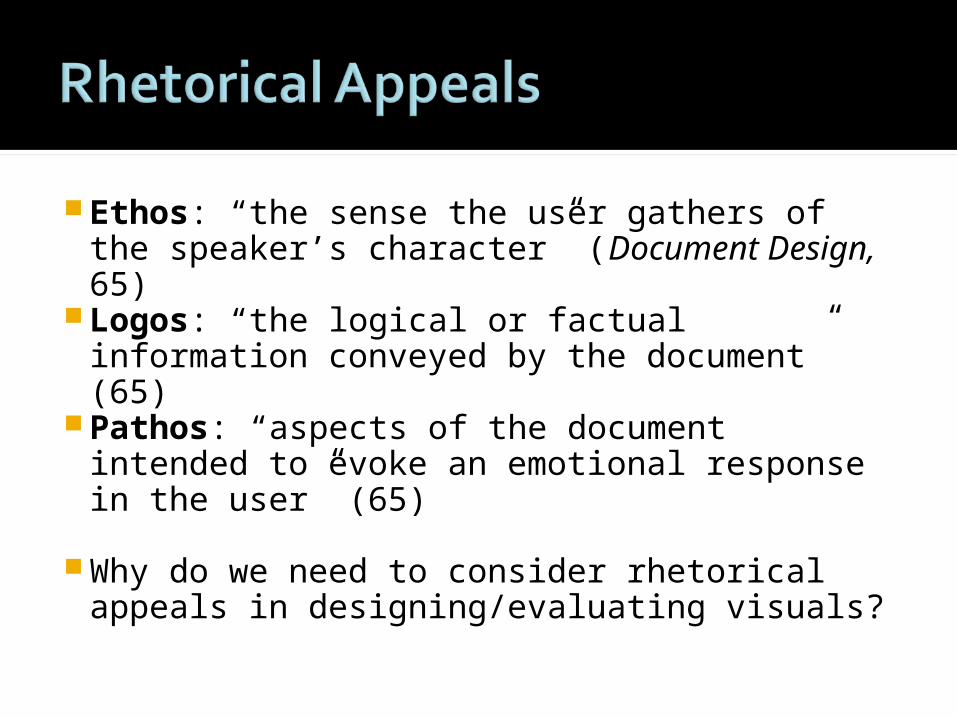
Ethos: “the sense the user gathers of the speaker’s character” (Document Design, 65)
Logos: “the logical or factual information conveyed by the document” (65)
Pathos: “aspects of the document intended to evoke an emotional response in the user” (65)
Why do we need to consider rhetorical appeals in designing/evaluating visuals?
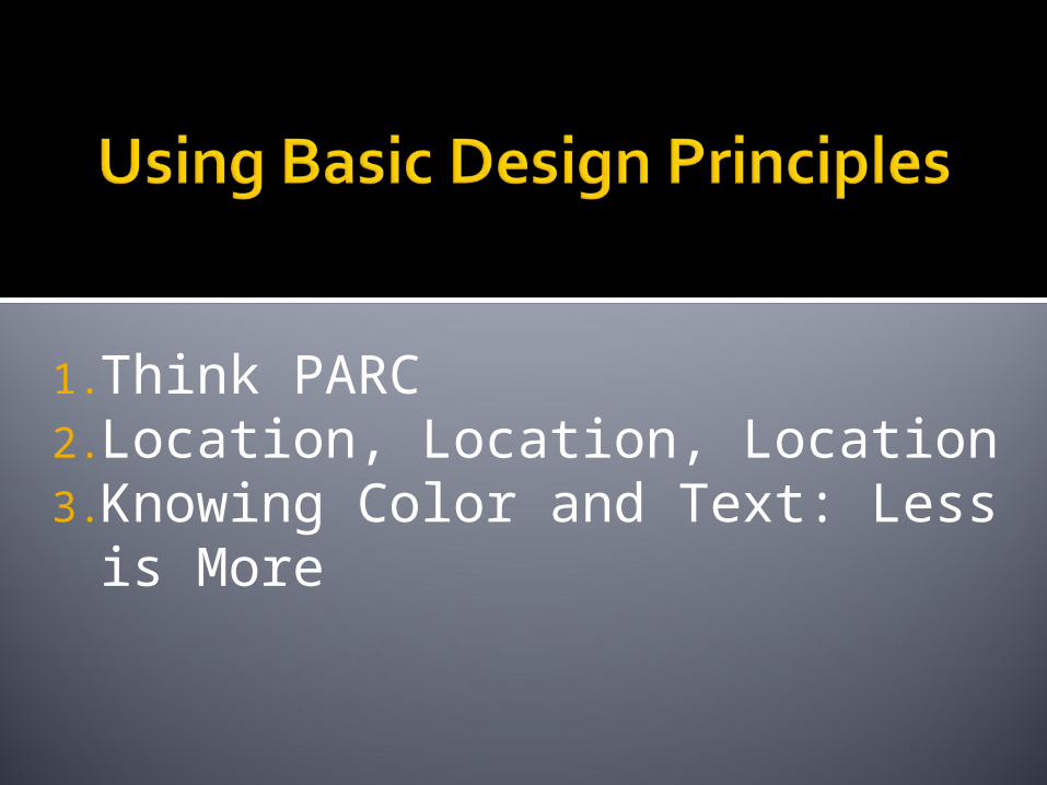
1.Think PARC2.Location, Location, Location3.Knowing Color and Text: Less is
More
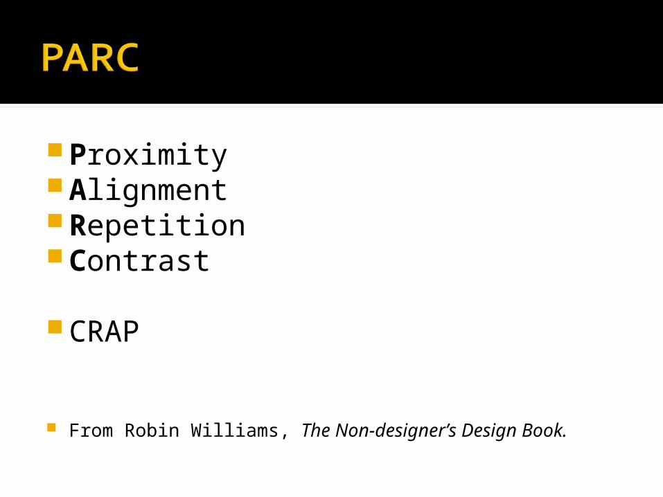
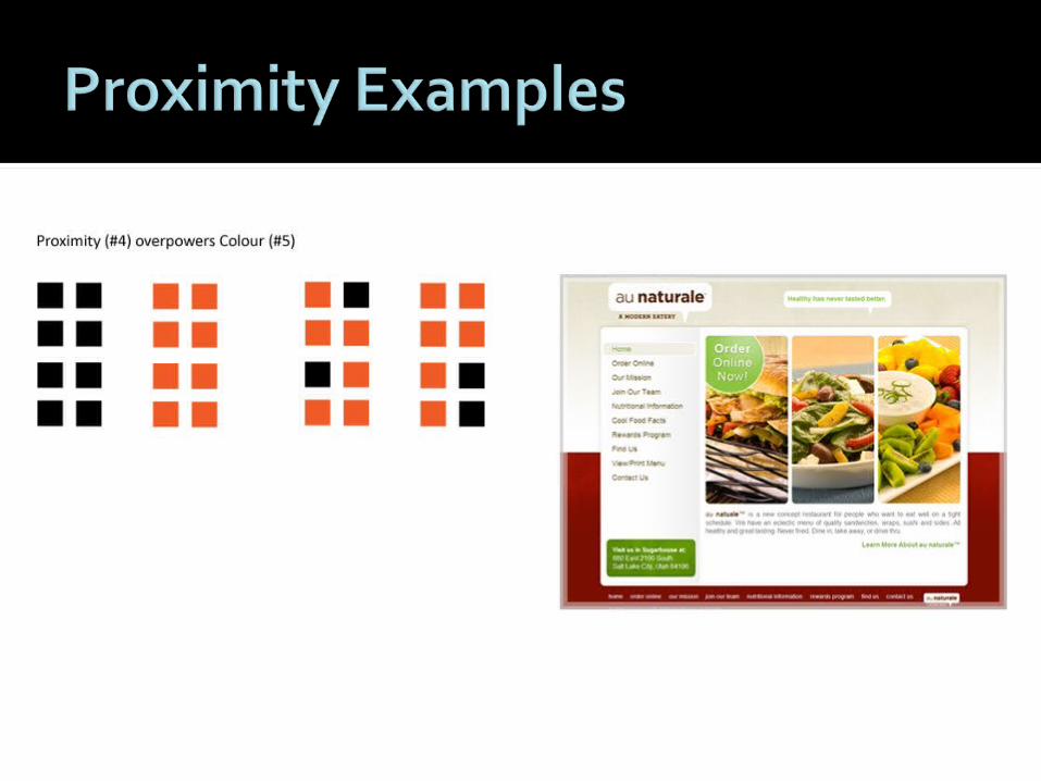
ProximityAlignmentRepetitionContrast
CRAP
From Robin Williams, The Non-designer’s Design Book.
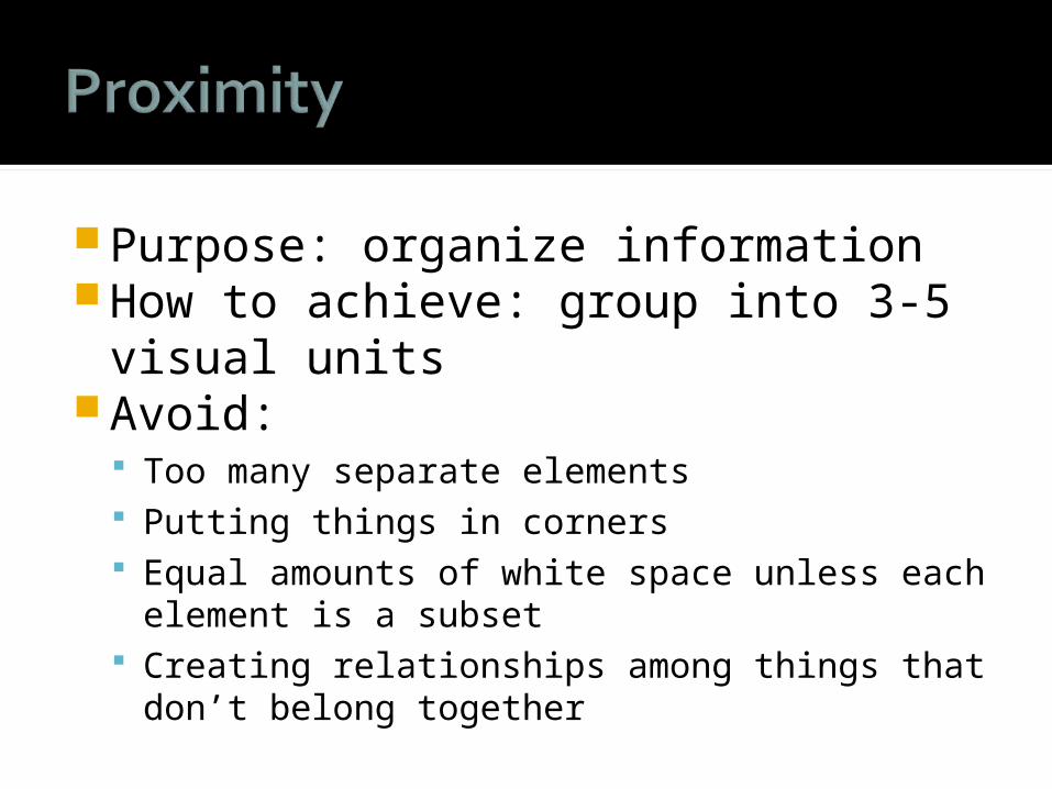
Purpose: organize informationHow to achieve: group into 3-5 visual
unitsAvoid:
Too many separate elements Putting things in corners Equal amounts of white space unless each
element is a subset Creating relationships among things that don’t
belong together
Purpose: unify and organize How to achieve it: Be conscious of what
things are aligning together To avoid:
Multiple kinds of alignment Centered alignment (harder to read)
Purpose: visual interest and unity.How to achieve: Be consistent with
visual elementsAvoid: Too many design elements
competing for attention
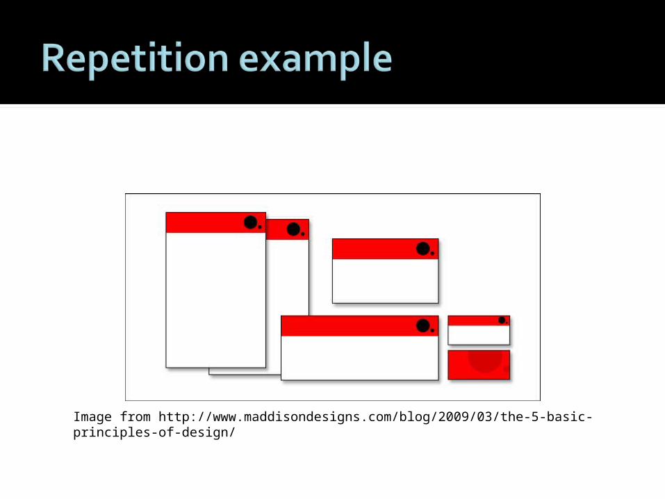
Image from http://www.maddisondesigns.com/blog/2009/03/the-5-basic-principles-of-design/
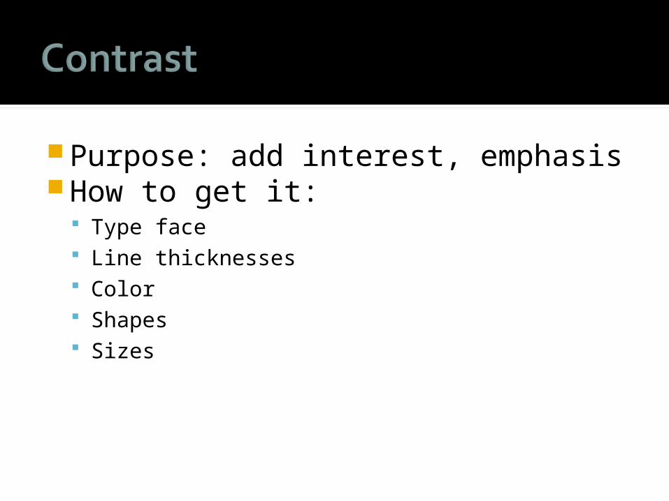
Purpose: add interest, emphasisHow to get it:
Type face Line thicknesses Color Shapes Sizes
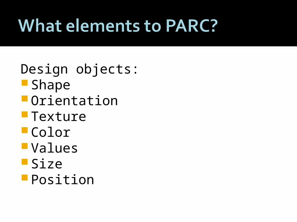
Design objects:ShapeOrientationTextureColorValuesSize Position
LayoutOrder (arrangement)Focus
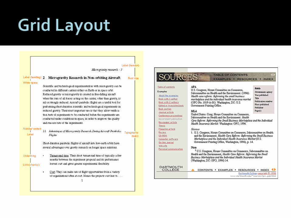
Power ZonesGridsWhite space
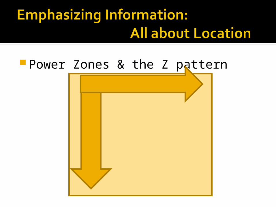
Power Zones & the Z pattern
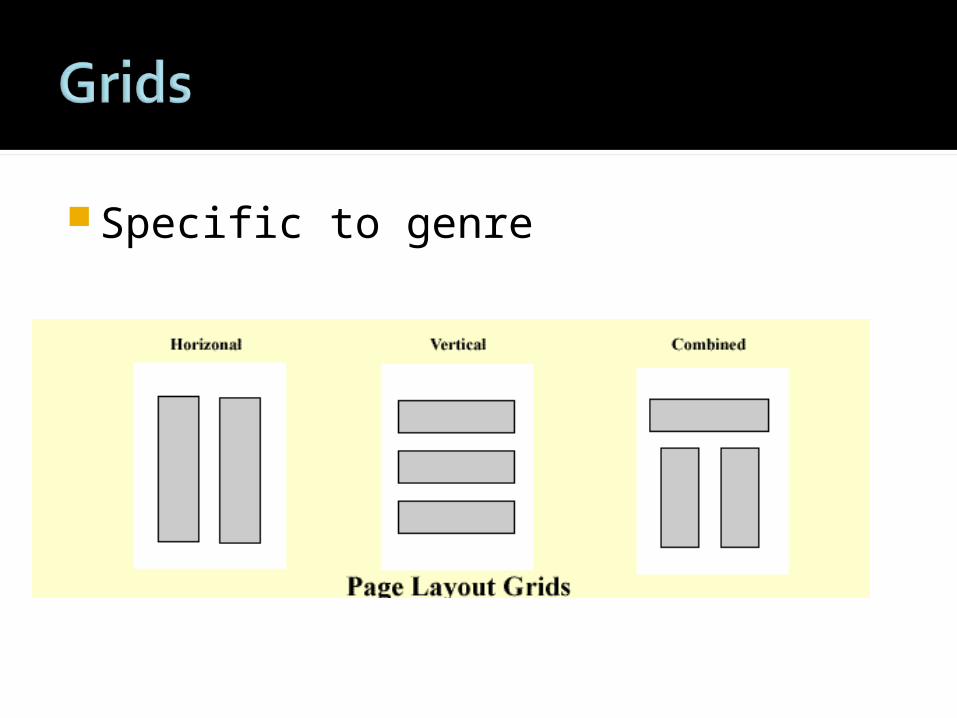
Specific to genre
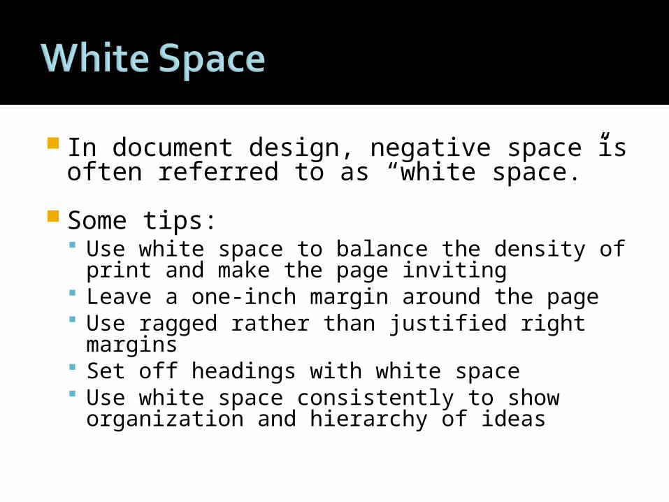
In document design, negative space is often referred to as “white space.”
Some tips: Use white space to balance the density of
print and make the page inviting Leave a one-inch margin around the page Use ragged rather than justified right
margins Set off headings with white space Use white space consistently to show
organization and hierarchy of ideas
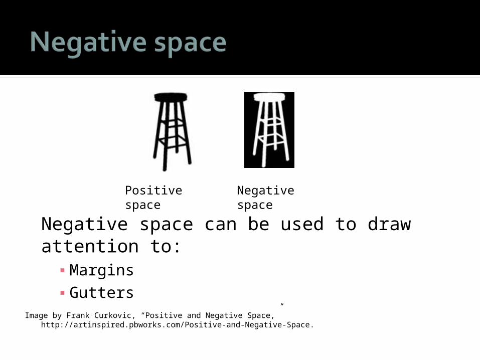
Negative space can be used to draw attention to:
▪ Margins▪ Gutters
Image by Frank Curkovic, “Positive and Negative Space,” http://artinspired.pbworks.com/Positive-and-Negative-Space.
Positive space Negative space
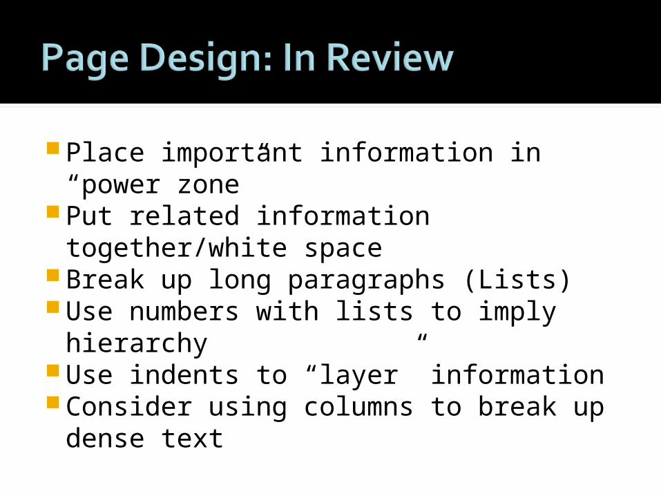
Place important information in “power zone”
Put related information together/white space
Break up long paragraphs (Lists) Use numbers with lists to imply
hierarchy Use indents to “layer” information Consider using columns to break up
dense text
What style do I want for my text (formal, academic, informal, fanciful, casual, etc.)? What tone should I adopt (witty, serious, etc.)?
How can you convey a visual style?ColorFontsBalance
Select at least three colors that you feel works well together
Less is MORE
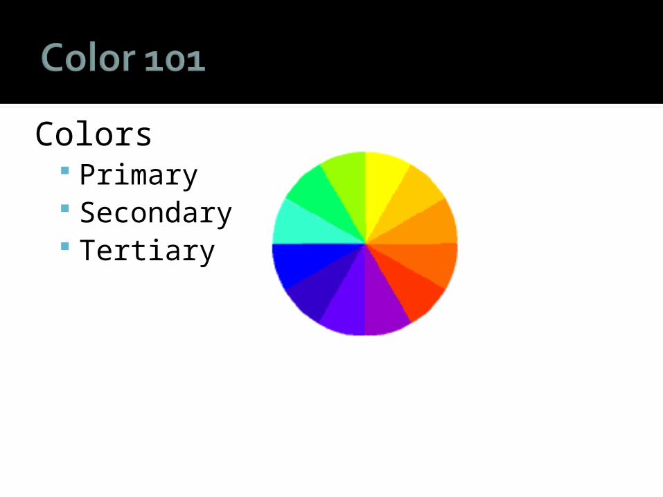
Colors Primary Secondary Tertiary
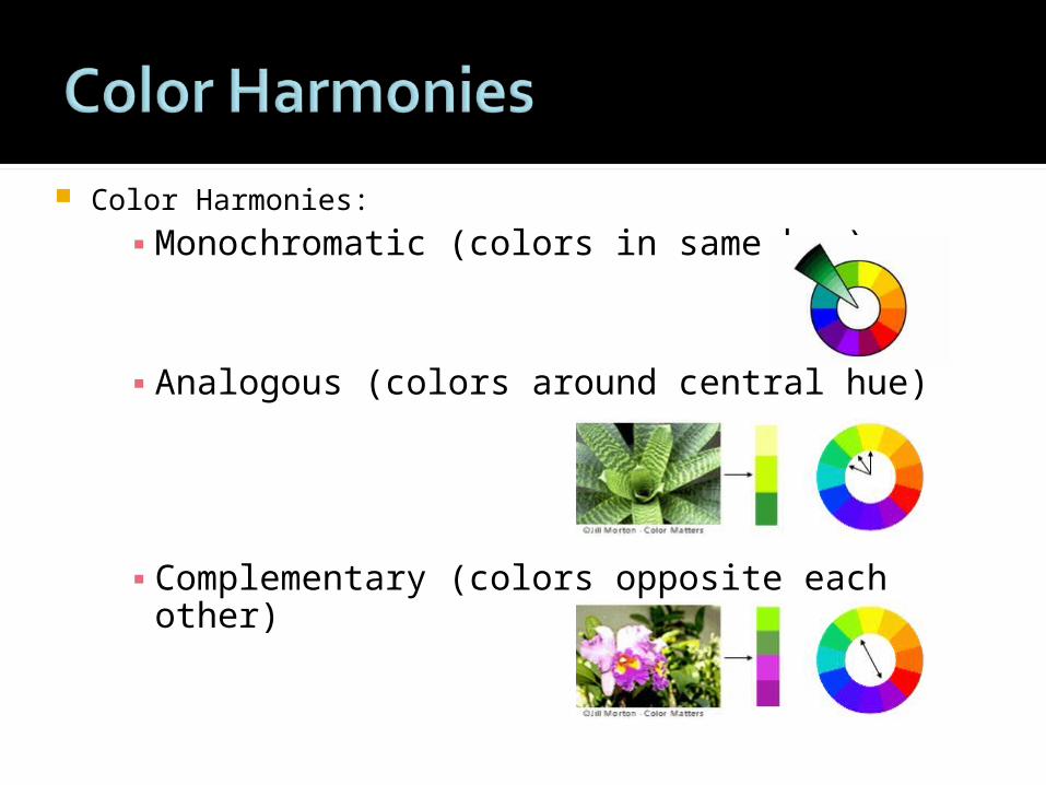
Color Harmonies:
▪ Monochromatic (colors in same hue)
▪ Analogous (colors around central hue)
▪ Complementary (colors opposite each other)
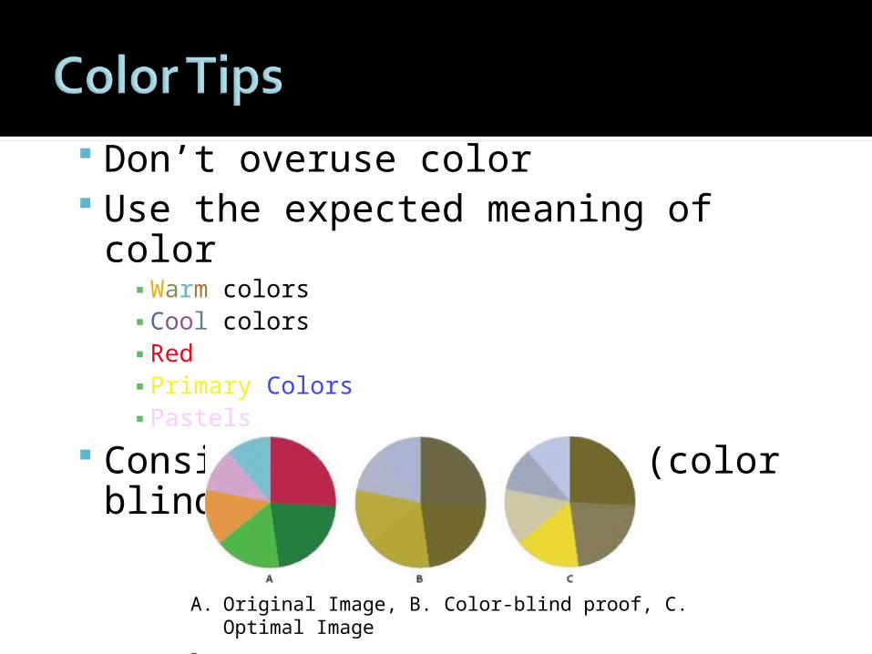
Don’t overuse color Use the expected meaning of color
▪ Warm colors▪ Cool colors▪ Red▪ Primary Colors▪ Pastels
Consider audience needs (color blindness)
A. Original Image, B. Color-blind proof, C. Optimal Image
From: http://www.adobe.com/accessibility/products/illustrator/overview.html#validation
“Typography enables us to see writing in material terms as letter-forms, printed pages, posters, computer screens. It helps to name the available tools of representation that composers draw on to make their own means of production. [And] typography links writing to delivery . . . The visual design of writing figures prominently as the material form in which the message is delivered.”
--John Trimbur, “Delivering the Message: Typography and the Materiality of Writing.” Visual Rhetoric in a Digital World, p. 263.
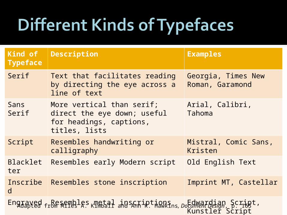
Kind of Typeface
Description Examples
Serif Text that facilitates reading by directing the eye across a line of text
Georgia, Times New Roman, Garamond
Sans Serif More vertical than serif; direct the eye down; useful for headings, captions, titles, lists
Arial, Calibri, Tahoma
Script Resembles handwriting or calligraphy
Mistral, Comic Sans, Kristen
Blackletter
Resembles early Modern script Old English Text
Inscribed Resembles stone inscription Imprint MT, Castellar
Engraved Resembles metal inscriptions Edwardian Script, Kunstler Script
Grunge Draws attention to artistic value of type
Curlz MT, Chiller, Jokerman
Dingbats Provides images for glyphs Wingdings
Adapted from Miles A. Kimball and Ann R. Hawkins, Document Design, p. 165
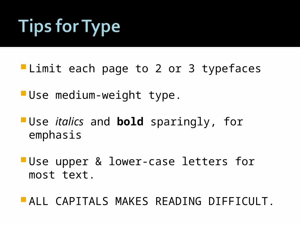
Limit each page to 2 or 3 typefaces
Use medium-weight type.
Use italics and bold sparingly, for emphasis
Use upper & lower-case letters for most text.
ALL CAPITALS MAKES READING DIFFICULT.
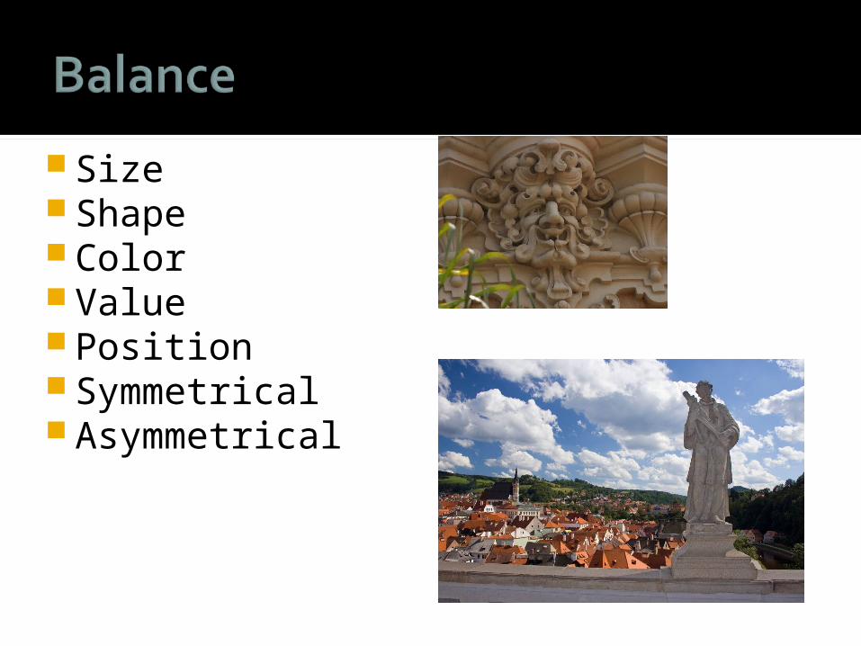
Size Shape Color Value Position Symmetrical Asymmetrical
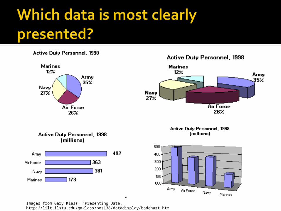
Images from Gary Klass, “Presenting Data,” http://lilt.ilstu.edu/gmklass/pos138/datadisplay/badchart.htm
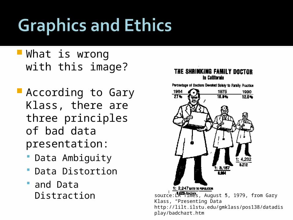
What is wrong with this image?
According to Gary Klass, there are three principles of bad data presentation: Data Ambiguity Data Distortion and Data Distraction
source:LA Times, August 5, 1979, from Gary Klass, “Presenting Data” http://lilt.ilstu.edu/gmklass/pos138/datadisplay/badchart.htm
Make sure all data are clearly labeled
Begin at zero and use equal increments
Use bar graphs, not pie chartsAvoid replacing bars with picturesPresent data variation, not design
variationExplain how the image relates
Creating effective posters
Font types Title 72-100 Subtitles 30-50 Body text 26-30
Grid: 3 to 4 columns
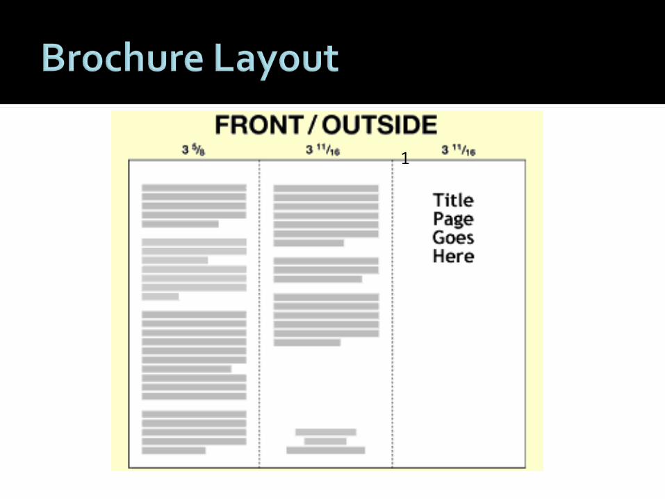
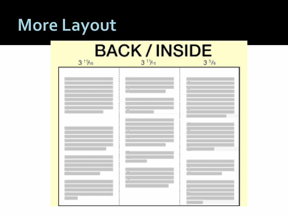
Layout Rhetorical purpose of Panal
1165
2 3 4
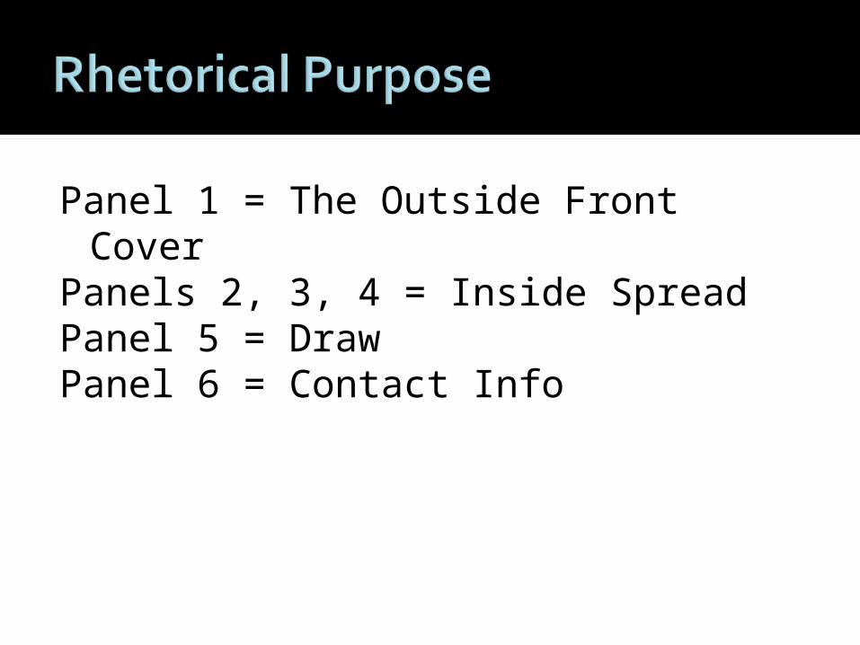
Panel 1 = The Outside Front Cover Panels 2, 3, 4 = Inside SpreadPanel 5 = DrawPanel 6 = Contact Info
must be an attention grabber ... it should capture the attention of your target audience
arouse sufficient interest to want to pick it up and open it.
Here are some things to include on the Outside Front Cover. A colour picture A key benefit of the event A tease ... a provocative question Key information of the event ...
information at a glance
Headings Information (Logos)
Facts Stats examples
Striking Images (Pathos)
The first to be seen inside Very important Draws the audience in Use Pathos
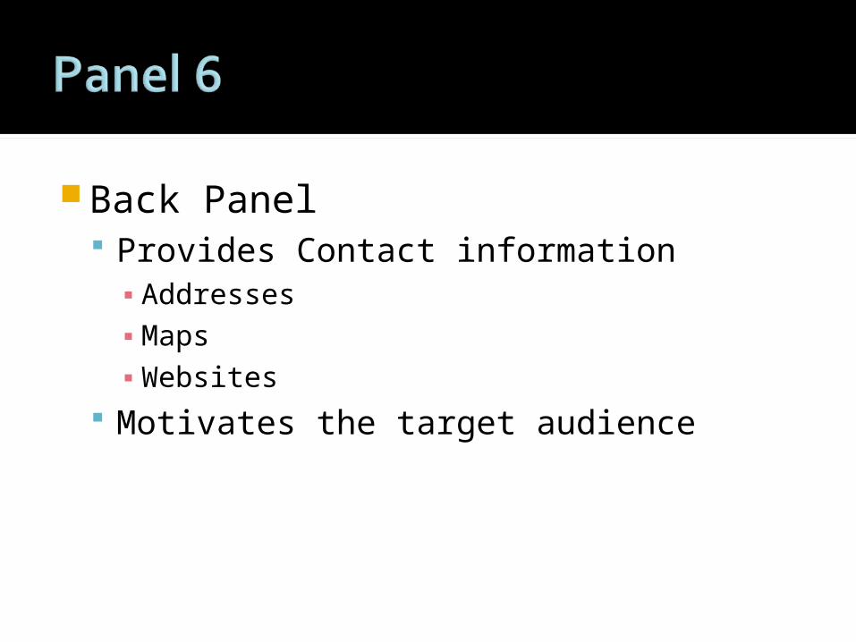
Back Panel Provides Contact information
▪ Addresses▪ Maps▪ Websites
Motivates the target audience
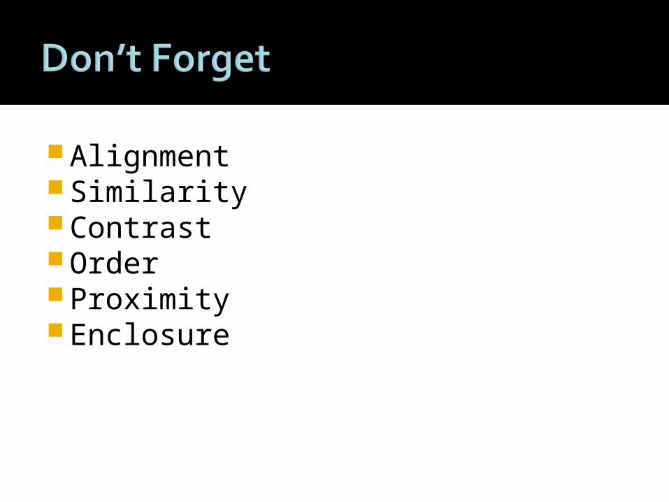
AlignmentSimilarityContrastOrderProximityEnclosure
One single clear message
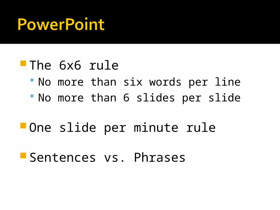
The 6x6 rule No more than six words per line No more than 6 slides per slide
One slide per minute rule
Sentences vs. Phrases
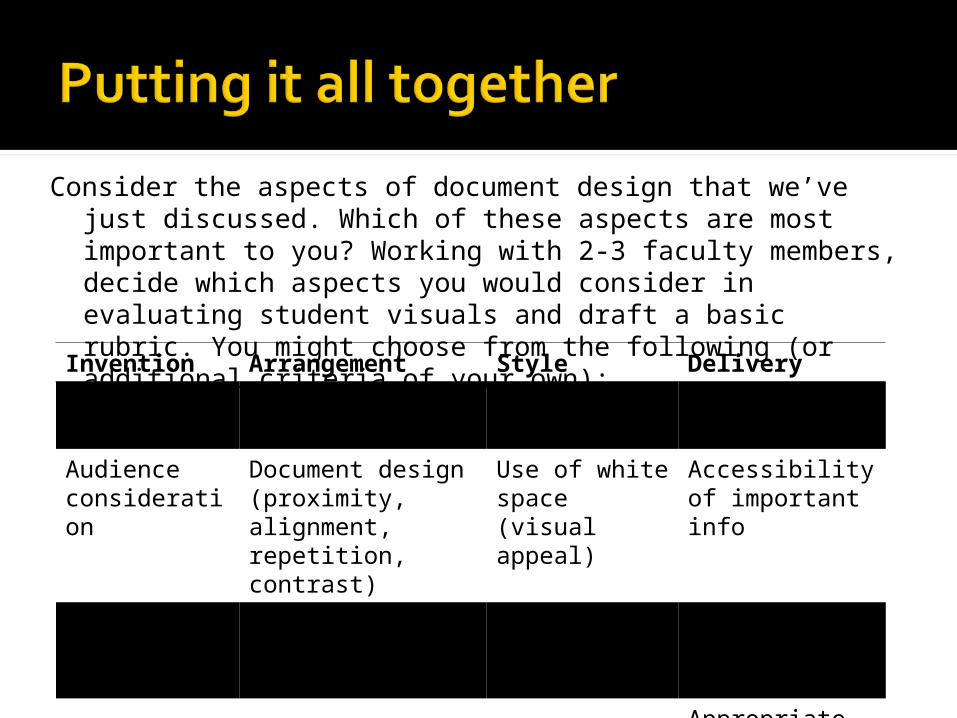
Consider the aspects of document design that we’ve just discussed. Which of these aspects are most important to you? Working with 2-3 faculty members, decide which aspects you would consider in evaluating student visuals and draft a basic rubric. You might choose from the following (or additional criteria of your own):
Invention Arrangement Style Delivery
Purpose Visual organization
Color Typography
Audience consideration
Document design (proximity, alignment, repetition, contrast)
Use of white space (visual appeal)
Accessibility of important info
Appropriate medium/genre
Balance Purposeful use of images
Appropriate labels for images
Using the rubric you have just created, assess a sample student document.
How well does your rubric work to assess the document?
What areas does your rubric assess well?
What areas does your rubric struggle to assess? Is there anything missing from your rubric?
DuFrene, Debbie D. and Carol M. Lehman. “Concept, Content, Construction, and Contingencies: Getting the Hart Before the PowerPoint Cart.” Business Communication Quarterly. Mar 2004: 84-88.
Dlugan, Andrew. “ Speech Analysis #1: How to Study and Critique a Speech.” Six Minutes: Public Speaking and Presentation Blog. 18 Jan 2008. 5 May 2009. <http://sixminutes.dlugan.com/2008/01/18/speech-evaluation-1-how-to-study-critique-speech/>
Faigley, Lester, Diana George, Anna Palchik, and Cynthia Selfe. Picturing Texts. New York: W. W. Norton, 2004.
Handa, Carolyn, ed. Visual Rhetoric in a Digital World: A Critical Sourcebook. Boston: Bedford/St. Martin’s, 2004.
Kimball, Miles A., Ann R. Hawkins. Document Design: A Guide for Technical Communicators. Boston: Bedford/St. Martin’s, 2008.
Lucas, Stephen E. The Art of Public Speaking. 3rd edition. New York: Random House, 1989.
Redmond, Mark V., and Denise Vrchota. Everyday Public Speaking. Boston: Pearson, 2007.
Williams, Robin. The Non-Designer’s Design Book. 2nd edition. Berkeley, CA: Peachpit Press, 2004.