Embed Size (px)
Citation preview
2
Designing Mobile Interfaces for Novice and Low-Literacy Users
INDRANI MEDHI, Microsoft Research IndiaSOMANI PATNAIK, Massachusetts Institute of TechnologyEMMA BRUNSKILL, University of California, BerkeleyS. N. NAGASENA GAUTAMA and WILLIAM THIES, Microsoft Research IndiaKENTARO TOYAMA, University of California, Berkeley
While mobile phones have found broad application in bringing health, financial, and other services to thedeveloping world, usability remains a major hurdle for novice and low-literacy populations. In this article,we take two steps to evaluate and improve the usability of mobile interfaces for such users. First, we offer anethnographic study of the usability barriers facing 90 low-literacy subjects in India, Kenya, the Philippines,and South Africa. Then, via two studies involving over 70 subjects in India, we quantitatively compare theusability of different points in the mobile design space. In addition to text interfaces such as electronic forms,SMS, and USSD, we consider three text-free interfaces: a spoken dialog system, a graphical interface, and alive operator.
Our results confirm that textual interfaces are unusable by first-time low-literacy users, and error pronefor literate but novice users. In the context of healthcare, we find that a live operator is up to ten timesmore accurate than text-based interfaces, and can also be cost effective in countries such as India. In thecontext of mobile banking, we find that task completion is highest with a graphical interface, but thosewho understand the spoken dialog system can use it more quickly due to their comfort and familiarity withspeech. We synthesize our findings into a set of design recommendations.
Categories and Subject Descriptors: H.5.2 [Information Interfaces and Presentation]: User Interfaces
General Terms: Design, Human Factors
Additional Key Words and Phrases: Mobile banking, mobile health, data entry, data accuracy, illiteracy
ACM Reference Format:Medhi, I., Patnaik, S., Brunskill, E., Gautama, S. N. N., Thies, W., and Toyama, K. 2011. Designing mobileinterfaces for novice and low-literacy users. ACM Trans. Comput.-Hum. Interact. 18, 1, Article 2 (April 2011),28 pages.DOI = 10.1145/1959022.1959024 http://doi.acm.org/10.1145/1959022.1959024
1. INTRODUCTION
There were over 4 billion phone users in 2008 [ITU 2009], and close to 60% of sub-scribers live in developing countries [UNCTAD 2008]. Thus, many entities with aglobal development focus have turned to the mobile phone as a potential platformfor delivering development services, in sectors spanning education, finance, health,agriculture, and governance [Donner 2008]. One of the challenges of delivering suchservices, however, is that 41% of the population in the least developed countries is
This work was supported in part by the MIT Public Service Center.Authors’ Addresses: I. Medhi, Microsoft Research India; S. Patnaik, MIT; E. Brunskill, University of Cal-ifornia, Berkeley; S. N. N. Gautama, Microsoft Research India; W. Thies (corresponding author) MicrosoftResearch India; email: [email protected]; K. Toyama, University of California, Berkeley.Permission to make digital or hard copies of part or all of this work for personal or classroom use is grantedwithout fee provided that copies are not made or distributed for profit or commercial advantage and thatcopies show this notice on the first page or initial screen of a display along with the full citation. Copyrights forcomponents of this work owned by others than ACM must be honored. Abstracting with credit is permitted.To copy otherwise, to republish, to post on servers, to redistribute to lists, or to use any component of thiswork in other works requires prior specific permission and/or a fee. Permissions may be requested fromPublications Dept., ACM, Inc., 2 Penn Plaza, Suite 701, New York, NY 10121-0701 USA, fax +1 (212)869-0481, or [email protected]© 2011 ACM 1073-0516/2011/04-ART2 $10.00
DOI 10.1145/1959022.1959024 http://doi.acm.org/10.1145/1959022.1959024
ACM Transactions on Computer-Human Interaction, Vol. 18, No. 1, Article 2, Publication date: April 2011.
2:2 I. Medhi et al.
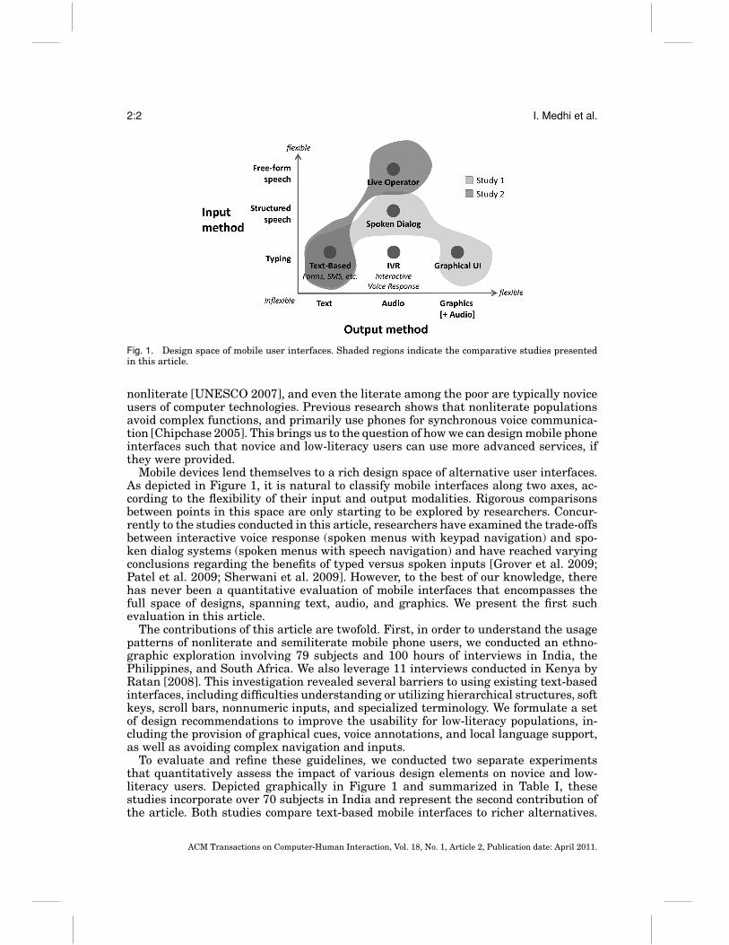
Fig. 1. Design space of mobile user interfaces. Shaded regions indicate the comparative studies presentedin this article.
nonliterate [UNESCO 2007], and even the literate among the poor are typically noviceusers of computer technologies. Previous research shows that nonliterate populationsavoid complex functions, and primarily use phones for synchronous voice communica-tion [Chipchase 2005]. This brings us to the question of how we can design mobile phoneinterfaces such that novice and low-literacy users can use more advanced services, ifthey were provided.
Mobile devices lend themselves to a rich design space of alternative user interfaces.As depicted in Figure 1, it is natural to classify mobile interfaces along two axes, ac-cording to the flexibility of their input and output modalities. Rigorous comparisonsbetween points in this space are only starting to be explored by researchers. Concur-rently to the studies conducted in this article, researchers have examined the trade-offsbetween interactive voice response (spoken menus with keypad navigation) and spo-ken dialog systems (spoken menus with speech navigation) and have reached varyingconclusions regarding the benefits of typed versus spoken inputs [Grover et al. 2009;Patel et al. 2009; Sherwani et al. 2009]. However, to the best of our knowledge, therehas never been a quantitative evaluation of mobile interfaces that encompasses thefull space of designs, spanning text, audio, and graphics. We present the first suchevaluation in this article.
The contributions of this article are twofold. First, in order to understand the usagepatterns of nonliterate and semiliterate mobile phone users, we conducted an ethno-graphic exploration involving 79 subjects and 100 hours of interviews in India, thePhilippines, and South Africa. We also leverage 11 interviews conducted in Kenya byRatan [2008]. This investigation revealed several barriers to using existing text-basedinterfaces, including difficulties understanding or utilizing hierarchical structures, softkeys, scroll bars, nonnumeric inputs, and specialized terminology. We formulate a setof design recommendations to improve the usability for low-literacy populations, in-cluding the provision of graphical cues, voice annotations, and local language support,as well as avoiding complex navigation and inputs.
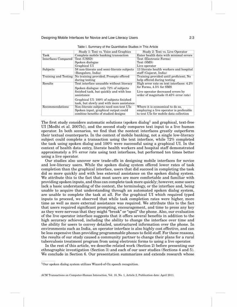
To evaluate and refine these guidelines, we conducted two separate experimentsthat quantitatively assess the impact of various design elements on novice and low-literacy users. Depicted graphically in Figure 1 and summarized in Table I, thesestudies incorporate over 70 subjects in India and represent the second contribution ofthe article. Both studies compare text-based mobile interfaces to richer alternatives.
ACM Transactions on Computer-Human Interaction, Vol. 18, No. 1, Article 2, Publication date: April 2011.
Designing Mobile Interfaces for Novice and Low-Literacy Users 2:3
Table I. Summary of the Quantitative Studies in This Article
Study 1: Text vs. Voice and Graphics Study 2: Text vs. Live OperatorTask Complete mobile banking transaction Enter health data with minimal errorsInterfaces Compared Text (USSD)
Spoken dialogueGraphical UI
Text (Electronic Forms)Text (SMS)Live operator
Subjects 58 non-literate and semi-literate subjects(Bangalore, India)
13 literate health workers and hospitalstaff (Gujarat, India)
Training and Testing No training provided; Prompts offeredduring testing
Training provided until proficient; Nohelp offered during testing
Results Text interface unusable without literacy
Spoken dialogue: only 72% of subjectsfinished task, but quickly and with lessassistance
Graphical UI: 100% of subjects finishedtask, but slowly and with more assistance
High error rate on text interfaces: 4.2%for Forms, 4.5% for SMS
Live operator decreased errors byorder of magnitude (0.45% error rate)
Recommendations Non-literate subjects need non-text UIsSpoken input, graphical output couldcombine benefits of studied designs
Where it is economical to do so,employing a live operator is preferableto text UIs for mobile data collection
The first study considers automatic solutions (spoken dialog1 and graphical, text-freeUI [Medhi et al. 2007b]), and the second study compares text input to a live humanoperator. In both scenarios, we find that the nontext interfaces greatly outperformtheir textual counterparts. In the context of mobile banking, not a single low-literacysubject could complete a transaction using the text interface, while 72% completedthe task using spoken dialog and 100% were successful using a graphical UI. In thecontext of health data entry, literate health workers and hospital staff demonstratedapproximately a 5% error rate using text interfaces, but performed ten times betterusing a live operator.
Our studies also uncover new trade-offs in designing mobile interfaces for noviceand low-literacy users. While the spoken dialog system offered lower rates of taskcompletion than the graphical interface, users that did succeed in completing the taskdid so more quickly and with less external assistance on the spoken dialog system.We attribute this to the fact that most users are more comfortable and familiar withproviding spoken inputs, and thus can complete task more quickly; however, some userslack a basic understanding of the context, the terminology, or the interface and, beingunable to acquire that understanding through an automated spoken dialog system,are unable to complete the task at all. For the graphical UI which required typedinputs to proceed, we observed that while task completion rates were higher, moretime as well as more external assistance was required. We attribute this to the factthat users required significant prompting, encouragement, and time to press any keyas they were nervous that they might “break” or “spoil” the phone. Also, our evaluationof the live operator interface suggests that it offers several benefits in addition to thehigh accuracy achieved, including the ability to change the interface over time andthe ability for users to convey detailed, unstructured information over the phone. Inenvironments such as India, an operator interface is also highly cost effective, and canbe less expensive than providing programmable phones to field staff. For these reasons,the results of our study caused a community partner to change their plans for a ruraltuberculosis treatment program from using electronic forms to using a live operator.
In the rest of this article, we describe related work (Section 2) before presenting ourethnographic investigation (Section 3) and each of our user studies (Sections 4 and 5).We conclude in Section 6. Our presentation summarizes and extends research whose
1Our spoken dialog system utilizes Wizard-of-Oz speech recognition.
ACM Transactions on Computer-Human Interaction, Vol. 18, No. 1, Article 2, Publication date: April 2011.
2:4 I. Medhi et al.
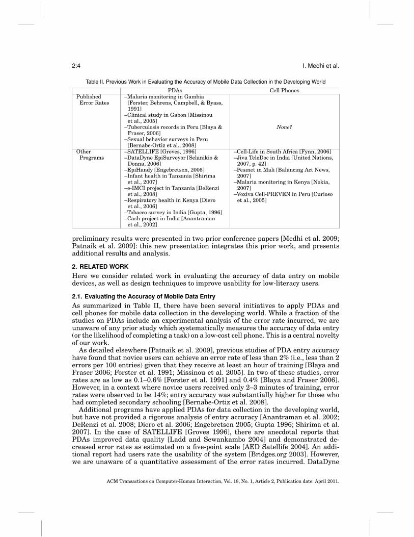
Table II. Previous Work in Evaluating the Accuracy of Mobile Data Collection in the Developing World
PDAs Cell PhonesPublished
Error Rates–Malaria monitoring in Gambia
[Forster, Behrens, Campbell, & Byass,1991]
–Clinical study in Gabon [Missinouet al., 2005]
–Tuberculosis records in Peru [Blaya &Fraser, 2006]
None?
–Sexual behavior surveys in Peru[Bernabe-Ortiz et al., 2008]
OtherPrograms
–SATELLIFE [Groves, 1996]–DataDyne EpiSurveyor [Selanikio &
Donna, 2006]–EpiHandy [Engebretsen, 2005]–Infant health in Tanzania [Shirima
et al., 2007]–e-IMCI project in Tanzania [DeRenzi
et al., 2008]–Respiratory health in Kenya [Diero
et al., 2006]–Tobacco survey in India [Gupta, 1996]–Cash project in India [Anantraman
et al., 2002]
–Cell-Life in South Africa [Fynn, 2006]–Jiva TeleDoc in India [United Nations,
2007, p. 42]–Pesinet in Mali [Balancing Act News,
2007]–Malaria monitoring in Kenya [Nokia,
2007]–Voxiva Cell-PREVEN in Peru [Curioso
et al., 2005]
preliminary results were presented in two prior conference papers [Medhi et al. 2009;Patnaik et al. 2009]: this new presentation integrates this prior work, and presentsadditional results and analysis.
2. RELATED WORK
Here we consider related work in evaluating the accuracy of data entry on mobiledevices, as well as design techniques to improve usability for low-literacy users.
2.1. Evaluating the Accuracy of Mobile Data Entry
As summarized in Table II, there have been several initiatives to apply PDAs andcell phones for mobile data collection in the developing world. While a fraction of thestudies on PDAs include an experimental analysis of the error rate incurred, we areunaware of any prior study which systematically measures the accuracy of data entry(or the likelihood of completing a task) on a low-cost cell phone. This is a central noveltyof our work.
As detailed elsewhere [Patnaik et al. 2009], previous studies of PDA entry accuracyhave found that novice users can achieve an error rate of less than 2% (i.e., less than 2errors per 100 entries) given that they receive at least an hour of training [Blaya andFraser 2006; Forster et al. 1991; Missinou et al. 2005]. In two of these studies, errorrates are as low as 0.1–0.6% [Forster et al. 1991] and 0.4% [Blaya and Fraser 2006].However, in a context where novice users received only 2–3 minutes of training, errorrates were observed to be 14%; entry accuracy was substantially higher for those whohad completed secondary schooling [Bernabe-Ortiz et al. 2008].
Additional programs have applied PDAs for data collection in the developing world,but have not provided a rigorous analysis of entry accuracy [Anantraman et al. 2002;DeRenzi et al. 2008; Diero et al. 2006; Engebretsen 2005; Gupta 1996; Shirima et al.2007]. In the case of SATELLIFE [Groves 1996], there are anecdotal reports thatPDAs improved data quality [Ladd and Sewankambo 2004] and demonstrated de-creased error rates as estimated on a five-point scale [AED Satellife 2004]. An addi-tional report had users rate the usability of the system [Bridges.org 2003]. However,we are unaware of a quantitative assessment of the error rates incurred. DataDyne
ACM Transactions on Computer-Human Interaction, Vol. 18, No. 1, Article 2, Publication date: April 2011.
Designing Mobile Interfaces for Novice and Low-Literacy Users 2:5
EpiSurveyor [Selanikio and Donna 2006] is also argued to be more accurate than paperforms [Selanikio 2009], though we are unaware of a controlled study.
Cell phones have also found broad application for mobile data collection in the de-veloping world, with interfaces spanning electronic forms [Balancing Act News 2007;Fynn 2006; Nokia 2007; Skinner et al. 2007; United Nations 2007] and interactivevoice response [Curioso et al. 2005]. While we are unaware of previous evaluations ofentry accuracy, there are three studies ( published concurrently to our own) that assessthe accuracy of novice users in navigating interactive voice response systems [Groveret al. 2009; Patel et al. 2009; Sherwani et al. 2009]. The studies have varying results:one reports that task completion is higher with dialed inputs than with speech inputs[Patel et al. 2009], one reports comparable task completion but a preference for dialedinputs over speech inputs [Grover et al. 2009], and one reports that speech inputssignificantly outperform dialed inputs [Sherwani et al. 2009].
To avoid the complexities of navigating electronic forms, the CAM framework offersa hybrid system in which paper forms are used for organization while phones are usedfor data entry [Parikh 2005]. Each field on the paper form is annotated with a barcodewhich is recognized by a camera on the phone prior to data entry. Users that lackedprior camera or computer experience were trained to a level of comfort within 5–15 minutes. A separate study measures error rates of 1% or below using the CAMsystem [Parikh et al. 2006]. This represents an interesting and useful design point,especially in cases where paper forms are already ingrained into the workflow. We focuson solutions that are independent of any paper workflow and which do not necessarilyrequire a camera-phone. While phones that support electronic forms (e.g., via Java)often have cameras, our SMS, USSD, spoken dialog, and live operator solutions aresuitable to the most inexpensive phones.
2.2. Design Principles for Low-Literacy Users
Because for the most part illiteracy correlates strongly with poverty, nonliterate usersare very different from the target users of typical UI designs [Cooper and Reimann2003]. Most previous work with nonliterate users focuses on the mechanics of theinterface, and on PCs or PDAs. Many researchers have recognized the value of imagery,and have advocated extensive use of graphics [Grisedale et al. 1997; Havelock 1971;Medhi et al. 2007a, 2007b; Parikh et al. 2003a, 2003b]. More specifically, it appearsthat static hand-drawn representations are better understood than photographs oricons [Medhi et al. 2007a]. Voice instructions and audio annotations are also powerful,and much of the interesting work in this area focuses on the interplay between graphicsand audio to generate a usable interface, as reviewed elsewhere [Medhi et al. 2007a,2007b]. Some authors note that the use of numbers is acceptable, as many nonliteratepeople can read numerical digits [Medhi et al. 2007b; Parikh et al. 2003a, 2003b].
Other work has focused on ultra-simple navigation as a design goal [Grisedale et al.,1997], or on removing anxieties about technology use. For example, looping video clipswhich include dramatizations of the overall usage scenario have been found effectivein reducing barriers to usage by first-time users [Medhi and Toyama 2007]. Voicerecordings of “help” information have also been shown valuable [Medhi et al. 2007b].These principles have been applied to application domains such as job informationsystems [Medhi et al. 2007b], health information dissemination [Medhi et al. 2007a],and microfinance [Parikh et al. 2003a, 2003b].
Interfaces for low-literacy users have also been studied in the context of Auto-matic Teller Machines (ATMs). Two studies propose an icon-based approach for ATMs[Ivatury 2004; Thatcher et al. 2006]. Another study looks at attitudes in literateand semiliterate bankaccount holders towards ATMs and alternative ATM interfaces(speech based and icon based) [Thatcher et al. 2005]. Overall, groups showed a tendency
ACM Transactions on Computer-Human Interaction, Vol. 18, No. 1, Article 2, Publication date: April 2011.
2:6 I. Medhi et al.
to prefer an icon-based alternative ATM interface over the other choices. Evaluationsof a pilot trial by one large bank in India make various recommendations for ATMs forlow-literacy users: avoid use of text altogether; loop voice instructions in simple, slowvernacular; provide biometric authentication; use consistent visual cues [Medhi andRatan 2006].
Apart from work that focuses on PCs, PDAs, and ATMs, there is some amountof research that looks at mobile phone UIs for low-literacy users. Researchers haverecognized the value of voice feedback [Parikh et al. 2006; Plauche and Prabaker 2006]and speech interfaces [Boyera 2007; Plauche and Prabaker 2006; Sherwani et al. 2007].Others have questioned suitability of menu-based navigation for novice users [Joneset al. 2000] and have discussed designs that advocate fewer menus and dedicatedbuttons for this target group [Lehrman 2007]. Again there is work that looks beyondthe UI at coping mechanisms of illiterate and semiliterate users when confronted withtraditional mobile interfaces [Chipchase 2005, 2006].
3. ETHNOGRAPHY OF NOVICE USERS
To better understand the key challenges of designing mobile interfaces for novice users,we first investigated the current situation among existing users and potential users.Our inquiry focused on mobile banking as the driving application; mobile banking refersto the provision of financial services such as money transfer, payments, and balanceinquiries via a mobile phone, often to communities that lack access to traditional bankaccounts. Instead of requiring visits to a bank branch or ATM, cash transactions canalso be done at retail outlets that serve as intermediaries. While our focus is on mobilebanking, most of our observations in this article also extend to other domains (resultsthat are specific to banking have been published elsewhere [Medhi et al. 2009]). In thissection we restrict our attention to nonliterate and semiliterate populations.
3.1. Methodology
We conducted a total of 79 interviews and qualitative user studies: 26 in New Delhiand Bangalore, India, 30 in Bohol, Philippines, and 23 in Cape Town and Globersdale,South Africa. (Variations in number are due in part to the complexity of identifyingsubjects with the characteristics we were seeking.) We also utilize 11 interviews inKenya by Ratan [2008]. Our subjects had three common background traits: (1) func-tional illiteracy or semiliteracy but partial numeracy; (2) low levels of formal education(highest education attained being schooling up to the eighth grade of the K-12 ed-ucation system or its equivalent across the four countries); (3) zero experience withpersonal computers.
Apart from these commonalities, we looked for varying degrees of experience withusing mobile phones: (a) those who did not use or own a mobile phone; (b) those whoowned or used mobile phones but did not use any kind of mobile banking systems; and(c) those who used mobile banking systems. 40 of our subjects were in the first category,34 in the second, and 16 in the third. These traits make them an ideal user populationwith which to explore our ideas with regards to creating a mobile phone UI suited fornonliterate and semiliterate populations. Subjects were selected with the assistanceof both for-profit corporations (running mobile banking services) as well as nonprofitorganizations working with poor populations.
There were some commonalities across all locations that were not intentionally cho-sen, but nevertheless correlated with our target population. Among the key commonal-ities, across all four locations, our users strongly and positively associated the Englishlanguage (which they did not speak for the most part) with wealth and prestige. Thiswas due to a combination of mindset inherited from colonial history, as well as themodern-day fact of greater economic opportunities available to English speakers. Also
ACM Transactions on Computer-Human Interaction, Vol. 18, No. 1, Article 2, Publication date: April 2011.
Designing Mobile Interfaces for Novice and Low-Literacy Users 2:7
for the most part, all of our subjects were very open with respect to illiteracy, attachingno shame to the inability to read; this is unlike illiterate individuals in developed coun-tries who often hide illiteracy. Our subjects were typically domestic workers and dailywage laborers like plumbers, carpenters, construction workers, mechanics, vegetablevendors, weavers, farm hands, fishermen, drivers, etc. Household income ranged fromUSD 20–USD 200 per month.
Naturally, differences also exist across geographies. The subjects’ primary languageswere Kannada, Hindi, and Tamil in India, Tagalog in Philippines, Afrikaans, Xhosa,and Zulu in South Africa, and Kiswahili in Kenya. Relevant to our study, all but theIndian languages can be written in the same Latin alphabet that is standard on mobilephones throughout the world. Some of our subjects had television sets, music players,and gas burners, but these were not owned by all households. A few had seen computersin person (but again, none had ever used them).
The interviews were one-on-one, open-ended conversations that lasted for at leastan hour. Questions and discussion themes included basic demographic information,access and use of financial services, and access and use of mobile phones. The studyinvolved over 100 hours spent in the field. We visited individuals at their homes inorder to talk to our subjects in a comfortable environment and to observe their livingenvironments. We also conducted interviews at mobile banking agent locations wheremobile transactions took place.
We conducted qualitative user studies with our subjects, focusing on a locally avail-able mobile banking service as a usability case study. Subjects were given a set of tasksto perform both on their own handsets and on mobile phones provided by us (in orderto determine how much of their usage was by rote memorization). These tasks includedthe following.
—Dialing a phone number to call a friend.—Writing a short SMS text message to a friend.—Depositing a small amount to their account on their own phone.—Transferring a small amount to a relative from their own phone.—Diagramming how they perceived the menu structure (for geographies with menu-
based UIs). Users were asked in their local language, “Can you draw how this functionwas accomplished?”
—Performing the first two tasks with a phone supplied to the subject (different inmodel from theirs: a Nokia 2610).
All users were compensated for their time at the end of the study. We consulted theintermediary organizations to establish the right mode and amount. Participants with-out mobile phones were given gift cards for local stores and those with mobile phoneswere given talk-time cards roughly equivalent to half a daily wage.
3.2. Phone Usage
The mobile phone handsets that our subjects used ranged from basic, black-and-white,second-hand purchases costing USD 12 (common in India and Philippines) to brandnew purchases with camera and color screen that cost USD 150 (occasionally seen inKenya and South Africa). We found high usage of texting in the Philippines, especiallyamong young, semiliterate users with education up to eighth grade (even 100 textsper day), to no usage of texting in Kenya, South Africa, and India. There was strongpreference for voice calls in Kenya [Ratan 2008] and India [Medhi and Ratan 2008],and for texting in Philippines; the number of voice calls ranged from 5 calls (India,Kenya, and South Africa) to no calls per day (Philippines). Sharing of phones amongfamily members and friends was common. Overall, the kind of phone usage dependedon factors such as age, literacy, and pricing strategy. Older users, who mostly were less
ACM Transactions on Computer-Human Interaction, Vol. 18, No. 1, Article 2, Publication date: April 2011.
2:8 I. Medhi et al.
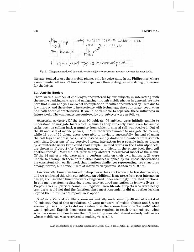
Fig. 2. Diagrams produced by semiliterate subjects to represent menu structures for user tasks.
literate, tended to use their mobile phones only for voice calls. In the Philippines, wherea one-minute call was ∼7 times more expensive than texting, we saw strong preferencefor the latter.
3.3. Usability Barriers
There were a number of challenges encountered by our subjects in interacting withthe mobile banking services and navigating through mobile phones in general. We notehere that in our analysis we do not decouple the difficulties encountered by users due tolow literacy and those due to inexperience with technology, since our target populationhad both these characteristics. It would be valuable to separate these influences infuture work. The challenges encountered by our subjects were as follows.
Hierarchical navigation. Of the total 90 subjects, 56 subjects were initially unable tounderstand or navigate hierarchical menus as they currently exist, even for simpletasks such as calling back a number from which a missed call was received. Out ofthe 40 nonusers of mobile phones, 100% of them were unable to navigate the menus,while 16 out of 50 phone users were able to navigate successfully. Instead of usingthe call logs or address book, users instead simply dialed the numbers from scratcheach time. Diagrams of the perceived menu interaction for a specific task, as drawnby semiliterate users (who could read simple, isolated words in the Latin alphabet),are shown in Figure 2 (for “send a message to a friend in the phone book then callanother friend”). Most did not refer to any abstract hierarchical model of the menu.Of the 34 subjects who were able to perform tasks on their own handsets, 23 wereunable to accomplish them on the other handset supplied by us. These observationsare consistent with earlier work that mentions challenges representing tree structuresamong literate, but novice, users of information systems [Walton et al. 2002].
Discoverability. Functions buried in deep hierarchies are known to be less discoverable,and we confirmed this with our subjects. An additional issue arose from poor interactiondesign, such as when functions were categorized under seemingly unrelated functions.In one menu system, registering a new user required navigation as follows: Svcs+ →Prepaid Svcs → [Service Name] → Register. Even literate subjects who were heavytext users could not find the function, since most respondents did not bother lookingbeyond the unintuitive “Prepaid Svcs” option.
Scroll bars. Vertical scrollbars were not initially understood by 48 out of a total of90 subjects. Out of this population, 40 were nonusers of mobile phones and 8 werevoice-only users. Subjects did not realize that there were functions “beneath” whatwas displayed. Explicit demonstrations were required to teach these subjects whatscrollbars were and how to use them. This group coincided almost entirely with userswhose mobile use was restricted to making voice calls.
ACM Transactions on Computer-Human Interaction, Vol. 18, No. 1, Article 2, Publication date: April 2011.
Designing Mobile Interfaces for Novice and Low-Literacy Users 2:9
Soft-key function mapping. All of our subjects were comfortable handling the “hard keys”(direct number entry and send/end keys), regardless of whether they owned mobilephones or not. However, as many as 45 users had difficulty with soft keys: usuallyunlabeled keys (often appearing directly below the screen) that have different functionsin different contexts, or numeric keys when used to choose from an enumerated list onscreen. When they were asked to send a text and were required to traverse the manydifferent layers of the UI, they became lost and had no idea which buttons to press justto navigate. If they managed to get past the first step, they were unable to read thetextually annotated steps later. The soft keys were difficult to understand because itrequired mapping soft keys to the changing functions displayed on screen.
Nonnumeric inputs. 27 of the 50 mobile phone users we spoke with used their phones formaking and receiving voice calls only, and the proportion was higher in India, Kenya,and South Africa. Twenty-four of these subjects were unable to type even a singleword, much less an entire text message. For constructing a USSD syntax2 comprisingof digits and symbols (“*” and “#”), our subjects were comfortable typing the digits, butcould not locate the symbols.
Language difficulties. All the mobile banking services issue SMS receipts for transac-tions. Messages are always entirely in English (except in the case of the mobile bankingservice M-PESA where the receipts are in English as well as in Kiswahili). Subjects,most of whom were not fluent in English, had difficulty reading the text portions ofthese receipts, but almost all could identify the numbers and what they meant. How-ever, subjects still had difficulty with receipts indicating multiple transactions.
It was also difficult for subjects to understand specialized or technical terms, evenwhen they were in the local language. Since most of our subjects did not have bank ac-counts, they were not familiar with the vocabulary of banking. “View last transaction,”“Get balance,” “Change PIN,” and so forth, were all alien concepts, in the absence ofdetailed explanation. We later observed similar patterns in the health domain; symp-toms such as “jaundice” did not translate well into Hindi, and were sometimes morerecognizable in English.
All of the banking services provide instruction manuals and information brochuresfor assisting users. Most of these manuals are overloaded with textual information,mostly in English. For nonliterate users, these are all but useless, since the accompa-nying visuals often are not self-explanatory. Some of the services offer local languagemanuals, but these too are complex and laden with banking jargon. We found thatmost subjects did not attempt to read these manuals, and that human mediation wascritical for most successful transactions.
3.4. Design Recommendations
Broad lessons from this exercise led to the following design recommendations.
(1) Provide graphical cues.(2) Provide voice annotation support wherever possible.(3) Provide local language support, both in text and audio.(4) Minimize hierarchical structures.(5) Avoid requiring nonnumeric text input.(6) Avoid menus that require scrolling.
2USSD (Unstructured Supplementary Service Data) is a standard for transmitting data, typically anticipat-ing real-time responses, using GSM phones. In the context of mobile banking, a user might enter a stringsuch as *109*72348937857623# to request a balance check, which will then appear on his or her handset ina menu format similar to an SMS message.
ACM Transactions on Computer-Human Interaction, Vol. 18, No. 1, Article 2, Publication date: April 2011.
2:10 I. Medhi et al.
(7) Minimize soft-key mappings.(8) Integrate human mediators into the overall system, to familiarize potential users
with scenarios and UIs.
The first four items echo design recommendations from previous work [Medhi et al.2007b]. Items 5–7 were identified as a result of working with mobile phones. Thelast item is consistent with the literature on computing technology for development[Warschauer 2003]. We note that while our current recommendation is to avoid use ofnonintuitive interfaces such as nonnumeric text input, scrolling, and soft keys, it alsorepresents an interesting research agenda to improve the usability of these elementsto make them more accessible to first-time users.
4. EXPERIMENT 1: TEXT VS. VOICE AND GRAPHICS
To try to satisfy all the posed design recommendations of the prior section, we investi-gated richer interfaces that can display graphics and audio. Yet, richer platforms comewith their own drawbacks, including greater complexity, greater cost, and less platformuniversality. Therefore, our goal in this second phase of research is to compare hownonliterate subjects (drawn exclusively from India) react to three different UIs thatmake trade-offs between cost and richness: (1) a text-based UI, (2) a voice UI (in whichusers talk to a spoken dialog system over the phone), and (3) a graphical UI (in whichusers press keys to navigate voice-annotated images on their handset). The graphicalUI incorporates what is known about text-free designs for nonliterate users.
4.1. Application Domain
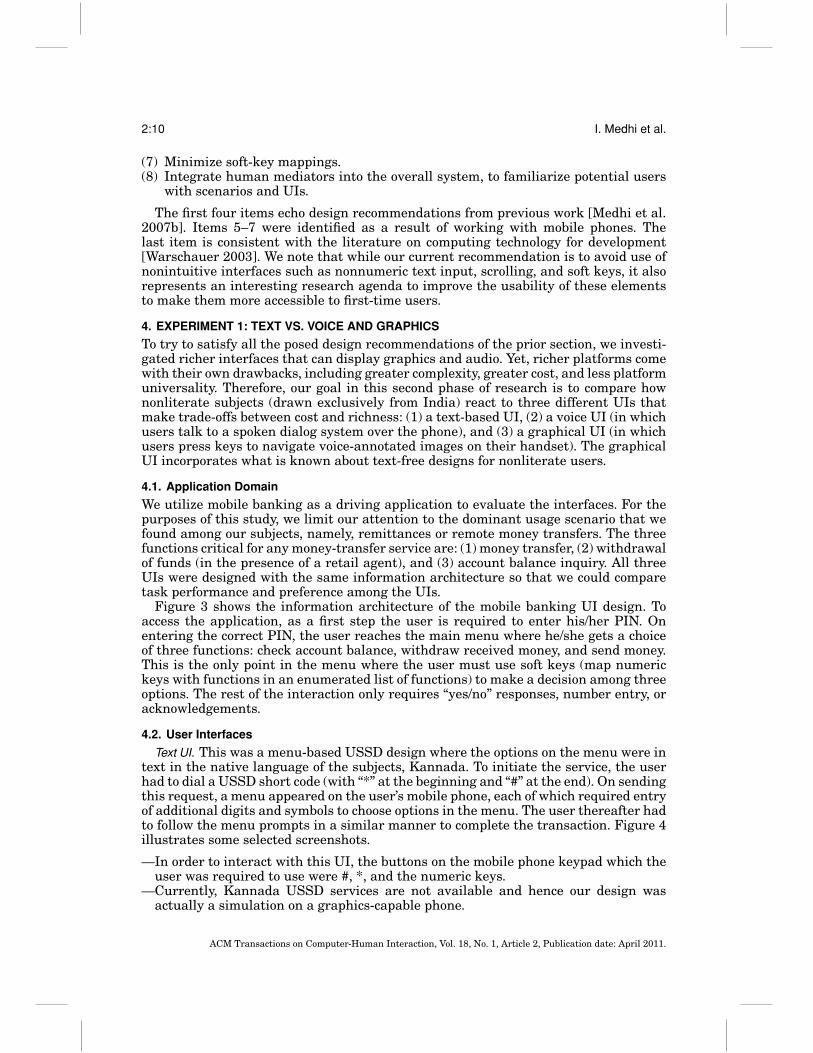
We utilize mobile banking as a driving application to evaluate the interfaces. For thepurposes of this study, we limit our attention to the dominant usage scenario that wefound among our subjects, namely, remittances or remote money transfers. The threefunctions critical for any money-transfer service are: (1) money transfer, (2) withdrawalof funds (in the presence of a retail agent), and (3) account balance inquiry. All threeUIs were designed with the same information architecture so that we could comparetask performance and preference among the UIs.
Figure 3 shows the information architecture of the mobile banking UI design. Toaccess the application, as a first step the user is required to enter his/her PIN. Onentering the correct PIN, the user reaches the main menu where he/she gets a choiceof three functions: check account balance, withdraw received money, and send money.This is the only point in the menu where the user must use soft keys (map numerickeys with functions in an enumerated list of functions) to make a decision among threeoptions. The rest of the interaction only requires “yes/no” responses, number entry, oracknowledgements.
4.2. User Interfaces
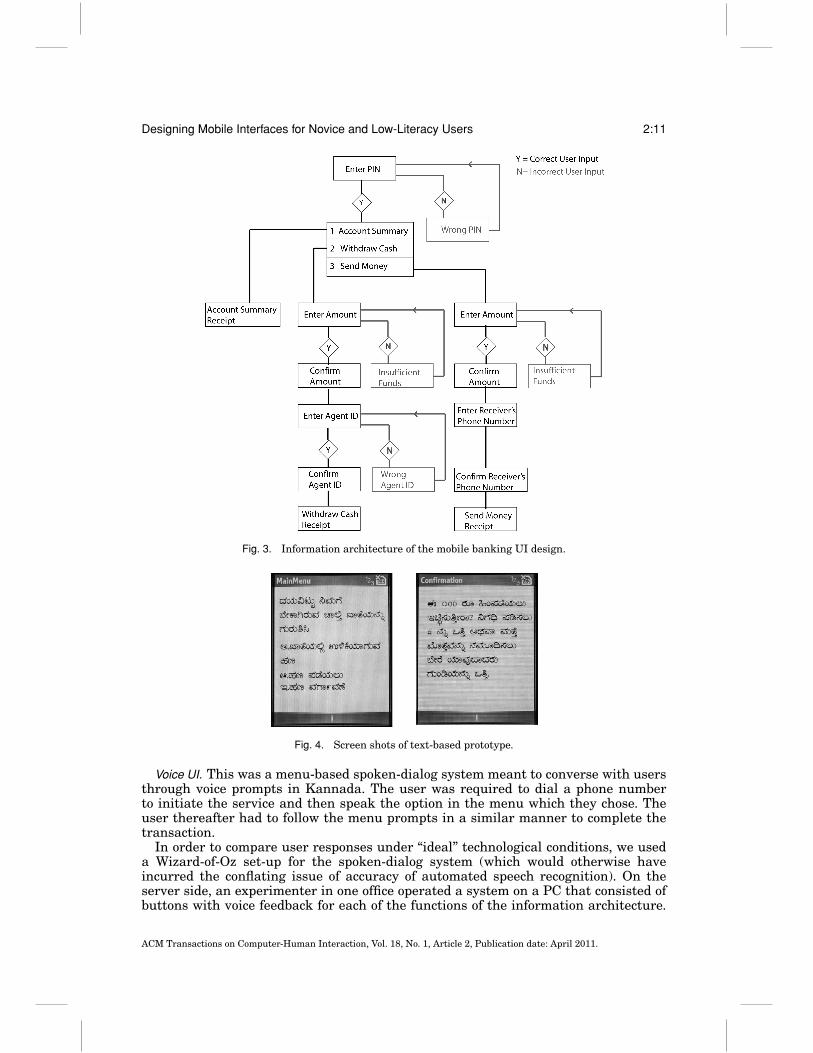
Text UI. This was a menu-based USSD design where the options on the menu were intext in the native language of the subjects, Kannada. To initiate the service, the userhad to dial a USSD short code (with “*” at the beginning and “#” at the end). On sendingthis request, a menu appeared on the user’s mobile phone, each of which required entryof additional digits and symbols to choose options in the menu. The user thereafter hadto follow the menu prompts in a similar manner to complete the transaction. Figure 4illustrates some selected screenshots.
—In order to interact with this UI, the buttons on the mobile phone keypad which theuser was required to use were #, *, and the numeric keys.
—Currently, Kannada USSD services are not available and hence our design wasactually a simulation on a graphics-capable phone.
ACM Transactions on Computer-Human Interaction, Vol. 18, No. 1, Article 2, Publication date: April 2011.
Designing Mobile Interfaces for Novice and Low-Literacy Users 2:11
Fig. 3. Information architecture of the mobile banking UI design.
Fig. 4. Screen shots of text-based prototype.
Voice UI. This was a menu-based spoken-dialog system meant to converse with usersthrough voice prompts in Kannada. The user was required to dial a phone numberto initiate the service and then speak the option in the menu which they chose. Theuser thereafter had to follow the menu prompts in a similar manner to complete thetransaction.
In order to compare user responses under “ideal” technological conditions, we useda Wizard-of-Oz set-up for the spoken-dialog system (which would otherwise haveincurred the conflating issue of accuracy of automated speech recognition). On theserver side, an experimenter in one office operated a system on a PC that consisted ofbuttons with voice feedback for each of the functions of the information architecture.
ACM Transactions on Computer-Human Interaction, Vol. 18, No. 1, Article 2, Publication date: April 2011.
2:12 I. Medhi et al.
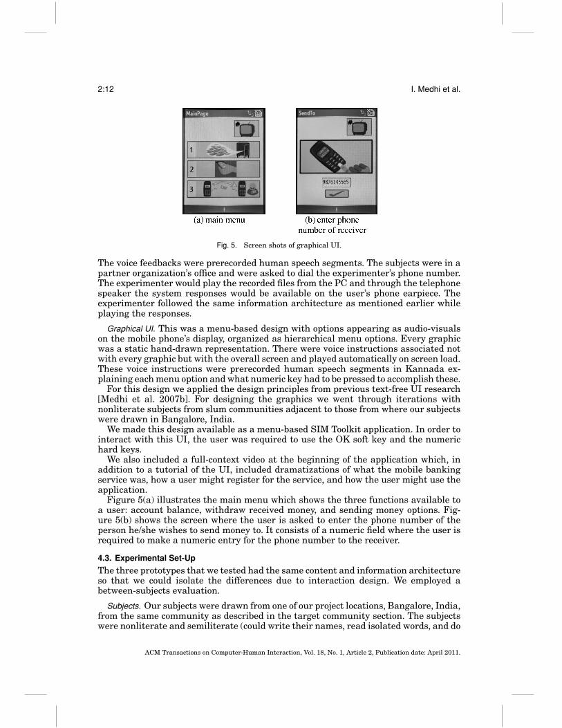
Fig. 5. Screen shots of graphical UI.
The voice feedbacks were prerecorded human speech segments. The subjects were in apartner organization’s office and were asked to dial the experimenter’s phone number.The experimenter would play the recorded files from the PC and through the telephonespeaker the system responses would be available on the user’s phone earpiece. Theexperimenter followed the same information architecture as mentioned earlier whileplaying the responses.
Graphical UI. This was a menu-based design with options appearing as audio-visualson the mobile phone’s display, organized as hierarchical menu options. Every graphicwas a static hand-drawn representation. There were voice instructions associated notwith every graphic but with the overall screen and played automatically on screen load.These voice instructions were prerecorded human speech segments in Kannada ex-plaining each menu option and what numeric key had to be pressed to accomplish these.
For this design we applied the design principles from previous text-free UI research[Medhi et al. 2007b]. For designing the graphics we went through iterations withnonliterate subjects from slum communities adjacent to those from where our subjectswere drawn in Bangalore, India.
We made this design available as a menu-based SIM Toolkit application. In order tointeract with this UI, the user was required to use the OK soft key and the numerichard keys.
We also included a full-context video at the beginning of the application which, inaddition to a tutorial of the UI, included dramatizations of what the mobile bankingservice was, how a user might register for the service, and how the user might use theapplication.
Figure 5(a) illustrates the main menu which shows the three functions available toa user: account balance, withdraw received money, and sending money options. Fig-ure 5(b) shows the screen where the user is asked to enter the phone number of theperson he/she wishes to send money to. It consists of a numeric field where the user isrequired to make a numeric entry for the phone number to the receiver.
4.3. Experimental Set-Up
The three prototypes that we tested had the same content and information architectureso that we could isolate the differences due to interaction design. We employed abetween-subjects evaluation.
Subjects. Our subjects were drawn from one of our project locations, Bangalore, India,from the same community as described in the target community section. The subjectswere nonliterate and semiliterate (could write their names, read isolated words, and do
ACM Transactions on Computer-Human Interaction, Vol. 18, No. 1, Article 2, Publication date: April 2011.
Designing Mobile Interfaces for Novice and Low-Literacy Users 2:13
some basic addition) adults living in five urban slum communities. We chose a range ofsuch participants varying in age, environment they lived and worked in at present, andvarying levels of experience in using mobile phones. Participants ranged in age from25–65 years. The taxonomic structure which we followed in choosing our participantswas: (a) no experience using mobile phones, (b) experience with using mobile phonesbut only for basic functions such as receiving and making calls, (c) experience withusing mobile phones for more complex functions such as sending text messages.
There were a total of 58 participants (60 initially, but two did not show up for thevoice-based trial), 28 male and 30 female. Each of the prototypes was tested on one-third of the total participants, that is, 20 participants (10 male and 10 female) in thecase of text-based and graphical UIs and 18 participants (8 male and 10 female) inthe case of the voice-based UI. The tests were conducted in the NGO office, in anenvironment participants were familiar with.
Training. As the goal of this experiment was to explore the experience of first-timeusers, we did not conduct any training of participants prior to their use of the inter-faces. The only assistance received was in the form of prompts from the experimenter,on a demand-driven basis during the evaluation. Prompts took the form of spoken en-couragement or reminders when the subjects appeared to be stuck or asked for helpfrom the experimenter. The number of prompts was recorded for each subject.
In order to help subjects grasp the general context, however, we did provide anintroductory overview that explained the concept of mobile banking. We delivered thisoverview in the best format that we expect would be available to users of a given UIin the real world. As users of a graphical UI would have graphics-capable phones, weprovided a full-context video as an overview; however, as users of the voice and textUIs would typically be using low-cost phones, we provided a live, verbal explanationthat mirrored the content in the full-context video. To keep the content consistent,both during the verbal explanation and playing of full-context video, subjects were notallowed to ask any questions to the experimenter.
Testing. Across all the three prototypes, once we were satisfied that our subjectsunderstood the capability of the application, we then told them the following story:A sibling of theirs who lived in a different town desperately needed money urgently.Assuming that the sibling also had a mobile banking account, their objective was tosend Rs. 400 to that sibling.
The preceding task was to be considered incomplete when either of these two thingshappened: (1) Despite repeated prompts, subjects gave up on the task, (2) subjectscommitted a fatal error (e.g., checked “account summary” when they were asked to“transfer money” of Rs. 400 and could not navigate their way back to the “transfermoney” menu despite repeated prompts).
Device and documentation tools. The device where the applications were tested was agraphics-capable phone. This phone was selected because of higher-quality graphicsand for ease of prototyping. While the graphics capabilities are required for the graphi-cal UI, they are unutilized by the voice and text UIs. We used the same phone to test allthree UIs, and did not observe any effects (on the voice and text UIs) that would havebeen different with a low-cost phone. The technique for data collection was detailednotes taken by us in situ while the participants were performing the task. This includedrecording total time taken and total number of prompts required for task completion.
4.4. Results
Consistent with prior research [Medhi et al. 2007b], the tests confirmed that nonliteratesubjects were unable to make sense of the text-based UI. More interestingly, they
ACM Transactions on Computer-Human Interaction, Vol. 18, No. 1, Article 2, Publication date: April 2011.
2:14 I. Medhi et al.
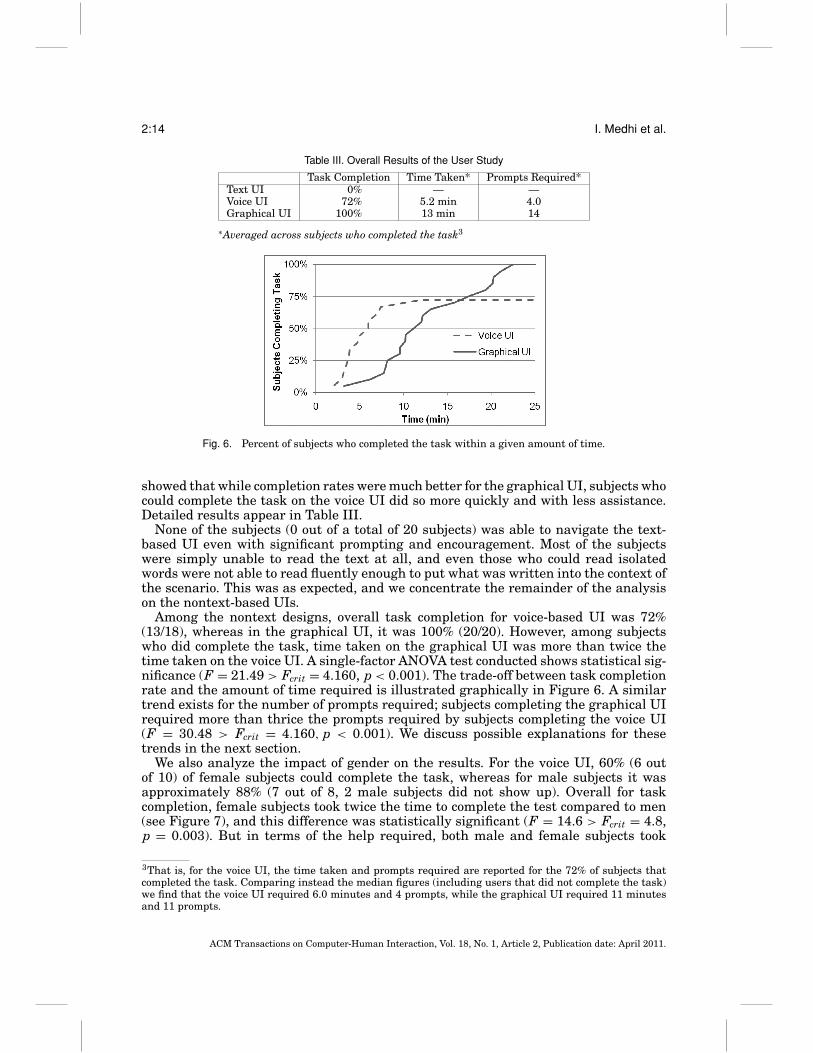
Table III. Overall Results of the User Study
Task Completion Time Taken* Prompts Required*Text UI 0% — —Voice UI 72% 5.2 min 4.0Graphical UI 100% 13 min 14
∗Averaged across subjects who completed the task3
Fig. 6. Percent of subjects who completed the task within a given amount of time.
showed that while completion rates were much better for the graphical UI, subjects whocould complete the task on the voice UI did so more quickly and with less assistance.Detailed results appear in Table III.
None of the subjects (0 out of a total of 20 subjects) was able to navigate the text-based UI even with significant prompting and encouragement. Most of the subjectswere simply unable to read the text at all, and even those who could read isolatedwords were not able to read fluently enough to put what was written into the context ofthe scenario. This was as expected, and we concentrate the remainder of the analysison the nontext-based UIs.
Among the nontext designs, overall task completion for voice-based UI was 72%(13/18), whereas in the graphical UI, it was 100% (20/20). However, among subjectswho did complete the task, time taken on the graphical UI was more than twice thetime taken on the voice UI. A single-factor ANOVA test conducted shows statistical sig-nificance (F = 21.49 > Fcrit = 4.160, p < 0.001). The trade-off between task completionrate and the amount of time required is illustrated graphically in Figure 6. A similartrend exists for the number of prompts required; subjects completing the graphical UIrequired more than thrice the prompts required by subjects completing the voice UI(F = 30.48 > Fcrit = 4.160, p < 0.001). We discuss possible explanations for thesetrends in the next section.
We also analyze the impact of gender on the results. For the voice UI, 60% (6 outof 10) of female subjects could complete the task, whereas for male subjects it wasapproximately 88% (7 out of 8, 2 male subjects did not show up). Overall for taskcompletion, female subjects took twice the time to complete the test compared to men(see Figure 7), and this difference was statistically significant (F = 14.6 > Fcrit = 4.8,p = 0.003). But in terms of the help required, both male and female subjects took
3That is, for the voice UI, the time taken and prompts required are reported for the 72% of subjects thatcompleted the task. Comparing instead the median figures (including users that did not complete the task)we find that the voice UI required 6.0 minutes and 4 prompts, while the graphical UI required 11 minutesand 11 prompts.
ACM Transactions on Computer-Human Interaction, Vol. 18, No. 1, Article 2, Publication date: April 2011.

Designing Mobile Interfaces for Novice and Low-Literacy Users 2:15
3.45 3.71
7.24
4.00
0
1
2
3
4
5
6
7
8
Time (min) Prompts
Performance by Gender on Voice UI
male
female
Fig. 7. Performance by gender on the voice UI.
12.8414.40
12.98 12.90
0
6
12
18
Time (min) Prompts
Performance by Gender on Graphical UI
male
female
Fig. 8. Performance by gender on the graphical UI.
similar number of prompts for completing the test (F = 0.051 < Fcrit = 4.8, p = 0.826),as shown in Figure 7.
For the graphical UI, there were no major differences in terms of time taken and helprequired between male and female subjects. Male and female subjects took the sametime for completion (F = 0.003 < Fcrit = 4.413, p = 0.958). Male and female subjectsalso took almost the same number of prompts for task completion on the graphical UI(F = 0.289 < Fcrit = 4.413, p = 0.598). Details are in Figure 8.
4.5. Discussion
It may seem counter-intuitive that the voice UI could result in lower task completionrates while simultaneously requiring less time and fewer prompts for those who didcomplete the task. Based on our observations and post-trial interviews, we offer severalexplanations for this phenomenon. We divide our analysis according to two orthogonalquestions: why were users faster and more independent on the voice UI, and why werethey also more likely to give up?
Users were faster and more independent on the voice UI. Three factors were responsible forthe speed and independence of users who completed tasks on the voice UI. First, userswere less hesitant to provide spoken inputs than to provide typed inputs. Except fordialing the phone number initially, the rest of the interaction on the voice UI mirroreda normal conversation on a normal phone, and users were comfortable participatingin the conversation just as they would do otherwise. In contrast, interaction with the
ACM Transactions on Computer-Human Interaction, Vol. 18, No. 1, Article 2, Publication date: April 2011.
2:16 I. Medhi et al.
graphical UI required typed inputs, an unfamiliar mode of interaction that causesanxiety for novice users. Subjects were nervous that their keypress might “break” or“spoil” the phone, and thus required significant prompting, encouragement, and timeto press any key.
Second, subjects found it easier to determine which word they should speak onthe voice UI versus determining which button they should press on the graphicalUI. At the top-level menu, the voice UI required subjects to speak their selection,for example, “Account Summary”, “Withdraw Money,” etc. In contrast, the graphical UIrequired subjects to map numeric keys to functions, for example, press 1 for the accountsummary, press 2 to withdraw money, etc. For the rest of the interaction, there wasonly one way to accomplish a task and the user was not required to make any decisions.For the voice UI this interaction was almost like an informal telephone conversationwith “yes/no” questions, whereas in the graphical UI the subject needed to understandthe buttons and push the right ones to accomplish the task.
Third, some subjects had prior experience with voice UIs, whereas no subjects hadprior experience with graphical UIs. Out of the 13 subjects who completed the task onthe voice UI, 7 had prior experience using voice UIs for functions such as mobile phonerecharge, setting caller tunes, etc. All of the subjects (7/7) who were previously exposedto voice UIs succeeded in completing the task.
Users were more likely to give up on the voice UI. Despite the influences detailed earlier, therate of task completion on the voice UI was nonetheless lower than the graphical UI.We attribute this to three factors. First, using the voice UI, some subjects did not un-derstand the concept of mobile banking. Post-trial interviews revealed that full-contextvideo in the graphical UI helped in better understanding the concept of mobile bankingand the scenarios in which it could be used, as compared to a verbal explanation thatmirrored the content of the same, in the case of voice UI.
Second, under the voice UI, some people could not understand technical bankingterms in the local language. Since most of our subjects did not have bank accounts,they were not familiar with the vocabulary of banking (“account summary,” “withdrawcash receipt,” etc.). We suspect using alternative colloquial terms could have resultedin better comprehension. Under the graphical UI, such subjects relied on the graphicalcues to guide them through the process. However, when they could not understand thespoken options, they were unable to complete the process; even with encouragementand prompts from the experimenters they did not put the prompted explanations aboutthe terminology into the context of the scenario.
Third, some subjects did not understand the basic mode of interaction using the voiceUI. They did not understand the concept of speaking with a voice that responded onlyin a certain, fixed manner; for example, subjects would keep saying “What Sir?”, “YesSir”, “Can’t understand what you are saying, Sir”, thinking it was a real person. Thesesubjects had never been exposed to voice UIs earlier.
These factors are compounded by the fact that it is perhaps more difficult to providehelpful prompts to users of the voice UI versus users of the graphical UI. With thegraphical UI: (a) the experimenter and subjects share a common view of the computerdevice, and (b) users employ different modalities for the tasks; viewing the graphicsoutput and listening to the experimenter prompts. In contrast, with the voice UI:(a) the experimenter observes only one side of the conversation (we did not conduct areal-time audio tap of the other side), and (b) users employ the same modalities for thetasks, listening to both system and experimenter prompts. Such competing usage ofthe speech channel could contribute to cognitive overload of the user, making it difficultto provide effective assistance with the dialog system.
ACM Transactions on Computer-Human Interaction, Vol. 18, No. 1, Article 2, Publication date: April 2011.
Designing Mobile Interfaces for Novice and Low-Literacy Users 2:17
Summary. We believe that task completion was lower on the voice UI because somesubjects lacked a basic understanding of mobile banking, banking terminology, or theconcept of automated spoken dialog systems. For subjects that passed these basicrequirements, they completed the task quickly and with less assistance because oftheir general comfort with speaking versus typing, their comprehension of what tospeak (versus what to type), and (in some cases) their prior experience with voice UIs.While our focus in this study was on the first-time experience of low-literacy users, itremains an important question for future work to understand the impact of increasedtraining or experience on users’ ability to complete tasks.
5. EXPERIMENT 2: TEXT VS. LIVE OPERATOR
In our second usability experiment, we expand our attention to consider a very interac-tive interface: that of a live operator, in which users accomplish tasks by talking to anactual human over the phone. We compare this interface to textual interfaces, based oneither electronic forms or SMS. Unlike the previous experiment, we focus our attentionon literate subjects who nonetheless have limited exposure to technology. We also focuson an application in mobile data collection, where users always succeed in reportingdata, but do so with varying degrees of accuracy. Thus, we report our results in termsof the error rate in data entered, rather than the rate of task completion.
The basic result of our experiment is that the operator interface is about 10 timesmore accurate than either electronic forms or SMS. While forms and SMS exhibitederror rates of 4.2% and 4.5%, respectively, corresponding to approximately one errorin every 20 entries, the live operator interface exhibited only one error in our entiretrial (corresponding to an error rate of 0.5%). This came as a surprise to us and (incombination with the cost effectiveness of call centers in India) caused our applicationpartners to switch their plans from using an electronic forms interface to using anoperator interface in a realistic setting.
5.1. Application Domain
We focus on an application in rural healthcare, in which health workers are tasked withinterviewing patients and uploading their symptoms via a phone. This application wasdesigned in partnership with a tuberculosis treatment program for their use in ruralIndia. In many tuberculosis treatment programs, patients consume antibiotics threetimes per week under the direct supervision of a health worker. It is critical thatpatients finish the full six-month treatment regimen in order to defeat the disease;otherwise they risk developing antibiotic resistance. By promptly uploading patientsymptoms from rural areas to a doctor in a central location, our partners hope to offerimproved medical guidance, ensuring the effectiveness of drugs, addressing real andperceived side-effects, and enabling more patients to complete the course of treatment.
The information architecture consists of a fixed series of questions. First, the pa-tient is identified by name. Then, eleven health indicators are entered. The first threeindicators are numeric: temperature, weight, and pulse. The next indicator is multiple-choice, designating the patient’s cough as either absent, rare, mild, heavy, or severe(with blood). The final indicators are yes/no questions, indicating the presence or ab-sence of seven symptoms and side-effects: night sweats, chest pain, loss of appetite,nausea, coughing with blood, yellow eyes, and fatigue. These indicators were chosen inconsultation with tuberculosis health experts.
5.2. User Interfaces
Electronic forms UI. In this interface, the user navigates a set of textual forms andmenus to enter the health data. As illustrated in Figure 9, numeric fields are entered
ACM Transactions on Computer-Human Interaction, Vol. 18, No. 1, Article 2, Publication date: April 2011.

2:18 I. Medhi et al.
Fig. 9. Screen shots of the electronic forms interface.
directly while multiple-choice options are selected from a list. The forms were imple-mented using Java.
The electronic forms underwent several design iterations, including gathering feed-back from a 3-day session with 22 health workers prior to this study. Based on feedbackfrom the workers, we chose to employ hybrid English/Hindi menus for some of the forms,since some medical terms are easier to understand in English, but others are easier tounderstand in Hindi. We also changed from using multi-select lists (with a checkboxper symptom) to a simpler interface utilizing individual yes/no questions.
Compared to other interfaces considered in this section, electronic forms are visuallyrich and enable health data to be stored locally on the phone in case the connectivityis poor. On the negative side, electronic forms require a programmable phone (suchas a Java phone) which elevates the cost per health worker. The interface can beprogrammed to use either SMS or GPRS to upload data to a server, depending on localcost and reliability constraints.
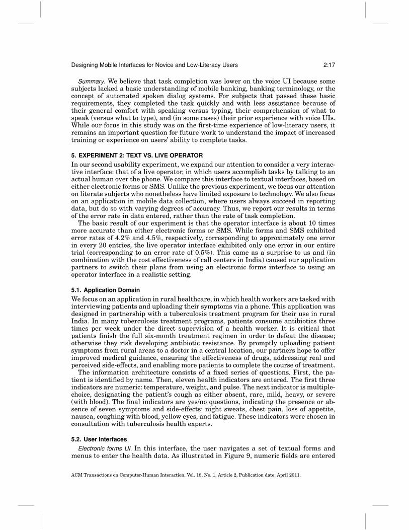
SMS UI. This interface requires health workers to construct a stylized SMS messagein which all patient symptoms are encoded numerically. Workers carry a cue card (seeFigure 10) that instructs them how to encode the patient’s health indicators into asingle SMS. The last box in Figure 10 represents a complete patient report that is sentto the server. While it would have been possible to encode certain symptoms using textrather than numeric digits, we opted for a numeric encoding due to familiarity andspeed with numeric input. The cue card was translated into the local language.
Unlike the electronic forms interface, the SMS interface is compatible with all low-cost phones (it does not require a programmable phone). Some workers also have moreexperience in sending SMS messages than they do in navigating complex forms. On thenegative side, the SMS encoding is somewhat complicated and requires an up-to-datecue card. It is also relatively easy for adversarial workers to fake a visit by resendingan old SMS.
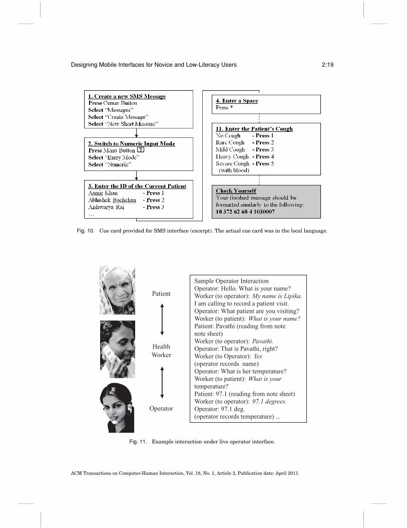
Live operator UI. In this interface, the health worker calls a live operator and dictatesthe symptoms over the phone. The operator is seated in front of a computer and entersthe symptoms directly into a database. As illustrated by the sample interaction inFigure 11, the health worker interacts with both the operator and the patient at thesame time, relaying the operator’s questions to the patient and repeating the patient’sreply to the operator. The operator confirms answers with the worker; this adds to thelength of the call but could potentially increase the accuracy.
Employing a live operator offers several advantages over the other interfaces. Healthworkers do not need to be literate to talk to the operator. It is easy to change and adapt
ACM Transactions on Computer-Human Interaction, Vol. 18, No. 1, Article 2, Publication date: April 2011.
Designing Mobile Interfaces for Novice and Low-Literacy Users 2:19
Fig. 10. Cue card provided for SMS interface (excerpt). The actual cue card was in the local language.
Patient
Health Worker
Operator
Sample Operator Interaction Operator: Hello. What is your name? Worker (to operator): My name is Lipika. I am calling to record a patient visit. Operator: What patient are you visiting? Worker (to patient): What is your name? Patient: Pavathi (reading from note note sheet) Worker (to operator): Pavathi. Operator: That is Pavathi, right? Worker (to Operator): Yes (operator records name) Operator: What is her temperature? Worker (to patient): What is your temperature? Patient: 97.1 (reading from note sheet) Worker (to operator): 97.1 degrees. Operator: 97.1 deg. (operator records temperature) ...
Fig. 11. Example interaction under live operator interface.
ACM Transactions on Computer-Human Interaction, Vol. 18, No. 1, Article 2, Publication date: April 2011.
2:20 I. Medhi et al.
the survey questions over time, without distributing a new program or cue card. It isalso easy for workers to convey detailed, free-form notes that do not fit into the standardsurvey. The potential drawbacks of the operator interface are the unconventional three-way social interaction, and also the cost (of employing the operator and consumingairtime). However, in countries such as India, we have found that the costs of theoperator are less than the costs of programmable phones for a single TB treatmentprogram [Patnaik et al. 2009]. This makes the operator interface a very realistic andattractive option.
5.3. Experimental Set-Up
The user study took place in the Surat and Bharuch districts of the Indian state ofGujarat during July and August of 2008. We employed a within-subjects evaluation.
Subjects. There were 13 subjects, consisting of 6 community health workers and 7hospital paramedical staff. Eleven of the subjects were native Gujarati speakers andall spoke Hindi. Unlike the previous study, all of these subjects were literate.
The education level of the health workers ranged from 10–12 years, and their averageage was 26. While 5 out of 6 health workers had used a cell phone, only one of themowned a cell phone. In contrast, the education level of the hospital staff ranged fromclass 10 to a B.A. degree (4 out of 7 had obtained postsecondary training). The averageage of the hospital staff was 29, and all but one of them owned a cell phone. A detailedbreakdown of the subjects is available in a prior paper [Patnaik et al. 2009].
Initially, we had hoped to perform the study entirely with community health workers,as they are often the primary agents of remote data collection (including in our partner’stuberculosis treatment program). However, this turned out to be infeasible becausesome community health workers were unable to travel to the public health center fortraining and testing, and it was not feasible for us to travel to each worker’s home. Thisprompted us to broaden the study to include hospital staff from other centers.
Training. Subjects were trained in groups by at least two trainers at a given time.Initially, examples were presented on a whiteboard and subjects were instructed topractice entering in the data on either electronic forms or as an SMS using the cuecard. After this stage, a paper with a set of example patients was handed out, andsubjects were instructed to practice entering in this data. In the final stage, subjectswere instructed to practice role playing patient-worker interactions with each other.
Subjects received variable amounts of training, depending on their experience andavailability. Health workers were trained in large groups for a duration of 6–8 hours,while hospital staff were trained in small groups for 45 minutes to 2 hours. The longertraining sessions were not necessarily more effective, given that the group size waslarger. While it would have been desirable to achieve more uniform training, thiswas difficult given the logistics of transportation and worker schedules. Prior to thecompletion of training, all subjects had completed at least two perfect interactions onboth electronic forms and SMS, and at least one perfect interaction on the live operatormode.
Testing. Subjects were tested in pairs, alternating who was being tested on data entryand who was playing the fake patient for that data point. The order of the interfaceswas randomized: for a given subject pairing, the order of voice, SMS, and electronicforms was alternated. For the voice interface, the second author acted as the operatorand was located outside of the room testing was being conducted in; however, therewas always an additional person associated with the experiment inside the room at alltimes with the subjects.
ACM Transactions on Computer-Human Interaction, Vol. 18, No. 1, Article 2, Publication date: April 2011.
Designing Mobile Interfaces for Novice and Low-Literacy Users 2:21
0
1
2
3
4
5
Error rate (%) Entry time (min)
Overall Error Rates and Entry Times
ElectronicForms
SMS
LiveOperator
Fig. 12. Overall error rates and entry times for the trial.
During testing, each subject performed two complete patient/worker interactions (inthe role of the worker) for each of the forms and SMS interfaces. For the operatorinterface, the six community health workers completed only one interaction, whileothers completed two interactions (we did not anticipate that the operator interfacewould become a focal point of this study until halfway through our experiments).
The lag time between training and testing was exactly one day for seven of thesubjects, and ranged between half a day and two days for the remaining subjects. Allsubjects received a brief refresher and supervised entry session immediately prior totesting.
Device and documentation tools. The device used for experimentation was a low-end Javaphone (a Motorola L6i). All interfaces and related tools (cue cards, etc.) were presentedin Hindi, and the mobile phones used had dual Hindi menus. To measure outcomes,we inspected the data entered into the phones and also gathered an audio recording ofthe calls to the live operator.
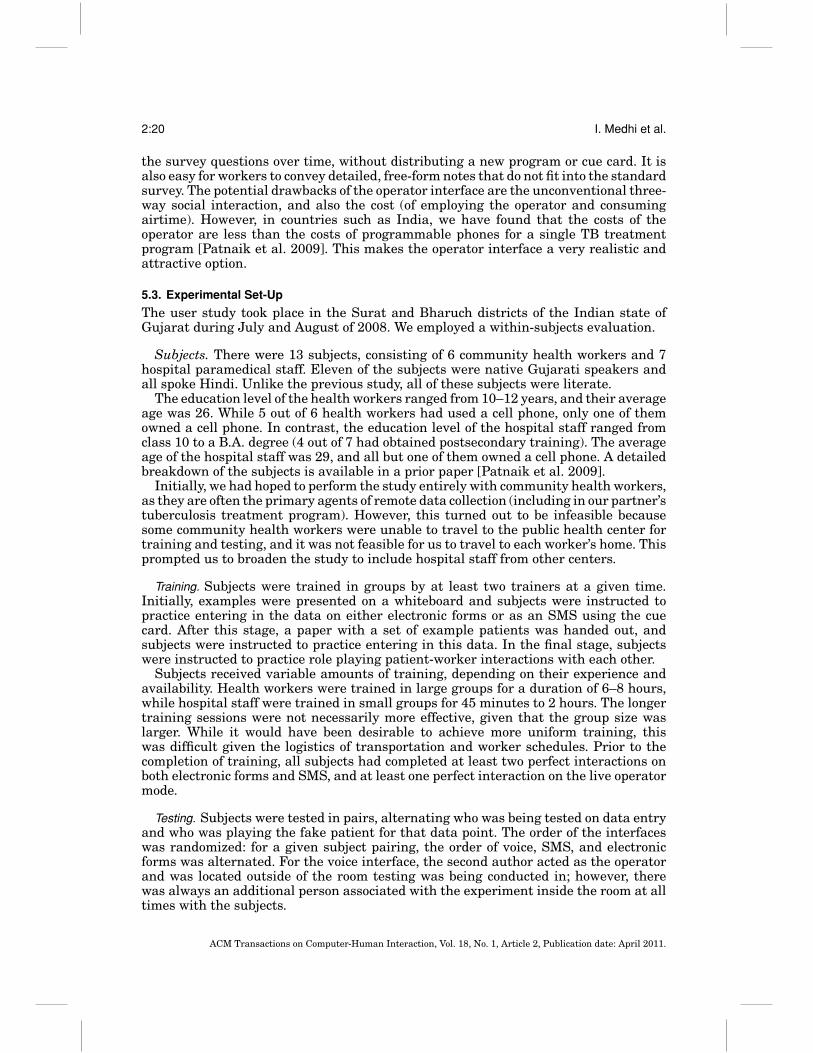
5.4. Results
The results of the user study are summarized in Figure 12. We present both theaccuracy of data entry, as well as the time needed to interview patients and report thedata.
On average, electronic forms and SMS offered comparable error rates of 4.2% and4.5% per entry, respectively. The operator interface proved to be approximately 10×more accurate, with an error rate of 0.45% per entry (corresponding to only a singleerror across all of our tests). While only one out of thirteen participants performedperfectly on both the forms and SMS interfaces, twelve out of thirteen participantsperformed perfectly with the operator. A single-factor ANOVA test revealed that oper-ator interface had a significantly lower error rate than electronic forms (F = 7.38 >Fcrit = 4.06, p = 0.009) and SMS (F = 7.49 > Fcrit = 4.06, p = 0.009); no significantdifference was found between the error rates of electronic forms and SMS (F = 0.042< Fcrit = 4.03, p = 0.839).
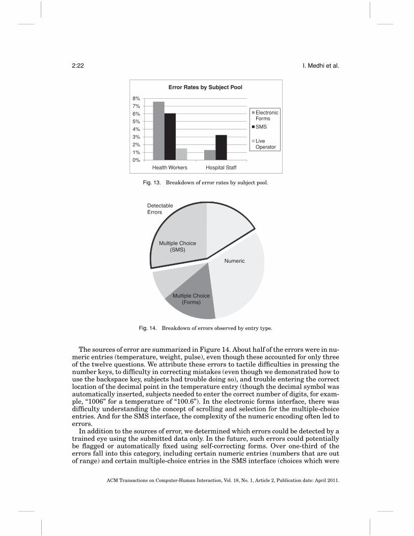
It is important to note that our results indicate a bimodal distribution of error rates:hospital staff performed notably better than health workers. As summarized in Fig-ure 13, health workers exhibited an error rate of 7.6% for forms and 6.1% for SMS,while hospital staff exhibited an error rate of 1.3% for forms and 3.2% for SMS. Inaddition, the only operator error occurred with health workers. These differences arediscussed in the following section.
ACM Transactions on Computer-Human Interaction, Vol. 18, No. 1, Article 2, Publication date: April 2011.
2:22 I. Medhi et al.
0%
1%
2%
3%
4%
5%
6%
7%
8%
Health Workers Hospital Staff
Error Rates by Subject Pool
ElectronicForms
SMS
LiveOperator
Fig. 13. Breakdown of error rates by subject pool.
DetectableErrors
Multiple Choice(SMS)
Numeric
Multiple Choice(Forms)
Fig. 14. Breakdown of errors observed by entry type.
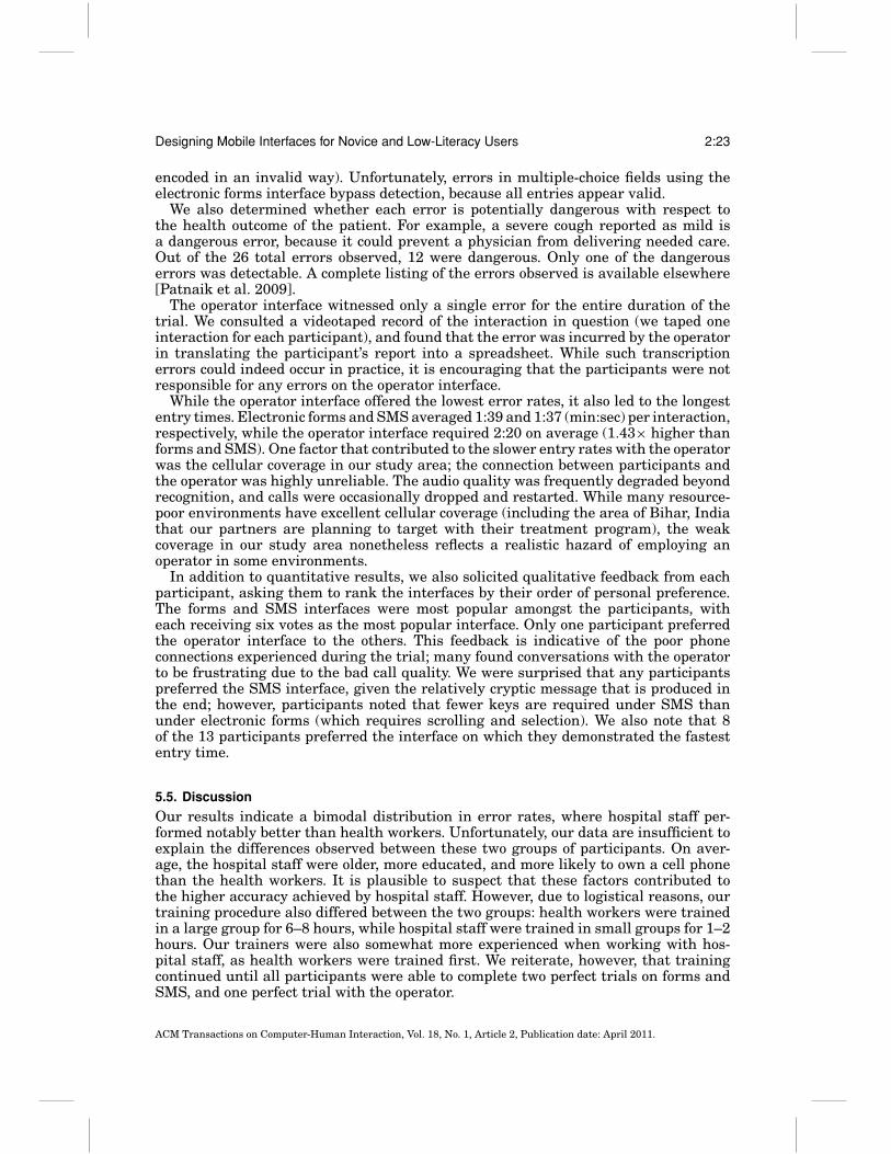
The sources of error are summarized in Figure 14. About half of the errors were in nu-meric entries (temperature, weight, pulse), even though these accounted for only threeof the twelve questions. We attribute these errors to tactile difficulties in pressing thenumber keys, to difficulty in correcting mistakes (even though we demonstrated how touse the backspace key, subjects had trouble doing so), and trouble entering the correctlocation of the decimal point in the temperature entry (though the decimal symbol wasautomatically inserted, subjects needed to enter the correct number of digits, for exam-ple, “1006” for a temperature of “100.6”). In the electronic forms interface, there wasdifficulty understanding the concept of scrolling and selection for the multiple-choiceentries. And for the SMS interface, the complexity of the numeric encoding often led toerrors.
In addition to the sources of error, we determined which errors could be detected by atrained eye using the submitted data only. In the future, such errors could potentiallybe flagged or automatically fixed using self-correcting forms. Over one-third of theerrors fall into this category, including certain numeric entries (numbers that are outof range) and certain multiple-choice entries in the SMS interface (choices which were
ACM Transactions on Computer-Human Interaction, Vol. 18, No. 1, Article 2, Publication date: April 2011.
Designing Mobile Interfaces for Novice and Low-Literacy Users 2:23
encoded in an invalid way). Unfortunately, errors in multiple-choice fields using theelectronic forms interface bypass detection, because all entries appear valid.
We also determined whether each error is potentially dangerous with respect tothe health outcome of the patient. For example, a severe cough reported as mild isa dangerous error, because it could prevent a physician from delivering needed care.Out of the 26 total errors observed, 12 were dangerous. Only one of the dangerouserrors was detectable. A complete listing of the errors observed is available elsewhere[Patnaik et al. 2009].
The operator interface witnessed only a single error for the entire duration of thetrial. We consulted a videotaped record of the interaction in question (we taped oneinteraction for each participant), and found that the error was incurred by the operatorin translating the participant’s report into a spreadsheet. While such transcriptionerrors could indeed occur in practice, it is encouraging that the participants were notresponsible for any errors on the operator interface.
While the operator interface offered the lowest error rates, it also led to the longestentry times. Electronic forms and SMS averaged 1:39 and 1:37 (min:sec) per interaction,respectively, while the operator interface required 2:20 on average (1.43× higher thanforms and SMS). One factor that contributed to the slower entry rates with the operatorwas the cellular coverage in our study area; the connection between participants andthe operator was highly unreliable. The audio quality was frequently degraded beyondrecognition, and calls were occasionally dropped and restarted. While many resource-poor environments have excellent cellular coverage (including the area of Bihar, Indiathat our partners are planning to target with their treatment program), the weakcoverage in our study area nonetheless reflects a realistic hazard of employing anoperator in some environments.
In addition to quantitative results, we also solicited qualitative feedback from eachparticipant, asking them to rank the interfaces by their order of personal preference.The forms and SMS interfaces were most popular amongst the participants, witheach receiving six votes as the most popular interface. Only one participant preferredthe operator interface to the others. This feedback is indicative of the poor phoneconnections experienced during the trial; many found conversations with the operatorto be frustrating due to the bad call quality. We were surprised that any participantspreferred the SMS interface, given the relatively cryptic message that is produced inthe end; however, participants noted that fewer keys are required under SMS thanunder electronic forms (which requires scrolling and selection). We also note that 8of the 13 participants preferred the interface on which they demonstrated the fastestentry time.
5.5. Discussion
Our results indicate a bimodal distribution in error rates, where hospital staff per-formed notably better than health workers. Unfortunately, our data are insufficient toexplain the differences observed between these two groups of participants. On aver-age, the hospital staff were older, more educated, and more likely to own a cell phonethan the health workers. It is plausible to suspect that these factors contributed tothe higher accuracy achieved by hospital staff. However, due to logistical reasons, ourtraining procedure also differed between the two groups: health workers were trainedin a large group for 6–8 hours, while hospital staff were trained in small groups for 1–2hours. Our trainers were also somewhat more experienced when working with hos-pital staff, as health workers were trained first. We reiterate, however, that trainingcontinued until all participants were able to complete two perfect trials on forms andSMS, and one perfect trial with the operator.
ACM Transactions on Computer-Human Interaction, Vol. 18, No. 1, Article 2, Publication date: April 2011.
2:24 I. Medhi et al.
Perhaps the most important result of this study is the identification of the liveoperator as a highly accurate and flexible interface for mobile data collection. We weresurprised and alarmed that the textual interfaces resulted in error rates as muchas 10× higher than the live operator. In collaboration with community partners, ouroriginal intent was to utilize electronic forms in an upcoming tuberculosis treatmentprogram. However, we consider it to be an unacceptable risk that 38% of submittedforms (containing critical health information) may contain errors. For this reason, wehave overhauled our plans and will pursue a treatment program using a live operatorrather than forms or SMS. While the cost of a live operator may be prohibitive in manycountries, in India it proves to be very cost effective. The increased cost of a humanoperator is more than compensated by the decreased cost of voice-only handsets, voice-only cellular plans, decreased training time, and decreased literacy requirements forhealth workers [Patnaik et al. 2009].
A second noteworthy result of the study is that the overall error rates observed forSMS are not significantly higher than that of electronic forms, even when our electronicforms solution was iteratively designed in collaboration with the target community.This suggests that it might be viable to consider a simple SMS reporting system incases where it is too complex or costly to develop an electronic forms solution.
While the results of this study have changed our own approach to implementingmobile data collection, we caution the reader in extending the results of the studybeyond its original context. Our sample size is very small, encompassing only 13 usersand observing only 26 errors in total. Clearly a larger study is needed to obtain a moreprecise estimate of the error rates, particularly in the case of a live operator (where weobserved only 1 error during our trials). In addition, we are focused on the scenario inwhich users have limited cell phone familiarity and there is limited time to performtraining. If either of these variables changes, it may be possible to implement high-accuracy mobile data collection with electronic forms or SMS. Also, while the error ratesthat we report on mobile phones are 3 − 8× higher than those previously reported forPDAs, our data are unable to distinguish whether this difference is due to the devicesor due to other aspects of the study demographics, training, and evaluation. A futurestudy could address this question directly by evaluating both phones and PDAs in thesame context.
6. CONCLUSIONS AND FUTURE WORK
Given the widespread excitement in using mobile phones for providing services in thedeveloping world, it is important to establish that the data entered on these devicesmeets the strict accuracy requirements of health, finance, and other applications. Inthis article, we explore the usability of mobile interfaces for novice and low-literacyusers via three in-depth studies: an ethnographic investigation of 90 subjects in India,Kenya, the Philippines, and South Africa; a quantitative evaluation of text, spokendialog, and graphical interfaces across 58 first-time low-literacy subjects in southernIndia; and a quantitative evaluation of electronic forms, SMS, and live operator inter-faces across 13 novice but literate users in northern India.
Our results confirm that textual interfaces are unusable by low-literacy users anddifficult to use accurately by novice users. In the context of mobile banking, not a singlelow-literacy user was able to complete tasks in existing text-based UIs. In the contextof healthcare, we observed approximately a 5% error rate amongst novice users (intol-erable for many health applications) using an SMS or electronic forms interface. Ourethnographic investigation points to many usability barriers to traditional textual in-terfaces, including difficulty in scrolling and hierarchical navigation, soft-key mapping,nonnumeric input, and understanding technical language. Our general guidelines areto minimize use of these elements, while providing voice and graphical cues.
ACM Transactions on Computer-Human Interaction, Vol. 18, No. 1, Article 2, Publication date: April 2011.
Designing Mobile Interfaces for Novice and Low-Literacy Users 2:25
What interfaces are usable by low-literacy users? Perhaps our most positive result isthat of a live operator: novice users can dictate patient health information with 99.5%accuracy for real-time transcription by an operator. In India, a live operator is a cost-effective solution for reporting small amounts of data, and we advocate its use overSMS or electronic forms. However, for environments or applications that cannot supportan operator, an automated interface is needed. Though it remains an open researchproblem to develop a fully automatic interface that allows first-time nonliterate usersto complete tasks without assistance, our studies advance the state-of-the-art in thisarea by identifying effective design elements as well as usability bottlenecks that canbe targeted in future work.
In the case of the voice UI, most users were comfortable with the spoken interface,but some users (28%) encountered roadblocks that prevented them from completingthe task. Before deploying a spoken interface for novice and first-time users, it wouldbe critical to ensure that they are familiar with the language, concepts, and terms thatare used in the application. It would also be critical for them to understand the generalconcept of interacting with a spoken dialog system. If these hurdles can be overcome,the voice UI offers a platform that is relatively familiar and natural to users, allowingthem to complete tasks more quickly and with less assistance than on the graphical UI.A practical means of leveraging the voice UI could be as part of a hybrid interface, whereusers first attempt a spoken dialog system, but are referred to a live operator if theyexperience problems. Introducing the operator could boost the rate of task completionwhile also leveraging the automated interface in cases where it is effective. In order tofurther inform this trade-off, in future research it will be valuable to rigorously assessthe accuracy and usability of a spoken dialog system relative to a live operator.
In the case of the graphical UI, all of our subjects completed the task, but only withextensive prompting and encouragement. While the number of prompts needed maydecrease with further practice or coaching, the current interface is not suitable forindependent use by first-time users. In order to make users more autonomous, it willbe necessary to decrease their anxiety about pressing keys and “breaking” the device.It will also be helpful to decrease the mental burden of mapping keys to abstractfunctions. One promising avenue for addressing both of these challenges is to explorea new design point that augments the graphical UI with spoken input. By integratinga spoken dialog system with graphical cues, one could potentially leverage the bestaspects of both interfaces.
ACKNOWLEDGMENTS
We are very grateful to the many people who graciously facilitated and participated in our user studies. Wethank Kabir Kumar of CGAP for making introductions with partner organizations, Aishwarya Ratan forsharing data from Kenya ethnography and for valuable feedback, Abhishek A. for the illustrations for rich-client UI, Avinash Shetty and David Darkwa for software development, Kalika Bali for designing the spoken-dialog interaction design, and Raghu Menon for help with usability studies. We thank Stree Jagruti Samitee(India), LearntoEarn and University of Cape Town (South Africa) and Holy Name University (Philippines)for help in recruiting subjects. We thank G-Cash, Eko, Equity, Safaricom and WIZZIT for allowing us to studytheir mobile banking services. We thank the hospital staff at the Sardar Vallabhbhai National Institute ofTechnology in Surat, and also at the Reliance TB Hospital in Hazira. We thank Joshnaben Godia of theTaluka Development office in Vagra, Gujarat, and especially Suprava Patnaik for all her help with our study.
REFERENCES
AED SATELLIFE. 2004. Cost effectiveness study report for the pda data capture and transmission.http://www.healthnet.org/coststudy.php.
ACM Transactions on Computer-Human Interaction, Vol. 18, No. 1, Article 2, Publication date: April 2011.

2:26 I. Medhi et al.
ANANTRAMAN, V., MIKKELSEN, T., KHILNANI, R., KUMAR, V. S., MACHIRAJU, N. R., PENTLAND, A., ET AL. 2002.Handheld computers for rural healthcare: Experiences from research concept to global operations. InProceedings of the Workshop on Development by Design.
BALANCING ACT NEWS. 2007. Mali: Mobile service helps bring down infant mortality.http://www.balancingact-africa.com/news/back/balancing-act 364.html.
BERNABE-ORTIZ, A., CURIOSO, W. H., GONZALES, M. A., EVANGELISTA, W., CASTAGNETTO, J. M., CARCAMO, C. P., ET AL.2008. Handheld computers for self-administered sensitive data collection: A comparative study in Peru.BMC Med. Inf. Decis. Making 8, 11.
BLAYA, J. AND FRASER, H. S. 2006. Development, implementation and preliminary study of a PDA-basedbacteriology collection system. In Proceedings of the AMIA Annual Symposium. 41–45.
BOYERA, S. 2007. The mobile Web to bridge the digital divide? In Proceedings of the IST-Africa Conference.BRIDGES.ORG. 2003. Evaluation of the SATELLIFE PDA project. http://www.bridges.org/files/active/1/
Evltn%20rpt SATELLIFE%20PDA%20Project FINAL 28%20Feb%202003.pdf.CHIPCHASE, J. 2005. Understanding non-literacy as a barrier to mobile phone communication. http://
research.nokia.com/bluesky/non-literacy-001-2005/index.html.CHIPCHASE, J. 2006. Literacy, communication, and design. In Proceedings of the UIAH Conference.COOPER, A. AND REIMANN, R. 2003. About Face 2.0, The Essentials of Interaction Design. Wiley Publishing.CURIOSO, W. H., KARRAS, B. T., CAMPOS, P. E., BUENDIA, C., HOLMES, K. K., AND KIMBALL, A. M. 2005. Design and
implementation of Cell-PREVEN: a real-time surveillance system for adverse events using cell phonesin Peru. In Proceedings of the AMIA Annual Symposium. 176–180.
DERENZI, B., LESH, N., PARIKH, T., SIMS, C., MAOKLA, W., CHEMBA, M., ET AL. 2008. E-IMCI: Improving pedi-atric health care in low-income countries. In Proceedings of the ACM Conference on Human Factors inComputing Systems (CHI).
DIERO, L., ROTICH, J., BII, J., MAMLIN, B., EINTERZ, R., KALAMAI, I., ET AL. 2006. A computer-based medical recordsystem and personal digital assistants to assess and follow patients with respiratory tract infectionsvisiting a rural Kenyan health centre. BMC Med. Inf. Decis. Making, 6, 1, 21.
DONNER, J. 2008. Research approaches to mobile use in the developing world: A review of the literature. Inf.Soc. 24, 3.
ENGEBRETSEN, T. 2005. Acceptance of information technology by health research projects in low-income coun-tries: Intention to use and acceptance of using EpiHandy (IUAUE). Master’s thesis, Agder UniversityCollege.
FORSTER, D., BEHRENS, R. H., CAMPBELL, H., AND BYASS, P. 1991. Evaluation of a computerized field datacollection system for health surveys. Bull. World Health Organ. 69, 1, 107–111.
FYNN, R. 2006. Remote HIV/AIDS patient monitoring tool using 3g/gprs packet-switched mobile technology.In Appropriate Healthcare Technologies for Developing Countries 129–138.
GRISEDALE, S., GRAVES, M., AND GRUNSTEIDL, A. 1997. Designing a graphical user interface for healthcareworkers in rural India. In Proceedings of the ACM Conference on Human Factors in Computing Systems(CHI). ACM Press, New York.
GROVER, A. S., PLAUCHE, M., BARNARD, E., AND KUUN, C. 2009. HIV health information access using spokendialogue systems: Touchtone vs. speech. In Proceedings of the International Conference on Informationand Communication Technologies and Development.
GROVES, T. 1996. SatelLife: Getting relevant information to the developing world. BMJ Clinic. Res. 313, 7072,1606–1609.
GUPTA, P. C. 1996. Survey of sociodemographic characteristics of tobacco use among 99,598 individuals inBombay, India using handheld computers. Tobacco Control 5, 2, 114–120.
HAVELOCK, E. A. 1971. Prologue to Greek Literacy. University of Cincinnati Press.ITU. 2009. Measuring the Information Society: The ICT Development Index. International Telecommunica-
tions Union.IVATURY, G. 2004. Harnessing technology to transform financial services for the poor. Small Enterpr. Devel.
15, 4, 25–30.JONES, M., BUCHANAN, G., THIMBLEBY, H., AND MARSDEN, G. 2000. User interfaces for mobile Web devices: WWW9
mobile workshop position paper. In Proceedings of the International World Wide Web Conference.LADD, H. AND SEWANKAMBO, N. 2004. Uganda health information network.Tech. rep. submitted to the Interna-
tional Development Research Centre, SATELLIFE and Uganda Chartered HealthNet.LEHRMAN, S. 2007. Dialing in. Mobile phones target the world’s nonreading poor. Sci. Amer. 296, 5, 30–31.MEDHI, I., GAUTAMA, S. N. N., AND TOYAMA, K. 2009. A comparison of mobile money-transfer uis for non-literate
and semi-literate users. In proceedings of the ACM Conference on Human Factors in Computing Systems(CHI).
ACM Transactions on Computer-Human Interaction, Vol. 18, No. 1, Article 2, Publication date: April 2011.
Designing Mobile Interfaces for Novice and Low-Literacy Users 2:27
MEDHI, I., PRASAD, A., AND TOYAMA, K. 2007a. Optimal audio-visual representations for illiterate users. InProceedings of the International World Wide Web Conference.
MEDHI, I. AND RATAN, A. 2006. Usability test of—bank’s biometric-ATM prototype: An evaluation. Tech. rep.,Microsoft Research India.
MEDHI, I. AND RATAN, A. 2008. Eko report: An evaluation. Tech. rep., Microsoft Research India.MEDHI, I., SAGAR, A., AND TOYAMA, K. 2007b. Text-Free user interfaces for illiterate and semiliterate users. Inf.
Technol. Int. Devel. 4, 1, 37–50.MEDHI, I. AND TOYAMA, K. 2007. Full-Context videos for first-time, non-literate pc users. In Proceedings of the
International Conference on Information and Communication Technologies and Development.MISSINOU, M. A., OLOLA, C. H. O., ISSIFOU, S., MATSIEGUI, P., ADEGNIKA, A. A., BORRMANN, S., ET AL. 2005. Short
report: Piloting paperless data entry for clinical research in Africa. Amer. J. Trop. Med. Hyg. 72, 3,301–303.
NOKIA. 2007. Mobilizing against malaria. Expand. Horiz. Newslet. 12–13.PARIKH, T., GHOSH, K., AND CHAVAN, A. 2003a. Design considerations for a financial management system
for rural, semi-literate users. In proceedings of the ACM Conference on Human Factors in ComputingSystems (CHI).
PARIKH, T., GHOSH, K., AND CHAVAN, A. 2003b. Design studies for a financial management system for micro-credit groups in rural India. In Proceedings of the ACM Conference on Universal Usability.
PARIKH, T. S. 2005. Using mobile phones for secure, distributed document processing in the developing world.IEEE Pervas. Comput. 4, 2, 74–81.
PARIKH, T. S., JAVID, P., SASIKUMAR, K., GHOSH, K., AND TOYAMA, K. 2006. Mobile phones and paper documents:Evaluating a new approach for capturing microfinance data in rural India. In Proceedings of the ACMConference on Human Factors in Computing Systems (CHI).
PATEL, N., AGARWAL, S., RAJPUT, N., NANAVATI, A., DAVE, P., AND PARIKH, T. S. 2009. A comparative study ofspeech and dialed input voice interfaces in rural India. In Proceedings of the ACM Conference on HumanFactors in Computing Systems (CHI).
PATNAIK, S., BRUNSKILL, E., AND THIES, W. 2009. Evaluating the accuracy of data collection on mobile phones:A study of forms, sms, and voice. In Proceedings of the International Conference on Information andCommunication Technologies and Development.
PLAUCHE, M. AND PRABAKER, M. 2006. Tamil market: A spoken dialog system for rural India. In Proceedings ofthe ACM Conference on Human Factors in Computing Systems (CHI).
RATAN, A. 2008. Using technology to deliver financial services to low-income households: A preliminary studyof Equity Bank and M-PESA customers in Kenya. Tech. rep., Microsoft Research India.
SELANIKIO, J. N. D. 2009. Advantages of using handheld computers for data collection. http://siteresources.worldbank.org/DEVMARKETPLACE/Resources/205097-1099409088482/Brief-HandheldAdvantages.pdf.
SELANIKIO, J. AND DONNA, R. 2006. DataDyne brief. http://www.datadyne.org/files/DataDyne brief.pdf.SHERWANI, J., ALI, N., MIRZA, S., FATMA, A., MEMON, Y., KARIM, M., ET AL. 2007. HealthLine: Speech-Based
access to health information by low-literacy users. In Proceedings of the International Conference onInformation and Communication Technologies and Development.
SHERWANI, J., PALIJO, S., MIRZA, S., AHMED, T., ALI, N., AND ROSENFELD, R. 2009. Speech vs. touch-tone: Telephonyinterfaces for information access by low literate users. In Proceedings of the International Conference onInformation and Communication Technologies and Development.
SHIRIMA, K., MUKASA, O., SCHELLENBERG, J., MANZI, F., JOHN, D., MUSHI, A., ET AL. 2007. The use of personal digitalassistants for data entry at the point of collection in a large household survey in southern Tanzania.Emerg. Themes Epidemiol. 4, 1, 5.
SKINNER, D., RIVETTE, U., AND BLOOMBERG, C. 2007. Evaluation of use of cellphones to aid compliance with drugtherapy for HIV patients. AIDS Care 19, 5, 605–607.
THATCHER, A., MAHLANGU, S., AND ZIMMERMAN, C. 2006. Accessibility of ATMs for the functionally illiteratethrough icon-based interfaces. Behav. Inf. Technol. 25, 1, 65–81.
THATCHER, A., SHAIK, F., AND ZIMMERMAN, C. 2005. Attitudes of semi-literate and literate bank ac-count holders to the use of automatic teller machines (ATMs). Int. J. Industr. Ergonom. 35,15–30.
UNCTAD. 2008. Information economy report 2007-2008: Science and technology for development—The newparadigm of ICT. In United Nations Conference on Trade and Development.
UNESCO. 2007. UNESCO Institute of Statistics Data Centre, regional literacy rates. http://stats.uis.unesco.org/unesco/TableViewer/tableView.aspx?ReportId=y201.
ACM Transactions on Computer-Human Interaction, Vol. 18, No. 1, Article 2, Publication date: April 2011.
2:28 I. Medhi et al.
UNITED NATIONS. 2007. Achieving the Health Millennium Development Goals in Asia and the Pacific: Policiesand Actions Within Health Systems and Beyond. Economic and Social Commission for Asia and thePacific, United Nations Publications. 120.
WALTON, M., VUKOVIC, V., AND MARSDEN, G. 2002. ‘Visual literacy’ as challenge to the internationalisation ofinterfaces: A study of South African student Web users. In Proceedings of the ACM Conference on HumanFactors in Computing Systems (CHI).
WARSCHAUER, M. 2003. Demystifying the digital divide. Sci. Amer. 289, 2, 42–48.
Received February 2010; revised August 2010; accepted October 2010
ACM Transactions on Computer-Human Interaction, Vol. 18, No. 1, Article 2, Publication date: April 2011.