Embed Size (px)
Citation preview
W h i t e Pa P e r
Designing for Mobile Websites using Responsive Design amelia Marschall-Miller
1
W H I T E P A P E R / D E s I g n I n g f o R M o b I l E W E b s I T E s u s I n g R E s P o n s I v E D E s I g n
The Social Imperative
Over the last few years, the web design community
has seen a monumental shift in how we think about
and create websites, due to the rapid rise of mobile
browser use. From initially just making sure a site
“worked” on mobile, we are now expected to make
sure sites are “optimized” for mobile: providing a
great user experience no matter the device viewing
a site. There are several ways to accomplish this,
and one of the most talked about techniques is
Responsive Web Design (RWD).
Mashable dubbed 2013 “The Year of Responsive
Web Design”1 ; now is the time to fully understand
what it takes to have a responsive website, and decide
if 2013 will be the year you or your organization will
take this leap.
Is RWD Right for Me?
Before we go in depth about how to develop an RWD
website, it’s important to understand the different
options available to achieve a mobile-friendly
website, and ensure that Responsive Web Design
is the right choice for your needs. In a nutshell, a
responsive website uses a fluid layout and flexible
images adapted with media queries – the ultimate goal
being a single website, optimized for any screen size.
Adaptive Web Design (AWD) also uses media queries
to set breakpoints and create separate fixed-width
layouts, optimized for multiple screen sizes. So while
responsive website layouts change fluidly to account
for any browser width, adaptive websites may have
slightly less than ideal layouts between breakpoints.
A third option to achieve a mobile-friendly website is
to develop a dedicated, standalone mobile website.
Unlike RWD and AWD, a dedicated mobile website
is developed independent from a corresponding
desktop site, and browser detection is used to
redirect mobile users to the correct site.
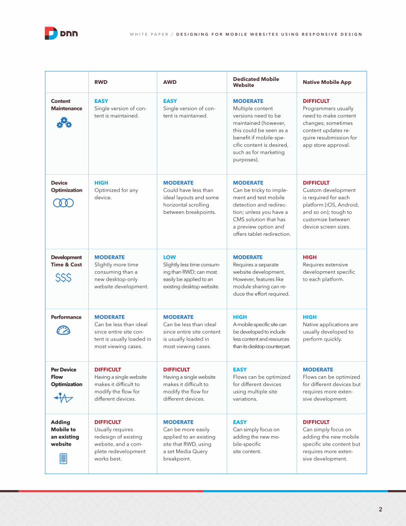
RWD, AWD, and dedicated mobile websites all
have their advantages and disadvantages. The
following charts compare these techniques and
native mobile applications.
These pros and cons apply differently to every
organization. Sometimes larger organizations prefer
a dedicated mobile site, with mobile-specific content
KNOW THIS…
Mashable dubbed 2013
“The Year of Responsive Web Design”KNOW THIS…
Websites running on a Content
Management System with easily
customizable CSS layouts, such as
DNN, are ideal candidates for RWD.
2
W H I T E P A P E R / D E s I g n I n g f o R M o b I l E W E b s I T E s u s I n g R E s P o n s I v E D E s I g n
RWD AWD Dedicated Mobile Website Native Mobile App
Content Maintenance
EAsySingle version of con-tent is maintained.
EAsySingle version of con-tent is maintained.
MoDERAtEMultiple content versions need to be maintained (however, this could be seen as a benefit if mobile-spe-cific content is desired, such as for marketing purposes).
DiffiCultProgrammers usually need to make content changes; sometimes content updates re-quire resubmission for app store approval.
Device optimization
HigHOptimized for any device.
MoDERAtECould have less than ideal layouts and some horizontal scrolling between breakpoints.
MoDERAtECan be tricky to imple-ment and test mobile detection and redirec-tion; unless you have a CMS solution that has a preview option and offers tablet redirection.
DiffiCultCustom development is required for each platform (iOS, Android, and so on); tough to customize between device screen sizes.
Development time & Cost
MoDERAtESlightly more time consuming than a new desktop-only website development.
loWSlightly less time consum-ing than RWD; can most easily be applied to an existing desktop website.
MoDERAtERequires a separate website development. However, features like module sharing can re-duce the effort required.
HigHRequires extensive development specific to each platform.
Performance MoDERAtECan be less than ideal since entire site con-tent is usually loaded in most viewing cases.
MoDERAtECan be less than ideal since entire site content is usually loaded in most viewing cases.
HigHA mobile-specific site can be developed to include less content and resources than its desktop counterpart.
HigHNative applications are usually developed to perform quickly.
Per Device flow optimization
DiffiCultHaving a single website makes it difficult to modify the flow for different devices.
DiffiCultHaving a single website makes it difficult to modify the flow for different devices.
EAsyFlows can be optimized for different devices using multiple site variations.
MoDERAtEFlows can be optimized for different devices but requires more exten-sive development.
Adding Mobile to an existing website
DiffiCultUsually requires redesign of existing website, and a com-plete redevelopment works best.
MoDERAtECan be more easily applied to an existing site that RWD, using a set Media Query breakpoint.
EAsyCan simply focus on adding the new mo-bile-specific site content.
DiffiCultCan simply focus on adding the new mobile specific site content but requires more exten-sive development.
3
W H I T E P A P E R / D E s I g n I n g f o R M o b I l E W E b s I T E s u s I n g R E s P o n s I v E D E s I g n
for marketing purposes, to avoid modifying any
current desktop website. Dedicated mobile sites are
also sometimes developed using some responsive
techniques, so the “mobile” website version also looks
good on tablets and not just certain phones. But the
combination of centralized content maintenance and
optimization across all devices often makes RWD the
best choice for many organizations, small and large.
No matter the website technique, a website solution
is always going to be less costly than a native app.
Websites running on a Content Management
System with easily customizable CSS layouts, such
as DNN, are ideal candidates for RWD. In DNN, a
responsive design is applied in the skin files, just
like any non-responsive design. Your columns and
content panes are laid out as usual in the skin.ascx
file, while the responsive styles are added using
media quires in skin.css.
If you want to “mobilize” an existing site, creating
a separate dedicated mobile site or using AWD
will likely be easier to implement than full RWD.
Responsive Web Design works best when you can
start with a new code layout and well thought out
design, which we discuss in the next section.
Designing a Responsive Website
There are more elements to consider when designing
a responsive website, but the process can easily
be adapted into your current design style. Before
developing a responsive site, it is most helpful to start
with mockups for at least three screen sizes: desktop,
tablet, and mobile. These mockups do not need to be
created at any particular device size, since the website
will be optimized in between these snapshots as well.
It may be most comfortable to design the desktop
layout first, which can work fine. After that, you can
determine how the layout should change when
shrinking the width for tablet and mobile device
sizes. Or, many RWD proponents advocate a “mobile
first” process. From a design standpoint, this means
thinking about your content and what is absolutely
necessary for a mobile user, designing the mobile
layout first and adding more content as is appropriate
when designing the tablet and desktop layouts.
Regardless of the preferred design process, it is
important to understand how a responsive website
layout is modified during development to provide
workable mockups. Responsive websites use columns
KNOW THIS…
regardless of the preferred design process, it is important to understand how a responsive
website layout is modified during development to provide workable mockups.
4
W H I T E P A P E R / D E s I g n I n g f o R M o b I l E W E b s I T E s u s I n g R E s P o n s I v E D E s I g n
of content “floated” next to each other. As a screen
width shrinks, the columns get skinnier. Once those
columns are too small for their content to fit, they
stack vertically, with the later, right columns pushed
below. This means it is important to keep elements in
the same general order between each mockup, as it is
difficult to move content from a column that appears
later in the HTML markup above earlier columns.
Developing a Responsive Website
Once your responsive site mockups are ready, you will
also need to decide if you plan to develop your site
mobile first. One of the main benefits of developing
the mobile version as the default website layout is
improved performance. Since larger images and
resource-intensive content is often only included
for larger screens, developing mobile first allows
you to only load that content once it’s needed. If
you start by developing the desktop version first,
some content used on larger screens may still be
loaded and taking up resources, even if hidden from
mobile users. However, for the sake of simplicity and
wider familiarity with traditional desktop website
development, our demonstration will use a desktop-
first approach. The process of applying responsive
techniques to a desktop site can be easier to learn
and understand at first.
Set a Fluid Grid
First up in the CSS, we frame our entire site with a
fluid, wrapping container:#page { width: 90%; max-width: 960px; margin: 0 auto; }
By centering the site (margin:0 auto) and setting
width:90%, this ensures that the site will always
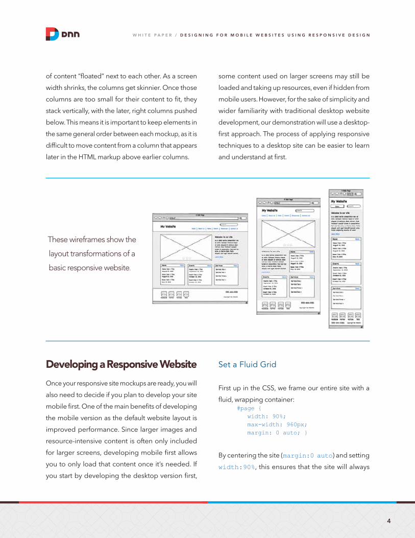
these wireframes show the
layout transformations of a
basic responsive website.
5
W H I T E P A P E R / D E s I g n I n g f o R M o b I l E W E b s I T E s u s I n g R E s P o n s I v E D E s I g n
have a 5% margin on either side, no matter the
browser width. This is important to prevent content
from pushing right up to the edge of browser
screens and becoming more difficult to read. By
setting max-width:960px, we are giving our
website a maximum size, so widescreen monitors
will still see a standard desktop website size, and
maintain readable line-lengths.
Within the wrapping container, each content div will
be floated and have a width set with percentages,
such as:#LeftColumn { float: left; width: 70%; }#RightColumn { float: right;
width: 30%; }
These two columns will fill the entire width of the
surrounding container at all times, since 70% +
30% = 100%. Don’t get confused because we set
the wrapping container to have a width of 90%.
Percentage widths are always relative to their
surrounding element – every div has a total available
width of 100% within it, no matter the pixel size. Now
we have two content columns that will sit next to
each other, expanding and contracting in width while
always keeping the same proportions and filling the
surrounding container.
We want to set up all sections of our site layout in
the same fashion. Any content area of pixel-based
mockup can easily be translated to percentages using
a little math: Target (px) / Context (px) = Result (%)
This will ensure ratios and proportions remain as
intended, instead of just guessing at what percentage
width to use. For example, a 300px wide column
inside of a 700px wide surrounding container
in a mockup: 300px / 700px = 0.42857 or 42.857%
Set Margins
Of course, we need some space between these
content columns! But we also need to ensure our
total widths of elements next to each other stay under
100%. We could do:#LeftColumn { width: 65%; margin-right:5% }#RightColumn { width: 30%; }
So 65% + 5% + 30% = 100%. The margin size will also
shrink and expand proportionately as the surrounding
container size changes.
Set Media Sizes
Although responsive content areas are set using
percentages, most included media, such as images,
will have pixel sizes associated with them. In order
to ensure media stays within the current size of its
surrounding container, the following CSS should
be included:img, object, embed, iframe, video { max-width:100%; }
This small bit of code can do a lot to make sure media
stays properly aligned within your site.
6
W H I T E P A P E R / D E s I g n I n g f o R M o b I l E W E b s I T E s u s I n g R E s P o n s I v E D E s I g n
Make Changes with Media Queries
With our layout setup fluidly with percentages, and
all content set to fill it dynamically, we should have
a basic responsive site that will adjust as we shrink
our browser. Of course, if our browser gets too small,
columns will start to get too skinny, menus will get
out of line, and things will look broken. That’s where
CSS media queries come in.
Media queries serve different CSS based on your
browser size or type. Media queries can target all
sorts of aspects of your browser, such as resolution
and orientation, but for this demo we will simply be
targeting browser size using max-width. Media
queries can be included directly in the main CSS file
(put them at the end, since CSS is applied in the order
its written), so our CSS file will look something like this:
/* Desktop site CSS first */
@media (max-width:800px) { /*tablet-specific styles go here*/}
@media (max-width:600px) { /*smaller tablet styles go here*/}
@media (max-width:400px) { /*mobile styles go here*/}
If we were developing mobile-first, the CSS order
would be opposite:
/* Mobile site CSS first */
@media (min-width:500px) { /*tablet-specific styles go here*/}
@media (max-width:700px) { /*larger screen styles go here*/}
/* etc */
At this stage in development, we begin to test and
review our website at increasingly smaller widths,
and make necessary adjustments to ensure things
work well and fit with our smaller mockups. One
common adjustment is to stack content columns that
were previously next to each other, by setting 100%
widths, once they become too skinny:
@media (max-width:600px) { #LeftColumn { width: 100%; margin-right:0% } #RightColumn { width: 100%; }}
Remember that media query breakpoints do not
need to be set at any particular “standard” device
size, which is common within AWD. For example,
320px and 480px have been popular breakpoints
since those are the portrait and landscape widths
of the Apple iPhone. However, if something looks
like it needs adjusting at 496px, then that’s where a
change should be made. Set media queries where
they are most needed!
We can also show and hide content using media
queries. Using display:none in our CSS will remove
content from view when it’s not needed, such as
hiding a large banner rotator in your mobile media
query. As previously mentioned, it’s important to
remember that using display:none does not
7
W H I T E P A P E R / D E s I g n I n g f o R M o b I l E W E b s I T E s u s I n g R E s P o n s I v E D E s I g n
generally help performance of the site, since
the content is usually still loaded and just hidden
from display.
At this point, it’s simply a matter of reviewing
your website at different sizes and making CSS
adjustments to improve usability along the way.
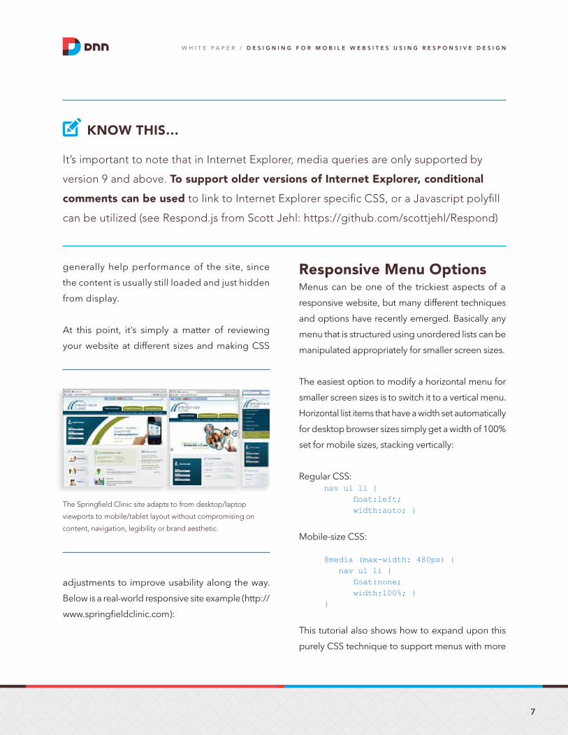
Below is a real-world responsive site example (http://
www.springfieldclinic.com):
Responsive Menu OptionsMenus can be one of the trickiest aspects of a
responsive website, but many different techniques
and options have recently emerged. Basically any
menu that is structured using unordered lists can be
manipulated appropriately for smaller screen sizes.
The easiest option to modify a horizontal menu for
smaller screen sizes is to switch it to a vertical menu.
Horizontal list items that have a width set automatically
for desktop browser sizes simply get a width of 100%
set for mobile sizes, stacking vertically:
Regular CSS:nav ul li { float:left; width:auto; }
Mobile-size CSS:
@media (max-width: 480px) { nav ul li { float:none; width:100%; }}
This tutorial also shows how to expand upon this
purely CSS technique to support menus with more
KNOW THIS…
it’s important to note that in internet explorer, media queries are only supported by
version 9 and above. To support older versions of Internet Explorer, conditional
comments can be used to link to internet explorer specific CSS, or a Javascript polyfill
can be utilized (see respond.js from Scott Jehl: https://github.com/scottjehl/respond)
the Springfield Clinic site adapts to from desktop/laptop
viewports to mobile/tablet layout without compromising on
content, navigation, legibility or brand aesthetic.
8
W H I T E P A P E R / D E s I g n I n g f o R M o b I l E W E b s I T E s u s I n g R E s P o n s I v E D E s I g n
than one level: http://ejhansel.com/a-responsive-
drop-down-navigation-menu.
Building upon that basic option, a vertical menu may
be hidden and only shown when a “Menu” button
is clicked, freeing up more space for content. An
extra button used to toggle the menu is hidden from
desktop view using display:none, and then shown
while the ul is instead hidden at a mobile size. A
little bit of jQuery is also used to toggle the menu to
appear when the button is hit.
The markup:
<nav> <a href=”#” class=”show-mobile”>Main Menu</a> <ul><li>…</li></ul> </nav>
Regular CSS:
.show-mobile { display: none; }
CSS to show the button and hide the menu for mobile:@media (max-width: 768px) { nav .show-mobile { display: block; } nav ul { display: none; } }
jQuery for the menu toggle:
<script> jQuery(“.show-mobile”).click(function () { jQuery(“nav ul”).toggle(“fast”); });<script>
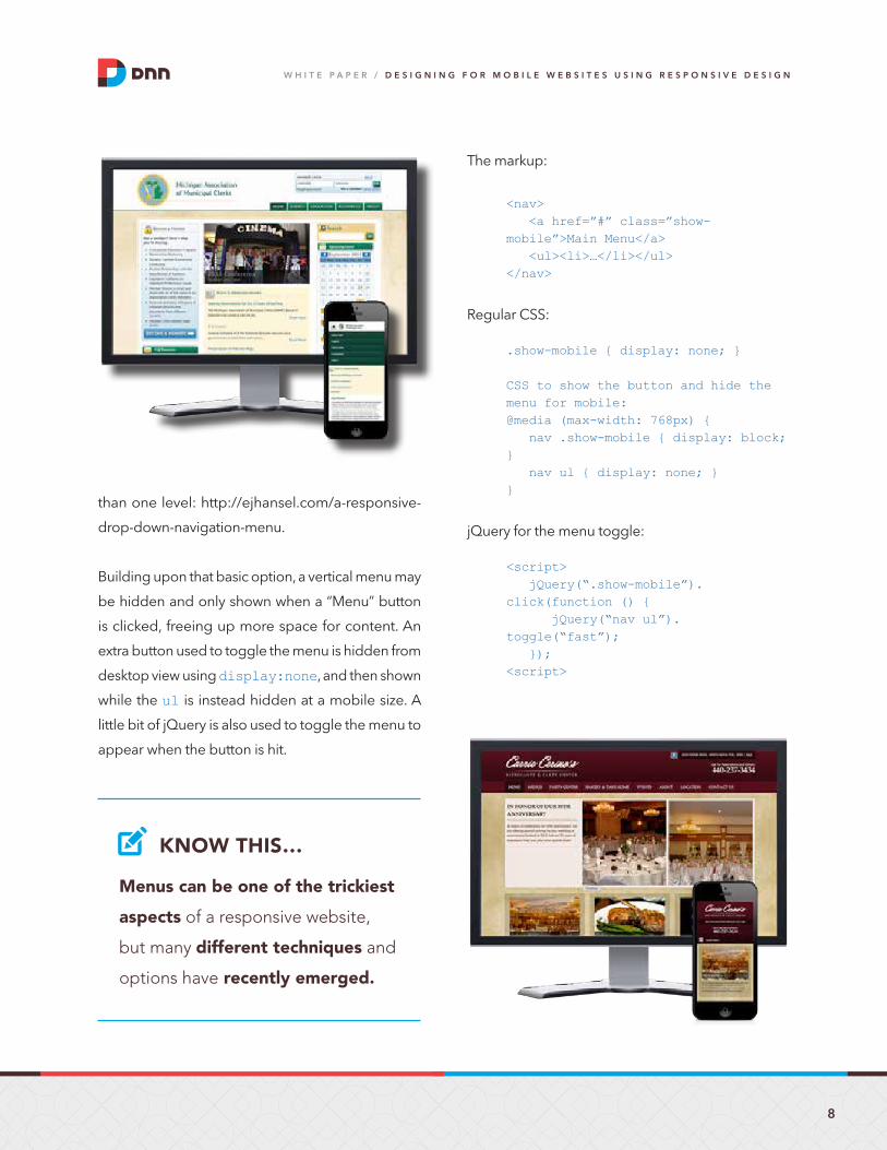
Menus can be one of the trickiest
aspects of a responsive website,
but many different techniques and
options have recently emerged.
KNOW THIS…
9
W H I T E P A P E R / D E s I g n I n g f o R M o b I l E W E b s I T E s u s I n g R E s P o n s I v E D E s I g n
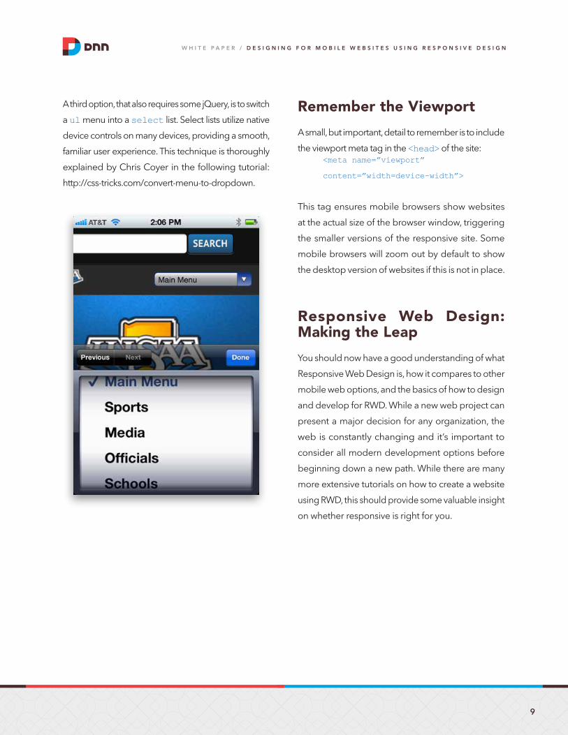
A third option, that also requires some jQuery, is to switch
a ul menu into a select list. Select lists utilize native
device controls on many devices, providing a smooth,
familiar user experience. This technique is thoroughly
explained by Chris Coyer in the following tutorial:
http://css-tricks.com/convert-menu-to-dropdown.
Remember the Viewport
A small, but important, detail to remember is to include
the viewport meta tag in the <head> of the site:<meta name=”viewport”
content=”width=device-width”>
This tag ensures mobile browsers show websites
at the actual size of the browser window, triggering
the smaller versions of the responsive site. Some
mobile browsers will zoom out by default to show
the desktop version of websites if this is not in place.
Responsive Web Design: Making the Leap
You should now have a good understanding of what
Responsive Web Design is, how it compares to other
mobile web options, and the basics of how to design
and develop for RWD. While a new web project can
present a major decision for any organization, the
web is constantly changing and it’s important to
consider all modern development options before
beginning down a new path. While there are many
more extensive tutorials on how to create a website
using RWD, this should provide some valuable insight
on whether responsive is right for you.
10
W H I T E P A P E R / D E s I g n I n g f o R M o b I l E W E b s I T E s u s I n g R E s P o n s I v E D E s I g n
About DNN
DNN provides a suite of solutions for creating
rich, rewarding online experiences for customers,
partners and employees. Our technology is the
foundation for 750,000+ websites worldwide and
our customers include True Value Hardware, Bose,
Cornell University, Glacier Water, Dannon, Delphi,
USAA, NASCAR, Northern Health and the City of
Denver. In addition to our commercial solutions,
DNN is the steward of the DotNetNuke Open
Source Project.
amelia Marschall-Miller is Partner and Creative Director at Gravity
Works in Lansing, Michigan. With five years of hands-on website
design and front-end development experience, she now balances
between design, htML/CSS coding, and leading her team through
an ever-changing stream of web and mobile projects. amelia was a
contributing author to “Professional Mobile application Development”
from Wrox, a collaborative effort by Gravity Works as an introduction to various mobile
development techniques. amelia is continually exploring the latest responsive website
design techniques and mobile user interfaces. She is one of the rare designers who likes
to code. She also has a love of typography, and enjoys swimming, skiing, snowboarding,
pottery, and competing in triathlons.
ABOUT THE AUTHOR…
For more information about
Evoq Content, visit
www.dnnsoftware.com
Call us:
(650) 288-3150
Email us:
c o n t a c t
1 http://mashable.com/2012/12/11/responsive-web-design
155 BOVET ROAD, SUITE 201 SAN MATEO, CA 94402 WWW.DNNSOfTWARE.COM
WWW.DNNSOfTWARE.COM/PRIVACy | COPyRIghT By DNN CORP. | DNN, EVOq, AND DOTNETNUkE ARE TRADEMARkS Of DNN CORP.