Embed Size (px)
Citation preview
Reprinted with permission from SignCraft Magazine,www.signcraft.com
,800-204-0204
Designing for legibilityHow big for the lettering? How far away to view the sketch?
By Ken Millar
o sell signs effectively, we must know
what it takes to create a sign that works:
a sign that is both attractive and readable
in the setting that it is used. The first part,
coming up with an interesting design, is
usually easier to do than the second part,
which is how do you make sure it will be
readable on site?
If you can explain and discuss these issues
with clients, they’ll realize they’re dealing
with a professional who has their best inter-
est in mind. In this time of ours, when every-
one can choose fonts and clipart and do fades
and shadows and distort letters with a click
here and a click there, many clients may not
place value in the design alone.
But if you can show them that you know
how to make sure their sign can be read and
deliver their message—you’ve got something
to sell. It will likely separate you from the
competition.
Why signage fails We can learn a lot about
creating successful sign layouts by consider-
ing what causes a sign to fail—to not deliver
its message to potential readers. By learning
the common pitfalls we may be able to avoid
them in our layouts. I find that when signage
Tis not readable, it’s usually because of one
or more of the following reasons:
1. Too many signs in a concentrated area
2. Too much copy or wording
3. Poor design or layout
4. Bad choice of colors
5. Letter style that is not legible
from the reading distance
Traditionally, advertising design houses
stuck to the golden rule of “a trademark plus
seven words or less” for design for painted
bulletins and billboards. This rule is hard to
apply in a sign shop.We may not have the
luxury of eliminating unnecessary wording.
But nonetheless, the copy must be managed
in the layout or readability will suffer.
Guidelines for letter readability Most exterior
signs are read from a considerable distance.
On top of this distance issue, the reader is
often in a moving vehicle.There are physical
limitations to what the viewer is capable of
reading at that distance and in the time they
have to read it. A wise designer plans for this.
Over the years, charts have been published
showing the readable distance for various
letter heights for maximum impact. When
applying for a driver’s license, your eyes are
tested for the ability to distinguish letters
and numerals at various distances, based
on a minimum acceptable vision of 20/40.
With 20/40 vision, you are able to read
the following size letters at these distances,
assuming they’re black block letters on
a white background:
Readable distance will vary with color, style
42 SignCraft | January/February 2011 | www.signcraft.com
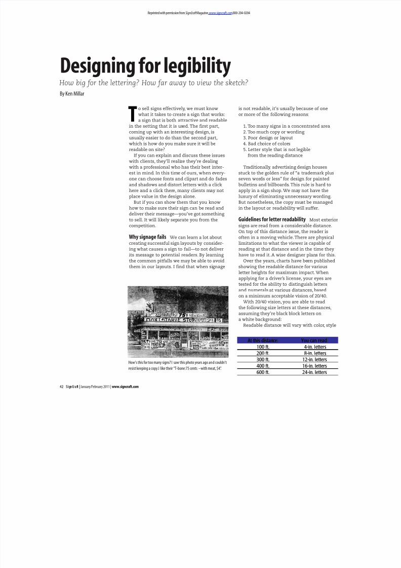
How’s this for too many signs? I saw this photo years ago an d couldn’t
resist keeping a copy.I like their “T-bone:75 cents –with meat, $4”.
At this distance: You can read:
100 ft. 4-in. letters
200 ft. 8-in. letters
300 ft. 12-in. letters
400 ft. 16-in. letters
600 ft. 24-in. letters
www.signcraft.com | January/February 2011 | SignCraft 43
of lettering and stylizing of individual letters.
A bolder letter may be readable at a lesser
height. Readability may be improved by open-
ing the interior portion of lettering by stretch-
ing the letters horizontally or vertically.
Designers of roadside bulletins and billboards
often do that.
Have you ever measured off a typical read-
ing distance for a sign to see how much of the
copy was actually legible from that distance?
It’s a great exercise—and essential if you want
to design effective signs and be able to explain
your designs to your clients.
Reading distance is a critical factor Outdoor
advertising companies usually have a sales-
person to sell potential clients locations of
existing boards for an advertising contract.
Often the salesperson takes a beautiful layout
to the client, who holds it at arm’s length
for viewing.
The client probably does not know much
about the issue of readability at a given
distance.The salesperson may not be aware
of the guidelines that will guarantee good,
readable signage. The end result is often that
the salesperson is happy to sell the location—
but the client is not happy when he drives
by the billboard location he has rented and
cannot read the message.
I see this failure almost daily and wonder
who is to blame. The same problem is appar-
ent on fascia signs, vehicles, freestanding
signs and most any other type of sign.The
primary message of many signs simply can’t
be read from the distance at which they can
be seen.
By becoming familiar with the formulas
for readability, the sign designer and the
salesperson will both gain knowledge that
has been proven over time to produce better
signage. In the early ‘50’s, the standard poster
size for printed-paper outdoor advertising
was approximately 12-ft.-high-by-24-ft. long—
a ratio of 1 to 2. The sketches were typically
done at a scale of 1 ⁄ 2 in. equals one ft.The
designers often used this simple formula for
reviewing a sketch or drawing of an outdoor
advertising sign before making it into a full-
sized printed poster:
Viewing the sketch from about 17 ft. away
simulated seeing the sign at a typical viewing
distance of about 400 ft.
The proper approach is to estimate the
typical viewing distance at that scale and
look at the drawing from this distance. If
more sign designers started doing this, the
effectiveness of signs in general would sky-
rocket. Most likely, the primary message
on most signs would get larger.
Here is a set of guidelines based on that
traditional formula that you can use to review
your drawings at scale:
Consider the viewing time It takes three to
five seconds to read a typical sign, once you’re
close enough to see it adequately and assum-
ing the lettering is done in a very legible style
and color combination. Often we must read
signs from a moving vehicle—or the sign itself
is on a moving vehicle.This affects the time
we have to read the sign and introduces other
distractions that can reduce this time.
While driving a vehicle at 30mph on a city
street, you’re moving at 44 ft. per second.
Consider these three possible different
locations of your vehicle:
A = 220 ft., or 5 seconds before reaching
the intersection
B = 132 ft., or 3 seconds before reaching
the intersection
C = intersection, at which there are two
possible events: You either go through
the intersection on a green light with no
viewing time at all or you are stopped by
a red light and have a long viewing time.
A driver may not be aware of the sign at
all during the travel space of 220 ft. He or she
may be looking only at the road or may be
looking in another direction—say looking for
a street sign or a business address. To catch
the eye, the message on the sign must be
direct and to the point, with minimal copy.
continued...
Scale
View sketch at this distance to simulate viewing at:
400 ft. 200 ft.
1/4 in. 8.5 ft. 4.25 ft.
1/2 in. 17 ft. 8.5 ft.
3/4 in. 25.5 ft. 12.75 ft.
1 in. 34 ft. 17 ft.
1 1/2 in. 51 ft. 25.5 ft.
44 SignCraft | January/February 2011 | www.signcraft.com
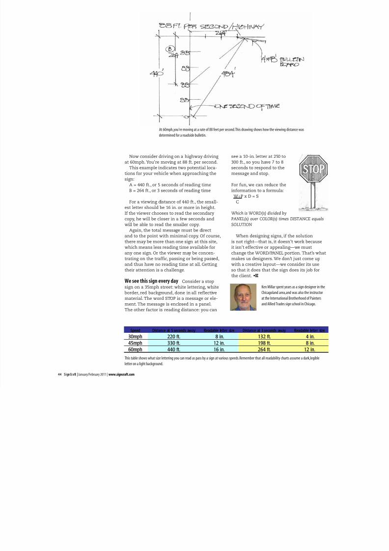
Now consider driving on a highway driving
at 60mph.You’re moving at 88 ft. per second.
This example indicates two potential loca-
tions for your vehicle when approaching the
sign:
A = 440 ft., or 5 seconds of reading time
B = 264 ft., or 3 seconds of reading time
For a viewing distance of 440 ft., the small-
est letter should be 16 in. or more in height.
If the viewer chooses to read the secondary
copy, he will be closer in a few seconds and
will be able to read the smaller copy.
Again, the total message must be direct
and to the point with minimal copy. Of course,
there may be more than one sign at this site,
which means less reading time available for
any one sign. Or the viewer may be concen-
trating on the traffic, passing or being passed,
and thus have no reading time at all. Getting
their attention is a challenge.
We see this sign every day Consider a stop
sign on a 35mph street: white lettering, white
border, red background, done in all reflective
material. The word STOP is a message or ele-
ment. The message is enclosed in a panel.
The other factor is reading distance: you can
see a 10-in. letter at 250 to
300 ft., so you have 7 to 8
seconds to respond to the
message and stop.
For fun, we can reduce the
information to a formula:
W÷P x D = S
C
Which is WORD(s) divided by
PANEL(s) over COLOR(s) times DISTANCE equals
SOLUTION
When designing signs, if the solution
is not right—that is, it doesn’t work because
it isn’t effective or appealing—we must
change the WORD/PANEL portion. That’s what
makes us designers. We don’t just come up
with a creative layout—we consider its use
so that it does that the sign does its job for
the client. •SC
Speed Distance at 5 seconds away Readable letter size Distance at 3 seconds away Readable letter size
30mph 220 ft. 8 in. 132 ft. 4 in.
45mph 330 ft. 12 in. 198 ft. 8 in.
60mph 440 ft. 16 in. 264 ft. 12 in.
At 60mph,you’re moving at a rate of 88 feet per second.This drawing shows how the viewing distance was
determined for a roadside bulletin.
This table shows what size lettering you can read as pass by a sign at various speeds.Remember that all readability charts assume a dark,legible
letter on a light background.
Ken Millar spent years as a sign designer in the
Chicagoland area,and was also the instructor
at the International Brotherhood of Painters
and Allied Trades sign school in Chicago.