Embed Size (px)
DESCRIPTION
Published articles on residential and commercial design.
Citation preview
“People love to be in a decorated space,” says Philip. “It allows them to get to know you and makes them feel more comfortable.”
UrbanFeature
The cozy, creative loft of gallery co-owner Philip Slein is a postscript to his affinity
for curious art forms and the rich history of St. Louis.
The stellar view from Philip Slein’s loft
includes the historic Ely Walker Building and the downtown skyline. “The
neon glow of the Red Moon Restaurant’s
‘weatherball’ shines throughout the
neighborhood every night,” he says.
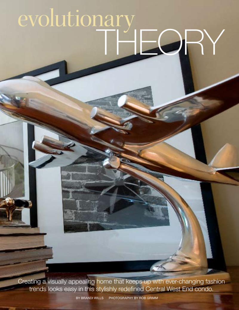
OPPOSITE PAGE: The circa late-1960s model
plane was built by St. Louis local,
Dr. William Schierman.
BY BRANDI WILLSPHOTOGRAPHY BY MICHAEL JACOB
I t’s been called a boy’s tree house, an eclectic hobby shop and a personal his-tory museum,” says Philip Slein of his Washington
Avenue loft. But the words of friend and Washington University professor Michael Byron ring truest in Philip’s mind when he stands amongst the motley collection of local memorabilia and personal accents. Dominated by scenes from Missouri’s hand in the westward expansion, “Michael took one look at my place and felt an overwhelming spirit of manifest destiny.”
46 St. Louis Homes & Lifestyles May 2007
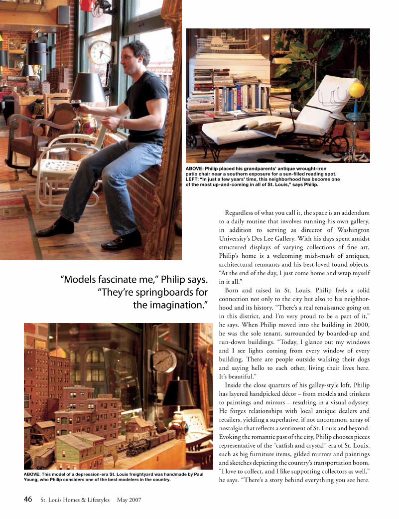
“Models fascinate me,” Philip says. “They’re springboards for
the imagination.”
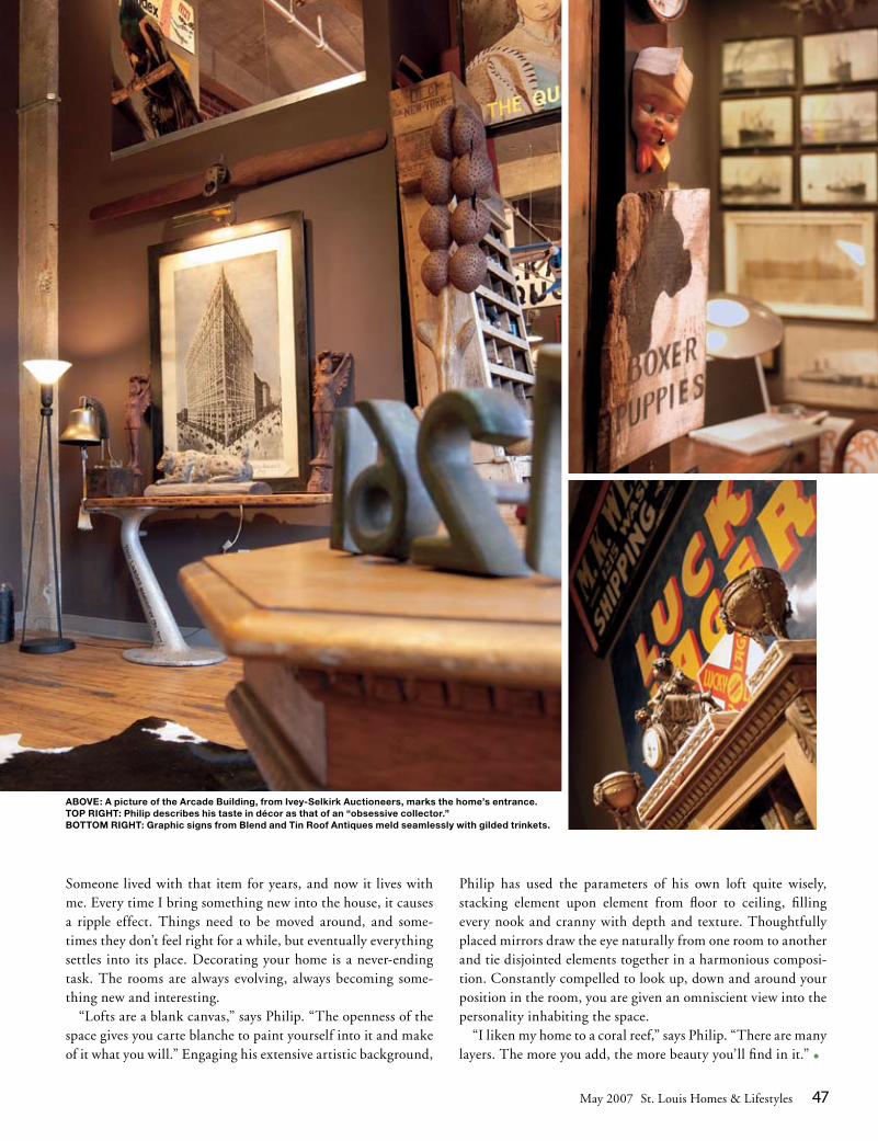
ABOVE: Philip placed his grandparents’ antique wrought-iron patio chair near a southern exposure for a sun-filled reading spot. LEFT: “In just a few years’ time, this neighborhood has become one of the most up-and-coming in all of St. Louis,” says Philip.
ABOVE: This model of a depression-era St. Louis freightyard was handmade by Paul Young, who Philip considers one of the best modelers in the country.
Regardless of what you call it, the space is an addendum to a daily routine that involves running his own gallery, in addition to serving as director of Washington University’s Des Lee Gallery. With his days spent amidst structured displays of varying collections of fine art, Philip’s home is a welcoming mish-mash of antiques, architectural remnants and his best-loved found objects. “At the end of the day, I just come home and wrap myself in it all.” Born and raised in St. Louis, Philip feels a solid connection not only to the city but also to his neighbor-hood and its history. “There’s a real renaissance going on in this district, and I’m very proud to be a part of it,” he says. When Philip moved into the building in 2000, he was the sole tenant, surrounded by boarded-up and run-down buildings. “Today, I glance out my windows and I see lights coming from every window of every building. There are people outside walking their dogs and saying hello to each other, living their lives here. It’s beautiful.” Inside the close quarters of his galley-style loft, Philip has layered handpicked décor – from models and trinkets to paintings and mirrors – resulting in a visual odyssey. He forges relationships with local antique dealers and retailers, yielding a superlative, if not uncommon, array of nostalgia that reflects a sentiment of St. Louis and beyond. Evoking the romantic past of the city, Philip chooses pieces representative of the “catfish and crystal” era of St. Louis, such as big furniture items, gilded mirrors and paintings and sketches depicting the country’s transportation boom. “I love to collect, and I like supporting collectors as well,” he says. “There’s a story behind everything you see here.
May 2007 St. Louis Homes & Lifestyles 47
Someone lived with that item for years, and now it lives with me. Every time I bring something new into the house, it causes a ripple effect. Things need to be moved around, and some-times they don’t feel right for a while, but eventually everything settles into its place. Decorating your home is a never-ending task. The rooms are always evolving, always becoming some-thing new and interesting. “Lofts are a blank canvas,” says Philip. “The openness of the space gives you carte blanche to paint yourself into it and make of it what you will.” Engaging his extensive artistic background,
Philip has used the parameters of his own loft quite wisely, stacking element upon element from floor to ceiling, filling every nook and cranny with depth and texture. Thoughtfully placed mirrors draw the eye naturally from one room to another and tie disjointed elements together in a harmonious composi-tion. Constantly compelled to look up, down and around your position in the room, you are given an omniscient view into the personality inhabiting the space. “I liken my home to a coral reef,” says Philip. “There are many layers. The more you add, the more beauty you’ll find in it.” •
ABOVE: A picture of the Arcade Building, from Ivey-Selkirk Auctioneers, marks the home’s entrance.TOP RIGHT: Philip describes his taste in décor as that of an “obsessive collector.”BOTTOM RIGHT: Graphic signs from Blend and Tin Roof Antiques meld seamlessly with gilded trinkets.
UrbanFeature
46 www.stlouishomesmag.com
Creating a visually appealing home that keeps up with ever-changing fashion trends looks easy in this stylishly redefined Central West End condo.
THEORYevolutionary
By Brandi Wills PhotograPhy By roB grimm
48 www.stlouishomesmag.com
K eeping your closet in tune with what’s hot in the fashion world can be challenging enough; try designing a home that could continually top the “best dressed” list, and you
might feel a little overwhelmed. But in room after room of the Central West End condo of a Ralph Lauren regional director, sophisticated style and taste evolve into a grand presentation.
When purchasing the home in 2006, the homeowner started with the general layout. “I create floor plans all day long,” he says. “Before buying this house, I had to map out where all my things would go and try to envision how they would look before I went about moving them in.” He wanted the home to feel comfortable and inviting, so his first priority was to knock down a wall that
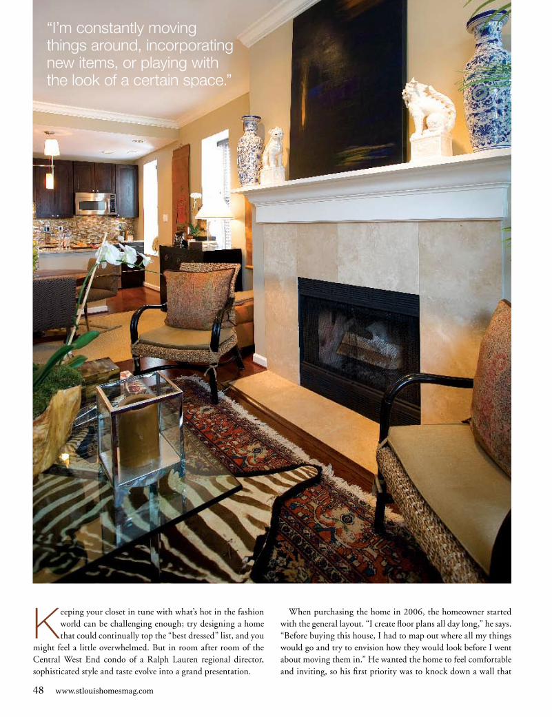
“I’m constantly moving things around, incorporating new items, or playing with the look of a certain space.”

Opposite page: The layering of textures, prints and décor creates a cozy, touchable feel in the home. Above: With a classic English sofa as the dividing point, the separate living and working spaces feel congruent and natural in proximity to each other. Architectural prints from a favorite calendar were matted, framed and installed on the wall above the office desk, creating a symmetrical point of interest in the large room. Right: A gold-painted chair with animal-print upholstery draws the two ends of the room together, complementing both the rug in the living space and the gold frames in the workspace.
enclosed the kitchen, opening up the area and creating a nice flow between the major rooms in the home.
The homeowner has an eye for the visually pleasing, drawing on his experience creating signature looks within Ralph Lauren’s department store boutiques. Each room in the home is anchored by any number of classic furniture pieces that the homeowner has purchased over the years. “Classic styles are actually quite transitional,” he explains. “They’re timeless. They last longer, so they make the best investment pieces.”
The centerpiece of the home, the living and working area, utilizes a classic English sofa covered in khaki twill to distinguish the separate spaces. The living area is a picture-perfect entertaining area, with a conversation-friendly seating arrangement and a number of personal touches. The artwork above the fireplace was a gift painted by a friend and lends a creative focal point to the room. The layering of rugs below the coffee table follows the fashion trend of mixing clothing textures and styles to create a uniform look. The homeowner often
updates the area to keep it fresh. “I’m always rearranging things,” he says. “I like something, I buy it and work it into the room.”
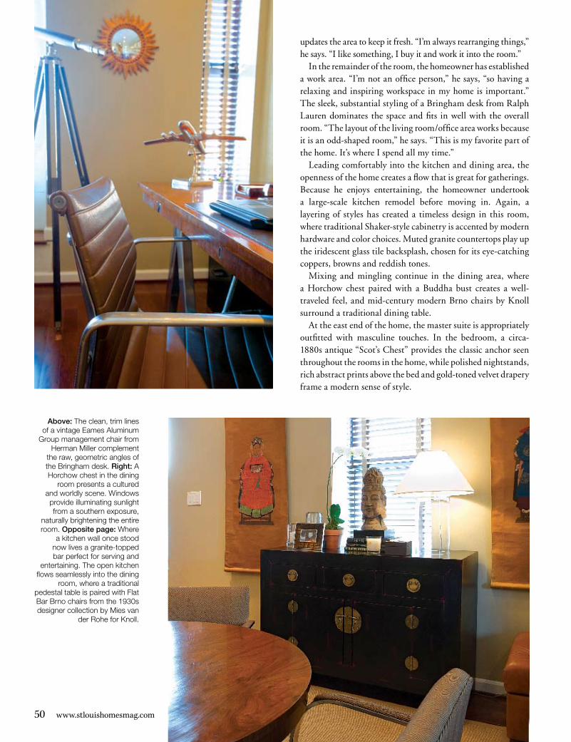
In the remainder of the room, the homeowner has established a work area. “I’m not an office person,” he says, “so having a relaxing and inspiring workspace in my home is important.” The sleek, substantial styling of a Bringham desk from Ralph Lauren dominates the space and fits in well with the overall room. “The layout of the living room/office area works because it is an odd-shaped room,” he says. “This is my favorite part of the home. It’s where I spend all my time.”
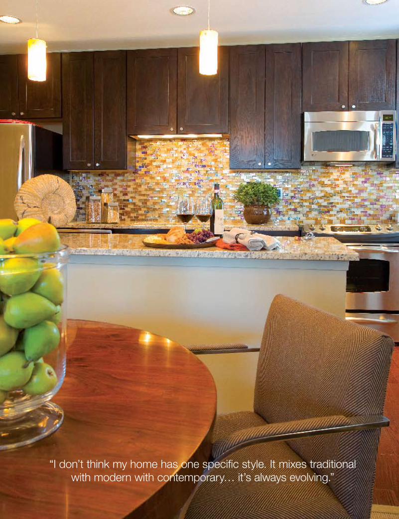
Leading comfortably into the kitchen and dining area, the openness of the home creates a flow that is great for gatherings. Because he enjoys entertaining, the homeowner undertook a large-scale kitchen remodel before moving in. Again, a layering of styles has created a timeless design in this room, where traditional Shaker-style cabinetry is accented by modern hardware and color choices. Muted granite countertops play up the iridescent glass tile backsplash, chosen for its eye-catching coppers, browns and reddish tones.
Mixing and mingling continue in the dining area, where a Horchow chest paired with a Buddha bust creates a well-traveled feel, and mid-century modern Brno chairs by Knoll surround a traditional dining table.
At the east end of the home, the master suite is appropriately outfitted with masculine touches. In the bedroom, a circa-1880s antique “Scot’s Chest” provides the classic anchor seen throughout the rooms in the home, while polished nightstands, rich abstract prints above the bed and gold-toned velvet drapery frame a modern sense of style.
Above: The clean, trim lines of a vintage Eames Aluminum
Group management chair from Herman Miller complement
the raw, geometric angles of the Bringham desk. Right: A Horchow chest in the dining
room presents a cultured and worldly scene. Windows
provide illuminating sunlight from a southern exposure,
naturally brightening the entire room. Opposite page: Where
a kitchen wall once stood now lives a granite-topped bar perfect for serving and
entertaining. The open kitchen flows seamlessly into the dining
room, where a traditional pedestal table is paired with Flat Bar Brno chairs from the 1930s designer collection by Mies van
der Rohe for Knoll.
50 www.stlouishomesmag.com
“I don’t think my home has one specific style. It mixes traditional with modern with contemporary… it’s always evolving.”
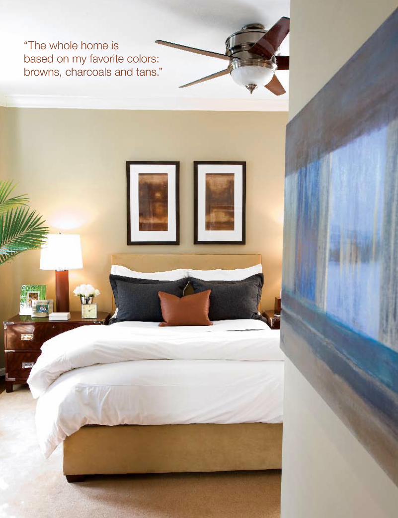
“The whole home is based on my favorite colors: browns, charcoals and tans.”
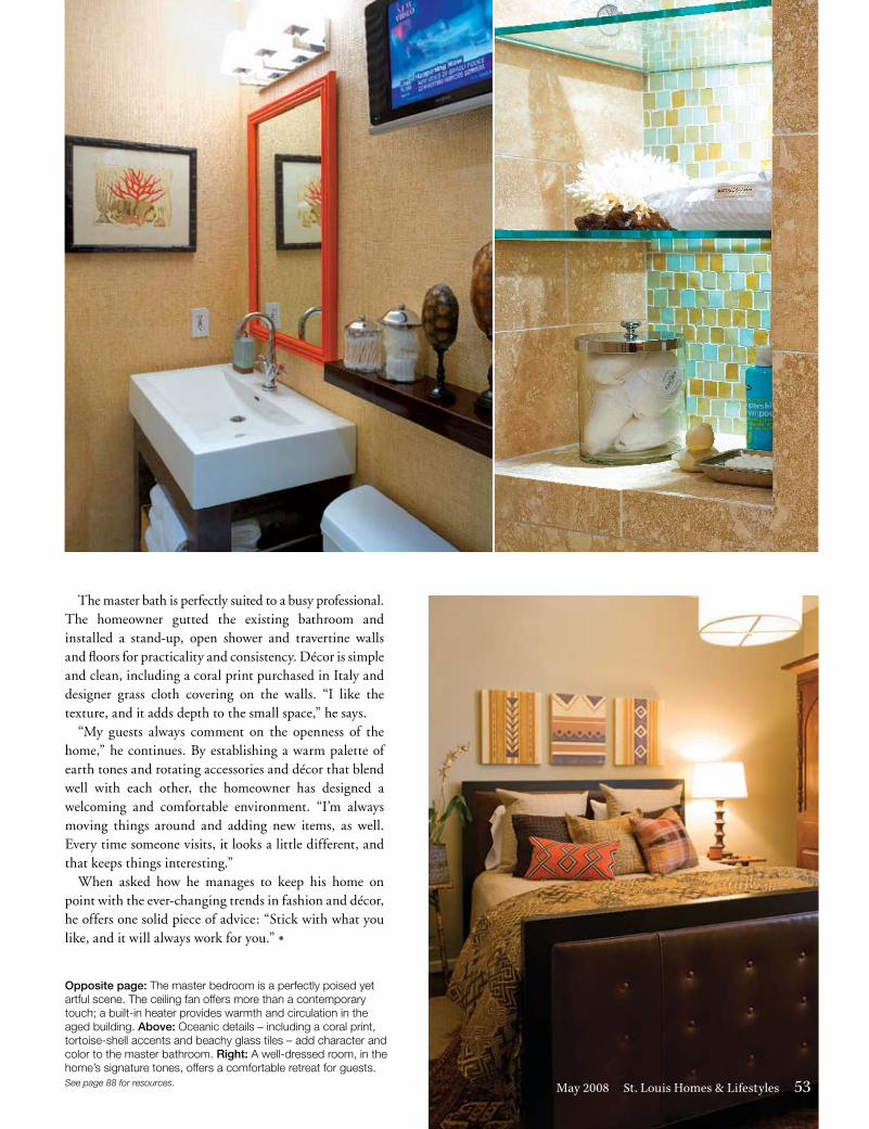
Opposite page: The master bedroom is a perfectly poised yet artful scene. The ceiling fan offers more than a contemporary touch; a built-in heater provides warmth and circulation in the aged building. Above: Oceanic details – including a coral print, tortoise-shell accents and beachy glass tiles – add character and color to the master bathroom. Right: A well-dressed room, in the home’s signature tones, offers a comfortable retreat for guests.See page 88 for resources.
The master bath is perfectly suited to a busy professional. The homeowner gutted the existing bathroom and installed a stand-up, open shower and travertine walls and floors for practicality and consistency. Décor is simple and clean, including a coral print purchased in Italy and designer grass cloth covering on the walls. “I like the texture, and it adds depth to the small space,” he says.
“My guests always comment on the openness of the home,” he continues. By establishing a warm palette of earth tones and rotating accessories and décor that blend well with each other, the homeowner has designed a welcoming and comfortable environment. “I’m always moving things around and adding new items, as well. Every time someone visits, it looks a little different, and that keeps things interesting.”
When asked how he manages to keep his home on point with the ever-changing trends in fashion and décor, he offers one solid piece of advice: “Stick with what you like, and it will always work for you.” •
May 2008 St. Louis Homes & Lifestyles 53
UrbanFeature
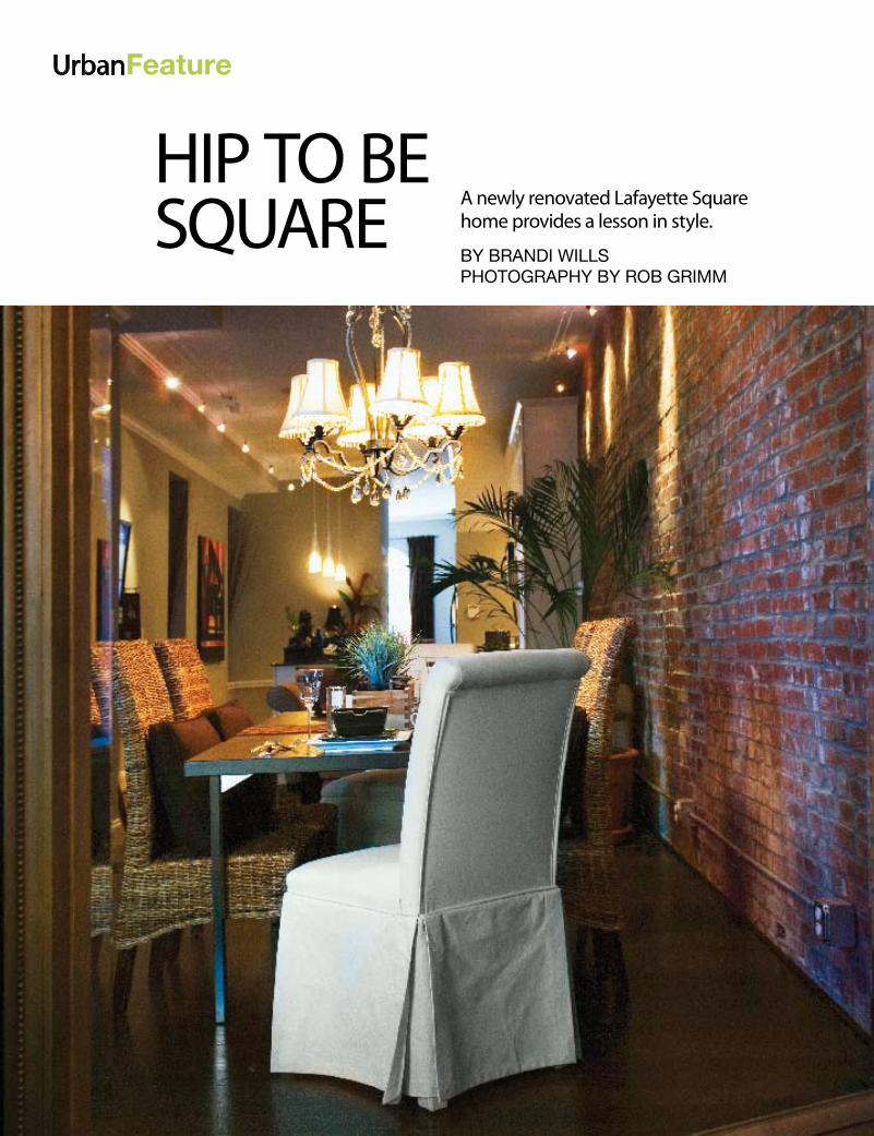
HIP TO BE SQUARE A newly renovated Lafayette Square
home provides a lesson in style.
By BRANDI WILLS PhotogRAPhy By RoB gRIMM
June/July 2007 St. Louis Homes & Lifestyles 59
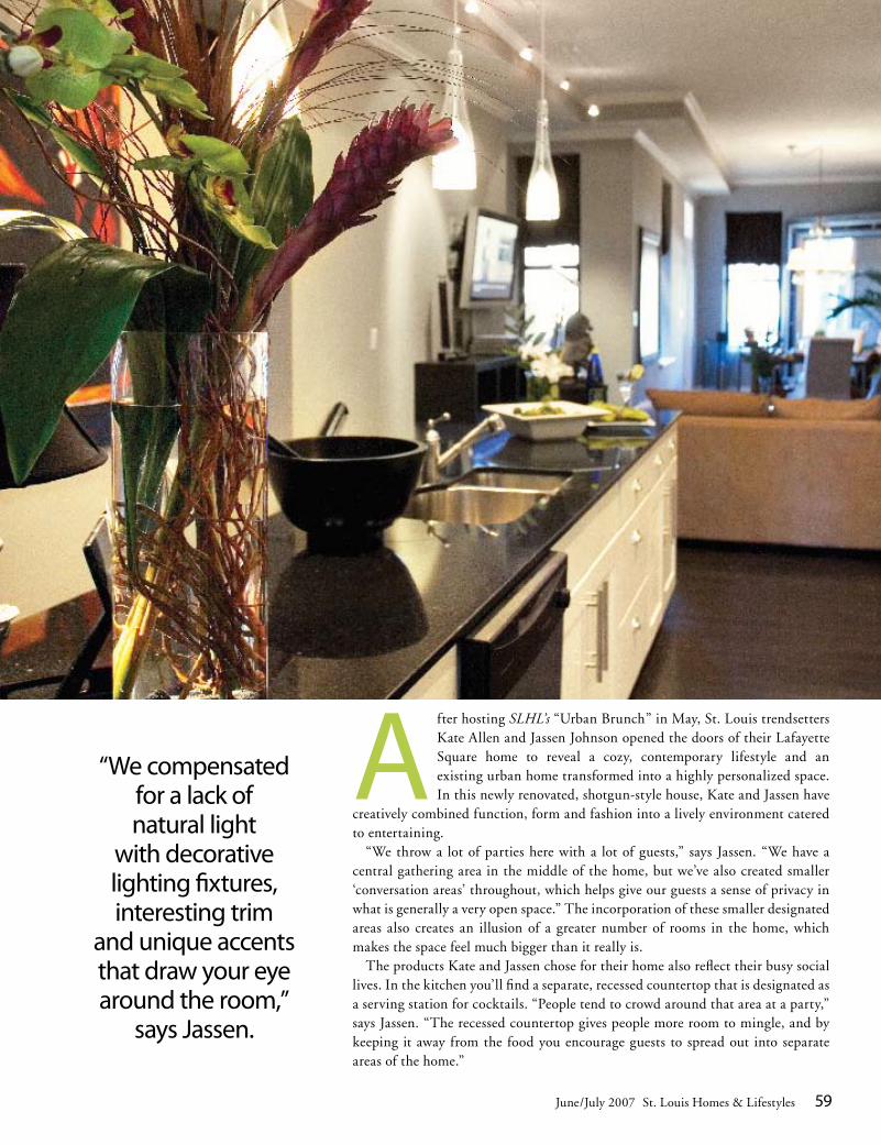
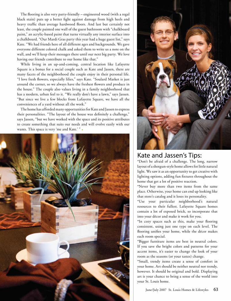
A fter hosting SLHL’s “Urban Brunch” in May, St. Louis trendsetters Kate Allen and Jassen Johnson opened the doors of their Lafayette Square home to reveal a cozy, contemporary lifestyle and an existing urban home transformed into a highly personalized space. In this newly renovated, shotgun-style house, Kate and Jassen have
creatively combined function, form and fashion into a lively environment catered to entertaining.
“We throw a lot of parties here with a lot of guests,” says Jassen. “We have a central gathering area in the middle of the home, but we’ve also created smaller ‘conversation areas’ throughout, which helps give our guests a sense of privacy in what is generally a very open space.” The incorporation of these smaller designated areas also creates an illusion of a greater number of rooms in the home, which makes the space feel much bigger than it really is.
The products Kate and Jassen chose for their home also reflect their busy social lives. In the kitchen you’ll find a separate, recessed countertop that is designated as a serving station for cocktails. “People tend to crowd around that area at a party,” says Jassen. “The recessed countertop gives people more room to mingle, and by keeping it away from the food you encourage guests to spread out into separate areas of the home.”
A newly renovated Lafayette Square home provides a lesson in style.
By BRANDI WILLS PhotogRAPhy By RoB gRIMM
“We compensated for a lack of natural light
with decorative lighting fixtures, interesting trim
and unique accents that draw your eye around the room,”
says Jassen.
60 www.stlouishomesmag.com
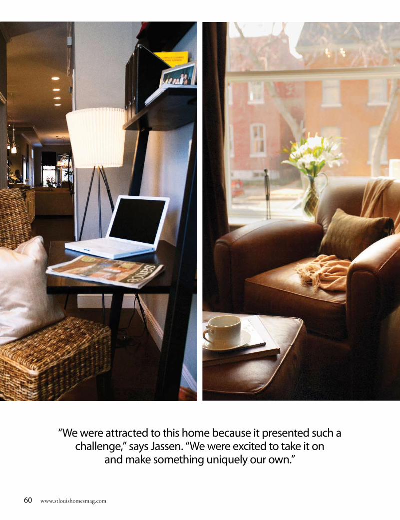
“We were attracted to this home because it presented such a challenge,” says Jassen. “We were excited to take it on
and make something uniquely our own.”

June/July 2007 St. Louis Homes & Lifestyles 61
The richly stained bookcase in the front room houses some of the couple’s treasured books, accessories and memoribilia. “It’s my favorite space in the house,” says Jassen. “All my
resources are there. It’s where I go for inspiration when I’m working on projects.”
62 www.stlouishomesmag.com
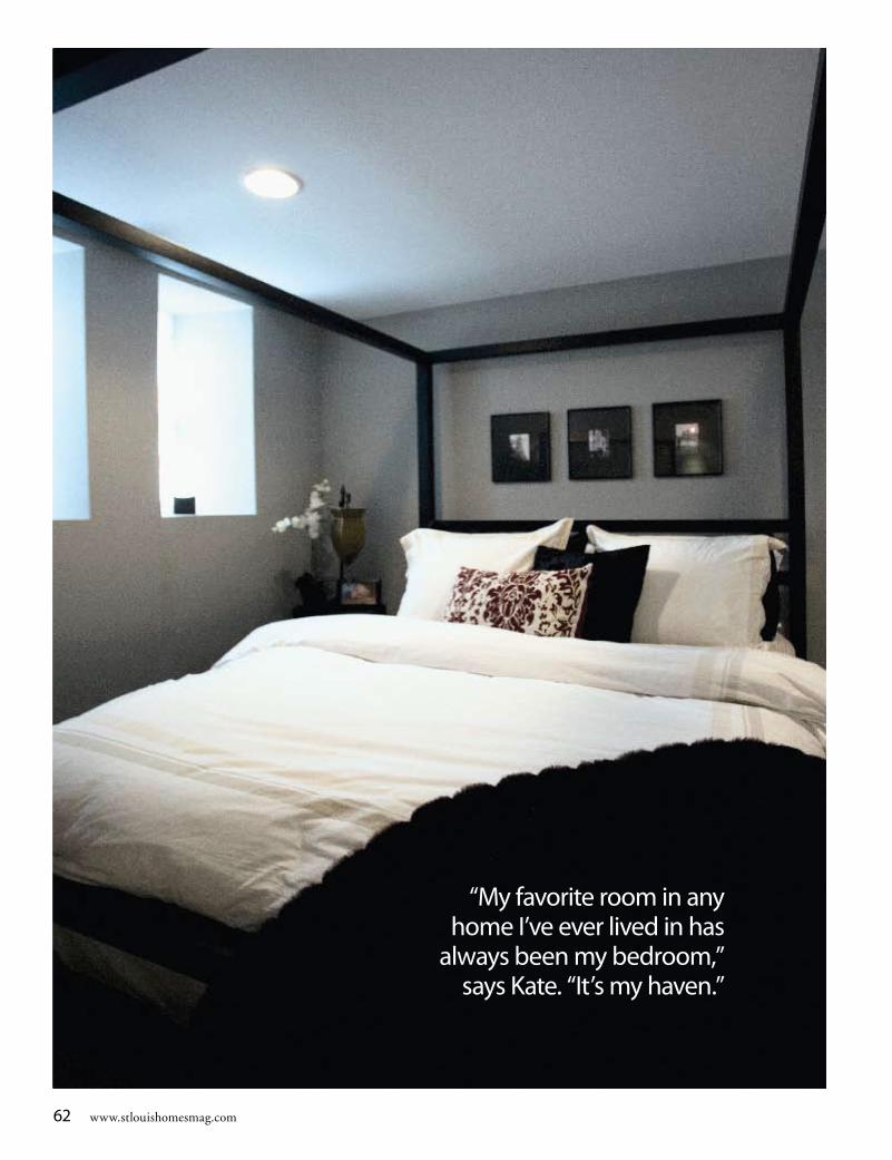
“My favorite room in any home I’ve ever lived in has
always been my bedroom,” says Kate. “It’s my haven.”
June/July 2007 St. Louis Homes & Lifestyles 63
Kate and Jassen’s Tips:*Don’t be afraid of a challenge. The long, narrow layout of a shotgun-style home allows for little natural light. We saw it as an opportunity to get creative with lighting options, adding fun fixtures throughout the home that get a lot of positive reaction.*Never buy more than two items from the same place. Otherwise, your home can end up looking like that store’s catalog and it loses its personality.*Use your particular neighborhood’s natural resources to their fullest. Lafayette Square homes contain a lot of exposed brick, so incorporate that into your décor and make it work for you.*In cozy spaces such as this, make your flooring consistent, using just one type on each level. The flooring unifies your home, while the décor makes each room special.*Bigger furniture items are best in neutral colors. If you save the bright colors and patterns for your accent items, it’s easier to change the look of your room as the seasons (or your tastes) change.*Small, trendy items create a sense of comfort in your home. Art should be neither neutral nor trendy, however. It should be original and bold. Displaying art is your chance to bring a sense of the world into your St. Louis home.
The flooring is also very party-friendly – engineered wood (with a regal black stain) puts up a better fight against damage from high heels and heavy traffic than average hardwood floors. And last but certainly not least, the couple painted one wall of the guest bathroom with “chalkboard paint,” an acrylic-based paint that turns virtually any interior surface into a chalkboard. “Our Mardi Gras party this year had a huge guest list,” says Kate. “We had friends here of all different ages and backgrounds. We gave everyone different colored chalk and asked them to write us a note on the wall, and we’ll keep their messages there until our next big party. We love having our friends contribute to our home like that.”
While living in an up-and-coming, central location like Lafayette Square is a bonus for a social couple such as Kate and Jassen, there are many facets of the neighborhood the couple enjoy in their personal life. “I love fresh flowers, especially lilies,” says Kate. “Soulard Market is just around the corner, so we always have the freshest flowers and produce in the house.” The couple also values living in a family neighborhood that has a modern, urban feel to it. “We really don’t have a lawn,” says Jassen. “But since we live a few blocks from Lafayette Square, we have all the conveniences of a yard without all the work.”
The home has afforded many opportunities for Kate and Jassen to express their personalities. “The layout of the house was definitely a challenge,” says Jassen, “but we have worked with the space and its positive attributes to create something that suits our needs and will evolve easily with our wants. This space is very ‘me and Kate.’ ” •
UrbanFeature
By Brandi WillsPhotograPhy By roB grimm
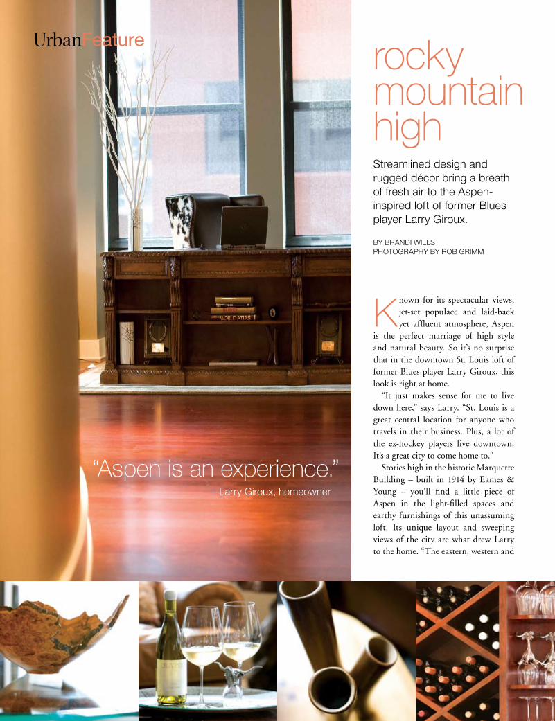
Known for its spectacular views, jet-set populace and laid-back yet affluent atmosphere, Aspen
is the perfect marriage of high style and natural beauty. So it’s no surprise that in the downtown St. Louis loft of former Blues player Larry Giroux, this look is right at home.
“It just makes sense for me to live down here,” says Larry. “St. Louis is a great central location for anyone who travels in their business. Plus, a lot of the ex-hockey players live downtown. It’s a great city to come home to.”
Stories high in the historic Marquette Building – built in 1914 by Eames & Young – you’ll find a little piece of Aspen in the light-filled spaces and earthy furnishings of this unassuming loft. Its unique layout and sweeping views of the city are what drew Larry to the home. “The eastern, western and
52 www.stlouishomesmag.com
streamlined design and rugged décor bring a breath of fresh air to the aspen-inspired loft of former Blues player larry giroux.
rockymountain high
“Aspen is an experience.” – larry giroux, homeowner
November/December 2007 St. Louis Homes & Lifestyles 53
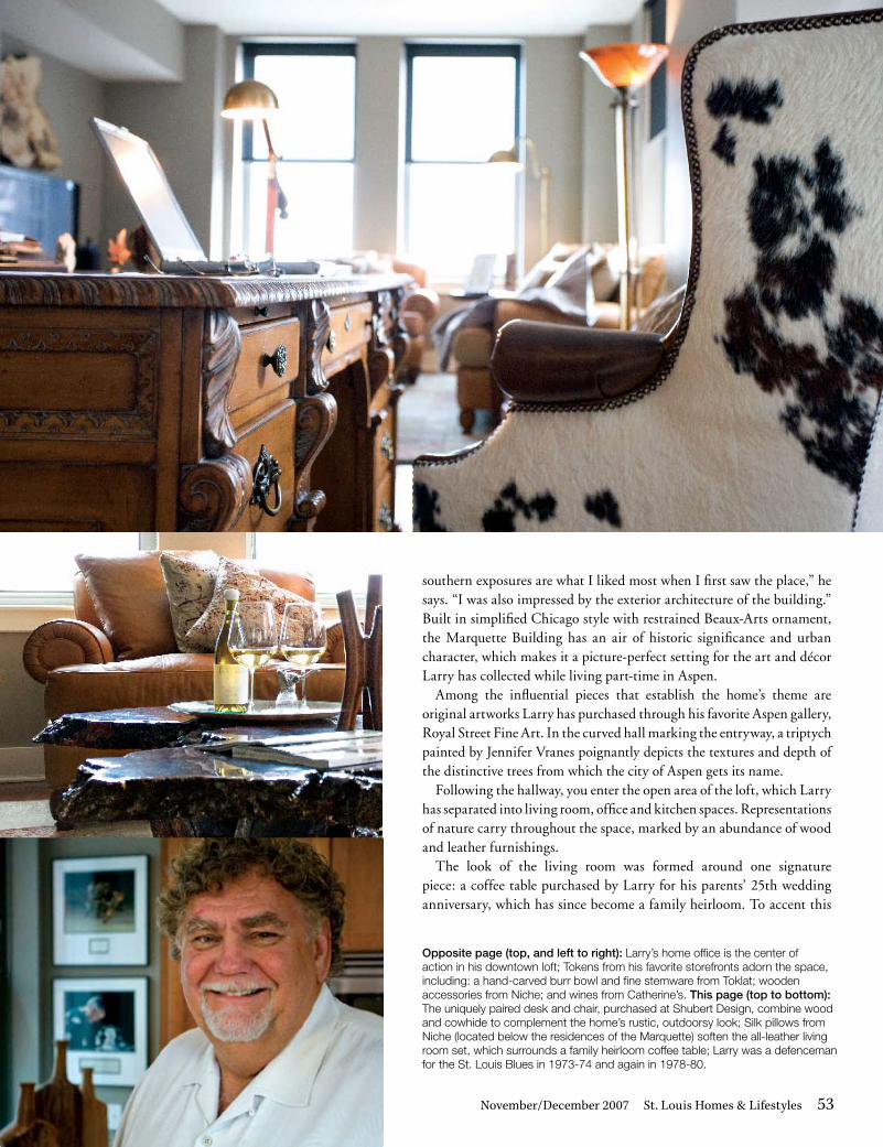
southern exposures are what I liked most when I first saw the place,” he says. “I was also impressed by the exterior architecture of the building.” Built in simplified Chicago style with restrained Beaux-Arts ornament, the Marquette Building has an air of historic significance and urban character, which makes it a picture-perfect setting for the art and décor Larry has collected while living part-time in Aspen.
Among the influential pieces that establish the home’s theme are original artworks Larry has purchased through his favorite Aspen gallery, Royal Street Fine Art. In the curved hall marking the entryway, a triptych painted by Jennifer Vranes poignantly depicts the textures and depth of the distinctive trees from which the city of Aspen gets its name.
Following the hallway, you enter the open area of the loft, which Larry has separated into living room, office and kitchen spaces. Representations of nature carry throughout the space, marked by an abundance of wood and leather furnishings.
The look of the living room was formed around one signature piece: a coffee table purchased by Larry for his parents’ 25th wedding anniversary, which has since become a family heirloom. To accent this
Opposite page (top, and left to right): larry’s home office is the center of action in his downtown loft; tokens from his favorite storefronts adorn the space, including: a hand-carved burr bowl and fine stemware from toklat; wooden accessories from niche; and wines from Catherine’s. This page (top to bottom): the uniquely paired desk and chair, purchased at shubert design, combine wood and cowhide to complement the home’s rustic, outdoorsy look; silk pillows from niche (located below the residences of the marquette) soften the all-leather living room set, which surrounds a family heirloom coffee table; larry was a defenceman for the st. louis Blues in 1973-74 and again in 1978-80.
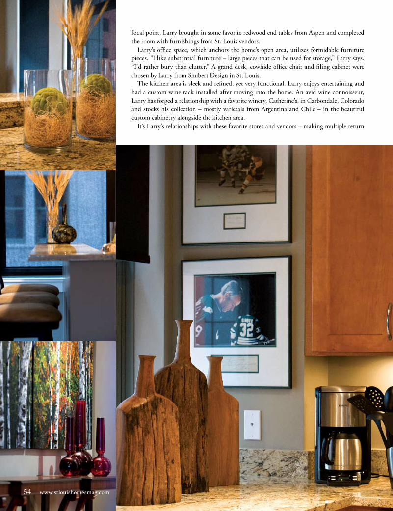
focal point, Larry brought in some favorite redwood end tables from Aspen and completed the room with furnishings from St. Louis vendors.
Larry’s office space, which anchors the home’s open area, utilizes formidable furniture pieces. “I like substantial furniture – large pieces that can be used for storage,” Larry says. “I’d rather bury than clutter.” A grand desk, cowhide office chair and filing cabinet were chosen by Larry from Shubert Design in St. Louis.
The kitchen area is sleek and refined, yet very functional. Larry enjoys entertaining and had a custom wine rack installed after moving into the home. An avid wine connoisseur, Larry has forged a relationship with a favorite winery, Catherine’s, in Carbondale, Colorado and stocks his collection – mostly varietals from Argentina and Chile – in the beautiful custom cabinetry alongside the kitchen area.
It’s Larry’s relationships with these favorite stores and vendors – making multiple return
54 www.stlouishomesmag.com54 www.stlouishomesmag.com
trips when in the area or arranging to order special items through their storefront – that have helped him create the look he wanted in this home. “I actually enjoy shopping for my home,” he says. “If you go into a store and share your m.o. with them, they really get into it, helping you find what you need. It becomes really fun.” Larry also takes the women in his life – friends, daughters and nieces – with him when shopping for home décor, in case he needs a little guidance.
The result of his efforts has been a cozy, lodge-like home for Larry and his guests to enjoy. “It’s amazing what comes out when you have a theme.” •See page 108 for design resources.
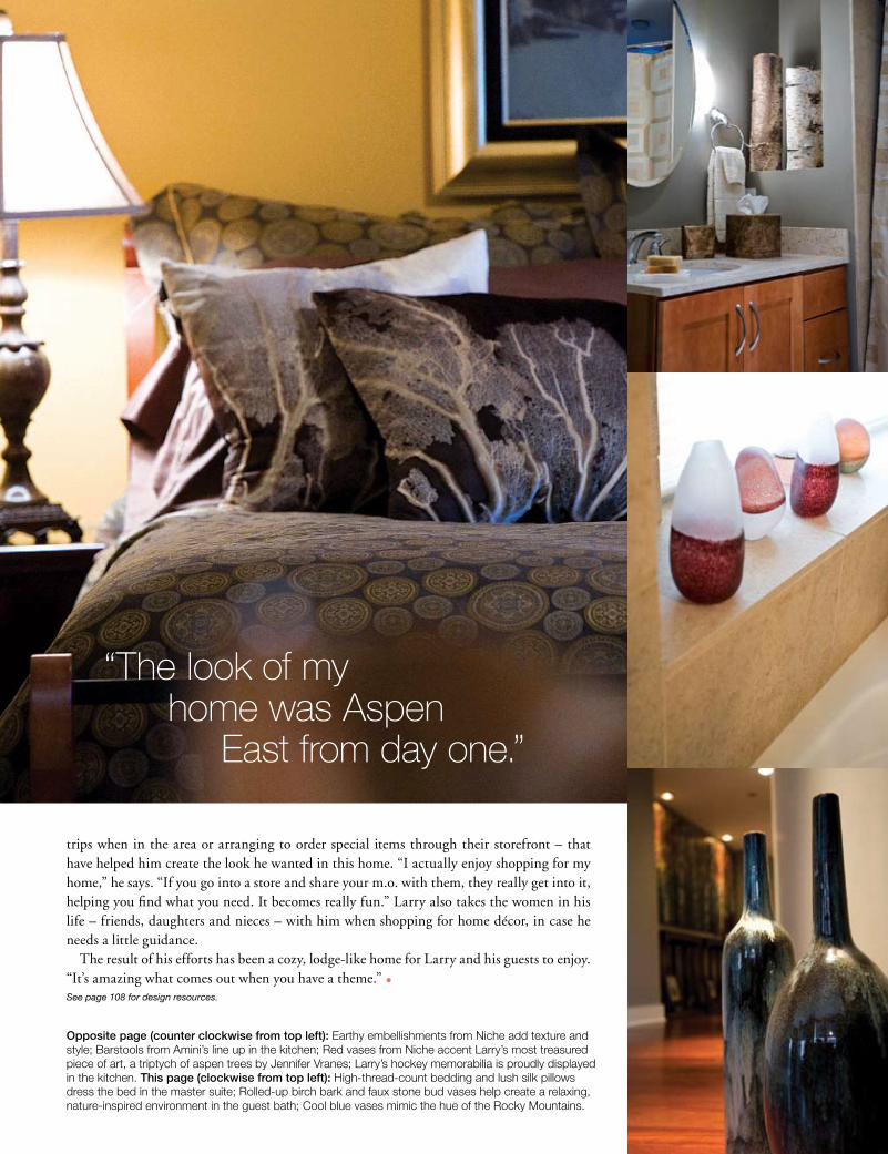
“The look of my home was Aspen East from day one.”
Opposite page (counter clockwise from top left): Earthy embellishments from niche add texture and style; Barstools from amini’s line up in the kitchen; red vases from niche accent larry’s most treasured piece of art, a triptych of aspen trees by Jennifer Vranes; larry’s hockey memorabilia is proudly displayed in the kitchen. This page (clockwise from top left): high-thread-count bedding and lush silk pillows dress the bed in the master suite; rolled-up birch bark and faux stone bud vases help create a relaxing, nature-inspired environment in the guest bath; Cool blue vases mimic the hue of the rocky mountains.

arthome is where the
isA visionary art collection takes up residence in the heart of the Central West End.
By Brandi Wills PhotograPhy By Michael JacoB
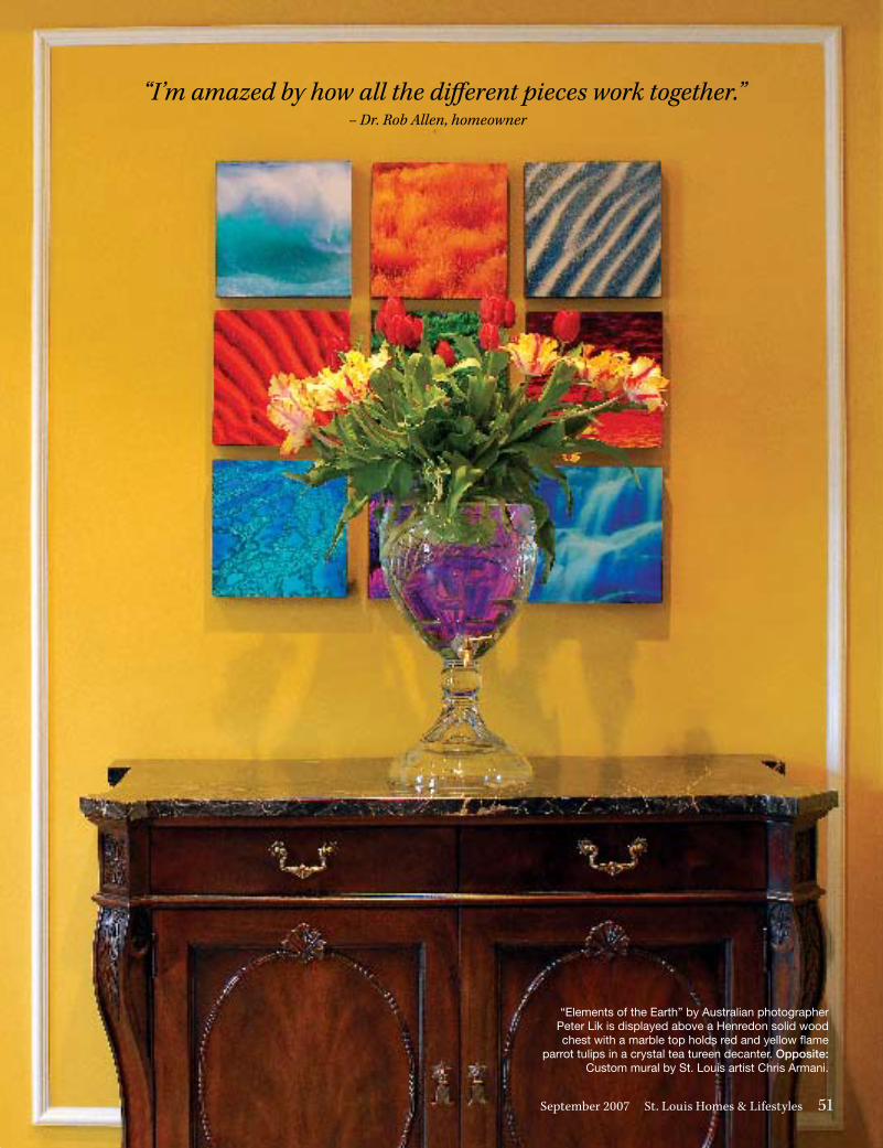
UrbanFeature“I’m amazed by how all the different pieces work together.”
– Dr. Rob Allen, homeowner
“I’m amazed by how all the different pieces work together.” – Dr. Rob Allen, homeowner
“Elements of the Earth” by Australian photographer Peter Lik is displayed above a Henredon solid wood chest with a marble top holds red and yellow flame
parrot tulips in a crystal tea tureen decanter. Opposite: Custom mural by St. Louis artist Chris Armani.
September 2007 St. Louis Homes & Lifestyles 51
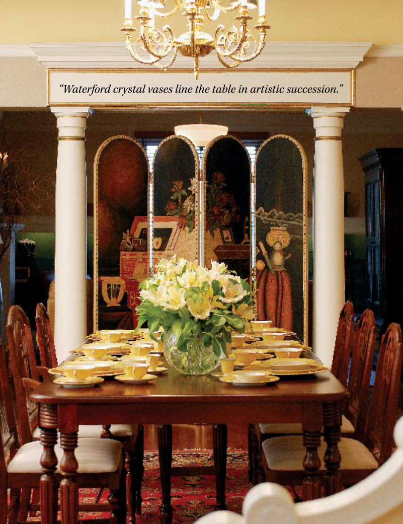
“Waterford crystal vases line the table in artistic succession.”
Mixing of cultures and styles has always been at the foundation of life within the Central West End. With a history of notable residents, from artists to
entrepreneurs, this cultural microcosm is built upon layers of vision and soul, focusing on the inspirational attributes of the neighborhood. Here you will find a community steeped in local flavor with a passion for the arts.
Built in 1897 and designed by St. Louis architect Edmund A. Manny, the Neo-Georgian style, Fullerton’s-Westminster Place home of Dr. Rob Allen is an art-lover’s paradise. Acquired over years of travel to various destinations from provincial to exotic, Dr. Allen’s collection of objets d’art brought a worldly flair to this year’s Central West End House and Garden Tour. For the tour, each room in the historic home was accented with a specially designed floral arrangement by Straub’s master floral designer, Scott Hepper, using vases and containers from the homeowner’s personal collection.
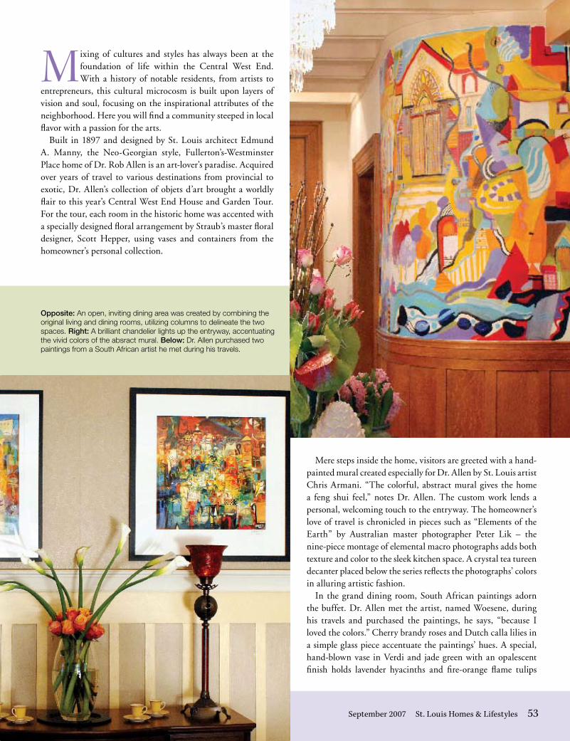
Mere steps inside the home, visitors are greeted with a hand-painted mural created especially for Dr. Allen by St. Louis artist Chris Armani. “The colorful, abstract mural gives the home a feng shui feel,” notes Dr. Allen. The custom work lends a personal, welcoming touch to the entryway. The homeowner’s love of travel is chronicled in pieces such as “Elements of the Earth” by Australian master photographer Peter Lik – the nine-piece montage of elemental macro photographs adds both texture and color to the sleek kitchen space. A crystal tea tureen decanter placed below the series reflects the photographs’ colors in alluring artistic fashion.
In the grand dining room, South African paintings adorn the buffet. Dr. Allen met the artist, named Woesene, during his travels and purchased the paintings, he says, “because I loved the colors.” Cherry brandy roses and Dutch calla lilies in a simple glass piece accentuate the paintings’ hues. A special, hand-blown vase in Verdi and jade green with an opalescent finish holds lavender hyacinths and fire-orange flame tulips
Opposite: an open, inviting dining area was created by combining the original living and dining rooms, utilizing columns to delineate the two spaces. Right: a brilliant chandelier lights up the entryway, accentuating the vivid colors of the absract mural. Below: dr. allen purchased two paintings from a south african artist he met during his travels.
September 2007 St. Louis Homes & Lifestyles 53
54 www.stlouishomesmag.com
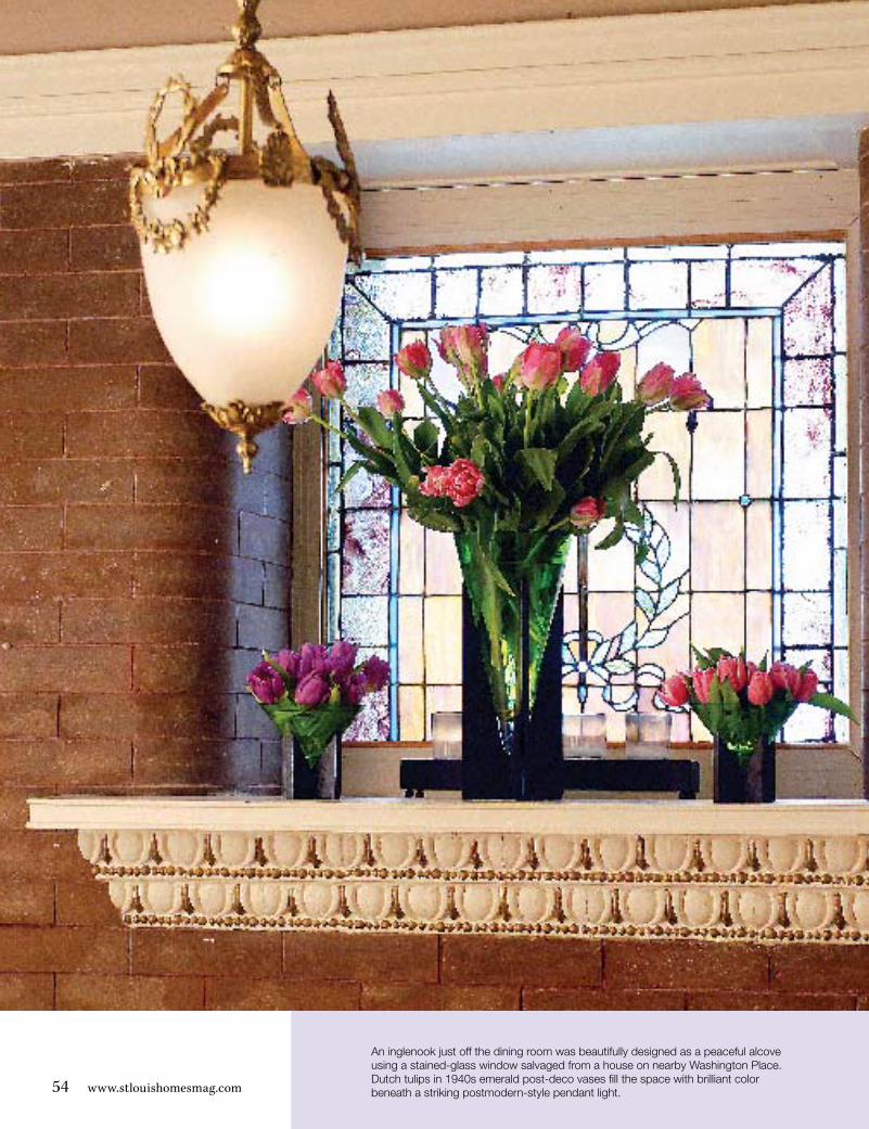
an inglenook just off the dining room was beautifully designed as a peaceful alcove using a stained-glass window salvaged from a house on nearby Washington Place. dutch tulips in 1940s emerald post-deco vases fill the space with brilliant color beneath a striking postmodern-style pendant light.
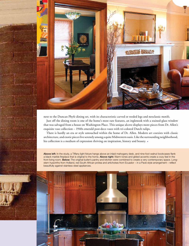
next to the Duncan Phyfe dining set, with its characteristic carved or reeded legs and neoclassic motifs. Just off the dining room is one of the home’s most rare features, an inglenook with a stained-glass window
that was salvaged from a house on Washington Place. This unique alcove displays more pieces from Dr. Allen’s exquisite vase collection – 1940s emerald post-deco vases with tri-colored Dutch tulips.
There is hardly an era or style untouched within the home of Dr. Allen. Modern art coexists with classic architecture, and exotic pieces live serenely among a quite Midwestern oasis. Like the surrounding neighborhood, his collection is a medium of expression thriving on inspiration, history and beauty. •
Above left: in the study, a tiffany light fixture hangs above an inlaid mahogany desk, and nine-foot walnut bookcases flank a black marble fireplace that is original to the home. Above right: Warm tones and gilded accents create a cozy feel in the front living room. Below: the original butler’s pantry and kitchen were combined to create a very contemporary space. long-stem hyacinths from holland, red south african protea and artichokes from ecuador – in a Pavé-style arrangement – reflect beautifully against stainless steel appliances.

SuburbanFeature
56 www.stlouishomesmag.com
collective memoryThe Ladue home of Rick and Jodi GoRdon is a coLLecTion of LocaL and peRsonaL hisToRy beauTifuLLy bLended ToGeTheR ThRouGh vaRiaTions on fRench desiGn.
By Brandi WillsPhotograPhy By Michael JacoB

58 www.stlouishomesmag.com
“I love the look of toile. It’s so authentic to farmhouses I’ve seen in France.”
– Jodi Gordon
W hen Rick and Jodi Gordon first set foot in their Ladue farmhouse, they had no idea it would one day become their home. Having just spent 18 months rehabbing
a farmhouse in Olivette, the couple was scouting open houses for inspiration, not for purchasing. Enchanted by the home’s rich history and rustic design, Rick and Jodi decided to sell their recently completed project and start a new one.
The Gordons were told that the house once resided across the street from its current location. When the home flooded one year, the structure was lifted and moved across the street to higher ground by a pack of mules. And the gates to the home’s drive were once used to mark the entrance to Ladue’s apple orchards. The Gordons were concerned with upholding the integrity of the home, a priority to them and a promise they had made to the previous owners. “It was hard to find a contractor to restore the home,” says Jodi. “I was told over and over to tear down the home and rebuild it. But I wanted a home with history and charm.”
Her persistence prevailed, and once the restoration work was completed, Jodi could focus on the home’s interior design. She decided on the French Country style because of how well it complemented the rustic nature of the farmhouse. “French Country is a very versatile and flexible design style,” says Jodi. “That’s important to our family because we want everyone in our home to feel comfortable. We have a laid-back lifestyle, with two 100-pound dogs and kids of all ages running in and
out of each room. We needed a home that fit with our personalities.”Implementing a French Country look meant using colors and
patterns that reflected the French countryside, as well as designing with antiques. “I like to have a lot of antiques in my home because it brings a sense of the past into your present,” says Jodi. “I look at the antiques in our home and I know there is a story attached to that piece of furniture that I’ll never know. It’s mysterious and intriguing, and at the same time makes a home feel more cozy and lived-in.”
In the kitchen, for example, you’ll find Jodi’s favorite piece, a
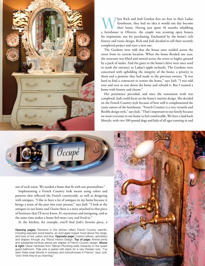
Opening pages: elements in the kitchen reflect french country warmth, including exposed wood beams, an acid-aged copper hood above the range, and hues of red, yellow and blue. Opposite page: custom pillows, upholstery and drapery through Joy Tribout interior design. Top of page: animal prints and substantial furniture pieces are staples of french country design. Above & right: clever hardware from Tallman plumbing adds character to the quaint guest bathroom. pale pink is paired with black for a very parisian look. “i’ve seen these soap fixtures in subways and schoolhouses in france,” says Jodi, “and i think they’re so charming.”

“I wanted my study to be masculine, to have that distinguished Ralph Lauren look.” – Rick Gordon
warped and curious antique butcher’s block. “I saw the butcher’s block in an antique store, and the storeowner said it had just been sitting there for months,” says Jodi. “I had to have it, and I told him that come hell or high water, I’d find a place in my home for it. It’s one of my favorite pieces, and it serves as a great buffet table when we entertain.”
Incorporating more of her family’s tastes, Jodi added a twist to the home’s décor by including some bright, contemporary colors. She brought in designer Joy Tribout to help design select rooms. Jodi loves the look of chocolate brown paired with bright pink, so in the family room, Joy and Jodi accessorized with pillows, upholstery and curtains in this color combination. An instinctual pattern in any style of French design, toile was used in this room and throughout the home to impart color and texture. The result was a taste of Modern French design among the French Country home.
Jodi and Rick wove their family histories into the home’s décor
60 www.stlouishomesmag.com
as well, exhibiting an heirloom china collection in the gold-and-copper striped dining room and displaying the many clocks passed down through Rick’s family in his study. “These clocks are sentimental, personal items. They need to be hung on the walls, not stored in boxes.” The study presents itself as a pillar of masculinity against the brightly colored backdrop of the home. Stacked from floor to ceiling with books, photos and memorabilia, the room is less of a “lodge” and more of a masculine library, chronicling the lives of many. “There are generations of history in this house, including the clock and china collections,” says Rick. “These things go back to my great-great-grandfather. I think there is more history around us than we’re aware of.”
In the second-level bedroom suites, there is more color and personality to follow. The Gordons had their daughter Katie get involved with the decorating process by designing
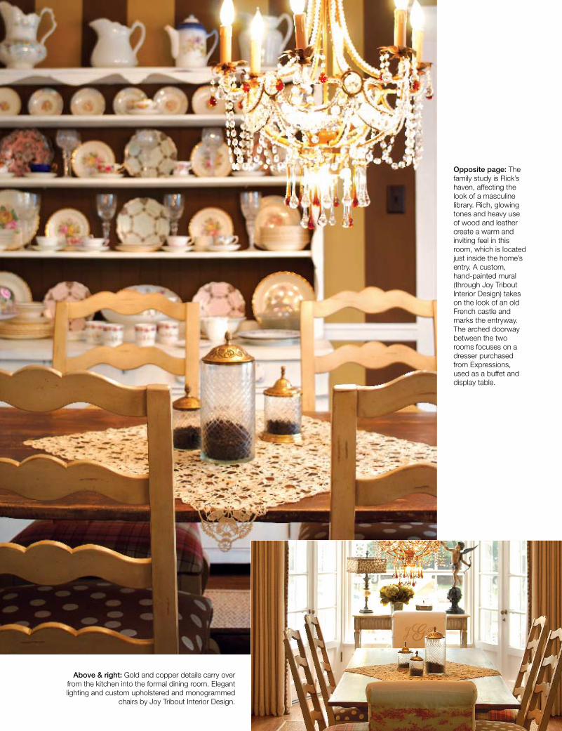
Above & right: Gold and copper details carry over from the kitchen into the formal dining room. elegant lighting and custom upholstered and monogrammed
chairs by Joy Tribout interior design.
Opposite page: The family study is Rick’s haven, affecting the look of a masculine library. Rich, glowing tones and heavy use of wood and leather create a warm and inviting feel in this room, which is located just inside the home’s entry. a custom, hand-painted mural (through Joy Tribout interior design) takes on the look of an old french castle and marks the entryway. The arched doorway between the two rooms focuses on a dresser purchased from expressions, used as a buffet and display table.
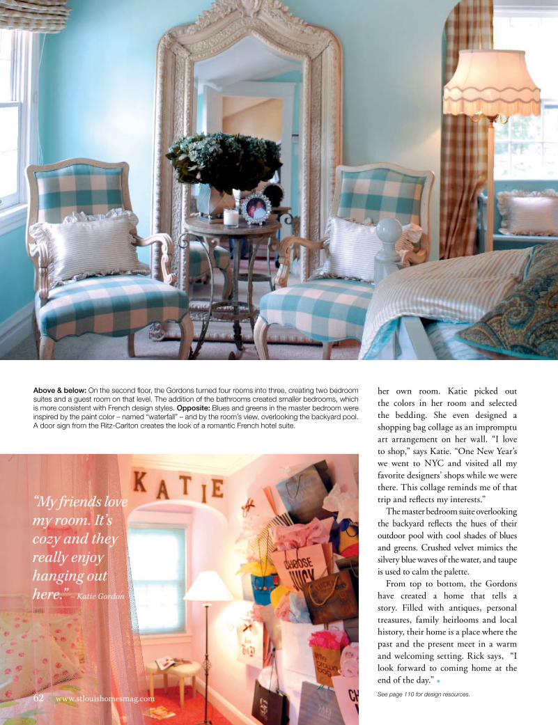
Above & below: on the second floor, the Gordons turned four rooms into three, creating two bedroom suites and a guest room on that level. The addition of the bathrooms created smaller bedrooms, which is more consistent with french design styles. Opposite: blues and greens in the master bedroom were inspired by the paint color – named “waterfall” – and by the room’s view, overlooking the backyard pool. a door sign from the Ritz-carlton creates the look of a romantic french hotel suite.
her own room. Katie picked out the colors in her room and selected the bedding. She even designed a shopping bag collage as an impromptu art arrangement on her wall. “I love to shop,” says Katie. “One New Year’s we went to NYC and visited all my favorite designers’ shops while we were there. This collage reminds me of that trip and reflects my interests.”
The master bedroom suite overlooking the backyard reflects the hues of their outdoor pool with cool shades of blues and greens. Crushed velvet mimics the silvery blue waves of the water, and taupe is used to calm the palette.
From top to bottom, the Gordons have created a home that tells a story. Filled with antiques, personal treasures, family heirlooms and local history, their home is a place where the past and the present meet in a warm and welcoming setting. Rick says, “I look forward to coming home at the end of the day.” •
“My friends love my room. It’s cozy and they really enjoy hanging out here.” – Katie Gordon
62 www.stlouishomesmag.comSee page 110 for design resources.
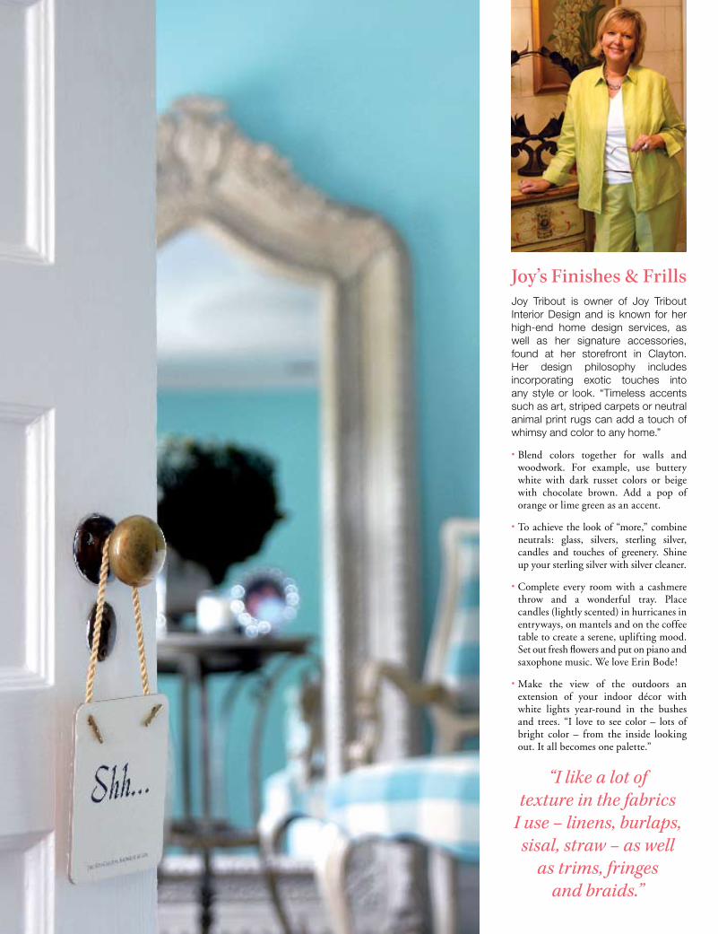
Joy’s Finishes & Frills Joy Tribout is owner of Joy Tribout interior design and is known for her high-end home design services, as well as her signature accessories, found at her storefront in clayton. her design philosophy includes incorporating exotic touches into any style or look. “Timeless accents such as art, striped carpets or neutral animal print rugs can add a touch of whimsy and color to any home.”
• Blend colors together for walls and woodwork. For example, use buttery white with dark russet colors or beige with chocolate brown. Add a pop of orange or lime green as an accent.
• To achieve the look of “more,” combine neutrals: glass, silvers, sterling silver, candles and touches of greenery. Shine up your sterling silver with silver cleaner.
• Complete every room with a cashmere throw and a wonderful tray. Place candles (lightly scented) in hurricanes in entryways, on mantels and on the coffee table to create a serene, uplifting mood. Set out fresh flowers and put on piano and saxophone music. We love Erin Bode!
• Make the view of the outdoors an extension of your indoor décor with white lights year-round in the bushes and trees. “I love to see color – lots of bright color – from the inside looking out. It all becomes one palette.”
“I like a lot of texture in the fabrics
I use – linens, burlaps, sisal, straw – as well
as trims, fringes and braids.”

SPACE EXPLORATIONproject GARMIN WORLD HEADQUARTERS design PGAV ARCHITECTS words BRANDI WILLS
DsDesign
34 Commercial Journal - Kansas City

1.1 Garmin’s newly constructed world
headquarters building in Olathe, Kansas,
encompasses 757,000 square feet of sleek
and efficient design.
October/November 2005 35

36 Commercial Journal - Kansas City
I n November 2004, a team of courageous and accomplished pioneers
successfully completed what had proven itself to be a challenging yet
satisfying mission. Okay, so pioneers is pushing it a bit—what they did was
not unprecedented, but impressive nonetheless. In just under two years, this
dedicated team designed and built 517,000 square feet of additional space
to Garmin’s world headquarters in Olathe, Kansas.
The team responsible for this amazing feat included not only PGAV
Architects, Turner Construction, Walter P. Moore structural engineers,
Henderson Engineers Inc., Acoustical Design Group and more, but members
of Garmin’s staff as well.
“What made this such a successful project was the team approach,” says
Ken Conrad, principal at Walter P. Moore. “There was a high level of owner
participation, and it takes the right kind of owner to produce a signature
project such as this.”
Mike Schaadt, vice president at PGAV, agrees that finding a team
with chemistry and trust that works well together was key to successfully
achieving Garmin’s ultimate goals. “On one level, it produced a beautiful
and functional new headquarters in a short amount of time,” says Schaadt.
“On another level, it created a space in which Garmin can more efficiently
and effectively work at moving units.”
The choices made by Garmin were wise ones indeed. What stands today
as their headquarters building is an eight-story structure, of which they cur-
rently occupy three floors. They also greatly expanded their warehouse and
laboratory facilities and erected a new parking garage. So why this huge
increase in square footage?
“A key focus of the master plan was how to design today for future needs,”
says Kevin Rauckman, CFO of Garmin. “Garmin has always seen the
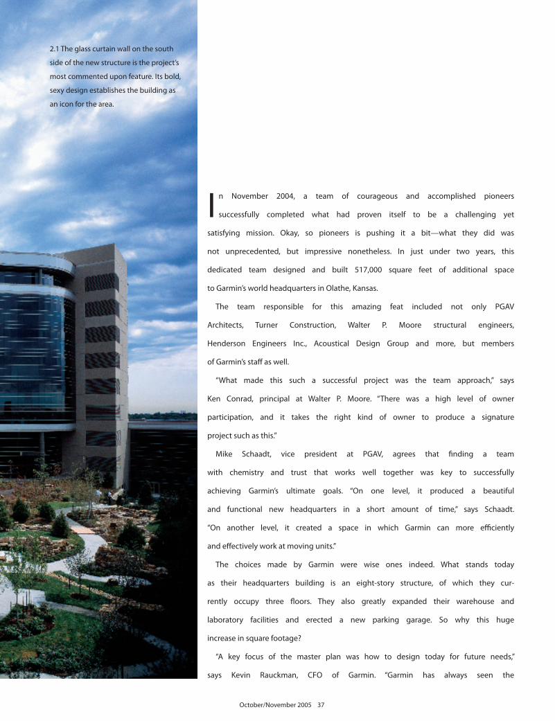
2.1 The glass curtain wall on the south
side of the new structure is the project’s
most commented upon feature. Its bold,
sexy design establishes the building as
an icon for the area.
October/November 2005 37

3.1
3.1
3.2 3.43.3
38 Commercial Journal - Kansas City
importance of investing first in the people, facilities and supplies needed to
support the business. So the investment is seen as one in functional space
and beauty—for the employees and the community.”
That ideal is reflected in nearly every aspect of the project’s design, from
the building’s structure to its furnishings and beyond. “Garmin had some
very specific requirements for the mechanical-electrical infrastructure,” says
Drew Rimmer, vice president of Henderson Engineers Inc. “Accommodating
the comfort of the employees and visitors in this facility, which operates 24/7,
was very important to them—specific temperature and humidity control,
specialty lighting, vibration isolation, etc.”
More easily identifiable considerations can be found in the interiors of the
new building. As an established company in the area, which has made the
proper space investment to increase their workforce, Garmin wanted the
addition to complement the original building instead of downplay it.
“The interiors of the new space were designed to pay homage to their
existing headquarters building,” says Pat Duff, project manager at PGAV.
“We wanted the two areas to look harmonious, so we used the same general
color palette and carpeting, adding different accent pieces—in yellow, blue
or brown—on each floor to differentiate them.”
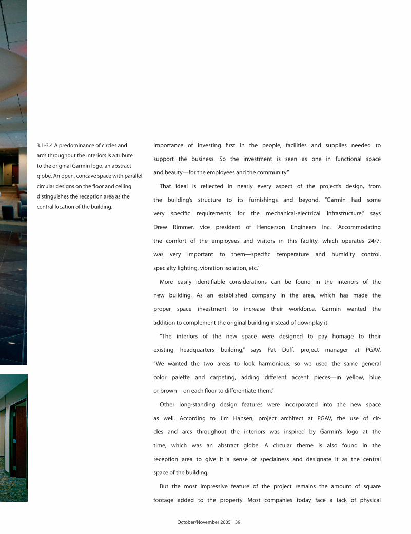
Other long-standing design features were incorporated into the new space
as well. According to Jim Hansen, project architect at PGAV, the use of cir-
cles and arcs throughout the interiors was inspired by Garmin’s logo at the
time, which was an abstract globe. A circular theme is also found in the
reception area to give it a sense of specialness and designate it as the central
space of the building.
But the most impressive feature of the project remains the amount of square
footage added to the property. Most companies today face a lack of physical
3.1-3.4 A predominance of circles and
arcs throughout the interiors is a tribute
to the original Garmin logo, an abstract
globe. An open, concave space with parallel
circular designs on the floor and ceiling
distinguishes the reception area as the
central location of the building.
October/November 2005 39
space to house their growing business, instead of an overabundance. But, in
the long term, this single large investment will prove itself wise, as Garmin
will be able to avoid a series of small additions to support its growing staff.
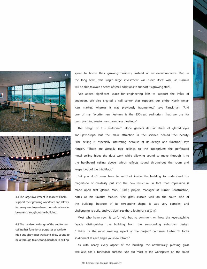
“We added significant space for engineering labs to support the influx of
engineers. We also created a call center that supports our entire North Amer-
ican market, whereas it was previously fragmented,” says Rauckman. “And
one of my favorite new features is the 250-seat auditorium that we use for
team planning sessions and company meetings.”
The design of this auditorium alone garners its fair share of glazed eyes
and jaw-drops, but the main attraction is the science behind the beauty.
“The ceiling is especially interesting because of its design and function,” says
Hansen. “There are actually two ceilings to the auditorium; the perforated
metal ceiling hides the duct work while allowing sound to move through it to
the hardboard ceiling above, which reflects sound throughout the room and
keeps it out of the third floor.”
But you don’t even have to set foot inside the building to understand the
magnitude of creativity put into the new structure. In fact, that impression is
made upon first glance. Mark Huber, project manager at Turner Construction,
notes as his favorite feature, “The glass curtain wall on the south side of
the building, because of its serpentine shape. It was very complex and
challenging to build, and you don’t see that a lot in Kansas City.”
Most who have seen it can’t help but to comment on how this eye-catching
façade distinguishes the building from the surrounding suburban design.
“I think it’s the most amazing aspect of the project,” continues Huber. “It looks
so different at each angle you view it from.”
As with nearly every aspect of the building, the aesthetically pleasing glass
wall also has a functional purpose. “We put most of the workspaces on the south
4.1 The large investment in space will help
support their growing workforce and allows
for many employee-based considerations to
be taken throughout the building.
4.2 The handsome design of the auditorium
ceiling has functional purposes as well; to
hide unsightly duct work and allow sound to
pass through to a second, hardboard ceiling.
4.1
4.2
40 Commercial Journal - Kansas City
side of the building,” says Duff, “where there is the most access to natural light.”
While the project wasn’t slated for certification of any kind as to its environ-
mental sustainability and energy efficiency, PGAV integrated sustainable
and efficient features and systems into the project. Some of those included:
effective use of daylight to reduce lighting needs and increase user comfort;
a highly reflective Sarnafil roof to reflect solar radiation and absorb less heat;
efficient mechanical systems for heating and cooling; and conscientious use
of land and consideration for the impact this building has on the area.
One highly notable impact is that the new headquarters is helping to
establish a standard of distinctive commercial design in Johnson County.
“The end result was very satisfying,” says Rimmer. “The building is an icon
for Olathe.” £
4.3 Seating in the new auditorium was
designed to cater to both large and small
groups; the two front rows consist of
more flexible seating options and include
accommodations for use of multimedia
equipment, while the remaining stadium
seating allows for a greater occupancy
during lectures and conferences.
4.3
October/November 2005 41