Embed Size (px)
Citation preview
Design Project 2: Using Methods of
Abstraction to Create a Logo
Delivered by
Mohammad Zikky, M.TMultimedia Creative Department, EEPIS Surabaya
Visual Design Fundamentals:A Digital Approach, 3rd Edition
Authors: Alan Hashimoto and Mike Clayton
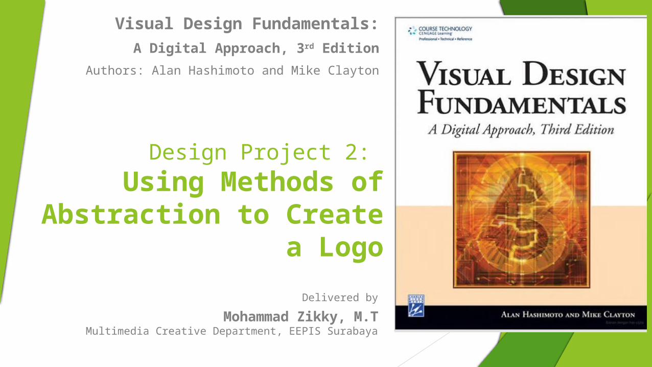
Overview The second project will allow you to explore some ways you can use the things you
learned in the previous project to solve a visual communication problem. In this project, you will use abstraction to develop a visual symbol for a business. Such a visual symbol is frequently called a “logo.”
In the previous project, you were given an object as the starting point. In this project, you will choose the object to use. Using your selected object, use the Simplification Method and one of the three remaining methods from the previous project
The four methods of abstracting objects that you have explored are the following:
Abstraction Through Simplification eliminates some visual information to focus attention on the essential qualities or emphasize some particular aspect of the object
Abstraction Through Repetition repeat all or parts of the object in order to create a more complex design where the composition is unified by the repetition of shape
Abstraction Using Type Combination elements are combined to create a new visual message. In this case, the image (or object) is combined with a letterform (or type).
Figure. Examples of each method of abstraction.
Left to right: Simplification, Repetition, Line and Shape, and Type Combination
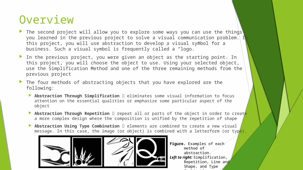
Content: The Basic Problem Defined Choose an occupation in which someone would use a specific tool or
object to complete his or her job. This should be something familiar and not too complex or detailed.
For example, a carpenter might use a hammer, a saw, or a planer. A chef might use a whisk, a peeler, or a sifter. A mechanic might use a wrench, a car-jack, or a screwdriver.
Do not select objects that rely on texture or color because these elements will not be part of this project
Objects for this project should be easily associated with a particular occupation and could include objects such as a whisk, a hammer, or a compass.
Content: The Basic Problem Defined In the last project, you were limited to using a 4" × 4" square in
creating your studies.
In this project, you will also use two different size rectangles: a 4" × 6" rectangle and a 4" × 8" rectangle.
You may use these either vertically or horizontally.
You will also be required to use type to accompany the final logo.
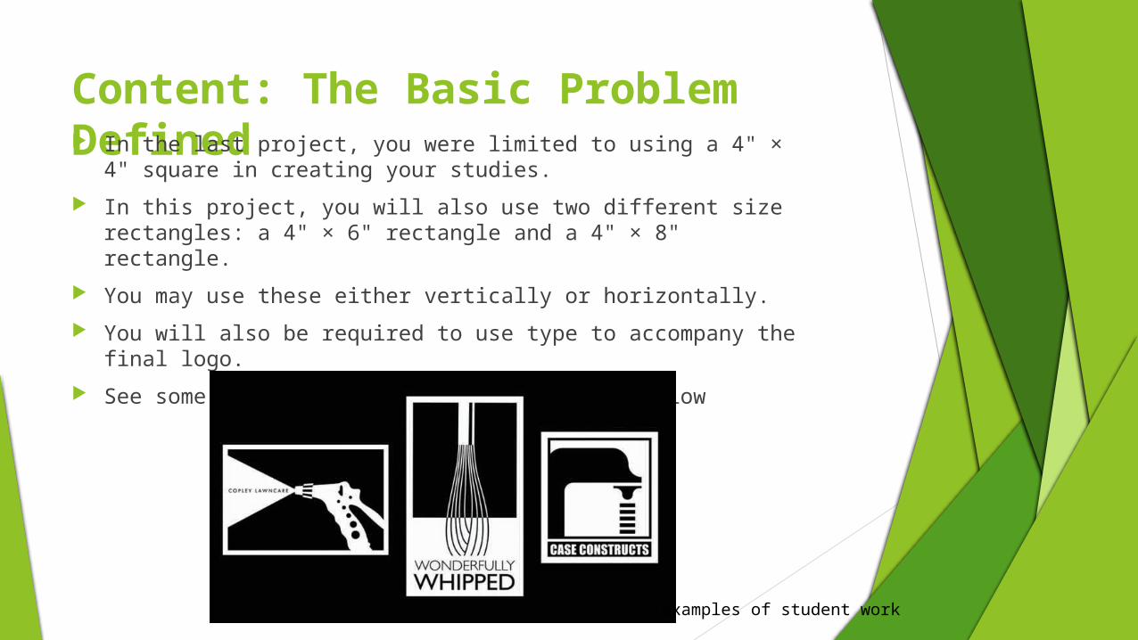
See some examples from students in Figure below
Examples of student work
Background: From Design to Communication At some point, students need to begin the shift from
purely formal design to design as a means of communication
The previous project was concerned only with understanding formal design relationships and with exploring some of the methods of abstracting an object. Now students need to realize that the ultimate purpose of understanding design, so they can use visual means to communicate an idea, thought, or feeling.
A logo is a visual symbol that represents a person, group, or organization. Logos need to be able to be recognized quickly and remembered by their intended audience. The selection of the object is very important and needs to be familiar enough that people will know what it is as soon as they see it. A logo must also be highly unified.
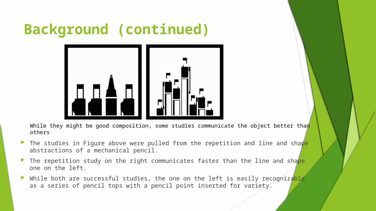
Background (continued)
The studies in Figure above were pulled from the repetition and line and shape abstractions of a mechanical pencil.
The repetition study on the right communicates faster than the line and shape one on the left.
While both are successful studies, the one on the left is easily recognizable as a series of pencil tops with a pencil point inserted for variety.
While they might be good composition, some studies communicate the object better than others

The Picture Frame
In the first project, you were limited to a 4" × 4" square, or a 1:1 ratio. For this project, you can begin to explore your object using a 4" × 6" rectangle (a 1.5:1 ratio) and a 4" × 8" rectangle (a 2:1 ratio).
This modification may better help you communicate the object that you choose.
In this project, composition and content take center stage. The object you choose might require you to explore a more vertical picture frame in order to fully recognize it.
In Figure beside, the vertical nature of the hand mixer lends itself to a different format:
In the first study, it is hard to make out what the object is. Those familiar with what hand mixers look like might be able to recognize it right away,
but others might be able to understand the object better if they see more of it, as shown in the examples in the center or left
Examples of studies using the 1:1, 1.5:1, and 2:1 ratios
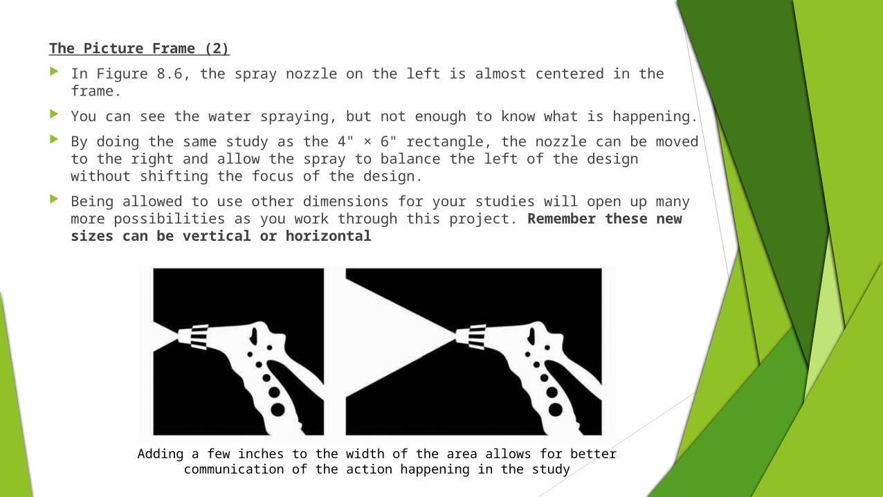
The Picture Frame (2)
In Figure 8.6, the spray nozzle on the left is almost centered in the frame.
You can see the water spraying, but not enough to know what is happening.
By doing the same study as the 4" × 6" rectangle, the nozzle can be moved to the right and allow the spray to balance the left of the design without shifting the focus of the design.
Being allowed to use other dimensions for your studies will open up many more possibilities as you work through this project. Remember these new sizes can be vertical or horizontal
Adding a few inches to the width of the area allows for better communication of the action happening in the study
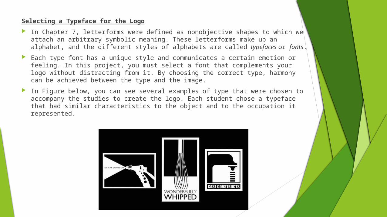
Selecting a Typeface for the Logo
In Chapter 7, letterforms were defined as nonobjective shapes to which we attach an arbitrary symbolic meaning. These letterforms make up an alphabet, and the different styles of alphabets are called typefaces or fonts.
Each type font has a unique style and communicates a certain emotion or feeling. In this project, you must select a font that complements your logo without distracting from it. By choosing the correct type, harmony can be achieved between the type and the image.
In Figure below, you can see several examples of type that were chosen to accompany the studies to create the logo. Each student chose a typeface that had similar characteristics to the object and to the occupation it represented.
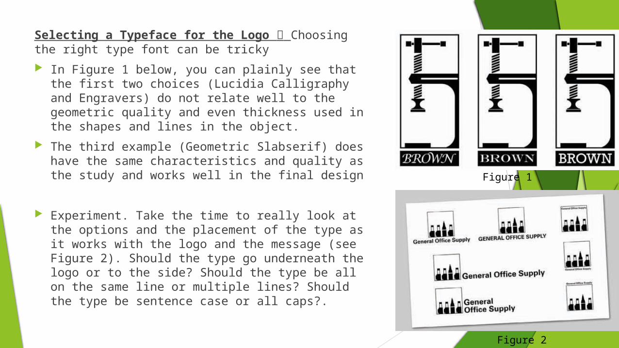
Selecting a Typeface for the Logo Choosing the right type font can be tricky
In Figure 1 below, you can plainly see that the first two choices (Lucidia Calligraphy and Engravers) do not relate well to the geometric quality and even thickness used in the shapes and lines in the object.
The third example (Geometric Slabserif) does have the same characteristics and quality as the study and works well in the final design
Experiment. Take the time to really look at the options and the placement of the type as it works with the logo and the message (see Figure 2). Should the type go underneath the logo or to the side? Should the type be all on the same line or multiple lines? Should the type be sentence case or all caps?.
Figure 1
Figure 2

What you can analyze about these logos?
Conceptual Process Using the information from the previous four chapters and with the
parameters of the problem defined, you can repeat the conceptual process used before as a guide for this project. The following are the steps that you must take to complete this process:
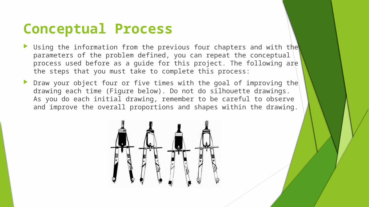
Draw your object four or five times with the goal of improving the drawing each time (Figure below). Do not do silhouette drawings. As you do each initial drawing, remember to be careful to observe and improve the overall proportions and shapes within the drawing.
To study the areas of the drawing, use the same L-shaped cropping frames from the first project.
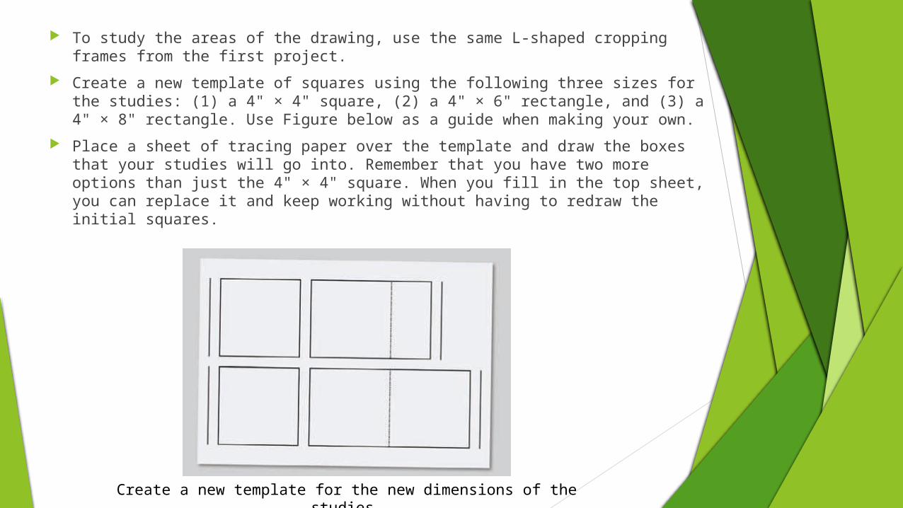
Create a new template of squares using the following three sizes for the studies: (1) a 4" × 4" square, (2) a 4" × 6" rectangle, and (3) a 4" × 8" rectangle. Use Figure below as a guide when making your own.
Place a sheet of tracing paper over the template and draw the boxes that your studies will go into. Remember that you have two more options than just the 4" × 4" square. When you fill in the top sheet, you can replace it and keep working without having to redraw the initial squares.
Create a new template for the new dimensions of the studies.
Creating Studies Using the Simplification Method
“The beginning of this process starts with the first steps: simplifying the object”
Method One: Simplification
Adjust the cropping frames to show the square or rectangular area of your drawing.
Move the frame around the drawing, expanding and contracting the area of the frame until you have isolated what you think would be an interesting composition.
Then transfer that composition to one of the shapes on your tracing paper.
Continue to search for and find interesting compositions within the initial drawings.
Since you are not working with just a square, be mindful of the rectangular compositions that can be made within the other rectangular shapes.
With these added dimensions, you can now explore vertical and horizontal compositions.
Remember to fill in the shapes as solids.
You should do at least 25 of these initial compositions.
After completing the initial exploratory studies, evaluate them to select those with the strongest overall compositions, the most visual interest, and the best communication for your company, and then refine these.
Use the same criteria as outlined in Chapter 4: consider balance, unity through the use of similar shapes, variety to create interest, and recognition of the object.
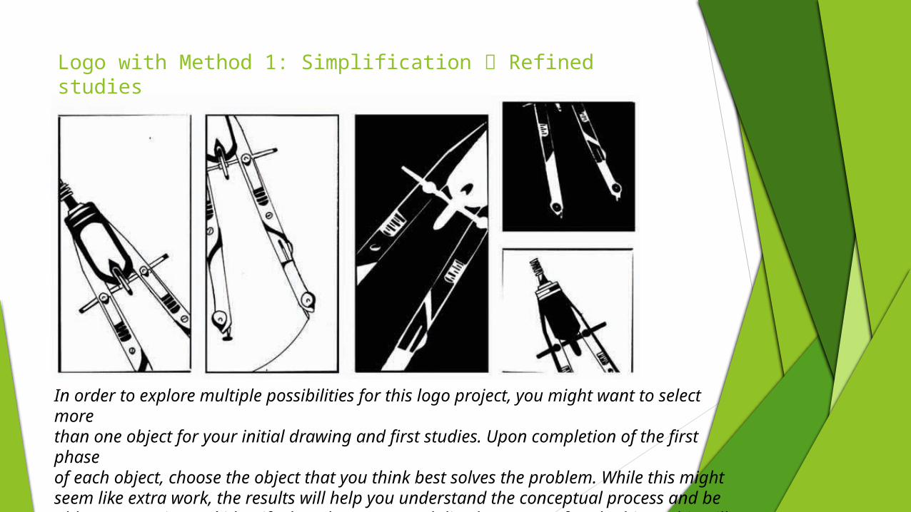
Logo with Method 1: Simplification Refined studies
In order to explore multiple possibilities for this logo project, you might want to select morethan one object for your initial drawing and first studies. Upon completion of the first phaseof each object, choose the object that you think best solves the problem. While this might seem like extra work, the results will help you understand the conceptual process and be able to recognize and identify the advantages and disadvantages of each object. This will allow you to determine which idea would be the best solution
Creating Studies Using Your Selected Method
You may choose one (or more) of the abstraction methods used in the previous Project as your favorite method to complete this project. The remaining methods are:
Repetition (Chapter 5)
Line and Shape (Chapter 6)
Type Combination (Chapter 7)
As outlined in all of the other methods, follow these steps:
Use the same initial drawing and object.
Use the same template of squares and rectangles and the same technique of marker studies.
For the initial studies, use both the initial drawings and the simplification studies from the previous method.
You should do at least 25 studies for your chosen method.
Remember to use all three dimensions for your studies. Explore the possibilities of the larger boxes.
Method Two: Repetition
Some studies should work with fewer objects, and other studies should work with as many as eight or nine objects. Some studies should show most or all of the object, and others should show only partial objects.
In evaluating these compositions, pay attention to the negative shapes created by repetition as much as the shapes within the objects themselves.
Change the scale of the objects both within one frame and from frame to frame.
Keep in mind that exactly repeating patterns will not hold a viewer’s attention for long. Some variation is necessary for interest.
Too much variety can create visual chaos.
Method Three: Line and Shape
In this phase, you may also repeat the object, but too much repetition will make these images too chaotic, so two or three is usually enough. Some studies should show most or all of the object, and others should show only part of the object.
In evaluating these compositions, along with the positive shapes, pay attention to the implied shapes created by line.
Change the scale of the object both within one frame and from study to study.
In using line to create an implied shape, consider how the alignments between the ends of the lines work to help unify the design and consider how using similar angles can also help to create unity and rhythm within the composition
Method Four: Type Combination
Letterforms that tend to make the best overall design are those that are simpler and less decorative.
Pay attention to the counter forms (negative space) of the letters. They tend to offer many more opportunities for combining the image with the form.
Pay particular attention to how well the object and letterform are synthesized into a unified whole.
You might want to use the same font that the letterform came from when choosing the type for the logo
Revisions of the Chosen MethodsOnce you have completed the studies, select the five most successful studies from each method and revise them. Some of these may be variations of the original studies
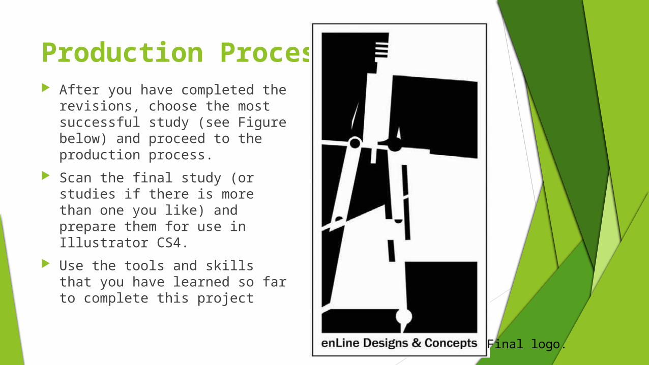
Production Process After you have completed the
revisions, choose the most successful study (see Figure below) and proceed to the production process.
Scan the final study (or studies if there is more than one you like) and prepare them for use in Illustrator CS4.
Use the tools and skills that you have learned so far to complete this project
Final logo.
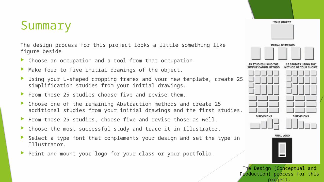
Summary
The design process for this project looks a little something like figure beside
Choose an occupation and a tool from that occupation.
Make four to five initial drawings of the object.
Using your L-shaped cropping frames and your new template, create 25 simplification studies from your initial drawings.
From those 25 studies choose five and revise them.
Choose one of the remaining Abstraction methods and create 25 additional studies from your initial drawings and the first studies.
From those 25 studies, choose five and revise those as well.
Choose the most successful study and trace it in Illustrator.
Select a type font that complements your design and set the type in Illustrator.
Print and mount your logo for your class or your portfolio.
The Design (Conceptual and Production) process for this project.