Embed Size (px)
DESCRIPTION
My name is Jed Whippey, a graphic designer based in Bristol. Here is my design Portfolio, feel free to contact me.
Citation preview
MY DESIGN PORTFOLIO
YEAR 0//

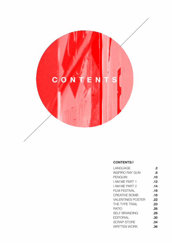
C O N T E N T S
CONTENTS//LANGUAGE INSPIRO RAY GUNPENGUINI AM ME PART 1I AM ME PART 2FILM FESTIVALCREATIVE BOMBVALENTINES POSTERTHE TYPE TRAILRATIOSELF BRANDINGEDITORIALSCRAP STOREWRITTEN WORK
.2
.6.10.12.14.16.18.22.23.26.28.30.34.36
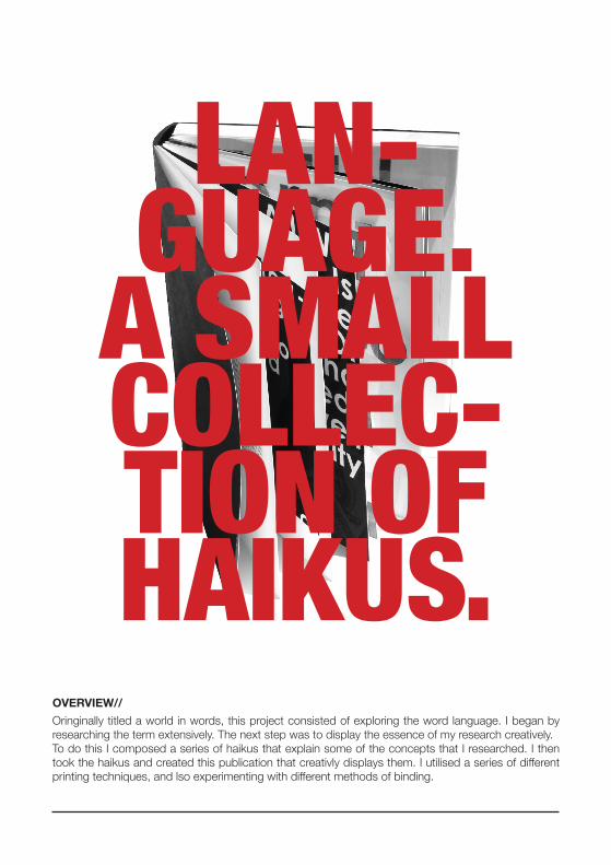
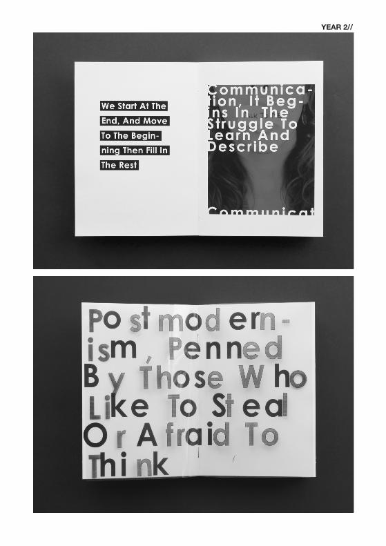
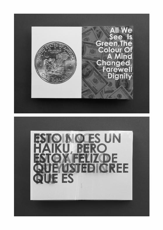
Oringinally titled a world in words, this project consisted of exploring the word language. I began by researching the term extensively. The next step was to display the essence of my research creatively.To do this I composed a series of haikus that explain some of the concepts that I researched. I then took the haikus and created this publication that creativly displays them. I utilised a series of different printing techniques, and lso experimenting with different methods of binding.
OVERVIEW//
LAN-GUAGE.
A SMALL COLLEC-TION OF HAIKUS.
YEAR 2//

YEAR 2//

SELF PROMOTIONAL
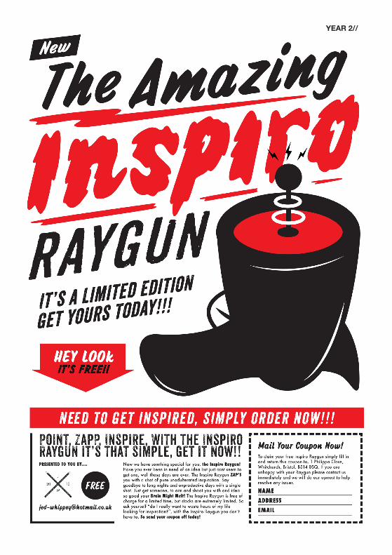
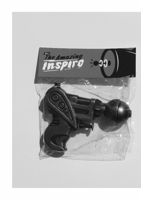
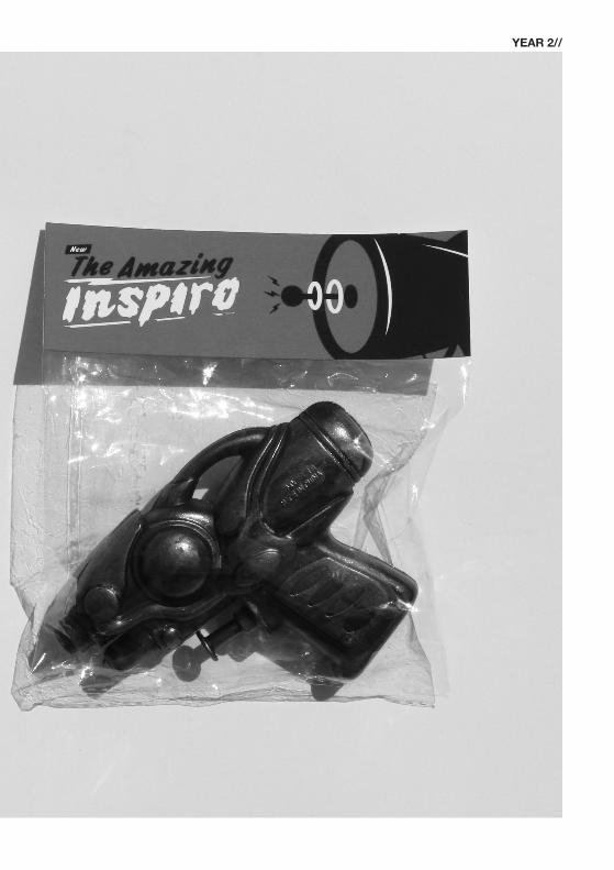
MAILERTHE INSPIRO
RAYGUN.
Here I was asked to create a promotional mailer that would be sent out in order to try and obtain work placement. The overall concept for this piece is one that I am extremely proud of. The whole idea is that the recipitent of the poster would fill in the coupon and send it back to me requesting the advertised raygun. I would then send them the raygun followed by a letter recalling it. The letter would include the option of having me work for them for free for a week as compensation.
OVERVIEW//
YEAR 2//
YEAR 2//
ONE FLEW OVER THE CUCKOO’S NEST BOOK
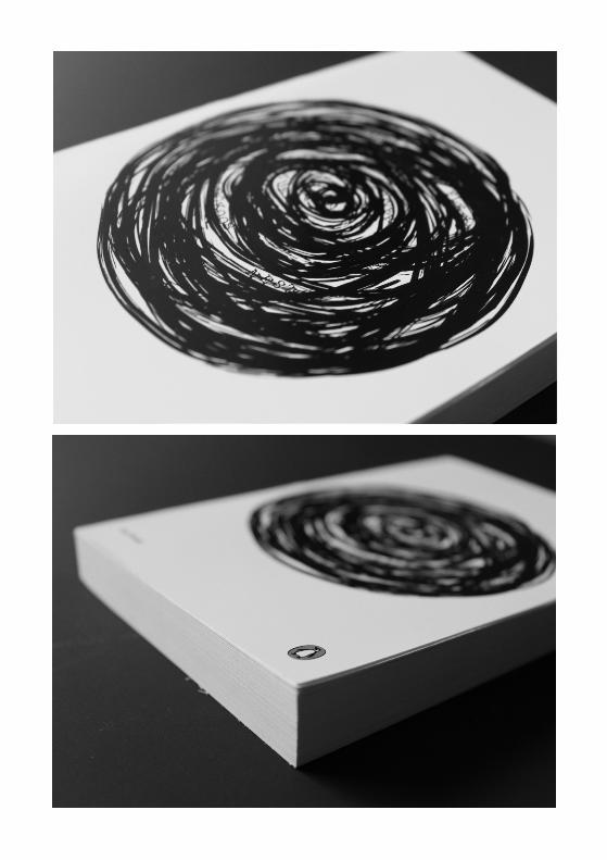
COVER Here is my entry to the 2012 penguin book cover competition. There was a choice of two book’s, I opted for One Flew Over The Cuckoo’s Nest. The reason being that its a dense story that is layered with symbolism, this meant that I had a lot to work with. As you can see on the right my design is a large spiral. This spiral represents the madness of the characters within the book. In the spiral I have worked in the title of the book. This represents how the madness wrapping itself around the psyche of each of the patients on the ward.
OVERVIEW//
YEAR 2//
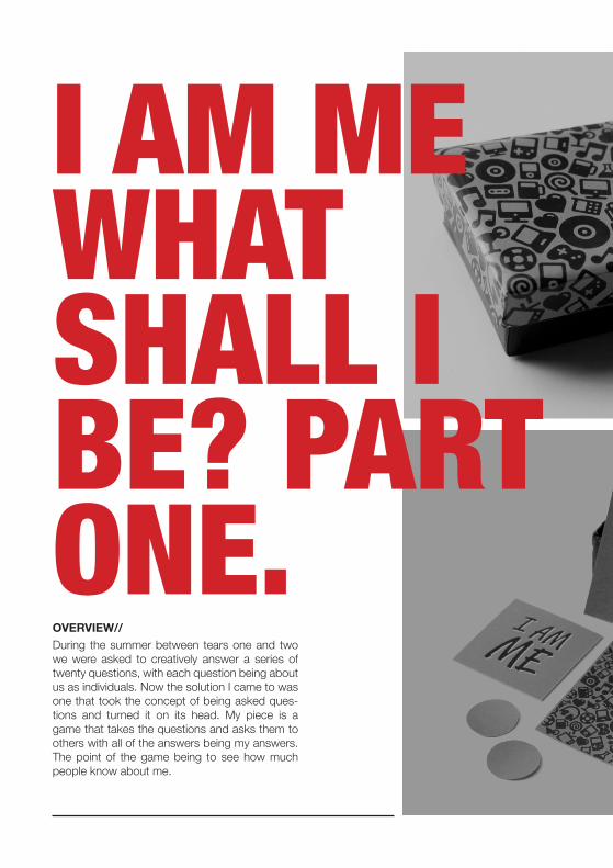
I AM ME WHAT SHALL I BE? PART ONE.During the summer between tears one and two we were asked to creatively answer a series of twenty questions, with each question being about us as individuals. Now the solution I came to was one that took the concept of being asked ques-tions and turned it on its head. My piece is a game that takes the questions and asks them to others with all of the answers being my answers. The point of the game being to see how much people know about me.
OVERVIEW//

YEAR 2//

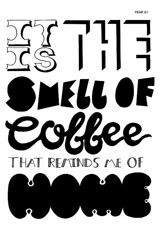
Finished Poster In Situ.
Fig.1//
OVERVIEW//After part one had been finished we took the answer to one of the questions and from that create a creative outcome, I created this hand rendered poster. Further I soaked the frame in coffee so to further emphasise the answer.
PART TWO.
YEAR 2//
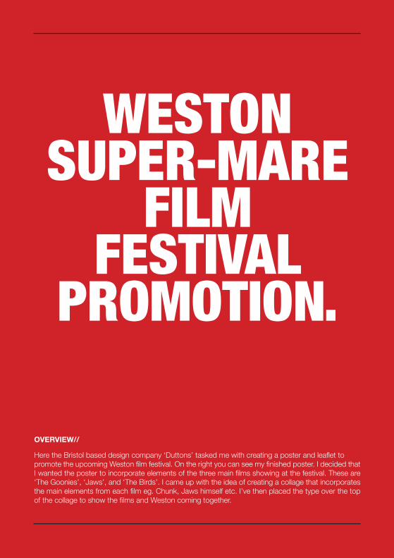
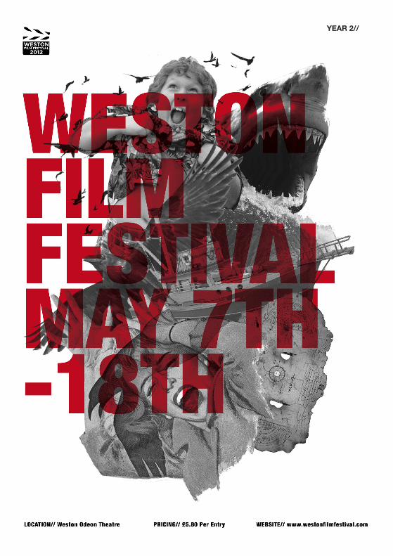
Here the Bristol based design company ‘Duttons’ tasked me with creating a poster and leaflet to promote the upcoming Weston film festival. On the right you can see my finished poster. I decided that I wanted the poster to incorporate elements of the three main films showing at the festival. These are ‘The Goonies’, ‘Jaws’, and ‘The Birds’. I came up with the idea of creating a collage that incorporates the main elements from each film eg. Chunk, Jaws himself etc. I’ve then placed the type over the top of the collage to show the films and Weston coming together.
OVERVIEW//
WESTONSUPER-MARE
FILM FESTIVAL
PROMOTION.
YEAR 2//
SONY BANNER & POSTER CREATIVE BOMB, ONE DAYPROJECT
SONY BANNER & POSTER CREATIVE BOMB, ONE DAYPROJECT
YEAR 2//
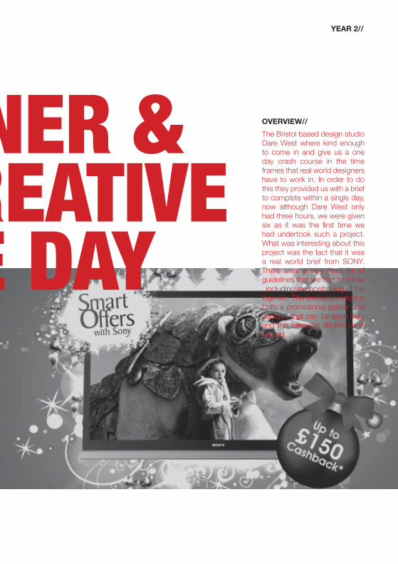
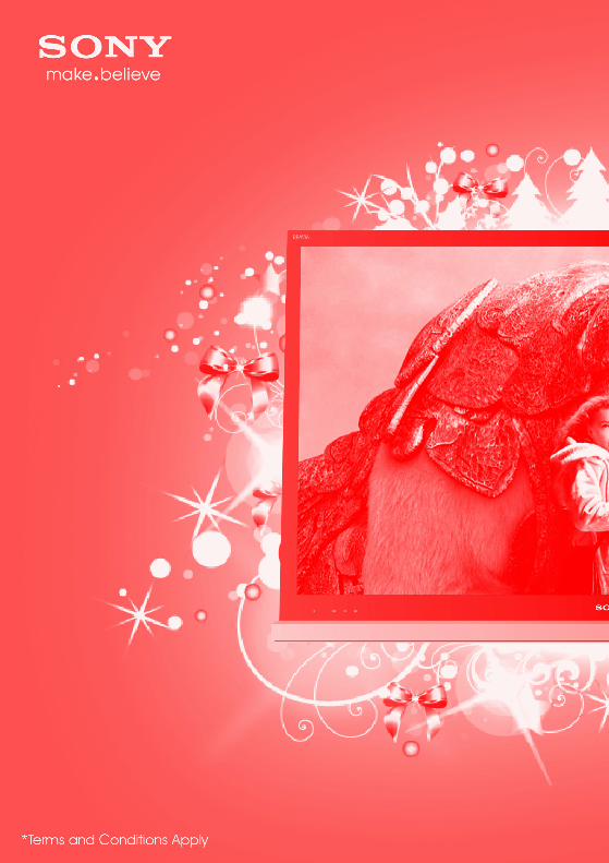
OVERVIEW//The Bristol based design studio Dare West where kind enough to come in and give us a one day crash course in the time frames that real world designers have to work in. In order to do this they provided us with a brief to complete within a single day, now although Dare West only had three hours, we were given six as it was the first time we had undertook such a project. What was interesting about this project was the fact that it was a real world brief from SONY. There were a very strict list of guidelines that we had to follow , including the positioning of the logo etc. The finished product is both a promotional poster and banner., that can be seen here and the following double page spread.


OVERVIEW//A simple print that was created for valentins day 2012. The aim was to not create a print that was cliche and stuck in the typical valentines day space, but instead reject the cliches.
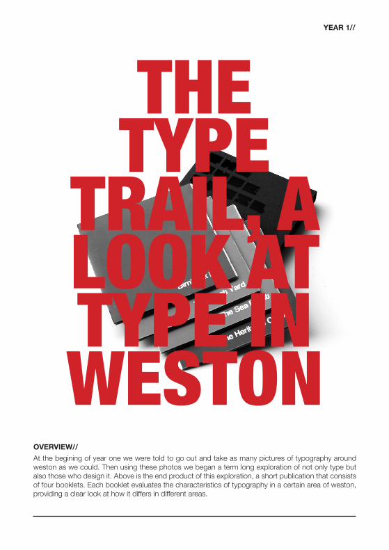
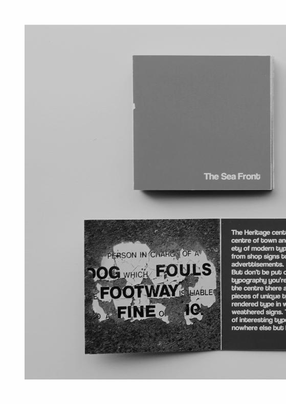
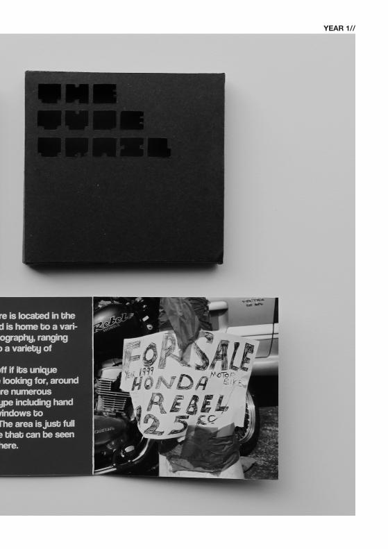
THE TYPE
TRAIL, A LOOK AT TYPE IN WESTON
YEAR 1//
At the begining of year one we were told to go out and take as many pictures of typography around weston as we could. Then using these photos we began a term long exploration of not only type but also those who design it. Above is the end product of this exploration, a short publication that consists of four booklets. Each booklet evaluates the characteristics of typography in a certain area of weston, providing a clear look at how it differs in different areas.
OVERVIEW//
YEAR 1//
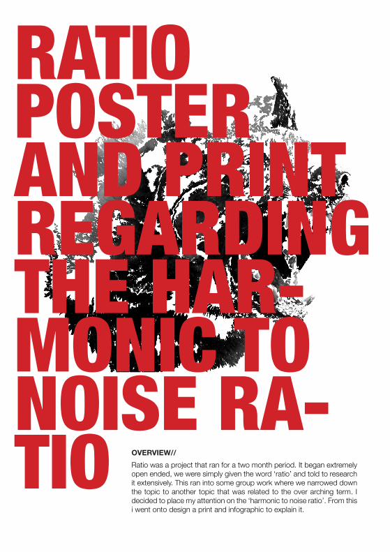
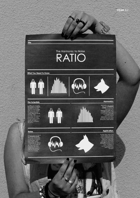
RATIOPOSTER AND PRINT REGARDING THE HAR-MONIC TO NOISE RA-TIO Ratio was a project that ran for a two month period. It began extremely
open ended, we were simply given the word ‘ratio’ and told to research it extensively. This ran into some group work where we narrowed down the topic to another topic that was related to the over arching term. I decided to place my attention on the ‘harmonic to noise ratio’. From this i went onto design a print and infographic to explain it.
OVERVIEW//
YEAR 1//
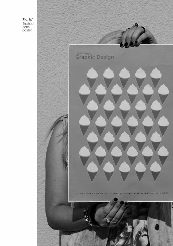
finished cone poster
Fig.1//
YEAR 1//
ICE CREAM SELF BRAND-ING Here I was posed with the task of branding myself
but it had to focus on some aspect of our personality. This was a difficult project as I was very reluctant to hone in on the connotations of my surname. Once I had passed this barrier i decied to fully embrace the ice cream connotation. I came up with this small cone design that was applied to stationery and the print that you see here. The beauty of the mark is that it reflects me on a personal level.
OVERVIEW//
EDITORIALDESIGN.
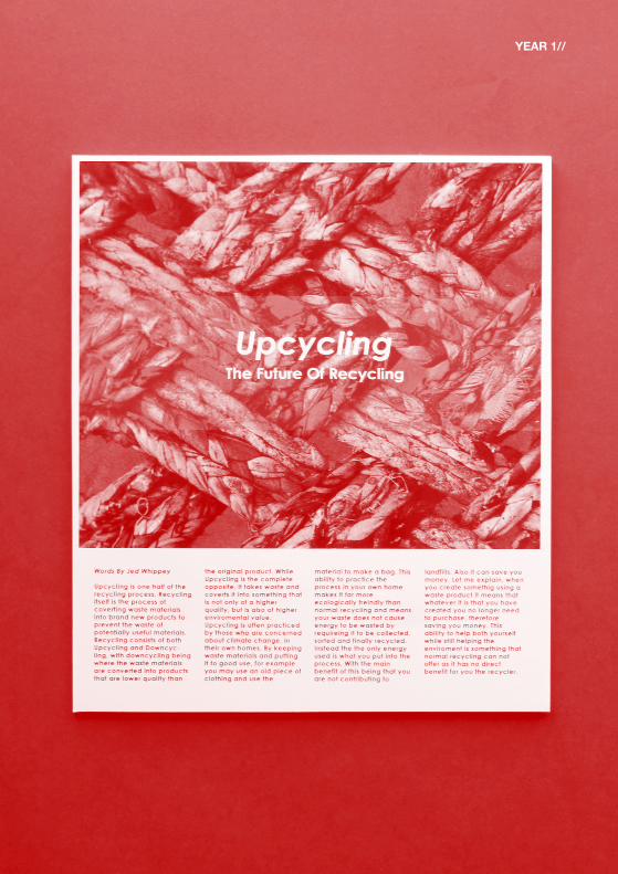
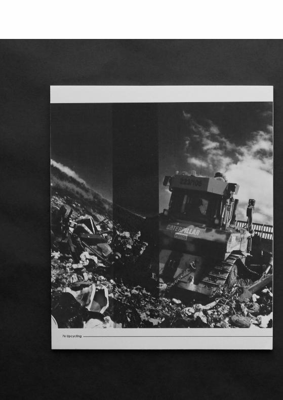
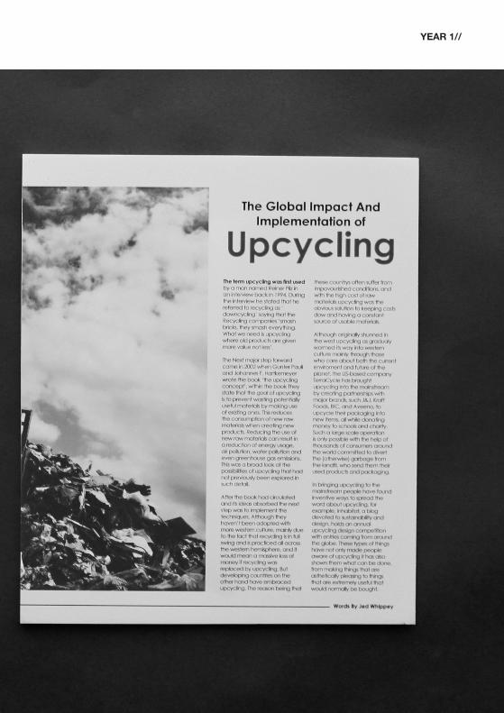
UPCYCLING THE FUTURE
OF RECYCLING.
Here I was tasked with researching the term upcycling. The research was quite extensive and led to me writing a very short report that highlights both the positives and negatives of the process. It also highlighted the negatives of the standard recycling process. I then took the short report and using my design skills created the following editorial layouts. The outcomes work by combining powerful imagery with the very thought out report.
OVERVIEW//
YEAR 1//
YEAR 1//
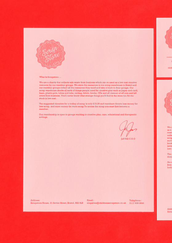
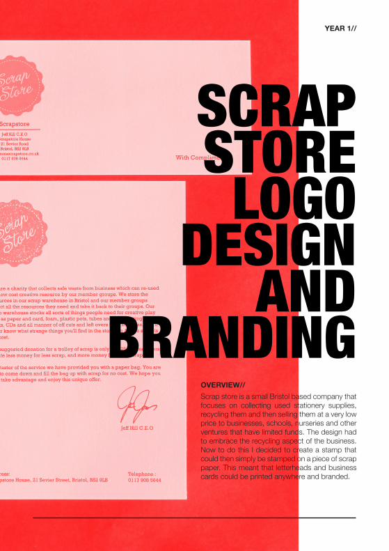
SCRAP STORE LOGO
DESIGN AND
BRANDING
YEAR 1//
SCRAP STORE LOGO
DESIGN AND
BRANDINGScrap store is a small Bristol based company that focuses on collecting used stationery supplies, recycling them and then selling them at a very low price to businesses, schools, nurseries and other ventures that have limited funds. The design had to embrace the recycling aspect of the business. Now to do this I decided to create a stamp that could then simply be stamped on a piece of scrap paper. This meant that letterheads and business cards could be printed anywhere and branded.
OVERVIEW//
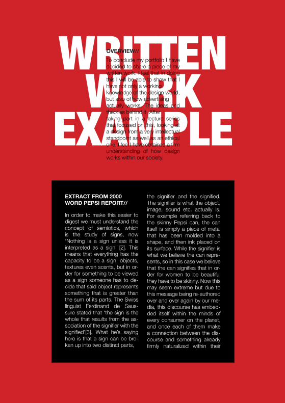
WRITTEN WORK
EXAMPLE
To conclude my portfolio I have decided to share a piece of my written work. I feel that in doing this I will be able to show that I have not only a working knowledge of the design world, but also of how advertising actually works. The ideas and theories behind it. After taking part in a lecture series that focused on this, looking at a design from a very intellectual standpoint as well as an ethical one, I feel I have obtained a firm understanding of how design works within our society.
OVERVIEW//
In order to make this easier to digest we must understand the concept of semiotics, which is the study of signs, now ‘Nothing is a sign unless it is interpreted as a sign’ [2]. This means that everything has the capacity to be a sign, objects, textures even scents, but in or-der for something to be viewed as a sign someone has to de-cide that said object represents something that is greater than the sum of its parts. The Swiss linguist Ferdinand de Saus-sure stated that ‘the sign is the whole that results from the as-sociation of the signifier with the signified’[3]. What he’s saying here is that a sign can be bro-ken up into two distinct parts,
the signifier and the signified. The signifier is what the object, image, sound etc. actually is. For example referring back to the skinny Pepsi can, the can itself is simply a piece of metal that has been molded into a shape, and then ink placed on its surface. While the signifier is what we believe the can repre-sents, so in this case we believe that the can signifies that in or-der for women to be beautiful they have to be skinny. Now this may seem extreme but due to this message being re-authored over and over again by our me-dia, this discourse has embed-ded itself within the minds of every consumer on the planet, and once each of them make a connection between the dis-course and something already firmly naturalized within their
EXTRACT FROM 2000 WORD PEPSI REPORT//

Now a discourse as extreme as this can have devastating effects on an individual, for example a teenage girl who is overweight is going to be subject to feelings of inadequacy, as she is being told by the media that she is not beautiful. This type of gender stereotyping could lead to an eating disorder, or in the most extreme of cases, suicide. This shows that a designer has to be aware of the potential effects of what he or she is doing, they cannot simply create a piece of design from a cognitive stand point, by this I mean they cannot think in an entirely logical manner, for example, if I was designing an advertisement for the new skinny Pepsi can I could not just think that if I abuse the discourse that skinny is beautiful, people will simply accept it and try to adhere to it by purchasing the product. I would need to take into account the emotional response, as refusal to do so could potentially have negative effects on peoples well being and in my eyes would be unethical.
Also even if this ideology didn’t have a negative impact on a person now, it may have a negative effect on them later in life as once an ideology like this, which is constantly being reinforced by the masses, has become naturalized it is very difficult for a person to then change their perception and reject it, instead, as French philosopher Louis Pierre Althusser states, we will constantly reproduce It in a process he refers to as ‘hailing’[4]. Now hailing is ‘ubiquitous, and almost entirely irresistible and is at the center of any ideological system. It attempts to make another individual recognize and accept a form of ideology. Through hailing, ideology acts or functions in such a way that it recruits subjects among individuals’ [5]. What this means is that once we hold an ideology we will constantly try to force it on others, and it is this excessive re authoring that makes it difficult for us to have our ideologies changed.
Although Althusser has a valid argument, he does fail to take into account counter cultures, theses are cultures that play host to people, mainly the young, who reject and/or oppose the dominant values and behaviors within society. But to under-stand this we can simply turn to Italian philosopher Antonio Gramsci’s Idea of ‘Hegemony’[6]. Now Hegemony is when the ‘dominant groups in society, including fundamentally but not exclusively the ruling class, maintain their dominance by securing the
through the negotiated construction of a political and ideological consensus which incorporates both dominant and dominated groups’[7] This shows that if the dominant group looses said dominance over the subordinate group then that group will begin to develop its own ideology’s, and will therefore begin to carve out there own counter culture.
Moving back to the advert (fig.1) we can see that Pepsi have opted to use a celebrity endorsement, the celebrity in question is actress and model Sofia Vergara. The advert doesn’t make it that clear it is her as she is wearing sunglasses. But the red sunglasses have been used to place an emphasis on the lips, with the red color representing passion and femininity. In this regard we can refer to Arnston (2008) who makes the point that ‘red is a dramatic, highly visible hue, it is associated with sexuality and aggression, with passion and violence’[8]. These qualities of passion and femininity are those that have been handed down to women as important. The model is also shown drinking through a straw; this is to ensure that her lipstick does not smudge; something that has also been re-authored as a sign of sensuality.
The use of celebrity endorsement is extremely powerful. We live in a culture in which we have been taught to idolize celebrities. To understand why we must first turn to the German philosopher Friedrich Nietzsche who in 1882 declared that ‘God Is Dead!’[9], this is not to say that he believed a God ever existed, but suggests that the power of science had become so all encompassing that the search for the spiritual seemed to many to be redundant. He then suggests that in order to find the purpose we have lost, we need to recapture a moral compass in our lives.
‘A DESiGNER HAS TO BE AWARE OF THE POTENTIAL EFFECTS OF WHAT HE OR SHE IS DOING’
YEAR 2//
END.
YEAR 0//