Embed Size (px)
DESCRIPTION
Undergraduate portfolio in Interior Design, Architecture, and Art.
Citation preview

Good design is obvious. Great design is Joe Sparano
Kayla J. Nelson design portfolio

In the wise words of Joe Sparano: Good design is obvious. Great design is
this is the essence of my philosophy on design. Any designer
can make a space aesthetically pleasing. It can be obvious in its splendor, but
that does not make it a great design. Great design allows users to inherently
work and live better than they ever thought imaginable through the
functionality of the space plan and aesthetic elements. It is the transparent
parts of the design that makes it stand out above other design. This can be as
simple as creating a drawer for trash receptacles so users have more floor
space. Or even space planning wider aisles in a retail store to avoid
customers feeling cramped when browsing the merchandise. These small
transparent design features are what separates the good design from the
great design. By listening intently to my clients and putting their best
interests first, I implement these miniscule, transparent features in to design
to create a fantastic living or working environment. As a designer, it is my job
and passion to surpass obviously, good design to transparent, great design.
DESIGN PHILOSOPHY

The Gardens Model Residence……………………………………………………………………………3-7
Bonobos Pop-Up Retail Store………………………………………………………………………….9-14
Slice office design……………………………………………………………………………….…………15-21
Sentry World…………………………………………………………………………………………………..23-32
Additional Projects
Design a la Mode Front Porch Renovation………………………………..…..35-36
Hand Drafting…..……………………………………………………………………..…………37-38
Hand Renderings……………………………………………………………………..…………39-40
Watercolor Renderings………………………………………………………………..……….41
TABLE OF CONTENTS

3 MODEL RESIDENCE DESIGN
* Design submitted to the ASID State Chapter Scholarship
Project Objective: To design and create a model unit for a developer preparing to showcase their latest project. The unit is
to be designed for the aging-in-place generation, so the unit must be as accessible as possible, while not calling attention to
the fact that it is an accessible unit. The design should be sustainable and a universal style to appeal to the general middle
class buying market.
Solution: The Gardens’ model unit design is a sustainable, accessible, and universally appealing space for all potential
buyers. In order to accomplish this, an open concept floor plan was created, making it a flowing open space that will be
easily maneuverable while incorporating a contemporary feel to the property. The color scheme pulls natural Midwest
elements in to the interior, such as warm stone grays and earth tone browns with accents of rain-washed blues. this
provides a neutral yet beautiful home that will appeal to the vast majority of potential clients. Likewise, the furnishings of
the space have a traditional shape with strong arms in order to appeal aesthetically to buyers and provide support in getting
off and on the pieces. Each furnishing and finish was selected with great care in order to have an extremely sustainable,
durable, and eco-friendly space that follows the values of both the Gardens development and buyers of the space. Overall,
this unit provides a peaceful, accessible home that will offer all the wants and needs for the buyers to spend many more
years enjoyably, simply, and sustainably.
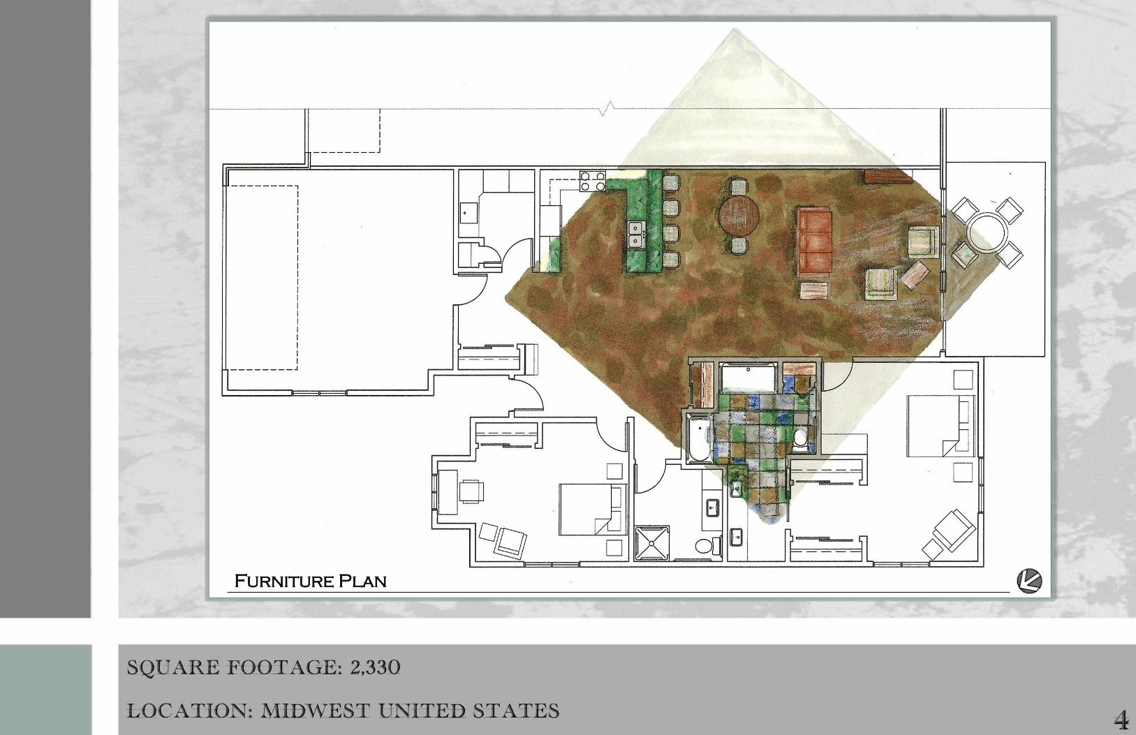
Furniture Plan
SQUARE FOOTAGE: 2,330
LOCATION: MIDWEST UNITED STATES 4
5 THE GARDENS MODEL RESIDENCE
DL Couch wallcovering
AmCork Cork flooring
Sherwin williams
paint selection

INVITING, NATURAL, UNIVERSAL 6
3D Model

7 THE GARDENS MODEL RESIDENCE

9
POP-UP RETAIL STORE * Design submitted to the PAVE Store Design Competition and Poster’s on Rotunda
Project Objective: To create a “pop-up” shop that successfully communicates the Bonobos brand. This is a unique
opportunity to, in popular parlance, turn clicks into bricks. Most companies expand an established brick-and-mortar
retail presence to online retail. This challenge will do the opposite. A successful online brand, Bonobos has only
two physical stores to date, so this pop-up shop will be part of the brand's initial development of a physical presence.
The “pop-up” shop must be easily put up and taken down to move from location to location within a few weeks.
Solution: The design for Bonobos’ pop-up retail store, featured in this project, exudes the feeling of a men’s walk-in
closet, creating a comforting environment for the male shopper. In order to promote the online element of Bonobos
and allow for ultimate convertibility, holograms are utilized instead of mannequins, to display merchandise and
capture passerby’s attention. The final design seizes shoppers’ attention, draws them inside, and establishes the
Bonobos brand on the consumer psyche.

10
SQUARE FOOTAGE: 1,250
LOCATION: MEATPACKING DISTRICT, NY

11
BONOBOS POP-UP RETAIL STORE
This wall will be
featured with creased
fabric as an accent and
to encourage the
wrinkle-free fabric that
bonobos’ clothes
features.
seasonal display located
here will really attract
attention and lure
customers in for the
hottest fashion of the
season.
This blocking plan has a
Loop Plan design which
really allows the thought
that Bonobos is designed to
make shopping for men easy.
All of the merchandise can
be easily looked at and
accessed. Having the cash
wrap located in the back of
the store will allow
security for the customer
service associates as well
as make customers
comfortable with their
shopping experience.
This blocking plan allows
for a lot of interest in the
space through the Free-
Flow Plan. This plan will
really encourage
customers to wander
throughout the entire
store. Having the online/
web area sections in
relative proximity to the
cash wrap will allow the
store attendants to
encourage customers to
check out the website.
Lounge like feeling to
this online/ web area.
Having the shoe and
accessories located in
this area will allow
customers to see beyond
these displays to the
hanging clothes beyond.
This wall will be featured
with creased fabric as an
accent and to encourage
the wrinkle-free fabric.

CONVERTIBLE, MASCULINE, CUTTING-EDGE
12
Final Solution:
The final floor plan
solution allows for
customers to browse the
merchandise in an inviting
way. This was
accomplished through a
loop plan. This plan
allows customers to
stroll through the space
at will and view the
merchandise. The aisles
are at least 60” wide,
which allows for ample
product-evaluation space.
The display areas were
planned in such a way that
the store feels like an
actual man’s closet,
making it easier for
themselves to envision the
merchandise in their own
home. Overall the plan
effectively displays the
merchandise while
appealing to the
psychological needs of
the male shopper and not
discouraging female
shoppers.

13
BONOBOS POP-UP RETAIL STORE
idea generation for a custom display final custom display
technology implementation ideas final creation of holograms as displays as opposed to
mannequins to further implement technology in the design

COMFORTING, HOLOGRAPHIC, SHOW-STOPPER
14
Online/ web area
View from front entrance View from the dressing room
View from the cash wrap

15 OFFICE DESIGN
* Design submitted to the ASID State Chapter Scholarship
Project Objective: To design a contemporary office space for the new up and coming social network, Slice, in Atlanta, Georgia.
Due to Slice being a social network, the business strives to have a lively, open, and SOCIAL atmosphere in their work
environment. Slice aims to have a functional office space that allows for their creativity and ideas to flow amongst each
other, much like a social networking’s news feed flows on a page.
Solution: Slice’s office design allows for a strong flow of communication through an open layout. Primary colors create
division throughout this open plan by labeling certain departments to a distinct hue. Using a bright color palette of blue,
purple, orange, and green transforms the office into a contemporary oasis that reflects the creative and energetic quality of
the company and the way work is accomplished. This fun and inviting atmosphere balances the natural and artificial light to
create a productive work environment that encourages employees to expand their creative thought and develop fresh ideas
that will keep Slice current.
Designers: Kayla Nelson, Morgan Miskowski, Melissa Kalupa, Danielle Sweitzer

16
SQUARE FOOTAGE: 10,997
LOCATION: ATLANTA, GA
Shaw Carpet tiles
Custom vinyl wallcovering
Essex with Recore
wallcovering
Lighting Selections
Fabric
Selections
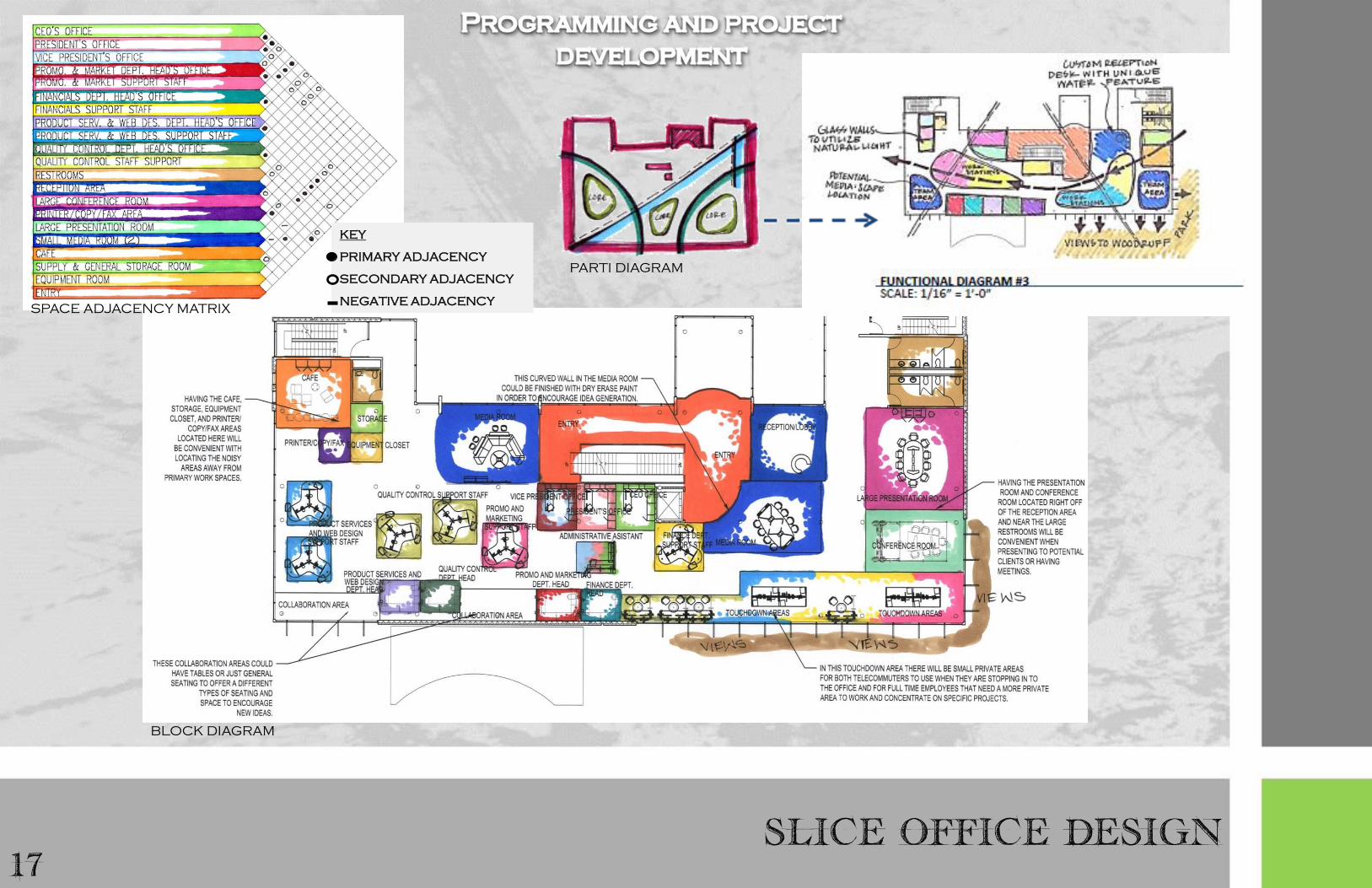
17 SLICE OFFICE DESIGN
KEY
PRIMARY ADJACENCY
SECONDARY ADJACENCY
NEGATIVE ADJACENCY SPACE ADJACENCY MATRIX
PARTI DIAGRAM
BLOCK DIAGRAM

CREATIVE, FRESH, PRODUCTIVE
18
Floor Plan

19 SLICE OFFICE DESIGN
Presentation room
This room is exceptionally adaptable due to the Train
tables with casters. There are endless options of room
configurations so that the space can be reconfigured
to appropriately accomplish the necessary task at hand.
The presentation room also is not located in an area of
the building with direct sunlight, but has natural light
penetrating through the glass walls. This avoids glare
for superb presentation quality.
Private offices for executive staff members
The private offices feature l-shaped work
stations with two guest chairs. While they
are private offices, there is still an open
element through the sliding glass doors.
Privacy shades were specified for ultimate
privacy when required.
Private offices
Presentation room

COLLABORATIVE, ENERGETIC, CURVILINEAR
Touchdown Workstations and Lounge Media:Scape Collaboration Area
These areas were designed as touchdown spaces for telecommuter employees. They also are intended for permanent employees
to utilize to collaborate or if they need a change of work space to allow their creativity to flow. The variety of spaces helps
appeal to the different work ethic styles.
20
Touchdown workstations
Media:scape
21 SLICE OFFICE DESIGN
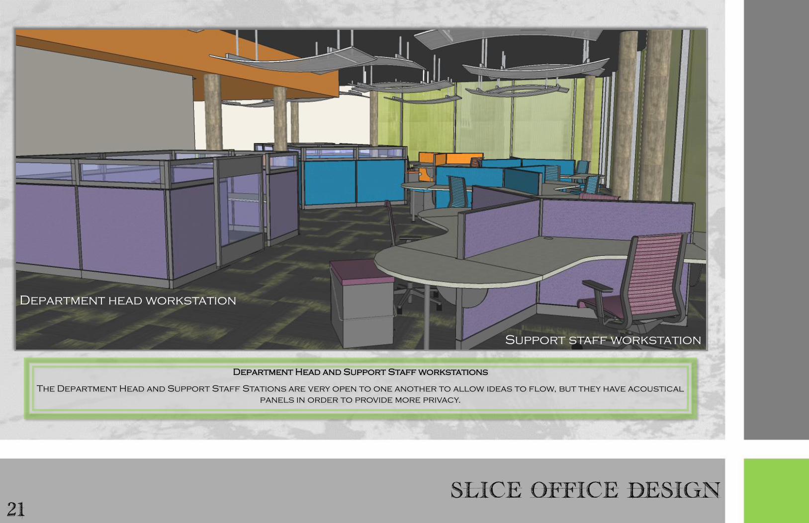
Department Head and Support Staff workstations
The Department Head and Support Staff Stations are very open to one another to allow ideas to flow, but they have acoustical
panels in order to provide more privacy.
Department head workstation
Support staff workstation

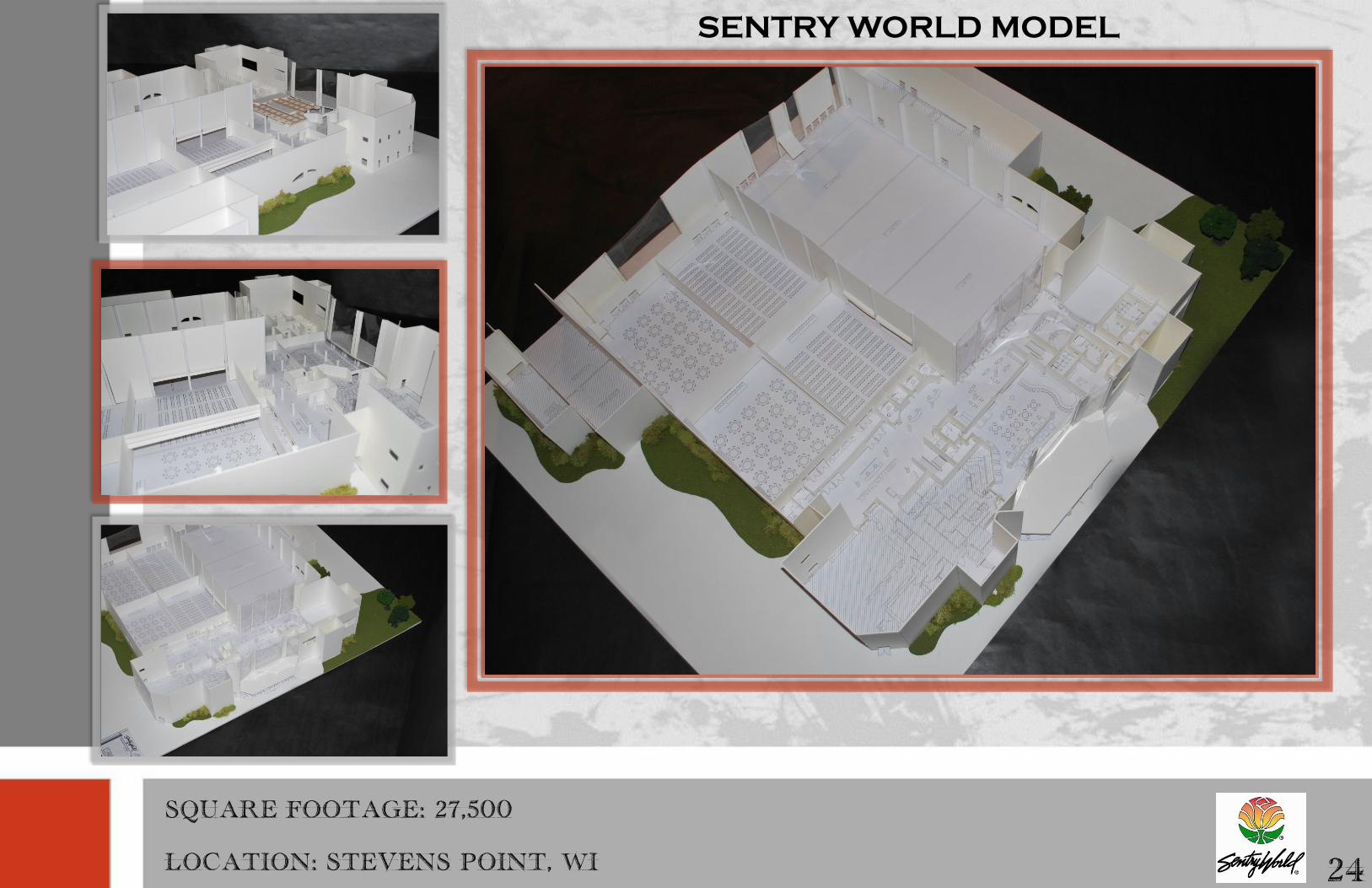
23 MULTI-USE FACILITY DESIGN
Project Objective: To design a profitable multi-use facility for Sentry World. Sentry World is the club house for the world famous
sentry world Golf Course. The 27,000 sq. ft. facility, as it currently stands, has a large amount of wasted space and the facility is
not turning a profit. The facility has a pro shop, restaurant, 6 tennis courts, 3 racquetball courts, a distinguished banquet hall,
and an unused conference room. The basis of this design was to utilize the full square footage, develop ways to turn a profit, have
a sustainable focus, create elegant and sought after banquet space, and make an aesthetically appealing yet unique space to keep
visitors returning. The client wanted to turn this in to a premiere wedding and conference venue in Stevens Point, Wisconsin.
Spaces that were required: entrance/lobby; Conference Center/ Banquet Hall; Distinguished Banquet Space; Sport Plate
Restaurant; Locker Rooms; Four Private Offices with assistants; Public Restrooms; Spa Features; Workout Studio; Small Business
Center/Café, Tennis Courts, and a Dressing Room.
Solution: This design for SentryWorld provides countless amenities and a high end appearance to keep customers returning and
talking about the facility. The previously not utilized square footage in the space was utilized to increase capital, increase
sustainability, and increase use of the space through larger banquet facilities, spa amenities, and a cafe. The use of natural
elements, warm neutrals, and the SentryWorld logo will satisfy the aethestic tastes of the vast majority of potential clients and
Stevens Point Area citizens while branding SentryWorld as a unique facility. Through all of these design elements, SentryWorld
will now be set worlds apart from all other sports facilities, banquet facilities, and golf courses not just statewide, but
nationwide as well.
Spaces highlighted In this portfolio: conference/ banquet hall and Sport Plate Restaurant
Designers: Kayla Nelson and Morgan Miskowski
SENTRY WORLD MODEL
24
SQUARE FOOTAGE: 27,500
LOCATION: STEVENS POINT, WI

25 SENTRY WORLD FIRST FLOOR
First Floor Plan

NATURAL, MAXIMIZED, CALMING
26

27 SENTRY WORLD SECOND FLOOR
Second Floor Plan
CURVILINEAR, HIGH-END, FUNCTIONAL
28
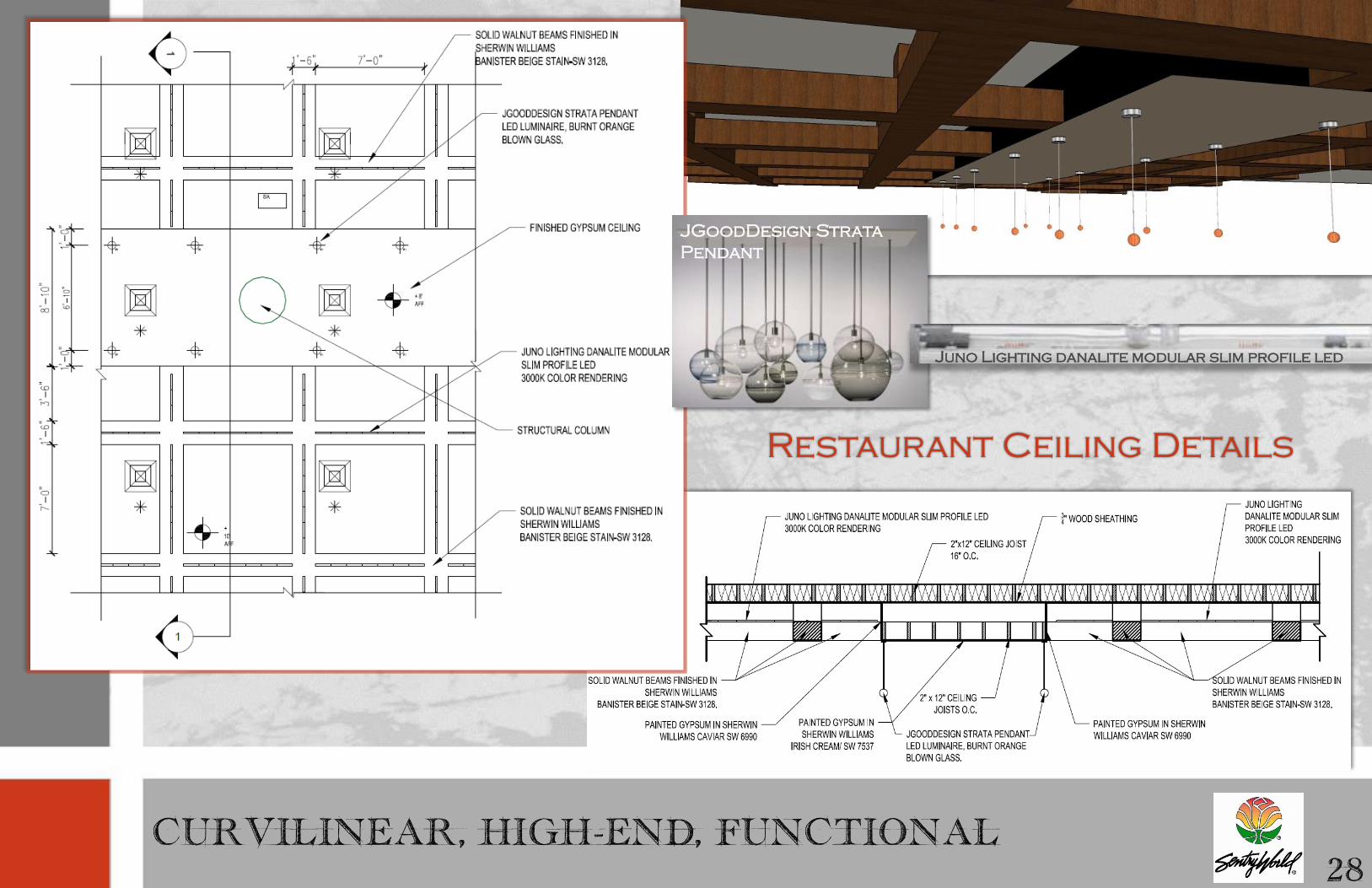
JGoodDesign Strata
Pendant
Restaurant Ceiling Details
Juno Lighting danalite modular slim profile led

29 SENTRY WORLD SPORT PLATE RESTAURANT
The Sport Plate Restaurant features an upscale design embodying elements
from the natural landscape, a color scheme pulled from the SentryWorld
logo, and a flair of sports appeal. All of these elements combine to create a
warm and unique atmosphere that will keep customers returning not just for
the Friday fish fry but for the unforgettable interior. The space features an
expansive curvilinear custom bar that can be accessed immediately from the
entrance in SentryWorld as well as the entrance from the golf course. This
creates a huge draw for customers since they can easily come to the Sport
Plate just to have a drink. There is bar height seating, booths, banquettes,
and tables in order to appeal to sports fans and sit down diners. The
restaurant features an accent wall with a custom vinyl wallcovering
featuring sepia toned images from the golf course. This ultimately combines
the exterior with the interior while providing a unique upscale design feature
and a sports mood. The Sport Plate Restaurant design fulfills a niche not
previously filled in Stevens Point, Wisconsin.

UPSCALE, ENERGETIC, UNIQUE
30
custom vinyl wallcovering
table top
bar countertop
Lumicor resin panel
Back of booth
fabric
booth seat fabric
chair back fabric
barstool back and
seat fabric
chair seat fabric
flooring
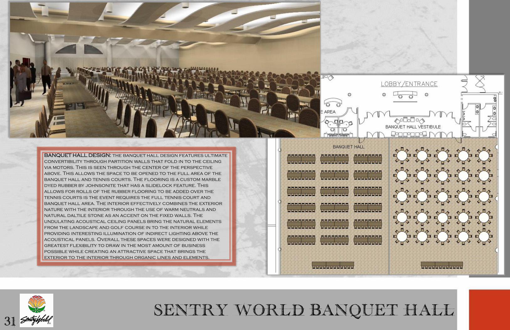
31 SENTRY WORLD BANQUET HALL
BANQUET HALL DESIGN: the banquet hall design features ultimate
convertibility through partition walls that fold in to the ceiling
via motors. This is seen through the center of the perspective
above. This allows the space to be opened to the full area of the
banquet hall and tennis courts. The flooring is a custom marble
dyed rubber by johnsonite that has a slidelock feature. This
allows for rolls of the rubber flooring to be added over the
tennis courts is the event requires the full tennis court and
banquet hall area. The interior effectively combines the exterior
nature with the interior through the use of warm neutrals and
natural daltile stone as an accent on the fixed walls. The
undulating acoustical ceiling panels bring the natural elements
from the landscape and golf course in to the interior while
providing interesting illumination of indirect lighting above the
acoustical panels. Overall these spaces were designed with the
greatest flexibility to draw in the most amount of business
possible while creating an attractive space that brings the
exterior to the interior through organic lines and elements.

DISTINGUISHED, FLEXIBLE, UNFORGETTABLE
32
Curvetec lighting panels Daltile wall tiles
Banquet table
laminate
chair and table
metal finish
banquet chair seat
back fabric
banquet chair seat
bottom fabric


ADDITIONAL PROJECTS 34
Design a la Mode Front Porch Renovation…………………………………………………..35-36
Hand Drafting……………………………………………………………………………………………........37-38
Hand Renderings……………………………………………………………………………………………...39-40
Watercolor Renderings………………………………………………………………………………………41

35 DESIGN A LA MODE
Project Objective: To create a welcoming and contemporary entrance to the design a la mode showroom.
Project Solution: an eye-catching and cheerful front porch area was created through the use of the new
bohemia style. This style combines hues of aqua, raspberry, lime, and yellow with whimsical fabrics.
Existing furniture that was re-purposed, new furniture, and accessories tied the entrance together to set
a contemporary mood for customers to begin their experience at design a la mode with. The existing
furniture pieces I personally repainted to fit the overall design.
Design Inspiration

FRONT PORCH RENOVATION 36
Before
After
Before
Before
After After

37
HAND DRAFTING
SECTION VIEW AND WALL DETAIL

HAND DRAFTING
RENDERED FLOOR PLAN, ELEVATIONS, AND PERSPECTIVE
38

39 HAND RENDERINGS
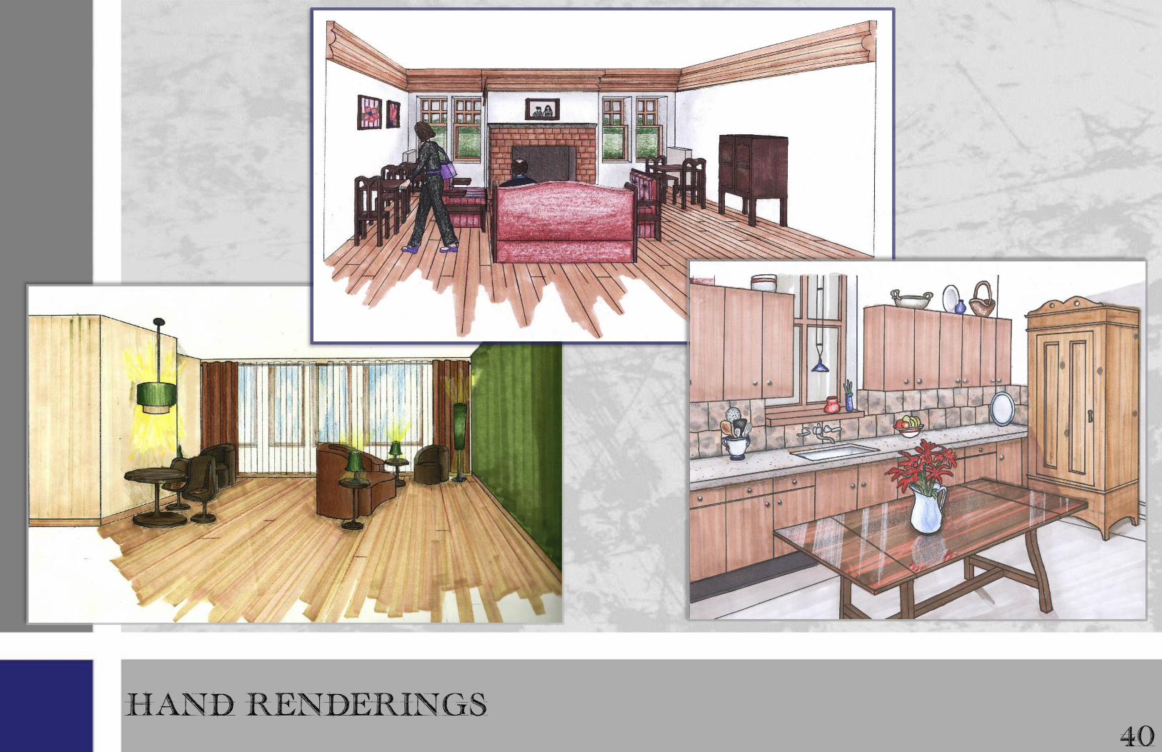
HAND RENDERINGS
40

41 WATERCOLOR RENDERINGS

Good design is obvious. Great design is Joe Sparano
Kayla J. Nelson design portfolio