Embed Size (px)
Citation preview

Design Guidelines
Vineland, New Jersey
Rev. 6/21/07

2

3
Contents Purpose 4 Mission and Vision 5 Mains Street Success 6 History of Vineland 6 The Main Street Approach 7 Taking Advantage of Main Street 7 The Main Street Architectural Tradition 8 The Traditional Façade 10 Façade Change as Evolution 11 Architectural Variety 13 Storefront Design 15 Doors 19 Window Displays 21 Awnings and Canopies 23 Signs 25 Sidewalks 29 Rear Entrances 30 Historical Architectural Decoration 32 Upper Façade and Building Cornice 34 Painting 36 Color 37 Masonry Cleaning 38 Energy Conservation 40 New/Infill Construction 42

4
Purpose The following guidelines have been adopted as an amendment to the redevelopment plan that was adopted by the City of Vineland in May 2004 to assist in the revitalization of the Vineland Downtown Improvement Dis-trict. The redevelopment plan delineates Landis Avenue between East Ave. and East Blvd. as Landis Avenue Main Street District, henceforth referred to as “Main Street” and between West Blvd. and Delsea Dr. as the following three districts: Landis Avenue Commercial District, West Vineland Village, and the Plaza Commercial District, henceforth referred to as “Landis Commercial District”. Before any permits can be issued for new construction, exterior renovations, demolition, signage or awnings in the Vineland Downtown Improvement District, the Director of Redevelopment must sign off on the project after the City Council appointed Design Review Committee has reviewed the project for compliance with the design guidelines. In addition, improvements that do not require a permit such as changes in paint color, windows and lighting must also be approved by the Design Review Committee. Remember, before you make any exterior changes to your building, contact the Director of Redevelopment to ensure design guideline compliance.

5
Mission
Main Street Vineland is a nonprofit organization that works to preserve, protect, and enhance the downtown area with its historic and natural assets, while raising the value of the downtown properties and its businesses. Main Street Vineland follows the Four Point Approach to Downtown Management using organization, promotion, design, and economic restructuring, as defined by the National Main Street Center and the Main Street New Jersey Office.
Vision
Downtown Vineland will be a vibrant and desirable place to live, study, and work. It will be an exciting community destination, attracting visitors and residents alike by embracing history, culture, and progress through architectural preservation, and celebrating our diverse heritage, as well as the arts and theatre. Thriving special retail and wide tree-lined sidewalks with accessible transportation will provide a safe, clean, family-oriented, and attractive environment, serving as the heart of our community — a regional center of commerce and agriculture.

6
Main Street Success What makes a Main Street business successful? There is no single formula. Product, price, display, service,
location, and market all play a part. So does the outward appearance of the business. Many store owners regard appearance as secondary to the more immediate concerns of price, product, and
service. Too often the building itself is neglected or mishandled. Yet experience shows, time and again, that appearance is extremely important to a healthy commercial district. When merchants work together to create an attractive image, the downtown as a whole can benefit.
Through the National Main Street Center, the National Trust for Historic Preservation has demonstrated the value of keeping up appearances. Without gimmicks or themes, it has shown how to build on resources and strengths that already exist in traditional commercial centers across the country. The time-tested methods for keeping up appearances are presented in this publication.
History of Vineland The City of Vineland was established by Charles K. Landis to fulfill his dream of creating the “ideal
community.” A native of Philadelphia, Landis imagined a city of factories, stores, schools, churches, and recreation halls surrounded by miles of farms, orchards and vineyards. His dream took shape with the creation of Landis Avenue, in August of 1861. The extra-wide, tree-lined street was reminiscent of the Champs-Elysée in Paris.
With its classic grid system and the extra-wide “Main Street,” Vineland was designed to attract Philadelphians trying to escape the city, as well as immigrants looking for a place to settle in their new country.
From the beginning, Mr. Landis was concerned with the beauty of his new town and required that homes be set back from the street edge and trees be planted along the frontage. Aesthetics were of utmost importance.
Vineland prospered and Landis Avenue, with its many hotels, restaurants, and shops, was a huge success. But Vineland grew up in times very different than today; merchants directed their attention to the walking trade and the fastest moving vehicle was the horse-drawn carriage.
The twentieth century brought changes to the Downtown. The automobile brought competition from commercial strips and shopping centers. Downtown retailers turned their attention to passing cars, erecting shiny storefronts and eye-catching signs. Many proprietors of the Downtown struggled to survive. Many attempted to compete by mimicking their competitors.
The Downtown now appears as a cross between neglected old buildings and a commercial strip. It presents a confused image to the shopping public, satisfying neither the pedestrian nor the driving customer.

7
The Main Street Approach The key to improving appearances lies in recognizing a simple fact: The traditional business district is
neither a shopping mall nor a commercial strip and should not pretend to be either.
With its buildings, history, settings, and place within the community, Downtown Vineland is unique and
special. It makes sense to acknowledge these resources and take full advantage of them — to develop the
qualities that are already present downtown —qualities a mall or strip will never have.
In 2005, Vineland was designated a Main Street Community. This designation is part of a state and national
revitalization program that is intended to help make the most of a location, whether it is on Landis Avenue or
elsewhere in the Main Street District.
The four-pronged Main Street revitalization program consists of: organization, promotion, economic
restructuring, and design. This guide addresses Main Street Design.
Design enhances the visual appearance, attractiveness, and traffic management of the business
district. Historic building rehabilitations, street and alley clean-ups, parking and traffic calming issues, colorful
banners, landscaping, and lighting all improve the physical beauty of the downtown as a quality place in which
to shop, work, walk, invest, and live.
Taking Advantage of Main Street The Main Street revitalization program is intended to help property owners make the most of their location.
While organizational, promotional, and economic restructuring questions are also important to the Main Street
revitalization program, this guide is designed to offer advice on the care of property.
What improvements can make a building work better? How can it be more attractive to shoppers? The
following pages present suggestions for improving appearances, as well as ideas for prolonging the life of old
buildings.
The practical advice offered here for restoration, rehabilitation or simply better maintenance can be
augmented by more comprehensive guides listed in the reference section of this publication. Also consult
knowledgeable professionals in our community. Other sources of information and expertise include the State
Historic Preservation Office, the Technical Preservation Services Division of the National Park Service, and the
National Main Street Center.

8
The Main Street Architectural Tradition
This is the basic building block
of Main Street—the traditional street front commercial façade. Although built in many sizes, shapes and styles, it was always essentially the same façade.
Façades of this type lined Main Street on both sides. One next to another, they formed strong solid blocks, marked by the rhythm of repeating parts.
Because it was composed of similar façades, the block had a consistent, organized and coordinated appearance. Façades were related to each other through the compatibility in height, width, setback, proportions of openings, composition and rhythm.
With these blocks facing each other, the street took on a distinct character. Compared with a typical residen- tial street, Main Street created a feeling of containment. The street became an outdoor room, filled with activity.
Building Façades
The Street Storefronts line the Pedestrain Street
The sidewalk (or the “pedestrian street”) was a window-shopper’s delight. One after another, the store windows formed a continuous display case of Main Street merchan-dise. The appearance of Main Street today is largely a result of a strong architectural tradition continuing through the 1930s, this tradition controlled how Main Street looked.
The consistency of this building tradition brought about a unity that strengthened Main Street as a whole. If tradi-tional business districts today are to benefit from this unity, changes to buildings must respect this tradition.
Original Façade
A Note of Emphasis Sensitive storefront change is essential to
improving the appearance of Main Street. The following qualities should be remembered as
important to the traditional storefront
Remodeled Façade
9

10
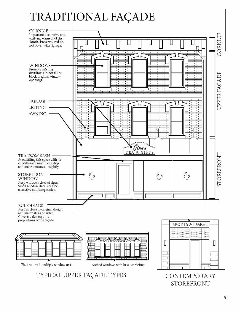
The Traditional Façade We have looked at the façade as the building block of
Main Street. Now let us consider the individual building façade itself. Essentially, it had three parts.
- Cornice 1. Building cornice. - Upper Façade The traditional building cornice—made of brick, - Storefront wood, metal or other materials—served to
visually cap the building, complementing its appearance. 2. Upper façade. The upper façade—constructed of
brick, stone, wood, stucco or pressed metal—almost always contained regularly spaced window openings surrounded by decorative details.
3. Storefront. The traditional characteristics of the storefront contrast markedly with the more substantial upper façade and building cornice. The storefront was rather delicate in appearance and was composed primarily of large display windows surrounded by enframing piers and a storefront cornice.
Decorative
Cornice
Decorative
Window Hoods
Masonry Wall
Regularly
Spaced Windows
The Storefront
Typical Storefronts
In the mid 1880s to early 1900s typical storefronts were characterized by boldly decorated cornices, cast-iron columns and large display windows.
From the early to mid 1900s typical storefronts had simplified cornices, transom windows over display windows and metal window frames.
Typical Building Cornices and Upper Façades
Typical building cornices and upper façades in the mid to late 1800s were characterized by boldly decorated cornice and window hoods and narrow window openings. In the late 1800s to early 1900s, these areas of the facade were mostly highlighted by corbelled brick cornices and large, arched window openings. By the early to mid 1900s, typical upper façades were marked by corbelled brick cornices and less decorative large window openings.
A Note of Emphasis
Sensitive storefront change is essential to improving the appearance of Main Street. The follow-ing qualities should be remembered as important to the traditional store-front:
Cornice Upper Façade Transom Window Storefront Cornice Storefront Pier Display Window Bulkhead

11
Façade Change as Evolution
The existing Main Street environment is a product of
an evolution that began with the construction of the first building and which has continued ever since. Façades change; this is natural, inevitable and often desirable.
The goal of this publication is to guide sensitive and appropriate change.
The Quality of Change When it was first constructed,
the typical Main Street façade exhibited some basic inherent qualities: (1) an architectural style characterized by its decoration; (2) certain construction materials; and (3) a unified visual composition in which parts looked related.
These qualities came together to form a visual resource. Sensitive change accepts these façade qualities and builds on them. The result is a harmonious blend of changes and existing elements. Insensitive change, on the other hand, ignores and often negates the qualities of the original resource. The result is an unnecessary clash between new and old as the drawing illustrates.
The Masonry Wall The Decorative Elements
12
An
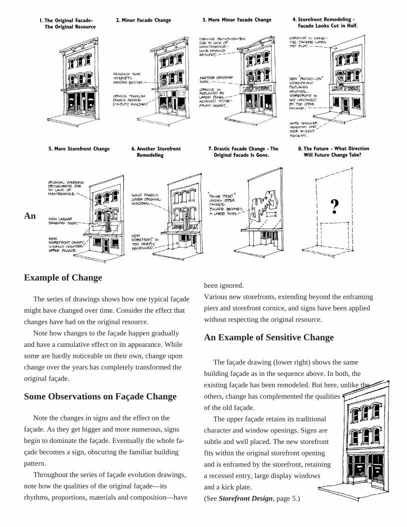
Example of Change
The series of drawings shows how one typical façade might have changed over time. Consider the effect that changes have had on the original resource.
Note how changes to the façade happen gradually and have a cumulative effect on its appearance. While some are hardly noticeable on their own, change upon change over the years has completely transformed the original façade.
Some Observations on Façade Change
Note the changes in signs and the effect on the façade. As they get bigger and more numerous, signs begin to dominate the façade. Eventually the whole fa- çade becomes a sign, obscuring the familiar building pattern.
Throughout the series of façade evolution drawings, note how the qualities of the original façade—its rhythms, proportions, materials and composition—have
been ignored. Various new storefronts, extending beyond the enframing piers and storefront cornice, and signs have been applied without respecting the original resource.
An Example of Sensitive Change The façade drawing (lower right) shows the same
building façade as in the sequence above. In both, the existing façade has been remodeled. But here, unlike the others, change has complemented the qualities of the old façade.
The upper façade retains its traditional character and window openings. Signs are subtle and well placed. The new storefront fits within the original storefront opening and is enframed by the storefront, retaining a recessed entry, large display windows and a kick plate. (See Storefront Design, page 5.)

13
Architectural Variety The traditional commercial storefront building can
be considered the cornerstone of Main Street. Dating from the nineteenth and early twentieth centuries, these buildings share a remarkable similarity, a consistency that has strengthened Main Street as a whole.
If respect for its historic buildings is maintained, the traditional strength of Main Street can work yet today. What about “less historic” structures? Or changes already made to buildings? Do they necessarily detract from the character of the traditional business district?
That depends. You will note that recommendations for new buildings (See Guideline on New Infill Construction, page 41.) call for contemporary design, not fake history. (See Note on False History, page 14.) In the same way, we can expect changes made over the years to mirror their own times. This reflects the growth and vitality of Main Street.
New and remodeled buildings are evaluated as they relate to their surroundings, as well as for design itself. Height, width, relationship to the street, roof forms, proportion, composition, rhythm, proportion of openings, materials, and colors—these are 10 criteria that should be considered in the design. By relating buildings to each other, new con-struction and building renovations can be welcome additions to Main Street, rather than unwanted intruders.
Similarly, the variety of architectural styles that exist along Main Street should be judged on their own qualities, not simply by their age. Before you set out to make changes because your building is not “historic
enough,” see it for what it is and learn to recognize its own particular values.
In addition to the 10 criteria already discussed, other standards exist that should be used to judge the compatibility of new construction or remodeled façades. For instance, the unaltered façade of a nineteenth-century building is highly valued because it retains its original integrity. The same holds true, sometimes to a lesser degree perhaps, for an unchanged façade of a twentieth-century building. The 1940s and ‘50s are as much a part of Main Street as the 1890s.
In most cases, many changes have
taken place, regardless of age. If the resulting appearance is pleasing in proportions, composition, and details and if it respects the other criteria, the façade is a visual resource for the commercial district. It is not necessary to change a façade simply because it doesn’t look historic.

14
The most important characteristic, probably, is quality. If in design, construction and maintenance, a façade displays craftsmanship and pride, then it is making a positive contribution to its surroundings.
With a critical eye, look at the façade of your building and those of its neighbors. By all means, make improvements where you see they are needed. But, on the other hand, don’t be afraid to like what
you see. On this page are some examples of the architectural variety present along Main Street. Consider how
these buildings, no matter what their age, make a posi- tive contribution to the commercial district’s environ- ment.
A Note on False History
Attempting to make a building look older than it is by applying decorations from earlier styles falsifies the true history of the structure. It also detracts from the true history of the adjacent buildings and the business district, creating a false impression of Main Street. Moreover, creating a “more historic” appearance for a building can be expensive.
Another way some communities attempt to make their downtowns more “historic” is by developing a theme—such as Bavarian or Tudor English—for all buildings. In doing so, the community is denying its true architectural heritage and suggesting that the downtown belongs in another time and place. Applying false themes almost always disregards the 10 criteria for good design on Landis Avenue and creates blocks of buildings that look awkward and uncomfortable. Moreover, turning the downtown into something it isn’t is very expensive.

15
Storefront Design We have looked at the evolution of the traditional
Main Street façade and seen the changes that have been—and will continue to be made. Many are concentrated on the storefront. For generation after generation, store-fronts change while upper façades and building cornices remain the same, deteriorate, or disappear behind cover-ups.
Because of their relatively permanent nature, the upper façade and the building cornice are primarily maintenance and repair problems. (See Upper Façade and Building Cornice, page 33.) The appearance of the storefront, on the other hand, is a design issue.
If you wish to restore the original storefront, a little research can be invaluable. Look in the local library for historic photos or postcards of your building. Ask previous
owners if they have the original plans. Look for old maps or lithographs of your town; they often contain drawings of downtown buildings. Or your building may have been depicted in an old
newspaper advertisement. Finally, examine the façade itself; you may find evidence of its original appearance.
However, you won’t necessarily need to recreate the storefront’s exact historic appearance. The following are ideas to consider if you are planning to change your storefront. Although each is founded on the traditional storefront, these ideas are not “historic” in nature. They are functional and designed to make the storefront more attractive and accessible to shoppers.
Keeping the Storefront in Its Place Every traditional Main Street building
façade has a well-defined opening which the original storefront filled. It is the area bounded by the enframing Storefront cornice and piers on the top and sides and by the sidewalk at the bottom. Many problems with façades today arise from remodeling
in which the storefront has been allowed to stray out of its natural surroundings. In such cases, the storefront no longer looks contained; instead it looks as if it has been pasted on. One senses that the storefront is “out of control,”—that it dominates the building façade as a whole.
A general rule for future renovations can be stated as follows: The storefront should be designed to fit within the opening originally intended for it and not extend beyond it.
The Slightly Recessed Storefront To emphasize the feeling of containment, a storefront
might be set back slightly (six inches to a foot) from the front of a building.
It is common to see a remodeled storefront recessed as a
whole or punched far back (3 to 15 feet) into the façade. Except for buildings constructed in the 1920s and ’30s, this treatment is almost never historically accurate. Unless specifically designed to lure customers to the entry, deep recesses tend to isolate the storefront from the street. The pedestrian is not so tempted to stop, look in the window, and enter the store.
16
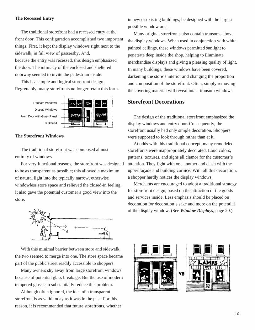
The Recessed Entry The traditional storefront had a recessed entry at the
front door. This configuration accomplished two important things. First, it kept the display windows right next to the sidewalk, in full view of passersby. And, because the entry was recessed, this design emphasized the door. The intimacy of the enclosed and sheltered doorway seemed to invite the pedestrian inside.
This is a simple and logical storefront design. Regrettably, many storefronts no longer retain this form.
The Storefront Windows The traditional storefront was composed almost
entirely of windows. For very functional reasons, the storefront was designed
to be as transparent as possible; this allowed a maximum of natural light into the typically narrow, otherwise windowless store space and relieved the closed-in feeling. It also gave the potential customer a good view into the store.
With this minimal barrier between store and sidewalk,
the two seemed to merge into one. The store space became part of the public street readily accessible to shoppers.
Many owners shy away from large storefront windows because of potential glass breakage. But the use of modern tempered glass can substantially reduce this problem.
Although often ignored, the idea of a transparent storefront is as valid today as it was in the past. For this reason, it is recommended that future storefronts, whether
in new or existing buildings, be designed with the largest possible window area.
Many original storefronts also contain transoms above the display windows. When used in conjunction with white painted ceilings, these windows permitted sunlight to penetrate deep inside the shop, helping to illuminate merchandise displays and giving a pleasing quality of light. In many buildings, these windows have been covered, darkening the store’s interior and changing the proportion and composition of the storefront. Often, simply removing the covering material will reveal intact transom windows.
Storefront Decorations The design of the traditional storefront emphasized the
display windows and entry door. Consequently, the storefront usually had only simple decoration. Shoppers were supposed to look through rather than at it.
At odds with this traditional concept, many remodeled storefronts were inappropriately decorated. Loud colors, patterns, textures, and signs all clamor for the customer’s attention. They fight with one another and clash with the upper façade and building cornice. With all this decoration, a shopper hardly notices the display windows.
Merchants are encouraged to adopt a traditional strategy for storefront design, based on the attraction of the goods and services inside. Less emphasis should be placed on decoration for decoration’s sake and more on the potential of the display window. (See Window Displays, page 20.)
Transom Windows
Display Windows
Front Door with Glass Panel
Bulkhead

17
Choosing Materials The choice of materials can be critical to the overall
success of your storefront design. Again, take a cue from the traditional storefront, whose simple and unobtrusive materials emphasized display windows and the entry door.
Today, many remodeled storefronts are made of materials that look out of place on Main Street because of color, texture, or a combination of the two. Not only do they clash with traditional commercial building façades; but often, they are unattractive designs for any building.
As significant as the materials themselves is the way they are used. One commonly sees a renovated façade that appears sloppy and disorganized because the materials have been carelessly applied. Haphazard combinations can destroy an otherwise pleasing design.
This problem is particularly evident at the “edges” — where the storefront touches the cornice and piers. (See Keeping the Storefront in Its Place, page 15)
In addition, the joint between your storefront and those of adjacent buildings should have a neat, controlled appearance. Remember that the visual impact of your façade design extends well beyond your building.

18
Doors The Front Door
Historically, the storefront entry was more than just a door. Its design and appearance reflected its commercial importance. Tall and stately in proportion, and built of wood with a large glass panel, the traditional storefront door looked substantial yet inviting to the customer.
The idea of making the front door special is just as important today. Entering your store should be a pleasant experience. You want your customers to feel a special invitation as they approach and open the door.
Original storefront doors along Landis Avenue have become scarce. They have been replaced by the standard aluminum and glass commercial doors, or by doors more appropriate to residential buildings. Although modern aluminum doors lack historic character, this type of door cannot always be considered inappropriate. Its simple appearance makes it unobtrusive. If you want to enhance the personality of your store, however, you should consider other options.
1. Your front door should be compatible with the rest of your storefront. It should be significant but not outspoken.
2. If your storefront retains its original character, a traditional wood door with a glass panel (as tall as possible) will reinforce the building’s design. Try to find a door that fits the storefront’s appearance.
3. If traditional appearance is not a concern, choose a door based on the total design of your storefront. Many door sizes and designs are available in both wood and metal. If you choose the standard aluminum and glass door, consider a dark, anodized finish, rather than a light, metallic color. The following illustration shows some new door designs that may be appropriate.
4. Avoid over-decorating the entry door. Most fake “historic” doors are decorated with designs, moldings, and window grilles that look residential, and thus out of place downtown. The same holds true for many contemporary door designs. The door should reinforce the character of your building as well as beckon customers inside. Consider the use of subtle decorations on the door. A handsome doorknob or pull, a brass kick plate, or attractive painted sign on the glass is enough to turn your door into something special.

19
The Secondary Doors The typical downtown building often had an
additional door on the front to permit access to the upper floors.
Compared to the storefront entrance, this second door was slightly more modest in design and usually not recessed as amply. If you are selecting a new door for this location, you may find the following ideas helpful:
1. If you choose to maintain a traditional storefront design, a solid or glass-paneled wood door is most appropriate.
2. Whatever your choice, this door should be less prominent than the storefront door. The second front door should fit into the overall façade without drawing undo attention. A door that is too fancy will look out of place in these surroundings.
Door Maintenance If any of the doors in your building are old but workable,
you should certainly consider keeping them. If the doors are made of wood, maintenance is very important. Keep them clean and in good working order.
Check the wood for problems. Are portions of the wood soft, cracked, or split? Does the door have insect damage? Pay particular attention to the threshold, bottom rail, and hinge rail.
Is the weather-stripping in good repair? Does the door fit snugly in the frame, or is it too tight? Check the hardware. Are the locks, hinges, and closer in working order? Remember, it is often less expensive to repair a door than replace it.

20
Window Displays Window displays should be an attractive part of your
storefront—a pedestrian-level sign. Well-designed displays help draw customers into your store. To create a window display that really works for your business, however, you must expend a little thought and effort.
1. First, define your buying audience. Find out who your customers are: Businesspeople? Homeowners? Gardeners? Your display should attract the attention of those important people on the other side of your window.
2. Now consider the merchandise you sell. Is it colorful or bland? Intricate or simple? Large or small? Does your product have “eye appeal?” Use your imagi- nation to give your merchandise some life. For example, try opening the door of a dishwasher to show what it looks like inside. Looking at your product in different ways can give you new ideas.
3. Think of the display window as a large picture framed by your storefront. Step back and observe how they relate. The building and window should create a single unit that is complimented by the display in color and proportion.
4. Give some thought to the message you want to
communicate. How much do you want to say, and what is the most effective way of saying it in your “picture window?” Remember, your window primarily invites people to come in and shop, but it can present more specific information about your products and services as well.
Develop a clear idea of what you want to show your consumer audience. Decide on the most important concept and limit yourself to a single theme. Don’t confuse people with too much of a good thing. The idea is to entice people into your shop, not to display every product you sell.
5. Let your product speak for itself. Displays that exhibit actual products provide immediate communication without words. Color, shape, size, material, texture—and, in some cases, smell, taste, and sound—are subtle ways to get your message across.
6. Color can help pull your display together. Look at the
color of your building, particularly the storefront; now look at your merchandise. Think about colors that go together with the building and your product, then decide on a color scheme.
Remember, however, that too many colors can be confusing, while too few will make a dull display. Accents like red or yellow can brighten up your window, but don’t overdo it.

21
7. Look at your window display as a composition – as if it were a sculpture or an oil painting. Compliment or emphasize the shape of your window by using your vertical or horizontal elements. Think in terms of a group—how do your products work together? Group similar elements to convey a message that’s easy to “read.” Think of size as well. A large object can balance several smaller items. Experiment with different arrangements before you finally decide what looks best in your window.
8. If words or prices are part of your display, signs should also contribute to your overall theme. Select an appropriate typeface (See Signs, page 24.) and a color that does not overwhelm your products. For professional quality, hire an experienced sign maker.
9. An attractive, well-lit display can entice night- time window shoppers to return during business hours. Incandescent spot lights, mounted on ceiling tracks or recessed into the ceiling, can effectively highlight products as well as provide adequate overall lighting. Consider using halogen bulbs, which, although more expensive than
incandescent bulbs, last longer and use smaller fixtures. A well-lit window display also improves public safety by lighting the sidewalk and allowing police to see inside your shop at night. 10. To keep customers interested, change displays often. Your windows can change with the seasons, as well as reflect holidays and special events throughout the year. 11. Consider investing in reusable seasonal displays. Properly stored and protected, a
sturdy display can be used for three or four years, and its cost can be prorated. Create a memorable display for holidays so it can be anticipated by shoppers each year as a traditional part of the season.
12. If your store has display windows next to rear entries, (See Rear Entrances, page 28.) displays should be simpler than those in the front, but should be of similar quality.
13. Remember, your window display is an integral part of your business. It contributes to:
• the character and success of your store; • the character of your street; and • the character of the business district as a whole. Your display is an invitation to come inside and shop.
Make it a good one.

22
Awnings and Canopies An awning or
canopy can be both a decorative and functional addition to your storefront. It serves as an energy saver by regulating the amount of sunlight that enters your window. Shaded by an awning or canopy, shoppers are enticed to stop, look, and step inside.
1. An awning or canopy creates a pleasant space in front of your building, in the same manner as trees. It provides shade and shelter for busy shoppers, a resting place where pedestrians can pause and get out of the flow of traffic.
2. Awnings and canopies regulate the amount of sunlight that comes in your windows. Based on the building’s orientation to the sun— north, south, east, or west— you can determine whether your storefront needs an awning or canopy.
If your building faces north, it probably won’t need an awning or canopy. For a building with a southern exposure, however, awnings and canopies can be excellent climate control devices. A
combination of insulating glass (See Energy Conservation, page 39.) and an awning or canopy can significantly reduce your energy costs.
Use awnings and canopies as an alternative to window films. Window films are discouraged because they block your store visually from the outside foot traffic. Façade money cannot be used to purchase or apply window films.
3. The installation design will determine in large part how energy effective the fixture will be. Do you want an awning that can be opened and closed? Or do you want a fixed awning or canopy that remains permanently extended?
An operable awning lets sunlight into your building on cold days, helping to heat the interior. It shades your window when it is sunny outside. Although it is more expensive to install an operable awning than a fixed one, you will probably recoup the extra cost through reduced energy consumption.
4. As a visual element, an awning or canopy can add character and interest to your storefront. You should think about how it will appear in relation to the scale of your building. How will it affect existing architectural features? Will it overpower the proportions of your windows and façade? Look at neighboring buildings

23
and imagine what impact the addition of an awning or canopy will have on the character of the streetscape.
5. Awnings can be constructed from a variety of materials. Canvas fabric is traditionally the most popular and historically compatible. It is flexible, but must be weather treated before installation. Costs are lower than for other awning materials. Most commercially available canvas awnings have been impregnated with a polymer coating for easy maintenance. The awnings should be cleaned twice a year by spraying with a garden hose.
Vinyl awnings are often very shiny and therefore inappropriate for almost all storefronts in Landis Avenue’s Main Street District.
6. Canopies are usually constructed of metal and wood. They should be securely fastened to the façade; steel rods are often used to anchor canopies. Positioning the rods so that they blend into the design of the upper façade is important. Not all storefront designs can accommodate an awning.
7. Before choosing a color and pattern for your awning or canopy, look at the entire building. If it has minimal architectural detailing, it can be “jazzed up” with a fancy, striped fabric. A more decorated façade should be complemented with a simple stripe or solid shade. Select an awning or canopy color that enhances the existing building materials
and colors. Awning or canopy designs must be submitted to the Design Review Committee before installation. (See Color, page 36.)
8. Awnings and canopies have long been used to display the names of businesses.
If you choose to include a sign on your awning or canopy, keep the message simple and direct. Signs should be
located on the valances (flaps) of awnings and should be attached to the fascia of canopies.
9. Make sure the material you choose is guaranteed to be weather resistant. Most awning fabric is chemically treated
to retard deterioration by rain or snow. With the exception of aluminum, most of the woods and metals used in canopies should be painted to resist weathering. Sun bleaching is another problem to consider, particularly when choosing a color for the awning. 10. Awnings or canopies are not appropriate solutions for every storefront design. When well designed and properly placed, however, they can save you money, spruce up your storefront, and create a pleasant sidewalk space for shoppers. 11. Awnings and canopies when anchored on
buildings need to be structurally sound and require special attention. Fasteners should be permanent and corrosion resistant. When installed on a masonry building, fasteners should be aligned with the mortar joints.

24
Signs Signs are a vital part of our Downtown. With a sign, you can call attention to your business and create an individual image. But it’s often forgotten that signs contribute to a commercial district’s overall image as well.
Merchants try to out-shout one another with large, flashy signs.
If Main Street is to present a harmonious appearance, its signs must serve both of these images. Consider the following guidelines when designing your sign. (See Principles of Sign Design, page 26.)
1. Stand back and question the sign’s purpose. • Does it merely identify your business? • Do you want to let the personality of your
store or office shine through? • Is it necessary to provide information about
your products on the sign? • What kind of customers are you trying to
attract? • Is the sign meant to be read by pedestrians,
motorists, or both? • Is the sign legible for the intended audience.
2. Think about the type of sign you want. Word sign – This type of sign employs words to
describe your business and its products. Symbol sign – Often, a recognizable symbol conveys
the image of a business better than words.
Number sign – Some signs use numbers instead of
symbols or words; the most common of these are street address signs that help customers locate your business.
Perhaps you’ll want to combine words, symbols, and numbers in the same sign.
3. Consider the possibilities of combining different materials. Each has unique qualities that can be exploited to create a sign suited to your needs.
Signs can be made from wood, metal, stone, neon, canvas, paint on glass, gold leaf, and etched or stained glass, to name a few materials. Signs can also be made of plastic. The most suitable use of this material for Main Street is to create signs made of individually formed letters, symbols, or numbers. Vacuum-formed plastic signs are not permitted in the Main Street District. They may be used in the commercial district upon approval from the Design Review Committee. Use of moving, flashing or scrolling signs is prohibited.
4. You may want to look at photos that show how your building looked in the past to see how signs were related to historic architectural details.
5. Visualize how your sign will appear in relation to the entire façade. The sign should not dominate; its shape and proportions should fit your building in the same way a window or door fits.
For example, a sign hung under the storefront cornice complements the building’s architecture and therefore

25
presents a strong image. 6. Decide where you want to put your sign. There
are several suitable options: • Under the storefront cornice • Painted on glass • On the awning valance • On the canopy fascia • On the side of the building (City ordinance
prohibits signs on the sides of buildings. There is an exception, however, for buildings not oriented to the street, such as strip stores oriented perpendicular to the public street. Signs projecting from the building must be pedestrian oriented. Permitted materials are wood and metal. Maximum size of a projecting sign is 6.5 sq. ft., maximum projection is 3.5 ft. The sign must maintain a minimum grade clearance of 7.5 ft. and not exceed more than 12’ above grade. Sign must be located at least 5 ft. from side property line. Only one projecting sign is allowed per storefront.
Some types of signs are not appropriate, such as the signs made of vacuum-formed plastic or oversized signs placed on top of the building or applied over the upper façade. These signs are prohibited in the Main Street District, and vacuum-formed plastic signs are only permitted in the Commercial District upon approval from the Design Review Committee.
7. Decide how much you want your sign to say. It is important to keep the message simple and to the point. Remember, your sign will be viewed as part of a very complex environment filled with written and visual messages.
8. Look at the color of your building and the colors you see on surrounding structures. Take hints from these when selecting colors for your sign.
You will usually get the best results if you opt for a simple color scheme—a range of three colors. Avoid garish colors; they belong out on the highway! Day-Glo colors are prohibited in the Main Street District. (See Principles of Sign Design, page 26.)
9. As with colors, lighting is important. If you illuminate your sign at night, the light source should be as inconspicuous as possible. Try to avoid obtrusive or gaudy lighting techniques that merely distract attention from the sign. Signs on Landis Avenue in the Main Street District should never be internally lit.
10. Express the personality of your establishment through the type style you select. To learn about various styles, look at other signs around town. Think about what each style says about the business and product it advertises. Then, define the image you want your sign to project. Generally, block or serif lettering is more legible than italicized, cursive, or stylistic fonts.
11. Quality of workmanship and construction is also a vital consideration. A simple, well-made sign speaks more highly of your establishment than an extravagant, but sloppy sign. Choose a sign maker carefully; ask to

26
see samples of previous work. Homemade signs are prohibited. A qualified sign company must be used to create signage.
12. Signs, when anchored on buildings, need to be structurally sound and require special attention. Fasten- ers should be permanent and corrosion resistant. When installed on masonry buildings, fasteners should be aligned with the mortar joints.
13. Signs provided by national distributors are not appropriate in the Main Street District. They don’t reflect the individuality of your business and usually appear as add-ons to your storefront advertising. The signs you display should advertise your personal busi- ness message.
14. Your entire building conveys an image that acts as a sign. Your building’s appearance is more subtle than a word, symbol, or number sign, but it can be more effective.
15. Wall signs are limited to 10% of the façade. City ordinance states that all signage, whether permanent or temporary, if visible from the public street or sidewalk, is counted, whether on the exterior of the building, on the window, or inside the window. This also includes awn- ings and canopies. Multiple signs are still held to the 10% standard in total square feet of façade.
16. Sandwich Boards (temporary signage showing the day’s specials) may be displayed only by restaurants, but only using VDID/Main Street approved boards. Only one sandwich board may be displayed per property, and they must be displayed on the private portion of the property. Boards must be removed at the close of business each day. Sandwich boards will be 24” x 42” overall, with the sign area being 24” x 36”.
Principles of Sign Design
The effectiveness of a sign is determined by a number of factors, including size, placement, content, legibility, letter size and color contrast. In this section, these factors are examined as a set of basic principles governing the design of any sign, no matter what the type of material.
1. Size and Placement. The location selected for a sign influences its size and the choice of materials, colors and method of illumination. Because each building is different in design, each sign must be considered individually.
The design of a building façade will usually present obvious clues for the best location of a sign. Flat, continuous surfaces, unbroken by either decorative detailing or openings such as windows and doors, are logical places to consider installing a flush-mounted sign. Covering up such details and openings merely undermines the attractive features that give a building its architectural style and character.
Almost every building façade has one or more logical locations where a sign can be placed for good visibility without obscuring the architectural design of the building. Historically, the most common location is the area between the storefront windows and the storefront cornice. Other locations include the area immediately above the cornice, the surface of the piers that frame the storefront and the display and transom windows. In some cases placing the sign higher on the façade may be appropriate but, in general, placing it below windows will ensure that it can be easily read by passing pedestrians and motorists.
2. Content. The fewer the words used to communicate a message, the more effective the sign. Too much information will make the message confusing. If additional information is necessary, it should be contained on smaller signs placed in the secondary locations like the front door, display

27
window or adjacent piers. The name of the business should be the only message on the principal sign. Secondary signs may inform the customer of products sold or services rendered. In the case of symbol signs the symbol itself will indicate the principal product or service.
3. Legibility. A good sign should communicate its message quickly and easily. The clearer the typestyle, the more readily it will be understood; hence, lettering that is ornate and difficult to read should be avoided. Within these guidelines, however, a great number of typestyles are appropriate for commercial signs. In addition to conveying the sign’s message, the lettering itself also imparts an image of the business, depending on the typestyle chosen. For example, serif style letters (those with a slight tail at the end of each stroke) have a traditional, timeless appeal, in part because they evoke classical lettering styles. Sans serif letters, on the other hand, convey a more contemporary image.
The use of all uppercase or all lowercase letters, or a mix of the two, also affects the legibility of a sign and the message it imparts. Uppercase letters have a monumental,
architectural quality, especially in typestyles with strong vertical and horizontal elements. Lowercase letters, in contrast, have a simpler, less formal character.
4. Letter size. The size and proportion of lettering affect the quality of the sign. Typically, signs applied directly to the storefront and lower building surfaces should contain letters that are at least nine to fourteen inches high. Add about one inch in height to the letters for every additional 50 feet between the sign and viewer. While there is no universal formula for determining the proportion of lettering to background, a good rule of
thumb is to use no more than 60 percent of the sign surface for lettering.
5. Color contrast. A sign’s colors—and in particular, the contrast between its lettering and background—greatly influence its legibility. Generally, stronger contrast results in a more legible sign. A sign with a dark background will have the strongest visual impact because dark colors have a tendency to recede while lighter or brighter colors stand out.
Using dark or muted colors for the background of a sign also helps it fit more naturally into the architectural design of most older buildings, especially if the sign’s colors complement those of the building’s materials.
If the sign’s background lacks color, as with those painted on glass or Plexiglas, then light colors should be used. Since the typical store interior appears dark during the day, it forms an effective background for letters in pale paint or gold leaf. If the store interior is illuminated at night, the effectiveness of this contrast will be diminished somewhat, though the lettering will still be legible in silhouette.
Sign Illumination The appearance of a well-designed sign can be enhanced,
or marred, by the way in which it is lighted. Illuminated signs are important for businesses that stay open in the evening and for those that want to advertise their presence after closing. At night, illuminated signs and storefront display windows provide a pleasing, ambient light to the sidewalks and streets of the commercial district, making them appear lively, inviting and safe to pedestrians and passing motorists.
Careful consideration should be given to the quality, quantity, method, and type of illumination selected. Ultimately, the type of light used and the way in which it is provided will determine the effectiveness of the sign,

28
its perceived color and its relationship to surrounding building materials.
External illumination. Signs may be lighted in two ways: externally and internally. Incandescent spotlights, gooseneck lights and fluorescent strip luminaries are the most common types of external lights. Bare spotlights provide the simplest form of external illumination. Lighting a sign with exposed outdoor sockets and bare spotlights, however, can produce a harsh glare that makes the sign illegible and detracts from the image of the business. If unshielded, bare spots may also shine in the viewer’s eyes. For example, external illumination can be hidden within fabricated sheet metal housings located above or below the sign, placed behind opaque letters to provide a silhouetted effect, or suspended in front of the sign on rigid electrical conduit arms, which direct the light back toward the sign. Gooseneck and angle lights—their light fixtures shielded by metal shades—are popular forms of the latter type. Though generally positioned to illuminate flush-mounted and projecting signs from above, they can also be installed on either side.
The size of a fixture, type of bulb and light level must be carefully scaled to preserve the ambience of Main Street. Incandescent bulbs provide a warm, bright light that renders objects in their true colors. More intense forms of light, such as sodium vapor, mercury vapor or other metal halide light sources, are not well suited for illuminating signs. Their overly bright light can actually render signs illegible, as well as distort the color of both sign and building. Lighting that is appro- priate for signs may also serve an auxiliary security function. This is especially true of lights positioned to wash over a sign at the rear entrance of a building. Wash-lighting can be provided by spherical or can- shaped lights that are recessed in a horizontal housing above the sign. Fixtures should be placed evenly within the housing so that they provide an even distribution of light over the sign and do not create severe shadows. As a rule of thumb, individual fixtures, whether set in a housing for wash-lighting or used on gooseneck mounts,
should be positioned approximately three to four feet apart to provide even lighting. Closer spacing, particularly of gooseneck lights, will create an unnecessary, cluttered appearance.
Thematic fixtures, like colonial carriage lamps, are rarely appropriate for signs on historic commercial buildings. When mounted on the building wall adjacent to signs, they are particularly ineffective because they fail to illuminate the sign adequately. Even worse, their showy design may actually detract from the sign or overwhelm it. The only appropriate use of colonial carriage lamps is when flanking the doorway in a Colonial Revival storefront.
Internal illumination. Internally lit box signs are prohibited in the Main Street District. Internally lit signs may be used in the Landis Commercial District upon approval from the Design Review Committee.
Sidewalks Any and all changes made to sidewalks must be reviewed
and approved by the Design Review Subcommittee and the City of Vineland Engineering Department. Sidewalks should be unpainted, well-maintained concrete or pavers that match the adjacent street hardscaping in materials, construction, color and pattern. Replacement concrete must match existing and surrounding concrete.
Rear Entrances Spaces behind buildings are frequently forgotten.
People tend to avoid them because they are usually un-kempt and unattractive. Too often, these spaces have been considered strictly service areas, where deliveries are made or garbage is picked up.

29
More and more parking areas for Landis Avenue, however, are being developed behind buildings, in the
middle of the block. The backs of the buildings are coming into full and open view.
This suggests two things: First, the appearance of the back areas is important to the commercial district. Second, the rear entrances can potentially benefit all businesses by allowing direct entry from the parking lot
into
stores. Customers don’t need to walk around the block to reach a shop. If you don’t have an attractive rear entrance to your business, but are considering making improvements, consider the following:
1. Would additional walk-through traffic help or hinder your business? Would a rear entrance be an added convenience to your customers?
2. What changes would you need to make to give your store an attractive rear entrance? How would you handle the circulation, displays, and security throughout the building?
3. Although the two are similar, the rear entrance should
not compete with the storefront in importance. In most cases, the rear entrance should occupy a relatively small part of the back elevation and exhibit more of a utilitarian character. Still, it should be maintained and developed to support the overall appearance and convenience of the district.
4. Like the storefront, the rear entry requires identification. It should be inviting and attractive. A glass panel in the back door is one way to open your store to potential customers. A small sign on or near the door is another way to identify your business. Be sure to keep it small, and don’t clutter the area with too many signs. If your building has rear windows on the ground floor, use them for displays; they will also attract people to your door. An awning or small canopy can be a pleasant addition and a convenience to shoppers during inclement weather. If there is enough sun, planter boxes might also be added, but only if you attend to them properly.
The goal is to make rear entrances more attractive and inviting, while still maintaining a feeling of safety. Shade trees and low level planting should be encouraged. Additionally, windows looking out onto parking lots and walkways enhance safety. Efforts should also be made to make it clear that a rear entrance is for patrons, not just employees.
5. Like the storefront, the rear entry should respect

30
next-door neighbors. Try to make your entry compatible with neighboring stores. Look at the back entrances next to yours. It might be wise for you and your fellow merchants to get together and plan an attractive approach to the rear elevation of your buildings.
6. Normal service activities, such as trash collection, loading, shipping, and storage must also occur with ease. It is possible to accommodate these functions and, at the same time, make the space behind the store more pleasant for shoppers.
7. If possible, pick a central location for trash collection—one that will serve several stores efficiently. Grouping the containers gives a less cluttered appearance.
8. Simple enclosures can be readily constructed to hide refuse containers and prevent clutter. These enclosures should open from the front for easy removal of full, heavy cans. Dumpsters must be screened from view.
Before construction, be sure to consult the collection agency and ensure that your design will not disrupt activities. Four-sided trash enclosures are required.
Use a neutral color to paint or stain these enclosures. Bright or loud colors draw attention to the screens and containers, when the purpose is to camouflage them. Choose colors that blend in with those of the rear façade.
9. Paved areas, drainage issues, and unwanted plant growth are issues often overlooked regarding rear entrances.
Paved areas are often full of potholes, which is both bothersome and dangerous for pedestrians.
Poor drainage is another common problem. Drainage problems cause puddles and other hazards for pedestrians. Make sure there is adequate drainage away from your building. Also, check the storm drain inlets regularly to see if they need cleaning.
Weeds and scrub trees can also be a problem in areas behind buildings. These plants are tenacious and will grow wherever they can. For a better image, keep them under control. Where opportunities exist for landscaping, they should be utilized. 10. Snow removal is another consideration. Just as front walks need to be shoveled, so too do back
entrances. 11. The rear façades of commercial buildings have been
ignored and neglected for a long time. In many cases, they have been left to deteriorate or have been poorly maintained. Windows on the ground and upper floors are frequently ill-kept, boarded up, or dirty. Electrical and telephone lines are haphazardly attached to many buildings, giving them a cluttered look. With good design and proper maintenance, rear entrances can become attractive and convenient for Landis shoppers.
12. Any improvements to the backs of buildings will require approval from the VDID/Main Street Design Review Subcommittee and the City of Vineland.

31
Historical Architectural Decoration
Certainly one of the most striking aspects of the tradi- tional façade is its eye-catching detail. Historically, decoration was freely used to embellish the façade. Often, today, only the decoration of the upper façade remains. Yet even in this incomplete state, details should be preserved.
Much of the Downtown’s visual character rests in its architectural detailing. You might think of a decorative feature as an antique. It is a blend of architecture and sculpture, an example of craftsmanship that would be difficult and costly to reproduce today.
The first step in preserving detailing is to determine what kind of decoration you have. Basically, six types of materials have been used for decorations.
Identify Materials 1. Brick
Decorative brick work can be found on buildings of almost any date. In detail, it ranges from elaborate corbelled cornices and bold window arches to decorated storefront piers. Brick detailing also occurs when bricks are laid in patterns in the upper façade of a building.
2. Stone
Sandstone, limestone, marble, granite, and other building stones are often found on the façades of
downtown buildings. For decorations, they range from elaborately carved corner details to arches over windows and doors to decorated stone quoins.
3. Cast-Iron and Sheet Metal Metal decoration is usually found on buildings
constructed before 1900. It was generally applied as an add-on to a masonry façade. Building and storefront cornices, window surrounds, and even entire façades can be recognized by the intricacy of the detail. Metal or cast-iron decorations are more durable than wood, but must be kept painted to prevent rusting.
4. Wood Wood was used for decoration
in a variety of ways. Wood details are often subtle, like the moldings around windows. These less ornate details are nevertheless important to the total façade. Wood cornices can also be more elaborate with dentils, modillions, and compound molding profiles.
5. Terra Cotta Decorative terra cotta was commonly used from 1890 to
1930. A ceramic material, terra cotta offered flexibility in form, color, and detail. Terra cotta was applied to buildings as a decorative veneer or installed as a masonry unit in combination with brick or stone.
6. Decorative Glass Decorative glass comes in many forms —beveled,
stained, leaded, and etched— which has been used in many ways. It is most commonly seen as a transom window. Often, the decoration serves as a sign. In the 1920’s and 1930’s, entire storefronts were faced in opaque structural glass. Known by the trade names of Vitrolite or Carrara glass, these structural glass panels were popular to create Art Deco and Art Modern storefronts. The caulking between the panels should match the panel color.

32
Identify Problems The next step is to identify any visual or structural
problems. For the best solution, consult a local, knowledgeable professional or tradesman and be sure to explain that you want to preserve the decorations.
1. Brick Problems Many of the problems that effect decorative brick
are the same as for masonry in general. (See Masonry Cleaning, page 37.) In other cases, decorative brickwork has been damaged during an earlier façade remodeling. If this is the problem, new replacement bricks of the same shape may be available or replacement decoration can be molded
in a substitute material. The formation of white powder (efflorescence) on the surface of the brickwork indicates a moisture infiltration problem.
2. Stone Problems Stone decorations are also subject to many of the
problems discussed in Masonry Cleaning. Decorative stone is subject to erosion from windblown grit and chemicals contained in rain and snow. The surface may also flake off if water penetrates into the stone. These problems require expert advice but can be cured.
3. Cast-Iron and Sheet Metal Problems With metal decoration, look for obvious signs of
deterioration: corrosion, tears, holes, and missing pieces. Look also for more subtle evidence, such as telltale rust and surface discoloration, often a sign of deterioration in the supporting wood framing. Since the metal decoration is applied to the surface, check its anchoring to the wall. Minor deterioration can be resolved by properly prepar- ing, priming, and painting the decoration. If more exten- sive repairs are needed, a local, skilled metal worker can fabricate replacement parts. But again, remember to communicate your desire to preserve the decoration.
4. Wood Problems Wood decoration is very susceptible to deterioration.
Problems are easy to prevent, however, through regular maintenance. When checking for problems, look for soft,
dry, or split areas in the wood surfaces, especially those exposed to harsh weather. Some of these problems can be
fixed by filling and caulking the wood, then priming, and painting. The wood may also be consolidated or hardened by using an epoxy injection. When repair is impossible, consult a local mill shop for a replacement piece that matches the existing detail. All new wood should be back-primed and edge-primed (at saw cuts) prior to installation.
5. Terra Cotta Problems Terra cotta is a cast-masonry product, so many of its
potential problems are the same as those that affect brick. Other problems include cracking and chipping of the glazed surface. Also, check for loose anchoring of the terra cotta to the structural wall.
Terra cotta is the most difficult material to restore. Contact an expert for all maintenance and repair work. Exercise great care when dealing with this material because replacement terra cotta is extremely hard to find.
6. Decorative Glass Problems One of the problems with glass decoration is that many
times, it is covered up. Look for it in transoms or behind plywood window covers. Sagging, if it occurs, means that the glass and the frame need to be reinforced with a brace. Other problems often occur with old leaded or stained glass. The metal between the glass panes may be either zinc or lead. Always use the same metal when making repairs.
A General Approach Any historic detail should be treated with care. First,
maintain what you have. If necessary, repair or replace the detail by duplicating or complementing the original. The addition of fake “historic” decoration to make a façade look “old” is not recommended. This will inevitably cheapen the quality of the façade.
A Note on Substitute Materials In some cases, it is appropriate, and less expensive, to
replace a missing or badly deteriorated architectural decoration with a different material. If a substitute material

33
is considered, it should have the same appearance — texture, color, size, shape, and detailing-as the original. It is also important to be sure that when the temperature changes, the substitute material will expand and contract at a rate similar to the original.
Upper Façade and Building Cornice
The visual importance of the upper façade and build-
ing cornice is evident in their steady march down Main Street. Of particular importance are the windows in the upper façade. They create a repeated pattern that helps tie together the façades.
Upper façades are often neglected or replaced with inappropriate materials, and the windows are sometimes boarded up. Unpainted, boarded up, or barred windows are in violation of City Code. Deterioration or inappro- priate changes not only alter the character of the build- ing, but change the image of the streetscape as well. Proper treatment and maintenance of the upper façade and cornice can prevent this problem.
Make a checklist of upper façade and cornice maintenance problems. Many can be solved and others prevented through regular care.
Upper Façade Maintenance
Maintaining the upper façades on Main Street is usually a simple task. The façade may only need to be cleaned and painted; or, if constructed of masonry, it may have mortar joints that need to be repointed. In some cases, holes left by the removal of signs or other objects may need to be filled.
Repairing and maintaining the upper façade may be more complicated. If details and decorations are damaged or missing, they should be repaired or replaced. (See Historic Architectural Decoration, page 31.) On some commercial buildings, the upper façade has been completely covered with aluminum or some other material to make it look “modern.” This type of change is inappropriate for buildings in traditional commercial districts. Coverings over front façades not only destroy their visual appeal but also give pigeons a place to roost. Removing the covering will allow the architecture of the upper façade to contribute to your business’ image.
Cornice Maintenance Building cornices are often constructed of sheet metal
applied over a wood frame, decorative wood molding, brick or stone.
1. Sheet metal cornices should be painted regularly to prevent rust. Replacements for missing pieces can be fabricated. Be sure to check the wood support structure for rot or insect damage. If found, replace the deteriorated portions.
2. Decorative molded wood cornices should also be regularly painted. Missing or damaged wood can be duplicated by a local wood worker.
3. If a projecting masonry (brick or stone) cornice has been destroyed during a previous remodeling, consider duplicating the original cornice design in another material, such as fiberglass or fiberglass reinforced concrete.
Window Maintenance
Before discussing specific window problems, a note of caution is in order. Various maintenance and repair materials

34
(putty, caulk, primer, paint, etc.) are mentioned in the following paragraphs. There are several types of repair materials in these categories, so be sure to use the correct product for the materials you are working with. Consult a local expert to determine which will best solve your problems. 1. Check the wood parts of the window. Are some portions of the wood soft, cracked, or split? Pay parti- cular attention to window sills and the bottom of window sashes (the bottom rails) where water has collected over the years.
Minor problems can be easily solved. Proper treat- ment and a fresh coat of paint can repair wood and prevent further deterioration. Proper treatment may simply require scraping off old paint from the wood. Fill the cracks with caulk or wood putty; then sand, prime and repair. (See Painting, page 35.) To repair more extensive damage, it may be necessary to apply a wood consolidate or replace the damaged sections with matching elements.
2. Check the joints between the window and the opening. If the joints are loose or open, they should be caulked to prevent air and water infiltration. Be sure to use the proper caulking material.
Loose or broken window panes are easily fixed. First, remove all broken glass and old glazing putty. Find new glass to match the size, color and reflectivity of existing panes. Install the glass using the appropriate glazier’s points and putty. Window Repair
If simple maintenance does not solve window problems, more extensive repair may be required. 1. Wood may be badly deteriorated. Most likely, it is the sill or bottom rail of the sash. These parts can be replaced without installing a whole new window. Check with your local lumber supply store or mill shop for pieces that match the original window.
2. If your window doesn’t operate the way it used to,
it may be painted shut. Tapping the sash with a hammer wrapped in cloth and carefully cutting the paint between the sash and the frame with a sharp knife should solve the problem. “Soaping” the window tracks will help the window slide better.
3. Another common malfunction is a broken window mechanism. If the sash locks, cords or weights are broken, consult a window dealer or builder. He or she can show you the simplest way to fix the mechanism without replacing the entire window.
Window Replacement If all other efforts to maintain or repair a window have
failed, you may have to consider replacing the entire window
unit. 1. Find replacements that match the existing units.
Standard wood windows are relatively easy to buy or have made. More unusual styles are usually custom-made, but not as expensive as you might think.
2. Consider the window opening. Do not alter the existing opening to fit the new windows; instead, make sure windows fill the openings.
3. Consider material and color. If you must use aluminum or metal-clad replacement windows, a dark anodized finish is preferable to a light metallic color.
4. The number of glass panes and the profiles of the sash rails and muntins should match the original as closely as possible. Avoid fake “historic” or very modern-looking windows that do not fit the style of your building. Do not add shutters to your upper-floor windows either; they are appropriate for residential, but not commercial buildings.
Storm Windows Insulating storm windows can help conserve heat and
energy, but they often look wrong on an older façade. For this reason, consider installing them on the inside of the window where they won’t be seen. Make sure that interior storm windows are properly vented so that moisture does not build up between the windows.

35
If storm windows are installed on the outside, their design should match the existing window in shape, meeting rail alignment, size of glazed area, and color. If metal storm windows are used, an anodized or baked-on finish is less obtrusive than plain aluminum and can be painted for compatibility with the building’s appearance.
Painting
Painting can be one of the most dramatic improve-
ments you make to your building. But you must know what steps to take. The following procedures will help smooth the way for a successful paint job:
1. Determine what you need to prepare for painting. Check all the wood. Is it sound or rotting? Does it have insect damage? Repair or replace any damaged areas that you find.
If you have a masonry building and need to repaint it, first check the mortar. If the building needs repoint- ing, do that before painting.
2. Plan a painting schedule. Some times of the year, such as Spring and Fall, are better than others for painting. Good weather usually ensures a better paint job. Ask your local paint dealer for assistance.
3. Check the condition of the windows. Install new
glass as necessary. Replace any deteriorated putty with a glazing compound; be sure to put it all around the window. Wait two or three days for the compound to dry before painting.
4. Prepare the surface adequately. Be sure to remove all peeling and loose paint. A variety of tools can be used; a wire brush, a scraper, a heat plate, or an electric heat gun. Use these last two devices carefully; employ only enough heat to soften the paint so that it can be easily removed. Do not use a blow torch or any source of an open flame.
5. A primer should be used for all bare wood surfaces as it helps the final coat adhere. Mix a little of the finish coat paint with the primer to achieve a richer color.
6. Determine the type of paint suited for your building. Stone, brick, wood, concrete block, and metal all require different paints and primers.
7. Which kind of paint should you use, oil or latex? There are advantages and disadvantages to each.
Oil • More durable • Some feel it preserves wood and adheres better • More difficult to clean up
Latex • Less durable • Easier to apply • Easier to clean up An important reminder: Once you use latex, you must
continue to use it. It is difficult to switch back to oil. If you have been using an oil-based paint, it is best to continue with oil.
8. There are three degrees of shine for paint: gloss, semi gloss, and flat or matte.
9. Remember that quality paint will last longer than a cheap brand. It will not fade or peel as quickly and usually gives better coverage.
A Note on Lead Paint If your building is more than 50 years old, it may
contain lead-based paint. If you are removing the existing paint as part of the repainting process, have a sample tested. It is imperative that the testing be done by a reputable company or by a state testing lab. If a problem exists, contact your state environmental department for information on options for removing or encasing the lead-based paint.

36
Color The color you paint your building, window trim, or
door is, to some extent, a personal decision. It is an expression of yourself and your commercial establish- ment. However, there are other people and things to think about. The following procedures can help you decide what colors to use on your building.
1. Be a good neighbor and look at your building in the context of the entire block or downtown. The color of your building can affect the overall character of Main Street.
2. Think about how the sun strikes your building. The amount of sunlight can change the hue of paint color. Hold a paint chip to your building on cloudy and sunny days. To be certain about your color choice, invest in a quart of paint and apply it. There is a great difference between a small color chip and an entire wall.
3. Decide whether you would like to return your building to its original paint colors. If you are seeking historical accuracy, carefully scrape a small area to reveal different layers of paint. Please note that over time, the original color may have faded. To get a better idea of the true color, wet the original surface. The base color will appear more accurately when moist.
4. Color schemes for commercial buildings differ by architectural style. They also differ according to the period when the building was constructed. In addition to scraping a small area of the building to determine its historic color, consult period paint guides for proper color combinations and placement.
5. It is important to remember that white paint was not used as widely during the Victorian period as it is today. White is a glaring color that does not blend in readily with most downtown environments.
6. Traditionally, building trim is painted as decoration, often in a contrasting shade lighter or darker than the primary building color. This paint treatment defined the trim, but it was not so overpowering that the trim colors dominated the building.
7. Today, aluminum frames have frequently replaced traditional wood doors and windows. The shine and metallic color of aluminum do not complement historic buildings. Paint them a more neutral color (after treating with trisodium phosphate) or choose darker, anodized frames.
8. Paint color should be used to tie together all building elements, including the cornice, upper façade, windows, storefront, and doors. To do this, you must limit the number
of colors you use; in most cases, choose no more than three and be sure to select complementary colors.
9. With these procedures in mind, express the identity of your business through paint color. It adds to the richness and variety of Main Street.

37
Masonry Cleaning The decision to clean the surface of your building is partly a matter of appearance and partly a maintenance issue. Cleaning can give it new life, restoring the natural qualities of the brick or stone. There are also functional reasons for cleaning masonry. Dirty areas on brick or stone remain wet for a longer period of time. This dampness can promote chemical reactions that lead to deterioration. Harmful microorganisms also thrive in dirt, in time damaging the building surface. Masonry cleaning can lighten the load of building maintenance as well. If you clean the paint from a building and opt
for the natural color of the brick or stone, it eliminates the periodic chore of repainting.
A word of caution—improper cleaning can cause masonry deterioration to accelerate. After several years, this deterioration can affect the structural stability of your building. Before deciding to remove paint from a building, particularly one made of brick, try to determine if the building has always been painted. Some of Main Street’s masonry buildings were built with soft brick, which needs paint to protect it from the weather.
Masonry cleaning is a technical subject about which the National Trust’s Main Street Center, the National Park Service’s Division of Technical Assistance, and the New Jersey Historic Preservation Office have accumulated much material. Don’t hesitate to ask for advice.
The following is a list of steps to consider when deciding whether to clean your building:
1. Consult an expert who can help you inspect the surface and determine the safest, most efficient method of cleaning.
2. To be on the safe side, pay for a test patch. Evaluate the effectiveness of the cleaning method. Some forms of dirt and paint are difficult to remove.
3. Let the test patch weather for several months. Any problems with the cleaning method will show up during this period. Residue from the cleaning should not be left on the brick or stone.
4. After the test patch has been completed, examine the masonry. Note whether there are pock marks. Are the edges too rounded? Does the face of the masonry rub off when you touch it? Some masonry may be too soft to clean.
5. Check any alterations to the original building. Brick or stone used to fill in old, unused doors or windows or to construct additions may be unsightly or a different color than the original. Perhaps the building was first painted to conceal these differences and thus should be repainted.
6. Inspect the mortar between the masonry units. Poor pointing could allow water to seep into the building and cause damage. An expert can help you decide whether to repoint before or after cleaning. (Be sure to use the appropriate mortar type; the wrong choice can lead to visual and/or structural problems.)
7. After testing, look at the original color of the masonry. Do you like it?
8. Be sure the company you choose to clean your building has a good reputation. If possible, take the time to investigate examples of previous work yourself.
9. Look at the area surrounding your building. Shrubs, trees, or ground cover will need protection. Whoever does the cleaning should agree to cover the plant material and soil around the plants. Use a water-resistant material. Do not allow run-off from lead-based paints to contaminate the soil or groundwater. Sidewalks and pavers must also be covered and protected from damage.
10. Think about the weather when you decide to clean your building. Avoid wet cleaning operations when a danger of frost might exist.
If you are doing more than one maintenance task on the exterior of your building, plan a work schedule. Some work should be done before cleaning; other work is best done afterward. For example, it is usually best to caulk around windows before the cleaning process (to keep water out of the joints), but to paint them after (to ensure that the paint is not disturbed during cleaning).
11. Make sure that all entrances, windows, and window wells are adequately protected against water seepage during cleaning.

38
Cleaning Process Several methods are used to clean masonry build-
ings. Choosing one method over another should be based on:
• The amount and type of soil to be removed • The amount and type of paint to be removed • The type and condition of the masonry
It is most important to understand how your building material will interact, physically and chemically, with the cleaner. If you don’t know, ask for help. Be sure to take your time and learn about various processes.
Water Cleaning Cleaning with water sounds easy, and it can be the
most economical way to clean a dirty building. But do watch for potential problems. For instance, ask about the mineral composition of your city’s water supply. Some minerals could leave stains on your building; check with the cleaning company.
Areas of the building that are especially dirty may require a good deal of manual scrubbing and strong detergent. The increased work hours can raise the total cost of the job.
Be sure to use only bristle brushes, not metal. Metal can disturb the mortar and damage masonry. Water pressure should not exceed 600 psi at the nozzle.
Chemical Cleaning Finding the right chemical for the job is the biggest
challenge. Every company seems to have a secret formula. Remember that chemical cleaners can either be alkaline or acidic.
Be sure to choose the right kind of chemical for your building. Acidic products, for example, should never be used on limestone or marble buildings.
The masonry is usually pre-wet to soften any dirt. The chemical is then applied and left on the building surface.
Finally, the cleaner is rinsed off, usually with water. When the building is rinsed, make certain that all of the chemical is washed off. Be sure the runoff is collected before it can enter the storm drainage system or soak into the ground.
Abrasive Cleaning Sounds tough? It is! Fine particles, such as sand, are
forced with air or, sometimes with water, through a nozzle. Blasting is never recommended because it can damage or erode masonry surfaces.

39
Energy Conservation Energy conservation in a building means minimizing
its energy needs and maximizing the comfort of its occupants. If properly treated most old commercial buildings can be as energy efficient as new ones. The process is not particularly costly, but it does require a commitment to identify and solve some specific problems.
1. The traditional commercial building has some basic characteristics that help save energy.
2. Old commercial buildings also have some typical energy problems.
3. Windows and doors should be sealed as tightly as possible. When closed, they should not leak air or moisture.
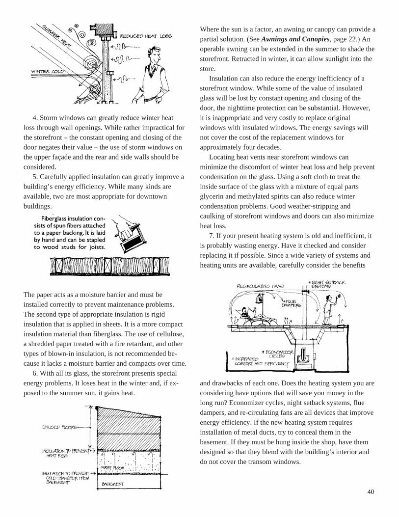
40
4. Storm windows can greatly reduce winter heat loss through wall openings. While rather impractical for the storefront – the constant opening and closing of the door negates their value – the use of storm windows on the upper façade and the rear and side walls should be considered.
5. Carefully applied insulation can greatly improve a building’s energy efficiency. While many kinds are available, two are most appropriate for downtown buildings.
The paper acts as a moisture barrier and must be installed correctly to prevent maintenance problems. The second type of appropriate insulation is rigid insulation that is applied in sheets. It is a more compact insulation material than fiberglass. The use of cellulose, a shredded paper treated with a fire retardant, and other types of blown-in insulation, is not recommended be- cause it lacks a moisture barrier and compacts over time.
6. With all its glass, the storefront presents special energy problems. It loses heat in the winter and, if ex- posed to the summer sun, it gains heat.
Where the sun is a factor, an awning or canopy can provide a partial solution. (See Awnings and Canopies, page 22.) An operable awning can be extended in the summer to shade the storefront. Retracted in winter, it can allow sunlight into the store.
Insulation can also reduce the energy inefficiency of a storefront window. While some of the value of insulated glass will be lost by constant opening and closing of the door, the nighttime protection can be substantial. However, it is inappropriate and very costly to replace original windows with insulated windows. The energy savings will not cover the cost of the replacement windows for approximately four decades.
Locating heat vents near storefront windows can minimize the discomfort of winter heat loss and help prevent condensation on the glass. Using a soft cloth to treat the inside surface of the glass with a mixture of equal parts glycerin and methylated spirits can also reduce winter condensation problems. Good weather-stripping and caulking of storefront windows and doors can also minimize heat loss.
7. If your present heating system is old and inefficient, it is probably wasting energy. Have it checked and consider replacing it if possible. Since a wide variety of systems and heating units are available, carefully consider the benefits and drawbacks of each one. Does the heating system you are considering have options that will save you money in the long run? Economizer cycles, night setback systems, flue dampers, and re-circulating fans are all devices that improve energy efficiency. If the new heating system requires installation of metal ducts, try to conceal them in the basement. If they must be hung inside the shop, have them designed so that they blend with the building’s interior and do not cover the transom windows.

41
New/Infill Construction The construction of new buildings on vacant lots
downtown should be encouraged. Because this type of building fills a “hole” in the built environment, it is call- ed infill construction.
The design of a new infill building, particularly its front façade is a special challenge. It should be designed to look appropriate and compatible with surrounding buildings. Otherwise, the new building will look awkward and out of place.
What is good infill design? There is no pat answer; a good design will vary according to its setting. Professionals generally agree that because an infill building is new, it should look new. However, its appearance must be sensitive to the character of its neighbors or else it detracts from an area’s character by compromising what is authentic and historic. The central idea behind good infill construction is a simple one. To a large degree, the design of an infill façade should be an outgrowth of those around it. If the design of the new façade is based on those of its neighbors, it is sure to be compatible.
This approach strikes a proper balance between the existing architecture and good contemporary design. The modern designer is allowed the freedom of individual talent
—
within limits. Since a good infill design responds to its surroundings, it
is not possible to develop specific guidelines that will apply to all cases. Every site has its own design problems and opportunities. Infill buildings will need approval of the Design Review Committee and the City of Vineland before construction can begin.
Several general concepts should govern the visual relationship between an infill building and its neighbors.
1. Height Buildings in traditional commercial districts share a
similar height. Infill construction should be respectful. When the new lots have been combined, the massing and width of the new building should be vertically delineated in response to the original proportions. A new façade that is too
high or low can interrupt this consistent quality.
2. Width The infill building should reflect the characteristic
rhythm of the façades along the street. If the site is large, the mass of the façade can be divided into a number of small bays.

42
3. Proportion The characteristic proportion (the relationship
between height and width) of existing façades should be respected.
4. Relationship to Street The new façade’s relationship to the street (called the
“setback”) should be consistent with that of its neighbor- ing buildings.
5. Roof and Cornice Forms The form of the roof and building cornice should be
similar to those on adjacent structures. On Main Street, this usually means a flat roof hidden behind a cornice.
6. Composition The composition of the infill façade ( that is, the
organization of its parts) should be similar to that of the surrounding façades.
7. Rhythm Rhythms that carry throughout the block (such as window
spacing) should be incorporated into the new façade. 8. Proportions of Openings The size and proportion of window and door openings
should be similar to those on surrounding façades. The same applies to the ratio of window area to solid wall for the façade as a whole.
9. Materials An infill façade should be composed of materials that
complement adjacent façades. The new building should not stand out against others.
10. Color The colors chosen for an infill façade should tie it to its
neighbors.

43
CONTACTS: Sandra Forosisky Director of Redevelopment City of Vineland Economic Development 640 East Wood Street Vineland, NJ 08360 (856) 794-4000 ext. 4623
Department of Licenses and Inspections (856) 794-4113
Acknowledgement: Illustrations and some text in this document were obtained from the Building Improvement File
from the Main Street National Trust. Permission granted through New Jersey Main Street.