Embed Size (px)
Citation preview
Design for Web Pages
Lynch and Horton, 6,7
Nielsen reports, www.nngroup.com
Overview
• Web pages (vs. sites), but interconnected
– Page Structure• Driven in part by human reading principles• Newly (as a culture) learned elements
– Canonical form
– Page Design• Page design In context of site• Pages’ graphic design is for “visual information management” (L&H)
• About graphic design for web pages • First of all web page is part of an interactive system
– Driven by human perceptual (and aesthetic) principles– Gestalt perceptual principles
• Recall, Lynch and Horton are guideline oriented
Structure - Books and Web Pages
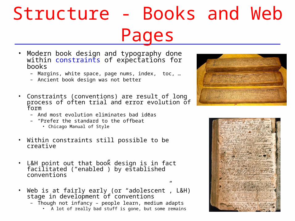
• Modern book design and typography done within constraints of expectations for books
– Margins, white space, page nums, index, toc, …– Ancient book design was not better
• Constraints (conventions) are result of long process of often trial and error evolution of form
– And most evolution eliminates bad ideas– “Prefer the standard to the offbeat”
• Chicago Manual of Style
• Within constraints still possible to be creative
• L&H point out that book design is in fact facilitated (“enabled”) by established conventions
• Web is at fairly early (or “adolescent”, L&H) stage in development of conventions
– Though not infancy – people learn, medium adapts• A lot of really bad stuff is gone, but some remains
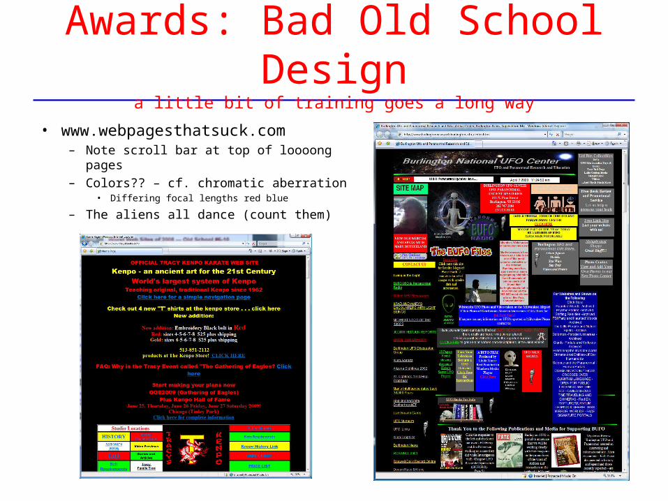
Awards: Bad Old School Designa little bit of training goes a long way
• www.webpagesthatsuck.com – Note scroll bar at top of loooong pages– Colors?? – cf. chromatic aberration
• Differing focal lengths red blue
– The aliens all dance (count them)
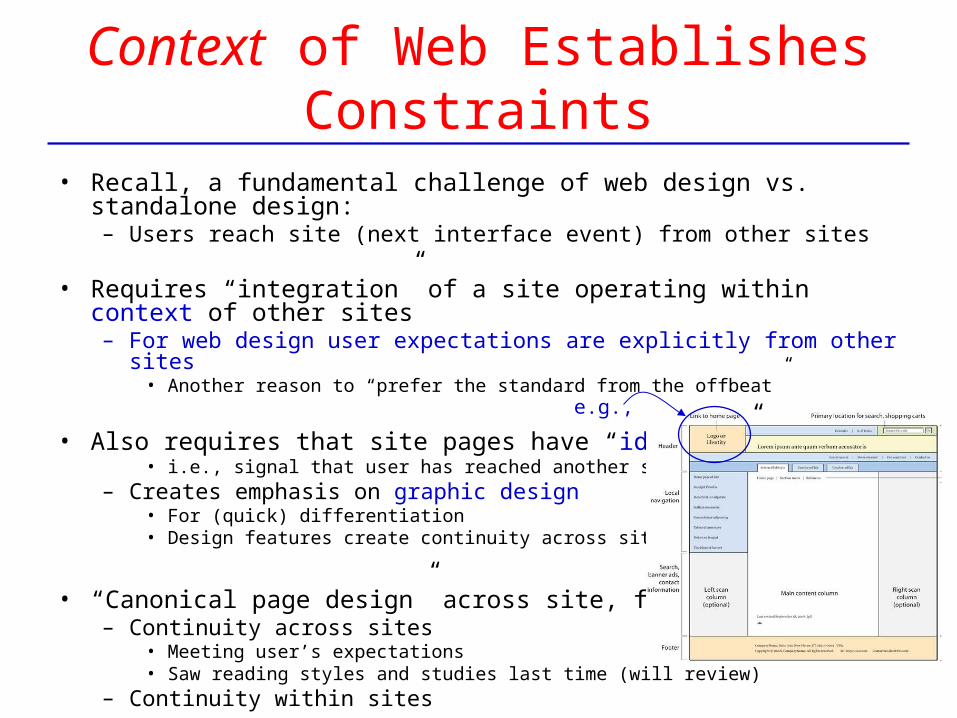
Context of Web Establishes Constraints
• Recall, a fundamental challenge of web design vs. standalone design:– Users reach site (next interface event) from other sites
• Requires “integration” of a site operating within context of other sites– For web design user expectations are explicitly from other sites
• Another reason to “prefer the standard from the offbeat”
• Also requires that site pages have “identity”• i.e., signal that user has reached another site,
– Creates emphasis on graphic design • For (quick) differentiation• Design features create continuity across site
• “Canonical page design” across site, for both:– Continuity across sites
• Meeting user’s expectations• Saw reading styles and studies last time (will review)
– Continuity within sites
e.g.,
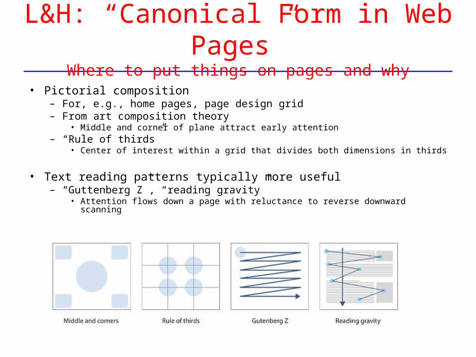
L&H: “Canonical Form in Web Pages”Where to put things on pages and why
• Pictorial composition– For, e.g., home pages, page design grid– From art composition theory
• Middle and corner of plane attract early attention– “Rule of thirds”
• Center of interest within a grid that divides both dimensions in thirds
• Text reading patterns typically more useful– “Guttenberg Z”, “reading gravity”
• Attention flows down a page with reluctance to reverse downward scanning
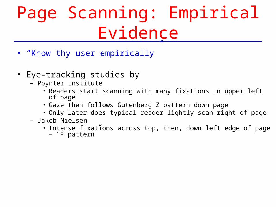
Page Scanning: Empirical Evidence
• “Know thy user empirically”
• Eye-tracking studies by – Poynter Institute
• Readers start scanning with many fixations in upper left of page• Gaze then follows Gutenberg Z pattern down page• Only later does typical reader lightly scan right of page
– Jakob Nielsen• Intense fixations across top, then, down left edge of page – “F pattern”
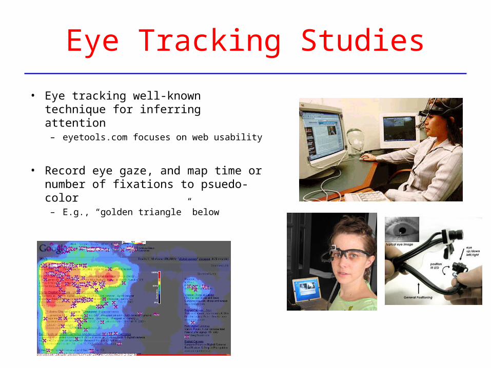
Eye Tracking Studies
• Eye tracking well-known technique for inferring attention
– eyetools.com focuses on web usability
• Record eye gaze, and map time or number of fixations to psuedo-color
– E.g., “golden triangle” below
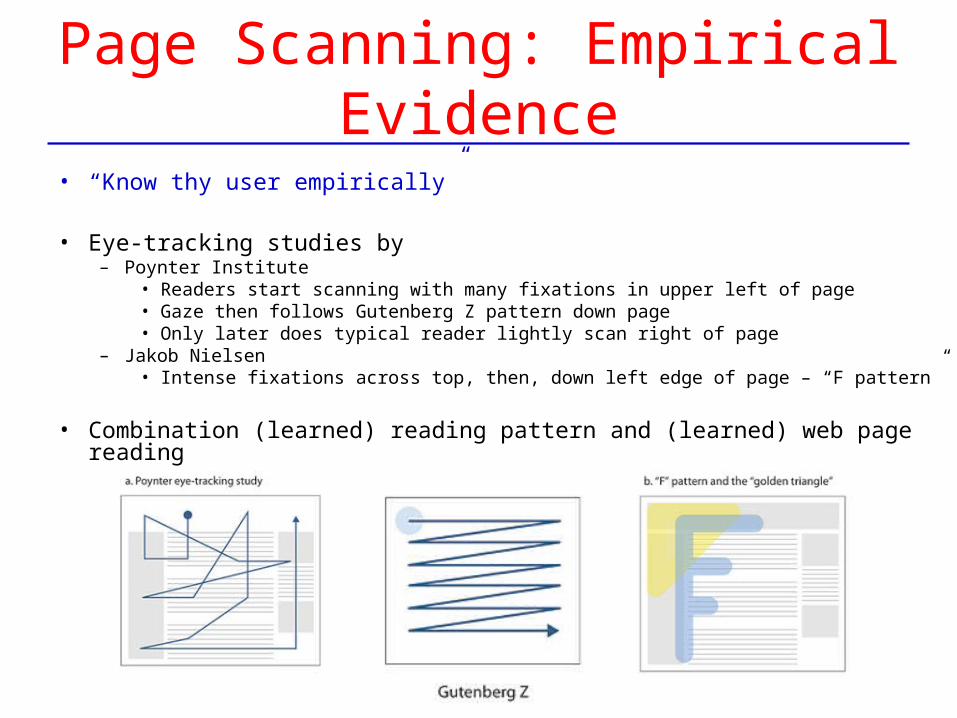
Page Scanning: Empirical Evidence
• “Know thy user empirically”
• Eye-tracking studies by – Poynter Institute
• Readers start scanning with many fixations in upper left of page• Gaze then follows Gutenberg Z pattern down page• Only later does typical reader lightly scan right of page
– Jakob Nielsen• Intense fixations across top, then, down left edge of page – “F pattern”
• Combination (learned) reading pattern and (learned) web page reading
Eye Tracking Studies
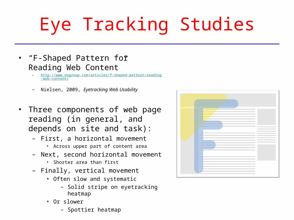
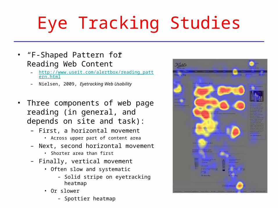
• “F-Shaped Pattern for Reading Web Content”
– http://www.nngroup.com/articles/f-shaped-pattern-reading-web-content/
– Nielsen, 2009, Eyetracking Web Usability
• Three components of web page reading (in general, and depends on site and task):
– First, a horizontal movement• Across upper part of content area
– Next, second horizontal movement• Shorter area than first
– Finally, vertical movement• Often slow and systematic
– Solid stripe on eyetracking heatmap
• Or slower
– Spottier heatmap
Eye Tracking Studies
• “F-Shaped Pattern for Reading Web Content”
– http://www.useit.com/alertbox/reading_pattern.html– Nielsen, 2009, Eyetracking Web Usability
• Three components of web page reading (in general, and depends on site and task):
– First, a horizontal movement• Across upper part of content area
– Next, second horizontal movement• Shorter area than first
– Finally, vertical movement• Often slow and systematic
– Solid stripe on eyetracking heatmap
• Or slower
– Spottier heatmap
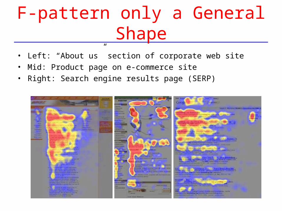
F-pattern only a General Shape
• Left: “About us” section of corporate web site• Mid: Product page on e-commerce site• Right: Search engine results page (SERP)
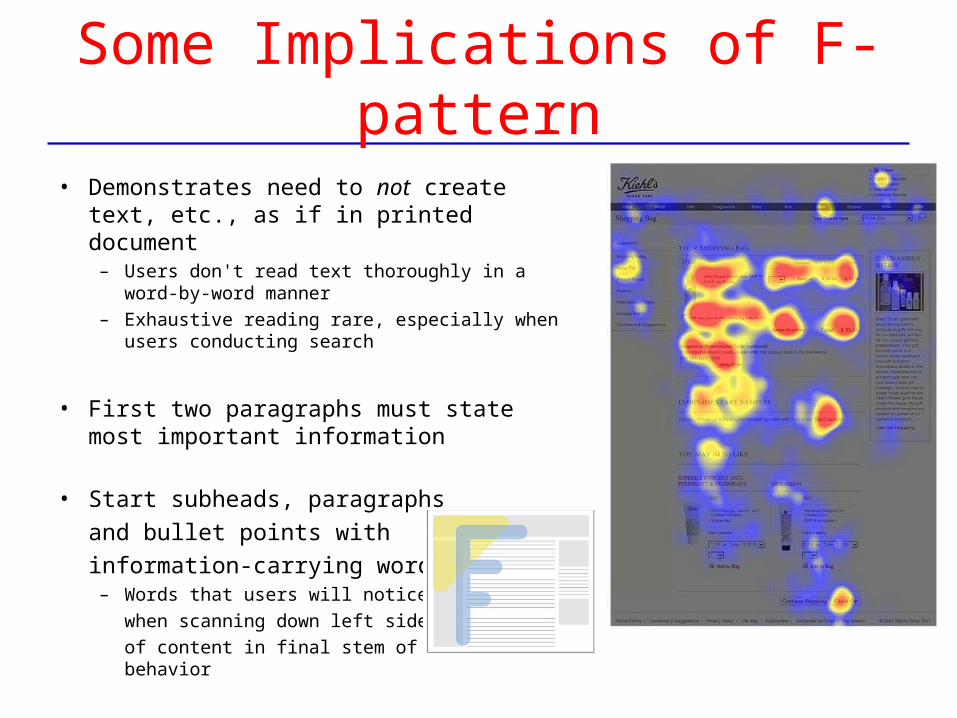
Some Implications of F-pattern
• Demonstrates need to not create text, etc., as if in printed document
– Users don't read text thoroughly in a word-by-word manner
– Exhaustive reading rare, especially when users conducting search
• First two paragraphs must state most important information
• Start subheads, paragraphs
and bullet points with
information-carrying words– Words that users will notice
when scanning down left side
of content in final stem of their F-behavior
User’s Expectations of Web Pages
• Users have viewed a lot of web pages
• Have developed expectations about how to efficiently find information on a web page (and in a web site)
– Recall, information foraging discussion
• This is learned behavior, just as how to read a book is a learned behavior
• Effective design should exploit what is known about learned behavior
• Will see some examples
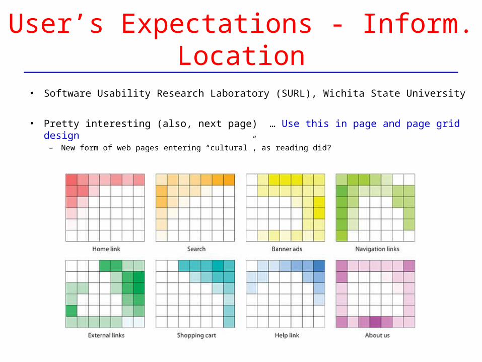
User’s Expectations - Inform. Location
• Software Usability Research Laboratory (SURL), Wichita State University
• Pretty interesting (also, next page) … Use this in page and page grid design– New form of web pages entering “cultural”, as reading did?
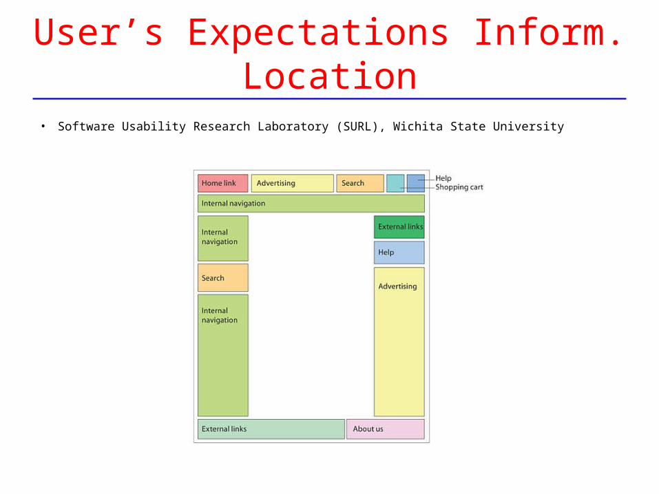
User’s Expectations Inform. Location
• Software Usability Research Laboratory (SURL), Wichita State University
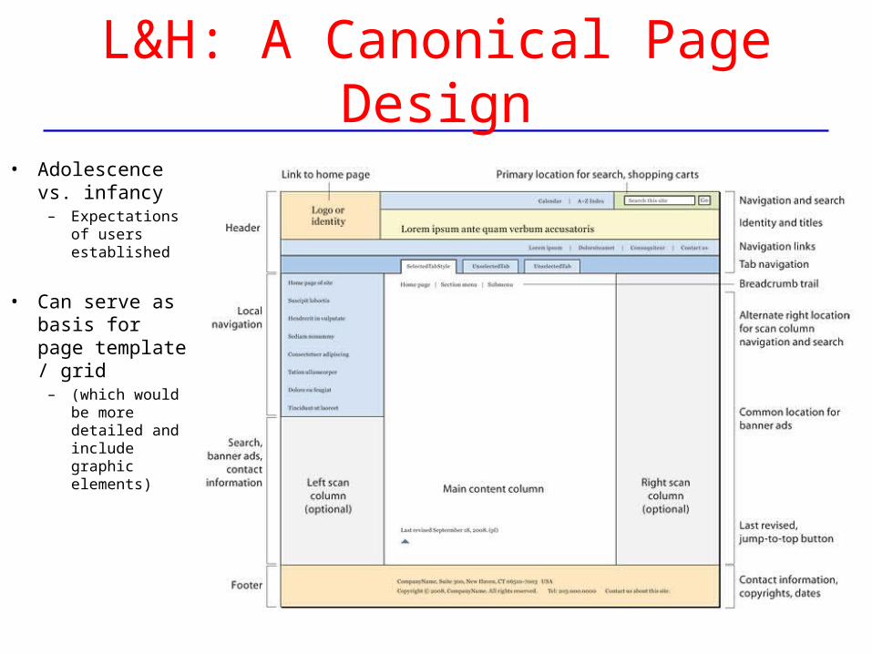
L&H: A Canonical Page Design
• Adolescence vs. infancy
– Expectations of users established
• Can serve as basis for page template / grid
– (which would be more detailed and include graphic elements)
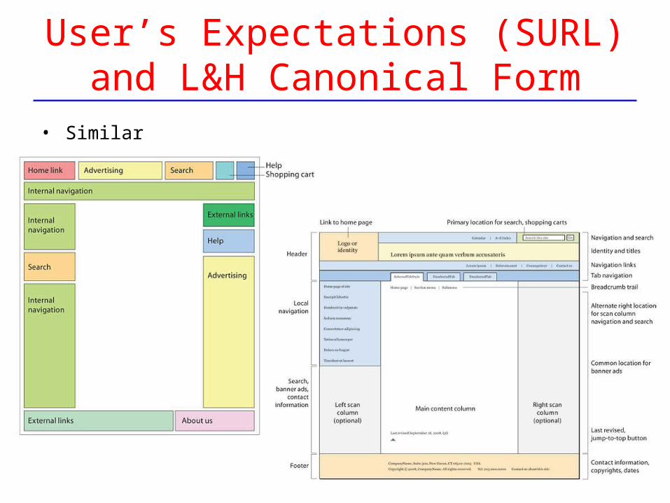
User’s Expectations (SURL)and L&H Canonical Form
• Similar
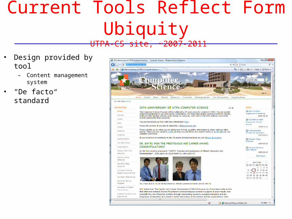
Current Tools Reflect Form Ubiquity UTPA-CS site, ~2007-2011
• Design provided by tool– Content management
system
• “De facto standard”

Current Tools Reflect Form UbiquityUTPA-CS site, ~2007-2011
• Design provided by tool– Content management
system
• “De facto standard”
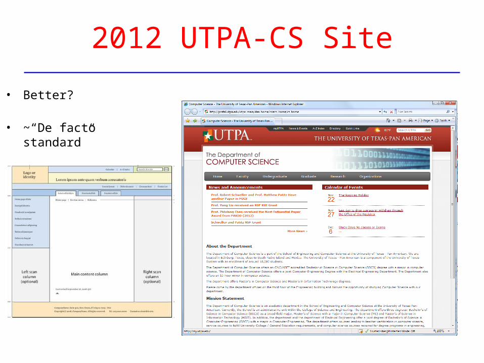
2012 UTPA-CS Site
• Better?
• ~“De facto standard”
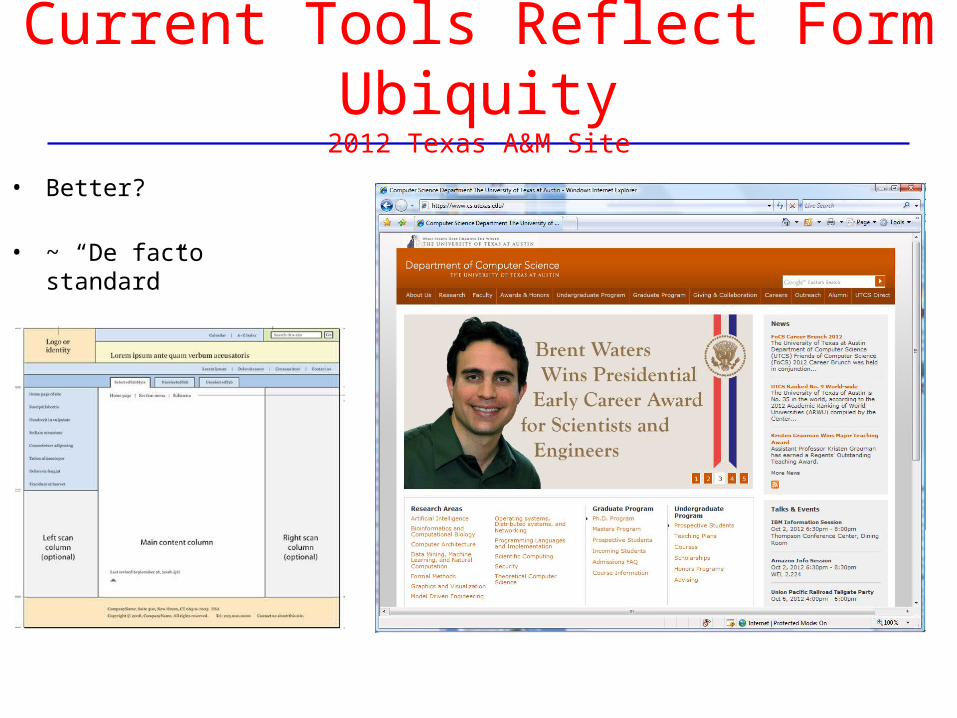
Current Tools Reflect Form Ubiquity2012 Texas A&M Site
• Better?
• ~ “De facto standard”
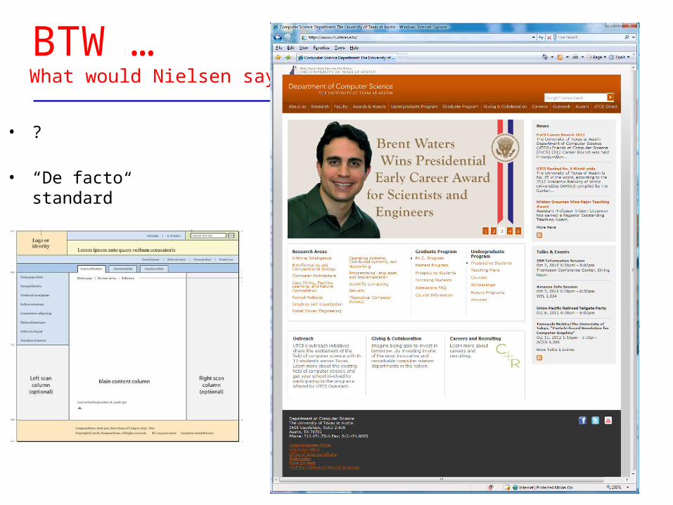
BTW … What would Nielsen say?
• ?
• “De facto standard”
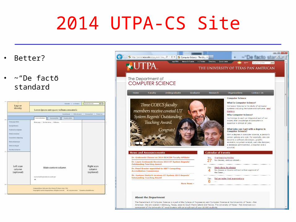
2014 UTPA-CS Site
• Better?
• ~“De facto standard”
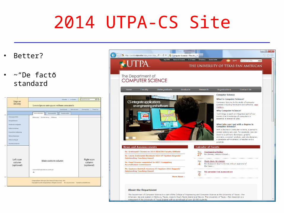
2014 UTPA-CS Site
• Better?
• ~“De facto standard”
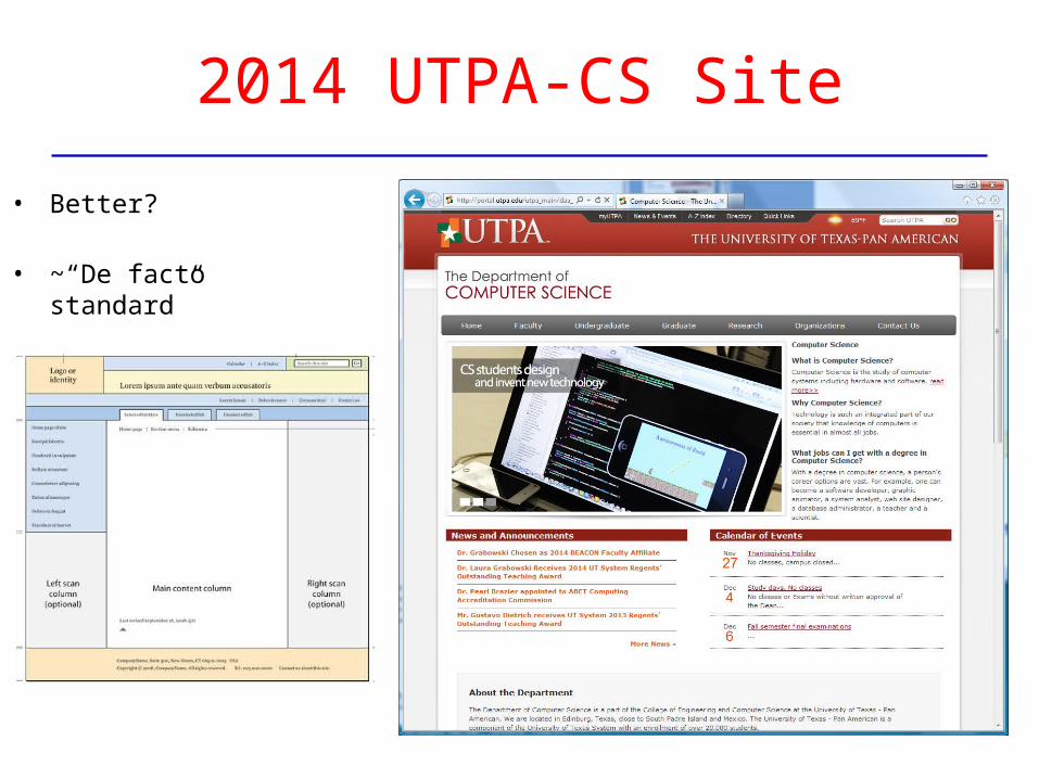
2014 UTPA-CS Site
• Better?
• ~“De facto standard”
the next 20 pages of L&H…
• More in L&H about page structure– Pretty straightforward– Details about elements of canonical design
• E.g., tabs for global navigation, orientation in navigation, checkout carts– “Scan columns” are, well, columns– “Content area” should have title, jump to top, dates, …
• Page templates– Use them, and start with internal, leaving homepage for last– Can have different types of internal pages
• 1 vs. 2 vs. 3 columns, with or without navigation
• Drop down menus – don’t use them
• Alternate “front doors”, “landing pages”, “splash screen”– Bad idea: not much real info, extra click, hard for search engines, skip them
• Note: have skipped “search engine optimization”, as well as implementation
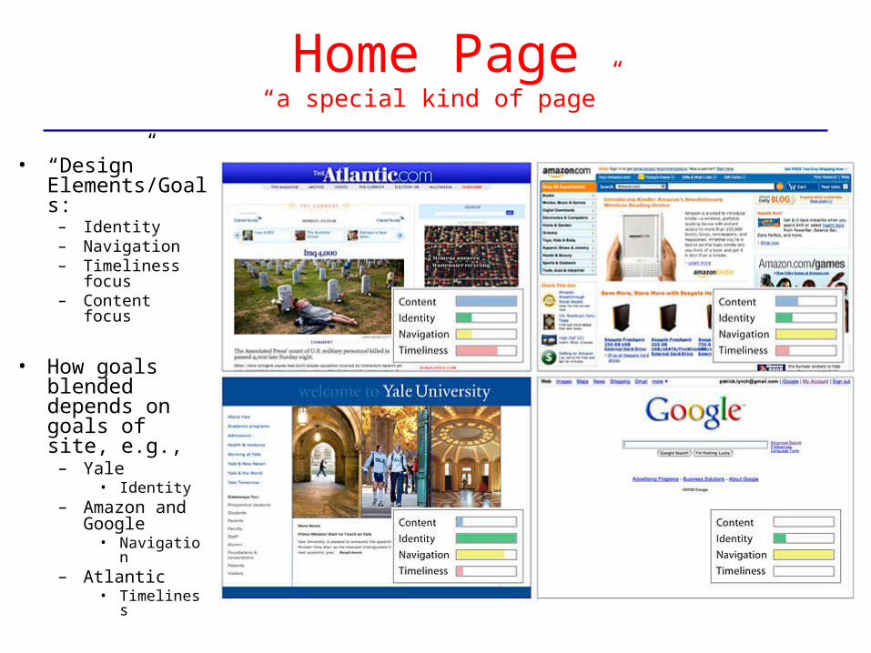
Home Page“a special kind of page”
• “Design” Elements/Goals:
– Identity– Navigation– Timeliness
focus– Content focus
• How goals blended depends on goals of site, e.g.,
– Yale • Identity
– Amazon and Google
• Navigation– Atlantic
• Timeliness
About Web Page Design
• Recall, Tim Berners-Lee created W W W to be page-oriented– I.e., the basic unit of information is the page
• … and not a bad idea, given the technology
– Book metaphor, reasonable size for transmission, etc. • HTML and things unnatural
– HTML is a “scripting” or mark-up language, as is nroff , SGML• Quite unnatural to those first using WYSIWYG editors
– Original design rationale was to allow “freedom” of browser to create mark up elements in a particular style
• Browser, in fact, is interpreter of text files with HTML, CSS, etc.
– Again, important fact is that “elements” of a page are constant across documents• e.g., Heading 1st level, emphasized text• And how exactly to display those elements are decided by browser and user
– Much of “challenge” of HTML results from deviating from this model and attempting to control exactly what is seen on screen in this stage of technology
• Cascading style sheets (css), etc. help much, but still a challenge
Page Design Introduction, L&H
• L&H introduction:
– Information sources (whether print or electronic) should convey:• clarity, order, and trustworthiness
– Spatial organization of graphics and text on Web page can: • “Engage” user with graphic impact• Prioritize information• Direct user's attention – our focus – a fundamental idea – much detail
• Fact:– People create order out of visually presented material
• indeed, people create order out of anything!
• Designer’s task is to facilitate and direct the imposition of order– Done by using “design principles” in creating pages (or anything else)– Will examine basics design – for web pages and more generally
Page Design Introduction, L&H
• Designer’s task is to facilitate and direct the imposition of order
– Done by using “design principles” in creating pages (or anything else)– Will examine basics design – for web pages and more generally
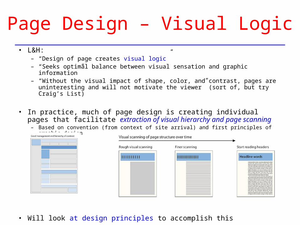
Page Design – Visual Logic• L&H:
– “Design of page creates visual logic”– “Seeks optimal balance between visual sensation and graphic information”– “Without the visual impact of shape, color, and contrast, pages are
uninteresting and will not motivate the viewer” (sort of, but try Craig’s List)
• In practice, much of page design is creating individual pages that facilitate extraction of visual hierarchy and page scanning
– Based on convention (from context of site arrival) and first principles of graphic design
• Will look at design principles to accomplish this
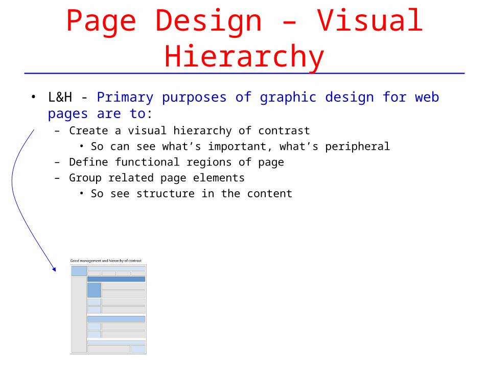
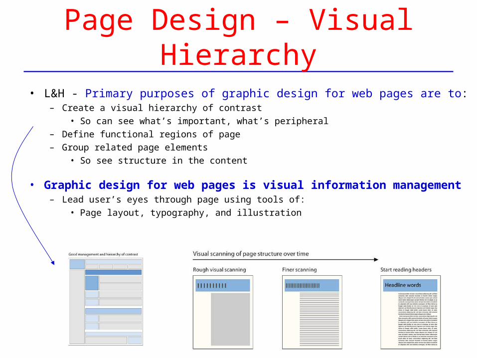
Page Design – Visual Hierarchy
• L&H - Primary purposes of graphic design for web pages are to:– Create a visual hierarchy of contrast
• So can see what’s important, what’s peripheral– Define functional regions of page– Group related page elements
• So see structure in the content
Page Design – Visual Hierarchy
• L&H - Primary purposes of graphic design for web pages are to:– Create a visual hierarchy of contrast
• So can see what’s important, what’s peripheral– Define functional regions of page– Group related page elements
• So see structure in the content
• Graphic design for web pages is visual information management – Lead user’s eyes through page using tools of:
• Page layout, typography, and illustration
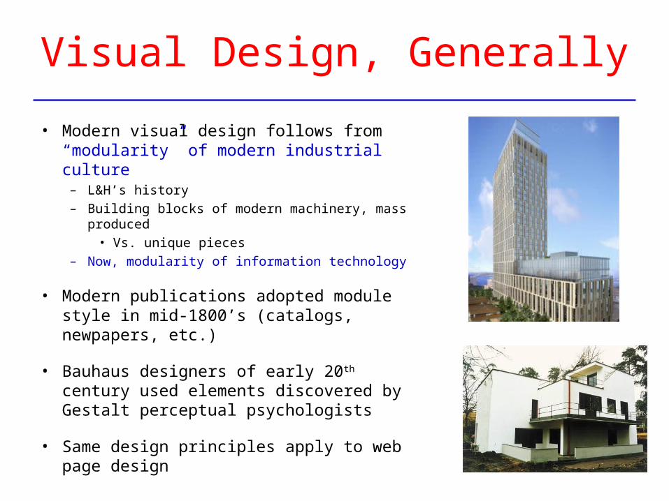
Visual Design, Generally
• Modern visual design follows from “modularity” of modern industrial culture
– L&H’s history– Building blocks of modern machinery, mass
produced• Vs. unique pieces
– Now, modularity of information technology
• Modern publications adopted module style in mid-1800’s (catalogs, newpapers, etc.)
• Bauhaus designers of early 20th century used elements discovered by Gestalt perceptual psychologists
• Same design principles apply to web page design
Gestalt LawsHow users perceptually form the “modules” (organizations) of graphic design
Gestalt LawsHow users perceptually form the “modules” (organizations) of graphic design
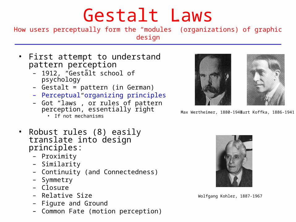
• First attempt to understand pattern perception
– 1912, “Gestalt school of psychology”– Gestalt = pattern (in German)– Perceptual organizing principles– Got “laws”, or rules of pattern perception,
essentially right• If not mechanisms
• Robust rules (8) easily translate into design principles:
– Proximity– Similarity– Continuity (and Connectedness)– Symmetry– Closure– Relative Size– Figure and Ground– Common Fate (motion perception)
Max Wertheimer, 1880-1943
Wolfgang Kohler, 1887-1967
Kurt Koffka, 1886-1941
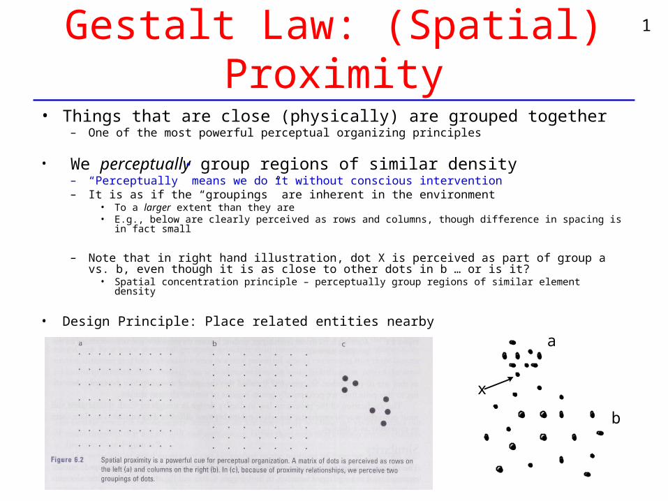
Gestalt Law: (Spatial) Proximity
• Things that are close (physically) are grouped together– One of the most powerful perceptual organizing principles
• We perceptually group regions of similar density– “Perceptually” means we do it without conscious intervention– It is as if the “groupings” are inherent in the environment
• To a larger extent than they are• E.g., below are clearly perceived as rows and columns, though difference in spacing is in fact small
– Note that in right hand illustration, dot X is perceived as part of group a vs. b, even though it is as close to other dots in b … or is it?
• Spatial concentration principle – perceptually group regions of similar element density
• Design Principle: Place related entities nearby
a
x
a
b
1
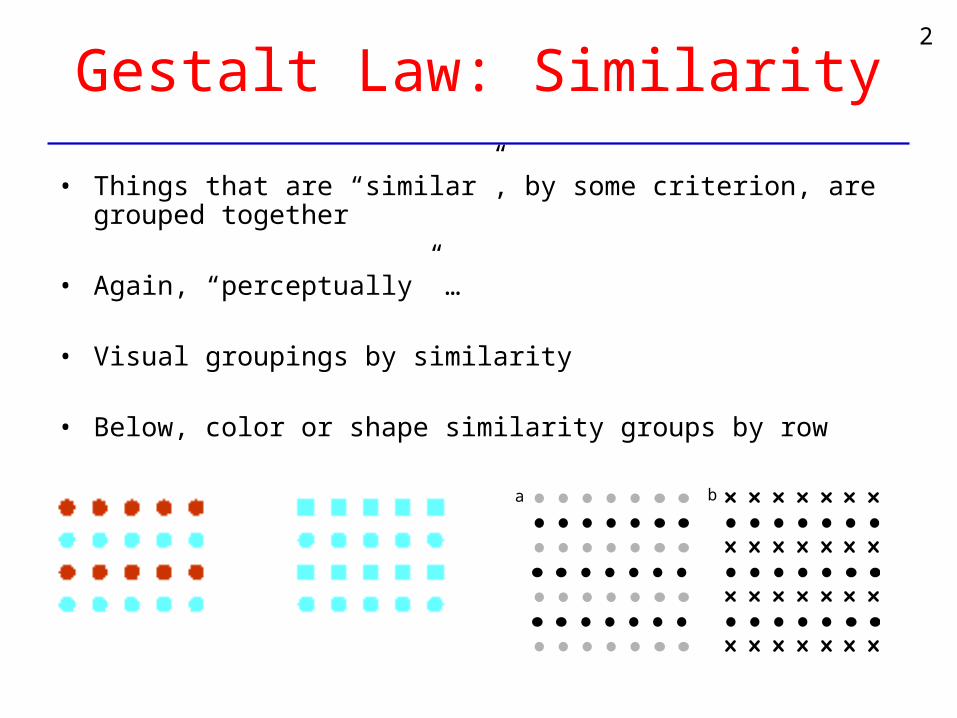
Gestalt Law: Similarity
• Things that are “similar”, by some criterion, are grouped together
• Again, “perceptually” …
• Visual groupings by similarity
• Below, color or shape similarity groups by row
a
a b
2
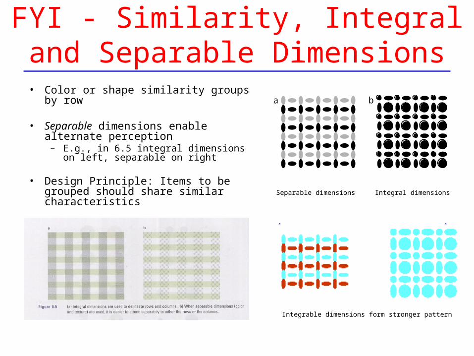
FYI - Similarity, Integral and Separable Dimensions
• Color or shape similarity groups by row
• Separable dimensions enable alternate perception
– E.g., in 6.5 integral dimensions on left, separable on right
• Design Principle: Items to be grouped should share similar characteristics
a
a b
Separable dimensions Integral dimensions
Integrable dimensions form stronger pattern
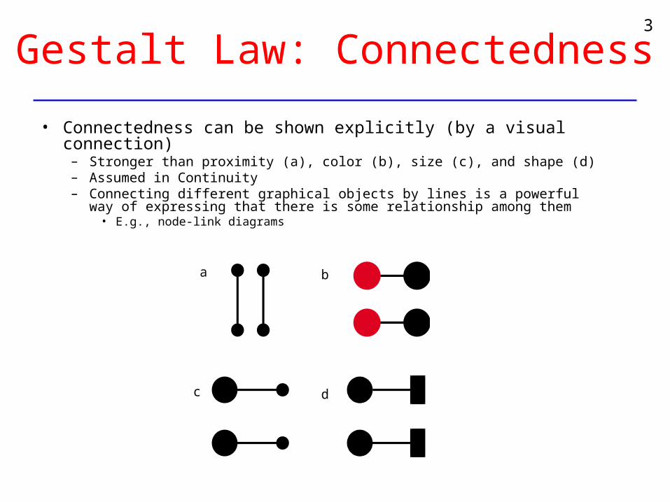
Gestalt Law: Connectedness
• Connectedness can be shown explicitly (by a visual connection)– Stronger than proximity (a), color (b), size (c), and shape (d)– Assumed in Continuity– Connecting different graphical objects by lines is a powerful way of
expressing that there is some relationship among them• E.g., node-link diagrams
a b
c d
3
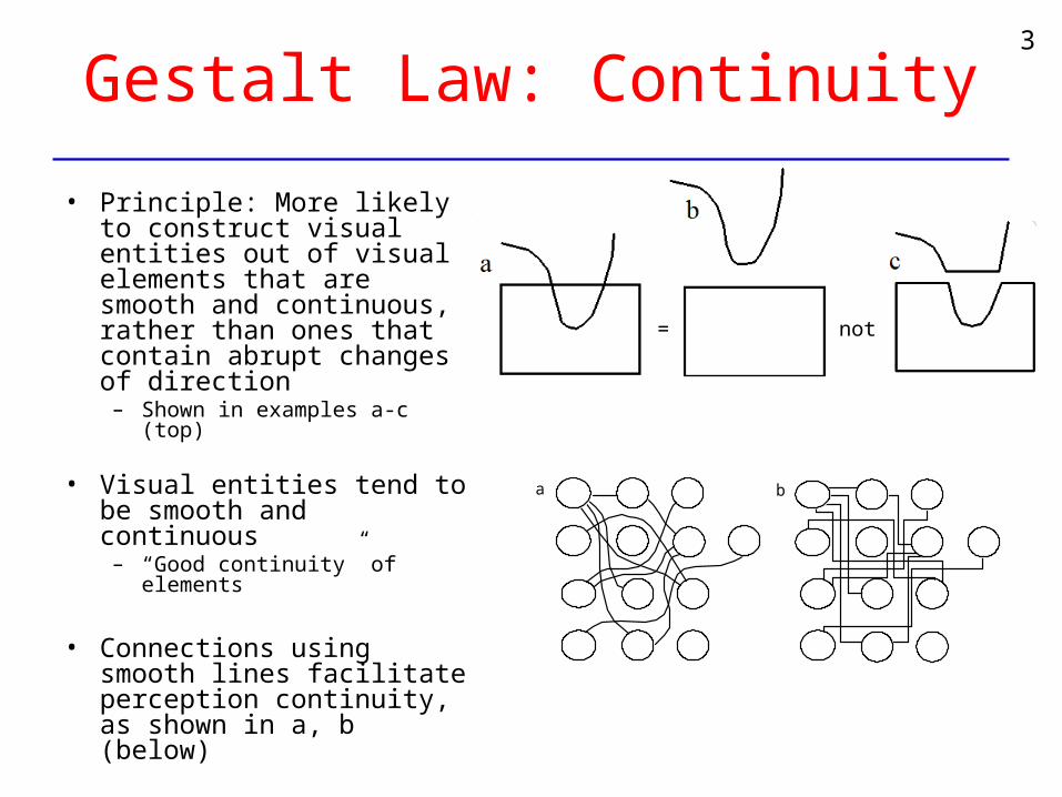
Gestalt Law: Continuity
• Principle: More likely to construct visual entities out of visual elements that are smooth and continuous, rather than ones that contain abrupt changes of direction
– Shown in examples a-c (top)
• Visual entities tend to be smooth and continuous
– “Good continuity” of elements
• Connections using smooth lines facilitate perception continuity, as shown in a, b (below)
a
a b
= not
3
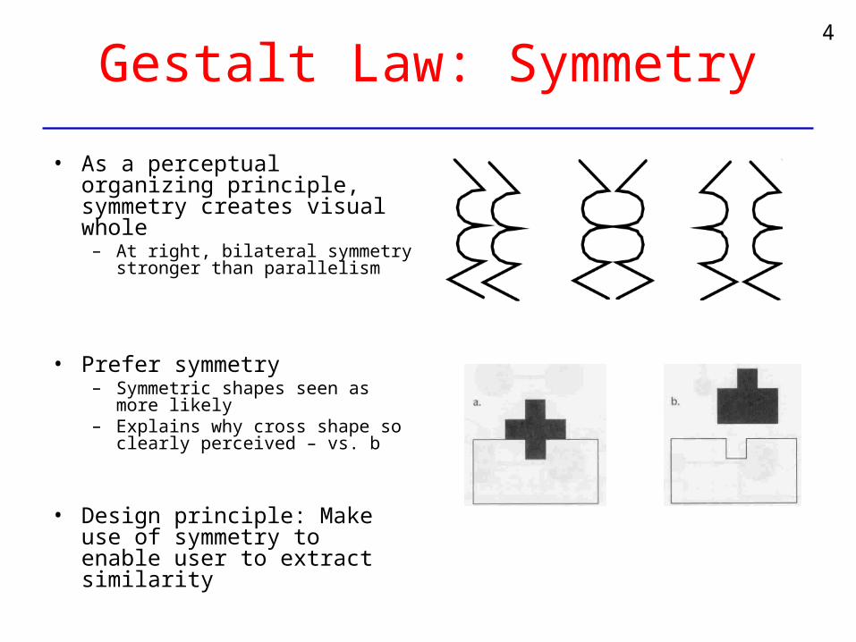
Gestalt Law: Symmetry
• As a perceptual organizing principle, symmetry creates visual whole
– At right, bilateral symmetry stronger than parallelism
• Prefer symmetry– Symmetric shapes seen as more
likely– Explains why cross shape so
clearly perceived – vs. b
• Design principle: Make use of symmetry to enable user to extract similarity
4
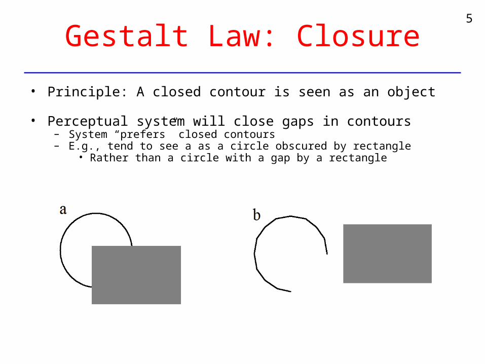
Gestalt Law: Closure
• Principle: A closed contour is seen as an object
• Perceptual system will close gaps in contours– System “prefers” closed contours– E.g., tend to see a as a circle obscured by rectangle
• Rather than a circle with a gap by a rectangle
5
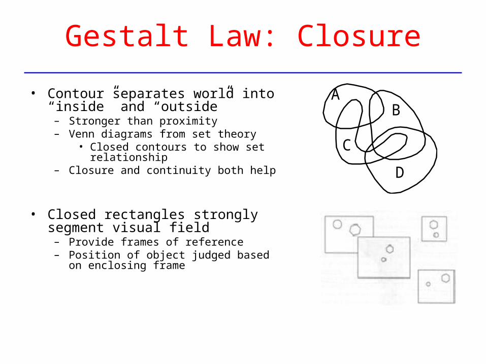
Gestalt Law: Closure
• Contour separates world into “inside” and “outside”
– Stronger than proximity– Venn diagrams from set theory
• Closed contours to show set relationship– Closure and continuity both help
• Closed rectangles strongly segment visual field
– Provide frames of reference– Position of object judged based on enclosing
frame
a
AB
C
D
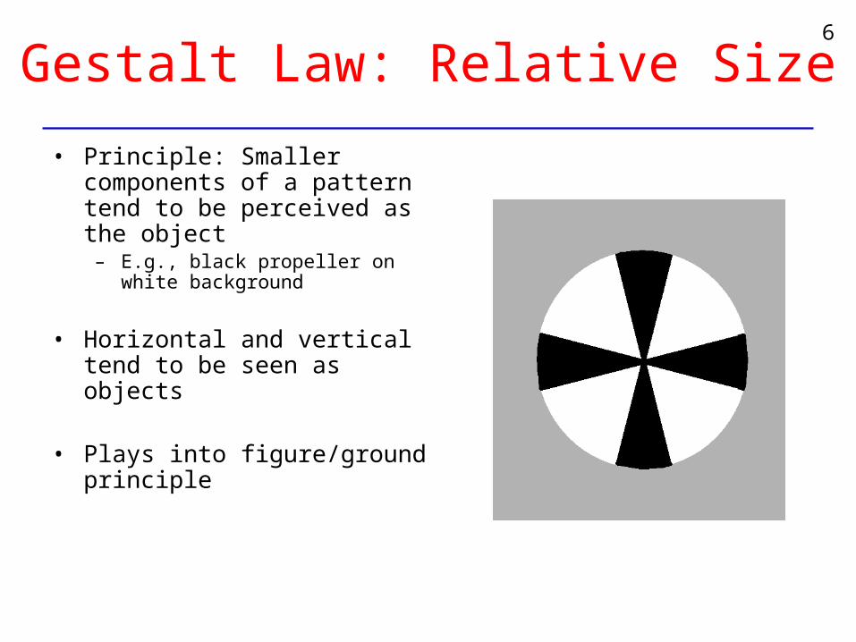
Gestalt Law: Relative Size
• Principle: Smaller components of a pattern tend to be perceived as the object
– E.g., black propeller on white background
• Horizontal and vertical tend to be seen as objects
• Plays into figure/ground principle
6
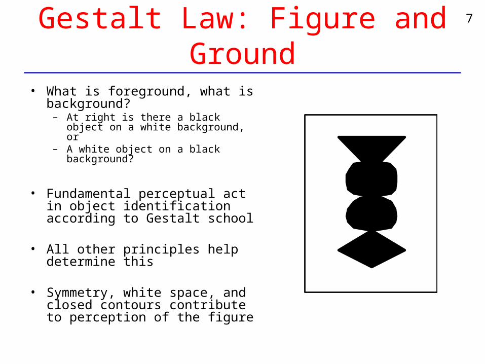
Gestalt Law: Figure and Ground
• What is foreground, what is background?
– At right is there a black object on a white background, or
– A white object on a black background?
• Fundamental perceptual act in object identification according to Gestalt school
• All other principles help determine this
• Symmetry, white space, and closed contours contribute to perception of the figure
7
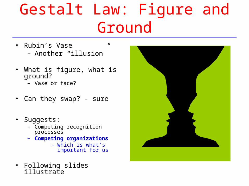
Gestalt Law: Figure and Ground
• Rubin’s Vase– Another “illusion”
• What is figure, what is ground?– Vase or face?
• Can they swap? - sure
• Suggests:– Competing recognition processes– Competing organizations
– Which is what’s important for us
• Following slides illustrate
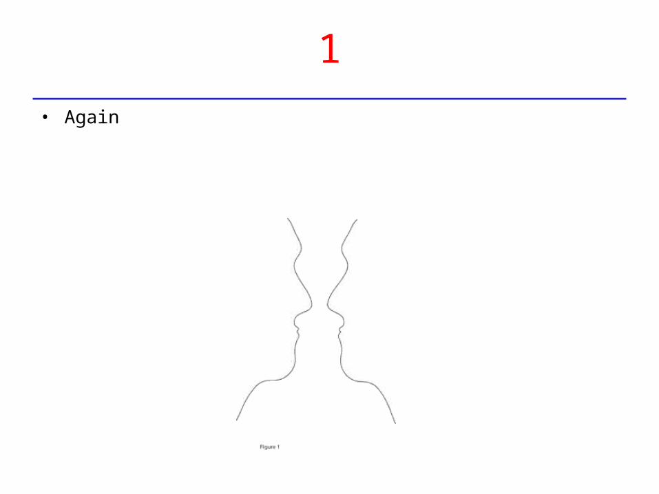
1
• Again
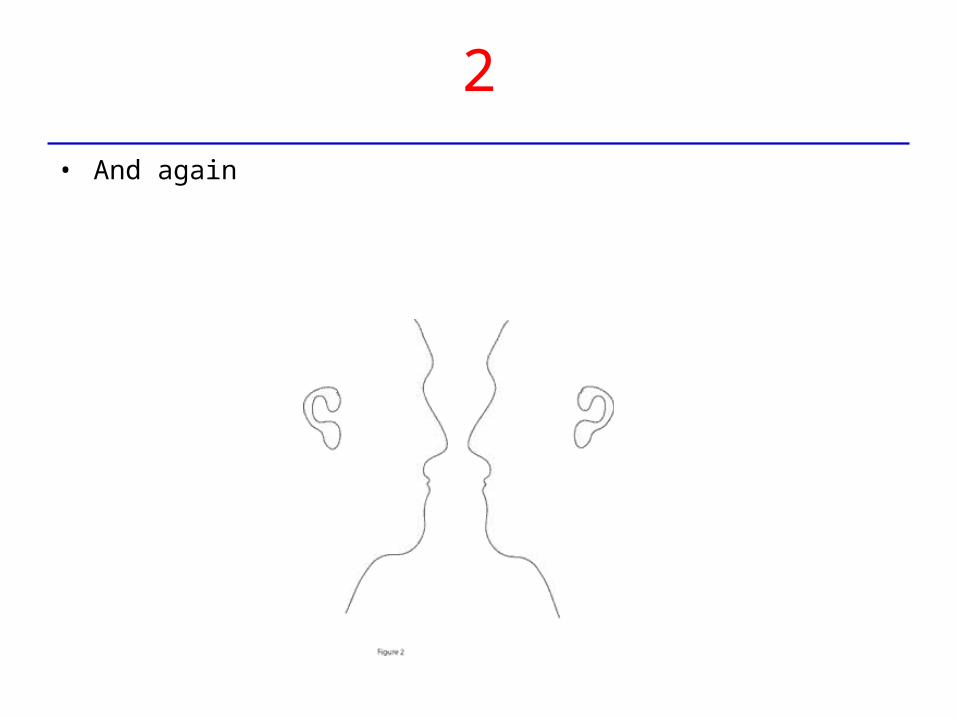
2
• And again
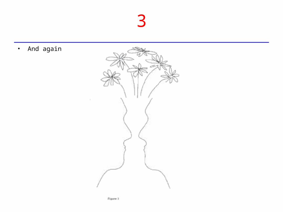
3• And again
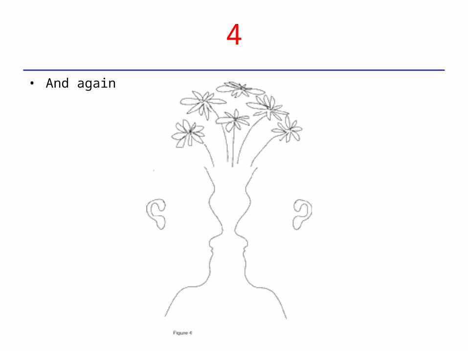
4
• And again
Page Design
Page Design
• In practice, web page design combines:
– Visual design:• Simple page grid establishes discrete functional areas
– E.g., adequate “white space" defines figure-ground relationship for page areas
– E.g., color similarity will lead to perceiving as similar (or part of group)
– Accepted (learned, evolving) conventions• Places for functionality, information are predictable• Canonical form
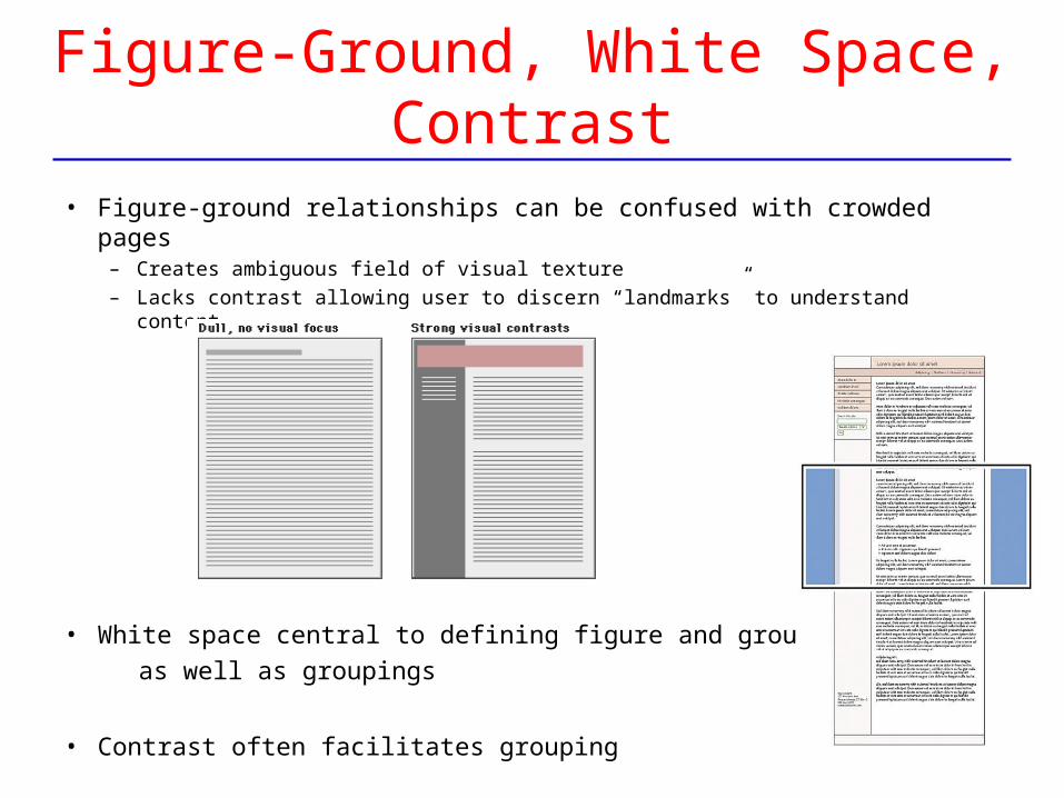
Figure-Ground, White Space, Contrast
• Figure-ground relationships can be confused with crowded pages– Creates ambiguous field of visual texture– Lacks contrast allowing user to discern “landmarks” to understand content
• White space central to defining figure and ground,
as well as groupings
• Contrast often facilitates grouping
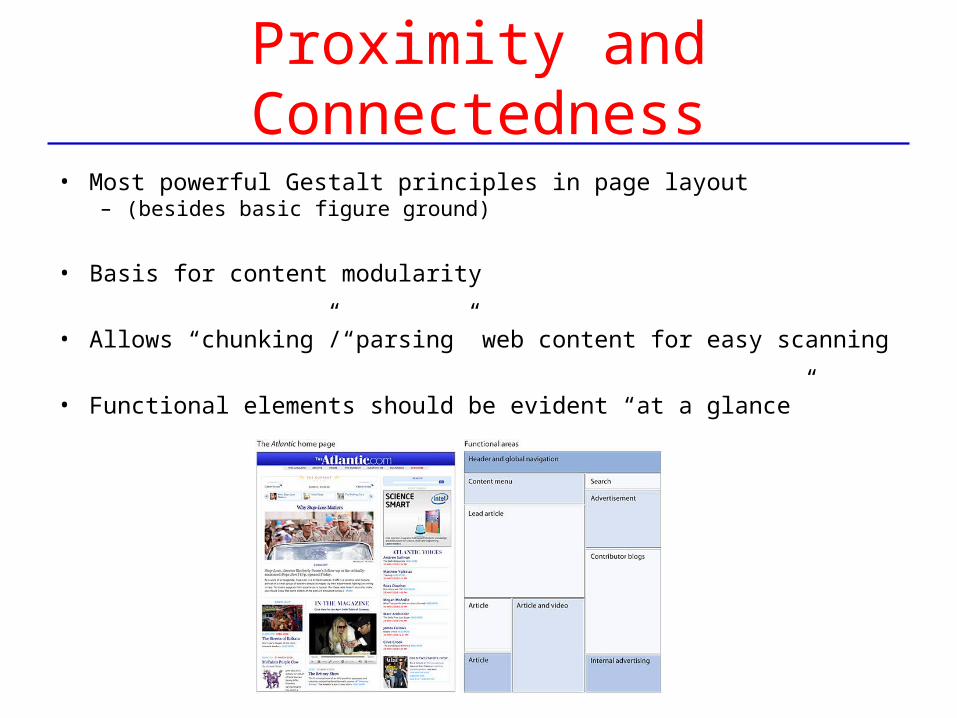
Proximity and Connectedness
• Most powerful Gestalt principles in page layout – (besides basic figure ground)
• Basis for content modularity
• Allows “chunking”/“parsing” web content for easy scanning
• Functional elements should be evident “at a glance”
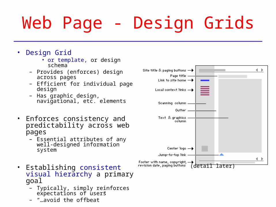
Web Page - Design Grids
• Design Grid• or template, or design schema
– Provides (enforces) design across pages
– Efficient for individual page design– Has graphic design, navigational,
etc. elements
• Enforces consistency and predictability across web pages
– Essential attributes of any well-designed information system
• Establishing consistent visual hierarchy a primary goal
– Typically, simply reinforces expectations of users
– “…avoid the offbeat”
(detail later)
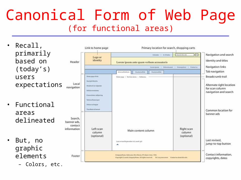
Canonical Form of Web Page(for functional areas)
• Recall, primarily based on (today’s) users expectations
• Functional areas delineated
• But, no graphic elements
– Colors, etc.
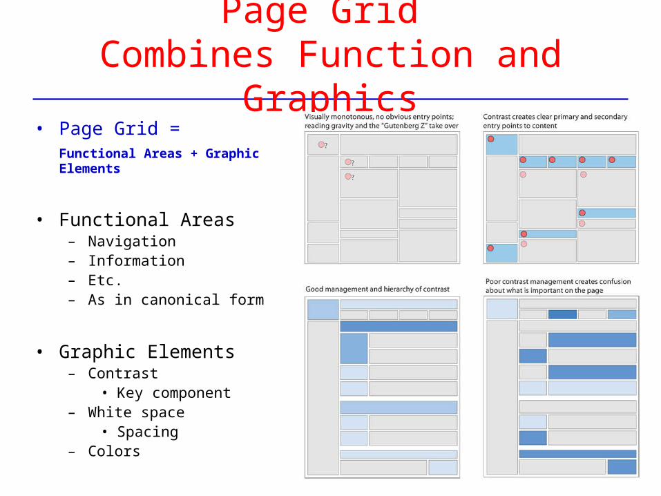
Page Grid Combines Function and Graphics
• Page Grid = Functional Areas + Graphic Elements
• Functional Areas– Navigation– Information– Etc.– As in canonical form
• Graphic Elements– Contrast
• Key component– White space
• Spacing– Colors
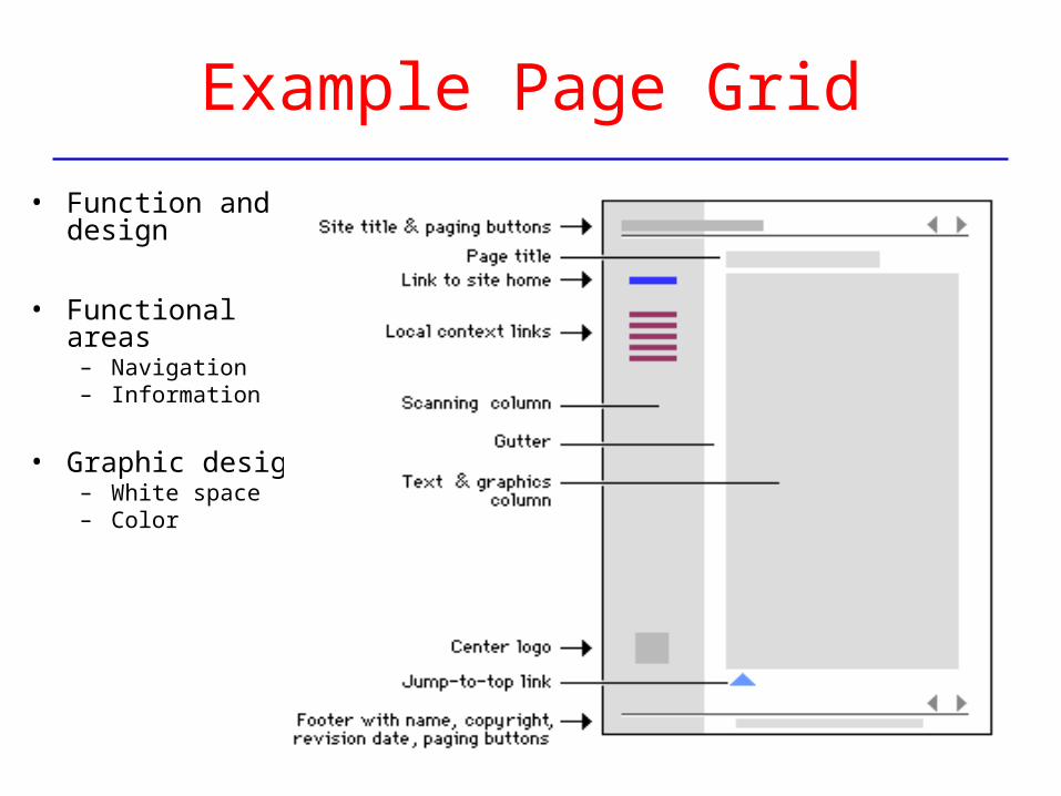
Example Page Grid
• Function and design
• Functional areas – Navigation– Information
• Graphic design– White space– Color
About “Style” … – L&H
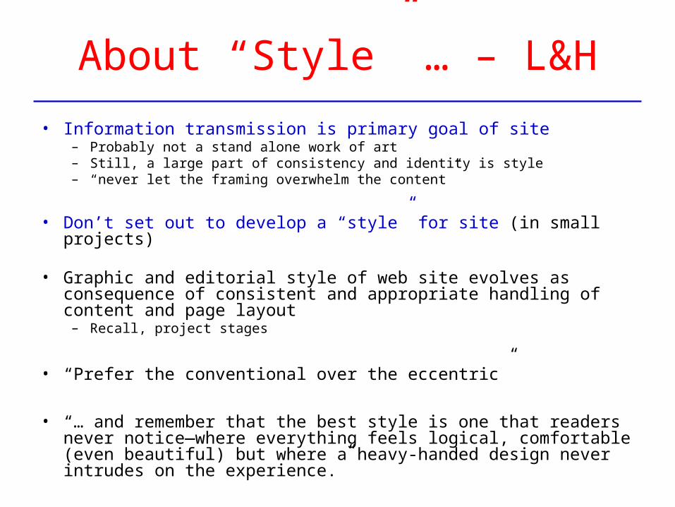
• Information transmission is primary goal of site– Probably not a stand alone work of art– Still, a large part of consistency and identity is style– “never let the framing overwhelm the content”
• Don’t set out to develop a “style” for site (in small projects)
• Graphic and editorial style of web site evolves as consequence of consistent and appropriate handling of content and page layout
– Recall, project stages
• “Prefer the conventional over the eccentric”
• “… and remember that the best style is one that readers never notice—where everything feels logical, comfortable (even beautiful) but where a heavy-handed design never intrudes on the experience.”
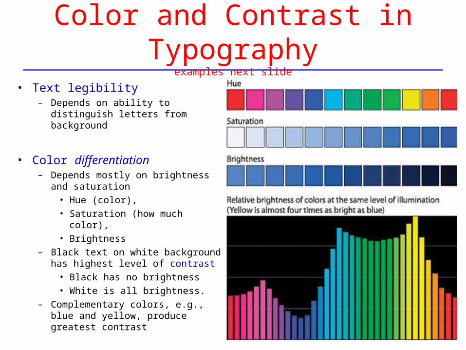
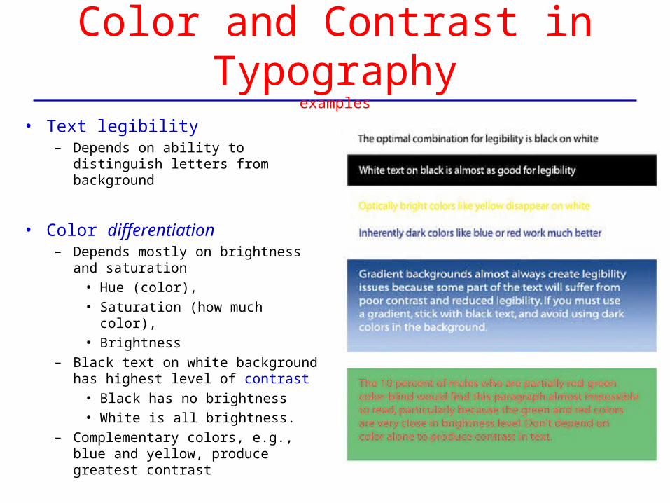
Color and Contrast in Typographyexamples next slide
• Text legibility – Depends on ability to distinguish
letters from background
• Color differentiation – Depends mostly on brightness and
saturation• Hue (color), • Saturation (how much color), • Brightness
– Black text on white background has highest level of contrast
• Black has no brightness• White is all brightness.
– Complementary colors, e.g., blue and yellow, produce greatest contrast
Color and Contrast in Typographyexamples
• Text legibility – Depends on ability to distinguish
letters from background
• Color differentiation – Depends mostly on brightness and
saturation• Hue (color), • Saturation (how much color), • Brightness
– Black text on white background has highest level of contrast
• Black has no brightness• White is all brightness.
– Complementary colors, e.g., blue and yellow, produce greatest contrast
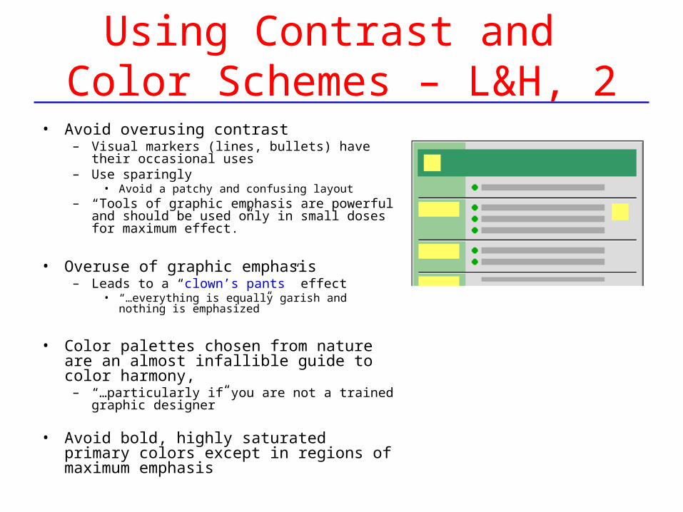
Using Contrast and Color Schemes – L&H, 1
• Avoid overusing contrast– Visual markers (lines, bullets) have their
occasional uses– Use sparingly
• Avoid a patchy and confusing layout– “Tools of graphic emphasis are powerful and
should be used only in small doses for maximum effect.”
• Overuse of graphic emphasis – Leads to a “clown’s pants” effect
• “…everything is equally garish and nothing is emphasized”
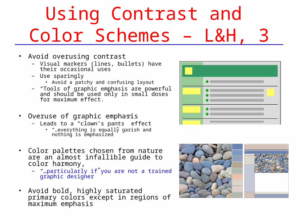
• Color palettes chosen from nature are an almost infallible guide to color harmony,
– “…particularly if you are not a trained graphic designer”
• Avoid bold, highly saturated primary colors except in regions of maximum emphasis
Using Contrast and Color Schemes – L&H, 2
• Avoid overusing contrast– Visual markers (lines, bullets) have their
occasional uses– Use sparingly
• Avoid a patchy and confusing layout– “Tools of graphic emphasis are powerful and
should be used only in small doses for maximum effect.”
• Overuse of graphic emphasis – Leads to a “clown’s pants” effect
• “…everything is equally garish and nothing is emphasized”
• Color palettes chosen from nature are an almost infallible guide to color harmony,
– “…particularly if you are not a trained graphic designer”
• Avoid bold, highly saturated primary colors except in regions of maximum emphasis
Using Contrast and Color Schemes – L&H, 3
• Avoid overusing contrast– Visual markers (lines, bullets) have their
occasional uses– Use sparingly
• Avoid a patchy and confusing layout– “Tools of graphic emphasis are powerful and
should be used only in small doses for maximum effect.”
• Overuse of graphic emphasis – Leads to a “clown’s pants” effect
• “…everything is equally garish and nothing is emphasized”
• Color palettes chosen from nature are an almost infallible guide to color harmony,
– “…particularly if you are not a trained graphic designer”
• Avoid bold, highly saturated primary colors except in regions of maximum emphasis
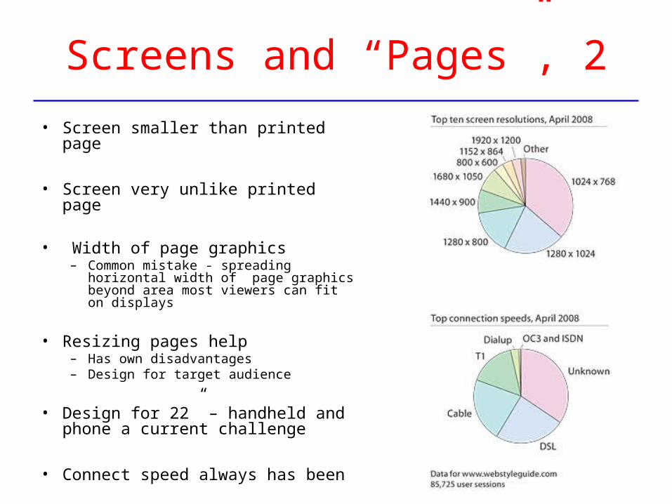
Screens and “Pages”, 1
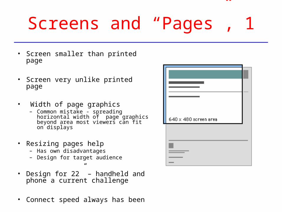
• Screen smaller than printed page
• Screen very unlike printed page
• Width of page graphics– Common mistake - spreading
horizontal width of page graphics beyond area most viewers can fit on displays
• Resizing pages help– Has own disadvantages– Design for target audience
• Design for 22” – handheld and phone a current challenge
• Connect speed always has been
Screens and “Pages”, 2
• Screen smaller than printed page
• Screen very unlike printed page
• Width of page graphics– Common mistake - spreading
horizontal width of page graphics beyond area most viewers can fit on displays
• Resizing pages help– Has own disadvantages– Design for target audience
• Design for 22” – handheld and phone a current challenge
• Connect speed always has been
Design for Screens of Information
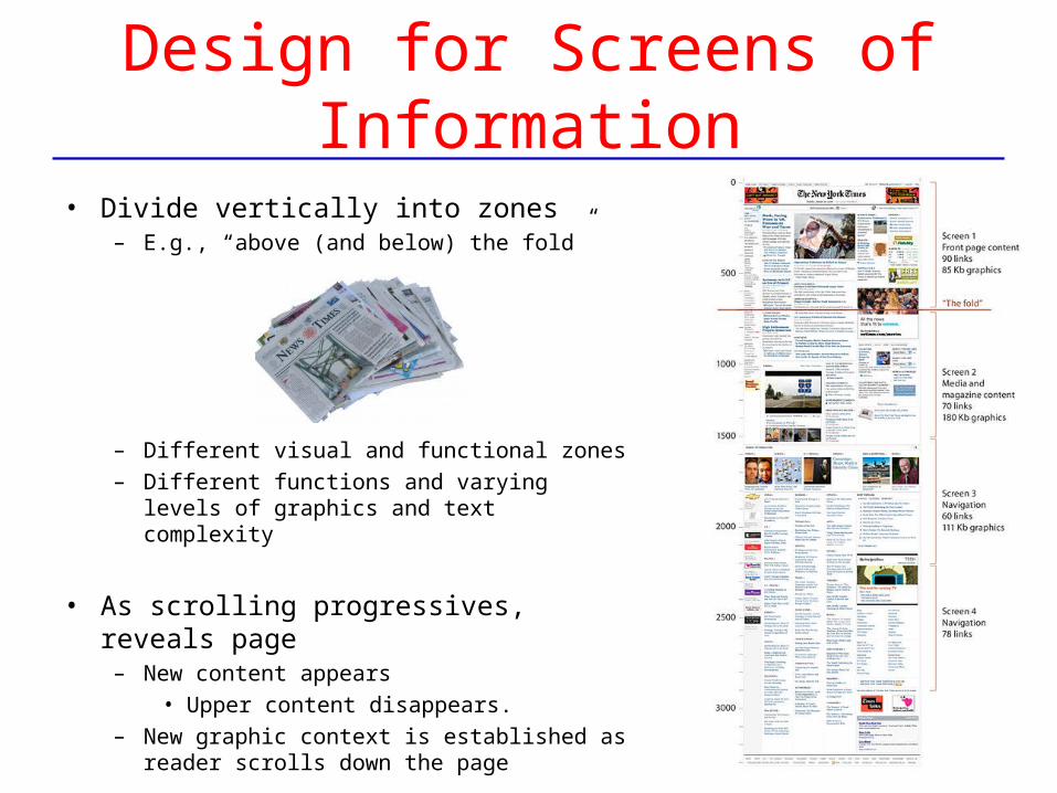
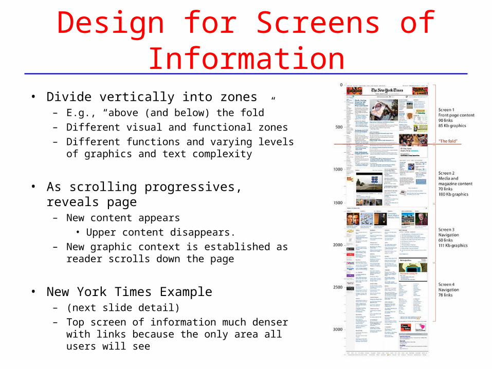
• Divide vertically into zones– E.g., “above (and below) the fold”
– Different visual and functional zones– Different functions and varying levels of
graphics and text complexity
• As scrolling progressives, reveals page– New content appears
• Upper content disappears. – New graphic context is established as reader
scrolls down the page
Design for Screens of Information
• Divide vertically into zones– E.g., “above (and below) the fold” – Different visual and functional zones– Different functions and varying levels of
graphics and text complexity
• As scrolling progressives, reveals page– New content appears
• Upper content disappears. – New graphic context is established as reader
scrolls down the page
• New York Times Example– (next slide detail) – Top screen of information much denser with
links because the only area all users will see
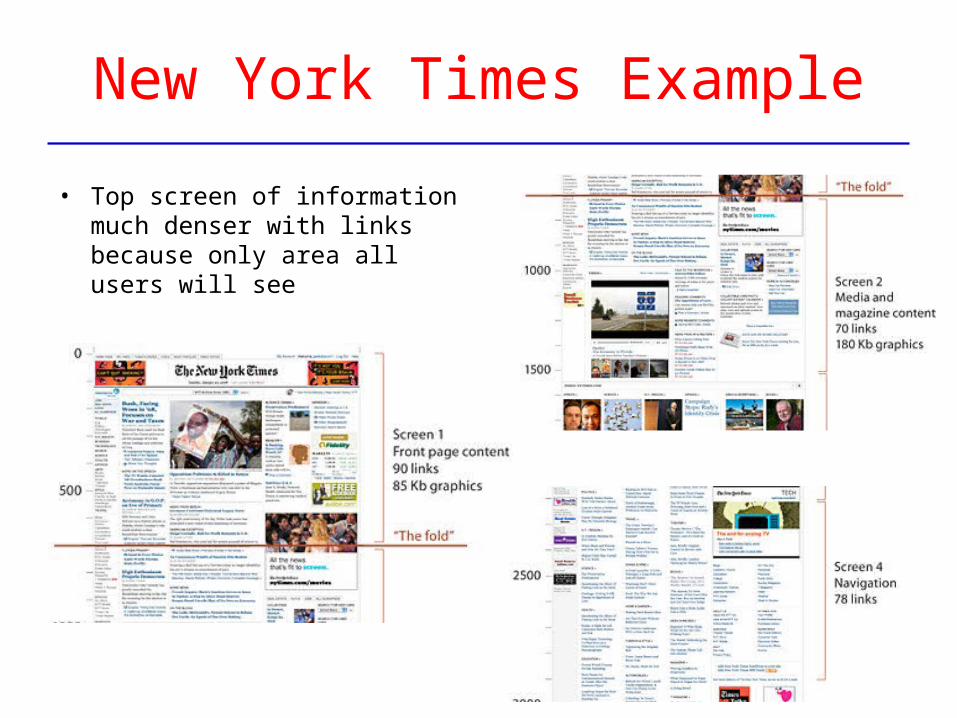
New York Times Example
• Top screen of information much denser with links because only area all users will see
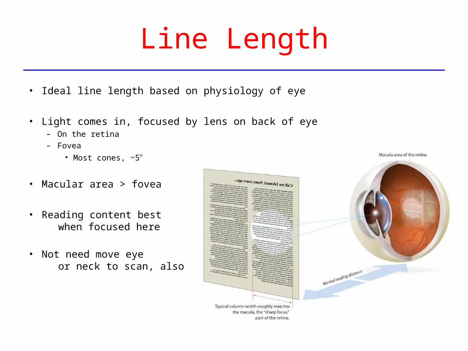
Line Length
• Ideal line length based on physiology of eye
• Light comes in, focused by lens on back of eye– On the retina– Fovea
• Most cones, ~5o
• Macular area > fovea
• Reading content best when focused here
• Not need move eye or neck to scan, also
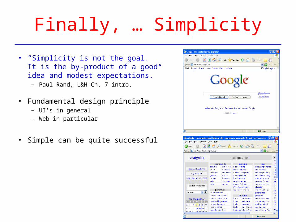
Finally, … Simplicity
• “Simplicity is not the goal. It is the by-product of a good idea and modest expectations.”
– Paul Rand, L&H Ch. 7 intro.
• Fundamental design principle– UI’s in general– Web in particular
• Simple can be quite successful
End

![M100 LED Direct [L10] · PDF fileLED MR16 downlight. DM. 6,7. eldoLED SOLOdrive 0-10V (Linear) Driver. DML. 6,7. eldoLED SOLOdrive 0-10V (Logarithmic) DMD. 6,7. eldoLED DALI (Logarithmic)](https://img.pdfslide.us/doc/110x75/5ab8c7537f8b9ac10d8d5fdf/m100-led-direct-l10-mr16-downlight-dm-67-eldoled-solodrive-0-10v-linear.jpg)