Embed Size (px)
Citation preview

Descriptive Statistics
(Level IV Graduate Math)
Draft
(NSSAL)
C. David Pilmer
©2011
(Last Updated: April 2015)

This resource is the intellectual property of the Adult Education Division of the Nova Scotia
Department of Labour and Advanced Education.
The following are permitted to use and reproduce this resource for classroom purposes.
Nova Scotia instructors delivering the Nova Scotia Adult Learning Program
Canadian public school teachers delivering public school curriculum
Canadian non-profit tuition-free adult basic education programs
Nova Scotia Community College instructors
The following are not permitted to use or reproduce this resource without the written
authorization of the Adult Education Division of the Nova Scotia Department of Labour and
Advanced Education.
Upgrading programs at post-secondary institutions (exception: NSCC)
Core programs at post-secondary institutions (exception: NSCC)
Public or private schools outside of Canada
Basic adult education programs outside of Canada
Individuals, not including teachers or instructors, are permitted to use this resource for their own
learning. They are not permitted to make multiple copies of the resource for distribution. Nor
are they permitted to use this resource under the direction of a teacher or instructor at an
unauthorized learning institution.
Acknowledgments
The Adult Education Division would also like to thank the following NSCC instructors for
reviewing this resource and offering suggestions during its development.
Eileen Burchill (IT Campus)
Nancy Harvey (Akerley Campus)
Eric Tetford (Burridge Campus)
Tanya Tuttle-Comeau (Cumberland Campus)
Alice Veenema (Kingstec Campus)
NSSAL i Draft
©2011 C. D. Pilmer
Table of Contents
Introduction…………………………………………………………………………... ii
Negotiated Completion Date…………………………………………………………. ii
The Big Picture……………………………………………………………………….
Course Timelines……………………………………………………………………..
iii
iv
Populations and Samples ……………………………………………………………. 1
Tables ………………………………………………………………………………... 3
Types of Data ……………………………………………………………………….. 5
Bar Graphs and Histograms ………………………………………………………… 7
Circle Graphs and Line Graphs ……………………………………………………… 15
First Impressions ……………………………………………………………………. 20
Second Impressions …………………………………………………………………. 22
What Type of Graph Should be Used ………………………………………………. 24
Mean, Median, Mode, and Trimmed Mean …………………………………………. 26
Box and Whisker Plots ………………………………………………………………. 34
Using Technology to Make Box and Whisker Plots ………………………………… 41
Standard Deviation …………………………………………………………………... 46
Using Technology to Calculate Population Standard Deviation …………………….. 52
Distributions …………………………………………………………………………. 57
Normal Distributions and the 68-95-99.7 Rule ……………………………………… 60
Z-Scores ……………………………………………………………………………… 68
Growth Charts ……………………………………………………………………….. 80
Putting It Together …………………………………………………………………… 85
Appendix
Area Under the Normal Curve (z-Table) …………………………………………….. 96
The 68-95-99.7 Rule Reference Page ……………………………………………….. 97
Weight-for-Age Percentiles: Boys …………………………………………………... 98
Length-for-Age Percentiles: Boys …………………………………………………… 99
Head Circumference-for-Age: Boys ………………………………………………… 100
Post-Unit Reflections ………………………………………………………………… 101
Soft Skills Rubric ……………………………………………………………………. 102
Answers ……………………………………………………………………………… 103
NSSAL ii Draft
©2011 C. D. Pilmer
Introduction
Statistics is the discipline concerned with the collection, organization, and analysis of data to
draw conclusions or make predictions. Statistics is widely employed in government, business,
and the natural and social sciences. In this unit we will focus on descriptive statistics; the
branch of statistics that deals with the description of data. In the first part of the unit, we will
look at the different ways data can be presented using graphs (e.g. bar graphs, histograms, circle
graphs, line graphs,…) and how these graphs can be interpreted. In the next part of the unit we
will learn how to determine and interpret measures of central tendency and standard deviation.
In descriptive statistics, we must differentiate between two important terms; population and
sample. A population is the set representing all measurements of interest to an investigator. A
sample is a subset of measurements selected randomly from the population of interest. It is
probably easier to look at these terms in the following way. Suppose you wanted to know the
average income of working adults in your community. If you asked every working adult in the
community, then you are dealing with the population. If, however, you randomly selected and
interviewed only a portion of the working adults in your community, then you are dealing with a
sample. For the sake of simplicity, this unit will only focus on populations. For example, if one
of the questions supplies student scores on a test, you will assume that these scores represent all
the student scores, not a randomly selected portion of the scores.
The other branch of statistics that we have not discussed is inferential statistics. In the case of
inferential statistics one makes inferences about population characteristics based on evidence
drawn from samples. Translated you take a random sample from a population and use the
information collected from that small sample to make a prediction about the much larger
population. For example if you wanted to know how much time Nova Scotian adults between
the ages of 20 years and 40 years of age spent watching television on weekdays, it would be
impractical to collect data from every NS adult in that age group. It would be very challenging,
time-consuming, and expensive. It would make more sense to randomly select 300 adults from
that age group, collect the data, analyze the data, and use that data to predict the average number
of hours all NS adults in that age group view television on weekdays. Although inferential
statistics is an extremely important branch of statistics, it goes beyond what is needed for a
graduate level math course. Inferential statistics is, however, examined in the Academic Level
IV Math course.
Negotiated Completion Date
After working for a few days on this unit, sit down with your instructor and negotiate a
completion date for this unit.
Start Date: _________________
Completion Date: _________________
Instructor Signature: __________________________
Student Signature: __________________________
NSSAL iii Draft
©2011 C. D. Pilmer
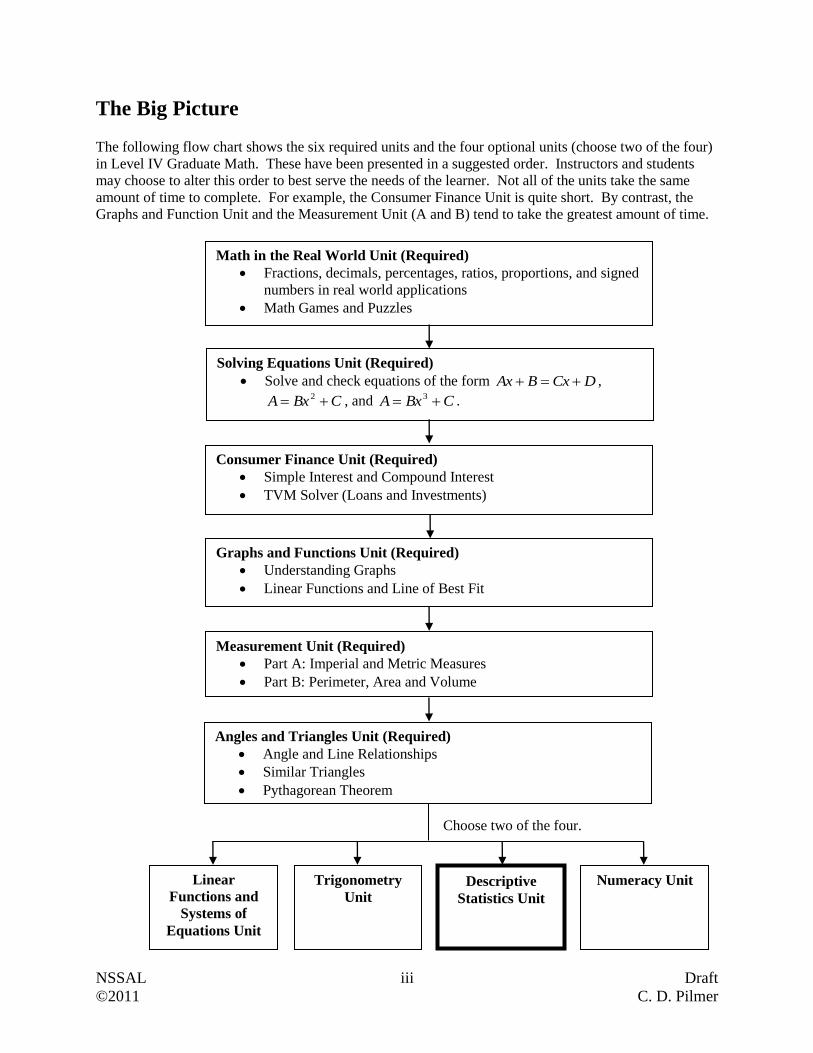
The Big Picture The following flow chart shows the six required units and the four optional units (choose two of the four)
in Level IV Graduate Math. These have been presented in a suggested order. Instructors and students
may choose to alter this order to best serve the needs of the learner. Not all of the units take the same
amount of time to complete. For example, the Consumer Finance Unit is quite short. By contrast, the
Graphs and Function Unit and the Measurement Unit (A and B) tend to take the greatest amount of time.
Math in the Real World Unit (Required)
Fractions, decimals, percentages, ratios, proportions, and signed
numbers in real world applications
Math Games and Puzzles
Solving Equations Unit (Required)
Solve and check equations of the form DCxBAx ,
CBxA 2 , and CBxA 3 .
Consumer Finance Unit (Required)
Simple Interest and Compound Interest
TVM Solver (Loans and Investments)
Graphs and Functions Unit (Required)
Understanding Graphs
Linear Functions and Line of Best Fit
Measurement Unit (Required)
Part A: Imperial and Metric Measures
Part B: Perimeter, Area and Volume
Choose two of the four.
Linear
Functions and
Systems of
Equations Unit
Trigonometry
Unit Descriptive
Statistics Unit
Numeracy Unit
Angles and Triangles Unit (Required) Angle and Line Relationships
Similar Triangles
Pythagorean Theorem

NSSAL iv Draft
©2011 C. D. Pilmer
Course Timelines
Graduate Level IV Math is a two credit course within the Adult Learning Program. As a two
credit course, learners are expected to complete 200 hours of course material. Since most ALP
math classes meet for 6 hours each week, the course should be completed within 35 weeks. The
curriculum developers have worked diligently to ensure that the course can be completed within
this time span. Below you will find a chart containing the unit names and suggested completion
times. The hours listed are classroom hours.
Unit Name Minimum
Completion Time
in Hours
Maximum
Completion Time
in Hours
Math in the Real World Unit 24 34
Solving Equations Unit 20 28
Consumer Finance Unit 15 18
Graphs and Functions Unit 25 30
Measurement Unit (A & B) 22 30
Angles and Triangles Unit 14 16
Selected Unit #1 18 22
Selected Unit #2 18 22
Total: 156 hours Total: 200 hours
As one can see, this course covers numerous topics and for this reason may seem daunting. You
can complete this course in a timely manner if you manage your time wisely, remain focused,
and seek assistance from your instructor when needed.
NSSAL 1 Draft
©2011 C. D. Pilmer
Populations and Samples
As we learned in the introduction, descriptive statistics is concerned with the description of
data. This means that we look at methods that organize data and summarize data in an effective
presentation that ultimately increases our understanding of the data.
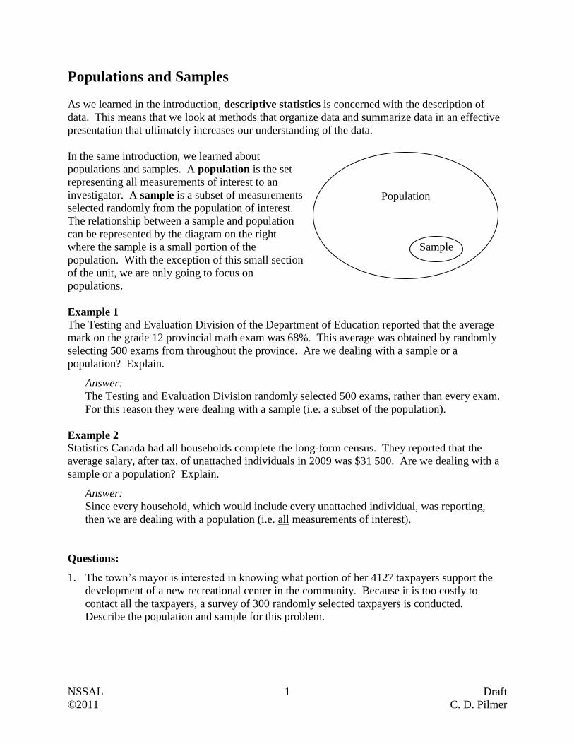
In the same introduction, we learned about
populations and samples. A population is the set
representing all measurements of interest to an
investigator. A sample is a subset of measurements
selected randomly from the population of interest.
The relationship between a sample and population
can be represented by the diagram on the right
where the sample is a small portion of the
population. With the exception of this small section
of the unit, we are only going to focus on
populations.
Example 1
The Testing and Evaluation Division of the Department of Education reported that the average
mark on the grade 12 provincial math exam was 68%. This average was obtained by randomly
selecting 500 exams from throughout the province. Are we dealing with a sample or a
population? Explain.
Answer:
The Testing and Evaluation Division randomly selected 500 exams, rather than every exam.
For this reason they were dealing with a sample (i.e. a subset of the population).
Example 2
Statistics Canada had all households complete the long-form census. They reported that the
average salary, after tax, of unattached individuals in 2009 was $31 500. Are we dealing with a
sample or a population? Explain.
Answer:
Since every household, which would include every unattached individual, was reporting,
then we are dealing with a population (i.e. all measurements of interest).
Questions:
1. The town’s mayor is interested in knowing what portion of her 4127 taxpayers support the
development of a new recreational center in the community. Because it is too costly to
contact all the taxpayers, a survey of 300 randomly selected taxpayers is conducted.
Describe the population and sample for this problem.
Population
Sample
NSSAL 2 Draft
©2011 C. D. Pilmer
2. A building contractor just purchased 6000 used bricks. He knows that a small portion of
these bricks are cracked and therefore unusable. He randomly selected 200 bricks and
discovered that 14 of them were unusable. Describe the population and sample for this
problem.
3. A company conducted a phone survey that involved 1200 randomly selected employed
workers from Nova Scotia. Each participant had to report their annual gross income. At the
time (2009) it was known that there were 453 000 employed workers in Nova Scotia. After
conducting the survey and analyzing the data, the company reported an average annual
income of 29 900 for the 1200 participants. Describe the population and sample for this
problem.
4. Between 2001 and 2009, 3730 adults obtained high school diplomas through the Nova Scotia
School for Adult Learning (NSSAL). The Nova Scotia government wanted to know how
many of these adults pursued further education after obtaining their diploma. After
interviewing 240 randomly selected graduates, it was discovered that 65% had pursued post
secondary education primarily at the Nova Scotia Community College. Describe the
population and sample for this problem.
NSSAL 3 Draft
©2011 C. D. Pilmer
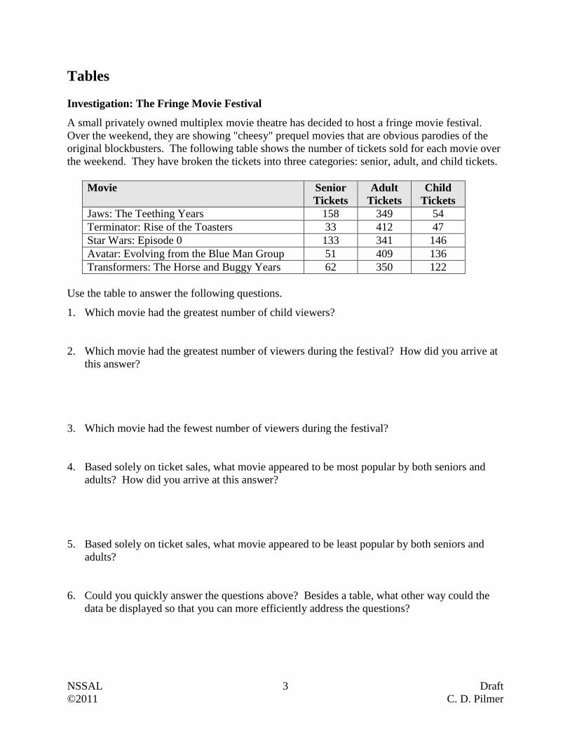
Tables
Investigation: The Fringe Movie Festival
A small privately owned multiplex movie theatre has decided to host a fringe movie festival.
Over the weekend, they are showing "cheesy" prequel movies that are obvious parodies of the
original blockbusters. The following table shows the number of tickets sold for each movie over
the weekend. They have broken the tickets into three categories: senior, adult, and child tickets.
Movie Senior
Tickets
Adult
Tickets
Child
Tickets
Jaws: The Teething Years 158 349 54
Terminator: Rise of the Toasters 33 412 47
Star Wars: Episode 0 133 341 146
Avatar: Evolving from the Blue Man Group 51 409 136
Transformers: The Horse and Buggy Years 62 350 122
Use the table to answer the following questions.
1. Which movie had the greatest number of child viewers?
2. Which movie had the greatest number of viewers during the festival? How did you arrive at
this answer?
3. Which movie had the fewest number of viewers during the festival?
4. Based solely on ticket sales, what movie appeared to be most popular by both seniors and
adults? How did you arrive at this answer?
5. Based solely on ticket sales, what movie appeared to be least popular by both seniors and
adults?
6. Could you quickly answer the questions above? Besides a table, what other way could the
data be displayed so that you can more efficiently address the questions?
NSSAL 4 Draft
©2011 C. D. Pilmer
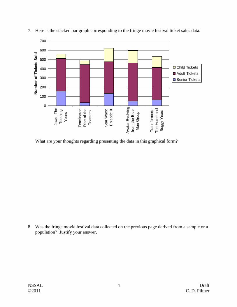
7. Here is the stacked bar graph corresponding to the fringe movie festival ticket sales data.
0
100
200
300
400
500
600
700
Jaw
s:
The
Teeth
ing
Years
Term
inato
r:
Ris
e o
f th
e
Toaste
rs
Sta
r W
ars
:
Epis
ode 0
Avata
r:E
volv
ing
from
the B
lue
Man G
roup
Tra
nsfo
rmers
:
The H
ors
e a
nd
Buggy Y
ears
Nu
mb
er
of
Tic
kets
So
ld
Child Tickets
Adult Tickets
Senior Tickets
What are your thoughts regarding presenting the data in this graphical form?
8. Was the fringe movie festival data collected on the previous page derived from a sample or a
population? Justify your answer.

NSSAL 5 Draft
©2011 C. D. Pilmer
Types of Data
In the last section we learned that data is often easier to understand if it is expressed as a graph
instead of a table. Before we can look at all the different ways data can be displayed in graphical
form (e.g. line graphs, circle graphs, histograms, …), we need to take a few minutes and learn
about the different types of data. These different types influence the type of graph that can be
used.
When data is collected, the responses can be classified as a categorical data set or a numerical
data set. These two terms are most easily explained using an example. Suppose we have an
adult education class comprised of 10 learners who all have cell phones. The instructor asks two
questions and obtains the following responses.
Question 1: What cell phone provider do you use?
Responses to Question 1:
{Telus, Bell Aliant, Telus, Bell Aliant, Rogers, Rogers, Koodo, Rogers, Telus, Rogers}
Question 2: What was your cell phone bill for the previous month?
Responses to Question 2:
{$27.80, $33.50, $45.70, $32.00, $54.90, $29.00, $43.65, $67.40, $35.89, $39.67}
The collection of responses to the first question is called a categorical data set. Categorical data
is data that can be assigned to distinct non-overlapping categories. The responses to question 1
fit into four categories; Bell Aliant, Koodo, Rogers and Telus. The collection of responses to the
second question is called a numerical data set. This is the case because the data is comprised of
numbers, specifically different amounts of money.
There are two types of numerical data; discrete and continuous. Numerical data is discrete if the
possible values are isolated points on a number line. For example, if survey participants were
asked how many phone calls they made today, their responses would be whole numbers like 0, 4
or 12. They would not respond with something like 7.8 phone calls. Since they can only report
isolated points, then we end up with discrete numerical data. Numerical data is continuous if the
set of possible values forms an entire interval on the number line. For example, if soil samples
were tested for acidity, the pH could be reported with numbers like 4, 4.17, 4.173, or any other
number in the interval. Generally continuous data arises when observations involve making
measurements (e.g. weighing objects, recording temperatures, recording time to complete
tasks,…) while discrete data arises when observations involve counting.
NSSAL 6 Draft
©2011 C. D. Pilmer
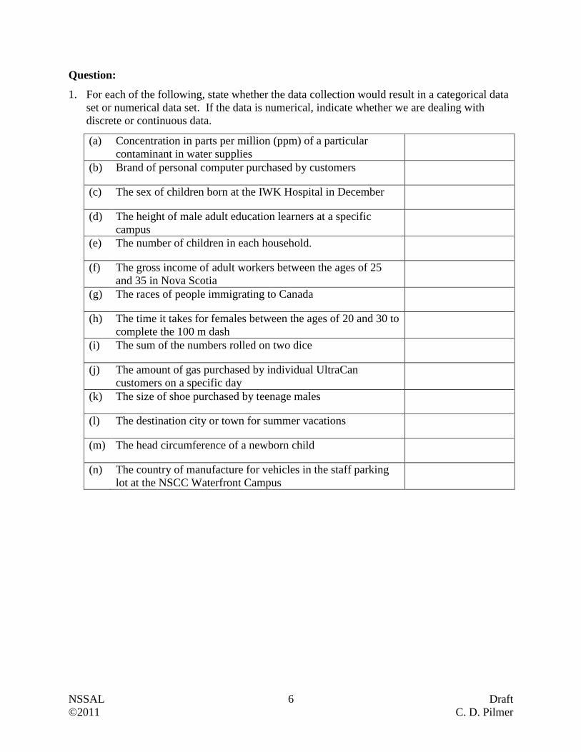
Question:
1. For each of the following, state whether the data collection would result in a categorical data
set or numerical data set. If the data is numerical, indicate whether we are dealing with
discrete or continuous data.
(a) Concentration in parts per million (ppm) of a particular
contaminant in water supplies
(b) Brand of personal computer purchased by customers
(c) The sex of children born at the IWK Hospital in December
(d) The height of male adult education learners at a specific
campus
(e) The number of children in each household.
(f) The gross income of adult workers between the ages of 25
and 35 in Nova Scotia
(g) The races of people immigrating to Canada
(h) The time it takes for females between the ages of 20 and 30 to
complete the 100 m dash
(i) The sum of the numbers rolled on two dice
(j) The amount of gas purchased by individual UltraCan
customers on a specific day
(k) The size of shoe purchased by teenage males
(l) The destination city or town for summer vacations
(m) The head circumference of a newborn child
(n) The country of manufacture for vehicles in the staff parking
lot at the NSCC Waterfront Campus
NSSAL 7 Draft
©2011 C. D. Pilmer
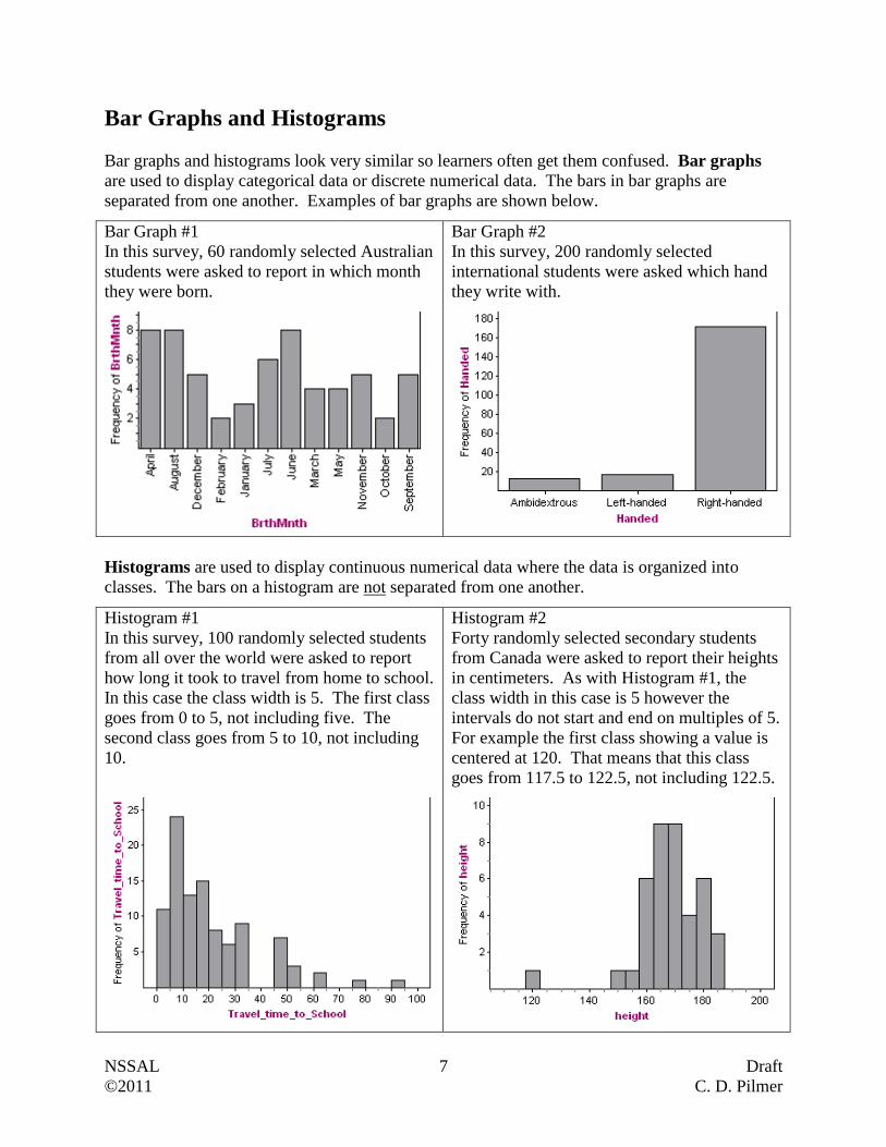
Bar Graphs and Histograms
Bar graphs and histograms look very similar so learners often get them confused. Bar graphs
are used to display categorical data or discrete numerical data. The bars in bar graphs are
separated from one another. Examples of bar graphs are shown below.
Bar Graph #1
In this survey, 60 randomly selected Australian
students were asked to report in which month
they were born.
Bar Graph #2
In this survey, 200 randomly selected
international students were asked which hand
they write with.
Histograms are used to display continuous numerical data where the data is organized into
classes. The bars on a histogram are not separated from one another.
Histogram #1
In this survey, 100 randomly selected students
from all over the world were asked to report
how long it took to travel from home to school.
In this case the class width is 5. The first class
goes from 0 to 5, not including five. The
second class goes from 5 to 10, not including
10.
Histogram #2
Forty randomly selected secondary students
from Canada were asked to report their heights
in centimeters. As with Histogram #1, the
class width in this case is 5 however the
intervals do not start and end on multiples of 5.
For example the first class showing a value is
centered at 120. That means that this class
goes from 117.5 to 122.5, not including 122.5.
NSSAL 8 Draft
©2011 C. D. Pilmer
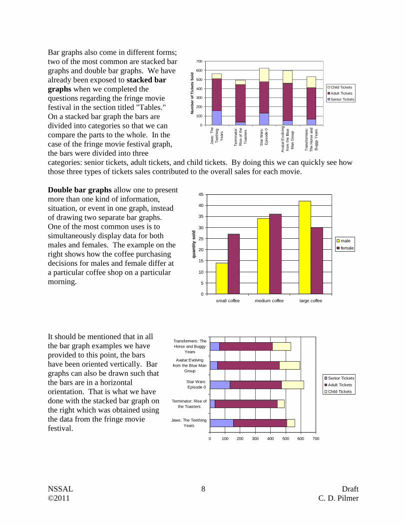
Bar graphs also come in different forms;
two of the most common are stacked bar
graphs and double bar graphs. We have
already been exposed to stacked bar
graphs when we completed the
questions regarding the fringe movie
festival in the section titled "Tables."
On a stacked bar graph the bars are
divided into categories so that we can
compare the parts to the whole. In the
case of the fringe movie festival graph,
the bars were divided into three
categories: senior tickets, adult tickets, and child tickets. By doing this we can quickly see how
those three types of tickets sales contributed to the overall sales for each movie.
Double bar graphs allow one to present
more than one kind of information,
situation, or event in one graph, instead
of drawing two separate bar graphs.
One of the most common uses is to
simultaneously display data for both
males and females. The example on the
right shows how the coffee purchasing
decisions for males and female differ at
a particular coffee shop on a particular
morning.
It should be mentioned that in all
the bar graph examples we have
provided to this point, the bars
have been oriented vertically. Bar
graphs can also be drawn such that
the bars are in a horizontal
orientation. That is what we have
done with the stacked bar graph on
the right which was obtained using
the data from the fringe movie
festival.
0
100
200
300
400
500
600
700
Jaw
s:
The
Teeth
ing
Years
Term
inato
r:
Ris
e o
f th
e
Toaste
rs
Sta
r W
ars
:
Epis
ode 0
Avata
r:E
volv
ing
from
the B
lue
Man G
roup
Tra
nsfo
rmers
:
The H
ors
e a
nd
Buggy Y
ears
Nu
mb
er
of
Tic
kets
So
ld
Child Tickets
Adult Tickets
Senior Tickets
0
5
10
15
20
25
30
35
40
45
small coffee medium coffee large coffee
qu
an
tity
so
ld
male
female
0 100 200 300 400 500 600 700
Jaws: The Teething
Years
Terminator: Rise of
the Toasters
Star Wars:
Episode 0
Avatar:Evolving
from the Blue Man
Group
Transformers: The
Horse and Buggy
Years
Senior Tickets
Adult Tickets
Child Tickets

NSSAL 9 Draft
©2011 C. D. Pilmer
Example 1
Anne tracked the additional time, in minutes, she spent outside of regular class time to work on
her five courses, over two days (Wednesday and Thursday). That information is displayed in the
graph below.
0
5
10
15
20
25
30
35
40
Biology
Com
muni
catio
ns
Mat
h
Histo
ry
Soc
iology
Min
ute
s o
f A
dd
itio
nal
Wo
rk
Wednesday
Thursday
(a) How much time did she spend on Thursday doing additional work in History?
(b) In what subject and on what day did she spend 25 minutes doing additional work?
(c) In what subject did she spend the same amount of time on Wednesday and Thursday doing
additional work?
(d) How much more time did she spend on Wednesday doing additional work in Math compared
to Thursday?
(e) How much more time did she spend on Thursday doing addition work in Biology compared
to History?
(f) How much time over the two days did she spend doing additional work in Biology and
Communications?
Answers:
(a) 10 minutes
(b) Math on Thursday
(c) Sociology (She spent 15 minutes each day)
(d) Math Wednesday: 30 minutes
Math Thursday: 25 minutes
30 - 25 = 5 minutes
(e) Biology Thursday: 20 minutes
History Thursday: 10 minutes
20 - 10 = 10 minutes
(f) 15 + 20 + 20 + 35 = 90 minutes or 1.5 hours
NSSAL 10 Draft
©2011 C. D. Pilmer
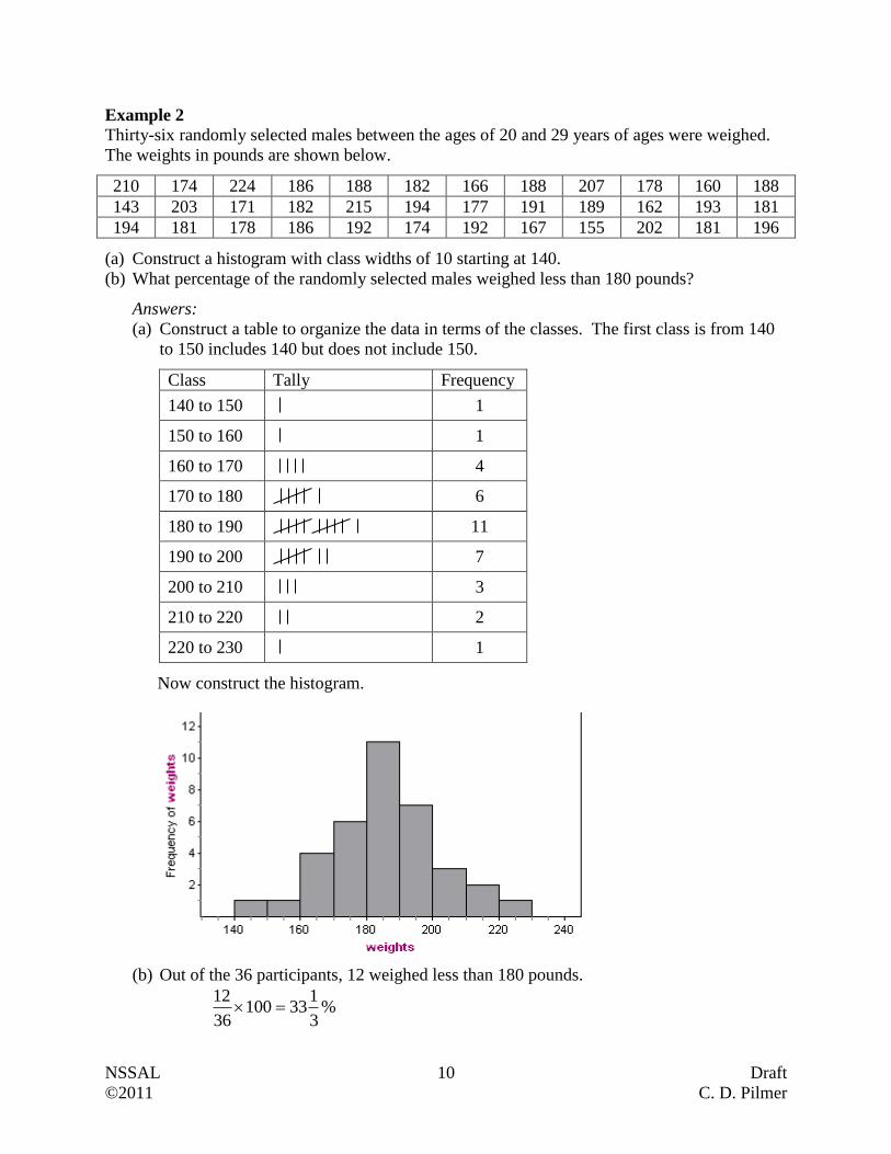
Example 2
Thirty-six randomly selected males between the ages of 20 and 29 years of ages were weighed.
The weights in pounds are shown below.
210 174 224 186 188 182 166 188 207 178 160 188
143 203 171 182 215 194 177 191 189 162 193 181
194 181 178 186 192 174 192 167 155 202 181 196
(a) Construct a histogram with class widths of 10 starting at 140.
(b) What percentage of the randomly selected males weighed less than 180 pounds?
Answers:
(a) Construct a table to organize the data in terms of the classes. The first class is from 140
to 150 includes 140 but does not include 150.
Class Tally Frequency
140 to 150
1
150 to 160
1
160 to 170
4
170 to 180
6
180 to 190
11
190 to 200
7
200 to 210
3
210 to 220
2
220 to 230
1
Now construct the histogram.
(b) Out of the 36 participants, 12 weighed less than 180 pounds.
%3
133100
36
12
NSSAL 11 Draft
©2011 C. D. Pilmer
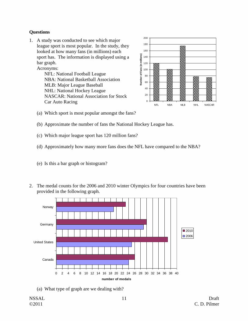
Questions
1. A study was conducted to see which major
league sport is most popular. In the study, they
looked at how many fans (in millions) each
sport has. The information is displayed using a
bar graph.
Acronyms:
NFL: National Football League
NBA: National Basketball Association
MLB: Major League Baseball
NHL: National Hockey League
NASCAR: National Association for Stock
Car Auto Racing
(a) Which sport is most popular amongst the fans?
(b) Approximate the number of fans the National Hockey League has.
(c) Which major league sport has 120 million fans?
(d) Approximately how many more fans does the NFL have compared to the NBA?
(e) Is this a bar graph or histogram?
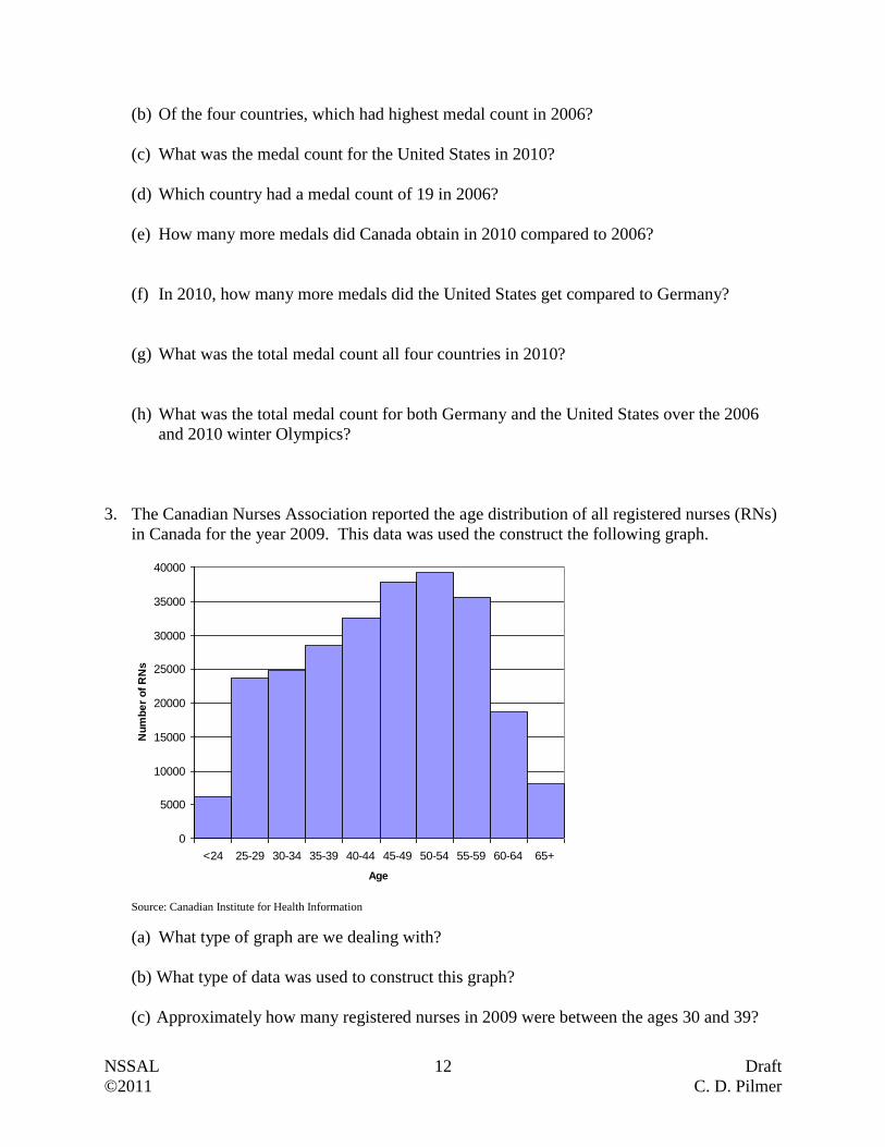
2. The medal counts for the 2006 and 2010 winter Olympics for four countries have been
provided in the following graph.
0 2 4 6 8 10 12 14 16 18 20 22 24 26 28 30 32 34 36 38 40
Canada
United States
Germany
Norway
number of medals
2010
2006
(a) What type of graph are we dealing with?
0
20
40
60
80
100
120
140
160
180
200
NFL NBA MLB NHL NASCAR
Nu
mb
er
of
Fa
ns
(in
millio
ns
)
NSSAL 12 Draft
©2011 C. D. Pilmer
(b) Of the four countries, which had highest medal count in 2006?
(c) What was the medal count for the United States in 2010?
(d) Which country had a medal count of 19 in 2006?
(e) How many more medals did Canada obtain in 2010 compared to 2006?
(f) In 2010, how many more medals did the United States get compared to Germany?
(g) What was the total medal count all four countries in 2010?
(h) What was the total medal count for both Germany and the United States over the 2006
and 2010 winter Olympics?
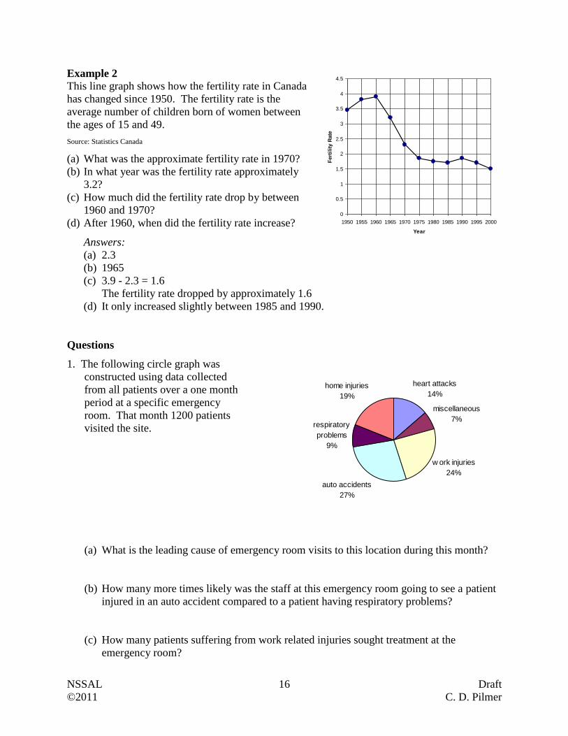
3. The Canadian Nurses Association reported the age distribution of all registered nurses (RNs)
in Canada for the year 2009. This data was used the construct the following graph.
0
5000
10000
15000
20000
25000
30000
35000
40000
<24 25-29 30-34 35-39 40-44 45-49 50-54 55-59 60-64 65+
Age
Nu
mb
er
of
RN
s
Source: Canadian Institute for Health Information
(a) What type of graph are we dealing with?
(b) What type of data was used to construct this graph?
(c) Approximately how many registered nurses in 2009 were between the ages 30 and 39?

NSSAL 13 Draft
©2011 C. D. Pilmer
(d) In 2009, approximately how many more 55 to 59 year old RNs are there compared to 60
to 64 year old RNs?
(e) What three classes of ages had the greatest number of RNs in 2009?
(f) Considering that Canada has an aging population, what potential problem is likely to
occur in the near future based on the information supplied in this graph.
4. The Nephrology and Hypertension Department of the Children's Hospital in London, Ontario
reported the number of cases they addressed over the different fiscal years (i.e. from April 1
of one year to March 31 of the next year). They broke the cases into three categories: new
consults, consult visits, and inpatient days. New consults refer to cases that have been
referred by an outside source (typically a family doctor) to the department. With each case,
the information in the patient's medical file is reviewed to see if the patient needs can be
served by the department. Consult visits refer to day clinic visits by patients. Inpatient days
refer to hospital stays by patients whose immediate needs cannot be met by day clinic visits.
0
100
200
300
400
500
600
700
800
900
1000
1100
1200
1300
1400
2004
/200
5
2005
/200
6
2006
/200
7
2007
/200
8
2008
/200
9
2009
/201
0
Fiscal Year
Nu
mb
er
of
Ca
se
s
Inpatient Days
Consult Visits
New Consults
Source: University of Western Ontario, Department of Paediatrics
(a) What type of graph are we dealing with?
(b) Were there significant changes in the number of new consults to the Nephrolopgy and
Hypertension Department over the six fiscal years?

NSSAL 14 Draft
©2011 C. D. Pilmer
(c) Approximately how many cases were dealt with in the 2008/2009 fiscal year?
(d) Approximately how many consult visits were dealt with in 2004/2005?
(e) Approximately how many cases involving inpatient visits were addressed in 2005/2006?
(f) Approximately how many more cases involving consult visits occurred in 2006/2007
compared to 2005/2006?
(g) What was the big shift from 2008/2009 to 2009/2010?
5. Thirty randomly selected families of four were asked how much they spent on their last
family meal at a restaurant. The following data was obtained.
70 86 94 74 65 68 67 72 90 66
68 78 82 66 97 80 71 69 72 64
62 67 75 103 64 83 77 64 78 86
(a) Construct a histogram with class widths of 5 starting at 60. Reminder that the class 60 to
65 does not include the number 65. The 65 is in the next class.
Class Tally Frequency
60 to 65
65 to 70
70 to 75
75 to 80
80 to 85
85 to 90
90 to 95
95 to 100
100 to 105
(b) What percentage of the families spent $90 or more on their meal?
(c) What type of data are we dealing with?
(d) Are we dealing with a sample or population?

NSSAL 15 Draft
©2011 C. D. Pilmer
Circle Graphs and Line Graphs
Circle graphs, also called pie charts, are divided into sectors where each sector represents part
of a whole. Each sector is proportional in size to the amount each sector represents. For
example if 70 out of 140 people responded that their favorite ice cream was chocolate, then the
"chocolate" sector of the circle graph would be 50% or half of the circle graph.
Example 1
In 1999, registered nurses were asked to report
where they were employed. The results are
presented in the circle graph on the right. At the
time there were 229 000 registered nurses in
Canada.
Source: Registered Nurses Database
(a) What percentage of registered nurses
worked in nursing homes in 1999?
(b) Approximately how many registered nurses
worked in hospitals in 1999?
(c) Approximately 9160 RNs were employed in
what sector?
(d) Approximately how many RNs were
employed in either home care or nursing
homes?
(e) Approximately how many more RNs were employed in hospitals than in community health
agencies?
(f) What is the ratio of RNs employed in community health agencies to nursing home?
Answers:
(a) 12%
(b) 59% of 229 000
0.59 229 000 = 135 110 RNs
(c) %4100229000
9160 These RNs are working in home care.
(d) 4% + 12% = 16% 16% of 229 000
0.16 229 000 = 36 640 RNs
(e) 59% - 8% = 51% 51% of 229 000
0.51 229 000 = 116 790 RNs
(f) home nursing
agencyhealth community
3
2
412
48
12
8
desired ratio
Line graphs are created by plotting data points and connected them with lines. These lines are
useful for showing trends; that is, how something changes in value as something else happens.
Home Care
4%
Nursing Home
12%
Hospital
59%
Not Stated
1%
Other
16%
Community
Health Agency
8%
NSSAL 16 Draft
©2011 C. D. Pilmer
Example 2
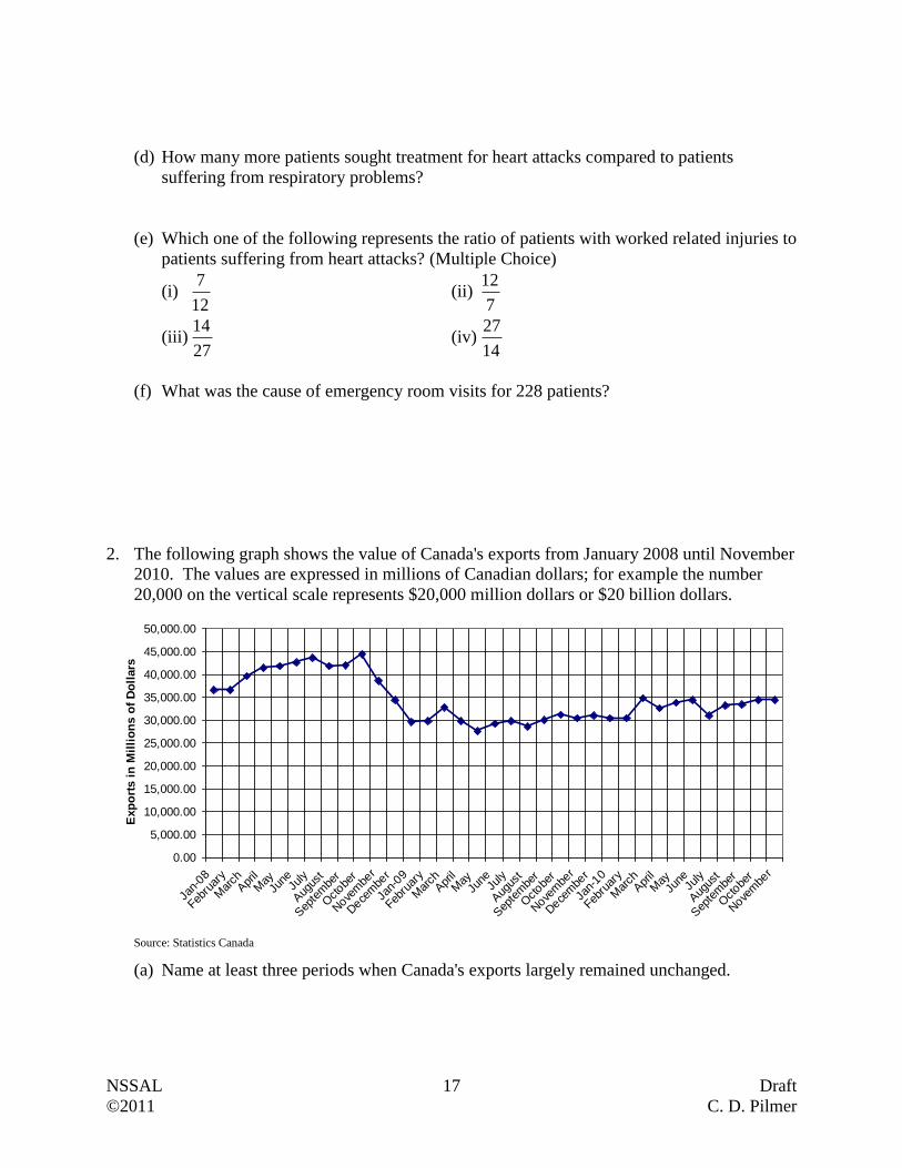
This line graph shows how the fertility rate in Canada
has changed since 1950. The fertility rate is the
average number of children born of women between
the ages of 15 and 49.
Source: Statistics Canada
(a) What was the approximate fertility rate in 1970?
(b) In what year was the fertility rate approximately
3.2?
(c) How much did the fertility rate drop by between
1960 and 1970?
(d) After 1960, when did the fertility rate increase?
Answers:
(a) 2.3
(b) 1965
(c) 3.9 - 2.3 = 1.6
The fertility rate dropped by approximately 1.6
(d) It only increased slightly between 1985 and 1990.
Questions
1. The following circle graph was
constructed using data collected
from all patients over a one month
period at a specific emergency
room. That month 1200 patients
visited the site.
(a) What is the leading cause of emergency room visits to this location during this month?
(b) How many more times likely was the staff at this emergency room going to see a patient
injured in an auto accident compared to a patient having respiratory problems?
(c) How many patients suffering from work related injuries sought treatment at the
emergency room?
heart attacks
14%
miscellaneous
7%
w ork injuries
24%
auto accidents
27%
respiratory
problems
9%
home injuries
19%
0
0.5
1
1.5
2
2.5
3
3.5
4
4.5
1950 1955 1960 1965 1970 1975 1980 1985 1990 1995 2000
Year
Fert
ilit
y R
ate
NSSAL 17 Draft
©2011 C. D. Pilmer
(d) How many more patients sought treatment for heart attacks compared to patients
suffering from respiratory problems?
(e) Which one of the following represents the ratio of patients with worked related injuries to
patients suffering from heart attacks? (Multiple Choice)
(i) 12
7 (ii)
7
12
(iii) 27
14 (iv)
14
27
(f) What was the cause of emergency room visits for 228 patients?
2. The following graph shows the value of Canada's exports from January 2008 until November
2010. The values are expressed in millions of Canadian dollars; for example the number
20,000 on the vertical scale represents $20,000 million dollars or $20 billion dollars.
0.00
5,000.00
10,000.00
15,000.00
20,000.00
25,000.00
30,000.00
35,000.00
40,000.00
45,000.00
50,000.00
Jan-
08
Febru
ary
Mar
chApr
il
May
June
July
Aug
ust
Sep
tem
ber
Octobe
r
Nove
mbe
r
Dece
mbe
r
Jan-
09
Febru
ary
Mar
chApr
il
May
June
July
Aug
ust
Sep
tem
ber
Octobe
r
Nove
mbe
r
Dece
mbe
r
Jan-
10
Febru
ary
Mar
chApr
il
May
June
July
Aug
ust
Sep
tem
ber
Octobe
r
Nove
mbe
r
Exp
ort
s i
n M
illi
on
s o
f D
oll
ars
Source: Statistics Canada
(a) Name at least three periods when Canada's exports largely remained unchanged.

NSSAL 18 Draft
©2011 C. D. Pilmer
(b) During what month and year did Canada's exports almost reach $45 billion dollars?
(c) When were Canada's exports lowest between Jan-08 and Nov-10?
(d) Approximately how much did exports drop by between October 2008 and January 2009?
Based on your knowledge of world events, why do you think this occurred?
3. There were 725 housing starts in the first quarter of 2011 in Nova Scotia. These starts were
broken into four categories: single detached (i.e. single dwelling homes), semi-detached (i.e.
single-family home that is joined on one side to another home), row housing (i.e.
townhouse), and apartments.
Single Detached,
293
Apartments, 337
Semi-detached, 60Row Housing, 35
Source: Canada Mortgage and Housing Corporation
(a) What percentage of the housing starts was for single detached homes?
(b) What is the ratio of row housing starts to semi-detached starts?
(c) How many more apartment starts were there compared to the combined row housing and
semi-detached starts?
NSSAL 19 Draft
©2011 C. D. Pilmer
(d) The Canada Mortgage and Housing Corporation predicts that the second quarter housing
starts in Nova Scotia will increase from 725 to 850. If they assume that the proportion of
single detached starts remains the same from the first quarter to the second, how many
single detached starts do they anticipate in this second quarter?
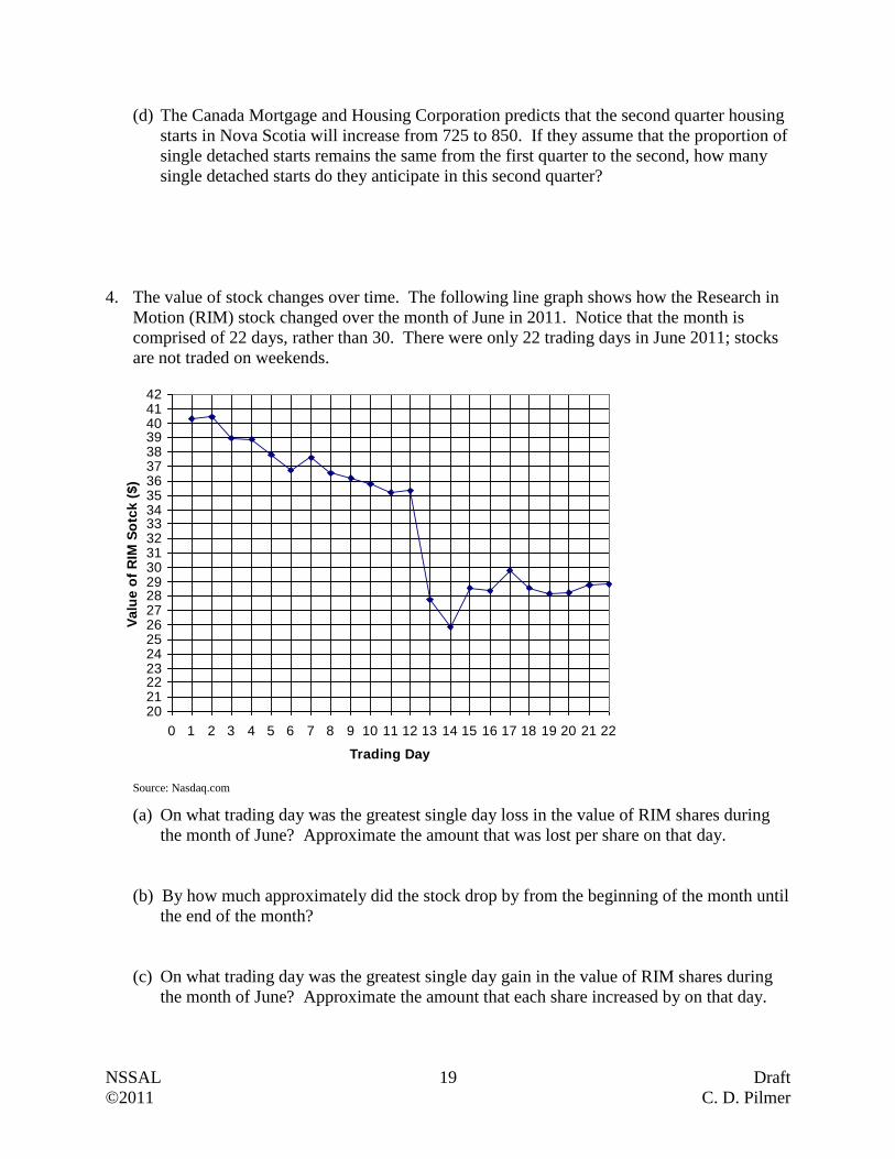
4. The value of stock changes over time. The following line graph shows how the Research in
Motion (RIM) stock changed over the month of June in 2011. Notice that the month is
comprised of 22 days, rather than 30. There were only 22 trading days in June 2011; stocks
are not traded on weekends.
2021222324252627282930313233343536373839404142
0 1 2 3 4 5 6 7 8 9 10 11 12 13 14 15 16 17 18 19 20 21 22
Trading Day
Va
lue
of
RIM
So
tck
($
)
Source: Nasdaq.com
(a) On what trading day was the greatest single day loss in the value of RIM shares during
the month of June? Approximate the amount that was lost per share on that day.
(b) By how much approximately did the stock drop by from the beginning of the month until
the end of the month?
(c) On what trading day was the greatest single day gain in the value of RIM shares during
the month of June? Approximate the amount that each share increased by on that day.
NSSAL 20 Draft
©2011 C. D. Pilmer
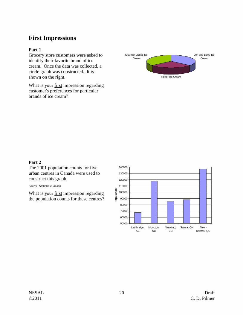
First Impressions
Part 1
Grocery store customers were asked to
identify their favorite brand of ice
cream. Once the data was collected, a
circle graph was constructed. It is
shown on the right.
What is your first impression regarding
customer's preferences for particular
brands of ice cream?
Part 2
The 2001 population counts for five
urban centres in Canada were used to
construct this graph.
Source: Statistics Canada
What is your first impression regarding
the population counts for these centres?
Jen and Berry Ice
Cream
Faxter Ice Cream
Charmer Dairies Ice
Cream
50000
60000
70000
80000
90000
100000
110000
120000
130000
140000
Lethbridge,
AB
Moncton,
NB
Nanaimo,
BC
Sarnia, ON Trois-
Riveres, QC
Po
pu
lati
on
NSSAL 21 Draft
©2011 C. D. Pilmer
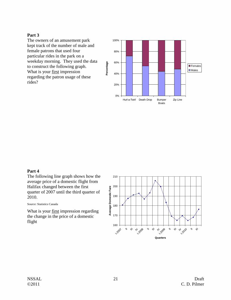
Part 3
The owners of an amusement park
kept track of the number of male and
female patrons that used four
particular rides in the park on a
weekday morning. They used the data
to construct the following graph.
What is your first impression
regarding the patron usage of these
rides?
Part 4
The following line graph shows how the
average price of a domestic flight from
Halifax changed between the first
quarter of 2007 until the third quarter of
2010.
Source: Statistics Canada
What is your first impression regarding
the change in the price of a domestic
flight
160
170
180
190
200
210
I-200
7 II III IV
I-200
8 II III IV
I-200
9 II III IV
I-201
0 II III
Quarters
Av
era
ge
Do
me
sti
c F
are
0%
20%
40%
60%
80%
100%
Hurl-a-Twirl Death Drop Bumper
Boats
Zip Line
Perc
en
tag
e
Females
Males
NSSAL 22 Draft
©2011 C. D. Pilmer
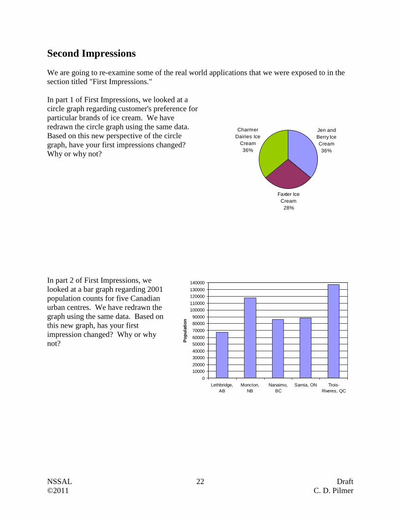
Second Impressions
We are going to re-examine some of the real world applications that we were exposed to in the
section titled "First Impressions."
In part 1 of First Impressions, we looked at a
circle graph regarding customer's preference for
particular brands of ice cream. We have
redrawn the circle graph using the same data.
Based on this new perspective of the circle
graph, have your first impressions changed?
Why or why not?
In part 2 of First Impressions, we
looked at a bar graph regarding 2001
population counts for five Canadian
urban centres. We have redrawn the
graph using the same data. Based on
this new graph, has your first
impression changed? Why or why
not?
Faxter Ice
Cream
28%
Charmer
Dairies Ice
Cream
36%
Jen and
Berry Ice
Cream
36%
0
10000
20000
30000
40000
50000
60000
70000
80000
90000
100000
110000
120000
130000
140000
Lethbridge,
AB
Moncton,
NB
Nanaimo,
BC
Sarnia, ON Trois-
Riveres, QC
Po
pu
lati
on
NSSAL 23 Draft
©2011 C. D. Pilmer
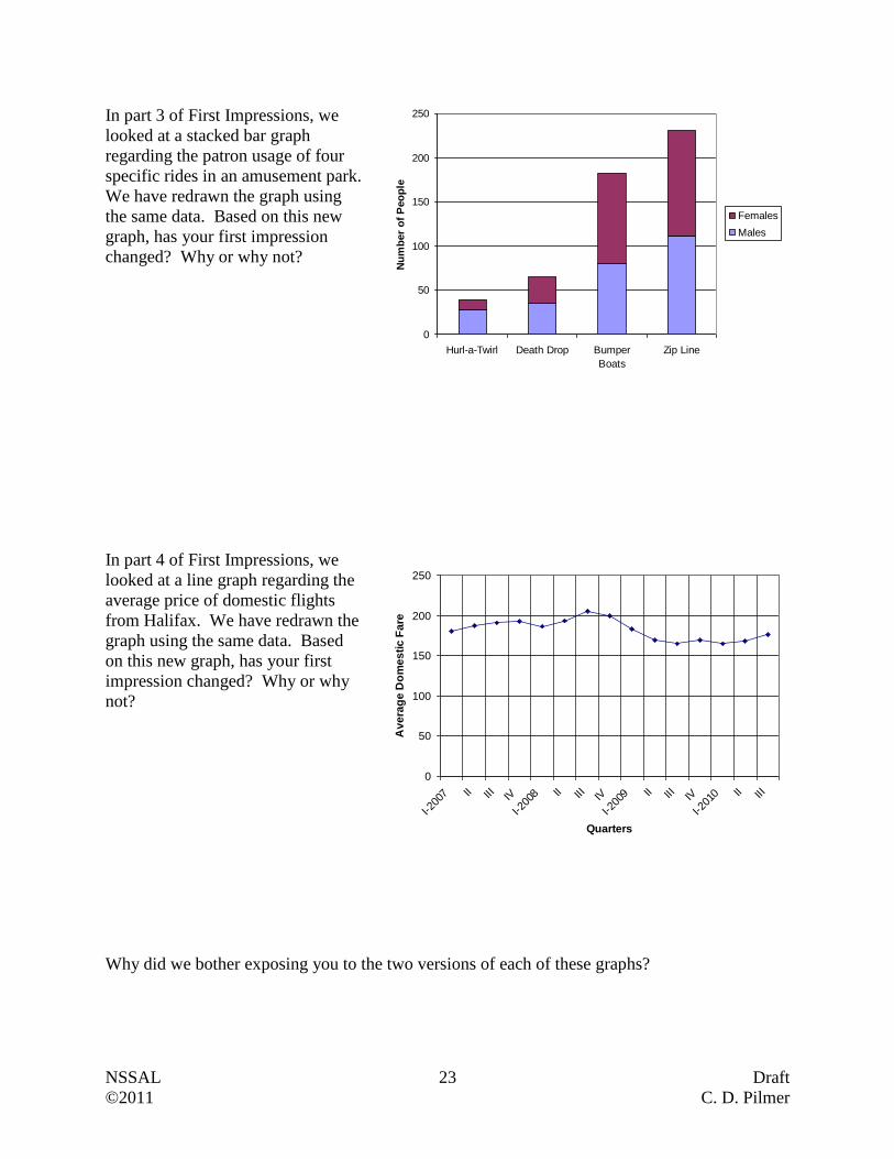
In part 3 of First Impressions, we
looked at a stacked bar graph
regarding the patron usage of four
specific rides in an amusement park.
We have redrawn the graph using
the same data. Based on this new
graph, has your first impression
changed? Why or why not?
In part 4 of First Impressions, we
looked at a line graph regarding the
average price of domestic flights
from Halifax. We have redrawn the
graph using the same data. Based
on this new graph, has your first
impression changed? Why or why
not?
Why did we bother exposing you to the two versions of each of these graphs?
0
50
100
150
200
250
I-200
7 II III IV
I-200
8 II III IV
I-200
9 II III IV
I-201
0 II III
Quarters
Av
era
ge
Do
me
sti
c F
are
0
50
100
150
200
250
Hurl-a-Twirl Death Drop Bumper
Boats
Zip Line
Nu
mb
er
of
Peo
ple
Females
Males
NSSAL 24 Draft
©2011 C. D. Pilmer
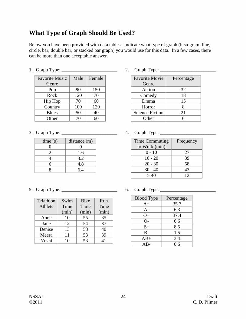
What Type of Graph Should Be Used?
Below you have been provided with data tables. Indicate what type of graph (histogram, line,
circle, bar, double bar, or stacked bar graph) you would use for this data. In a few cases, there
can be more than one acceptable answer.
1. Graph Type: _______________________
2. Graph Type: _______________________
Favorite Music
Genre
Male Female
Pop 90 150
Rock 120 70
Hip Hop 70 60
Country 100 120
Blues 50 40
Other 70 60
Favorite Movie
Genre
Percentage
Action 32
Comedy 18
Drama 15
Horror 8
Science Fiction 21
Other 6
3. Graph Type: _______________________
4. Graph Type: _______________________
time (s) distance (m)
0 0
2 1.6
4 3.2
6 4.8
8 6.4
Time Commuting
to Work (min)
Frequency
0 - 10 27
10 - 20 39
20 - 30 58
30 - 40 43
> 40 12
5. Graph Type: _______________________
6. Graph Type: _______________________
Triathlon
Athlete
Swim
Time
(min)
Bike
Time
(min)
Run
Time
(min)
Anne 10 55 35
Jane 12 54 37
Denise 13 58 40
Meera 11 53 39
Yoshi 10 53 41
Blood Type Percentage
A+ 35.7
A- 6.3
O+ 37.4
O- 6.6
B+ 8.5
B- 1.5
AB+ 3.4
AB- 0.6

NSSAL 25 Draft
©2011 C. D. Pilmer
7. Graph Type: _______________________
8. Graph Type: _______________________
Town Population
in 2006
Amherst 9505
Digby 2092
Kentville 5812
Pictou 3813
Port Hawkesbury 3517
Television Audience Share (%)
Program
Type 1996 - 1997 2001 - 2002
Comedy 12 8
Drama 13 9
Reality 10 8
9. Graph Type: _______________________
10. Graph Type: _______________________
Salaries in Thousands
of Dollars
Number of
Employees
15 - 25 16
25 - 35 43
35 - 45 57
45 - 55 48
55 - 65 23
65- 75 11
more than 75 6
Year Cell Phone Revenues
(Billions of Canadian Dollars)
1997 3.3
1998 4.4
1999 4.6
2000 5.4
2001 6.0
2002 7.2
2003 8.1
NSSAL 26 Draft
©2011 C. D. Pilmer
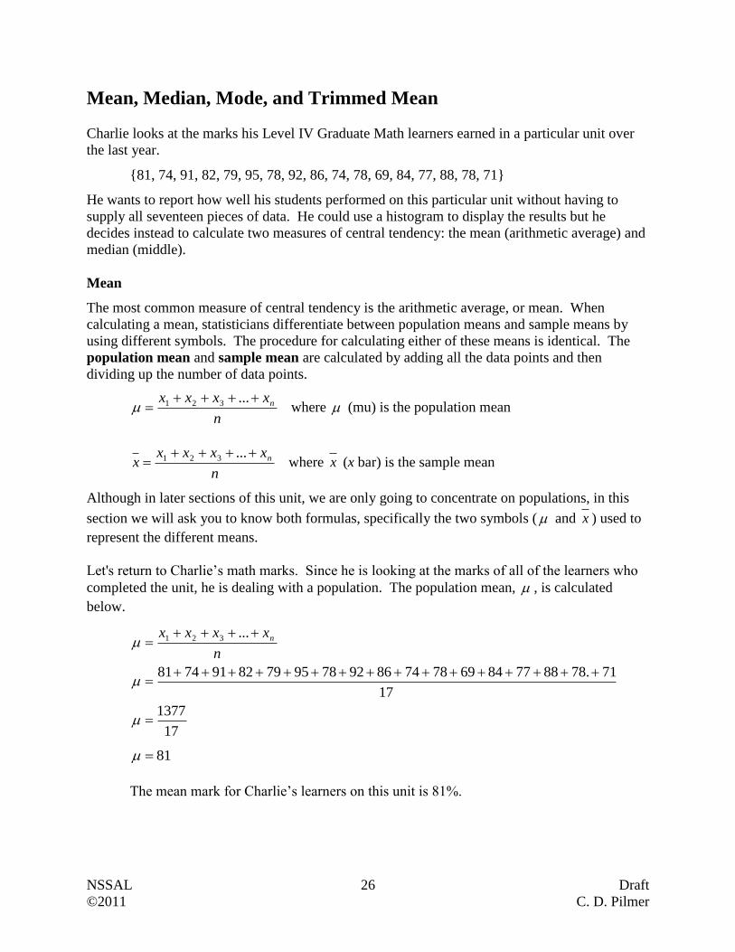
Mean, Median, Mode, and Trimmed Mean
Charlie looks at the marks his Level IV Graduate Math learners earned in a particular unit over
the last year.
{81, 74, 91, 82, 79, 95, 78, 92, 86, 74, 78, 69, 84, 77, 88, 78, 71}
He wants to report how well his students performed on this particular unit without having to
supply all seventeen pieces of data. He could use a histogram to display the results but he
decides instead to calculate two measures of central tendency: the mean (arithmetic average) and
median (middle).
Mean
The most common measure of central tendency is the arithmetic average, or mean. When
calculating a mean, statisticians differentiate between population means and sample means by
using different symbols. The procedure for calculating either of these means is identical. The
population mean and sample mean are calculated by adding all the data points and then
dividing up the number of data points.
n
xxxx n
...321 where (mu) is the population mean
n
xxxxx n
...321 where x (x bar) is the sample mean
Although in later sections of this unit, we are only going to concentrate on populations, in this
section we will ask you to know both formulas, specifically the two symbols ( and x ) used to
represent the different means.
Let's return to Charlie’s math marks. Since he is looking at the marks of all of the learners who
completed the unit, he is dealing with a population. The population mean, , is calculated
below.
17
1377
17
71.78887784697874869278957982917481
...321
n
xxxx n
81
The mean mark for Charlie’s learners on this unit is 81%.
NSSAL 27 Draft
©2011 C. D. Pilmer
Median
The mean is not the only way to describe the center. Another method is to use the “middle
value” of the data which is called the median. The median separates the higher half of the data
from the lower half.
The median can be calculated in the following manner.
1. Arrange the data points in order of size, from smallest to largest.
2. If the number of data points is odd, then the median is the data point in the middle of the
ordered list.
3. If the number of data points is even, then the median is the mean of the two data points
that share the middle of the ordered list.
Return to Charlie’s math marks. The median is calculated by following the procedure provided
below.
Order the data points from smallest to largest
69, 71, 73, 74, 77, 78, 78, 78, 79, 81, 82, 84, 86, 88, 91, 92, 95
Since we have an odd number of data points (n = 17), then median will be in the middle data
point of the ordered list.
69, 71, 74, 74, 77, 78, 78, 78, 79, 81, 82, 84, 86, 88, 91, 92, 95
The median will be 79.
Suppose we had another instructor, Angela, who had sixteen learners who completed the same
unit. She has recorded the marks that they made and worked out the mean and median.
{99, 94, 80, 63, 77, 99, 68, 62, 95, 78, 66, 93, 65, 64, 98, 95}
Mean:
16
1296
16
95986465936678956268997763809499
...321
n
xxxx n
81 The mean mark for these learners on this unit is 81%.
Median:
Order the data points from smallest to largest
62, 63, 64, 65, 66, 68, 77, 78, 80, 93, 94, 95, 95, 98, 99, 99
Since the number of data points is even (n = 16), then the median is the mean of the two data
points that share the middle of the ordered list.
62, 63, 64, 65, 66, 68, 77, 78, 80, 93, 94, 95, 95, 98, 99, 99
Median 792
8078

NSSAL 28 Draft
©2011 C. D. Pilmer
Is the Mean and Median Enough?
These measures of central tendency often do not give us a complete understanding of the data set
because they do not give any indication how the data is spread out. This is especially evident
when we look at the means and medians for the two groups of math students previously
discussed. Although the means and medians are identical for Charlie's and Angela's learners, the
marks earned by the two groups are vastly different.
In Charlie’s group, the majority of students earned marks between 71 and 88. There was
only one mark in the sixties and only three marks in the nineties. The marks are clustered
together.
In Angela's group, learners could largely be divided into two groups; learners who did
very well (i.e. obtained marks in the high 90's) and learners who found the material
challenging (i.e. obtained marks in the 60's). The marks are not clustered together as they
were with Charlie's learners.
Range of Marks Number of Charlie's
Learners
Number of Angela's
Learners
60 to 65 0 3
65 to 70 1 3
70 to 75 3 0
75 to 80 5 2
80 to 85 3 1
85 to 90 2 0
90 to 95 2 2
95 to 100 1 5
It is important to note that our two measures of central tendency, mean and median, did not
reveal this important difference between the two data sets. We will address this issue in a later
section of this unit.
When are the Mean and Median Not Close to Each Other?
There are times when the mean and median may not be close to each other. One case is if an
outlier exists within the data set. An outlier is a data point that falls outside the overall pattern
of the data set. Consider the following data set where the data points have already been arranged
in ascending order.
{2.8, 3.0, 3.0, 3.1, 3.2, 3.4, 3.4, 3.5, 3.5, 3.6, 3.7, 3.9, 4.0, 4.2, 16.7}
Notice that all but one data point is between 2.8 and 4.2. The mean for this data set is 4.3 and the
median is 3.5. It is obvious that in this case the median is a far better measure of central
tendency than the mean. The outlier, 16.7, greatly influenced the mean to a point where it no
longer accurately represented the center of the data set.
The extreme sensitivity of the mean to even a single outlier and the insensitivity of the median to
outliers led to the development of trimmed means. Trimmed means are calculated by ordering
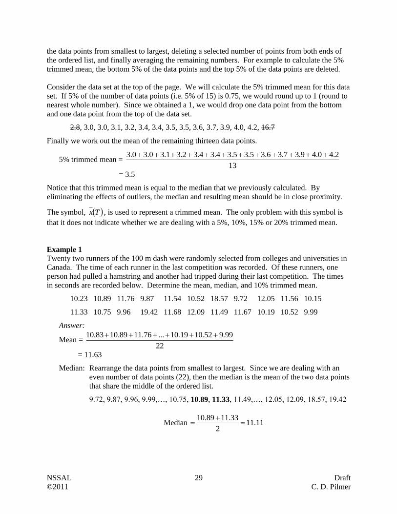
NSSAL 29 Draft
©2011 C. D. Pilmer
the data points from smallest to largest, deleting a selected number of points from both ends of
the ordered list, and finally averaging the remaining numbers. For example to calculate the 5%
trimmed mean, the bottom 5% of the data points and the top 5% of the data points are deleted.
Consider the data set at the top of the page. We will calculate the 5% trimmed mean for this data
set. If 5% of the number of data points (i.e. 5% of 15) is 0.75, we would round up to 1 (round to
nearest whole number). Since we obtained a 1, we would drop one data point from the bottom
and one data point from the top of the data set.
2.8, 3.0, 3.0, 3.1, 3.2, 3.4, 3.4, 3.5, 3.5, 3.6, 3.7, 3.9, 4.0, 4.2, 16.7
Finally we work out the mean of the remaining thirteen data points.
5% trimmed mean = 13
2.40.49.37.36.35.35.34.34.32.31.30.30.3
= 3.5
Notice that this trimmed mean is equal to the median that we previously calculated. By
eliminating the effects of outliers, the median and resulting mean should be in close proximity.
The symbol, Tx , is used to represent a trimmed mean. The only problem with this symbol is
that it does not indicate whether we are dealing with a 5%, 10%, 15% or 20% trimmed mean.
Example 1
Twenty two runners of the 100 m dash were randomly selected from colleges and universities in
Canada. The time of each runner in the last competition was recorded. Of these runners, one
person had pulled a hamstring and another had tripped during their last competition. The times
in seconds are recorded below. Determine the mean, median, and 10% trimmed mean.
10.23 10.89 11.76 9.87 11.54 10.52 18.57 9.72 12.05 11.56 10.15
11.33 10.75 9.96 19.42 11.68 12.09 11.49 11.67 10.19 10.52 9.99
Answer:
Mean = 22
99.952.1019.10...76.1189.1083.10
= 11.63
Median: Rearrange the data points from smallest to largest. Since we are dealing with an
even number of data points (22), then the median is the mean of the two data points
that share the middle of the ordered list.
9.72, 9.87, 9.96, 9.99,…, 10.75, 10.89, 11.33, 11.49,…, 12.05, 12.09, 18.57, 19.42
Median 11.112
33.1189.10
NSSAL 30 Draft
©2011 C. D. Pilmer
10% Trimmed Mean
If 10% of the number of data points (i.e. 10% of 22) is 2.2, we would round down
to 2 (round to nearest whole number). We will now drop two data points from the
bottom and two data points from the top of the data set, and then work out the
mean of the remaining eighteen data points.
9.72, 9.87, 9.96, 9.99, 10.15,…, 11.76, 12.05, 12.09, 18.57, 19.42
10% trimmed mean = 18
09.1205.1276.11...15.1099.996.9
= 11.02
Mode
The mode of a set of data is the value in the set that occurs most frequently. For the following
data, the mode is 6 because it occurs more times than any other value.
{2, 3, 4, 4, 5, 6, 6, 6, 6, 7, 7, 7, 9, 10} Mode = 6
Many textbooks and websites refer to the mode as a measure of central tendency; this is
incorrect. Although the mode is often around the center of the data set when the points are
arranged from smallest to largest, this is not always the case. Consider the data we previously
examined concerning Charlie's and Angela's Graduate Math learners.
Data for Charlie's Learners
Order the data points from smallest to largest, and identify the data point that occurs most
frequently.
69, 71, 73, 74, 77, 78, 78, 78, 79, 81, 82, 84, 86, 88, 91, 92, 95
Mode = 78
Data for Angela's Learners
Order the data points from smallest to largest, and identify the data point(s) that occurs most
frequently.
62, 63, 64, 65, 66, 68, 77, 78, 80, 93, 94, 95, 95, 98, 99, 99
The data points 95 and 99 occur the most frequently therefore we state that is data set is
bimodal.
Mode = 95 and 99
The mode for the Charlie's data is close to the center of the data set, however, the modes for
Angela's data is not near the center.
NSSAL 31 Draft
©2011 C. D. Pilmer
Questions
Please use the appropriate symbols ( x , , and Tx ) when answering these questions.
1. A study regarding the size of winter wolf packs in regions of the United States, Canada, and
Finland was conducted. The following data from 18 randomly selected packs was obtained.
2 3 15 8 7 8 2 4 13
7 3 7 10 7 5 4 2 4
(a) Are we dealing with a sample or a population? _____________________
(b) Determine the mean, median, and mode.
(c) Why would the researchers not likely use a trimmed mean with this data set?
2. A local cab company has a fleet of nine cars. The company kept the records for the amount
of money each vehicle required for a one week period. The data is shown below.
$125 $157 $210 $139 $182 $167 $143 $150 $162
(a) Are we dealing with a sample or a population? _____________________
(b) Are we dealing with a numerical or categorical data set? _____________________
(c) Determine the mean, median, and mode.

NSSAL 32 Draft
©2011 C. D. Pilmer
3. A magazine conducted a survey where they wished to understand the average class size of
first year courses at a local community college. They randomly selected 17 first year classes
and obtained the following numbers.
23 37 36 40 39 115 28 25 41
23 32 27 16 15 31 27 34
(a) Are we dealing with a sample or a population? ____________________
(b) Determine the mean, median, mode, 5% trimmed mean, and 10% trimmed mean.
(c) Why is it appropriate to use trimmed means in this situation?
(d) If this data set was comprised of 78 data points and we wanted to calculate a 5% trimmed
mean, how many data points would be dropped from the bottom and top of the data set?
4. A new subdivision outside of Halifax was constructed over the last few years. Barb wanted
to know what the average value of the new homes was. She was not prepared to look at the
assessed values of all 218 new homes. Instead she randomly selected 24 homes and recorded
their assessed values. These values in thousands of dollars are shown below.
267 265 226 254 231 221 246 252 253 241 261 589
243 269 267 253 287 320 221 264 257 249 226 267

NSSAL 33 Draft
©2011 C. D. Pilmer
(a) Calculate the mean, median, mode, and 5% trimmed mean.
(b) Which of these measures is not influenced or less influenced by extremely high or low
data points?
(c) Would a histogram or a bar graph be used with this data set?
5. In gymnastics and diving, several judges score each athlete. The final score for the athlete is
calculated by removing the high and low scores and averaging the remainder. Why do you
think they use this trimmed mean scoring method in gymnastics and diving?
NSSAL 34 Draft
©2011 C. D. Pilmer
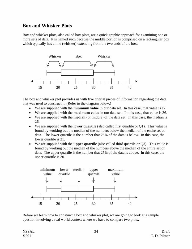
Box and Whisker Plots
Box and whisker plots, also called box plots, are a quick graphic approach for examining one or
more sets of data. It is named such because the middle portion is comprised on a rectangular box
which typically has a line (whisker) extending from the two ends of the box.
The box and whisker plot provides us with five critical pieces of information regarding the data
that was used to construct it. (Refer to the diagram below.)
We are supplied with the minimum value in our data set. In this case, that value is 17.
We are supplied with the maximum value in our data set. In this case, that value is 36.
We are supplied with the median (or middle) of the data set. In this case, the median is
26.
We are supplied with the lower quartile (also called first quartile or Q1). This value is
found by working out the median of the numbers below the median of the entire set of
data. The lower quartile is the number that 25% of the data is below. In this case, the
lower quartile is 21.
We are supplied with the upper quartile (also called third quartile or Q3). This value is
found by working out the median of the numbers above the median of the entire set of
data. The upper quartile is the number that 25% of the data is above. In this case, the
upper quartile is 30.
Before we learn how to construct a box and whisker plot, we are going to look at a sample
question involving a real world context where we have to compare two plots.
15 20 25 30 35 40
Box Whisker Whisker
15 20 25 30 35 40
median minimum
value
lower
quartile
maximum
value
upper
quartile
NSSAL 35 Draft
©2011 C. D. Pilmer
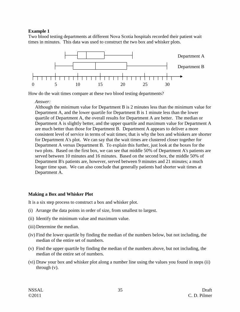
Example 1
Two blood testing departments at different Nova Scotia hospitals recorded their patient wait
times in minutes. This data was used to construct the two box and whisker plots.
How do the wait times compare at these two blood testing departments?
Answer:
Although the minimum value for Department B is 2 minutes less than the minimum value for
Department A, and the lower quartile for Department B is 1 minute less than the lower
quartile of Department A, the overall results for Department A are better. The median or
Department A is slightly better, and the upper quartile and maximum value for Department A
are much better than those for Department B. Department A appears to deliver a more
consistent level of service in terms of wait times; that is why the box and whiskers are shorter
for Department A's plot. We can say that the wait times are clustered closer together for
Department A versus Department B. To explain this further, just look at the boxes for the
two plots. Based on the first box, we can see that middle 50% of Department A's patients are
served between 10 minutes and 16 minutes. Based on the second box, the middle 50% of
Department B's patients are, however, served between 9 minutes and 21 minutes; a much
longer time span. We can also conclude that generally patients had shorter wait times at
Department A.
Making a Box and Whisker Plot
It is a six step process to construct a box and whisker plot.
(i) Arrange the data points in order of size, from smallest to largest.
(ii) Identify the minimum value and maximum value.
(iii) Determine the median.
(iv) Find the lower quartile by finding the median of the numbers below, but not including, the
median of the entire set of numbers.
(v) Find the upper quartile by finding the median of the numbers above, but not including, the
median of the entire set of numbers.
(vi) Draw your box and whisker plot along a number line using the values you found in steps (ii)
through (v).
0 5 10 15 20 25
Department A
Department B
30
NSSAL 36 Draft
©2011 C. D. Pilmer
Example 2
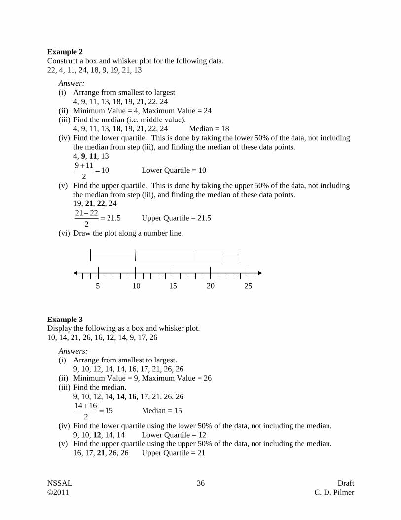
Construct a box and whisker plot for the following data.
22, 4, 11, 24, 18, 9, 19, 21, 13
Answer:
(i) Arrange from smallest to largest
4, 9, 11, 13, 18, 19, 21, 22, 24
(ii) Minimum Value = 4, Maximum Value = 24
(iii) Find the median (i.e. middle value).
4, 9, 11, 13, 18, 19, 21, 22, 24 Median = 18
(iv) Find the lower quartile. This is done by taking the lower 50% of the data, not including
the median from step (iii), and finding the median of these data points.
4, 9, 11, 13
102
119
Lower Quartile = 10
(v) Find the upper quartile. This is done by taking the upper 50% of the data, not including
the median from step (iii), and finding the median of these data points.
19, 21, 22, 24
5.212
2221
Upper Quartile = 21.5
(vi) Draw the plot along a number line.
Example 3
Display the following as a box and whisker plot.
10, 14, 21, 26, 16, 12, 14, 9, 17, 26
Answers:
(i) Arrange from smallest to largest.
9, 10, 12, 14, 14, 16, 17, 21, 26, 26
(ii) Minimum Value = 9, Maximum Value = 26
(iii) Find the median.
9, 10, 12, 14, 14, 16, 17, 21, 26, 26
152
1614
Median = 15
(iv) Find the lower quartile using the lower 50% of the data, not including the median.
9, 10, 12, 14, 14 Lower Quartile = 12
(v) Find the upper quartile using the upper 50% of the data, not including the median.
16, 17, 21, 26, 26 Upper Quartile = 21
5 10 15 20 25
NSSAL 37 Draft
©2011 C. D. Pilmer
(vi) Draw plot along a number line.
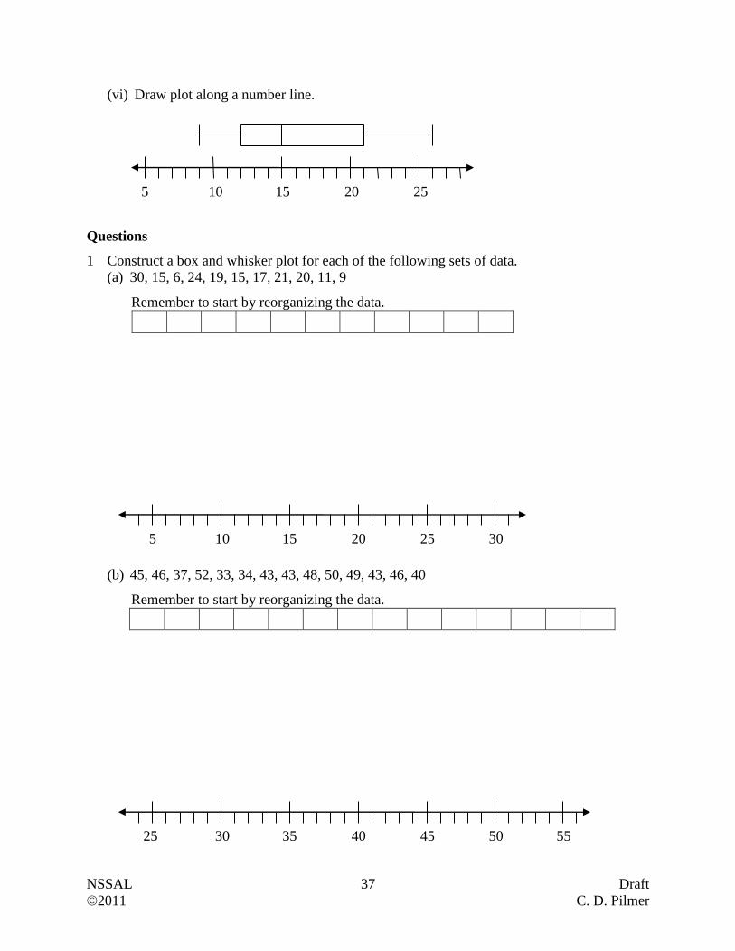
Questions
1 Construct a box and whisker plot for each of the following sets of data.
(a) 30, 15, 6, 24, 19, 15, 17, 21, 20, 11, 9
Remember to start by reorganizing the data.
(b) 45, 46, 37, 52, 33, 34, 43, 43, 48, 50, 49, 43, 46, 40
Remember to start by reorganizing the data.
25 30 35 40 45 50 55
5 10 15 20 25 30
5 10 15 20 25
NSSAL 38 Draft
©2011 C. D. Pilmer
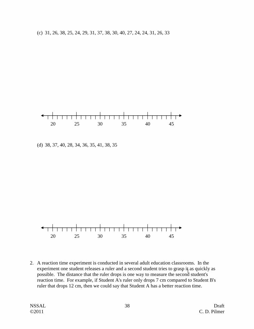
(c) 31, 26, 38, 25, 24, 29, 31, 37, 38, 30, 40, 27, 24, 24, 31, 26, 33
(d) 38, 37, 40, 28, 34, 36, 35, 41, 38, 35
2. A reaction time experiment is conducted in several adult education classrooms. In the
experiment one student releases a ruler and a second student tries to grasp it as quickly as
possible. The distance that the ruler drops is one way to measure the second student's
reaction time. For example, if Student A's ruler only drops 7 cm compared to Student B's
ruler that drops 12 cm, then we could say that Student A has a better reaction time.
20 25 30 35 40 45
20 25 30 35 40 45
NSSAL 39 Draft
©2011 C. D. Pilmer
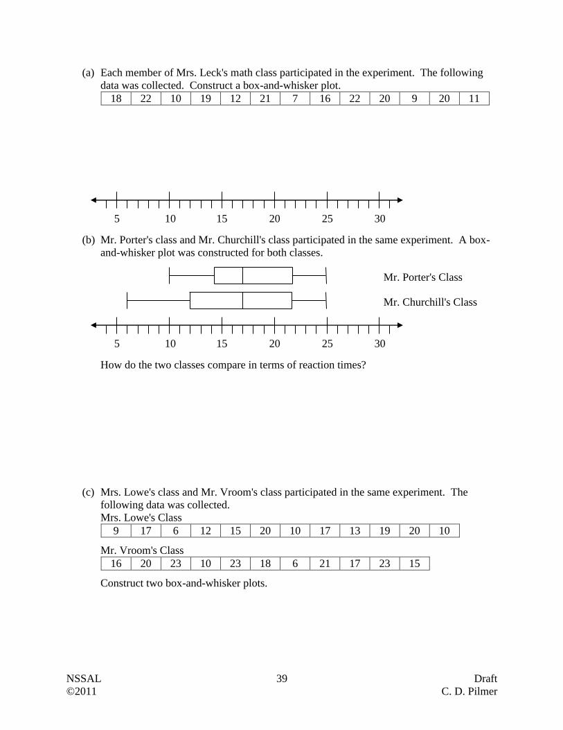
(a) Each member of Mrs. Leck's math class participated in the experiment. The following
data was collected. Construct a box-and-whisker plot.
18 22 10 19 12 21 7 16 22 20 9 20 11
(b) Mr. Porter's class and Mr. Churchill's class participated in the same experiment. A box-
and-whisker plot was constructed for both classes.
How do the two classes compare in terms of reaction times?
(c) Mrs. Lowe's class and Mr. Vroom's class participated in the same experiment. The
following data was collected.
Mrs. Lowe's Class
9 17 6 12 15 20 10 17 13 19 20 10
Mr. Vroom's Class
16 20 23 10 23 18 6 21 17 23 15
Construct two box-and-whisker plots.
5 10 15 20 25 30
Mr. Porter's Class
Mr. Churchill's Class
5 10 15 20 25 30
NSSAL 40 Draft
©2011 C. D. Pilmer
How do the two classes compare in terms of reaction times?
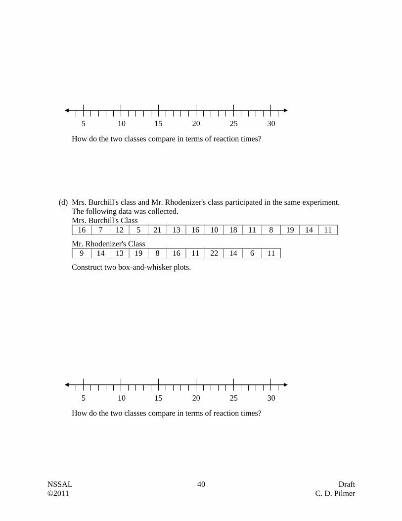
(d) Mrs. Burchill's class and Mr. Rhodenizer's class participated in the same experiment.
The following data was collected.
Mrs. Burchill's Class
16 7 12 5 21 13 16 10 18 11 8 19 14 11
Mr. Rhodenizer's Class
9 14 13 19 8 16 11 22 14 6 11
Construct two box-and-whisker plots.
How do the two classes compare in terms of reaction times?
5 10 15 20 25 30
5 10 15 20 25 30
NSSAL 41 Draft
©2011 C. D. Pilmer
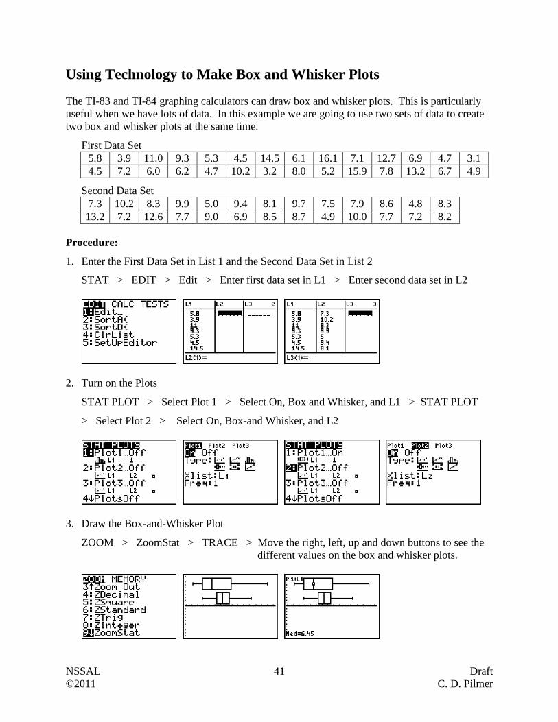
Using Technology to Make Box and Whisker Plots
The TI-83 and TI-84 graphing calculators can draw box and whisker plots. This is particularly
useful when we have lots of data. In this example we are going to use two sets of data to create
two box and whisker plots at the same time.
First Data Set
5.8 3.9 11.0 9.3 5.3 4.5 14.5 6.1 16.1 7.1 12.7 6.9 4.7 3.1
4.5 7.2 6.0 6.2 4.7 10.2 3.2 8.0 5.2 15.9 7.8 13.2 6.7 4.9
Second Data Set
7.3 10.2 8.3 9.9 5.0 9.4 8.1 9.7 7.5 7.9 8.6 4.8 8.3
13.2 7.2 12.6 7.7 9.0 6.9 8.5 8.7 4.9 10.0 7.7 7.2 8.2
Procedure:
1. Enter the First Data Set in List 1 and the Second Data Set in List 2
STAT > EDIT > Edit > Enter first data set in L1 > Enter second data set in L2
2. Turn on the Plots
STAT PLOT > Select Plot 1 > Select On, Box and Whisker, and L1 > STAT PLOT
> Select Plot 2 > Select On, Box-and Whisker, and L2
3. Draw the Box-and-Whisker Plot
ZOOM > ZoomStat > TRACE > Move the right, left, up and down buttons to see the
different values on the box and whisker plots.
NSSAL 42 Draft
©2011 C. D. Pilmer
Questions
In the following questions you will be asked to draw histograms as well as box-and-whisker
plots. You are required to draw the histograms by hand and the box and whisker plots using
technology.
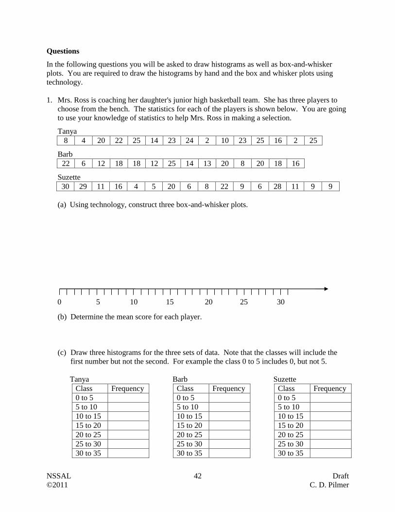
1. Mrs. Ross is coaching her daughter's junior high basketball team. She has three players to
choose from the bench. The statistics for each of the players is shown below. You are going
to use your knowledge of statistics to help Mrs. Ross in making a selection.
Tanya
8 4 20 22 25 14 23 24 2 10 23 25 16 2 25
Barb
22 6 12 18 18 12 25 14 13 20 8 20 18 16
Suzette
30 29 11 16 4 5 20 6 8 22 9 6 28 11 9 9
(a) Using technology, construct three box-and-whisker plots.
(b) Determine the mean score for each player.
(c) Draw three histograms for the three sets of data. Note that the classes will include the
first number but not the second. For example the class 0 to 5 includes 0, but not 5.
Tanya Barb Suzette
Class Frequency Class Frequency Class Frequency
0 to 5 0 to 5 0 to 5
5 to 10 5 to 10 5 to 10
10 to 15 10 to 15 10 to 15
15 to 20 15 to 20 15 to 20
20 to 25 20 to 25 20 to 25
25 to 30 25 to 30 25 to 30
30 to 35 30 to 35 30 to 35
5 10 15 20 25 30 0
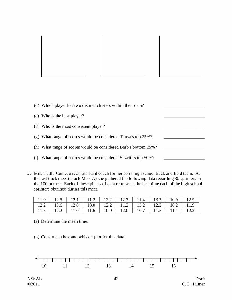
NSSAL 43 Draft
©2011 C. D. Pilmer
(d) Which player has two distinct clusters within their data? __________________
(e) Who is the best player? __________________
(f) Who is the most consistent player? __________________
(g) What range of scores would be considered Tanya's top 25%? __________________
(h) What range of scores would be considered Barb's bottom 25%? __________________
(i) What range of scores would be considered Suzette's top 50%? __________________
2. Mrs. Tuttle-Comeau is an assistant coach for her son's high school track and field team. At
the last track meet (Track Meet A) she gathered the following data regarding 30 sprinters in
the 100 m race. Each of these pieces of data represents the best time each of the high school
sprinters obtained during this meet.
11.0 12.5 12.1 11.2 12.2 12.7 11.4 13.7 10.9 12.9
12.2 10.6 12.8 13.0 12.2 11.2 13.2 12.2 16.2 11.9
11.5 12.2 11.0 11.6 10.9 12.0 10.7 11.5 11.1 12.2
(a) Determine the mean time.
(b) Construct a box and whisker plot for this data.
11 12 13 14 15 16 10
NSSAL 44 Draft
©2011 C. D. Pilmer
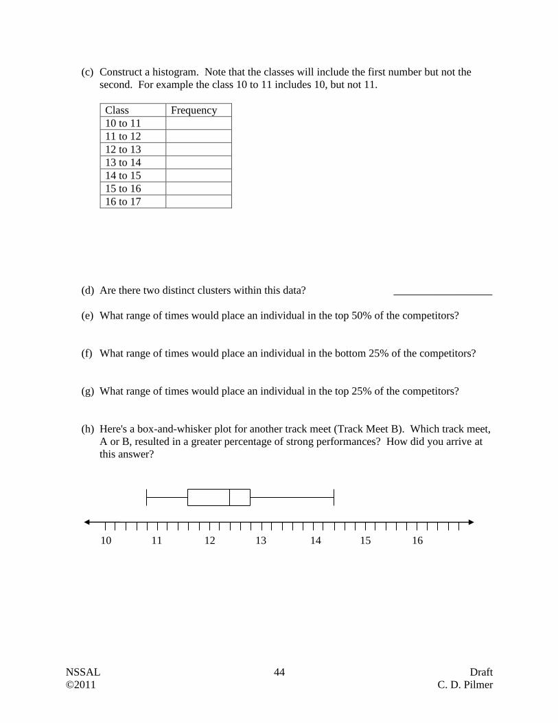
(c) Construct a histogram. Note that the classes will include the first number but not the
second. For example the class 10 to 11 includes 10, but not 11.
Class Frequency
10 to 11
11 to 12
12 to 13
13 to 14
14 to 15
15 to 16
16 to 17
(d) Are there two distinct clusters within this data? __________________
(e) What range of times would place an individual in the top 50% of the competitors?
(f) What range of times would place an individual in the bottom 25% of the competitors?
(g) What range of times would place an individual in the top 25% of the competitors?
(h) Here's a box-and-whisker plot for another track meet (Track Meet B). Which track meet,
A or B, resulted in a greater percentage of strong performances? How did you arrive at
this answer?
11 12 13 14 15 16 10
NSSAL 45 Draft
©2011 C. D. Pilmer
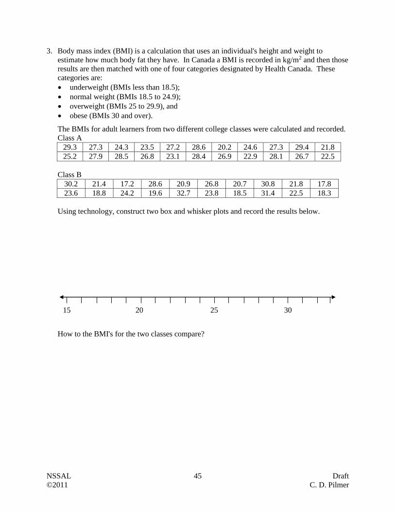
3. Body mass index (BMI) is a calculation that uses an individual's height and weight to
estimate how much body fat they have. In Canada a BMI is recorded in kg/m2 and then those
results are then matched with one of four categories designated by Health Canada. These
categories are:
underweight (BMIs less than 18.5);
normal weight (BMIs 18.5 to 24.9);
overweight (BMIs 25 to 29.9), and
obese (BMIs 30 and over).
The BMIs for adult learners from two different college classes were calculated and recorded.
Class A
29.3 27.3 24.3 23.5 27.2 28.6 20.2 24.6 27.3 29.4 21.8
25.2 27.9 28.5 26.8 23.1 28.4 26.9 22.9 28.1 26.7 22.5
Class B
30.2 21.4 17.2 28.6 20.9 26.8 20.7 30.8 21.8 17.8
23.6 18.8 24.2 19.6 32.7 23.8 18.5 31.4 22.5 18.3
Using technology, construct two box and whisker plots and record the results below.
How to the BMI's for the two classes compare?
15 20 25 30
NSSAL 46 Draft
©2011 C. D. Pilmer
Standard Deviation
Measures of central tendency (median and mode) do not give us any indication of how the data is
spread out. Consider the following two sets of data.
First Data Set: 13, 14, 15, 15, 15, 16, 17
Second Data Set: 10, 12, 13, 15, 17, 18, 20
The mean for both of these data sets is 15, however, the individual pieces of data in these sets are
considerably different. In the first set, the numbers range from 13 to 17, and clearly cluster
around the number 15. In the second set the numbers range from 10 to 20 and tend to be more
spread out around the mean. The dispersion is far greater in the second set, than in the first.
Standard deviation is one way of measuring dispersion. If the standard deviation is low, then
the data clusters around the mean. If the standard deviation is high, then the data is spread out
around the mean. Without getting into the actual calculations, the standard deviation for the first
data set is 1.20 and the standard deviation for the second data set is 3.30. The larger number
indicates greater dispersion.
Calculating Standard Deviation
Before we get to the calculations, we have to remind you of an important point and introduce two
formulas. In the unit introduction we stated that this unit would focus on populations, rather than
samples. A population is the set representing all measurements of interest to an investigator
while a sample is simply a subset of the measurements from the population chosen at random.
We learned that the mean is calculated by adding all the data values and then dividing up the
number of data values. This can be expressed using the following formula.
n
xxxx n
...321 where (mu) is the population mean
The formula for population standard deviation, (sigma), is shown below. You are not
expected to memorize this formula.
n
xxxx n
22
3
2
2
2
1 ...
This formula requires that you complete six steps.
Step 1: Find the mean; .
Step 2: Calculate the difference between each data value and the mean; ix .
Step 3: Square those differences found in Step 2; 2ix
Step 4: Add the squared differences; 22
3
2
2
2
1 ... nxxxx
Step 5: Divide the sum from Step 4 by the number of data values.
Step 6: Square root the value from Step 5.

NSSAL 47 Draft
©2011 C. D. Pilmer
The easiest way to learn how to use this formula (i.e. complete the six steps) is to construct a
table where only small portions of the calculation are completed at any one time.
Example 1
Determine the standard deviation for the following set of data.
10, 12, 13, 15, 17, 18, 20
Answer:
Find the mean. n
xxxx n
...321 (Step 1)
7
20181715131210
15
Construct the table.
ix ix
(Step 2)
2ix
(Step 3)
10 -5 25
12 -3 9
13 -2 4
15 0 0
17 2 4
18 3 9
20 5 25
Sum = 76
(Step 4)
3.3
7
76
(Steps 5 and 6)
The population standard deviation is 3.3.
Example 2
Mrs. Gillis teaches math to adults. At the end of the year she examines the final marks for all of
her students who have completed the course. She wants to work out the standard deviation of
those marks.
87 72 91 82 74 93 75 83 78 75
Answer:
Find the mean. n
xxxx n
...321
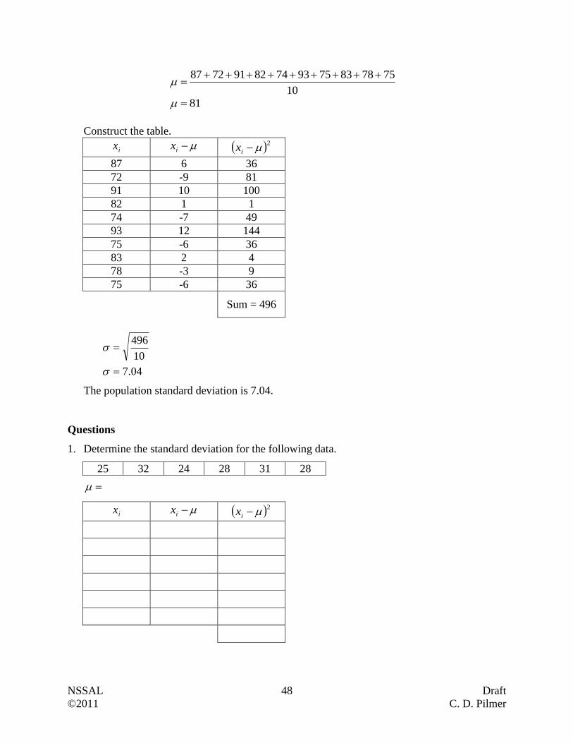
NSSAL 48 Draft
©2011 C. D. Pilmer
10
75788375937482917287
81
Construct the table.
ix ix 2
ix
87 6 36
72 -9 81
91 10 100
82 1 1
74 -7 49
93 12 144
75 -6 36
83 2 4
78 -3 9
75 -6 36
Sum = 496
04.7
10
496
The population standard deviation is 7.04.
Questions
1. Determine the standard deviation for the following data.
25 32 24 28 31 28
ix ix 2
ix
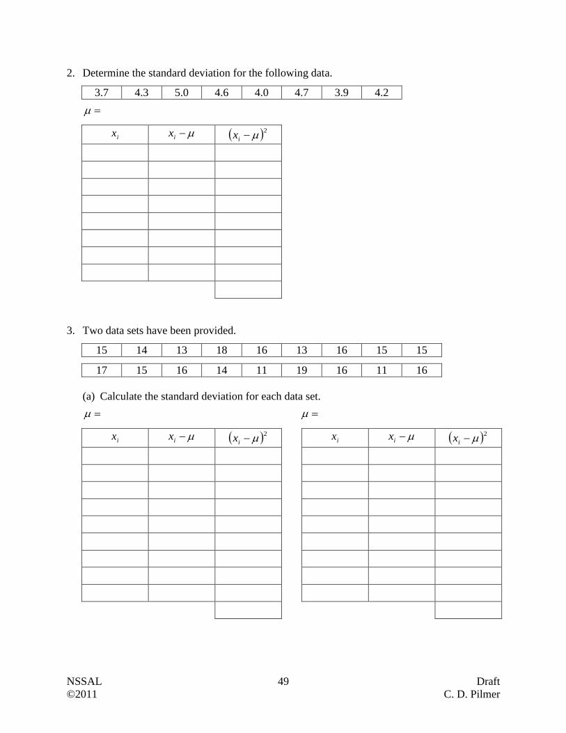
NSSAL 49 Draft
©2011 C. D. Pilmer
2. Determine the standard deviation for the following data.
3.7 4.3 5.0 4.6 4.0 4.7 3.9 4.2
ix ix 2
ix
3. Two data sets have been provided.
15 14 13 18 16 13 16 15 15
17 15 16 14 11 19 16 11 16
(a) Calculate the standard deviation for each data set.
ix ix 2
ix ix ix 2
ix

NSSAL 50 Draft
©2011 C. D. Pilmer
(b) The standard deviations are different for the two data sets. What is this telling you?
4. Barb, a math instructor, recorded the height in centimetres of all of the male students in her
Level IV math courses. She obtained the following measurements.
181 173 184 183 190 180 186 176 185
(a) What is the median for this data?
(b) What is the mean for this data?
(c) Is Barb dealing with a categorical or numerical data set?
(d) Determine the standard deviation.
ix

NSSAL 51 Draft
©2011 C. D. Pilmer
(e) Another instructor at different campus also has 9 male learners in his Level IV Math
courses. He measured their heights. He found the mean to be 182 cm with a standard
deviation of 6.4 cm. Based on these results, what can you say about the heights of this
instructor’s male learners compared to Barb’s male learners?
(f) A third instructor at another campus also has 9 male learners in her Level IV Math
courses. She measured their heights. She found the mean to be 179 cm with a standard
deviation of 4.8 cm. Based on these results, what can you say about the heights of this
instructor’s male learners compared to Barb’s male learners?
5. Without attempting any calculations, match each standard deviation with the appropriate
histogram. Please note that all of the histograms are drawn at the same scale.
Standard Deviations:
(a) 0.69 (b) 1.40 (c) 3.34 (d) 3.62
Histograms:
(i)
Matches with _____ Matches with _____ Matches with _____ Matches with _____
6. Create two data sets the meet all of the following conditions.
They have at least six pieces of data.
They must have a mean of 10.
They have standard deviations that are quite different.
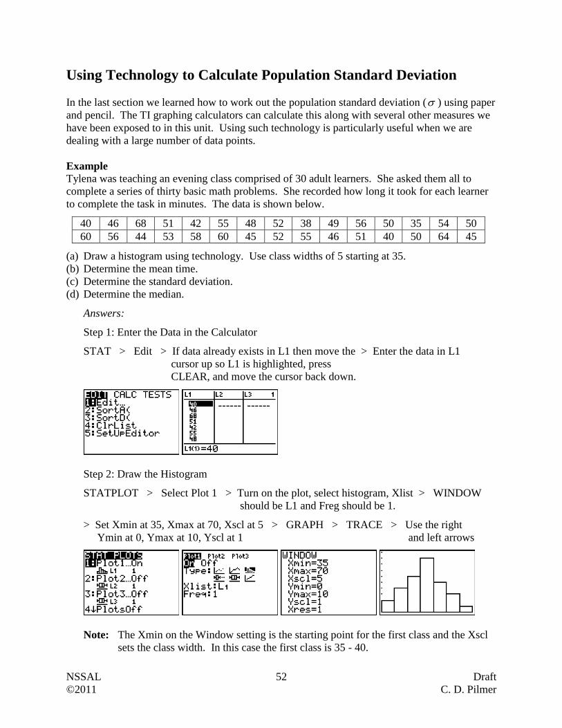
NSSAL 52 Draft
©2011 C. D. Pilmer
Using Technology to Calculate Population Standard Deviation
In the last section we learned how to work out the population standard deviation ( ) using paper
and pencil. The TI graphing calculators can calculate this along with several other measures we
have been exposed to in this unit. Using such technology is particularly useful when we are
dealing with a large number of data points.
Example
Tylena was teaching an evening class comprised of 30 adult learners. She asked them all to
complete a series of thirty basic math problems. She recorded how long it took for each learner
to complete the task in minutes. The data is shown below.
40 46 68 51 42 55 48 52 38 49 56 50 35 54 50
60 56 44 53 58 60 45 52 55 46 51 40 50 64 45
(a) Draw a histogram using technology. Use class widths of 5 starting at 35.
(b) Determine the mean time.
(c) Determine the standard deviation.
(d) Determine the median.
Answers:
Step 1: Enter the Data in the Calculator
STAT > Edit > If data already exists in L1 then move the > Enter the data in L1
cursor up so L1 is highlighted, press
CLEAR, and move the cursor back down.
Step 2: Draw the Histogram
STATPLOT > Select Plot 1 > Turn on the plot, select histogram, Xlist > WINDOW
should be L1 and Freg should be 1.
> Set Xmin at 35, Xmax at 70, Xscl at 5 > GRAPH > TRACE > Use the right
Ymin at 0, Ymax at 10, Yscl at 1 and left arrows
Note: The Xmin on the Window setting is the starting point for the first class and the Xscl
sets the class width. In this case the first class is 35 - 40.
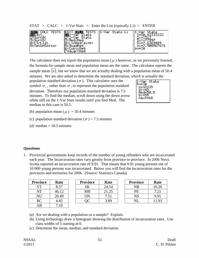
NSSAL 53 Draft
©2011 C. D. Pilmer
STAT > CALC > 1-Var Stats > Enter the List (typically L1) > ENTER
The calculator does not report the population mean ( ) however, as we previously learned,
the formula for sample mean and population mean are the same. The calculator reports the
sample mean x , but we know that we are actually dealing with a population mean of 50.4
minutes. We are also asked to determine the standard deviation, which is actually the
population standard deviation ( ). This calculator uses the
symbol x , rather than , to represent the population standard
deviation. Therefore our population standard deviation is 7.5
minutes. To find the median, scroll down using the down arrow
while still on the 1-Var Stats results until you find Med. The
median in this case is 50.5.
(b) population mean ( ) = 50.4 minutes
(c) population standard deviation ( ) = 7.5 minutes
(d) median = 50.5 minutes
Questions
1. Provincial governments keep records of the number of young offenders who are incarcerated
each year. The incarceration rates vary greatly from province to province. In 2006 Nova
Scotia reported an incarceration rate of 9.91. That means that 9.91 young persons out of
10 000 young persons was incarcerated. Below you will find the incarceration rates for the
provinces and territories for 2006. (Source: Statistics Canada)
Province Rate Province Rate Province Rate
YT 8.57 SK 24.54 NB 10.20
NT 46.12 MB 21.25 PE 7.21
NU 20.49 ON 7.51 NS 9.91
BC 4.45 QC 3.89 NL 11.93
AB 7.18
(a) Are we dealing with a population or a sample? Explain.
(b) Using technology draw a histogram showing the distribution of incarceration rates. Use
class widths of 5 starting at 0.
(c) Determine the mean, median, and standard deviation.
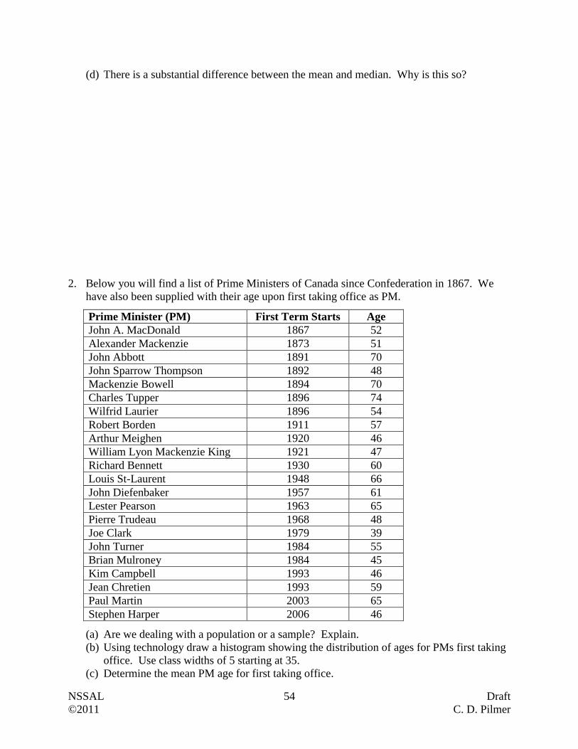
NSSAL 54 Draft
©2011 C. D. Pilmer
(d) There is a substantial difference between the mean and median. Why is this so?
2. Below you will find a list of Prime Ministers of Canada since Confederation in 1867. We
have also been supplied with their age upon first taking office as PM.
Prime Minister (PM) First Term Starts Age
John A. MacDonald 1867 52
Alexander Mackenzie 1873 51
John Abbott 1891 70
John Sparrow Thompson 1892 48
Mackenzie Bowell 1894 70
Charles Tupper 1896 74
Wilfrid Laurier 1896 54
Robert Borden 1911 57
Arthur Meighen 1920 46
William Lyon Mackenzie King 1921 47
Richard Bennett 1930 60
Louis St-Laurent 1948 66
John Diefenbaker 1957 61
Lester Pearson 1963 65
Pierre Trudeau 1968 48
Joe Clark 1979 39
John Turner 1984 55
Brian Mulroney 1984 45
Kim Campbell 1993 46
Jean Chretien 1993 59
Paul Martin 2003 65
Stephen Harper 2006 46
(a) Are we dealing with a population or a sample? Explain.
(b) Using technology draw a histogram showing the distribution of ages for PMs first taking
office. Use class widths of 5 starting at 35.
(c) Determine the mean PM age for first taking office.
NSSAL 55 Draft
©2011 C. D. Pilmer
(d) Determine the standard deviation.
(e) Determine the median.
(f) What can you conclude based on the histogram and standard deviation?
3. Cholesterol is waxy, fat-like substance found in all cells of the body. Our bodies need it to
make hormones, vitamin D, and substances used in digestion. However, cholesterol,
specifically low density lipoprotein (LDL) cholesterol, in high amounts is dangerous to one's
health. The following chart looks at various cholesterol ranges and their classifications. The
units of measure are millimoles per litre (mmol/L).
LDL Cholesterol
Levels
below 2.6 from 2.6
to 3.3
from 3.4
to 4.1
from 4.2
to 4.9
above 4.9
Classification desirable near
optimal
borderline high too high
Dr. Gillis is looking through the records for all her male patients over the last year who are
between the ages of 50 and 60 years. They have all had blood work and she records all the
LDL cholesterol levels for these patients in the chart below.
4.1 3.6 3.4 5.1 2.4 2.5 2.5 3.5 3.8 4.8 4.4 2.4 2.3 4.2 3.3
5.2 2.9 2.7 5.3 2.6 2.8 3.0 4.6 4.9 3.3 3.2 3.0 3.7 3.7 3.4
(a) Using technology draw a histogram showing the distribution of LDL cholesterol levels.
Use class widths of 0.8 starting at 1.8.
(b) Determine the mean LDL cholesterol levels for Dr. Gillis' male patients between the ages
of 50 and 60 years.
NSSAL 56 Draft
©2011 C. D. Pilmer
(c) Determine the standard deviation.
(d) Determine the median.
(e) What can you conclude based on the histogram and standard deviation?
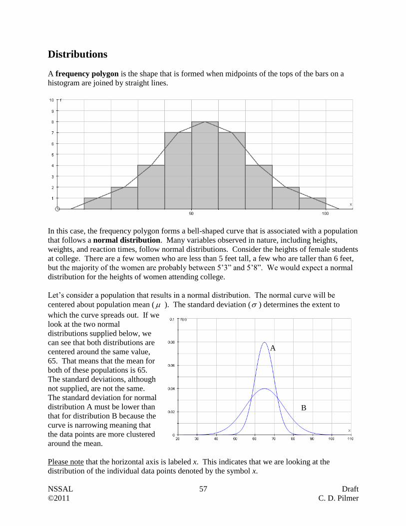
NSSAL 57 Draft
©2011 C. D. Pilmer
Distributions
A frequency polygon is the shape that is formed when midpoints of the tops of the bars on a
histogram are joined by straight lines.
In this case, the frequency polygon forms a bell-shaped curve that is associated with a population
that follows a normal distribution. Many variables observed in nature, including heights,
weights, and reaction times, follow normal distributions. Consider the heights of female students
at college. There are a few women who are less than 5 feet tall, a few who are taller than 6 feet,
but the majority of the women are probably between 5’3” and 5’8”. We would expect a normal
distribution for the heights of women attending college.
Let’s consider a population that results in a normal distribution. The normal curve will be
centered about population mean ( ). The standard deviation ( ) determines the extent to
which the curve spreads out. If we
look at the two normal
distributions supplied below, we
can see that both distributions are
centered around the same value,
65. That means that the mean for
both of these populations is 65.
The standard deviations, although
not supplied, are not the same.
The standard deviation for normal
distribution A must be lower than
that for distribution B because the
curve is narrowing meaning that
the data points are more clustered
around the mean.
Please note that the horizontal axis is labeled x. This indicates that we are looking at the
distribution of the individual data points denoted by the symbol x.
A
B
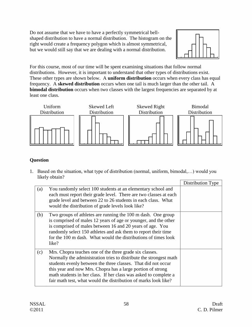
NSSAL 58 Draft
©2011 C. D. Pilmer
Do not assume that we have to have a perfectly symmetrical bell-
shaped distribution to have a normal distribution. The histogram on the
right would create a frequency polygon which is almost symmetrical,
but we would still say that we are dealing with a normal distribution.
For this course, most of our time will be spent examining situations that follow normal
distributions. However, it is important to understand that other types of distributions exist.
These other types are shown below. A uniform distribution occurs when every class has equal
frequency. A skewed distribution occurs when one tail is much larger than the other tail. A
bimodal distribution occurs when two classes with the largest frequencies are separated by at
least one class.
Uniform
Distribution
Skewed Left
Distribution
Skewed Right
Distribution
Bimodal
Distribution
Question
1. Based on the situation, what type of distribution (normal, uniform, bimodal,…) would you
likely obtain?
Distribution Type
(a) You randomly select 100 students at an elementary school and
each must report their grade level. There are two classes at each
grade level and between 22 to 26 students in each class. What
would the distribution of grade levels look like?
(b) Two groups of athletes are running the 100 m dash. One group
is comprised of males 12 years of age or younger, and the other
is comprised of males between 16 and 20 years of age. You
randomly select 150 athletes and ask them to report their time
for the 100 m dash. What would the distributions of times look
like?
(c) Mrs. Chopra teaches one of the three grade six classes.
Normally the administration tries to distribute the strongest math
students evenly between the three classes. That did not occur
this year and now Mrs. Chopra has a large portion of strong
math students in her class. If her class was asked to complete a
fair math test, what would the distribution of marks look like?
NSSAL 59 Draft
©2011 C. D. Pilmer
Distribution Type
(d) You randomly select 100 females between the ages of 20 and 29
and record their heights. What would the distribution of heights
look like?
(e) A college instructor had what he described as an average class of
students. From his perspective there were a few weak students,
a few strong students but the majority of the students were of
average ability. He gave the class an extremely challenging test
where only the strongest students could maintain good marks,
ranging from 75% to 95%. The rest of the students did poorly
where many resoundingly failed the test. What would the
distribution of marks for this test look like?
(f) You spin the following spinner 300
times recording how many times you
obtain each of the results (1, 2, 3, 4).
What would the distribution of results
look like?
(g) A nursing student working at the children's hospital looks at the
birth weights of all babies born in the hospital during June, July,
and August. What would the distribution of birth weights look
like?
(h) Eastern American Toad, common in Nova Scotia, enter the
world as small dark polliwogs, become miniature toads, and
finally mature to be adult toads. What would the distribution of
ages for Eastern American Toads of all forms (polliwogs to
adults) look like?
(i) A personal trainer at a coed gym recorded the maximum
resistance people would set on a particular piece of exercise
equipment over a one month period. What would the
distribution of resistance settings look like?
(j) A kinesiologist is recording the grip strength of 250 randomly
selected males between the ages of 25 and 35. What would the
distribution of grip strengths look this?
1
3 4
2
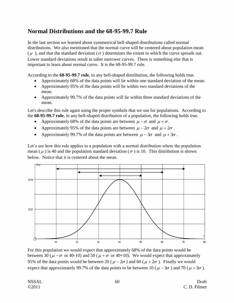
NSSAL 60 Draft
©2011 C. D. Pilmer
Normal Distributions and the 68-95-99.7 Rule
In the last section we learned about symmetrical bell-shaped distributions called normal
distributions. We also mentioned that the normal curve will be centered about population mean
( ), and that the standard deviation ( ) determines the extent to which the curve spreads out.
Lower standard deviations result in taller narrower curves. There is something else that is
important to learn about normal curve. It is the 68-95-99.7 rule.
According to the 68-95-99.7 rule, in any bell-shaped distribution, the following holds true.
Approximately 68% of the data points will lie within one standard deviation of the mean.
Approximately 95% of the data points will lie within two standard deviations of the
mean.
Approximately 99.7% of the data points will lie within three standard deviations of the
mean.
Let's describe this rule again using the proper symbols that we use for populations. According to
the 68-95-99.7 rule, in any bell-shaped distribution of a population, the following holds true.
Approximately 68% of the data points are between and .
Approximately 95% of the data points are between 2 and 2 .
Approximately 99.7% of the data points are between 3 and 3 .
Let’s see how this rule applies to a population with a normal distribution where the population
mean ( ) is 40 and the population standard deviation ( ) is 10. This distribution is shown
below. Notice that it is centered about the mean.
For this population we would expect that approximately 68% of the data points would be
between 30 ( or 40-10) and 50 ( or 40+10). We would expect that approximately
95% of the data points would be between 20 ( 2 ) and 60 ( 2 ). Finally we would
expect that approximately 99.7% of the data points to be between 10 ( 3 ) and 70 ( 3 ).
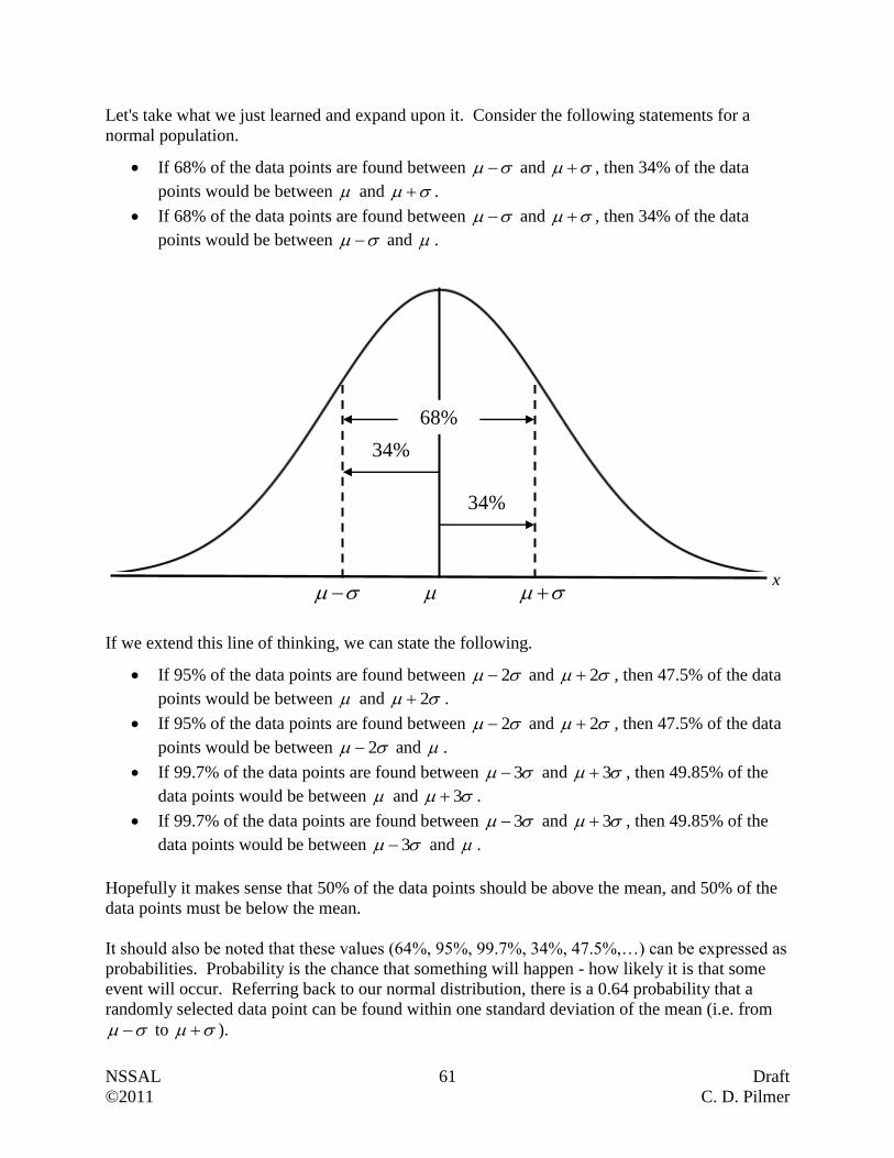
NSSAL 61 Draft
©2011 C. D. Pilmer
Let's take what we just learned and expand upon it. Consider the following statements for a
normal population.
If 68% of the data points are found between and , then 34% of the data
points would be between and .
If 68% of the data points are found between and , then 34% of the data
points would be between and .
If we extend this line of thinking, we can state the following.
If 95% of the data points are found between 2 and 2 , then 47.5% of the data
points would be between and 2 .
If 95% of the data points are found between 2 and 2 , then 47.5% of the data
points would be between 2 and .
If 99.7% of the data points are found between 3 and 3 , then 49.85% of the
data points would be between and 3 .
If 99.7% of the data points are found between 3 and 3 , then 49.85% of the
data points would be between 3 and .
Hopefully it makes sense that 50% of the data points should be above the mean, and 50% of the
data points must be below the mean.
It should also be noted that these values (64%, 95%, 99.7%, 34%, 47.5%,…) can be expressed as
probabilities. Probability is the chance that something will happen - how likely it is that some
event will occur. Referring back to our normal distribution, there is a 0.64 probability that a
randomly selected data point can be found within one standard deviation of the mean (i.e. from
to ).
68%
34%
34%
x
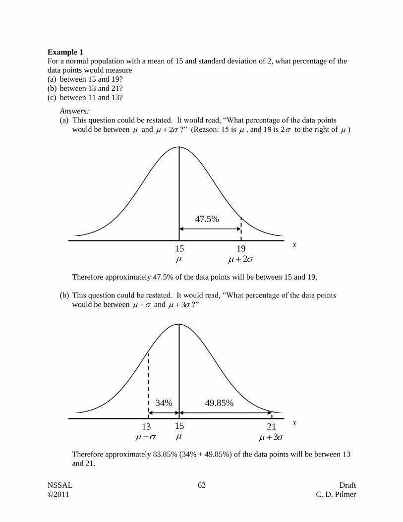
NSSAL 62 Draft
©2011 C. D. Pilmer
Example 1
For a normal population with a mean of 15 and standard deviation of 2, what percentage of the
data points would measure
(a) between 15 and 19?
(b) between 13 and 21?
(c) between 11 and 13?
Answers:
(a) This question could be restated. It would read, “What percentage of the data points
would be between and 2 ?” (Reason: 15 is , and 19 is 2 to the right of )
Therefore approximately 47.5% of the data points will be between 15 and 19.
(b) This question could be restated. It would read, “What percentage of the data points
would be between and 3 ?”
Therefore approximately 83.85% (34% + 49.85%) of the data points will be between 13
and 21.
47.5%
19 2
15
49.85%
21 3
15
34%
13
x
x
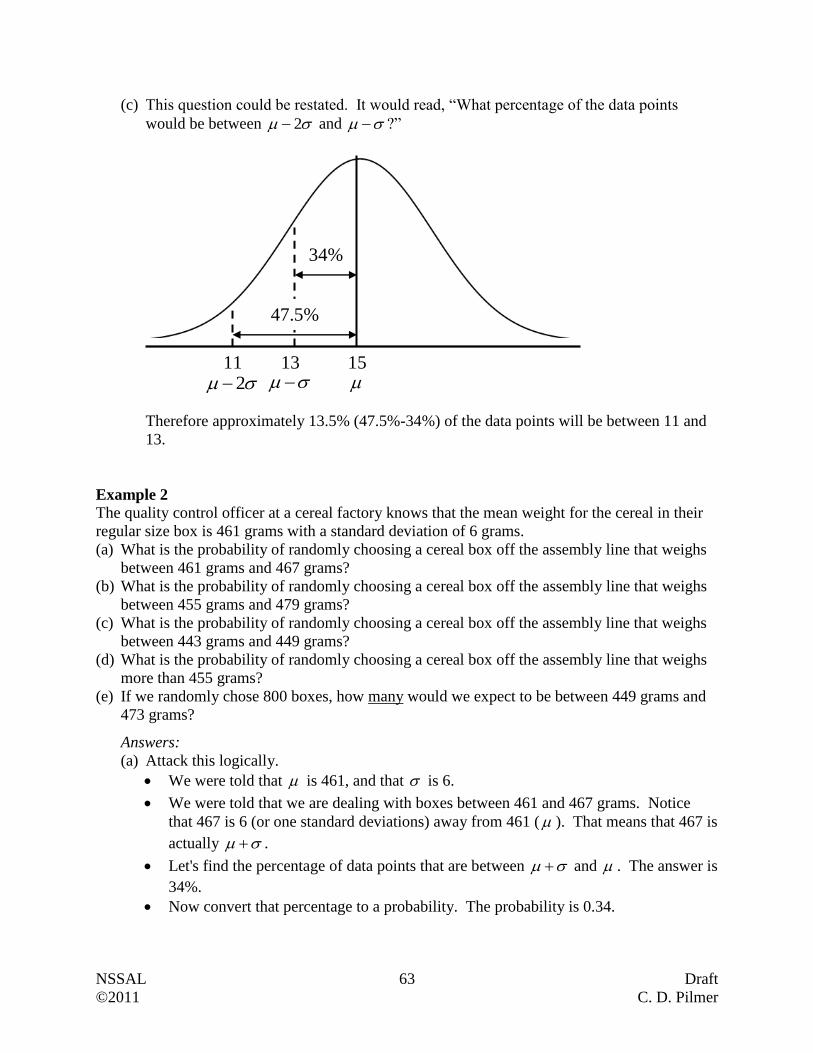
NSSAL 63 Draft
©2011 C. D. Pilmer
(c) This question could be restated. It would read, “What percentage of the data points
would be between 2 and ?”
Therefore approximately 13.5% (47.5%-34%) of the data points will be between 11 and
13.
Example 2
The quality control officer at a cereal factory knows that the mean weight for the cereal in their
regular size box is 461 grams with a standard deviation of 6 grams.
(a) What is the probability of randomly choosing a cereal box off the assembly line that weighs
between 461 grams and 467 grams?
(b) What is the probability of randomly choosing a cereal box off the assembly line that weighs
between 455 grams and 479 grams?
(c) What is the probability of randomly choosing a cereal box off the assembly line that weighs
between 443 grams and 449 grams?
(d) What is the probability of randomly choosing a cereal box off the assembly line that weighs
more than 455 grams?
(e) If we randomly chose 800 boxes, how many would we expect to be between 449 grams and
473 grams?
Answers:
(a) Attack this logically.
We were told that is 461, and that is 6.
We were told that we are dealing with boxes between 461 and 467 grams. Notice
that 467 is 6 (or one standard deviations) away from 461 ( ). That means that 467 is
actually .
Let's find the percentage of data points that are between and . The answer is
34%.
Now convert that percentage to a probability. The probability is 0.34.
11 2
15
34%
13
47.5%

NSSAL 64 Draft
©2011 C. D. Pilmer
(b) Think logically.
455 is one standard deviation to the left of the mean, and therefore can be expressed
as .
479 is three standard deviations to the right of the mean and therefore can be
expressed as 3 .
We actually need to find the percentage of boxes that are between and
3 .
We know that 34% of the data points are between and . We also know that
49.85% of the data points are between and 3 . Therefore we can conclude
that 83.85% (34% + 49.85%) of the data points are between and 3 .
Convert 83.85% to a probability of 0.8385. Based on this number, we can say that
there is a very high chance that a randomly selected cereal box will have weight
between 455 g and 479 g.
(c) Think logically.
443 is three standard deviations to the left of the mean, and therefore can be
expressed as 3 .
449 is two standard deviations to the left of the mean, and therefore can be expressed
as 2 .
We actually need to find the percentage of boxes that are between 3 and
2 .
We know that 49.85% of the data points are between 3 and . We also know
that 47.5% of the data points are between 2 and . Therefore we can conclude
that 2.35% (49.85% - 47.5%) of the data points are between 3 and 2 .
Convert 2.35% to a probability of 0.0235. Based on this number, we can say that
there is a very slight chance that a randomly selected cereal box will have weight
between 443 g and 449 g.
(d) Think logically.
34% of the data points are between 455 ( ) and 461 ( ).
50% of the data points are greater than 461 ( )
Therefore 84% of the data is greater than 455. This gives us a probability of 0.84
(e) The number 449 is 2 . The number 473 is 2 . We know that 95% of the data
points should be two standard deviations to the left and right of the mean. As a
probability, it is expressed as 0.95.
76080095.0
Of the 800 randomly selected cereal boxes, we would expect 760 boxes to be between
449 g and 473 g.
NSSAL 65 Draft
©2011 C. D. Pilmer
Questions
1. Use the 68-95-99.7 rule on a distribution of data points with a population mean of 230 and a
population standard deviation of 15 to answer the following questions. You may wish to
draw and label a normal distribution curve to assist you with each of these questions. This is
what we did in Example 1.
(a) What percentage of the data points would measure between 215 and 245?
(b) What percentage of the data points would measure between 230 and 260?
(c) What percentage of the data points would measure between 215 and 230?
(d) What percentage of the data points would measure between 185 and 230?
(e) What percentage of the data points would measure between 200 and 245?
(f) What percentage of the data points would measure between 215 and 275?
(g) What is the probability that a randomly selected data point would be between 185 and
260?
(h) What is the probability that a randomly selected data point would be between 245 and
260?
NSSAL 66 Draft
©2011 C. D. Pilmer
(i) What is the probability that a randomly selected data point would be between 185 and
200?
(j) What is the probability that a randomly selected data point would be between 245 and
275?
(k) What is the probability that a randomly selected data point would be less 245?
(l) What is the probability that a randomly selected data point is greater than 200?
(m) What is the probability that a randomly selected data point is less than 215?
2. A company monitored the production of 2000 bagels for a one day period. They determined
that the mean weight (population mean) of the bagels was 104 grams with a standard
deviation of 3 grams. Assume the distribution of bagel weights is bell-shaped. You may
choose to draw and label a normal distribution curve to assist you with each of these
questions.
(a) How many of the 2000 bagels were within 9 grams of the mean?
(b) How many of the 2000 bagels were within 3 grams of the mean?
NSSAL 67 Draft
©2011 C. D. Pilmer
(c) How many of the 2000 bagels are between 98 grams and 104 grams?
(d) How many of the 2000 bagels are between 101 grams and 110 grams?
(e) How many of the 2000 bagels are between 107 grams and 110 grams?
(f) How many of the 2000 bagels are between 98 grams and 110 grams?
(g) How many of the 2000 bagels are between 95 grams and 101 grams?
(h) How many of the 2000 bagels are between 98 grams and 113 grams?
(i) How many of the 2000 bagels are between 95 grams and 104 grams?
(j) How many of the 2000 bagels are between 110 grams and 113 grams?
(k) How many of the 2000 bagels are less than 98 grams?
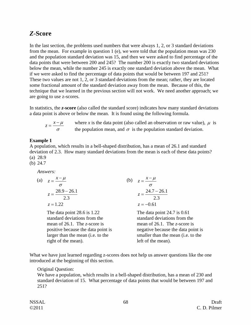
NSSAL 68 Draft
©2011 C. D. Pilmer
Z-Score
In the last section, the problems used numbers that were always 1, 2, or 3 standard deviations
from the mean. For example in question 1 (e), we were told that the population mean was 230
and the population standard deviation was 15, and then we were asked to find percentage of the
data points that were between 200 and 245? The number 200 is exactly two standard deviations
below the mean, while the number 245 is exactly one standard deviation above the mean. What
if we were asked to find the percentage of data points that would be between 197 and 251?
These two values are not 1, 2, or 3 standard deviations from the mean; rather, they are located
some fractional amount of the standard deviation away from the mean. Because of this, the
technique that we learned in the previous section will not work. We need another approach; we
are going to use z-scores.
In statistics, the z-score (also called the standard score) indicates how many standard deviations
a data point is above or below the mean. It is found using the following formula.
xz
Example 1
A population, which results in a bell-shaped distribution, has a mean of 26.1 and standard
deviation of 2.3. How many standard deviations from the mean is each of these data points?
(a) 28.9
(b) 24.7
Answers:
(a)
22.1
3.2
1.269.28
z
z
xz
The data point 28.6 is 1.22
standard deviations from the
mean of 26.1. The z-score is
positive because the data point is
larger than the mean (i.e. to the
right of the mean).
(b)
61.0
3.2
1.267.24
z
z
xz
The data point 24.7 is 0.61
standard deviations from the
mean of 26.1. The z-score is
negative because the data point is
smaller than the mean (i.e. to the
left of the mean).
What we have just learned regarding z-scores does not help us answer questions like the one
introduced at the beginning of this section.
Original Question:
We have a population, which results in a bell-shaped distribution, has a mean of 230 and
standard deviation of 15. What percentage of data points that would be between 197 and
251?
where x is the data point (also called an observation or raw value), is
the population mean, and is the population standard deviation.
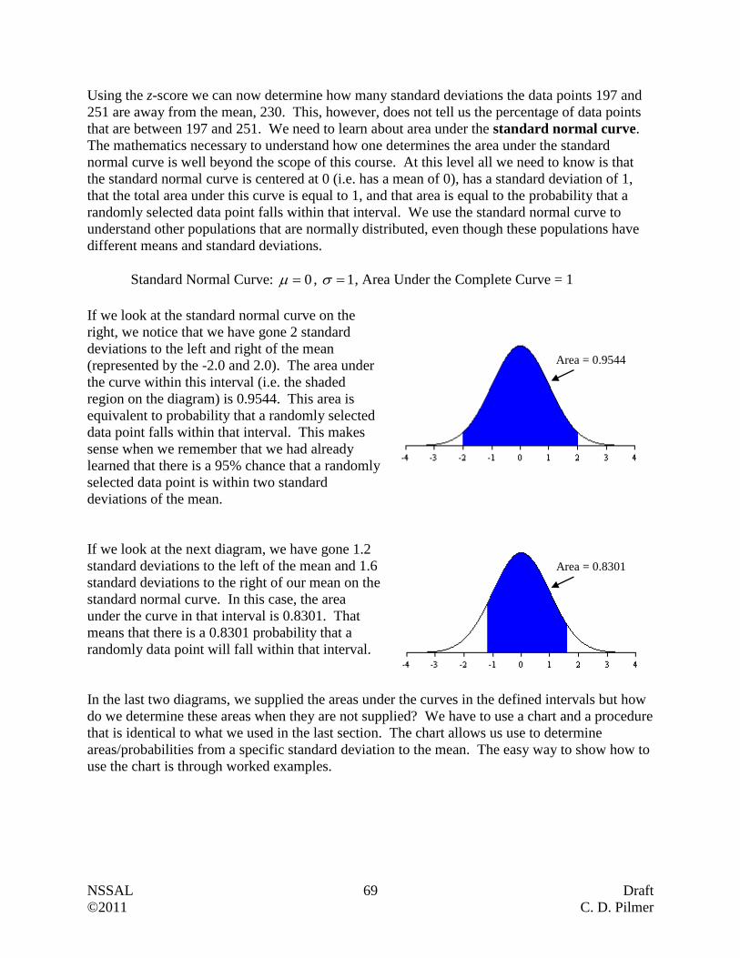
NSSAL 69 Draft
©2011 C. D. Pilmer
Using the z-score we can now determine how many standard deviations the data points 197 and
251 are away from the mean, 230. This, however, does not tell us the percentage of data points
that are between 197 and 251. We need to learn about area under the standard normal curve.
The mathematics necessary to understand how one determines the area under the standard
normal curve is well beyond the scope of this course. At this level all we need to know is that
the standard normal curve is centered at 0 (i.e. has a mean of 0), has a standard deviation of 1,
that the total area under this curve is equal to 1, and that area is equal to the probability that a
randomly selected data point falls within that interval. We use the standard normal curve to
understand other populations that are normally distributed, even though these populations have
different means and standard deviations.
Standard Normal Curve: 0 , 1 , Area Under the Complete Curve = 1
If we look at the standard normal curve on the
right, we notice that we have gone 2 standard
deviations to the left and right of the mean
(represented by the -2.0 and 2.0). The area under
the curve within this interval (i.e. the shaded
region on the diagram) is 0.9544. This area is
equivalent to probability that a randomly selected
data point falls within that interval. This makes
sense when we remember that we had already
learned that there is a 95% chance that a randomly
selected data point is within two standard
deviations of the mean.
If we look at the next diagram, we have gone 1.2
standard deviations to the left of the mean and 1.6
standard deviations to the right of our mean on the
standard normal curve. In this case, the area
under the curve in that interval is 0.8301. That
means that there is a 0.8301 probability that a
randomly data point will fall within that interval.
In the last two diagrams, we supplied the areas under the curves in the defined intervals but how
do we determine these areas when they are not supplied? We have to use a chart and a procedure
that is identical to what we used in the last section. The chart allows us use to determine
areas/probabilities from a specific standard deviation to the mean. The easy way to show how to
use the chart is through worked examples.
Area = 0.9544
Area = 0.8301
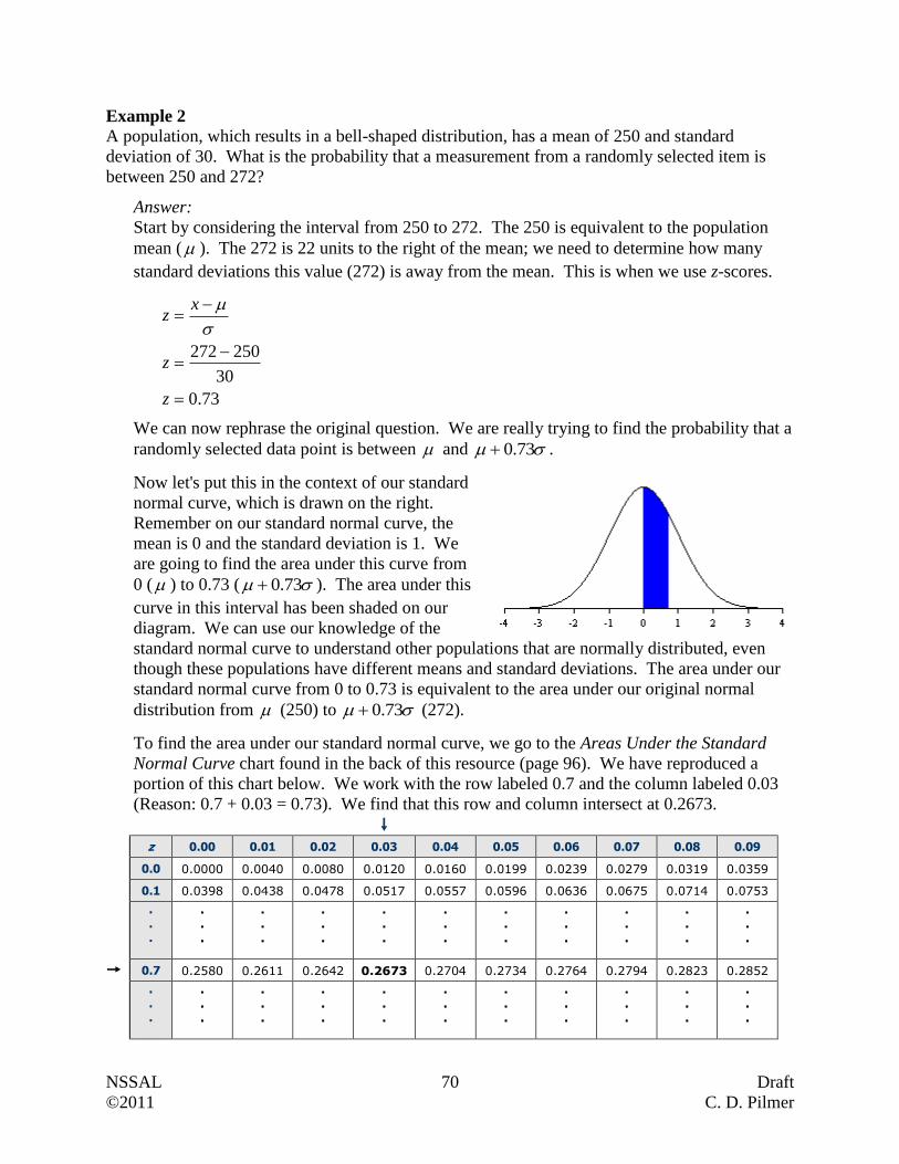
NSSAL 70 Draft
©2011 C. D. Pilmer
Example 2
A population, which results in a bell-shaped distribution, has a mean of 250 and standard
deviation of 30. What is the probability that a measurement from a randomly selected item is
between 250 and 272?
Answer:
Start by considering the interval from 250 to 272. The 250 is equivalent to the population
mean ( ). The 272 is 22 units to the right of the mean; we need to determine how many
standard deviations this value (272) is away from the mean. This is when we use z-scores.
73.0
30
250272
z
z
xz
We can now rephrase the original question. We are really trying to find the probability that a
randomly selected data point is between and 73.0 .
Now let's put this in the context of our standard
normal curve, which is drawn on the right.
Remember on our standard normal curve, the
mean is 0 and the standard deviation is 1. We
are going to find the area under this curve from
0 ( ) to 0.73 ( 73.0 ). The area under this
curve in this interval has been shaded on our
diagram. We can use our knowledge of the
standard normal curve to understand other populations that are normally distributed, even
though these populations have different means and standard deviations. The area under our
standard normal curve from 0 to 0.73 is equivalent to the area under our original normal
distribution from (250) to 73.0 (272).
To find the area under our standard normal curve, we go to the Areas Under the Standard
Normal Curve chart found in the back of this resource (page 96). We have reproduced a
portion of this chart below. We work with the row labeled 0.7 and the column labeled 0.03
(Reason: 0.7 + 0.03 = 0.73). We find that this row and column intersect at 0.2673.
z 0.00 0.01 0.02 0.03 0.04 0.05 0.06 0.07 0.08 0.09
0.0 0.0000 0.0040 0.0080 0.0120 0.0160 0.0199 0.0239 0.0279 0.0319 0.0359
0.1 0.0398 0.0438 0.0478 0.0517 0.0557 0.0596 0.0636 0.0675 0.0714 0.0753
. . .
.
.
.
.
.
.
.
.
.
.
.
.
.
.
.
.
.
.
.
.
.
.
.
.
.
.
.
.
.
.
0.7 0.2580 0.2611 0.2642 0.2673 0.2704 0.2734 0.2764 0.2794 0.2823 0.2852
. . .
.
.
.
.
.
.
.
.
.
.
.
.
.
.
.
.
.
.
.
.
.
.
.
.
.
.
.
.
.
.

NSSAL 71 Draft
©2011 C. D. Pilmer
That means that the area under the standard normal curve between 0 ( ) and 0.73
( 73.0 ) is 0.2673. In terms of our original normally distribution, it means that there is a
0.2673 probability that a randomly selected data point will be between 250 ( ) and 272
( 73.0 ).
Example 3
Data for a population was normally distributed with a mean of 167 and standard deviation of 18.
What is the probability that a randomly selected data point from this population is between 144
and 181?
Answer:
This question is more challenging than the last one because neither of the values supplied
(144 or 181) is the population mean. The lower limit, 144, is below the mean, while the
upper limit, 181, is above the mean.
We need to find out how much above and below these two values are but in terms of
standard deviations. That means we need to work out the z-scores.
28.1
18
167144
z
z
xz
78.0
18
167181
z
z
xz
Our question can now be rephrased as "What is the probability that a randomly selected data
point from this population is between 28.1 and 78.0 ?"
To tackle this, we need to work with the
standard normal curve and have to break the
question into parts. We start by finding the
area/probability on our standard normal curve
from -1.28 ( 28.1 ) to 0 ( ), then find the
area/probability from 0 ( ) to 0.78
( 78.0 ), and finally we add the two
areas/probabilities.
Area/Probability between 28.1 and
(Find 1.28 on the chart.)
z 0.00 0.01 0.02 0.03 0.04 0.05 0.06 0.07 0.08 0.09
0.0 0.0000 0.0040 0.0080 0.0120 0.0160 0.0199 0.0239 0.0279 0.0319 0.0359
0.1 0.0398 0.0438 0.0478 0.0517 0.0557 0.0596 0.0636 0.0675 0.0714 0.0753
. . .
.
.
.
.
.
.
.
.
.
.
.
.
.
.
.
.
.
.
.
.
.
.
.
.
.
.
.
.
.
.
1.2 0.3849 0.3869 0.3888 0.3907 0.3925 0.3944 0.3962 0.3980 0.3997 0.4015
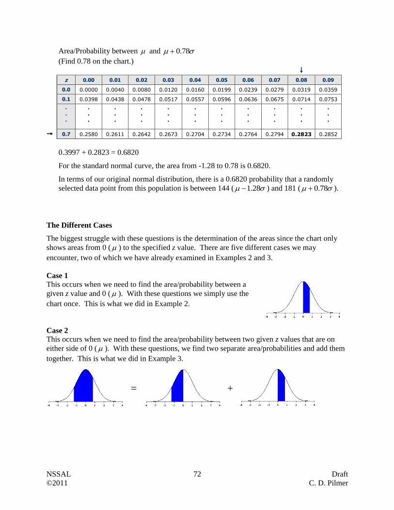
NSSAL 72 Draft
©2011 C. D. Pilmer
Area/Probability between and 78.0
(Find 0.78 on the chart.)
z 0.00 0.01 0.02 0.03 0.04 0.05 0.06 0.07 0.08 0.09
0.0 0.0000 0.0040 0.0080 0.0120 0.0160 0.0199 0.0239 0.0279 0.0319 0.0359
0.1 0.0398 0.0438 0.0478 0.0517 0.0557 0.0596 0.0636 0.0675 0.0714 0.0753
. . .
.
.
.
.
.
.
.
.
.
.
.
.
.
.
.
.
.
.
.
.
.
.
.
.
.
.
.
.
.
.
0.7 0.2580 0.2611 0.2642 0.2673 0.2704 0.2734 0.2764 0.2794 0.2823 0.2852
0.3997 + 0.2823 = 0.6820
For the standard normal curve, the area from -1.28 to 0.78 is 0.6820.
In terms of our original normal distribution, there is a 0.6820 probability that a randomly
selected data point from this population is between 144 ( 28.1 ) and 181 ( 78.0 ).
The Different Cases
The biggest struggle with these questions is the determination of the areas since the chart only
shows areas from 0 ( ) to the specified z value. There are five different cases we may
encounter, two of which we have already examined in Examples 2 and 3.
Case 1
This occurs when we need to find the area/probability between a
given z value and 0 ( ). With these questions we simply use the
chart once. This is what we did in Example 2.
Case 2
This occurs when we need to find the area/probability between two given z values that are on
either side of 0 ( ). With these questions, we find two separate area/probabilities and add them
together. This is what we did in Example 3.
= +
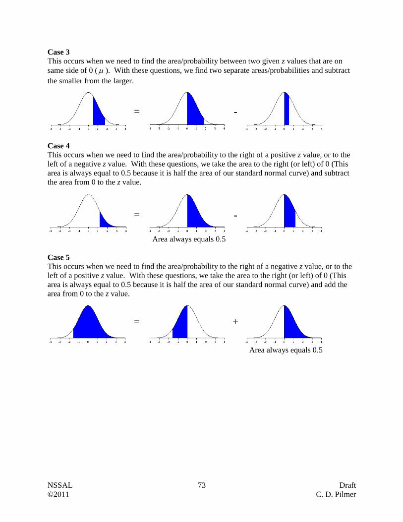
NSSAL 73 Draft
©2011 C. D. Pilmer
Case 3
This occurs when we need to find the area/probability between two given z values that are on
same side of 0 ( ). With these questions, we find two separate areas/probabilities and subtract
the smaller from the larger.
Case 4
This occurs when we need to find the area/probability to the right of a positive z value, or to the
left of a negative z value. With these questions, we take the area to the right (or left) of 0 (This
area is always equal to 0.5 because it is half the area of our standard normal curve) and subtract
the area from 0 to the z value.
Area always equals 0.5
Case 5
This occurs when we need to find the area/probability to the right of a negative z value, or to the
left of a positive z value. With these questions, we take the area to the right (or left) of 0 (This
area is always equal to 0.5 because it is half the area of our standard normal curve) and add the
area from 0 to the z value.
Area always equals 0.5
= -
= -
+ =
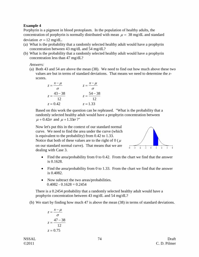
NSSAL 74 Draft
©2011 C. D. Pilmer
Example 4
Porphyrin is a pigment in blood protoplasm. In the population of healthy adults, the
concentration of porphyrin is normally distributed with mean 38 mg/dL and standard
deviation 12 mg/dL.
(a) What is the probability that a randomly selected healthy adult would have a prophyrin
concentration between 43 mg/dL and 54 mg/dL?
(b) What is the probability that a randomly selected healthy adult would have a prophyrin
concentration less than 47 mg/dL?
Answers:
(a) Both 43 and 54 are above the mean (38). We need to find out how much above these two
values are but in terms of standard deviations. That means we need to determine the z-
scores.
42.0
12
3843
z
z
xz
33.1
12
3854
z
z
xz
Based on this work the question can be rephrased. "What is the probability that a
randomly selected healthy adult would have a prophyrin concentration between
42.0 and 33.1 ?"
Now let's put this in the context of our standard normal
curve. We need to find the area under the curve (which
is equivalent to the probability) from 0.42 to 1.33.
Notice that both of these values are to the right of 0 (
on our standard normal curve). That means that we are
dealing with Case 3.
Find the area/probability from 0 to 0.42. From the chart we find that the answer
is 0.1628.
Find the area/probability from 0 to 1.33. From the chart we find that the answer
is 0.4082.
Now subtract the two areas/probabilities.
0.4082 - 0.1628 = 0.2454
There is a 0.2454 probability that a randomly selected healthy adult would have a
prophyrin concentration between 43 mg/dL and 54 mg/dL?
(b) We start by finding how much 47 is above the mean (38) in terms of standard deviations.
75.0
12
3847
z
z
xz
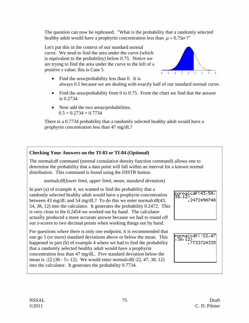
NSSAL 75 Draft
©2011 C. D. Pilmer
The question can now be rephrased. "What is the probability that a randomly selected
healthy adult would have a prophyrin concentration less than 75.0 ?"
Let's put this in the context of our standard normal
curve. We need to find the area under the curve (which
is equivalent to the probability) below 0.75. Notice we
are trying to find the area under the curve to the left of a
positive z value; this is Case 5.
Find the area/probability less than 0. It is
always 0.5 because we are dealing with exactly half of our standard normal curve.
Find the area/probability from 0 to 0.75. From the chart we find that the answer
is 0.2734.
Now add the two areas/probabilities.
0.5 + 0.2734 = 0.7734
There is a 0.7734 probability that a randomly selected healthy adult would have a
prophyrin concentration less than 47 mg/dL?
Checking Your Answers on the TI-83 or TI-84 (Optional)
The normalcdf command (normal cumulative density function command) allows one to
determine the probability that a data point will fall within an interval for a known normal
distribution. This command is found using the DISTR button.
normalcdf(lower limit, upper limit, mean, standard deviation)
In part (a) of example 4, we wanted to find the probability that a
randomly selected healthy adult would have a prophyrin concentration
between 43 mg/dL and 54 mg/dL? To do this we enter normalcdf(43,
54, 38, 12) into the calculator. It generates the probability 0.2472. This
is very close to the 0.2454 we worked out by hand. The calculator
actually produced a more accurate answer because we had to round off
our z-scores to two decimal points when working things out by hand.
For questions where there is only one endpoint, it is recommended that
one go 5 (or more) standard deviations above or below the mean. This
happened in part (b) of example 4 where we had to find the probability
that a randomly selected healthy adult would have a prophyrin
concentration less than 47 mg/dL. Five standard deviation below the
mean is -22 (38 - 512). We would enter normalcdf(-22, 47, 38, 12)
into the calculator. It generates the probability 0.7734.
NSSAL 76 Draft
©2011 C. D. Pilmer
Questions
1. A population, which results in a bell-shaped distribution, has a mean of 42.7 and standard
deviation of 7.9. How many standard deviations from the mean is each of these data points?
(a) 37.6
(b) 53.2
2. It may surprise you but professors at universities do not spend all their time teaching
graduate and undergraduate students. A significant amount of time is spent on research. So
what percentage of time do professors spend teaching and on teaching-related activities?
The NEA Almanac of Higher Education reported that the mean percentage of time spent on
teaching activities is about 51% with a standard deviation of 25%. If we are dealing with a
bell-shaped distribution, determine the z-scores corresponding to the following professors'
percentage of time devoted to teaching activities.
(a) Dr. B. Pletner, 68%
(b) Dr. R. Dawson, 43%
3. An NSCC instructor examined the results from a common exam offered at all campuses. She
discovered that the marks were normally distributed. She calculated the z-scores for her six
learners. These are shown below.
Tylena, 0.93 Meera, -0.42 Elliott, 1.27
Hamid, -1.13 Beverly, 0.00 Marcus, 0.58
(a) Which of these learners scored above the mean?
(b) Which of these learners scored below the mean?
(c) Which of the learner scored on the mean?
(d) Which of her learners obtained the best mark? Based on the information provided, can
you determine the mark?
(e) Can you tell if every one of her learners passed the test? Explain.
NSSAL 77 Draft
©2011 C. D. Pilmer
4. The concentration of red blood cells in whole blood is measured in millions per cubic
millimetre. Within the population of healthy females, the red blood cell concentration is
normally distributed with a mean of 4.8 million/mm3 and a standard deviation of 0.3
million/mm3.
(Hint: Each of these five questions corresponds to the five cases we described earlier for area
under the standard normal curve. You may wish to draw the standard normal curve as was
done in the worked examples to assist you with each part of this question.)
(a) What is the probability that a randomly selected healthy female would have a red blood
cell concentration between 4.8 and 5.3 million/mm3?
(b) What is the probability that a randomly selected healthy female would have a red blood
cell concentration between 4.4 and 5.0 million/mm3?
(c) What is the probability that a randomly selected healthy female would have a red blood
cell concentration between 5.2 and 5.5 million/mm3?
(d) What is the probability that a randomly selected healthy female would have a red blood
cell concentration less than 4.6 million/mm3?
(e) What is the probability that a randomly selected healthy female would have a red blood
cell concentration greater than 4.3 million/mm3?
NSSAL 78 Draft
©2011 C. D. Pilmer
5. A community examined the response times of their police department over a three year
period. They discovered that the distribution of response times was bell-shaped and that the
mean response time was 8.2 minutes with a standard deviation of 1.9 minutes. For a
randomly received emergency call to the police department in that three year period, what is
the likelihood that the response time will be:
(a) greater than 8.2 minutes?
(b) between 6.0 and 8.2 minutes?
(c) less than 9.3 minutes?
(d) between 6.4 and 7.7 minutes?
(e) between 4.2 and 8.8 minutes?
(f) greater than 9.7 minutes?

NSSAL 79 Draft
©2011 C. D. Pilmer
6. A consumer magazine reports that the average life of a refrigerator before replacement is 14
years with a standard deviation of 2.5 years. Assume that the distribution of refrigeration life
spans is approximately normal. What is the probability that someone will keep a
refrigerator:
(a) between 11 years and 16 years?
(b) greater than 15 years?
(c) less than 14 years?
(d) between 10 years and 13 years?
(e) greater than 12 years?
(f) between 8 years and 14 years?
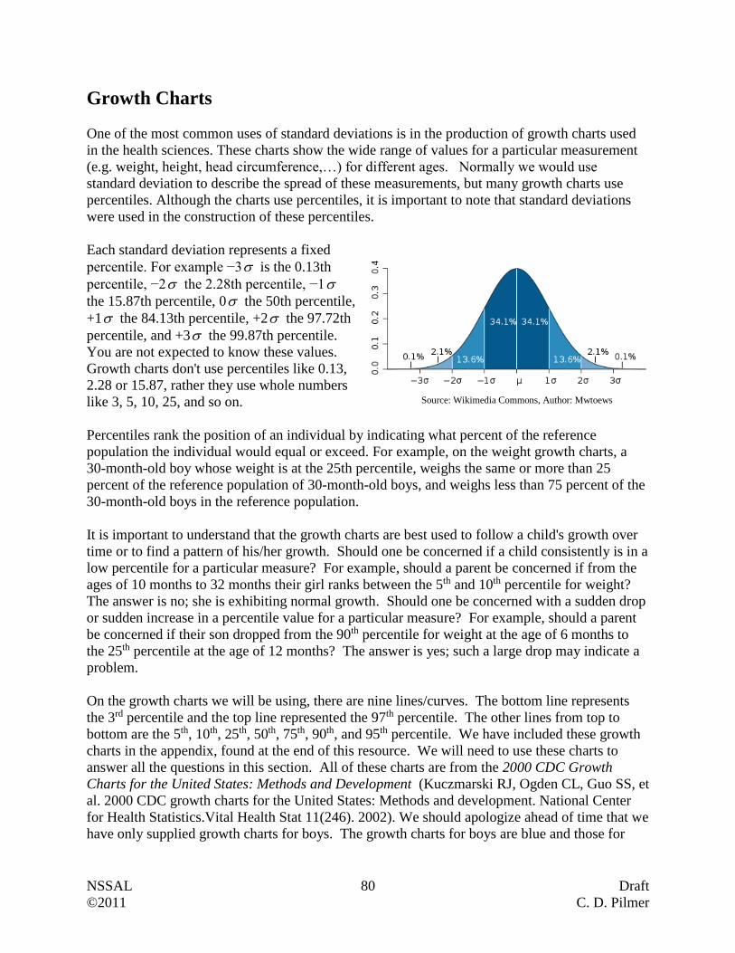
NSSAL 80 Draft
©2011 C. D. Pilmer
Growth Charts
One of the most common uses of standard deviations is in the production of growth charts used
in the health sciences. These charts show the wide range of values for a particular measurement
(e.g. weight, height, head circumference,…) for different ages. Normally we would use
standard deviation to describe the spread of these measurements, but many growth charts use
percentiles. Although the charts use percentiles, it is important to note that standard deviations
were used in the construction of these percentiles.
Each standard deviation represents a fixed
percentile. For example −3 is the 0.13th
percentile, −2 the 2.28th percentile, −1
the 15.87th percentile, 0 the 50th percentile,
+1 the 84.13th percentile, +2 the 97.72th
percentile, and +3 the 99.87th percentile.
You are not expected to know these values.
Growth charts don't use percentiles like 0.13,
2.28 or 15.87, rather they use whole numbers
like 3, 5, 10, 25, and so on.
Percentiles rank the position of an individual by indicating what percent of the reference
population the individual would equal or exceed. For example, on the weight growth charts, a
30-month-old boy whose weight is at the 25th percentile, weighs the same or more than 25
percent of the reference population of 30-month-old boys, and weighs less than 75 percent of the
30-month-old boys in the reference population.
It is important to understand that the growth charts are best used to follow a child's growth over
time or to find a pattern of his/her growth. Should one be concerned if a child consistently is in a
low percentile for a particular measure? For example, should a parent be concerned if from the
ages of 10 months to 32 months their girl ranks between the 5th and 10th percentile for weight?
The answer is no; she is exhibiting normal growth. Should one be concerned with a sudden drop
or sudden increase in a percentile value for a particular measure? For example, should a parent
be concerned if their son dropped from the 90th percentile for weight at the age of 6 months to
the 25th percentile at the age of 12 months? The answer is yes; such a large drop may indicate a
problem.
On the growth charts we will be using, there are nine lines/curves. The bottom line represents
the 3rd percentile and the top line represented the 97th percentile. The other lines from top to
bottom are the 5th, 10th, 25th, 50th, 75th, 90th, and 95th percentile. We have included these growth
charts in the appendix, found at the end of this resource. We will need to use these charts to
answer all the questions in this section. All of these charts are from the 2000 CDC Growth
Charts for the United States: Methods and Development (Kuczmarski RJ, Ogden CL, Guo SS, et
al. 2000 CDC growth charts for the United States: Methods and development. National Center
for Health Statistics.Vital Health Stat 11(246). 2002). We should apologize ahead of time that we
have only supplied growth charts for boys. The growth charts for boys are blue and those for
Source: Wikimedia Commons, Author: Mwtoews
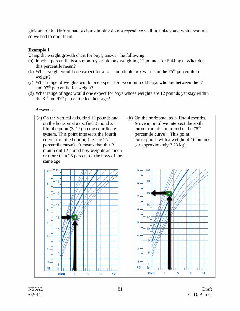
NSSAL 81 Draft
©2011 C. D. Pilmer
girls are pink. Unfortunately charts in pink do not reproduce well in a black and white resource
so we had to omit them.
Example 1
Using the weight growth chart for boys, answer the following.
(a) In what percentile is a 3 month year old boy weighting 12 pounds (or 5.44 kg). What does
this percentile mean?
(b) What weight would one expect for a four month old boy who is in the 75th percentile for
weight?
(c) What range of weights would one expect for two month old boys who are between the 3rd
and 97th percentile for weight?
(d) What range of ages would one expect for boys whose weights are 12 pounds yet stay within
the 3rd and 97th percentile for their age?
Answers:
(a) On the vertical axis, find 12 pounds and
on the horizontal axis, find 3 months.
Plot the point (3, 12) on the coordinate
system. This point intersects the fourth
curve from the bottom; (i.e. the 25th
percentile curve). It means that this 3
month old 12 pound boy weights as much
or more than 25 percent of the boys of the
same age.
(b) On the horizontal axis, find 4 months.
Move up until we intersect the sixth
curve from the bottom (i.e. the 75th
percentile curve). This point
corresponds with a weight of 16 pounds
(or approximately 7.23 kg).
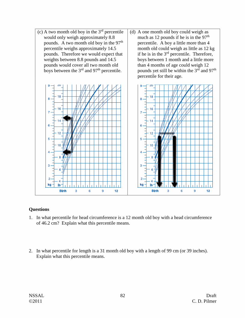
NSSAL 82 Draft
©2011 C. D. Pilmer
(c) A two month old boy in the 3rd percentile
would only weigh approximately 8.8
pounds. A two month old boy in the 97th
percentile weighs approximately 14.5
pounds. Therefore we would expect that
weights between 8.8 pounds and 14.5
pounds would cover all two month old
boys between the 3rd and 97th percentile.
(d) A one month old boy could weigh as
much as 12 pounds if he is in the 97th
percentile. A boy a little more than 4
month old could weigh as little as 12 kg
if he is in the 3rd percentile. Therefore,
boys between 1 month and a little more
than 4 months of age could weigh 12
pounds yet still be within the 3rd and 97th
percentile for their age.
Questions
1. In what percentile for head circumference is a 12 month old boy with a head circumference
of 46.2 cm? Explain what this percentile means.
2. In what percentile for length is a 31 month old boy with a length of 99 cm (or 39 inches).
Explain what this percentile means.
NSSAL 83 Draft
©2011 C. D. Pilmer
3. For each case, determine the percentile ranking.
(a) 33 month old boy, length = 36 inches
(b) 21 month old boy, weight = 31 pounds
(c) 30 month old boy, weight = 26 pounds
(d) 23 month old boy, head circumference = 19.5 inches
(e) 10 month old boy, length = 28.5 inches
(f) 33 month old boy, head circumference = 19.75 inches (or approximately 51 cm)
(g) 10 month old boy, weight = 24.5 pounds (or approximately 11.3 kg)
(h) 28 month old boy, length = 33.5 inches (or approximately 86 cm)
4. For each case, determine the measure.
(a) What weight would one expect for a twelve month old boy who is in the 5th percentile for
weight?
(b) What length would one expect for a 20 month old boy who is in the 50th percentile for
length?
(c) What head circumference would one expect for a 10 month old boy who is in the 97th
percentile for head circumference?
5. What range of lengths would one expect for 15 month old boys who are between the 3rd and
97th percentile for length?
6. What range of head circumferences would one expect for 30 month old boys who are
between the 3rd and 97th percentile for head circumference?
NSSAL 84 Draft
©2011 C. D. Pilmer
7. What range of ages would one expect for boys whose lengths are 31 inches yet stay within
the 3rd and 97th percentile for their age?
8. What range of ages would one expect for boys whose head circumferences are 16.25 inches
yet stay within the 3rd and 97th percentile for their age?
9. What range of weights would one expect for 33 month old boys who are between the 25th
and 75th percentile for weight?
10. What range of lengths would one expect for 22 month old boys who are between the 10th and
90th percentile for length?
11. What range of ages would one expect for boys whose weights are 21 pounds yet stay within
the 5th and 90th percentile for their age?
12. What range of ages would one expect for boys whose lengths are 29 inches yet stay within
the 25th and 75th percentile for their age?
13. Look at the weights of a particular boy over a 12 month period. Do you have concerns
regarding his weight? Explain.
Months 0 2 4 6 8 10 12
Weight (kg) 4.55 5.89 6.80 7.58 7.82 8.16 8.42

NSSAL 85 Draft
©2011 C. D. Pilmer
Putting It Together
In this unit we looked at the following.
Populations and Samples
Categorical and Numerical Data
Bar Graphs, Double Bar Graphs, Stacked Bar Graphs, Histogram, Circle Graphs and Line
Graphs
Mean, Trimmed Mean, Median, and Mode
Box and Whisker Plots (with and without technology)
Standard Deviation (with and without technology)
Distributions (Normal, Skewed, Bimodal, Uniform)
The 68-95-99.7 Rule for Normal Distributions
Z-Scores
Growth Charts
Questions:
1. The manager of the community sportsplex wanted to know how the 1386 members might
feel about the discussion concerning an addition to the existing building that included a 25
metre, 8 lane pool. He asked 230 randomly selected members if they were willing to pay an
additional $35 a year on their membership fee to have these new features. Describe the
population and the sample for this situation.
2. For each of the following, state whether the data collection would result in a categorical data
set or numerical data set. If the data is numerical, indicate whether we are dealing with
discrete or continuous data.
(a) The number of pets in Nova Scotian households
(b) The type of MP3 player owned by adults.
(c) The diameter of the trunk of spruce trees growing in a particular
valley.
(d) The size of T-shirts worn by boys between the ages of 16 and 18
years
(e) The number of children traveling more than 1.5 kilometres to
school.
(f) The time to complete a driver’s license renewal at a specific
Access Nova Scotia location

NSSAL 86 Draft
©2011 C. D. Pilmer
3. The 5-year survival rates for six different types of cancers have been supplied in the graph
below.
0
10
20
30
40
50
60
70
80
90
100
Pro
state
Skin
Melan
oma
Bre
ast
Colo
rectal
Ova
ry
Bra
in
Su
rviv
al
Rate
%
1992 to 1994
2004 to 2006
Source: Canadian Cancer Registry
(a) What was the approximate survival rate for colorectal cancer between 1992 and 1994?
(b) What was the approximate survival rate for breast cancer between 2004 and 2006?
(c) By approximately how much did the survival rate for ovarian cancer improve from 1992-
1994 to 2004-2006?
(d) If approximately 22 200 Canadian women were diagnosed with breast cancer in 2006,
then how many are expected to survive?
(e) What type of graph (bar, double bar, stacked bar, circle,…) are we dealing with here?
(f) Can you conclude that there were fewer cases of brain cancer than prostate cancer based
on this graph? Why or why not?
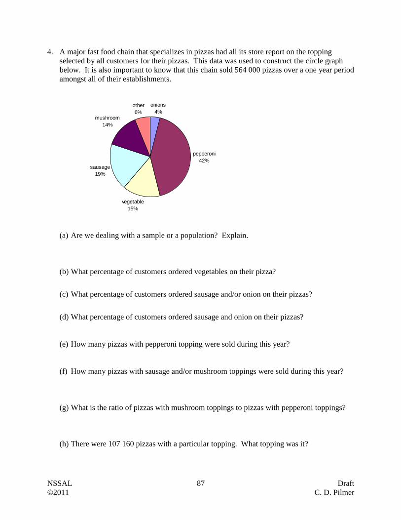
NSSAL 87 Draft
©2011 C. D. Pilmer
4. A major fast food chain that specializes in pizzas had all its store report on the topping
selected by all customers for their pizzas. This data was used to construct the circle graph
below. It is also important to know that this chain sold 564 000 pizzas over a one year period
amongst all of their establishments.
onions
4%
pepperoni
42%
vegetable
15%
sausage
19%
mushroom
14%
other
6%
(a) Are we dealing with a sample or a population? Explain.
(b) What percentage of customers ordered vegetables on their pizza?
(c) What percentage of customers ordered sausage and/or onion on their pizzas?
(d) What percentage of customers ordered sausage and onion on their pizzas?
(e) How many pizzas with pepperoni topping were sold during this year?
(f) How many pizzas with sausage and/or mushroom toppings were sold during this year?
(g) What is the ratio of pizzas with mushroom toppings to pizzas with pepperoni toppings?
(h) There were 107 160 pizzas with a particular topping. What topping was it?
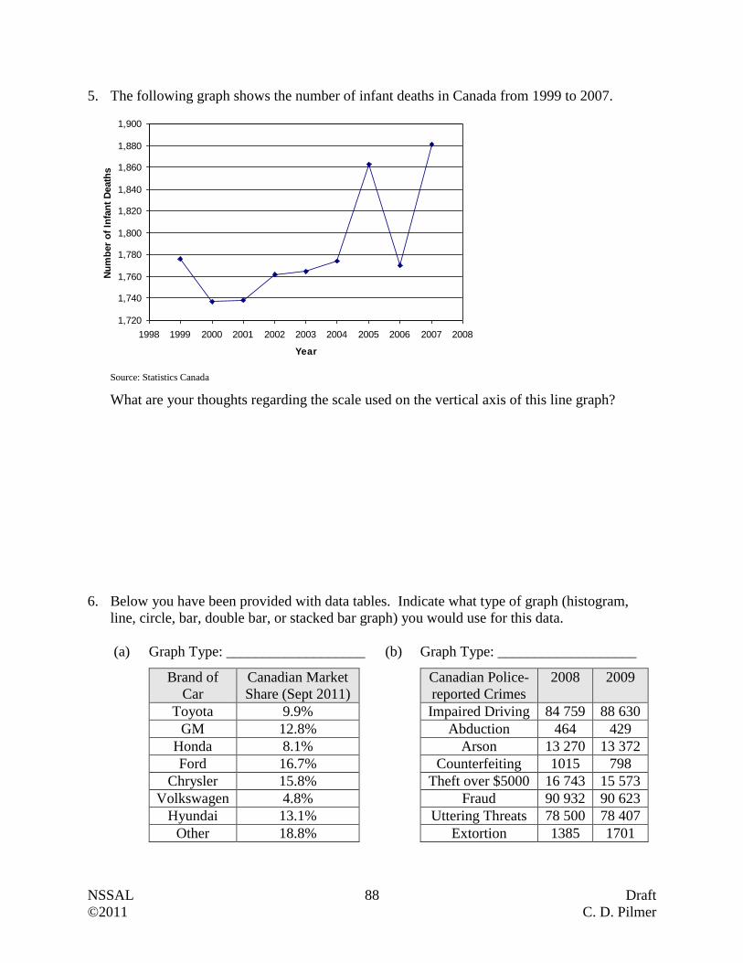
NSSAL 88 Draft
©2011 C. D. Pilmer
5. The following graph shows the number of infant deaths in Canada from 1999 to 2007.
1,720
1,740
1,760
1,780
1,800
1,820
1,840
1,860
1,880
1,900
1998 1999 2000 2001 2002 2003 2004 2005 2006 2007 2008
Year
Nu
mb
er
of
Infa
nt
Death
s
Source: Statistics Canada
What are your thoughts regarding the scale used on the vertical axis of this line graph?
6. Below you have been provided with data tables. Indicate what type of graph (histogram,
line, circle, bar, double bar, or stacked bar graph) you would use for this data.
(a)
Graph Type: ___________________ (b) Graph Type: ___________________
Brand of
Car
Canadian Market
Share (Sept 2011)
Toyota 9.9%
GM 12.8%
Honda 8.1%
Ford 16.7%
Chrysler 15.8%
Volkswagen 4.8%
Hyundai 13.1%
Other 18.8%
Canadian Police-
reported Crimes
2008 2009
Impaired Driving 84 759 88 630
Abduction 464 429
Arson 13 270 13 372
Counterfeiting 1015 798
Theft over $5000 16 743 15 573
Fraud 90 932 90 623
Uttering Threats 78 500 78 407
Extortion 1385 1701
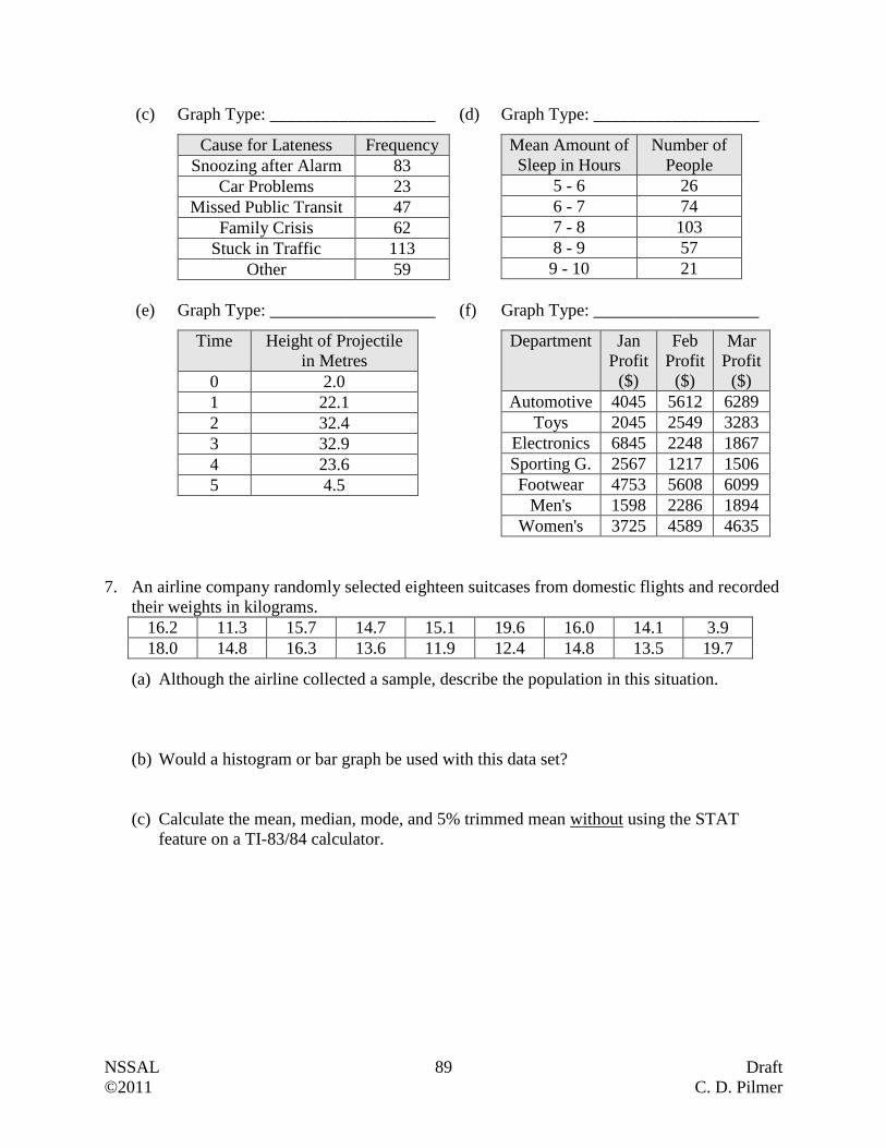
NSSAL 89 Draft
©2011 C. D. Pilmer
(c)
Graph Type: ___________________ (d) Graph Type: ___________________
Cause for Lateness Frequency
Snoozing after Alarm 83
Car Problems 23
Missed Public Transit 47
Family Crisis 62
Stuck in Traffic 113
Other 59
Mean Amount of
Sleep in Hours
Number of
People
5 - 6 26
6 - 7 74
7 - 8 103
8 - 9 57
9 - 10 21
(e)
Graph Type: ___________________ (f) Graph Type: ___________________
Time Height of Projectile
in Metres
0 2.0
1 22.1
2 32.4
3 32.9
4 23.6
5 4.5
Department Jan
Profit
($)
Feb
Profit
($)
Mar
Profit
($)
Automotive 4045 5612 6289
Toys 2045 2549 3283
Electronics 6845 2248 1867
Sporting G. 2567 1217 1506
Footwear 4753 5608 6099
Men's 1598 2286 1894
Women's 3725 4589 4635
7. An airline company randomly selected eighteen suitcases from domestic flights and recorded
their weights in kilograms.
16.2 11.3 15.7 14.7 15.1 19.6 16.0 14.1 3.9
18.0 14.8 16.3 13.6 11.9 12.4 14.8 13.5 19.7
(a) Although the airline collected a sample, describe the population in this situation.
(b) Would a histogram or bar graph be used with this data set?
(c) Calculate the mean, median, mode, and 5% trimmed mean without using the STAT
feature on a TI-83/84 calculator.
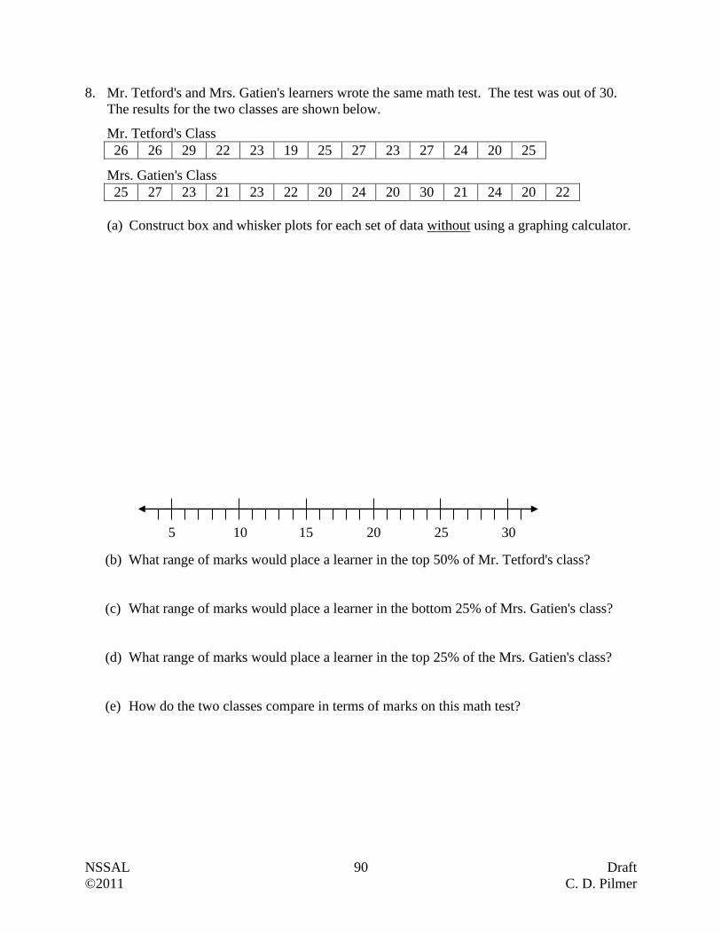
NSSAL 90 Draft
©2011 C. D. Pilmer
8. Mr. Tetford's and Mrs. Gatien's learners wrote the same math test. The test was out of 30.
The results for the two classes are shown below.
Mr. Tetford's Class
26 26 29 22 23 19 25 27 23 27 24 20 25
Mrs. Gatien's Class
25 27 23 21 23 22 20 24 20 30 21 24 20 22
(a) Construct box and whisker plots for each set of data without using a graphing calculator.
(b) What range of marks would place a learner in the top 50% of Mr. Tetford's class?
(c) What range of marks would place a learner in the bottom 25% of Mrs. Gatien's class?
(d) What range of marks would place a learner in the top 25% of the Mrs. Gatien's class?
(e) How do the two classes compare in terms of marks on this math test?
5 10 15 20 25 30

NSSAL 91 Draft
©2011 C. D. Pilmer
9. A study looked at the concentration of iron in the bloodstream of ten randomly selected high
performance female athletes. The following data was collected. The concentrations are
measured in grams per decilitre (g/dl).
15.3 14.2 13.6 11.9 14.8 12.6 14.6 13.9 14.2 12.9
(a) Are we dealing with a population or a sample?
(b) Calculate the mean without using the STAT features on your calculator. Use the
appropriate symbol.
(c) Calculate the standard deviation without using the STAT features on your calculator..
ix
10. If you were collecting a random sample in each situation, what type of distribution (normal,
uniform, bimodal, skewed) would you likely obtain?
Distribution Type
(a) Hodgkin’s lymphoma is a type of cancer that originates from
white blood cells. This disease typically affects people either in
early adulthood or when they are 55 years of age or older. You
randomly select 250 patients with Hodgkin’s lymphoma and ask
them to report the age of their initial diagnosis. What would the
distribution of ages likely look like?
(b) Most people make under $40,000 a year, but some make quite a
bit more, with a smaller number making many millions of
dollars a year. What would the distribution of yearly earnings
likely look like?
(c) James is working as a biologist for the summer and measuring
the circumferences of randomly selected maple trees in a natural
growth forest. What would the distribution of circumferences
likely look like?
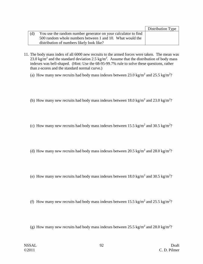
NSSAL 92 Draft
©2011 C. D. Pilmer
Distribution Type
(d) You use the random number generator on your calculator to find
500 random whole numbers between 1 and 10. What would the
distribution of numbers likely look like?
11. The body mass index of all 6000 new recruits to the armed forces were taken. The mean was
23.0 kg/m2 and the standard deviation 2.5 kg/m2. Assume that the distribution of body mass
indexes was bell-shaped. (Hint: Use the 68-95-99.7% rule to solve these questions, rather
than z-scores and the standard normal curve.)
(a) How many new recruits had body mass indexes between 23.0 kg/m2 and 25.5 kg/m2?
(b) How many new recruits had body mass indexes between 18.0 kg/m2 and 23.0 kg/m2?
(c) How many new recruits had body mass indexes between 15.5 kg/m2 and 30.5 kg/m2?
(d) How many new recruits had body mass indexes between 20.5 kg/m2 and 28.0 kg/m2?
(e) How many new recruits had body mass indexes between 18.0 kg/m2 and 30.5 kg/m2?
(f) How many new recruits had body mass indexes between 15.5 kg/m2 and 25.5 kg/m2?
(g) How many new recruits had body mass indexes between 25.5 kg/m2 and 28.0 kg/m2?

NSSAL 93 Draft
©2011 C. D. Pilmer
(h) How many new recruits had body mass indexes between 15.5 kg/m2 and 18.0 kg/m2?
(i) How many new recruits had body mass indexes greater than 23.0 kg/m2?
(j) How many new recruits had body mass indexes greater than 20.5 kg/m2?
(k) How many new recruits had body mass indexes less than 28.0 kg/m2?
(l) How many new recruits had body mass indexes greater than 25.5 kg/m2?
(m) How many new recruits had body mass indexes less than 18.0 kg/m2?
12. Data collected over the last 100 years indicates that the average daily temperature for a
particular location in August is 26oC with a standard deviation of 3oC. If we are dealing with
a bell-shaped distribution, determine the z-scores corresponding to each of these
temperatures.
(a) 31oC
(b) 24oC
NSSAL 94 Draft
©2011 C. D. Pilmer
13. Scores on the Wechsler Adult Intelligence Scale (i.e. an IQ test) for 20 to 34 year old adults
are approximately normal with a mean of 110 and a standard deviation of 25. For a
randomly selected adult within that age group, determine (without using a graphing
calculator) the likelihood that their IQ will be:
(a) between 104 and 128?
(b) between 80 and 110?
(c) greater than 110?
(d) less than 132?
(e) between 90 and 107?
(f) greater than 150?
NSSAL 95 Draft
©2011 C. D. Pilmer
14. In what percentile for head circumference is a 11 month old boy with a head circumference
of 44.4 cm? Explain what this percentile means.
15. What weight would one expect for a 24 month old boy who is in the 25th percentile for
weight?
16. What range of lengths would one expect for 28 month old boys who are between the 3rd and
97th percentile for lengths?
17. What range of ages would one expect for boys whose lengths are 25 inches yet stay within
the 3rd and 97th percentile for their age?
18. What range of head circumferences would one expect for 25 month old boys who are
between the 10th and 90th percentile for head circumference?
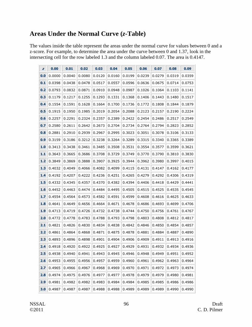
NSSAL 96 Draft
©2011 C. D. Pilmer
Areas Under the Normal Curve (z-Table)
The values inside the table represent the areas under the normal curve for values between 0 and a
z-score. For example, to determine the area under the curve between 0 and 1.37, look in the
intersecting cell for the row labeled 1.3 and the column labeled 0.07. The area is 0.4147.
z 0.00 0.01 0.02 0.03 0.04 0.05 0.06 0.07 0.08 0.09
0.0 0.0000 0.0040 0.0080 0.0120 0.0160 0.0199 0.0239 0.0279 0.0319 0.0359
0.1 0.0398 0.0438 0.0478 0.0517 0.0557 0.0596 0.0636 0.0675 0.0714 0.0753
0.2 0.0793 0.0832 0.0871 0.0910 0.0948 0.0987 0.1026 0.1064 0.1103 0.1141
0.3 0.1179 0.1217 0.1255 0.1293 0.1331 0.1368 0.1406 0.1443 0.1480 0.1517
0.4 0.1554 0.1591 0.1628 0.1664 0.1700 0.1736 0.1772 0.1808 0.1844 0.1879
0.5 0.1915 0.1950 0.1985 0.2019 0.2054 0.2088 0.2123 0.2157 0.2190 0.2224
0.6 0.2257 0.2291 0.2324 0.2357 0.2389 0.2422 0.2454 0.2486 0.2517 0.2549
0.7 0.2580 0.2611 0.2642 0.2673 0.2704 0.2734 0.2764 0.2794 0.2823 0.2852
0.8 0.2881 0.2910 0.2939 0.2967 0.2995 0.3023 0.3051 0.3078 0.3106 0.3133
0.9 0.3159 0.3186 0.3212 0.3238 0.3264 0.3289 0.3315 0.3340 0.3365 0.3389
1.0 0.3413 0.3438 0.3461 0.3485 0.3508 0.3531 0.3554 0.3577 0.3599 0.3621
1.1 0.3643 0.3665 0.3686 0.3708 0.3729 0.3749 0.3770 0.3790 0.3810 0.3830
1.2 0.3849 0.3869 0.3888 0.3907 0.3925 0.3944 0.3962 0.3980 0.3997 0.4015
1.3 0.4032 0.4049 0.4066 0.4082 0.4099 0.4115 0.4131 0.4147 0.4162 0.4177
1.4 0.4192 0.4207 0.4222 0.4236 0.4251 0.4265 0.4279 0.4292 0.4306 0.4319
1.5 0.4332 0.4345 0.4357 0.4370 0.4382 0.4394 0.4406 0.4418 0.4429 0.4441
1.6 0.4452 0.4463 0.4474 0.4484 0.4495 0.4505 0.4515 0.4525 0.4535 0.4545
1.7 0.4554 0.4564 0.4573 0.4582 0.4591 0.4599 0.4608 0.4616 0.4625 0.4633
1.8 0.4641 0.4649 0.4656 0.4664 0.4671 0.4678 0.4686 0.4693 0.4699 0.4706
1.9 0.4713 0.4719 0.4726 0.4732 0.4738 0.4744 0.4750 0.4756 0.4761 0.4767
2.0 0.4772 0.4778 0.4783 0.4788 0.4793 0.4798 0.4803 0.4808 0.4812 0.4817
2.1 0.4821 0.4826 0.4830 0.4834 0.4838 0.4842 0.4846 0.4850 0.4854 0.4857
2.2 0.4861 0.4864 0.4868 0.4871 0.4875 0.4878 0.4881 0.4884 0.4887 0.4890
2.3 0.4893 0.4896 0.4898 0.4901 0.4904 0.4906 0.4909 0.4911 0.4913 0.4916
2.4 0.4918 0.4920 0.4922 0.4925 0.4927 0.4929 0.4931 0.4932 0.4934 0.4936
2.5 0.4938 0.4940 0.4941 0.4943 0.4945 0.4946 0.4948 0.4949 0.4951 0.4952
2.6 0.4953 0.4955 0.4956 0.4957 0.4959 0.4960 0.4961 0.4962 0.4963 0.4964
2.7 0.4965 0.4966 0.4967 0.4968 0.4969 0.4970 0.4971 0.4972 0.4973 0.4974
2.8 0.4974 0.4975 0.4976 0.4977 0.4977 0.4978 0.4979 0.4979 0.4980 0.4981
2.9 0.4981 0.4982 0.4982 0.4983 0.4984 0.4984 0.4985 0.4985 0.4986 0.4986
3.0 0.4987 0.4987 0.4987 0.4988 0.4988 0.4989 0.4989 0.4989 0.4990 0.4990

NSSAL 97 Draft
©2011 C. D. Pilmer
The 68-95-99.7 Rule Reference Page
34% 34%
13.5% 13.5% 2.35% 2.35%
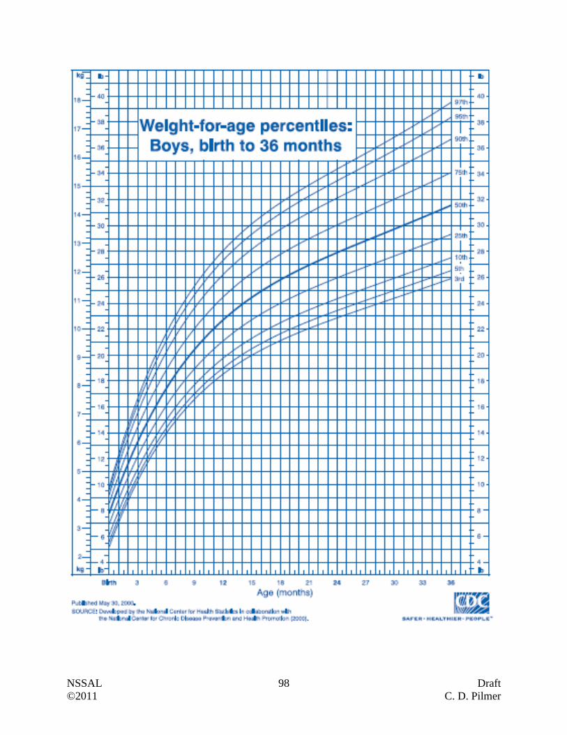
NSSAL 98 Draft
©2011 C. D. Pilmer
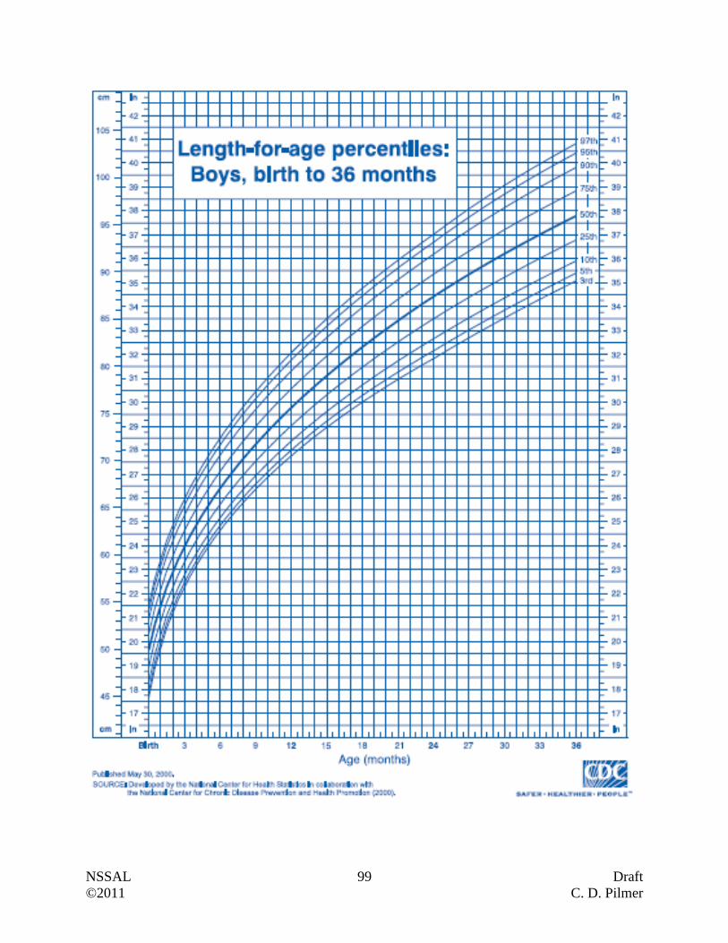
NSSAL 99 Draft
©2011 C. D. Pilmer
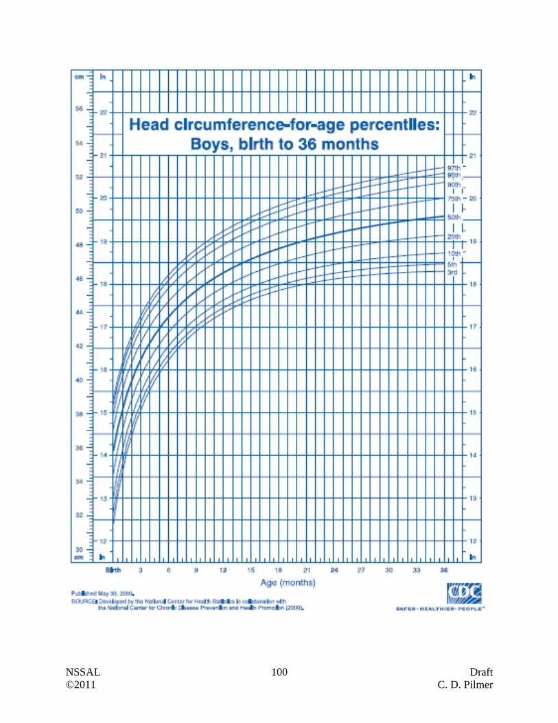
NSSAL 100 Draft
©2011 C. D. Pilmer

NSSAL 101 Draft
©2011 C. D. Pilmer
Post-Unit Reflections
What is the most valuable or important
thing you learned in this unit?
What part did you find most interesting or
enjoyable?
What was the most challenging part, and
how did you respond to this challenge?
How did you feel about this topic when
you started this unit?
How do you feel about this topic now?
Of the skills you used in this unit, which
is your strongest skill?
What skill(s) do you feel you need to
improve, and how will you improve them?
How does what you learned in this unit fit
with your personal goals?
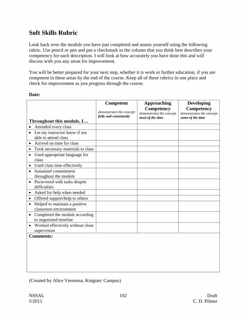
NSSAL 102 Draft
©2011 C. D. Pilmer
Soft Skills Rubric
Look back over the module you have just completed and assess yourself using the following
rubric. Use pencil or pen and put a checkmark in the column that you think best describes your
competency for each description. I will look at how accurately you have done this and will
discuss with you any areas for improvement.
You will be better prepared for your next step, whether it is work or further education, if you are
competent in these areas by the end of the course. Keep all of these rubrics in one place and
check for improvement as you progress through the course.
Date:
Throughout this module, I…
Competent
demonstrates the concept
fully and consistently
Approaching
Competency demonstrates the concept
most of the time
Developing
Competency demonstrates the concept
some of the time
Attended every class
Let my instructor know if not
able to attend class
Arrived on time for class
Took necessary materials to class
Used appropriate language for
class
Used class time effectively
Sustained commitment
throughout the module
Persevered with tasks despite
difficulties
Asked for help when needed
Offered support/help to others
Helped to maintain a positive
classroom environment
Completed the module according
to negotiated timeline
Worked effectively without close
supervision
Comments:
(Created by Alice Veenema, Kingstec Campus)
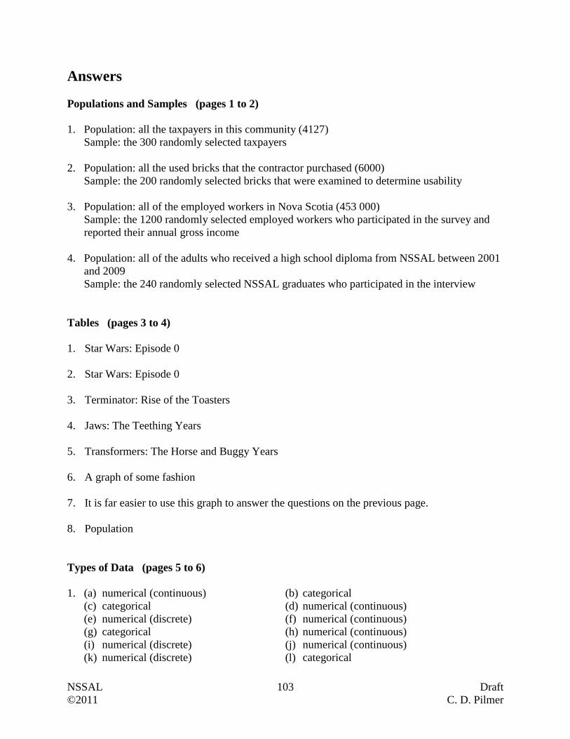
NSSAL 103 Draft
©2011 C. D. Pilmer
Answers
Populations and Samples (pages 1 to 2)
1. Population: all the taxpayers in this community (4127)
Sample: the 300 randomly selected taxpayers
2. Population: all the used bricks that the contractor purchased (6000)
Sample: the 200 randomly selected bricks that were examined to determine usability
3. Population: all of the employed workers in Nova Scotia (453 000)
Sample: the 1200 randomly selected employed workers who participated in the survey and
reported their annual gross income
4. Population: all of the adults who received a high school diploma from NSSAL between 2001
and 2009
Sample: the 240 randomly selected NSSAL graduates who participated in the interview
Tables (pages 3 to 4)
1. Star Wars: Episode 0
2. Star Wars: Episode 0
3. Terminator: Rise of the Toasters
4. Jaws: The Teething Years
5. Transformers: The Horse and Buggy Years
6. A graph of some fashion
7. It is far easier to use this graph to answer the questions on the previous page.
8. Population
Types of Data (pages 5 to 6)
1. (a) numerical (continuous) (b) categorical
(c) categorical (d) numerical (continuous)
(e) numerical (discrete) (f) numerical (continuous)
(g) categorical (h) numerical (continuous)
(i) numerical (discrete) (j) numerical (continuous)
(k) numerical (discrete) (l) categorical
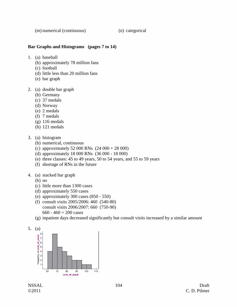
NSSAL 104 Draft
©2011 C. D. Pilmer
(m) numerical (continuous) (n) categorical
Bar Graphs and Histograms (pages 7 to 14)
1. (a) baseball
(b) approximately 78 million fans
(c) football
(d) little less than 20 million fans
(e) bar graph
2. (a) double bar graph
(b) Germany
(c) 37 medals
(d) Norway
(e) 2 medals
(f) 7 medals
(g) 116 medals
(h) 121 medals
3. (a) histogram
(b) numerical, continuous
(c) approximately 52 000 RNs (24 000 + 28 000)
(d) approximately 18 000 RNs (36 000 - 18 000)
(e) three classes: 45 to 49 years, 50 to 54 years, and 55 to 59 years
(f) shortage of RNs in the future
4. (a) stacked bar graph
(b) no
(c) little more than 1300 cases
(d) approximately 550 cases
(e) approximately 300 cases (850 - 550)
(f) consult visits 2005/2006: 460 (540-80)
consult visits 2006/2007: 660 (750-90)
660 - 460 = 200 cases
(g) inpatient days decreased significantly but consult visits increased by a similar amount
5. (a)
NSSAL 105 Draft
©2011 C. D. Pilmer
(b) %3
216
(c) numerical, continuous
(d) sample
Circle Graphs and Line Graphs (pages 15 to 19)
1. (a) automobile accidents
(b) 3 times
(c) 288
(d) 60
(e) (ii) 7
12
(f) home injuries
2. (a) Jan - Feb 08, Aug - Sept 08, Jan - Feb 09, Jan - Feb 10, Oct - Nov 10
(b) Oct 08
(c) May 09
(d) $15 000 million ($15 billion)
3. (a) 40%
(b) 12
7
(c) 242 starts
(d) 340
4. (a) 13th day, $7.40
(b) $11.40 per share
(c) 15th day, $2.50 per share
First Impression/Second Impressions (pages 20 to 23)
(More detailed responses are required than what is supplied below.)
Part 1 - The perspective of the circle graph that was initially presented can lead one to believe
that the three brands of ice cream are favored equally; this is not the case.
Part 2 - One may initially assume that the population of Trois-Rivieres is 4 to 5 times that of
Lethbridge if one did not consider the scale on the vertical axis. On the first bar graph, the
vertical axis starts at 50 000, rather than 0 (as it does on the second graph).
Part 3 - Because the first graph deals with percentages, we do know what percentage of patrons
for each ride were male and female. However, we are unable to see how the rides compared to
NSSAL 106 Draft
©2011 C. D. Pilmer
each other in terms of attracting patrons. This only occurred when we were able to examine the
second graph which plotted number of people on the vertical axis.
Part 4 - The first graph may have made individuals believe that the average price of a domestic
airfare was fluctuating wildly. This occurs when one fails to look at the scale on the vertical
axis. In the first graph, the scale starts at $160, rather than $0 (as it does in the second graph).
What Type of Graph Should Be Used? (pages 24 to 25)
1. Double Bar Graph (or Stacked Bar Graph)
2. Circle Graph (or Bar Graph)
3. Line Graph
4. Histogram
5. Stacked Bar Graph
6. Circle Graph (or Bar Graph)
7. Bar Graph
8. Double Bar Graph
9. Histogram
10. Line Graph
Mean, Median, Mode, and Trimmed Mean (pages 26 to 33)
1. (a) sample
(b) 2.6x Median = 6 Mode = 7
(c) There are no outliers.
2. (a) population
(b) numerical
(c) 44.159 Median = 157 No Mode
3. (a) sample
(b) 35x (34.6) Median = 31 Mode = 23 and 27 (bimodal)
5% Trimmed Mean 31Tx (30.6)
10% Trimmed Mean 31Tx (30.9)
NSSAL 107 Draft
©2011 C. D. Pilmer
(c) Trimmed means are appropriate because the outlier 115 exists within the data set.
(d) Four data points from the bottom and four data points from top of the data set
4. (a) 268x (267.875) Median = 254 (253.5) Mode = 267 255Tx (255.409)
(b) Median and Trimmed Mean
(c) Histogram
5. This score system was likely implemented to eliminate the effect of a single rogue judge who
would inflate or deflate the score of a particular athlete.
Box and Whisker Plots (pages 34 to 40)
1 (a) minimum: 6
lower quartile: 11
median: 17
upper quartile: 21
maximum: 30
(b) minimum: 33
lower quartile: 40
median: 44
upper quartile: 48
maximum: 52
(c) minimum: 24
lower quartile: 25.5
median: 30
upper quartile: 35
maximum: 40
(d) minimum value: 28
lower quartile: 35
median: 36.5
upper quartile: 38
maximum: 41
2. (a) minimum: 7
lower quartile: 10.5
median: 18
upper quartile: 20.5
maximum: 22
(b) The median, upper quartile and maximum for Mr. Porter's class are equal to those for
Mr.Churchill's class. That means that in both classes student with slower reaction times
(i.e. worse than the median) were performing at the approximately the same level. When
we compared students with faster reaction times (i.e. better than the median), however,
we notice a difference between the two classes. Because Mr. Churchill's class has a
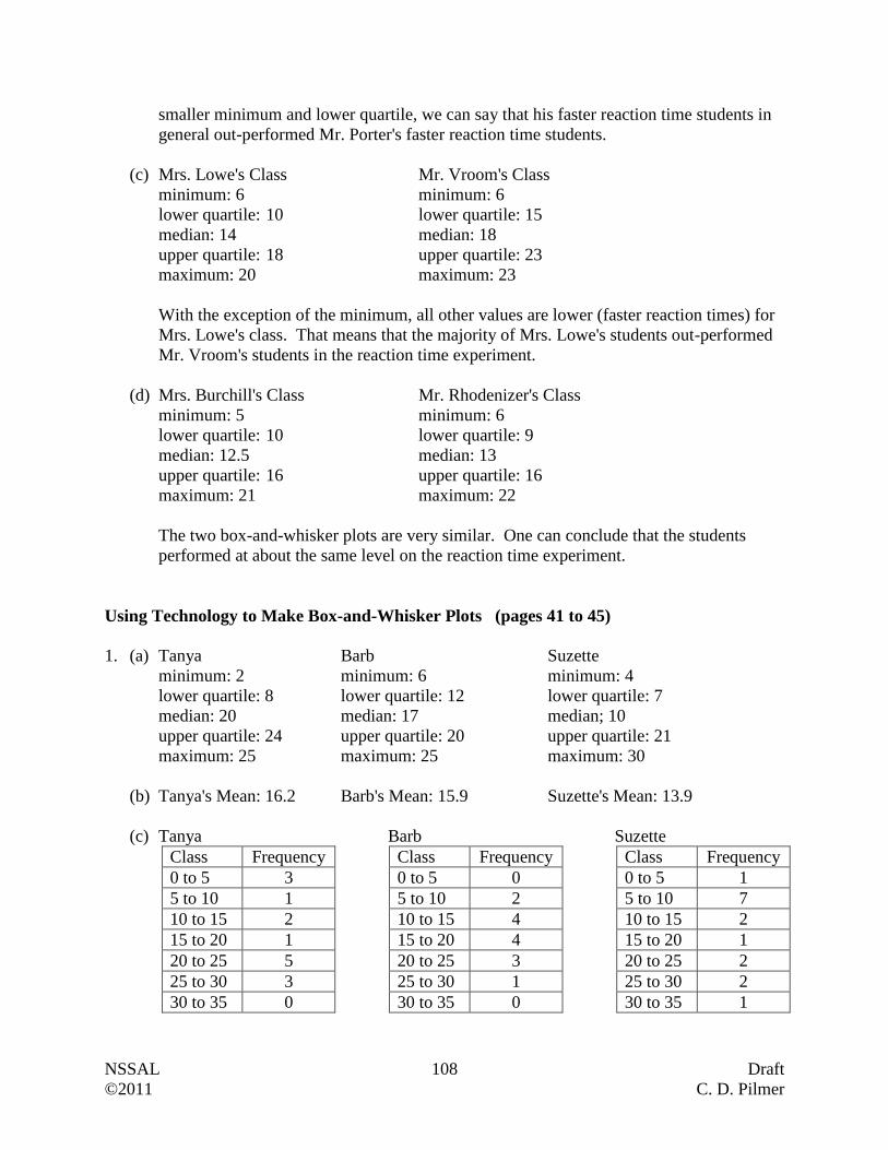
NSSAL 108 Draft
©2011 C. D. Pilmer
smaller minimum and lower quartile, we can say that his faster reaction time students in
general out-performed Mr. Porter's faster reaction time students.
(c) Mrs. Lowe's Class Mr. Vroom's Class
minimum: 6 minimum: 6
lower quartile: 10 lower quartile: 15
median: 14 median: 18
upper quartile: 18 upper quartile: 23
maximum: 20 maximum: 23
With the exception of the minimum, all other values are lower (faster reaction times) for
Mrs. Lowe's class. That means that the majority of Mrs. Lowe's students out-performed
Mr. Vroom's students in the reaction time experiment.
(d) Mrs. Burchill's Class Mr. Rhodenizer's Class
minimum: 5 minimum: 6
lower quartile: 10 lower quartile: 9
median: 12.5 median: 13
upper quartile: 16 upper quartile: 16
maximum: 21 maximum: 22
The two box-and-whisker plots are very similar. One can conclude that the students
performed at about the same level on the reaction time experiment.
Using Technology to Make Box-and-Whisker Plots (pages 41 to 45)
1. (a) Tanya Barb Suzette
minimum: 2 minimum: 6 minimum: 4
lower quartile: 8 lower quartile: 12 lower quartile: 7
median: 20 median: 17 median; 10
upper quartile: 24 upper quartile: 20 upper quartile: 21
maximum: 25 maximum: 25 maximum: 30
(b) Tanya's Mean: 16.2 Barb's Mean: 15.9 Suzette's Mean: 13.9
(c) Tanya Barb Suzette
Class Frequency Class Frequency Class Frequency
0 to 5 3 0 to 5 0 0 to 5 1
5 to 10 1 5 to 10 2 5 to 10 7
10 to 15 2 10 to 15 4 10 to 15 2
15 to 20 1 15 to 20 4 15 to 20 1
20 to 25 5 20 to 25 3 20 to 25 2
25 to 30 3 25 to 30 1 25 to 30 2
30 to 35 0 30 to 35 0 30 to 35 1
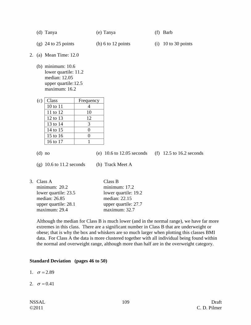
NSSAL 109 Draft
©2011 C. D. Pilmer
(d) Tanya (e) Tanya (f) Barb
(g) 24 to 25 points (h) 6 to 12 points (i) 10 to 30 points
2. (a) Mean Time: 12.0
(b) minimum: 10.6
lower quartile: 11.2
median: 12.05
upper quartile: 12.5
maximum: 16.2
(c) Class Frequency
10 to 11 4
11 to 12 10
12 to 13 12
13 to 14 3
14 to 15 0
15 to 16 0
16 to 17 1
(d) no (e) 10.6 to 12.05 seconds (f) 12.5 to 16.2 seconds
(g) 10.6 to 11.2 seconds (h) Track Meet A
3. Class A Class B
minimum: 20.2 minimum: 17.2
lower quartile: 23.5 lower quartile: 19.2
median: 26.85 median: 22.15
upper quartile: 28.1 upper quartile: 27.7
maximum: 29.4 maximum: 32.7
Although the median for Class B is much lower (and in the normal range), we have far more
extremes in this class. There are a significant number in Class B that are underweight or
obese; that is why the box and whiskers are so much larger when plotting this classes BMI
data. For Class A the data is more clustered together with all individual being found within
the normal and overweight range, although more than half are in the overweight category.
Standard Deviation (pages 46 to 50)
1. 2.89
2. 0.41
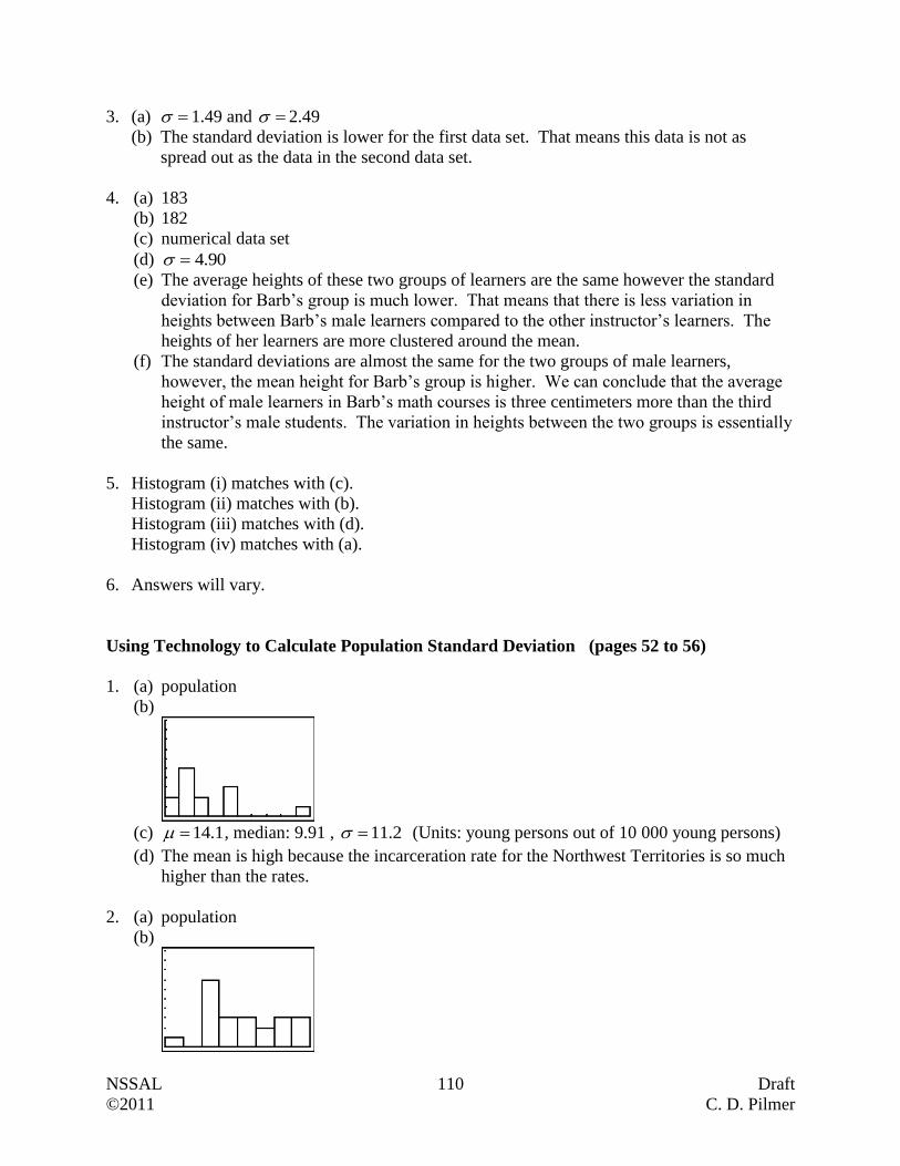
NSSAL 110 Draft
©2011 C. D. Pilmer
3. (a) 1.49 and 2.49
(b) The standard deviation is lower for the first data set. That means this data is not as
spread out as the data in the second data set.
4. (a) 183
(b) 182
(c) numerical data set
(d) 90.4
(e) The average heights of these two groups of learners are the same however the standard
deviation for Barb’s group is much lower. That means that there is less variation in
heights between Barb’s male learners compared to the other instructor’s learners. The
heights of her learners are more clustered around the mean.
(f) The standard deviations are almost the same for the two groups of male learners,
however, the mean height for Barb’s group is higher. We can conclude that the average
height of male learners in Barb’s math courses is three centimeters more than the third
instructor’s male students. The variation in heights between the two groups is essentially
the same.
5. Histogram (i) matches with (c).
Histogram (ii) matches with (b).
Histogram (iii) matches with (d).
Histogram (iv) matches with (a).
6. Answers will vary.
Using Technology to Calculate Population Standard Deviation (pages 52 to 56)
1. (a) population
(b)
(c) 1.14 , median: 9.91 , 2.11 (Units: young persons out of 10 000 young persons)
(d) The mean is high because the incarceration rate for the Northwest Territories is so much
higher than the rates.
2. (a) population
(b)
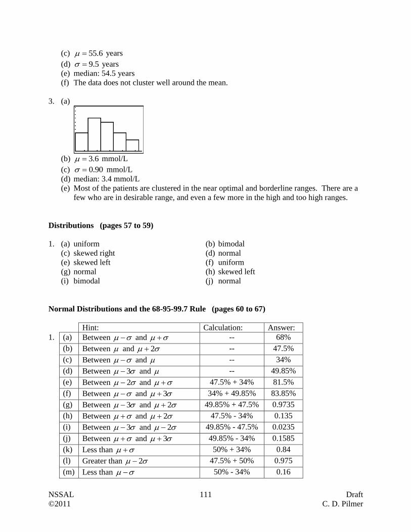
NSSAL 111 Draft
©2011 C. D. Pilmer
(c) 6.55 years
(d) 5.9 years
(e) median: 54.5 years
(f) The data does not cluster well around the mean.
3. (a)
(b) 6.3 mmol/L
(c) 90.0 mmol/L
(d) median: 3.4 mmol/L
(e) Most of the patients are clustered in the near optimal and borderline ranges. There are a
few who are in desirable range, and even a few more in the high and too high ranges.
Distributions (pages 57 to 59)
1. (a) uniform (b) bimodal
(c) skewed right (d) normal
(e) skewed left (f) uniform
(g) normal (h) skewed left
(i) bimodal (j) normal
Normal Distributions and the 68-95-99.7 Rule (pages 60 to 67)
Hint: Calculation: Answer:
1. (a) Between and -- 68%
(b) Between and 2 -- 47.5%
(c) Between and -- 34%
(d) Between 3 and -- 49.85%
(e) Between 2 and 47.5% + 34% 81.5%
(f) Between and 3 34% + 49.85% 83.85%
(g) Between 3 and 2 49.85% + 47.5% 0.9735
(h) Between and 2 47.5% - 34% 0.135
(i) Between 3 and 2 49.85% - 47.5% 0.0235
(j) Between and 3 49.85% - 34% 0.1585
(k) Less than 50% + 34% 0.84
(l) Greater than 2 47.5% + 50% 0.975
(m) Less than 50% - 34% 0.16

NSSAL 112 Draft
©2011 C. D. Pilmer
Hint: Calculation: Percentage: Answer:
2. (a) Between 3 and 3 -- 99.7% 1994
(b) Between and -- 68% 1360
(c) Between 2 and -- 47.5% 950
(d) Between and 2 34% + 47.5% 81.5% 1630
(e) Between and 2 47.5% - 34% 13.5% 270
(f) Between 2 and 2 -- 95% 1900
(g) Between 3 and 49.85% - 34% 15.85% 317
(h) Between 2 and 3 47.5% + 49.85% 97.35% 1947
(i) Between 3 and -- 49.85% 997
(j) Between 2 and 3 49.85% – 47.5% 2.35% 47
(k) Less than 2 50% - 47.5% 2.5% 50
Z-Scores (pages 68 to 79)
1. (a) -0.65
(b) 1.33
2. (a) 0.68
(b) -0.32
3. (a) Tylena, Elliott, Marcus
(b) Meera, Hamid
` (c) Beverly
(d) Elliott, no
(e) No, they may have all passed if the mean mark was very high or the majority could have
failed if the mean mark was very low. Without the mean and standard deviation we
cannot tell who passed and who failed.
4. (a) 0.4525
(b) 0.4082 + 0.2486 = 0.6568
(c) 0.4901 - 0.4082 = 0.0819
(d) 0.5 - 0.2486 = 0.2514
(e) 0.5 + 0.4525 = 0.9525
5. (a) 0.5
(b) 0.3770
(c) 0.5 + 0.2190 = 0.7190
(d) 0.3289 - 0.1026 = 0.2263
(e) 0.4826 - 0.1255 = 0.6081
(f) 0.5 - 0.2852 = 0.2148
6. (a) 0.3849 + 0.2881 = 0.6730
NSSAL 113 Draft
©2011 C. D. Pilmer
(b) 0.5 - 0.1554 = 0.3446
(c) 0.5
(d) 0.4452 - 0.1554 = 0.2898
(e) 0.2881 + 0.5 = 0.7881
(f) 0.4918
Growth Charts (pages 80 to 84)
1. 50th percentile; The head circumference for this 12 month old boy is equal to or greater than
the head circumference of 50% of the boys of the same age.
2. 95th percentile; The length of this 31 month old boy is equal to or greater than the length of
95% of the boys of the same age.
3. (a) 25th percentile
(b) 90th percentile
(c) 10th percentile
(d) 75th percentile
(e) Between the 25th and 50th percentile
(f) Between the 50th and 75th percentile
(g) Between the 90th and the 95th percentile
(h) Between 5th and 10th percentile
4. (a) 19 pounds (approximately 8.6 kg)
(b) 33 inches (approximately 83.7 cm)
(c) 19 inches (approximately 48.2 cm)
5. 29 inches (approximately 73.6 cm) to 33.5 inches (approximately 85.1 cm)
6. 18.25 inches (approximately 46.3 cm) to 20.5 inches (approximately 52 cm)
7. 10 to 21 months
8. 1 to 6 months
9. 28.5 pounds (approximately 12.9 kg) to 33 pounds (approximately 15 kg)
10. 32 inches (approximately 81.3 cm) to 35.5 inches (approximately 90.2 cm)
11. 6 to 17 months
12. 9 to 12 months
13. (Hint: Change to Percentiles) Should be concerned; the boy went from 97th percentile for
weight at birth to the 3rd percentile for weight by the age of 12 months
NSSAL 114 Draft
©2011 C. D. Pilmer
Putting It Together (pages 85 to 95)
1. Population: all 1386 members of the sportsplex
Sample: the 230 randomly selected members
2. (a) Numerical, Discrete (b) Categorical
(c) Numerical, Continuous (d) Categorical
(e) Numerical, Discrete (f) Numerical, Continuous
3. (a) 56%
(b) 87%
(c) 4%
(d) 19314 (if you use a survival rate of 87%)
(e) double bar
(f) No, The graph does not show the number of cases. It only shows survival rates.
4. (a) population because all stores had to report toppings selected by all customers.
(b) 15%
(c) 23%
(d) Cannot determine based on the information supplied.
(e) 236 880 pizzas
(f) 186 120 pizzas
(g) 3
1
(h) sausage
5. The scale used makes one initially feel that there were drastic fluctuations in the number of
infant deaths between 2004 and 2007. This is not the case.
6. (a) circle graph
(b) double bar graph
(c) bar graph
(d) histogram
(e) line graph
(f) stacked bar graph
7. (a) Population: All suitcases on domestic flights
(b) Histogram
(c) 5.14x kg, Median = 14.8 kg, Mode = 14.8, 9.14Tx kg
8. (a) Mr. Tetford's Class Mrs. Gatien's Class
Minimum: 19 Minimum: 20
Lower Quartile: 22.5 Lower Quartile: 21
Median: 25 Median: 22.5
Upper Quartile: 26.5 Upper Quartile: 24
Maximum: 29 Maximum: 30

NSSAL 115 Draft
©2011 C. D. Pilmer
(b) 25 to 29
(c) 20 to 21
(d) 24 to 30
(e) Although Mrs. Gatien's class' lowest and highest marks are better than those for Mr.
Tetford's class, the middle 50% of her learners obtained marks between 21 and 24, while
the middle 50% of Mr. Tetford's learners obtained marks between 22.5 and 26.5 (actually
between 23 and 26 because half points were not awarded on the test). Mr. Tetford's class
outperformed Mrs. Gatien's class on this particular test.
9. (a) sample
(b) 13.8 g/dl
(c) 1.01 g/dl
10. (a) Bimodal (b) Skewed (left)
(c) Normal (d) Uniform
11. (a) 2040 (b) 2850
(c) 5982 (d) 4890
(e) 5841 (f) 5031
(g) 810 (h) 141
(i) 3000 (j) 5040
(k) 5850 (l) 960
(m) 150
12 (a) 1.67
(b) -0.67
13. (a) 0.0948 + 0.2642 = 0.3590
(b) 0.3849
(c) 0.50
(d) 0.3106 + 0.5 = 0.8106
(e) 0.2881 - 0.0478 = 0.2403
(f) 0.5 - 0.4452 = 0.0548
14. 10th percentile; The head circumference for this 11 month old boy is equal to or greater than
the head circumference of 10% of the boys of the same age.
15. 26 pounds (or 11.8 kg)
16. 33 inches to 38.5 inches
17. 2 months to approximately 6.7 months
18. 18.5 inches to almost 20 inches