Embed Size (px)
Citation preview
1 Copyright © 2018 Pearson Education, Inc.
Descriptive Analytics I:
Nature of Data, Statistical
Modeling, and
Visualization
Learning Objectives for Chapter 2
Understand the nature of data as it relates to business intelligence (BI) and analytics
Learn the methods used to make real-world data analytics ready
Describe statistical modeling and its relationship to business analytics
Learn about descriptive and inferential statistics
Define business reporting, and understand its historical evolution
Understand the importance of data/information visualization
Learn different types of visualization techniques
Appreciate the value that visual analytics brings to business analytics
Know the capabilities and limitations of dashboards
CHAPTER OVERVIEW
In the age of Big Data and business analytics in which we are living, the importance of data is undeniable. The newly coined phrases like “data is the oil,” “data is the
CHAPTER
2
2 Copyright © 2018 Pearson Education, Inc.
new bacon,” “data is the new currency,” and “data is the king” are further stressing the renewed importance of data. But what type of data are we talking about? Obviously, not just any data. The “garbage in garbage out—GIGO” concept/principle applies to today’s “Big Data” phenomenon more so than any data definition that we have had in the past. To live up to its promise, its value proposition, and its ability to turn into insight, data has to be carefully created/identified, collected, integrated, cleaned, transformed, and properly contextualized for use in accurate and timely decision making. Data is the main theme of this chapter. Accordingly, the chapter starts with a description of the nature of data: what it is, what different types and forms it can come in, and how it can be preprocessed and made ready for analytics. The first few sections of the chapter are dedicated to a deep yet necessary understanding and processing of data. The next few sections describe the statistical methods used to prepare data as input to produce both descriptive and inferential measures. Following the statistics sections are sections on reporting and visualization. A report is a communication artifact prepared with the specific intention of converting data into information and knowledge and relaying that information in an easily understandable/digestible format. Nowadays, these reports are more visually oriented, often using colors and graphical icons that collectively look like a dashboard to enhance the information content. Therefore, the latter part of the chapter is dedicated to subsections that present the design, implementation, and best practices for information visualization, storytelling, and information dashboards. CHAPTER OUTLINE
2.1 Opening Vignette: SiriusXM Attracts and Engages a New Generation of Radio Consumers with Data-Driven Marketing
2.2 The Nature of Data
2.3 A Simple Taxonomy of Data
2.4 The Art and Science of Data Preprocessing
2.5 Statistical Modeling for Business Analytics
2.6 Regression Modeling For Inferential Statistics
2.7 Business Reporting
2.8 Data Visualization
2.9 Different Types of Charts and Graphs
2.10 The Emergence of Visual Analytics
2.11 Information Dashboards
3 Copyright © 2018 Pearson Education, Inc.
ANSWERS TO END OF SECTION REVIEW QUESTIONS
Section 2.1 Review Questions
1. What does SiriusXM do? In what type of market does it conduct its business?
SiriusXM is a provider of satellite radio. They primarily provide services in automobiles.
2. What were the challenges? Comment on both technology and data-related challenges.
The company had several challenges. The first was the changing demographics of car owners. As cars were sold on the secondary market it was more difficult for them to identify new potential customers. Additionally, the company had a technical challenge because of an acquisition. There was uncertainty about their ability to use all of the technology available through the acquisition.
3. What were the proposed solutions?
The company felt that it would be able to maintain a strategic advantage if it began working towards being a data-driven marketing company. This would allow them to more precisely target current and potential customers.
4. How did they implement the proposed solutions? Did they face any implementation challenges?
The company decided to bring all marketing work in-house. It was determined that it was important for them to clean the data and manage it in a central repository. To do this they partnered with Teradata. There were challenges with the implementation due to the variability in the data itself and the complexity of the task.
5. What were the results and benefits? Were they worth the effort/investment?
The company has been able to progress significantly in its goal of becoming a data-driven marketing organization. With the new systems in place, it is possible to move campaigns faster with better visibility.
6. Can you think of other companies facing similar challenges that can potentially benefit from similar data-driven marketing solutions?
Most companies that market directly to end users could use a similar approach to managing and leveraging data in their marketing activities.
4 Copyright © 2018 Pearson Education, Inc.
Section 2.2 Review Questions
1. How do you describe the importance of data in analytics? Can we think of analytics without data?
Data is the main ingredient in all forms of analytics. You cannot have analytics without data.
2. Considering the new and broad definition of business analytics, what are the main inputs and outputs to the analytics continuum?
Because of the broader definition of business analytics, almost any data from almost any source can be considered an input. In the same way, after analytics has been performed output can take a wide variety of forms depending on the specific business purpose.
3. Where does the data for business analytics come from?
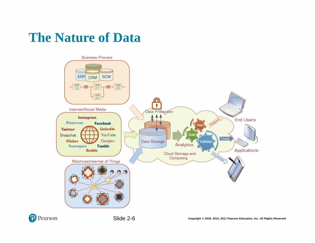
Data can come from a wide variety of locations. Examples can include business processes and systems, the Internet and social media, and machines or the Internet of Things.
4. In your opinion, what are the top three data-related challenges for better analytics?
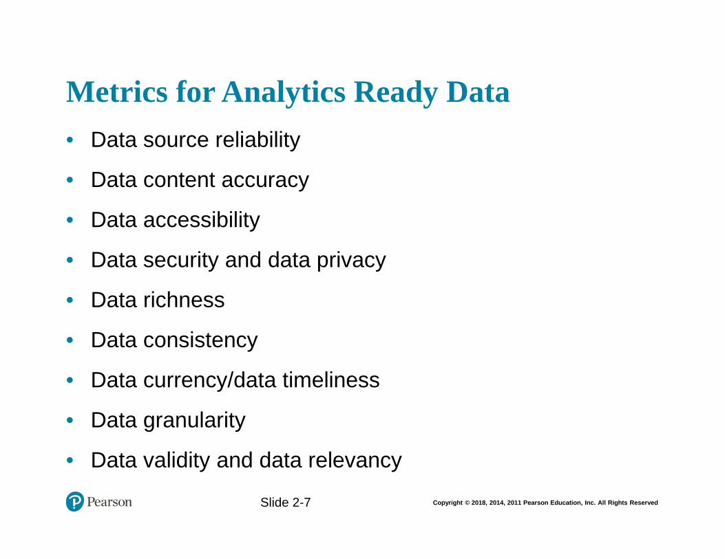
Opinions will vary, but examples of challenges include data reliability, accuracy, accessibility, security, richness, consistency, timeliness, granularity, validity, and relevance.
5. What are the most common metrics that make for analytics-ready data?
It must be relevant to the problem at hand and meet the quality/quantity requirements. It also has to have a certain data structure in place with key fields/variables with properly normalized values and conform to organizational definitions.
Section 2.3 Review Questions
1. What is data? How does data differ from information and knowledge?
Data refers to a collection of facts usually obtained as the result of experiments, observations, transactions, or experiences. Data may consist of numbers, letters, words, images, voice recordings, and so on, as measurements of a set of variables. Data is a raw commodity and does not become information or knowledge until after it is processed.
5 Copyright © 2018 Pearson Education, Inc.
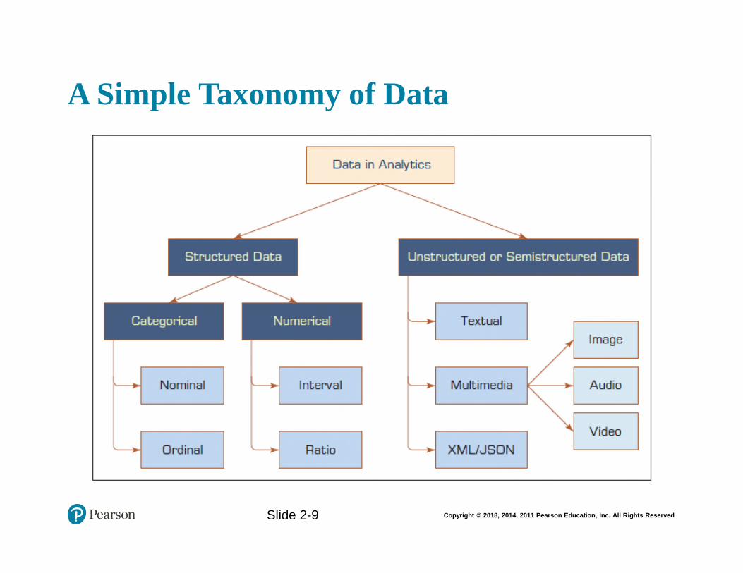
2. What are the main categories of data? What types of data can we use for BI and analytics?
The main categories of data are structured data and unstructured data. Both of these types of data can be used for business intelligence and analytics, although it is easier and more expedient to use structured data.
3. Can we use the same data representation for all analytics models? Why, or why not?
No, other data types, including textual, spatial, imagery, video, and voice, need to be converted into some form of categorical or numeric representation before they can be processed by analytics methods.
4. What is a 1-of-N data representation? Why and where is it used in analytics?
Nominal or ordinal variables are converted into numeric representations using some type of 1-of-N pseudo variables (e.g., a categorical variable with three unique values can be transformed into three pseudo variables with binary values—1 or 0). This allows it to be used in predictive analytics.
Section 2.4 Review Questions
1. Why is the original/raw data not readily usable by analytics tasks?
It is often dirty, misaligned, overly complex, and inaccurate.
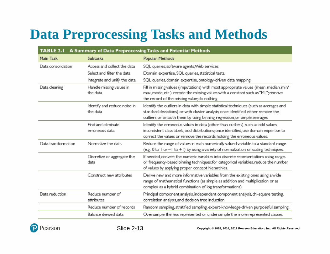
2. What are the main data preprocessing steps?
The main data preprocessing steps include data consolidation, data cleaning, data transformation, and data reduction.
3. What does it mean to clean/scrub the data? What activities are performed in this phase?
In this step, the values in the data set are identified and dealt with. The analyst will identify noisy values in the data and smooth them out, as well as addressing any missing values.
4. Why do we need data transformation? What are the commonly used data transformation tasks?
Data transformation is often needed to ensure that data is in a format in which it can be used for analysis. During data transformation the data is normalized, discretized, and attributes are created.
5. Data reduction can be applied to rows (sampling) and/or columns (variable selection). Which is more challenging?
6 Copyright © 2018 Pearson Education, Inc.
Data reduction as it applies to variable selection is more complex. This is because variables to be studied must be selected and others discarded. This is typically done by individuals who are experts in the field.
Section 2.5 Review Questions
1. What is the relationship between statistics and business analytics?
Statistics can be used as a part of business analytics, either to help generate reports or as a presentation format.
2. What are the main differences between descriptive and inferential statistics?
Descriptive statistics is all about describing the sample data on hand, and inferential statistics is about drawing inferences or conclusions about the characteristics of the population.
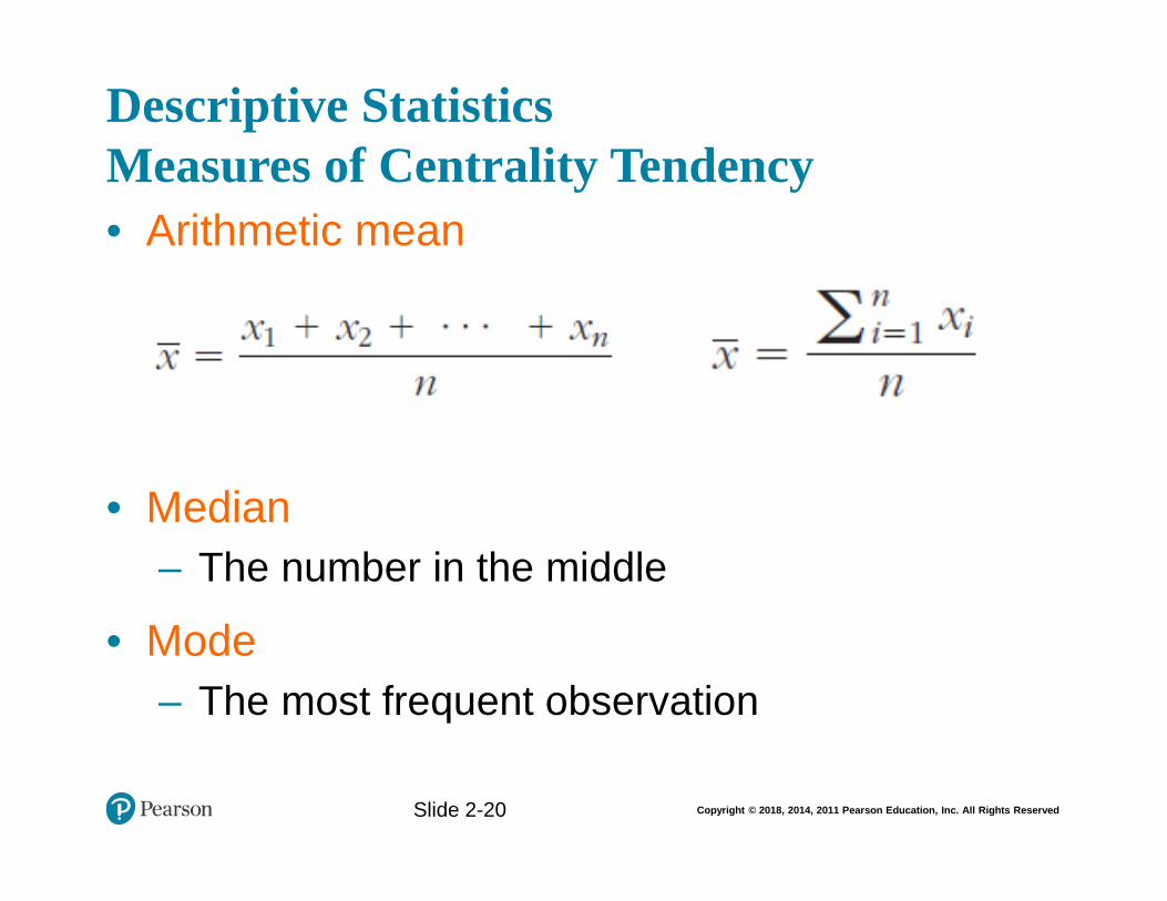
3. List and briefly define the central tendency measures of descriptive statistics.
Measures of centrality are the mathematical methods by which we estimate or describe central positioning of a given variable of interest. A measure of central tendency is a single numerical value that aims to describe a set of data by simply identifying or estimating the central position within the data.
The arithmetic mean (or simply mean or average) is the sum of all the values/observations divided by the number of observations in the data set.
The median is the measure of center value in a given data set. It is the number in the middle of a given set of data that has been arranged/sorted in order of magnitude (either ascending or descending).
The mode is the observation that occurs most frequently (the most frequent value in our data set).
4. List and briefly define the dispersion measures of descriptive statistics.
Measures of dispersion are the mathematical methods used to estimate or describe the degree of variation in a given variable of interest.
The range is the difference between the largest and the smallest values in a given data set (i.e., variables).
Variance is a method used to calculate the deviation of all data points in a given data set from the mean.
7 Copyright © 2018 Pearson Education, Inc.
The standard deviation is a measure of the spread of values within a set of data. The standard deviation is calculated by simply taking the square root of the variations.
Mean absolute deviation is calculated by measuring the absolute values of the differences between each data point and the mean and summing them.
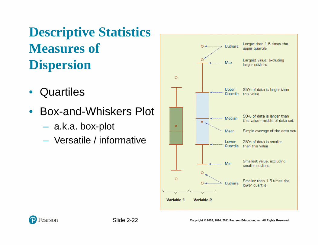
Quartiles help us identify spread within a subset of the data. A quartile is a quarter of the number of data points given in a data set. Quartiles are determined by first sorting the data and then splitting the sorted data into four disjoint smaller data sets.
5. What is a box-and-whiskers plot? What types of statistical information does it represent?
The box-and-whiskers plot is a graphical illustration of several descriptive statistics about a given data set. The box plot shows the centrality, the dispersion, and the minimum and maximum ranges.
6. What are the two most commonly used shape characteristics to describe a data distribution?
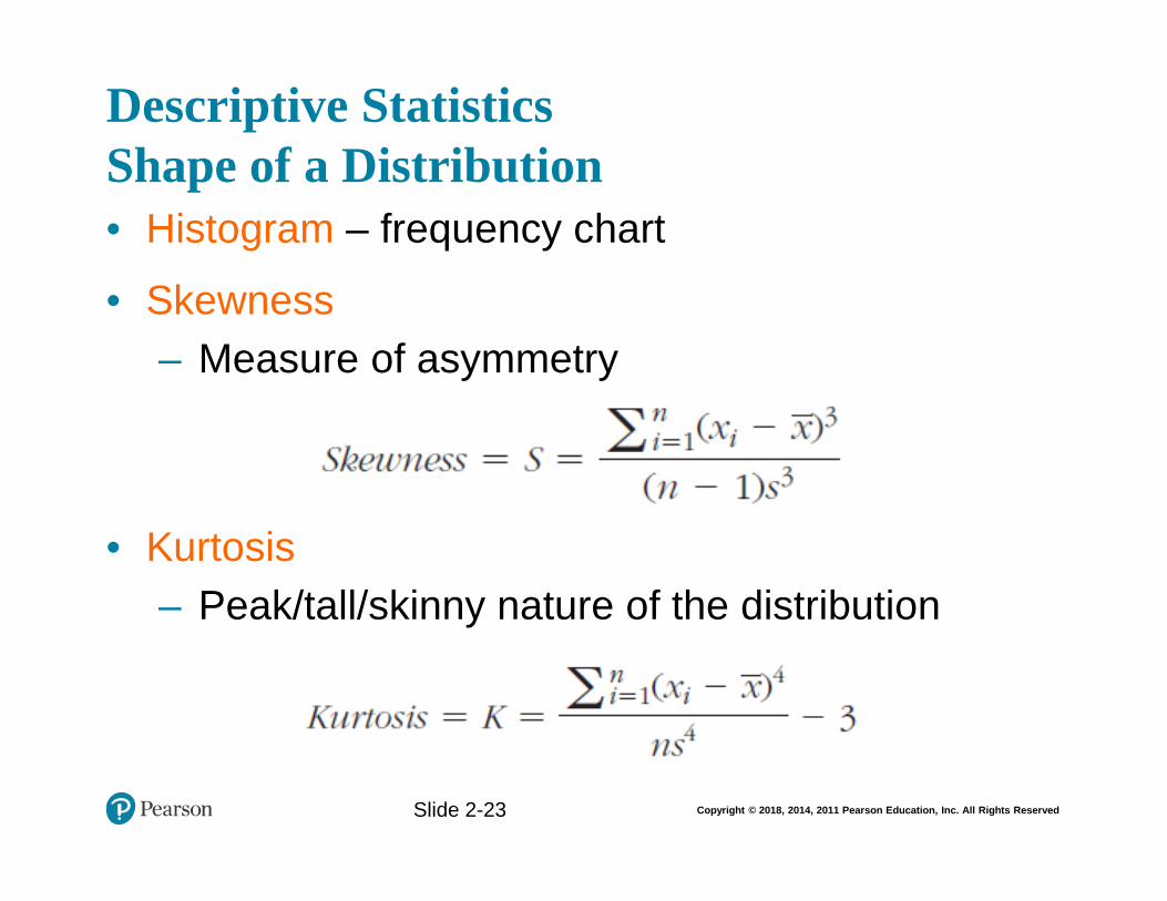
Skewness is a measure of asymmetry in a distribution of the data that portrays a unimodal structure—only one peak exists in the distribution of the data. Kurtosis is another measure to use in characterizing the shape of a unimodal distribution that is more interested in characterizing the peak/tall/skinny nature of the distribution.
Section 2.6 Review Questions
1. What is regression, and what statistical purpose does it serve?
Regression is a relatively simple statistical technique to model the dependence of a variable (response or output variable) on one (or more) explanatory (input) variables.
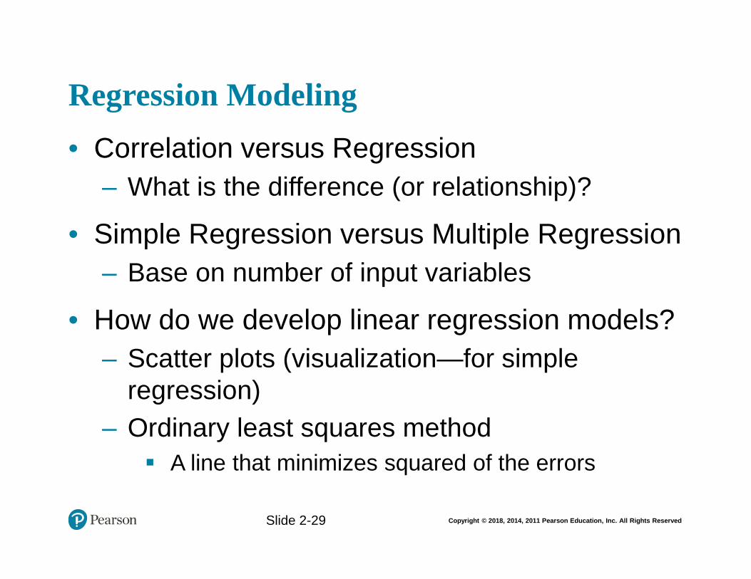
2. What are the commonalities and differences between regression and correlation?
Correlation makes no a priori assumption of whether one variable is dependent on the other(s) and is not concerned with the relationship between variables; instead it gives an estimate on the degree of association between the variables. On the other hand, regression attempts to describe the dependence of a response variable on one (or more) explanatory variables where it implicitly assumes that there is a one-way causal effect from the explanatory variable(s) to the response variable, regardless of whether the path of effect is direct or indirect. Also, although correlation is interested in the low-level relationships between two variables,
8 Copyright © 2018 Pearson Education, Inc.
regression is concerned with the relationships between all explanatory variables and the response variable.
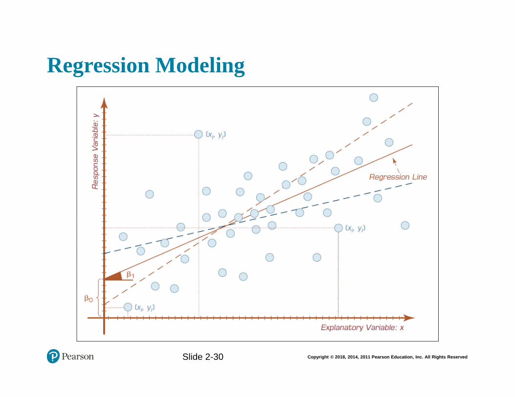
3. What is OLS? How does OLS determine the linear regression line?
Ordinary least squares (OLS) method aims to minimize the sum of squared residuals and leads to a mathematical expression for the estimated value of the regression line.
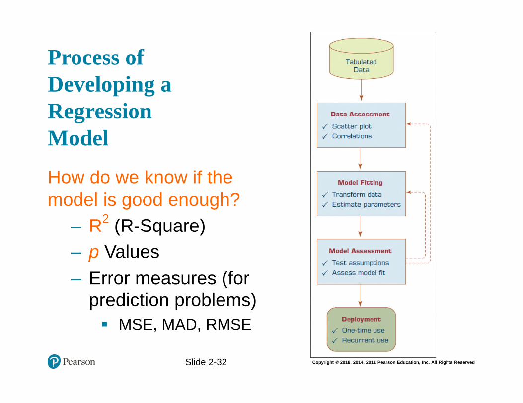
4. List and describe the main steps to follow in developing a linear regression model.
First perform a quick assessment of the data through the use of a scatter plot and/or correlations. Next, perform model fitting by transforming the data into a more usable format and estimating any needed parameters. Third, model your assessment by testing assumptions and evaluating its fit. Finally, if the steps show that regression is warranted, deploy and calculate the regression.
5. What are the most commonly pronounced assumptions for linear regression?
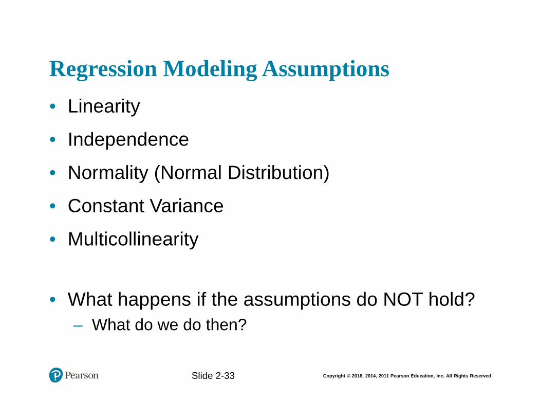
The most commonly pronounced assumptions for linear regression include linearity, independence, normality, constant variance, and multicollinearity.
6. What is logistics regression? How does it differ from linear regression?
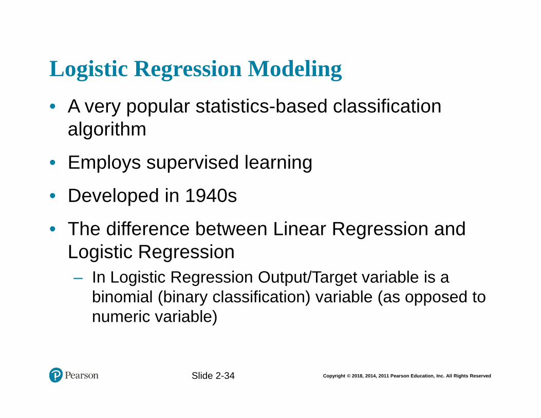
Logistics regression is a very popular, statistically sound, probability-based classification algorithm that employs supervised learning. It differs from linear regression with one major point: its output (response variable) is a class as opposed to a numerical variable.
7. What is time series? What are the main forecasting techniques for time series data?
Time series forecasting is the use of mathematical modeling to predict future values of the variable of interest based on previously observed values.
Section 2.7 Review Questions
1. What is a report? What are reports used for?
A report is any communication artifact prepared with the specific intention of conveying information in a presentable form to whoever needs it, whenever and wherever they may need it. It is usually a document that contains information (usually driven from data and personal experiences) organized in a narrative, graphic, and/or tabular form, prepared periodically (recurring) or on an as-required (ad hoc) basis, referring to specific time periods, events, occurrences, or subjects.
9 Copyright © 2018 Pearson Education, Inc.
2. What is a business report? What are the main characteristics of a good business report?
A business report is a written document that contains information regarding business matters. Business reporting (also called enterprise reporting) is an essential part of the larger drive toward improved managerial decision making and organizational knowledge management. The foundation of these reports is various sources of data coming from both inside and outside the organization. Creation of these reports involves ETL (extract, transform, and load) procedures in coordination with a data warehouse and then using one or more reporting tools. While reports can be distributed in print form or via e-mail, they are typically accessed via a corporate intranet. Primary characteristics of a good business report include clarity, brevity, completeness, and correctness.
3. Describe the cyclic process of management and comment on the role of business reports.
The cyclic process of management, as illustrated in Figure 2.1, involves these steps: data acquisition leads to information generation which leads to decision making which leads to business process management. Perhaps the most critical task in this cyclic process is the reporting (i.e., information generation)—converting data from different sources into actionable information.
4. List and describe the three major categories of business reports.
There are a wide variety of business reports, which for managerial purposes can be grouped into three major categories: metric management reports, dashboard-type reports, and balanced scorecard-type reports. Metric management reports involve outcome-oriented metrics based on service level agreements and/or key performance indicators. Dashboard-type reports present a range of performance indicators on one page, with both static/predefined elements and customizable widgets and views. Balanced scorecard reports present an integrated view of a company’s health and include financial, customer, business process, and learning/growth perspectives.
5. What are the main components of a business reporting system?
A business reporting system includes several components. One is the online transaction processing system (ERP, POS, etc.) that records transactions. A second is a data supply that takes recorded events and transactions and delivers them to the reporting system. Next comes an ETL component that ensures quality and performs necessary transformations prior to loading the data into a data store. Then there is the data storage itself (such as a data warehouse). Business logic converts the data into the reporting outputs. Publication distributes or hosts the reports for end users. And finally assurance provides a quality control check on the reports and their dissemination.
10 Copyright © 2018 Pearson Education, Inc.
Section 2.8 Review Questions
1. What is data visualization? Why is it needed?
Data visualization, perhaps more appropriately called “information visualization,” is the use of visual representations to explore, make sense of, and communicate data. It is closely related to the fields of information graphics, scientific visualization, and statistical graphics. What is portrayed in visualizations is the information (aggregations, summarizations, and contextualization) and not the data. Companies and individuals increasingly rely on data to make good decisions. Because data is so voluminous, there is a need for visual tools that help people understand it.
2. What are the historical roots of data visualization?
Predecessors to data visualization date back to the second century AD. Today’s most popular visual forms date back a few centuries. Geographical exploration, mathematics, and popularized history spurred the creation of early maps, graphs, and timelines as far back as the 1600s. The now familiar line and bar charts date back to the late 1700s. Charles Joseph Minard used visualizations to graphically portray the losses suffered by Napoleon’s army in the Russian campaign of 1812. The 1900s saw the rise of a more formal, empirical attitude toward visualization, which tended to focus on aspects such as color, value scales, and labeling. In the 2000s the Internet has emerged as a new medium for visualization, and added interactivity to previously static graphics.
3. Carefully analyze Charles Joseph Minard’s graphical portrayal of Napoleon’s march. Identify and comment on all of the information dimensions captured in this ancient diagram.
In this graphic Minard managed to simultaneously represent several data dimensions, including the size of the army, direction of movement, geographic locations, outside temperature, etc. He did this in an artistic and informative manner. The background of the image is a map depicting the location of battles. There is a thick lighter band that shows the size of Napoleon’s army at each position, and a dark lower one that depicts the retreat. A line at the bottom depicts temperatures at each position in time and space.
4. Who is Edward Tufte? Why do you think we should know about his work?
Edward Tufte is a statistician whose website chronicles many historical data visualizations, including Minard’s graphic of Napoleon’s defeat. His work can bring insights into how to follow best practices for information visualization.
5. What do you think is the “next big thing” in data visualization?
The future of data/information visualization is very hard to predict. We can only extrapolate from what has already been invented: more three-dimensional
11 Copyright © 2018 Pearson Education, Inc.
visualization, more immersive experience with multidimensional data in a virtual reality environment, and holographic visualization of information. There is a pretty good chance that we will see something that we have never seen in the information visualization realm invented before the end of this decade.
Section 2.9 Review Questions
1. Why do you think there are many different types of charts and graphs?
Different types of charts are appropriate for conveying different types of information. Line graphs are good for time-series data. Bar charts are good for depicting nominal or numerical data that can be easily categorized. Pie charts should be used for depicting proportions. Scatter plots and bubble charts are good for illustrating relationships between two or three variables (bubble charts add a dimension via the size of the dot). Histograms are like bar charts, except they depict frequency distributions. Gantt charts and PERT charts are good at illustrating project timelines and task dependencies. Geographic maps, of course, show geographic information. Bullet graphs show progress toward a goal. Heat maps and highlight tables illustrate the comparison of continuous values across two categories using color. Tree maps are good for showing hierarchical information. Even though these charts and graphs cover a major part of what is commonly used in information visualization, they by no means cover it all. Nowadays, one can find many other specialized graphs and charts that serve a specific purpose.
2. What are the main differences among line, bar, and pie charts? When should you use one over the others?
Line graphs are good for time-series data. Bar charts are good for depicting nominal or numerical data that can be easily categorized. Pie charts should be used for depicting proportions. You shouldn’t use pie charts if the number of categories is very large.
3. Why would you use a geographic map? What other types of charts can be combined with a geographic map?
Geographic maps are useful when the data set includes any kind of location data, including addresses, postal codes, state names or abbreviations, country names, latitude/longitude, or some type of custom geographic encoding. Maps can be used in conjunction with other charts and graphs. For instance, one can use maps to show distribution of customer service requests by product type (depicted in pie charts) by geographic locations.
12 Copyright © 2018 Pearson Education, Inc.
4. Find two more kinds of charts that are not covered in this section and comment on their usability.
A concept map is a diagram that shows relationships between concepts, usually showing specific ideas and information as boxes and using arrows to connect them. Concept maps are often used by designers and engineers to organize ideas.
Another type of chart is an organization chart (or org-chart). This is a hierarchical, tree-structured chart that shows how an organization is structured and how its parts and jobs are related.
A motion chart is like a bubble chart in that it depicts data on dimensions of the x-axis, y-axis, size, and color of bubbles. In addition, however, it is also animated, so that bubbles move and resize themselves over time.
Section 2.10 Review Questions
1. What are the main reasons for the recent emergence of visual analytics?
The growth of visual analytics correlates with the growth of analytics in general. More BI and analytics vendors are becoming aware that their customers require quick and preferably interactive visualizations, not just for their normal reporting systems, but also to illustrate predictive and prescriptive decision-making information. Many of the information visualization vendors are adding the capabilities to call themselves visual analytics solution providers. Conversely, analytics solution providers such as SAS are embedding their analytics capabilities into a high-performance data visualization environment that they call visual analytics.
2. Look at Gartner’s Magic Quadrant for Business Intelligence and Analytics Platforms. What do you see? Discuss and justify your observations.
What we can see from Gartner’s Magic Quadrant is that the vast majority of the “challengers” in the visual analytics space are considered to be “niche players,” while all of the “leaders” are “visionaries.” Most of the leaders are either relatively recently founded information visualization companies (e.g., Tableau Software, QlikTech, or Tibco Spotfire) or are well-established, large analytics companies (e.g., SAS, IBM, Microsoft, SAP, or MicroStrategy) that are increasingly focusing their efforts in information visualization and visual analytics. This chart, and the Gartner report from which it comes, shows that data discovery/visualization has become a mainstream architecture, perhaps surpassing the OLAP/semantic offerings of traditional BI vendors. This is further evidenced by the change of name of the magic quadrant from “BI” to “BI and Analytics.”
3. What is the difference between information visualization and visual analytics?
13 Copyright © 2018 Pearson Education, Inc.
Visual analytics is the combination of visualization and predictive analytics. While information visualization is aimed at answering “what happened” and “what is happening” and is closely associated with business intelligence (routine reports, scorecards, and dashboards), visual analytics is aimed at answering “why is it happening,” “what is more likely to happen,” and is usually associated with business analytics (forecasting, segmentation, and correlation analysis).
4. Why should storytelling be a part of your reporting and data visualization?
The central idea of business reporting is to tell a story. Everyone who has data to analyze has stories to tell, whether it’s diagnosing the reasons for manufacturing defects, selling a new idea in a way that captures the imagination of your target audience, or informing colleagues about a particular customer service improvement program. Stories bring life to data and facts. They can help you make sense and order out of a disparate collection of facts. They make it easier to remember key points and can paint a vivid picture of what the future can look like. Stories also create interactivity—people put themselves into stories and can relate to the situation. People will be much more engaged and receptive if information is presented to them in a story format.
5. What is a high-powered visual analytics environment? Why do we need it?
A high-powered visualization environment is one in which high-performance, in-memory solutions are applied to exploring massive amounts of data in a very short time (almost instantaneously). Due to the increasing demand for visual analytics coupled with fast-growing data volumes, there is an ever-growing need to invest in highly efficient visualization systems. SAS Visual Analytics is an example of such an environment. These systems help to empower larger numbers of users, solve complex problems more quickly, and improve collaboration and information sharing. By enabling end-users, IT staff are freed up. In addition, these tools allow for growth at a self-determined pace.
Section 2.11 Review Questions
1. What is an information dashboard? Why are they so popular for BI software tools?
Information dashboards provide visual displays of important information that is consolidated and arranged on a single screen so that information can be digested at a single glance and easily drilled in and further explored. They are common components of most, if not all, performance management systems, performance measurement systems, BPM software suites, and BI platforms. Dashboards pack a lot of information into a single screen, which is one reason for their popularity.
14 Copyright © 2018 Pearson Education, Inc.
2. What are the graphical widgets commonly used in dashboards? Why?
Dashboards can include many kinds of visual widgets, including charts, performance bars, sparklines, gauges, meters, stoplights, geographic maps, etc. These help to highlight, at a glance, the data and exceptions that require action. A picture tells a thousand words, and through the use of many graphical widgets, a dashboard can convey a wealth of information to decision makers in a short time.
3. List and describe the three layers of information portrayed on dashboards.
The three layers of information found in most dashboards are:
1. Monitoring. Graphical, abstracted data to monitor key performance metrics.
2. Analysis. Summarized dimensional data to analyze the root cause of problems.
3. Management. Detailed operational data that identify what actions to take to resolve a problem.
4. What are the common characteristics of dashboards and other information visuals?
All well-designed dashboards share some common characteristics. They use visual components (e.g., charts, performance bars, sparklines, gauges, meters, stoplights) to highlight, at a glance, the data and exceptions that require action. They are transparent to the user, meaning that they require minimal training and are extremely easy to use. They combine data from a variety of systems into a single, summarized, unified view of the business. They enable drill-down or drill-through to underlying data sources or reports, providing more detail about the underlying comparative and evaluative context. They present a dynamic, real-world view with timely data refreshes, enabling the end user to stay up to date with any recent changes in the business. And they require little, if any, customized coding to implement, deploy, and maintain.
5. What are the best practices in dashboard design?
• Benchmark key performance indicators with industry standards. • Wrap the dashboard metrics with contextual metadata (e.g. data source,
data currency, refresh schedule). • Prioritize and rank alerts/exceptions streamed to the dashboard. • Enrich the dashboard with business users’ comments. • Present information in three different levels (visual dashboard, static
report, and self-service cube). • Pick the right visual construct using dashboard design principles. • Provide for guided analytics.
15 Copyright © 2018 Pearson Education, Inc.
ANSWERS TO APPLICATION CASE QUESTIONS FOR DISCUSSION
Application Case 2.1 Medical Device Company Ensures Product Quality While Saving Money
1. What were the main challenges for the medical device company? Were they market or technology driven? Explain.
The company faced both market-driven and technology-driven challenges. The competitive nature of the marketplace made it important for them to always be improving on their products. Technically, the company needed a better method to analyze the large volumes of data that it collected.
2. What was the proposed solution?
The proposed solution was to adopt Dell Statistica. This software allowed for the complex analytics required, as well as meeting the demands necessary in a healthcare setting.
3. What were the results? What do you think was the real return on investment (ROI)?
The results were very positive and, based on the information presented, probably provided a positive return on ROI. Specifically the analytics tools allowed them to maintain regulatory compliance, ensure product consistency, evaluate supply chain issues, and save time overall.
16 Copyright © 2018 Pearson Education, Inc.
Application Case 2.2 Improving Student Retention with Data-Driven Analytics
1. What is student attrition, and why is it an important problem in higher education?
Student attrition represents students who drop out or fail to complete a course of study. This is very important in higher education as it is a leading metric of the success of individual institutions.
2. What were the traditional methods to deal with the attrition problem?
Traditional solutions are quite varied. Most are centered on obvious problems, but may not take into account problems that are difficult to evaluate or quantify. Additionally, they may not account for the confluence of multiple problems.
3. List and discuss the data-related challenges within context of this case study.
The largest data-related challenge is the volume of data available. This data is normally from multiple sources, and used primarily for multiple, different purposes. It is important to be able to aggregate all data, but at the same time identify data that truly affects student retention.
4. What was the proposed solution? And, what were the results?
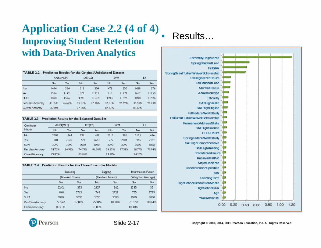
The solution uses a variety of data and controls for important variables to create a system to predict freshman attrition. The system used was able to predict that attrition with approximately 80% accuracy.
17 Copyright © 2018 Pearson Education, Inc.
Application Case 2.3 Town of Cary Uses Analytics to Analyze Data from Sensors, Assess Demand, and Detect Problems
1. What were the challenges the Town of Cary was facing?
The town was seeking an accurate way to track the use of water across multiple locations to both identify potential leaks as well as simplify meter readings.
2. What was the proposed solution?
The town installed 60,000 wireless meters in customers’ homes and monitored the data through an online portal. A SAS solution was used to manage and analyze the data.
3. What were the results?
Based on this project, the city has a much better understanding of how water is used within its borders. Additionally, it is much easier to bill for water use and plan for future demands.
4. What other problems and data analytics solutions do you foresee for towns like Cary?
Opinions will vary, but it is possible for towns like Cary to use similar systems to monitor other utilities to achieve the same level of understanding.
18 Copyright © 2018 Pearson Education, Inc.
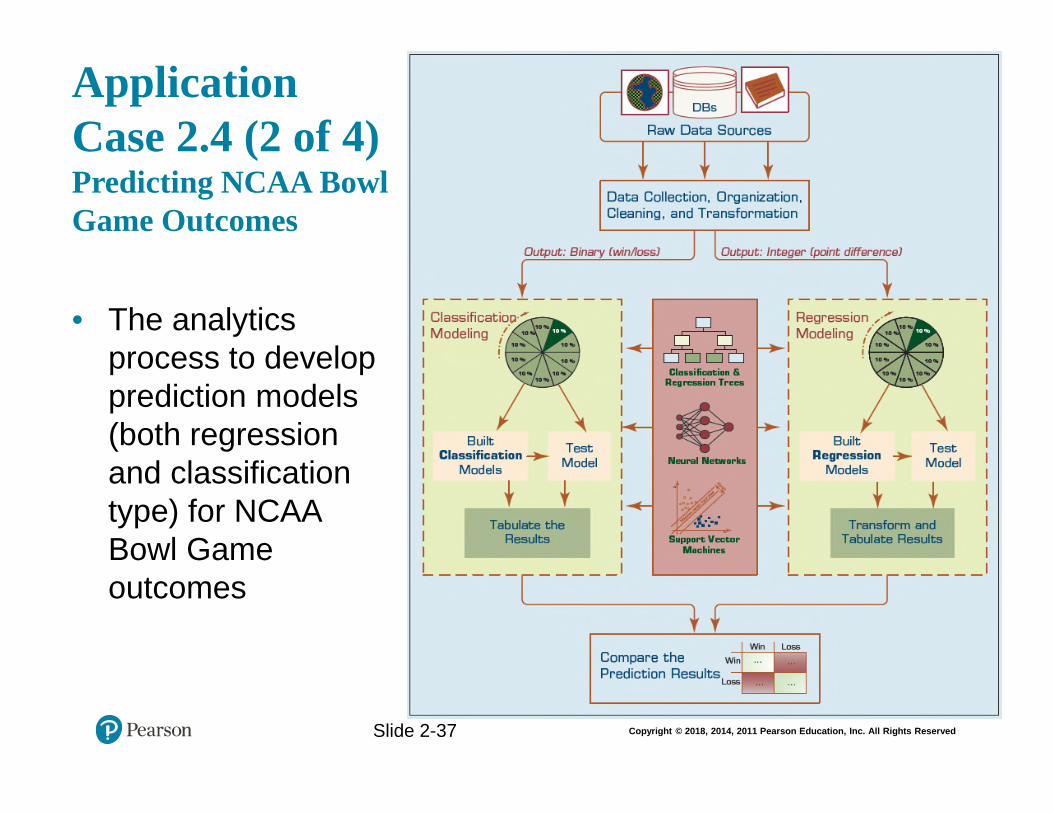
Application Case 2.4 Predicting NCAA Bowl Game Outcomes
1. What are the foreseeable challenges in predicting sporting event outcomes (e.g., college bowl games)?
While a large amount of data exists that can be used to possibly help predict the outcome of sporting events, understanding how all of that information works together and how important individual factors will be is quite challenging. Additionally there are individual actions that can occur on the day that may affect the outcome as well.
2. How did the researchers formulate/design the prediction problem (i.e., what were the inputs and output, and what was the representation of a single sample—row of data)?
The researchers generated a very detailed model using a wide array of variables available to them. You can see the listing of the variables in Table 2.5 in the case itself. Researchers used data analysis techniques to identify the important variables and understand their weight.
3. How successful were the prediction results? What else can they do to improve the accuracy?
A number of potential models were created, but the most accurate model indicates an accuracy of 86.48%. It is possible that accuracy could be improved in the future with the addition of new data points, both in the form of variables and completed games.
Application Case 2.5: Flood of Paper Ends at FEMA
1. What is FEMA and what does it do?
The Federal Emergency Management Agency (FEMA) is a U.S. federal agency that coordinates disaster response when the President declares a national disaster.
2. What are the main challenges that FEMA faces?
When a disaster occurs, FEMA is inundated with a huge amount of paperwork to sift through in order to administer the National Flood Insurance Program (NFIP). Sifting through this paperwork is very cumbersome and labor-intensive.
3. How did FEMA improve its inefficient reporting practices?
The solution was to implement a system based on WebFOCUS software from Information Builders. As a result, FEMA staff can now browse insurance data
19 Copyright © 2018 Pearson Education, Inc.
posted on NFIP’s BureauNet intranet site, select just the information they want to see, and get an onscreen report or download the data as a spreadsheet. This also allows them to create custom reports without having to go through their IT provider, CSC. The first major test of this system was Tropical Storm Allison, and BureauNet worked very well. It also has been able to scale up to handle increased demand.
Application Case 2. 6 Macfarlan Smith Improves Operational Performance Insight with Tableau Online
1. What were the data and reporting related challenges Macfarlan Smith facing?
The company had a number of challenges to overcome. The first was data located in many systems, some of which were difficult to access. Another issue was that the quality of the data was in doubt, bringing concerns that results may not be valid. Finally, even with data aggregated and scrubbed, the process of using that data for analysis was very time consuming.
2. What was the solution and the obtained results/benefits?
The company adopted a Tableau system that could be used to store, analyze, and present data for decision making. Because the system was SaaS, it required very little in up-front investment. After using the system the company is able to access and utilize data in ways that it was never able to in the past. They are now able to generate reports as well as answer customer questions with ease.
Application Case 2.7: Dallas Cowboys Score Big with Tableau and Teknion
1. How did the Dallas Cowboys use information visualization?
They incorporated Tableau and Teknion to assist with visualizing and understanding their merchandising activities, involving the complete supply chain from manufacture to end customer.
2. What were the challenges, the proposed solution, and the obtained results?
The Dallas Cowboys Merchandising Division needed more visibility into their data so they could run more profitably. Microsoft was selected, as the baseline platform that had been selected was not sufficient for the task. Tableau and Teknion together provided real-time reporting and dashboard capabilities that provided the necessary visualization functionality to meet and exceed the Cowboys’ requirements. Now, for the first time, the Dallas Cowboys are able to monitor their complete merchandising activities from manufacture to end
20 Copyright © 2018 Pearson Education, Inc.
customer and see not only what is happening across the life cycle, but drill down even further into why it is happening.
Application Case 2.8: Visual Analytics Helps Energy Supplier Make Better Connections
1. Why do you think energy supply companies are among the prime users of information visualization tools?
Energy companies are typically dealing with a very large amount of information that comes from a wide variety of sources. Additionally, these companies tend to be working with very large budgets, and the ability to identify areas of possible savings can result in large increases to revenue.
2. How did Electrabel use information visualization for the single version of the truth?
The company was concerned about the diversity and disparity of the information that it was using to make decisions. By centralizing information, it was possible for them to create “one version of the truth” and create dashboards and reports that showed reliable information that could be used for decision making.
3. What were their challenges, the proposed solution, and the obtained results?
The company’s primary challenge was the variety and diversity in the data that it needed to aggregate. The company selected a SAS Visual Analytics system to manage and report the data. After implementing the system, the company has been able to deliver quality information in the form of reports much faster and at a lower cost.
ANSWERS TO END OF CHAPTER QUESTIONS FOR DISCUSSION
1. How do you describe the importance of data in analytics? Can we think of analytics without data? Explain.
Data is the main ingredient in all forms of analytics. You cannot have analytics without data.
21 Copyright © 2018 Pearson Education, Inc.
2. Considering the new and broad definition of business analytics, what are the main
inputs and outputs to the analytics continuum?
Because of the broader definition of business analytics, almost any data from almost any source can be considered an input. In the same way, after analytics has been performed, output can take a wide variety of forms depending on the specific business purpose.
3. Where does the data for business analytics come from? What are the sources and the nature of that incoming data?
Data can come from a wide variety of locations. Examples can include business processes and systems, the Internet and social media, and machines or the Internet of Things.
4. What are the most common metrics that make for analytics-ready data?
It must be relevant to the problem at hand and meet the quality/quantity requirements. It also has to have a certain data structure in place with key fields/variables with properly normalized values and conform to organizational definitions.
5. What are the main categories of data? What types of data can we use for BI and analytics?
The main categories of data are structured data and unstructured data. Both of these types of data can be used for business intelligence and analytics, although it is easier and more expedient to use structured data.
6. Can we use the same data representation for all analytics models (i.e., do different analytics models require different data representation schema)? Why, or why not?
No, other data types, including textual, spatial, imagery, video, and voice, need to be converted into some form of categorical or numeric representation before they can be processed by analytics methods.
7. Why is the original/raw data not readily usable by analytics tasks?
It is often dirty, misaligned, overly complex, and inaccurate.
8. What are the main data preprocessing steps? List and explain their importance in analytics.
The main data preprocessing steps include data consolidation, data cleaning, data transformation, and data reduction.
22 Copyright © 2018 Pearson Education, Inc.
9. What does it mean to clean/scrub the data? What activities are performed in this phase?
In this step, the values in the data set are identified and dealt with. The analyst will identify noisy values in the data and smooth them out, as well as address any missing values.
10. Data reduction can be applied to rows (sampling) and/or columns (variable selection). Which is more challenging? Explain.
Data reduction as it applies to variable selection is more complex. This is because variables to be studied must be selected and others discarded. This is typically done by individuals who are experts in the field.
11. What is the relationship between statistics and business analytics (consider the placement of statistics in a business analytics taxonomy)?
Statistics can be used as a part of business analytics, either to help generate reports or as a presentation format.
12. What are the main differences between descriptive and inferential statistics?
Descriptive statistics is all about describing the sample data on hand, and inferential statistics is about drawing inferences or conclusions about the characteristics of the population.
13. What is a box-and-whiskers plot? What types of statistical information does it represent?
The box-and-whiskers plot is a graphical illustration of several descriptive statistics about a given data set. The box plot shows the centrality, the dispersion, and the minimum and maximum ranges.
14. What are the two most commonly used shape characteristics to describe a data distribution?
Skewness is a measure of asymmetry in a distribution of the data that portrays a unimodal structure—only one peak exists in the distribution of the data. Kurtosis is another measure to use in characterizing the shape of a unimodal distribution that is more interested in characterizing the peak/tall/skinny nature of the distribution.
15. List and briefly define the central tendency measures of descriptive statistics.
23 Copyright © 2018 Pearson Education, Inc.
Measures of centrality are the mathematical methods by which we estimate or describe central positioning of a given variable of interest. A measure of central tendency is a single numerical value that aims to describe a set of data by simply identifying or estimating the central position within the data.
• The arithmetic mean (or simply mean or average) is the sum of all the values/observations divided by the number of observations in the data set.
• The median is the measure of center value in a given data set. It is the number in the middle of a given set of data that has been arranged/sorted in order of magnitude (either ascending or descending).
• The mode is the observation that occurs most frequently (the most frequent value in our data set).
16. What are the commonalities and differences between regression and correlation?
Correlation makes no a priori assumption of whether one variable is dependent on the other(s) and is not concerned with the relationship between variables; instead it gives an estimate on the degree of association between the variables. On the other hand, regression attempts to describe the dependence of a response variable on one (or more) explanatory variables where it implicitly assumes that there is a one-way causal effect from the explanatory variable(s) to the response variable, regardless of whether the path of effect is direct or indirect. Also, although correlation is interested in the low-level relationships between two variables, regression is concerned with the relationships between all explanatory variables and the response variable.
17. List and describe the main steps to follow in developing a linear regression model.
First perform a quick assessment of the data through the use of a scatter plot and or correlations. Next, perform model fitting by transforming the data into a more usable format and estimating any needed parameters. Third, model your assessment by testing assumptions and evaluating its fit. Finally, if the steps show that aggression is warranted, deploy and calculate the regression.
18. What are the most commonly pronounced assumptions for linear regression? What is crucial to the regression models against these assumptions?
The most commonly pronounced assumptions for linear regression include linearity, independence, normality, constant variance, and multicollinearity.
19. What are the commonalities and differences between linear regression and logistic regression?
Logistic regression is a very popular, statistically sound, probability-based classification algorithm that employs supervised learning. It differs from linear
24 Copyright © 2018 Pearson Education, Inc.
regression with one major point: its output (response variable) is a class as opposed to a numerical variable.
20. What is time series? What are the main forecasting techniques for time series data?
Time series forecasting is the use of mathematical modeling to predict future values of the variable of interest based on previously observed values.
21. What is a business report? Why is it needed?
A business report is a written document that contains information regarding business matters. Business reporting (also called enterprise reporting) is an essential part of the larger drive toward improved managerial decision making and organizational knowledge management. The foundation of these reports is various sources of data coming from both inside and outside the organization. Creation of these reports involves ETL (extract, transform, and load) procedures in coordination with a data warehouse and then using one or more reporting tools. While reports can be distributed in print form or via e-mail, they are typically accessed via a corporate intranet. Primary characteristics of a good business report include clarity, brevity, completeness, and correctness.
22. What are the best practices in business reporting? How can we make our reports stand out?
Business reporting is about good storytelling. Here are some best practices for telling compelling stories with your business report: Think of your analysis as a story—use a story structure. Be authentic—your story will flow. Be visual—think of yourself as a film editor. Make it easy for your audience and you. Invite and direct discussion.
Business reports are often presented in the form of a dashboard or scorecard. Following are some best practices of dashboard design:
• Benchmark key performance indicators with industry standards. • Wrap the dashboard metrics with contextual metadata (e.g., data source,
data currency, refresh schedule). • Prioritize and rank alerts/exceptions streamed to the dashboard. • Enrich the dashboard with business users’ comments. • Present information in three different levels (visual dashboard, static
report, and self-service cube). • Pick the right visual construct using dashboard design principles. • Provide for guided analytics.
25 Copyright © 2018 Pearson Education, Inc.
23. Describe the cyclic process of management and comment on the role of business reports.
The cyclic process of management involves these steps: data acquisition leads to information generation which leads to decision making which leads to business process management. Perhaps the most critical task in this cyclic process is the reporting (i.e., information generation)—converting data from different sources into actionable information.
24. List and describe the three major categories of business reports.
There are a wide variety of business reports, which for managerial purposes can be grouped into three major categories: metric management reports, dashboard-type reports, and balanced scorecard-type reports. Metric management reports involve outcome-oriented metrics based on service level agreements and/or key performance indicators. Dashboard-type reports present a range of performance indicators on one page, with both static/predefined elements and customizable widgets and views. Balanced scorecard reports present an integrated view of a company’s health and include financial, customer, business process, and learning/growth perspectives.
25. Why has information visualization become a centerpiece in business intelligence and analytics? Is there a difference between information visualization and visual analytics?
A picture tells a thousand words. Hence, information visualization is key to quickly providing understanding of complex information. This has been true for hundreds of years, as evidenced by Minard’s graphical depiction of Napoleon’s defeat. In an increasingly complex information age, visualization is even more important. Since BI and analytics are all about making sense of high volume, fast-paced, interrelated data, it is natural that information visualization would be a centerpiece. BI companies are rapidly adding information visualization and visual analytics into their products and services.
Information visualization and visual analytics are related but distinct concepts. Visual analytics is the combination of visualization and predictive analytics. While information visualization is aimed at answering “what happened” and “what is happening” and is closely associated with business intelligence (routine reports, scorecards, and dashboards), visual analytics is aimed at answering “why is it happening,” “what is more likely to happen,” and is usually associated with business analytics (forecasting, segmentation, and correlation analysis).
26. What are the main types of charts/graphs? Why are there so many of them?
Different types of charts are appropriate for conveying different types of information. Line graphs are good for time-series data. Bar charts are good for
26 Copyright © 2018 Pearson Education, Inc.
depicting nominal or numerical data that can be easily categorized. Pie charts should be used for depicting proportions. Scatter plots and bubble charts are good for illustrating relationships between two or three variables (bubble charts add a dimension via the size of the dot). Histograms are like bar charts, except they depict frequency distributions. Gantt charts and PERT charts are good at illustrating project timelines and task dependencies. Geographic maps, of course, show geographic information. Bullet graphs show progress toward a goal. Heat maps and highlight tables illustrate the comparison of continuous values across two categories using color. Tree maps are good for showing hierarchical information. Even though these charts and graphs cover a major part of what is commonly used in information visualization, they by no means cover it all. Nowadays, one can find many other specialized graphs and charts that serve a specific purpose.
27. How do you determine the right chart for the job? Explain and defend your reasoning.
Line graphs are good for time-series data. Bar charts are good for depicting nominal or numerical data that can be easily categorized. Pie charts should be used for depicting proportions. You shouldn’t use pie charts if the number of categories is very large.
28. What is the difference between information visualization and visual analytics?
Visual analytics is the combination of visualization and predictive analytics. While information visualization is aimed at answering “what happened” and “what is happening” and is closely associated with business intelligence (routine reports, scorecards, and dashboards), visual analytics is aimed at answering “why is it happening,” “what is more likely to happen,” and is usually associated with business analytics (forecasting, segmentation, and correlation analysis).
29. Why should storytelling be a part of your reporting and data visualization?
The central idea of business reporting is to tell a story. Everyone who has data to analyze has stories to tell, whether it’s diagnosing the reasons for manufacturing defects, selling a new idea in a way that captures the imagination of your target audience, or informing colleagues about a particular customer service improvement program. Stories bring life to data and facts. They can help you make sense and order out of a disparate collection of facts. They make it easier to remember key points and can paint a vivid picture of what the future can look like. Stories also create interactivity—people put themselves into stories and can relate to the situation. People will be much more engaged and receptive if information is presented to them in a story format.
27 Copyright © 2018 Pearson Education, Inc.
30. What is an information dashboard? Why are they so popular for BI software tools?
Information dashboards provide visual displays of important information that is consolidated and arranged on a single screen so that information can be digested at a single glance and easily drilled in and further explored. They are common components of most, if not all, performance management systems, performance measurement systems, BPM software suites, and BI platforms. Dashboards pack a lot of information into a single screen, which is one reason for their popularity.
31. What are the best practices in dashboard design?
• Benchmark key performance indicators with industry standards. • Wrap the dashboard metrics with contextual metadata (e.g., data source, data
currency, refresh schedule). • Prioritize and rank alerts/exceptions streamed to the dashboard. • Enrich the dashboard with business users’ comments. • Present information in three different levels (visual dashboard, static report,
and self-service cube). • Pick the right visual construct using dashboard design principles. • Provide for guided analytics.
32. Do you think performance dashboards are here to stay? Or are they about to be outdated? What do you think will be the next big wave in business intelligence and analytics?
Like all technology, performance dashboards will evolve and morph over time. Dashboards are not a new concept. Their roots can be traced at least to the EIS of the 1980s. Today, dashboards are ubiquitous. Currently they are used as reporting tools, largely for the purpose of evaluating a company’s performance, and are often tied with business performance methodologies like Balanced Scorecard or Six Sigma. The specific visualizations in a dashboard (charts, graphs, and maps) will evolve over time, and the technology platforms may change. For example, with virtual reality, holographic and immersive technologies, the user experience may change considerably. But the purpose of a dashboard to monitor company performance and respond to warnings and events will continue. (Answers will vary by student.)
ANSWERS TO END OF CHAPTER EXERCISES
Teradata University and Other Hands-on Exercises
1. Download the “Voting Behavior” data and the brief data description from the book’s Web site. This is a data set manually compiled from counties all around
28 Copyright © 2018 Pearson Education, Inc.
the United States. The data is partially processed, that is, some derived variables are created. Your task is to thoroughly preprocess the data by identifying the error and anomalies and proposing remedies and solutions. At the end you should have an analytics-ready version of this data. Once the preprocessing is completed, pull this data into Tableau (or into some other data visualization software tool) to extract useful visual information from it. To do so, conceptualize relevant questions and hypotheses (come up with at least three of them) and create proper visualizations that address those questions of “tests” of those hypotheses.
Student responses will vary.
2. Download Tableau (at tableau.com, following academic free software download instructions on their site). Using the Visualization_MFG_Sample data set (available as an Excel file on this book’s Web site) answer the following questions:
a. What is the relationship between gross box office revenue and other movie-related parameters given in the data set?
b. How does this relationship vary across different years? Prepare a professional-looking written report that is enhanced with screenshots of your graphic findings.
Student responses will vary.
3. Go to teradatauniversitynetwork.com. Look for an article that deals with the nature of data, management of data, and/or governance of data as it relates to BI and analytics, and critically analyze the content of the article.
Student responses will vary.
4. Go to UCI data repository (archive.ics.uci.edu/ml/datasets.html), and identify a large data set that contains both numeric and nominal values. Using Microsoft Excel, or any other statistical software:
a. Calculate and interpret central tendency measures for each and every variable.
b. Calculate and interpret the dispersion/spread measures for each and every variable.
Student responses will vary.
5. Go to UCI data repository (archive.ics.uci.edu/ml/datasets. html), and identify two data sets, one for estimation/regression and one for classification. Using Microsoft Excel, or any other statistical software:
a. Develop and interpret a linear regression model.
b. Develop and interpret a logistic regression model.
29 Copyright © 2018 Pearson Education, Inc.
Student responses will vary.
6. Go to KDnuggest.com, and become familiar with the range of analytics resources available on this portal. Then, identify an article, a white paper, or an interview script that deals with the nature of data, management of data, and/or governance of data as it relates to BI and business analytics, and critically analyze the content of the article.
Student responses will vary.
7. Go to Stephen Few’s blog, “The Perceptual Edge” (perceptualedge.com). Go to the section of “Examples.” In this section, he provides critiques of various dashboard examples. Read a handful of these examples. Now go to dundas.com. Select the “Gallery” section of the site. Once there, click the “Digital Dashboard” selection. You will be shown a variety of different dashboard demos. Run a couple of the demos.
a. What sorts of information and metrics are shown on the demos? What sorts of actions can you take?
b. Using some of the basic concepts from Few’s critiques, describe some of the good design points and bad design points of the demos.
Student responses will vary.
8. Download an information visualization tool, such as Tableau, QlikView, or Spotfire. If your school does not have an educational agreement with these companies, then a trial version would be sufficient for this exercise. Use your own data (if you have any) or use one of the data sets that comes with the tool (they usually have one or more data sets for demonstration purposes). Study the data, come up with a couple of business problems, and use data visualization to analyze, visualize, and potentially solve those problems.
Student responses will vary.
9. Go to teradatauniversitynetwork.com. Find the “Tableau Software Project.” Read the description, execute the tasks, and answer the questions.
Student responses will vary.
10. Go to teradatauniversitynetwork.com. Find the assignments for SAS Visual Analytics. Using the information and step-by-step instructions provided in the assignment, execute the analysis on the SAS Visual Analytics tool (which is a Web-enabled system that does not require any local installation). Answer the questions posed in the assignment.
Student responses will vary.
30 Copyright © 2018 Pearson Education, Inc.
11. Find at least two articles (one journal article and one white paper) that talk about storytelling, especially within the context of analytics (i.e., data-driven storytelling). Read and critically analyze the article and paper, and write a report to reflect your understanding and opinions about the importance of storytelling in BI and business analytics.
Student responses will vary.
12. Go to Data.gov—a U.S. government–sponsored data portal that has a very large number of data sets on a wide variety of topics ranging from healthcare to education, climate to public safety. Pick a topic that you are most passionate about. Go through the topic-specific information and explanation provided on the site. Explore the possibilities of downloading the data, and use your favorite data visualization tool to create your own meaningful information and visualizations.
Student responses will vary.
31 Copyright © 2018 Pearson Education, Inc.
Team Assignments and Role-Playing Projects
1. Analytics starts with data. Identifying, accessing, obtaining, and processing of relevant data are the most essential tasks in any analytics study. As a team, you are tasked to find a large enough real-world data (either from your own organization, which is the most referred, or from the Internet that can start with a simple search, or from the data links posted on KDnuggets.com), one that has tens of thousands of rows and more than 20 variables to go through and document a thorough data preprocessing project. In your processing of the data, identify anomalies and discrepancies using descriptive statistics methods and measures, and make the data analytics ready. List and justify your preprocessing steps and decisions in a comprehensive report.
Team reports will vary.
2. Go to a well-known information dashboard provider Web site (dundas.com, idashboards.com, enterprise-dashboard.com). These sites provide a number of examples of executive dashboards. As a team, select a particular industry (e.g., healthcare, banking, airline). Locate a handful of example dashboards for that industry. Describe the types of metrics found on the dashboards. What types of displays are used to provide the information? Using what you know about dashboard design, provide a paper prototype of a dashboard for this information.
Team reports will vary.
3. Go to teradatauniversitynetwork.com. From there, go to University of Arkansas data sources. Choose one of the large data sets, and download a large number of records (this may require you to write an SQL statement that creates the variables that you want to include in the data set). Come up with at least 10 questions that can be addressed with information visualization. Using your favorite data visualization tool (e.g., Tableau), analyze the data, and prepare a detailed report that includes screenshots and other visuals.
Team reports will vary.
Copyright © 2018, 2014, 2011 Pearson Education, Inc. All Rights Reserved
Business Intelligence, Analytics, and Data Science: A Managerial PerspectiveFourth Edition
Chapter 2Descriptive Analytics I: Nature of Data, StatisticalModeling, and Visualization
Copyright © 2018, 2014, 2011 Pearson Education, Inc. All Rights Reserved
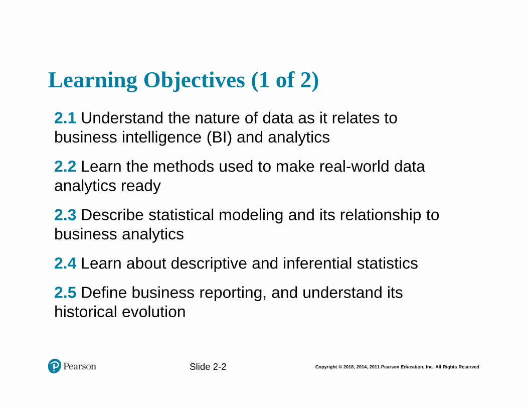
Learning Objectives (1 of 2)
• 2.1 Understand the nature of data as it relates to business intelligence (BI) and analytics
• 2.2 Learn the methods used to make real-world data analytics ready
• 2.3 Describe statistical modeling and its relationship to business analytics
• 2.4 Learn about descriptive and inferential statistics
• 2.5 Define business reporting, and understand its historical evolution
Slide 2-2
Copyright © 2018, 2014, 2011 Pearson Education, Inc. All Rights Reserved
Learning Objectives (2 of 2)
• 2.6 Understand the importance of data/information visualization
• 2.7 Learn different types of visualization techniques
• 2.8 Appreciate the value that visual analytics brings to business analytics
• 2.9 Know the capabilities and limitations of dashboards
Slide 2-3
Copyright © 2018, 2014, 2011 Pearson Education, Inc. All Rights Reserved
OPENING VIGNETTE Attracts and Engages a New Generation of Radio Consumers with Data-Driven Marketing
1. What does SiriusXM do? In what type of market does it conduct its business?
2. What were the challenges? Comment on both technology and data-related challenges.
3. What were the proposed solutions?
4. How did they implement the proposed solutions? Did they face any implementation challenges?
5. What were the results and benefits? Were they worth the effort/investment?
Slide 2-4
Copyright © 2018, 2014, 2011 Pearson Education, Inc. All Rights Reserved
The Nature of Data
• Data: a collection of facts
– usually obtained as the result of experiences, observations, or experiments
• Data may consist of numbers, words, images, …
• Data is the lowest level of abstraction (from which information and knowledge are derived)
• Data is the source for information and knowledge
• Data quality and data integrity critical to analytics
Slide 2-5
Copyright © 2018, 2014, 2011 Pearson Education, Inc. All Rights Reserved
The Nature of Data
Slide 2-6
Copyright © 2018, 2014, 2011 Pearson Education, Inc. All Rights Reserved
Metrics for Analytics Ready Data
• Data source reliability
• Data content accuracy
• Data accessibility
• Data security and data privacy
• Data richness
• Data consistency
• Data currency/data timeliness
• Data granularity
• Data validity and data relevancy
Slide 2-7
Copyright © 2018, 2014, 2011 Pearson Education, Inc. All Rights Reserved
A Simple Taxonomy of Data
• Data (datum—singular form of data): facts
• Structured data
– Targeted for computers to process
– Numeric versus nominal
• Unstructured/textual data
– Targeted for humans to process/digest
• Semi-structured data?
– XML, HTML, Log files, etc.
• Data taxonomy…
Slide 2-8
Copyright © 2018, 2014, 2011 Pearson Education, Inc. All Rights Reserved
A Simple Taxonomy of Data
Slide 2-9
Copyright © 2018, 2014, 2011 Pearson Education, Inc. All Rights Reserved
Application Case 2.1 Medical Device Company Ensures Product Quality While Saving Money
Questions for Discussion
1. What were the main challenges for the medical device company? Were they market or technology driven?
2. What was the proposed solution?
3. What were the results? What do you think was the real return on investment (ROI)?
Slide 2-10
Copyright © 2018, 2014, 2011 Pearson Education, Inc. All Rights Reserved
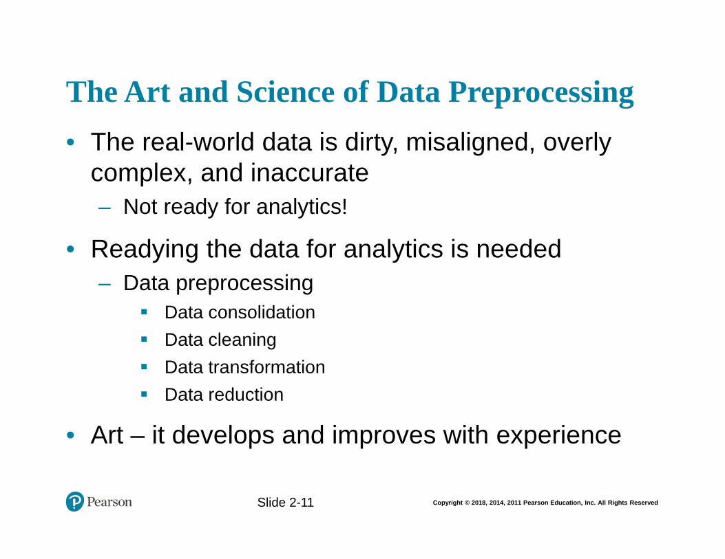
The Art and Science of Data Preprocessing
• The real-world data is dirty, misaligned, overly complex, and inaccurate
– Not ready for analytics!
• Readying the data for analytics is needed
– Data preprocessing
Data consolidation
Data cleaning
Data transformation
Data reduction
• Art – it develops and improves with experience
Slide 2-11
Copyright © 2018, 2014, 2011 Pearson Education, Inc. All Rights Reserved
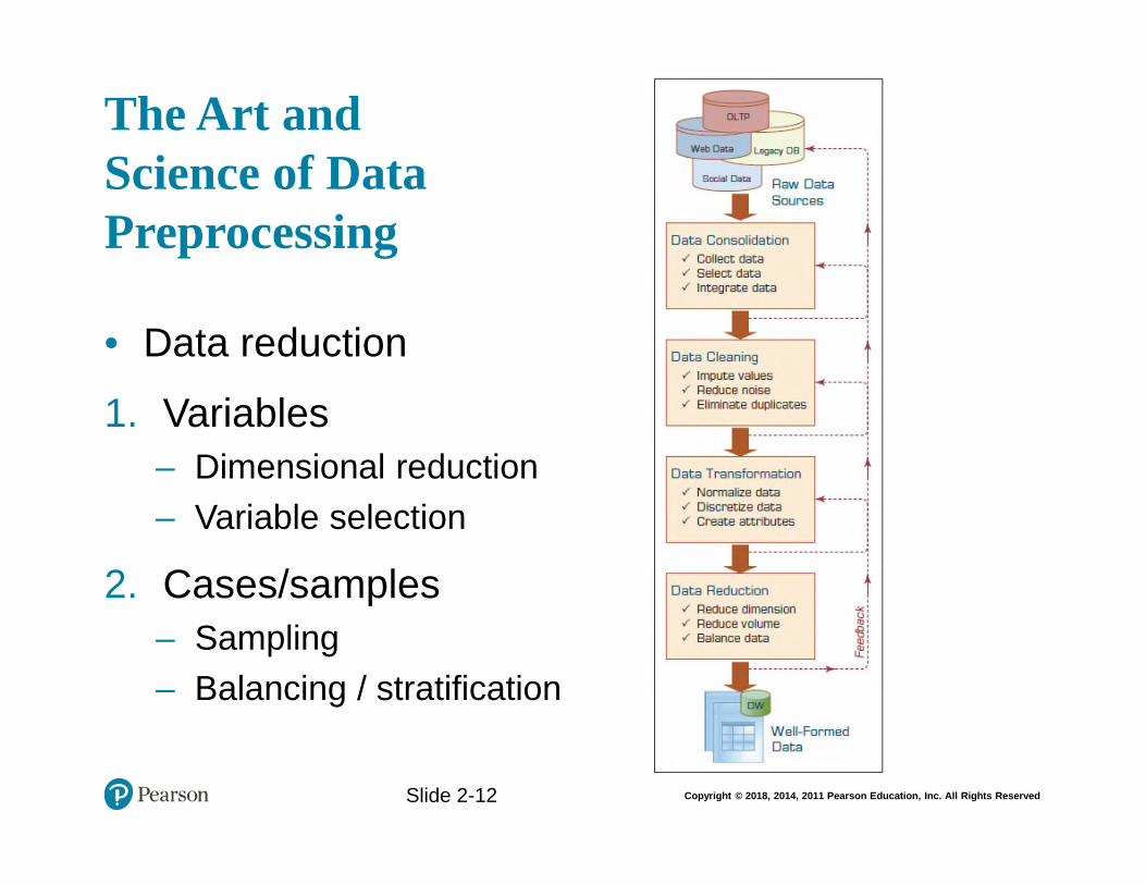
The Art and Science of Data Preprocessing
• Data reduction
1. Variables
– Dimensional reduction
– Variable selection
2. Cases/samples
– Sampling
– Balancing / stratification
Slide 2-12
Copyright © 2018, 2014, 2011 Pearson Education, Inc. All Rights Reserved
Data Preprocessing Tasks and Methods
Slide 2-13
Copyright © 2018, 2014, 2011 Pearson Education, Inc. All Rights Reserved
Application Case 2.2 (1 of 4) Improving Student Retention with Data-Driven Analytics
Questions for Discussion
1. What is student attrition, and why is it an important problem in higher education?
2. What were the traditional methods to deal with the attrition problem?
3. List and discuss the data-related challenges within context of this case study.
4. What was the proposed solution? And, what were the results?
Slide 2-14
Copyright © 2018, 2014, 2011 Pearson Education, Inc. All Rights ReservedSlide 2-15
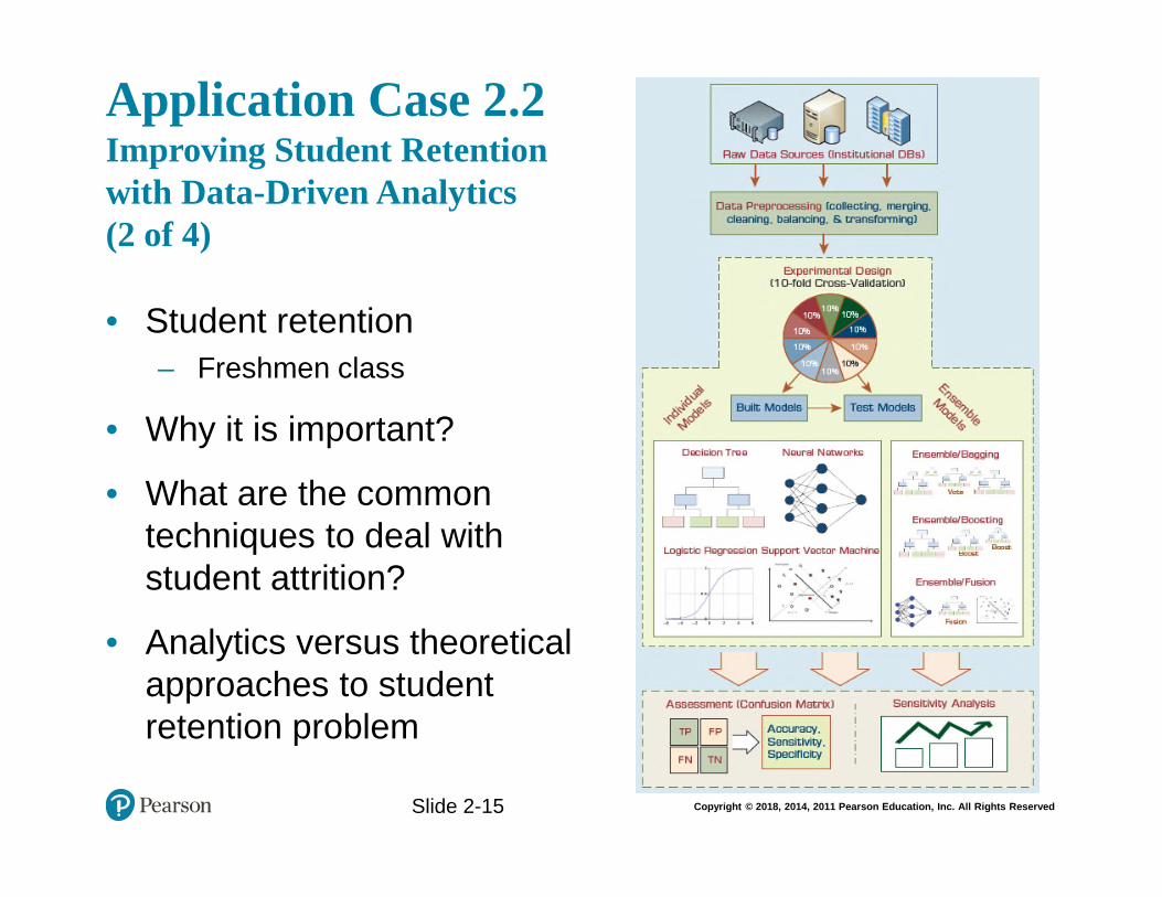
Application Case 2.2 Improving Student Retention with Data-Driven Analytics (2 of 4)
• Student retention
– Freshmen class
• Why it is important?
• What are the common techniques to deal with student attrition?
• Analytics versus theoretical approaches to student retention problem
Copyright © 2018, 2014, 2011 Pearson Education, Inc. All Rights ReservedSlide 2-16
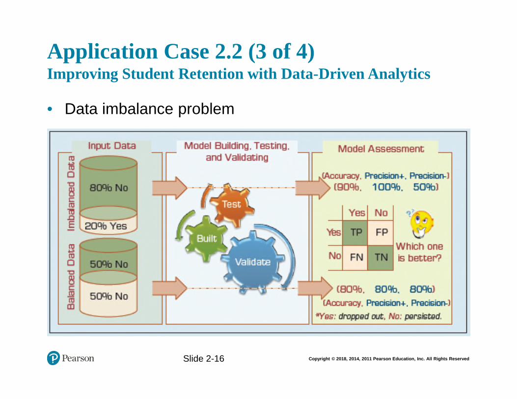
Application Case 2.2 (3 of 4) Improving Student Retention with Data-Driven Analytics
• Data imbalance problem
Copyright © 2018, 2014, 2011 Pearson Education, Inc. All Rights ReservedSlide 2-17
Application Case 2.2 (4 of 4) Improving Student Retention with Data-Driven Analytics
• Results…
Copyright © 2018, 2014, 2011 Pearson Education, Inc. All Rights Reserved
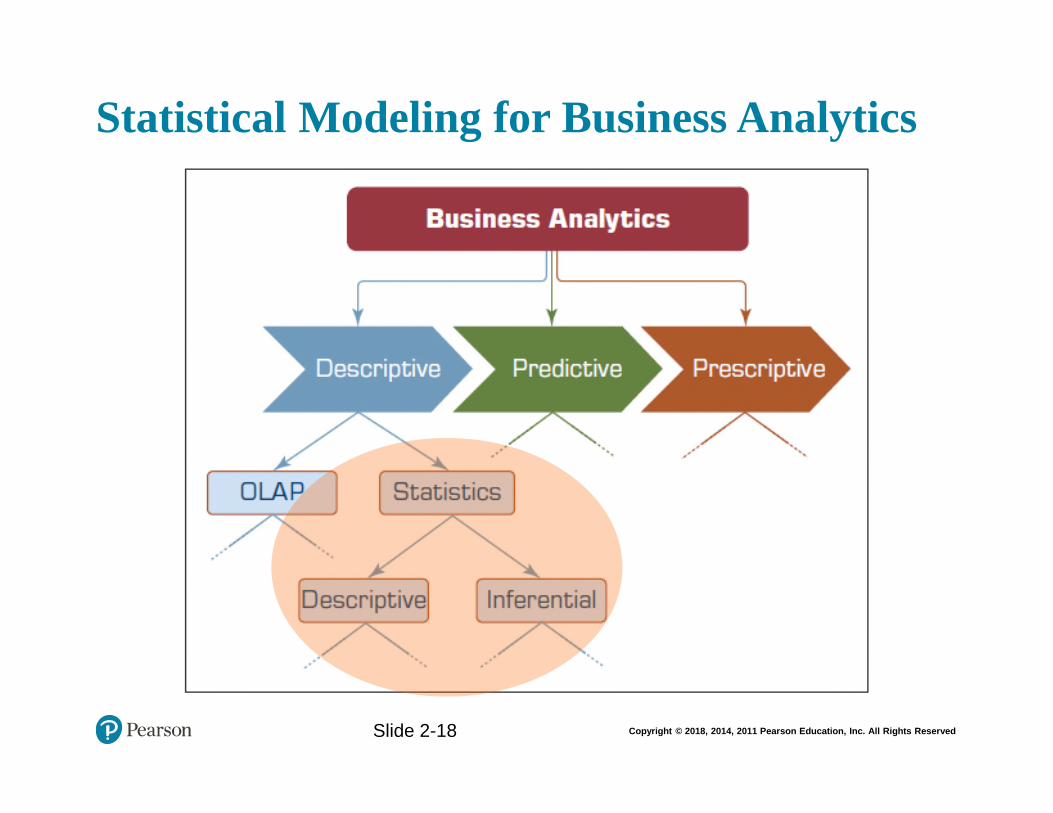
Statistical Modeling for Business Analytics
Slide 2-18
Copyright © 2018, 2014, 2011 Pearson Education, Inc. All Rights Reserved
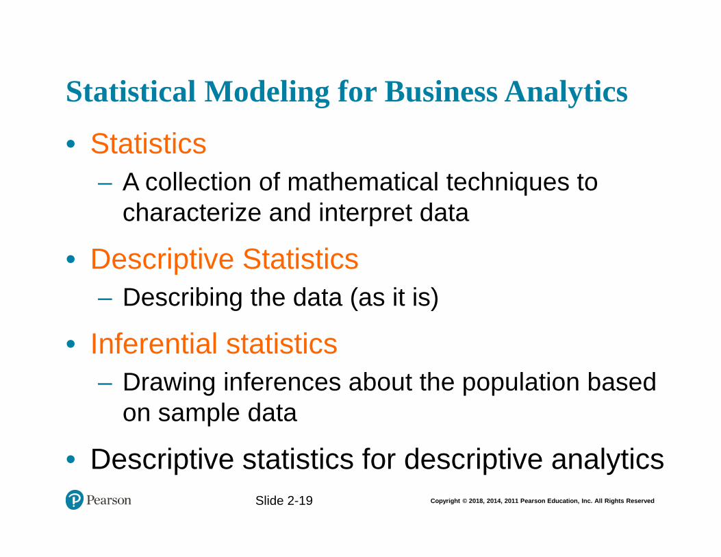
Statistical Modeling for Business Analytics
• Statistics
– A collection of mathematical techniques to characterize and interpret data
• Descriptive Statistics
– Describing the data (as it is)
• Inferential statistics
– Drawing inferences about the population based on sample data
• Descriptive statistics for descriptive analyticsSlide 2-19
Copyright © 2018, 2014, 2011 Pearson Education, Inc. All Rights Reserved
Descriptive StatisticsMeasures of Centrality Tendency
• Arithmetic mean
• Median
– The number in the middle
• Mode
– The most frequent observation
Slide 2-20
Copyright © 2018, 2014, 2011 Pearson Education, Inc. All Rights Reserved
Descriptive StatisticsMeasures of Dispersion• Dispersion
– Degree of variation in a given variable
• Range
– Max - Min
• Variance Standard Deviation
• Mean Absolute Deviation (MAD)
– Average absolute deviation from the meanSlide 2-21
Copyright © 2018, 2014, 2011 Pearson Education, Inc. All Rights Reserved
Descriptive StatisticsMeasures of Dispersion
• Quartiles
• Box-and-Whiskers Plot
– a.k.a. box-plot
– Versatile / informative
Slide 2-22
Copyright © 2018, 2014, 2011 Pearson Education, Inc. All Rights Reserved
Descriptive StatisticsShape of a Distribution• Histogram – frequency chart
• Skewness
– Measure of asymmetry
• Kurtosis
– Peak/tall/skinny nature of the distribution
Slide 2-23
Copyright © 2018, 2014, 2011 Pearson Education, Inc. All Rights Reserved
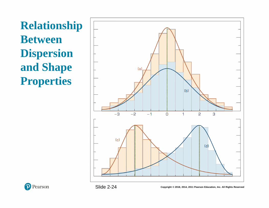
Relationship Between Dispersion and Shape Properties
Slide 2-24
Copyright © 2018, 2014, 2011 Pearson Education, Inc. All Rights Reserved
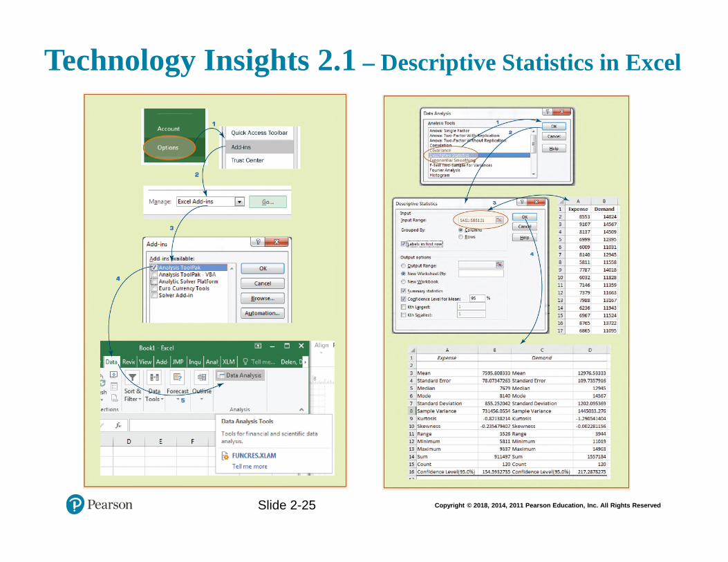
Technology Insights 2.1 – Descriptive Statistics in Excel
Slide 2-25
Copyright © 2018, 2014, 2011 Pearson Education, Inc. All Rights Reserved
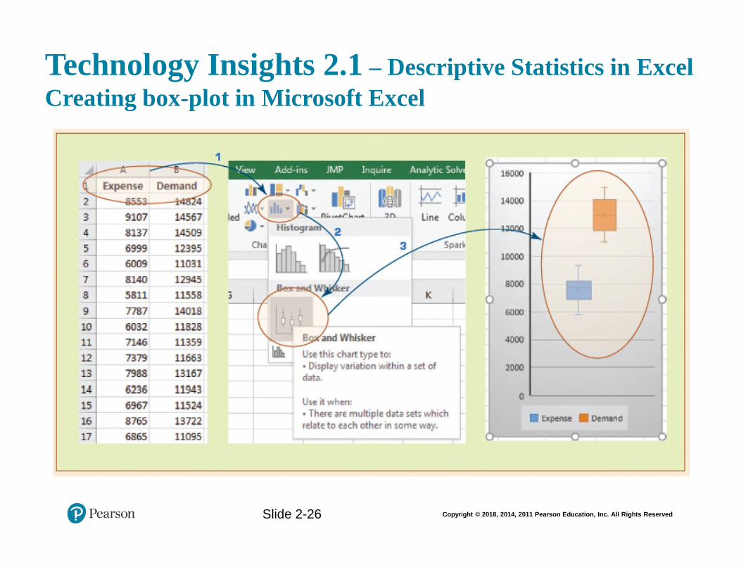
Technology Insights 2.1 – Descriptive Statistics in Excel
Creating box-plot in Microsoft Excel
Slide 2-26
Copyright © 2018, 2014, 2011 Pearson Education, Inc. All Rights Reserved
Application Case 2.3 Town of Cary Uses Analytics to Analyze Data from Sensors, Assess Demand, and Detect Problems
Questions for Discussion
1. What were the challenges the Town of Cary was facing?
2. What was the proposed solution?
3. What were the results?
4. What other problems and data analytics solutions do you foresee for towns like Cary?
Slide 2-27
Copyright © 2018, 2014, 2011 Pearson Education, Inc. All Rights Reserved
Regression Modeling for Inferential Statistics
• Regression
– A part of inferential statistics
– The most widely known and used analytics technique in statistics
– Used to characterize relationship between explanatory (input) and response (output) variable
• It can be used for
– Hypothesis testing (explanation)
– Forecasting (prediction)
Slide 2-28
Copyright © 2018, 2014, 2011 Pearson Education, Inc. All Rights Reserved
Regression Modeling
• Correlation versus Regression
– What is the difference (or relationship)?
• Simple Regression versus Multiple Regression
– Base on number of input variables
• How do we develop linear regression models?
– Scatter plots (visualization—for simple regression)
– Ordinary least squares method
A line that minimizes squared of the errors
Slide 2-29
Copyright © 2018, 2014, 2011 Pearson Education, Inc. All Rights Reserved
Regression Modeling
Slide 2-30
Copyright © 2018, 2014, 2011 Pearson Education, Inc. All Rights Reserved
Regression Modeling
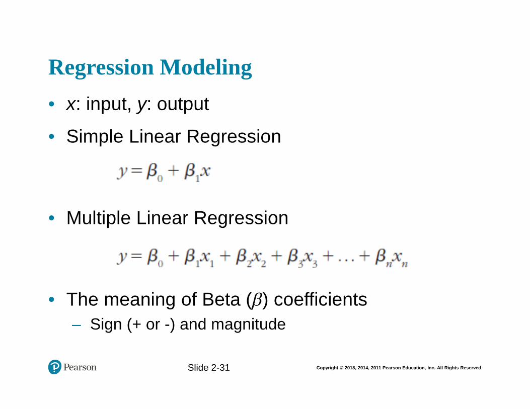
• x: input, y: output
• Simple Linear Regression
• Multiple Linear Regression
• The meaning of Beta (β) coefficients
– Sign (+ or -) and magnitude
Slide 2-31
Copyright © 2018, 2014, 2011 Pearson Education, Inc. All Rights Reserved
Process of Developing a Regression Model
How do we know if the model is good enough?
– R2
(R-Square)
– p Values
– Error measures (for prediction problems)
MSE, MAD, RMSE
Slide 2-32
Copyright © 2018, 2014, 2011 Pearson Education, Inc. All Rights Reserved
Regression Modeling Assumptions
• Linearity
• Independence
• Normality (Normal Distribution)
• Constant Variance
• Multicollinearity
• What happens if the assumptions do NOT hold?
– What do we do then?
Slide 2-33
Copyright © 2018, 2014, 2011 Pearson Education, Inc. All Rights Reserved
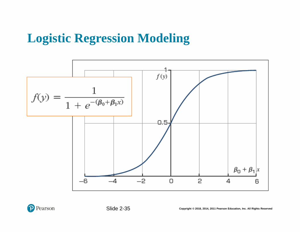
Logistic Regression Modeling
• A very popular statistics-based classification algorithm
• Employs supervised learning
• Developed in 1940s
• The difference between Linear Regression and Logistic Regression
– In Logistic Regression Output/Target variable is a binomial (binary classification) variable (as opposed to numeric variable)
Slide 2-34
Copyright © 2018, 2014, 2011 Pearson Education, Inc. All Rights Reserved
Logistic Regression Modeling
Slide 2-35
Copyright © 2018, 2014, 2011 Pearson Education, Inc. All Rights Reserved
Application Case 2.4 (1 of 4)Predicting NCAA Bowl Game Outcomes
Slide 2-36
Copyright © 2018, 2014, 2011 Pearson Education, Inc. All Rights Reserved
Application Case 2.4 (2 of 4)Predicting NCAA Bowl Game Outcomes
• The analytics process to develop prediction models (both regression and classification type) for NCAA Bowl Game outcomes
Slide 2-37
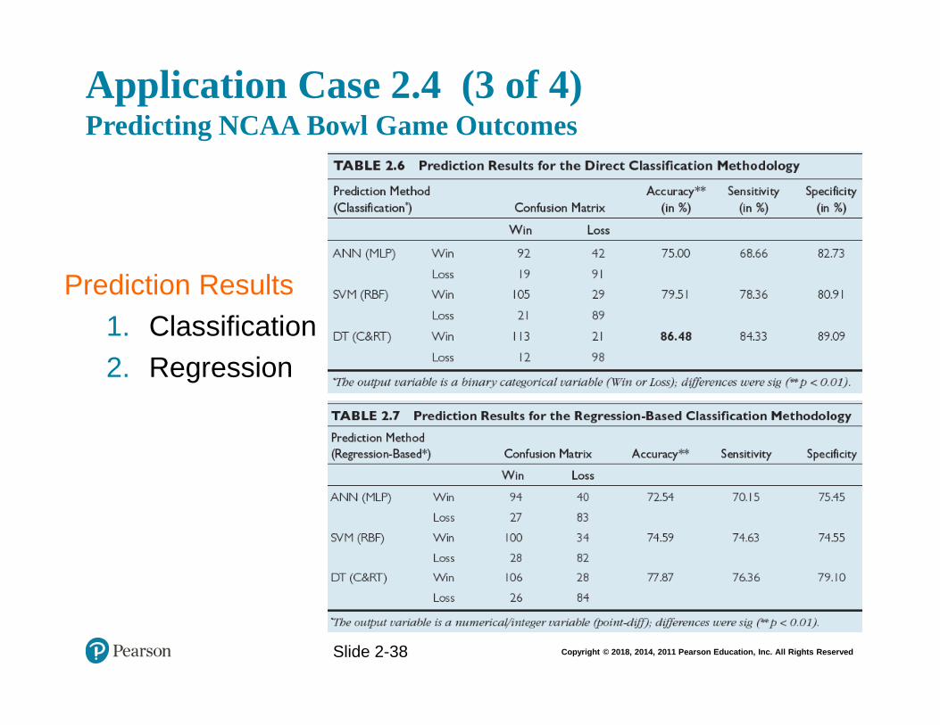
Copyright © 2018, 2014, 2011 Pearson Education, Inc. All Rights Reserved
Application Case 2.4 (3 of 4)Predicting NCAA Bowl Game Outcomes
Slide 2-38
Prediction Results
1. Classification
2. Regression

Copyright © 2018, 2014, 2011 Pearson Education, Inc. All Rights Reserved
Application Case 2.4 (4 of 4)Predicting NCAA Bowl Game Outcomes
Questions for Discussion
1. What are the foreseeable challenges in predicting sporting event outcomes (e.g., college bowl games)?
2. How did the researchers formulate/design the prediction problem (i.e., what were the inputs and output, and what was the representation of a single sample—row of data)?
3. How successful were the prediction results? What else can they do to improve the accuracy?
Slide 2-39
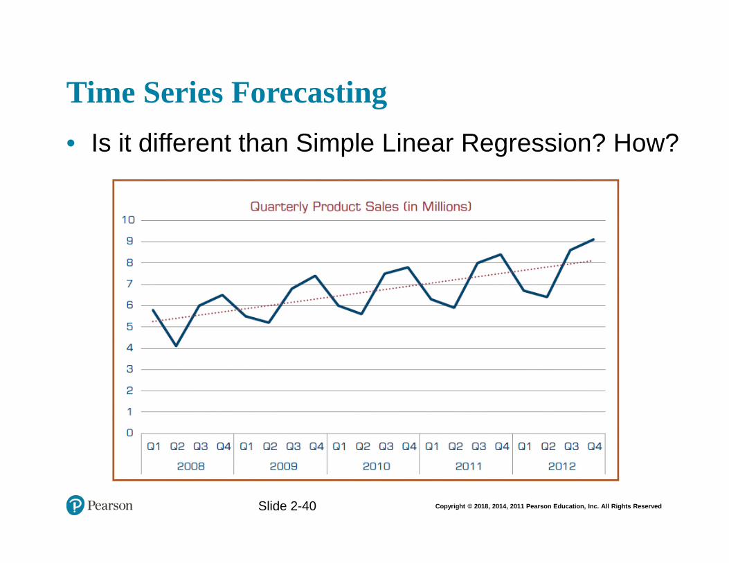
Copyright © 2018, 2014, 2011 Pearson Education, Inc. All Rights Reserved
Time Series Forecasting
• Is it different than Simple Linear Regression? How?
Slide 2-40
Copyright © 2018, 2014, 2011 Pearson Education, Inc. All Rights Reserved
Business Reporting Definitions and Concepts
• Report = Information Decision
• Report?– Any communication artifact prepared to convey
specific information
• A report can fulfill many functions– To ensure proper departmental functioning
– To provide information
– To provide the results of an analysis
– To persuade others to act
– To create an organizational memory…
Slide 2-41
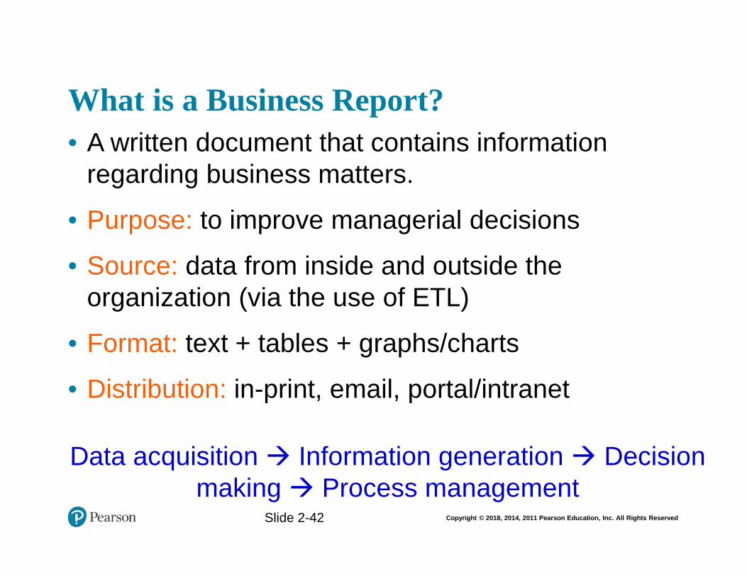
Copyright © 2018, 2014, 2011 Pearson Education, Inc. All Rights Reserved
What is a Business Report?
• A written document that contains information regarding business matters.
• Purpose: to improve managerial decisions
• Source: data from inside and outside the organization (via the use of ETL)
• Format: text + tables + graphs/charts
• Distribution: in-print, email, portal/intranet
Data acquisition Information generation Decision making Process management
Slide 1- 42
Slide 2-42
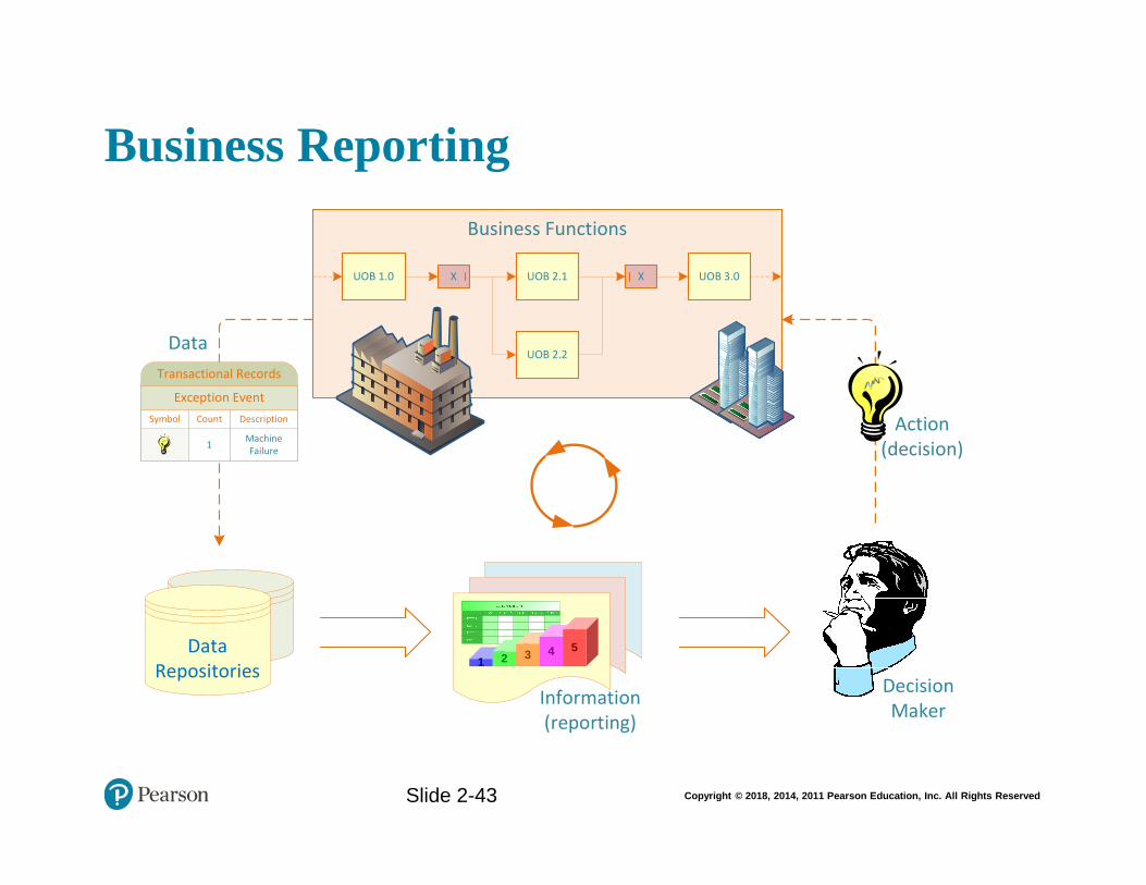
Copyright © 2018, 2014, 2011 Pearson Education, Inc. All Rights Reserved
Business Reporting
Slide 1- 43
Data Repositories
Business Functions
UOB 1.0 X
UOB 2.2
UOB 2.1 X UOB 3.0
1Machine Failure
Symbol Count Description
Exception Event
Transactional Records
1 2 3 4 5
Information(reporting)
DecisionMaker
Action(decision)
Data
Slide 2-43
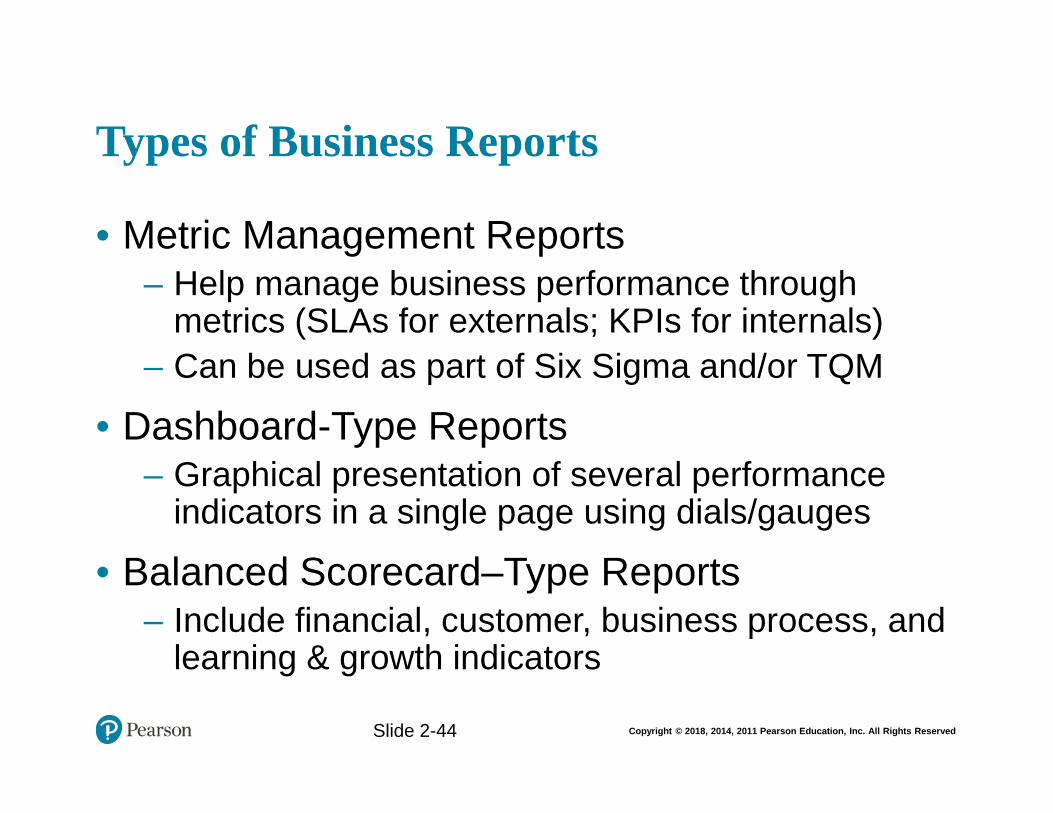
Copyright © 2018, 2014, 2011 Pearson Education, Inc. All Rights Reserved
Types of Business Reports
• Metric Management Reports– Help manage business performance through
metrics (SLAs for externals; KPIs for internals)
– Can be used as part of Six Sigma and/or TQM
• Dashboard-Type Reports– Graphical presentation of several performance
indicators in a single page using dials/gauges
• Balanced Scorecard–Type Reports– Include financial, customer, business process, and
learning & growth indicators
Slide 1- 44
Slide 2-44
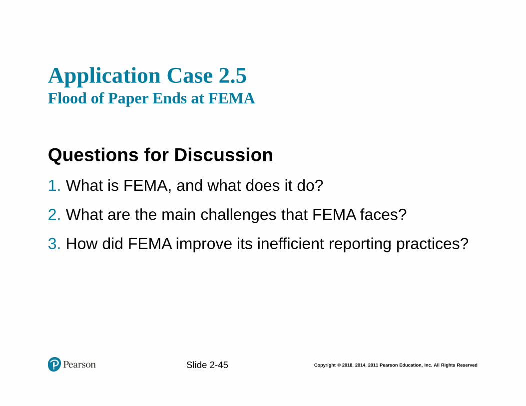
Copyright © 2018, 2014, 2011 Pearson Education, Inc. All Rights Reserved
Application Case 2.5Flood of Paper Ends at FEMA
Questions for Discussion
1. What is FEMA, and what does it do?
2. What are the main challenges that FEMA faces?
3. How did FEMA improve its inefficient reporting practices?
Slide 2-45
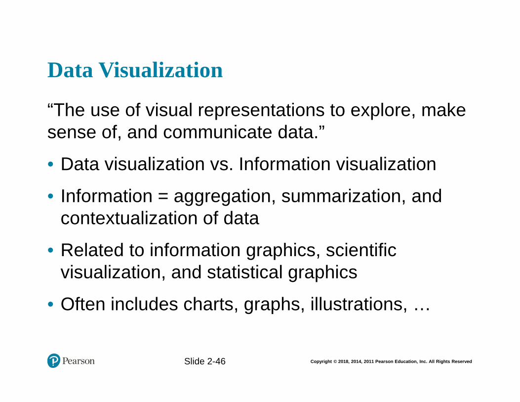
Copyright © 2018, 2014, 2011 Pearson Education, Inc. All Rights Reserved
Data Visualization
“The use of visual representations to explore, make sense of, and communicate data.”
• Data visualization vs. Information visualization
• Information = aggregation, summarization, and contextualization of data
• Related to information graphics, scientific visualization, and statistical graphics
• Often includes charts, graphs, illustrations, …
Slide 1- 46
Slide 2-46
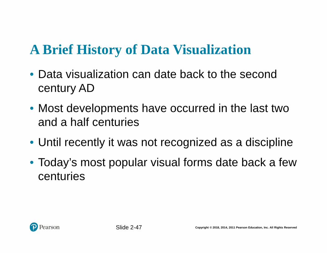
Copyright © 2018, 2014, 2011 Pearson Education, Inc. All Rights Reserved
A Brief History of Data Visualization
• Data visualization can date back to the second century AD
• Most developments have occurred in the last two and a half centuries
• Until recently it was not recognized as a discipline
• Today’s most popular visual forms date back a few centuries
Slide 1- 47
Slide 2-47
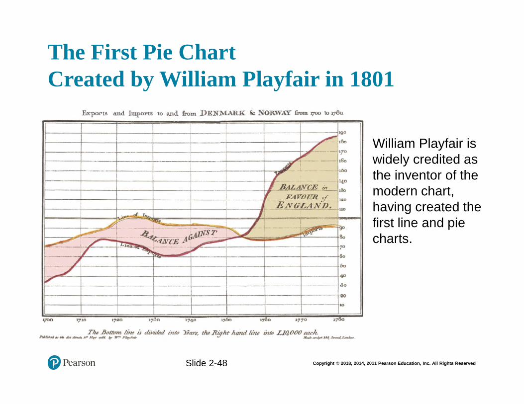
Copyright © 2018, 2014, 2011 Pearson Education, Inc. All Rights Reserved
The First Pie Chart Created by William Playfair in 1801
Slide 1- 48
William Playfair is widely credited as the inventor of the modern chart, having created the first line and pie charts.
Slide 2-48
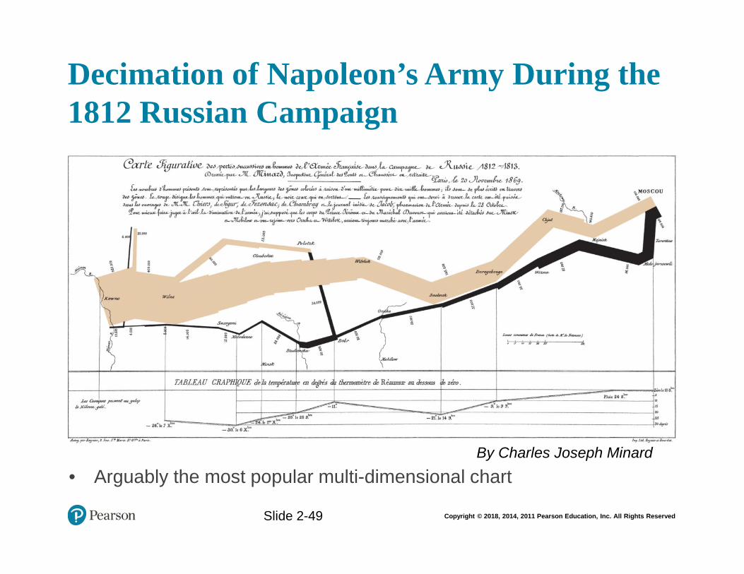
Copyright © 2018, 2014, 2011 Pearson Education, Inc. All Rights Reserved
Decimation of Napoleon’s Army During the 1812 Russian Campaign
Slide 1- 49
• Arguably the most popular multi-dimensional chart
By Charles Joseph Minard
Slide 2-49
Copyright © 2018, 2014, 2011 Pearson Education, Inc. All Rights Reserved
Application Case 2.6Macfarlan Smith Improves Operational Performance Insight with Tableau Online
Questions for Discussion
1. What were the data and reporting related challenges Macfarlan Smith facing?
2. What was the solution and the obtained results and/or benefits?
Slide 2-50
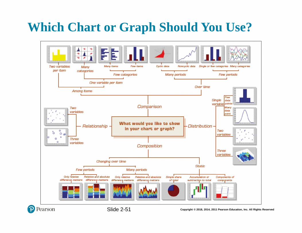
Copyright © 2018, 2014, 2011 Pearson Education, Inc. All Rights Reserved
Which Chart or Graph Should You Use?Slide 1- 51
Slide 2-51
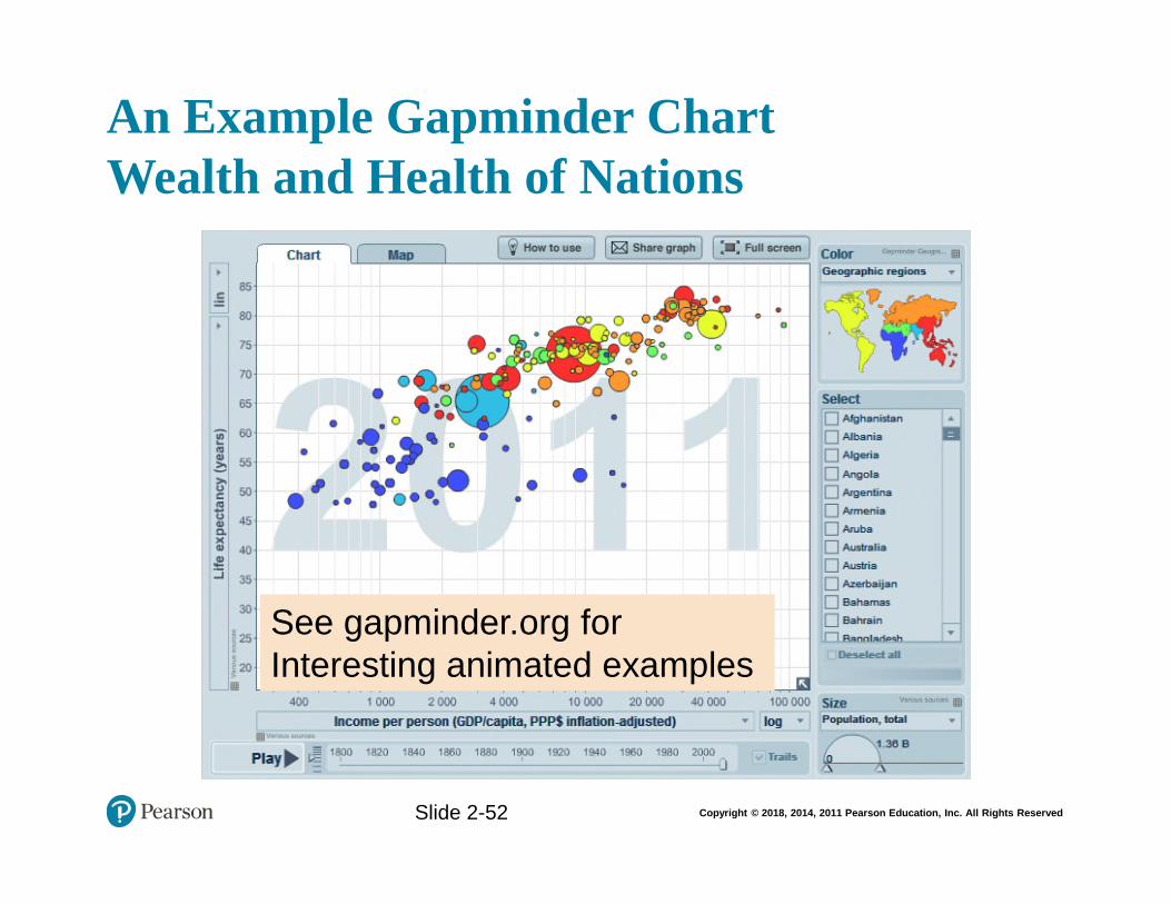
Copyright © 2018, 2014, 2011 Pearson Education, Inc. All Rights Reserved
An Example Gapminder Chart Wealth and Health of Nations
Slide 1- 52
See gapminder.org for Interesting animated examples
Slide 2-52
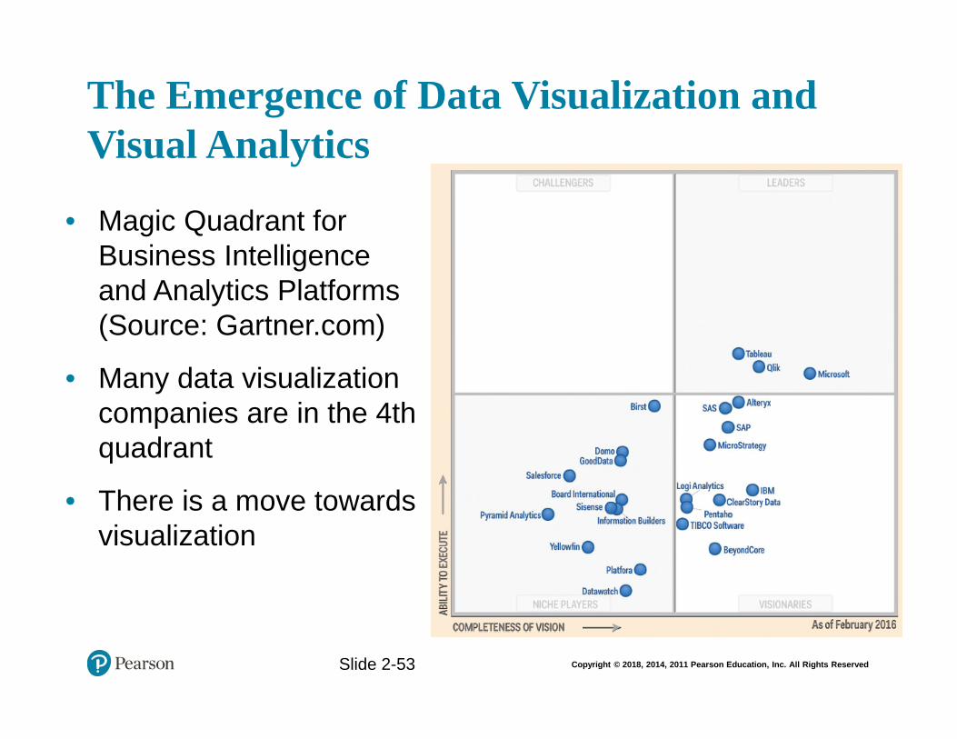
Copyright © 2018, 2014, 2011 Pearson Education, Inc. All Rights Reserved
The Emergence of Data Visualization and Visual Analytics
Slide 1- 53
• Magic Quadrant for Business Intelligence and Analytics Platforms (Source: Gartner.com)
• Many data visualization companies are in the 4th quadrant
• There is a move towards visualization
Slide 2-53
Copyright © 2018, 2014, 2011 Pearson Education, Inc. All Rights Reserved
The Emergence of Data Visualization and Visual Analytics
• Emergence of new companies
– Tableau, Spotfire, QlikView, …
• Increased focus by the big players
– MicroStrategy improved Visual Insight
– SAP launched Visual Intelligence
– SAS launched Visual Analytics
– Microsoft bolstered PowerPivot with Power View
– IBM launched Cognos Insight
– Oracle acquired Endeca
Slide 1- 54
Slide 2-54
Copyright © 2018, 2014, 2011 Pearson Education, Inc. All Rights Reserved
Visual Analytics
• A recently coined term– Information visualization + predictive analytics
• Information visualization– Descriptive, backward focused
– “what happened” “what is happening”
• Predictive analytics– Predictive, future focused
– “what will happen” “why will it happen”
• There is a strong move toward visual analytics
Slide 1- 55
Slide 2-55
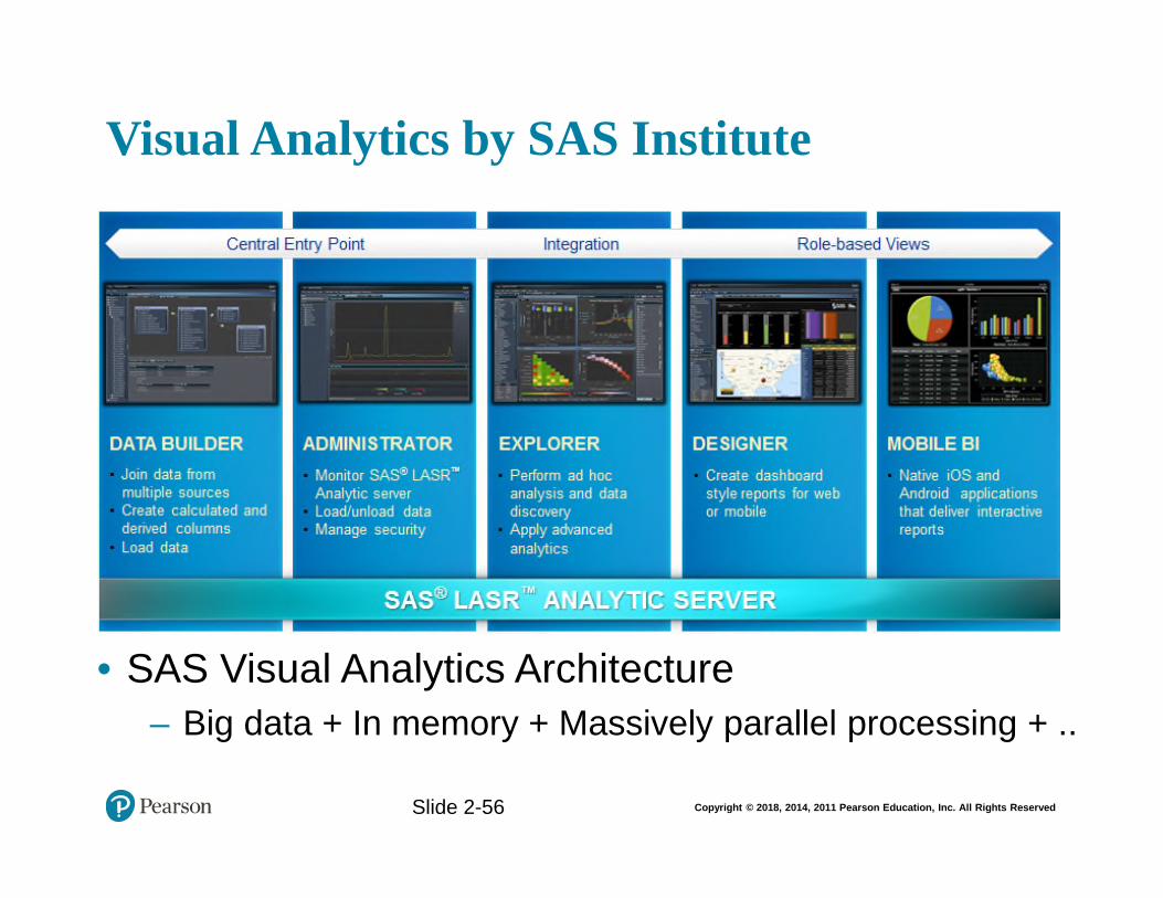
Copyright © 2018, 2014, 2011 Pearson Education, Inc. All Rights Reserved
Visual Analytics by SAS Institute
Slide 1- 56
• SAS Visual Analytics Architecture
– Big data + In memory + Massively parallel processing + ..
Slide 2-56
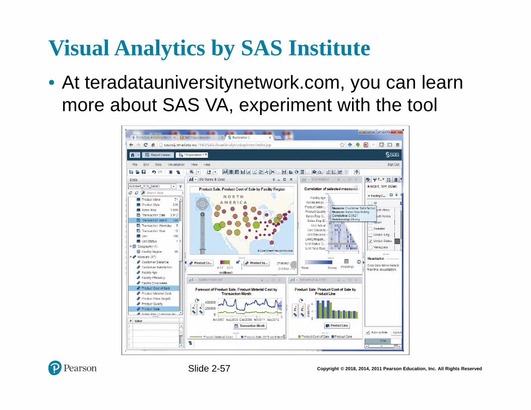
Copyright © 2018, 2014, 2011 Pearson Education, Inc. All Rights Reserved
Visual Analytics by SAS Institute
• At teradatauniversitynetwork.com, you can learn more about SAS VA, experiment with the tool
Slide 1- 57
Slide 2-57
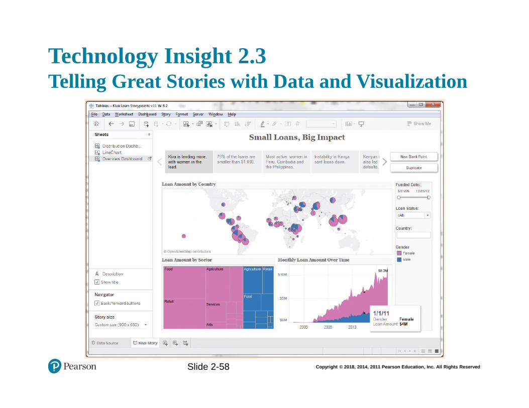
Copyright © 2018, 2014, 2011 Pearson Education, Inc. All Rights Reserved
Technology Insight 2.3Telling Great Stories with Data and Visualization
Slide 2-58
Copyright © 2018, 2014, 2011 Pearson Education, Inc. All Rights Reserved
Performance Dashboards
• Performance dashboards are commonly used in BPM software suites and BI platforms
• Dashboards provide visual displays of important information that is consolidated and arranged on a single screen so that information can be digested at a single glance and easily drilled in and further explored
Slide 2-59
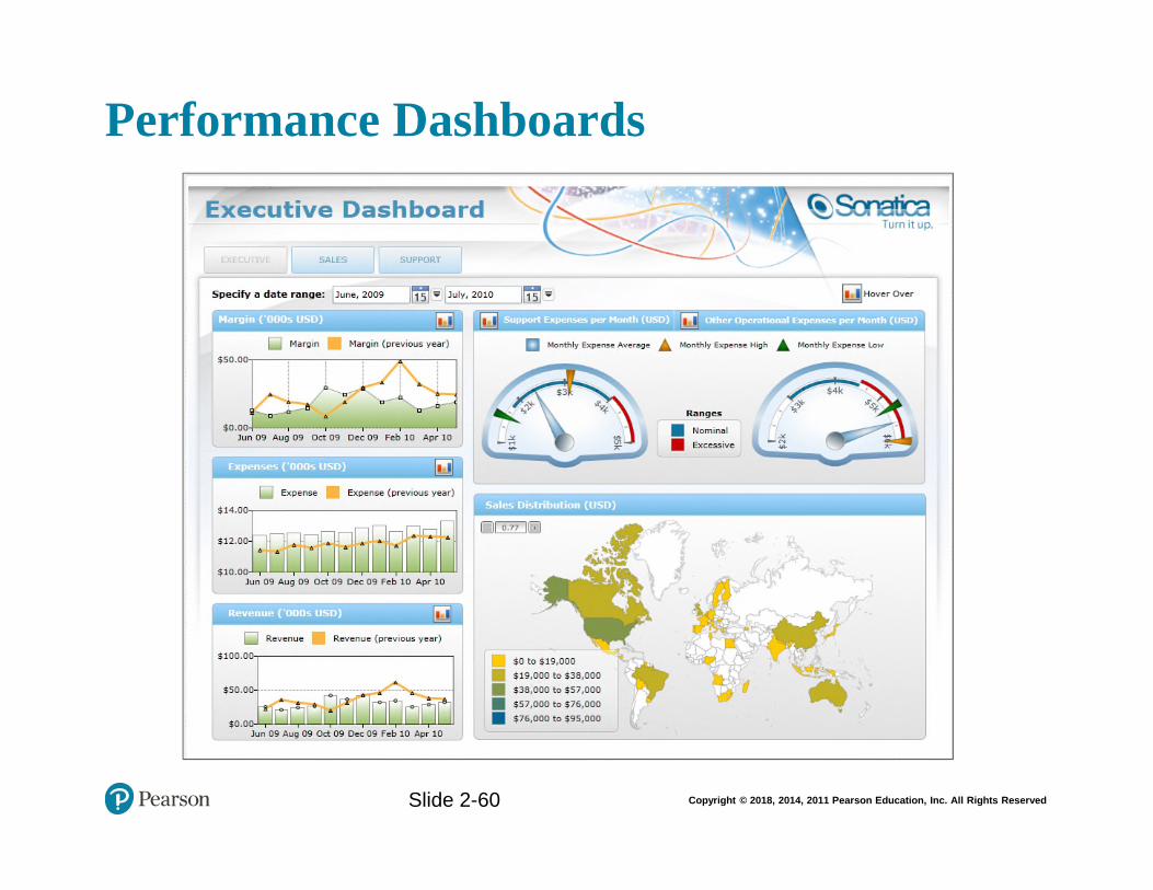
Copyright © 2018, 2014, 2011 Pearson Education, Inc. All Rights Reserved
Performance Dashboards
Slide 2-60
Copyright © 2018, 2014, 2011 Pearson Education, Inc. All Rights Reserved
Application Case 2.7Dallas Cowboys Score Big with Tableau and Teknion
Questions for Discussion
1. How did the Dallas Cowboys use information visualization?
2. What were the challenge, the proposed solution, and the obtained results?
Slide 2-61
Copyright © 2018, 2014, 2011 Pearson Education, Inc. All Rights Reserved
Performance Dashboards
• Dashboard design
– The fundamental challenge of dashboard design is to display all the required information on a single screen, clearly and without distraction, in a manner that can be assimilated quickly
• Three layer of information
– Monitoring
– Analysis
– Management
Slide 2-62
Copyright © 2018, 2014, 2011 Pearson Education, Inc. All Rights Reserved
Performance Dashboards
• What to look for in a dashboard
– Use of visual components to highlight data and exceptions that require action
– Transparent to the user, meaning that they require minimal training and are extremely easy to use
– Combine data from a variety of systems into a single, summarized, unified view of the business
– Enable drill-down or drill-through to underlying data sources or reports
– Present a dynamic, real-world view with timely data
– Require little coding to implement, deploy, and maintain
Slide 2-63
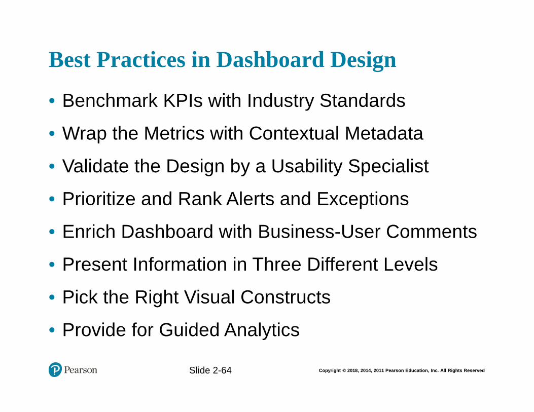
Copyright © 2018, 2014, 2011 Pearson Education, Inc. All Rights Reserved
Best Practices in Dashboard Design
• Benchmark KPIs with Industry Standards
• Wrap the Metrics with Contextual Metadata
• Validate the Design by a Usability Specialist
• Prioritize and Rank Alerts and Exceptions
• Enrich Dashboard with Business-User Comments
• Present Information in Three Different Levels
• Pick the Right Visual Constructs
• Provide for Guided Analytics
Slide 1- 64
Slide 2-64
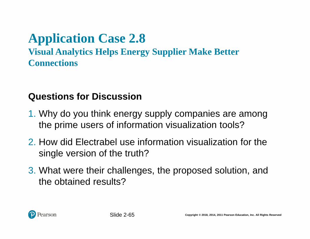
Copyright © 2018, 2014, 2011 Pearson Education, Inc. All Rights Reserved
Application Case 2.8Visual Analytics Helps Energy Supplier Make Better Connections
Questions for Discussion
1. Why do you think energy supply companies are among the prime users of information visualization tools?
2. How did Electrabel use information visualization for the single version of the truth?
3. What were their challenges, the proposed solution, and the obtained results?
Slide 2-65
Copyright © 2018, 2014, 2011 Pearson Education, Inc. All Rights Reserved
End of Chapter 2
• Questions / Comments
Slide 2-66


![Why model? [width=1.0in]../includes/legomanpages.cs.wisc.edu/~ferris/talks/mathbio-sep.pdfWhy model? to understand(descriptive process, validate principles and/or explore underlying](https://img.pdfslide.us/doc/110x75/5ae32f367f8b9a90138d2a8b/why-model-width10inincludes-ferristalksmathbio-seppdfwhy-model-to-understanddescriptive.jpg)