Embed Size (px)
Citation preview

Density Distribution Sunflower Plots in Stata 8
William D. Dupont & W. Dale Plummer Jr.
Department of BiostatisticsVanderbilt University School of Medicine
Presented at the3rd North American Stata Users Group Meeting
August 23, 2004
With additional annotations added August 30, 2004

The scatterplot is a powerful and ubiquitous graphic for displaying bivariate data. These plots, however, become difficult to read when the density of points in a region becomes high and the individual plot symbols are not discernible.
The next slide illustrates this problem with data from the Framingham Heart Study [1,2].

4060
8010
012
014
0D
iast
olic
Blo
od P
ress
ure
20 25 30 35 40 45 50Body Mass Index
Framingham Heart StudyBaseline Exam

Cleveland and McGill [3] introduced the sunflower plot as a solution to this problem. A sunflower is a number of short linesegments, called petals, that radiate from a central point. In a sunflower plot, the x-y plane is divided into a lattice of regular square bins; a sunflower is placed in the center of each bin that contains one or more observations. They are drawn so that the number of petals of each sunflower equals the number of observations in the associated bin. Sunflower plots are effective at dealing with the overstrike problem that arises with high-density scatter plots. Unfortunately, information on the precise location of points is lost in low-density regions of the graph. This is particularly true when the bin size is large. For very dense plots the sunflower petals can overlap making the number of petals indiscernible.
The next slide shows the original sunflower plot of Cleveland and McGill [3]. It is followed by a sunflower plot of the Framingham data. Note that the number of observations in the bins near the center of this distribution in indeterminable.

Cleveland and McGill [3] J Am Stat Assoc 1984; 79: 807-822

Dia
stol
ic B
lood
Pre
ssur
e
Body Mass Index15 20 25 30 35 40 45 50
50
70
90
110
130
150
Steichen & Cox [4] flower.ado

Carr et al. [5] Proposed using small hexagonal bins and coloring the bin background to indicate the order of magnitude of the bin density. For any given order of magnitude the size of a darker internal hexagon increased with increasing bin density.
This plot, which is illustrated in the next slide, does an excellent job of displaying the estimated density function for the data. It does not permit accurate estimation of the number of observations in each bin.
A more practical problem is that, to our knowledge, Carr et al. have not released software that makes these plots easy to generate.

Extensions by Carr et al. [5] J Am Stat Assoc 1987; 82: 424-436

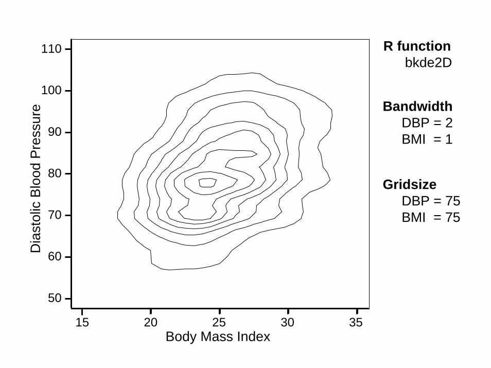
Another alternative is to use a bivariate kernel density smoothing algorithm to estimate the probability density function (pdf) and then use a contour program to generate a contour plot of the pdf. Such a plot is given in the next slide for the Framingham data. These plots do not give any information on the number or locations of the data points used to generate the contour plot. We will come back to these plots latter in this presentation.
Bivariate kernel density estimation contour plots are not currently available in Stata. The plots shown in this presentation were generated by the bkde2D and contour programs from the R statistical software package [6].

Bivariate Kernel Density EstimationContour Plot
50
70
110
60
80
90
100
Dia
stol
ic B
lood
Pre
ssur
e
15 3520 25 30Body Mass Index
R functions [6]bkde2D, KernSmooth packagecontour, graphics package
< 0.00050.0005 – 0.0010.001 – 0.00150.0015 – 0.0020.002 – 0.00250.0025 – 0.0030.003 – 0.00350.0035 – 0.004> 0.004

Stem and leaf plots [7] provide a clever way of displaying a univariate density distribution. The next slide shows such a plot for gas milage for different makes of automobiles using the Stata automotive data set.
Note that from a distance, this plot looks very much like a histogram. However, it is also possible to determine the exact values of the gas milage for each make of cars. For example, there are four makes with 17 mpg and one make with 31 mpg. These 5 observations are highlighted in the next figure.

Stem-and-leaf plot for mpg (Mileage (mpg))
1t | 221f | 444444551s | 666677771. | 888888888999999992* | 000111112t | 222223332f | 4444555552s | 6662. | 88893* | 0013t | 3f | 4553s | 3. | 4* | 1
Tukey’s Stem & Leaf Plot [7]Exploratory Data Analysis
1977

In designing the density distribution sunflower plot [8,9], our goal was to come as close as possible to the stem and leaf plot for bivariate date. That is, we wanted a graph that had the overallappearance of a density plot but that also gave as much information as possible about the actual data values in the sample.

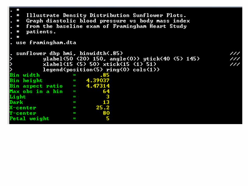
The next slide shows a density distribution sunflower plot of baseline diastolic blood pressure versus body mass index for subjects in the Framingham Heart Study. This is the same data set displayed previously. Data points are represented in one of three ways: as small circles representing individual data points as in a conventional scatterplot, as light sunflowers, and as dark sunflowers. In a light sunflower each petal represents one observation. In the next slide, light sunflowers are drawn in dark brown on a light green background. In a dark sunflower, each petal represents k observations, where k is specified by the user. (A dark sunflower with p petals represents between
and observations.) In the next slide, k = 5, and the dark sunflowers are drawn in black on a brown background. The first step in producing this graph is to define a lattice of hexagonal bins. The user specifies the bin width in the units of the x-axis. The bin height is then determined by the graphing software in such a way as to produce regular hexagonal bins. The user also specifies two thresholds l and d. Whenever there are less than l data points in a bin the individual data points are depicted at their exact location. When there are at least l but fewer than d data points in a bin they are depicted by a light sunflower. When there are at least dobservations in a bin they are depicted by a dark sunflower. In the next slide, the default values of l = 3 and d = 13 are used. The sunflower program automatically generates a legend that indicates the dark sunflower petal weight.
/ 2pk k- / 2pk k+

50
70
90
110
130
150D
iast
olic
Blo
od P
ress
ure
15 20 25 30 35 40 45 50Body Mass Index
Diastolic Blood Pressure1 petal = 1 obs.1 petal = 5 obs.

The Stata code and output that generated the preceding slide follows. The command
sunflower dbp bmi
would have generated a reasonable graph. The following command uses standard Stata 8 graph syntax to specify the axis labels and locate the figure legend in the lower left corner of the plot region [9]. The Stata output is also shown on the next two slides.
Default options make reasonable choices of the program’s parameters without requiring the user to specify them.


Default Options
Minimum observations in a sunflowerlight: 3dark: 13
Bin width usually chosen to give 40 bins per row
Bin height chosen to make bins regular hexagons
Petal weight chosen so that there are a maximum of 14 dark sunflower petals
Individual observations: blue circles
Light sunflowers: brown petals on green background
Dark sunflowers: black petals on orange background
User can explicitly control
Shape, size and color of symbols for individual observations
Minimum observations in light and dark sunflowers
Petal weight for dark sunflowers
Bin width, height and aspect ratio
Background colors of light and dark sunflower bins
Petal length and width for light and dark sunflowers
Location of bin centers
Standard options for Stata scatter plots
Details for controlling these features are given in the interactive documentation for Stata 8.2.
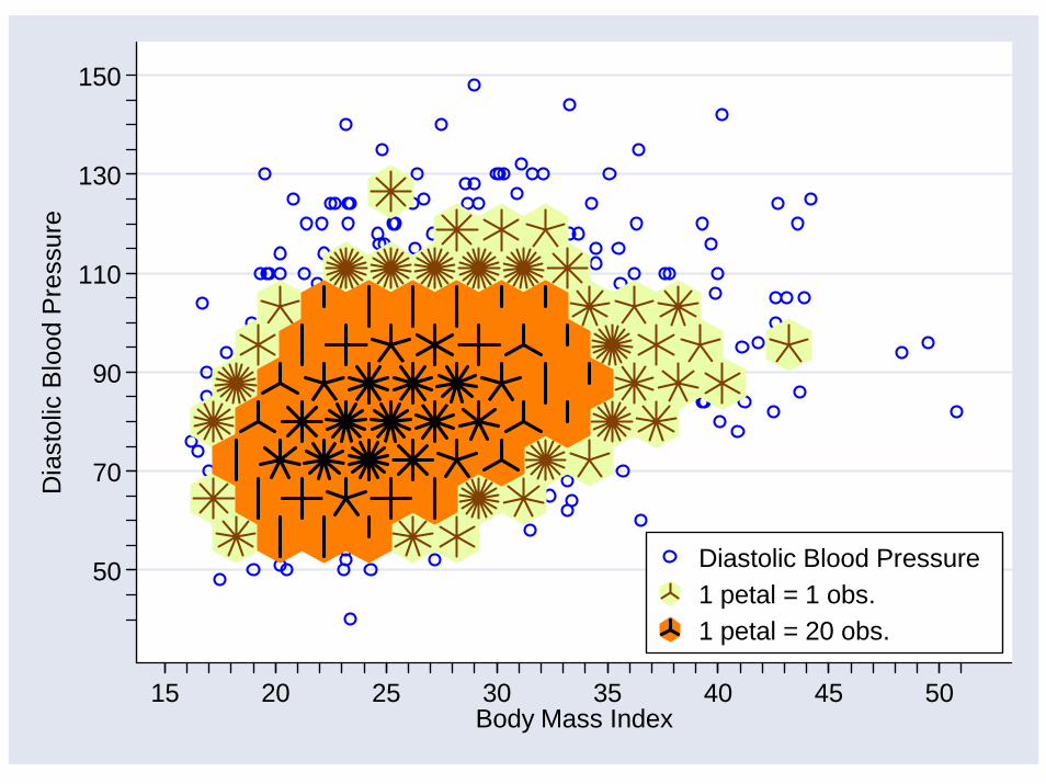
The following slide shows a sunflower plot with a bin width of 2, sunflowers that are 90% of their maximum size, and dark petals that are thicker than the light petals.
50
70
90
110
130
150D
iast
olic
Blo
od P
ress
ure
15 20 25 30 35 40 45 50Body Mass Index
Diastolic Blood Pressure1 petal = 1 obs.1 petal = 20 obs.

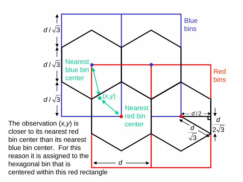
The next slide shows how observations are assigned to their hexagonal bins.
The x-y plain is tiled with overlapping blue and red rectangular bins as shown.
Each observation will lie in exactly one blue and one red rectangular bin. It also must lie in a hexagonal bin that is centered in the middle of one of these rectangular bins. The correct hexagonal bin is the one whose center is closest to the observation.
(x,y)
Nearest red bin center
Nearest blue bin center
Blue bins
Red bins
/ 3d
/ 3d
/ 3d
d
3d
/ 2d
2 3dThe observation (x,y) is
closer to its nearest redbin center than its nearest blue bin center. For this reason it is assigned to the hexagonal bin that is centered within this red rectangle

The preceding is easier said than programmed. This is because the bins must be regular measured in inches on the graph. However, we specify the bin width in the units of the x-axis.
The program must derive the bin height in units of the y-axis in such a way that the bin shape is regular when measured in inches on the graph.
The following slide schematically sketches how this is done.

d
23d
d
''d
'd
Bin width in x units
Bin width in pixel-widths
Bin width in pixel-heights
Bin height in pixel-height
Bin height in y units2 '''/ 3d
2 ''/ 3d

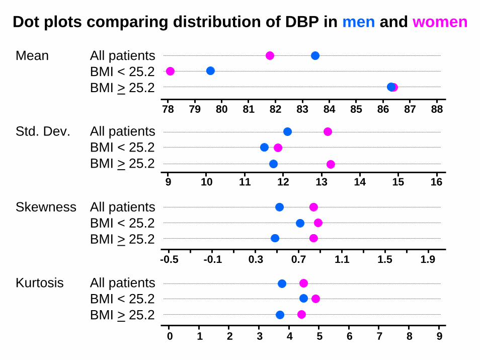
We next use sunflower plots to investigate subtle differences in the bivariate distribution of diastolic blood pressure (DBP) and body mass index (BMI) between men and women.
The next two slides show these distributions for men and women from the Framingham study. The sunflower program permits other graphs to be overlaid on top of the sunflower plot. In this example, lowess regression curves for both men and women are plotted. Note that these curves are very similar.
The distribution of diastolic blood pressure is more skewed in women than men. This is particularly true in people whose BMI is above the median value of 25.2.

50
70
90
110
130
150D
iast
olic
Blo
od P
ress
ure
15 20 25 30 35 40 45 50Body Mass Index
MenWomen1 petal = 1 obs.1 petal = 3 obs.
Lowess Regression
Men

50
70
90
110
130
150D
iast
olic
Blo
od P
ress
ure
15 20 25 30 35 40 45 50Body Mass Index
MenWomen1 petal = 1 obs.1 petal = 4 obs.
Lowess Regression
Women

* The Stata code that generated the preceding two slides is as follows.* See the Stata 8.2 interactive documentation for details.*use framingham.dta** Plot for men*sunflower dbp bmi if male, binwidth(.85) ///
ylabel(50 (20) 150, angle(0)) ytick(35 (5) 155) ///xlabel(15 (5) 50) xtick(15 (1) 52) ///ytitle(Diastolic Blood Pressure) ///legend(position(5) ring(0) cols(1) symxsize(7) ///
subtitle("Lowess Regression") ///order( 4 "Men" 5 "Women" 2 3)) ///
title("Men", position(11) ring(0) color(blue)) /// plot(lowess dbp bmi if male, bwidth(.2) clcolor(blue) ///
|| lowess dbp bmi if ~male, bwidth(.2) clcolor(pink)) ** Plot for women*use framingham.dta, clearsunflower dbp bmi if ~male, binwidth(.85) mcolor(pink) ///
ylabel(50 (20) 150, angle(0)) ytick(35 (5) 155) ///xlabel(15 (5) 50) xtick(15 (1) 52) ///ytitle(Diastolic Blood Pressure) ///legend(position(5) ring(0) cols(1) symxsize(7) ///
subtitle("Lowess Regression") ///order( 4 "Men" 5 "Women" 2 3)) ///
title("Women", position(11) ring(0) color(pink)) ///plot(lowess dbp bmi if male, bwidth(.2) clcolor(blue) ///
|| lowess dbp bmi if ~male, bwidth(.2) clcolor(pink))

There are many exploratory analyses that we might do in light of the preceding two graphs. For example, we might look at how the distribution of DBP differs between men and women overall and in subgroups defined by BMIs above and below the median value of 25.2.
The next slides show dot plots of means, standard deviations, skewness and kurtosis for men and women in these groups.
The range of the variables in these plots were chosen to span the same number of standard errors of these statistics. These standard errors were estimated by bootstrapping.
Note that the mean values for men and women differ more for thinner people than thicker folks and that the difference in skewness is greater for heavier people. This suggest testing the difference in distribution of DPB between men an women in these groups.
Dot plots comparing distribution of DBP in men and women
Mean All patientsBMI < 25.2BMI > 25.2
78 79 80 81 82 83 84 85 86 87 88
All patientsBMI < 25.2BMI > 25.2
Std. Dev.
9 10 11 12 13 14 15 16
All patientsBMI < 25.2BMI > 25.2
Skewness
-0.5 -0.1 0.3 0.7 1.1 1.5 1.9
All patientsBMI < 25.2BMI > 25.2
Kurtosis
0 1 2 3 4 5 6 7 8 9

Distribution tests of DBP in men compared to women
Kolmogorov-Smirnov
Permutation Test for Skewness
All Patients < 0.0005 0.0037
BMI < median 0.011 0.38
BMI > median 0.535 0.017
* median BMI = 25.2
Body Mass Index (BMI) Group
P Value

The preceding analyses indicate that the distribution of DBP differs between men and women.
The Kolmogorov-Smirnov test also suggests a difference in thinner subjects. This is primarily due to the difference in mean DBP for these people.
The permutation test for difference in skewness suggests that heavier women have a more skewed distribution than heavier men. This isconsistent with what we saw in the sunflower plots.
The following slides shows the code used to run the permutation test. Stata makes it very easy to run such test on almost any imaginable statistic.

program define skew_dif, rclass** Calculate and return the difference in skewness for men* and women. This program is used by the permute command.*
version 8.2args y
quietly summarize `y' if male, detaillocal male_skew=r(skewness)display "male_skew=" `maleskew'
quietly summarize `y' if ~male, detaillocal female_skew=r(skewness)display "female_skew=" `femaleskew'
local skewness_difference="`female_skew' - `male_skew'"
display "skewness_difference=" `skewness_difference'return scalar skewness_difference = `skewness_difference'
end

. *
. * Get the framingham data.
. *
. use framingham.dta, clear
. *
. * Do a permutation test for difference in skewness between men and women
. *
. permute male "skew_dif dbp" skew_dif=r(skewness_difference), ///> reps(10000) saving(skew_dif) replace
command: skew_dif dbpstatistic: skew_dif = r(skewness_difference)permute var: male
Monte Carlo permutation statistics Number of obs = 4689Replications = 10000
------------------------------------------------------------------------------T | T(obs) c n p=c/n SE(p) [95% Conf. Interval]-------------+----------------------------------------------------------------skew_dif | .3137402 37 10000 0.0037 0.0006 .0026064 .0050964 ------------------------------------------------------------------------------Note: confidence interval is with respect to p=c/nNote: c = #{|T| >= |T(obs)|}

01
23
4D
ensi
ty
-.4 -.3 -.2 -.1 0 .1 .2 .3 .4r(skewness_difference)
Histogram of 10,000 simulated skewness differences from permutation test
Observed difference in skewness
between men and women = 0.314
37 out of 10,000 simulated differences were as or more extreme than the observed.
P = 0.0037

Bivariate Kernel Density Estimation [10]
( )ˆ , ; ,x yf x y h h estimates the bivariate pdf with bandwidths andxh yh
( ),x y ( ),i ix y
It is a weighted sum of the sample values where the weights are a function of the distance and angle of the observation from ( ),x y
where is itself a known pdf. ( )1
1ˆ , ; , ,n
i ix y
ix y x y
x x y yf x y h h K
nh h h h=
Ê ˆ Ê ˆ- -= Á ˜ Á ˜Ë ¯ Ë ¯Â ( ),K x y
( ) ( ) ( )( )2 2, 1/ 2 exp /2K x y x y= p - +Often
and are smoothing parameters in the x and y directions. Note that these parameters are specified in units of x and y rather than in inches. Hence, if the ranges of x and y are quite different, specifying the same values of and can lead to very different degrees of smoothing in the x and y directions.
xh yh
xh yh

Bivariate Kernel Density Estimation
( )ˆ , ; ,x yf x y h h is evaluated at points in a rectangular array. The pdf is then estimated by interpolation.
The appearance of the estimated pdf is affected not only by the value ofand but also on the grid spacing in both the x and y directions.
The following graphs show estimated pdfs of the Framingham DBP – BMI data obtained using different values of the bandwidths and different numbers of grid points (Gridsize) in the x and y directions.
Note the dramatic effects of these parameters on the their contour plots. Sunflower plots can be helpful in choosing the most appropriate values of these parameters.
xh yh

Bivariate Kernel Density EstimationContour Plot
50
70
110
60
80
90
100
Dia
stol
ic B
lood
Pre
ssur
e
15 3520 25 30Body Mass Index
BandwidthDBP = 1BMI = 1
GridsizeDBP = 51BMI = 51
R functionbkde2D

15 20 25 30 35
5060
7080
9010
011
0
50
70
110
60
80
90
100
Dia
stol
ic B
lood
Pre
ssur
e
15 3520 25 30Body Mass Index
BandwidthDBP = 2BMI = 1
GridsizeDBP = 51BMI = 51
R functionbkde2D

15 20 25 30 35
5060
7080
9010
011
0
50
70
110
60
80
90
100
Dia
stol
ic B
lood
Pre
ssur
e
15 3520 25 30Body Mass Index
BandwidthDBP = 3BMI = 1
GridsizeDBP = 51BMI = 51
R functionbkde2D

15 20 25 30 35
5060
7080
9010
011
0
50
70
110
60
80
90
100
Dia
stol
ic B
lood
Pre
ssur
e
15 3520 25 30Body Mass Index
BandwidthDBP = 1BMI = 1
GridsizeDBP = 75BMI = 75
R functionbkde2D

15 20 25 30 35
5060
7080
9010
011
0
50
70
110
60
80
90
100
Dia
stol
ic B
lood
Pre
ssur
e
15 3520 25 30Body Mass Index
BandwidthDBP = 1.5BMI = 1
GridsizeDBP = 75BMI = 75
R functionbkde2D
15 20 25 30 35
5060
7080
9010
011
0
50
70
110
60
80
90
100
Dia
stol
ic B
lood
Pre
ssur
e
15 3520 25 30Body Mass Index
BandwidthDBP = 2BMI = 1
GridsizeDBP = 75BMI = 75
R functionbkde2D

Density Distribution Sunflower Plot generalizes the
Set lower bound of bin densityfor dark sunflowers sufficiently high to obtain atraditional sunflower plot.
Scatter PlotSet lower bound of bin density for light sunflowers sufficiently high to obtain a conventional scatter plot.
Cleveland and McGill’s Sunflower PlotSet lower bound of bin densityfor light sunflowers = 1

Conclusions
Density distribution sunflower plots
Plot observations at their exact location in low-density bins
Show the exact number of observations in medium-density bins
Show the approximate number of observations in high-density bins
Provide an overall appearance that is similar to a bivariate density plot
Can provide a useful crosscheck when drawing bivariate kernel density estimates

Acknowledgments and Contributions
W. Dale Plummer Jr. wrote the original Stata v.7 software for the sunflower program.
Thomas J. Steichen & Nicholas J. Cox wrote a program for drawing conventional sunflower plots called flower.ado [4]. This program was modified by Dale Plummer to create our program.
Nicholas J. Cox also gave valuable advice on this project
William W. Gould decided to include the program as part of Stata 8.
Jeffrey S. Pitblado rewrote all of the graphics part of Plummer’s program in creating the v8.2 version of this software.
I (WDD) am most grateful for the hard work and support of everyone who was involved in this project.

Disclaimer
This paper used data supplied by the National Heart, Lung and Blood Institute, NIH, DHHS. The views expressed in this paper are those of the authors and do not necessarily reflect the views of the National Heart, Lung and Blood Institute.
Copyright
The graphs in slides 5 and 8 are reprinted with permission from The Journal of the American Statistical Association. Copyright 1984 and 1987 by the American Statistical Association. All rights reserved.
The remainder of this presentation is in the public domain.

References[1] Framingham Heart Study (1997), The Framingham Study – 40 Year Public
Use Data Set, Bethesda, MD: National Heart, Lung, and Blood Institute, NIH.[2] Levy, D. (1999), 50 Years of Discovery: Medical Milestones from the National
Heart, Lung, and Blood Institute’s Framingham Heart Study, Hackensack, NJ: Center for Bio-Medical Communication Inc.
[3] Cleveland, W.S., McGill, R. (1984), “The Many Faces of a Scatterplot,”Journal of the American Statistical Association, 79, 807-822.
[4] Steichen, T.J., Cox, N.J. (1999). “Flower: Stata Module to Draw Sunflower Plots,” Stata program and help file downloadable from http://ideas.repec.org/c/boc/bocode/s393001.html. Accessed December 6, 2002.
[5] Carr, D.B., Littlefield, R.J., Nicholson, W.L., Littlefield, J.S. (1987), “Scatterplot Matrix Techniques for Large N,” Journal of the American Statistical Association, 82, 424-436.
[6] Gentleman, R., Ihaka, R. et. al. The R Project for Statistical Computing. http://www.r-project.org/. Accessed August 31, 2004.
[7] Tukey, J. (1977). Exploratory Data Analysis. Reading MA: Addison-Wesley.[8] Dupont WD, Plummer WD: Density distribution sunflower plots. J Stat
Software 2003; 8:(3)1-5 Posted at http://www.jstatsoft.org/index.php?vol=8 .)[9] StataCorp: Stata Statistical Software: Release 8.2, College Station, TX: Stata
Corp. 2004.[10] Wand, M.P., Jones, M.C. Kernel Smoothing. London: Chapman & Hall/CRC
1995


![[ME] Multilevel Mixed Effects - Survey Design · 2016. 2. 16. · Stata, , Stata Press, Mata, , and NetCourse are registered trademarks of StataCorp LP. Stata and Stata Press are](https://img.pdfslide.us/doc/110x75/6119d35ebac5e41ff76887ce/me-multilevel-mixed-effects-survey-design-2016-2-16-stata-stata-press.jpg)