Embed Size (px)
Citation preview
Comparing Data
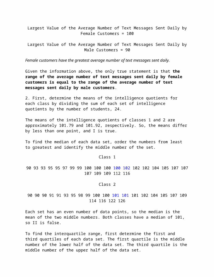
1. A cellular company wants to compare the average number of text messages sent by female customers and male customers daily. The company randomly selected 300 female customers and 300 male customers. The cellular company then recorded the average number of text messages sent daily by each customer. The results produced the box plots below.
Which of the following statements is true regarding the box plots above?A. Male customers have the greatest average number of text messages sent daily.
B. The range of the average number of text messages sent daily by female customers is equal to the range of the average number of text messages sent daily by male customers.
C. The interquartile range of the average number of text messages sent daily by female customers is equal to the interquartile range of the average number of text messages sent daily by male customers.
D. Female customers have the smallest average number of text messages sent daily.
2. The dot plots represent the Intelligence Quotients, or IQs, for fourth grade students in two different classes. Which of the statements are true?

I. The means of the classes differ by less than one point.II. Class 2 has a greater median compared to class 1.III. Class 1 has a greater interquartile range compared to class 2.IV. Class 2 has a greater standard deviation than class 1.
A. II and IIIB. I and IVC. II and IVD. I and II
3. The box plot below represents the number of absences, per student, over a semester by a group of seniors at Green Hill High School.

Using the box plot above, which of the following are true regarding the data set?
I. The interquartile range is 10 days.II. The median is 2 days.III. About 50 percent of the seniors missed from 1 day to 5 days
over the given semester.IV. About 50 percent of the seniors missed from 5 days to 10 days
over the given semester.A. I and IIB. I and IIIC. II and IIID. II and IV
4. The dot plots represent household incomes from two subdivisions. Which of the statements are true?

I. Subdivision 1 has a greater mean than subdivision 2.II. Subdivision 2 has a greater median than subdivision 1.III. Subdivision 1 has a greater interquartile range than subdivision 2.IV. Subdivision 2 has a greater standard deviation than subdivision 1.
A. II and IIIB. II and IVC. I and IIID. III and IV
5.The histograms below show the number of wins by the Tiger baseball team and the number ofwins by the Hurricane baseball team over a five year period.

Which of the following statements is true for the data sets above?A. The number of wins by the Tiger baseball team in 1996 and 1997 is greater than the
number of wins by the Hurricane baseball team in 1996 and 1997.
B. The number of wins by the Tiger baseball team in 2000 is less than the number of wins by the Hurricane baseball team in 1996.
C. Overall, number of wins by the Tiger baseball team is less than the number of wins by the Hurricane baseball team.
D. The number of wins by the Tiger baseball team in 1996 and 1997 is greater than the number of wins by the Hurricane baseball team in 1999 and 2000.
6. Jason is testing two fertilizers, Grow Well and Green Grow, so he went to a nursery and bought 50 tomato plants

of the same variety. He planted all 50 plants in an identical environment. He then administered Grow Well to 25 of the tomato plants and Green Grow to the remaining 25 tomato plants. After four weeks, Jason measured the heights of the tomato plants, to the nearest inch, and recorded their heights in the following histograms.
Which of the following statements is true for the data sets above?A. The number of tomato plants treated with Green Grow over the height of 18 inches is
equal to the number of tomato plants treated with Grow Well over the height of 18 inches.
B. The number of tomato plants treated with Green Grow over the height of 18 inches is greater than the number of tomato plants treated with Grow Well over the height of 18 inches.
C. All of the statements are false for the given data sets.
D. The number of tomato plants treated with Green Grow over the height of 18 inches is less than the number of tomato plants treated with Grow Well over the height of 18 inches.
7. A local race-walking club is hosting a race. They collected data about their members' speeds to determine how long volunteers will need to help at water stops along the route. By calculating the range of the data, the club can

determine when the first and last athletes will approach each water stop. Which dot plot displays a range of 1.8?
A.
B.
C.
D.
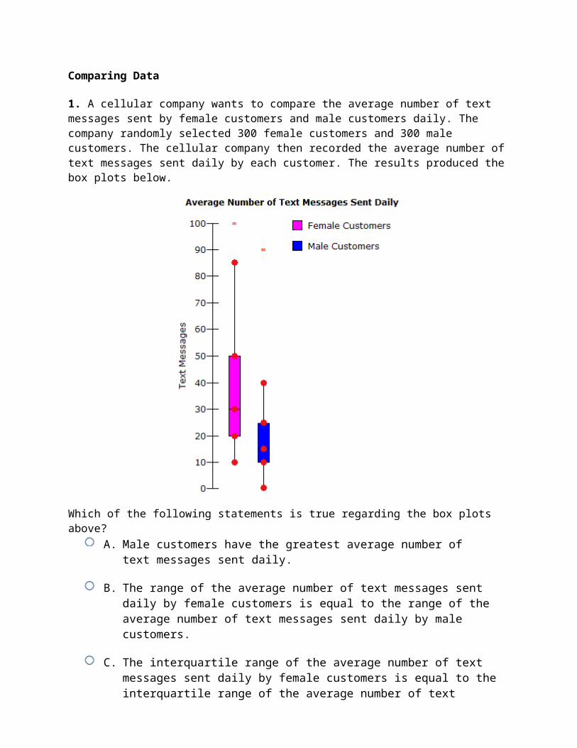
8. Lisa monitored the average weekly high temperature, in Fahrenheit, for Texas and Colorado over a one year period. She recorded her findings in the box plots below.

Which of the following statements is true regarding the box plots above?A. The range of the average monthly high temperature in Texas is less than the range of
the average monthly high temperature in Colorado.
B. All statements are false.
C. The interquartile range of the average monthly high temperature in Texas is equal to the interquartile range of the average monthly high temperature in Colorado.
D. The median average monthly high temperature in Texas is greater than the median average monthly high temperature in Colorado.
9. Angela is conducting a study regarding children and exercise. She surveyed a sample of children regarding their daily exercise times, rounded to the nearest minute, and she recorded her findings in the histogram below.

According to the histogram above, what is the range of the median daily exercise time?
A. 1 - 30 minutesB. 61 - 90 minutesC. 31 - 60 minutesD. 91 - 120 minutes
10. The dot plots represent test scores for two different exams. Which of the statements are true?
I. Exam 1 has a greater standard deviation than exam 2.II. Exam 1 has a greater median than exam 2.III. Exam 1 has a greater interquartile range than exam 2.IV. The means of the exams differ by less than one percentage point.
A. II and IIIB. II and IVC. I and IVD. I and III
11. The histograms below show the number of weekly hours, rounded to the nearest hour, worked by a sample of high school students and a sample of college students.

Which of the following statements is true regarding the maximum ranges of the data sets above?A. The maximum range of weekly hours worked by high school students is greater than
the maximum range of weekly hours worked by college students.
B. There is not enough information to make conclusions regarding the maximum ranges of each data set.
C. The maximum range of weekly hours worked by high school students is less than the maximum range of weekly hours worked by college students.
D. The maximum range of weekly hours worked by high school students is equal to the maximum range of weekly hours worked by college students.
12. The histogram below shows the heights, rounded to the nearest inch, of the members of the Oak High School basketball team.

What is the maximum range of the players' heights?A. 9 inchesB. 7 inchesC. 1 inchD. 5 inches
13. The table below shows the number of college scholarship applications submitted by seniors at Greenville High School.
Scholarship Applications
Number of Scholarship 0 - 1 2 - 3 4 - 5 6 - 7

ApplicationsNumber of Seniors 231 222 166 134
Which of the following histograms corresponds to the table above?.
D.
14. The histograms below show the values of Car M and Car N over a five year period.

Which of the following statements is true regarding the values of car M and car N over the five year period?
A. The value of car M and the value of car N declined an equivalent amount over the five year period.
B. There is not enough information to make any conclusion regarding the values of car M and car N.
C. The value of car M declined more than the value of car N over the five year period.
D. The value of car N declined more than the value of car M over the five year period.
15. The dot plots show the distribution of heights, in inches, for third grade girls in two classrooms. Which of the statements are true?

I. The center of the graph of class 1 is best measured by the median.II. The center of the graph of class 2 is best measured by the mean.III. Class 1 has a greater median than class 2.IV. Class 1 has a greater interquartile range than class 2.
A. I, II, and IVB. I and IIC. I, II, and IIID. III and IV
16. A mathematics teacher wants to compare the test scores of her 1st period class and her 2nd period class. In order to compare the test scores, the teacher creates the following box plots.

Which of the following statements are true regarding the box plots above?I. The range of 1st period's test scores is equal to the range of 2nd period's test
scores.II. There is a greater percentage of test scores between 85 and 95 in 1st period
than in 2ndperiod.III. The interquartile range of 1st period's test scores is less than the
interquartile range of 2ndperiod's test scores.IV. The median of 1st period's test scores is less than the median of 2nd period's
test scores.A. I and IIIB. II and IVC. II and IIID. I and IV
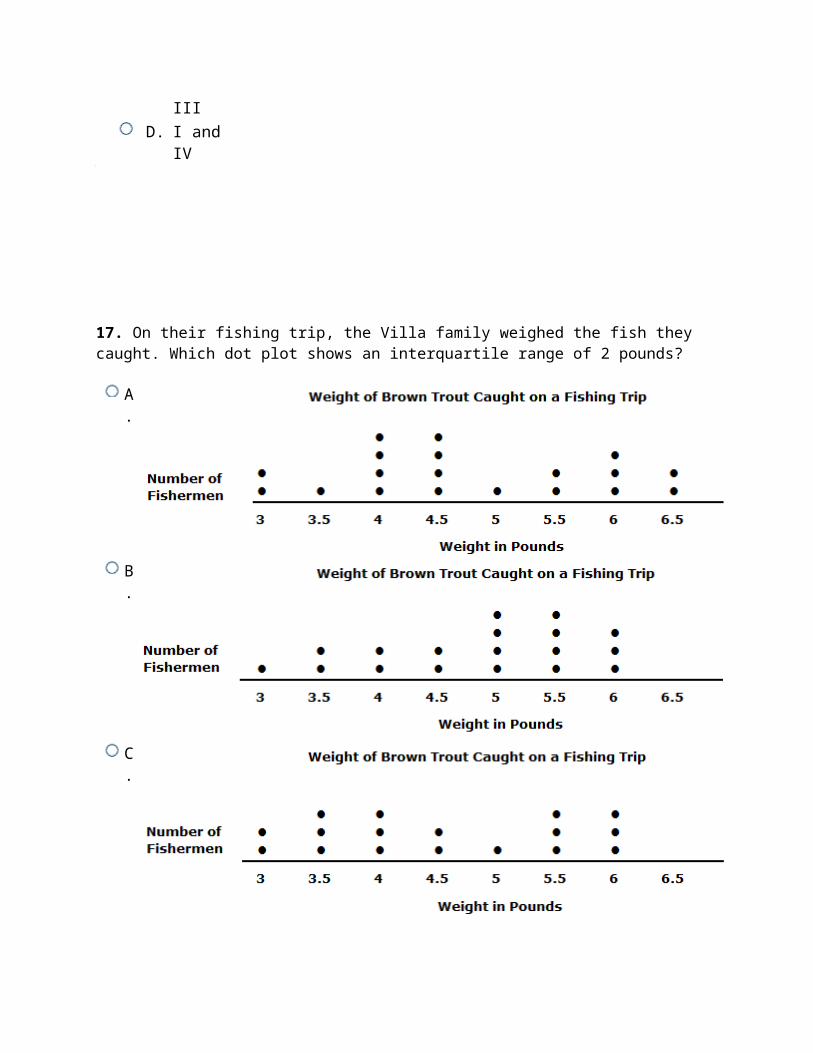
17. On their fishing trip, the Villa family weighed the fish they caught. Which dot plot shows an interquartile range of 2 pounds?

A.
B.
C.
D.
18. A retirement community tracks the ages of its residents. The dot plot below displays the data.

What is the standard deviation of the data? Round answer to the nearest hundredth.
A. 1.76 yearsB. 14.82 yearsC. 3.09 yearsD. 3.85 years
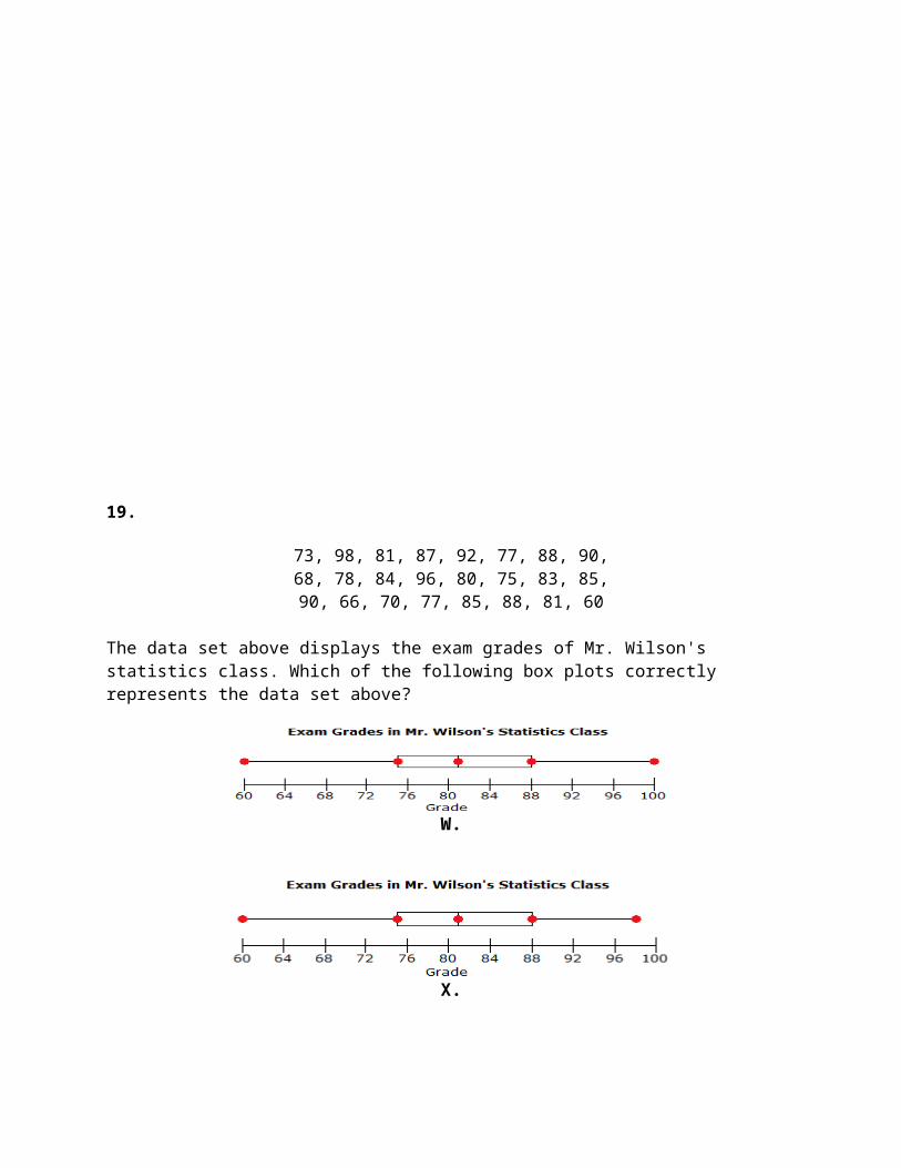
19.
73, 98, 81, 87, 92, 77, 88, 90,68, 78, 84, 96, 80, 75, 83, 85,90, 66, 70, 77, 85, 88, 81, 60

The data set above displays the exam grades of Mr. Wilson's statistics class. Which of the following box plots correctly represents the data set above?
W.
X.
Y.
Z.
A. YB. ZC. XD. W
20. Two fast food restaurants, Burger Heaven and Cheeseburger Land, are both claiming to offer the shortest drive-thru wait times in the the fast food market.
In order to determine the restaurant with the shortest drive-thru wait time, Julia decided to test each restaurant's claim. She went to each restaurant and
recorded the wait times of 15 lunchtime drive-thru customers. The box plots below show her findings.
Which of the following statements is true regarding the box plots above?A. Burger Heaven offers the shortest drive-thru wait time.
B. The range of Burger Heaven's drive-thru wait time is equal to the range of Cheeseburger Land's drive-thru wait times.
C. The median drive-thru wait time at Burger Heaven is greater than the median drive-thru wait time at Cheeseburger Land.
D. All statements are false.
21. A car dealership tracks the highway fuel efficiency of the preowned cars on the lot. The dot plot displays the collected data. What is the median fuel efficiency for the preowned cars?

A. 45 MPGB. 30 MPGC. 35 MPGD. 40 MPG
22. The dot plots represent the cost of first-year college tuitions for two different U.S. regions. Which of the statements are true?
I. Region 1 has a greater mean than region 2.II. Region 2 has a greater median than region 1.III. Region 1 has a greater interquartile range than region 2.IV. Region 2 has a greater standard deviation than region 1.
A. III and IVB. I and IIIC. II and IVD. I and II
23. Members of a garden club sold plants as a fundraiser for their club. The histogram below shows the number of plants that each member of the garden club sold during the fundrasier.
How many garden members sold 50 or more plants during the fundraiser?A. 16 membersB. 30 membersC. 58 membersD. 42 members
24. A local small business reported the wages of its hourly employees, and the dot plot displays the data. What is the mean of the data?
A. $15.75B. $15.00C. $15.50D. $15.25
25. The histograms below show the amount of daily television viewing, rounded to the nearest minute, of a sample of females and a sample of males.

Which of the following statements is true regarding the ranges of the medians of the data sets above?
A. The range of the median amount of daily television viewing for females is less than the range of the median amount of daily television viewing for males.
B. The range of the median amount of daily television viewing for females is equal to the range of the median amount of daily television viewing for males.
C. The range of the median amount of daily television viewing for females is greater than the range of the median amount of daily television viewing for males.
D. There is not enough information to make conclusions regarding the range of the median amount of daily television viewing.
26. The box plot below represents the ages of campers at a summer camp. What can be interpreted from this box plot?

A. It can be interpreted that about 50 percent of the campers are 8 years of age or younger.
B. It can be interpreted that about 50 percent of the campers are from 10 years of age to 14 years of age.
C. It can be interpreted that about 50 percent of the campers are 10 years of age or older.
D. It can be interpreted that about 50 percent of the campers are from 8 years of age to 10 years of age.
27. The box plot below represents the number of books checked out daily from a local library in the month of June. What is the interquartile range?
A. 35 booksB. 10 booksC. 45 booksD. 20 books
28.
10, 8, 50, 15, 10, 25, 20, 5,12, 15, 20, 15, 25, 18, 20
Josh works as a server at a restaurant. The data set above displays the amount of gratuity, in dollars, that he earned from each table that he served on a given night. Which of the following box plots represents the data set above?

W.
X.
Y.
Z.
A. XB. ZC. YD. W
29. The table below shows the test scores of students in a math course.
Math Test Scores
Score 50 - 59 60 - 69 70 - 79 80 - 89 90 - 99Number of Students 3 5 8 9 4
Which of the following histograms corresponds to the table above?

A.
B.
C.

D.
30. A social networking website researched the ages of its male users and female users. The findings were recorded in the box plots below.
Which of the following statements are true regarding the box plots above?I. The age range of female users is greater than the age range of male users.II. The percentage of female users that are ages 10 - 15 is greater than the

percentage of male users that are ages 10 - 15.III. The median age of female users is greater than the median age of male
users.IV. There is a 30 year age difference between the oldest female user and the
oldest male user.A. I and IVB. I and IIIC. II and IVD. II and III
Answers1. B 2. B 3. C 4. B 5. A 6. B 7. A 8. D 9. C 10. B 11. C 12. A 13. D 14. D 15. A 16. C

17. A 18. D 19. A 20. C 21. C 22. B 23. C 24. A 25. A 26. C 27. B 28. A 29. B 30. B
Explanations1. The range of each box plot can be found by subtracting the smallest value from the largest value for each box plot.
Range of the Average Number of Text Messages Sent Daily by Female Customers = 100 - 10 = 90
Range of the Average Number of Text Messages Sent Daily by Male Customers = 90 - 0 = 90The range of the average number of text messages sent daily by female customers is equal to the range of the average number of text messages sent daily by male customers.
The interquartile range (IQR) of each box plot can be found by subtracting the first quartile value from the third quartile value for each box plot.
IQR of Average Number of Text Messages Sent Daily by Female Customers = 50 - 20 = 30IQR of Average Number of Text Messages Sent Daily by Male Customers = 25 - 10 = 15
The interquartile range of the average number of text messages sent daily by female customers is greater than the interquartile range of the average number of text messages sent daily by male customers.
In order to determine the customers with the smallest average number of text messages sent daily, compare the smallest value of each box plot.
Smallest Value of the Average Number of Text Messages Sent Daily by Female Customers = 10
Smallest Value of the Average Number of Text Messages Sent Daily by Male Customers = 0
Male customers have the smallest average number of text messages sent daily.

In order to determine the customers with the greatest average number of text messages sent daily, compare the largest value of each box plot.
Largest Value of the Average Number of Text Messages Sent Daily by Female Customers = 100
Largest Value of the Average Number of Text Messages Sent Daily by Male Customers = 90
Female customers have the greatest average number of text messages sent daily.
Given the information above, the only true statement is that the range of the average number of text messages sent daily by female customers is equal to the range of the average number of text messages sent daily by male customers.
2. First, determine the means of the intelligence quotients for each class by dividing the sum of each set of intelligence quotients by the number of students, 24.
The means of the intelligence quotients of classes 1 and 2 are approximately 101.79 and 101.92, respectively. So, the means differ by less than one point, and I is true.
To find the median of each data set, order the numbers from least to greatest and identify the middle number of the set.
Class 1
90 93 93 95 95 97 99 99 100 100 100 100 102 102 102 104 105 107 107 107 109 109 112 116
Class 2
90 90 90 91 91 93 95 98 99 100 100 101 101 101 102 104 105 107 109 114 116 122 126
Each set has an even number of data points, so the median is the mean of the two middle numbers. Both classes have a median of 101, so II is false.
To find the interquartile range, first determine the first and third quartiles of each data set. The first quartile is the middle number of the lower half of the data set. The third quartile is the middle number of the upper half of the data set.
Class 1
90 93 93 95 95 97 99 99 100 100 100 100 102 102 102 104 105 107 107 107 109 109 112 116

Class 2
90 90 90 91 91 93 95 98 99 100 100 101 101 101 102 104 105 107 109 114 116 122 126
The interquartile range is the difference between the first and third quartiles.
Class 1: 107 - 98 = 9Class 2: 106 - 94 = 12
The interquartile ranges of classes 1 and 2 are 9 and 12, respectively. So, class 2 has a greater interquartile range than class 1, and III is false.
Now, find the standard deviations of each set of incomes using the formula shown below, where x = the data point, = the mean of the data points, and n = the number of data points.
For both regions, n = 24. For region 1, = 101.79. For region 2, = 101.917.
Using the formula for standard deviation, it is determined that the standard deviations of classes 1 and 2 are approximately 6.27 and 9.67, respectively. So, class 2 has a greater standard deviation than class 1, and IV is true.
Statements I and IV are true.
3.
Using the box plot above, find the median, the first quartile (Q1), the third quartile (Q3), and the interquartile range (IQR).
Median = 2
Q1 = 1

Q3 = 5
IQR = Q3 - Q1 = 5 - 1 = 4
About 50 percent of data lies between Q1 and Q3. Since the Q1 value is 1 and the Q3 value is 5, it can be interpreted that about 50 percent of seniors missed from 1 day to 5 days over the given semester.
Given the data above, II and III are true.
4. First, determine the means of the incomes for each subdivisions by dividing the sum of each set of incomes by the number of incomes, 27.
The mean of the incomes for subdivision 1 is approximately $55,333. The mean of the incomes for subdivision 2 is approximately $64,074. So, the mean for subdivision 2 is greater than the mean for subdivision 1, and I is false.
To find the median of each data set, order the numbers from least to greatest and identify the middle number of the set.
Subdivision 1 (in thousands)
45 48 48 48 50 50 50 50 52 52 52 54 54 56 56 56 58 58 58 58 58 61 63 63 63 64 69
Subdivision 2 (in thousands)
45 48 50 50 52 54 54 56 56 56 58 63 64 66 66 69 71 71 73 73 75 75 75 75 77 77 81
The median of the incomes for subdivision 1 is $56,000. The median of the incomes for subdivision 2 is $66,000. So, subdivision 2 has a greater median than subdivision 1, and II is true.
To find the interquartile range, first determine the first and third quartiles of each data set. The first quartile is the middle number of the lower half of the data set. The third quartile is the middle number of the upper half of the data set.
Subdivision 1 (in thousands)
45 48 48 48 50 50 50 50 52 52 52 54 54 56 56 56 58 58 58 58 58 61 63 63 63 64 69
Subdivision 2 (in thousands)
45 48 50 50 52 54 54 56 56 56 58 63 64 66 66 69 71 71 73 73 75 75 75 75 77 77 81

The interquartile range is the difference between the first and third quartiles.
Subdivision 1: $58,000 - $50,000 = $8,000Subdivision 2: $75,000 - $54,000 = $21,000
The interquartile ranges of subdivision 1 is $8,000. The interquartile range of subdivision 2 is $21,000. So, subdivision 2 has a greater interquartile range than subdivision 1, and III is false.
Now, find the standard deviations of each set of incomes using the formula shown below, where x = the data point, = the mean of the data points, and n = the number of data points.
For both subdivisions, n = 27. For subdivision 1, = $55,333. For subdivision 2, = $64,074.
Using the formula for standard deviation, it is determined that the standard deviation for subdivision 1 is approximately $5,856, and the standard deviation for subdivision 2 is approximately $10,516. So, subdivision 2 has a greater standard deviation than subdivision 1, and IV is true.
Statements II and IV are true.
5. The number of wins by each baseball team can be seen by investigating the height, or frequency, or each bin of the histogram.
Wins by the Tiger Baseball Team
1996 = 55 wins1997 = 30 wins1998 = 20 wins1999 = 15 wins2000 = 10 wins
Wins by the Hurricane Baseball Team
1996 = 5 wins1997 = 15 wins1998 = 20 wins1999 = 35 wins2000 = 55 wins
In order determine the statement that is true for the given data sets, compare the sum of the number of wins for the given time ranges, provided in the answer choices, for each team.
Given the information above, it is seen that the only true statement is that the number of wins by the Tiger baseball team in 1996 and 1997 is greater than the number of wins by the Hurricane baseball team in 1996 and 1997.
6. The Grow Well histogram shows that 4 tomato plants are heights 18 - 20 inches and 3 tomato plants are heights 21 - 23 inches; therefore, the following is

true regarding the number of tomato plants treated with Grow Well over the height of 18 inches.
4 tomato plants + 3 tomato plants = 7 tomato plants
The Green Grow histogram shows that 8 tomato plants are heights 18 - 20 inches and 7 tomato plants are heights 21 - 23 inches; therefore, the following is true regarding the number of tomato plants treated with Green Grow over the height of 18 inches.
8 tomato plants + 7 tomato plants = 15 tomato plants
Given that 15 is greater than 7, the only true statement is that the number of tomato plants treated with Green Grow over the height of 18 inches is greater than the number of tomato plants treated with Grow Well over the height of 18 inches.
7. For each dot plot find the range by subtracting the minimum value from the maximum value.
6.9 - 5.1 = 1.8
The dot plot that has a maximum value of 6.9 and a minimum value of 5.1, has a range of 1.8.
This dot plot displays a range of 1.8.
8. The median of each box plots is the middle value.
Median Average Monthly High Temperature in Texas = 78
Median Average Monthly High Temperature in Colorado = 64
The median average monthly high temperature in Texas is greater than the median average monthly high temperature in Colorado.
The range of each box plot can be found by subtracting the smallest value from the largest value for each box plot.

Range of the Average Monthly High Temperature in Texas = 96 - 56 = 40Range of the Average Monthly High Temperature in Colorado = 88 - 48 = 40The range of the average monthly high temperature in Texas is equal to the range of the average monthly high temperature in Colorado.
The interquartile range of each box plot can be found by subtracting the first quartile value from the third quartile value for each box plot.
Interquartile Range of the Average Monthly High Temperature in Texas = 90 - 64 = 26Interquartile Range of the Average Monthly High Temperature in Colorado = 82 - 52 = 30The interquartile range of the average monthly high temperature in Texas is less than the interquartile range of the average monthly high temperature in Colorado.
Given the information above, the only true statement is that the median average monthly high temperature in Texas is greater than the median average monthly high temperature in Colorado.
9. The median of a data set is the value of the middle entry.
Add the height of each bar of the histogram to find the total number of entries in the histogram.
30 + 40 + 10 + 5 = 85
Given that there are 85 entries in the histogram, the median will be the value of the 43rdentry of the histogram.
The 43rd entry of the histogram is contained in the range of 31 - 60 minutes; therefore, the range of the median daily exercise time is 31 - 60 minutes.
10. First, determine the means of the scores for each exam by dividing the sum of each set of scores by the number of scores, 27.
The mean of the scores for exam 1 is approximately 80.15 percent. The mean of the scores for exam 2 is approximately 80.74 percent. So, the difference between the two means is less than one percentage point, and IV is true.
Now, find the standard deviations of each set of scores using the formula shown below, where x = the data point, = the mean of the data points, and n = the number of data points.
For both exams, n = 27. For exam 1, = 80.15. For exam 2, = 80.74.
Using the formula for standard deviation, it is determined that the standard deviation for exam 1 is approximately 8.49, and the standard deviation for exam
2 is approximately 9.89. So, exam 2 has a greater standard deviation, and I is false.
Next, determine the medians of each data set by ordering the numbers from least to greatest and identifying the middle number of the set.
Exam 1
65 68 68 70 70 74 74 74 75 75 75 75 80 82 82 82 82 85 85 85 87 87 90 92 92 95 95
Exam 2
65 65 70 70 70 72 72 75 75 75 79 79 79 80 80 81 81 81 85 85 85 90 92 97 97 100 100
The median of exam 1 is 82, and the median of exam 2 is 80. So, exam 1 has a greater median, and II is true.
The interquartile range of a data set is the difference between the third quartile and first quartile of the set. The first quartile is the median of the lower half of the data, and the third quartile is the median of the upper half of the data.
The first and third quartiles of the data sets are shown below.
Exam 1
65 68 68 70 70 74 74 74 75 75 75 75 80 82 82 82 82 85 85 85 87 87 90 92 92 95 95
Exam 2
65 65 70 70 70 72 72 75 75 75 79 79 79 80 80 81 81 81 85 85 85 90 92 97 97 100 100
Now, calculate the interquartile ranges.
Both exams have an equal interquartile range of 13. So, III is false.
Therefore, statements II and IV are true.
11. The maximum range can be found by subtracting the smallest number of weekly hours worked from the greatest number of weekly hours worked.
Maximum Range of Weekly Hours Worked by High School Students = 19 hours - 12 hours = 7 hours
Maximum Range of Weekly Hours Worked by College Students = 29 hours - 10 hours = 19 hours

The maximum range of weekly hours worked by high school students is less than the maximum range of weekly hours worked by college students.
12. The maximum range of the Oak High School basketball players' heights can be found by subtracting the smallest potential height from the largest potential height.
75 inches - 66 inches = 9 inches
13. In order for a histogram to correspond to a table, the histogram must display all of the same data as the table. Check the ranges, frequencies, and title.
The ranges of the given table are as follows. Eliminate any histograms that do not have these exact ranges.
0 - 1, 2 - 3, 4 - 5, 6 - 7
The frequency of each range (the number of seniors) for the given table are as follows. Eliminate any histograms that do not have these exact frequencies.
231, 222, 166, 134
The title of the table must be identical to the title of the histogram. Eliminate any histograms that do not have this exact title.
Scholarship Applications
The only histogram to display all the correct information is shown below.
14. To find the amount of decline for car M, subtract the car's value in 2004 from the car's value in 2000.
$28,000.00 - $20,000.00 = $8,000.00

To find the amount of decline for car N, subtract the car's value in 2004 from the car's value in 2000.
$28,000.00 - $12,000.00 = $16,000.00
Given that $16,000.00 is greater than $8,000.00, the only true statement is that the value of car N declined more than the value of car M over the five year period.
15. The median best measures the center of the graph of class 1, because the data are skewed to the right which would significantly influence the mean. So, I is true.
The mean best measures the center of the graph of class 2, because it has a fairly normal distribution and no outliers. So, II is true.
To find the median of each data set, order the numbers from least to greatest and identify the middle number of the set.
Class 1
48 48 49 49 49 50 50 50 51 52 53 53 54 54 54 54 56 56 56 60 62
Class 2
49 50 51 51 52 52 52 53 53 53 54 54 54 54 55 55 55 56 56 57 58
The medians of classes 1 and 2 are 53 and 54, respectively. So, class 2 has a greater median than class 1, and III is false.
The interquartile range of a data set is the difference between the third quartile and first quartile of the set. The first quartile is the median of the lower half of the data, and the third quartile is the median of the upper half of the data.
The first and third quartiles of the data sets are shown below. Since there is an odd number of data points in the lower and upper halves of the data sets, each first and third quartile is the mean of the middle two numbers.
Class 1
48 48 49 49 49 50 50 50 51 52 53 53 54 54 54 54 56 56 56 60 62
Class 2
49 50 51 51 52 52 52 53 53 53 54 54 54 54 55 55 55 56 56 57 58
The first quartile of class 1 is 49.5, and the third quartile of class 1 is 55. The first quartile of class 2 is 52, and the third quartile of class 2 is 55.
Now, calculate the interquartile ranges.

The interquartile ranges of classes 1 and 2 are 5.5 and 3, respectively. So, class 1 has a greater interquartile range than class 2, and IV is true.
Therefore, statements I, II and IV are true.
16. The range of each box plot can be found by subtracting the smallest value from the largest value for each box plot.
Range of 1st Period's Test Scores = 100 - 65 = 35Range of 2nd Period's Test Score = 100 - 60 = 40The range of 1st period's test scores is less than the range of 2nd period's test scores.
In box plots, about 50 percent of data lies between the first quartile value and the third quartile value. Only about 25 percent of data lies between the median and the third quartile value.
About 50 percent of 1st period's test scores are contained between 85 to 95.
About 25 percent of 2nd period's test scores are contained between 85 and 95.
There is a greater percentage of test scores between 85 and 95 in 1st period than in 2ndperiod.
The interquartile range of each box plot can be found by subtracting the first quartile value from the third quartile value for each box plot.Interquartile Range of 1st Period's Test Scores = 95 - 85 = 10Interquartile Range of 2nd Period's Test Scores = 95 - 80 = 15The interquartile range of 1st period's test scores is less than the interquartile range of 2ndperiod's test scores.
The median of each box plots is the middle value.Median of 1st Period's Test Scores = 90Median of 2nd Period's Test Scores = 85The median of 1st period's test scores is greater than the median of 2nd period's test scores.
Given the information above, statements II and III are true.
17. Find the interquartile range for each dot plot. To find the interquartile range, first find the median of a data set by ordering the numbers from least to greatest.
3, 3, 3.5, 4, 4, 4, 4, 4.5, 4.5, 4.5, 4.5, 5, 5.5, 5.5, 6, 6, 6, 6.5, 6.5
Next, identify the middle number(s) of the data set.

3, 3, 3.5, 4, 4, 4, 4, 4.5, 4.5, 4.5, 4.5, 5, 5.5, 5.5, 6, 6, 6, 6.5, 6.5
Now, find the quartiles, or medians, of each half.
3, 3, 3.5, 4, 4, 4, 4, 4.5, 4.5, 4.5, 4.5, 5, 5.5, 5.5, 6, 6, 6, 6.5, 6.5
The first quartile is 4 and the third quartile is 6. To find the interquartile range, subtract the first quartile from the third.
6 - 4 = 2
The following dot plot displays an interquartile range of 2.
18. The equation for standard deviation is shown below, where x = the data point, = the mean of the data points, and n = the number of data points.
First, determine the mean, , by finding the sum of the data points and dividing by the number of data points, 29. So, 80.28.
The table below shows the calculations needed to determine the standard deviation of the data set.

Next, find the sum of the (x - )2 values.
Now, calculate the standard deviation.
The age distribution among residents in the retirement community has a standard deviation of approximately 3.85 years.
19. To create a box plot, order the data.
60, 66, 68, 70, 73, 75, 77, 77, 78, 80, 81, 81, 83, 84, 85, 85, 87, 88, 88, 90, 90, 92, 96, 98
Find the median, the first quartile (Q1), the third quartile (Q3), and the interquartile range (IQR).
Median =81 + 83
2 = 82
Q1 =75 + 77
2 = 76
Q3 =88 + 88
2 = 88
IQR = Q3 - Q1 = 88 - 76 = 12
Find the lower and upper fences for the given data.

Lower Fence = Q1 - 1.5 × IQR = 76 - 1.5 × 12 = 58
Upper Fence = Q3 + 1.5 × IQR = 88 + 1.5 × 12 = 106
It is seen that the given data set does not contain any outliers because there are no values in the data set less than 58 or greater than 106.
All values needed to create a box plot to represent the given data have been found. Construct the box plot.
Draw horizontal lines for the Q1, median, and Q3 values and create a box.
Determine the smallest and largest values in the data set that lie within the fences. Plot these points and create the whiskers.
The box plot that represents the given data is Y.
20. The median of each box plots is the middle value.
Median of Burger Heaven's Drive-Thru Wait Time = 4
Median of Cheeseburger Land's Drive-Thru Wait Time = 2
The median drive-thru wait time at Burger Heaven is greater than the median drive-thru wait time at Cheeseburger Land.
The range of each box plot can be found by subtracting the smallest value from the largest value for each box plot.
Range of Burger Heaven's Drive-Thru Wait Time = 10 - 1 = 9
Range of Cheeseburger Land's Drive-Thru Wait Time = 6 - 0.5 = 5.5
The range of Burger Heaven's drive-thru wait time is greater than the range of Cheeseburger Land's drive-thru wait time.
In order to determine the restaurant with the shortest drive-thru wait time, compare the smallest value of each box plot.
Smallest Value of Burger Heaven's Drive-Thru Wait Time = 1
Smallest Value of Cheeseburger Land's Drive-Thru Wait Time = 0.5
Cheeseburger Land offers the shortest drive-thru wait time.
Given the information above, the only true statement is that the median drive-thru wait time at Burger Heaven is greater than the median drive-thru wait time at Cheeseburger Land.
21. To find the median of a data set, order the numbers from least to greatest.
15, 15, 15, 15, 15, 20, 20, 20, 20, 25, 25, 25, 30, 30, 35,35, 40, 40, 45, 45, 45, 45, 45, 45, 50, 50, 55, 60, 65
Next, identify the middle number of the data set.
15, 15, 15, 15, 15, 20, 20, 20, 20, 25, 25, 25, 30, 30, 35,35, 40, 40, 45, 45, 45, 45, 45, 45, 50, 50, 55, 60, 65
The median of the data set is 35 MPG.
22. First, determine the means of the tuition costs for each region by dividing the sum of each set of tuition costs by the number of tuition costs, 27.
The means of the tuition costs for regions 1 and 2 are approximately $18,148 and $11,481, respectively. So, region 1 has a greater mean than region 2, and I is true.
To find the median of each data set, order the numbers from least to greatest and identify the middle number of the set.
Region 1 (in thousands)
2 4 5 5 6 6 7 10 13 15 16 17 17 17 19 19 21 22 24 27 27 28 28 31 33 34 37
Region 2 (in thousands)
2 3 3 4 5 5 6 6 7 8 8 8 9 9 9 9 10 10 10 13 15 16 21 22 24 31 37
The medians of the tuition costs for regions 1 and 2 are $17,000 and $9,000, respectively. So, region 1 has a greater median than region 2, and II is false.

To find the interquartile range, first determine the first and third quartiles of each data set. The first quartile is the middle number of the lower half of the data set. The third quartile is the middle number of the upper half of the data set.
Region 1 (in thousands)
2 4 5 5 6 6 7 10 13 15 16 17 17 17 19 19 21 22 24 27 27 28 28 31 33 34 37
Region 2 (in thousands)
2 3 3 4 5 5 6 6 7 8 8 8 9 9 9 9 10 10 10 13 15 16 21 22 24 31 37
The interquartile range is the difference between the first and third quartiles.
Region 1: $27,000 - $7,000 = $20,000Region 2: $15,000 - $6,000 = $9,000
The interquartile ranges of regions 1 and 2 are $20,000 and $9,000, respectively. So, region 1 has a greater interquartile range than region 2, and III is true.
Now, find the standard deviations of each set of incomes using the formula shown below, where x = the data point, = the mean of the data points, and n = the number of data points.
For both regions, n = 27. For region 1, = $18,148. For region 2, = $11,481.
Using the formula for standard deviation, it is determined that the standard deviation for region 1 is approximately $10,073, and the standard deviation for region 2 is approximately $10,516. So, region 1 has a greater standard deviation than region 2, and IV is false.
Statements I and III are true.
23. The histogram shows that 16 members sold 50 - 59 plants, 10 members sold60 - 69 plants, and 32 members sold 70 - 79 plants.
In order to find the number of members that sold 50 or more plants during the fundraiser, add the number of members from each of the three categories above.
16 members + 10 members + 32 members = 58 members
24. First, add the values of the data points together. The sum of the values equals $456.75.

Now, divide $456.75 by the number of data points, 29.
$465.75 ÷ 29 = $15.75
The mean of the data set is $15.75.
25. The median of a data set is the value of the middle entry.
Add the height of each bin of the histogram titled "Amount of Daily Television Viewing of Females" to find the total number of entries in the histogram.
30 + 20 + 15 + 5 = 70
Given that there are 70 entries in the histogram, the median will be the value that falls between the 35th entry and the 36th entry of the histogram.
The 35th entry and the 36th entry of the histogram are contained in the range of30 - 59 minutes of the histogram titled "Amount of Daily Television Viewing of Females;" therefore, the range of the median daily television viewing times for the sampled females is30 - 59 minutes.
Add the height of each bin of the histogram titled "Amount of Daily Television Viewing of Males" to find the total number of entries in the histogram.
0 + 20 + 25 + 25 = 70
Given that there are 70 entries in the histogram, the median will be the value that falls between the 35th entry and the 36th entry of the histogram.
The 35th entry and the 36th entry of the histogram is contained in the range of60 - 89 minutes of the histogram titled "Amount of Daily Television Viewing of Males;" therefore, the range of the median daily television viewing times for the sampled males is60 - 89 minutes.
Given the information above, the range of the median amount of daily television viewing for females is less than the range of the median amount of daily television viewing for males.
26. The median of a data set is the middle value that represents 50 percent of the data. The given box plot has a median of 10 years of age. This indicates that about 50 percent of the data lies below 10 years of age and about 50 percent of the data lies above 10 years of age.

Given the information above, it can be interpreted that about 50 percent of campers are 10 years of age or older.
27. Using the box plot, find the median, the first quartile (Q1), the third quartile (Q3), and the interquartile range (IQR). The IQR is the difference between the first and third quartiles.
Median = 25 books
Q1 = 20 books
Q3 = 30 books
IQR = Q3 - Q1 = 30 books - 20 books = 10 books
Therefore, the interquartile range is 10 books.
28. To create a box plot, order the data.
5, 8, 10, 10, 12, 15, 15, 15, 18, 20, 20, 20, 25, 25, 50
Find the median, the first quartile (Q1), the third quartile (Q3), and the interquartile range (IQR).
Median = 15Q1 = 10Q3 = 20
IQR = Q3 - Q1 = 20 - 10 = 10
Find the lower and upper fences for the given data.Lower Fence = Q1 - 1.5 × IQR
= 10 - 1.5 × 10 = -5
Upper Fence = Q3 + 1.5 × IQR = 20 + 1.5 × 10 = 35
It is seen that the given data set contains an outlier at 50, since 50 is greater than the upper fence value of 35.

All values needed to create a box plot to represent the given data have been found. Construct the box plot.
Draw horizontal lines for the Q1, median, and Q3 values and create a box.
Determine the smallest and largest values in the data set that lie within the fences. Plot these points and create the whiskers. Also, mark the outlier value of 50 with an asterisk.
The box plot that represents the given data is X.
29. In order for a histogram to correspond to a table, the histogram must display all of the same data as the table. Check the ranges, frequencies, and title.
The ranges of the given table are as follows. Eliminate any histograms that do not have these exact ranges.
50 - 59, 60 - 69, 70 - 79, 80 - 89, 90 - 99
The frequency of each range (the number of students) for the given table are as follows. Eliminate any histograms that do not have these exact frequencies.
3, 5, 8, 9, 4
The title of the table must be identical to the title of the histogram. Eliminate any histograms that do not have this exact title.
Math Test Scores
The only histogram to display all the correct information is shown below.

30. The range of each box plot can be found by subtracting the smallest value from the largest value for each box plot.
Age Range of Female Users = 80 - 10 = 70Age Range of Male Users = 65 - 10 = 55The age range of female users is greater than the age range of male users.
In box plots, about 25 percent of data lies between the smallest non-outlier and the first quartile.
About 25 percent of female users are ages 10 - 15.
About 25 percent of male users are ages 10 - 15.
The percentage of female users that are ages 10 - 15 is equal to the percentage of male users that are ages 10 - 15.
The median of each box plots is the middle value.
Median Age of Female Users = 25
Median Age of Male Users = 20
The median age of female users is greater than the median age of male users.
To find the age difference between the oldest female user and the oldest male user, find the difference between the largest value of each box plot.
Oldest Female User = 80
Oldest Male User = 65
The age difference between the oldest female user and the oldest male user is 80 - 65 = 15.

Given the information above, statements I and III are true.


![[DPnF] Female x Female = Love](https://img.pdfslide.us/doc/110x75/577cd9a01a28ab9e78a3c67d/dpnf-female-x-female-love.jpg)