Embed Size (px)
Citation preview
Data Visualisation with Google Fusion Tables Page 1 of 33
Data Visualisation with Google Fusion Tables Workshop Exercises Dr Luc Small | 12 April 2017 | 1.5
Data Visualisation with Google Fusion Tables Page 2 of 33
1 Introduction Google Fusion Tables is shaping up to be a powerful and accessible data visualisation tool. While still in "beta", this cloud-based application has a useful feature set that is destined to grow with time.
In this exercise we use Google Fusion Tables to create a "heat map" of NSW highlighting crime hotspots. In order to accomplish this we will draw in and combine data from two sources.
The first is a comma-separated-values (CSV) file containing crime statistics for all Local Government Areas (LGAs) in NSW. The 152 LGAs in NSW are variously referred to as shires, councils, cities, etc. You can read all about them here:
• http://en.wikipedia.org/wiki/Local_government_areas_of_New_South_Wales
The crime statistics, meanwhile, can be obtained here:
• http://www.bocsar.nsw.gov.au/Pages/bocsar_crime_stats/bocsar_onlinedatatools.aspx
The second data source is a keyhole mark-up language (KML) file that describes the boundaries of all the LGAs in NSW using geospatial coordinates. This dataset is available here:
• http://www.tallyroom.com.au/maps
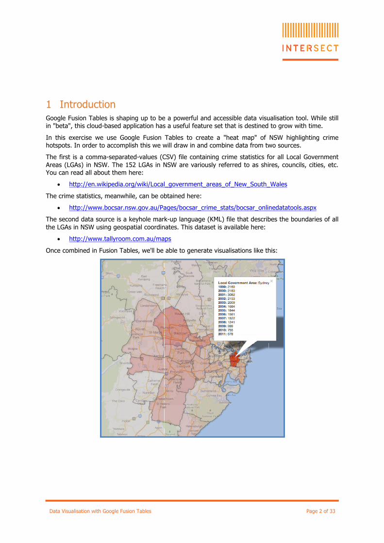
Once combined in Fusion Tables, we'll be able to generate visualisations like this:
Data Visualisation with Google Fusion Tables Page 3 of 33
2 Download your datasets The first step is to download a copy of the datasets you'll need for the exercise.
First grab the LGA boundaries KML file by following this link:
• http://bit.ly/Ntvncs
Save the downloaded file to a convenient location, such as your Desktop.
The file is zipped to speed up the download, so double-click on the file to extract it.
You should now have a file at your chosen location (say the Desktop) called:
• AUS-NSW-LGA-2012.kml
Next, visit the "Specific Crime Information Tool" provided by the NSW Government by following this link:
• http://bit.ly/J47gkw
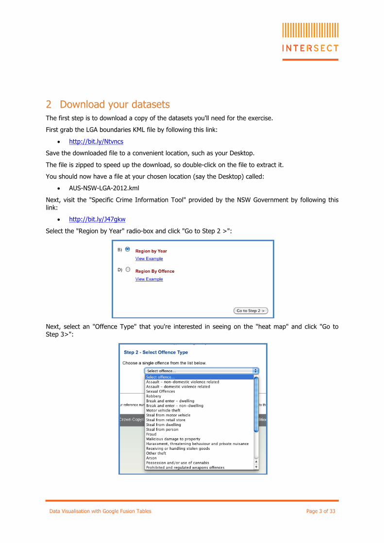
Select the "Region by Year" radio-box and click "Go to Step 2 >":
Next, select an "Offence Type" that you're interested in seeing on the "heat map" and click "Go to Step 3>":
Data Visualisation with Google Fusion Tables Page 4 of 33
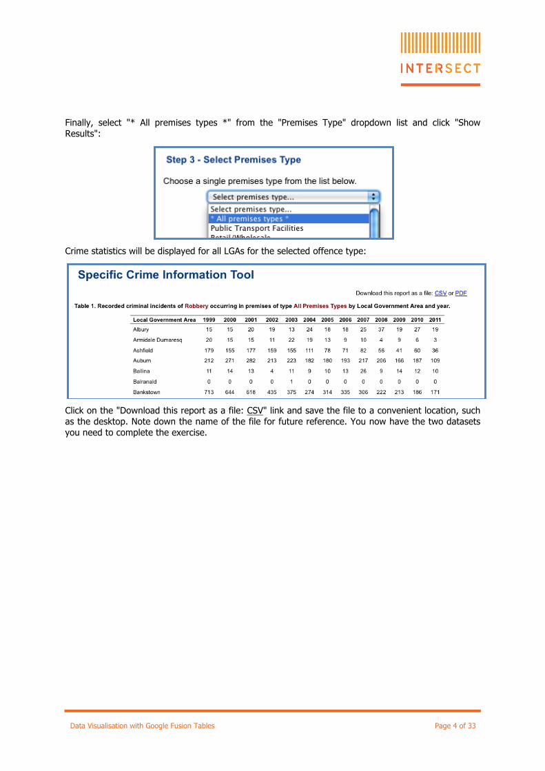
Finally, select "* All premises types *" from the "Premises Type" dropdown list and click "Show Results":
Crime statistics will be displayed for all LGAs for the selected offence type:
Click on the "Download this report as a file: CSV" link and save the file to a convenient location, such as the desktop. Note down the name of the file for future reference. You now have the two datasets you need to complete the exercise.
Data Visualisation with Google Fusion Tables Page 5 of 33
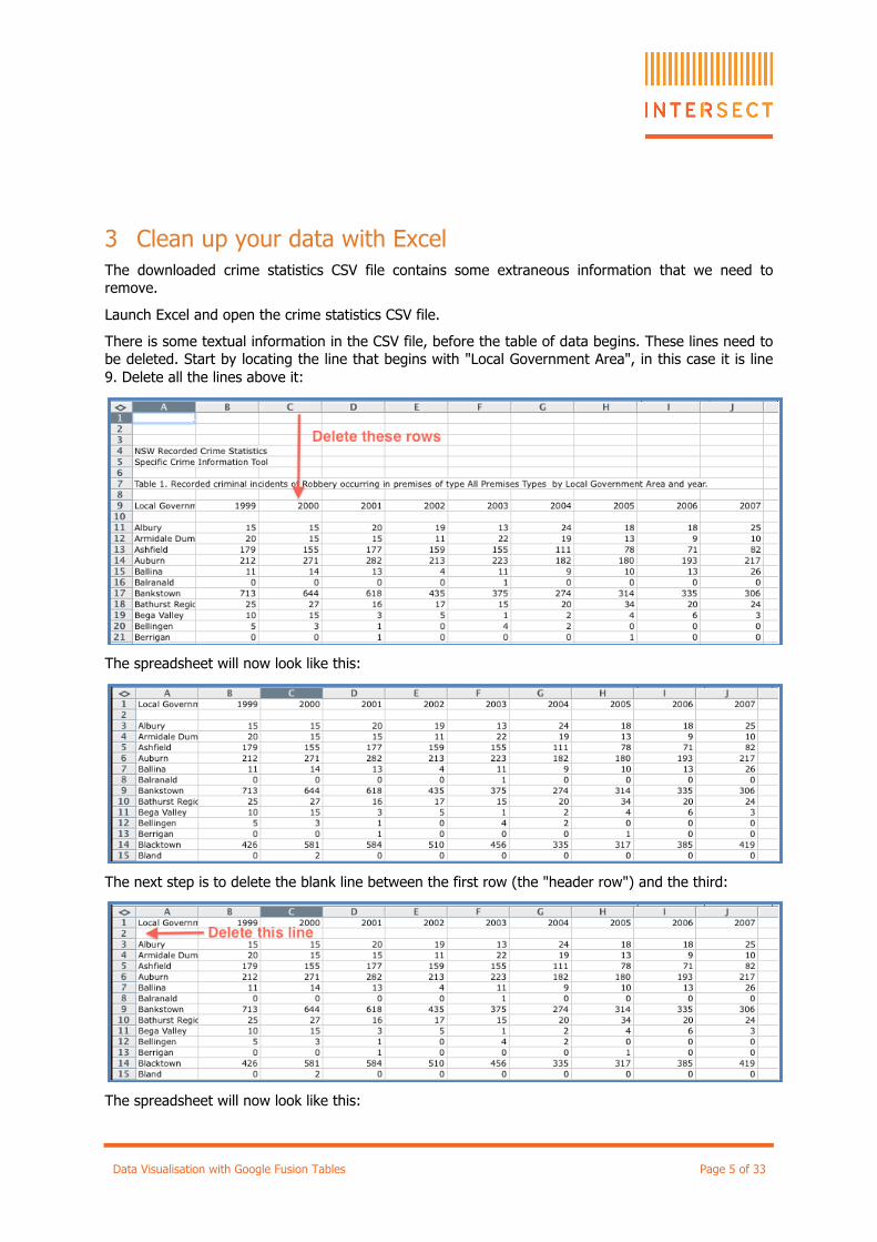
3 Clean up your data with Excel The downloaded crime statistics CSV file contains some extraneous information that we need to remove.
Launch Excel and open the crime statistics CSV file.
There is some textual information in the CSV file, before the table of data begins. These lines need to be deleted. Start by locating the line that begins with "Local Government Area", in this case it is line 9. Delete all the lines above it:
The spreadsheet will now look like this:
The next step is to delete the blank line between the first row (the "header row") and the third:
The spreadsheet will now look like this:
Data Visualisation with Google Fusion Tables Page 6 of 33
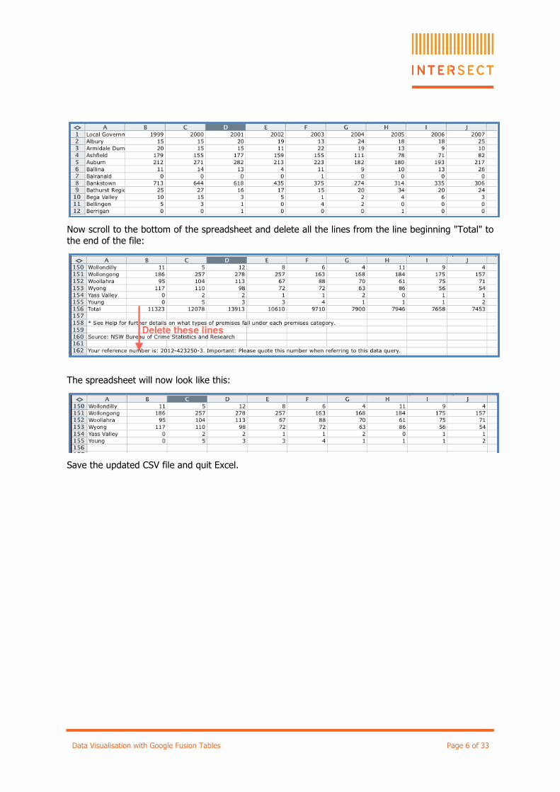
Now scroll to the bottom of the spreadsheet and delete all the lines from the line beginning "Total" to the end of the file:
The spreadsheet will now look like this:
Save the updated CSV file and quit Excel.
Data Visualisation with Google Fusion Tables Page 7 of 33
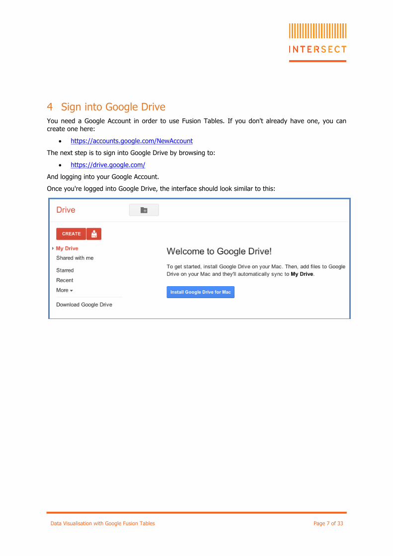
4 Sign into Google Drive You need a Google Account in order to use Fusion Tables. If you don't already have one, you can create one here:
• https://accounts.google.com/NewAccount
The next step is to sign into Google Drive by browsing to:
• https://drive.google.com/
And logging into your Google Account.
Once you're logged into Google Drive, the interface should look similar to this:
Data Visualisation with Google Fusion Tables Page 8 of 33
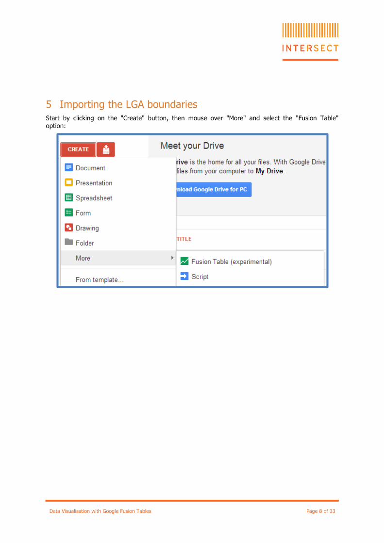
5 Importing the LGA boundaries Start by clicking on the "Create" button, then mouse over "More" and select the "Fusion Table" option:
Data Visualisation with Google Fusion Tables Page 9 of 33
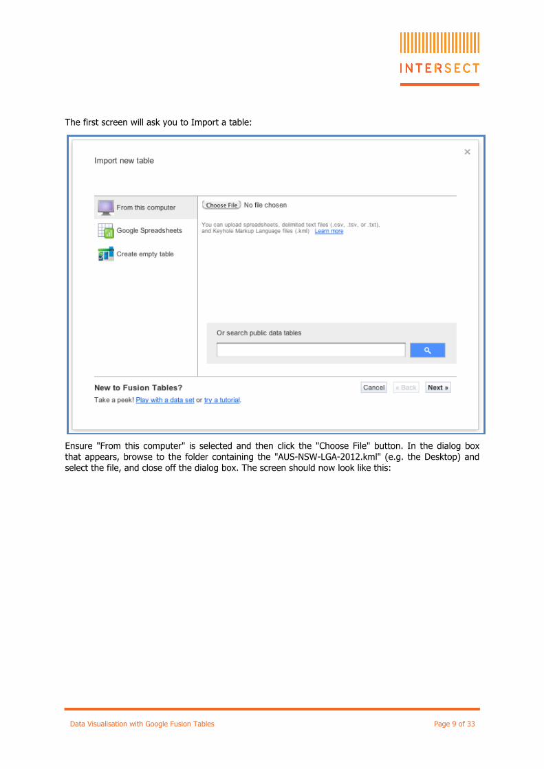
The first screen will ask you to Import a table:
Ensure "From this computer" is selected and then click the "Choose File" button. In the dialog box that appears, browse to the folder containing the "AUS-NSW-LGA-2012.kml" (e.g. the Desktop) and select the file, and close off the dialog box. The screen should now look like this:
Data Visualisation with Google Fusion Tables Page 10 of 33
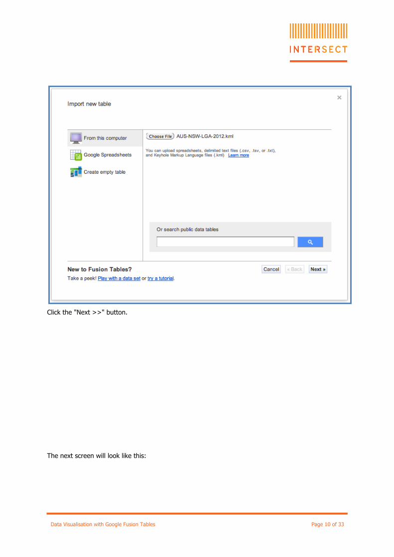
Click the "Next >>" button.
The next screen will look like this:
Data Visualisation with Google Fusion Tables Page 11 of 33
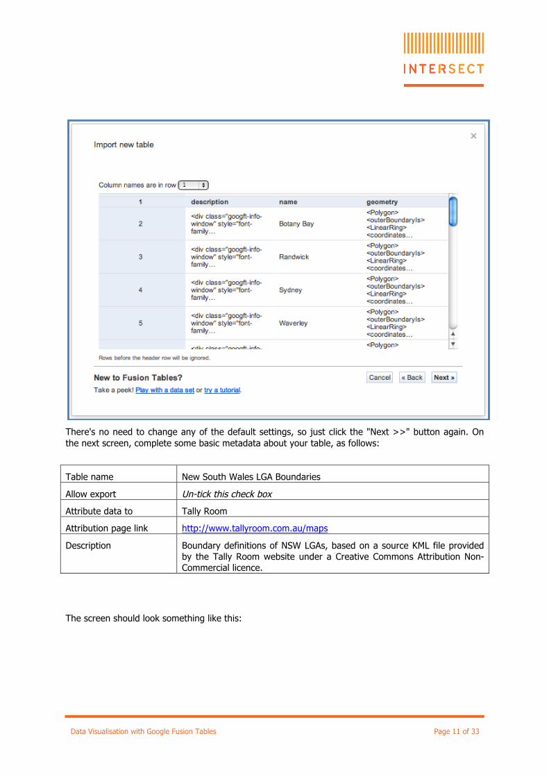
There's no need to change any of the default settings, so just click the "Next >>" button again. On the next screen, complete some basic metadata about your table, as follows:
Table name New South Wales LGA Boundaries
Allow export Un-tick this check box
Attribute data to Tally Room
Attribution page link http://www.tallyroom.com.au/maps
Description Boundary definitions of NSW LGAs, based on a source KML file provided by the Tally Room website under a Creative Commons Attribution Non-Commercial licence.
The screen should look something like this:
Data Visualisation with Google Fusion Tables Page 12 of 33
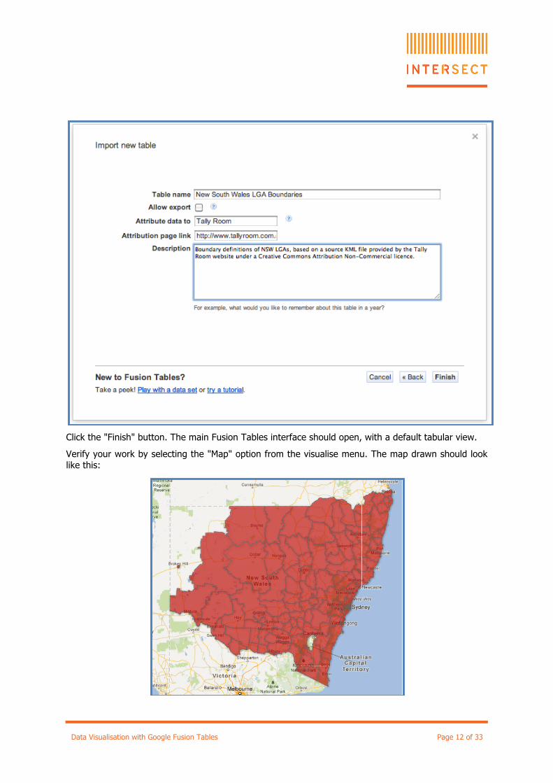
Click the "Finish" button. The main Fusion Tables interface should open, with a default tabular view.
Verify your work by selecting the "Map" option from the visualise menu. The map drawn should look like this:
Data Visualisation with Google Fusion Tables Page 13 of 33
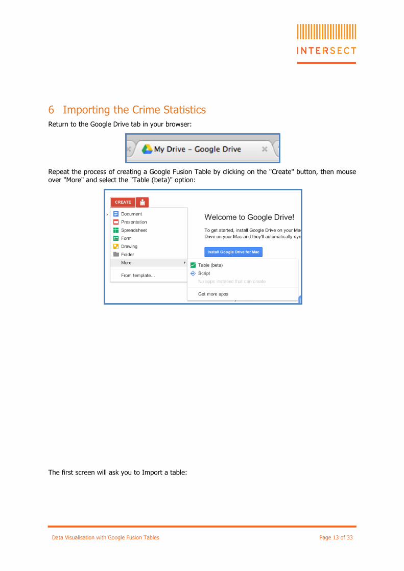
6 Importing the Crime Statistics Return to the Google Drive tab in your browser:
Repeat the process of creating a Google Fusion Table by clicking on the "Create" button, then mouse over "More" and select the "Table (beta)" option:
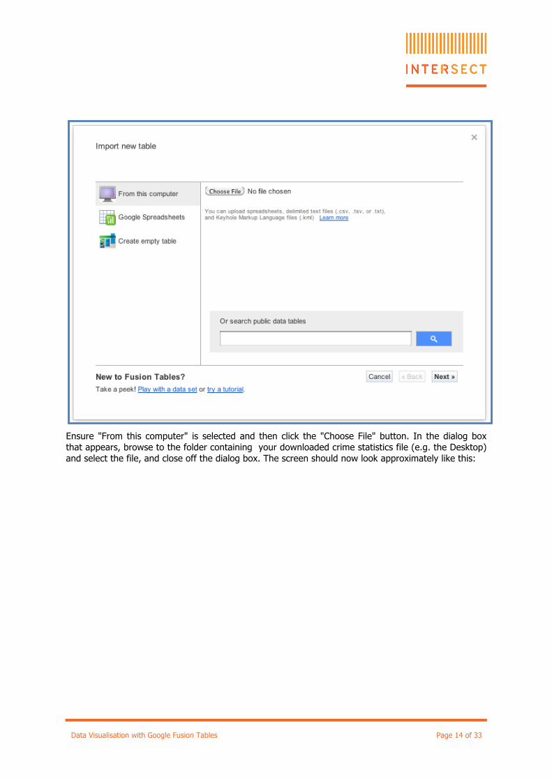
The first screen will ask you to Import a table:
Data Visualisation with Google Fusion Tables Page 14 of 33
Ensure "From this computer" is selected and then click the "Choose File" button. In the dialog box that appears, browse to the folder containing your downloaded crime statistics file (e.g. the Desktop) and select the file, and close off the dialog box. The screen should now look approximately like this:

Data Visualisation with Google Fusion Tables Page 15 of 33
Leave all the settings as their defaults and click the "Next >>" button.
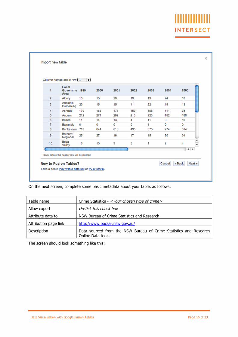
A new screen will appear. In the "Column names are in row" drop down box, leave the default of "1". In the preview area, verify that the bold row contains columns for "Local Government Area" and the years from 1999. Click "Next >>".
Data Visualisation with Google Fusion Tables Page 16 of 33
On the next screen, complete some basic metadata about your table, as follows:
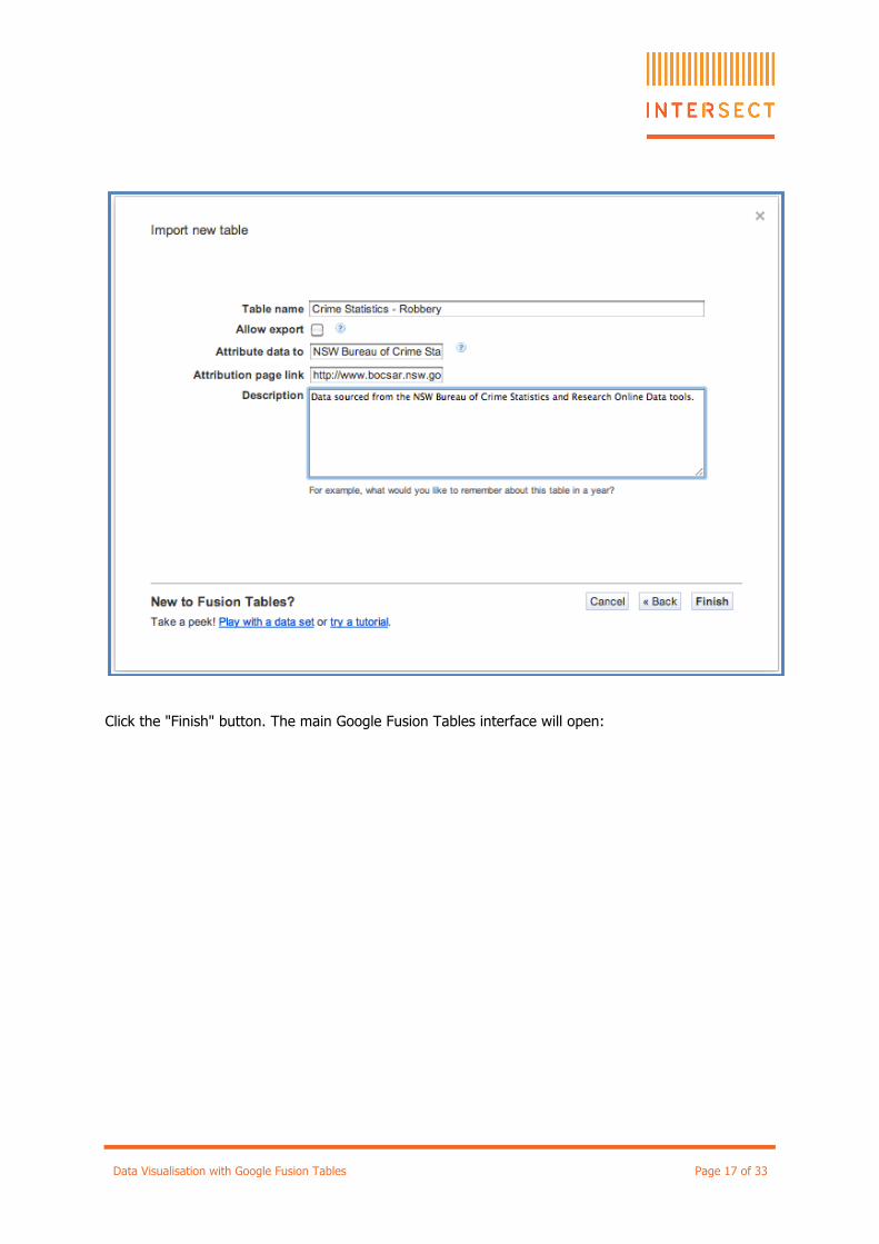
Table name Crime Statistics - <Your chosen type of crime>
Allow export Un-tick this check box
Attribute data to NSW Bureau of Crime Statistics and Research
Attribution page link http://www.bocsar.nsw.gov.au/
Description Data sourced from the NSW Bureau of Crime Statistics and Research Online Data tools.
The screen should look something like this:
Data Visualisation with Google Fusion Tables Page 17 of 33
Click the "Finish" button. The main Google Fusion Tables interface will open:
Data Visualisation with Google Fusion Tables Page 18 of 33
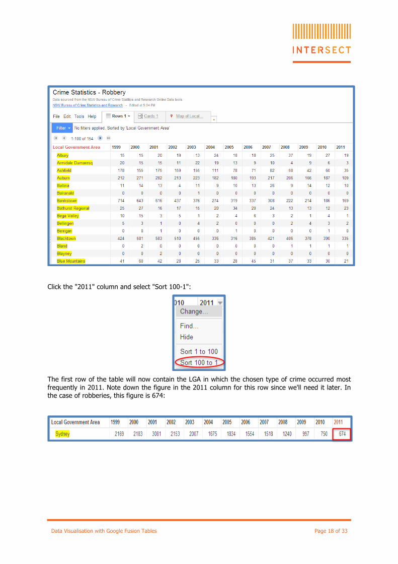
Click the "2011" column and select "Sort 100-1":
The first row of the table will now contain the LGA in which the chosen type of crime occurred most frequently in 2011. Note down the figure in the 2011 column for this row since we'll need it later. In the case of robberies, this figure is 674:

Data Visualisation with Google Fusion Tables Page 19 of 33
7 Merging the Tables Next we need to merge our tables, so that the crime statistics and geographic information are together in the same table.
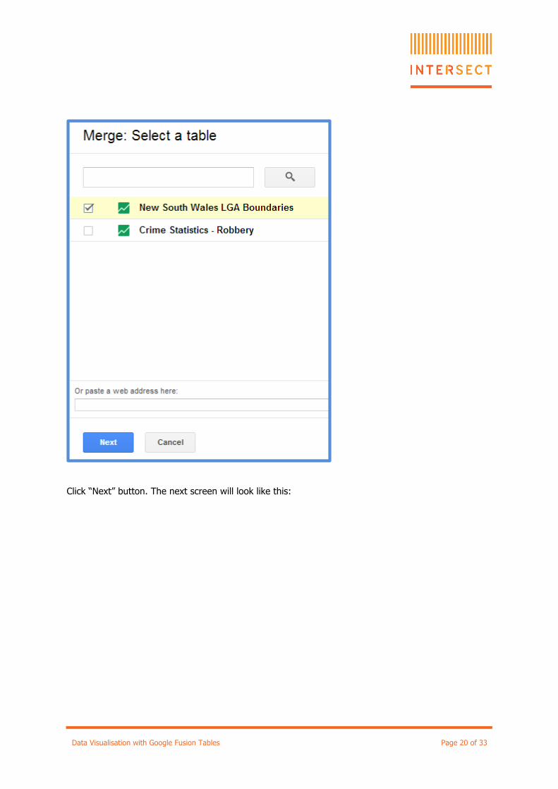
While still in your Crime Statistics table, from “File”, click the "Merge". The following dialog box will appear:
Select “New South Wales LGA Boundaries”:
Data Visualisation with Google Fusion Tables Page 20 of 33
Click “Next” button. The next screen will look like this:
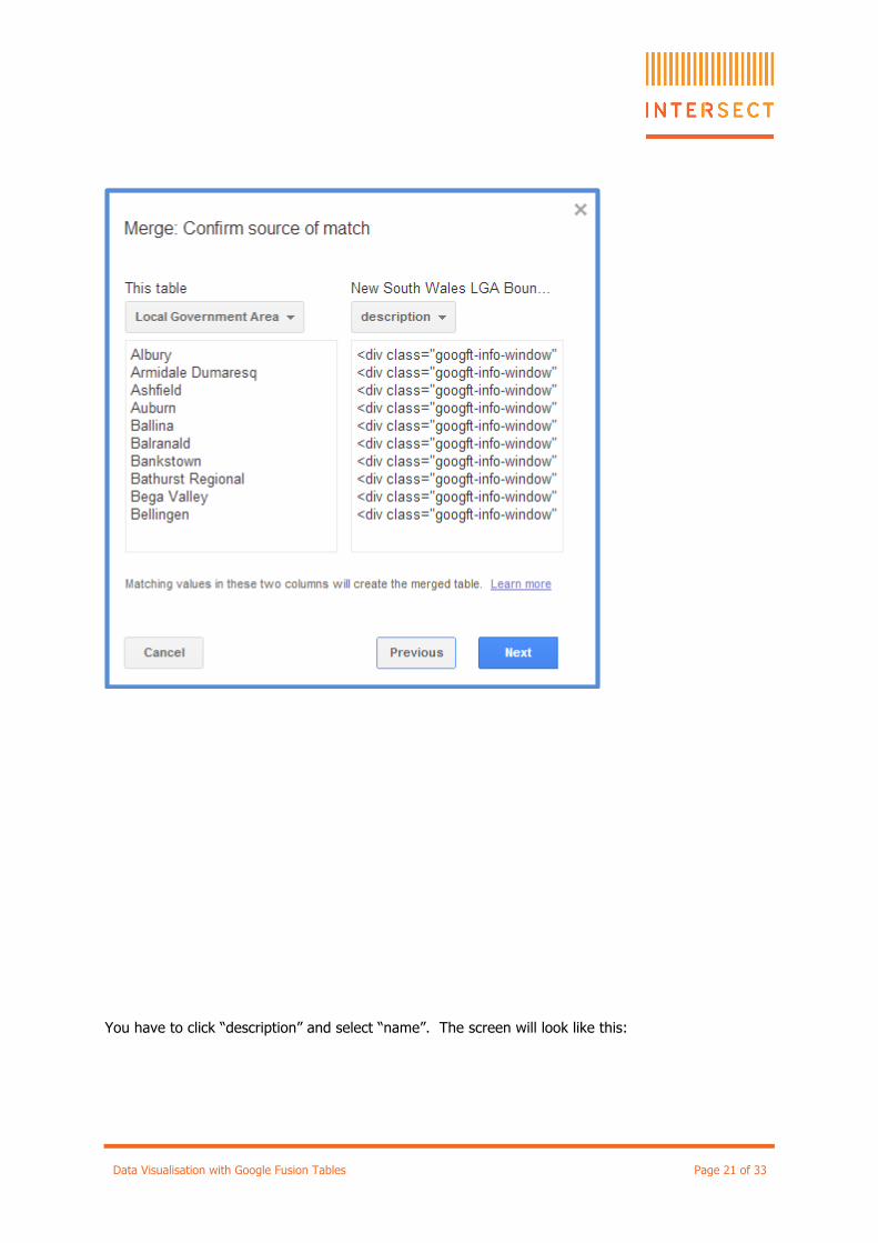
Data Visualisation with Google Fusion Tables Page 21 of 33
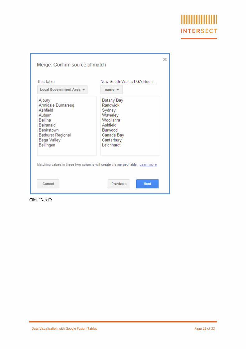
You have to click “description” and select “name”. The screen will look like this:
Data Visualisation with Google Fusion Tables Page 22 of 33
Click “Next”:
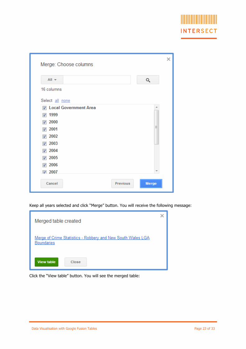
Data Visualisation with Google Fusion Tables Page 23 of 33
Keep all years selected and click “Merge” button. You will receive the following message:
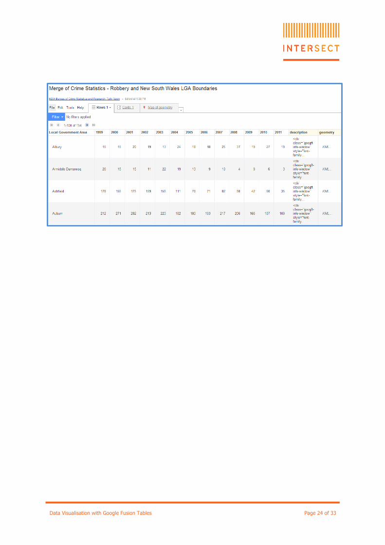
Click the “View table” button. You will see the merged table:
Data Visualisation with Google Fusion Tables Page 24 of 33
Data Visualisation with Google Fusion Tables Page 25 of 33
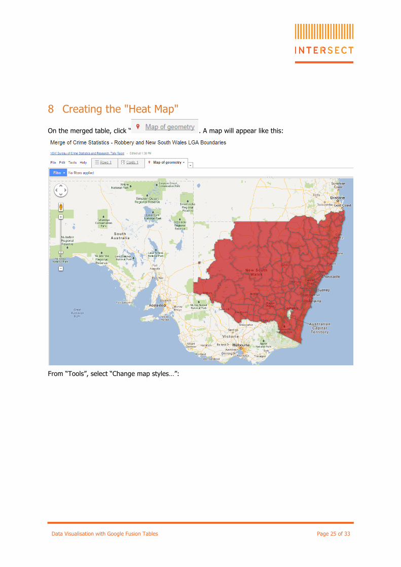
8 Creating the "Heat Map"
On the merged table, click “ . A map will appear like this:
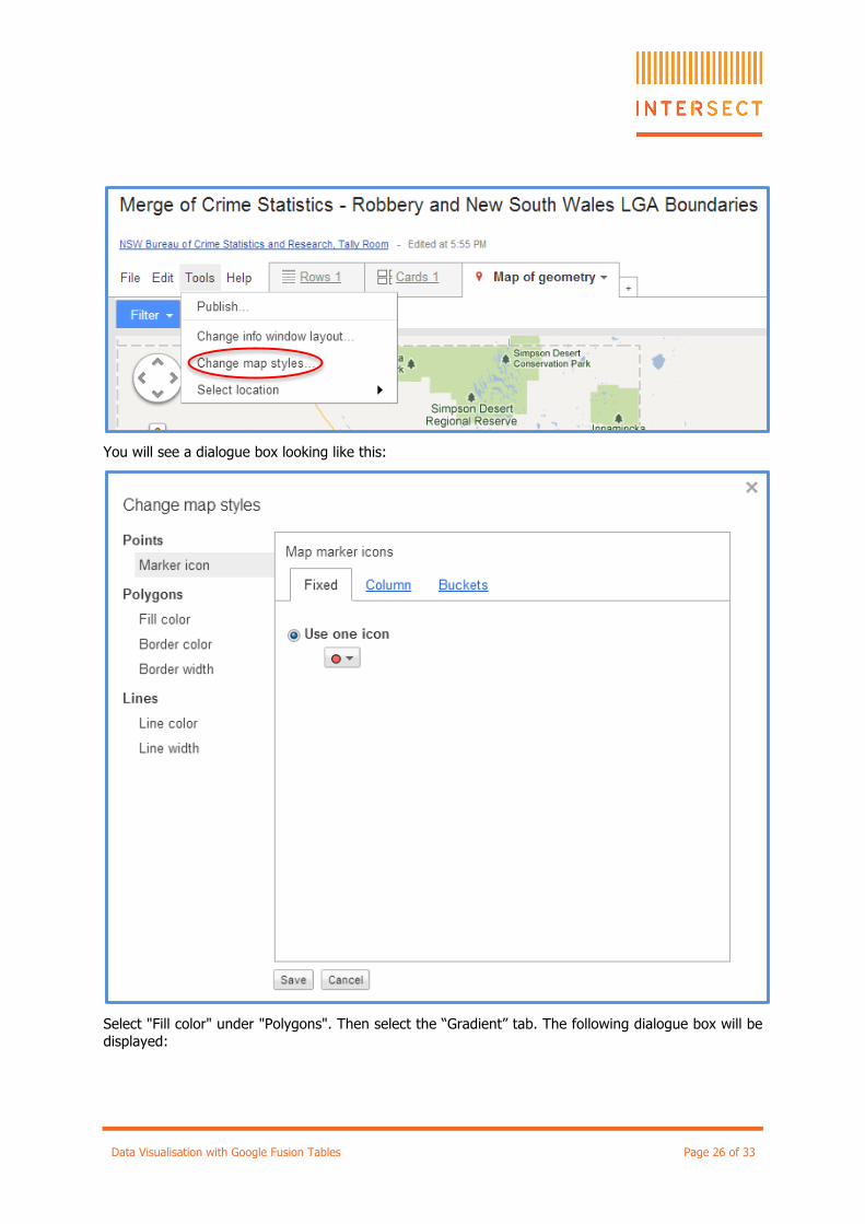
From “Tools”, select “Change map styles…”:
Data Visualisation with Google Fusion Tables Page 26 of 33
You will see a dialogue box looking like this:
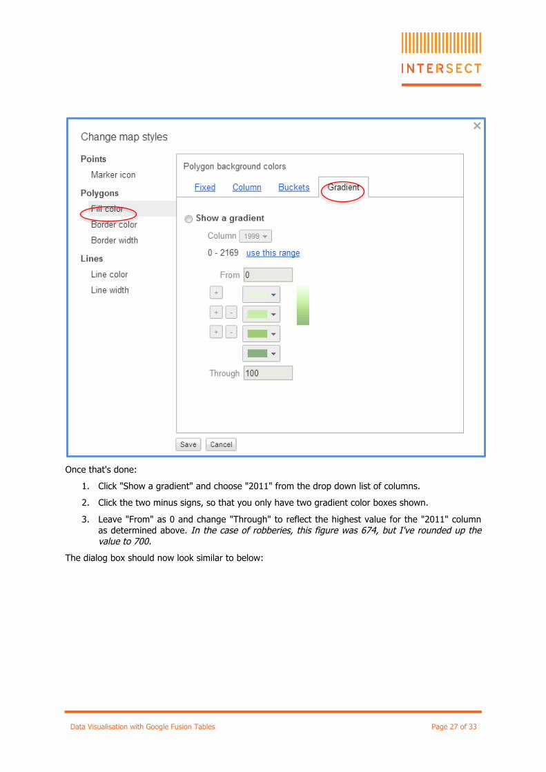
Select "Fill color" under "Polygons". Then select the “Gradient” tab. The following dialogue box will be displayed:
Data Visualisation with Google Fusion Tables Page 27 of 33
Once that's done:
1. Click "Show a gradient" and choose "2011" from the drop down list of columns.
2. Click the two minus signs, so that you only have two gradient color boxes shown.
3. Leave "From" as 0 and change "Through" to reflect the highest value for the "2011" column as determined above. In the case of robberies, this figure was 674, but I've rounded up the value to 700.
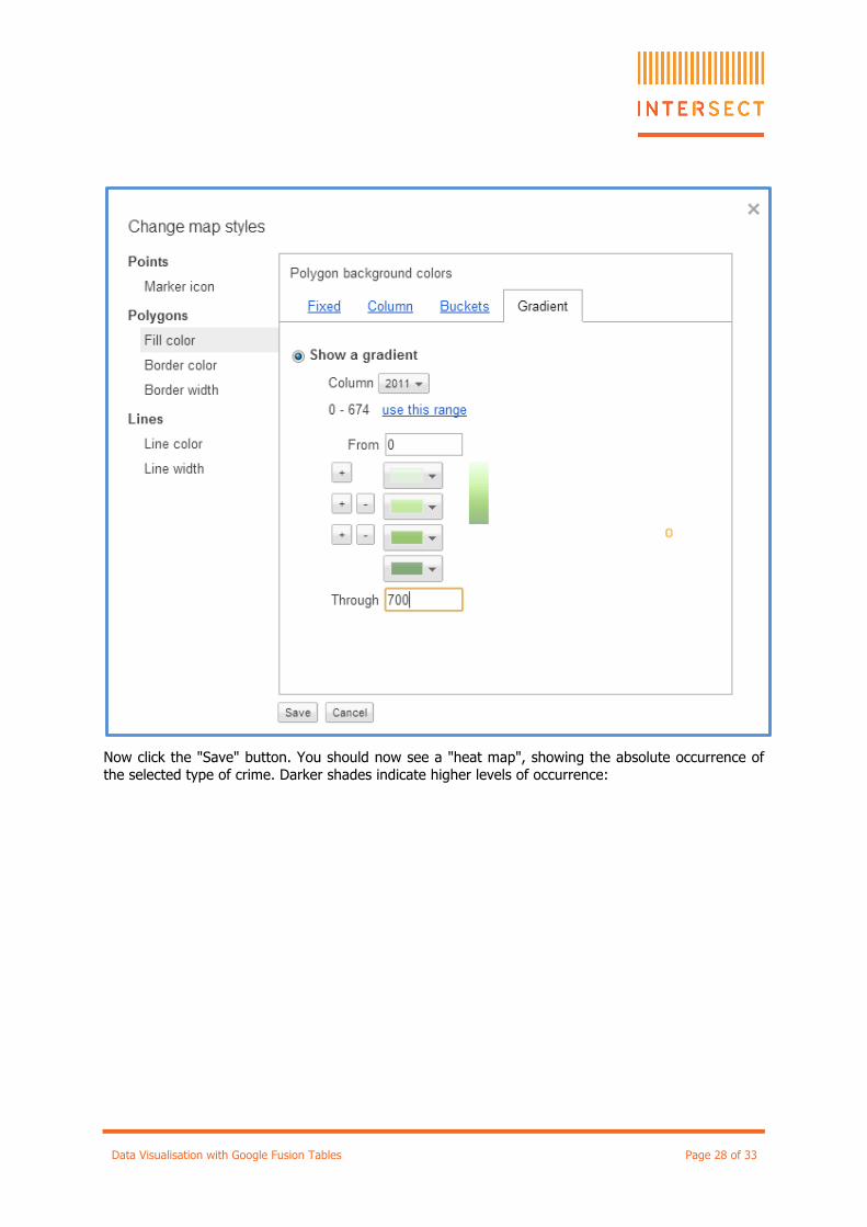
The dialog box should now look similar to below:
Data Visualisation with Google Fusion Tables Page 28 of 33
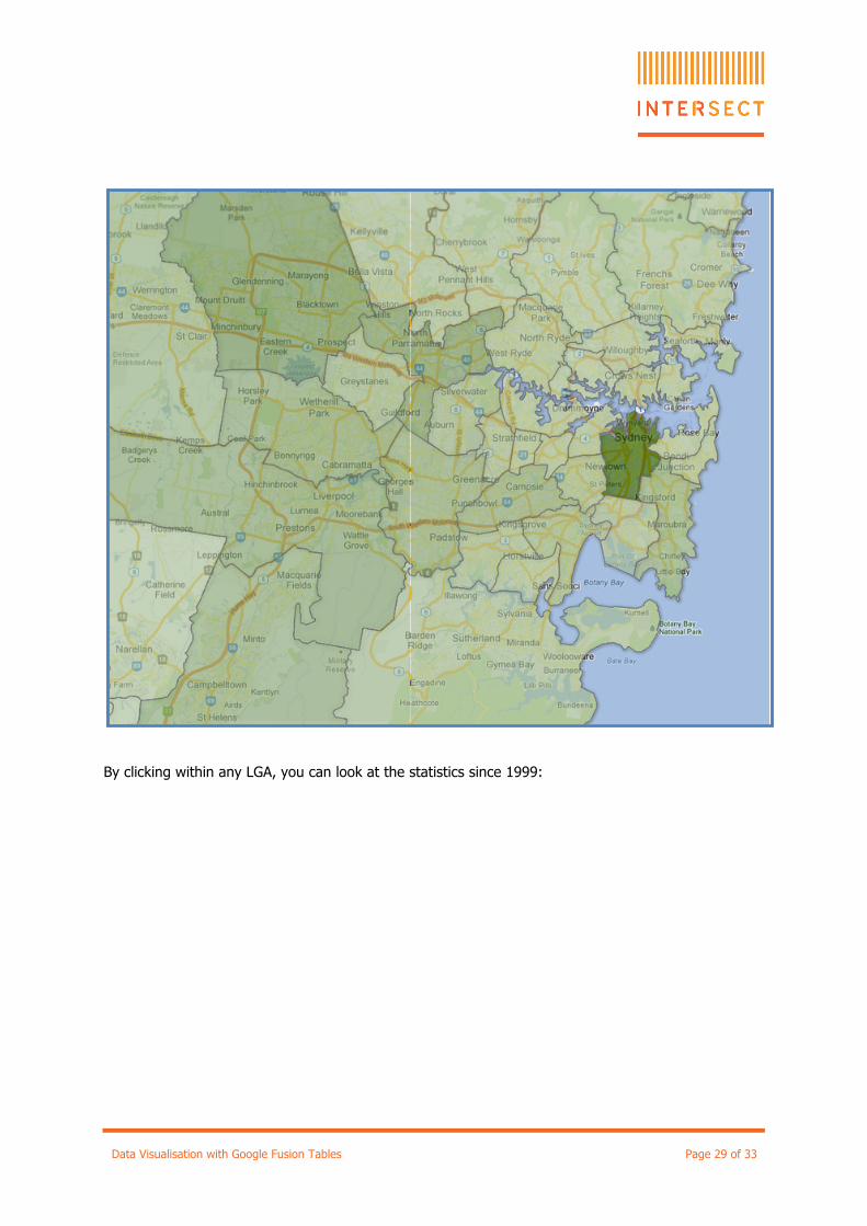
Now click the "Save" button. You should now see a "heat map", showing the absolute occurrence of the selected type of crime. Darker shades indicate higher levels of occurrence:
Data Visualisation with Google Fusion Tables Page 29 of 33
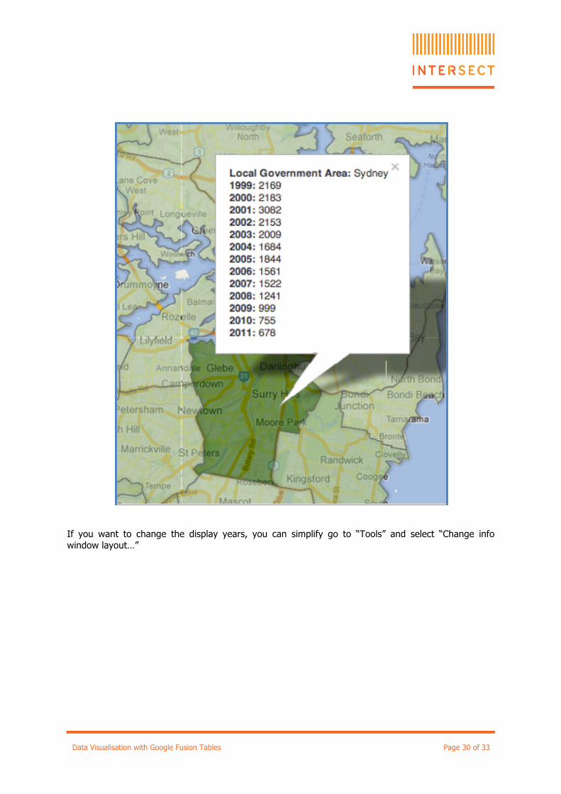
By clicking within any LGA, you can look at the statistics since 1999:
Data Visualisation with Google Fusion Tables Page 30 of 33
If you want to change the display years, you can simplify go to “Tools” and select “Change info window layout…”
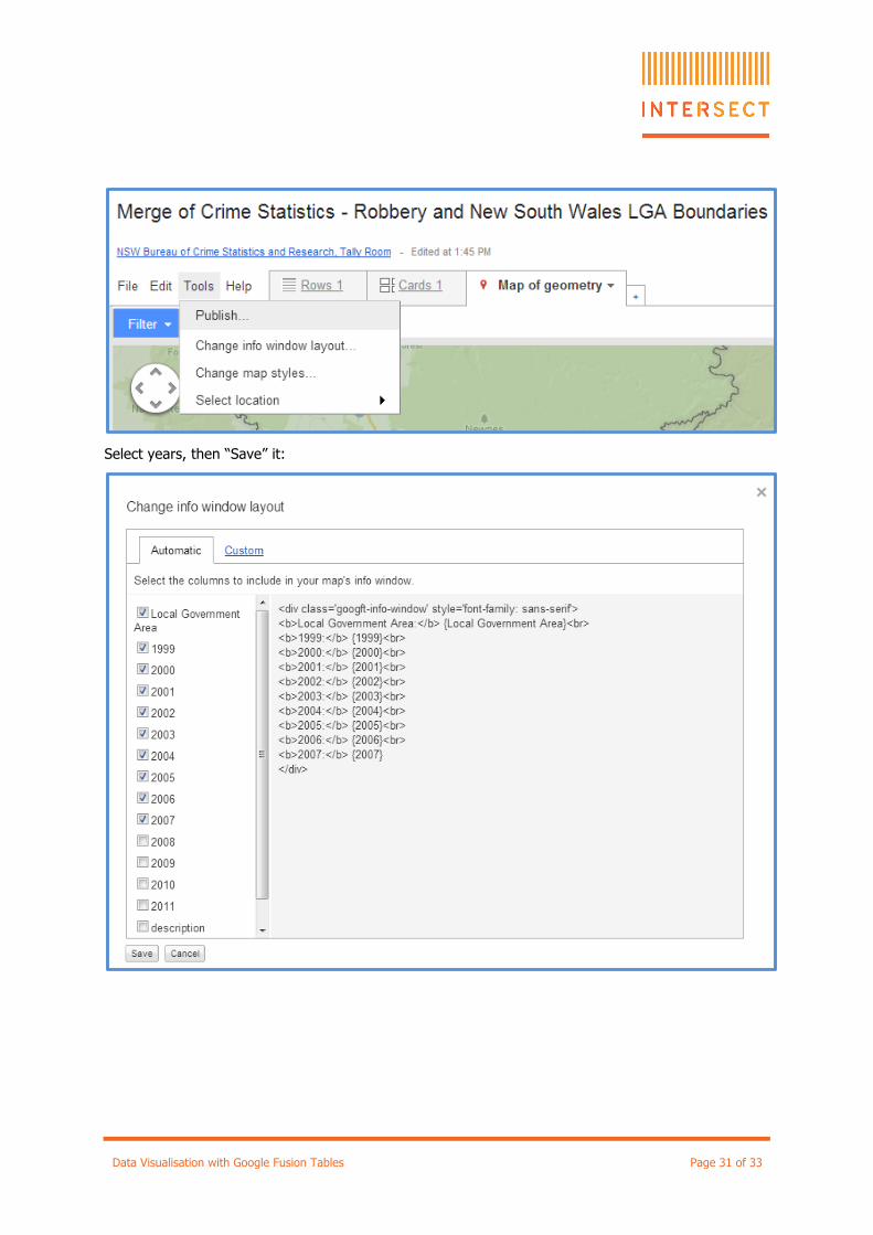
Data Visualisation with Google Fusion Tables Page 31 of 33
Select years, then “Save” it:
Data Visualisation with Google Fusion Tables Page 32 of 33
Other Things to Try Here are some suggestions for further experimentation:
• Try changing the heat map to reflect the statistics for a different year.
• Try “Change info window layout” to display only some of the columns.
• Try changing the colour of the gradient on the heat map.
Data Visualisation with Google Fusion Tables Page 33 of 33
Revision History
Version No. Revision Date Summary of Changes Revised by
1.0 16 July 2012 Initial Document Dr Luc Small
1.1 19 July 2012 Changed to include Excel section Dr Luc Small
1.2 23 July 2012 Small adjustments following trial presentation
Dr Luc Small
1.3 07 February 2013 Presentation updated to match changes to new Google drive lay out.
Wei Cai
1.5 12 April 2017 Updated link to new BOCSAR website Richard Berry


![Department of Computer Science, edlib.asdf.res · Google Fusion Tables [4] is a cloud-based service for data management and integration. Launched in 2009, Fusion Tables has received](https://img.pdfslide.us/doc/110x75/5f81603bf7f7323e190f6f7f/department-of-computer-science-edlibasdfres-google-fusion-tables-4-is-a-cloud-based.jpg)

![A Synchronization Protocol for ODK Tables and ODK Aggregate...3.2 Google Fusion Tables Google Fusion Tables [6] is a service o ered as part of Google Docs which provides access to](https://img.pdfslide.us/doc/110x75/5f362a9666c2416aa8416f6a/a-synchronization-protocol-for-odk-tables-and-odk-aggregate-32-google-fusion.jpg)