Embed Size (px)
Citation preview

Data Analyses and Presentation
Most research in science involves doing experiments or making observations that results in numerical data. The numbers, by themselves, usually don’t mean much. Consequently, they need to be manipulated, analyzed, and presented in ways that you and others can interpret.
Many data analyses in science are one of two types. The first type assesses possible relationships between two variables (X and Y). In other words, as X changes, what happens to Y? The left side of the flowchart shows these types of analyses. The other common type of statistic is one that assesses possible differences between two or more groups of numbers. For example, is there a statistical difference between body weights of female and male ladybugs? Tests that can help answer questions like this are shown on the right side of the flowchart.
This document includes an introduction to Instat software that makes these statistical analyses easy to run and understand. Also included is help in interpreting the P-values that statistical tests generate. To help with the task of displaying data, look at the step-by-step instructions on the use of Prism. Finally, examples of both deficient and improved tables and figures are shown to help with questions about formatting.
1

2
DATA ANALYSES USING INSTAT SOFTWARE RELATION OF XY DATA: CORRELATIONS & REGRESSION
EXAMPLE 1
Describe the relationship, if any, between body wrights (g) and lung lengths (mm) in garter snakes. Predict the length of the lung in a 10.9 g snake.
Lung Body length Snake wt. (g) (mm) 1 3.1 1.1 2 4.7 2.8 3 5.2 3.1 4 7.9 4.7 5 10.2 5.0 6 14.7 5.9 7 14.9 6.8 8 16.3 7.5 9 17.8 7.4 TASK: Create a scatterplot with body weight as the independent variable (X) and lung length as the dependent variable (Y). STEP 1. Open Instat. Under Specify Your Goal, click on Regression and correlation. Now click the blue Enter data arrow. (If you see an annoying Help Guide pop-up, press: tab tab space bar enter) STEP 2. Type in Body Weight and Lung Length as column headings for X and Y1. Type in the data. STEP 3. Click the blue arrow to advance to the Which test? screen. Click on Linear regression and then advance to the next screen. The slope and Y-intercept of the regression line is shown in the Best-fit Value column. Below that table you see both the correlation coefficient (r) and the coefficient of determination (r2). STEP 4. To protect an unknown lung length from a known body weight, click back to the data table. At the bottom of the data table, type in the known body weight. Skip forward to the Results screen and find the predicted lung length at the bottom. STEP 5. Lastly, click forward to the graph screen. You should see a scatterplot and linear regression line. You will also see a pair of confidence interval lines that we won’t discuss in this course. Note that the graph is rather crude and that Instat does not let you manipulate it. This type of graph is not intended for presentations.

3
EXAMPLE 2 Describe the relationship, if any, between age (yrs) and plasma estradiol concentration (ng/mL) in female leatherback turtles. Predict the hormone concentration in a 23 year-old turtle? Look at the scatter plot and think about the reliability of your prediction. Estradiol Turtle Age (yrs) (ng/mL) 1 6 56.3 2 6 65.3 3 7 47.8 4 9 89.5 5 12 55.5 6 14 60.1 7 15 22.4 8 16 99.7 9 19 43.2 10 24 79.0 11 26 67.4 12 27 36.7 13 28 88.2
DIFFERENCES BETWEEN MEANS & MEDIANS
HYPOTHESIS TESTING: 2-SAMPLE TESTS Data from scientific research often requires analysis in the form of simple comparisons. Let’s assume that we’re interested in comparing body temperatures in tree frogs and anole lizards. Let’s also choose to do our work with the help of a hypothesis. Hypotheses can be stated in a variety of ways;
- Frogs and lizards do not have equal body temperatures. - Frogs have lower body temperatures than lizards. - Frogs have higher body temperatures than lizards.
Or, a formal statement of a null hypothesis would be
- Ho: There is no difference in body temperature in frogs and lizards. After making the temperature measurements shown below, we want to address our hypothesis by using a statistical test. Two tests are commonly used to make two-sample

comparisons: the unpaired t test (1st choice) and the Mann-Whitney test (2nd choice). The following flowchart addresses how that choice is made. Frog Lizard temp. temp. (oC) (oC) _____________________ 17.3 24.2 16.4 17.9 17.9 26.4 20.7 22.4 18.1 18.8 17.8 32.4 15.9 28.4 16.2 19.0 17.3 27.1 15.8 22.8 29.0 19.8
4

5
Follow the steps below to use INSTAT to run a 2-sample test on the body temperature data. STEP 1. Find and open INSTAT on your network drive. The opening screen asks you to make some choices about your analyses and data. Under A. Specify your goal, click on Compare means (or medians). Under B. Choose a data entry format, click on raw data. STEP 2. To move to the next screen, click on the blue arrow pointing to the right and view the empty spread sheet. At the top of the spread sheet, type an informative title. Type ‘frogs (C)’ above the Group A column and ‘lizards (C)’ above the Group B column. Enter the raw data in the appropriate cells for each column. After double-checking the accuracy of your input, click on the blue arrow to move forward in the process. The next screen is a summary of descriptive statistics for the frog and lizard data. Means and estimates of variability can be obtained from this display. STEP 3. Click on the blue arrow to advance to the next screen. Here you are asked to answer three questions about your data and your assumptions. Your answers to these questions will determine which statistical test is run.
1. Is there value paired with the value next to it? Click No. Perform unpaired test. (Paired tests are relatively rare. Example: Blood pressure measurements in a group of patients that received a drug that alleviates high blood pressure. The ‘before drug’ blood pressure measurement is necessarily paired with the ‘after drug’ measurement for each patient. For these data a paired test is necessary).
2. Assume values are sampled from Gaussian distributions? (Gaussian distribution, normal distribution, and bell-shaped curve can be used interchangeably to describe data). Click on Yes. Also assume the populations have equal SDs. These choices will ensure that your statistical test will be a parametric type of test (e.g., a t test).
3. One- vs two-tail P value. Click on Two-tail P value (see handout that discusses one-vs two-tail P values).
STEP 4. Click on the blue arrow to move to the next screen to find the statistical results. Based on our choices above, the unpaired t test was run on the frog and lizard data. Inspect the output to determine if the unpaired t test revealed a significant difference and, more importantly, if any assumptions for parametric testing were violated. On the output page under P value, it is clear that the body temperatures are statistically different. Skipping down to Assumption test: Are the data sampled from Gaussian distributions?, we’re told that both the frog and lizard data passed a test for normality. So far so good. Upon reading Assumption test: Are the standard deviations equal?, however, you’re informed that the assumption of equal standard deviations for the raw data has been violated. Fortunately INSTAT makes some suggestions about optional alternative statistical tests. The preferred option involves switching to a nonparametric type of test that doesn’t require assumptions about the data. To make this switch, click on the backward blue arrow to return to the screen with the three questions. Under question 2, click on No. Perform nonparametric test. Then click on the forward blue arrow to obtain results. INSTAT will have run the nonparametric Mann-Whitney test. Note that this test compares medians and not means. The result from the Mann-Whitney test is that the median frog and lizard body temperatures are significantly different (p<0.0001). A typical way to report this outcome in a lab report would be

‘The body temperatures of tree frogs and anole lizards are significantly different (Mann-Whitney test, P< 0.0001).’
INTERPRETING P VALUES IN HYPOTHESIS TESTING This discussion and example have been taken from the unusually readable statistics book by H. Motulsky (1995, Intutitive Biostatistics, Oxford Univ. Press, New York). Key concepts are null hypothesis, alternative hypothesis, p value, one- and two-tailed values. To demonstrate these concepts by way of example, suppose that we are interested in whether systolic blood pressure differs between first and second year medical students. We suspect that the stress of medical school may cause increased pressure. Even though we suspect a difference, we usually begin by stating a null hypothesis (Ho):
Ho: no difference in blood pressure We don’t have the time, resources, or inclination to measure blood pressure in all of the students, Instead, we will take a random sample of 5 students from each class: MS1: 120, 80, 90, 110, 95 mean = 99 MS2: 105, 130, 145, 125, 115 mean = 124 A scatterplot (with means) of the data are shown below (taken without modification from Motulsky 1995). If we assume that the samples were randomly drawn and that our other methods were sound, there are two possible explanations for these data: (1) blood pressures in the two groups are actually identical although they appear different simply by chance, i.e., we just happened to select second year student with high pressure, or (2) MS2 blood pressure really are higher as the data suggest.
6

7
To test our hypothesis, we decided to use an unpaired t-test that produced a P value of 0.034. How do we interpret the P value? Here’s how: If the null hypothesis were true (no differences), then 3.4% of all possible experiments of this size would result in a difference between mean blood pressures as large as (or larger than) we observed. In other words, if the null hypothesis were true, there is only a ¾% chance of randomly selecting samples whose means are a far apart (or further) than we observed. You may be tempted to conclude that if there is a ¾% probability that our difference could have been caused by random chance, then there must be a 96.6% chance that it was caused by a real difference. Wrong --- not a valid conclusion. What you can say is that if the null hypothesis is true, then 96.6% of experiments would lead to a difference smaller than the one we observed and 3.4% of experiments would lead to a difference as large or larger than the one we observed. P values are based on the assumption that the null hypothesis is correct. A critical task is to decide if that assumption is a good one. The P value cannot tell you that. Enter human judgment. You must decide whether the calculated probability (P value) is so small that the null hypothesis must be rejected. Here is where most scientists rely on standard conventions (P < 0.05 or P < 0.01) that arbitrarily determine if a calculated P value is significant.
Using One-tailed P values vs Two-tailed P values A two-tailed P value is the probability (assuming the null hypothesis) that random sampling would result in blood pressures as large or larger than the observed difference with either group of medical students potentially being the larger (MS1 > MS2 or MS2 > MS1). A one-tailed P value is the probability (assuming the null hypothesis) that random sampling would produce a blood pressure difference as large or larger than the observed difference and that the group specified in advance by the “alternative” hypothesis (see below) has the larger mean. Since we did specify in advance that there was reason to suspect that MS2 > MS1, we would be justified in using a one-tailed P value. Unfortunately, statisticians argue among themselves over the appropriateness of one- and two-tailed tests. That’s worrisome to us nonstatisticians. Here is a reasonable way of deciding which one to use. When the null hypothesis is stated, it is common to also state what is called the alternative hypothesis (Halt). For our experiment, we could have stated hypotheses couple of different ways:
1 Ho: there is no difference in blood pressure Halt: there is a difference in blood pressure
2 Ho: there is no difference in blood pressure Halt: MS2 > MS1
Note that the first alternative hypothesis indicates a difference in blood pressure, but it doesn’t indicate which group of students might have the higher pressures. MS1 > MS2 would satisfy this hypothesis, but so would MS2 > MS1. In this case, a two-tailed P value would be appropriate. The second alternative hypothesis indicates an explicit “direction”, i.e., MS2 > MS1. In this case, a one-tailed P value would be appropriate. The statistical software that we’ll be using this semester (INSTAT) recommends always using a two-tailed P value. That simplifies matters and is acceptable for this course. Just make sure that you explicitly state which P value you use (one- or two-tailed).

Displaying Scientific Data: THE BIG 3
Numerical data are often shown graphically – especially if the objective is to display trends or patterns in the numbers. Although scientific research and the data it produces are extremely diverse, there are only three fundamental types of graphs that are commonly used. They are the histogram (bar graph), scatter plot, and symbol and line graph. Examples of each type are shown below.
(1) The “HISTOGRAM” is a good choice to display data for discrete groups of numbers. The entries on the X axis often represent named categories (“nominal” scale), e.g., spring spiders, summer earthworms, etc. Each bar in a histogram usually represents a mean and the error bar on top of the bar is usually one standard deviation or one standard error of the mean (SEM). If the histogram is complex, it is useful to show a key that differentiates bars by defining fill patterns.
8

(2) The “SCATTER PLOT” excels at showing the distribution of single data points as the independent variable changes. If the data points collectively appear approximately linear, it can be helpful to add a best-fit line from linear regression analysis. The line helps the eye see the underlying linearity. (3) Finally, the “SYMBOL AND LINE GRAPH” is an effective way of showing trends in a series of means. Each symbol represents a mean. The error bar extending above the symbol represents either one standard deviation or one SEM. The same goes for the error bar extending down from the symbol. Note that the lines on the graph connect the means and are not a result of linear regression.
9
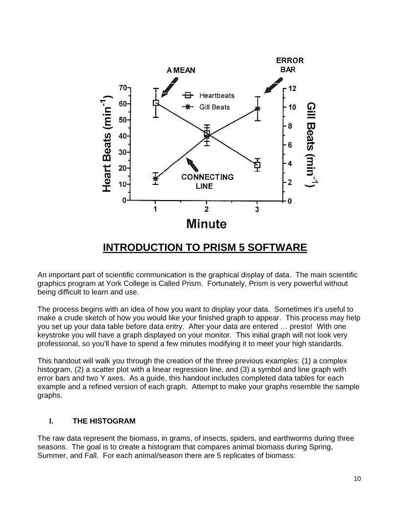
INTRODUCTION TO PRISM 5 SOFTWARE
An important part of scientific communication is the graphical display of data. The main scientific graphics program at York College is Called Prism. Fortunately, Prism is very powerful without being difficult to learn and use. The process begins with an idea of how you want to display your data. Sometimes it’s useful to make a crude sketch of how you would like your finished graph to appear. This process may help you set up your data table before data entry. After your data are entered … presto! With one keystroke you will have a graph displayed on your monitor. This initial graph will not look very professional, so you’ll have to spend a few minutes modifying it to meet your high standards. This handout will walk you through the creation of the three previous examples: (1) a complex histogram, (2) a scatter plot with a linear regression line, and (3) a symbol and line graph with error bars and two Y axes. As a guide, this handout includes completed data tables for each example and a refined version of each graph. Attempt to make your graphs resemble the sample graphs.
I. THE HISTOGRAM The raw data represent the biomass, in grams, of insects, spiders, and earthworms during three seasons. The goal is to create a histogram that compares animal biomass during Spring, Summer, and Fall. For each animal/season there are 5 replicates of biomass:
10

11
Spring Summer Fall Insects 227 g 321 864 201 241 513 98 189 399 132 328 764 75 246 614 Spiders 128 150 311 89 98 264 62 213 209 162 121 187 151 54 351 Earthworms 23 87 546 59 188 298 188 213 612 153 165 377 93 111 192 Where do we start? Our first task is to find Prism on the network. Use your mouse to click on My Computer and then open Program4 on Dragon. Click on Prism5 and then click on prism.exe… We’re there! On the “Welcome to GraphPad Prism” page, there are some important choices to be made. To begin making a histogram, select Grouped in the blue area on the left side of the page. Click on either the 1st or 3rd histogram example (either should work). At the bottom of the page you will find some choices about Y variables. Choose 5 replicates for Y … this makes sense because each animal/season consists of 5 replicates. Click Create. You are now looking at an empty data table. Navigating around the data table can be done by the mouse or, more easily, by the arrow keys. In the far left column, enter the word Spring in row 1, Summer in 2, and Fall in 3. The column title for the first set of 5 Y’s should be insects. The next set of 5 Y’s should be Spiders and the last 5 should be Earthworms. Now enter the data, filling the cells of the data table. Your completed data table should resemble the one displayed later in this handout. After the data are entered, you may view a crude first version of the histogram by clicking on “Graphs” to the left of the spreadsheet. Before getting too far, save your file (data table and graph) to a desired location. Next comes the really fund part of the process, i.e., shaping and refining to create a clear and sophisticated “publication-ready” graph. Useful tip: The most important tool in Prism is the Change menu (explore it!).

12
To change the label on the X axis, click on “Xtitle” and then type “Season”. To change the size of the label, you must first highlight it. The Text tool area at the top of the page allows you to manipulate text in many ways … explore this. Numbers and text anywhere on the graph can be similarly modified. The length of an axis can be changed by clicking on the axis and then dragging the little black box in the desired direction. The effectiveness of the Y axis on this graph can be improved. Double-click on the axis and then unclick Automatically determine…. You may now choose a preferred minimum and maximum for the numbers on the Y axis. This is also a good time to use the many tick options to create the desired look. Click “OK” to view the improvement. Get rid of the default title at the top of the graph by highlighting and deleting. The key on a graph indicates what the symbols, bars, or lines are representing. While useful, Prism may initially place the key in an undesirable location. Here is how to move the entire key as a unit. While depressing the shift key, sequentially click on Insects, Spiders, and Earthworms. When all three are framed, drag the entire key to the desired location. Before printing, let’s change the fill pattern on the bars in our graph to better differentiate them. Under “Change”, click on “Bar Appearance”. Match the Fill, Pattern, and Border to the desired “data set” displayed at the top of this window. Modify error bars to your liking. Click OK to see if you made a good choice.
PRINTING If using a black and white printer, avoid using color on your graph. When you are pleased with the appearance of your graph, click on “layout” on the far left of the screen. Double-click on the upper left choice and then again on the empty page. Select the name of the graph that you wish to print and click OK. Once in layout, drag your graph anywhere on the page. Click, hold, and drag any of the four dots that surround your graph in order to change its printed size. Finally, click on the print icon and then click OK.
II. THE SCATTER PLOT This example is a scatter plot that shows two different sets of data on one XY graph. Each set of data will appear on the finished graph along with its best-fit line and linear regression information. The two sets of data are the weights (grams) and volumes (mL) of red delicious apples and crab apples. The weight/volume raw data of the red delicious are 56/612, 67/550, 70/569, 89/771, 91/548, 109/911, 113/892, 142/1003, 154/1211, and 159/967. Weights and volumes for the crabs are 31/272, 34/201, 44/312, 49/319, 55/452, 61/392, 73/500, 80/525, 81/505, and 89/425. To begin working, open a new file and return to the “Welcome to GraphPad Prism” page. Under New Table and Graph, select the XY choice. Then select the first graph (showing points only).

13
Our independent variable, X, will be apple weights. Note that the dependent variable Y is not replicated. For each X, there is only one Y. Consequently, select “enter and plot a single Y value for each point”. Click “create” to see the empty data table. Enter the red delicious XY data to complete your data table and then click on “Graphs” to the left of the spreadsheet. Modify your graph by using the Change menu. To display a regression like, select linear regression on the Analyze part of the tool bar. After clicking OK, a best-fit line should appear on the scatter plot. To find the slope and Y-intercept, click on “results” to the left of the graph. The first two entries in results are slope (5.586) and intercept (216.9)... use them to create the equation for the line. Place the equation on the graph using a text box (“T” button). To obtain r, find r2 (0.8084) and take the square root. To add the data for crab apples, click on New on the tool bar and then on New Data Table. After entering the data, go to Change and select Add Data Sets. Highlight Data 2 and then add it. Commence refining.
III. THE SYMBOL AND LINE GRAPH Our last data set involves measurements of heartbeats and gill beats over a 3-minute interval. Using time as the independent variable (X), plot both types of data on the same graph. Our goal is to create a “symbol and line graph” with error bars around the means for heart beats and gill beats. At each minute, there are 6 replicates: Minute 1 Heartbeats Gill Beats 78 2 71 5 50 1 89 1 32 3 44 2 Minute 2 60 4 32 9 51 9 29 4 47 7 33 8 Minute 3 19 10 29 14 39 8 15 5 12 10 20 12

14
To format the data table, choose XY Graph and then select the second graph (“Points and connecting line”). For Y, select 6 replicates. Click Create. Complete the data table and then click on “Graphs”. Notice that the Y axis is scaled well for heartbeats but not for gill beats. Let’s therefore retain the left Y axis for heartbeats and add a right Y axis that will be scaled for gill beats. To do this, double click on one of the gill beat data points. At the bottom of the screen, select right Y axis and then click OK. You should now see a right Y axis that is roughly scaled for gill beat data. Commence refining. INPORTANT: End your Prism session by going to File Menu and exiting—do not use the “X” option in the upper right corner of the screen.

15

16

17