Embed Size (px)
Citation preview
Dashboards and Visual Discovery: More than Just Pretty BI By Cindi Howson
© 2012 BI Scorecard November 2012
www.biscorecard.com
Sponsored by:
Dashboards, once high-tech-but-static solutions reserved for senior executives, have evolved to become the face for self-service, mainstream business intelligence. Dashboards provide workers at all levels of an organization an at-a-glance view of the most important metrics, helping managers manage, front-line workers perform, and ensuring everyone is aligned to the goals of the business. Dashboards provide a starting point for exploration. Through alerts and engaging visualizations, dashboards reveal problems and opportunities and enable easy exploration of information. Linking insight to action, the best dashboards allow a decision maker to invoke an action, whether to restock inventory, contact a customer, or reroute a flight.
This whitepaper discusses the importance of dashboards in a BI portfolio, innovations influencing dashboard design, typical uses cases, and the changing role of business and IT in designing dashboards.
1
About the Author
CINDI HOWSON is the founder of BI Scorecard®, a resource for in-depth BI product reviews, based on exclusive hands-on testing. She has been advising clients on BI tool strategies and selections
for 20 years. She is the author of Successful Business Intelligence: Secrets to Making BI a Killer App. Prior to founding BI Scorecard®, Howson was a manager at Deloitte & Touche and a BI standards leader for a Fortune 500 company. She is a TDWI (The Data Warehousing Institute) faculty member and a contributing expert to Information Week. She has an MBA from Rice University.
MicroStrategy is a leading provider of enterprise software platforms for business intelligence (BI), mobile intelligence, and social intelligence applications. MicroStrategy’s BI platform enables leading organizations worldwide to analyze the vast amounts of data stored across their enterprises to make better business decisions. Companies choose MicroStrategy BI for its ease-of-use, sophisticated analytics, and superior data and user scalability. MicroStrategy provides best of breed, IT-developed and business-user-developed dashboards in a single platform, offering the best experience for users across the entire enterprise. Whether developed in the Cloud and accessed via Mobile, or developed on the Web and accessed from the Cloud, MicroStrategy provides the most flexibility for creation and sharing of dashboards. MicroStrategy’s mobile intelligence platform helps companies and organizations build, deploy, and maintain mobile apps across a range of solutions by embedding intelligence, transactions, and multimedia into apps. MicroStrategy’s social intelligence platform includes a number of applications that help enterprises harness the power of social networks for marketing and e-commerce, as well as a suite of free consumer friendly apps that use MicroStrategy’s enterprise technologies. The MicroStrategy Cloud offering combines MicroStrategy and third-party software, hardware, and services to enable rapid, cost-effective development of hosted BI, mobile, and social applications.
Dashboards and Visual Discovery: More than Just Pretty BI
Percent of Survey Respondents
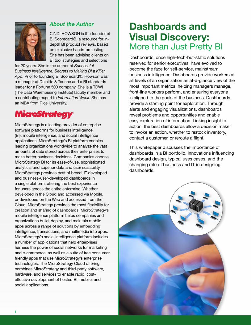
Standard, Fixed Reports
Business Query
Dashboards
OLAP
Portal
Office BI
Visual Discovery
Scorecards
Embedded BI
Predictive
Mobile
Success of BI Modules
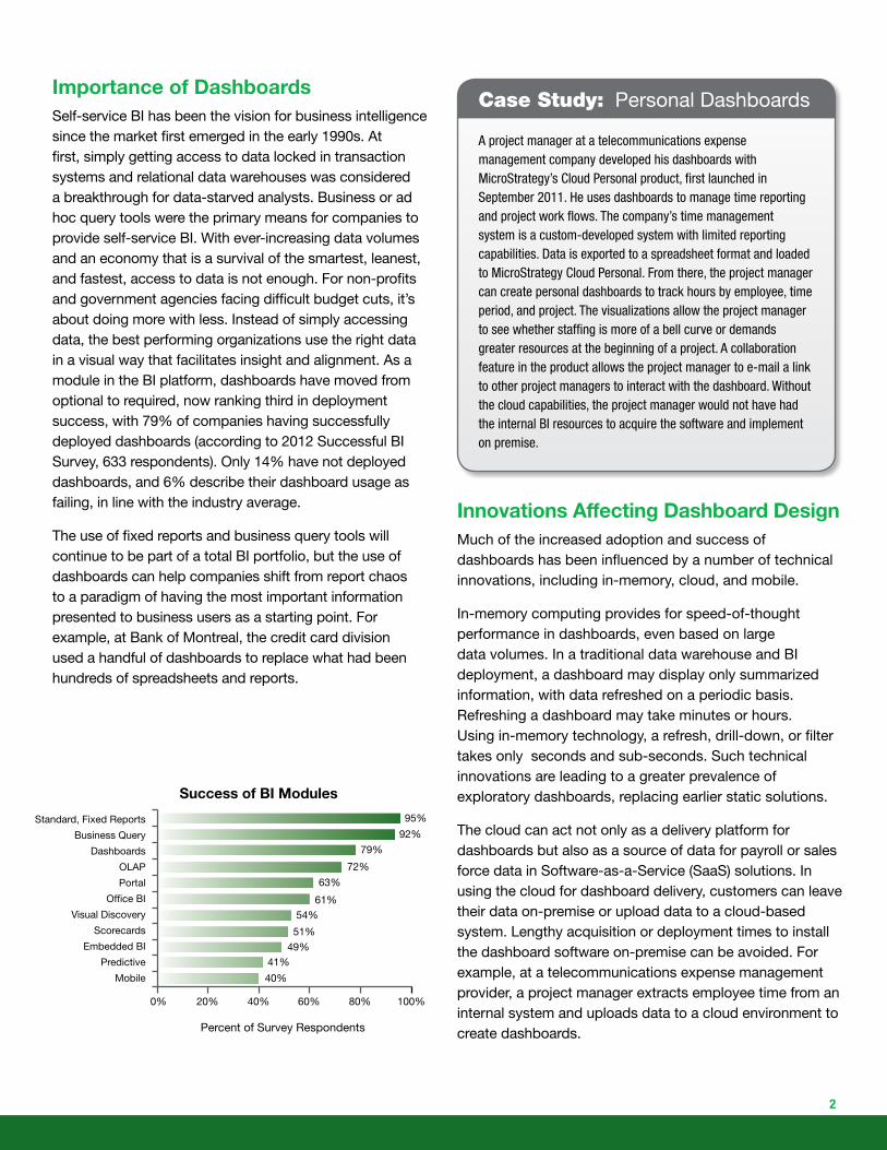
Case Study: Personal Dashboards
A project manager at a telecommunications expense management company developed his dashboards with MicroStrategy’s Cloud Personal product, first launched in September 2011. He uses dashboards to manage time reporting and project work flows. The company’s time management system is a custom-developed system with limited reporting capabilities. Data is exported to a spreadsheet format and loaded to MicroStrategy Cloud Personal. From there, the project manager can create personal dashboards to track hours by employee, time period, and project. The visualizations allow the project manager to see whether staffing is more of a bell curve or demands greater resources at the beginning of a project. A collaboration feature in the product allows the project manager to e-mail a link to other project managers to interact with the dashboard. Without the cloud capabilities, the project manager would not have had the internal BI resources to acquire the software and implement on premise.
Importance of DashboardsSelf-service BI has been the vision for business intelligence since the market first emerged in the early 1990s. At first, simply getting access to data locked in transaction systems and relational data warehouses was considered a breakthrough for data-starved analysts. Business or ad hoc query tools were the primary means for companies to provide self-service BI. With ever-increasing data volumes and an economy that is a survival of the smartest, leanest, and fastest, access to data is not enough. For non-profits and government agencies facing difficult budget cuts, it’s about doing more with less. Instead of simply accessing data, the best performing organizations use the right data in a visual way that facilitates insight and alignment. As a module in the BI platform, dashboards have moved from optional to required, now ranking third in deployment success, with 79% of companies having successfully deployed dashboards (according to 2012 Successful BI Survey, 633 respondents). Only 14% have not deployed dashboards, and 6% describe their dashboard usage as failing, in line with the industry average.
The use of fixed reports and business query tools will continue to be part of a total BI portfolio, but the use of dashboards can help companies shift from report chaos to a paradigm of having the most important information presented to business users as a starting point. For example, at Bank of Montreal, the credit card division used a handful of dashboards to replace what had been hundreds of spreadsheets and reports.
Innovations Affecting Dashboard DesignMuch of the increased adoption and success of dashboards has been influenced by a number of technical innovations, including in-memory, cloud, and mobile.
In-memory computing provides for speed-of-thought performance in dashboards, even based on large data volumes. In a traditional data warehouse and BI deployment, a dashboard may display only summarized information, with data refreshed on a periodic basis. Refreshing a dashboard may take minutes or hours. Using in-memory technology, a refresh, drill-down, or filter takes only seconds and sub-seconds. Such technical innovations are leading to a greater prevalence of exploratory dashboards, replacing earlier static solutions.
The cloud can act not only as a delivery platform for dashboards but also as a source of data for payroll or sales force data in Software-as-a-Service (SaaS) solutions. In using the cloud for dashboard delivery, customers can leave their data on-premise or upload data to a cloud-based system. Lengthy acquisition or deployment times to install the dashboard software on-premise can be avoided. For example, at a telecommunications expense management provider, a project manager extracts employee time from an internal system and uploads data to a cloud environment to create dashboards.
2
Case Study: Moving from Spreadsheets to Dashboards to Service Credit Card Customers
At Bank of Montreal, dashboards enable the sales force to better serve the bank’s corporate card customers. The Corporate Card division of the bank issues cards to corporations to simplify procurement and expense reimbursement. Some cards may be used for a wide range of purchases, and some may be for particular expense times. For example, supply chain customers may use fuel cards for drivers to purchase gas only. The bank uses both management-style and operational dashboards. Management uses dashboards to see which types of cards are most active and how they are performing, by different dimensions such as region, industry, and time period. Sales people use operational dashboards to track activity by customer and to ensure service levels are met.
The credit card division started on their dashboard development two years ago, replacing what was largely a manual, spreadsheet-based system. Data was exported from 60 or so reports into spreadsheets, where managers could explore data in different worksheets. The spreadsheets were becoming unmanageable, so a power user in the business developed a handful of dashboards that replaced hundreds of individual reports. The dashboards have selectors and drill-down to allow managers to explore data in an easier, and more efficient way. Sales people and managers can access a disconnected .mht file that allows dashboards to be accessed and interacted with from a laptop, while disconnected
from the bank or at a customer site.
With the release of the iPad in 2010, tablet devices have revolutionized mobile BI and brought the power of mobile to dashboards. There are now a number of Android-based tablets (Motorola Xoom, Samsung Galaxy), and Microsoft’s Surface. Now dashboards are not purely desktop solutions, accessible only via a browser, but instead, traveling executives expect to use them on the road, sales people while visiting customers, and store managers while inspecting store aisles. With the right security and caching, dashboards can be viewed and interacted with even when disconnected from a corporate network. While smartphones are still useful tools for accessing nuggets of information and alerts, tablet devices, with their larger screen sizes, allow for mobile dashboards and have largely replaced printed reports. Touches and swipes replace mouse clicks, and offline dashboards replace voluminous paper briefing books. Business users have finally declared that BI is easy.
An early adopter of dashboards on the iPad has been Novation, a health care supply contracting company. Their dashboards, built with MicroStrategy Mobile, provide hospital purchasing managers dashboards on iPads and iPhones to allow them to benchmark costs and control expenses.
Despite the excitement of mobile dashboards, the BI industry is in a state of flux in terms of which tablets to support as tablet vendors battle for market share. As well, BI vendors adopt different approaches to delivering dashboards on mobile devices, with some making device-dependent apps, others using HTML5, and some relying on the browser. Each approach has its merits and trade-offs, with device-specific apps currently providing the best user experience.
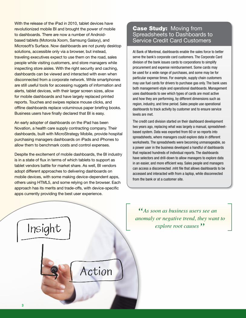
“As soon as business users see an anomaly or negative trend, they want to
explore root causes”
3
4
Operational DashboardsOperational dashboards provide access to real-time or near real-time information. They may be used in call centers to service customers or monitor call wait times. In logistics, an operational dashboard may provide information on trucks en route, mashing together traffic data and maps to predict delays or recommend alternate routes. In flight operations, a control room dashboard will alert coordinators to delays and when such a delay may exceed allowable time on the tarmac before incurring penalty.
These types of dashboards are typically built by IT personnel to ensure enterprise scale and access to multiple, real-time data sources. In the past, many companies custom developed these operational dashboards because packaged software did not meet functional requirements.
Monitoring DashboardsMonitoring dashboards provide multiple visual indicators for managers and executives to see at-a-glance what is going on in the business. Scorecards may be embedded in these dashboards to display actual versus target performance for key performance indicators. Executive information systems were precursors to management dashboards in the 1980s. Early EISs required IT to custom-code capabilities to present static information, usually updated quarterly at-best. Next-generation dashboards have replaced what once may have been printed briefing books or static executive information systems. These types of dashboards may also be built by IT when the requirements are known in advance, but increasingly, business users may assemble their own dashboards based on a library of re-usable components, whether reports or visualizations. Some business-user assembled dashboards may be personal, similar to a my Google News, or they may be used across a department to ensure better alignment.
These dashboards may rely on data from a central data warehouse, departmental datamarts, or spreadsheets.
Dashboard Use Cases and Their DesignersDashboards can be used for operational tasks, management, and monitoring, as well as exploration. Both the business use case and the underlying technical infrastructure will often determine who designs these dashboards, whether IT or business users themselves.
Case Study: AARP – Dashboards to Feed the Hungry
AARP has been a MicroStrategy customer for nine years. While embracing new technologies, their evolution from reporting to dashboards was somewhat accidental. A new CIO established a vision of “customer first,” and as part of that vision, he wanted IT to provide greater transparency to internal business units on the services IT was providing them. So IT developed a management-style dashboard that showed project status, open ticket count, actual versus budget IT expenses, satisfaction ratings, and so on. The dashboards were embedded in the company-wide portal as a SharePoint Web Part for everyone to see and access. As individual lines of businesses saw the IT dashboard, they appreciated the visual appeal and interactivity and began requesting similar solutions.
The AARP Foundation’s business unit, for example, has an annual initiative that is part of its Create the Good initiative to improve communities through various volunteer efforts. One of this year’s top initiatives is a drive to end hunger. As regional offices collect food and donations, field offices can track how well they are achieving the initiative’s goals to provide a million meals to people over the age of 50. Information in the dashboard comes from both a data warehouse and is also collected at local offices via the dashboards, using MicroStrategy’s Transaction Services. Transaction Services allows data to be captured from an iPad or iPhone and then written back to the data warehouse.
When AARP first began its implementation, IT developed most of the parameterized reports. Today, IT develops only a handful of reports and dashboards, and more business users now develop their own reports and dashboards. The BI Manager credits this change to three main factors: 1) the demand for IT resources exceeded staffing levels so users had to take on more responsibility, 2) greater sophistication of the work force in working with data and BI tools, and 3) easier-to-use BI tools. With the new Visual Insight product, the interface is easy enough for business users to create their own dashboard. This may be a prototype that IT then uses as a basis to make refinements or to extend the capabilities. The prototype facilitates the dialogue between business and IT to capture requirements.
At AARP, management dashboards allow all users of IT services to see how they are consuming resources, the status of help desk tickets, and pending projects. The Foundations business unit within AARP uses dashboards to track progress towards their goal of providing 1 million meals to seniors.

Best Practices for Better DashboardsA number of recent innovations have made dashboards more relevant and important within the BI tool portfolio. To ensure your company gets the full business value out of dashboards, follow these best practices:
• Make dashboards a core module of your BI tool portfolio. If you have custom developed earlier versions of dashboards, assess the latest generation of out-of-the-box solutions for better capabilities and lower ownership costs.
• Understand the distinct use cases of dashboards and proactively engage with business units to identify the role dashboards can play in helping them achieve business goals.
• Ensure the right tools and people develop dashboards, with IT designing enterprise-wide, operational dashboards and business users empowered to assemble more personalized dashboards.
• Recognize that dashboards are a starting point only. Build explorations and actions into your dashboards that link monitoring to insight to action. Understand that different capabilities correspond to particular user requirements, with single-user explorations potentially evolving to a broader dashboard, or vice versa.
• Design dashboards for mobility for traveling executives and field personnel, but be prepared for change in the underlying technology and devices IT has to support.
• Choose visualizations and color wisely to maximize insight, density of information, and visual appeal.
5
Exploratory DashboardsMany dashboard products started with fairly static capabilities. However, as soon as business users see an anomaly or negative trend, they want to explore root causes or to test new hypotheses. Explorations to do this may include a drill-down to a report, filters to view subsets of data, or sliders and lassos to hone in on particular time periods and dimensions.
To facilitate this interactivity and exploration, IT may have to build drill paths and interactivity into a dashboard based upon a set of predetermined workflows. In recent years,
Types of Dashboards
IT-D
evel
op
ed
Bus
ines
s-us
er
Ass
emb
led
OperationalMonitoring
Exploratory
Transaction systems, operational data warehouse, external files
Data warehouse, marts, and spreadsheets
BI vendors have added varying degrees of out-of-the-box components to provide interactivity. At the same time, visual data discovery, a new category of tools that started out as personal tools for business analysts, has evolved to provide dashboard capabilities. In this way, an exploratory dashboard may be built by business users, sometimes mashing together data from disparate sources that IT does not control.
Insight to ActionWhether the dashboard is operational, monitoring, or exploratory, once an insight is revealed, that insight may require further investigation or an immediate action. In some cases, if the business is operating efficiently, goals are on target, or call center hold times are in an acceptable range, no action is required. Types of immediate actions that should ideally be invoked from a dashboard include:
Initiate an order: if a warehouse manager sees that inventory is low, they may order replaced products or transfer goods from another warehouse.
Contact the customer: if a dashboard shows that an order has been delayed or other dissatisfaction indicators are high, then a customer service representative may invoke an e-mail to the customer acknowledging the problem and perhaps offering a discount on future orders.