Embed Size (px)
DESCRIPTION
Â
Citation preview
Marty Aaron Edwards
Module Brief: Dare Restaurant Re-brand Module Title: OUGD301
Board: Development of the Logo 1 / 4
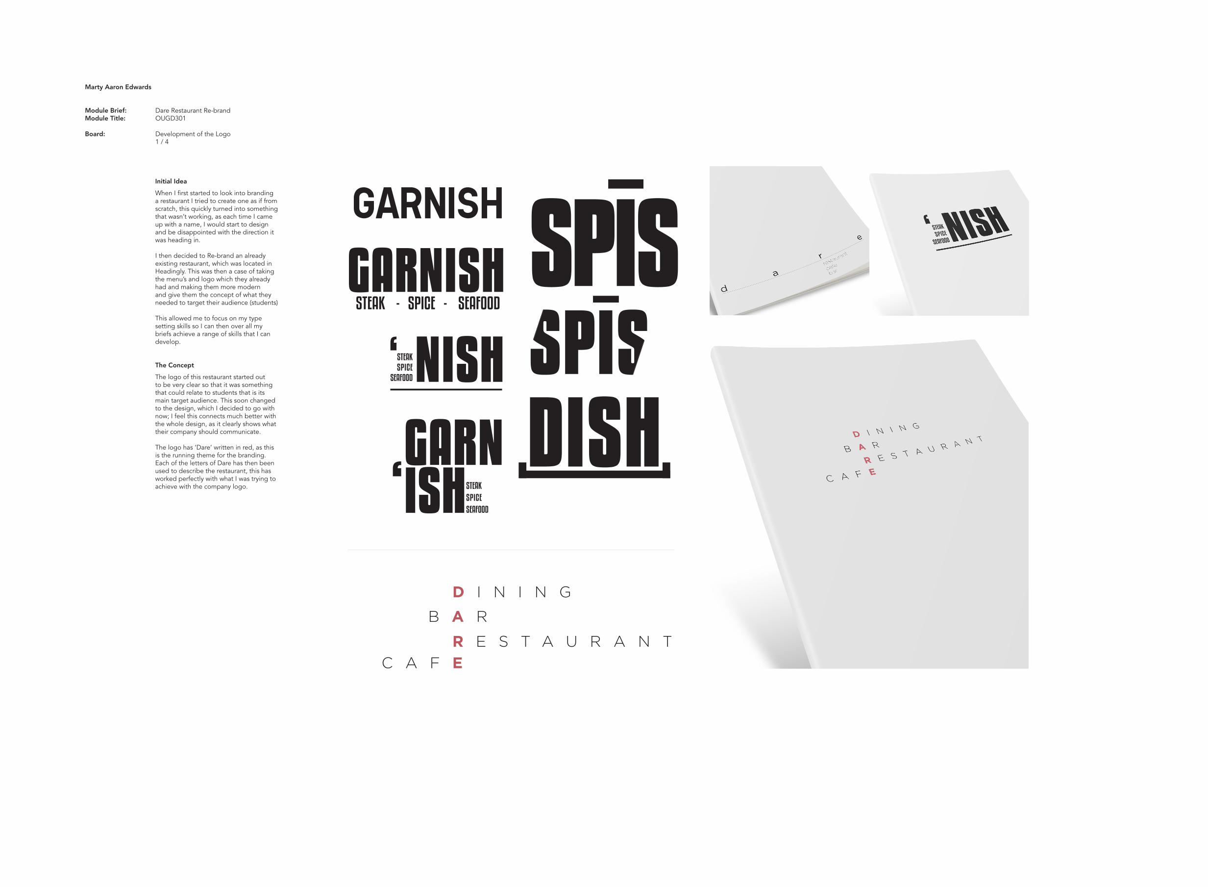
Initial Idea
When I first started to look into branding a restaurant I tried to create one as if from scratch, this quickly turned into something that wasn’t working, as each time I came up with a name, I would start to design and be disappointed with the direction it was heading in.
I then decided to Re-brand an already existing restaurant, which was located in Headingly. This was then a case of taking the menu’s and logo which they already had and making them more modern and give them the concept of what they needed to target their audience (students)
This allowed me to focus on my type setting skills so I can then over all my briefs achieve a range of skills that I can develop.
The Concept
The logo of this restaurant started out to be very clear so that it was something that could relate to students that is its main target audience. This soon changed to the design, which I decided to go with now; I feel this connects much better with the whole design, as it clearly shows what their company should communicate.
The logo has ‘Dare’ written in red, as this is the running theme for the branding. Each of the letters of Dare has then been used to describe the restaurant, this has worked perfectly with what I was trying to achieve with the company logo.
GARNISH
STEAK - SPICE - SEAFOODGARNISH SPĪS
STEAKSPICE
SEAFOOD NISH‘DISHGARN
‘ISHSTEAKSPICESEAFOOD
DARE
Marty Aaron Edwards
Module Brief: Dare Restaurant Re-brand Module Title: OUGD301
Board: Development of the Products 2 / 4
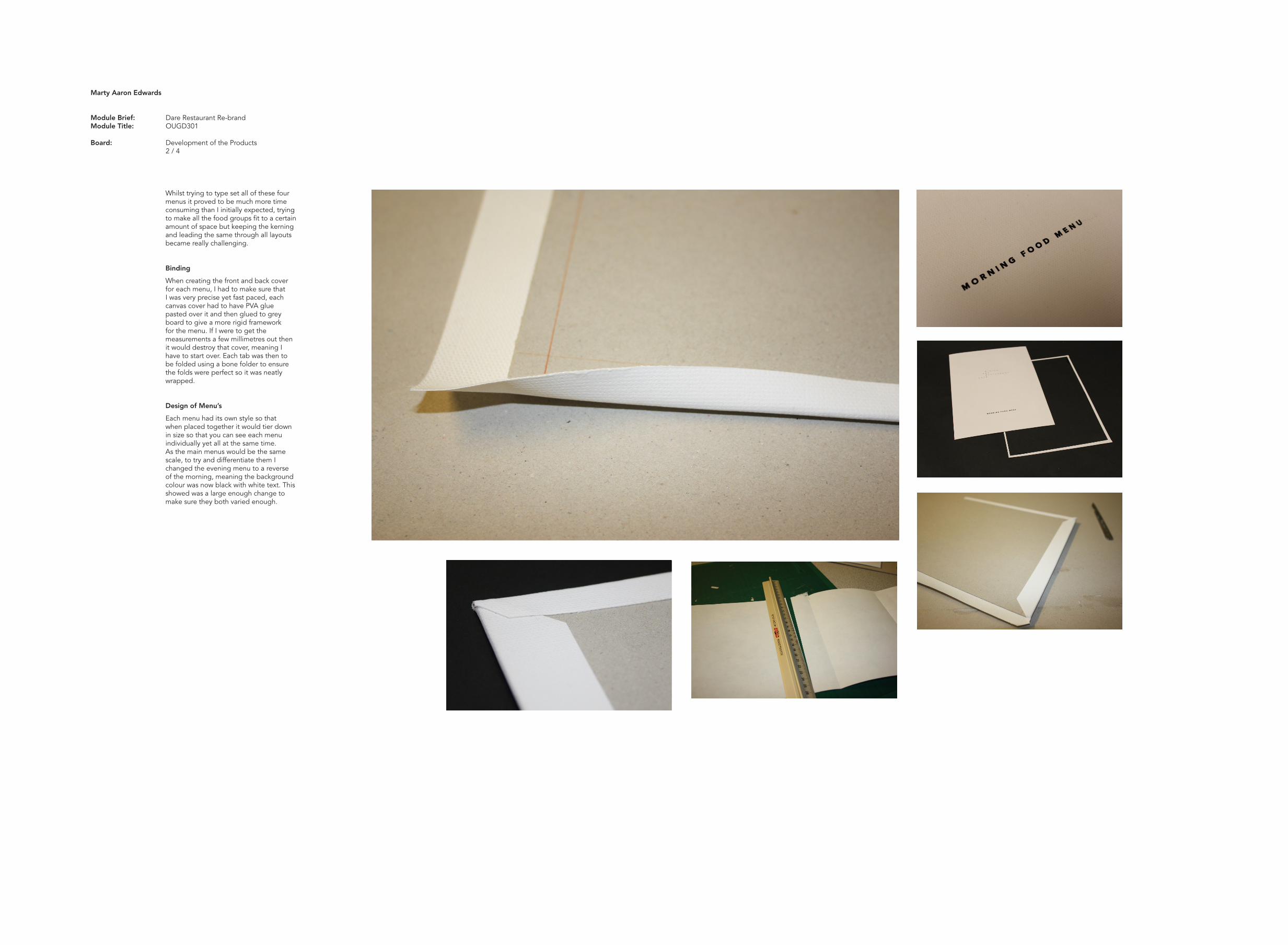
Whilst trying to type set all of these four menus it proved to be much more time consuming than I initially expected, trying to make all the food groups fit to a certain amount of space but keeping the kerning and leading the same through all layouts became really challenging.
Binding
When creating the front and back cover for each menu, I had to make sure that I was very precise yet fast paced, each canvas cover had to have PVA glue pasted over it and then glued to grey board to give a more rigid framework for the menu. If I were to get the measurements a few millimetres out then it would destroy that cover, meaning I have to start over. Each tab was then to be folded using a bone folder to ensure the folds were perfect so it was neatly wrapped.
Design of Menu’s
Each menu had its own style so that when placed together it would tier down in size so that you can see each menu individually yet all at the same time. As the main menus would be the same scale, to try and differentiate them I changed the evening menu to a reverse of the morning, meaning the background colour was now black with white text. This showed was a large enough change to make sure they both varied enough.
Marty Aaron Edwards
Module Brief: Dare Restaurant Re-brand Module Title: OUGD301
Board: The Range 3 / 4
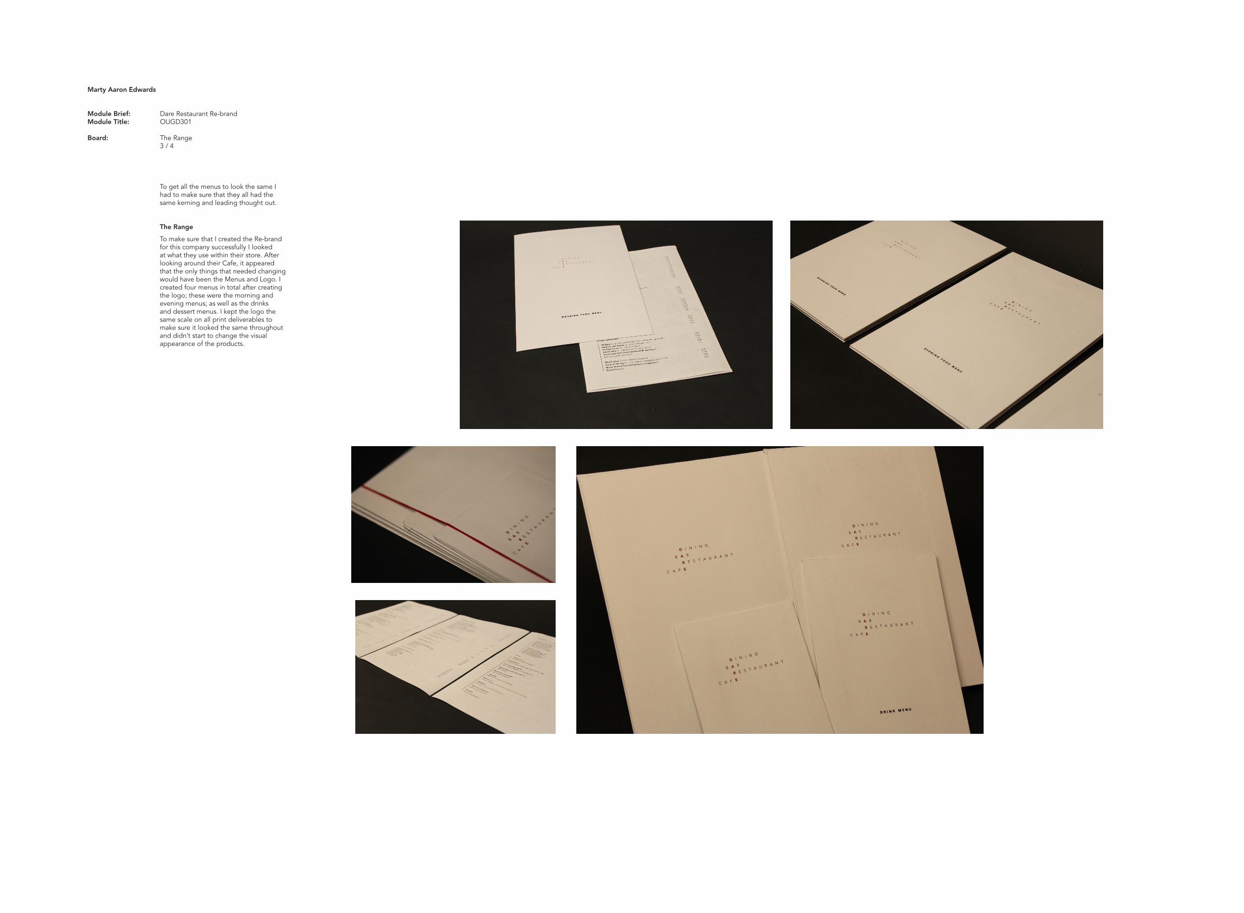
To get all the menus to look the same I had to make sure that they all had the same kerning and leading thought out.
The Range
To make sure that I created the Re-brand for this company successfully I looked at what they use within their store. After looking around their Cafe, it appeared that the only things that needed changing would have been the Menus and Logo. I created four menus in total after creating the logo; these were the morning and evening menus; as well as the drinks and dessert menus. I kept the logo the same scale on all print deliverables to make sure it looked the same throughout and didn’t start to change the visual appearance of the products.
Marty Aaron Edwards
Module Brief: Dare Restaurant Re-brand Module Title: OUGD301
Board: Final Outcomes 4 / 4
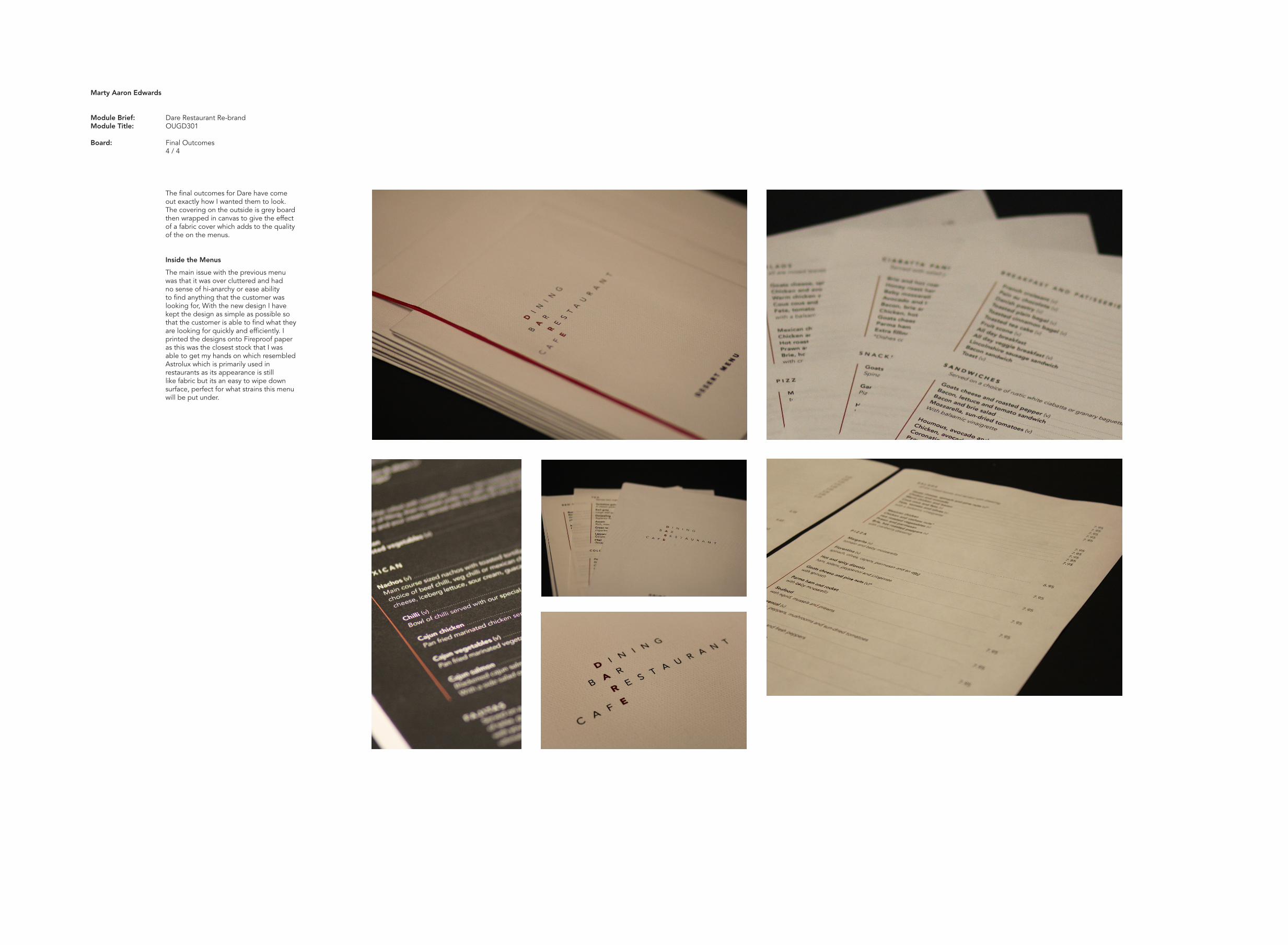
The final outcomes for Dare have come out exactly how I wanted them to look. The covering on the outside is grey board then wrapped in canvas to give the effect of a fabric cover which adds to the quality of the on the menus.
Inside the Menus
The main issue with the previous menu was that it was over cluttered and had no sense of hi-anarchy or ease ability to find anything that the customer was looking for, With the new design I have kept the design as simple as possible so that the customer is able to find what they are looking for quickly and efficiently. I printed the designs onto Fireproof paper as this was the closest stock that I was able to get my hands on which resembled Astrolux which is primarily used in restaurants as its appearance is still like fabric but its an easy to wipe down surface, perfect for what strains this menu will be put under.