Embed Size (px)
Citation preview

commercialtype.comCommercial
Dala Prisma
Dala Prisma is a development of the stencil typeface Dala Floda, replacing the solid forms with a series of stripes which vary in width, offering a wonderful optical effect. The extreme thinning of lines means this family only works at large display sizes.
Published 2014 designed by Paul barnes & ben kiel 6 styles3 weights w/ italics
FeaturesProPortional oldstyle figuresProPortional lining figuressmall caPs (roman)fractions (Prebuilt and arbitrary)swash caPitalsdiscretionary ligatures
Stripes have always fascinated humans; we are drawn to and repelled by these forms found in the natural and manmade worlds. In the visual arts we find them everywhere. Typefaces with inscribed lines appeared in the Eighteenth century, but the first striped letter was probably made by Edmund Fry during the early years of the Nineteenth century. During the twentieth century the Klingspor foundry released a version of Rudolf Koch’s Kabel, named Prisma in the early 1930s, seemingly inspired by the striped neon letters found at night across Germany. In Dala Prisma, this optical effect is applied to the Renaissance style stencil, Dala Floda. The variation between thick and thin is exaggerated with multiple lines, which increase in number as the typefaces becomes bolder. With both roman and italic variants, Dala Prisma is a uniquely powerful display typeface.

dala Prisma 2 of 16
commercialtype.comCommercial
Dala Prisma RomanDala Prisma ItalicDala Prisma BoldDala Prisma Bold ItalicDala Prisma FatDala Prisma Fat Italic
dala Prisma 3 of 16
commercialtype.comCommercial
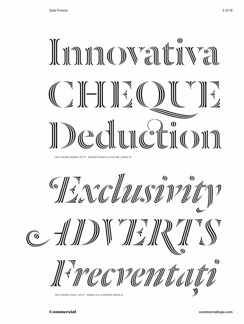
InnovativaChequeDeductionExclusivity
ADvertsFrecventaţi
dala Prisma roman, 100 Pt [discretionary ct ligature, swash q]
dala Prisma italic, 100 Pt [swash a r, alternate swash e]

dala Prisma 4 of 16
commercialtype.comCommercial
Triplicatogħaxarantithesis
LiverpoolBoDegaPróximos
dala Prisma bold, 100 Pt
dala Prisma bold italic, 100 Pt [alternate h, discretionary is ligature]

dala Prisma 5 of 16
commercialtype.comCommercial
Weekend høytiDFälschen
dala Prisma fat, 100 Pt
AtšķirīgiberlInExample
dala Prisma fat italic, 100 Pt [swash ex ligature, swash e]

dala Prisma 6 of 16
commercialtype.comCommercial
tehtävIstäApparemmentgReenstOnenhancements
DemocracyGeochronologistPæDagogerUnterschwelliger
dala Prisma roman, 70 Pt [alternate swash t]
dala Prisma italic, 70 Pt [swash g P r y, discretionary ll st ligatures]

dala Prisma 7 of 16
commercialtype.comCommercial
ÞjóðsögumTransmissionsKoreańsKaChoreography
rozDěLiLo CrowdfundedPrinCiPaLsTeóricamente
dala Prisma bold, 70 Pt
dala Prisma bold italic, 70 Pt

dala Prisma 8 of 16
commercialtype.comCommercial
commerceBureaucracyDezemBroGroßartigen
dala Prisma fat, 70 Pt
kInescoPeVerkooplijstlIQueFIerFondazioni
dala Prisma fat italic, 70 Pt [swash e f k z, alternate q]

dala Prisma 9 of 16
commercialtype.comCommercial
the RAte Of 49% DAIlyImmortalised as the designerMiután 1911-ben egy hurrikán
ToIsen PalkInnon €700A magic element that was needed
el rumbo que necesita Paraguay
Un Demi-sièCLe aPrèsma proprio quando l’età gliBefore leaving hsbc in 2005
veDIC wrITIng In 1600rising 28,700 meters over anWerkelijkheid Wonderlijker
dala Prisma roman, 36 Pt
dala Prisma italic, 36 Pt [swash a e k P t d w]
dala Prisma bold, 36 Pt
dala Prisma bold italic, 36 Pt [swash w k r v, discretionary ij glyPh]

dala Prisma 10 of 16
commercialtype.comCommercial
siGnals & receiversJust about 2/3 of catia hadtre berättelserna gavs ut
strAuss unD bArtheWider social implicationescampar el foc o l’aigua
dala Prisma fat, 36 Pt [alternate swash amPersand]
dala Prisma fat italic, 36 Pt [swash w]
dala Prisma 11 of 16
commercialtype.comCommercial
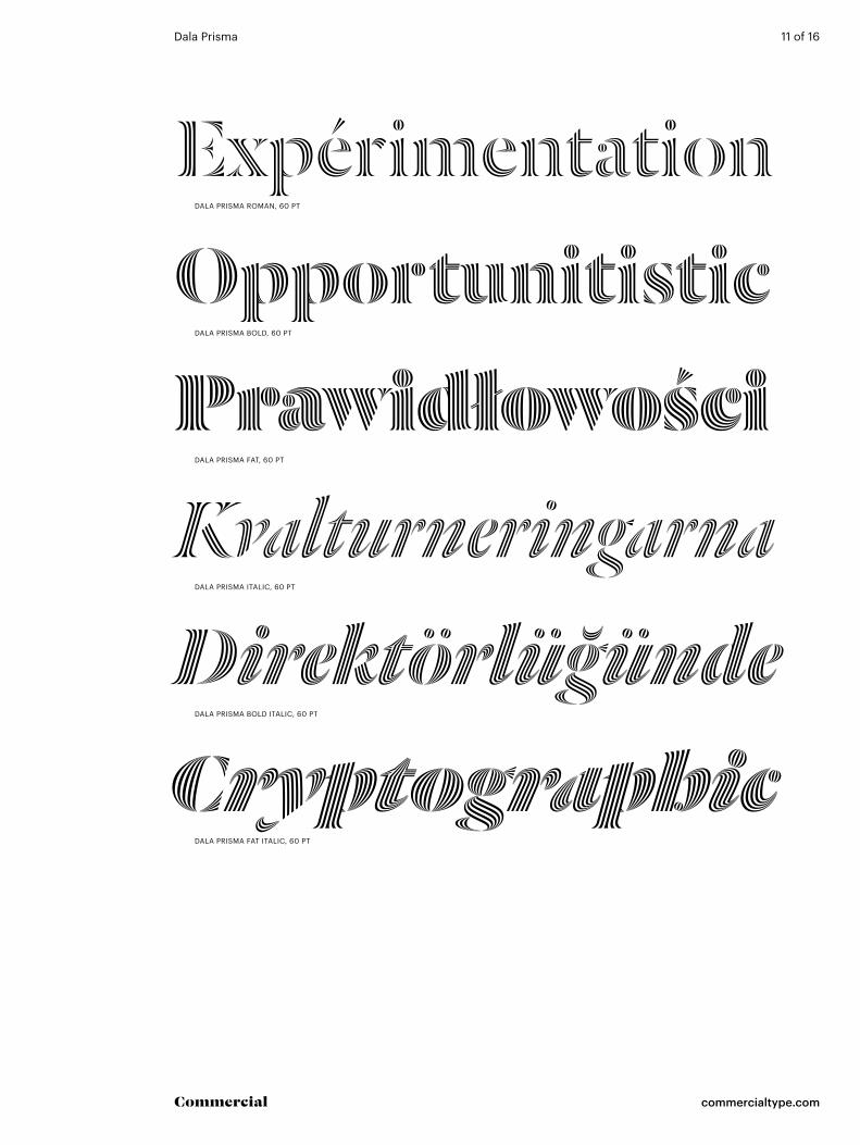
expérimentationopportunitisticPrawidłowości
dala Prisma roman, 60 Pt
dala Prisma bold, 60 Pt
dala Prisma fat, 60 Pt
KvalturneringarnaDirektörlüğündecryptographic
dala Prisma italic, 60 Pt
dala Prisma bold italic, 60 Pt
dala Prisma fat italic, 60 Pt

dala Prisma 12 of 16
commercialtype.comCommercial
uPPercase
lowercase
small caPs
standard Punctuation
all caP Punctuation
small caP Punctuation
ligatures
ProPortional oldstyle default figures
ProPortional lining
ProPortional small caP
Prebuilt fractions
numerators & denominators
swash uPPercase
accented swash lowercase
swash ligatures
swash small caP
swash lowercase
accented uPPercase
accented small caPs
accented lower case
note: dala floda roman substituted here in Place of dala Prisma, which is not intended for use at this size. character set is identical.
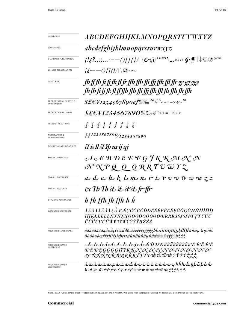
dala Prisma 13 of 16
commercialtype.comCommercial
uPPercase
lowercase
standard Punctuation
all caP Punctuation
ligatures
ProPortional oldstyle default figures
ProPortional lining
Prebuilt fractions
numerators & denominators
swash uPPercase
accented swash uPPercase
accented swash lowercase
swash ligatures
stylistic alternates
discretionary ligatures
swash lowercase
accented uPPercase
accented lower case
note: dala floda italic substituted here in Place of dala Prisma, which is not intended for use at this size. character set is identical.

dala Prisma 14 of 16
commercialtype.comCommercial
language feature română (romanian) s accent
language feature nederlands (dutch) iJ glyph
discretionary ligatures ct st
ŞtIRI faimoşiRIjks lijnbus Rijks lijnbus
hastened factsŞtIRI faimoşihastened facts
ProPortional oldstyle default figures
ProPortional lining
all caPs opens up spacing, moves punctuation up, substitutes lining figures
small caPs
all small caPs
swash q y (activates discretionary ligatures; final swashes apply only to the end of a line)
stylistic set 01 alternate q y
swash + stylistic set 02 alternate final swash t
$357 €895 £621$357 €895 £621
$357 €895 £621$357 €895 £621
‘Chip’ & $170
‘Chip’ & $3170?‘Chip’ & $3170?your QuestionyeAh QuICkYaoundé quit Yaoundé quit
Your questionYeAh quICk
‘ChIP’ & $170
‘Chip’ & $3170?‘Chip’ & $3170?
oPentyPe Featuresfamily wide
oPentyPe Featuresroman only
2 1/2 1/3 2/3 1/4 3/4 1/8 3/8 5/8 7/8Prebuilt fractions 2 1/2 1/3 2/3 1/4 2 1/72 3/29 45/64arbitrary fractions
ignores numeric date format 2 1/72 3/29 45/64
deaCtiVated
deaCtiVated
aCtiVated
aCtiVated
stylistic alternates illustrator/Photoshop Quickly yawns quickly Yawns
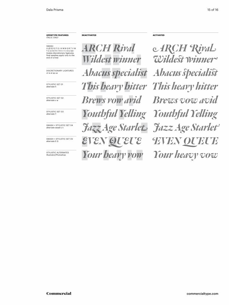
dala Prisma 15 of 16
commercialtype.comCommercial
swash a Æ b d e f g J k m n q r t V w y z a d e h k l m n r t v w z (ac-tivates discretionary ligatures; final swashes apply only to the end of a line)
discretionary ligatures ct is st sp us
stylistic set 01 alternate h
stylistic set 02 alternate v w
stylistic set 03 alternate y
swash + stylistic set 04 alternate swash z t
swash + stylistic set 05 alternate e q
stylistic alternates illustrator/Photoshop
arch rivalWildest winner
Arch RivalWildest winner
abacus specialist abacus specialistthis heavy hitter
Your heavy vow your heavy vow
this heavy hitterBrews vow avidBrews vow avid
Youthful YellingJazz age starleteven qUeUe Even qUeUe
Jazz age starletyouthful yelling
oPentyPe Featuresitalic only
deaCtiVated aCtiVated
dala Prisma 16 of 16
commercialtype.comCommercial
about the designer
coPyright
suPPorted languages
contact
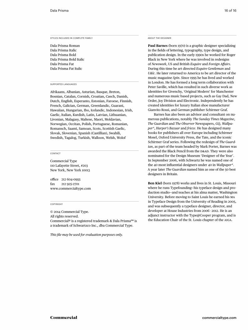
styles included in comPlete family
Dala Prisma RomanDala Prisma ItalicDala Prisma BoldDala Prisma Bold ItalicDala Prisma FatDala Prisma Fat Italic
© 2014 Commercial Type. All rights reserved. Commercial® is a registered trademark & Dala Prisma™ is a trademark of Schwartzco Inc., dba Commercial Type. This file may be used for evaluation purposes only.
Afrikaans, Albanian, Asturian, Basque, Breton, Bosnian, Catalan, Cornish, Croatian, Czech, Danish, Dutch, English, Esperanto, Estonian, Faroese, Finnish, French, Galician, German, Greenlandic, Guarani, Hawaiian, Hungarian, Ibo, Icelandic, Indonesian, Irish, Gaelic, Italian, Kurdish, Latin, Latvian, Lithuanian, Livonian, Malagasy, Maltese, Maori, Moldavian, Norwegian, Occitan, Polish, Portuguese, Romanian, Romansch, Saami, Samoan, Scots, Scottish Gaelic, Slovak, Slovenian, Spanish (Castillian), Swahili, Swedish, Tagalog, Turkish, Walloon, Welsh, Wolof
Commercial Type 110 Lafayette Street, #203New York, New York 10013
office 212 604-0955fax 212 925-2701 www.commercialtype.com
Paul Barnes (born 1970) is a graphic designer specializing in the fields of lettering, typography, type design, and publication design. In the early 1990s he worked for Roger Black in New York where he was involved in redesigns of Newsweek, US and British Esquire and Foreign Affairs. During this time he art directed Esquire Gentleman and U&lc. He later returned to America to be art director of the music magazine Spin. Since 1995 he has lived and worked in London. He has formed a long term collaboration with Peter Saville, which has resulted in such diverse work as identities for Givenchy, ‘Original Modern’ for Manchester and numerous music based projects, such as Gay Dad, New Order, Joy Division and Electronic. Independently he has created identities for luxury Italian shoe manufacturer Gianvito Rossi, and German publisher Schirmer Graf.
Barnes has also been an advisor and consultant on nu-merous publications, notably The Sunday Times Magazine, The Guardian and The Observer Newspapers, GQ, Wallpa-per*, Harper’s Bazaar and frieze. He has designed many books for publishers all over Europe including Schirmer Mosel, Oxford University Press, the Tate, and the iconic Schirmer Graf series. Following the redesign of The Guard-ian, as part of the team headed by Mark Porter, Barnes was awarded the Black Pencil from the D&AD. They were also nominated for the Design Museum ‘Designer of the Year’. In September 2006, with Schwartz he was named one of the 40 most influential designers under 40 in Wallpaper*. A year later The Guardian named him as one of the 50 best designers in Britain.
Ben Kiel (born 1978) works and lives in St. Louis, Missouri where he runs Typefounding—his typeface design and pro-duction studio—and teaches at his alma matter, Washington University. Before moving to Saint Louis he earned his MA in Typeface Design from the University of Reading in 2005, and was subsequently a typeface designer, director, and developer at House Industries from 2006 – 2012. He is an adjunct instructor with the Type@Cooper program, and is the Education Chair of the St. Louis chapter of the AIGA.