Embed Size (px)
DESCRIPTION
MOTU Addendum for Cue MixFx
Citation preview
N E W F E A T U R E S I N C U E M I X F X
1
New Features in CueMix FX
OVERVIEW
This document provides late-breaking information about
new features in the audio drivers and CueMix FX console not
covered in the manual.
WaveRT support . . . . . . . . . . . . . . . . . . . . . . . . . . . . . . . . . . . . . . . . . . . . . . . . . . 1
FFT and Spectrogram display. . . . . . . . . . . . . . . . . . . . . . . . . . . . . . . . . . . . . 1
Oscilloscope . . . . . . . . . . . . . . . . . . . . . . . . . . . . . . . . . . . . . . . . . . . . . . . . . . . . . . 3
X-Y Plot . . . . . . . . . . . . . . . . . . . . . . . . . . . . . . . . . . . . . . . . . . . . . . . . . . . . . . . . . . . 7
Phase Analysis . . . . . . . . . . . . . . . . . . . . . . . . . . . . . . . . . . . . . . . . . . . . . . . . . . . . 9
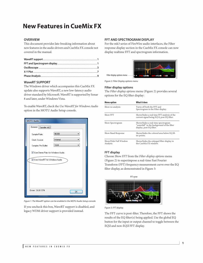
WaveRT SUPPORT
The Windows driver which accompanies this CueMix FX
update also supports WaveRT, a new low-latency audio
driver standard by Microsoft. WaveRT is supported by Sonar
8 and later, under Windows Vista.
To enable WaveRT, check the
Use WaveRT for Windows Audio
option in the MOTU Audio Setup console.
Figure 1: The WaveRT option can be enabled in the MOTU Audio Setup console.
If you uncheck this box, WaveRT support is disabled, and
legacy WDM driver support is provided instead.
FFT AND SPECTROGRAM DISPLAY
For the mk3 series of FireWire audio interfaces, the Filter
response display section in the CueMix FX console can now
display realtime FFT and spectrogram information.
Figure 2: Filter Display options menu
Filter display options
The
Filter display options
menu
(Figure 2) provides several
options for the EQ filter display:
FFT display
Choose
Show FFT
from the
Filter display options
menu
(Figure 2) to superimpose a real-time Fast Fourier
Transform (FFT) frequency measurement curve over the EQ
filter display, as demonstrated in Figure 3:
Figure 3: FFT display.
The FFT curve is post-filter. Therefore, the FFT shows the
results of the EQ filter(s) being applied. Use the global EQ
button for the input or output channel to toggle between the
EQ’d and non-EQ’d FFT display.
Menu option What it does
Show no analysis Turns off both the FFT and Spectrogram in the Filter display.
Show FFT Shows/hides a real time FFT analysis of the current signal being EQ’d, post EQ filter.
Show Spectrogram Shows/hides a real-time spectrogram “waterfall” in the background of the filter display, post EQ filter.
Show Band Response Shows/hides the colored area below EQ fil-ter points.
Show/Hide Full Window Analysis
Shows/hides the enlarged filter display in the CueMix FX window.
Filter display options menu
FFT curve
N E W F E A T U R E S I N C U E M I X F X
2
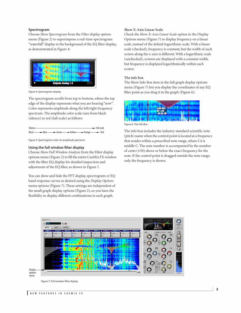
Spectrogram
Choose
Show Spectrogram
from the
Filter display options
menu (Figure 2) to superimpose a real-time spectrogram
“waterfall” display in the background of the EQ filter display,
as demonstrated in Figure 4:
Figure 4: Spectrogram display.
The spectrogram scrolls from top to bottom, where the top
edge of the display represents what you are hearing “now”.
Color represents amplitude along the left/right frequency
spectrum. The amplitude color scale runs from black
(silence) to red (full scale) as follows:
Figure 5: Spectrogram color-to-amplitude spectrum.
Using the full window filter display
Choose
Show Full Window Analysis
from the Filter display
options menu (Figure 2) to fill the entire CueMix FX window
with the filter EQ display for detailed inspection and
adjustment of the EQ filter, as shown in Figure 7.
You can show and hide the FFT display, spectrogram or EQ
band response curves as desired using the
Display Options
menu options (Figure 7). These settings are independent of
the small graph display options (Figure 2), so you have the
flexibility to display different combinations in each graph.
Show X-Axis Linear Scale
Check the
Show X-Axis Linear Scale
option in the Display
Options menu (Figure 7) to display frequency on a linear
scale, instead of the default logarithmic scale. With a linear
scale (checked), frequency is constant, but the width of each
octave along the x-axis is different. With a logarithmic scale
(unchecked), octaves are displayed with a constant width,
but frequency is displayed logarithmically within each
octave.
The info box
The Show Info Box item in the full graph display options
menu (Figure 7) lets you display the coordinates of any EQ
filter point as you drag it in the graph (Figure 6):
Figure 6: The Info Box.
The info box includes the industry standard scientific note
(pitch) name when the control point is located at a frequency
that resides within a prescribed note range, where C4 is
middle C. The note number is accompanied by the number
of cents (±50) above or below the exact frequency for the
note. If the control point is dragged outside the note range,
only the frequency is shown.
Black Blue Green Yellow Orange Red
Silence Full scale
Figure 7: Full window filter display.
Display options menu
N E W F E A T U R E S I N C U E M I X F X
3
OSCILLOSCOPE
The Oscilloscope (Figure 8) graphs the amplitude of an
audio signal over time.
Amplitude is displayed on the y-axis and time is displayed on
the x-axis. A thick white vertical line marks where time
equals zero; a thick white horizontal line marks where
amplitude equals zero (Figure 8, below).
Level meters are displayed to the right of the graph. One or
two meters are shown, depending on the current view mode
(see “View controls”).
Opening the oscilloscope
Each mk3 series FireWire audio interface has its own
oscilloscope. To open an oscilloscope, choose the
Oscilloscope
item from the Devices menu under the desired
interface.
Figure 9: Opening the oscilloscope
Choosing a channel to display
The oscilloscope follows the currently focused audio input or
output. If you focus a mono channel (e.g. Analog 3), its
corresponding stereo pair will be displayed (Analog 3–4).
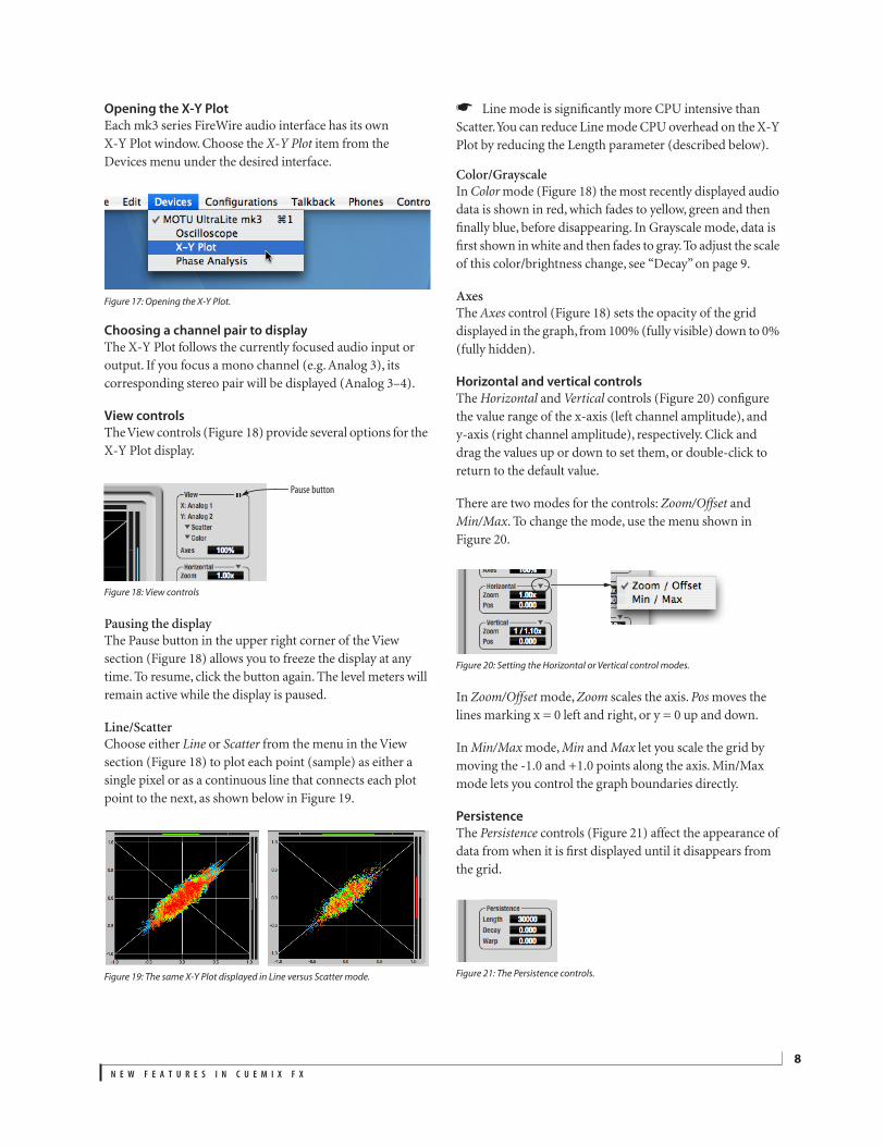
View controls
The View controls (Figure 10) provide several options for the
oscilloscope display.
Figure 10: View controls
View menu
The View menu (Figure 10) lets you choose how you wish to
display the audio channel(s) being displayed.
Display options
The
Axes
control (Figure 10) sets the opacity of the grid
displayed in the graph, from 100% (fully visible) down to 0%
(fully hidden). The
Show Ruler
option toggles the
measurement items (see “Measurement information” on
page 5).
Pausing the display
The Pause button in the upper right corner of the View
section (Figure 10) allows you to freeze the display at any
time. To resume, click the button again. The level meters will
remain active while the display is paused.
Figure 8: Oscilloscope
View menu setting What it displays
Left Left channel only
Right Right channel only
Split screen Left channel on top; right channel on the bottom
Shared Left and right on top of each other; left is green, right is
red
Add Left and right channels’ amplitudes are added together
Subtract L-R The right channel’s amplitude is subtracted from the left
channel’s amplitude
Pause button
View menu
N E W F E A T U R E S I N C U E M I X F X
4
Horizontal controls (time axis)
The
Horizontal
controls (Figure 11) configure the value
range of the x-axis (time). Click and drag the values up or
down to set them, or double-click to return to the default
value.
There are two modes for the controls:
Zoom/Offset
and
Min/Max
. To change the mode, use the Horizontal control
menu (Figure 11).
Figure 11: Horizontal control menu
In
Zoom/Offset
mode,
Zoom
sets the display zoom from
1/1000x to 10x, where the number represents the number of
pixels per sample. For example, when the horizontal zoom
value is 10x, 10 samples are displayed in 100 pixels; when the
horizontal zoom value is 1/10x, 100 samples are displayed in
10 pixels.
Offset
moves the line marking time equals zero left
or right.
In
Min/Max
mode,
Min
and
Max
set the earliest and most
recent displayed time.
Time Units
The
Time Units
sub-menu (Figure 11) provides the option to
view the X axis in Seconds or Samples.
Vertical controls (amplitude axis)
The
Vertical
controls (Figure 11) operate similarly to the
Horizontal controls, except that they configure the y-axis
(amplitude).
In
Zoom/Offset
mode,
Zoom
sets the display zoom from
1/2 to 100x, and
Offset
moves the line marking amplitude
equals zero line up or down.
In
Min/Max
mode,
Min
and
Max
set the smallest and largest
displayed amplitude.
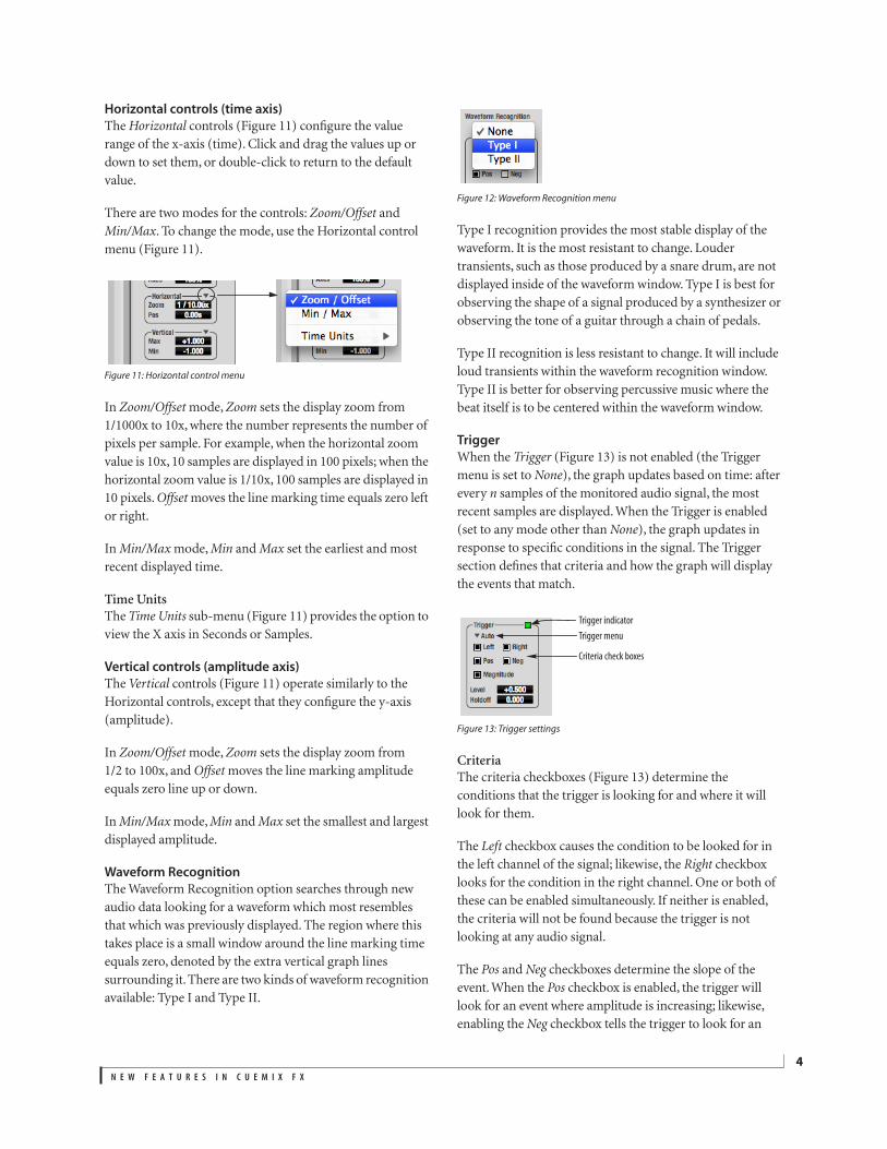
Waveform Recognition
The Waveform Recognition option searches through new
audio data looking for a waveform which most resembles
that which was previously displayed. The region where this
takes place is a small window around the line marking time
equals zero, denoted by the extra vertical graph lines
surrounding it. There are two kinds of waveform recognition
available: Type I and Type II.
Figure 12: Waveform Recognition menu
Type I recognition provides the most stable display of the
waveform. It is the most resistant to change. Louder
transients, such as those produced by a snare drum, are not
displayed inside of the waveform window. Type I is best for
observing the shape of a signal produced by a synthesizer or
observing the tone of a guitar through a chain of pedals.
Type II recognition is less resistant to change. It will include
loud transients within the waveform recognition window.
Type II is better for observing percussive music where the
beat itself is to be centered within the waveform window.
Trigger
When the
Trigger
(Figure 13) is not enabled (the Trigger
menu is set to
None
), the graph updates based on time: after
every
n
samples of the monitored audio signal, the most
recent samples are displayed. When the Trigger is enabled
(set to any mode other than
None
), the graph updates in
response to specific conditions in the signal. The Trigger
section defines that criteria and how the graph will display
the events that match.
Figure 13: Trigger settings
Criteria
The criteria checkboxes (Figure 13) determine the
conditions that the trigger is looking for and where it will
look for them.
The
Left
checkbox causes the condition to be looked for in
the left channel of the signal; likewise, the
Right
checkbox
looks for the condition in the right channel. One or both of
these can be enabled simultaneously. If neither is enabled,
the criteria will not be found because the trigger is not
looking at any audio signal.
The
Pos
and
Neg
checkboxes determine the slope of the
event. When the
Pos
checkbox is enabled, the trigger will
look for an event where amplitude is increasing; likewise,
enabling the
Neg
checkbox tells the trigger to look for an
Trigger indicator
Trigger menu
Criteria check boxes

N E W F E A T U R E S I N C U E M I X F X
5
event where amplitude is decreasing. One or both of these
can be enabled simultaneously. If neither is enabled, the
criteria will not be found because the trigger is not looking
for any particular kind of event.
The
Level
setting defines the amplitude threshold that the
trigger is looking for. The Level is indicated on the graph by a
blue horizontal line (or two blue horizontal lines, if
Magnitude
is enabled). Events which cross this threshold
using the enabled slope(s) in the enabled channel(s) will
activate the trigger. The response of the trigger is set by the
Trigger mode (see “Trigger modes”, below).
Enabling the
Magnitude
checkbox tells the trigger to look for
both positive and negative Level values, regardless of
whether the Level value is positive or negative. For example,
if Level is set to +0.500 and
Magnitude
is enabled, the trigger
will look for both +0.500 and -0.500. You will see a second
blue line appear in the display when
Magnitude
is enabled to
denote the second value.
Holdoff
Holdoff
defines a time interval during which the oscilloscope
does not trigger. The most recent trace will be displayed
during that period. When the period is over, the trigger is “re-
armed’, i.e. it will begin looking for the criteria again.
Click and drag this value up or down to set it, or double-click
to return to the default value.
Trigger modes
The Trigger menu (Figure 13 on page 4) provides four
modes:
Trigger indicator
The Trigger indicator (Figure 13 on page 4) displays the state
of the trigger, and also provides a way to manually interact
with it. The Trigger indicator always displays one of three
colors:
You can also click on the Trigger indicator to force certain
actions, depending on the Trigger mode. In Auto and
Normal modes, clicking on the Trigger indicator causes the
display to run freely; you may click & hold to force this to
occur for as long as you’d like. In Single Sweep mode, clicking
on the Trigger indicator re-arms the trigger. When the
Trigger mode is
None,
clicking on the Trigger indicator has
no effect.
Measurement information
You can view detailed information about a particular time
range by using the measurement bars.
Figure 14: Measurement information
To adjust the left and right edges of the measurement area,
click and drag the blue bars in the graph, or click and drag
the blue numbers in the upper left or right corners. To reset
them to the default value, double-click the numbers.
Information about the measured area is displayed at the
center of the top ruler: the duration (in seconds and
samples), the approximate frequency, and the scientific note
name. If the measured area is long enough, the approximate
beats per minute (bpm) is displayed.
Trigger mode What it does
None The Trigger is not active; this is the default mode. The incoming
audio signal will be displayed continuously as audio is received.
Auto The display is always updating, but when the condition is met,
the trigger event will be displayed centered around the line
marking time equals zero.
Normal The display updates only when the condition is met; the last
trace will be displayed until the next matching event is found.
Single Sweep Similar to Normal mode, but the last trace will be displayed
until you manually arm the trigger by clicking the Trigger indi-
cator (Figure 13 on page 4) or by pressing the spacebar.
Color Status
Green When the current Trigger criteria has been met (including when the
Trigger mode is
None
).
Yellow When the Trigger is armed, but has not yet found an event which
matches its criteria. Yellow can also indicate that the graph has been
manually paused using the Pause button in the View section (see
“Pausing the display” on page 3).
Red When the Trigger is being held off, either because the Trigger mode
is set to Single Sweep or the Holdoff time is not set to zero.
N E W F E A T U R E S I N C U E M I X F X
6
Ideas for using the Oscilloscope
The Oscilloscope can be used in many useful ways during the
routine operation of your recording studio. Here are just a
few examples.
Analyzing and comparing harmonic content
The oscilloscope lets you “see” the nature of the harmonic
profile in any audio material. You can also view two signals
side by side (in stereo mode) to compare their profiles and, if
necessary, make adjustments to the source of each signal and
view your changes in real time.
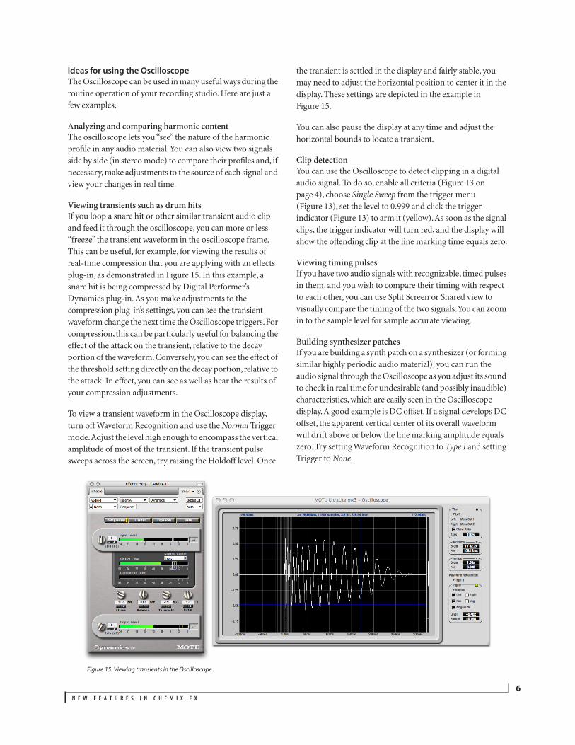
Viewing transients such as drum hits
If you loop a snare hit or other similar transient audio clip
and feed it through the oscilloscope, you can more or less
“freeze” the transient waveform in the oscilloscope frame.
This can be useful, for example, for viewing the results of
real-time compression that you are applying with an effects
plug-in, as demonstrated in Figure 15. In this example, a
snare hit is being compressed by Digital Performer’s
Dynamics plug-in. As you make adjustments to the
compression plug-in’s settings, you can see the transient
waveform change the next time the Oscilloscope triggers. For
compression, this can be particularly useful for balancing the
effect of the attack on the transient, relative to the decay
portion of the waveform. Conversely, you can see the effect of
the threshold setting directly on the decay portion, relative to
the attack. In effect, you can see as well as hear the results of
your compression adjustments.
To view a transient waveform in the Oscilloscope display,
turn off Waveform Recognition and use the
Normal
Trigger
mode. Adjust the level high enough to encompass the vertical
amplitude of most of the transient. If the transient pulse
sweeps across the screen, try raising the Holdoff level. Once
the transient is settled in the display and fairly stable, you
may need to adjust the horizontal position to center it in the
display. These settings are depicted in the example in
Figure 15.
You can also pause the display at any time and adjust the
horizontal bounds to locate a transient.
Clip detection
You can use the Oscilloscope to detect clipping in a digital
audio signal. To do so, enable all criteria (Figure 13 on
page 4), choose
Single Sweep
from the trigger menu
(Figure 13), set the level to 0.999 and click the trigger
indicator (Figure 13) to arm it (yellow). As soon as the signal
clips, the trigger indicator will turn red, and the display will
show the offending clip at the line marking time equals zero.
Viewing timing pulses
If you have two audio signals with recognizable, timed pulses
in them, and you wish to compare their timing with respect
to each other, you can use Split Screen or Shared view to
visually compare the timing of the two signals. You can zoom
in to the sample level for sample accurate viewing.
Building synthesizer patches
If you are building a synth patch on a synthesizer (or forming
similar highly periodic audio material), you can run the
audio signal through the Oscilloscope as you adjust its sound
to check in real time for undesirable (and possibly inaudible)
characteristics, which are easily seen in the Oscilloscope
display. A good example is DC offset. If a signal develops DC
offset, the apparent vertical center of its overall waveform
will drift above or below the line marking amplitude equals
zero. Try setting Waveform Recognition to
Type I
and setting
Trigger to
None
.
Figure 15: Viewing transients in the Oscilloscope
N E W F E A T U R E S I N C U E M I X F X
7
Another example is waveform polarity. If you are combining
several raw waveforms, polarity is a critical, yet not always
obvious, factor in determining the resulting sound. You can
use the Oscilloscope to easily view and compare polarities to
see if they are inverted from one another or not. The
Add
and
Subtract L - R
View menu settings are particularly useful
here.
You can also use the Oscilloscope to help you apply
waveform modulation and keep it “in bounds”. For example,
you could easily see if pulse width modulation is collapsing
in on itself to choke the sound, an effect that is readily seen in
the Oscilloscope display but not necessarily easy to
determine by ear when using multiple modulation sources.
Guitarists can also visually observe the effects of their pedals
and processing, while playing. With the Trigger mode set to
None
and Waveform Recognition set to
Type I
, the waveform
will be tracks automatically.
When applying filters and filter resonance, the visual effect
on the waveform can be invaluable in reinforcing what you
are hearing as you make adjustments.
Monitoring control voltage output from Volta
MOTU’s Volta instrument plug-in for Mac OS X turns your
audio interface into a control voltage interface, giving you
precise digital control from your favorite audio workstation
software of any hardware device with a control voltage (CV)
input. The CV signals output from Volta can be monitored in
the Oscilloscope, giving you visual feedback on LFOs,
envelopes, ramps, step sequencers, and more.
For more information on Volta, see www.motu.com.
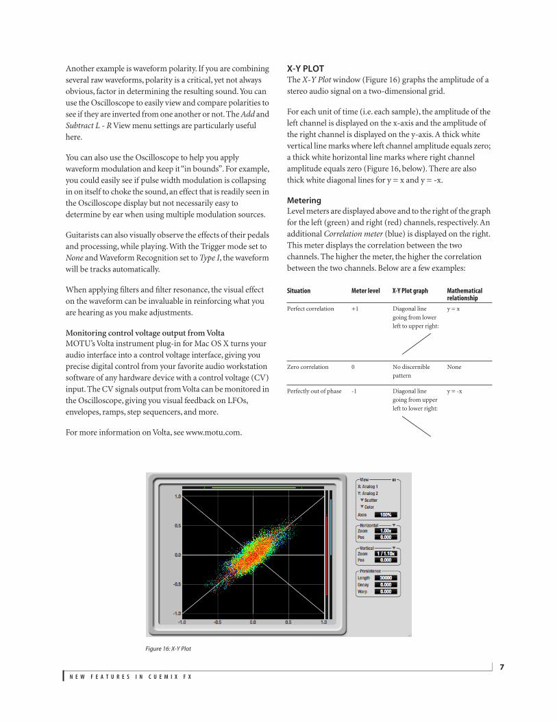
X-Y PLOT
The
X-Y Plot
window (Figure 16) graphs the amplitude of a
stereo audio signal on a two-dimensional grid.
For each unit of time (i.e. each sample), the amplitude of the
left channel is displayed on the x-axis and the amplitude of
the right channel is displayed on the y-axis. A thick white
vertical line marks where left channel amplitude equals zero;
a thick white horizontal line marks where right channel
amplitude equals zero (Figure 16, below). There are also
thick white diagonal lines for y = x and y = -x.
Metering
Level meters are displayed above and to the right of the graph
for the left (green) and right (red) channels, respectively. An
additional
Correlation meter
(blue) is displayed on the right.
This meter displays the correlation between the two
channels. The higher the meter, the higher the correlation
between the two channels. Below are a few examples:
Situation Meter level X-Y Plot graph Mathematical relationship
Perfect correlation +1 Diagonal line
going from lower
left to upper right:
y = x
Zero correlation 0 No discernible
pattern
None
Perfectly out of phase -1 Diagonal line
going from upper
left to lower right:
y = -x
Figure 16: X-Y Plot
N E W F E A T U R E S I N C U E M I X F X
8
Opening the X-Y Plot
Each mk3 series FireWire audio interface has its own
X-Y Plot window. Choose the
X-Y Plot
item from the
Devices menu under the desired interface.
Figure 17: Opening the X-Y Plot.
Choosing a channel pair to display
The X-Y Plot follows the currently focused audio input or
output. If you focus a mono channel (e.g. Analog 3), its
corresponding stereo pair will be displayed (Analog 3–4).
View controls
The View controls (Figure 18) provide several options for the
X-Y Plot display.
Figure 18: View controls
Pausing the display
The Pause button in the upper right corner of the View
section (Figure 18) allows you to freeze the display at any
time. To resume, click the button again. The level meters will
remain active while the display is paused.
Line/Scatter
Choose either
Line
or
Scatter
from the menu in the View
section (Figure 18) to plot each point (sample) as either a
single pixel or as a continuous line that connects each plot
point to the next, as shown below in Figure 19.
Figure 19: The same X-Y Plot displayed in Line versus Scatter mode.
☛
Line mode is significantly more CPU intensive than
Scatter. You can reduce Line mode CPU overhead on the X-Y
Plot by reducing the Length parameter (described below).
Color/Grayscale
In
Color
mode (Figure 18) the most recently displayed audio
data is shown in red, which fades to yellow, green and then
finally blue, before disappearing. In Grayscale mode, data is
first shown in white and then fades to gray. To adjust the scale
of this color/brightness change, see “Decay” on page 9.
Axes
The
Axes
control (Figure 18) sets the opacity of the grid
displayed in the graph, from 100% (fully visible) down to 0%
(fully hidden).
Horizontal and vertical controls
The
Horizontal
and
Vertical
controls (Figure 20) configure
the value range of the x-axis (left channel amplitude), and
y-axis (right channel amplitude), respectively. Click and
drag the values up or down to set them, or double-click to
return to the default value.
There are two modes for the controls:
Zoom/Offset
and
Min/Max
. To change the mode, use the menu shown in
Figure 20.
Figure 20: Setting the Horizontal or Vertical control modes.
In
Zoom/Offset
mode,
Zoom
scales the axis.
Pos
moves the
lines marking x = 0 left and right, or y = 0 up and down.
In
Min/Max
mode,
Min
and
Max
let you scale the grid by
moving the -1.0 and +1.0 points along the axis. Min/Max
mode lets you control the graph boundaries directly.
Persistence
The Persistence controls (Figure 21) affect the appearance of
data from when it is first displayed until it disappears from
the grid.
Figure 21: The Persistence controls.
Pause button
N E W F E A T U R E S I N C U E M I X F X
9
Length
Length (Figure 21) sets the number of recent samples to show
on the plot. For example, when Length is set to 10,000, the
10,000 most recent samples are shown.
Decay
The brightness (in Grayscale mode) or hue (in Color mode)
of each sample on the plot is determined by a linear scale,
with the most recent sample displayed at the maximum value
and the oldest sample displayed at the minimum value.
Decay (Figure 21 on page 8) determines the brightness or
hue of the minimum value. When Decay is zero, the oldest
sample is black. When Decay is +1.000, the oldest sample is
fully opaque (in Grayscale mode) or red (in Color mode).
Warp
Warp (Figure 21) determines the position of data points after
they are first drawn. When warp is zero, data points remain
in the same position. When warp is positive, they contract
towards the origin (center of the grid). When warp is
negative, they expand away from the origin. The further the
warp value is from zero, the greater the effect.
Using the X-Y Plot
The X-Y Plot helps you “see” the width of the stereo field of a
mix. It also helps you determine if a mix has issues with
polarity, as follows:
If a stereo signal is out of phase, it is not mono compatible
because it can cancel itself out, either partially or nearly
completely, when collapsed to mono.
Figure 22: Checking polarity in a stereo signal with the X-Y Plot.
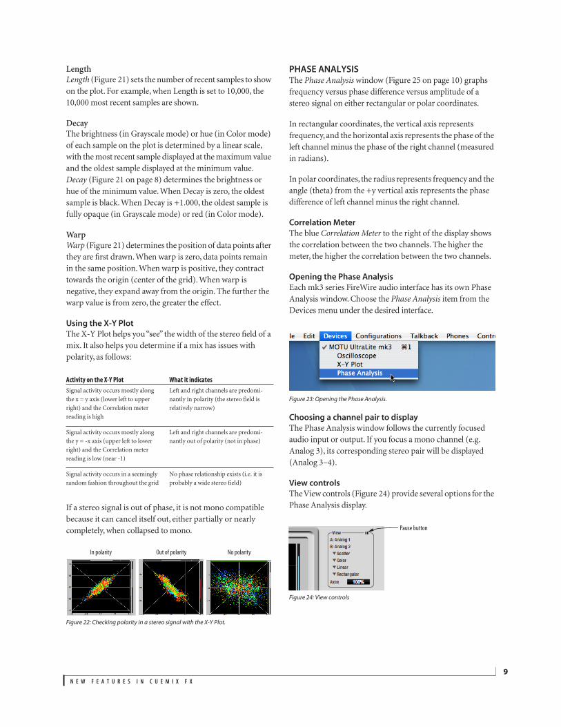
PHASE ANALYSISThe Phase Analysis window (Figure 25 on page 10) graphs
frequency versus phase difference versus amplitude of a
stereo signal on either rectangular or polar coordinates.
In rectangular coordinates, the vertical axis represents
frequency, and the horizontal axis represents the phase of the
left channel minus the phase of the right channel (measured
in radians).
In polar coordinates, the radius represents frequency and the
angle (theta) from the +y vertical axis represents the phase
difference of left channel minus the right channel.
Correlation Meter
The blue Correlation Meter to the right of the display shows
the correlation between the two channels. The higher the
meter, the higher the correlation between the two channels.
Opening the Phase Analysis
Each mk3 series FireWire audio interface has its own Phase
Analysis window. Choose the Phase Analysis item from the
Devices menu under the desired interface.
Figure 23: Opening the Phase Analysis.
Choosing a channel pair to display
The Phase Analysis window follows the currently focused
audio input or output. If you focus a mono channel (e.g.
Analog 3), its corresponding stereo pair will be displayed
(Analog 3–4).
View controls
The View controls (Figure 24) provide several options for the
Phase Analysis display.
Figure 24: View controls
Activity on the X-Y Plot What it indicates
Signal activity occurs mostly along
the x = y axis (lower left to upper
right) and the Correlation meter
reading is high
Left and right channels are predomi-
nantly in polarity (the stereo field is
relatively narrow)
Signal activity occurs mostly along
the y = -x axis (upper left to lower
right) and the Correlation meter
reading is low (near -1)
Left and right channels are predomi-
nantly out of polarity (not in phase)
Signal activity occurs in a seemingly
random fashion throughout the grid
No phase relationship exists (i.e. it is
probably a wide stereo field)
In polarity Out of polarity No polarity
Pause button

N E W F E A T U R E S I N C U E M I X F X
10
Pausing the display
The Pause button in the upper right corner of the View
section (Figure 24) allows you to freeze the display at any
time. To resume, click the button again. The correlation
meter will remain active while the display is paused.
A/B (stereo audio channels)
The View section (Figure 24) displays the pair of input or
output audio channels you are viewing. See “Choosing a
channel pair to display” above.
Line/Scatter
Choose either Line or Scatter from the menu in the View
section (Figure 24) to plot each data point as either a single
pixel or as a continuous line that connects each frequency
data point to the next, as shown below in Figure 19.
Figure 26: The same Phase Analysis displayed in Line versus Scatter mode.
☛ Line mode is significantly more CPU intensive than
Scatter. You can reduce Line mode CPU overhead for the
Phase Analysis display by increasing the Floor filter and
reducing the Max Delta Theta filters (see “Filters” on
page 11).
Color/Grayscale
In Color mode (Figure 24) signal amplitude is indicated by
color as follows: red is loud and blue is soft. In grayscale
mode, white is loud and gray is soft.
Linear/Logarithmic
Choose either Linear or Logarithmic from the menu in the
View section (Figure 24) to change the scale of the frequency
axis. In rectangular coordinates, the vertical axis represents
frequency, and in polar coordinates, the radius from the
center is frequency. With a linear scale, frequencies are
spaced evenly; in a logarithmic scale, each octave is spaced
evenly (frequencies are scaled logarithmically within each
octave).
Linear is better for viewing high frequencies; logarithmic is
better for viewing low frequencies.
Rectangular/Polar
Choose either Rectangular or Polar from the menu in the
View section (Figure 24) to control how audio is plotted on
the Phase Analysis grid. Rectangular plots the audio on an
X-Y grid, with frequency along the vertical axis and phase
difference on the horizontal axis. Polar plots the data on a
polar grid with zero Hertz at its center. The length of the
radius (distance from the center) represents frequency, and
the angle (theta) measured from the +y (vertical) axis
represents the phase difference in degrees.
Figure 25: Phase Analysis
N E W F E A T U R E S I N C U E M I X F X
11
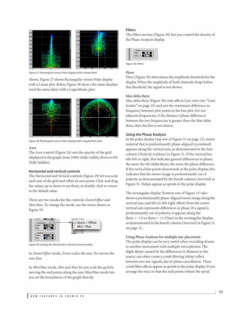
Figure 27: Rectangular versus Polar display (with a linear plot).
Above, Figure 27 shows Rectangular versus Polar display
with a Linear plot. Below, Figure 28 show s the same displays
(and the same data) with a Logarithmic plot:
Figure 28: Rectangular versus Polar display with a logarithmic plot.
Axes
The Axes control (Figure 24) sets the opacity of the grid
displayed in the graph, from 100% (fully visible) down to 0%
(fully hidden).
Horizontal and vertical controls
The Horizontal and Vertical controls (Figure 29) let you scale
each axis of the grid and offset its zero point. Click and drag
the values up or down to set them, or double-click to return
to the default value.
There are two modes for the controls: Zoom/Offset and
Min/Max. To change the mode, use the menu shown in
Figure 29.
Figure 29: Setting the Horizontal or Vertical control modes.
In Zoom/Offset mode, Zoom scales the axis. Pos moves the
zero line.
In Min/Max mode, Min and Max let you scale the grid by
moving the end points along the axis. Min/Max mode lets
you set the boundaries of the graph directly.
Filters
The Filters section (Figure 30) lets you control the density of
the Phase Analysis display.
Figure 30: Filters
Floor
Floor (Figure 30) determines the amplitude threshold for the
display. When the amplitude of both channels drops below
this threshold, the signal is not shown.
Max delta theta
Max delta theta (Figure 30) only affects Line view (see “Line/
Scatter” on page 10) and sets the maximum difference in
frequency between plot points in the line plot. For two
adjacent frequencies, if the distance (phase difference)
between the two frequencies is greater than the Max delta
theta, then the line is not drawn.
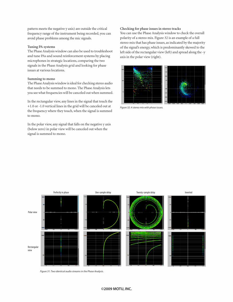
Using the Phase Analysis
In the polar display (top row of Figure 31 on page 12), stereo
material that is predominantly phase-aligned (correlated)
appears along the vertical axis, as demonstrated in the first
column (Perfectly in phase) in Figure 31. If the vertical line
tilts left or right, this indicates general differences in phase;
the more the tilt (delta theta), the more the phase difference.
If the vertical line points downwards in the polar display, this
indicates that the stereo image is predominantly out of
polarity, as demonstrated by the fourth column (Inverted) in
Figure 31. Delays appear as spirals in the polar display.
The rectangular display (bottom row of Figure 31) also
shows a predominantly phase-aligned stereo image along the
vertical axis, and tilt (or left-right offset) from the center
vertical axis represents differences in phase. If a signal is
predominantly out of polarity, it appears along the
theta = -1.0 or theta = +1.0 lines in the rectangular display,
as demonstrated in the fourth column (Inverted) in Figure 31
on page 12.
Using Phase Analysis for multiple mic placement
The polar display can be very useful when recording drums
or another instrument with multiple microphones. The
slight delays caused by the differences in distance to the
source can often create a comb filtering (delay) effect
between two mic signals, due to phase cancellation. These
comb filter effects appear as spirals in the polar display. If you
arrange the mics so that the null points (where the spiral
N E W F E A T U R E S I N C U E M I X F X
12
pattern meets the negative y axis) are outside the critical
frequency range of the instrument being recorded, you can
avoid phase problems among the mic signals.
Tuning PA systems
The Phase Analysis window can also be used to troubleshoot
and tune PAs and sound reinforcement systems by placing
microphones in strategic locations, comparing the two
signals in the Phase Analysis grid and looking for phase
issues at various locations.
Summing to mono
The Phase Analysis window is ideal for checking stereo audio
that needs to be summed to mono. The Phase Analysis lets
you see what frequencies will be canceled out when summed.
In the rectangular view, any lines in the signal that touch the
+1.0 or -1.0 vertical lines in the grid will be canceled out at
the frequency where they touch, when the signal is summed
to mono.
In the polar view, any signal that falls on the negative y axis
(below zero) in polar view will be canceled out when the
signal is summed to mono.
Checking for phase issues in stereo tracks
You can use the Phase Analysis window to check the overall
polarity of a stereo mix. Figure 32 is an example of a full
stereo mix that has phase issues, as indicated by the majority
of the signal’s energy, which is predominantly skewed to the
left side of the rectangular view (left) and spread along the -y
axis in the polar view (right).
Figure 32: A stereo mix with phase issues.
Figure 31: Two identical audio streams in the Phase Analysis.
Perfectly in phase One-sample delay Twenty-sample delay
Polar view
Rectangular
view
Inverted
©2009 MOTU, INC.