Embed Size (px)
Citation preview
CREATE THE CONTENTS PAGE..
Using Photoshop to
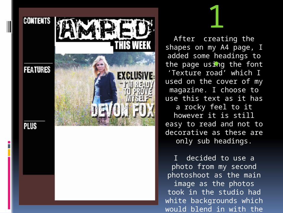
After creating the shapes on my A4 page, I added
some headings to the page using the font ‘Texture
road’ which I used on the cover of my magazine. I
choose to use this text as it has a rocky feel to it
however it is still easy to read and not to decorative
as these are only sub headings.
I decided to use a photo from my second
photoshoot as the main image as the photos took in
the studio had white backgrounds which would
blend in with the page background too much.
I also added my main title in the same font as the
cover
1.
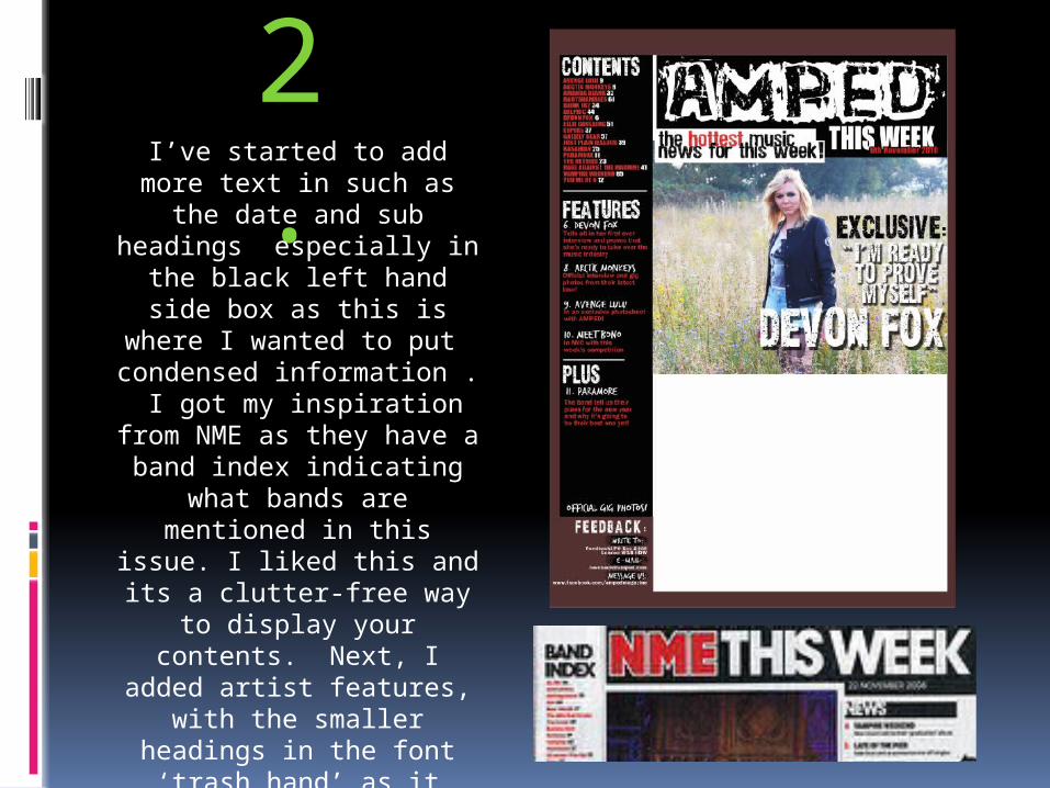
2.
I’ve started to add more text in such as the date
and sub headings especially in the black left
hand side box as this is where I wanted to put
condensed information . I got my inspiration from
NME as they have a band index indicating what
bands are mentioned in this issue. I liked this and its a clutter-free way to display your contents.
Next, I added artist features, with the smaller headings in the font ‘trash hand’ as it reminds me of
something that would be in NME.
At the bottom of the page I put a feedback box which is
present in a lot of magazines.
3.
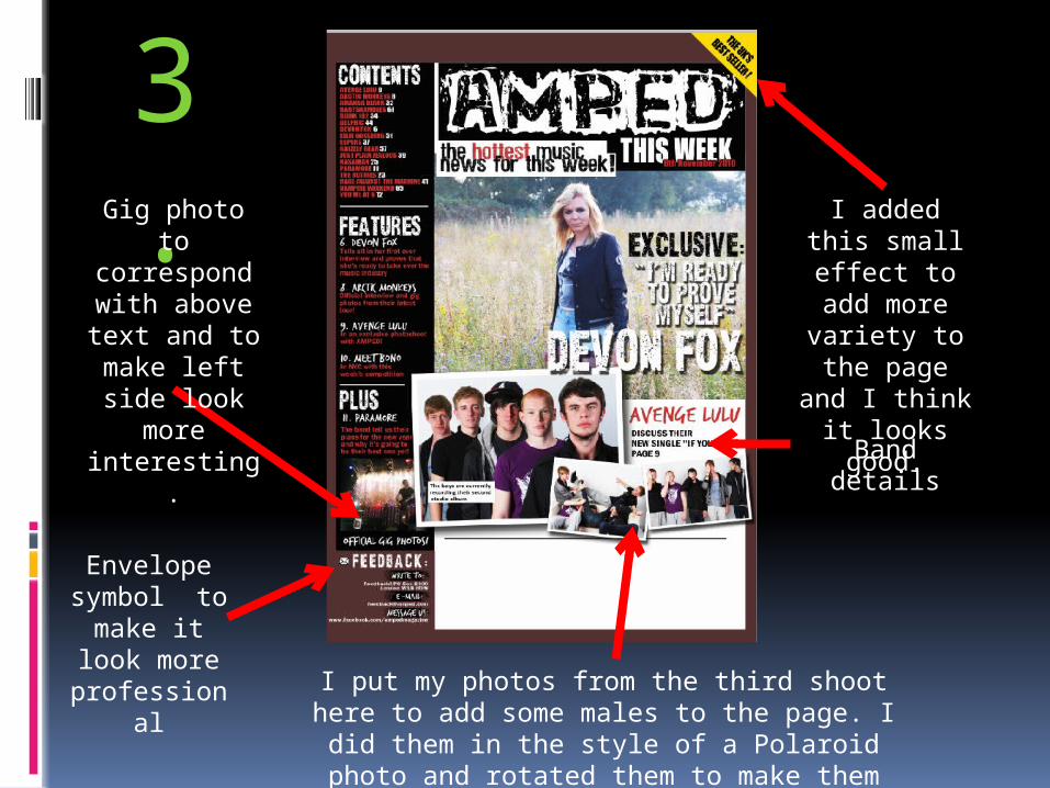
Envelope symbol to
make it look more
professional
Gig photo to correspond with above text and to
make left side look more
interesting.
I added this small effect to add more
variety to the page and I
think it looks good.
Band details
I put my photos from the third shoot here to add some males to the page. I did them in the style of a Polaroid photo and rotated them to
make them look interesting