Embed Size (px)
Citation preview
Creating a website for Zuri Tours & Safaris
Mirka Kangasaho
Bachelor’s Thesis
Degree Programme in Tourism
2016
Abstract
21.3.2016
Author(s) Mirka Kangasaho
Degree programme Degree programme in Tourism
Report/thesis title Creating a website for Zuri Tours & Safaris
Number of pages and appendix pages 37+4
This thesis is a report about the planning and implementing a website for a Tanzanian com-
pany Zuri Tours & Safaris. The goals were to get the website for the commissioner and ease
their marketing through that. For me the aim was to develop as a website planner and maker.
The project was commissioned in March 2015 and doing the website was started in 23rd of
March. The publishing was in 22nd of June. The thesis consists of the theory part and the part
about implementing.
The part of the commissioner has the basic information about the company. On top of that it
includes the products that are offered. Also the safari and tour market in Africa and Tanzania
and the ways of competition are covered. The chapter about the marketing communication
has the theory and subheading goes deeper to the marketing via website. The theory of mak-
ing a website again has the practical theory about details, how the website should be planned
and implemented. There will be discussed one by one each part of a website. The chapter
about the preparations for the website is empirical while it explains the steps of selecting the
tools, how the communicating with a Tanzanian commissioner worked out and the bench-
marking. The last chapter is strictly about the implementing and it is synchronized with the
chapter of the theory of making the website. It has all the same elements explained how in
this case was done.
The website was made in Wix, a platform for making the websites. Apart from the content
and the texts the commissioner did not effect on the project, except forwarding the material
that was possible to be used. Some ideas about how the things would be possible to do easi-
er or better came out in a chapter of discussion. Mainly the small practical things were
planned a bit worse as they could have been.
Keywords Website, safaris, tourism, marketing communication
Table of contents
1 Introduction ................................................................................................................... 1
2 Zuri Tours & Safaris ...................................................................................................... 4
2.1 The products ......................................................................................................... 4
2.2 Market in Africa and in Tanzania ........................................................................... 6
2.3 The ways in competition ........................................................................................ 6
3 Marketing communication ............................................................................................. 9
3.1 Marketing via website .......................................................................................... 10
4 Making a website ........................................................................................................ 11
4.1 Layout ................................................................................................................. 12
4.2 Usability and navigation ...................................................................................... 13
4.3 Content ............................................................................................................... 14
4.3.1 Texts ........................................................................................................ 14
4.4 Visuality .............................................................................................................. 15
4.4.1 Colours .................................................................................................... 16
4.4.2 Fonts ........................................................................................................ 17
4.4.3 Pictures .................................................................................................... 17
5 Preparations for the website ........................................................................................ 19
5.1 Selecting the tools ............................................................................................... 19
5.1.1 Wix ........................................................................................................... 19
5.2 Communication with the commissioner ............................................................... 20
5.3 Benchmarking ..................................................................................................... 21
6 Creating the website ................................................................................................... 25
6.1 Layout ................................................................................................................. 26
6.2 Usability and navigation ...................................................................................... 27
6.3 Content ............................................................................................................... 28
6.3.1 Texts ........................................................................................................ 31
6.4 Visuality .............................................................................................................. 32
6.4.1 Colours .................................................................................................... 33
6.4.2 Pictures .................................................................................................... 34
6.4.3 Fonts ........................................................................................................ 34
6.4.4 Self-evaluation ......................................................................................... 35
7 Discussion ................................................................................................................... 36
References ...................................................................................................................... 38
1
1 Introduction
The commissioner for this thesis is Tanzanian Zuri Tours & Safaris. The commission was
created when the need of the new website for them and my ability to develop websites
came together. Since the company is a small newcomer, they are in a big need of a web-
site. The contact person is my classmate and the only person from the company in Fin-
land. Since we were in different cities during the project, the communication worked main-
ly via social media and phone sessions.
The objective of the commissioner is to get the website to market their company and in
that way develop their marketing. They want their website to reflect their ability to create
not only services, but experiences. Informative and visually tempting website is the thing
the commissioner is waiting for. Zuri Tours & Safaris need the website to create mostly
visibility and reliability. They need a clear website, which reaches people all over the
world. It needs to be accessible easily and the information needs to be straight forward
and trustworthy. My objective is to develop myself in creating the websites. Since my only
tool for now has been a Finnish website platform Kotisivukone, I look forward to find a new
tool. We will start the planning from a scratch so I will have a freedom of planning and
implementing. The new tool comes with some challenges but that is only way to get bet-
ter. Since the websites I have done till now have been really simple, for a strict and pro-
fessional target group and far from my own field, this project is a great opportunity. It gives
me possibility to learn about marketing in tourism. Also it will be fascinating to create a
website for an operator which highlights experiencing so much. Getting information of how
to make the website attractive and clear is the biggest thing I learn during this project.
During this project there will be challenges of how to make the website better than the
competitors’ ones. To get attention in a field which can be very competitive, the website
needs to get lots of views and it needs to be available easily. Also as a local company, the
website needs to show how responsible and safe the company is. When making the web-
site for Tanzanian company, a big problem might be communicating. In Tanzania internet
access is not as obvious everyday thing as in Finland. It will be not so easy to contact the
commissioner himself in any time. Also the new tool which will be used as a platform of
making the website will be a challenge. Picking a platform is the first thing, but probably
the commissioner will choose it because the payment depends on the platform. After pick-
ing the platform it is time for me to learn how to use it. For now I have used only Finnish
Kotisivukone and I am not really familiar with any others. These challenges are still some-
thing that can be solved. The competition with other companies is just about learning
about other websites and making ours better. Communicating with Tanzanian commis-
2
sioner is a thing that just needs a right attitude from the beginning and patience. Learning
how to use a new platform will maybe take some time but I know my strength and how to
be really patient in this kind of projects so in the end there will be no problems unsolved.
When the theoretical part is done, it will be taken into practise. Using the information
found, the website is created for the commissioner. The purpose is to get the website
done during June 2015. For a start the basic things for the website were planned: what
kind of structure it will have, how it will look like, what are the main headings and so on.
That is the most crucial phase of planning and the most important phase to have support
from the commissioner. The next steps are more about the details and more up to creator.
After the planning there is the implementing phase. That is mostly personal work of the
creator and the commissioner is only obliged to check the work and give comments as
often as possible. After making the website there is the publishing. After that it still needs
some fixing. There is always something that comes to commissioner’s mind after publish-
ing and they are not able to make it themselves. Below there is a schedule where are the
dates when everything finally happened.
27.4. First meeting with Pulli What the website should consists, how to communicate.
5.5. The basis of the website The visual platform got its first shape, first pictures were added and some texts.
5.5.-22.6. Making the website
The texts, the pictures etc. were added. The whole website was made.
22.6. Publishing The last important things were added and the website got pub-lished.
26.10. Ready on my behalf Last changes from me, basic information how to edit the web-site were given for Zuri employees.
Table 1. Schedule of the project
The thesis consists of six main chapters. At first there is more information of the commis-
sioner. There are basic information and lots of details that will be used in website too and
are important for me to know in an early stage of this project. The theory of marketing
communication and creating a website are important parts, where the reader finds justifia-
ble information of how and why modern companies need website or other kind of online
marketing. Knowledge from books, websites and professionals of the field will lead the
theoretical parts of the thesis. There are large totalities like why to use Internet, how to
impress customers and what is the part of the online communication in tourism compa-
nies. Furthermore also smaller pieces of the creating website are covered: modifying the
text in the right form, choosing the right pictures and creating a layout which will show all
the small details of the strictly planned aggregates. Of course the actual process of mak-
ing the website is included. There will be detailed information what we ended up choos-
3
ingto be the ways to market Zuri Tours & Safaris: everything from begging to small details
of the website. Discussion part gathers up the thesis and the whole project.
4
2 Zuri Tours & Safaris
Zuri Tours & Safaris is a tour and safari operator in Tanzania, Kilimanjaro area. The staff
consists of the local professionals. It was established 2014 by the owner Emmanuel
Mafie. The company is small and all of the employees have experience of many years in
the field of tourism. They are all local and know the region well enough to serve informa-
tive and reliable tours and safaris. (Pulli 30.6.2015)
Zuri Tours & Safaris has a main goal to provide trustworthy and safe experiences for tour-
ists. They want to get profit from this business. (Pulli 30.6.2015.) Also many of the em-
ployees name getting information about other cultures and a life experience as goals.
(Pulli 8.5. 2015.)
Main mission is to provide not only tours and safaris but lifetime experiences for the cus-
tomers. (Pulli 8.5.2015.) It is the job of every employee to give the best service for the
customers. Trust and safety are also the values that the company wants to highlight. To
give tailor made experiences is important for Zuri Tours & Safaris. By creating unforgetta-
ble experiences they get the good reputation, which is needed. (Pulli 30.6.2015.)
2.1 The products
Amount of tourists in Tanzania is increasing all the time. (Trading Economics 2012) That
is a good reason to create a new company for safaris and tours. As it is mentioned in Ser-
vices Marketing: Integrating customer focus across the firm, it is really important to focus
on customer’s point of view when marketing. For example seeing the website, which is
created, in the eyes of customer, is really important when it is wanted to get effective mar-
keting. (McGraw & Hill 2003, 27.)
Zuri Tours & Safaris names all nationalities as their target group. Since they have good
connections in Finland and there are Finnish customers already, Finnish people are one
target group that Zuri Tours & Safaris invests. Also the website will be translated to Finn-
ish. There are products for all ages and group sizes. There are some tours which are suit-
able for families, even for the smallest ones. Alternatively there is a possibility to get chal-
lenging and adventurous trip. (Pulli 30.6.2015.) Already the point where a person or a
group is going to Tanzania for a tour or a safari tells about adventurous, curious and expe-
rience central mind-set. That is why already the marketing needs to show how amazing a
trip with Zuri Tours & Safaris can be.
5
As the owner of Zuri Tours & Safaris says: “Zuri Tours & Safaris is a safari company offer-
ing more than just safari holidays, climbs and day trips in Tanzania; we offer unforgettable
experiences.” (Pulli 8.5.2015.) In practice the company offers services with the whole
baggage. The main categories are safaris, mountain climbing trips and day trips. With Zuri
Tours & Safaris the trips are always tailor-made. The customer can affect to the route, to
the length and therefore to the price. (Pulli 8.5.2015.) According to Pulli safaris are the
most popular product of Zuri Tours & Safaris. It is a possible option for every age and can
be planned exactly how a customer wants. (Pulli 30.6.2015.)
Safaris are divided into Southern and Northern Safaris. (Pulli 8.5.2015.) In Tanzania-book
it is said that many visitors concentrate their trip and activities to Northern Tanzania where
Mt. Kilimanjaro and Mt. Meru, Serengeti National Park and Lake Manyara are located.
(Fitzpatrick 2008, 11.). But Zuri Tours & Safaris try to reach also the Southern Tanzania
where are located more national parks and for example Selous Game Reserve and Mafia
Islands. As said before all safaris are possible to fix as a customer wants. It is possible to
get free time and get own interests fit to the schedule. Ready-made itineraries are from
three days till ten days. Accommodation in safaris can be chosen between lodges and
tents. In Northern safaris departure place is Moshi or Arusha and in Southern ones always
Dar es Salaam. (Pulli 8.5.2015.)
For now Zuri Tours & Safaris make climbing trips to Mt. Kilimanjaro and Mt. Meru. They
are near to Moshi, the company’s head office and safaris’ departure town. Kilimanjaro is
the highest mountain in Africa and Mt. Meru the fifth highest. Climbing to Mt. Kilimanjaro is
pretty challenging and therefore suits for fit travellers. With Zuri Tours & Safaris the cus-
tomers get to choose from three different routes, from four nights to seven nights trips. It
also depends on the route how demanding and how well equipped the trip is. Mt. Meru is
lower and therefore also less demanding than Mt. Kilimanjaro. It takes at least three or
four days to get to Mt. Meru and back. (Pulli 18.5.2015.)
Shorter and somehow easier trips that Zuri Tours & Safaris offers are beach holidays in
four beautiful places of Tanzania: city of Dar es Salaam, which has beaches near-by,
Zanzibar, Pangani and Mafia Island. Also day trips are shorter. There are cultural experi-
ences of Maasai and Hadzabe tribes. In these trips you get to know old cultures of Tanza-
nia which are still there alive. There are also trips to Prison Island to get to know history of
the place, spice tour and coffee tour and hike to the waterfall. Pure nature hikes are to
Maji Moto – hot springs, to lake Chala and a day trip to Mt. Kilimanjaro. These day trips
take a traveller near to African nature, culture and history. (Pulli 20.6.2015.)
6
2.2 Market in Africa and in Tanzania
Tourism in Africa overall is increasing all the time. From 1990 to 2011 the amount of tour-
ists has increased from 6.7 million to 33.1 million. According to The World Bank the de-
veloping countries are able to increase the tourism a lot more effectively than the rest of
the world. Most of these countries are African and Tanzania is one of them. The World
Bank report highlights how important it is to get good support from government so that the
tourism can keep growing. After couple of countries have worked for their tourism num-
bers and been ready to try it, the fear of the problems that tourism can bring is fading
slowly away. Now already 1 in 20 jobs in Sub-Saharan Africa are tourism-based. Still one
of the problems in increasing the tourism in Africa is the scepticism among the local peo-
ple. The fear of especially destroying the nature is in the way of development. (The World
Bank 2013. 1; 21.) Olli Marttila has observed that many countries in Africa have lost their
wild-life areas because of tourism. There are many risks in people discovering new coun-
tries. But according to Marttila Tanzania is the biggest winner in that situation, since it has
many large nature reserves which protect the amazing nature and also old heritages in
Tanzania. (Marttila 2008, 64.)
Safari Bookings names Tanzania one of the top 8 safari countries. In customer based
rating Tanzania is the most liked one, with 4.8 stars out of five. In this site, only con that
experts named was that Tanzania has too many highlights to fit in one safari. (Safari
Bookings 2015.) The most famous attraction in Tanzania is Mount Kilimanjaro. Since Tan-
zania offers so many places to visit and tourism is increasing, the safari industry has got-
ten really competitive. That also feeds the operators that are not so safe and honest, but
their prices are cheaper. (Fitzpatrick 2008, 36.)
When searching for tours and safaris in Tanzania, over 2000 results come up. The tours
can be categorized in many different ways: Duration, price, destination, customization,
comfort level and ratings. The budget trips can be found even under 200 euros. Longer
and more luxurious trips can be up to even 10 000 euros. The price is always dependent
of the accommodation, comfort level and all different factors. (Safari Bookings 2015.)
2.3 The ways in competition
The biggest strength of Zuri Tours & Safaris is the ability to plan the tours and safaris ex-
actly the way a customer wants. There are ready suggestions for customers to start with,
but final decision is up to them. The ability to plan the safari or the tour with a customer
comes from the size of the company. Because Zuri Tours & Safaris is a small company
7
with fewer customers, every customer can be served as an individual and the service is
more personal that way.
Destination can be picked from the lists that are available in the website. Zuri Tours &
Safaris operate trips to all of the most popular destinations and as everything, a customer
can pick those places that are the most interesting. The duration depends on how many
and which places are visited. Also comfort level differs. For example climbing to Mount
Kilimanjaro the customer can choose if he wants accommodation in a tent or sleeping
huts. (Pulli 18.6.2015.) It is advisable that the customer reserves enough time to every
destination, but if the customer want can the trips be gotten tight schedules too. (Pulli
30.6.2015)
Zuri Tours & Safaris prices are not informed in the website because there can be so many
different variations of the trips. The prices start from under 200 euros and from there it
changes depending on the reasons mentioned above. (Pulli 30.6.2015) Although Tanza-
nia can be visited in any time of the year, July and August are the highest seasons. That
is when the hotels are their fullest. Since from March to May it is rain season, the prices
are lower. (Fitzpatrick 2008, 12.)
Zuri Tours & Safaris have the head office in Moshi, which is the capital of Kilimanjaro ar-
ea. It is situated right next to Mount Kilimanjaro. (Fitzpatrick 2008, 12.) The staff is availa-
ble there. Main marketing happens online. The website and different travel sites are the
most important ways to reach the customers. Booking a trip happens with straight com-
munication with the company. There is no booking program in use. (Pulli 30.6.2015.) In
the website there is the template the customer can fill and get in touch with Zuri Tours &
Safaris through that. Also there are the address, e-mail address, phone number,
WhatsApp and Skype. Via those a customer can contact the company. (Pulli 8.5.2015.)
According to Zeithaml and Bitner physical evidence consists of the concrete things that
determine the image that the customer gets about the company. Seeing and analysing the
physical evidences starts already before the service. The customer might make the buying
decision based on them: comparing the visible signs of quality. During the service cus-
tomers observe all the time and make conclusions about the company based on the phys-
ical evidences. Afterwards it is important for the customer to get something to remind
about the business: business card, online questionnaire about the service or something
else. (Zeithaml & Bitner 2003, 282-335.)
8
As a safari company, Zuri Tours & Safaris’ most important physical evidences are land-
scape and environment, the equipment, such as safari cars and climbing equipment, em-
ployee uniforms and the website. Secondary comes the design and access of the office.
Since the safaris start from outside, not the office, many customers do not even go to the
office. Still especially when told in website that the office is located right next to Mount
Kilimanjaro, it creates the feel of safari already. The landscape and the environment are
logically the most important thing in the safaris themselves. It is all based on that and
Tanzanian nature takes care of it. The equipment, uniforms and website are in a big role
of creating feeling of safety. When travelling in sub Saharan Africa it is necessary to make
customers feel safe and professional. At the same time especially the clothing of employ-
ees need to be African-like. For example suit will not convince. The most important thing
in the website is of course to make that safety feeling, but also advertise the experiences
that Zuri Tours & Safaris are able to offer. (Pulli 20.6.2015.)
Service process in Zuri Tours & Safaris starts when a customer finds out about the com-
pany. First expression needs to give the promises which can be filled and convince the
customer that right this safari company is the best one to choose. When the customer
contacts the company, answers need to be clear, informative and fast. Since the tours and
safaris are fixable depending on the customer’s wishes, communication might continue for
a long time. After making the deal, instructions needs to be clear and all questions need to
be answered. The service itself begins when the customer arrives, warm welcoming and
safe feeling from the beginning are important for the first impression. Taking care of the
customer throughout the trip consists of many things. Safaris need to include the animals
that promised and fulfil the expectations. All promised refreshments and goods need to be
offered and for example hydration is important thing for safety to take care of, especially
with tourists from countries, where they are not used to the hot climate. Working with the
wild animals, safety with them is also the responsibility of an employee. After the service
delivered, the company needs to take care of the post-service activities. The feedback
and really memorable things need to be taken under consideration. Afterwards those re-
views might come really handy and help the company to improve their actions. (Pulli
20.6.2015.)
9
3 Marketing communication
Marketing communication is a part of marketing mix, which defines 4 P’s: product, place,
price and promotion. Marketing communications is a big part of promotion. It defines how
a company wants to be seen by customers. (Management study guide 2013.) Promotion
consists of advertising, personal selling, sales promotion and public relations. (Brown
2013.)
Advertising is impersonal, but it reaches a big amount of people in a small effort. It is also
warned that even though cost per one contact is low, advertising might get really expen-
sive. For example television commercials are pricy. Especially the old ways of advertising
can be expensive, like television, newspapers etc. But for example websites and especial-
ly social media can be really cheap option. Even though internet advertising has some
disadvantages such as it is difficult to measure how effective it is and people cannot con-
centrate to everything that is online. But if an online advertise is well planned, it reaches
the target groups; it has short lead time and can be cheap option. (Brown 2013.)
While choosing which media to use, a company needs to consider cost per contact, reach,
frequency and audience selectivity. Cost per contact means how much money it takes to
reach one person of the target market. Reach is the amount of people of the target groups
which are reached at least once. Frequency consists all times than advertise reaches a
customer. Selectivity means the ability to reach exactly the right people, who are part of
targeting. All of these points need to be taken under consideration so that the numbers of
each section is high enough but not too high so the customers get the message but will
not get annoyed by it. (Brown 2013.)
To make effective marketing communications the company needs to know the customers.
Some kind of stereotypical customer could be thought so the hopes, expectations would
be clear. It would also be important to know what channels the customers use to find the
service the company is offering. To go forward with the marketing communications starts
with the first goal, informing the customer. For that the company can have advertising
which will lead to the website. The second goal is to persuade the customers to choose
the service of the company over the others. The website is number one tool to do that.
Third goal is to remind the customers to use the company’s services again. In that point it
is important to use more personal way to contact the customer. (Gray 2012.)
10
3.1 Marketing via website
A website is one of the most beneficial ways of marketing. The quality-price ratio is good,
since the website is pretty cheap to have, but it reaches a large amount of people all the
time, in a small effort. It is highlighted that almost all of the B2B decisions start online.
About 93% of them begin with online research, like Google or Yahoo. It is estimated that
also when people themselves are searching for services, they use online searches a lot.
(Keller.)
For a company which chooses to use a website there are plenty of opportunities and ad-
vantages. It is a way to communicate with people anytime and anywhere. It is always
there when the possible customers want some information or get in touch. It is also easy
to add, delete and moderate the information. Everything is always updated with just a little
effort, unlike for example the brochures which need to be made again even for a little
change. (Neeley 2010.) A website is also a way of marketing which is permanent. Once
made, it lasts. Unlike all paper marketing, like brochures, newspaper adds, posters and
also television and radio advertisements, it doesn’t need to be redone or repeated. Web-
site is also the best way to make the business worldwide. Through internet it is easy to
reach people all over world. (Keller.)
For a customer a company without a website is almost always the same than a company
that doesn’t exist. People nowadays need the possibility to find information from internet,
easily and widely. In top of being a company in some listing, it is important to have the real
website. Being in a list with dozens of other companies might give the name and some
contact information to the consumer. Still the possibility to click the name and go straight
to the website is often wanted. That is how some companies are automatically eliminated
from possible options. Also visibility in Google and other search engines is important. That
is the easiest way for a possible customer to find the company. Via website it is also pos-
sible to offer easier customer support, which leads to the better customer service. (Keller.)
11
4 Making a website
The first and the most important thing when starting to plan a website is to specify the
theme of the site. It depends on what company it is for, what are the purpose and the tar-
get group. The different categories of websites are for example commercial, informative
and conversational sites. That is normally pretty clear for the one who wants to get web-
sites made. After that it gets more complicated. In this point the target group is important
to recognize and know well. Also the product needs to be analysed. Is it something any-
one can buy or use: cheap and/or simple or is it more expensive or meant for some expert
group. This all defines the market the website is aimed to. From that the style of the web-
site starts to take a shape. (Crowder 2000, 10-17.)
After defining the theme and purpose of the website, it is time to get familiar with the audi-
ence. The basic thinking will lead to the questions of who they are, what they are like: na-
tionalities, cultural backgrounds, etc. Also for example level of the audience needs to be
taken under consideration. It makes no sense to have an advanced website for an audi-
ence which is only at the beginner level, or vice versa. Everything, content, visual-design,
navigating, depends on who is it for. When the target groups are set, some questions still
need answers. The style of a client can determine the style of the website. Way of com-
municating can be brought to a website to, the way they talk or communicate in social
media. Also the clothing style of a customer tells a lot, what kind of website they will feel
comfortable. Worldview is also important. The style of the website should match the way a
customer sees the world. (Crowder 2000, 16-20.)
All visual planning is about sending some message for a customer. Tools can be pictures,
texts, graphics, materials, colours and shapes. The one in charge needs to understand
the message clearly to be able to send it forward. Even the tiniest detail should be
planned and support the aim. Every platform of marketing should remind one another so
that the big picture is controlled. (Korkeila, Lammela & Paananen 2010, 18.) When de-
signing a website it needs to be seen as a developer: such critic and knowledge can be-
come only from that perspective. But the important thing is to see the work as a visitor: the
simplicity and clearness can be reached only by acting like not-professional, who does not
know anything about the structure and the mechanics of the site. (Crowder 2000, 11.)
Making a website includes planning and implementing layout, availability and usability,
content and visuality, such as colours, pictures and fonts. Layout is the first thing to think
to a pure canvas. It defines the looks of the website. Planning availability and usability is
important and for visitor it is one of the most important things to be able to navigate
12
through the website easily. Content is what will be included to the website; every piece of
information to be used. Visuality is about detailing the website, making it to look welcom-
ing, clear and whatever it is supposed to message for the visitor.
4.1 Layout
To make a website welcoming, tempting and engaging, the layout, the structure of a site
must be well planned. The layout is the frame for the whole website. It keeps pages, sec-
tions, topics, links, graphics and texts all tight together. It needs to be planned the way
that people pay attention to the thing a creator wants them to.
The website layout needs to be first of all lean and clean. There are no simply and ex-
haustive rules how to fit together all the components. The creator just needs to trust him-
self. It is also recommended that the website would be shown to someone the creator can
trust and then do by his recommendations. The website needs to be interesting and it can
have some unusual features, but too much clutter needs to be avoided. Also same layout
through all pages inside the website is important thing to not stress or annoyance the visi-
tors. (Crowder 2000, 11-23)
The pages might be done in same structure, but the all the pages can also have the same
template. It is clearer if fewer templates are used. (Sklar 2009, 75.) When starting the lay-
out plan, it should be thought as the simplest possible way. In the end it always gets more
complicated, even messy. Each page has to include a story, a reason why the page is
there. It should always be thought from the visitor’s point of view: what is this page here
for. (Creative Bloq 2015.) The balance between the amount of the pictures and the
amount of the texts is a tricky thing to achieve. When done right, the pictures can support
the importance of the text and make the view of the page more structured. (Crowder 2000,
101.)
Basic things in layout are choosing the background and arranging the text and the pic-
tures. Background needs to be chosen so that it doesn’t disturb anything, especially the
text. Still if possible it should be chosen so that it still is in sync with the theme of the page.
(Crowder 2000, 11.) The layout of the important things needs to be thought so that the
visitors’ natural instincts are taken under consideration. The studies have shown that the
glance is the most likely to move in a shape of F: from the top to the bottom and from the
left to the right. When so, the most effective way to organize the website is to put the most
important things to the left-up-corner. (Shortie Designs 2014.)
13
To get started with planning the layout it is important to make a draft to the paper. Design
of the website is aimed to solve problems and it happens through a good layout, not the
small details. That is why it needs to planned before making it happen online. (Creative
Bloq 2015.) It is a lot easier to predict the problems in this point, while drafting it to the
paper than after it is online.
4.2 Usability and navigation
The navigation is the way to make sure that the visitor never gets lost in the website.
Nowadays people have many options and they are used to easy way. If the website is not
simple enough, people will just close it and find another one, probably from some other
company. (GoDaddy 2013.) It is important to plan the navigation to the people who want
to find the information as fast as possible and the people who want to explore and con-
centrate to everything the website can offer. So the first group requires some fast way to
navigate through the website, such as search engine and the clear structure. The other
group needs easy way to explore throughout the site. (Crowder 2000, 61.) Of all times the
visitor must have the understanding about where he is, where he can continue, how and
how to get back where he started. (Sklar 2009, 92.)
The biggest thing while planning the usability is the navigation bar. It includes the infor-
mation what is found in the website. It should be the same in every page. That way navi-
gating stays clear and it will not be confusing. For example the link to home page should
be in every page and rather at the same place. (Crowder 2000, 62.) After that the clear
stating where the customer is at the moment is important. Every page should have a clear
name, which tells what a visitor can find there. Links forward need to be well placed and
thought. The planner should have some vision what question pop up to visitor’s mind and
answer them offering the links to next pages. Hyperlinks ease this and give possibility to
click words which can be explained more detailed in other location. A browser has a back-
button which can be used everywhere. But still the pages should have individual option for
that. Also every page should have option to get back to starting point, home page. That
highlights the fact earlier mentioned, that every page should have that link and to make it
clear, at the same location. (Sklar 2009, 91-94.)
A flat hierarchy is a clear option in many cases. Three click-policy states that a visitor
should be able to find the information they are searching for the most of the three clicks.
That is why the totality that a website offers needs to be put to smaller pieces. Clear shar-
ing helps to keep the website easy to use. (Sklar 2009, 93.) If there is lots of information
and it needs to be put more complicated way on display, the search engine is a good idea.
14
If some exact information is needed fast, the websites that have a search engine has a big
advantage to those which don’t have. (Crowder 2000, 61-63.)
4.3 Content
As picking the content to the website it is really important to set boundaries and stay in
them. The topics need to be stable and well structured. The writer needs to have good
guidelines. (Crowder 2012, 10.) The text is not supposed to be like online brochure. It
needs to answer to the visitor’s question, not just state what the maker wants. Fulfilling the
customer’s needs is the most important thing, why the website is there. This requires that
the website includes the straight information: clear, truthful and relevant. Information also
needs to be always changing and increasing. Content needs to be active. (Fletcher,
2010.)
In top of professional information, a website which purpose is to sell, needs some market-
ing content too. A story of a company is really well selling thing. It would be good to tell
who are you and why are you doing the specific thing you are marketing. This part should
be really personal and show how unique the company is and how passionate it is to offer
best it can to the client. All this is there to build trust and credibility, relationship with the
visitor. It makes the visitor decide: this is the company I want to get my product from.
(GoDaddy 2013.)
Showing the other parties recommend the company it is good to include the testimonials,
certificates and licenses to the website. The recommendations show that the company is
not the only one thinking it is the best option. Other people’s good experiences make the
visitors believe it is worth it. It gains the trust, the reliability and the feeling of safety. Links
to official certificates and licenses show that you are hardworking, trustworthy and simply
have willingness to go through the trouble of getting the stamp of trust. (GoDaddy 2013.)
Address info has to be in the website for many reasons. It is a nessecity for google and
other searche engines to see the physical place of your company and exact address to be
able to locate the company. Nowadays it is more and more common to do local searches
with the mobile devices. That highlights the importance of having the address public. Also
this gains trust among the visitors. (Fletcher, 2010.)
4.3.1 Texts
Text is normally a really big part of the website. The style of writing can shape a picture of
the company really harshly to the visitor’s mind. As it is said earlier even slang can be
15
used in some of the websites if the audience is strongly on it. It gives personality and
might even get readers more convinced about the one behind the website. The style of
text also defines the professionalism and relevance. If it is supposed to cause trust, the
text should be really proper. The text also determines other elements. If it is really busi-
ness-like, the other parts like pictures should be too. If the slang is used, then the forms
and charts probably shouldn’t be used. (Korkeila, Lammela & Paananen 2010, 110.)
The text should be built really unambiguously and without too much decorativeness.
Working with the words, not with everything else is necessary to give the right impression.
Words are the first thing the most of the visitors pay attention, pictures and others just
highlight the importance of the text. The most crucial things should be highlighted by locat-
ing them to the top of the page and maybe giving them extra attention via some color or
matching pictures. The key elements in making the text attractive are also easy terminolo-
gy and spelling. Terms used should be a kind which can be understood by average visitor.
If the website is planned only for doctors for example, the special terminology can be
used, but if the site is meant also for people without further education and knowledge, all
more difficult words should be explained. Of course the spelling is the thing people notice.
If the writing is really bad and has lots of mistakes, it is not as credible as hoped. (Jerz,
2010.)
Some details that are vital when making a website should be mentioned. The headings
are really upfront. It is always the first thing that pops up to visitor’s eyes when he opens a
new page. The heading needs to be a fast and short description about what the page is all
about. (Korkeila, Lammela & Paananen, 2010. 110-113.) Different kind of hyperlinks are
not that crucial, but if they exist, it brings more usability, clarity and it shows that there has
been effort to make the site easier to read for the visitor. Links should hide to the normal
text. They are not supposed to be highlighted, like “click here”, but rather just one word in
a sentence with a different color than the rest of the text. Also really detailed info should
be hidden under the links. For example in a marketing website, the basic info can be visi-
ble, but the really specified information can be in forms which can be easily printed too.
(Jerz, 2010.)
4.4 Visuality
Planning the visuality is an important step towards an impressive website. It defines the
clarity of all information included. Everything needs to have the own spots, so the visitors
won’t get confused. The meaning is to create a hierarchy to the important and less im-
portant things, set the limits for every category and build similarity to the connected things.
For example pictures are often acting not that important part. Still they can rise to very
16
meaningful, if they are well used and are managed to highlight the important messages.
Colours can be really effective at bringing some things up from the content. (Web Style
Guide.) In this part it is really important to think in the visitor’s point of view. What things
are expected to be found in the website? Visual contents can either hide the most im-
portant parts or be successful and pop them up so the visit in the website is pleasant and
easy. (Sklar 2009. 36-43.)
The style of the website is determined strongly by the concept of the company. Whole
visuality, colours, fonts and pictures, should adapt the topic. (Lynch&Horton.) All webpag-
es should have the same theme. It can be made easily with the banner, which should be
the same through all pages. Colours should be planned carefully to avoid a messy look.
Also fonts should be combined so it is easy to read and the words or parts that need to be
highlighted can truly pop up. Also the style of the pictures needs to be same throughout
the pages. (Sklar 2009. 36-43.)
4.4.1 Colours
Colours are a big part of the visuality and basically all the other elements are based on the
choosing of the colours. Well-planned theme of the colours prevents the chaos and confu-
sion. With colours it is possible to make the important information more visible, some col-
ours get automatically more attention than others. Creating structure is easy with the col-
ours. It doesn’t always need to be just lines, fonts and boxes to divide different parts from
another; colours can be creative, beautiful and clear way for that. Still it needs to be care-
fully planned. Done wrong, colours can cause lots of disturbance and annoyance. That
again easily leads to lose of the customers. (Sklar 2009. 243.) The colours need to be
picked carefully and a colour circle is a good help for that. Typically there are two to three
colours used in a website. If there is some kind of logo, the colours are easy to pick from
there. In top of these couple of main colours there can be some supporting colours which
can be different shades of the main ones. (Korkeila, Lammela & Paananen 2010. 24.)
First at planning the colours it needs to be taken under consideration that what all parts
need to be thought. The background colour or picture is the one under everything else. It
is such a big part of the website that it might even define the whole colour world of the
site. That is why it needs to be well-thought. As said earlier the colours need to be syn-
chronized with the topic of the website. This is the part where this should be done. For
example a site about the nature should probably be based on some earthy colours; then
again a website for a strictly professional use should be planned otherwise. The back-
ground colour layer is on top of the picture background. It is mostly defined so that the text
on top of that can be easily read. It should also be in sync with the background image.
17
The content colour is the fonts. That needs to be clear enough from the colour behind it.
(Sklar 2009. 245-248.)
The next step is just to choose the colours. The message and the topic need to be defined
in this point so that the colours can be used to highlight the impression and feeling as
wanted. Cold colours, like blue and grey, are often attached to calmness and safety. Then
again warm colours, like red and yellow, are cheerful, energetic and positive. When pick-
ing the support colours there needs to be enough contrast especially in fonts. That in-
creases the easiness of reading. Exact colours should be chosen by using for example a
colour circle. Those colours can be the ones next to each other in the circle or comple-
mentary colours. (Rönnberg 2015a.)
4.4.2 Fonts
The visitors in a website are always readers. The fonts should be planned a way which in
pleasant in that point of view, legibility is the most important thing while choosing the
fonts. That is why there should preferably be only one type. Changes between body, page
headings and section headings can be made by changing the colour, writing in bold and
enlarging. Font can be used to express feelings, tone and structure, but there should still
be careful, since fonts are also one thing that can make the website really messy looking.
(Sklar, 2009. 187-188.) Long texts should be as clear as possible, but the headings are
places where is able to add some personality and be playful; especially parts which are
wanted to be more noteworthy. (Rönnberg 2015b.)
There are even named fonts that are the best in Shortie Design –website. Sans Serif –
fonts seem to be the clearest ones and the easiest to read. Such as Arial and Verdana are
pretty basic fonts to choose. Ideal size for body font is 16px. It is big enough to be easy to
read, but not too big to make big picture look good. It is also recommended that there
would be only three different fonts and three different sizes to keep it clear. (Shortie De-
signs 2014.)
4.4.3 Pictures
They say that a picture is worth of a thousand words. Exactly that is why every website
should have pictures. Just one picture can have lots on information in it, and these times
when people are more likely to just scan through the pages than really to read it, it is really
important to draw attention. (Shortie Designs 2014.) The pictures also strengthen the
message. For the visitors it is easier to scan through and read only the really important
parts. That is also how to keep the visitors from becoming blunt. (Crowder 2010. 101.)
18
The pictures help to build a brand. While making the website the pictures can be chose so
that the correct message is sent. Pictures of smiling people and cheerful things are mes-
saging different image than serious people in suits. The pictures are also a possibility to
connect with the visitors, find things in common and make people think they are on the
same wavelength. (Shortie Designs 2014.)
The arrangements of the pictures should be thought through. Pictures can either make
impression of messy chaos or ease the reading. Also the amount of the pictures effects on
this. Wrong amount of the pictures in wrong places can make big problems for the visitors.
The pictures should be there to support the text, not drawing all of the attention. Also the
size is important. It needs to be big enough that the reader can see and perceive it thor-
oughly, but small enough to give space for the texts. The size needs to be put into per-
spective depending on the amount of the pictures and their importance. Only the most
important pictures should be kept big. Smaller pictures can be used as a separation of
different topics. (Crowder 2010. 100-102.)
Own pictures are always good to be used. It is the safest way to avoid the problems with
the use permissions. The problem is that everybody doesn’t have a possibility to take
good enough pictures. For that there are free and chargeable websites where the pictures
can be picked and used freely. On top of normal pictures it is strongly recommended that
the info graphics and videos would also be used. (Shortie Designs 2014.) Videos are
great way to interact. It attracts people more and they are eager to play a video. It makes
people to stay a longer time in a website. It is also one of the fastest ways to effect and it
is really personal and can be done really interesting. (Fletcher 2012.)
19
5 Preparations for the website
5.1 Selecting the tools
The tool selection was made together with the commissioner in a meeting with the contact
person. Since we both lived in Finland but the different cities we decided to handle the
communication mainly through Facebook. The e-mail was agreed to be the way to send
the bigger files such as pictures and the documents. All other planning like layout, was
talked about in Facebook. That is a good way to communicate, because all of the partici-
pants of the website is in and we all use it anyway daily basis. That is why it is fast way to
communicate and the orders of the commissioner get fast to me. Also for the commis-
sioner in Tanzania, where the internet connection is not always that good, Facebook,
which is easily opened, is a good way to go. E-mail for the bigger files was an obvious
choice, since there it is possible to send those and for me and connect person from Zuri
Tours & Safaris it was easy to manage that way.
As a platform to make a website, Wix.com got chosen. The websites I have done before
were made by kotisivukone.com. That is a Finnish platform and we figured out that the
site cannot be translated to English, so it was out of consideration. Since after the making
the website, the administration would be handed over the Tanzanian employees, the pos-
sibility to English is a necessity. The Wix.com was found by Pulli and fast I agreed since it
seemed to be as easy to use as Kotisivukone.com. There were also lots of good tools
which the use doesn’t need to pay. In many platforms of making a website, every little
thing requires paying more. For a company that has just started, like Zuri Tours & Safaris,
it is important that the website is quite cheap. On top of a possibility to edit a website in
English, as important thing while choosing a platform was the ability to translate the web-
sites into other languages. Duplicating the website in other languages is really important
for a company which main target groups are foreigners. On top of the reasons which af-
fected in the decision of the commissioner while choosing the platform, my requirements
fulfilled too. After a little while off making the website I got convinced that the Wix.com is a
great way to make websites. It was easy to use, but not too supervised: Wix.com offers
the user the free hands and lots of tools to make the website look exactly like planned.
5.1.1 Wix
Wix was founded in 2006. Three founders got the idea while they found out how difficult
time consuming and expensive it is to create a own website. They created the Wix.com
which makes the process of getting online easier and cheaper. The founders are Avishai
Abrahami, Nadav Abrahami and Giora Kaplan. For now the management level has grown
20
with nine professionals and total there are about 1000 employees in Wix. There are nine
offices in five countries: two in Israel, three in the USA, two in Brazil, one in Lithuania, and
one in Ukraine. Wix had already a million users only three years after the founding the
company. In 2014 there was 50 million users and now over 73 million, so the growth is
really big. (Wix 2015a.)
Wix promises to offer a website platform where users can implement their plans without
limits or coding. It is the only drag n’ drop platform which offers HTML5 capabilities, hun-
dreds of designer made templates, top grade hosting and lots of free apps and other fea-
tures. In the website there are many mentions how creating a website is free with Wix.
(Wix 2015a.) It might be a bit misleading, since using Wix is only free thing. Getting a do-
main and keeping the website open have always yearly costs. With a yearly paying plan
the prices are between four euros to 17 euros a month. (Wix 2015b.)
After making the website of Zuri Tours & Safaris it is easy to agree with the promises that
the introductions of Wix. The website was really easy to use and even though I had not
even known about it before I was able to start editing the website as soon as I logged in.
Also the freedom was obvious and there were no limits in editing the layout, stating the
pictures and creating text. While planning the different language pages, the instructions
were really easy to follow and the action was cut in to really small steps. Also the contact
person of the commissioner had to ask one question from Wix and the answer was imme-
diate and clear. Wix was a right choice and the both creating the website and the editing
afterwards were made easy for a user.
5.2 Communication with the commissioner
As said the communication tools during the project were mainly Facebook and e-mail.
With the connect person Pulli we also met couple of times and had meetings about the
website. The chain was clear and I got almost all of the information from Pulli, who got the
orders and suggestions from the commissioner himself. It worked well since Pulli is had
been working with Zuri Tours & Safaris and knew the basic things and the hopes of the
owner regarding the website. All the bigger decisions she needed to ask from commis-
sioner and wait for the answer before answering for me. Most of the decisions came from
Tanzania. Some, especially the decisions about the looks Pulli was able to make. Then
again in the times when I could not get in touch with the commissioner I made the deci-
sions by myself, implemented, informed them and asked them to tell me what changes
they want, if so.
21
Normally we had exchange of thoughts and messages couple times a week, but in the
most active times even many times a day. That of course created some problems, since
we all had different schedules, especially the commissioner in Tanzania. Sometimes the
answers were waited many days and since some questions were quite critical and im-
portant, making the website always stopped during those times. The biggest problem was
the internet access in Tanzania. That postponed many things, since the commissioner
was not able to check the progress in website, send the material or give any comments.
Despite the problems the communication was pretty well organized and because I and the
contact person were familiar with working with a multicultural environment, the challenges
were expected. The website was published in time and the communicating was as smooth
as expected.
5.3 Benchmarking
We did some benchmarking before starting to make the website. We had couple compa-
nies that are comparable to Zuri Tours & Safaris. Roy Safaris and Good Earth Tours and
Safaris are really appreciated tour operators, which have same basis as Zuri Tours & Sa-
faris: they are local tour operators, have same town to start the tours and safaris and have
the same price range. They both have the website too, so we were able to compare them
and have some guidelines from beginning, what we want from our website and how
should we start to implement it. (Good Earth Tours & Safaris; Roy Safaris 2009.)
As a company Roy Tours is an old and a traditional tour operator. It is established in 1989.
As Zuri Tours & Safaris they highlight their local employees, but also long experience in
the field. Roy Tours offers walking safaris, mountain trekking, beach holidays and Tanza-
nian safaris to pretty much the same destinations as Zuri Tours & Safaris. (Roy Safaris
2009.) Good Earth Safaris have the same tools to get customers. They also have a long
experience since the company was founded in 1995. Nowadays they have offices in Can-
ada and in the USA too. This company has safaris in other countries too, like Kenya and
Uganda, but the main market is Tanzania and also the headquarters is located in Arusha.
(Good Earth Tours 2015.) Both of these companies have really high appreciation in safari
markets and they are recommended by many people. (TripAdvisor 2013a.) Also in the
section of Outdoor activities in Arusha in TripAdvisor these two companies are really well
located. According to reviews Roy Tours is in a place two and Good Earth Safaris in a
place four out of 115 companies. (TripAdvisor 2015b.) According to these facts it seems
like these two companies are successful enough to learn from their example.
What comes to the websites of Roy Safaris and Good Earth Tours, the website of Roy
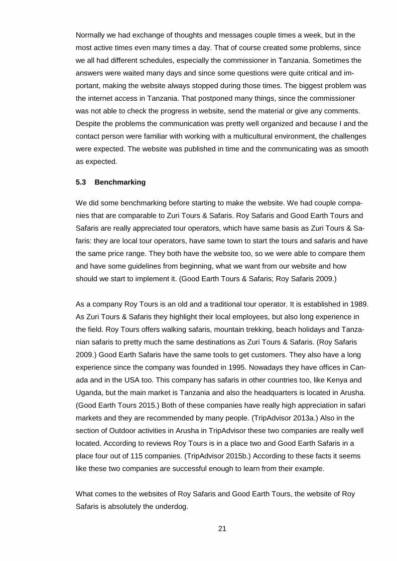
Safaris is absolutely the underdog.
22
Picture 1. Roy Safaris website.
Particularly the home page, the most important page, is really messy and confusing. What
is good, all of the most important things are there in the home page: Trip Advisor-
recommendations and certificates, logo, pictures, links to all important channels like Fa-
cebook and even a video about the company. As it can be seen all the important parts are
in the home page, with different highlight techniques. Some have a different font, some
are moving (for example the TripAdvisor -advertisement in the middle of the picture) and
some are in bright colors. That makes it really hard to read and even though everything
important is there, nothing stands out, but everything drowns to each other. When moving
in the website, the menu cannot be found in the same place all the time. Other problem is
that the parts of the menu can be found on top of the banner picture and under it, addi-
tionally there are some links on left side of the page too. It all can be really confusing to
the visitor. Also the logo which is there in every page is a link to home page in some pag-
es, when again in some pages the visitor cannot click the picture and home page –button
is in a different place. The website of Roy Safaris is really confusing. The thing that was
wanted to website of Zuri Tours & Safaris was the amount of the pictures, better placed
though. Mostly what was learnt from this website was the things that are not wanted, such
as many menus. Only one, clear menu is really important and a logo which takes to the
home page every time. Also a basic plainness is essential.
23
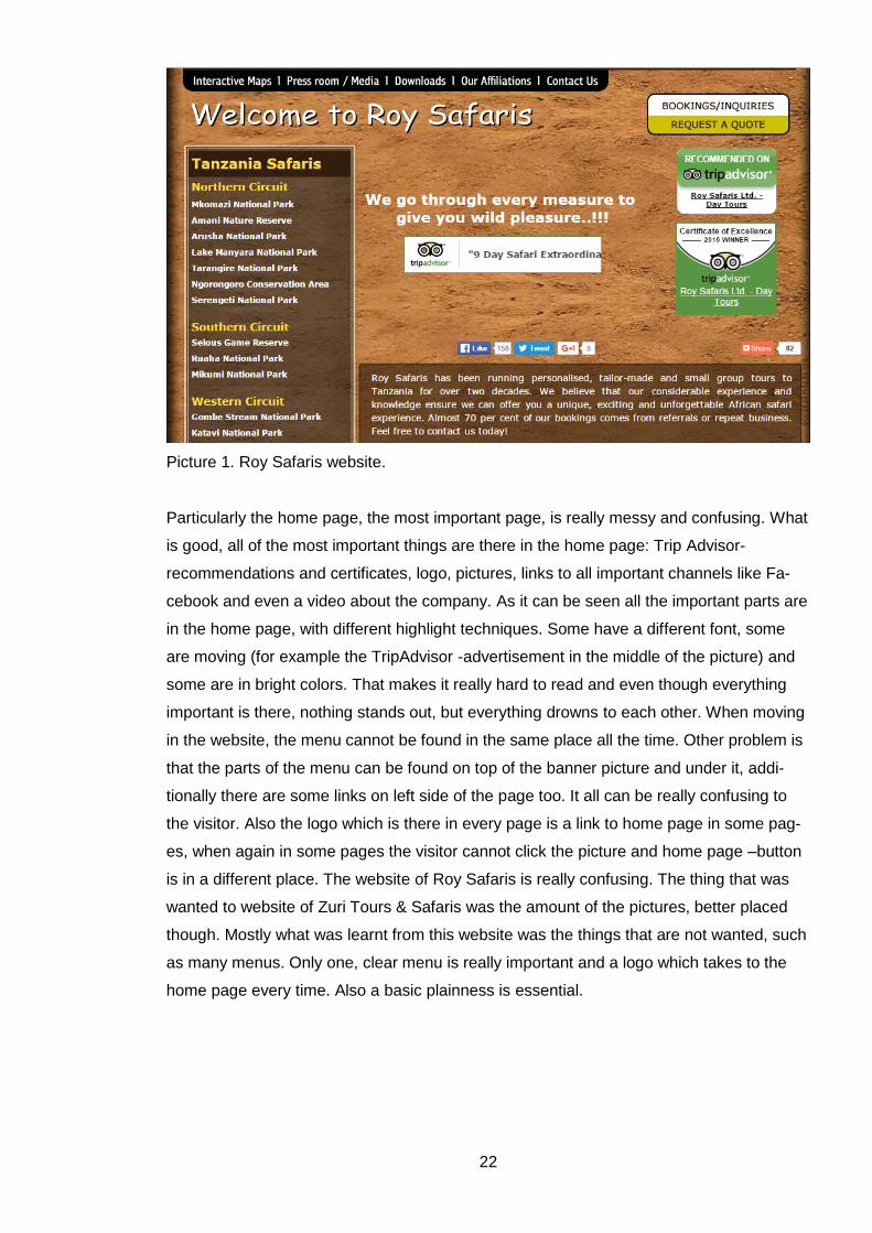
The website of Good Earth Tours & Safaris is really well planned and implemented.
Picture 2. Good Earth & Safaris website.
Compared to the website of Roy Safaris, the small things were in their places: the menu
was located to the top of the page, always in the same place and the logo took always to
the home page. Even though Good Earth Tours & Safaris had as much content in their
site, everything was just planned better. For example too large menu was cut into pieces
and the drop-down menu was there to make it clearer and simply to save the space. Just
like website of Roy Safaris, this website had some moving components. That little thing
was also planned better and it made a huge difference. Moving pictures in this website
were only there to draw some attention, make people interested and make them possibly
stay on the website. A good example is the TripAdvisor -mentioning, which can be seen in
both of these picture. In Roy Safaris -website it was in the middle of page and moving. It
was more disturbing than nicely getting the attention. In Good Earth Tours & Safaris eye
catches the recommendation easily, but it does not steal all the attention. Only con in the
website of Good Earth Tours & Safaris, which draw the attention was the gallery. It was
really interesting and personal with the slide show and the music, but those made it pretty
slow to load. On top of that mostly things to learn were quite positive in the website of
Good Earth Tours & Safaris. There were many things to be picked to Zuri Tours & Safaris.
The clearness was the most important thing. The website was professional, but interesting
and safari-like. The pictures were there to control the page and get the visitor watch were
24
wanted. The Contact us –page had both contact information of the company and the form
which can be filled and sent easily. Also the small but important notion was that the back-
ground picture was really right one to the safari atmosphere, but still pretty muted.
After all, both of the websites were really important to visit. Lots of things stand out both in
a good way and in a bad way. Also the fact, how much the website effects is really im-
portant to notice. For example, no matter how much more experienced Roy Safaris is than
Zuri Tours & Safaris, they might easily lose customers just because of their website. It
gave more ambition to create great and selling website to increase the interest and
knowledge about Zuri Tours & Safaris.
25
6 Creating the website
Planning the website for Zuri Tours & Safaris started from defining the purpose, the target
group, the product that will be sold and the theme. Almost all of them were decided by the
company itself and my job was mostly to specify them, think of a way to impress them and
implement. Only the theme was more up to me. It all started with the basic information
from Pulli, the contact person from Zuri Tours & Safaris. It included the purpose why the
website will be made, the products that are sold and the requests that what the site should
have and how it could look like. Only the products were all clear. They were listed with all
details and that was my main guideline later when choosing the theme for the website.
Products are all safari and tour trips to African nature. That automatically draws picture of
adventurous and nature-based site.
Criterions for evaluation were really poorly decided and there are not too many external or
even internal ways of evaluating. Zuri Safaris & Tours were not interested in measuring
the numbers of the visitors. There was no way to measure the amounts without the com-
missioner. That is why only opinions of the creator and contact person and some friends
were possible to be collected. The most important things to evaluate are the clarity, read-
ability and functionality: it needs to be made sure that everything works. As mentioned
before, three steps to everywhere is a maximum. That needs to be checked so the navi-
gating is kept simple.
The purpose and the target group were told loosely. The purpose is to get more visibility
and advertise the company. Clear guidelines with the purpose were needed to make an
effective website. Target group was told to be everybody from everywhere. It was left so
open that I needed to limit myself. The sample customer was created by what I thought to
be average person to use services of Zuri Tours & Safaris. The company had already lots
of Finnish customers so the site was planned to fulfil the needs of Finnish people: clear,
informative and professional text with lots of fact. The age and the marital status do not
affect, because there are products for all people, not depending on the age. It took a lot
more to specify the lifestyle and the style of the possible customers. The customers using
the services of this company are often experienced travellers and somehow adventurous.
They want new experiences, see the life of the local people, not just tourism side of the
destination and they are not afraid to try new things. They most likely appreciate the na-
ture and want to learn about it from the local people with a good now-how. In the website
the readers need to see that these things are achievable with Zuri Tours & Safaris.
26
When the basic customer was specified the purpose and the goal of making a website
needed to be defined. Since Zuri Tours & Safaris already has a Facebook page, reviews
in TripAdvisor and it is somehow known already as a tour operator. Increasing the visibility
is one of the main goals, but it is not straight depending on the planning of the website. Of
course it needs to be clear but nowadays other channels are more valid to spread the
information. The other channels need to be active on sharing the address to the website,
because they already have followers. The website will be online for those who want infor-
mation and need to be tempted to buy some services. Those who come to the website
need to be convinced that they want that company to operate their trip and there is no
better option. Also the website is there to give a change to contact the personnel and book
a trip.
6.1 Layout
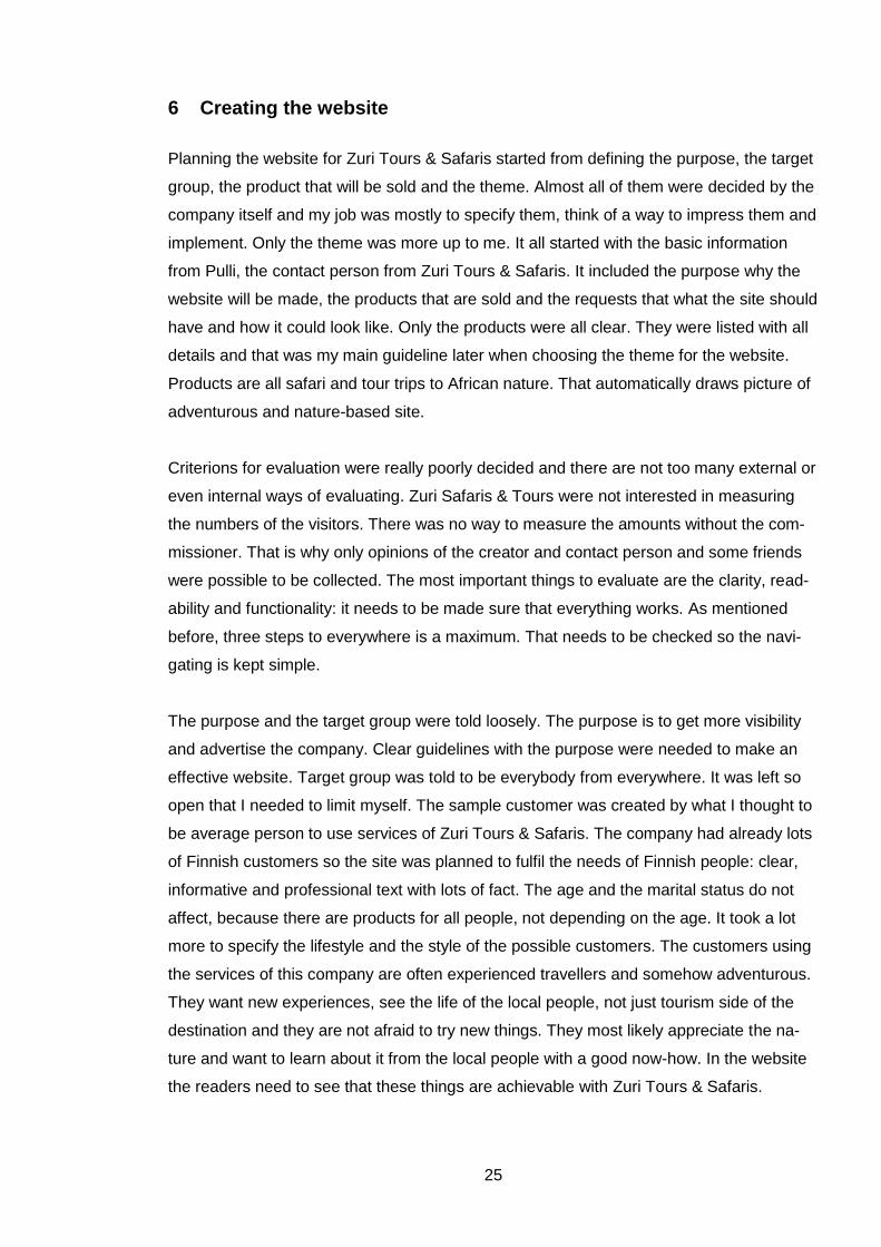
The layout is the first thing when starting to create a new website. The plan for this is a
crucial thing to do. It gives the base for everything that will be located in the website. In
this point I met with the connect person, Pulli so we were able to decide these concrete
things for the website. There is really basic structure I use in websites and Pulli approved.
The structure would be kept really clear with the menu top of the pages and the pictures
keeping the structure. All of the pages are also organized in a clear, old-fashioned way:
reader can scan the pages through from up-left to down-right. The pictures separate the
sections from each other. The plan for the website of Zuri Tours & Safaris can be seen
here. It is really simple and there are no details. It is just a draft so the creator can make
sure that the company will get what they want from the beginning.
Picture 3. Draft of the layout
27
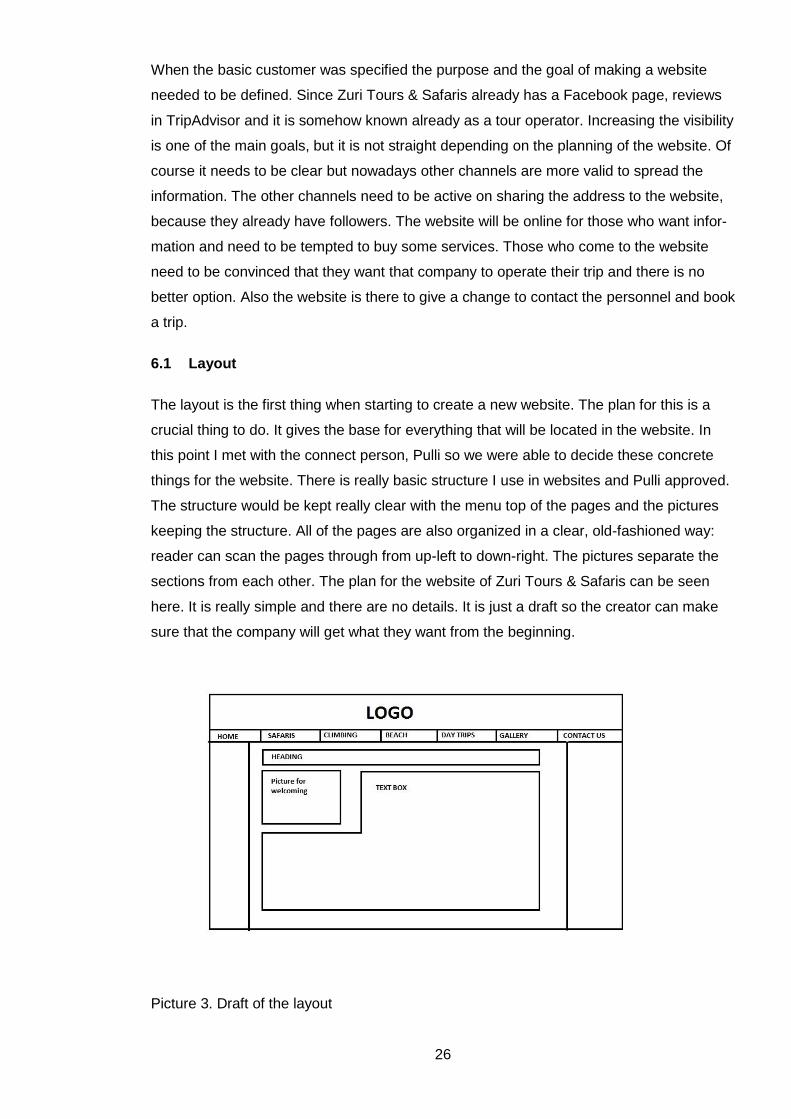
As it is recommended all of the pages remind each other. The structure and reading order
is always the same. Also the banner and the footer are exactly the same. That makes it
clearer and keeps the readers from the confusion. The banner has the same picture and
clicking it will lead back to the home page. Under the banner picture there is menu. The
footer has the most important information in every page. That way it is easy to find but
also because the search engines need repeating. Since the background pictures are a big
part of the look of the website it needed a lot of time to plan. At first the plan was to have
the same picture in every page. With the time there came up the pictures that illustrates
every subject. Since the main way to reach the goal of the website is to create a need and
a will to experience the Tanzanian nature, the pictures are one of the most effective ways.
That is why the different backgrounds were picked. The picture below shows what kind of
structure there is in every page of the website.
Picture 4. Structure of the website.
6.2 Usability and navigation
As said in the theory part, the visitor needs to always know where he is, where he can go
and how to get back where he started from. In the website of Zuri Tours & Safaris, it was
taken under consideration. In the top of the every page there is the title which tells the
location. The titles are obvious and clear, like in the page where is told about the climbing
to Mt. Kilimanjaro and Mt. Meru, the title is “Mountain Climbing”. The titles are always in
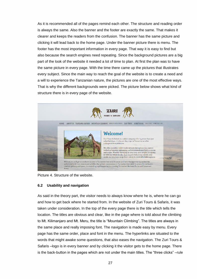
the same place and really imposing font. The navigation is made easy by menu. Every
page has the same order, place and font in the menu. The hyperlinks are situated to the
words that might awake some questions, that also eases the navigation. The Zuri Tours &
Safaris –logo is in every banner and by clicking it the visitor gets to the home page. There
is the back-button in the pages which are not under the main titles. The “three clicks” –rule
28
was followed and the flat hierarchy was tried to be created. That is why there is so many
pages. Navigating bar is situated under the banner. The picture below shows what the
menu looks like. There the visitor can choose the page he wants to move. The headings
are really clearly planned and tried to get into form which tells exactly what can be found
in each page.
Picture 5. Menu.
The decision to make their own pages to all of the topics could create some problems too:
it was warned that too many pages can get a visitor confused. Still in this case we decided
to make many pages, because the topics are really clear an otherwise the pages would
have had too much text and they would have gotten really messy. Because all the ser-
vices have their own pages, the search engine seemed like unnecessary. All of the things
are at least behind three clicks and the pages are really clear. If the visitors start asking
about the search possibility it can be added easily.
6.3 Content
What comes to the content, it was mostly decided by Zuri Tours & Safaris. I didn’t have
much to say in it, just couple of suggestions what could be added. However, the content
was planned so that it would include all the information of the trips. Since there can be too
much information and it is really criticized, it needed to be really well planned, to not con-
fuse the visitors. Still we ended up to this conclusion, because in this case, all of the in-
formation needs to be found in the website, because it is the main channel for possible
customers to find information. In the picture below can be seen how the main information
is there in the main page and detailed information is hidden under “Read more” –button.
29
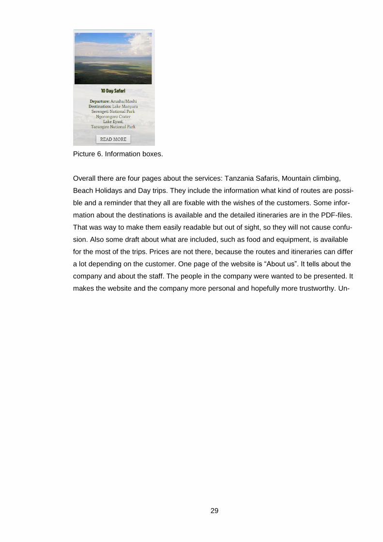
Picture 6. Information boxes.
Overall there are four pages about the services: Tanzania Safaris, Mountain climbing,
Beach Holidays and Day trips. They include the information what kind of routes are possi-
ble and a reminder that they all are fixable with the wishes of the customers. Some infor-
mation about the destinations is available and the detailed itineraries are in the PDF-files.
That was way to make them easily readable but out of sight, so they will not cause confu-
sion. Also some draft about what are included, such as food and equipment, is available
for the most of the trips. Prices are not there, because the routes and itineraries can differ
a lot depending on the customer. One page of the website is “About us”. It tells about the
company and about the staff. The people in the company were wanted to be presented. It
makes the website and the company more personal and hopefully more trustworthy. Un-
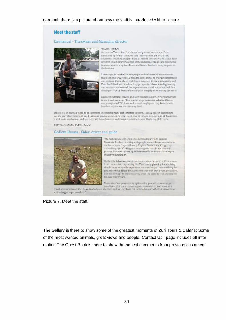
30
derneath there is a picture about how the staff is introduced with a picture.
Picture 7. Meet the staff.
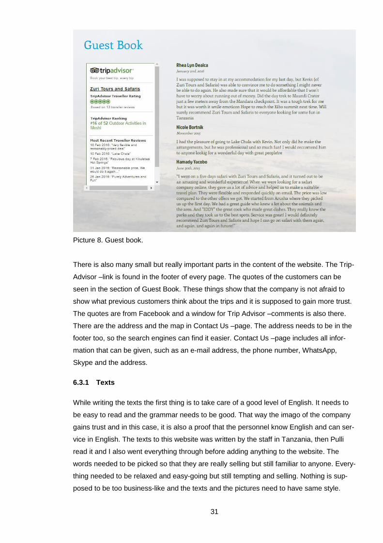
The Gallery is there to show some of the greatest moments of Zuri Tours & Safaris: Some
of the most wanted animals, great views and people. Contact Us –page includes all infor-
mation.The Guest Book is there to show the honest comments from previous customers.
31
Picture 8. Guest book.
There is also many small but really important parts in the content of the website. The Trip-
Advisor –link is found in the footer of every page. The quotes of the customers can be
seen in the section of Guest Book. These things show that the company is not afraid to
show what previous customers think about the trips and it is supposed to gain more trust.
The quotes are from Facebook and a window for Trip Advisor –comments is also there.
There are the address and the map in Contact Us –page. The address needs to be in the
footer too, so the search engines can find it easier. Contact Us –page includes all infor-
mation that can be given, such as an e-mail address, the phone number, WhatsApp,
Skype and the address.
6.3.1 Texts
While writing the texts the first thing is to take care of a good level of English. It needs to
be easy to read and the grammar needs to be good. That way the imago of the company
gains trust and in this case, it is also a proof that the personnel know English and can ser-
vice in English. The texts to this website was written by the staff in Tanzania, then Pulli
read it and I also went everything through before adding anything to the website. The
words needed to be picked so that they are really selling but still familiar to anyone. Every-
thing needed to be relaxed and easy-going but still tempting and selling. Nothing is sup-
posed to be too business-like and the texts and the pictures need to have same style.
32
As it was said before the headings were planned to be really visible and the whole point in
one or two words in every page. The body text is smooth and there is not much highlight-
ed. That way the things that really needed to be popped up, can be noticed. Just some
words or sentences were written in bold. The text was also arranged in a really simple
way. The sections were made with pictures and only the Contact Us –page has a box of
text where is all of the most important information. The detailed information of the trips
was tried to always get to the PDF –files so that they are not in a way but still really avail-
able and easy to print if needed too.
6.4 Visuality
In the website of Zuri Tours & Safaris the main goal for visuality is to create temptation,
clearness for the company, trustworthiness and a need for travel. Besides the tempting,
the website is tried to be kept controlled so the information is easily found. When the visi-
tor comes to the website, some kind of idea of travelling is normally there: either a con-
crete plan to travel or just a will to make it happen. The website needs to build a desire to
get to Tanzania, see the nature and pick Zuri Tours & Safaris to be a company to experi-
ence this all with. The visuality is the best way to do this, since it effects on people more
than just words. The backgrounds and the colours are there to keep the same theme
throughout the pages, the pictures are there to show what all Zuri Tours & Safaris can
offer. Since the services of this company are mostly based on experience, the pictures are
really important to create expectations which are tempting enough but also true. Even
though the webpages are different and have different backgrounds, the basic layout is
tried to be kept alike in every page. Everything is planned to be “safari-like”, the colours fit
in and the pictures are all from the tours of Zuri Tours & Safaris. Everything has also a
goal to share the texts. The picture below shows how the pictures share the text and gives
a structure.
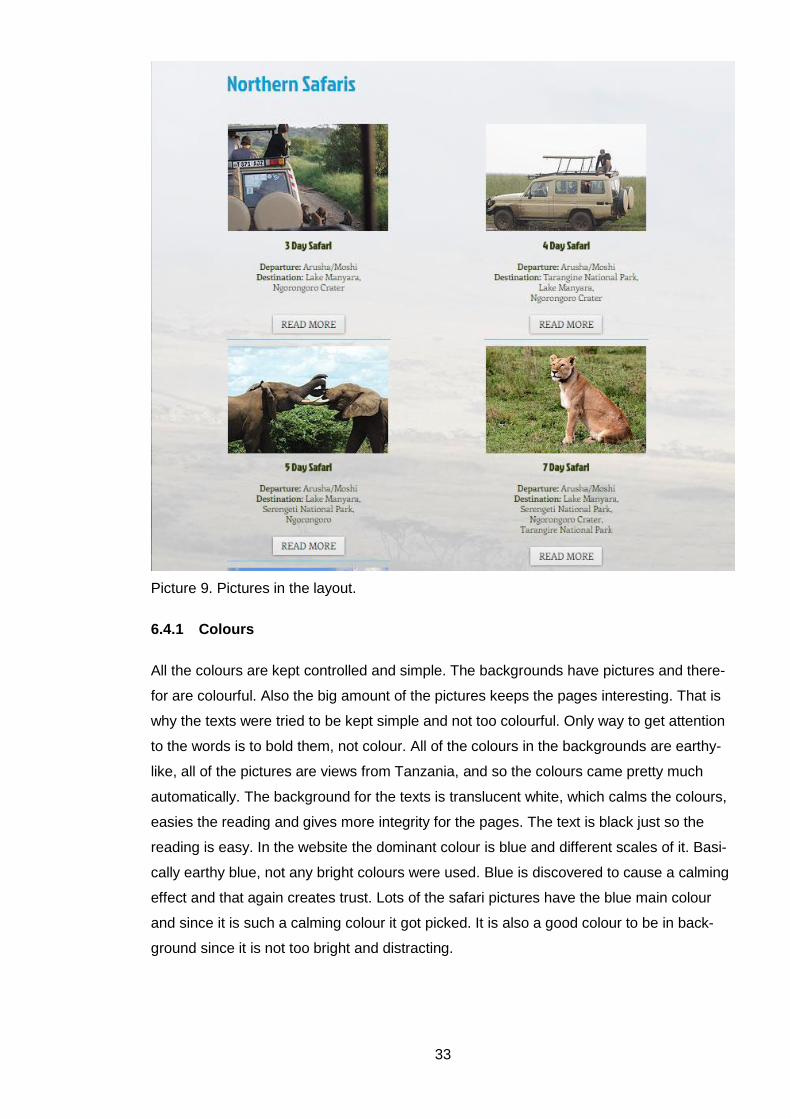
33
Picture 9. Pictures in the layout.
6.4.1 Colours
All the colours are kept controlled and simple. The backgrounds have pictures and there-
for are colourful. Also the big amount of the pictures keeps the pages interesting. That is
why the texts were tried to be kept simple and not too colourful. Only way to get attention
to the words is to bold them, not colour. All of the colours in the backgrounds are earthy-
like, all of the pictures are views from Tanzania, and so the colours came pretty much
automatically. The background for the texts is translucent white, which calms the colours,
easies the reading and gives more integrity for the pages. The text is black just so the
reading is easy. In the website the dominant colour is blue and different scales of it. Basi-
cally earthy blue, not any bright colours were used. Blue is discovered to cause a calming
effect and that again creates trust. Lots of the safari pictures have the blue main colour
and since it is such a calming colour it got picked. It is also a good colour to be in back-
ground since it is not too bright and distracting.
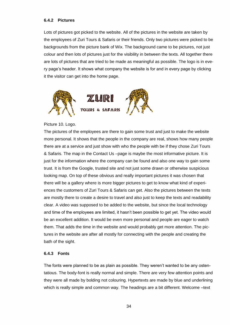
34
6.4.2 Pictures
Lots of pictures got picked to the website. All of the pictures in the website are taken by
the employees of Zuri Tours & Safaris or their friends. Only two pictures were picked to be
backgrounds from the picture bank of Wix. The background came to be pictures, not just
colour and then lots of pictures just for the visibility in between the texts. All together there
are lots of pictures that are tried to be made as meaningful as possible. The logo is in eve-
ry page’s header. It shows what company the website is for and in every page by clicking
it the visitor can get into the home page.
Picture 10. Logo.
The pictures of the employees are there to gain some trust and just to make the website
more personal. It shows that the people in the company are real, shows how many people
there are at a service and just show with who the people with be if they chose Zuri Tours
& Safaris. The map in the Contact Us –page is maybe the most informative picture. It is
just for the information where the company can be found and also one way to gain some
trust. It is from the Google, trusted site and not just some drawn or otherwise suspicious
looking map. On top of these obvious and really important pictures it was chosen that
there will be a gallery where is more bigger pictures to get to know what kind of experi-
ences the customers of Zuri Tours & Safaris can get. Also the pictures between the texts
are mostly there to create a desire to travel and also just to keep the texts and readability
clear. A video was supposed to be added to the website, but since the local technology
and time of the employees are limited, it hasn’t been possible to get yet. The video would
be an excellent addition. It would be even more personal and people are eager to watch
them. That adds the time in the website and would probably get more attention. The pic-
tures in the website are after all mostly for connecting with the people and creating the
bath of the sight.
6.4.3 Fonts
The fonts were planned to be as plain as possible. They weren’t wanted to be any osten-
tatious. The body-font is really normal and simple. There are very few attention points and
they were all made by bolding not colouring. Hypertexts are made by blue and underlining
which is really simple and common way. The headings are a bit different. Welcome –text
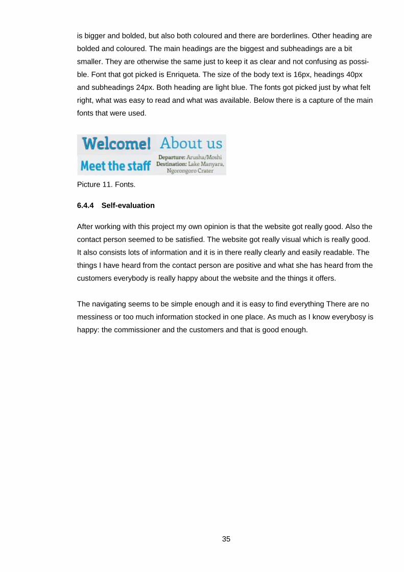
35
is bigger and bolded, but also both coloured and there are borderlines. Other heading are
bolded and coloured. The main headings are the biggest and subheadings are a bit
smaller. They are otherwise the same just to keep it as clear and not confusing as possi-
ble. Font that got picked is Enriqueta. The size of the body text is 16px, headings 40px
and subheadings 24px. Both heading are light blue. The fonts got picked just by what felt
right, what was easy to read and what was available. Below there is a capture of the main
fonts that were used.
Picture 11. Fonts.
6.4.4 Self-evaluation
After working with this project my own opinion is that the website got really good. Also the
contact person seemed to be satisfied. The website got really visual which is really good.
It also consists lots of information and it is in there really clearly and easily readable. The
things I have heard from the contact person are positive and what she has heard from the
customers everybody is really happy about the website and the things it offers.
The navigating seems to be simple enough and it is easy to find everything There are no
messiness or too much information stocked in one place. As much as I know everybosy is
happy: the commissioner and the customers and that is good enough.
36
7 Discussion
The project of creating a website for Zuri Tours & Safaris started when the contact person,
my classmate got to know that I am able to make websites. She knew that this company
needed a cheap planner and maker for their site and I promised to do it as my thesis. We
came to understanding of what schedule we are trying to make it and planned that the
website would be ready to be published during the summer. The making process went
ahead from writing thesis and the site was ready as planned. During the thesis and mak-
ing the website the importance of couple of things were highlighted many times. The most
important thing came to be a theme of the website. Without that even the starting is hard.
The world of colours and other things about looks are all depending of the theme of the
whole site. Clearness in usability and navigation are also really important and during the
process many questions popped up. Such as should there be a search and how to organ-
ize the links and the menu. Even though content and text were not in my hands, going
them through and making sure they are good enough to be published are something eve-
ry website maker should take under consideration. Besides the theme, overall picture is
really important especially in stage of planning. The layout defines how readable the web-
site is and does a visitor experience it easy enough to stay. All these things need to be
really strictly planned to make the whole website work.
During the project there were not so many challenges. The communication with the com-
missioner was one of the most problematic things. Since the commissioner was in Tanza-
nia where we knew to be connection problems, it was predictable, so it did not cause
more problems than just waiting time. Some differences of opinions were also the chal-
lenges, but pretty fast they were all solved by just giving the reasons why to prefer one
way over another. For a future there are some small practical things I would do different
next time in same kind of project. The idea of different background pictures for every page
seemed a nice visual addition and the commissioner got keened to it. Still I would not do
that again since it makes the loading time for visitors a bit longer. One a bit bigger prob-
lem was that the contact person had the access to Wix too. She was able to make some
changes without me. That was a bit distracting since sometimes I went in there had been
changes that I did not know about. Later we agreed about the rules about it. Later on I will
not let the commissioner do any changes during my process. I will make the website as
ready as wanted and later the owner can do the changes and I can teach how to use the
website platform. This way it just made my working more confusing and I had to get con-
tact with the person who had done the changes before I was able to continue. Also from
now on I would rather take a project of planning whole online marketing. Of course it is not
often possible since social media is often first created. Still being able to effect on the use
37
of the social media of Zuri Tours & Safaris would have been good. That way I would have
been able to synchronize these all fields, because the connection between the all chan-
nels of the company is really important thing nowadays.
Even though I have done couple of websites before, this was the most detailed one and
the only one with research. The importance of notes just for me got a new perspective
since the commissioner was not always to be reached and I had to have all of the things
that had been discussed written down. Also planning to the paper was a crucial thing
since we saw only a couple of times with the contact person and all my thoughts had to be
drawn so I was able to show them. Writing the important things as visible place as possi-
ble rose to be an important thing too. Because people reading the websites nowadays
want easy and fast answers the text needs to be well managed to catch people’s atten-
tion. Since the website of Zuri Tours & Safaris had lots of pages, hyperlinks came to be a
main factor in navigating. That is an easy way for a maker to make the visitors’ reading
more pleasant. Linking other sources like a window for Trip Advisor was a new thing for
me too. That is really practical thing to learn because normally even the smallest company
uses many channels and they are good to be linked together. Learning how to get more
visibility for search engines like Google was also new for me. That would have not come
to my mind without the research I did for the thesis. Of course the biggest thing that was
great for me to learn while making was to use Wix. Earlier my only tool had been Finnish
Kotisivukone, but now I can say to be advanced user of Wix too.
The whole project ended up going really smoothly. I found it interesting to find out real
facts about how to make the website more attractive and tempting. Also small advices
how to keep it clear and easy for the visitor will be really practical for the future. The com-
missioner is pleased with the website and they got what they were looking for. I did not get
the possibility to create any system for the follow-up, how many visitors there are and how
the website is going to affect the success of the company. The website is shared in the
Facebook page of Zuri Tours & Safaris and by many people. Hopes are that the website
makes the job it was made for.
38
References
Brown, M. 2013. Marketing Communications & Advertising. URL:
https://www.youtube.com/watch?v=lCa-rPW88bs Accessed: 30 July 2015.
Creative Bloq 2015. 20 steps to the perfect website layout. URL:
http://www.creativebloq.com/web-design/steps-perfect-website-layout-812625 Accessed:
6 October 2015.
Crowder, D. A. 2000. Building a web site for dummies. Wiley Publishing, Inc. Hoboken
Fitzpatrick, M. 2008. Tanzania. Lonely Planet Publications Pty Ltd.
Fletcher, A. 2012. The Top 10 Small business Web design mistakes. URL:
https://www.youtube.com/watch?v=BPgZAUHVzdU Accessed: 6 October 2015.
GoDaddy 2013. 10 things every business website must have | GoDaddy Webinar. URL:
https://www.youtube.com/watch?v=GnhU7ainAkA Accessed: 6 October 2015.
Good Earth Tours and Safaris. URL: http://www.goodearthtours.com/ Accessed: 10 De-
cember 2015.
Gray, T. 2012. Marketing Communiations Plan: Audience, Goals, Tools, Budget. URL:
http://www.tom-gray.com/2012/12/26/marketing-communications-plan-audience-goals-
tools-budget/ Accessed: 30 July 2015.
Jerz, D. G. 2010. Writing Web pages: Top 5 tips for effective online text. URL:
http://jerz.setonhill.edu/writing/e-text/conventions/ Accessed: 6 October 2015.
Keller, C.R. Why having a website is important. URL: http://www.profitworks.ca/blog/916-
blog/marketing-strategy/297-why-having-a-website-is-important.html Accessed: 6 October
2015.
Korkeila, Lammela & Paananen 2010. Suunnittele, toteuta ja julkaise. Adobe Crative Suite
–työnkulku. WSOY. Jyväskylä.
Lynch, P. J. & Horton, S. Visual Design. URL: http://webstyleguide.com/wsg3/7-page-
design/3-visual-design.html Accessed: 6 October 2015.
39
Management study guide 2013. Marketing communication – Meaning and its process.
http://www.managementstudyguide.com/marketing-communications.htm Accessed: 30
July 2015.
Neeley, J. 2010. Why is a website important? 5 reasons to be online. URL:
http://www.westhost.com/blog/2010/09/14/why-is-a-website-important-5-reasons-to-be-
online/#.ViKW034rLIW Accessed: 6 October 2015.
Pulli, H. 30 June 2015. Contact person. Zuri Tours & Safaris. Interview. Porvoo.
Pulli, H. 8 May 2015. Contact person. Zuri Tours & Safaris. E-mail.
Pulli, H. 18 May 2015. Contact person. Zuri Tours & Safaris. E-mail.
Pulli, H. 20 June 2015. Contact person. Zuri Tours & Safaris. E-mail.
Roy Safaris Limited 2009. URL: http://www.roysafaris.com/why-roy.html Accessed: 10
December 2015.
Rönnberg T. 2015a. Viisi vinkkiä värien käyttöön kotisivulla. URL:
http://www.kotisivukone.fi/blogi/2015/09/03/2673/?page2&edsacid=em-some-fb-
kotisivukoulu-14092015 Accessed: 6 October 2015.
Shortie Designs 2014. 10 Top Principles of effective web design. URL:
http://shortiedesigns.com/2014/03/10-top-principles-effective-web-design/ Accessed: 6
October 2015.
Sklar, J. 2009. Principles of web design. Course Technology, Cengage learning. Boston.
The Safari Bookings 2015. The 8 major safari countries.
URL: https://www.safaribookings.com/countries Accessed: 30 July 2015.
The World Bank 2013. Tourism in Africa: Harnessing Tourism for Growth and Improved
Livelihoods.
URL: http://www-
wds.worldbank.org/external/default/WDSContentServer/WDSP/IB/2013/09/30/000442464
_20130930124458/Rendered/PDF/814680WP0P13260Box0379837B00PUBLIC0.pdf
40
Accessed: 30 July 2015.
TripAdvisor 2013a. Recommended local Tanzanian safari company?? URL:
http://www.tripadvisor.com/ShowTopic-g293747-i9226-k6062639-
Recommended_local_Tanzanian_safari_company-Tanzania.html
TripAdvisor 2015b. Outdoor Activities in Arusha. URL:
https://www.tripadvisor.fi/Attractions-g297913-Activities-c61-Arusha_Arusha_Region.html
Wix 2015a. About us. URL: http://www.wix.com/about/us Accessed: 8 December 2015
Wix 2015b. Pricing Information. URL: http://www.wix.com/upgrade/website Accessed: 8
December 2015
Zeithaml, V. & Bitner, M. 2003. Services Marketing: Integrating customer focus across the
firm. McGrawl-Hill. New York.