Embed Size (px)
Citation preview
http://www.peakprosperity.com/crashcourse
Crash Course by Chris Martenson
1. Three Beliefs
2. The Three "E"s
3. Exponential Growth
4. Compounding is the Problem
5. Growth vs. Prosperity
6. What is Money?
7. Money Creation
8. The Fed - Money Creation
9. A brief History of US Money
10. Inflation
11. How Much is a Trillion?
12. Debt
13. A National Failure to Save
14. Assets & Demographics
15. Bubbles
16. Fuzzy Numbers
17a. Part A: Peak Oil
17b. Part B: Energy Budgeting
17c. Part C: Energy and the Economy
18. Environmental Data
19. Future Shock
20. What Should I Do?
1
It’s very important to distinguish between facts, opinions, and beliefs. I will try very hard to be
crystal-clear when I am presenting facts, stating opinion, or communicating my beliefs.
So let me be right upfront about this. I hold three beliefs, which I’m going to share with you and
then spend the rest of our time showing you how I got to these beliefs.
The first is that the next twenty years are going to be completely unlike the last twenty years. Why
is this important? Because we tend to base our view of the future on our most recent experience.
That’s just part of being a human. It is also a gigantic liability at key turning points. So I say that
massive change is already upon us. When I first gave this material as a talk three years ago, I
used to say, "Massive change is coming." Well, it’s here now, and the belief I hold is that it’s really
just getting underway, and I’ll show you why I believe that.
Next I believe that its possible – possible – that the pace and/or scope of change could
overwhelm the ability of our key social and support institutions to adapt. Katrina taught us that a
major US city could be wiped out and pretty much remain that way for years. That is an example
of major change occurring faster than our ability to respond. The types of changes I foresee in our
economic landscape are larger than Katrina. Much larger.
My third belief is that we do not lack any technology or understanding necessary to build
ourselves a better future. Rather, we only lack the political will, which really is a reflection of the
fact that “We the People” have not yet raised our voices in unison for real, substantive change.
So the good news is that we already have everything we need; the bad news is that we might not
deploy it fast enough.
Remember, these are simply my beliefs right now, and I reserve the right to change them if new
information suggests that they are wrong.
2
So, what do I mean when I say, “Massive change is upon us…”? Well, here’s where we need to
burrow into the three “E”s, which is where we’ll spend the rest of our time in the Crash Course.
The first “E” is the Economy, which is the lens through which the Crash Course looks at
everything. Within the Economy, there are four primary areas of concern: Exponential money, the
first-ever collapse of a global credit binge, an aging population, and a national failure to save. If it
isn’t clear to you what these mean, don’t worry; we’ll be discussing each of these in detail.
The next “E” is Energy, and there we will discuss what Peak Oil implies for an economic system
that is based on continual expansion. This topic is important enough that I should dedicate the
entire Crash Course to it, but I can’t, and I won’t.
And finally, the third “E”, the Environment, will be exerting its own unknowable but certainly
significant economic burdens, due to shrinking resources and other systemic pressures, at the
same time that the other two “E”s will be clamoring for your money and attention.
The story that I am going to weave for you cuts across all three “E”s and will make the claim that
our monetary system is badly out of step with reality and will suffer severe instability and possibly
collapse as a result.
It is fair to say that this particular constellation of issues, problems if you will, has never been
faced before at these levels.
Never.
Whether you find this terrifying or exhilarating is simply a matter of your mindset. One key
towards easing your mind is being armed with accurate and detailed information. That is what the
Crash Course will deliver.
When viewed individually, each one of the sub-areas on each of the “E”s could entirely consume
your entire attention. I am going to make the claim that these problems are so intertwined that
they cannot be solved in isolation. All three “E”s will need to be considered at the same time.
How are they linked? By something very powerful that we desperately need to understand a lot
better. Please join me for Chapter 3: Exponential Growth.
3
In the Crash Course, we will learn a few foundational Key Concepts. None are more important
than exponential growth. Understanding this will greatly enhance our chances to form a better
future.
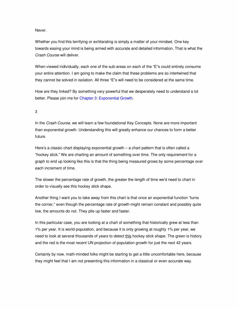
Here’s a classic chart displaying exponential growth – a chart pattern that is often called a
“hockey stick.” We are charting an amount of something over time. The only requirement for a
graph to end up looking like this is that the thing being measured grows by some percentage over
each increment of time.
The slower the percentage rate of growth, the greater the length of time we’d need to chart in
order to visually see this hockey stick shape.
Another thing I want you to take away from this chart is that once an exponential function “turns
the corner,” even though the percentage rate of growth might remain constant and possibly quite
low, the amounts do not. They pile up faster and faster.
In this particular case, you are looking at a chart of something that historically grew at less than
1% per year. It is world population, and because it is only growing at roughly 1% per year, we
need to look at several thousands of years to detect this hockey stick shape. The green is history
and the red is the most recent UN projection of population growth for just the next 42 years.
Certainly by now, math-minded folks might be starting to get a little uncomfortable here, because
they might feel that I am not presenting this information in a classical or even accurate way.
Where mathematicians have been trained to define exponential growth in terms of the rate of
change, we are going to focus on the amount of change. Both are valid; it’s just one way is easier
to express as a formula and the other is easier for most people to intuitively grasp.
Unlike the rate of change, the amount of change is not constant; it grows larger and larger with
every passing unit of time, and that’s why it is more important for us to appreciate than the rate.
This is such an important concept that I will dedicate the next chapter to illustrating it.
Also, mathematicians would say that there is no “turn the corner” stage of an exponential chart,
because this is just an artifact of where we draw the left hand scale. That is, an exponential chart
always looks like a hockey stick at every moment in time, as long as we adjust the left axis
properly.
But if you know the limits, or boundaries, of what you are measuring, then you can fix the left axis,
and the “turn the corner” stage is absolutely real and vitally important.
This is a crucial distinction, and our future depends on more of us appreciating this.
For example, the total carrying capacity of the earth for humans is thought to be somewhere in
this zone, give or take a few billion. Because of this, the “turn the corner” stage is very real, of
immense importance to us, and not an artifact of graphical trickery.
The critical take-away for exponential functions, the one thing I want you to recall, relates to the
concept of “speeding up.”
You can think of the key feature of exponential growth either as the AMOUNT that is added
growing larger over each additional unit of time, or you can think of it as the TIME shrinking
between each additional unit of amount added. Either way, the theme is “speeding up.”
To illustrate this using population: If we started with 1 million people and set the growth rate to a
measly 1% per year, we’d find that it would take 694 years before we achieved a billion people.
But we’d be at 2 billion people after only 100 more years, while the third billion would require just
41 more years. Then 29 years, then 22, and then finally only 18 years to add another, to bring us
to 6 billion people. That is, each additional billion people took a shorter and shorter amount of
time to achieve. Here we can see the theme of speeding up.
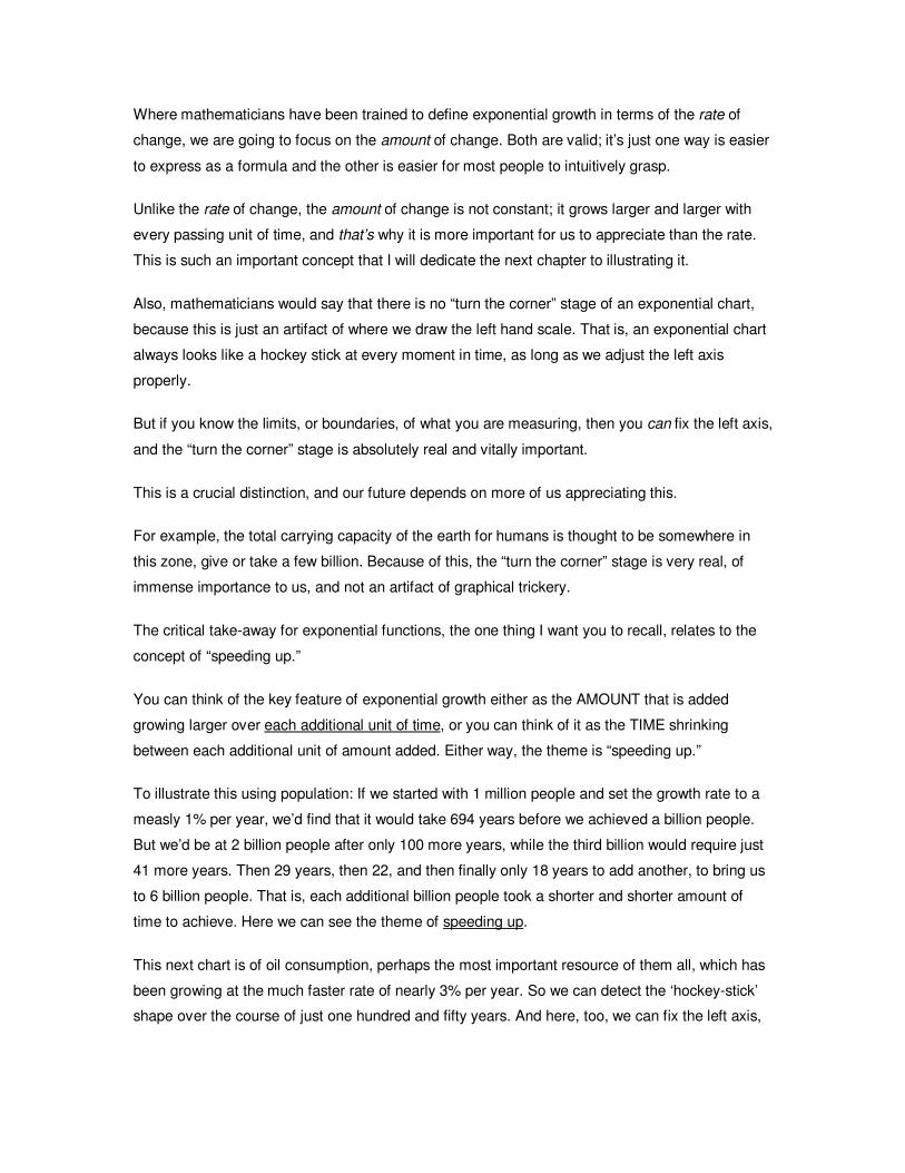
This next chart is of oil consumption, perhaps the most important resource of them all, which has
been growing at the much faster rate of nearly 3% per year. So we can detect the ‘hockey-stick’
shape over the course of just one hundred and fifty years. And here, too, we can fix the left axis,
because we know with reasonable accuracy how much oil the world can maximally produce. So,
again, having “turned the corner” is extremely relevant and important to us.
And here’s the US money supply, which has been compounding at incredible rates, ranging
between 5% and 18% per year. So this chart only needs to be a few decades long to see the
hockey stick effect.
And here’s world-wide water use, species extinction, fisheries exploited, and forest cover lost.
Each one of these is a finite resource, as are many other critical resources, and quite a few are
approaching their limits.
And here is the world you live in. If it seems like the pace of change is speeding up, well, that’s
because it is. You happen to live at a time when humans will finally have to confront the fact that
our exponential money system and resource use will encounter hard, physical limits.
And behind all of this, driving every bit of every graph is the number of people on the surface of
the planet.
Taken one at a time, any one of these charts could command the full attention of every earnest
person on the face of the planet, but we need to understand that they are, in fact, all related and
connected. They are all compound graphs, and they are being driven by compounding forces.
To try and solve one, you’d need to understand how it relates to the other ones that you see, as
well as others not displayed here, because they all intersect and overlap.
The fact that you live here, in the presence of multiple exponential graphs relating to everything
from money to population to species extinction, has powerful implications for your life and the
lives of those who will follow you.
It deserves your very highest attention.
Let’s move onto an example that will help you understand these graphs a little bit better. Please
join me for Chapter 4: Compounding Is The Problem.
Thank you for listening.
4
The purpose of this mini-presentation is to help you understand the power of compounding. If
something, such as a population, oil demand, a money supply, or anything, steadily increases in
size in some proportion to its current size, and you graph it over time, the graph will look like a
hockey stick.
Said more simply, if something is increasing over time on a percentage basis, it is growing
exponentially.
Using an example drawn from a magnificent paper by Dr. Albert Bartlett, let me illustrate the
power of compounding for you.
Suppose I had a magic eye dropper and I placed a single drop of water in the middle of your left
hand. The magic part is that this drop of water is going to double in size every minute.
At first nothing seems to be happening, but by the end of a minute, that tiny drop is now the size
of two tiny drops.
After another minute, you now have a little pool of water that is slightly smaller in diameter than a
dime sitting in your hand.
After six minutes, you have a blob of water that would fill a thimble.
Now suppose we take our magic eye dropper to Fenway Park, and, right at 12:00 p.m. in the
afternoon, we place a magic drop way down there on the pitcher’s mound.
To make this really interesting, suppose that the park is watertight and that you are handcuffed to
one of the very highest bleacher seats.
My question to you is, “How long do you have to escape from the handcuffs?” When would it be
completely filled? In days? Weeks? Months? Years? How long would that take?
I’ll give you a few seconds to think about it.
The answer is, you have until 12:49 on that same day to figure out how you are going to get out
of those handcuffs. In less than 50 minutes, our modest little drop of water has managed to
completely fill Fenway Park.
Now let me ask you this – at what time of the day would Fenway Park still be 93% empty space,
and how many of you would realize the severity of your predicament?
Any guesses? The answer is 12:45. If you were squirming in your bleacher seat waiting for help
to arrive, by the time the field is covered with less than 5 feet of water, you would now have less
than 4 minutes left to get free.
And that, right there, illustrates one of the key features of compound growth…the one thing I want
you take away from all this. With exponential functions, the action really only heats up in the last
few moments.
We sat in our seats for 45 minutes and nothing much seemed to be happening, and then in four
minutes – bang! – the whole place was full.
This example was loosely based on a wonderful paper by Dr. Albert Bartlett that clearly and
cleanly describes this process of compounding, which you can find in our Essential Reading
section. Dr. Bartlett said, “The greatest shortcoming of the human race is the inability to
understand the exponential function.” And he’s absolutely right.
With this understanding, you’ll begin to understand the urgency I feel – there’s simply not a lot of
maneuvering room once you hop on the vertical portion of a compound graph. Time gets short.
This makes compounding the first Key Concept of the Crash Course.
Now, what does all of this have to do with money and the economy and your future? I can’t wait
to tell you. Please join me for Chapter 5: Growth vs. Prosperity.
Thank you for listening.
5
Now I’m going to introduce the second Key Concept, and it is far enough out of the mainstream
that I’m going to get a little backup from a 19th-century philosopher.
Here’s the quote.
All truth passes through three stages. First, it is ridiculed. Second, it is violently opposed. Third, it
is accepted as being self-evident.
This great quote comes from this happy guy down in the corner. (Arthur Schopenhauer)
At some point over the next 20 years, this next concept I’m about to introduce will be “self-
evident.” But for now, I think it would be safe to say that a lot of people would consider it to be
ridiculous.
And it centers around growth.
Growth is good, right? We all want a growing economy, I guess? Why? Well, because a growing
economy means that we are becoming more prosperous. Growth offers opportunities, and we are
all for opportunities. At least I am. And this is the dominant story of our day.
So, many people would say that growth equals prosperity.
But is this actually true? And what if it’s not?
Growth is actually a consequence of surplus, if we think about it. For example, our bodies only
grow if it has a surplus of food. With an exact match between calories consumed and calories
burned, a body neither gains nor loses weight. A pond will only grow deeper if more water is
flowing in than is flowing out.
So, it can be said that growth is actually dependent on surplus.
Similarly, prosperity is dependent on surplus. Here’s another example. Imagine that you are a
family of four, your yearly income is $40,000, and at the end of the year there is no money left –
at the end of the year, there are zero extra dollars. But then a 10% raise comes along, which
equals $4,000, and your family can EITHER afford to have one more child OR you can enjoy
additional prosperity by spending a little bit more on each person. But you can’t do both. There is
only enough surplus money in this example to do one thing, so you have to choose – will it be
growth, or will it be additional prosperity? And what is true for a family of four is equally true for a
town, a state, a country, and, yes, our entire world.
Through this example we can tease out a very simple and utterly profound concept, that growth
does NOT equal prosperity. For the past few hundred years we have been lulled into linking the
two concepts, because there was always sufficient surplus energy that we could have both
growth AND prosperity.
That is, we didn’t have to make any hard choices between the two.
The economist Malcolm Slesser, of the Resource Use Institute of Edinburgh, Scotland, has
calculated that over half of the world’s energy is now used to simply grow.
So here’s the question: What’s going to happen when 100% of our surplus money or energy is
being used to simply grow? The result is going to be stagnant prosperity.
And what happens if there’s not enough surplus to even fund growth alone? Well, when that time
comes, we will experience both negative growth and negative prosperity – not exactly the sort of
future I am looking forward to.
This, then, is the greatest challenge of our times – properly recognizing where we want our
remaining surplus to go and getting that story out. I, for one, want to see continued advances in
energy efficiency, medical technology, and everything else that modern society can offer. This is
what we place at risk if we allow ourselves to do what is easy – that is, take the path of least
resistance and simply grow – instead of doing what is right, which is directing our surplus towards
a more prosperous future.
So there it is: Key Concept #2: Growth does NOT equal prosperity.
Now that you have these two in hand, we are ready to explore this thing called “money.”
6
Before we begin our tour through the Economy, the Environment, and Energy, we need to share
a common understanding of this thing called money.
Money is something that we live with so intimately on a daily basis that it probably has escaped
our close attention.
Money is an essential human creation, and, were all money to disappear, a new form of money
would spontaneously arise in its place, such as cows, tobacco, bread, a certain type of nut husk,
perhaps, or even nautilus shells.
Without money, the complex job specializations that we have today would not exist, because
barter is so cumbersome and constraining. More importantly, though, is the concept that each
type of money system has its pros and cons – each will enforce its own peculiar outcomes by
promoting some behaviors while suppressing others.
Now, if we crack open a textbook, we’ll find that money should possess three characteristics. The
first is that it should be a store of value. Gold and silver filled this role perfectly, because they
were rare, took a lot of human energy to mine, and did not corrode or rust. By contrast, the US
dollar pretty much constantly loses value over time – a feature which punishes savers and
enforces the need to speculate and/or invest.
A second feature is that money needs to be accepted as a medium of exchange, meaning that it
is widely accepted within a population as an intermediary, within and across all economic
transactions.
And the third feature is that money needs to be a unit of account, meaning that the money must
be divisible and each unit must be equivalent. The US “unit of account” is the dollar. Diamonds
have much value, but are not good at being ‘money,’ because they are not perfectly equivalent to
each other and dividing them causes them to lose value. That is, they fail at being a unit of
account.
Blah blah blah….so what is money, really? I believe in a very simple definition.
Money is a claim on human labor.
With a very few minor exceptions, pretty much anything you can think of that you might spend
your money on will involve human labor to bring it there. I say it’s a claim rather than a store,
because the human labor in question might have happened in the past, or it might not have
happened yet.
The concept of money being a claim on human labor is important, and we’ll be building on it later,
especially when we get to debt.
As implied in the picture series earlier, literally anything can be considered money – cows, bread,
shells, tobacco. A US dollar, like all modern currencies, however, is an example of a type of
money called fiat money. “Fiat” is a Latin word meaning “let it be done,” and fiat money has value
because a government decrees that it does.
And this brings us to the key question: What exactly is a US dollar?
Once, a dollar was backed by a known weight of silver or gold of intrinsic value. In this example,
we can see that the dollar came from the US Treasury and was backed by a given amount of
silver that was payable to the bearer on demand.
Of course, that was back in the 1930’s, and those days are long gone. Now dollars are the liability
of the Federal Reserve, a private entity entrusted to manage the US money supply and
empowered by the Federal Reserve Act of 1913 to perform this function.
You’ll note that modern dollars have no language entitling the bearer to anything, and that’s
because they are no longer backed by anything tangible. Rather, the ‘value’ of the dollar comes
from this language right here: The fact that it is illegal to refuse to accept dollars for payment and
that they are the only acceptable form of payment for taxes.
It is crucially important that a nation’s money supply is carefully managed, for if it is not, the
monetary unit can be destroyed by inflation. In fact, there are over 3,800 past examples of paper
currencies that no longer exist. There are numerous examples from the United States, which may
have some collector value but no longer possess any monetary value. Of course, I could just as
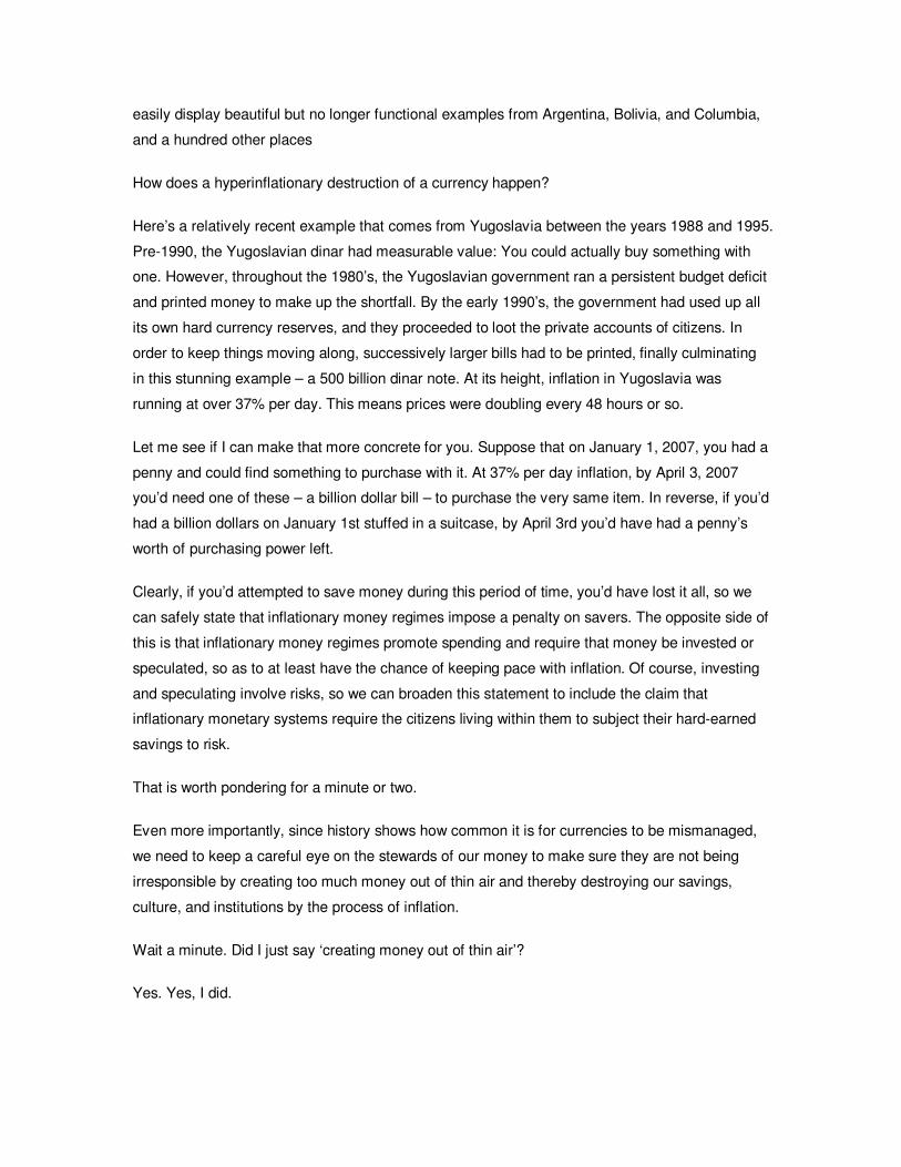
easily display beautiful but no longer functional examples from Argentina, Bolivia, and Columbia,
and a hundred other places
How does a hyperinflationary destruction of a currency happen?
Here’s a relatively recent example that comes from Yugoslavia between the years 1988 and 1995.
Pre-1990, the Yugoslavian dinar had measurable value: You could actually buy something with
one. However, throughout the 1980’s, the Yugoslavian government ran a persistent budget deficit
and printed money to make up the shortfall. By the early 1990’s, the government had used up all
its own hard currency reserves, and they proceeded to loot the private accounts of citizens. In
order to keep things moving along, successively larger bills had to be printed, finally culminating
in this stunning example – a 500 billion dinar note. At its height, inflation in Yugoslavia was
running at over 37% per day. This means prices were doubling every 48 hours or so.
Let me see if I can make that more concrete for you. Suppose that on January 1, 2007, you had a
penny and could find something to purchase with it. At 37% per day inflation, by April 3, 2007
you’d need one of these – a billion dollar bill – to purchase the very same item. In reverse, if you’d
had a billion dollars on January 1st stuffed in a suitcase, by April 3rd you’d have had a penny’s
worth of purchasing power left.
Clearly, if you’d attempted to save money during this period of time, you’d have lost it all, so we
can safely state that inflationary money regimes impose a penalty on savers. The opposite side of
this is that inflationary money regimes promote spending and require that money be invested or
speculated, so as to at least have the chance of keeping pace with inflation. Of course, investing
and speculating involve risks, so we can broaden this statement to include the claim that
inflationary monetary systems require the citizens living within them to subject their hard-earned
savings to risk.
That is worth pondering for a minute or two.
Even more importantly, since history shows how common it is for currencies to be mismanaged,
we need to keep a careful eye on the stewards of our money to make sure they are not being
irresponsible by creating too much money out of thin air and thereby destroying our savings,
culture, and institutions by the process of inflation.
Wait a minute. Did I just say ‘creating money out of thin air’?
Yes. Yes, I did.
This is such an important process to your, our, my future that we’re going to spend the next two
sections learning about how money is created.
If you’re ready, proceed to the next section.
7
Here we will explore the process by which money is created.
Let me introduce you to John Kenneth Galbraith. He taught at Harvard University for many years
and was active in politics, serving in the administrations of Franklin D. Roosevelt, Harry S.
Truman, John F. Kennedy, and Lyndon B. Johnson; and among other roles served as United
States Ambassador to India under Kennedy.
He was one of a few two-time recipients of the Presidential Medal of Freedom.
Clearly a pretty accomplished and stand-up kind of guy. About money, he famously said: “The
process by which money is created is so simple that the mind is repelled.” We’re about to discuss
that very thing.
If you don’t get this segment on the first pass, don’t worry, because money creation is truly a
bizarre thing to ponder, let alone accept. It’s actually a very simple process, but really difficult to
accept.
First, let’s look at how money is created by banks.
Leaving aside for now where this money comes from, suppose a person walks into town with
$1000, and, luckily, a brand new bank with no deposits has just opened up. The $1000 is
deposited in the bank, and now the person has a $1000 asset (their bank account) and the bank
has a $1000 liability (the very same bank account).
Now, there’s a rule on the books, a federal rule, that allows banks to loan out a proportion, a
fraction, of the money they have on deposit to others. In theory, banks are allowed to loan out up
to 90% of what people have on deposit with them, although, as we’ll see later, the actual
proportion is much closer to 100% than 90%. Nonetheless, because banks retain only a fraction
of their deposits in reserve, the term for this process is “fractional reserve banking.”
Back to our example. We now have a bank with $1000 on deposit, and banks do not make
money by holding on to it – rather, they make their living by borrowing at one rate and loaning at
a higher rate.
Since any bank can loan out up to 90%, the bank in our example manages to locate a single
individual that wants to borrow $900.
This borrower then spends that money by giving it to another person, perhaps his accountant,
who, in turn, deposits it in a bank. Now it could be the same bank, or a different bank, but that
really doesn’t change how this story gets told at all.
With this new deposit, the bank has a fresh $900 to work with, and so it gets busy finding
somebody who wants to borrow 90% of that amount, or $810.
And so another loan, this time for $810, is made, which gets spent and redeposited in the bank,
meaning that a brand new, fresh deposit of $810 is available to loan against. So the bank loans
out out 90% of $810, or $729, and so it goes, until we finally discover that the original $1000
deposit has mushroomed into a total of $10,000.
Is this all real money? You bet it is, especially if it’s in your bank account. But if you were paying
close attention, you’d realize that what we’ve actually got here are three things. First, we’ve got
$1000 held in reserve by the bank, $10,000 in total in various bank accounts, and $9000 dollars
of new debt. The original $1000 is now entirely held in reserve by the bank, but every new dollar,
all $9,000 of them, was loaned into existence and is “backed” by an equivalent amount of debt.
How’s your mind doing? Is it repelled yet?
You might also notice here that if everybody who had money at the bank, all $10,000 dollars of
them, tried to take their money out at once, that the bank would not be able to pay it out, because,
well, they wouldn’t have it. The bank would only have $1000 hanging around in reserve. Period.
You might also notice that this mechanism of creating new money out of new deposits works
great…as long as nobody defaults on their loan. If and when that happens, things get tricky. But
that’s another story for later.
For now, I want you to understand that money is loaned into existence. Conversely, when loans
are paid back, money ‘disappears.’
This is how money is created, and I invite you to verify this for yourself. One place is the Federal
Reserve itself, which has published a handy comic book from which I drew this fine example. You
can find a link to that on the website under Essential Articles.
You may have noticed that I left out something very important here, and that is interest. Where
does the money come from to pay the interest on all the loans? If all the loans are paid back
without interest, we can undo the entire string of transactions, but when we factor in interest,
there suddenly isn’t enough money to pay back all the loans.
Clearly that is a big hole in this story, and so we’ll need to find out where that comes from. In
doing so, we’ll also clear up the mystery of where the original $1000 came from.
So what was the purpose of all this? Why did we spend these past few minutes studying the
mechanism of money creation? Because in order to appreciate the implications of our massive
levels of debt, you have to understand how the debt came into being. That’s one reason. And the
more important one is tied to all those exponential graphs we viewed earlier in Section 3. But
we’re not quite there yet.
8
Suppose Congress needs more money than it has. I know, that’s a stretch! Perhaps it has done
something really historically foolish, like cutting taxes while conducting two wars at the same time.
Now, Congress doesn’t actually have any money, so the request for additional spending gets
passed over to the Treasury Department.
You may be surprised, or dismayed, or perhaps neither, to learn that the Treasury Department
lives hand-to-mouth and rarely has more than a couple of weeks’ of cash on hand, if that.
So the Treasury Department, in order to raise cash, will print up a stack of Treasury bonds, which
are the means by which the US government borrows money. A bond has a ‘face value,’ which is
the amount it will be sold for, and it has a stated rate of interest that it will pay the holder. So if
you bought a bond with $100 face value and that paid a rate of interest of 5%, then you’d pay
$100 for this bond and get $105 back in a year.
Treasury bonds are sold in regularly scheduled auctions, and it is safe to say that the majority of
these bonds are bought by big banks, such as those of China and Japan recently. At auction the
banks purchase these bonds, and then money gets sent into the Treasury coffers, where it can
be disbursed for the usual array of government programs.
I promised you that I’d show you how money first comes into being, and so far that hasn’t
happened, has it? The bonds are being bought with money that already exists. Money is created
by this next mechanism, where the Federal Reserve buys a Treasury bond from a bank.
When the Fed does this: They simply transfer money in the amount of the bond to the other bank
and take possession of the bond. A bond is swapped for money.
Now, where did this money come from? Glad you asked. It comes out of thin air, as the Fed
creates money when it ‘buys’ this debt. New Fed money is always exchanged for debt, so we can
now put the title on this page.
Don’t believe me? Here’s a quote from a Federal Reserve publication entitled “Putting it Simply:”
"When you or I write a check, there must be sufficient funds in our account to cover the check,
but when the Federal Reserve writes a check, there is no bank deposit on which that check is
drawn. When the Federal Reserve writes a check, it is creating money."
Wow. That is an extraordinary power. Whereas you or I need to work to obtain money, and place
it at risk to have it grow, the Federal Reserve simply prints up as much as it wishes, whenever it
wants, and then loans it to us all via the US Government, with interest.
Given the fact that over 3,800 paper currencies (and a few metallic ones) have been rendered
worthless due to mismanagement, wouldn’t it make sense to keep a very close eye on whether or
not the Federal Reserve is acting responsibly with our own monetary unit?
So now we know that there are two kinds of money out there.
The first is bank credit, which is money that is loaned into existence, as we saw here. Bank credit
is a type of money that comes with an equal and offsetting amount of debt associated with it.
Debt upon which interest must be paid.
The second type is money printed out of thin air, and that is what we see here at this stage.
The process by which money is created is so simple that the mind is repelled, so don’t worry if
you need to review this chapter several more times. I’ve had some people attend my seminar four
or more times and they say that this concept is just now starting to really sink in.
However, if you understood all that, and ‘get it,’ congratulations! Give yourself a hand, because
it’s not easy.
These monetary learnings allow us to formulate two more extremely important Key Concepts.
The first is that all dollars are backed by debt. At the local bank level, all new money is loaned
into existence. At the Federal Reserve level, money is simply manufactured out of thin air and
then exchanged for interest-paying government debt. In both cases, the money is backed by debt.
Debt that pays interest. From this Key Concept, we can formulate a truly profound statement,
which is that at a minimum, each year enough new money must be loaned into existence to cover
the interest payments on all of the past outstanding debt.
If we flip this slightly, we can say that each year all the outstanding debt must compound by at
least the rate of the interest on that debt. Each and every year it must grow by some percentage.
Because our debt-based money system is growing by some percentage continually, it is an
exponential system by its very design. A corollary of this is that the amount of debt in the system
will always exceed the amount of money.
I am not going to cast judgment on this and say that it is good or it is bad. It simply is what it is. By
understanding its design, though, you will be better equipped to understand that the potential
range of future outcomes for our economy are not limitless, but rather bounded by the rules of the
system.
All of which leads us to the fourth Key Concept, which is that perpetual expansion is a
requirement of modern banking. In fact we can make a rule: Each year, new credit (loans)
must be made that at least equal the amount of all the outstanding interest payments that year.
Without a continuous expansion of the money supply, past debts would not be able to be serviced,
and defaults would ripple through, and possibly destroy, the entire system. Defaults are the
Achilles heel of a debt-based money system, which we saw in our local banking example in the
previous chapter. Because of this, all the institutional and political forces in our society are geared
towards avoiding this outcome.
So the banking system must continually expand – not necessarily because it is the right (or
wrong) thing to do, but, rather, simply because that is how it was designed. It is a feature of the
system, just like using gasoline is a feature of my car’s engine. I might wish and hope that my car
would run on straw, but I’d be wasting my time, because that’s just not how it was designed.
By understanding the requirement for continual expansion, we will be in a better position to make
informed decisions about what’s likely to transpire and take meaningful actions to enhance our
prospects.
More philosophically, we might wonder about the long-term viability of a system that must expand
exponentially but which exists on a spherical planet. The key question is, “Can our current money
system somehow be modified to be stable, fair, and useful when it is not growing?”
So the question is this: What happens when a human-contrived money system that must expand,
by its very design, runs headlong into the physical limits of a spherical planet?
One more belief of mine is that I will witness this collision in my adult lifetime, and in fact it may
have already started. I am extremely interested to see how this is all going to turn out.
Now this is, admittedly, a truly gigantic proposition to consider, and some would say that this is
not very interesting at all, but rather frightening. Well, if you want the future to look just like the
past, then I suppose it is frightening. But if you are flexible in your view of the future, then you
have an opportunity to make the most of whatever future actually arrives. These are fascinating,
invigorating, and truly unprecedented times, and I, for one, am thrilled to be living right now, right
here, with you.
In the next section we’ll be looking at some very important historical context about our money
system, where you’ll learn that our money system could be viewed as a masterpiece of
sophisticated evolution or as a historically brief experiment that is not yet 37 years old.
9
Before we move on to current events, it’s vital that we know how we got here.
I will now present an extremely shortened version of recent US monetary history. The purpose of
this section is to show you that the US government has radically shifted the rules during times of
emergency and that our monetary system is really a lot younger than you might think.
After the panic of 1907, when private banker J.P. Morgan intervened as the lender of last resort,
banks began agitating for a government solution. What was finally decided upon in 1913 was a
federally-sponsored cartel, called the Federal Reserve, which sounded governmental but really
was not. The stock of the Federal Reserve was to be held by its member banks, not the US
government nor the public, which remains the case today. So what we call the Federal Reserve
actually is a federally-sponsored banking cartel, licensed to lend money into existence.
By the 1930’s, a Federal-Reserve-fueled speculative bubble had burst, resulting in numerous
bank failures, which shrank the money supply by nearly a third in three years. Despite being
chartered as a lender of last resort, the Federal Reserve failed to halt a catastrophic banking
collapse.
In 1933, newly-elected President Franklin D. Roosevelt decided to counter the falling money
supply in a most drastic manner. To accomplish this he confiscated all privately-held gold and
immediately devalued the US dollar. Prior to the seizure it took approximately $21 to buy an
ounce of gold and afterwards it took $35. Soon after, contractual obligations of the US
government, such as bonds payable in gold, were nullified, with the approval of the Supreme
Court. This goes to show how governments, in a period of emergency, can change rules and
break their own laws.
All of this seized gold either ended up in the vaults of the Federal Reserve, at the International
Monetary Fund, or “on the books” of the Federal Reserve. A grand total of $11 billion was
exchanged for all 261 million ounces of the nation’s gold. In other words, complete control of the
gold supply of the most powerful and prosperous nation on earth was exchanged for eleven
billion dollars, printed out of thin air, creating some very serious storage hardships for the Federal
Reserve. I mean, have you ever tried lifting 70 pound gold bricks over your head?
In any event, to end the turmoil of depression and war, and to provide a foundation for global
recovery, a conference was held at Bretton Woods, N.H. in 1944, with all the major allied powers
attending. Recognizing that the US then represented nearly half of the global economy, the US
dollar was made the global reserve currency. All other currencies had fixed rates of exchange to
the dollar, which in turn was redeemable for gold at $35 per ounce.
The Bretton Woods II system ushered in a period of prosperity and rapid economic recovery. But
there was a flaw in the system. Nothing in the Bretton Woods agreement prevented the US
Federal Reserve from expanding the supply of Federal Reserve notes. As this happened, the
gold backing behind each dollar steadily declined, such that there was not enough gold to back all
of the dollars.
Meanwhile, as the Vietnam War intensified, the US was running budget deficits and flooding the
world with paper dollars. The French, under President Charles DeGaulle, became suspicious that
the US would be unable to honor its Bretton Woods obligations to redeem their excess dollars
into gold.
As the French exchanged their surplus dollar for gold, the US Treasury's gold stocks declined
alarmingly. Finally, President Nixon declared force majeure on August 15th, 1971, and “slammed
the gold window,” ending its dollar convertibility. That's what governments do during wartime, and
the US followed the pattern. But this time, it affected the whole world, because the removal of
gold convertibility of the dollar destroyed the foundation of the Bretton Woods system.
Without a gold backing, there was no hard, physical limit to how many paper dollars could be
issued.
Since we now know that all dollars are backed by debt, what do you suppose happened to US
debt levels once the externally applied rigor of gold was removed? Let’s find out.
This is a chart of US federal debt from the period of 1949 to 2004. Note that it looks like any other
exponential chart we’ve already reviewed. But especially note that the graph “turns the corner”
shortly after Nixon slammed the gold window – that is, when Nixon removed the last vestige of
external physical restraint from the system. And also note how rapidly the debt levels have
climbed recently. These past few years have seen the highest and most rapid accumulation of
federal debt in our entire history, thanks in large measure to an experiment never before
attempted in our country’s history – the conduct of two foreign wars AND a tax cut at the same
time.
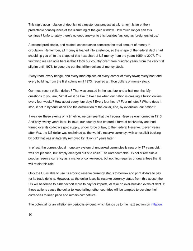
This rapid accumulation of debt is not a mysterious process at all; rather it is an entirely
predictable consequence of the slamming of the gold window. How much longer can this
continue? Unfortunately there’s no good answer to this, besides “as long as foreigners let us.”
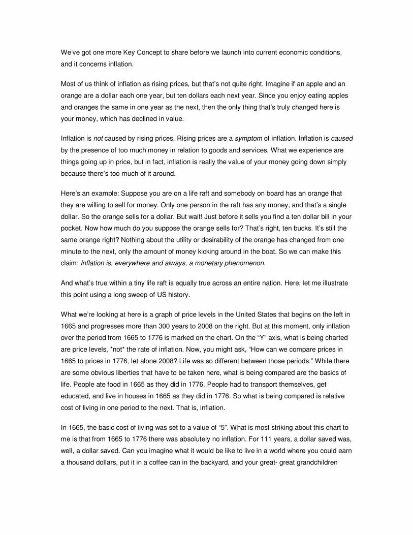
A second predictable, and related, consequence concerns the total amount of money in
circulation. Remember, all money is loaned into existence, so the shape of the federal debt chart
should tip you off to the shape of this next chart of US money from the years 1959 to 2007. The
first thing we can note here is that it took our country over three hundred years, from the very first
pilgrim until 1973, to generate our first trillion dollars of money stock.
Every road, every bridge, and every marketplace on every corner of every town; every boat and
every building, from the first colony until 1973, required a trillion dollars of money stock.
Our most recent trillion dollars? That was created in the last four-and-a-half-months. My
questions to you are, “What will it be like to live here when our nation is creating a trillion dollars
every four weeks? How about every four days? Every four hours? Four minutes? Where does it
stop, if not in hyperinflation and the destruction of the dollar, and, by extension, our nation?”
If we view these events on a timeline, we can see that the Federal Reserve was formed in 1913.
And only twenty years later, in 1933, our country had entered a form of bankruptcy and had
turned over its collective gold supply, under force of law, to the Federal Reserve. Eleven years
after that, the US dollar was enshrined as the world’s reserve currency, with an explicit backing
by gold that was unilaterally removed by Nixon 27 years later.
In effect, the current global monetary system of unbacked currencies is now only 37 years old. It
was not planned, but simply emerged out of a crisis. The unredeemable US dollar remains a
popular reserve currency as a matter of convenience, but nothing requires or guarantees that it
will retain this role.
Only the US is able to use its eroding reserve currency status to borrow and print dollars to pay
for its trade deficits. However, as the dollar loses its reserve currency status from this abuse, the
US will be forced to either export more to pay for imports, or take on ever-heavier levels of debt. If
these actions cause the dollar to keep falling, other countries will be tempted to devalue their
currencies to keep pace and remain competitive.
The potential for an inflationary period is evident, which brings us to the next section on inflation.
10
We’ve got one more Key Concept to share before we launch into current economic conditions,
and it concerns inflation.
Most of us think of inflation as rising prices, but that’s not quite right. Imagine if an apple and an
orange are a dollar each one year, but ten dollars each next year. Since you enjoy eating apples
and oranges the same in one year as the next, then the only thing that’s truly changed here is
your money, which has declined in value.
Inflation is not caused by rising prices. Rising prices are a symptom of inflation. Inflation is caused
by the presence of too much money in relation to goods and services. What we experience are
things going up in price, but in fact, inflation is really the value of your money going down simply
because there’s too much of it around.
Here’s an example: Suppose you are on a life raft and somebody on board has an orange that
they are willing to sell for money. Only one person in the raft has any money, and that’s a single
dollar. So the orange sells for a dollar. But wait! Just before it sells you find a ten dollar bill in your
pocket. Now how much do you suppose the orange sells for? That’s right, ten bucks. It’s still the
same orange right? Nothing about the utility or desirability of the orange has changed from one
minute to the next, only the amount of money kicking around in the boat. So we can make this
claim: Inflation is, everywhere and always, a monetary phenomenon.
And what’s true within a tiny life raft is equally true across an entire nation. Here, let me illustrate
this point using a long sweep of US history.
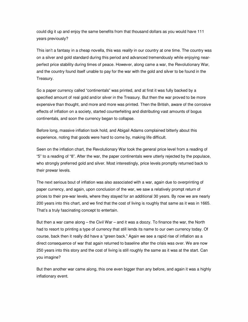
What we’re looking at here is a graph of price levels in the United States that begins on the left in
1665 and progresses more than 300 years to 2008 on the right. But at this moment, only inflation
over the period from 1665 to 1776 is marked on the chart. On the “Y” axis, what is being charted
are price levels, *not* the rate of inflation. Now, you might ask, “How can we compare prices in
1665 to prices in 1776, let alone 2008? Life was so different between those periods.” While there
are some obvious liberties that have to be taken here, what is being compared are the basics of
life. People ate food in 1665 as they did in 1776. People had to transport themselves, get
educated, and live in houses in 1665 as they did in 1776. So what is being compared is relative
cost of living in one period to the next. That is, inflation.
In 1665, the basic cost of living was set to a value of “5”. What is most striking about this chart to
me is that from 1665 to 1776 there was absolutely no inflation. For 111 years, a dollar saved was,
well, a dollar saved. Can you imagine what it would be like to live in a world where you could earn
a thousand dollars, put it in a coffee can in the backyard, and your great- great grandchildren
could dig it up and enjoy the same benefits from that thousand dollars as you would have 111
years previously?
This isn’t a fantasy in a cheap novella, this was reality in our country at one time. The country was
on a silver and gold standard during this period and advanced tremendously while enjoying near-
perfect price stability during times of peace. However, along came a war, the Revolutionary War,
and the country found itself unable to pay for the war with the gold and silver to be found in the
Treasury.
So a paper currency called “continentals” was printed, and at first it was fully backed by a
specified amount of real gold and/or silver in the Treasury. But then the war proved to be more
expensive than thought, and more and more was printed. Then the British, aware of the corrosive
effects of inflation on a society, started counterfeiting and distributing vast amounts of bogus
continentals, and soon the currency began to collapse.
Before long, massive inflation took hold, and Abigail Adams complained bitterly about this
experience, noting that goods were hard to come by, making life difficult.
Seen on the inflation chart, the Revolutionary War took the general price level from a reading of
“5” to a reading of “8”. After the war, the paper continentals were utterly rejected by the populace,
who strongly preferred gold and silver. Most interestingly, price levels promptly returned back to
their prewar levels.
The next serious bout of inflation was also associated with a war, again due to overprinting of
paper currency, and again, upon conclusion of the war, we saw a relatively prompt return of
prices to their pre-war levels, where they stayed for an additional 30 years. By now we are nearly
200 years into this chart, and we find that the cost of living is roughly that same as it was in 1665.
That’s a truly fascinating concept to entertain.
But then a war came along – the Civil War – and it was a doozy. To finance the war, the North
had to resort to printing a type of currency that still lends its name to our own currency today. Of
course, back then it really did have a “green back.” Again we see a rapid rise of inflation as a
direct consequence of war that again returned to baseline after the crisis was over. We are now
250 years into this story and the cost of living is still roughly the same as it was at the start. Can
you imagine?
But then another war came along, this one even bigger than any before, and again it was a highly
inflationary event.
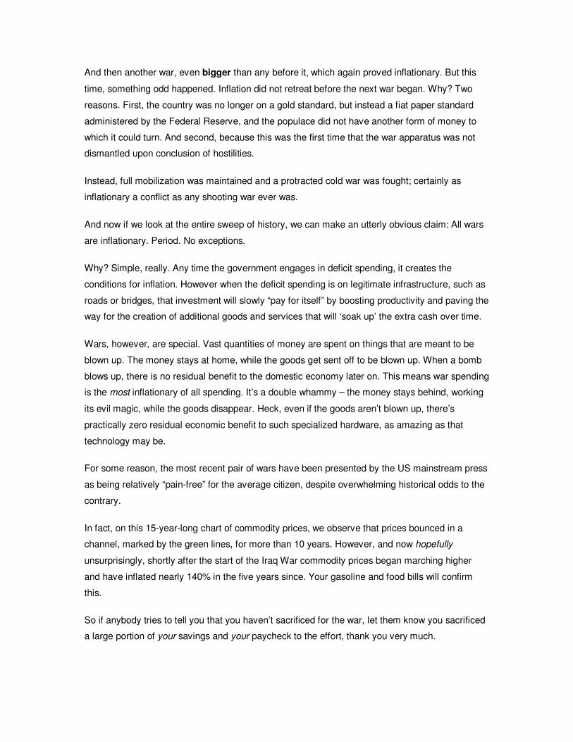
And then another war, even bigger than any before it, which again proved inflationary. But this
time, something odd happened. Inflation did not retreat before the next war began. Why? Two
reasons. First, the country was no longer on a gold standard, but instead a fiat paper standard
administered by the Federal Reserve, and the populace did not have another form of money to
which it could turn. And second, because this was the first time that the war apparatus was not
dismantled upon conclusion of hostilities.
Instead, full mobilization was maintained and a protracted cold war was fought; certainly as
inflationary a conflict as any shooting war ever was.
And now if we look at the entire sweep of history, we can make an utterly obvious claim: All wars
are inflationary. Period. No exceptions.
Why? Simple, really. Any time the government engages in deficit spending, it creates the
conditions for inflation. However when the deficit spending is on legitimate infrastructure, such as
roads or bridges, that investment will slowly “pay for itself” by boosting productivity and paving the
way for the creation of additional goods and services that will ‘soak up’ the extra cash over time.
Wars, however, are special. Vast quantities of money are spent on things that are meant to be
blown up. The money stays at home, while the goods get sent off to be blown up. When a bomb
blows up, there is no residual benefit to the domestic economy later on. This means war spending
is the most inflationary of all spending. It’s a double whammy – the money stays behind, working
its evil magic, while the goods disappear. Heck, even if the goods aren’t blown up, there’s
practically zero residual economic benefit to such specialized hardware, as amazing as that
technology may be.
For some reason, the most recent pair of wars have been presented by the US mainstream press
as being relatively “pain-free” for the average citizen, despite overwhelming historical odds to the
contrary.
In fact, on this 15-year-long chart of commodity prices, we observe that prices bounced in a
channel, marked by the green lines, for more than 10 years. However, and now hopefully
unsurprisingly, shortly after the start of the Iraq War commodity prices began marching higher
and have inflated nearly 140% in the five years since. Your gasoline and food bills will confirm
this.
So if anybody tries to tell you that you haven’t sacrificed for the war, let them know you sacrificed
a large portion of your savings and your paycheck to the effort, thank you very much.
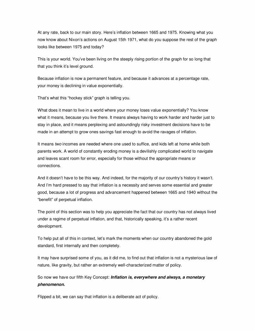
At any rate, back to our main story. Here’s inflation between 1665 and 1975. Knowing what you
now know about Nixon’s actions on August 15th 1971, what do you suppose the rest of the graph
looks like between 1975 and today?
This is your world. You’ve been living on the steeply rising portion of the graph for so long that
that you think it’s level ground.
Because inflation is now a permanent feature, and because it advances at a percentage rate,
your money is declining in value exponentially.
That’s what this “hockey stick” graph is telling you.
What does it mean to live in a world where your money loses value exponentially? You know
what it means, because you live there. It means always having to work harder and harder just to
stay in place, and it means perplexing and astoundingly risky investment decisions have to be
made in an attempt to grow ones savings fast enough to avoid the ravages of inflation.
It means two incomes are needed where one used to suffice, and kids left at home while both
parents work. A world of constantly eroding money is a devilishly complicated world to navigate
and leaves scant room for error, especially for those without the appropriate means or
connections.
And it doesn’t have to be this way. And indeed, for the majority of our country’s history it wasn’t.
And I’m hard pressed to say that inflation is a necessity and serves some essential and greater
good, because a lot of progress and advancement happened between 1665 and 1940 without the
“benefit” of perpetual inflation.
The point of this section was to help you appreciate the fact that our country has not always lived
under a regime of perpetual inflation, and that, historically speaking, it’s a rather recent
development.
To help put all of this in context, let’s mark the moments when our country abandoned the gold
standard, first internally and then completely.
It may have surprised some of you, as it did me, to find out that inflation is not a mysterious law of
nature, like gravity, but rather an extremely well-characterized matter of policy.
So now we have our fifth Key Concept: Inflation is, everywhere and always, a monetary
phenomenon.
Flipped a bit, we can say that inflation is a deliberate act of policy.
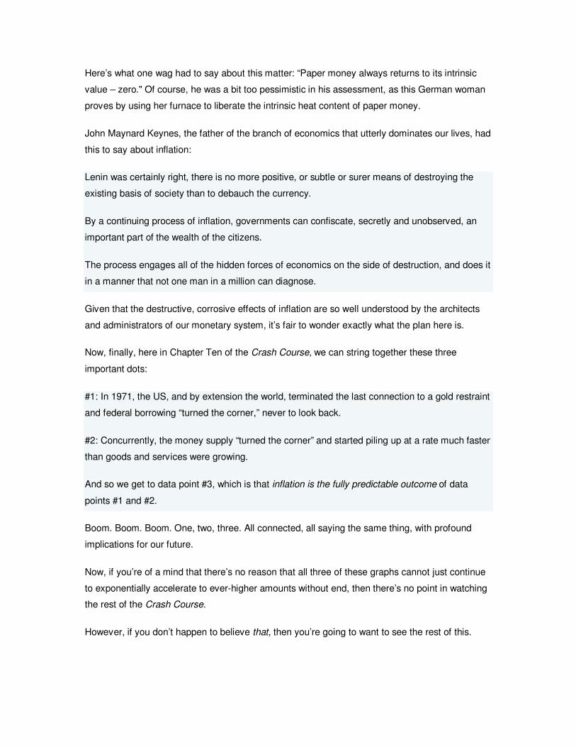
Here’s what one wag had to say about this matter: “Paper money always returns to its intrinsic
value – zero." Of course, he was a bit too pessimistic in his assessment, as this German woman
proves by using her furnace to liberate the intrinsic heat content of paper money.
John Maynard Keynes, the father of the branch of economics that utterly dominates our lives, had
this to say about inflation:
Lenin was certainly right, there is no more positive, or subtle or surer means of destroying the
existing basis of society than to debauch the currency.
By a continuing process of inflation, governments can confiscate, secretly and unobserved, an
important part of the wealth of the citizens.
The process engages all of the hidden forces of economics on the side of destruction, and does it
in a manner that not one man in a million can diagnose.
Given that the destructive, corrosive effects of inflation are so well understood by the architects
and administrators of our monetary system, it’s fair to wonder exactly what the plan here is.
Now, finally, here in Chapter Ten of the Crash Course, we can string together these three
important dots:
#1: In 1971, the US, and by extension the world, terminated the last connection to a gold restraint
and federal borrowing “turned the corner,” never to look back.
#2: Concurrently, the money supply “turned the corner” and started piling up at a rate much faster
than goods and services were growing.
And so we get to data point #3, which is that inflation is the fully predictable outcome of data
points #1 and #2.
Boom. Boom. Boom. One, two, three. All connected, all saying the same thing, with profound
implications for our future.
Now, if you’re of a mind that there’s no reason that all three of these graphs cannot just continue
to exponentially accelerate to ever-higher amounts without end, then there’s no point in watching
the rest of the Crash Course.
However, if you don’t happen to believe that, then you’re going to want to see the rest of this.
There is literally nothing more important for you to be doing right now than gaining an
understanding of how these pieces fit together, assessing the risks for yourself, and taking
actions to prepare for the possibility of a future that’s substantially different from today.
Now that we’ve covered compounding, money, and inflation, you have the tools to get the most
from the remaining sections of the Crash Course.
We have a few more dots to connect. Let’s go.
11
During the Crash Course you will often encounter numbers that are expressed in trillions. How
much is a trillion?
You know what? I’m not really sure myself.
A trillion is a very, very big number, and I think it would be worth spending a couple of minutes
trying to get our arms around the concept.
First, a numerical review.
A thousand is a one with three zeros after it.
A million is a thousand times bigger than that and it’s a one with six zeros after it. At this level I
can really get my mind around the difference between these two numbers. A million dollars in the
bank is a very different concept from a thousand dollars in the bank. I get that.
A billion then is a thousand times bigger than a million, and it’s a one followed by 9 zeros.
And a trillion is a thousand times bigger than that, and it’s a one followed by 12 zeros.
So a trillion is a thousand billions, which means it is a million millions. You know what? I don’t
know what that means! I can’t visualize that, so let’s take a different tack on this.
Suppose I gave you a thousand dollar bill and said you and a friend had to spend it all in a single
evening out on the town. You’d have a pretty good time.
Now suppose you had a stack of thousand dollar bills that was four inches in height. If you did,
you know what? Congratulations, you’d be a millionaire.
Now suppose you wanted to enter the super-elite of the wealthy and have a billion dollars. How
tall of a stack of thousand dollar bills would that be?
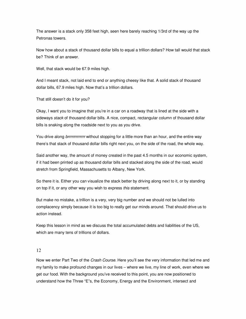
The answer is a stack only 358 feet high, seen here barely reaching 1/3rd of the way up the
Petronas towers.
Now how about a stack of thousand dollar bills to equal a trillion dollars? How tall would that stack
be? Think of an answer.
Well, that stack would be 67.9 miles high.
And I meant stack, not laid end to end or anything cheesy like that. A solid stack of thousand
dollar bills, 67.9 miles high. Now that’s a trillion dollars.
That still doesn’t do it for you?
Okay, I want you to imagine that you’re in a car on a roadway that is lined at the side with a
sideways stack of thousand dollar bills. A nice, compact, rectangular column of thousand dollar
bills is snaking along the roadside next to you as you drive.
You drive along brrrrrrrrrrrrr without stopping for a little more than an hour, and the entire way
there’s that stack of thousand dollar bills right next you, on the side of the road, the whole way.
Said another way, the amount of money created in the past 4.5 months in our economic system,
if it had been printed up as thousand dollar bills and stacked along the side of the road, would
stretch from Springfield, Massachusetts to Albany, New York.
So there it is. Either you can visualize the stack better by driving along next to it, or by standing
on top if it, or any other way you wish to express this statement.
But make no mistake, a trillion is a very, very big number and we should not be lulled into
complacency simply because it is too big to really get our minds around. That should drive us to
action instead.
Keep this lesson in mind as we discuss the total accumulated debts and liabilities of the US,
which are many tens of trillions of dollars.
12
Now we enter Part Two of the Crash Course. Here you’ll see the very information that led me and
my family to make profound changes in our lives – where we live, my line of work, even where we
get our food. With the background you’ve received to this point, you are now positioned to
understand how the Three “E”s, the Economy, Energy and the Environment, intersect and
seemingly converge on a very narrow window of the future: The Twenty-Teens. It’s the data in
these next parts that leads me to conclude that the next twenty years are going to be completely
unlike the last twenty years. A small warning: This material can be shocking and some or you
may find it emotionally challenging.
So we begin Part Two with “Debt.” We’re going to pick up two more Key Concepts in this section,
and one of them is utterly essential. It is this: Ever-growing debts implicitly assume that the
future is going to be larger than the present. We’ll be examining that statement in detail in this
chapter.
Before we go there, a few definitions are in order. A financial debt, then, is a contractual
obligation to repay a specified amount of money at some point in the future. The concept of debt
is thoroughly characterized within the legal system, so we can say that a debt is a legal contract
providing money today in exchange for repayment in the future…with interest, of course.
Debts come in many forms. Auto loans and mortgage debt are known as “secured” debts
because there is a recoverable asset attached to the debt. Credit card debt is known as
"unsecured" because no specific asset can be directly seized in the event of a default.
For you and I, there are only two ways to settle a debt. Pay it off or default on it. If you have a
printing press like the government does, a third option exists: Printing money to pay for the debt.
This method is a poorly disguised form of taxation, since it forcefully removes value from all
existing money and transfers that value to the debtholders. I view it as a form of default, but one
that preferentially punishes savers and those least able to bear the impact of inflation.
The pure debt obligations of the US Government as of April 2008 stand at 9 trillion, 444 billion
dollars and change. This is only the debt. Once we add in the liabilities of the US government,
chiefly Medicare and Social Security, we get a number five to eight times larger than this. We’ll be
discussing these liabilities in the next chapter, so that’s all I’m going to say about them now. Right
now we are focused simply on debt, and it’s enough to know that debt is only part of the whole
story.
Okay. Next this is a chart of total US debt – that’s federal, state, municipal, corporate, and private
debts in the red line, compared against total national income in the yellow line. The total debt in
the US now stands at over $48 trillion. That’s 48 stacks of thousand dollar bills, each of which is
67.9 miles high.
If we adjust these debt levels for both population and inflation over time so we’re comparing
apples to apples, we find that in 1952 there was the equivalent of $76,000 of total debt per person
and that today the number is $183,000. At $183,000 per head, this means that today the average
family of four in America is associated with $732,000 of debt. This is a useful way to look at debt
because it doesn’t really matter if the debt is owed by a government agency a corporation or an
individual, because these are really the debts of our country and all debts get paid through the
actions of people. So examining the debts on a per capita, or household basis, gives us a sense
of the situation.
Can debts forever grow faster than the incomes that service them? No, they cannot. There is a
mathematical limit in there somewhere.
Am I saying that all debt is “bad”? No, not at all. Time for another definition. Debt that can best be
described as investment debt provides the opportunity to pay itself back. An example would be a
college loan offering the opportunity to earn a higher wage in the future. Another would be a loan
to expand the seating at a successful restaurant. In the parlance of bankers, these are examples
of “self-liquidating debt.” Meaning that the loans boost future revenues and have a means of
paying themselves back. But what about loans that are merely consumptive in nature, such as
those taken out for a fancier car, or for vacations, or for more war material? These are called
“non-self-liquidating debts” because they do not generate any additional future revenue. So not
ALL debts are bad, only too much unproductive borrowing is bad.
In the past five years, American debt has grown by more than $16 trillion, and a very large
proportion of that has been of the non-self-liquidating variety. This has profound implications for
the future. Because non-self-liquidating loans do not generate future cash flows, it means that
ordinary income will have to be used to pay off today’s consumption. And this will mean less cash
for discretionary spending in the future.
So what is debt really? Well, debt provides us money to spend today. Perhaps we buy a nicer car
and we enjoy that car today. But in the future the loan payments represent money that we do not
have then to spend on other items or to save. So we can say that debt represents future
consumption taken today. As long as it is my decision to go into debt and the repayment is my
responsibility, then everything is cool.
However, once we consider that our current levels of debt will require the effort of future
generations to pay them back, we start to trend into the moral aspect of this story. Is it really
proper for one generation to consume well beyond its means and expect the following
generations to forego their consumption to pay it all back? That is precisely our current situation,
and these charts say as much. I often wonder if my children are going to accept this bargain. I
have my doubts.
Now, we learned in Section 4 that money can be viewed as a claim on human labor, and we just
learned that debt is really just a claim on future money, so we can put these statements together
and arrive at Key Concept #6: Debt is a claim on future human labor. Debt is a claim on future
labor. When we get to the section on baby boomers and the demographic challenge our country
faces, I’ll be recalling this important concept.
When viewed historically, and compared to gross domestic product, the current levels of debt are
without precedent, and the chart even suggests that we are living in the mother of all credit
bubbles. Current total credit market debt stands at more than 340% of total Gross Domestic
Product (GDP). As we can see on this chart, the last time debts got even remotely close to
current levels was back in the 1930’s, and that bears a bit of explanation. The easy credit policies
of the Fed gave us the “roaring twenties” and then a burst credit bubble, which was followed by
eleven years of economic contraction and hardship, which we now refer to the Great Depression.
Note that the debt to GDP ratio didn’t start to climb until after 1929. What’s the explanation for
this? Were more loans being made? No, the chart climbs here, because while the debts remained,
the economy fell away from under them, creating this spike.
In the absence of the Great Depression anomaly, our country always held less than 200% of our
GDP in debt. It is only since the mid-1980’s that that relationship was violated, so we can say that
our current experiment with these levels of debt is only 23 years old and therefore a historically
brief phenomenon. And it is this chart, more than any other, that leads me to conclude that the
next twenty years are going to be completely unlike the last twenty years. I just cannot see how
we can pull off another twenty just like that area circled in red.
Based on the shape of this chart, our entire financial universe has made a rather substantial and
collective assumption about the future. Because a debt is a claim on the future, each incremental
expansion of the level of debt is an implicit assumption that the future will be larger than today
Which means there is a very profound assumption baked right into this debt chart. And that is the
future will be larger than the present. Here’s what I mean.
A debt is always paid off in the future, and loans are made with the expectation that they’ll be paid
back, with interest. If more credits are extended this year than last, then that means there’s an
expectation, an assumption, that the ability exists to pay those loans back in the future. Given that
our debts are now over 340% of GDP there is an explicit assumption here that the future GDP is
going to be larger than today’s. A lot larger. More cars sold, more resources consumed, more
money earned, more houses built – all of it – must be larger than today just to offer the chance of
paying back the loans we’ve ALREADY taken on. But each quarter we see that new debts are
being made at a rate five times to six times faster than growth in the underlying economy. Even
with a fairly optimistic assessment of future growth, this trajectory is unsustainable.
Our banks, pension funds, governmental structure and everything else tied to the continued
expansion of debt has an enormous stake in its perpetual growth. And so here we come to our
seventh Key Concept of the Crash Course.
Our debt markets assume that the future will be (much) larger than the present.
But what happens if that’s not true? What if the means to repay all those claims does not arrive in
the future? Well, broadly speaking, if that comes to pass there’s only one result with two different
means of making it happen. The result is that the claims – the debts – must be diminished
somehow, and that could happen either by a process of debt defaults or by inflation. The defaults
are easy to explain, the debts don’t get repaid, and the holders of that debt don’t get their money
back. Boom. The claims get diminished. The future isn’t large enough to pay back the claims?
Then defaults are simply a way of not paying them.
The inflation route can be confusing, so think of it this way – what if you sold your house to
someone and elected to hold a note for $500,000. The terms call for the note to be repaid all at
once in ten years as a single payment of $650,000. Well, what if you get paid your $650,000 right
on time but that $650,000 will only buy this house? You got paid, all right, but your claim on the
future was vastly diminished by inflation. In the default scenario, your money is still worth
something, but you don’t get it back. In the inflation scenario you get it back but it hardly buys
anything. In both cases your future was diminished, so the impact is very nearly the same but the
means of achieving it are wildly different.
So the questions you need to ponder for yourself are: Have too many claims been made on the
future? And if so, will we face inflation or defaults as the means of squaring things up? You will
arrive at wildly different life decisions depending on whether you answer “YES” or “NO” to the first
question and “inflation” or “defaults” for the second question. So they are worth pondering.
All right, here’s what we’ve learned:
1. Key Concept #6 is Debt is a claim on future human labor.
2. Per capita debt has never been higher. We are in truly unprecedented territory in this
country.
3. Debt has increased by $16 trillion in the past five years, and most of it consumptive
debt. Meaning that future consumption will have to be seriously curtailed, or we’ll enter a
period of debt destruction, either by defaults or inflation.
4. And finally, Key Concept #7: Our debt markets assume that the future will be much
larger than the present.
This last insight plays in two critical areas that are coming up in future installments of the Crash
Course.
Our entire economic system, and by extension our way of life, is founded on debt, and debt is
founded on the assumption that the future will always be bigger than the past. Therefore it is
utterly vital that we examine this assumption closely, because if this assumption is false, so are a
lot of other things we may be taking for granted.
13
If you’ve just seen the previous chapter on debt, then you might be wondering if either our
savings or our assets are of sufficient quantity to make those levels of debt perfectly manageable.
In the next chapter I’ll deal with assets. In this chapter I will present evidence that the United
States has failed to save money at virtually every level of society and make the claim that the
United States government is insolvent. I use that term precisely. Whereas bankruptcy is a legal
process that begins once cash flows can no longer meet current obligations, insolvency happens
when one’s liabilities exceed one’s assets and is the first step on the road towards bankruptcy.
The purpose of the Crash Course is to give you the context and data you need to be able to
accurately assess the likelihoods and risks that our economy faces over the next few years. My
position is that the next twenty years are going to be completely unlike the last twenty years, and
to support this statement I am going to take you through six key areas of data. Debt, Savings,
Assets, Demographics, Peak Oil, and Climate Change. Any one of these could prove
economically challenging, but the combination of two or more simultaneously, well,.I’ll leave that
for you to assess.
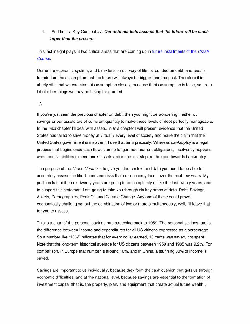
This is a chart of the personal savings rate stretching back to 1959. The personal savings rate is
the difference between income and expenditures for all US citizens expressed as a percentage.
So a number like “10%” indicates that for every dollar earned, 10 cents was saved, not spent.
Note that the long-term historical average for US citizens between 1959 and 1985 was 9.2%. For
comparison, in Europe that number is around 10%, and in China, a stunning 30% of income is
saved.
Savings are important to us individually, because they form the cash cushion that gets us through
economic difficulties, and at the national level, because savings are essential to the formation of
investment capital (that is, the property, plan, and equipment that create actual future wealth).
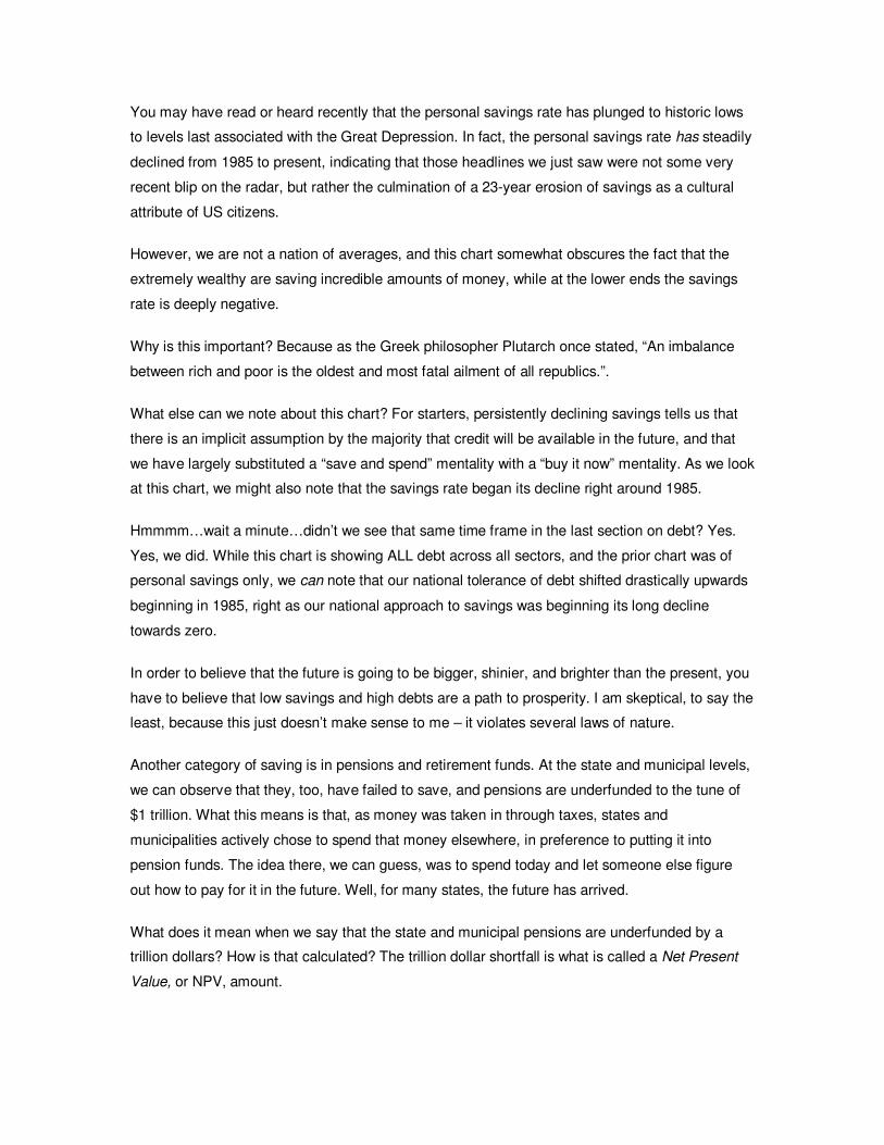
You may have read or heard recently that the personal savings rate has plunged to historic lows
to levels last associated with the Great Depression. In fact, the personal savings rate has steadily
declined from 1985 to present, indicating that those headlines we just saw were not some very
recent blip on the radar, but rather the culmination of a 23-year erosion of savings as a cultural
attribute of US citizens.
However, we are not a nation of averages, and this chart somewhat obscures the fact that the
extremely wealthy are saving incredible amounts of money, while at the lower ends the savings
rate is deeply negative.
Why is this important? Because as the Greek philosopher Plutarch once stated, “An imbalance
between rich and poor is the oldest and most fatal ailment of all republics.”.
What else can we note about this chart? For starters, persistently declining savings tells us that
there is an implicit assumption by the majority that credit will be available in the future, and that
we have largely substituted a “save and spend” mentality with a “buy it now” mentality. As we look
at this chart, we might also note that the savings rate began its decline right around 1985.
Hmmmm…wait a minute…didn’t we see that same time frame in the last section on debt? Yes.
Yes, we did. While this chart is showing ALL debt across all sectors, and the prior chart was of
personal savings only, we can note that our national tolerance of debt shifted drastically upwards
beginning in 1985, right as our national approach to savings was beginning its long decline
towards zero.
In order to believe that the future is going to be bigger, shinier, and brighter than the present, you
have to believe that low savings and high debts are a path to prosperity. I am skeptical, to say the
least, because this just doesn’t make sense to me – it violates several laws of nature.
Another category of saving is in pensions and retirement funds. At the state and municipal levels,
we can observe that they, too, have failed to save, and pensions are underfunded to the tune of
$1 trillion. What this means is that, as money was taken in through taxes, states and
municipalities actively chose to spend that money elsewhere, in preference to putting it into
pension funds. The idea there, we can guess, was to spend today and let someone else figure
out how to pay for it in the future. Well, for many states, the future has arrived.
What does it mean when we say that the state and municipal pensions are underfunded by a
trillion dollars? How is that calculated? The trillion dollar shortfall is what is called a Net Present
Value, or NPV, amount.
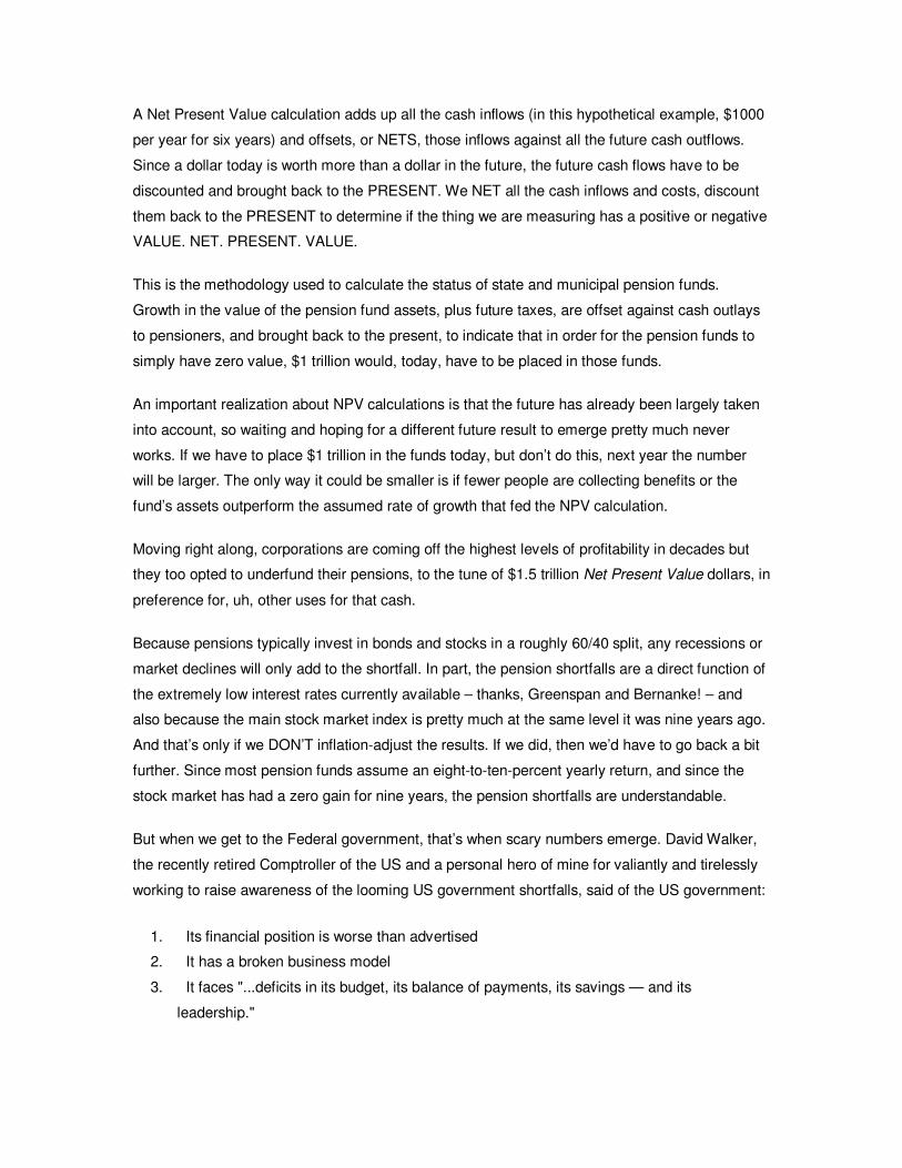
A Net Present Value calculation adds up all the cash inflows (in this hypothetical example, $1000
per year for six years) and offsets, or NETS, those inflows against all the future cash outflows.
Since a dollar today is worth more than a dollar in the future, the future cash flows have to be
discounted and brought back to the PRESENT. We NET all the cash inflows and costs, discount
them back to the PRESENT to determine if the thing we are measuring has a positive or negative
VALUE. NET. PRESENT. VALUE.
This is the methodology used to calculate the status of state and municipal pension funds.
Growth in the value of the pension fund assets, plus future taxes, are offset against cash outlays
to pensioners, and brought back to the present, to indicate that in order for the pension funds to
simply have zero value, $1 trillion would, today, have to be placed in those funds.
An important realization about NPV calculations is that the future has already been largely taken
into account, so waiting and hoping for a different future result to emerge pretty much never
works. If we have to place $1 trillion in the funds today, but don’t do this, next year the number
will be larger. The only way it could be smaller is if fewer people are collecting benefits or the
fund’s assets outperform the assumed rate of growth that fed the NPV calculation.
Moving right along, corporations are coming off the highest levels of profitability in decades but
they too opted to underfund their pensions, to the tune of $1.5 trillion Net Present Value dollars, in
preference for, uh, other uses for that cash.
Because pensions typically invest in bonds and stocks in a roughly 60/40 split, any recessions or
market declines will only add to the shortfall. In part, the pension shortfalls are a direct function of
the extremely low interest rates currently available – thanks, Greenspan and Bernanke! – and
also because the main stock market index is pretty much at the same level it was nine years ago.
And that’s only if we DON’T inflation-adjust the results. If we did, then we’d have to go back a bit
further. Since most pension funds assume an eight-to-ten-percent yearly return, and since the
stock market has had a zero gain for nine years, the pension shortfalls are understandable.
But when we get to the Federal government, that’s when scary numbers emerge. David Walker,
the recently retired Comptroller of the US and a personal hero of mine for valiantly and tirelessly
working to raise awareness of the looming US government shortfalls, said of the US government:
1. Its financial position is worse than advertised
2. It has a broken business model
3. It faces "...deficits in its budget, its balance of payments, its savings — and its
leadership."
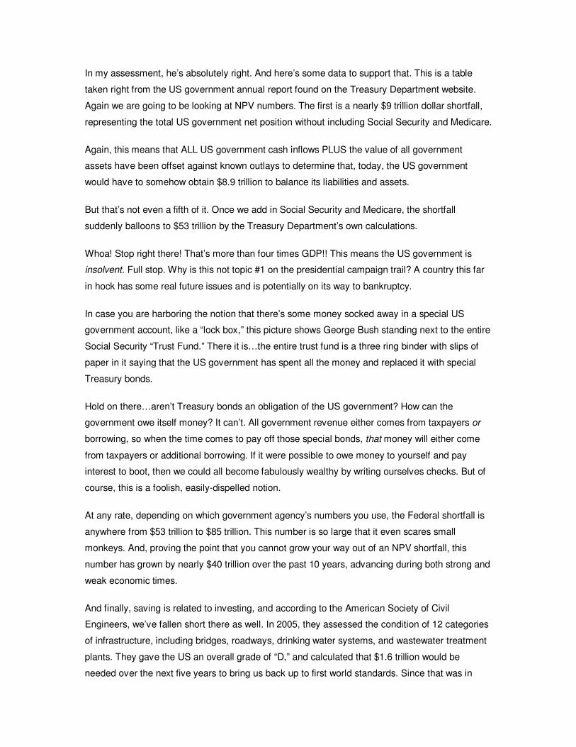
In my assessment, he’s absolutely right. And here’s some data to support that. This is a table
taken right from the US government annual report found on the Treasury Department website.
Again we are going to be looking at NPV numbers. The first is a nearly $9 trillion dollar shortfall,
representing the total US government net position without including Social Security and Medicare.
Again, this means that ALL US government cash inflows PLUS the value of all government
assets have been offset against known outlays to determine that, today, the US government
would have to somehow obtain $8.9 trillion to balance its liabilities and assets.
But that’s not even a fifth of it. Once we add in Social Security and Medicare, the shortfall
suddenly balloons to $53 trillion by the Treasury Department’s own calculations.
Whoa! Stop right there! That’s more than four times GDP!! This means the US government is
insolvent. Full stop. Why is this not topic #1 on the presidential campaign trail? A country this far
in hock has some real future issues and is potentially on its way to bankruptcy.
In case you are harboring the notion that there’s some money socked away in a special US
government account, like a “lock box,” this picture shows George Bush standing next to the entire
Social Security “Trust Fund.” There it is…the entire trust fund is a three ring binder with slips of
paper in it saying that the US government has spent all the money and replaced it with special
Treasury bonds.
Hold on there…aren’t Treasury bonds an obligation of the US government? How can the
government owe itself money? It can’t. All government revenue either comes from taxpayers or
borrowing, so when the time comes to pay off those special bonds, that money will either come
from taxpayers or additional borrowing. If it were possible to owe money to yourself and pay
interest to boot, then we could all become fabulously wealthy by writing ourselves checks. But of
course, this is a foolish, easily-dispelled notion.
At any rate, depending on which government agency’s numbers you use, the Federal shortfall is
anywhere from $53 trillion to $85 trillion. This number is so large that it even scares small
monkeys. And, proving the point that you cannot grow your way out of an NPV shortfall, this
number has grown by nearly $40 trillion over the past 10 years, advancing during both strong and
weak economic times.
And finally, saving is related to investing, and according to the American Society of Civil
Engineers, we’ve fallen short there as well. In 2005, they assessed the condition of 12 categories
of infrastructure, including bridges, roadways, drinking water systems, and wastewater treatment
plants. They gave the US an overall grade of “D,” and calculated that $1.6 trillion would be
needed over the next five years to bring us back up to first world standards. Since that was in
2005, and inflation for things made out of metal and asphalt has advanced enormously since then,
let’s just round this up to an even $2 trillion.
And putting it all together, we find that a personal failure to save is reflected by a state and local
failure to save, which are mirrored by a corporate failure to save, all dwarfed by a failure to save
at the federal government level. And capping it all off is a profound failure to invest. All of these
deficits lie before us and lead me to conclude that the next twenty years are going to be
completely unlike the last twenty years.
This is our legacy – the economic and physical world that we are choosing to leave to those who
follow us – and most of these bills will come due, in a big way, in the twenty-teens. Is that too far
away to worry about? Not in the least, once you consider the full scope of the deficits.
How did we get here? How did this happen? As a former consultant to Fortune 500 companies, I
saw an explanation for this, and it all begins at the top. If the leadership of a company was
financially reckless or had a moral disregard for its workers, then this same behavior could be
found reflected throughout all the layers of the company.
Our government has pursued a reckless policy of debt accumulation while neglecting saving and
investing, and so have states, municipalities, corporations, and private citizens.
David Walker was exactly right in the earlier quote: “The US government faces deficits in…its
leadership.” The top sets the tone. This topic should be front and center in our 2008 political
debates, but it is nowhere to be found. We are laboring under a profound deficit of leadership.
Next we move onto assets, and see how they stack up against our debts and our national
failure to save.
14
As we learned in the section on debt, our nation has a historic, never-before-seen level of debt
and a historic failure to save.
Now some would say that it’s not reasonable to look only at debt and savings; one also has to
consider assets. After all, does it really matter if you have no savings and a million dollars of debt
if you have assets worth $10 million? That’s a great point, and so we’re going to take a look at
assets here.
All right, so what is an asset? One definition is items of ownership convertible into cash: total
resources of a person or business, as cash, notes and accounts receivable, securities,
inventories, goodwill, fixtures, machinery, or real estate.
So an asset is something of value that can be converted to cash or provides access to, or
enhances, a flow of cash. If we simply said assets are deposits, real estate, a stock or a bond,
and the stuff we own, we’d pretty much cover the vast majority of what we consider to be our
assets.
We’re only going to look at the assets of households, because, as we saw earlier, the liabilities
and assets of the US and state governments are really the liabilities of its citizens. But do
remember, as we noted in Chapter 13, the US government has a total net worth of negative $50
to $85 trillion. In fact, that mismatch between assets and liabilities does not belong to the US
government, it belongs to you and me and everybody else. Our national debts and liabilities are,
well, ours. On the private side, the assets of companies belong entirely to the bondholders and
shareholders of the company, not the company itself. And who holds those? Ultimately, private
citizens do. Since we can pool citizens into households, we could examine household assets,
deduct some relevant liabilities, and get a decent view of where things stand.
And we do this because the Federal Reserve tracks net worth at the household level, and this
data is routinely and widely reported in the media. In fact, according to the Federal Reserve,
household net worth has exploded by nearly $20 trillion in only five years – an astonishing feat –
and it represents more ‘wealth’ than our country managed to amass from its inception until the
late 1980s. And these are net assets, so the Federal Reserve, and many in the media, take the
position that, with just under $60 trillion in net worth, Americans are doing just fine and our rapidly
climbing debt levels are no cause for concern.
But before we get too excited about the astonishing wealth indicated here, there are two key
oversights and a fallacy hidden in this report of which you should be aware. As always, the devil
is in the details. Before I address those, I want you to observe this period here, spanning from
2000 to 2003. That dip in the net worth of households was due to the stock market collapse that
ran from 2000 to 2003 and caused such great panic at the Fed that Greenspan lowered interest
rates to the emergency rate of 1%, thereby igniting the greatest of housing and credit bubbles in
all of history. And this decline in total net worth leads to this observation: Debt is fixed. When you
take on a debt, there it placidly sits, growing larger, until you make payments on it. Debts do not
vary with general economic conditions, or whether you get a raise or lose your job. Assets, on the
other hand, are variable, sometimes gaining and sometimes losing value. And so this leads to the
8th Key Concept of the Crash Course: Debts are fixed, while assets are variable.
Okay. Where did that $19.8 trillion in new wealth come from? About 80% of that growth came
from a rise in financial assets and the remaining 20% came from growth in real estate and other
‘tangible’ assets.
When we look at how much of each type there are, we see that 72% of the total net worth
consists of financial assets totaling about $41 trillion, while the tangible assets are the remaining
28% and total around $16 trillion.
If we examine these assets a little more closely, we see that the $41 trillion dollars worth of
financial assets consist of things like pension funds, the assets of privately held businesses,
deposits, stocks, and bonds, which we can roughly recompose into these four main classes:
stocks, bonds, cash or deposits, and the assets of privately held businesses.
The other bucket of $16 trillion in tangible assets consists primarily of real estate, which is 75% of
this bucket, and consumer durables, which would be your car, your dryer, and your snow blower,
if you have one. For every single one of these assets except cash, in order to liberate the wealth
from these assets you’d have to sell them first.
One general rule of asset markets goes like this: Things go UP in price when there are more
buyers than sellers, AND things go DOWN in price when there are more sellers than buyers. Hold
onto that thought for when we get to demographics.
Now let me expose a great fallacy of the household wealth report. I’ll use real estate to make the
point. Suppose you have a house that you bought for $250,000, and over time, say the last five
years, it went up in assessed value to $500,000. The Fed would record this as a $250,000
increase in your net wealth. But there’s really no way for you to easily get to that wealth. Sure,
you could borrow against that, but that does not liberate the wealth, it only exchanges an amount
of it for debt. But suppose that you sold your house. Well, if you wanted to move into an
equivalent house, guess what? They’ve all gone up in price along with yours, and so you have to
spend $500,000 for an equivalent house, so nope, no wealth was liberated there. In fact, the only
way to liberate the wealth in your house is to downsize and buy a smaller one (or rent). So here’s
the rhetorical question of the day: How can everyone downsize? You might be able to, but, on
balance, everyone can’t. At least not without creating a massive glut of large homes and a
disparate shortage of smaller ones. And if everyone can’t do this, then it means that it is
impossible to ever release the full value, or embodied wealth, of all the houses. So the wealth
number is fun to look at individually, but it is more or less meaningless as a whole. This same
dynamic is true for other assets as well: Sufficient buyers are essential, or the wealth is as good
as stranded.
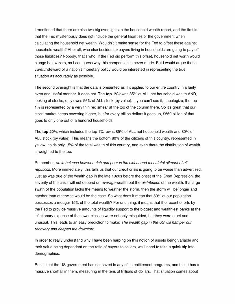
I mentioned that there are also two big oversights in the household wealth report, and the first is
that the Fed mysteriously does not include the general liabilities of the government when
calculating the household net wealth. Wouldn’t it make sense for the Fed to offset these against
household wealth? After all, who else besides taxpayers living in households are going to pay off
those liabilities? Nobody, that’s who. If the Fed did perform this offset, household net worth would
plunge below zero, so I can guess why this comparison is never made. But I would argue that a
careful steward of a nation’s monetary policy would be interested in representing the true
situation as accurately as possible.
The second oversight is that the data is presented as if it applied to our entire country in a fairly
even and useful manner. It does not. The top 1% owns 35% of ALL net household wealth AND,
looking at stocks, only owns 56% of ALL stock (by value). If you can’t see it, I apologize; the top
1% is represented by a very thin red smear at the top of the column there. So it’s great that our
stock market keeps powering higher, but for every trillion dollars it goes up, $560 billion of that
goes to only one out of a hundred households.
The top 20%, which includes the top 1%, owns 85% of ALL net household wealth and 80% of
ALL stock (by value). This means the bottom 80% of the citizens of this country, represented in
yellow, holds only 15% of the total wealth of this country, and even there the distribution of wealth
is weighted to the top.
Remember, an imbalance between rich and poor is the oldest and most fatal ailment of all
republics. More immediately, this tells us that our credit crisis is going to be worse than advertised.
Just as was true of the wealth gap in the late 1920s before the onset of the Great Depression, the
severity of the crisis will not depend on average wealth but the distribution of the wealth. If a large
swath of the population lacks the means to weather the storm, then the storm will be longer and
harsher than otherwise would be the case. So what does it mean that 80% of our population
possesses a meager 15% of the total wealth? For one thing, it means that the recent efforts by
the Fed to provide massive amounts of liquidity support to the biggest and wealthiest banks at the
inflationary expense of the lower classes were not only misguided, but they were cruel and
unusual. This leads to an easy prediction to make: The wealth gap in the US will hamper our
recovery and deepen the downturn.
In order to really understand why I have been harping on this notion of assets being variable and
their value being dependent on the ratio of buyers to sellers, we’ll need to take a quick trip into
demographics.
Recall that the US government has not saved in any of its entitlement programs, and that it has a
massive shortfall in them, measuring in the tens of trillions of dollars. That situation comes about
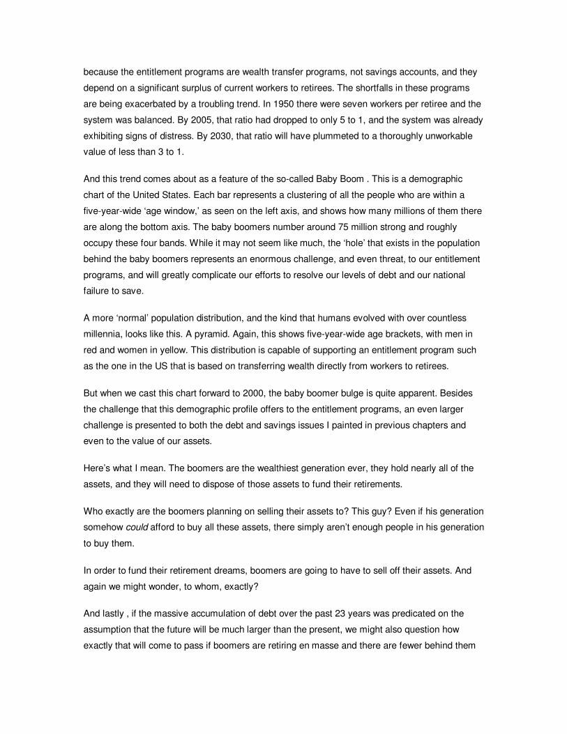
because the entitlement programs are wealth transfer programs, not savings accounts, and they
depend on a significant surplus of current workers to retirees. The shortfalls in these programs
are being exacerbated by a troubling trend. In 1950 there were seven workers per retiree and the
system was balanced. By 2005, that ratio had dropped to only 5 to 1, and the system was already
exhibiting signs of distress. By 2030, that ratio will have plummeted to a thoroughly unworkable
value of less than 3 to 1.
And this trend comes about as a feature of the so-called Baby Boom . This is a demographic
chart of the United States. Each bar represents a clustering of all the people who are within a
five-year-wide ‘age window,’ as seen on the left axis, and shows how many millions of them there
are along the bottom axis. The baby boomers number around 75 million strong and roughly
occupy these four bands. While it may not seem like much, the ‘hole’ that exists in the population
behind the baby boomers represents an enormous challenge, and even threat, to our entitlement
programs, and will greatly complicate our efforts to resolve our levels of debt and our national
failure to save.
A more ‘normal’ population distribution, and the kind that humans evolved with over countless
millennia, looks like this. A pyramid. Again, this shows five-year-wide age brackets, with men in
red and women in yellow. This distribution is capable of supporting an entitlement program such
as the one in the US that is based on transferring wealth directly from workers to retirees.
But when we cast this chart forward to 2000, the baby boomer bulge is quite apparent. Besides
the challenge that this demographic profile offers to the entitlement programs, an even larger
challenge is presented to both the debt and savings issues I painted in previous chapters and
even to the value of our assets.
Here’s what I mean. The boomers are the wealthiest generation ever, they hold nearly all of the
assets, and they will need to dispose of those assets to fund their retirements.
Who exactly are the boomers planning on selling their assets to? This guy? Even if his generation
somehow could afford to buy all these assets, there simply aren’t enough people in his generation
to buy them.
In order to fund their retirement dreams, boomers are going to have to sell off their assets. And
again we might wonder, to whom, exactly?
And lastly , if the massive accumulation of debt over the past 23 years was predicated on the
assumption that the future will be much larger than the present, we might also question how
exactly that will come to pass if boomers are retiring en masse and there are fewer behind them
to take their place? Man…the next generation better be prepared to work really, really hard! Too
bad they are graduating with the highest levels of college debt ever recorded.
This sort of demographic profile will be with us for decades and cannot be wished away or fixed
by some clever policy. It is simply a fact of life, and one that we’d do well to recognize and plan
for rather than ignore.
Boomer retirement has already begun, and the pace of this will accelerate rapidly over the next
15 years, which will make the twenty-teens quite interesting and leads me to conclude that the
next twenty years are going to be completely unlike the last twenty years.
Next time we’re going to discuss asset bubbles. Understanding the destructive dynamics of
bubbles is critical if you want to know what’s coming next and why the Federal Reserve is
panicking right now.
15
Okay, now that we’ve taken a look at US assets, we need to spend some time understanding
what an asset bubble is, how one might form, and the consequences of the aftermath. And we
are specifically going to examine the housing bubble in detail, because it’s happening right now
and is the largest bubble in all of history and will probably be the most destructive.
Through the long sweep of history, the bursting of asset bubbles has nearly always been
traumatic. Social, political, and economic upheavals have a bad habit of following asset bubbles,
while wealth destruction is a guaranteed feature.
Along the continuum of irrational financial behavior, it can be tricky to tell the difference between
a bubble, a mania, and mere touch of exuberance. A bubble is reserved for the height of folly,
and history is rich with folly.
Bubbles used to happen once every generation or so, because it took time to forget the pain from
the damage. Today we are facing the bursting of a second major asset bubble, housing, spaced
less than ten years from the bursting of the dot-com bubble. This is simply astounding and
thoroughly unprecedented.
So how would we know that we’re in an ‘asset bubble’? What do they look like, and what can we
expect when one bursts?
The Fed famously likes to claim that you can’t spot one until it bursts. But actually you can, and
the definition is pretty simple: A bubble exists when asset price inflation rises beyond what
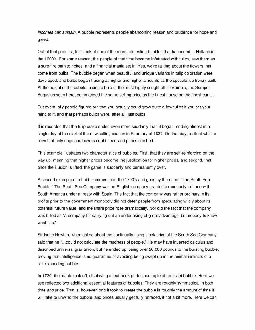
incomes can sustain. A bubble represents people abandoning reason and prudence for hope and
greed.
Out of that prior list, let’s look at one of the more interesting bubbles that happened in Holland in
the 1600’s. For some reason, the people of that time became infatuated with tulips, saw them as
a sure-fire path to riches, and a financial mania set in. Yes, we’re talking about the flowers that
come from bulbs. The bubble began when beautiful and unique variants in tulip coloration were
developed, and bulbs began trading at higher and higher amounts as the speculative frenzy built.
At the height of the bubble, a single bulb of the most highly sought after example, the Semper
Augustus seen here, commanded the same selling price as the finest house on the finest canal.
But eventually people figured out that you actually could grow quite a few tulips if you set your
mind to it, and that perhaps bulbs were, after all, just bulbs.
It is recorded that the tulip craze ended even more suddenly than it began, ending almost in a
single day at the start of the new selling season in February of 1637. On that day, a silent whistle
blew that only dogs and buyers could hear, and prices crashed.
This example illustrates two characteristics of bubbles. First, that they are self-reinforcing on the
way up, meaning that higher prices become the justification for higher prices, and second, that
once the illusion is lifted, the game is suddenly and permanently over.
A second example of a bubble comes from the 1700’s and goes by the name “The South Sea
Bubble.” The South Sea Company was an English company granted a monopoly to trade with
South America under a treaty with Spain. The fact that the company was rather ordinary in its
profits prior to the government monopoly did not deter people from speculating wildly about its
potential future value, and the share price rose dramatically. Nor did the fact that the company
was billed as “A company for carrying out an undertaking of great advantage, but nobody to know
what it is."
Sir Isaac Newton, when asked about the continually rising stock price of the South Sea Company,
said that he “…could not calculate the madness of people.” He may have invented calculus and
described universal gravitation, but he ended up losing over 20,000 pounds to the bursting bubble,
proving that intelligence is no guarantee of avoiding being swept up in the animal instincts of a
still-expanding bubble.
In 1720, the mania took off, displaying a text-book-perfect example of an asset bubble. Here we
see reflected two additional essential features of bubbles: They are roughly symmetrical in both
time and price. That is, however long it took to create the bubble is roughly the amount of time it
will take to unwind the bubble, and prices usually get fully retraced, if not a bit more. Here we can
see those features in perfect form. Keep an eye on this shape. We’ll be seeing it again, and again,
and again.
And here in a chart of the Dow Jones, beginning in 1921 we can see that the stock bubble that
preceded the Great Depression followed the same rough trajectory, requiring about as much time
to deflate as it did to inflate, and that prices roughly returned to the levels from which they started.
And here’s the stock price of GM in the blue line between the years 1912 and 1922, and Intel in
the red line between 1992 and 2002, periods during which both stocks were swept up in bubbles.
Here we might also note that the price data looks very similar for both stocks, despite the fact that
they reflect a car company and a high tech chip manufacturer separated by a span of 80 years.
The fact that bubbles display the same price behaviors over the centuries tells us that they are
not artifacts of particular financial systems, but rather are shaped by the human emotions of
greed, fear, and hope. Those have not changed through the years, and this is why you should
hold onto your wallet any time you hear the words this time it’s different.
Somewhere along the way, people started to believe this about houses. It got to the point that
people began to really believe that a house was a path to riches. And, even better, it was a
magical path that would transport you to easy street even if you sat on your sofa the whole time
drinking beer.
Now, there’s simply no way for this to be true, and we should have known better, but bubbles
usually have their way with the masses. Regardless, over the long haul house prices will be set
by whatever it costs to build a new house, meaning that inflation will dictate house prices.
This amazing chart of inflation-adjusted house prices, created by Robert Shiller, reveals that
between 1890 and 1998, house prices tracked the rate of inflation very closely. Any time the chart
line is rising, houses are appreciating in price faster than the rate of inflation, and any time the
line is falling, they are losing ground compared to inflation.
Over this entire 118-year period, house prices averaged 101.2, meaning that inflation-adjusted
house prices are roughly comparable across this entire sweep of history. Real estate prices were
stable compared to inflation, then fell before and during the Great Depression, stabilized again,
and then rose dramatically after the war.
See this little bump right here? That was a property bubble that I still remember clearly, because
it impacted the Northeast, where I lived at the time, and I got to ride my bike through abandoned
construction projects. Notice that this property bubble returned to baseline in a fairly symmetrical
fashion, as did the property bubble of 1989.
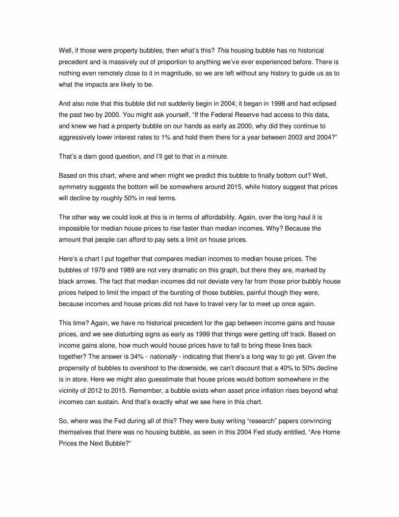
Well, if those were property bubbles, then what’s this? This housing bubble has no historical
precedent and is massively out of proportion to anything we’ve ever experienced before. There is
nothing even remotely close to it in magnitude, so we are left without any history to guide us as to
what the impacts are likely to be.
And also note that this bubble did not suddenly begin in 2004; it began in 1998 and had eclipsed
the past two by 2000. You might ask yourself, “If the Federal Reserve had access to this data,
and knew we had a property bubble on our hands as early as 2000, why did they continue to
aggressively lower interest rates to 1% and hold them there for a year between 2003 and 2004?”
That’s a darn good question, and I’ll get to that in a minute.
Based on this chart, where and when might we predict this bubble to finally bottom out? Well,
symmetry suggests the bottom will be somewhere around 2015, while history suggest that prices
will decline by roughly 50% in real terms.
The other way we could look at this is in terms of affordability. Again, over the long haul it is
impossible for median house prices to rise faster than median incomes. Why? Because the
amount that people can afford to pay sets a limit on house prices.
Here’s a chart I put together that compares median incomes to median house prices. The
bubbles of 1979 and 1989 are not very dramatic on this graph, but there they are, marked by
black arrows. The fact that median incomes did not deviate very far from those prior bubbly house
prices helped to limit the impact of the bursting of those bubbles, painful though they were,
because incomes and house prices did not have to travel very far to meet up once again.
This time? Again, we have no historical precedent for the gap between income gains and house
prices, and we see disturbing signs as early as 1999 that things were getting off track. Based on
income gains alone, how much would house prices have to fall to bring these lines back
together? The answer is 34% - nationally - indicating that there’s a long way to go yet. Given the
propensity of bubbles to overshoot to the downside, we can’t discount that a 40% to 50% decline
is in store. Here we might also guesstimate that house prices would bottom somewhere in the
vicinity of 2012 to 2015. Remember, a bubble exists when asset price inflation rises beyond what
incomes can sustain. And that’s exactly what we see here in this chart.
So, where was the Fed during all of this? They were busy writing “research” papers convincing
themselves that there was no housing bubble, as seen in this 2004 Fed study entitled, “Are Home
Prices the Next Bubble?”
The main summary of the study started off on a good note, stating, “Home prices have been
rising strongly since the mid-1990s, prompting concerns that a bubble exists in this asset class
and that home prices are vulnerable to a collapse that could harm the US economy.”
But then main conclusion of the paper veered sharply off into a ditch, reading:
“A close analysis of the U.S. housing market in recent years, however, finds little basis for such
concerns. The marked upturn in home prices is largely attributable to strong market
fundamentals: Home prices have essentially moved in line with increases in family income and
declines in nominal mortgage interest rates.”
“Essentially moved in line with increases in family income?” What? One of the most widely known
facts of our time is that family incomes have not moved up at all over the past 8 years on an
inflation-adjusted basis and is one of the principal economic failures of this decade. This just goes
to show that the Federal Reserve is either stocked with inept or biased researchers, and, of the
two, I am not sure which makes me feel worse about our chances of pulling through this mess.
But the Fed’s researchers were simply doing what millions of people did; namely, falling prey to
believing that somehow “this time it’s different.” But that’s just how bubbles are. People take leave
of their senses, use all manner of rationales to justify their positions, but then, suddenly one day
the illusion lifts, and what seemed to be unassailably true no longer makes any sense at all. Once
that day happens, the fate of the bubble is reduced to measuring the speed of its collapse.
Why is any of this important to us? Because we are going to be living with the after-effects for a
very long time.
While it’s tempting to lay the blame for what’s happening on the housing bubble, it’s important to
remember that the dramatic rise in house prices was itself just a symptom of a credit bubble run
amok.
Total credit at the end of 2000, when the stock bubble was bursting, stood at $27 trillion dollars.
By the end of 2007, it stood at an astounding $48 trillion dollars. This $21 trillion increase in
borrowing is five times larger than the increase in US GDP over the same period of time. Any
attempt to understand the housing bubble has to be viewed against the backdrop of this massive
increase in debt.
But as we noted in an earlier chapter, this credit bubble has been going on for 25 years.
Unwinding a multi-generational debt-binge is going to require some enormous changes in
attitudes and habits.
One reason that any bubble, but especially a housing bubble like this one, is so destructive is
because so many bad investments are made along the way.
Too many houses were built, too many shopping centers, too many condos, and nearly all of
them too large and ill-positioned for a future of expensive energy. Sorry to say, but all those
trillions of dollars were wasted, and, worse, stole opportunities from the things that needed that
money more.
The Austrian school of economics has a very crisp and historically accurate definition of how a
credit bubble ends. According to Ludwig Von Mises:
“There is no means of avoiding the final collapse of a boom brought about by credit expansion.
The alternative is only whether the crisis should come sooner as a result of a voluntary
abandonment of further credit expansion, or later as a final and total catastrophe of the currency
system involved.”
This is a view I happen to ascribe to and explains my strong preference for placing my wealth out
of the path of a potential dollar collapse. As a nation, we’ve undertaken desperate measures to
avoid abandoning the continuation of our credit expansion, leaving a final catastrophe of the
currency as our most likely outcome.
As for the timing? It could hardly be worse. Dealing with a bursting housing bubble is hardly the
sort of challenge we need at this particular moment in history, but here we are. The stewardship
and vision displayed by the Federal Reserve and Washington, DC in bringing this all about have
been utterly atrocious.
So what can we expect from a collapsing credit bubble? Simply put, everything that fed upon and
grew as a consequence of too much easy credit will collapse. I am especially leery of financial
stocks, low grade bonds, and of course, real estate.
I see very few conventional ways to protect ones wealth, and so I invite you to begin asking
yourself (and, if you have one, your financial advisor) some very hard questions about the safety
of your holdings. You’ll be glad you did.
Remember, this time it’s probably NOT different.
Please join us for the next chapter, where we explore the extent to which we have been telling
ourselves pleasant half-truths and other falsehoods, which I call “Fuzzy Numbers.”
Thank you for listening.
16
What if it’s true, as Kevin Phillips recently stated in an article in Harpers’, that “[e]ver since the
1960s, Washington has gulled its citizens and creditors by debasing official statistics, the vital
instruments with which the vigor and muscle of the American economy are measured?”
What if it turned out that our individual, corporate, and government decision-making was based
on deeply misleading, if not provably false, data?
That’s what we’re going to take a look at here, by examining the ways that inflation and Gross
Domestic Product, or GDP, are measured.
As you now know, inflation is a matter of active policy. Too little and our current banking system
risks failure. Too much and the majority of people noticeably lose their savings, which makes
them politically restive. So keeping inflation at a "goldilocks" temperature – not too hot and not too
cold – is the name of the game.
Inflation has two components. The first is the simple pressure on prices due to too much money
floating around. The second component lies with people’s expectations of future inflation. If
expectations are that inflation will be tame, they are said to be well-anchored. If people expect
prices to rise, they tend to spend their money now, while the getting is still good, and this serves
to fuel further inflation in a self-reinforcing manner. The faster people spend, the faster inflation
rises. Zimbabwe is a perfect modern example of this dynamic in play.
Accordingly, official inflation policy has two components – the first is regulating the money supply
and the second is anchoring your expectations.
And how exactly is this anchoring accomplished? Over time, this has evolved into little more than
telling you that inflation is a bit lower, or even a lot lower, than it actually is.
The details of how this is done are more complicated but worthy of your attention. Let me be clear,
the tricks and subversions we will examine did not arise with any particular administration or
political party. Rather, they arose incrementally during every administration you care to examine
over the past 40 years.
Under Kennedy, who disliked high unemployment numbers, a new classification was developed
that scrubbed so-called ‘discouraged workers’ from the headline data, causing unemployment
figures to drop.
Johnson created the “unified budget” that we currently enjoy, which rolls surplus Social Security
funds into the general budget, where they are spent but then not reported as part of the deficit
you read about.
Richard Nixon bequeathed us the so-called “core inflation” measure, which strips out food and
fuel, which, as Barry Ritholtz says, is like reporting inflation ex-inflation, while it was Bill Clinton
who left us with the current tangled statistical morass that is now our official method of inflation
measurement.
At every turn, a new way of measuring and reporting was derived that invariably served to make
things seem a bit rosier than they actually were. Economic activity was higher, inflation was lower
(a lot lower), and jobs were more plentiful. Unfortunately, the cumulative impact of all this data
manipulation is that our measurements no longer match reality. We are, in effect, telling ourselves
lies, and these fibs serve to distort our decisions and jeopardize our economic future.
Let’s begin with inflation, which is reported to us by the Bureau of Labor Statistics, or BLS, in the
form of the Consumer Price Index, or CPI.
If you were to measure inflation, you’d probably track the cost of a basket of goods from one year
to the next, subtract the two, and measure the difference. And your method would, in fact, be the
way inflation was officially measured right on up through the early 1980s.
But In 1996, Clinton implemented the Boskin Commission findings, which now have us measuring
inflation using three oddities: substitution, weighting, and hedonics. To begin with this list, we no
longer simply measure the cost of goods and services from one year to the next, because of
something called the "substitution effect." Thanks to the Boskin Commission, it is now assumed
that when the price of something rises, people will switch to something cheaper. So any time, say,
that the price of salmon goes up too much, it is removed from the basket of goods and substituted
with something cheaper, like hot dogs. By this methodology, the BLS says that food costs rose
4.1% from 2007 to 2008.
However according to the Farm Bureau, which does not do this and simply tracks the exact same
shopping basket of thirty goods from one year to the next, food prices rose 11.3% over the past
year, compared to the BLS which says they only rose 4.1%. That’s a huge difference. In my
household, our experience is better matched by the Farm Bureau.
One impact of using substitution is that our measure of inflation no longer measures the cost of
living, but the cost of survival.
Next, anything that rises too quickly in price is now subjected to so-called “geometric weighting,”
in which goods and services that are rising most rapidly in price get a lower weighting in the CPI
basket, under the assumption that people will use less of those things. Using the government’s
own statistics from two different sources, we find that health care is about 17% of our total
economy, but it is weighted as only 6% of the CPI basket.
Because healthcare costs are rising extremely rapidly, the impact of including a much smaller
healthcare weighting is a reduction in reported inflation. By simply reinstating the actual level of
healthcare spending, our reported CPI would be several percent higher.
But the most outlandish adjustment of them all goes by the name “hedonics,” the Greek root of
which means “for the pleasure of.” This adjustment is supposed to adjust for quality
improvements, especially those that lead to greater enjoyment or utility of the product, but it has
been badly overused.
Here’s an example. Tim LaFleur is a commodity specialist for televisions at the Bureau of Labor
Statistics, where the CPI is calculated. I’m guessing he works in a place that looks like this. In
2004, he noted that a 27-inch television selling for $329.99 was selling for the same price as last
year, but was now equipped with a better screen. After taking this subjective improvement into
account, he adjusted the price of the TV downwards by $135, concluding that the screen
improvement was the same as if the price of the TV had fallen by 29%. The price reflected in the
CPI was not the actual retail store cost of $329.99, which is what it would cost you to buy, but
$195. Bingo! At the BLS, TeeVees cost less and inflation is heading down. At the store, they’re
still selling for $329.99.
Hedonics are a one-way trip. If I get a new phone this year and it has some new buttons, the BLS
will say the price has dropped. But if it only lasts eight months instead of 30 years, like my old
phone, no adjustment will be made for that loss. In short, hedonics rests on the improbable
assumption that new features are always beneficial and are synonymous with falling prices.
Over the years, the BLS has expanded the use of hedonic adjustments and now applies these
adjustments to everything from DVDs, automobiles, washers, dryers, refrigerators, and even to
college textbooks. Hedonics are now used to adjust as much as 46% of the total CPI.
What would happen if you were to strip out all the fuzzy statistical manipulations and calculate
inflation like we used to do it? Luckily, John Williams of shadowstats.com has done exactly that,
painstakingly following each statistical modification over time and reversing their effects.
If inflation were calculated today, the exact same way it was in the early 1980’s, Mr. Williams
finds that it would be running at closer to 13% than the currently reported 5%. This is a stunning
8% difference, which explains much that we see around us. It explains why people have had to
borrow more and save less – their real income was actually a lot lower than reported. A higher
rate of inflation is consistent with weak labor markets and growing levels of debt. It fits the
monetary growth data better. So many things that were difficult to explain under a low-inflation
reading suddenly make sense.
The social cost to this self-deception is enormous. For starters, if inflation were calculated like it
used to be, Social Security payments, whose increases are based on the CPI, would be 70%
higher today than they actually are. Because Medicare increases are also tied to the CPI,
hospitals are increasingly unable to balance their budgets, forcing many communities to lose
services. These are real impacts.
But besides paying out less in entitlement checks, by understating inflation, politicians gain in
another very important way.
Gross Domestic Product, or GDP, is how we tell ourselves that our economy is either doing well
or doing poorly. In theory, the GDP is the sum total of all value-added transactions within our
country in any given year.
Here’s an example, though, of how far from reality GDP has strayed. The reported number for
2003 was a GDP of $11 trillion, implying that $11 trillion of money-based, value-added economic
transactions had occurred.
However, nothing of the sort happened.
First, that 11 trillion included $1.6 trillion of imputations, where it was assumed that economic
value had been created but no actual transactions took place.
The largest of these imputations was the “value” that the owner of a house receives by not having
to pay themselves rent. Get that? If you own your house free and clear, the government adds
how much they think you should be paying yourself rent to live there and adds that amount to the
GDP.
Another is the benefit you receive from the “free checking” provided by your bank, which is
imputed to have a value, because if it weren’t free, then you’d have to pay for it. So that value is
guesstimated and added to the GDP as well. Together, just these two imputations add up to over
a trillion dollars of our reported GDP.
Next, the GDP has many elements that are hedonically adjusted. For instance, computers are
hedonically adjusted to account for the idea that, because they are faster and more feature-rich
than in past years, they must be more additive to our economic output.
So if a thousand dollar computer were sold, it would be recorded as contributing more than a
thousand dollars to the GDP. Of course, that extra money is fictitious, in the sense that it never
traded hands and doesn’t exist.
What’s interesting is that for the purposes of inflation measurements, hedonic adjustments are
used to reduce the apparent price of computers, but for GDP calculations, hedonic adjustments
are used to boost their apparent price. Hedonics, therefore, are used to maneuver prices higher
or lower, depending on which outcome makes thing look more favorable.
So what were the total hedonic adjustments in 2003? An additional, whopping $2.3 trillion. Taken
together, these mean that $3.9 trillion, or fully 35% of our reported GDP, was NOT BASED on
transactions that you could witness, record, or touch. They were guessed at, modeled, or imputed,
but they did not show up in any bank accounts, because no cash ever changed hands.
As an aside, when you hear people say things like “our debt to GDP is still quite low” or “income
taxes as a percentage of GDP are historically low,” it’s important to remember that because GDP
is artificially high, any ratio where GDP is the denominator will be artificially low.
Now let’s tie in inflation to the GDP story. The GDP you read about is always inflation-adjusted
and reported after inflation is subtracted out. This is called the real GDP, while the pre-inflation
adjusted number is called nominal GDP. This is an important thing to do, because GDP is
supposed to measure real output, not the impact of inflation.
For example, if our entire economy consisted of producing lava lamps, and we produced one of
them in one year and one of them the next year, we’d want to record our GDP growth rate as
zero because our output is exactly the same.
So if we sold a lava lamp for $100 one year but $110 the next, we’d accidentally record 10% GDP
growth if we didn’t back out the price increase. So in this example, the real lava lamp economy
has a value of $100, while the nominal lava lamp economy is $110. But all we care about is the
real economy, because we’re trying to measure what we actually produced.
Ah! Now we can begin to understand the second powerful reason that DC loves a low inflation
reading. It’s because GDP is expressed in real terms. In the 3rd quarter of 2007, it was reported
that we experienced a very surprising and strong 4.9% rate of GDP growth. At the time, there
were many proud officials declaring that certain tax cuts were responsible for this excellent news,
and so forth. Less well reported was the fact that nominal GDP was 5.9%, from which was
deducted the jaw-droppingly low inflation reading of 1%, giving us the final result of 4.9%.
In order to believe the 4.9% figure, you have to first believe that our nation was experiencing a
1% rate of inflation during the same period that oil was approaching $100/barrel and inflation was
obviously and irrefutably exploding all over the globe.
Lest you think I’ve cherry picked an accidental one-time embarrassing statistical moment, here’s
a chart of the so-called GDP deflator, which is the specific measure of inflation that is subtracted
from the nominal GDP to yield the reported real GDP. As you can see, for the past fifteen
quarters the Bureau of Economic Analysis has been serenely and systematically subtracting
lower and lower amounts of inflation, which simply flies in the face of both real-world inflation data
and common sense. Remember, each percent that inflation is understated equals a full percent
that GDP is overstated.
If this is not lying to ourselves, then delusional is the next word that comes to mind. I want you to
keep this deception in mind when you next read about how “our robust economy is still
expanding.”
If, instead, we make our own assumptions about inflation, or use those of John Williams, then we
find that we’ve been in a solid recession for quite a while now. Ahhhhhhh…!
Suddenly a lot of things that were difficult to understand make perfect sense. Contracting
businesses, rising foreclosures, job losses, rising budget deficits, falling tax revenues, declining
auto sales; all of these are consistent with recession and not expansion.
The same sort of statistical wizardry that we’ve explored here is performed on income,
unemployment figures, house prices, budget deficits, and virtually every other government
supplied economic statistic you can think of. Each is laced with a long series of lopsided
imperfections that inevitably paint a rosier picture than is warranted.
We are now in the midst of a fearful credit crisis, a bursting bubble, and the first wave of boomer
retirements, and solid, credible information is what we need as a beacon to find our way out. To
close with Kevin Phillips again, “…our nation may truly regret losing sight of history, risk, and
common sense.”
And that’s why you should care about something as yawn-inducing as how the inflation and GDP
numbers are calculated.
That’s it for Fuzzy Numbers. Join me next time for Peak Oil and its relationship to our economic
future.
17a
Okay, we’re up to the chapter on Peak Oil, and this one is a doozy. If you think all the way back to
Chapter 3, I said I was going to connect the Three “Es,” and we are now about to connect the
Economy to Energy. This is one of the most important chapters, this is a big subject, and I wish to
acknowledge that much of this chapter stands on the shoulders of the hundreds of dedicated
people who have gathered the data, made the points, and tirelessly worked to advance our
understanding of the role of energy in our lives. I tip my hat to these sources and many others.
Energy is the lifeblood of any economy. But when an economy is based on an exponential debt-
based money system, and that is based on exponentially increasing energy supplies, the supply
of that energy therefore deserves our very highest attention.
And when we look at US energy use, we see in this chart from the Department of Energy that oil
represents over 50% of our total yearly energy use, while oil and natural gas together represent
over 75%.
We’re going to examine oil in detail, although pretty much everything I am about to say about oil
applies equally to natural gas.
In order to understand what “Peak Oil” means, we need to share a common understanding about
how oil fields work and how oil is extracted. A common misperception is that an oil rig is plunked
down over an oil field, a pipe is inserted, and then oil gushes from a big, underground lake or
cavern that eventually gets sucked dry.
It turns out that it is pretty much just solid rock down there, and oil is only found in porous rocks,
like sandstone, that permit the oil to flow through the rocks crevices and pores. No vast caverns
or lakes of oil exist down there. Oil has to be carefully extracted from what turns out to be a very
solid rock matrix.
It’s better to think of an oil field like a margarita, where the oil is the tequila mix and the rock is the
crushed ice. When an oil field is tapped, we find that the amount of oil that comes out if it follows
a very prescribed pattern over time that ends up resembling a bell curve. At first, shortly after the
drink is discovered, there’s just one straw in our margarita, but then with excitement more and
more straws are stuck in and more and more drink flows out of the glass. But then that dreaded
slurping sound begins, and now, no matter how many new straws we insert, the amount of
margarita coming out of the glass declines, until it is all gone and we are only left with ice. That’s
pretty much exactly how an oil field works.
Every oil field exploited to date has exhibited this same basic extraction profile. And what is true
for one is equally true when we measure across many oil fields and then sum the result. Because
individual fields peak, so to do collections of fields. Peak Oil, then, is NOT an abstract theory so
much as it is a physical description of an extremely well characterized physical phenomenon.
How much remains to be discovered is a theory, but the process by which oil fields become
depleted is rather well-understood. Peak Oil is simply a fact. Also, Peak Oil is NOT synonymous
with “running out of oil.” At the moment of peak, somewhere around half the oil still remains.
But something interesting happens at the halfway mark. Where oil gushed out under pressure at
first, the back half usually has to get laboriously pumped out of the ground at higher cost,
obviously. Where every barrel of oil was cheaper to extract on the way up, the reverse is true on
the way down. Each barrel becomes more costly in terms of time, money, and energy to extract.
Eventually, it costs more to extract a barrel of oil than it is worth, and that’s when an oil field is
abandoned.
Here’s our experience with oil in United States. From the first well drilled in 1859 until 1970, more
and more oil was progressively pumped from the ground. But after that point, less and less came
out of the ground. It is said, then, that the US hit a peak of oil production in 1970 at just under 10
million barrels a day, and today produces just a little over 5 million barrels a day. Those are the
facts.
Counting only our crude oil consumption here, the remaining balance of our 15 million barrel a
day crude oil habit is met by imports. That is, we import two-thirds of our daily needs.
Now, in order to produce oil, you have to first find the oil, right? It’s pretty hard to pump something
you haven’t found. US oil discoveries peaked in 1930, which yields a gap between a peak in
discovery and a peak in production of 40 years. Remember that number.
Here’s an interesting aside. Suppose we wanted to become “independent from imported oil” and
decided to replace those 10 million imported barrels with some other form of energy. Those 10
million barrels represent the same power equivalent as 750 nuclear power plants. Considering
the issues we have with the 104 we have operating right now, I think it’s safe to say nuclear
power is not a realistic candidate for reducing oil imports. Well then, how much would we have to
increase our solar wind and biomass energy production? There, we’d have to increase our
currently installed base by a factor of 2,000. Not 2000%. Two-thousand times as much.
When we look at worldwide oil discoveries, we find that those increased in every decade up to the
1960’s and then have decreased in every decade since then, with future projections looking even
more grim. The exact peak of discovery? That was in 1964, 44 years ago, and that is another
cold, hard, indisputable fact.
Remember, in order to produce oil you have to find it first.
And here is the third and final fact about production I want to present. This is a chart of global
conventional crude oil production only – it leaves out biofuels and other liquids that amount to
roughly 10 million barrels a day, collectively. Conventional crude is the easy, high-energy-yield
stuff and it is what the world’s past 100 years of growth has been built upon. We can see here
that, since mid-2004, for some reason, oil production has been flat. Whatever the reason for this
is, it isn’t price, because oil has climbed from $50 a barrel to $120 a barrel as of today.
If ever there was a strong incentive to get oil out of the ground and off to market, this would be
one.
Is it possible, then, that this chart is telling us that conventional crude oil production is at a peak?
The twin signals of rapidly rising price and flat production certainly make a compelling argument
that this is the case. Interestingly, the global peak in discoveries was exactly 40 years prior to the
leveling off of this production graph, possibly echoing the US gap between the discovery and
production peaks. I’m softpedaling this to an enormous degree. Let me be blunt: If we are already
at peak, as these data suggest is possible, then we are in trouble.
However, the most urgent issue before us does not lie with identifying the precise moment of
Peak Oil. That is, truthfully, an academic distraction, because the economic dislocations will begin
as soon as there’s a gap between supply and demand.
Here’s a very simple and clever way to think about the supply and demand problem, which was
developed by Dallas geologist Jeffrey Brown, which he calls the Export Land Model. Suppose
that we have a hypothetical country that produces 2 million barrels of crude a day, but which is
declining at 5% a year. We’d note that they’d be able to export 2 million barrels, and that after ten
years that would decline to one and a quarter million barrels a day. This seems manageable. But
now suppose that this country uses oil themselves, as they all do, and they are consuming 1
million barrels a day, and this internal demand is increasing at 2.5% a year. This is also
reasonable.
What happens to exports under this model? They go to zero in ten years. This is the miracle of
compounding, but in reverse, where exports are eaten into from both ends. It turns out that this is
a very realistic scenario, because we can already observe that production is declining even as
demand is increasing in a number of countries. In the case of Mexico, currently the number
THREE supplier of oil exports to the US, production declines and supply growth will entirely
eliminate their exports by the year 2011 or 2012. Now, where in the world is the US going to find
a new #3 oil supplier in the next 3-4 years?
When world production will peak is a matter of some dispute, with estimates ranging from right
now to some 30 years away. But as I said before, the precise moment of the peak is really just an
academic concern. What we need to be most concerned with is the day that world demand
outstrips available supply. It is at that moment that the oil markets will change forever and
probably quite suddenly. First we’ll see massive price hikes, that’s a given. But do you remember
the food ‘shortages’ that seemingly erupted overnight back in February of 2008? Those were
triggered by the perception of demand exceeding supply, which led to an immediate export ban
on food shipments by many countries. This same dynamic of national hoarding will certainly be a
feature of the global oil market once the perception of shortage takes hold. When that happens,
our concerns about price will be trumped by our fears of shortages.
In order to understand why oil is so important to our economy and our daily lives, we have to
understand something about what it does for us. We value any source of energy because we can
harness it to do work for us. For example, every time you turn on a 100-watt light bulb, it is the
same as if you had a fit human being in the basement, pedaling as hard as they could to keep
that bulb lit. That is how much energy a single light bulb uses. In the background, while you run
water, take hot showers, and vacuum the floor, it is as if your house is employing the services of
50 such extremely fit bike riders. This “slave count,” if you will, exceeds that of kings in times past.
It can truly be said that we are all living like kings. Although we may not appreciate that, because
it all seems so ordinary that we take it for granted.
And how much ‘work’ is embodied in a gallon of gasoline, our most favorite substance of them
all? Well, if you put a single gallon in a car, drove it until it ran out, and then turned around and
pushed the car home, you’d find out. It turns out that a gallon of gas has the equivalent energy of
500 hours of hard human labor, or 12-1/2 forty-hour work weeks.
So how much is a gallon of gas worth? $4? $10? If you wanted to pay this poor man $15 an hour
to push your car home, then we might value a gallon of gas at $7,500.
Here’s another example. It has been calculated that the amount of food that average North
America citizen consumes in year requires the equivalent of 400 gallons of petroleum to produce
and ship.
At $4/gallon, that works out to $1600 of your yearly food bill spent on fuel, which doesn’t sound
too extreme. However, when we consider that those 400 gallons represent the energy equivalent
of 100 humans working year round at 40 hours a week, then it takes on an entirely different
meaning. This puts your diet well out of the reach of most kings of times past. Just to put this in
context, as it is currently configured, food production and distribution use fully two-thirds of our
domestic oil production. This is one reason why a cessation of imports would be, shall we say,
disruptive.
Besides the way that oil works tirelessly in the background to make our lives easy beyond
historical measure, oil is a miracle in other ways. In this picture, a typical American family was
asked to cart out onto their front lawn everything in their house that was derived from oil. That’s
quite a sight.
How easily could we replace the role of oil in our style of consumer-led, growth based economy?
Not very. We currently use oil mainly for transportation, sitting at right around 70% of all oil
consumption. The next biggest block is for industrial purposes, followed by residential, which
means heating oil. This last, tiny little sliver? That’s oil used to generate electricity. With the
exception of biofuels, which I’ll get to later, all renewable energy resources either provide heat or
electricity, meaning that even if we entirely replaced ALL of the electricity and heat currently
provided by oil with renewables, we’d only be addressing these tiny slices here.
And in the industrial processes, oil is the primary input feedstock to innumerable necessities of
life, such as fertilizer, plastics, paint, synthetic fibers, innumerable chemical processes, and flying
around. When we consider other potential fuel sources, we find that they are mostly incapable of
fulfilling these needs.
Biofuels and coal could potentially fill some of these functions, but certainly not without a massive
reinvestment program and not anytime soon.
Let’s review a few Key Facts. You have to find oil before you can produce it, and Key Fact #1 is
that world oil discoveries peaked in 1964. US discoveries peaked in 1930, and 40 years later
production peaked. We are now 44 years after the global discovery peak.
Key Fact #2 is that world production of conventional crude has been flat for the past four years,
even as prices have increased by 140%. Taken together, Key Facts #1 and #2 suggest the
possibility that Peak Oil is already upon us. If true, then we are going to wish with all our hearts
that we had begun preparing for this moment a decade or more ago.
Key Fact #3 is that the US oil imports are the energy equivalent of more than 750 nuclear power
plants, which is seven times as many nuclear plants as currently exist here, and nearly twice the
total number of nuclear plants in the entire world..
Key Concept #9 of the Crash Course is that Peak Oil is a well defined process that is nothing
more than a physical description of how oil fields age. We have literally thousands of studied
examples under our belts and this is not open to debate. Only when the peak might arrive is up
for discussion.
Mostly hidden from us in plain sight is Key Concept #10: The amount of work that oil performs for
you is equivalent to having hundreds of slaves. It is this work that makes our lives what they are -
staggeringly comfortable by historical standards. The average middle class life in western society
would be the envy of kings in times past.
Key Concept #11 is that Oil is a magical substance of finite supply but of unlimited importance.
This cannot be overstated.
Transitioning from one fuel source to another is a devilishly expensive proposition, posing
enormous challenges with respect to cost, scale, and time. Our species transitioned over many
years from wood to coal because coal was a better fuel source. And we transitioned over several
decades from coal to oil for the same reason. Nobody has been able to advance any candidates
as our next source of energy. Technology is not a source of energy – it may well help us to exploit
our energy more efficiently – but it is a big mistake to confuse technology with energy sources.
And finally, what we need to keep a careful eye out for is the supply of oil being exceeded by
demand, and this raises Key Concept # 12: Oil exports are being hit two ways - by rising demand
and declining production. This raises the prospect that the moment when the world’s nations
finally realize that there is not enough oil to supply everybody may come much sooner than most
suspect. Exponential functions are hard for most humans to grasp, and oil exports are being
doubly squeezed, subjecting them to a surprisingly high rate of decline.
This completes an immensely brief tour through Peak Oil. If you have not already done so, you
owe it to yourself to become knowledgeable on this subject due to its unequaled importance. I
have links aplenty on the Essential Books, Essential Articles, and Resources pages on my site.
In the next section we will discuss the intersection between Energy and the Economy, and I will
make the point that it was no accident that our exponential, debt-based money system grew up at
precisely the same moment that a new source of high quality energy was discovered that proved
capable of increasing exponentially right alongside it.
Please join me as I explore the importance of energy to our particular economic and monetary
systems in Chapter 17b – Energy Economics.
Thank you for your attention.
17b
Now we embark on the precise line of thinking that completely dominates my investing and
purchasing habits and I call it energy economics.
When oil first began to be used for industrial purposes, world population stood at 1.5 billion and
sailing ships still plied the waters alongside coal steamers. Since then, population has expanded
more than four times, the world’s economy by more than twenty times, and energy use more than
forty-fold.
We are all familiar with the massive benefits that accrued from this explosive liberation of human
potential. In order to appreciate the delicacy of the continuation of this abundance, we need to
understand the actual role of energy in forming our society.
If we recall back to Crash Course Chapter 5, I made the point that both growth and prosperity are
dependent on surplus. They are, and so is one other equally important social element. If we make
this yellow box represent the total food energy available to humans, and then set it to exactly
equal the amount of food those people need to get more food to stay alive, then we’d find that the
their society would be very rudimentary and not terribly complex.
If, instead, these people were able to produce just 1.2 calories for every 1 calorie expended, then
they’d have the exact energy balance that existed in medieval times. This skinny 20% surplus
allotment of energy is sufficient to allow rich hierarchies to form, job specializations to develop,
and large works of architecture to be built.
With sufficient surplus energy, humans can construct remarkably complex creations in short order,
as these pictures of oil-rich Dubai taken only 17 years apart can attest.
Now we can state the 13th Key Concept of the Crash Course: Social complexity relies on surplus
energy. Societies that unwillingly lose complexity are notoriously unpleasant places to live. Given
this, shouldn’t we pay close attention to how much surplus energy we’ve got, and where it comes
from?
This is why we’re going to take a quick tour through the concept of energy budgeting. It is the
same as household budgeting, but we leave dollars out of the equation. It works like this.
At any given time, there is a defined amount of energy that is available to use as we wish. Let’s
put everything into this square – solar, wind, hydro, nuclear, coal, petroleum, natural gas, and
anything I’ve happened to miss.
That’s our total energy to use any way we wish. But if we want to have more energy next year, we
obviously have to invest some of that back into finding more energy. Then, we must also invest in
building and maintaining the capital structure that allow us to collect and distribute energy and
maintain a complex society. Roads, pipelines bridges, electrical pylons, and buildings would go
into this category.
What’s left over can be used for consumption. Part of this goes to basic living needs, such as
water, food, and shelter, leaving the rest for discretionary things like trips to the Galapagos, hula
hoops, and attending Burning Man.
To simplify this even more, we can divide energy up into two big buckets: energy that must be
reinvested to keep everything going and energy that we can more or less choose what to do with.
This is exactly analogous to your earnings. Suppose your household earns $50,000 per year and
your total taxes are 30%. This leaves you $35,000 to buy food, pay for your shelter, purchase
gasoline for your car and maybe do a few other things besides. If this suddenly flipped around,
and you found yourself with only $15,000 of take-home pay, your situation would change
drastically. Perhaps you could only afford food and shelter, while the car and new electronics and
vacations become mere distant memories. Your life would be forcibly simplified in terms of the
number of things you could afford to buy or do. It would be unpleasant.
So I want you to begin to think of the amount of energy that we have to reinvest in order to get
more energy as the same thing as the tax on your salary.
And here’s why.
Forget all about how much money energy costs, because it is actually irrelevant, especially when
money is printed out of thin air. Instead we are going to focus on how much energy it takes to get
energy, because, as I am going to show you, that is what really matters. Fortunately, the concept
is easy, and it’s called net energy.
The way we are going to measure this is by dividing the amount of energy we get by the amount
of energy we had to use in order to get that energy. Energy out over energy in. Energy in is the
tax, while energy out is our take home pay. Imagine that if the total energy it took to get an oil well
drilled was one barrel of oil and a hundred barrels was found. We’d say that our net energy return
was 100:1. In this example, the tax we paid was 1 out of 100, or 1%. Another phrase for this that
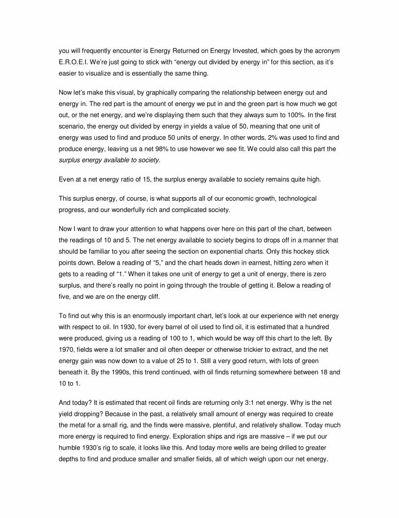
you will frequently encounter is Energy Returned on Energy Invested, which goes by the acronym
E.R.O.E.I. We’re just going to stick with “energy out divided by energy in” for this section, as it’s
easier to visualize and is essentially the same thing.
Now let’s make this visual, by graphically comparing the relationship between energy out and
energy in. The red part is the amount of energy we put in and the green part is how much we got
out, or the net energy, and we’re displaying them such that they always sum to 100%. In the first
scenario, the energy out divided by energy in yields a value of 50, meaning that one unit of
energy was used to find and produce 50 units of energy. In other words, 2% was used to find and
produce energy, leaving us a net 98% to use however we see fit. We could also call this part the
surplus energy available to society.
Even at a net energy ratio of 15, the surplus energy available to society remains quite high.
This surplus energy, of course, is what supports all of our economic growth, technological
progress, and our wonderfully rich and complicated society.
Now I want to draw your attention to what happens over here on this part of the chart, between
the readings of 10 and 5. The net energy available to society begins to drops off in a manner that
should be familiar to you after seeing the section on exponential charts. Only this hockey stick
points down. Below a reading of “5,” and the chart heads down in earnest, hitting zero when it
gets to a reading of “1.” When it takes one unit of energy to get a unit of energy, there is zero
surplus, and there’s really no point in going through the trouble of getting it. Below a reading of
five, and we are on the energy cliff.
To find out why this is an enormously important chart, let’s look at our experience with net energy
with respect to oil. In 1930, for every barrel of oil used to find oil, it is estimated that a hundred
were produced, giving us a reading of 100 to 1, which would be way off this chart to the left. By
1970, fields were a lot smaller and oil often deeper or otherwise trickier to extract, and the net
energy gain was now down to a value of 25 to 1. Still a very good return, with lots of green
beneath it. By the 1990s, this trend continued, with oil finds returning somewhere between 18 and
10 to 1.
And today? It is estimated that recent oil finds are returning only 3:1 net energy. Why is the net
yield dropping? Because in the past, a relatively small amount of energy was required to create
the metal for a small rig, and the finds were massive, plentiful, and relatively shallow. Today much
more energy is required to find energy. Exploration ships and rigs are massive – if we put our
humble 1930’s rig to scale, it looks like this. And today more wells are being drilled to greater
depths to find and produce smaller and smaller fields, all of which weigh upon our net energy.
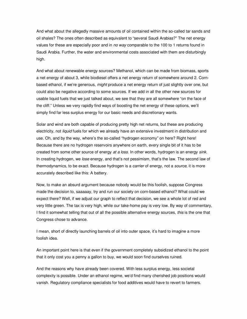
And what about the allegedly massive amounts of oil contained within the so-called tar sands and
oil shales? The ones often described as equivalent to “several Saudi Arabias?” The net energy
values for these are especially poor and in no way comparable to the 100 to 1 returns found in
Saudi Arabia. Further, the water and environmental costs associated with them are disturbingly
high.
And what about renewable energy sources? Methanol, which can be made from biomass, sports
a net energy of about 3, while biodiesel offers a net energy return of somewhere around 2. Corn-
based ethanol, if we’re generous, might produce a net energy return of just slightly over one, but
could also be negative according to some sources. If we add in all the other new sources for
usable liquid fuels that we just talked about, we see that they are all somewhere “on the face of
the cliff.” Unless we very rapidly find ways of boosting the net energy of these options, we’ll
simply find far less surplus energy for our basic needs and discretionary wants.
Solar and wind are both capable of producing pretty high net returns, but these are producing
electricity, not liquid fuels for which we already have an extensive investment in distribution and
use. Oh, and by the way, where’s the so-called “hydrogen economy” on here? Right here!
Because there are no hydrogen reservoirs anywhere on earth, every single bit of it has to be
created from some other source of energy at a loss. In other words, hydrogen is an energy sink.
In creating hydrogen, we lose energy, and that’s not pessimism, that’s the law. The second law of
thermodynamics, to be exact. Because hydrogen is a carrier of energy, not a source, it is more
accurately described like this: A battery.
Now, to make an absurd argument because nobody would be this foolish, suppose Congress
made the decision to, saaaaay, try and run our society on corn-based ethanol? What could we
expect there? Well, if we adjust our graph to reflect that decision, we see a whole lot of red and
very little green. The tax is very high, while our take-home pay is very low. By way of commentary,
I find it somewhat telling that out of all the possible alternative energy sources, this is the one that
Congress chose to advance.
I mean, short of directly launching barrels of oil into outer space, it’s hard to imagine a more
foolish idea.
An important point here is that even if the government completely subsidized ethanol to the point
that it only cost you a penny a gallon to buy, we would soon find ourselves ruined.
And the reasons why have already been covered. With less surplus energy, less societal
complexity is possible. Under an ethanol regime, we’d find many cherished job positions would
vanish. Regulatory compliance specialists for food additives would have to revert to farmers.
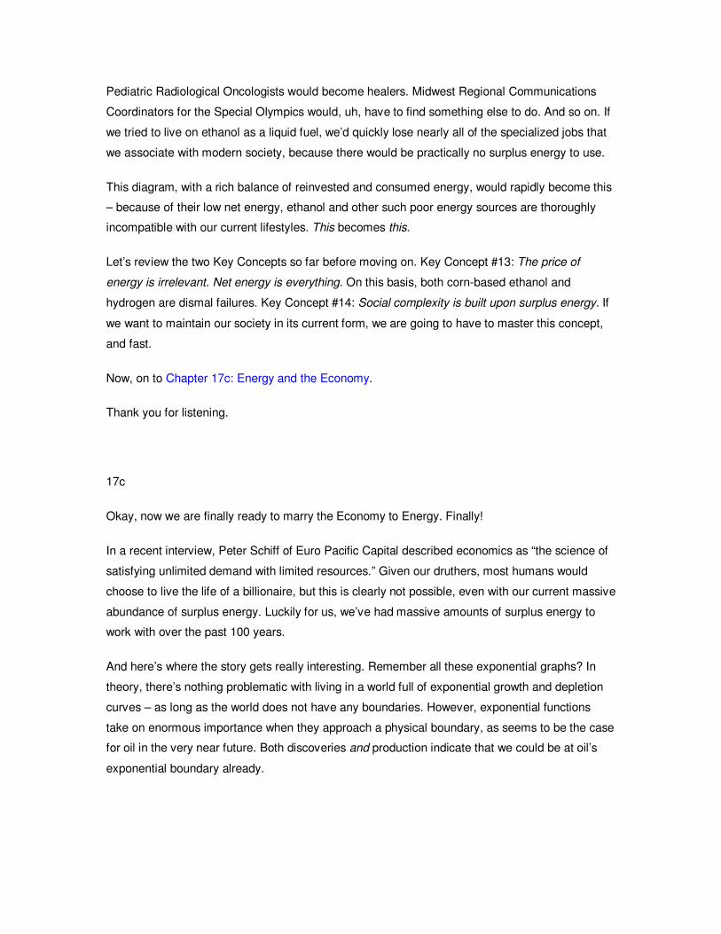
Pediatric Radiological Oncologists would become healers. Midwest Regional Communications
Coordinators for the Special Olympics would, uh, have to find something else to do. And so on. If
we tried to live on ethanol as a liquid fuel, we’d quickly lose nearly all of the specialized jobs that
we associate with modern society, because there would be practically no surplus energy to use.
This diagram, with a rich balance of reinvested and consumed energy, would rapidly become this
– because of their low net energy, ethanol and other such poor energy sources are thoroughly
incompatible with our current lifestyles. This becomes this.
Let’s review the two Key Concepts so far before moving on. Key Concept #13: The price of
energy is irrelevant. Net energy is everything. On this basis, both corn-based ethanol and
hydrogen are dismal failures. Key Concept #14: Social complexity is built upon surplus energy. If
we want to maintain our society in its current form, we are going to have to master this concept,
and fast.
Now, on to Chapter 17c: Energy and the Economy.
Thank you for listening.
17c
Okay, now we are finally ready to marry the Economy to Energy. Finally!
In a recent interview, Peter Schiff of Euro Pacific Capital described economics as “the science of
satisfying unlimited demand with limited resources.” Given our druthers, most humans would
choose to live the life of a billionaire, but this is clearly not possible, even with our current massive
abundance of surplus energy. Luckily for us, we’ve had massive amounts of surplus energy to
work with over the past 100 years.
And here’s where the story gets really interesting. Remember all these exponential graphs? In
theory, there’s nothing problematic with living in a world full of exponential growth and depletion
curves – as long as the world does not have any boundaries. However, exponential functions
take on enormous importance when they approach a physical boundary, as seems to be the case
for oil in the very near future. Both discoveries and production indicate that we could be at oil’s
exponential boundary already.
Population, money, and oil demand are all exhibiting exponential behavior. Of the three, we can
make a very strong case that both population and our money system are utterly dependent on the
continued expansion of oil energy.
And here are the questions that arise from that line of thinking. What if our exponentially-based
economic and monetary systems, rather than being the sophisticated culmination of human
evolution, are really just an artifact of oil? What if all of our rich societal complexity and all of our
trillions of dollars of wealth and debt simply are the human expression of surplus energy pumped
from the ground? It’s an interesting thought.
More immediately, you and I would be perfectly within our rights to wonder what will happen when,
not if, but when oil begins to decline. What will happen to our exponential, debt-based money
system during this period? Is it even possible for it to function in a world without constant growth?
These are important questions, and they deserve answers.
My opinion is that the financial instability we are now experiencing is due at least in part to the
early stages of this process.
And by placing oil consumption on a four-thousand year timeline, all sorts of troubling questions
pop up when we overlay a population curve on top of it. Together, these graphs say that we might
want a little dose of adult-sized planning to go with our usual election year hoopla.
Central banking just happened to come into maturity coincident with an exponentially exploitable
energy source, and became all-powerful and revered within a very short period of time. Fiat
money systems have come and gone, but this one had a trillion barrel energy tailwind that is
about to turn into a headwind.
Distributing ever-larger shares of money during a period of constant growth is a pleasant job that
enjoys broad political and popular support. Operating in a world of declining energy is an utterly
new prospect for every single political and financial institution. It makes the science of meeting
unlimited demand with limited resources even trickier, if not impossible, if the system is not up to
the task.
And so now it is up to us, you and me, to wonder what we should expect in the future from a
money system whose most very basic assumption of them all might be in error. What if the
assumption that the future will not just be bigger but exponentially bigger, than the present is
incorrect?
This assumption is on full display in the debt chart of the US as compared to GDP. The red circle
betrays a profound belief that the future will be much, much larger than the present. Consider that
the total economy of the US is only some $14 trillion dollars, while the total credit market debt of
the US is more than $49 trillion dollars. Lop off a few zeros and round things off, and this is the
same as a bank loaning 500 thousand dollars for a home against a salary of 140 thousand dollars.
If we knew that the current tax bracket of the borrower was going to double and then triple, would
this be a good loan to make? To our nation, the end of cheap oil means a sustained and
permanent reduction in our after-tax take home pay.
My question is, who in their right mind loans more and more money to someone whose earnings
are all but guaranteed to decline?
Here’s how it all sums up. There are some knowns. We know that energy is the course for all
growth and complexity. We know that surplus energy is shrinking. We know that the age of cheap
oil is over. And we know that because of this, oil costs will consume an ever-greater proportion of
our total budget.
And because of these knowns, there are some risks. There is the risk that our exponential money
system will cease to operate in a world of declining energy surplus. It might simply not be suited
to the task.
And there is the risk that our society will be forced to become less complex. If you really think
about it, that is a very loaded sentence right there.
And finally there is the risk that even as oil winds down, the momentum of the money system will
create conditions ripe for hyperinflation.
Each one of these knowns adds to each one of these risks, and that is what this course is about:
assessing those risks, and deciding what, if anything, a prudent adult should do about adapting to
these realities and facing these risks.
When I put these together, I feel comfortable making these predictions. Remember, I reserve the
right to change these with the arrival of new information at a later date.
The status quo will be preserved at all costs. Politicians will hide the truth, economic statistics will
become even fuzzier, and central banks will continue to throw more and more money at a system
that, at its core, is out of tune with reality.
Number Two, hyperinflation, will result. The price of anything is a function of how many dollars
are floating around and how much of that product, or good, there happens to be. Because literally
every single failed fiat currency regime has failed for the same reasons, we can reasonably
conclude that the future will be filled with ever more dollars. At the same time, declining surplus
energy will assure that there are fewer goods floating around. Together, these spell inflation.
Number Three is the logical outflow of #1 and #2. Standards of living will decline. However, I am
living proof that even as ones standard of living declines, one’s quality of life can go up.
Yes, it is entirely possible that I am raising issues here that will play out over many years, or even
decades, and almost certainly will be influenced by changes in behavior and technology. But the
point cannot be denied – we are squandering precious time and remaining energy in a desperate,
certainly foolish, and, possibly, ultimately unpleasant bid to preserve the status quo. We must not
fall into this trap.
And on that note, we’re almost through. Next we tie the first two E’s to the Environment, where I
will focus on the exponential extraction of resources and modification/depletion of critical support
systems.
Please join me for Chapter 18: The Environment.
Thank you for listening.
18
Congratulations, you’ve made it to the final chapter of data. The remaining two chapters are
summaries and conclusions.
Let me start right out by saying that this is not going to be about global warming. Instead, I want
to focus on more linear, less complicated, and, I believe, more immediate concerns.
The primary intent of the Crash Course is to show you that there’s a bit of a disconnect between
an exponential money system that enforces a creed of constant growth, and living on a spherical
planet. In this section, a lot of you are going to find out that the planet is a whole lot smaller than
you might have thought.
Most of the reason is contained in this curve right here. Population.
Consider that the entire human population finally reached 3 billion in 1960, and that projections
call for adding another 3 billion in only 42 more years. All of history until 1960, to get to the first 3
billion souls; roughly 40 years for the next 3 billion.
Remember the Fenway park example of 44 minutes to fill up 3% of the park but only 5 more
minutes to fill up the remaining 97%? That’s the dynamic in play here.
Before we contemplate 50% more humans in only 40 years, let me show you the pickle in which
the current crop already finds itself.
This year there will be 70 million more humans on the surface of the planet than last year. 70
million. To put that in context, that is nearly three times as many people as live in the top ten most
populous US cities combined. Worldwide population growth is equivalent to three of each of these
cities, each year, for the next forty years.
More people means more demand for resources. More aluminum, more food, more consumer
goods shipped to more places, and more cars. Always more cars.
And in case anybody has the misperception that maybe this isn’t such a big deal, because maybe
these people will be living in China in a dirt hovel with maybe a donkey and a wicker basket, let
me show you one of the fastest-growing cities in the world. In many respects, it is newer and
more modern than most Western cities. This is what everybody aspires to.
People are the same the world over. We all want to live in bright, shiny cities, and we want to
shop for nice things in nice districts. As a quick aside, China is said to have between 1.3 and 1.6
billion citizens. This means the entire US population of 300 million people, or 0.3 billion, would be
referred to by the Chinese as a ‘rounding error.’
In fact, the top five most populous cities in the US combined have fewer inhabitants than the
largest city in China.
But I want to return to the earlier statement that over the next forty years another 3 billion people
will crowd onto the surface of the planet.
One trait that humans share with all organisms is that we use the easiest to obtain and highest-
quality resources first. When we use the earth’s resources, we start with the deepest soils, the
largest trees, and the richest fishing waters. That is, we naturally exploit the highest quality
resources first.
At this point, I want to recall that oil is a finite natural resource, and because of this we find that
individual oil fields and collections of oil fields exhibit a classic extraction profile that resembles a
bell curve.
We can broaden this to create a generalized resource extraction profile, where we start with the
closest, richest, most accessible, and highest grade resources first, before moving on to
successively harder, poorer, thinner, or more distant resources. What this means is that over time,
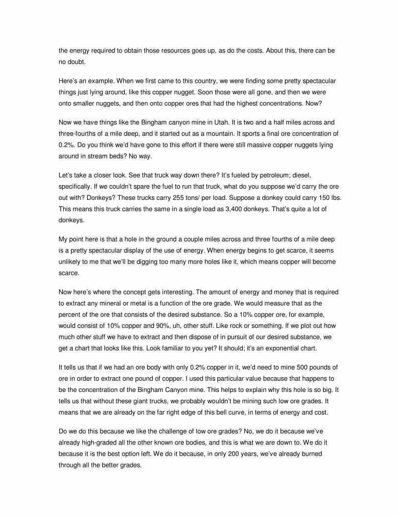
the energy required to obtain those resources goes up, as do the costs. About this, there can be
no doubt.
Here’s an example. When we first came to this country, we were finding some pretty spectacular
things just lying around, like this copper nugget. Soon those were all gone, and then we were
onto smaller nuggets, and then onto copper ores that had the highest concentrations. Now?
Now we have things like the Bingham canyon mine in Utah. It is two and a half miles across and
three-fourths of a mile deep, and it started out as a mountain. It sports a final ore concentration of
0.2%. Do you think we’d have gone to this effort if there were still massive copper nuggets lying
around in stream beds? No way.
Let’s take a closer look. See that truck way down there? It’s fueled by petroleum; diesel,
specifically. If we couldn’t spare the fuel to run that truck, what do you suppose we’d carry the ore
out with? Donkeys? These trucks carry 255 tons/ per load. Suppose a donkey could carry 150 lbs.
This means this truck carries the same in a single load as 3,400 donkeys. That’s quite a lot of
donkeys.
My point here is that a hole in the ground a couple miles across and three fourths of a mile deep
is a pretty spectacular display of the use of energy. When energy begins to get scarce, it seems
unlikely to me that we’ll be digging too many more holes like it, which means copper will become
scarce.
Now here’s where the concept gets interesting. The amount of energy and money that is required
to extract any mineral or metal is a function of the ore grade. We would measure that as the
percent of the ore that consists of the desired substance. So a 10% copper ore, for example,
would consist of 10% copper and 90%, uh, other stuff. Like rock or something. If we plot out how
much other stuff we have to extract and then dispose of in pursuit of our desired substance, we
get a chart that looks like this. Look familiar to you yet? It should; it’s an exponential chart.
It tells us that if we had an ore body with only 0.2% copper in it, we’d need to mine 500 pounds of
ore in order to extract one pound of copper. I used this particular value because that happens to
be the concentration of the Bingham Canyon mine. This helps to explain why this hole is so big. It
tells us that without these giant trucks, we probably wouldn’t be mining such low ore grades. It
means that we are already on the far right edge of this bell curve, in terms of energy and cost.
Do we do this because we like the challenge of low ore grades? No, we do it because we’ve
already high-graded all the other known ore bodies, and this is what we are down to. We do it
because it is the best option left. We do it because, in only 200 years, we’ve already burned
through all the better grades.
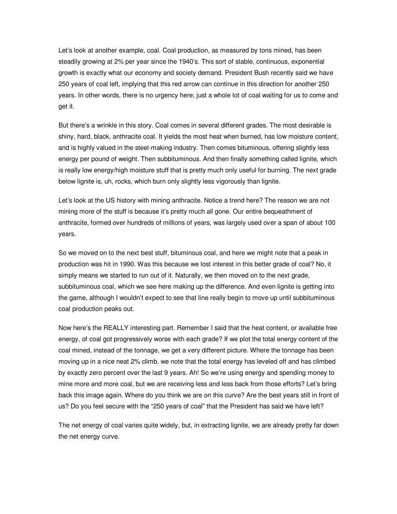
Let’s look at another example, coal. Coal production, as measured by tons mined, has been
steadily growing at 2% per year since the 1940’s. This sort of stable, continuous, exponential
growth is exactly what our economy and society demand. President Bush recently said we have
250 years of coal left, implying that this red arrow can continue in this direction for another 250
years. In other words, there is no urgency here; just a whole lot of coal waiting for us to come and
get it.
But there’s a wrinkle in this story. Coal comes in several different grades. The most desirable is
shiny, hard, black, anthracite coal. It yields the most heat when burned, has low moisture content,
and is highly valued in the steel-making industry. Then comes bituminous, offering slightly less
energy per pound of weight. Then subbituminous. And then finally something called lignite, which
is really low energy/high moisture stuff that is pretty much only useful for burning. The next grade
below lignite is, uh, rocks, which burn only slightly less vigorously than lignite.
Let’s look at the US history with mining anthracite. Notice a trend here? The reason we are not
mining more of the stuff is because it’s pretty much all gone. Our entire bequeathment of
anthracite, formed over hundreds of millions of years, was largely used over a span of about 100
years.
So we moved on to the next best stuff, bituminous coal, and here we might note that a peak in
production was hit in 1990. Was this because we lost interest in this better grade of coal? No, it
simply means we started to run out of it. Naturally, we then moved on to the next grade,
subbituminous coal, which we see here making up the difference. And even lignite is getting into
the game, although I wouldn’t expect to see that line really begin to move up until subbituminous
coal production peaks out.
Now here’s the REALLY interesting part. Remember I said that the heat content, or available free
energy, of coal got progressively worse with each grade? If we plot the total energy content of the
coal mined, instead of the tonnage, we get a very different picture. Where the tonnage has been
moving up in a nice neat 2% climb, we note that the total energy has leveled off and has climbed
by exactly zero percent over the last 9 years. Ah! So we’re using energy and spending money to
mine more and more coal, but we are receiving less and less back from those efforts? Let’s bring
back this image again. Where do you think we are on this curve? Are the best years still in front of
us? Do you feel secure with the “250 years of coal” that the President has said we have left?
The net energy of coal varies quite widely, but, in extracting lignite, we are already pretty far down
the net energy curve.
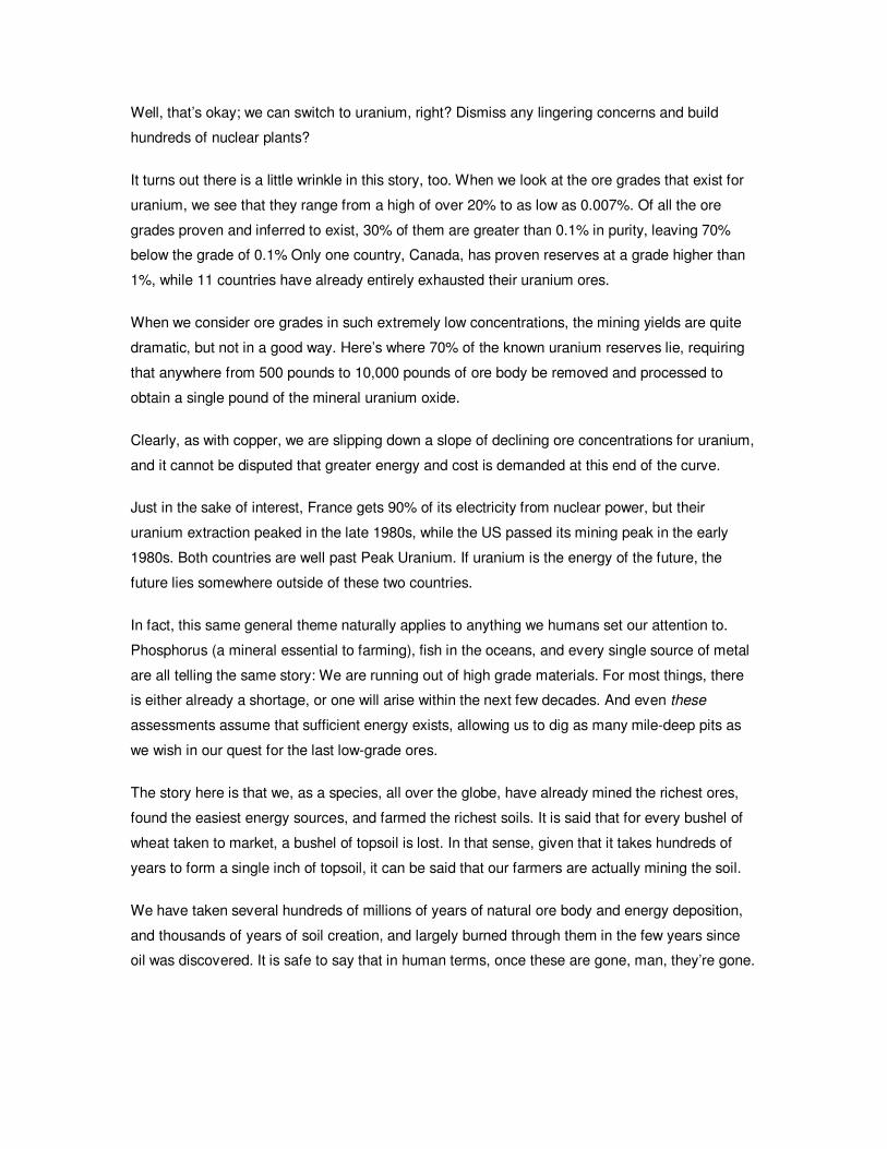
Well, that’s okay; we can switch to uranium, right? Dismiss any lingering concerns and build
hundreds of nuclear plants?
It turns out there is a little wrinkle in this story, too. When we look at the ore grades that exist for
uranium, we see that they range from a high of over 20% to as low as 0.007%. Of all the ore
grades proven and inferred to exist, 30% of them are greater than 0.1% in purity, leaving 70%
below the grade of 0.1% Only one country, Canada, has proven reserves at a grade higher than
1%, while 11 countries have already entirely exhausted their uranium ores.
When we consider ore grades in such extremely low concentrations, the mining yields are quite
dramatic, but not in a good way. Here’s where 70% of the known uranium reserves lie, requiring
that anywhere from 500 pounds to 10,000 pounds of ore body be removed and processed to
obtain a single pound of the mineral uranium oxide.
Clearly, as with copper, we are slipping down a slope of declining ore concentrations for uranium,
and it cannot be disputed that greater energy and cost is demanded at this end of the curve.
Just in the sake of interest, France gets 90% of its electricity from nuclear power, but their
uranium extraction peaked in the late 1980s, while the US passed its mining peak in the early
1980s. Both countries are well past Peak Uranium. If uranium is the energy of the future, the
future lies somewhere outside of these two countries.
In fact, this same general theme naturally applies to anything we humans set our attention to.
Phosphorus (a mineral essential to farming), fish in the oceans, and every single source of metal
are all telling the same story: We are running out of high grade materials. For most things, there
is either already a shortage, or one will arise within the next few decades. And even these
assessments assume that sufficient energy exists, allowing us to dig as many mile-deep pits as
we wish in our quest for the last low-grade ores.
The story here is that we, as a species, all over the globe, have already mined the richest ores,
found the easiest energy sources, and farmed the richest soils. It is said that for every bushel of
wheat taken to market, a bushel of topsoil is lost. In that sense, given that it takes hundreds of
years to form a single inch of topsoil, it can be said that our farmers are actually mining the soil.
We have taken several hundreds of millions of years of natural ore body and energy deposition,
and thousands of years of soil creation, and largely burned through them in the few years since
oil was discovered. It is safe to say that in human terms, once these are gone, man, they’re gone.
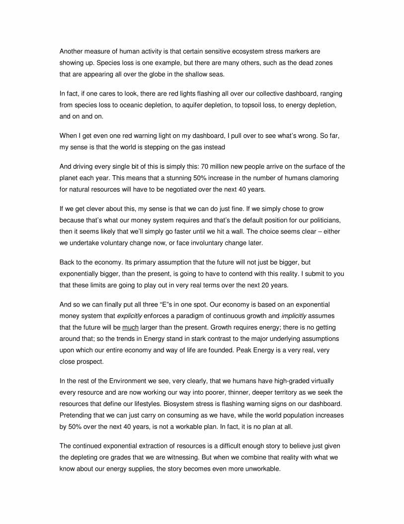
Another measure of human activity is that certain sensitive ecosystem stress markers are
showing up. Species loss is one example, but there are many others, such as the dead zones
that are appearing all over the globe in the shallow seas.
In fact, if one cares to look, there are red lights flashing all over our collective dashboard, ranging
from species loss to oceanic depletion, to aquifer depletion, to topsoil loss, to energy depletion,
and on and on.
When I get even one red warning light on my dashboard, I pull over to see what’s wrong. So far,
my sense is that the world is stepping on the gas instead
And driving every single bit of this is simply this: 70 million new people arrive on the surface of the
planet each year. This means that a stunning 50% increase in the number of humans clamoring
for natural resources will have to be negotiated over the next 40 years.
If we get clever about this, my sense is that we can do just fine. If we simply chose to grow
because that’s what our money system requires and that’s the default position for our politicians,
then it seems likely that we’ll simply go faster until we hit a wall. The choice seems clear – either
we undertake voluntary change now, or face involuntary change later.
Back to the economy. Its primary assumption that the future will not just be bigger, but
exponentially bigger, than the present, is going to have to contend with this reality. I submit to you
that these limits are going to play out in very real terms over the next 20 years.
And so we can finally put all three “E”s in one spot. Our economy is based on an exponential
money system that explicitly enforces a paradigm of continuous growth and implicitly assumes
that the future will be much larger than the present. Growth requires energy; there is no getting
around that; so the trends in Energy stand in stark contrast to the major underlying assumptions
upon which our entire economy and way of life are founded. Peak Energy is a very real, very
close prospect.
In the rest of the Environment we see, very clearly, that we humans have high-graded virtually
every resource and are now working our way into poorer, thinner, deeper territory as we seek the
resources that define our lifestyles. Biosystem stress is flashing warning signs on our dashboard.
Pretending that we can just carry on consuming as we have, while the world population increases
by 50% over the next 40 years, is not a workable plan. In fact, it is no plan at all.
The continued exponential extraction of resources is a difficult enough story to believe just given
the depleting ore grades that we are witnessing. But when we combine that reality with what we
know about our energy supplies, the story becomes even more unworkable.
Because each of the key environmental resources upon which we depend – metals, minerals, soil,
water, oceanic fish, and all the rest – have been “high graded,” their continued extraction is going
to increasingly be in competition for dwindling energy supplies that we’d also like to use to
transport ourselves, to construct buildings, and to stay warm.
Taken together, it becomes quite clear that our challenge is to adapt to a world of less, not more.
A world where we have to put more energy into carefully managing what we have than seeking
out new sources to exploit. We have an economic system that must grow, coupled to an energy
system that can’t grow, both of which are linked to a world of rapidly depleting resources. Out of
the three “E”s, this is the one that is going to be doing the changing, and you need to be ready for
that. That’s what this entire Crash Course has been about.
Let me make this even simpler. I want to be sure to get this point across clearly. Our economy
must grow to support a money system that requires growth, but is challenged by an energy
system that can’t grow, and both of these are linked to a natural world that is rapidly being
depleted.
Let me close by saying that if I thought these represented unfixable problems, I would not have
dedicated, full time, the last four years of my life developing this Crash Course and raided my
bank account to make it freely available to all. I am an optimist, and I want a better future of our
own design.
We can no longer afford pleasant platitudes about 250 years of coal left, without appreciating the
actual details involved.
It’s time to think big, develop a clear sense of priorities, and cast off the adolescent view that
nothing bad is going to happen to us because so far it hasn’t. And it’s time to show that we care
about future generations that are going to follow us. How do we wish to be judged? What is our
legacy?
For better or worse, you happen to be alive at one of the most dramatic turning points in our
species’ history that ranks right up there with climbing down out of the trees. The only real
question is, what role do you want to play? Shall your life be filled with fear or a resolute sense of
purpose?
The only way these challenges can become insurmountable is if we let them, by ignoring them for
too long.
Okay, it’s time to place all of these challenges onto a single timeline so that we can assess the
urgency of the risks that we face. Please join me for Chapter 19: Future Shock.
Thank you for your attention.
19
You are at the part of the Crash Course where everything you learned comes together into a
single spot. What I am offering is a comprehensive view of how all of our problems are actually
interrelated and need to be viewed as such or solutions will continue to elude us.
So let’s review the key trends, which appear to be converging on a very narrow window of the
future.
We began with an understanding of money and the fact that our money is loaned into existence,
with interest, and that this results in powerful pressures to keep the amount of credit, or money,
constantly growing by some percentage each year. This is the very definition of exponential
growth, which we can easily see in our money, and, of course, inflation charts.
Keeping this dynamic in mind, we encountered the data on debt, which is really a claim on the
future, vastly exceeding all historical benchmarks. The flip side to this, but a significant
sociological trend in its own right, is the steady erosion of savings observed over the exact same
period of time. Combined, we have the highest levels of debt ever recorded, coincident with some
of the lowest levels of savings ever recorded.
And we saw that our failure to save extends through all levels of our society and even includes a
desperate failure to invest in our infrastructure.
Next, we saw how assets, primarily housing, have been in a sustained bubble that is now bursting
and will take many years to play out. When credit bubbles burst, they result in financial panics
that end up destroying a lot of capital. Actually, that’s not quite right; this quote says it better:
“Panics do not destroy capital; they merely reveal the extent to which it has been previously
destroyed by its betrayal into hopelessly unproductive works.”
- John Stuart Mill, Political Economist (1806 – 1873)
So we learned that a bursting bubble is not something that is easily fixed by authorities, because
their attempts to limit further damage are misplaced. The damage has already been done. It is
contained within too many houses, and too many strip malls sold for too high prices, and too
many goods imported and bought on credit. All of that is done. All that’s left is figuring out who
ends up holding the bag, and right now these guys are working hard to assure that that’s you.
Then we learned that the most profound US government financial shortfall rests with a
demographic problem that itself cannot be fixed by any act of policy, or law, or level of optimism.
It is simply a fact. An inconvenient fact of circumstance, much like gravity sometimes, but a fact
nonetheless.
Even more than this, we learned that the assets boomers use to describe their wealth (stocks,
bonds, and houses) all have to be sold to somebody at some point in order to extract their value.
And we raised the uncomfortable observation that there are simply fewer people behind the
boomers to whom these assets can be sold. When sellers exceed buyers, values fall.
Through all of this, the economic numbers that we reported to ourselves were systematically
debased until they no longer reflected reality. If false data leads to bad decisions, then it’s no
wonder that we find ourselves in our current predicament. Only by returning to an honest self-
appraisal can we plot a strategic and meaningful course to the future.
Then we learned that energy is the source of all economic activity, and that oil is, by far, the most
important source of energy. Our entire economic configuration is built around the assumption of
unlimited growth in energy supplies, but this is an easily refuted proposition.
Individual oil fields peak and so do collections of them. And so Peak Oil is not so much a theory
as it is an observation about how oil fields age. We then explored the tension that obviously exists
between a monetary system that enforces exponential growth and the fact that our primary
energy source has either already peaked or will soon. Somehow, the US has not even begun to
invest in a future without cheap oil. We have no “Plan B.”
Lastly, we noted that the environment, meaning the world’s resources and natural systems upon
which we depend, is exhibiting clear signs that our exponential population is driving exponential
exploitation of resources, hastening their final depletion and altering ecosystems at alarming rates.
Also, we learned that even minor changes to the systems we depend on, such as rainfall patterns,
can create massive, usually unplanned, costs that will take priority over other needs.
And, yes, we’ve faced problems before, and we’ll face these as well. The concern comes when
we view them all at once.
Placed on a timeline, we see that a bursting housing bubble is already happening just as the first
wave of boomers enters retirement. At the same time, peak oil demand will outstrip supply,
forcing an enormously expensive adjustment even as unknowable costs associated with resource
depletion and a shifting climate lurk in the not-too-distant future. And sitting over all of this, limiting
our options, will be our national failure to save and invest, and historically unprecedented levels of
debt.
This timeline, stretching from now to 2020, reveals a truly massive set of challenges, converging
on an exceptionally short window of time.
The question becomes, “Where will the money come from to apply to each of these challenges, if
our savings are depleted and our debt levels already in uncharted territory?”
Any one of these events will prove to be a difficult strain on our national economy, while any two
could be disruptive. If three or more happen simultaneously? It’s not hard to foresee the
economic destruction of our country as a result, or perhaps the dollar utterly ruined as a store of
wealth.
How many trillions will be required to fund boomer retirement? How many trillions to reshape our
transportation infrastructure to accommodate Peak Oil? Where will the tens of trillions come from
to make up the shortfalls in pensions and entitlement programs? How do we make good on our
pension and entitlement promises while burdened with the highest debt loads ever seen? Where
does the money come from to clean up the aftermath of a bursting asset bubble? How much
more expensive will food and minerals be in the future, when oil has peaked but many more
people are placing higher demands on increasingly marginal resources?
Each of these key trends or threats will take years, if not decades, to address, and yet we find
them all parked almost directly in front of us, without any serious national discussions or planning.
With every passing day we squander precious time, while the problems grow larger and more
costly, if not thoroughly intractable. Buying time is not a strategy and will prove to be a disastrous
tactic.
The mark of a mature adult is someone who can manage complexity and plans ahead. My
opinion is that, with few exceptions, the current political and corporate leadership of this country
are doing neither. We need to change this.
It is long past time to give up the adolescent notion that we can have our cake, eat it too, and
borrow more when it’s gone.
It is time, quite simply, to return to living within our natural and economic budgets. We need to set
priorities, set a budget, and stick to both.
And you? If you haven’t already, you need to begin to embrace the possibility that the path to the
future might not be straight - it may take a few twists and turns and end up somewhere
unexpected - and that you happen to be alive at one of the most interesting points in human
history, a time when a great shift may occur. This can be frightening or it can be exhilarating, and
that choice is yours.
So what do we do about all this? What can you do, and what steps should you be considering
right now?
Please join me for the final chapter of the Crash Course. Thank you for listening.
20
This chapter is the final integration of all the prior chapters and attempts to provide clarity around
the question of, “What should I do?” Let me rephrase that. What should WE do? Because the
changes that are potentially coming are not solvable alone.
Chapter 20 is not going to be a simple list of things to do. Instead, it will reflect my goal of each
person assuming responsibility for their own actions.
Chapter 20 is going to provide a framework for action. This is a way of structuring all the myriad
things you COULD do, into the prioritized list of things you WILL do. Consider it your personal
risk-mitigation plan.
I’m already drawing up plans for a new follow-on series of videos that will lay out my proposed
solutions for the nation and globe in more detail.
Okay, so you’ve seen the entire Crash Course, showing how the Economy, Energy, and the
Environment are interlinked. Specifically, you’ve seen that there is a substantial mismatch
between an economic model that must grow and a physical world of peaking oil and depleting
resources. We cannot possibly solve any one of these main issues in isolation, because doing so
will simply create new problems in one of the other “E”s. Truly non-status-quo solutions are called
for.
Which means there is a very real chance that our collective path will not be a linear extrapolation
of the present. Our individual challenge is to accept the possibility that the future may be quite a
departure from the present.
I believe that the future is not some purely random roll of the dice, and that we can minimize
future disruptions in our lives by taking actions today.
In one way I am glad to have waited to produce this final chapter, because we have had the great
financial panic of the Fall of 2008, and we can more precisely map where this is all headed.
The multi-trillion-dollar bailout packages offered to banks by various governments across the
globe are nearly 100% dedicated towards preserving the status quo.
But at the same time, none of these challenges or trends are going to be helped in the slightest
by bailing out the banking system, and some will be made worse. The fact that our national
leaders have chosen to go several trillion dollars further into debt in a desperate bid to preserve
"what was" simply indicates that it is now even more probable that the burden of meeting these
challenges has shifted a bit further towards private citizens and small communities.
Part of the complication with developing a “what should we do” chapter is that I have no idea
where your beliefs lie. Everybody exists somewhere along this spectrum of belief, ranging from
expecting a rather ordinary, if not slight, interruption in economic growth, all the way on up to a
big breakdown. Everybody exists along here somewhere.
And depending on where you happen to sit, both the number of things you could do, and their
urgency, increase dramatically.
Given this, where do we start? How do we get started, when there are so many variables and
things that need doing?
This is why we need a framework for action.
There are four sequential steps to this framework. First, you have to decide that you are going to
take action. Without this commitment, there’s not much point in continuing. Second, you need to
take stock of where you are, and here I propose a self-assessment that will unearth your
strengths, weakness, opportunities, and threats. Third, you’ve got to sort among the infinite list of
things you could do, and then fourth, you’ve got to prioritize this list, because you can’t do
everything. Together, these create the framework for action.
So let’s begin with Step 1 - the case for action.
First, let’s add some detail to the spectrum I laid out before. Here we might assess the potential
for disruption as beginning with “status quo,” meaning that all the key risks dissipate relatively
rapidly. Next on the spectrum would be a prolonged recession and all that that entails. Next we
might place a collapse of the financial system on here, and finally we might envisage a collapse
of government services at all levels
I am pretty certain that our future lies somewhere along this spectrum; the problem is, I don’t
know where. The key here is that I cannot entirely rule out any particular outcome. I can’t place a
probability of zero next to any of these, so I need to weigh them all.
So let’s play a little thought game with one of them and see how it might lead to making a case for
action. Let’s use #3 – Financial System Collapse.
Without worrying about how likely or probable a financial crisis might be, let’s simply say it is
either true or it is false. That is, it either happens or it doesn’t. Hopefully we can all agree that
“true or false” pretty much covers the total range of possible outcomes.
And down on this axis, we’ll say that you either prepared for this crisis in advance or you did not.
Again, it is either true or false that you chose to take steps to mitigate the impact of a financial
crisis.
So what happens if it’s both true that the crisis happened and that you did prepare as best you
could? Congratulations - give yourself a smiley face; you did the best you could.
And what about the case where the crisis did not happen and you did not prepare? Again,
congratulations - you did the best you could. It turns out that these are essentially equivalent
outcomes, and we can therefore remove them from our decision framework. In each case, we got
the best outcome we could, so there’s not much to be gained from weighing and comparing them.
But what about this case, where the crisis did not happen but you did prepare? How bad could
that be? What’s the worst that you could put in this box? Well, you probably wasted some money
(maybe the opportunity to participate in capital gains in the stock market) and some wasted time,
but perhaps worst of all, you ended up feeling foolish. That’s awful.
Now let’s compare this box to this other box, where the financial crisis happened but you did not
prepare. What can we put in this box? Here it’s possible that you suffered a massive loss of
wealth, had to make sudden, massive adjustments under the pressure of little time and scarce
resources, and live with a sense of recrimination for having been “right” in your concerns but
unprepared nonetheless. You can probably put a bunch more things in each of these boxes, and
you should. But for our purposes, we’re done.
Now all we have to do is compare these two boxes. That’s it. In the scheme of things, which is
worse? Where would you rather be? We are all built differently, but I am the sort that could never
forgive myself for being right but unprepared. I can more easily forgive myself for being wrong
and prepared. But that’s just me. Only you know which of these two boxes carries more weight for
you. But if you picked the upper right box, then I need to ask, “What’s preventing you from taking
action?”
Here’s a slight refinement of this thinking that allows for more subtlety than “true or false.”
Suppose that we revisit our spectrum for a financial crisis that spans from “it’s not too bad” all the
way to “everything breaks down and stops working for awhile.” Let’s assume that everyone has a
different assessment of how likely any particular outcome is.
We might find that one person assesses the chance as very low that anything too bad will happen,
while another person holds a nearly opposite view. In one important respect, they hold the same
view; they both hold the possibility of a bad outcome as being greater than zero. When an
outcome has a potentially huge impact, a prudent adult may decide to react to that risk, even
though it is not very probable.
As long as some risk exists in your mind, and as long as the potential costs of not taking action
are outweighed by the costs of taking action, then it makes sense to take action. That’s the case
for action.
Okay, assuming you’ve decided that taking action makes sense, the hard part is where? We’ve
been talking about some very big changes in the Crash Course, so where does one begin in this
enormous universe of potential actions?
Here’s where I would recommend that you spend an hour and perform a self-assessment. There
is an outline for this that you can download in the ACT section of ChrisMartenson.com.
It consists of three main areas. Your financial self-assessment should include your current &
future needs, your current & future income, taking stock of all forms of wealth, and any issues
concerning accessing your wealth that apply.
There are similar sorts of areas to cover that I am calling foundational that are equally as
important, if not more, than the financial areas. Lastly, there are all of your physical needs to
consider. A typical result of conducting a self-assessment is discovering that our lives are very
much dependent on a lot of things we take for granted.
Once you’ve got your self-assessment complete, you have a pretty good idea of where you are
strong and where you are not. The self-assessment, then, is your starting point – it represents
your position in relation to the outside world.
Now we need to go to the outside world and rank all of the possible risks and challenges that
exist, that we will then match against our self-assessment.
The three dimensions that we will use to begin bucketing the various events and risks are time
(that is, how near or urgent is the risk or event), impact (is this a big deal or a little deal?), and
likelihood (which is the same as the probability of the event).
To get a handle on time, consider grouping events on a timeline. In the first Horizon, which I see
as running from zero to two years out, I place the housing bust, a credit bubble burst, and the
possibility of a systemic banking failure. A bit further out, I foresee petroleum demand and supply
crossing, issues with boomer retirement, and the possible emergence of very high inflation. Even
further out, I see really big, hairy challenges like national insolvency, perhaps the end of fiat
money, and the emergence of a new economic model.
Since I can’t respond to all of these at once, I mainly focus on those that are within the immediate
Horizon. Again, you could place very different things in each of these Horizons, and those would
be the ones you would use. These happen to be mine. For illustrative purposes, we’ll run through
an example based on the possibility of a systemic banking failure.
Next, I segment things by Impact and Likelihood. If you understand insurance, you already
understand this next process. Think of fire insurance on a house. We don’t carry it because such
an event is especially likely (it is not), but because the impact is so catastrophic. That is, a
prudent person will combine impact and likelihood to come to the decision that purchasing fire
insurance makes sense.
So here’s a way to do that for the other areas in your life. Suppose we construct a simple 2x2
chart, and on this axis we break the likelihood of the event into “High” and “Low” buckets, while
on the other axis we split the impact into “High” and “Low” buckets.
So something that is both low impact and low likelihood is something that we should not ever
spend any of our precious time or resources on. Things that fall here are just not worth worrying
about.
Anything that is high impact and high likelihood is a slam-dunk. We always attend to these, and
we do them first.
Things that are of high impact but low likelihood require more thought, but generally we would
usually attend to most of the things in this box next. After that, we’d sometimes attend to things
that are low impact but high likelihood, especially if they happen to have easy or quick remedies.
So this becomes the area where events fall that I attend to. How you happen to fill this in will
depend on your age, financial means, family situation, and a host of other factors
Because I consider there to be a 50% chance of a systemic financial collapse over the next 2
years, I place this as a high impact/high probability event, meaning that this is a risk that
deserved and got a lot of my attention.
So let’s continue with the example. With this two-by-two grid in our minds, we might flesh out the
risks associated with financial system collapse using a table that looks like this.
First, we might assess the likelihood of widespread bank closures to be “high,” the impact to be
“high,” and therefore the rank of this event as “high.”
Then we might come to the same conclusions about our own personal banks. But we might
assess the overall rank of a disruption in the food distribution network as “medium,” and dollar
destruction as “medium” because it has both a high and a low which average out to medium. We
might assess cuts to government spending as “low.” These are a few examples. Other things can
and should be added to the list.
The point here is to assess the likelihood and impact of each event that we think applies to the
scenario we are studying. When you’ve completed this, we’ll have a ranked list of events.
My recommendation is that when you do these exercises, that you do them with like-minded
friends…they will think of things you will miss, it’s more fun, and will go faster.
Now you’ve got to generate a list. You do this by filtering those events that are imminent, likely,
and of high impact, through your self-assessment. I guarantee when you do this, you will end up
with an entirely too long list of things that you could possibly do.
It’s time to prioritize.
First, the list can quickly be broken into things that you can or will do, and things that you can’t or
won’t do. One person might feel completely empowered to move their wealth around; another
might have their wealth locked in an irrevocable trust.
Of the things that you can or will do, we will break those into three tiers of action, such that Tier 1
is always started and completed before beginning Tier 2, which will always precede Tier 3. This
makes it much easier to get started, because the lists are much more manageable.
Of the things that you can’t or won’t do, your options include finding someone else who can do
them (and this is where community comes in), or letting them go and not worrying about them
anymore.
Back to our example, let’s suppose that after filtering your ranked events through your self-
assessment you came up with a nice long list of actions that you’d like to undertake. Almost
certainly, there are too many to do all at once, and it is time to use the three-tier system to identify
and tackle the easiest, lowest cost, highest bang-for-the-buck stuff first.
So what is Tier 1? It consists of the easiest, quickest, and cheapest items that require minimal
outside assistance and no substantive changes to lifestyle. In this example, then, we might
decide that taking a bit of hard cash out of the bank would provide a reasonable buffer against the
risk of being without purchasing power, should the banks and ATMs go “on holiday” for a while.
This is easy and very do-able. Our major risk would be feeling a bit foolish later, after nothing
happens and we go to redeposit that money in a bank. We might also decide to spread our bets
around, just in case the bank holiday was not universal and only applied to some banks. Lastly,
we might decide to hedge against the vast loss of purchasing power that the people of Argentina
experienced while their banks were shuttered. Gold represents one of the few ways to hold a
money-like asset entirely outside of the banking system. And we’d do all of these things before
even thinking about starting the Tier 2 list.
And so we proceed to Tier 2, which consists of those Items that plug the biggest gaps in your
self-assessment and require a significant investment of time, money, and energy.
For instance, implementing a saving program so that you can afford needed items, or thinking
about ways to create a food buffer for your community, or getting involved with your neighbors
and local scene to a greater extent.
After these items have been gone through, it is time to consider the Tier 3 items - the hard stuff.
These are the biggest changes or life decisions on your list, such as changing where you live, or
acquiring new skills, or maybe changing your job. The point is that you should resist the urge to
spend any time or energy mulling these over until you’ve made serious progress on the Tier 1
and Tier 2 actions.
If all of this seems like too much work, and you were hoping Chapter 20 would be a more
directive and simplified “here’s what you do” shopping list, I can only say that there are no easy
answers for the magnitude of the challenges we face. This chapter could easily be an entire
course itself, and future videos on my site will explore these questions in greater detail.
What I have been consistently trying to prepare people for, the whole way along, is that the next
twenty years are going to be unlike the last twenty years.
Specifically, I think we each need to be prepared for a financial catastrophe – not because we are
100% sure it will happen, but because we can’t be 100% sure it won’t happen. Prudent adults
identify and manage risks.
And I think we each need to be prepared for the possibility, the possibility, that a disruption in our
basic support systems could happen. The things that surface in this line of thinking are
considered very “out there” in today’s society, but barely 100 years ago our complete
dependence on the just-in-time delivery of the basics of life would have been considered mad.
Lastly, I think the future is going to be about moving from an “I” to a “we” culture…back to a
bygone era, where neighbors weren’t just nice to each other, but relied on each other. As an
informed person, it is now your responsibility to help others as best you can. Perhaps this will be
with their knowledge and consent; perhaps you will have to be more indirect if they are not yet
ready to confront the changes.
And so I close with a personal call to action. Now that you’ve completed the Crash Course, I hope
you’ll agree that the challenges we face are not being adequately addressed at the national or
international levels. I created the Crash Course specifically to reach people, one at a time,
because I hold the belief that some of the risks we face are moving much, much faster than the
political process. I created the Crash Course so that you would understand what is going on and
to do my very best to help you appreciate that the future could be quite different than the past.
I need your help spreading the word. The Crash Course has been seen by hundreds of
thousands of people all across the globe, without any advertising on my part. This is because
people like you have taken the time to pass it along to their friends, relatives, and coworkers. But
I want it to be seen by millions. We need to create a tipping point of awareness around these
issues.
And so I need your financial help, because I have dedicated four years, and much of my bank
account, towards creating this body of work and then making it freely available to all. If you have
gotten something from this, if this has touched you or even changed your thinking in an important
way, then I hope you’ll consider “paying it forward” by making a financial contribution so that
somebody else down the line gets to see it. How much? I would suggest an amount that is neither
a stretch for you nor embarrassing.
The Crash Course needs to be seen in the halls of power, I need to train others to deliver the
message, I need to travel to take the show to venues both large and small, I need to support the
development of multiple language translations, and I need to expand the content, shrink it, add
new material, and keep the whole effort moving forward.
In whatever way you can contribute to that, even if that’s sending the link along to one other
person, I need your help. I will do my part if you will do yours. That is my promise to you. Because
after all, the future will be defined by what WE do. Thank you for listening.