Embed Size (px)
Citation preview
C.R.A.P. DesignLessons from
The Non-Designers Design Bookby Robin Williams
Prepared byPeter StoneSomers High School
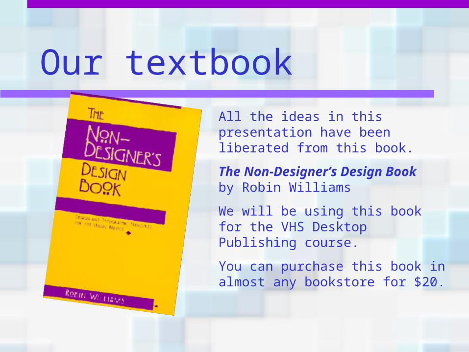
Our textbookAll the ideas in this presentation have been liberated from this book.
The Non-Designer’s Design Book by Robin Williams
We will be using this book for the VHS Desktop Publishing course.
You can purchase this book in almost any bookstore for $20.
DesignAll good design is based on the same four principles:
– Contrast– Repetition– Alignment– Proximity
Proximity• The principle of proximity states that you
group related items together.
• Move them physically close to each other so that they’re seen as one cohesive group.
• This gives the reader an instant visual clue as to the organization and content of the page.
• Let’s see some examples…
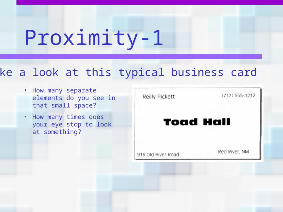
Proximity-1
• How many separate elements do you see in that small space?
• How many times does your eye stop to look at something?
Take a look at this typical business card
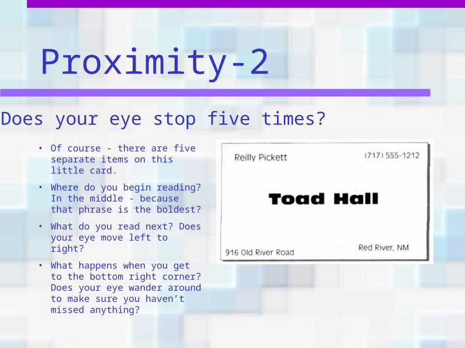
Proximity-2
• Of course - there are five separate items on this little card.
• Where do you begin reading? In the middle - because that phrase is the boldest?
• What do you read next? Does your eye move left to right?
• What happens when you get to the bottom right corner? Does your eye wander around to make sure you haven’t missed anything?
Does your eye stop five times?
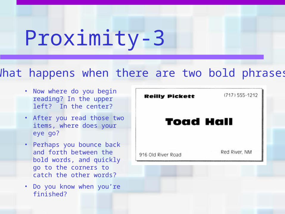
Proximity-3
• Now where do you begin reading? In the upper left? In the center?
• After you read those two items, where does your eye go?
• Perhaps you bounce back and forth between the bold words, and quickly go to the corners to catch the other words?
• Do you know when you’re finished?
What happens when there are two bold phrases?
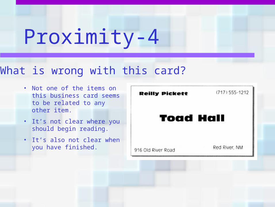
Proximity-4
• Not one of the items on this business card seems to be related to any other item.
• It’s not clear where you should begin reading.
• It’s also not clear when you have finished.
What is wrong with this card?
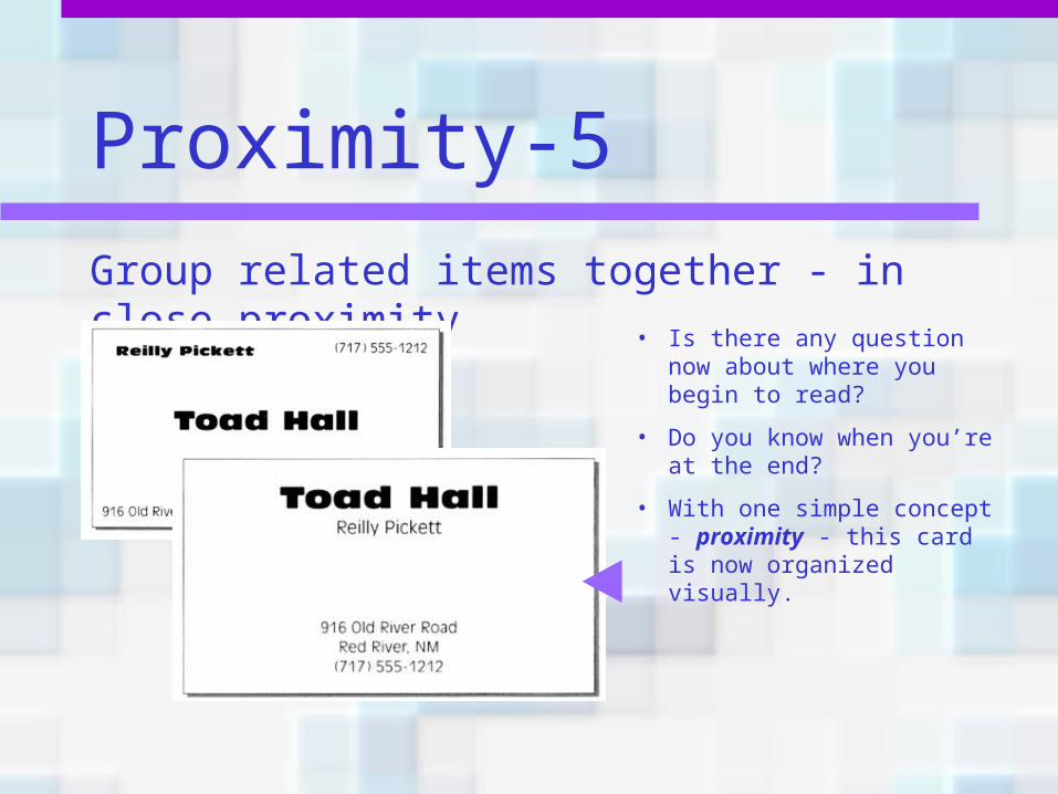
Proximity-5
• Is there any question now about where you begin to read?
• Do you know when you’re at the end?
• With one simple concept - proximity - this card is now organized visually.
Group related items together - in close proximity
Proximity-6
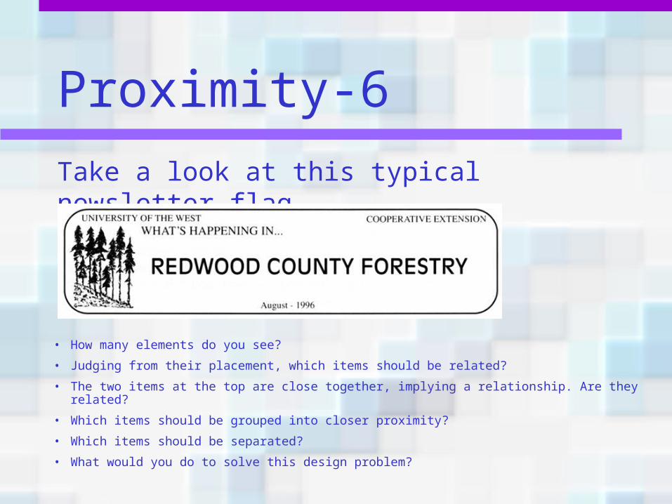
• How many elements do you see?
• Judging from their placement, which items should be related?
• The two items at the top are close together, implying a relationship. Are they related?
• Which items should be grouped into closer proximity?
• Which items should be separated?
• What would you do to solve this design problem?
Take a look at this typical newsletter flag
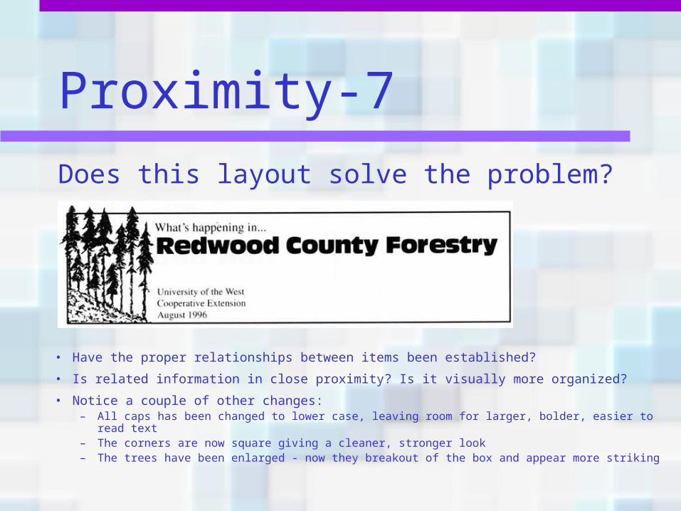
Proximity-7
• Have the proper relationships between items been established?
• Is related information in close proximity? Is it visually more organized?
• Notice a couple of other changes:– All caps has been changed to lower case, leaving room for larger, bolder, easier to read
text– The corners are now square giving a cleaner, stronger look– The trees have been enlarged - now they breakout of the box and appear more striking
Does this layout solve the problem?
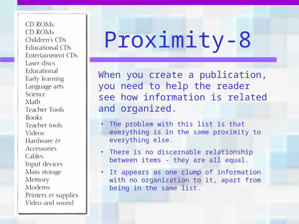
Proximity-8When you create a publication, you need to help the reader see how information is related and organized.• The problem with this list is that everything is in
the same proximity to everything else.
• There is no discernable relationship between items - they are all equal.
• It appears as one clump of information with no organization to it, apart from being in the same list.
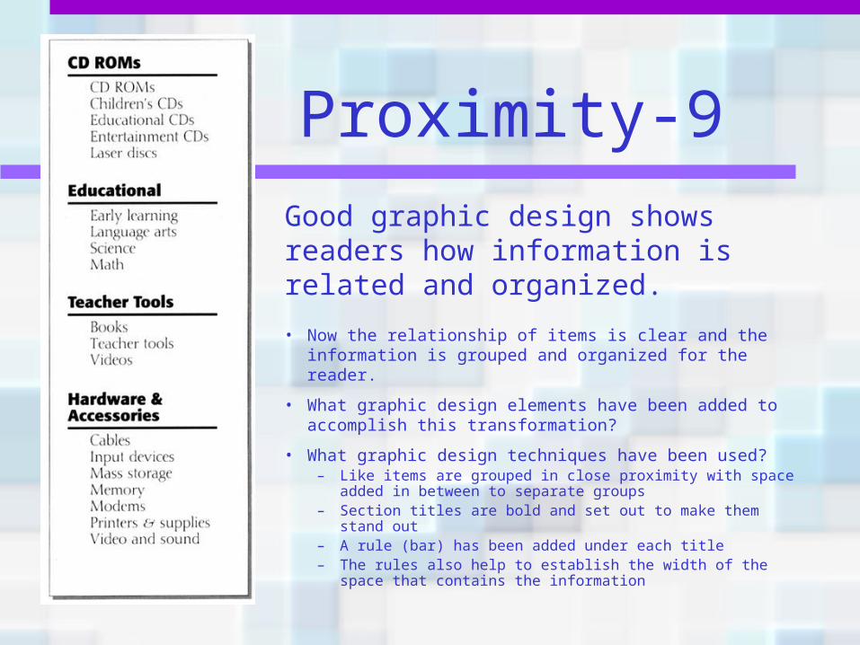
Proximity-9Good graphic design shows readers how information is related and organized.
• Now the relationship of items is clear and the information is grouped and organized for the reader.
• What graphic design elements have been added to accomplish this transformation?
• What graphic design techniques have been used?– Like items are grouped in close proximity with space
added in between to separate groups– Section titles are bold and set out to make them stand
out– A rule (bar) has been added under each title– The rules also help to establish the width of the space
that contains the information
Proximity summary• When several items are in close proximity,
they become one visual unit rather than several separate units.
• Basic purpose? To visually organize and prioritize the information for the reader.
• How do you get it? Squint your eyes and count the number of visual elements - you may have a problem if you see more than 3-5.
What to avoid• Avoid too many separate elements on a
page.
• Don’t stick things in the corners and in the middle.
• Don’t create relationships with elements that don’t belong together. If they are not related, move them apart from each other.
Alignment• The principle of alignment states that
nothing should be placed on the page arbitrarily. Every item should have a visual connection with something else on the page.
• Alignment forces you to be more conscious—no longer can you just throw things on the page wherever there happens to be room.
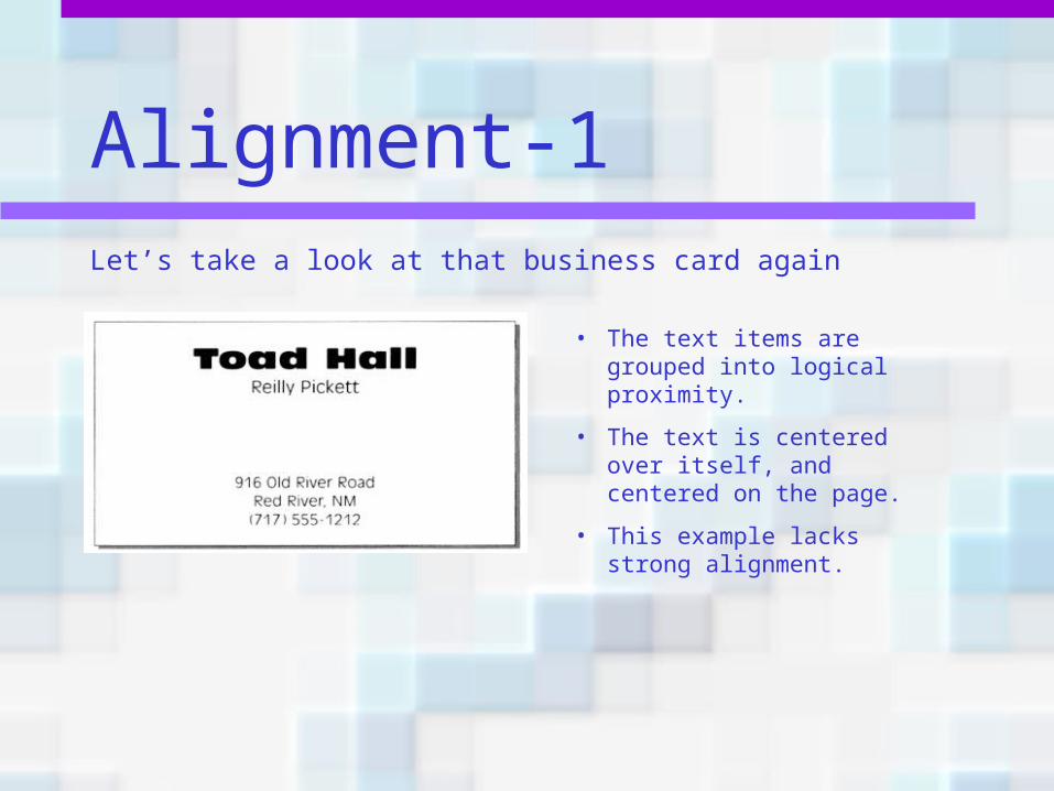
Alignment-1Let’s take a look at that business card again
• The text items are grouped into logical proximity.
• The text is centered over itself, and centered on the page.
• This example lacks strong alignment.
Alignment-2
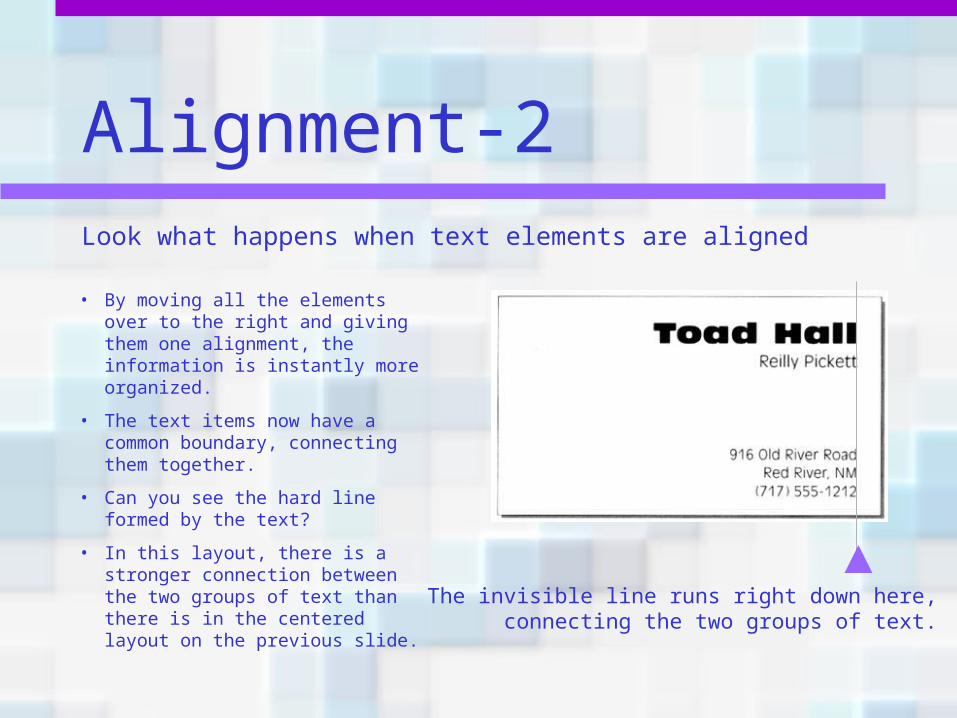
• By moving all the elements over to the right and giving them one alignment, the information is instantly more organized.
• The text items now have a common boundary, connecting them together.
• Can you see the hard line formed by the text?
• In this layout, there is a stronger connection between the two groups of text than there is in the centered layout on the previous slide.
Look what happens when text elements are aligned
The invisible line runs right down here, connecting the two groups of text.
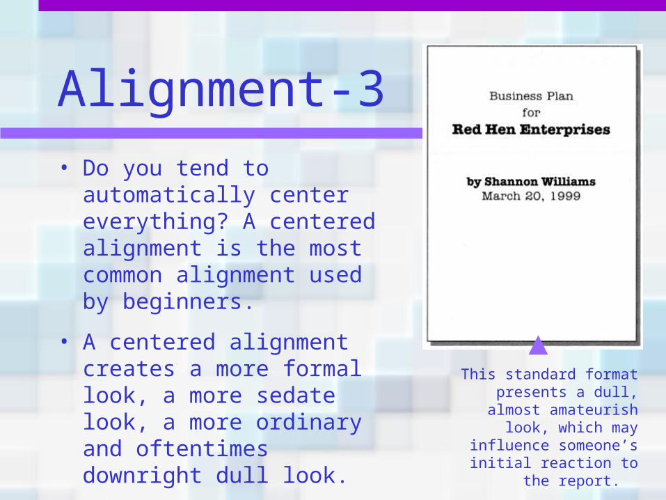
Alignment-3• Do you tend to
automatically center everything? A centered alignment is the most common alignment used by beginners.
• A centered alignment creates a more formal look, a more sedate look, a more ordinary and oftentimes downright dull look.
This standard format presents a dull, almost amateurish look, which
may influence someone’s initial
reaction to the report.
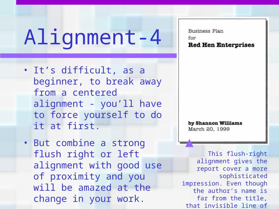
Alignment-4• It’s difficult, as a beginner,
to break away from a centered alignment - you’ll have to force yourself to do it at first.
• But combine a strong flush right or left alignment with good use of proximity and you will be amazed at the change in your work.
This flush-right alignment gives the report cover a
more sophisticated impression. Even though the author’s name is far
from the title, that invisible line of alignment connects
the two text blocks.
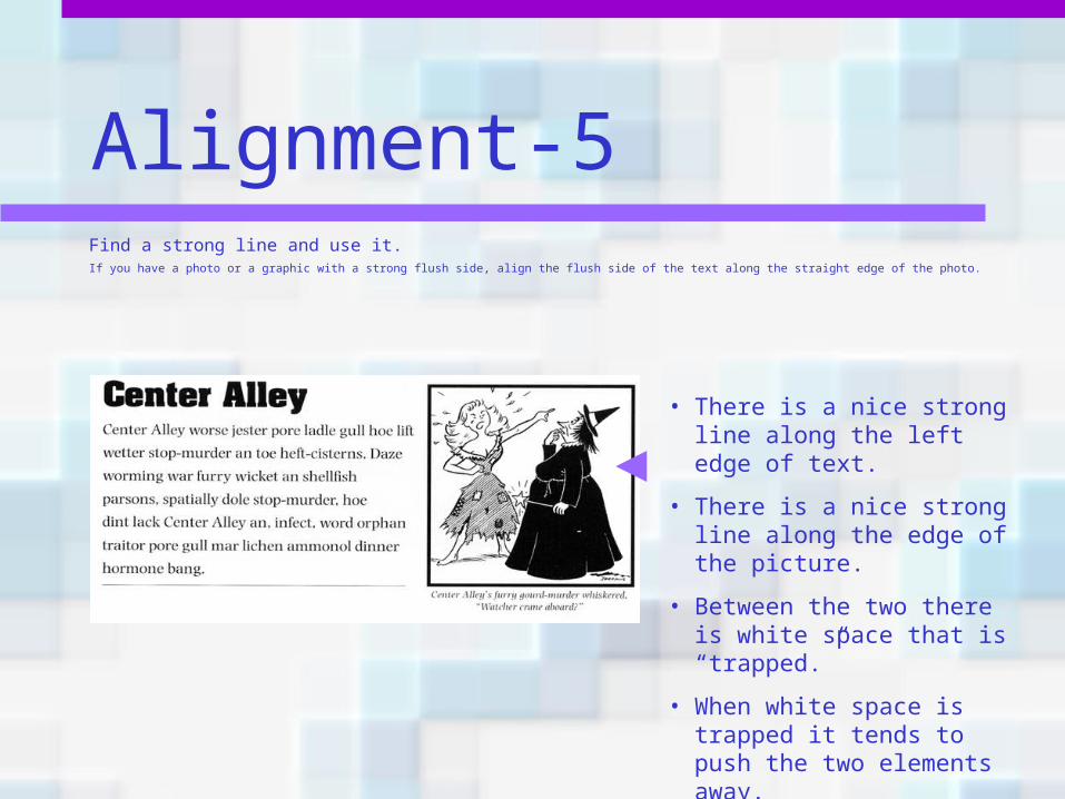
Alignment-5Find a strong line and use it.If you have a photo or a graphic with a strong flush side, align the flush side of the text along the straight edge of the photo.
• There is a nice strong line along the left edge of text.
• There is a nice strong line along the edge of the picture.
• Between the two there is white space that is “trapped.”
• When white space is trapped it tends to push the two elements away.
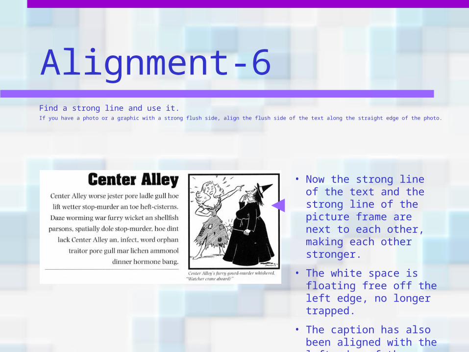
Alignment-6Find a strong line and use it.If you have a photo or a graphic with a strong flush side, align the flush side of the text along the straight edge of the photo.
• Now the strong line of the text and the strong line of the picture frame are next to each other, making each other stronger.
• The white space is floating free off the left edge, no longer trapped.
• The caption has also been aligned with the left edge of the picture.
Alignment summary• Every element should have some visual
connection with another element on the page.
• Basic purpose? To unify and organize the page.
• How do you get it? Be conscious of where you place elements. Always find something else on the page to align with, even if the two objects are physically far away from each other.
What to avoid• Avoid using more than one text alignment on
the page - don’t center some text and right-align other text.
• Try very hard to break away from a centered alignment unless you are consciously trying to create a more formal, sedate (often dull) look. Choose a centered alignment consciously, not by default.
Repetition• The principle of repetition states that you
repeat some aspect of the design throughout the entire piece.
• Push this idea further—turn that inconspicuous repetition into a visual key that ties the publication together.
• Repetition goes beyond just being naturally consistent—it is a conscious effort to unify all parts of a design.
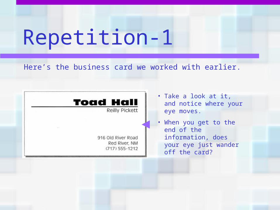
Repetition-1Here’s the business card we worked with earlier.
• Take a look at it, and notice where your eye moves.
• When you get to the end of the information, does your eye just wander off the card?
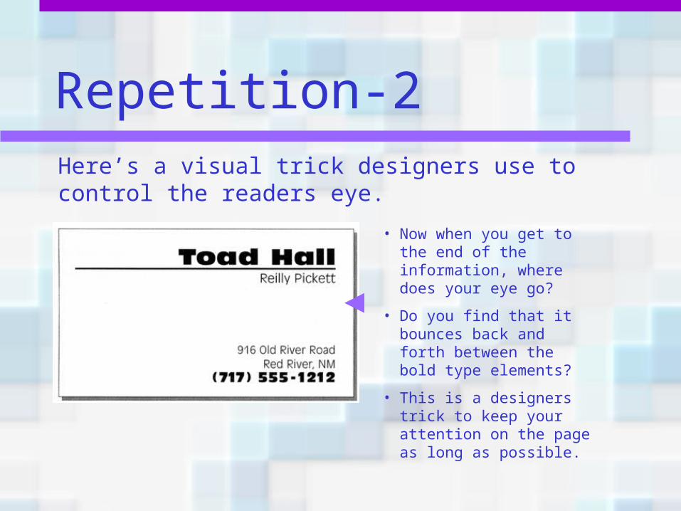
Repetition-2Here’s a visual trick designers use to control the readers eye.
• Now when you get to the end of the information, where does your eye go?
• Do you find that it bounces back and forth between the bold type elements?
• This is a designers trick to keep your attention on the page as long as possible.
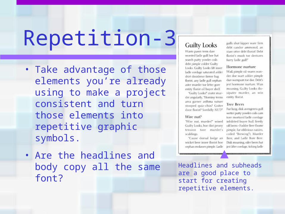
Repetition-3• Take advantage of those
elements you’re already using to make a project consistent and turn those elements into repetitive graphic symbols.
• Are the headlines and body copy all the same font?
Headlines and subheads are a good place to start for creating repetitive elements.
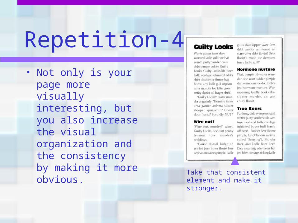
Repetition-4• Not only is your page
more visually interesting, but you also increase the visual organization and the consistency by making it more obvious.
Take that consistent element and make it stronger.
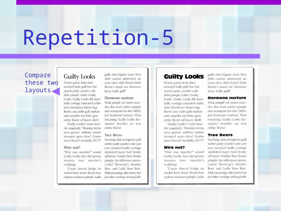
Repetition-5
Compare these two layouts
Repetition-6• Repetition helps
organize the information.
• It helps guide the reader through the pages.
• It helps unify disparate parts of the design.
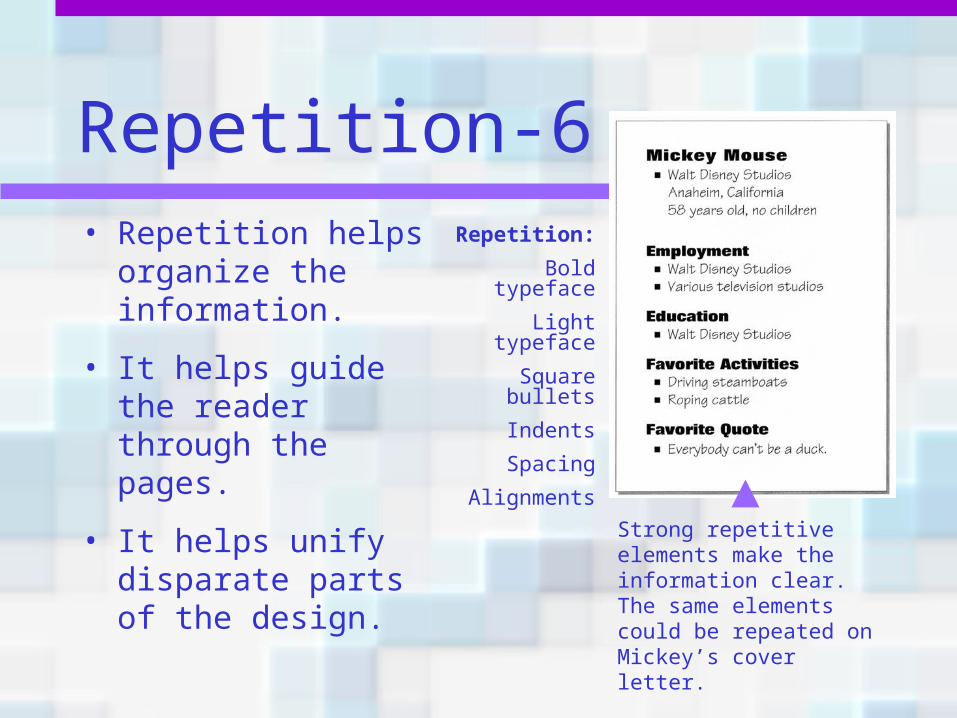
Repetition:
Bold typeface
Light typeface
Square bullets
Indents
Spacing
Alignments
Strong repetitive elements make the information clear. The same elements could be repeated on Mickey’s cover letter.
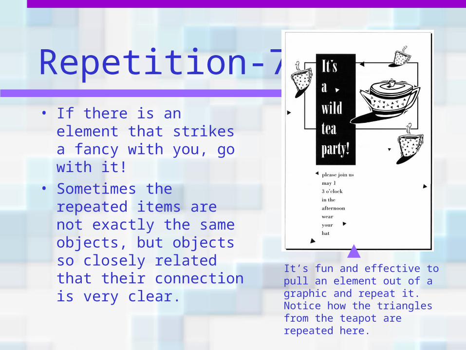
Repetition-7• If there is an element
that strikes a fancy with you, go with it!
• Sometimes the repeated items are not exactly the same objects, but objects so closely related that their connection is very clear.
It’s fun and effective to pull an element out of a graphic and repeat it. Notice how the triangles from the teapot are repeated here.
Repetition summary• A repetition of visual elements throughout
the design unifies and strengthens a piece by tying together otherwise separate parts.
• Basic purpose? To unify and to add visual interest.
• How do you get it? Think of it as being consistent. Then push the existing consistencies a little further. Then take a look at adding elements just to create repetition.
What to avoid• Repeating the element so much that it
becomes annoying.• Be conscious of the value of contrast.
For instance, if a woman were wearing a black evening dress with a red hat, red earrings, red lipstick, a red handbag, red shoes and a red coat, the repetition would not be a stunning and unifying contrast—it would be garish and the focus would be confused.
Contrast• The principle of contrast states that if
two items are not exactly the same, then make them different. Really different.
• Contrast is one of the most effective ways to add visual interest to your page.
You can do it many ways. Large type with small type. Thin line with thick line. Cool color with a warm color. Smooth with rough. Horizontal with vertical.
Don’t be a wimp!• You cannot contrast 12-point type with
14-point type.
• You cannot contrast a half-point rule with a one-point rule.
• You cannot contrast dark brown with black.
• Make it a drastic contrast!
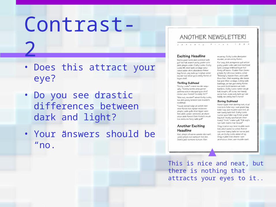
Contrast-2• Does this attract your
eye?
• Do you see drastic differences between dark and light?
• Your answers should be “no.”
This is nice and neat, but there is nothing that attracts your eyes to it..
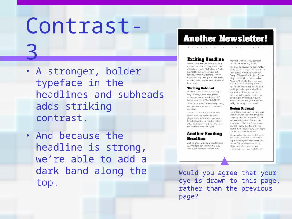
Contrast-3• A stronger, bolder
typeface in the headlines and subheads adds striking contrast.
• And because the headline is strong, we’re able to add a dark band along the top.
Would you agree that your eye is drawn to this page, rather than the previous page?
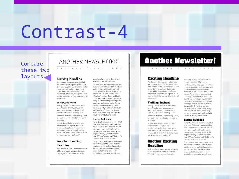
Contrast-4
Compare these two layouts
Contrast-5
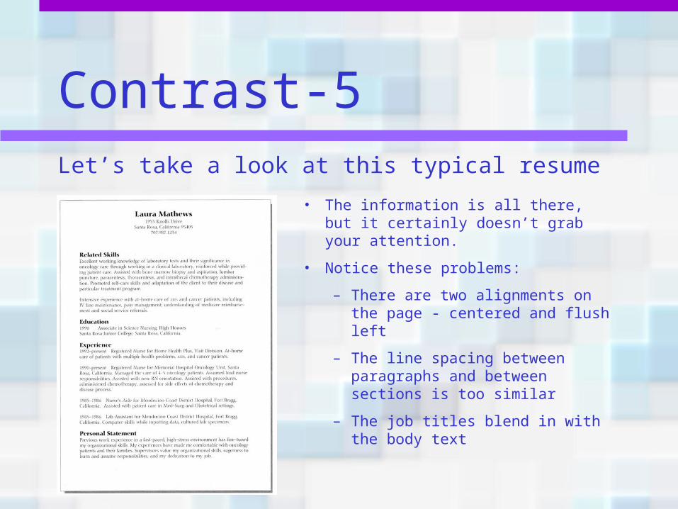
• The information is all there, but it certainly doesn’t grab your attention.
• Notice these problems:
– There are two alignments on the page - centered and flush left
– The line spacing between paragraphs and between sections is too similar
– The job titles blend in with the body text
Let’s take a look at this typical resume
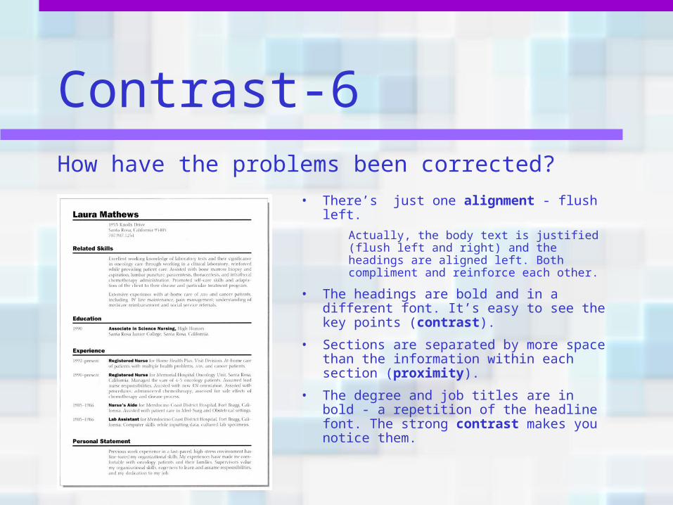
Contrast-6How have the problems been corrected?
• There’s just one alignment - flush left.
Actually, the body text is justified (flush left and right) and the headings are aligned left. Both compliment and reinforce each other.
• The headings are bold and in a different font. It’s easy to see the key points (contrast).
• Sections are separated by more space than the information within each section (proximity).
• The degree and job titles are in bold - a repetition of the headline font. The strong contrast makes you notice them.
Contrast-7
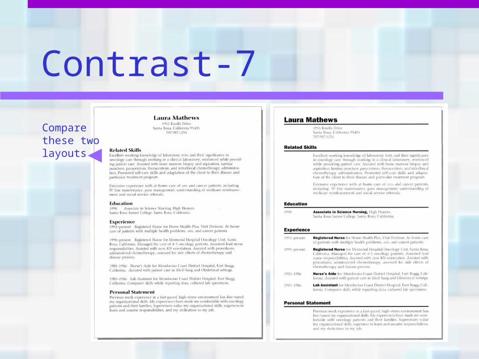
Compare these two layouts
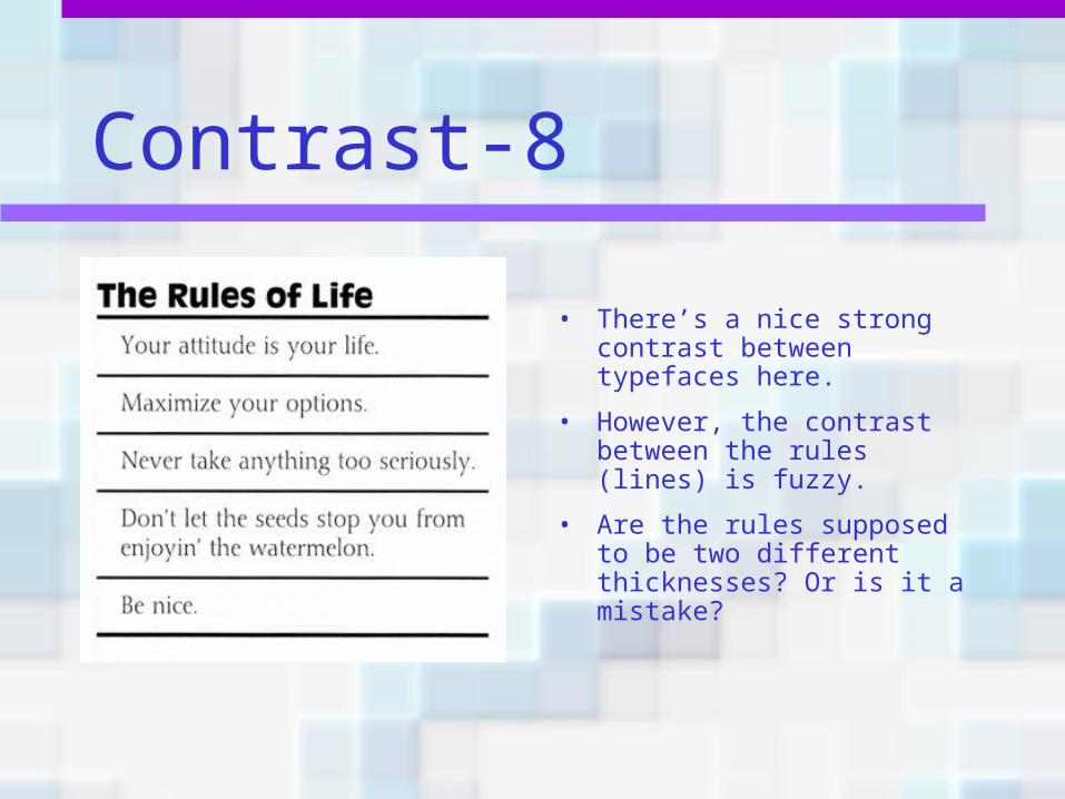
Contrast-8
• There’s a nice strong contrast between typefaces here.
• However, the contrast between the rules (lines) is fuzzy.
• Are the rules supposed to be two different thicknesses? Or is it a mistake?
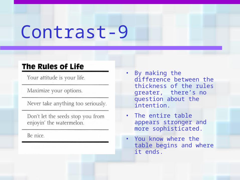
Contrast-9
• By making the difference between the thickness of the rules greater, there’s no question about the intention.
• The entire table appears stronger and more sophisticated.
• You know where the table begins and where it ends.
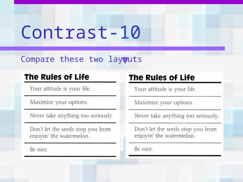
Contrast-10Compare these two layouts
Contrast summary• Contrast on a page draws our eyes to it; our
eyes like contrast.
• Basic purpose? It’s two fold:1) To create an interest on the page2) To aid in the organization of the information
• How do you get it? Through fonts, lines, colors, shapes, sizes, space, etc. The important thing is to be strong.
What to avoid• Avoid contrasting a sort-of-heavy line with a
sort-of-heavier line.
• Avoid contrasting brown text with black headlines.
• Avoid using two or more typefaces that are similar.
• If the items are not exactly the same, make them different!
• If you’re going to contrast, do it with strength!
ReviewDon’t be a wimp!
• Don’t be afraid of white space—it’s rest for the eyes and the soul.
• Don’t be afraid to make words very large or very small.
• Don’t be afraid to make your graphics very bold or very minimal.
• Don’t be afraid to be asymmetrical, to uncenter your format—it often makes the effect stronger. It’s okay to do the unexpected.
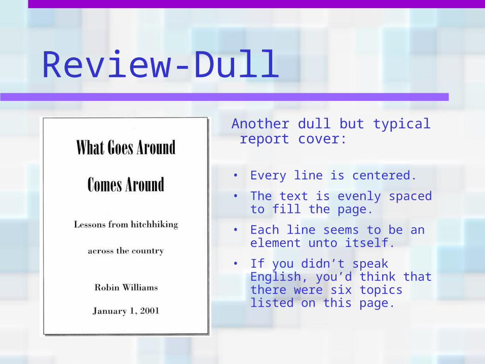
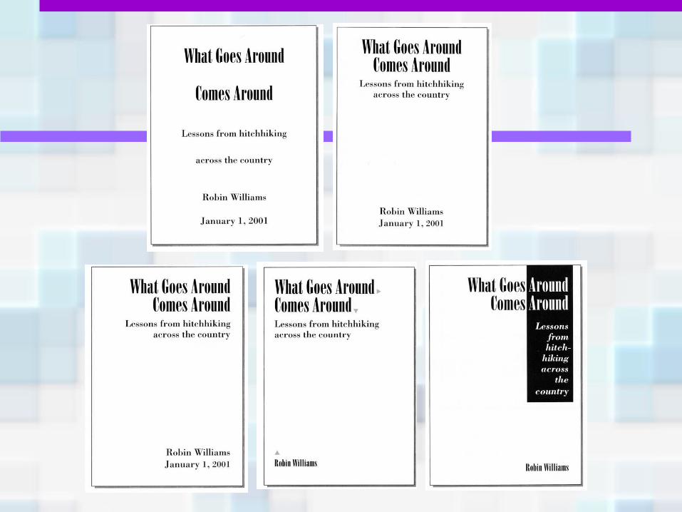
Review-Dull
Another dull but typical report cover:
• Every line is centered.
• The text is evenly spaced to fill the page.
• Each line seems to be an element unto itself.
• If you didn’t speak English, you’d think that there were six topics listed on this page.
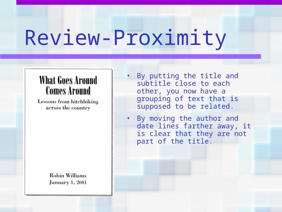
Review-Proximity
• By putting the title and subtitle close to each other, you now have a grouping of text that is supposed to be related.
• By moving the author and date lines farther away, it is clear that they are not part of the title.
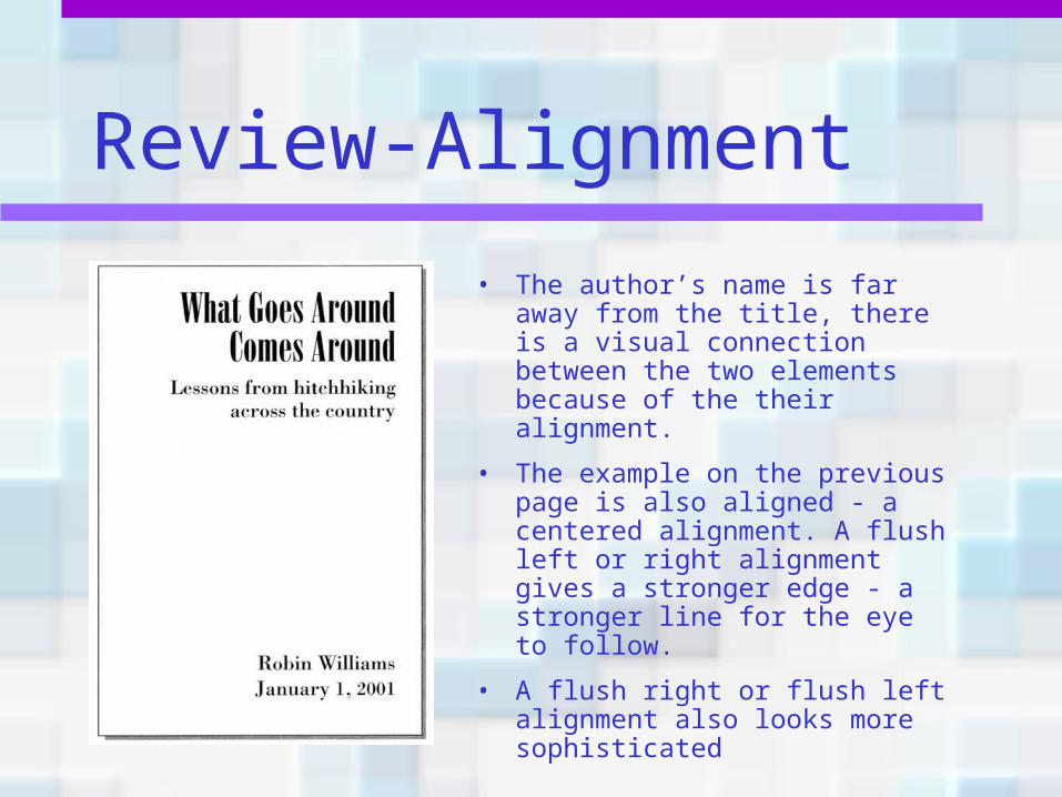
Review-Alignment
• The author’s name is far away from the title, there is a visual connection between the two elements because of the their alignment.
• The example on the previous page is also aligned - a centered alignment. A flush left or right alignment gives a stronger edge - a stronger line for the eye to follow.
• A flush right or flush left alignment also looks more sophisticated
Review-Repetition
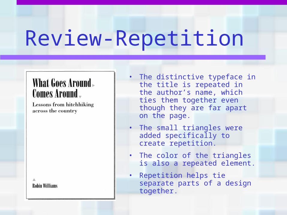
• The distinctive typeface in the title is repeated in the author’s name, which ties them together even though they are far apart on the page.
• The small triangles were added specifically to create repetition.
• The color of the triangles is also a repeated element.
• Repetition helps tie separate parts of a design together.
Review-Contrast
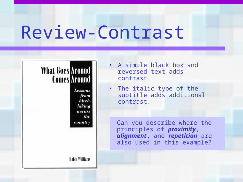
• A simple black box and reversed text adds contrast.
• The italic type of the subtitle adds additional contrast.
Can you describe where the principles of proximity, alignment, and repetition are also used in this example?
Final thought
Don’t be a wimp!Use the principles of design and be bold!