Embed Size (px)
Citation preview
CPS122 Lecture: The User Interface
Last revised December 4, 2018 Objectives:
1. To introduce the broad field of user interface design2. To introduce the concept of User Centered Design3. To introduce a process for user interface design4. To introduce key concepts concerning accessibility
Materials: 5.
1. Lethbridge/Langanere description of British Midlands flight 92 and USS Vincennes incident
2. Projectable of GUI design for iteration 2 of Library project3. Lethbridge/Langaniere ppt slides for §7.44. Projectable of Braude figures 3.21-3.245. Executable of Library Iteration 1 gift code6. Projectable of state diagram for checkout details portion of GUI7. “Why bother with Accessibility” from “Accessibility and the Swing Set” (http://
java.sun.com/products/jfc/tsc/articles/accessibility/index.html)8. Library project to demonstrate accessibility
I. Introduction
A.At the outset of our discussion, it is important to again note what we discussed earlier in the course about different kinds of stakeholders in a software project. Recall that a stakeholder is anyone who has a legitimate stake in the outcome of a project.
1. For a typical software project, there are four kinds of stakeholders. Who are they?
ASK
a) Users - those who will eventually use the software.
�1

b) Clients - those who decide to have the software developed, and pay for doing so.
c) Developers - those who actually produce the software.
d) Development managers - those who oversee the work of the developers.
2. A common mistake in software projects is to consider the needs of the clients, but not the needs of the users who will use the software. (An even worse mistake is to ignore both in favor of the needs of the developers!)
B. One of the most important factors in determining the success of many software systems is the quality of its user interface - the way in which human users interact with the program.
1. This may be:
a) A command-line interface.
b) A graphical-user interface
c) A set of web pages
d) A mobile device such as a smart phone or tablet
e) Various sorts of game devices - Wii, VR helmets etc.
f) A special hardware interface (e.g. for an embedded system, such as our ATM example.)
g) In some cases, of course, the user interface may seem not to be an issue at all, because the program does not interact with users directly (e.g. network protocol software that interacts only with other software). Even so, there is typically some kind of user interface involved for adjusting parameters, etc, and the functionality of the software eventually impacts the functionality of the software that users do interact with.
�2

2. The quality of the user interface impacts a program’s success in at least two ways.
a) Users prefer (and will purchase) programs that have a user interface that they perceive as best meeting their needs.
b) In some cases, human safety or even lives may be at stake - poorly-designed UI’s have led, in some cases, to people dying. Examples?
ASK
(1)British Midlands flight 92 - READ DESCRIPTION FROM page 258 in Lethbridge/Langaniere
(2)Shooting down of an Iranian passenger plane by the USS Vincennes - READ DESCRIPTION FROM page 281 in Lethbridge/Langaniere
C. The topic of UI design is a huge one.
1. A focus of graduate-level programs, including PhD in CS programs
2. A broad field, encompassing several fields in addition to CS, including
a) Psychology
b) Library/Information Science
c) Education
d) Communications
e) Technical Writing / English
f) Art
�3
3. A classic work in the field: Shneiderman, Ben. Designing the User Interface. (5th ed, 2010: Addison Wesley)
4. I certainly wouldn’t claim much expertise in this area.
D.In this lecture, I want to deal briefly with four issues:
1. The notion of user-centered design (UCD)
2. Fundamental concepts of user interface design
3. The process of designing a user interface
4. Considerations for making a user interface accessible to individuals with sight, hearing, or physical handicaps.
II. User-Centered Design (UCD)
A.There is a growing awareness in the software industry of the need to very consciously think about the eventual users of the software - i.e. not just the client who is paying for it, but the people who will actually use if (who may be employees or customers of the client.) This leads to a key concept called User-Centered Design.
B. One key notion in UCD is involving users in the design process.
1. One software development approach uses a team that includes users as well as developers.
2. Even if this is not done, there needs to be an early focus on users, testing with actual uses, and the use of iterative design.
C. Another key notion is bearing in mind user characteristics in the design process. What are the kinds of things we should bear in mind concerning potential users of a software system?
�4
ASK
1. Their goals - why are they using the software?
2. Their demographics
a) age
b) education level
c) language
d) culture
(1)left-to-right vs right-to-left reading/writing
(2)date and time formats (note European dd/mm/yy vs American mm/dd/yy)
(3)Weights and measures (metric vs English system)
(4)Significance of colors A special challenge arises when a UI is being designed to be used by people of diverse cultures - e.g. a system to be used internationally.
3. What is their knowledge of the software domain? (Employees of a client are typically more knowledgeable in this regard than customers - but not necessarily if the software is controlling a complex system.)
4. What is their knowledge of using computers?
�5
5. What is their physical ability? Designing software systems to be easily usable by people with physical handicaps is important:
a) Visual disabilities, including blindness, need for large fonts, color blindness.
b) Hearing disabilities
c) Physical disabilities - e.g.:
(1)Need for alternatives to using a mouse.
(2)Issues related to the height of a device such as a ticket dispenser or a gas pump affecting usability by a person in a wheelchair.
D.A very key idea in UCD is the notion of a use case.
1. As you recall, use cases are structured in terms of user goals - i.e. the are potential answers you would get if you asked a system user “what are you trying accomplish?”
2. In developing a system incrementally, it is good practice to first focus on the “central” use cases - i.e. the ones that represent the reason why the system exists - i.e. the ones that users will need most often. Note that we did this for the course project - renting and returning items and collecting monthly payments are clearly the central cases for a video rental store. (We included the item status report to make initial testing possible
�6

III.Fundamental Concepts of UI Design
A.One key concept is recognizing that a good UI has two properties which can conflict with one another: Usability and Utility
1. Definitions
a) Usability has to do with the ease of using the software.
b) Utility has to do with the functionality of the UI - what can the user do with the software?
2. What are some key aspects of usability? ASK
a) Learnability - including provision for both novice and expert users
b) Efficiency of use (not the efficiency of the software - but the amount of work a user must go through to use the software in terms of selecting options, responding to modal dialogues, etc.)
c) Effectiveness of error prevention / detection / correction
d) Acceptability - do users like to use the system?
3. Why are usability and utility sometimes in conflict with one another? ASK
4. How might this be addressed without compromising one or the other?ASK
�7
a) One approach is to provide different modes of operation (e.g. “novice mode” and “expert mode”)
b) Another is to provide different ways of performing the same function (e.g. making it possible to select a given function via a menu, a toolbar, or a hot key) Example: You have seen this in NetBeans
c) The software may include a help facility accessible via a help facility that has hot links to the portion of the system that actually does the operation. Example: Demo Mac Help “Set Date” - then follow link to open date and time preferences
B. Interaction styles There are several different styles of interaction between a user and a UI. (A given UI may incorporate more than one of these)
1. Direct manipulation
2. Menu selection
3. Form fill-in
4. Command language (command line)
5. Natural language
C. In general, a UI is easier to learn if it follows established conventions. This is particularly true with GUI applications that use menu selection as at least part of their UI - as many do
�8
1. Menu structures generally follow certain conventions that are so well established that we almost take them for granted, for example:
a) Most applications have a File menu as their first menu. This is the standard way of specifying file-related operations, including print and quit. (Even if there is nothing else that makes sense in a file menu, quit is still normally there.)
b) Likewise, most applications have an Edit menu as their second menu.
(1)If it is meaningful to let the user undo an action, that will normally be the first option in the Edit menu.
(2)If it is meaningful to include “cut and paste” in the UI, then the Edit menu with these options is needed.
c) Many applications include a Help menu, which is generally the last menu.
d) Normally, the program should display just one window on the screen (to avoid confusing the user). The exception would be a “document-centric” program that lets the user work on multiple documents at once - in which case the program will typically have one window per document, and a Window menu that includes the option of selecting different windows. Traditionally, this comes just before the Help menu.
e) Other examples? ASK
�9

2. Often, menus will have keyboard shortcuts. There are certain traditions related to these - e.g. the shortcut “S” is normally used for Save, “O” for open, “W” for close, “C” for copy, “V” for paste, “X” for cut, and “Z” for undo.
3. Adhering to standard structures like these wherever possible makes learning a new program much easier!
D.In the world of UI design, there are some key terms which you should be familiar with
1. Conceptual model - the mental model the user has of the problem being addressed. It is helpful to build the design around something that is already familiar to the user - e.g.
a) Word-processing programs give the user a view that looks like what the final document will look like, and allow direct manipulations that correspond to the way a user might edit a paper document. (Not so important now that almost everyone is familiar with using a word processor, but much more of an issue when people were first moving from paper markup to word-processing.)
b) The interface for a bill paying program may use the model of a bank check which is likely already familiar to the user.
2. Dialogue (as distinct from “dialog box”)
The interaction between the user and the system
3. Control or “widget”
A visible UI component - menu, button, etc.
�10
4. Affordance
The set of operations the user can do at a given point in time. UI designers would say “A button affords clicking”
5. State
At any given point in time, what the user sees and can do (the set of widgets and the affordance at some point in the dialogue)
6. Mode, modal dialog A state in which the affordance is restricted to a limited set of options. A modal dialog is a dialog box that requires a user to “satisfy” it before doing anything else. As a general rule, modes and modal dialogs should be minimized, but are sometimes useful.
a) Example: ASK “File save” and “Print” dialogs are often modal - once the user has decided to save or print a file, it makes little sense to allow further changes until the action is complete.
b) Note that modal dialog boxes often have a “Cancel” to allow the user to get out of the mode without actually doing anything.
7. Feedback The response from the system to an action performed by the user
8. Encoding Technique The way information is presented to a user - can be audibly, visually, or both
�11

a) Note that great care needs to be used in selecting encoding techniques to allow for physical handicaps, to preserve privacy, and to avoid annoying users.
b) Where possible, it is desirable to encode key information in more than one way to accommodate diverse needs.
E. Finally, we should note that there are many principles of good UI design.
1. Quick-check question “i” from book
2. One text gives 12 usability principles, plus an illustration of using them to improve a defective GUI. PROJECT/GO-OVER Lethbridge/Langaniere powerpoints for §7.4
3. Another writer gives a more pointed set, and another illustration. PROJECT/GO-OVER Braude figures 3.21-3.24
4. Schneiderman gives what he calls "The Eight Golden Rules of Interface Design"
a) Strive for consistency
b) Cater to universal accessibility
c) Offer informative feedback Example: progress bars for time-consuming actions
d) Design dialogues to yield closure
e) Prevent errors
�12
f) Permit easy reversal of actions Example: the ubiquitous do/undo facility. (We'll discuss the design pattern that supports this in a later lecture)
g) Support internal locus of control. Schneiderman describes this this way: “Experienced users strongly desire the sense that they are in charge of the interface and that the interface responds to their actions. They don't want surprises or changes in familiar behavior ...”Counterexample: Word!
h) Reduce short-term memory load Counterexample: I have several credit cards that I pay online. Most show me what my balance due is on the same screen as the one I use to setup a payment. But one shows me the balance on one screen and then uses another screen for payment setup, so I have to remember the balance from one screen to the next!
IV.The Process of Designing a User Interface
A. This will not be an attempt to give a detailed process for designing a UI. Rather, we will note some tools that can be helpful
B. Before designing a UI, it is important to think about the conceptual model that users will bring to the system; the UI should be designed so that it is as close as possible to the mental model the user will have.
C. A good starting place for the design of a UI may be the use case model for the system.
1. Obviously, the UI must make provision for each use case
�13
2. If the use cases are simple, it may be desirable to associate either a button or a menu option with each use case. Note: Some operations - such as opening, saving, or creating a file - are traditionally done using options in the File menu. Other operations may be better associated with buttons
3. Often, a tool bar tool may also be provided to initiate a frequently-used use case - in addition to a menu option or button.
4. If the use cases involve more complex operations, it makes sense to allocate a screen (or series of screens) to each. In this case, a button or menu option is typically used to initiate the operation.
5. Often, it is meaningful to group use cases into groups of closely-related operations, which then might have a common starting point (e.g. individual panes within a tabbed pane.)
D. Often, a state diagram can be used as a design tool.
1. The states correspond to the different visible states of the GUI - i.e. what screen etc. is being displayed and what buttons/menus are active.
2. The transitions correspond to the various user gestures - i.e. options the user may choose.
3. As an example, we'll construct a portion of the state diagram for the GUI of the Library- which you were given to use in your projects - the portion that pertains to checking out items. DEMONSTRATION: Library GUI - use executable in Project Software / Library Iteration 1 mine
�14

a) Check out Tab
(1)Bad Patron phone number (type “bad”) entered - error message and stays in same state
(2)Valid Patron phone number entered (type 1) - goes to check out details card.
b) Check out details card - no copies shown
(1)Bad Item call number (type “bad”) entered - error message and stays in same state
(2)Valid item ID (type call QA and copy 1) - transitions to details card - one or more copies shown - none selected
c) Check out details card - one or more copies shown
(1)Possible to add more copies (demonstrate both valid and invalid) [ bad, QA 1 again, PN 1 ]
(2)Remove copy (possible only if a copy is selected) - Show alternate transitions with guards
(a) Check out details card - no copies shown if one was shown
(b) Check out details card - one or more copies shown if more than one was shown
(3)Clear all copies - transitions to Check out details card no copies shown
(4)Rent all copies - transitions to Check out Tab
�15
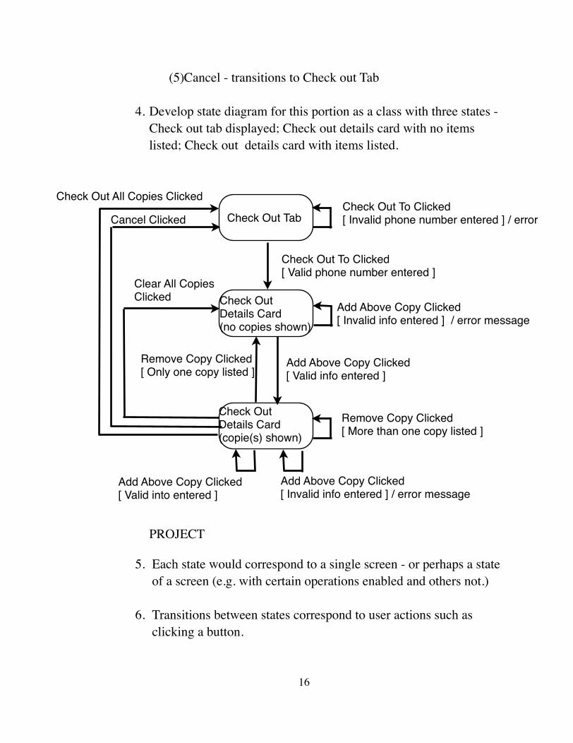
(5)Cancel - transitions to Check out Tab
4. Develop state diagram for this portion as a class with three states -Check out tab displayed; Check out details card with no items listed; Check out details card with items listed. PROJECT
5. Each state would correspond to a single screen - or perhaps a state of a screen (e.g. with certain operations enabled and others not.)
6. Transitions between states correspond to user actions such as clicking a button.
�16
Check Out To Clicked[ Valid phone number entered ]
Add Above Copy Clicked[ Valid info entered ]
Add Above Copy Clicked[ Invalid info entered ] / error message
Add Above Copy Clicked[ Valid into entered ]
Remove Copy Clicked [ More than one copy listed ]
Remove Copy Clicked [ Only one copy listed ]
Check Out All Copies Clicked
Cancel Clicked Check Out Tab
Check Out Details Card(no copies shown)
Check Out Details Card(copie(s) shown)
Clear All Copies Clicked
Check Out To Clicked[ Invalid phone number entered ] / error
Add Above Copy Clicked [ Invalid info entered ] / error message

The UI should be designed so that state transitions that would lead to problems are not possible.
7. Give out example UI for iteration 2 of project, or refer to it if already given out.
E. The quality of the UI can be measured be empirical testing with actual users (or people having similar characteristics - in most cases, not developers!). In the book I alluded to earlier, Schneiderman lists several areas that can be looked at, and that can also be used to compare different ways of structuring a UI:
1. Time to learn: how long does it take a typical user to learn to use the UI well enough to start accomplishing goals?
2. Speed of performance: how quickly can a user accomplish benchmark tasks? Counterexample: my.gordon course approvals!
3. Rate of errors by user: How many and what kinds of errors do people make in carrying out benchmark tasks? Note that, in the case of errors that are not easily reversible, the UI might incorporate features that reduce the likelihood of an error - e.g. the dialogs that often pop up in UI's before someone/thing is deleted if this cannot easily be reversed.
4. Retention over time: How well do users retain their knowledge of how to use the UI over a day, a week, or even a year?
5. Subjective satisfaction: Do users actually enjoy using the UI?
�17

V. Accessibility
A.With a bit of forethought, it is possible to ensure that the user interface for a given program is accessible to users with widely varying physical abilities.
B. This also turns out to be an important consideration for legal and marketability reasons.
READ From “Why bother with accessibility?” in “Accessibility and the Swing Set”
C. Some things one can do to promote accessibility.
1. Frankly, this is a very big topic that I’m only beginning to learn about.
2. Modern operating systems often incorporate facilities to facilitate accessibility. I will use Universal Access in Mac OS as an example because I am most familiar with it, but Windows and the Linux Gnome project have similar capabilities.
Walk through Accessibility System Preference on Mac, discussing each capability
3. However, it is important for software to be developed to facilitate using this kind of support support
D.Many people depend on keyboard navigation via the tab and arrow keys instead of point and click with a mouse, for either visual reasons or due to inability to manipulate a mouse.
DEMONSTRATE tabbing in the Library project - checkout details. Note how only enabled components are included.
�18

1. Tabbing through components is tied to the concept of keyboard focus. The component that has the keyboard focus is the one that receives keyboard input. (This is why you may have to select a text field in order to type in it.)
a) Each window displayed on the screen can have a component that is the focus owner for that window.
b) At any given time, there is only one window that is the focussed (front) window, and its focus owner is the focus owner for the whole system.
c) However, it is possible for a window not to have a focus owner. In that case, when that window is the front window no component has the keyboard focus.
2. Within any given window, a “focus cycle” is the sequence of components that receive the focus as one tabs around a window.
a) In Java Swing, a default focus cycle is established for a container, typically based on the order in which components are displayed (e.g. the default focus cycle for a container with a BorderLayout is top, left, center, right, bottom)
b) It is also possible to customize the focus cycle for container.
3. One thing that is very important is to ensure that the focus is always owned by some component in each window.
In the case of whose contents can change (like the tabbed pane used for the Library project), it is important that focus be given to some component in a given pane when that pane is made the visible one. (This is accomplished by requestFocus() in the formComponentShown() method - which should actually be requestFocusInWindow()!)
�19
4. When a window has many focusable components, it may be desirable to use panels within the window to create groupings, each with its own focus cycle. In this case, the overall focus cycle for the window involves the individual panels, and one can go down into the focus cycle of the individual panels.
E. Assistive technologies exist to convert visual displays into spoken text (screen readers) or braille. For these to succeed, components need to be able to furnish information about themselves to the assistive device.
1. Assistive technologies depend on the notion of screen focus, making information available about the component that currently has focus. (Hence, if no component has the focus at some point in time, the assistive technology is useless.)
2. In Java swing, this is handled through accessibility properties.
(SHOW in NetBeans)
a) AccessibleName - often defaulted (e.g. text displayed by a Button)
b) AccessibleDescription - defaults when there is a tool tip or there is an associated JLabel whose labelFor property is set.
3. Of course, this is important with other software systems as well. For example, when using images in a web page, one can include an alt tag that provides a textual description of the image.
F. When designing a UI, it is important to facilitate access by assistive technologies:
1. Ensuring focus is always set.
�20

2. Avoiding use of encodings for which there are no alternatives. (Example: if color is used to encode information, then the same information should also be accessible via a textual description; if sound is used to encode information, then there should be an available alternative such as a screen flash or text.
3. Ensuring that information can be accessed/entered using mouse alternatives such as tabbing. (Standard Swing components in Java support this, but if one creates custom components one may need to take steps to ensure this.)
�21


![Autdev Interface [Autorship + Webdevelopment + Interface]](https://img.pdfslide.us/doc/110x75/568bd8ee1a28ab2034a52641/autdev-interface-autorship-webdevelopment-interface.jpg)
