Embed Size (px)
Citation preview
Course: Government Process Re-engineering
Day 3
Session 4: Government Process Analysis
Agenda
Understand the ‘Effect’ which needs to be improved and the ‘Causes’ which impact it
Tool: Cause & Effect diagram – History & Usage
Exercise: create a cause & effect diagram for an identified issue
Classification of activities into Value Added (VA) and Non-Value Added (NVA)
Identifying process complexity
Definition of metrics – time based and non time based metrics
Slide 3
Identifying Root Causes
• Once current processes have been documented along with the data (relevant
CTPs) it is useful to identify the root causes of problems and non-value
adding activities in processes.
• Identifying the root cause of process dysfunction enables you to ensure that
the process redesign solves the root cause, rather than simply addressing a
symptom of a problem that will occur again.
• It also allow you to determine how many processes are affected by a single
root cause. The more process problems a root cause creates, the higher
priority it is for being addresses quickly and effectively.
Slide 4
A Cause-Effect diagram is a structured approach to exhaustively determine perceived sources (causes) of a problem (effect)• Why use it?
− To help the team organize and graphically display all the knowledge it has about the
problem
• What does it do?
− It helps unearth all possible causes for the problem at hand by capturing views of all
members
− It creates a consensus around the problem and builds support for resulting solutions
− It focuses the team on causes rather than symptoms
− Organizing data serves as a guide for discussion and inspires more ideas
Slide 5
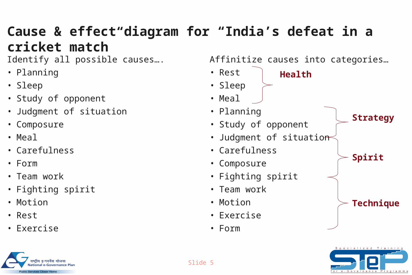
Cause & effect diagram for “India’s defeat in a cricket match”
Identify all possible causes….
• Planning
• Sleep
• Study of opponent
• Judgment of situation
• Composure
• Meal
• Carefulness
• Form
• Team work
• Fighting spirit
• Motion
• Rest
• Exercise
Affinitize causes into categories…
• Rest
• Sleep
• Meal
• Planning
• Study of opponent
• Judgment of situation
• Carefulness
• Composure
• Fighting spirit
• Team work
• Motion
• Exercise
• Form
Health
Strategy
Spirit
Technique
Slide 6
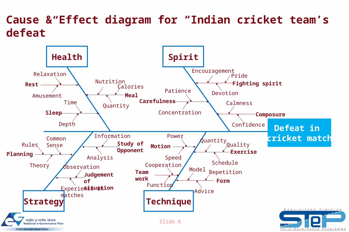
Defeat in cricket match
SpiritHealth
TechniqueStrategy
Planning
Rules
Theory
Common Sense
Composure
Confidence
CalmnessCarefulness
Concentration
PatienceMeal
Calories
Quantity
NutritionRest
Amusement
Relaxation
Sleep
Depth
Time
Study of Opponent
Information
Analysis
Judgement of situation
Observation
Experience in matches
Fighting spirit
Pride
Devotion
Encouragement
ExerciseQuality
Schedule
Quantity
Form
Repetition
Advice
ModelTeamwork
Cooperation
Function
Motion
Power
Speed
Cause & Effect diagram for “Indian cricket team’s defeat”
Slide 7
History of the Fishbone Diagram
• Ishikawa diagrams (also called fishbone diagrams or cause-and-
effect diagrams) are diagrams that show the causes of a certain
event.
• They were first proposed in the 1960s, by Kaoru Ishikawa who
pioneered quality management processes in the Kawasaki
shipyards, and in the process became one of the founding fathers
of modern management. They are considered one of the seven
basic tools of quality control
Slide 8
Usage of the Fishbone diagram
• Causes are derived from brainstorming sessions. Each cause or reason for
imperfection is a source of variation
• Causes are grouped into major categories to identify these sources of
variation. These groups are then be labeled as categories of the fishbone
• The 8 Ps (typical categories used in service industry, which is applicable also
to government service delivery)− Product / Service: Actual product / service delivered
− Pricing: Price of the product
− Place: Place of service delivery
− Promotion: promotion and publicity
− People: Anyone involved in the process
− Process: processes involved in delivering the service
− Physical Evidence: Material cues on service quality (e.g. paper on which ticket printed)
− Productivity & Quality
Slide 9
Brainstorming tool – 5 Whys approach
• The 5 Whys is a question-asking method used to explore the cause / effect
relationships underlying a particular problem
• Used to come up with the root causes for the problem at hand
• Continue asking Why till you get to a root cause (need not necessarily be at
the 5th Why…)
• Continue with the 5 whys process till all the possible root causes are covered
Slide 10
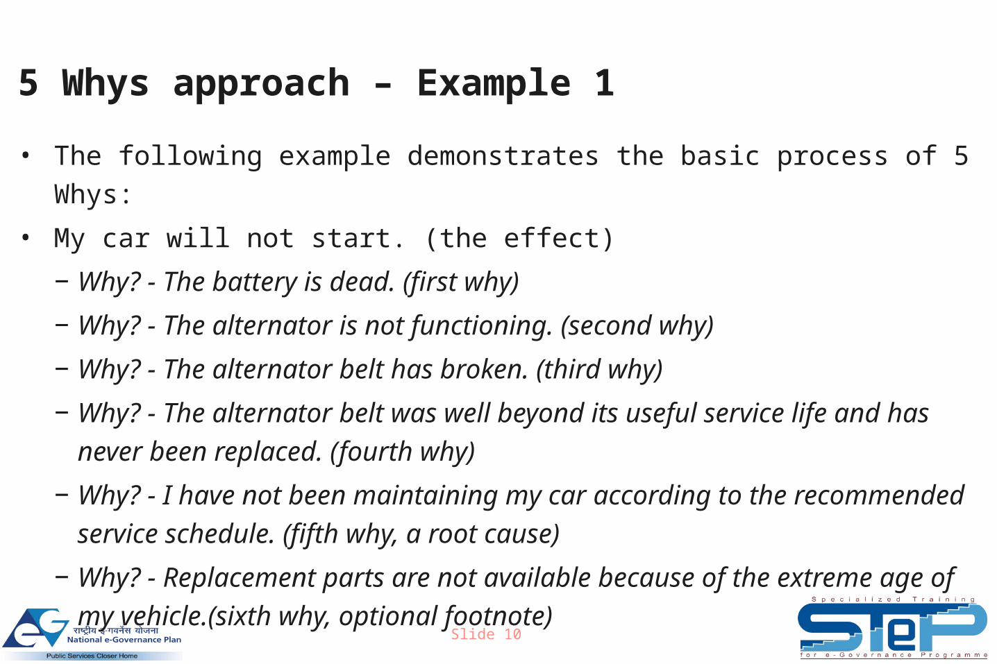
5 Whys approach – Example 1
• The following example demonstrates the basic process of 5 Whys:
• My car will not start. (the effect)
− Why? - The battery is dead. (first why)
− Why? - The alternator is not functioning. (second why)
− Why? - The alternator belt has broken. (third why)
− Why? - The alternator belt was well beyond its useful service life and has
never been replaced. (fourth why)
− Why? - I have not been maintaining my car according to the recommended
service schedule. (fifth why, a root cause)
− Why? - Replacement parts are not available because of the extreme age of
my vehicle.(sixth why, optional footnote)
Slide 11
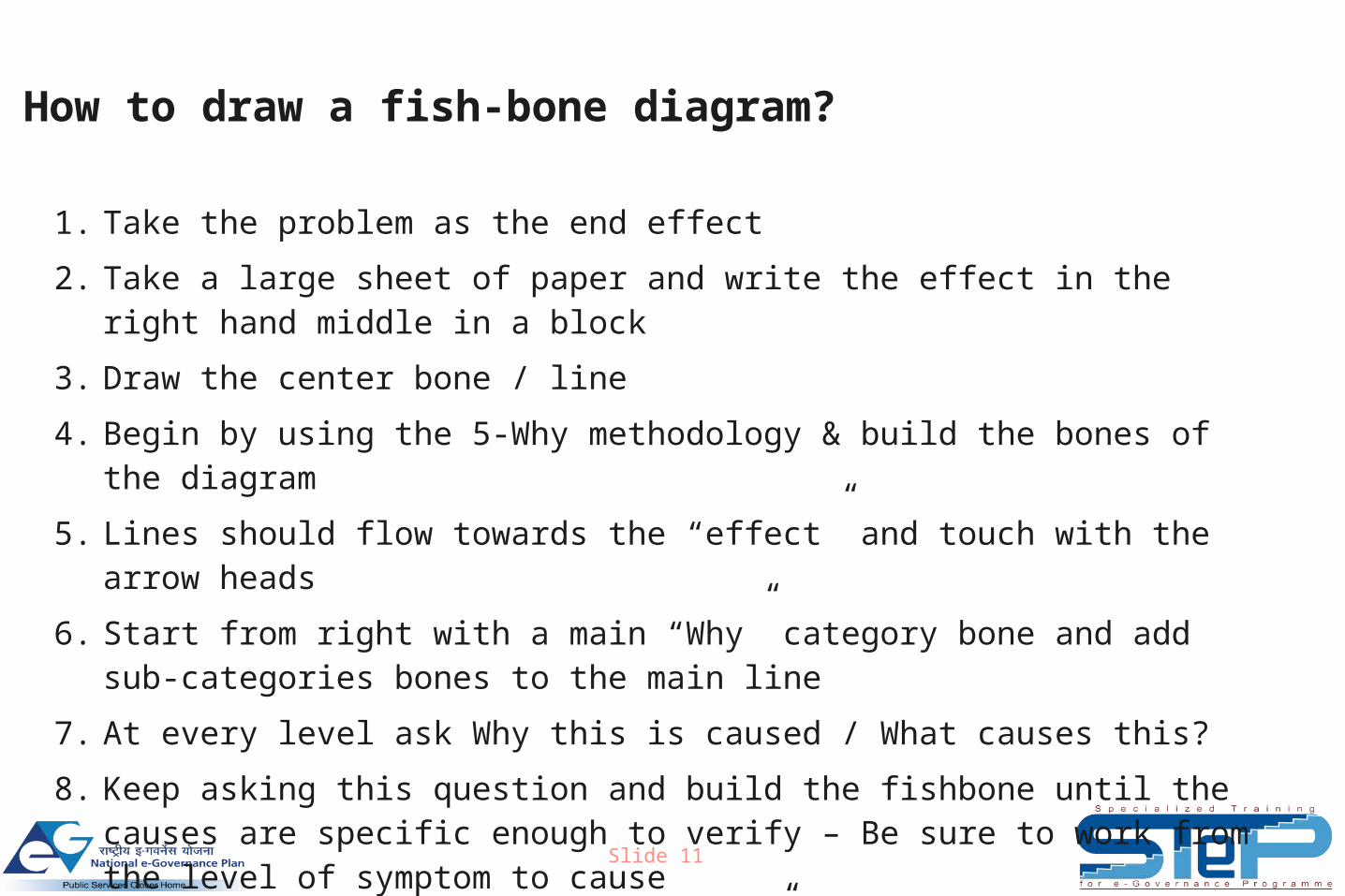
How to draw a fish-bone diagram?
1. Take the problem as the end effect
2. Take a large sheet of paper and write the effect in the right hand middle in a block
3. Draw the center bone / line
4. Begin by using the 5-Why methodology & build the bones of the diagram
5. Lines should flow towards the “effect” and touch with the arrow heads
6. Start from right with a main “Why” category bone and add sub-categories bones to the main line
7. At every level ask Why this is caused / What causes this?
8. Keep asking this question and build the fishbone until the causes are specific enough to verify – Be sure to work from the level of symptom to cause
9. General thumb rule is to ask “Why” five times to reach to a verifiable cause
Slide 12
How to draw a fish-bone diagram?
10.For every cause that is not a sub-category to the earlier “Why” and is a
distinct family/ category of cause, add a new bone to the diagram
11.Build the major categories/ families (bones) towards the left
12.Brain storm to collect all the possible causes that the team knows
13.Build the diagram by linking the brainstormed causes under appropriate
categories
14.Refine categories where necessary
15.It is a good practice to bring-in more and more people to look at the Fishbone
diagram to add to the cause
16.Circle the causes that seem most probable
17.Some of these causes can be taken up for measurement & verification
Slide 13
Why do we need to do Process Analysis?
• Process analysis helps us identify opportunities and areas for
improvement
• What constitutes process analysis?
− Measuring process efficiency – VA/ NVA activities
− Identifying process complexity – Data Entry Points (DEPs) / Hand off Points
(HOPs) etc.
− Hands On Time (HOT) vs. Turn Around Time (TAT) analysis
Slide 14
Classifying process activities in VA/ NVA (1 of 3)
• An activity is classified as Customer Value Added activity (CVA) if:
− The activity adds a form or feature to the end-product or service, and
− The customer is willing to pay for it
− The task enables a competitive advantage (reduce price, faster delivery,
fewer defects)
• e.g.: printing of passport, issue of food grains under PDS etc
Slide 15
Classifying process activities in VA/ NVA (2 of 3)
• An activity is classified as Business Value Added (BVA) if:
− The customer may not want to pay for it but are required for some reason
− The task required by law or regulation
− The task reduces financial risk?
− The process breaks-down if the task were removed
• e.g.: quality testing, attestation / authorization of copies of
documents etc
Slide 16
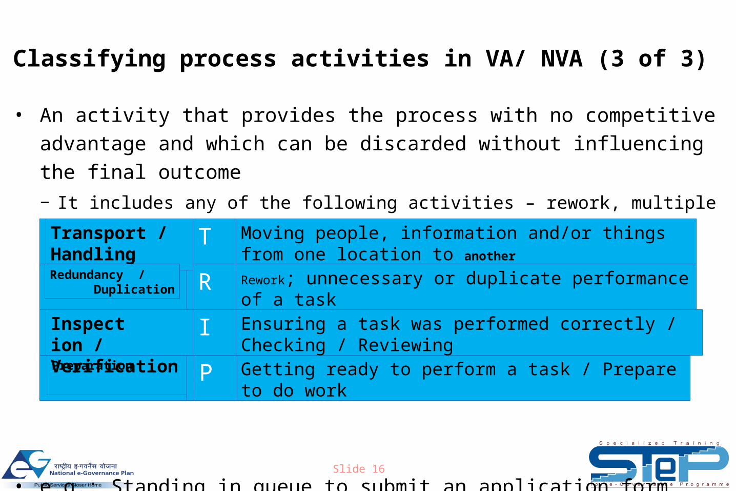
Classifying process activities in VA/ NVA (3 of 3)
• An activity that provides the process with no competitive advantage and
which can be discarded without influencing the final outcome
− It includes any of the following activities – rework, multiple signatures, counting,
handling, checking, inspecting, transporting, down-time, delaying, storing
• e.g.: Standing in queue to submit an application form
Getting ready to perform a task / Prepare to do work
Moving people, information and/or things from one location to another
Ensuring a task was performed correctly / Checking / Reviewing
Rework; unnecessary or duplicate performance of a task
Preparation
T
R
P
I
Transport / Handling
Inspect ion / Verification
Redundancy / Duplication
Slide 17
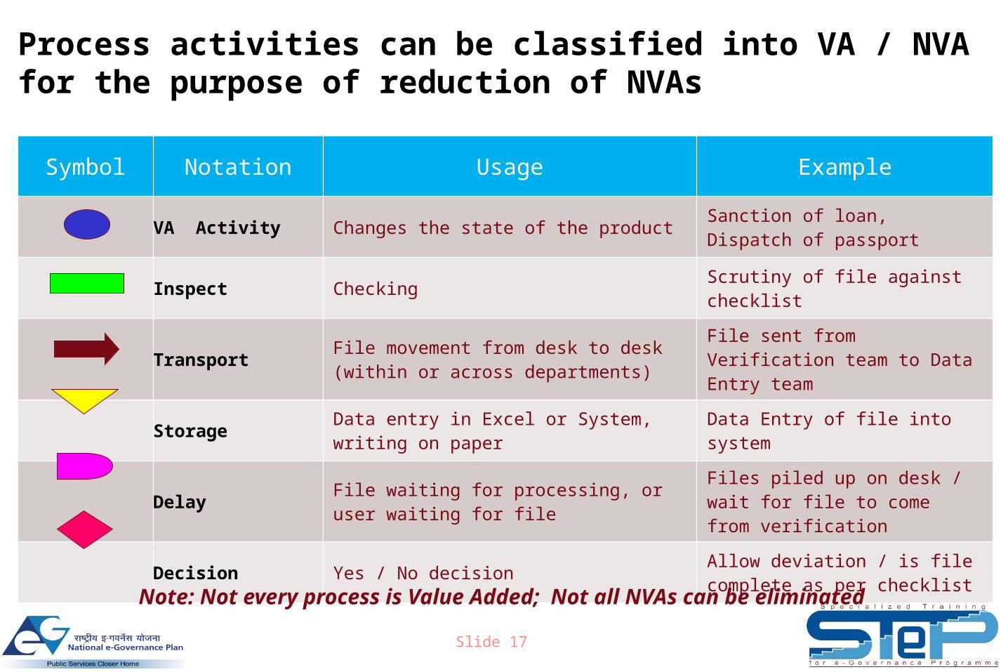
Symbol Notation Usage Example
VA Activity Changes the state of the product Sanction of loan, Dispatch of passport
Inspect Checking Scrutiny of file against checklist
Transport File movement from desk to desk (within or across departments)
File sent from Verification team to Data Entry team
Storage Data entry in Excel or System, writing on paper Data Entry of file into system
Delay File waiting for processing, or user waiting for file
Files piled up on desk / wait for file to come from verification
Decision Yes / No decision Allow deviation / is file complete as per checklist
Process activities can be classified into VA / NVA for the purpose of reduction of NVAs
Note: Not every process is Value Added; Not all NVAs can be eliminated
Slide 18
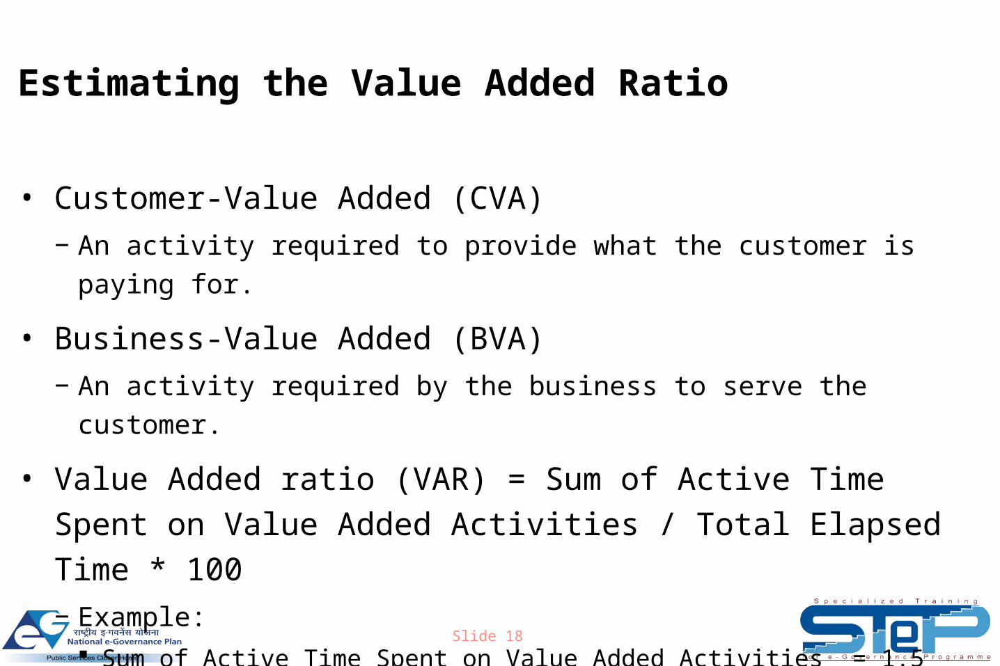
Estimating the Value Added Ratio
• Customer-Value Added (CVA)
− An activity required to provide what the customer is paying for.
• Business-Value Added (BVA)
− An activity required by the business to serve the customer.
• Value Added ratio (VAR) = Sum of Active Time Spent on Value
Added Activities / Total Elapsed Time * 100
− Example: Sum of Active Time Spent on Value Added Activities = 1.5 hours
Total Elapsed Time = 2 days = 48 hours
VAR = (1.5 hours / 48 hours) x 100 = 3.1%
Slide 19
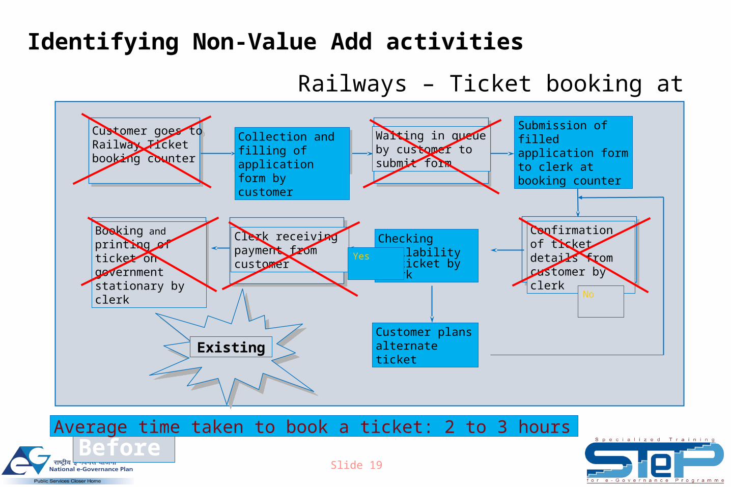
Identifying Non-Value Add activities
Railways – Ticket booking at counter
Before
Existing
Collection and filling of application form by customer
Confirmation of ticket details from customer by clerk
Booking and printing of ticket on government stationary by clerk
Clerk receiving payment from customer
Checking availability of ticket by clerk
Customer plans alternate ticket
Waiting in queue by customer to submit form
Customer goes toRailway Ticket booking counter
Customer goes toRailway Ticket booking counter
Yes
No
Submission of filled application form to clerk at booking counter
Average time taken to book a ticket: 2 to 3 hours
Slide 20
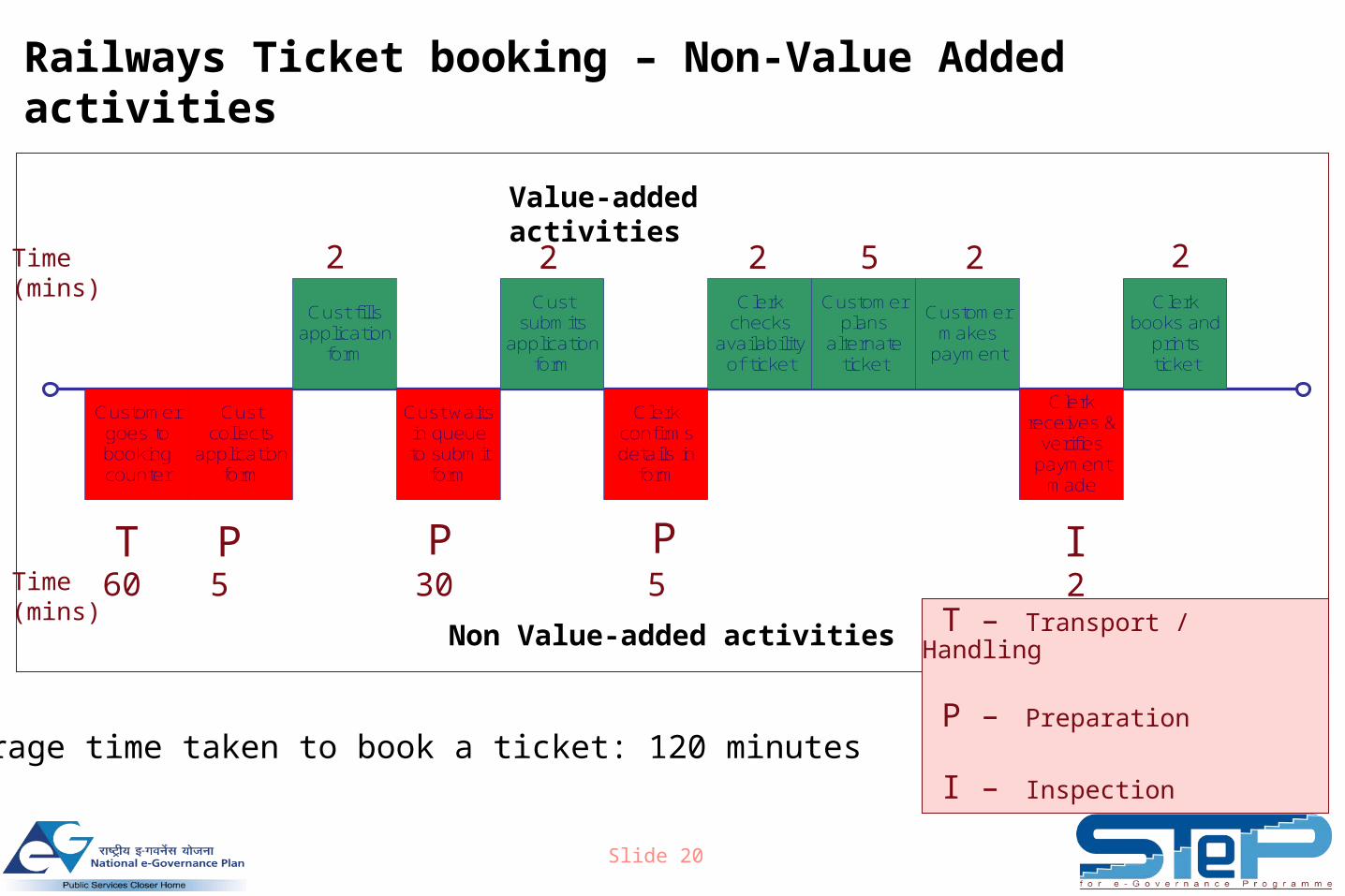
Railways Ticket booking – Non-Value Added activities
Value-added activities
Non Value-added activities
T P P P I
Customer goes to booking counter
Cust collects
application form
Cust fills application
form
Cust submits
application form
Cust waits in queue to submit
form
Clerk confirms details in
form
Clerk checks
availability of ticket
Customer plans
alternate ticket
Customer makes
payment
Clerk receives &
verifies payment
made
Clerk books and
prints ticket
2 2 2 5 2 2
60 5 30 5 2Time(mins)
Time(mins)
T – Transport / Handling
P – Preparation
I – Inspection Average time taken to book a ticket: 120 minutes
Slide 21
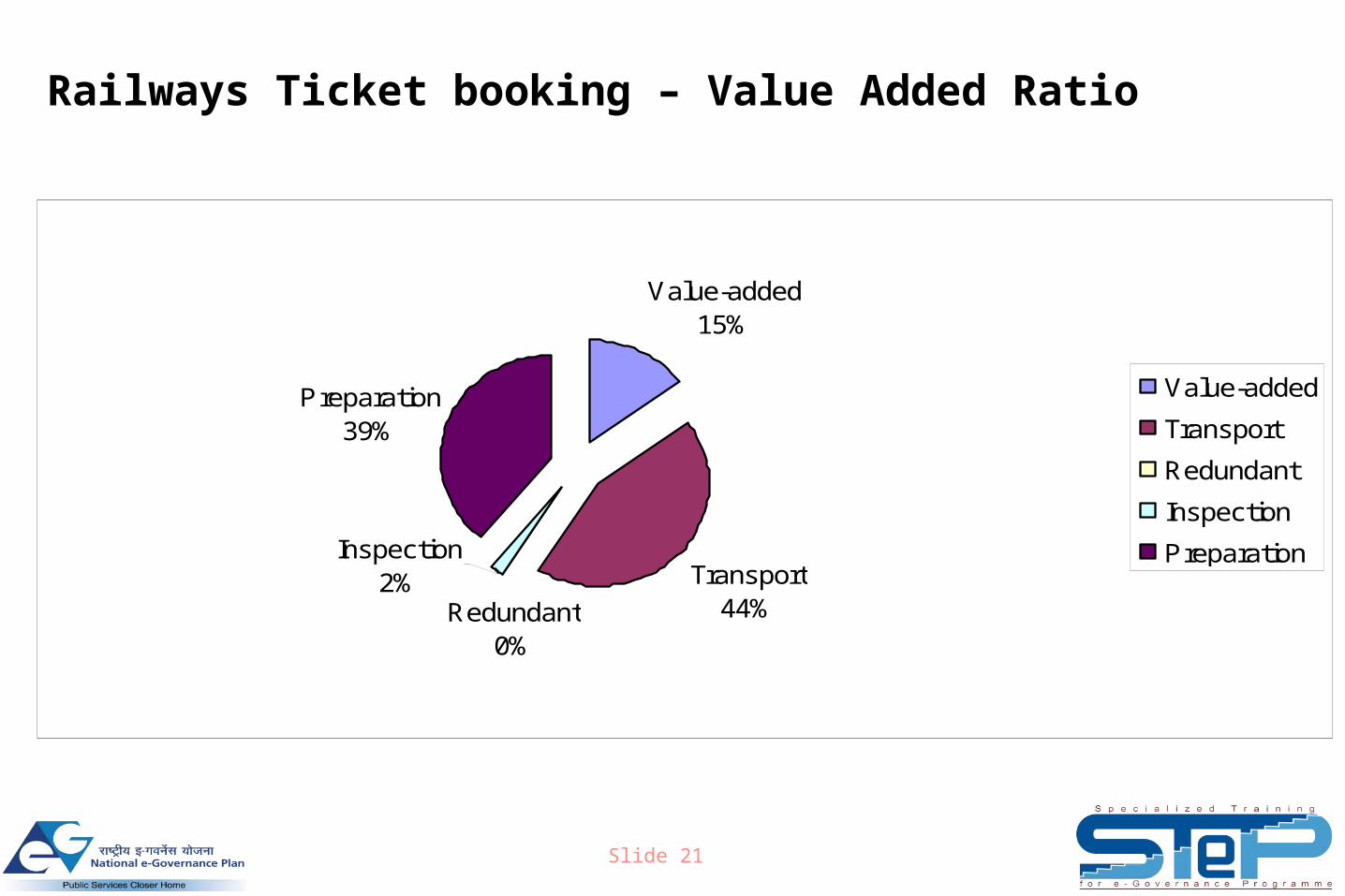
Railways Ticket booking – Value Added Ratio
Value-added15%
Transport44%
Preparation39%
Inspection2%
Redundant0%
Value-added
Transport
Redundant
Inspection
Preparation
Slide 22
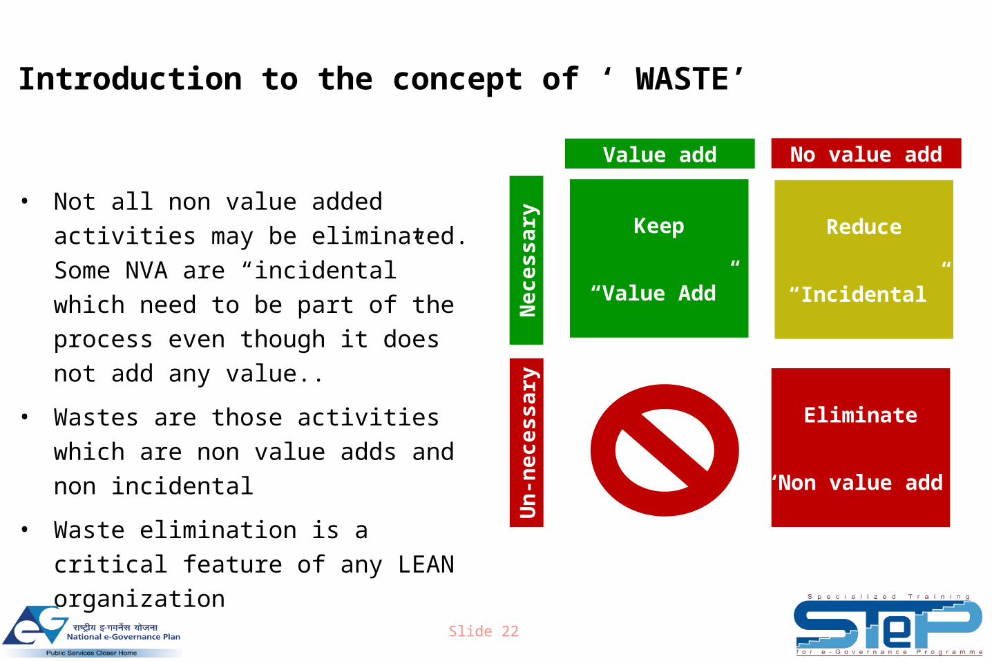
Introduction to the concept of ‘ WASTE’
• Not all non value added activities may
be eliminated. Some NVA are
“incidental” which need to be part of the
process even though it does not add
any value..
• Wastes are those activities which are
non value adds and non incidental
• Waste elimination is a critical feature of
any LEAN organization
Value add No value add
Ne
ce
ss
ary
Un
-ne
ce
ss
ary
Keep
“Value Add”
Reduce
“Incidental”
Eliminate
“Non value add”
Slide 23
The Seven Wastes
• Let us understand the characteristics of waste.
• Seven deadly wastes Motion Waiting Over Production Unnecessary Processing Defects Inventory Transportation
• All seven wastes add time & cost to the value stream.
Slide 24
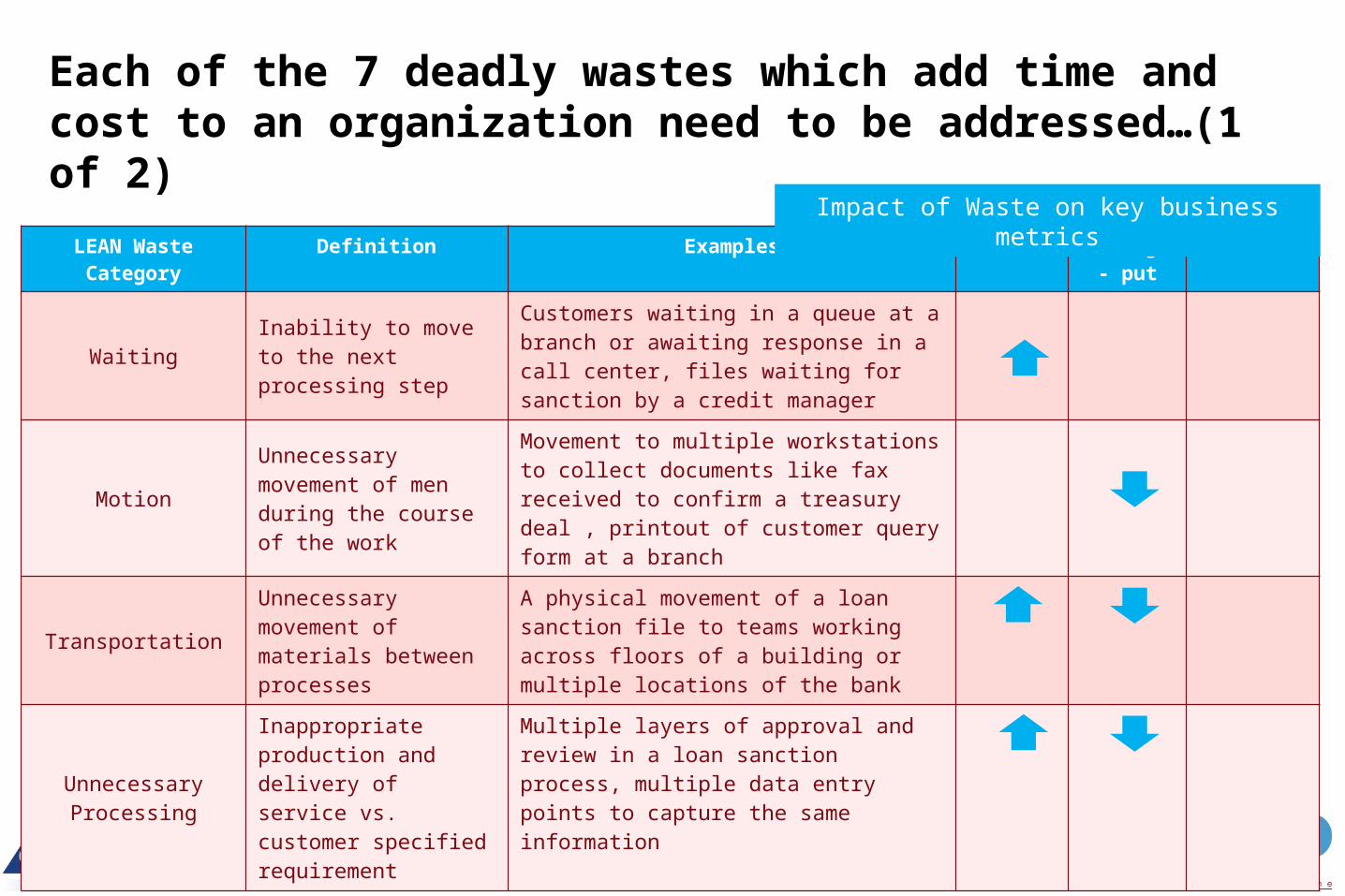
Each of the 7 deadly wastes which add time and cost to an organization need to be addressed…(1 of 2)
LEAN Waste Category
Definition Examples TAT Through- put
Errors
WaitingInability to move to the next processing step
Customers waiting in a queue at a branch or awaiting response in a call center, files waiting for sanction by a credit manager
MotionUnnecessary movement of men during the course of the work
Movement to multiple workstations to collect documents like fax received to confirm a treasury deal , printout of customer query form at a branch
TransportationUnnecessary movement of materials between processes
A physical movement of a loan sanction file to teams working across floors of a building or multiple locations of the bank
Unnecessary Processing
Inappropriate production and delivery of service vs. customer specified requirement
Multiple layers of approval and review in a loan sanction process, multiple data entry points to capture the same information
Impact of Waste on key business metrics
Slide 25
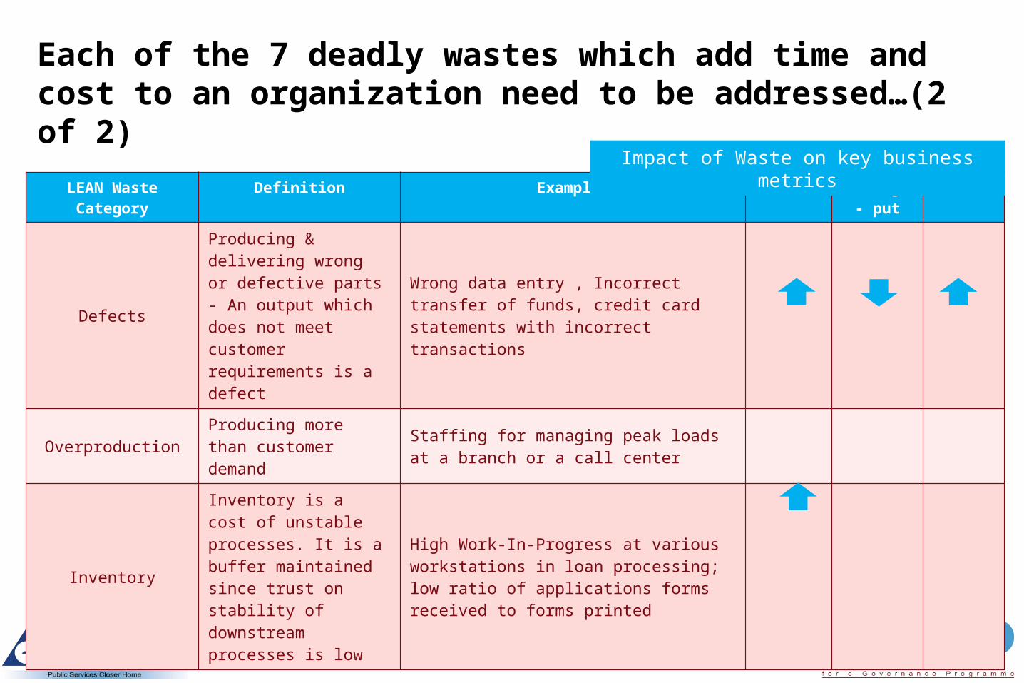
Each of the 7 deadly wastes which add time and cost to an organization need to be addressed…(2 of 2)
LEAN Waste Category
Definition Examples TAT Through- put
Errors
Defects
Producing & delivering wrong or defective parts - An output which does not meet customer requirements is a defect
Wrong data entry , Incorrect transfer of funds, credit card statements with incorrect transactions
OverproductionProducing more than customer demand
Staffing for managing peak loads at a branch or a call center
Inventory
Inventory is a cost of unstable processes. It is a buffer maintained since trust on stability of downstream processes is low
High Work-In-Progress at various workstations in loan processing; low ratio of applications forms received to forms printed
Impact of Waste on key business metrics
Slide 26
Process complexity analysis (1 of 2)
• Facilitates identification of those elements in the process that can be
eliminated
• Process Complexity Analysis documents the following:
− Number of data entry points (DEP)
− Number of hand-off points (HOP)
− Number of systems used
• More number of DEPs, HOPs and systems indicate a complex process
Slide 27
Process complexity analysis (2 of 2)
• Number of data entry points
− Shows the number of times data is being captured
− Identifies areas where duplication of work is taking place
• Number of hand-off points
− Shows how many hands the file passes through for processing
− Indicates areas where handoffs can be eliminated for speedier processing through
elimination of unnecessary activities & waiting time
• Number of systems used
− Shows the number of systems and excel sheets / registers where data is entered
− Allows us to identify areas where duplicate data entry is taking place and helps
eliminate un-necessary work
Slide 28
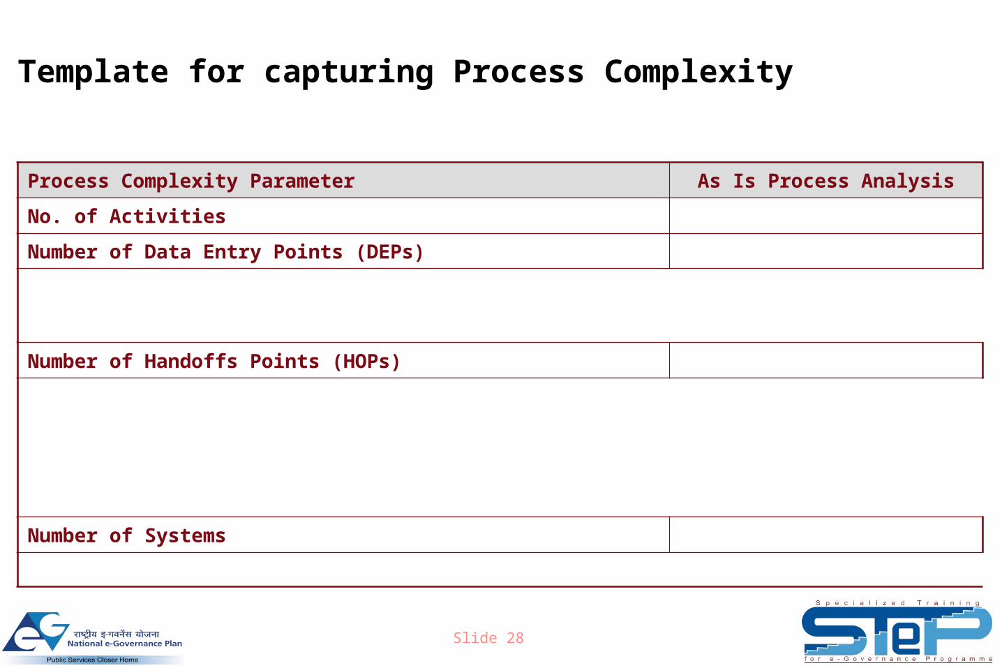
Template for capturing Process Complexity
Process Complexity Parameter As Is Process Analysis
No. of Activities
Number of Data Entry Points (DEPs)
Number of Handoffs Points (HOPs)
Number of Systems
Slide 29
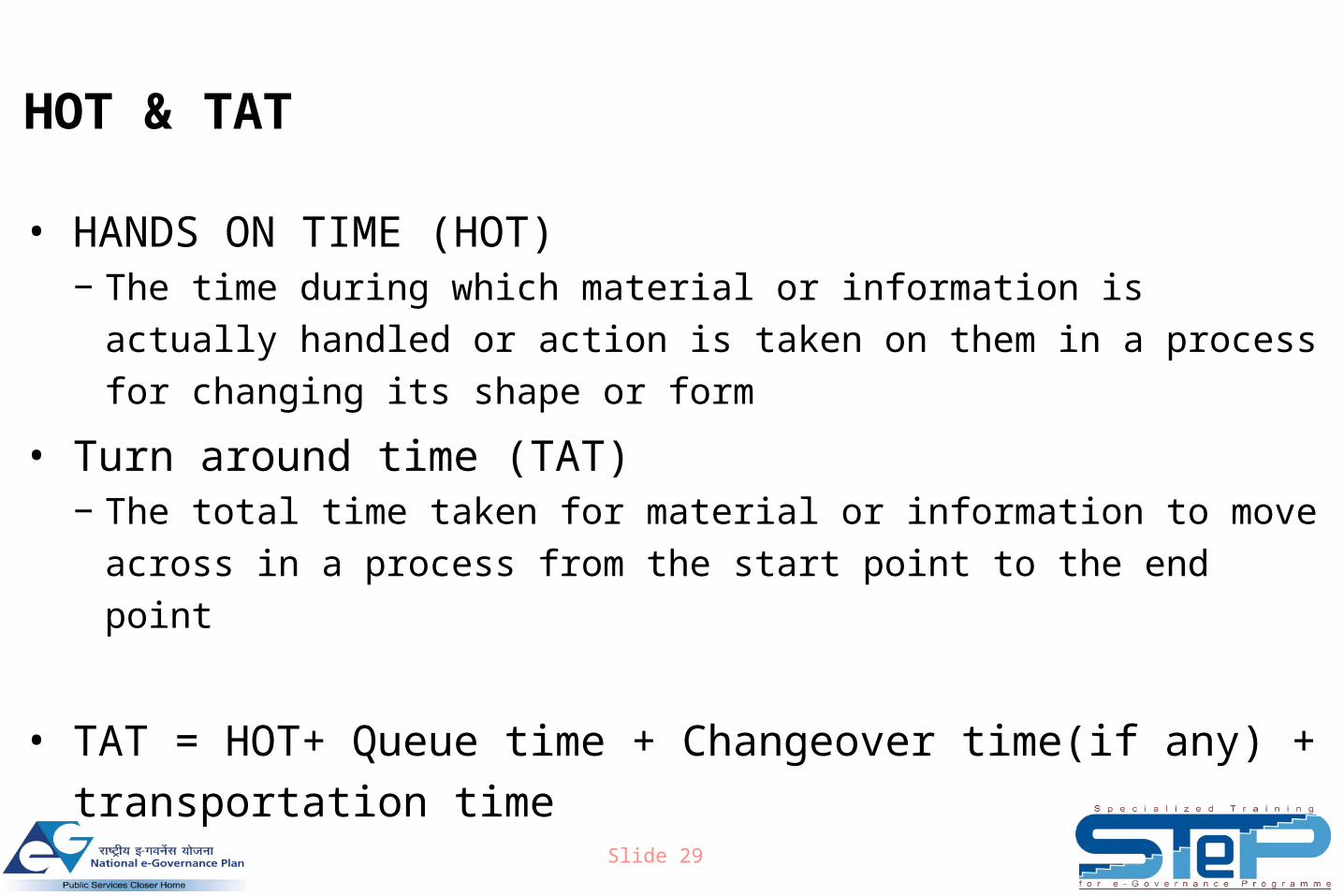
HOT & TAT
• HANDS ON TIME (HOT)− The time during which material or information is actually handled or action
is taken on them in a process for changing its shape or form
• Turn around time (TAT)− The total time taken for material or information to move across in a process
from the start point to the end point
• TAT = HOT+ Queue time + Changeover time(if any) +
transportation time
• Time other than HOT can be focused upon for improvement
Slide 30
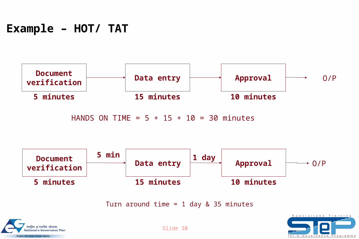
Example – HOT/ TAT
Document verification
Data entry Approval
5 minutes 15 minutes 10 minutes
Turn around time = 1 day & 35 minutes
Document verification
Data entry Approval
5 minutes 15 minutes 10 minutes
HANDS ON TIME = 5 + 15 + 10 = 30 minutes
5 min 1 dayO/P
O/P
Slide 31
Definition of key metrics
• The key metrics (CTQs & CTPs) of the process acts as indicators
of how the process has improved post GPR
• From the data collected on the CTQs and CTPs, the baseline
metrics can be obtained
• Post roll-out of GPR, these metrics can be tracked for continuous
improvement using Process Quality Information Systems (PQIS)
Slide 32
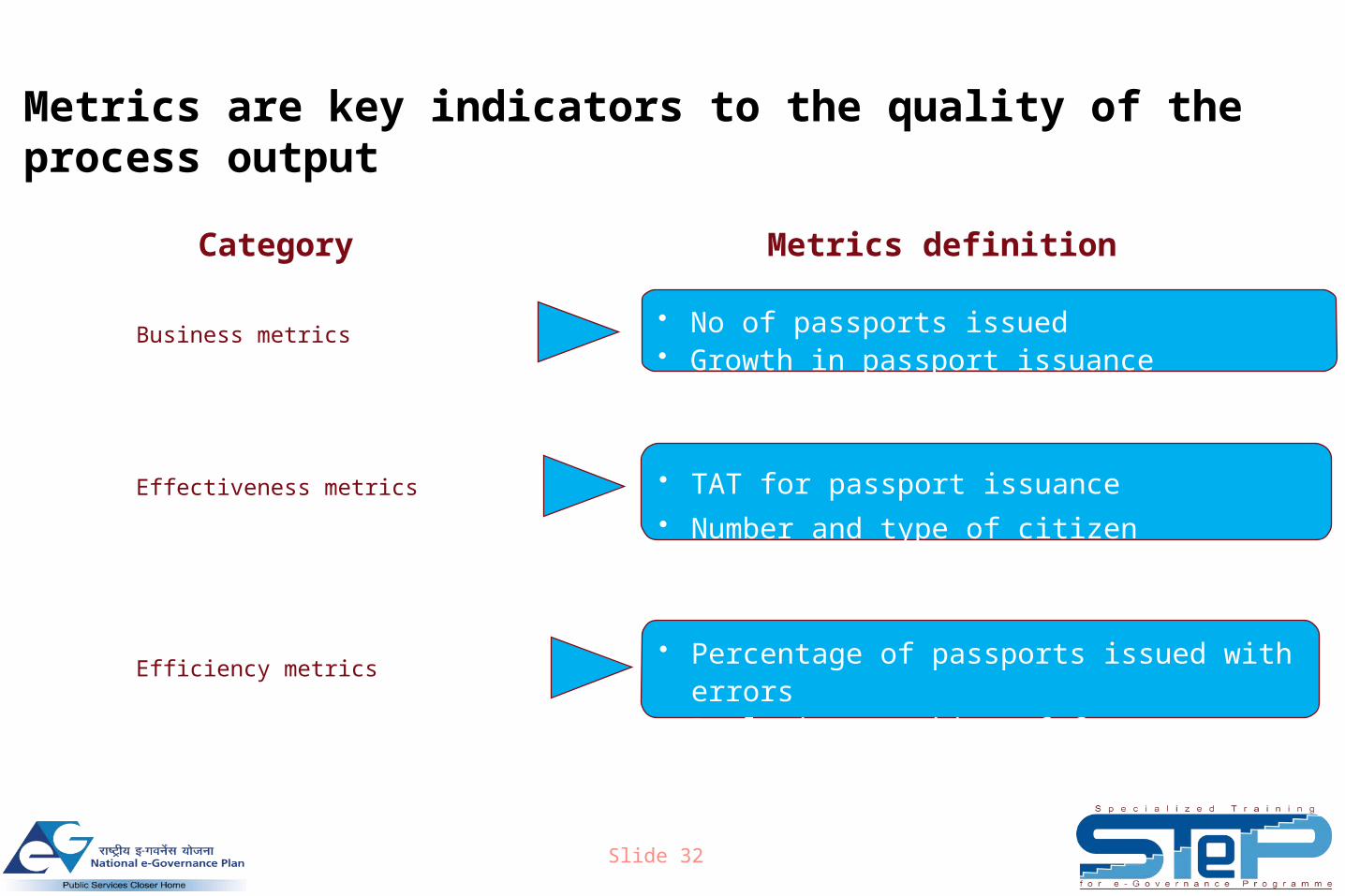
Metrics are key indicators to the quality of the process output
Business metrics
Effectiveness metrics
Efficiency metrics
• No of passports issued• Growth in passport issuance
• TAT for passport issuance• Number and type of citizen grievances
• Percentage of passports issued with errors • Real time tracking of forms
Category Metrics definition
Slide 33
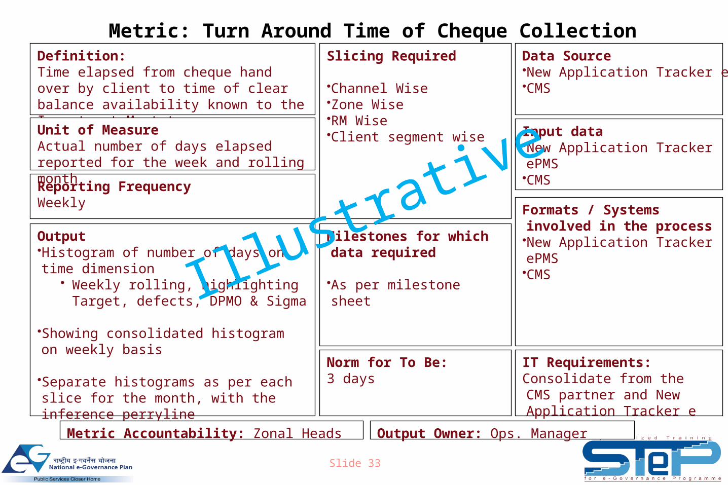
Metric: Turn Around Time of Cheque CollectionSlicing Required
•Channel Wise•Zone Wise•RM Wise•Client segment wise
Reporting FrequencyWeekly
Data Source•New Application Tracker ePMS•CMS
Output•Histogram of number of days on time dimension
• Weekly rolling, highlighting Target, defects, DPMO & Sigma
•Showing consolidated histogram on weekly basis
•Separate histograms as per each slice for the month, with the inference perryline
Definition: Time elapsed from cheque hand over by client to time of clear balance availability known to the Investment Mgmt team
Input data•New Application Tracker ePMS•CMS
IT Requirements:Consolidate from the CMS partner and New Application Tracker e PMS
Unit of MeasureActual number of days elapsed reported for the week and rolling month
Formats / Systems involved in the process•New Application Tracker ePMS•CMS
Milestones for which data required
•As per milestone sheet
Norm for To Be: 3 days
Output Owner: Ops. ManagerMetric Accountability: Zonal Heads
Illustrative
Slide 34
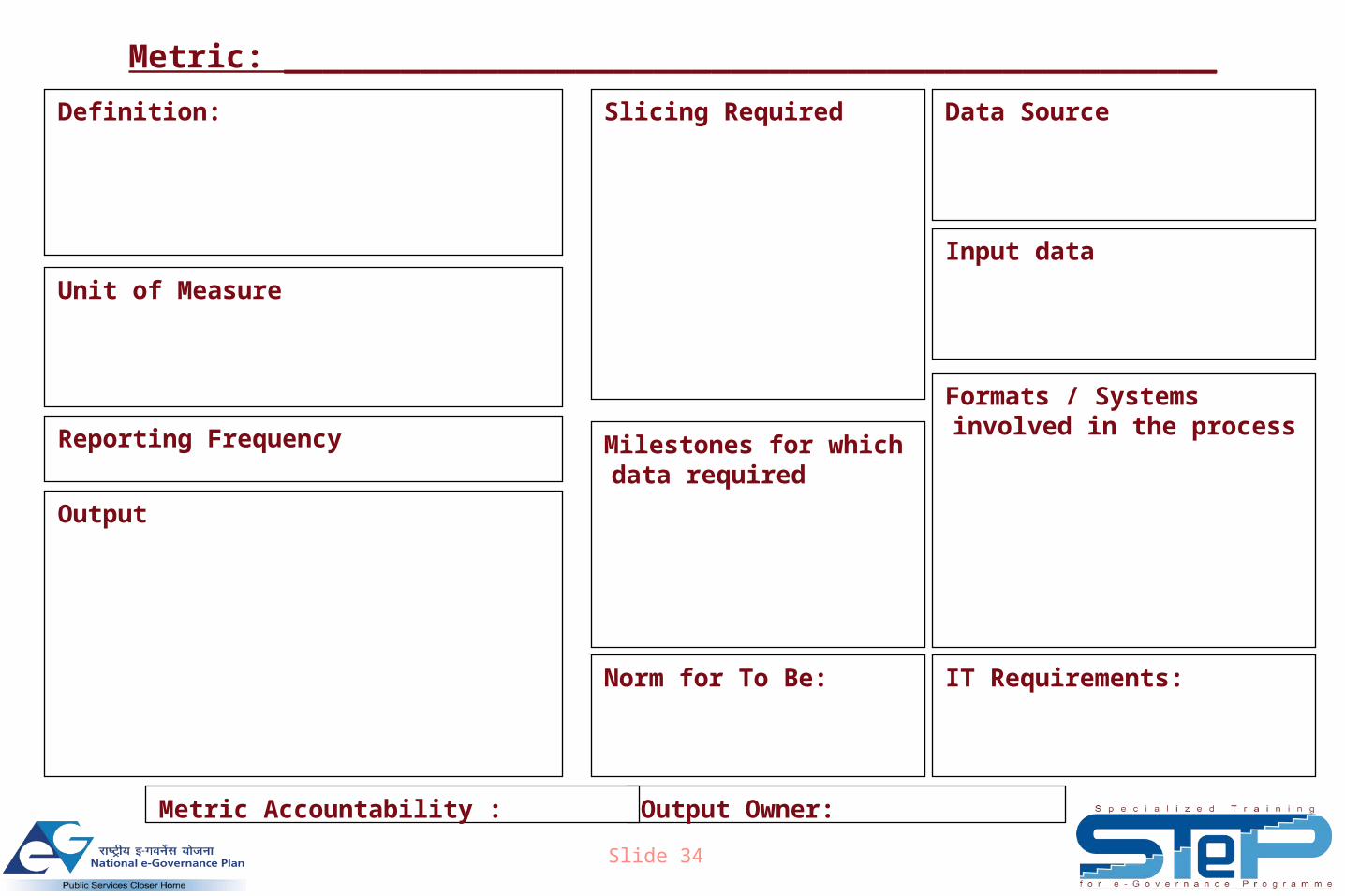
Metric: ________________________________________________
Slicing Required
Reporting Frequency
Data Source
Output
Definition:
Input data
IT Requirements:
Unit of Measure
Formats / Systems involved in the process
Milestones for which data required
Norm for To Be:
Output Owner:Metric Accountability :