Embed Size (px)
Citation preview
Correlation Based Tools for Analysis of Dynamic Networks
by
Kumaraguru Paramasivam
A Thesis Presented in Partial Fulfillment
of the Requirements for the Degree
Master of Science
Approved April 2011 by the
Graduate Supervisory Committee:
Charles Colbourn, Chair
Arunabha Sen
Violet R. Syrotiuk
ARIZONA STATE UNIVERSITY
May 2011
i
ABSTRACT
Time series analysis of dynamic networks is an important area of study
that helps in predicting changes in networks. Changes in networks are used to
analyze deviations in the network characteristics. This analysis helps in
characterizing any network that has dynamic behavior. This area of study has
applications in many domains such as communication networks, climate
networks, social networks, transportation networks, and biological networks. The
aim of this research is to analyze the structural characteristics of such dynamic
networks.
This thesis examines tools that help to analyze the structure of the
networks and explores a technique for computation and analysis of a large climate
dataset. The computations for analyzing the structural characteristics are done in a
computing cluster and there is a linear speed up in computation time compared to
a single-core computer. As an application, a large sea ice concentration anomaly
dataset is analyzed. The large dataset is used to construct a correlation based
graph. The results suggest that the climate data has the characteristics of a small-
world graph.

ii
DEDICATION
To my parents, my brother and my sister.

iii
ACKNOWLEDGMENTS
I would like to acknowledge the enthusiastic supervision of Dr. Charles
Colbourn for his guidance, encouragement and for providing the opportunity to
work on a novel and challenging research problem. I would also like to extend my
sincere gratitude to him for guiding me through the process of applying research
skills towards solving technical problems.
I also thank my committee members, Dr. Violet R. Syrotiuk and Dr. Arun
Sen, for their time and effort to help me fulfill the degree requirements. I am
grateful to the High Performance Computing Initiative team at the Arizona State
University for all the support they have given me to install new packages in the
system.
I am grateful to all my friends at Arizona State University for making my
stay in Tempe, Arizona particularly enjoyable. I would like to thank the graduate
students for guiding me with implementation and proof reading – Ramesh
Thulasiram, Abhishek Kohli, Anil Reddy, Mayur Agarwal, Sivaramakrishnan
Natarajan, Mohit Shah, Prasanna Sattigeri, Wilbur Lawrence, Supreet Bose,
Srinath Gowda, Vikram Kamath and Jawahar Ravee. I also thank my friend Shruti
Kaushik for encouraging me and giving me the confidence to complete my thesis
work. She is one of my few friends who share my joy in finishing this thesis.
Finally, I am indebted to my parents and uncles for their encouragement,
understanding and belief in my dreams. This work would have not been possible
without their patience and warmth.

iv
TABLE OF CONTENTS
Page
LIST OF FIGURES .................................................................................................... vi
CHAPTER
1 INTRODUCTION .................................................................................. 1
1.1 Motivation ..................................................................................... 2
1.2 Contribution .................................................................................. 3
1.3 Document Outline ......................................................................... 4
2 BACKGROUND AND RELATED WORK ........................................ 5
2.1 Background ................................................................................... 5
2.2 Implementation specific terms ................................................... 10
2.3 Related Work .............................................................................. 12
3 DESIGN AND IMPLEMENTATION ................................................ 15
3.1 Sea Ice Anomaly Data ................................................................ 16
3.2 Partitioning of the data ............................................................... 17
3.3 Constructing the correlation based graph .................................. 18
3.4 Constructing the random graphs ................................................ 18
3.5 Calculating the Degree Distributions ......................................... 19
3.6 Calculating the Clustering Coefficient ....................................... 19
3.7 Calculating the Characteristic Path Lengths .............................. 20
3.8 Visualizations of the graphs ....................................................... 20
4 ASSESSMENT AND EVALUATION ............................................... 22

v
CHAPTER Page
4.1 Climate dataset ............................................................................ 22
4.2 Correlation comparisions............................................................ 25
4.3 Comparison of degree distributions ........................................... 26
4.4 Comparison of Clustering Coefficients ..................................... 40
4.5 Comparison of Characteristic Path Length ................................ 40
5 CONCLUSION AND FUTURE WORK ............................................ 42
REFERENCES ........................................................................................................ 49
APPENDIX
A INSTRUCTION MANUAL FOR THE TOOLS ............................... 53
vi
LIST OF TABLES
Table Page
4.1. Cluster size for different correlation thresholds ............................... 33
4.2. Mean Degree and Frequency for 3-year periods ............................. 37
4.3. Mean Degree and Mean Frequency for threshold 0.5 ..................... 40
4.4. Mean Degree and Mean Frequency for threshold 0.7 ..................... 41
4.5. Mean Degree and Mean Frequency for threshold 0.9 ...................... 42

vii
LIST OF FIGURES
Figure Page
1. Sample SSM/I total sea ice concentration image for a week of 1979. 17
2. Climate data with land and missing data with latitude in x-axis and
longitude in y-axis ............................................................................. 23
3. Climate data – Missing data removed with latitude in x-axis and
longitude in y-axis ............................................................................. 23
4. Map showing aggregated geographical locations (latitudes, longitudes)
in the climate dataset ......................................................................... 24
5. Connected components in the correlation-based graph for a sample
climate dataset(1979-2005) for r=0.9 ................................................ 25
6. Sample SSM/I total sea ice concentration image for a week of 1979. 28
7. Random graph – Erdos Renyi model with density 0.000351 ............. 29
8. Degree distribution of Erdos-Renyi graph .......................................... 30
9. Random Graph – Barabasi graph with density 0.000351 ................... 31
10. Degree distribution of Barabasi graph ............................................... 32
11. Random Watts Strogatz graph with density 0.000351 ...................... 33
12. Degree distribution of Watts Strogatz model .................................... 34
13. Degree distributions of the correlation-based graphs for each 3-year
intervals from 1979 to 2005 .............................................................. 36
14. Degree Distribution of correlation-based graph for 1979 - 1987 ..... 37
15. Degree Distribution of correlation-based graph for 1988 - 1996 ..... 38
viii
Figure Page
16. Degree Distribution of correlation-based graph for 1997 - 2005 ..... 39
17. Comparison of degree distributions of correlation-based graphs,
random graphs and small-world graphs ............................................ 39
18. Comparision of Clustering coefficients ............................................. 40
19. Comparison of Characteristic Path lengths ....................................... 41
1
Chapter 1
INTRODUCTION
A network is a system of interacting nodes [1]. The nodes can be airplanes
in a transportation network, genes in a biological network or individuals in a
social network. Interacting dynamical systems can also be represented by a
network. The study of networks with non-trivial structural properties is done in
various fields. Networks can be used as an analysis framework, and it is easier to
visualize results in a network.
A graph is an abstract representation of a set of objects where some pairs
of the objects are connected by links. The interconnected objects are called
vertices, and the links that connect some pairs of vertices are called edges. In this
thesis we model the networks as graphs and we use the terms interchangeably.
Regular networks are networks that have same degree for each of the
vertices [1]. Each node has the same number of links connecting it in a specific
way to a number of neighboring nodes, like a full graph, ring, etc. In a fully
connected network, each node is linked to all other nodes [1]. Random networks
are networks that contain links or edges chosen completely at random with equal
probability.
In a regular graph, the length of a shortest path from one vertex to another
can be quite long. But in random graphs, far away nodes can be connected as
easily as nearby nodes and information may be transported over the network more
efficiently than in ordered networks [2].

2
A small-world network is a simple connected graph G exhibiting two
properties. First, each vertex of G is linked to a relatively well-connected set of
neighboring vertices. Second, these networks have small mean shortest path
length [2]. Small-world networks have a high degree of local clustering and a
small number of long-range connections [3]. These networks have small mean
shortest path lengths. Small-world networks have received attention in
understanding the theory of networks and the applications they have in many
application domains – such as analysis of social networks, ecological systems,
biological networks, transportation networks, communication networks, the
internet, financial market analysis, etc.
The clustering coefficient, degree distribution and the characteristic path
length are some important techniques to study the network structural properties of
networks. To determine whether the network is a small-world graph, the mean
clustering coefficient and the characteristic path length are calculated and
compared to a random graph of the same size. In small-world networks, the mean
clustering coefficient is much higher than the random networks and the
characteristic path length is greater than or equal to that of the random networks
[3].
The application of networks to climate science is an important area of
study [3]. Two important applications of networks to atmospheric sciences were
presented by Tsonis and Robert [1, 3]. In climate networks, a dynamic system
varies in some complex way and we are interested in the collective behavior of
these interacting dynamical systems and the structure of the resulting network [1,

3
3]. Complex networks offer a compelling perspective for capturing the dynamic
behavior of the climate system. The combination of analytic methods and
computational tools has the long-term potential for a transformative impact on
understanding the climate system. Identifying the patterns and analyzing them
helps understanding the complex processes of the observed phenomena in
scientific, social and political interest [3].
1.1 Motivation
The main motivation behind the thesis is to implement tools to analyze the
structural properties of the dynamic networks. Statistical network modeling has
gained interest in the systems biology domain, and a number of methods and
models have been proposed as frameworks for studying large biological networks
[4, 5, 6]. In these studies, features like node degree distribution and small
connected sub-graphs have been analyzed to capture some important features of
the network structure [7]. Efficient tools are needed to systematically study these
networks and their local features.
Sea ice anomaly data is an important proxy indicator of climate change, and
many research activities are conducted on Arctic sea ice. Data acquired by
meteorological satellites provides one of the most effective ways to study large-
scale changes in sea ice conditions in the Arctic. Sea ice covers most of the Arctic
Ocean and plays a significant role in the global water cycle and the global energy
balance. Thus, any changes in the Earth‘s climate are likely to first be seen in
areas such as the High Arctic.

4
Each month the National Snow and Ice Data Center (NSIDC) offer an
update of how much ice is covering the vast Arctic Ocean. Since the 1970s, the
real extent of sea ice has been shrinking. In September sea ice coverage hits its
absolute minimum, after the long summer season of melting and before ice starts
to grow again [8]. In September of 2010, the mean sea ice extent was 1.65 million
square miles, which is the lowest ever recorded for the month of September,
shattering the previous record in 2005 by 23%. Current climate model projections
indicate that the Arctic could be seasonally ice-free by 2050-2100, which will
significantly impact the global climate [9].
1.2 Contribution
This research work is aimed at implementing correlation based tools for the
time-series analysis of climate networks for a large sea ice concentration anomaly
dataset. The tools can help in analyzing large datasets to characterize the structure
of the network. Since this dataset is large, effective ways are developed to
partition the data based on space and time. These tools help in monitoring the
networks for different time periods. Studying them may identify if the network
has acquired more long-range or small-range connections. This work aims at
examining if the networks have a high degree of local clustering and a small
number of long-range connections.
These tools also help in graphing the structural properties of the networks.
Visual representations are also done for the random graphs and the small-world
graphs. The tools for comparing the climate graphs—Degree Distribution,
Clustering Coefficient and Characteristic Path length—are computed and

5
analyzed. The degree distribution of the graphs is represented as histograms and
bar graphs for analysis. The comparison and the results suggest that the climate
networks appear to have similar characteristics of small-world graphs.
1.3 Document Outline
The rest of the thesis is organized as follows: Chapter 2 provides background
information about the terms used in the thesis and the implementation
environment, Saguaro cluster and the visualization tools used for computation.
Chapter 2 also gives related work done in the area of time-series analysis of
dynamic networks. The design and implementation of the system are presented in
Chapter 3. Chapter 4 shows the results and evaluation done in the research work.
Conclusions for this thesis and future work are presented in Chapter 5.

6
Chapter 2
BACKGROUND AND RELATED WORK
This chapter describes the background information on this thesis work and
the related work done in the analysis of dynamic networks.
2.1 Background
This section will discuss some of the basic concepts and terms which are
related to time-series analysis, statistics of dynamic networks, and related topics
to understand the rest of the thesis.
2.1.1 NSIDC
The National Snow and Ice Data Center (NSIDC) is part of the
Cooperative Institute for Research in Environmental Sciences at the University of
Colorado at Boulder. NSIDC supports research into our world's frozen realms: the
snow, ice, glaciers, frozen ground, and climate interactions that make up Earth's
cryosphere [10]. Scientific data, whether taken in the field or relayed from
satellites orbiting Earth, form the foundation for the scientific research that
informs the world about our planet and our climate systems. NSIDC manages
cryosphere-related data ranging from the smallest text file to terabytes of remote
sensing data from NASA‘s Earth Observing System satellite program. They
manage polar and cryospheric data and conduct research under sponsorship from
the National Aeronautics and Space Administration, the National Oceanic and
Atmospheric Administration, and the National Science Foundation. NSIDC
archives scientific data and makes hundreds of scientific data sets accessible to
researchers around the world [10]. In this thesis the sea ice concentration anomaly

7
dataset for the years 1979-2005 was used as the data for these years was archived
and publicly available.
2.1.2 Time Series
The sea ice concentration anomaly dataset provided by NSIDC is a time
series. A time series is a sequence of data points, measured at successive times
spaced at uniform time intervals [11]. Time series analysis comprises methods for
analyzing time series data in order to extract meaningful statistical information.
Time series data have a natural temporal ordering [11]. This property makes time
series analysis distinct from other data analysis problems, in which there is no
natural ordering of the observations. A time series model will generally reflect the
fact that observations close together in time will be more closely related than
observations further apart. Time series models will often make use of the natural
one-way ordering of time so that values for a given period will be expressed as
deriving in some way from past values, rather than from future values [12]. The
sea ice concentration anomaly dataset will be represented as a correlation based
graph.
2.1.3 Correlation-Based Graph
Tsonis et al. derived a correlation-based graph G = (V, E) from a wind
anomaly dataset [3]. The vertex set of this graph corresponds to the relevant
dataset and there is an edge between any two vertices if the correlation between
the data values corresponding to this pair of vertices is greater than some
correlation threshold.
8
Correlation coefficients have been used to analyze the topology of gene
expression networks [13, 14, 15]. It has been used to characterize financial
markets [1, 16]. The effect of a different correlation threshold was studied by
Tsonis [1, 17]. Onnela analyzed the weighted properties of the network, where
each link is assigned a weight proportional to its corresponding correlation
coefficient [18].
2.1.4 Statistical Methods for Analysis
The correlation coefficient, clustering coefficient, characteristic path
length and degree distribution are some of the important statistical methods to
examine the structural features of the graphs and the time-series.
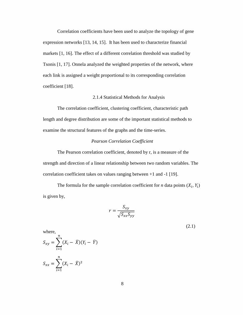
Pearson Correlation Coefficient
The Pearson correlation coefficient, denoted by r, is a measure of the
strength and direction of a linear relationship between two random variables. The
correlation coefficient takes on values ranging between +1 and -1 [19].
The formula for the sample correlation coefficient for n data points ( , )
is given by,
√
(2.1)
where,
∑( )( )
∑( )

9
∑( )
∑
∑
In a graph, the correlation coefficient quantifies how well-connected are
the neighbors of a vertex [20].
Clustering Coefficient
In a graph, let ‗v‘ be a vertex and let N(v) denote the neighborhood of a
vertex ‗v‘ containing all the vertices adjacent to ‗v‘. The graph generated by N(v),
G(N(v)) has vertex set N(v) and its edges are all edges of the graph with both
endpoints in N(v) [21]. If k(v) and e(v) denote the number of vertices and edges in
G(N(v) respectively, then the clustering coefficient of v is given by,
( )
( ( ) )
( )
( )( ( ) )
(2.2)
Then the mean clustering coefficient of a graph G is the mean of the clustering
coefficients of all vertices of G.
The clustering coefficient measures the degree to which nodes in a
network tend to cluster together. Calculating the clustering coefficient of the
correlation based graphs indicates how close its neighbors are to being a clique. It
is measured based on two definitions, namely global and local clustering
coefficients.
10
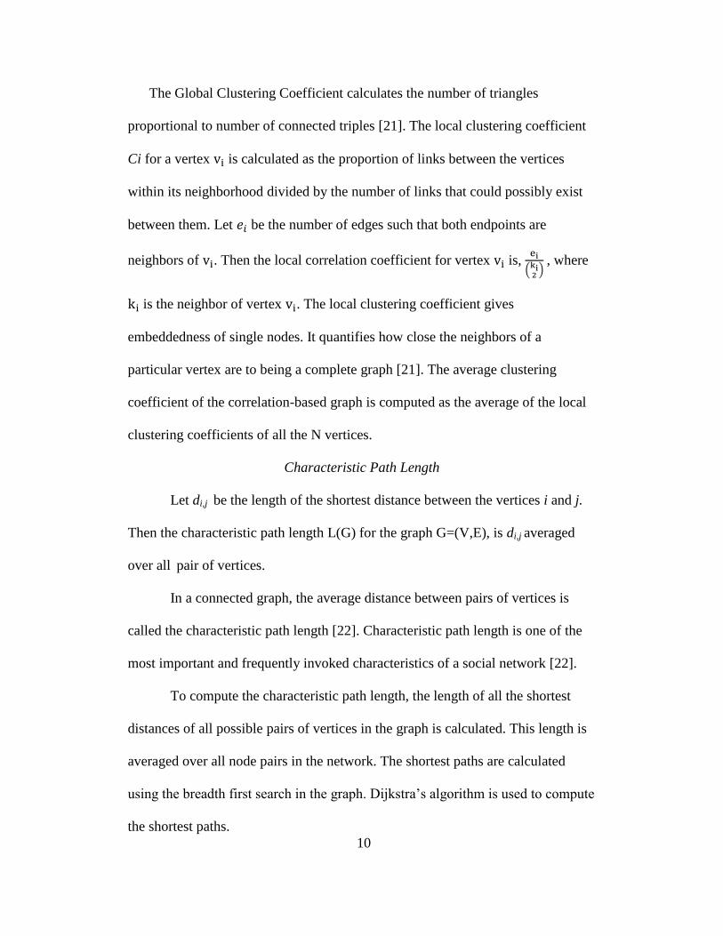
The Global Clustering Coefficient calculates the number of triangles
proportional to number of connected triples [21]. The local clustering coefficient
Ci for a vertex is calculated as the proportion of links between the vertices
within its neighborhood divided by the number of links that could possibly exist
between them. Let be the number of edges such that both endpoints are
neighbors of . Then the local correlation coefficient for vertex is,
( ) , where
is the neighbor of vertex . The local clustering coefficient gives
embeddedness of single nodes. It quantifies how close the neighbors of a
particular vertex are to being a complete graph [21]. The average clustering
coefficient of the correlation-based graph is computed as the average of the local
clustering coefficients of all the N vertices.
Characteristic Path Length
Let di,j be the length of the shortest distance between the vertices i and j.
Then the characteristic path length L(G) for the graph G=(V,E), is di,j averaged
over all pair of vertices.
In a connected graph, the average distance between pairs of vertices is
called the characteristic path length [22]. Characteristic path length is one of the
most important and frequently invoked characteristics of a social network [22].
To compute the characteristic path length, the length of all the shortest
distances of all possible pairs of vertices in the graph is calculated. This length is
averaged over all node pairs in the network. The shortest paths are calculated
using the breadth first search in the graph. Dijkstra‘s algorithm is used to compute
the shortest paths.

11
Dijkstra’s Algorithm
Dijkstra's algorithm is used to find the single-source shortest paths on a
graph G = (V, E). All weights must be nonnegative. The algorithm maintains a set
S of vertices whose final shortest-path weights from the source s have already
been determined. The algorithm repeatedly selects the vertex u V – S with the
minimum shortest-path estimate, adds u to S, and relaxes all edges leaving u [23].
A naive implementation of the priority queue gives a run time complexity
O (V²), where V is the number of vertices. Implementing the priority queue with a
Fibonacci heap makes the time complexity O (E + V log V), where E is the
number of edges [23].
Degree Distribution
The degree of a node in a network is the number of edges it has to other
nodes. The probability distribution of these degrees over the whole network is
called degree distribution [24]. The degree distribution helps us identify the nodes
with a significantly higher vertex degree than the average.
Power Law
A power law is a kind of mathematical relationship between two quantities
in which the frequency of an event varies as a power of some attribute of that
event. The frequency is said to follow a power law [25]. For instance, the number
of cities having a certain population size is found to vary as a power of the size of
the population, and hence follows a power law [25].

12
2.1.5 Graph Models to Compare Correlation-Based Graphs
In order to analyze the structural properties of the correlation based
graphs, random graphs and small-world graphs are used.
Random Graphs
Random graphs were introduced by Erdős and Rényi [26]. They defined
two ways for generating random graphs. A Gn,p graph is undirected, has n vertices
and p is the probability that an edge is present between any arbitrary pair of
vertices in the graph. Gn,p graphs are generated by drawing an indicator random
variable for each possible edge in the graph. A Gn,m random graph is undirected,
has n vertices and m edges. The m edges are chosen uniformly at random from the
set of all possible edges in the graph [27].
Barabási and Albert introduced a discrete time step model that creates a
random scale-free graph [28]. They start with a single vertex and in each time step
add another vertex to the graph. The network begins with an initial network of m
nodes (m ≥ 2) and the degree of each node in the initial network should be at least
1, otherwise it will always remain disconnected from the rest of the network. New
nodes are added to the network one at a time. Each new node is connected to m
existing nodes with a probability that is proportional to the number of links that
the existing nodes already have. [28].
Watts-Strogatz Small-World Model
Watts and Strogatz proposed a network model called a small-world graph
[1, 29]. In small-world graphs, most nodes are not neighbors of one another. Most
nodes can be reached from every other by a small number of hops [29]. In small-

13
world graphs, the average distance between any two nodes is proportional to the
logarithm of the number of nodes in the network [29].
In the context of a social network, there is a small-world characteristic of
strangers being linked by mutual acquaintance [30]. Small-world graphs tend to
contain sub graphs which have connections between almost any two nodes
between them. This property results in a small-world graph having a high
clustering coefficient [30]. Another property is that the mean shortest path length
is small [1, 30]. Many real life networks like road maps, food chains, voter
networks, social influence networks, etc. exhibit properties of small-world
graphs [30].
Density of a Graph
The density of a graph is the ratio of the number of edges and the number
of possible edges. The density of the correlation based graph will be computed
and used to construct random graphs and small-world graphs of same density.
2.2 Implementation Specific Terms
The environment and the tools used for implementation are explained in
this section. A high performance computing platform called Saguaro computing
cluster is used for implementation.
2.2.1. Saguaro Cloud Computing
Current engineering and scientific problems require the ability to manage
ever-growing volumes of data and to evaluate increasingly complex
computational models. By using clusters of computers and the concept of parallel

14
computing to distribute tasks over multiple processors at once, it is possible to
tackle certain problems with linear speed up in computational time. Not only does
it enable researchers to perform existing operations much faster and in greater
volume than ever before, but also allows to solve complex problems that would be
impractical without the capabilities of parallel processing.
The High Performance Computing Initiative (HPCI) facility at Arizona
State University host more than 5,000 processor cores, each as fast as or faster
than a single top-of-the-line desktop computer. The central computing cluster,
Saguaro, is capable of sustained performance of more than thirty trillion
computations per second (30 teraflops). In addition, more than 1 petabyte of disk
storage is available, providing both high performance and archival data storage to
the ASU research community [31].
2.2.3 Visualization Packages
R is a programming language that comes with a software environment
fully enabled for statistical computing and graphics [32]. It is a de facto standard
programming language for statistics and has strong support for bioinformatics and
computational biology, where statistical procedures are increasingly used more
frequently for biological data analysis. R comes with many built-in and third party
packages. Some of the packages used in R for analysis of the structure of the
graphs.
Network Tool
The ‗network‘ package in R is used to create and modify network objects.
The network class can represent a range of relational data types, and it supports

15
arbitrary vertex/edge/graph attributes. The network package provides tools for
creation, access, and modification of network class objects. These objects allow
for the representation of more complex structures than can be readily handled by
other means (e.g., sparse matrices), and are substantially more efficient in
handling large, sparse networks [33]. Network objects can often be treated as if
they were sparse matrices and they are also compatible with the Social Network
Analysis (SNA) package.
Social Network Analysis (SNA) Tool
The SNA package in R contains a range of tools for network analysis.
Supported functionality includes node and graph-level indices, structural distance
and covariance methods, structural equivalence detection, random graph
generation, and 2D/3D network visualization [34].
Network data for SNA routines can be given in any of these forms in this
package -- adjacency matrices, arrays of adjacency matrices, edge lists, sparse
matrix objects, ‗network‘ objects (from the network package), and lists of
adjacency matrices/arrays [35].
igraph Tool
The igraph is a library in R for analysis of graphs. The main goals of the
igraph library is to provide a set of data types and functions for implementation
of graph algorithms, and fast handling of large graphs with millions of vertices
and edges, allowing rapid prototyping via high level languages like R [36].
This library provides three different ways to visualize a graph. The first is
the ‗plot.igraph‘ function. This function uses a base R graphics engine and can be

16
used to plot a graph to a pdf or png file or the GUI output window. The second
function is ‗tkplot‘, which uses a Tk GUI for basic interactive graph manipulation.
The third way requires the ‗rgl‘ package and uses OpenGL [36].
Fruchterman-Reingold Layout
Fruchterman and Reingold proposed a layout for drawing graphs that uses
a force-based algorithm [37]. There are two main principles that were used for
drawing the graphs using the layout. First, the vertices connected by an edge are
drawn near each other. Second, the vertices are not drawn too close to each other.
The approach uses a force based method for drawing the graphs [37].
Frucherman Reingold layout helps to position the nodes of a graph in a two-
dimensional space so that all the edges are of more or less equal length and there
are as few crossing edges as possible.
2.3 Related Work
There are many practical computing problems concerning large
graphs [38]. The size of these graphs is as high as billions of vertices and trillions
of edges, and it is a challenge for efficient processing of such large data. There
exists no scalable general-purpose system for implementing graph algorithms in a
distributed environment [38]. In order to use distributed processing on real-life
graphs, we need a computation model that is scalable and fault-tolerant. Analysis
of networks has been done in many application domains.
In a financial market, the performance of a company is characterized by its
stock price. In the financial world, companies interact with one another creating a

17
complex system of interacting nodes [39]. The analysis of financial networks is
important in risk management and investment, and serves as inputs to the
portfolio optimization problem in the Markowitz portfolio theory [39].
In biological networks, complex underlying structures are studied to
identify blocks to describe the network. The exponential random graph models, a
family of statistical models that have previously been used to study social
networks, are used in modeling the structure of biological networks as a function
of the prominence of local features [4]. Saul and Filkov argue that the flexibility,
in terms of the number of available local feature choices, and scalability, in terms
of the network sizes, makes this approach ideal for statistical modeling of
biological networks [4]. Saul and Filkov illustrate the modeling on both genetic
and metabolic networks and provide a novel way of classifying biological
networks based on the prevalence of their local features [4]. The properties like
node degree distribution and small connected sub graphs are used to capture
features of biological network structure. Tools are needed to systematically study
these and other local features and the ways they collaborate to form the network
structure [4].
Studies on the community structure in social networks are used to analyze
the statistical properties of networked systems such as biological networks and the
World Wide Web [40]. Researchers have concentrated on a few properties that
seem to be common to many networks: the small-world property, power-law
degree distributions, and clustering coefficient. Girvan studied the property of
18
community structure, in which network nodes are joined together in tightly-knit
groups between which there are only looser connections [6, 40].
Some software based techniques have been developed for processing of
large-scale datasets. Pregel is a system that is designed for computations on large
graphs to use distributed processing on real-life graphs. Pregel is scalable and
fault-tolerant. MapReduce is a programming model and an associated
implementation for processing large datasets that is amenable to a broad variety of
real-world tasks [41]. Users specify the computation in terms of a map and
a reduce function, and the underlying runtime system automatically parallelizes
the computation across large-scale clusters of machines, handles machine failures
and schedules inter-machine communication to make efficient use of the network
and disks. More than ten thousand distinct MapReduce programs have been
implemented internally at Google over the past four years, and an average of one
hundred thousand MapReduce jobs are executed on Google's clusters every day,
processing a total of more than twenty petabytes of data per day [41].
The theory of graphs was first applied to climate data by Tsonis et al.,
specifically to a National Centers for Environmental Protection (NCEP) wind
anomaly gridded dataset [1, 2, 3]. An anomaly or deviation dataset is a dataset in
which the long-term average is subtracted from the data, giving the deviation
from the long-term average. They calculated correlation based graphs from the
wind anomaly dataset. Such graphs had the characteristics of small-world graphs,
since they had a high degree of local clustering and a small number of long-range
connections.

19
The goal is to analyze and study a large dataset that contains
measurements varying in space and time. The large dataset is used to construct a
correlation based graph, G. Computations involving large datasets have been
challenging to analyze and study, and efficient tools are needed to characterize the
dynamic changes in any type of network.
In order to extract meaningful information from large datasets one needs
to identify the kinds of correlation and the thresholds to be used. These kinds of
correlations vary for different datasets. To find relations between the nodes, one
needs to increase or decrease the threshold to identify how things are related in
the graph.
Since the amount of data can be huge (tens of thousands to millions of
nodes), there is a trade-off between the threshold selection and the computation
time. The higher the correlation threshold, it is likely that the number of edges in
the correlation based graph will be smaller. If the correlation threshold is low, the
number of edges constructed in the correlation based graph is higher, and as a
result of which, the computations in such graphs are quite time consuming.
Since the amount of data is huge, sequential processing of such data can
take a long time to execute. Hence, a parallel computing approach is preferred to
make better use of the computing facilities available today. Data is partitioned
based on time and space and computations are performed independently on
different processors.
20
Chapter 3
DESIGN AND IMPLEMENTATION
This chapter explains the sea ice concentration anomaly dataset and the
approaches used to partition the dataset. The techniques used for computation of
degree distribution, characteristic path length and the clustering coefficient are
also explained.
3.1 Sea Ice Anomaly Data
The sea ice concentration (SIC) anomaly dataset consists of 27 years
(1979-2005) of weekly SIC anomaly data derived from the Nimbus-7 Scanning
Multi-channel Microwave Radiometer (SMMR) and Defense Meteorological
Satellite Program Special Sensor Microwave/Imager (DMSP SSM/I) series of
meteorological satellites. Data acquisition started in late 1978, with the first full
year of data in 1979. An anomaly dataset is the long-term average subtracted from
the data to remove seasonal trends, making the data more amenable to statistical
analysis.
The climate dataset consists of sea ice anomaly data for 27 years (1979 –
2005). The dataset is given as 52 binary files (representing 52 weeks per year) for
each of the 27 years. The data for each week is a 304 × 448 floating point array
representing the Northern Hemisphere. The data value at each cell (x, y) in the
array represents the percentage of deviation in ice concentration from the 27-year
average for a given week. The cells represent the geographical position where the
data is recorded.
21
Since there are 52 weeks per year for 27 years, there are 1,404 arrays in
the data stack. Each array has 304 columns and 448 rows for a total of 136,192
cells. Each cell corresponds to a time series (hence there are 136,192 time series)
and each time series [x, y, t], 1 ≤ t ≤ 1,404 contain 1,404 values, starting at week 1
of 1979.
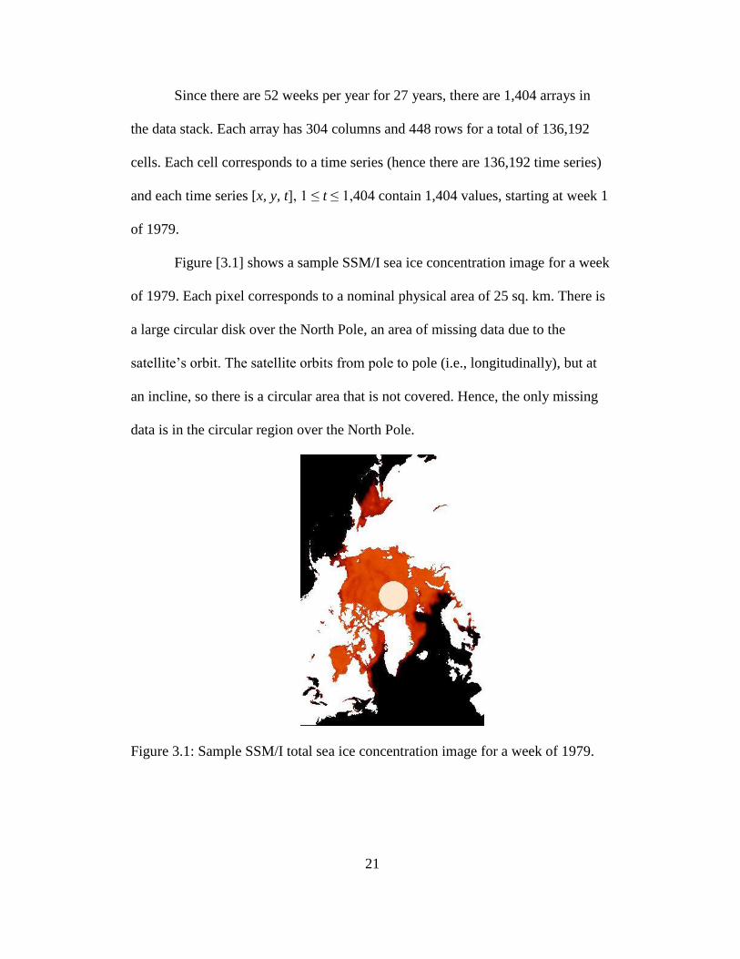
Figure [3.1] shows a sample SSM/I sea ice concentration image for a week
of 1979. Each pixel corresponds to a nominal physical area of 25 sq. km. There is
a large circular disk over the North Pole, an area of missing data due to the
satellite‘s orbit. The satellite orbits from pole to pole (i.e., longitudinally), but at
an incline, so there is a circular area that is not covered. Hence, the only missing
data is in the circular region over the North Pole.
Figure 3.1: Sample SSM/I total sea ice concentration image for a week of 1979.
22
The data for each year is represented by 52 binary files(52 weeks per year)
by NSIDC. Each binary file contains 304 X 448 floating point elements (cells).
The files are read in a little-endian format, taking 32-bits at a time to form a
floating point number. This is a sequential operation and 136,192 (304 * 448)
values are read. The dataset consists of land masses that can be ignored. In the
climate dataset land is denoted by the value 168. Missing data is denoted by the
value of 157.
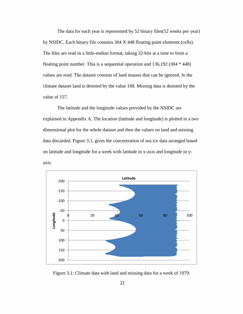
The latitude and the longitude values provided by the NSIDC are
explained in Appendix A. The location (latitude and longitude) is plotted in a two
dimensional plot for the whole dataset and then the values on land and missing
data discarded. Figure 3.1, gives the concentration of sea ice data arranged based
on latitude and longitude for a week with latitude in x-axis and longitude in y-
axis.
Figure 3.1: Climate data with land and missing data for a week of 1979.
-200
-150
-100
-50
0
50
100
150
200
0 20 40 60 80 100
Lon
gitu
de
Latitude
23
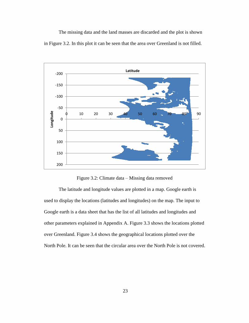
The missing data and the land masses are discarded and the plot is shown
in Figure 3.2. In this plot it can be seen that the area over Greenland is not filled.
Figure 3.2: Climate data – Missing data removed
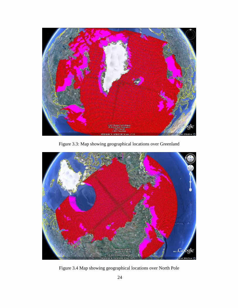
The latitude and longitude values are plotted in a map. Google earth is
used to display the locations (latitudes and longitudes) on the map. The input to
Google earth is a data sheet that has the list of all latitudes and longitudes and
other parameters explained in Appendix A. Figure 3.3 shows the locations plotted
over Greenland. Figure 3.4 shows the geographical locations plotted over the
North Pole. It can be seen that the circular area over the North Pole is not covered.
-200
-150
-100
-50
0
50
100
150
200
0 10 20 30 40 50 60 70 80 90
Lon
gitu
de
Latitude
24
Figure 3.3: Map showing geographical locations over Greenland
Figure 3.4 Map showing geographical locations over North Pole
25
3.2 Partitioning the Data
Partitioning the data is an important task for such a large dataset of
approximately 2GB in size. Since the dataset is huge and we are interested in
local clustering, we have partitioned the dataset both in time and space to
construct the correlation based graph. Since there are 27 years (1979-2005) of
data, the data is partitioned into 9 parts for each 3-year periods by reading the
binary files for only 3 years. The data is also partitioned into 3 parts for each 9-
year periods by reading the binary files for 9 years.
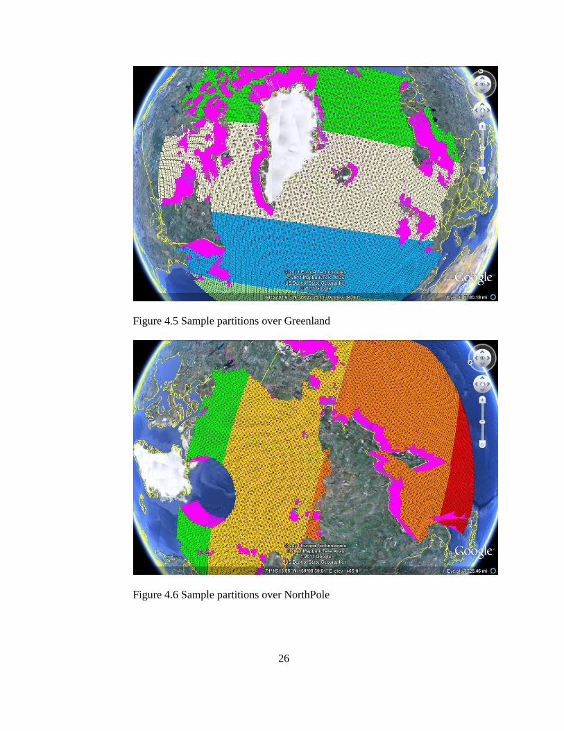
The data can be partitioned in space by giving range of locations (latitudes
and longitudes). The range of latitudes and longitudes varies between (31.10267,
168.3204) and (34.47208, -9.99898). The file ―Positions_Sea.csv‖ containing the
list of locations is explained in Appendix A. The range of points 1 to 10000
represents the range of latitudes and longitudes between (31.10267, 168.3204)
and (50.41197, 155.1614). The range of points 10001 to 20000 represents the
range of latitudes and longitudes between (50.4822, 154.8594) and (69.94001,
169.3236). Figure 3.5 and 3.6 shows a sample of six partitions done on the
dataset.
This partition in space can be done for the 3-year and 9-year periods.
Then the partitioned data is used as input for the functions to compute the degree
distribution, clustering coefficient and characteristic path length as explained in
Appendix A. Partitioning the data helps in computing and the computations can
be performed in parallel for these areas.
26
Figure 4.5 Sample partitions over Greenland
Figure 4.6 Sample partitions over NorthPole

27
3.3 Constructing the Correlation-Based Graph
The correlation-based graph G = (V,E) is constructed from the dataset.
The vertex set V corresponds to the cells. To determine the edge set, the Pearson
correlation coefficient is calculated between all pairs of cells (x, y) and (x’, y’),
1 ≤ x, x’ ≤ 304, 1 ≤ y, y’ ≤ 448, (x, y) ≠ (x’,y’), of time series. That is, the
correlation coefficient is computed between [x,y,t] and [x’,y’,t], 1 ≤ t ≤ 1404, for
each possible pair of cells.
If the correlation coefficient for a pair of cells (x, y) and (x’, y’) at the time
t i.e., [x, y, t] and [x’, y’, t], 1≤ t ≤ 1404, is greater than some threshold, then an
edge is inserted between cells (x, y) and (x’, y’). In our study, correlation values of
0.5, 0.7 and 0.9 are chosen to see how closely nodes are correlated in the graph,
G. The final result is a graph with edges between the cells having a correlation
greater than the threshold. This correlation based graph is used to study the
topological properties of the network.
3.4 Constructing the Random Graph models
Random graph models are used to compare the structure of the correlation
based graph. A random graph is constructed to be of the same number of vertices
as the correlation-based graph and is compared with the correlation based graphs.
In this implementation, the two random graph models used are Erdos Renyi
graphs and Barabasi graphs.
In order to construct the random graphs, the number of edges E in the
correlation-based graphs and the number of possible edges is computed. The

28
random graphs are constructed with same density values as the correlation based
graphs using the procedure explained in Appendix A.
3.4 Constructing the Small-World Graphs
The correlation based graphs are compared with the Watts-Strogatz small
world graph model to examine if they have the characteristics of a small world
graph. The small-world graphs are constructed with the same density as the
correlation based graphs.
3.5 Comparing the graphs
The degree distribution of the correlation based graph is calculated and the
histogram is plotted. The degree of the graph gives the number of edges
connected to each vertex of the graph. This distribution helps us identify the
nodes with a significantly higher vertex degree than the average. In order to
analyze the degree distribution of the graph, the mean of the degree and the mean
of the frequency are denoted by vertical and horizontal bars, respectively. The
degree distributions of the correlation based graphs are compared with the degree
distribution of the random graph models and small world graphs.
The clustering coefficient and the characteristic path lengths of the correlation
based graphs and the random graphs are calculated using the procedure explained
in Appendix A and are compared.

29
3.6 Graph Visualizations
This work tries to visualize the correlation based graphs created for 3-year
periods and 9-year periods and for different correlation thresholds. The degree
distribution of the graph is computed and a histogram is plotted for the
distribution. The characteristic path length of the graph is computed and plotted
against random graphs to see if the correlation based graphs, has the structure of a
small-world graph.
Looking for short-term and long-term changes in graphs is also an important
feature to study how things change over different time periods and is useful to
make predictions. Different characteristics of the graph are analyzed for different
lag periods and different correlation thresholds. These lag periods are used to
identify the changes in the network on a short and long-term basis.
The adjacency list computed based on the correlation coefficient is used to
construct the graph and is represented using the Fruchterman Reingold layout.
The edges between the nodes having only certain thresholds are inserted in the
graph and others are discarded. The connected components in the graph are
computed using the ‗clusters‘ utility in R. ‗clusters‘ utility takes the graph as input
and gives three results : the membership, size of clusters(a vector) and number of
clusters. The membership is a numeric vector giving the cluster id to which each
vertex belongs.
The constructed correlation based graphs, random graphs and the statistical
methods can be used for analyze and compare the correlation based graphs.

30
Chapter 4
ASSESSMENT AND EVALUATION
In this section, the number of edges present in the correlation based graphs
for different correlation thresholds is compared. The degree distribution,
clustering coefficient and the characteristic path length are computed for the
correlation based graph for the sea ice concentration (SIC) anomaly dataset for
thresholds 0.5, 0.7 and 0.9. The results are compared to Erdos-Renyi graph,
Barabasi graph and Watts-Strogatz graph of same density. The number of clusters
present in the graph for correlation thresholds of 0.5, 0.7 and 0.9 are calculated.
The dataset is partitioned in space and the geographical area where the largest
cluster occurs is identified for correlation threshold of 0.7. Graph visualization of
the correlation based graph for this geographical area (with largest cluster) is
presented. Visualizations are also done for the random graph models and Watts-
Strogatz graph of same density. The dataset is also partitioned based on time for
3-year periods and 9-year periods for the area with largest cluster and the degree
distributions are computed. The mean and standard deviations are computed for
the partitions based on time. The comparison of execution times in the Saguaro
cluster and a desktop computer for reading the sea ice anomaly dataset is also
presented.
4.1 Choice of Correlation Thresholds
The correlation-based graphs for the SIC anomaly dataset are constructed
for different correlation thresholds of {0.2, 0.3, 0.4, 0.5, 0.6, 0.7, 0.8, 0.9, and
0.95} and the numbers of edges in the graphs are computed. The number of nodes
31
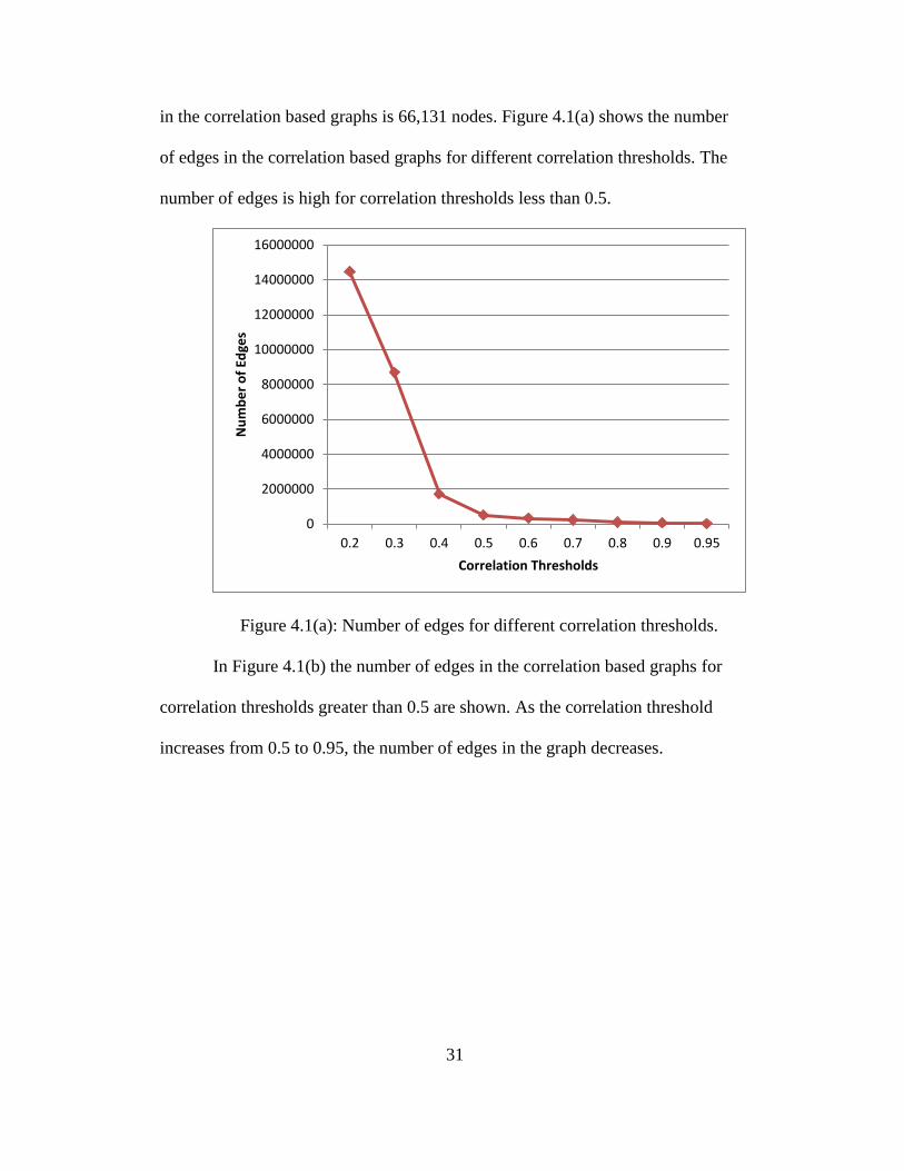
in the correlation based graphs is 66,131 nodes. Figure 4.1(a) shows the number
of edges in the correlation based graphs for different correlation thresholds. The
number of edges is high for correlation thresholds less than 0.5.
Figure 4.1(a): Number of edges for different correlation thresholds.
In Figure 4.1(b) the number of edges in the correlation based graphs for
correlation thresholds greater than 0.5 are shown. As the correlation threshold
increases from 0.5 to 0.95, the number of edges in the graph decreases.
0
2000000
4000000
6000000
8000000
10000000
12000000
14000000
16000000
0.2 0.3 0.4 0.5 0.6 0.7 0.8 0.9 0.95
Nu
mb
er
of
Edge
s
Correlation Thresholds
32
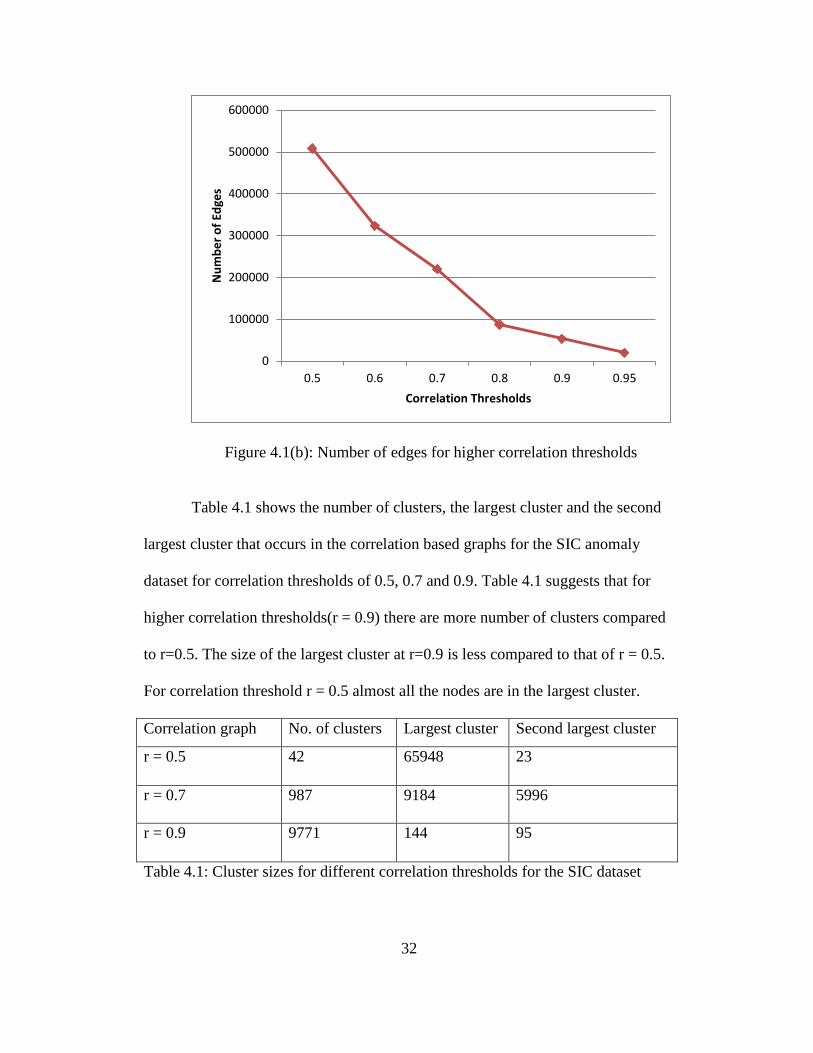
Figure 4.1(b): Number of edges for higher correlation thresholds
Table 4.1 shows the number of clusters, the largest cluster and the second
largest cluster that occurs in the correlation based graphs for the SIC anomaly
dataset for correlation thresholds of 0.5, 0.7 and 0.9. Table 4.1 suggests that for
higher correlation thresholds(r = 0.9) there are more number of clusters compared
to r=0.5. The size of the largest cluster at r=0.9 is less compared to that of r = 0.5.
For correlation threshold r = 0.5 almost all the nodes are in the largest cluster.
Correlation graph No. of clusters Largest cluster Second largest cluster
r = 0.5 42 65948 23
r = 0.7 987 9184 5996
r = 0.9 9771 144 95
Table 4.1: Cluster sizes for different correlation thresholds for the SIC dataset
0
100000
200000
300000
400000
500000
600000
0.5 0.6 0.7 0.8 0.9 0.95
Nu
mb
er
of
Edge
s
Correlation Thresholds
33
Because of the large number of edges and most of the nodes is part of the
largest cluster, the correlation thresholds less than 0.5 are not considered. For
correlation threshold 0.9 the cluster sizes are very small.
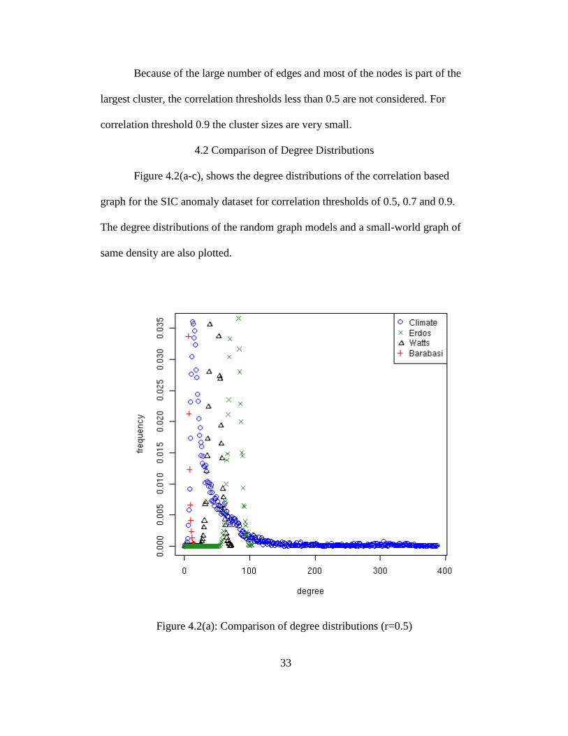
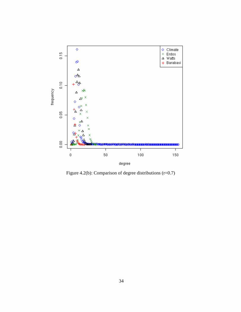
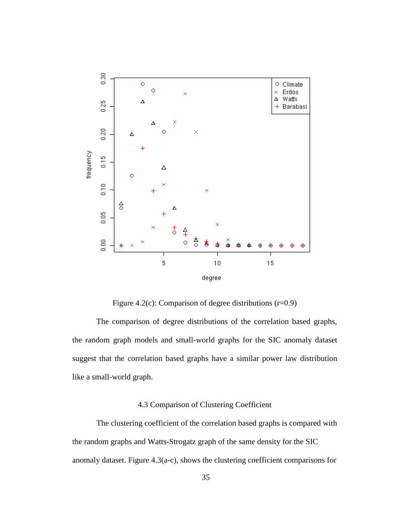
4.2 Comparison of Degree Distributions
Figure 4.2(a-c), shows the degree distributions of the correlation based
graph for the SIC anomaly dataset for correlation thresholds of 0.5, 0.7 and 0.9.
The degree distributions of the random graph models and a small-world graph of
same density are also plotted.
Figure 4.2(a): Comparison of degree distributions (r=0.5)
34
Figure 4.2(b): Comparison of degree distributions (r=0.7)
35
Figure 4.2(c): Comparison of degree distributions (r=0.9)
The comparison of degree distributions of the correlation based graphs,
the random graph models and small-world graphs for the SIC anomaly dataset
suggest that the correlation based graphs have a similar power law distribution
like a small-world graph.
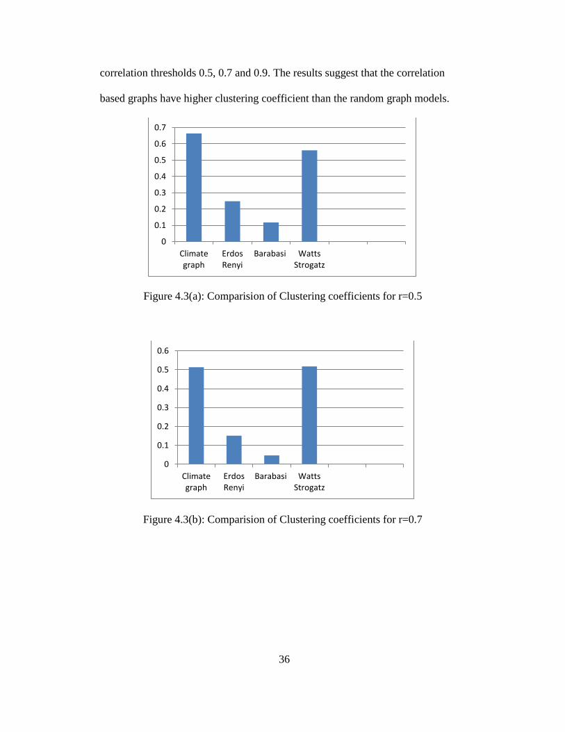
4.3 Comparison of Clustering Coefficient
The clustering coefficient of the correlation based graphs is compared with
the random graphs and Watts-Strogatz graph of the same density for the SIC
anomaly dataset. Figure 4.3(a-c), shows the clustering coefficient comparisons for
36
correlation thresholds 0.5, 0.7 and 0.9. The results suggest that the correlation
based graphs have higher clustering coefficient than the random graph models.
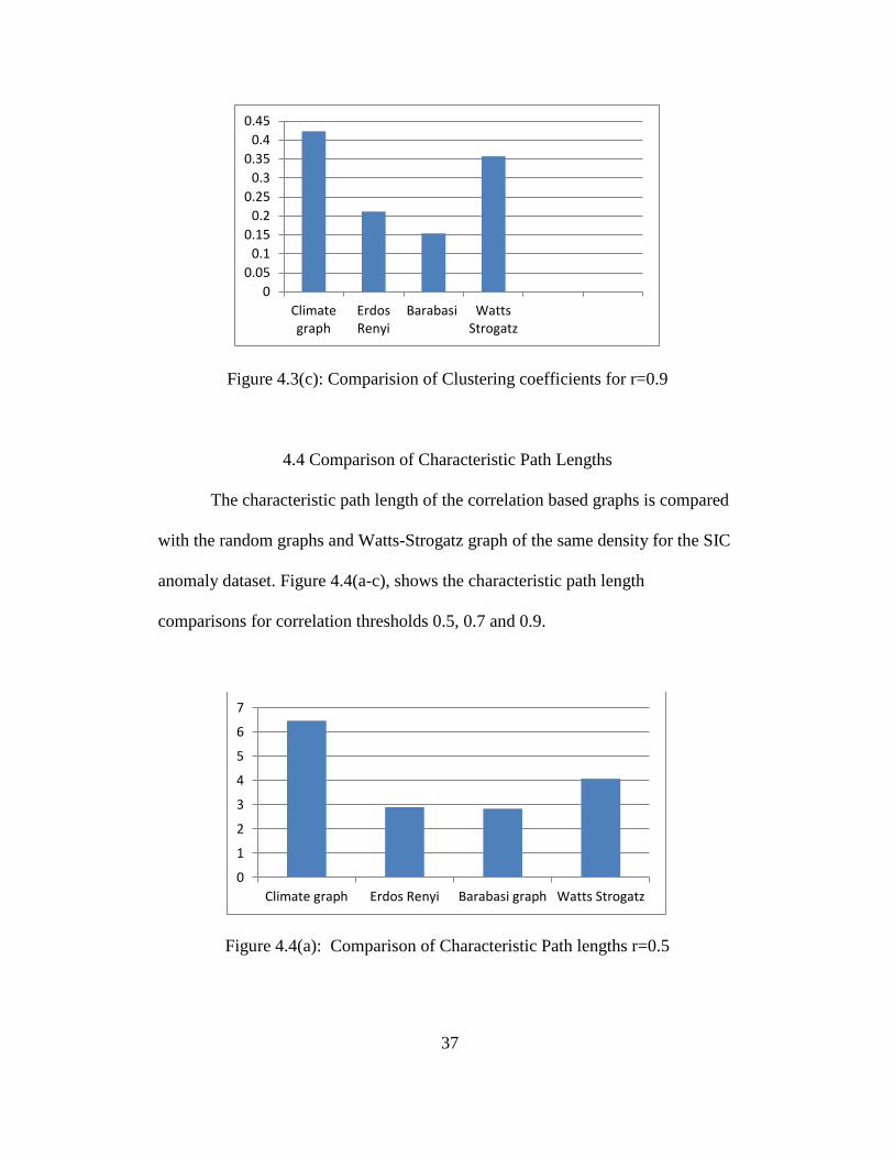
Figure 4.3(a): Comparision of Clustering coefficients for r=0.5
Figure 4.3(b): Comparision of Clustering coefficients for r=0.7
0
0.1
0.2
0.3
0.4
0.5
0.6
0.7
Climategraph
ErdosRenyi
Barabasi WattsStrogatz
0
0.1
0.2
0.3
0.4
0.5
0.6
Climategraph
ErdosRenyi
Barabasi WattsStrogatz
37
Figure 4.3(c): Comparision of Clustering coefficients for r=0.9
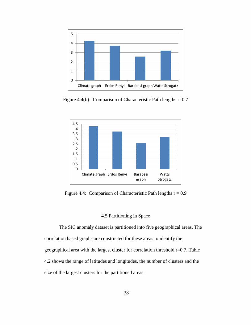
4.4 Comparison of Characteristic Path Lengths
The characteristic path length of the correlation based graphs is compared
with the random graphs and Watts-Strogatz graph of the same density for the SIC
anomaly dataset. Figure 4.4(a-c), shows the characteristic path length
comparisons for correlation thresholds 0.5, 0.7 and 0.9.
Figure 4.4(a): Comparison of Characteristic Path lengths r=0.5
0
0.05
0.1
0.15
0.2
0.25
0.3
0.35
0.4
0.45
Climategraph
ErdosRenyi
Barabasi WattsStrogatz
0
1
2
3
4
5
6
7
Climate graph Erdos Renyi Barabasi graph Watts Strogatz
38
Figure 4.4(b): Comparison of Characteristic Path lengths r=0.7
Figure 4.4: Comparison of Characteristic Path lengths r = 0.9
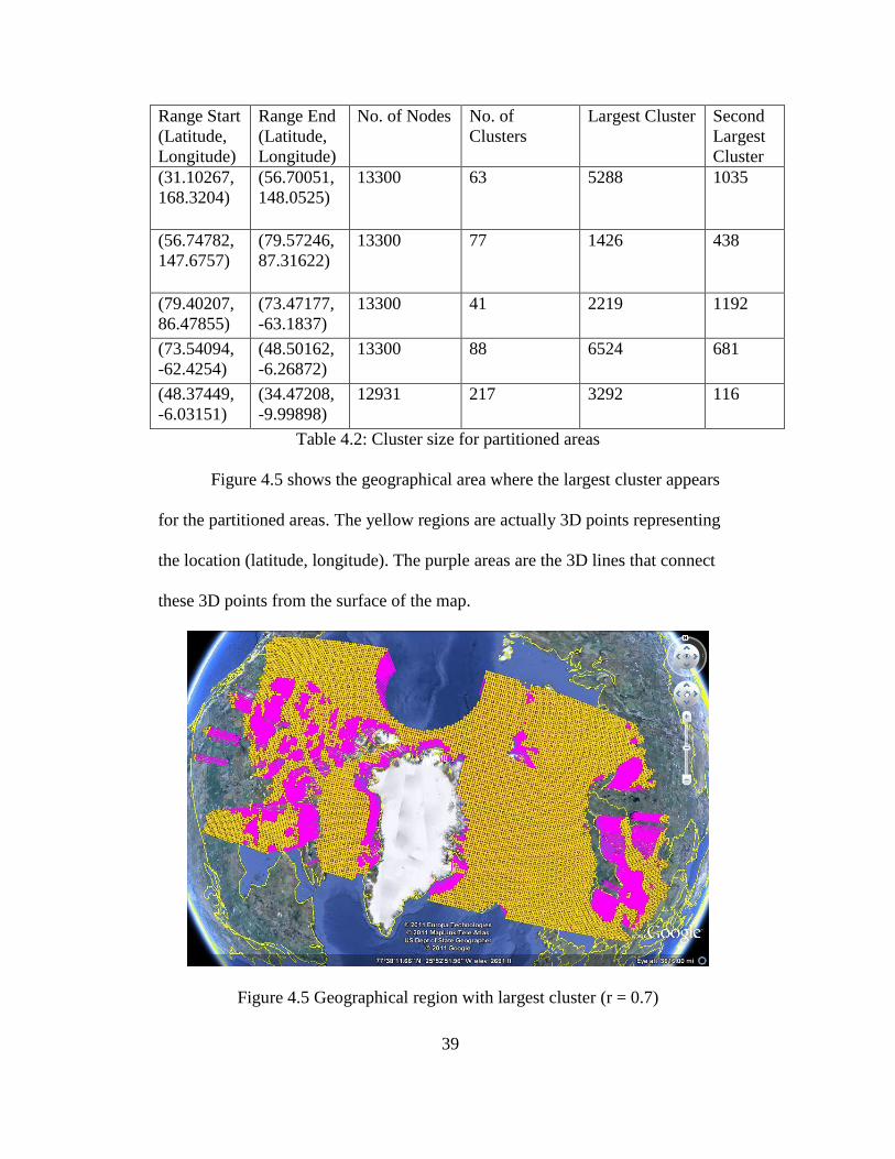
4.5 Partitioning in Space
The SIC anomaly dataset is partitioned into five geographical areas. The
correlation based graphs are constructed for these areas to identify the
geographical area with the largest cluster for correlation threshold r=0.7. Table
4.2 shows the range of latitudes and longitudes, the number of clusters and the
size of the largest clusters for the partitioned areas.
0
1
2
3
4
5
Climate graph Erdos Renyi Barabasi graph Watts Strogatz
00.5
11.5
22.5
33.5
44.5
Climate graph Erdos Renyi Barabasigraph
WattsStrogatz
39
Range Start
(Latitude,
Longitude)
Range End
(Latitude,
Longitude)
No. of Nodes No. of
Clusters
Largest Cluster Second
Largest
Cluster
(31.10267,
168.3204)
(56.70051,
148.0525)
13300 63 5288 1035
(56.74782,
147.6757)
(79.57246,
87.31622)
13300 77 1426 438
(79.40207,
86.47855)
(73.47177,
-63.1837)
13300 41 2219 1192
(73.54094,
-62.4254)
(48.50162,
-6.26872)
13300 88 6524 681
(48.37449,
-6.03151)
(34.47208,
-9.99898)
12931 217 3292 116
Table 4.2: Cluster size for partitioned areas
Figure 4.5 shows the geographical area where the largest cluster appears
for the partitioned areas. The yellow regions are actually 3D points representing
the location (latitude, longitude). The purple areas are the 3D lines that connect
these 3D points from the surface of the map.
Figure 4.5 Geographical region with largest cluster (r = 0.7)
40
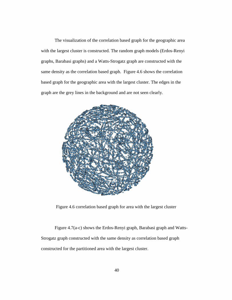
The visualization of the correlation based graph for the geographic area
with the largest cluster is constructed. The random graph models (Erdos-Renyi
graphs, Barabasi graphs) and a Watts-Strogatz graph are constructed with the
same density as the correlation based graph. Figure 4.6 shows the correlation
based graph for the geographic area with the largest cluster. The edges in the
graph are the grey lines in the background and are not seen clearly.
Figure 4.6 correlation based graph for area with the largest cluster
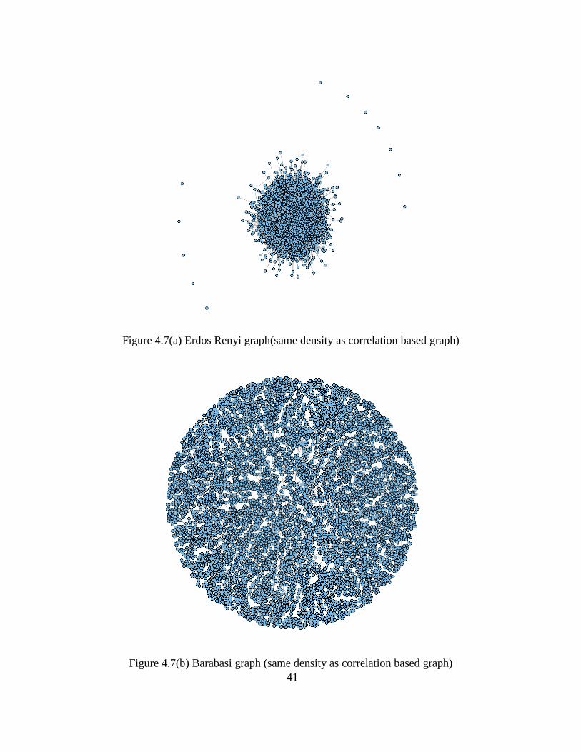
Figure 4.7(a-c) shows the Erdos-Renyi graph, Barabasi graph and Watts-
Strogatz graph constructed with the same density as correlation based graph
constructed for the partitioned area with the largest cluster.
41
Figure 4.7(a) Erdos Renyi graph(same density as correlation based graph)
Figure 4.7(b) Barabasi graph (same density as correlation based graph)

42
Figure 4.7(c) Barabasi graph (same density as correlation based graph)
4.4 Partitions Based on Time
The geographical area with the largest cluster is partitioned based on time
for 3-year and 9-year periods and the degree distributions for the correlation based
graphs are calculated.
4.4.1 Comparisons for 9-year Periods
The degree distributions are calculated for every 9 year periods from 1979
to 2005 for the correlation based graphs for these partitions. Figure 4.8 (a-c)
shows the histogram of the degree distributions for correlation threshold 0.5.
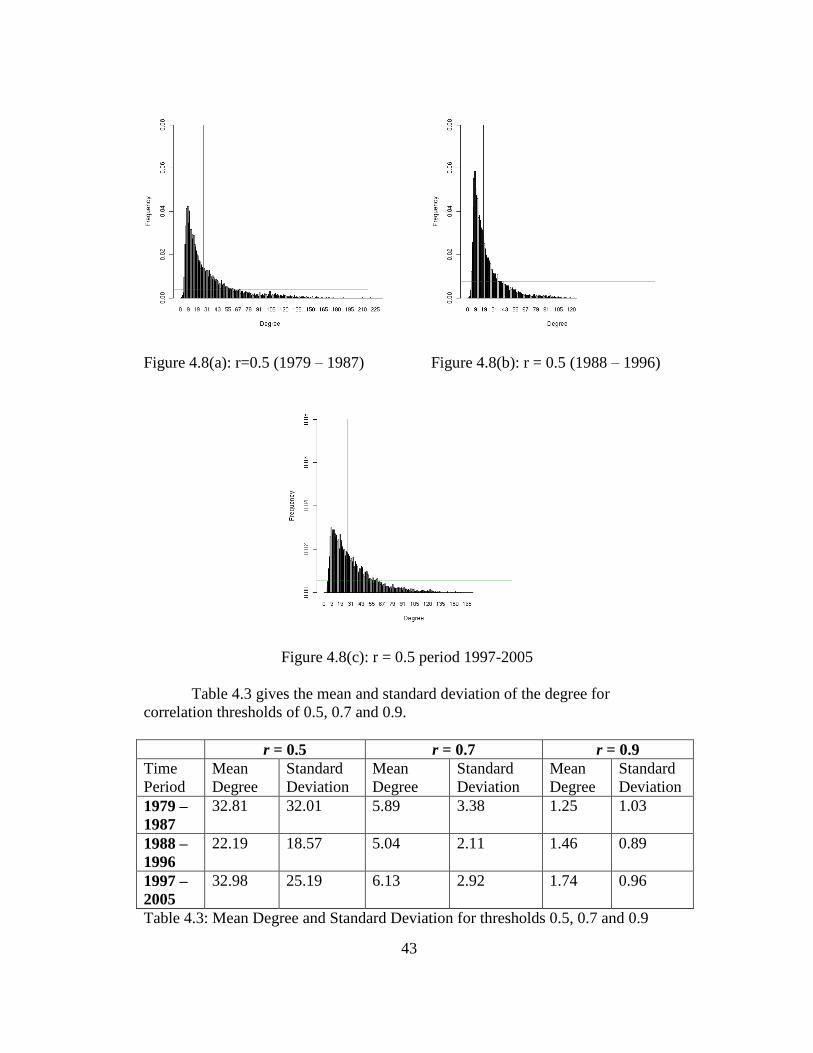
43
Figure 4.8(a): r=0.5 (1979 – 1987) Figure 4.8(b): r = 0.5 (1988 – 1996)
Figure 4.8(c): r = 0.5 period 1997-2005
Table 4.3 gives the mean and standard deviation of the degree for
correlation thresholds of 0.5, 0.7 and 0.9.
r = 0.5 r = 0.7 r = 0.9
Time
Period
Mean
Degree
Standard
Deviation
Mean
Degree
Standard
Deviation
Mean
Degree
Standard
Deviation
1979 –
1987
32.81 32.01 5.89 3.38 1.25 1.03
1988 –
1996
22.19 18.57 5.04 2.11 1.46 0.89
1997 –
2005
32.98 25.19 6.13 2.92 1.74 0.96
Table 4.3: Mean Degree and Standard Deviation for thresholds 0.5, 0.7 and 0.9
44
4.3.1 Comparison for 3-year Periods
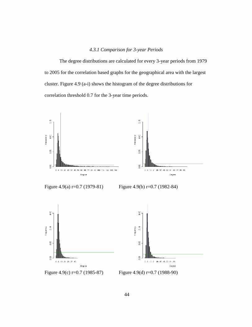
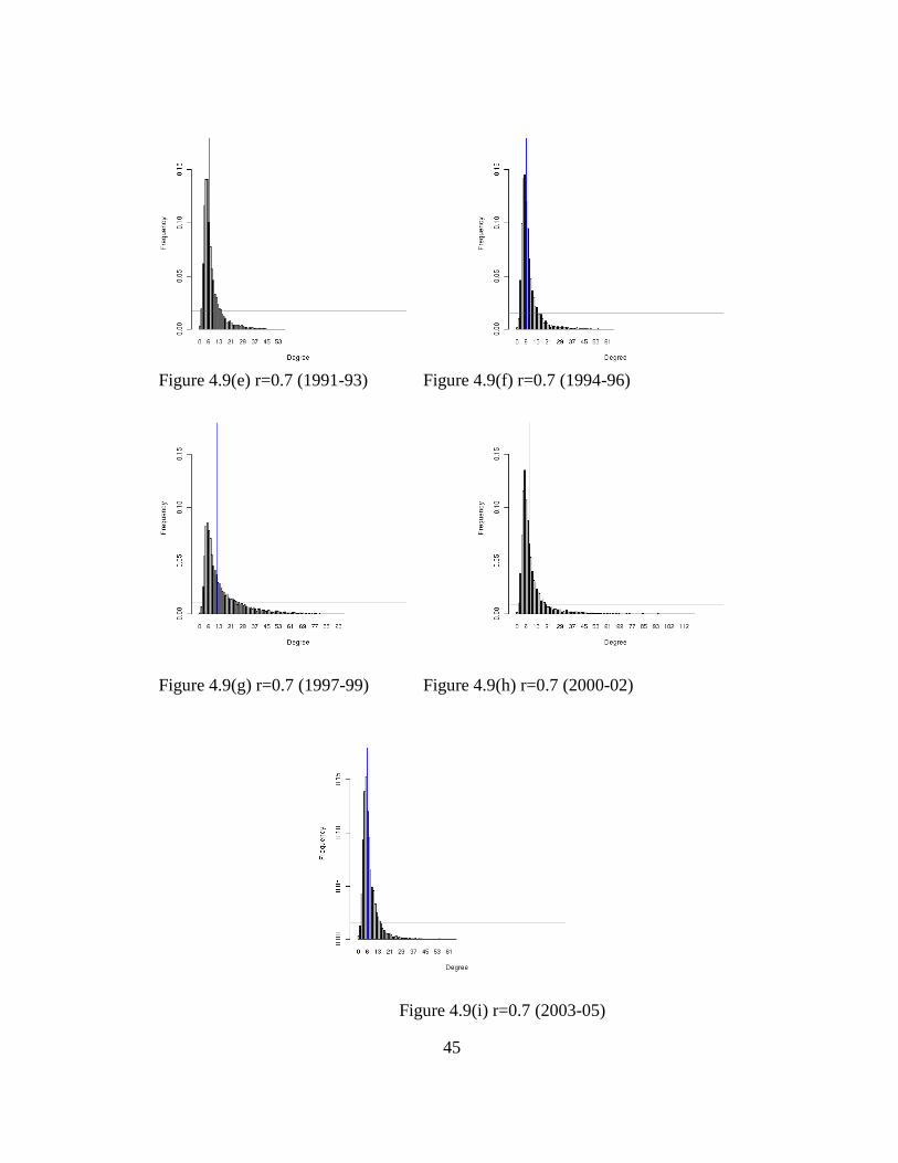
The degree distributions are calculated for every 3-year periods from 1979
to 2005 for the correlation based graphs for the geographical area with the largest
cluster. Figure 4.9 (a-i) shows the histogram of the degree distributions for
correlation threshold 0.7 for the 3-year time periods.
Figure 4.9(a) r=0.7 (1979-81) Figure 4.9(b) r=0.7 (1982-84)
Figure 4.9(c) r=0.7 (1985-87) Figure 4.9(d) r=0.7 (1988-90)
45
Figure 4.9(e) r=0.7 (1991-93) Figure 4.9(f) r=0.7 (1994-96)
Figure 4.9(g) r=0.7 (1997-99) Figure 4.9(h) r=0.7 (2000-02)
Figure 4.9(i) r=0.7 (2003-05)
46
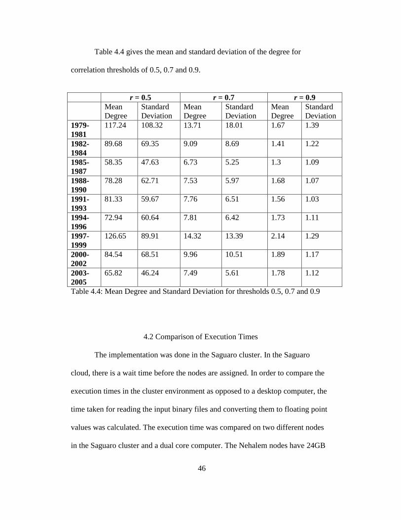
Table 4.4 gives the mean and standard deviation of the degree for
correlation thresholds of 0.5, 0.7 and 0.9.
r = 0.5 r = 0.7 r = 0.9
Mean
Degree
Standard
Deviation
Mean
Degree
Standard
Deviation
Mean
Degree
Standard
Deviation
1979-
1981
117.24 108.32 13.71 18.01 1.67 1.39
1982-
1984
89.68 69.35 9.09 8.69 1.41 1.22
1985-
1987
58.35 47.63 6.73 5.25 1.3 1.09
1988-
1990
78.28 62.71 7.53 5.97 1.68 1.07
1991-
1993
81.33 59.67 7.76 6.51 1.56 1.03
1994-
1996
72.94 60.64 7.81 6.42 1.73 1.11
1997-
1999
126.65 89.91 14.32 13.39 2.14 1.29
2000-
2002
84.54 68.51 9.96 10.51
1.89 1.17
2003-
2005
65.82 46.24 7.49 5.61
1.78 1.12
Table 4.4: Mean Degree and Standard Deviation for thresholds 0.5, 0.7 and 0.9
4.2 Comparison of Execution Times
The implementation was done in the Saguaro cluster. In the Saguaro
cloud, there is a wait time before the nodes are assigned. In order to compare the
execution times in the cluster environment as opposed to a desktop computer, the
time taken for reading the input binary files and converting them to floating point
values was calculated. The execution time was compared on two different nodes
in the Saguaro cluster and a dual core computer. The Nehalem nodes have 24GB
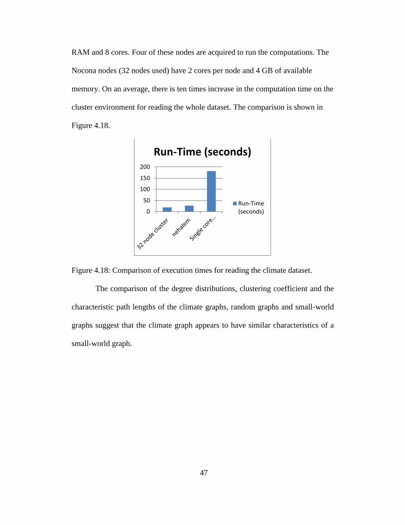
47
RAM and 8 cores. Four of these nodes are acquired to run the computations. The
Nocona nodes (32 nodes used) have 2 cores per node and 4 GB of available
memory. On an average, there is ten times increase in the computation time on the
cluster environment for reading the whole dataset. The comparison is shown in
Figure 4.18.
Figure 4.18: Comparison of execution times for reading the climate dataset.
The comparison of the degree distributions, clustering coefficient and the
characteristic path lengths of the climate graphs, random graphs and small-world
graphs suggest that the climate graph appears to have similar characteristics of a
small-world graph.
0
50
100
150
200
Run-Time (seconds)
Run-Time(seconds)

48
Chapter 5
CONCLUSIONS AND FUTURE WORK
This research presents software based tools that can be used to analyze and
study the structural characteristics of dynamic networks. The tools are used to
construct the correlation based graphs, the random graphs and the small-world
graphs. The SIC dataset was partitioned in space and the geographical area with
the largest cluster is identified. Correlations are computed by partitioning the area
with the largest cluster for 3-year and 9-year periods. Comparisons of the degree
distributions of the correlation based graphs are used to identify trends in the
networks over a period of time and can be used to study short-term and long-term
changes.
Clustering coefficients of the graphs are compared with the random graphs
and the results suggest that for climate graphs, the clustering coefficient is higher
than that of the random graphs. The characteristic path lengths are used as a tool
to analyze the correlation based graphs with the random graphs. The results
suggest that the correlation based graphs appears to have similar characteristics of
a small-world graph.
In continuation to this work, this tool can be enhanced as a GUI based
application and can be used as a generic tool to analyze the structural
characteristics of dynamic networks. A new method can be developed to
communicate with the Saguaro cloud to acquire maximum number of nodes for
the computation. This method should also assess the waiting time for execution of
the jobs in the cluster. New areas of application in communication networks,

49
social networks, transportation networks and many more domains can be
identified and studied to identify the properties of dynamic networks.
50
REFERENCES
[1] A. A. Tsonis and P. J. Roebber, ―The architecture of the climate network,‖
Physica A 333, pp. 497–504, 2004.
[2] D. J. Watts and S. H. Strogatz, ―Collective dynamics of ―small-world‖
networks,‖ Nature, vol. 393, pp. 440-442, 1998.
[3] A. A. Tsonis, K. L. Swanson, and P.J. Roebber, ―What do networks have to do
with climate?,‖ Bulletin of the American Meteorological Society, pp. 585-595,
May 2006.
[4] Z. M. Saul and V. Filkov, ―Exploring biological network structure using
exponential random graph models‖, Oxford Journals Life Sciences Bioinformatics
Volume23, Issue19, pp. 2604-2611,2007.
[5] A.-L. Barabasi and R. Albert, ―Emergence of scaling in random networks‖,
Science 286, pp. 509–512, 1999.
[6] R. Milo, S. Shen-Orr, S. Itzkovitz, N. Kashtan, D. Chklovskii and U. Alon,
―Network Motifs: Simple Building Blocks of Complex Networks‖, Science 298,
pp. 824-827, 2002.
[7] A. D. King, N. Pržulj, I. Jurisica, ―Protein complex prediction via cost-based
clustering‖, Bioinformatics, Volume 20, Number 17, pp. 3013-3020, 2004.
[8 ] Web link, ―Max Arctic Sea Ice Coverage Ties All-Time Low,‖ retrieved on
Feb 20 2011, http://www.climatecentral.org/blog/max-arctic-ice-coverage-ties-all-
time-low/.
[9] A. A. Tsonis, ―Is global warming injecting randomness into the climate
system?‖, Earth Observation Science, vol.85,no.38, pp. 361-364, September 2004.
[10] Web link, ―National Snow and Ice Data Center,‖ retrieved on March 25
2011, http://www.nsidc.org/about/expertise/overview.html
[11] Web link, ―Introduction to Time Series Analysis,‖ retrieved on March 22
2011, http://www.itl.nist.gov/div898/handbook/pmc/section4/pmc4.htm
[12] Web link, ―Time Series Analysis,‖ retrieved on March 25 2011,
http://www.statsoft.com/textbook/time-series-analysis/
[13] I. J. Farkas, H. Jeong, T. Vicsek, A.-L. Barabasi, and Z.N. Oltvai, ―The
topology of the transcription regulatory network in the yeast Saccharomyces
cerevisiae,‖ Physics, 318A, pp.601–612, 2003.
51
[14] H. Agrawal, ―Extreme self-organization in networks constructed from gene
expression data,‖ Phys.Rev. Lett., 89, pp.268–702, 2002.
[15] D. E. Featherstone and K. Broadie, ―Wrestling with pleiotropy: Genomic and
topological analysis of the yeast gene expression network,‖ Bioessays, 24, pp.
267–274, 2002.
[16] R. N. Mantegna, ―Hierarchical structure in financial Markets,‖ Eur. Phys. J.,
11B, pp.193–197, 1999.
[17] J.-P. Onnela, A. Chakraborti, K. Kaski, J. Kertesz, and A. Kanto, ―Dynamics
of market correlations:Taxonomy and portfolio analysis,‖ Phys. Rev. E, 68,
doi:10.1103/PhysRevE.68.056110, 2003.
[18] J.-P. Onnela, K. Kaski, and J. Kertesz, ―Clustering and information in
correlation based financial networks,‖ Eur. Phys. J., 38B, pp.353–362, 2004.
[19] J. L. Rodgers and W. A. Nicewander, ―Thirteen Ways to Look at the
Correlation Coefficient,‖ The American Statistician Vol. 42, No. 1, pp. 59-66, Feb
1998.
[20] Web link, ―Basic Statistics,‖ retrieved on February 15 2011,
http://www.statsoft.com/textbook/basic-statistics/
[21] Web link, ―Network Analyzer Help,‖ retrieved on February 15 2011,
http://med.bioinf.mpi-inf.mpg.de/netanalyzer/help/2.6.1/index.html
[22] Web link, ―Introductory Notes on Networks,‖ retrieved on February 15 2011,
http://www2.econ.iastate.edu/classes/econ308/tesfatsion/NetworkIntro.LT.htm
[23] Web link, ―Dijkstra's Algorithm,‖ retrieved on Mar 25 2011,
http://www.personal.kent.edu/~rmuhamma/Algorithms/MyAlgorithms/GraphAlg
or/dijkstraAlgor.htm
[24] S. N. Dorogovtsev, J. F. F. Mendes, and A. N. Samukhin, ―Size-dependent
degree distribution of a scale-free growing network,‖, Phys. Rev. E 63, 062101,
2001. [4 pages]
[25] R. Albert and A.-L. Barabasi, ―Statistical mechanics of complex networks,‖
Rev. Mod. Phys. 74, pp. 47–97, 2002.
[26] P. Erdös and A. Rényi, ―On random graphs,‖ Publicationes Mathematicae 6,
pp.290-297, 1959.
52
[27] Web link, ―Graph Theoretic Approach to Quantifying Community
Structure,‖ retrieved on February 15 2011,
http://www.tiem.utk.edu/~mmfuller/WebDocs/HTMLfiles/GrTh_details.html
[28] A.-L. Barabasi and R. Albert, ―Emergence of scaling in random networks,‖
Science 286, pp.509-512. 1999.
[29] Web link, ―Network Models,‖ retrieved on February 17 2011,
http://sole.dimi.uniud.it/~massimo.franceschet/networks/nexus/models.html
[30] Web link, ―Small-world properties,‖ retrieved on February 19 2011,
http://www.techrepublic.com/whitepapers/small-world-graphs-models-analysis-
and-applications-in-network-designs/2518907
[31] Web link, ―Ira A. Fulton High Performance Computing Initiative,‖ retrieved
on Mar 2 2011, http://hpc.asu.edu/
[32] B. Ripley, ―The R project in statistical computing,‖ MSOR Connections
1:23–25 (available from mathstore.ac.uk/newsletter/), 2001.
[33] C. T. Butts, ―network: a Package for Managing Relational Data in R,‖
Journal of Statistical Software, Volume 24, Issue 2, 2008.
URL http://www.jstatsoft.org.ezproxy1.lib.asu.edu/v24/i02/
[34] C. T. Butts, ―Social Network Analysis with sna,‖ Journal of Statistical
Software, Volume 24, Issue 6, 2008. URL
http://www.jstatsoft.org.ezproxy1.lib.asu.edu/v24/i06/
[35] C. T. Butts, ―sna: Tools for Social Network Analysis.‖ R package version
2.1, 2010. URL http://CRAN.R-project.org/package=sna.
[36] Web link, ―The igraph library,‖ retrieved on Mar 2 2011,
http://igraph.sourceforge.net
[37] T. M. J. Fruchterman and E. M. Reingold, ―Graph Drawing by Force-
directed Placement,‖ Software—Practice and Experience, VOL. 21(1 1), pp.1129-
1164, November 1991.
[38] G. Malewicz, M. H. Austern, A. J. C. Bik, J. C. Dehnert, I. Horn, N. Leiser,
and G. Czajkowski, ―Pregel: a system for large-scale graph processing,‖ In
Proceedings of the 2010 international conference on Management of
data (SIGMOD '10). ACM, New York, NY, USA, pp.135-146,
DOI=10.1145/1807167.1807184, 2010.
53
[39] J.-P. Onnela, J. Saramaki, K. Kaski, and J. Kertesz, ―Financial market - a
network perspective‖, In Practical Fruits of Econophysics, pp. 302–306. Springer,
2006.
[40] Web link, ―Community Detection In R,‖ retrieved on March 4 2011,
http://igraph.wikidot.com/community-detection-in-r
[41] J. Dean and S. Ghemawat, ―MapReduce: simplified data processing on large
clusters,‖ Commun. ACM 51, pp.107-113, DOI=10.1145/1327452.1327492,
2008.
[42] S. Milgram, ―The small-world problem,‖ Psych. Today, 1, pp. 60–67, 1967.

54
APPENDIX A
INSTRUCTION MANUAL FOR THE TOOLS
Accessing the Saguaro Environment
The computations are performed in the Saguaro cluster at the High
Performance Computing Initiative facility. The operating used for the client slide
is Ubuntu 10.04. The command to login to the cluster using secure shell is ―ssh
<username>:saguaro.fulton.asu.edu‖ where <username> is the name
registered in the Saguaro environment. To login in interactive mode (to view the
graphs and the plots), the command “ssh username –X –I <username>
saguaro.fulton.asu.edu” is used.
The nodes in the Saguaro cluster are used using the command ―qsub –l
nodes=X:node_name‖. X is the number of nodes to be acquired and the optional
node_name can be specific nodes like tigerton, nehalem, harpertown, and
clovertown. The default nonoca node has 2GB per CPU. Our tigerton computers
can handle that. They have 16 cpu's and 64GB. of RAM. Nehalem nodes have
24GB RAM and 8 processors. Harpertown nodes have 8 cores and 16GB RAM.
Clovertowwn nodes have 8 cores and 16GB RAM, as well.
The computations are done using 4 nehalem nodes. The 4 nehalem nodes
has the same computation time as 32 nonoca nodes and the time taken to acquire
32 nonoca nodes is higher compared to 4 nehalem nodes. To acquire 4 nehalem
nodes, the command ―qsub –l nodes=4:nehalem‖ is used. The command for
interactive mode is ―qsub –X –I –l nodes=4:nehalem‖

55
After a successful login to the cluster, the command ―use R-2.11.1‖ is
used. Then the command ―R‖ is entered in the terminal to enter the R command
prompt.
Geographical locations of the dataset
The latitudes and the longitudes for the locations are provided by NSIDC.
The documentation for these tools can be found in the web page
―http://nsidc.org/data/polar_stereo/tools_geo_pixel.html‖. The files are
psn25lats_v2.dat (latitudes) and psn25lons_v2.dat (longitudes).The
latitude/longitude grids are in binary format, and stored as 4-byte long integers in
little-endian format. The values are scaled by 100000. The binary files are read by
the program readLatLon.R and the result is written to the file positions.csv(a
comma separated file) that be imported into Microsoft Excel. The positions.csv
file also contains the data values for a week. This contains the entire 136,192
locations. The data values that are greater than 100 are masked and only the sea
ice data is obtained and copied to a xls document. The file Positions_Sea.csv
contains the list of latitudes and longitudes that has only the values on the sea and
the missing values removed.
Then the tool Earthpoint(www.earthpoint.us) is used to convert the xls
sheet to kml file compatible with Google earth to be displayed. A user account
must be created in earthpoint.us to make the conversion and for students the
account is free. In the xls document additional parameters like IconScale,
IconType, etc are added and the documentation for the extra paramenters are
56
provided in the web page http://earthpoint.us/ExcelToKml.aspx. Since only a
maximum of 35000 rows are to be used the sea ice locations are split into two
files and are used in ExcelToKml conversions. The kml file needs to be
opened using Google Earth software. Google Earth displays the locations on the
globe.
Reading the Dataset
The readData function will read all the values from the binary files for 27
years. The data for each year is present inside the folder ―ClimateData‖ with
folder names 1979 through 2005. The source codes are also placed in the same
folder ―ClimateData‖. Each folder for the year has 52 files for each week.
The folders are copied from the local machine to the Saguaro cluster using
secure copy. The command ―scp ClimateData/*
<username>@saguaro.fulton.asu.edu:~/ClimateData/‖ is used to copy the
contents of the data and source code from local machine to the Saguaro cluster. In
order to copy the files from Saguaro to current folder in the local machine, the
command
“scp <username>@saguaro.fulton.asu.edu:~/ClimateData/<foldername>/* .‖
must be used.
The function readData reads the data for 27 years. The function prototype
is readData(range_beg, range_end, start, end, LAG). If the data has to be
partitioned for 9-year periods, type the following command in the prompt.
>source(“readData_9years.R”, echo=T, print.eval=T)

57
This reads the climate dataset for 27 years and partitions the data into 3 parts. In
this file readData_9years.R the parameter values are start=1 and end=9 to the
function readData for values to be read for 9 years.
If the data has to be partitioned for 3-year periods, type the following
command in the prompt,.
>source(“readData_3years.R”, echo=T, print.eval=T)
In this file readData_3years.R there are variables that can be configured.
In this file readData_3years.R the parameter values are start=1 and end=3 to the
function readData for values to be read for 3 years.
The configuration variables are,
BASE_YEAR = 1979
ROW = 304
COL = 448
NUM_WEEKS = 52
LAG_WEEKS = 2
The BASE_YEAR is used to change the year from which the data should
be read. ROW and COL gives the dimension of the data in the file. The number of
weeks to be read can also be configured using NUM_WEEKS variable. The
LAG_WEEKS variable can be used to read the data with a lag of 0, 1, 2, 3, etc
weeks.
The dataset for the 3-year and 9-year periods can be partitioned in space
by modifying the range_start and range_end parameters in the call to the function
readData. The range_start and range_end are the index values that correspond to
a set of latitudes and longitudes in the file Positions_Sea.csv.
58
Computing the Pearson Correlation Coefficient
The Pearson correlation coefficient and the graph is constructed for
correlation coefficient greater than the threshold using the function,
corGraphPearson(data, threshold, filename).The output of the function is the
correlation based graph. The input parameters are the data to be passed, the
correlation threshold to be used to construct the correlation based graphs and the
filename to store temporary results like the number clusters in the graph and the
size of the clusters. The file correlationTool_9years.R and
correlationTool_3years.R must be invoked before calling the function
corGraphPearson. This function is invoked in the prompt using,
>source(“correlationTool_9years.R”,echo=T,print.eval=T)
>G1 = corGraphPearson(data, 0.7, “file.txt”)
Plotting the Graphs
The Pearson correlation coefficient and the graph is constructed for
correlation coefficient greater than the threshold using the function,
corGraphPlot(data, threshold, filename).The output of the function is the
correlation based graph. The input parameters are the data to be passed, the
correlation threshold to be used to construct the correlation based graphs and the
filename to store temporary results like the number clusters in the graph and the
size of the clusters. The files correlationToolPlot_9years.R or
correlationToolPlot_3years.R must be invoked before calling the function
corGraphPlot. This function is invoked in the prompt using,
>source(“correlationToolPlot_9years.R”,echo=T,print.eval=T)

59
>resultGraph = corGraphPlot(data, 0.7, “file.txt”)
The correlationToolPlot_9years.R uses another file igraph_randomPlot.R
to plot the random graphs and the small-world graphs. The functions to plot the
small-world graphs are placed inside the igraph_randomPlot.R file. The output
files are stored as .png files in the folders plot_r05_9 or plot_r05_3 depending on
the data processed for 3 years or 9 years.
Computation of Degree Distributions
The files correlationToolPlot_9years.R or correlationToolPlot_3years.R
must be invoked before calling the function degreeDist depending on computation
for 3 year periods or 9 year periods. The graph that is computed using
corGraphPearson is passed as a parameter to the function degreeDist to compute
the degree distribution of the graph. In this function the density of the correlation
based graph is computed and used to construct the random graphs and the small-
world graphs. The degree distributions of the random graphs and the small-world
graphs are also computed.
The prototype of the function is degreeDistribution(graph, id, path) where
graph is the correlation based graph, id is the identifier used for the distribution if
many distributions are created for different time periods and path is the path used
to store the results.
>source(“correlationTool_9years.R”,echo=T,print.eval=T)
>degreeDist(G1, 0.7, “graph_r07/”)
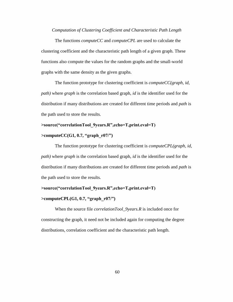
60
Computation of Clustering Coefficient and Characteristic Path Length
The functions computeCC and computeCPL are used to calculate the
clustering coefficient and the characteristic path length of a given graph. These
functions also compute the values for the random graphs and the small-world
graphs with the same density as the given graphs.
The function prototype for clustering coefficient is computeCC(graph, id,
path) where graph is the correlation based graph, id is the identifier used for the
distribution if many distributions are created for different time periods and path is
the path used to store the results.
>source(“correlationTool_9years.R”,echo=T,print.eval=T)
>computeCC(G1, 0.7, “graph_r07/”)
The function prototype for clustering coefficient is computeCPL(graph, id,
path) where graph is the correlation based graph, id is the identifier used for the
distribution if many distributions are created for different time periods and path is
the path used to store the results.
>source(“correlationTool_9years.R”,echo=T,print.eval=T)
>computeCPL(G1, 0.7, “graph_r07/”)
When the source file correlationTool_9years.R is included once for
constructing the graph, it need not be included again for computing the degree
distributions, correlation coefficient and the characteristic path length.