Embed Size (px)
Citation preview

Corporate / Logo Standards
The Master Brand Logo
The Cummins logo is the primary symbol used worldwide to representour company, our products and our people. It is a valuable asset that must beprotected.
Our brand position is “dependability,” so it is very important to demonstrate consistency and quality in the way we use and display the Cummins logo on all external and internal materials.
Use of the logo standards and logo art will ensure that our brand symbol is used properly and effectively.
Trademark Integrity
Don’t condense, stretch, reshape, add to or alter the logo in any way.
Don’t use the logo in an outline form or fill the logo with a pattern.
Don’t fill the type in the logo with a color different from the background.
Don’t use the logo in a sentence or as the letter “C” in a word.
Don’t allow other graphic shapes to touch or overlap the logo.
The logo can be reversed out of a color background or photograph, and maybe embossed or debossed. When the logo is reversed, the background image shows through the letters, as if the letters are cut out.
The shape of the logo may be used to create the appearance of embossing for applications such as PowerPoint backgrounds providing it is used with a complete logo in white or black.
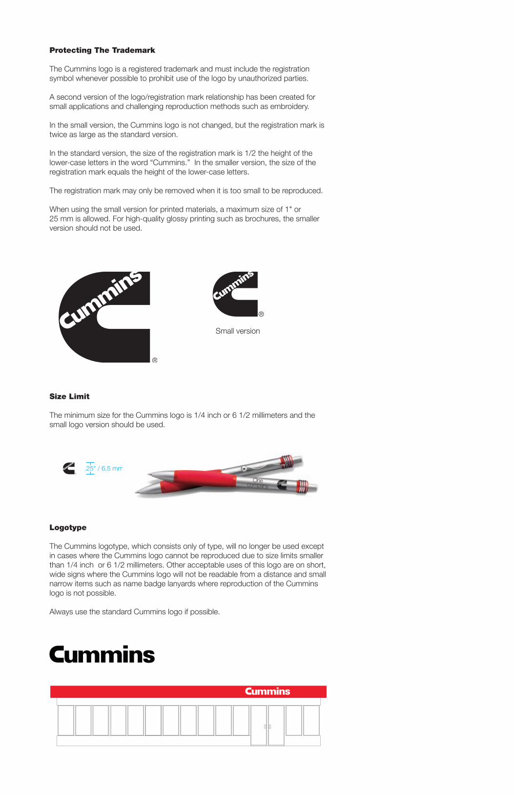
Protecting The Trademark
The Cummins logo is a registered trademark and must include the registration symbol whenever possible to prohibit use of the logo by unauthorized parties.
A second version of the logo/registration mark relationship has been created for small applications and challenging reproduction methods such as embroidery.
In the small version, the Cummins logo is not changed, but the registration mark is twice as large as the standard version.
In the standard version, the size of the registration mark is 1/2 the height of the lower-case letters in the word “Cummins.” In the smaller version, the size of the registration mark equals the height of the lower-case letters.
The registration mark may only be removed when it is too small to be reproduced.
When using the small version for printed materials, a maximum size of 1" or25 mm is allowed. For high-quality glossy printing such as brochures, the smaller version should not be used.
Small version
Size Limit
The minimum size for the Cummins logo is 1/4 inch or 6 1/2 millimeters and the small logo version should be used.
Logotype
The Cummins logotype, which consists only of type, will no longer be used except in cases where the Cummins logo cannot be reproduced due to size limits smaller than 1/4 inch or 6 1/2 millimeters. Other acceptable uses of this logo are on short, wide signs where the Cummins logo will not be readable from a distance and small narrow items such as name badge lanyards where reproduction of the Cummins logo is not possible.
Always use the standard Cummins logo if possible.
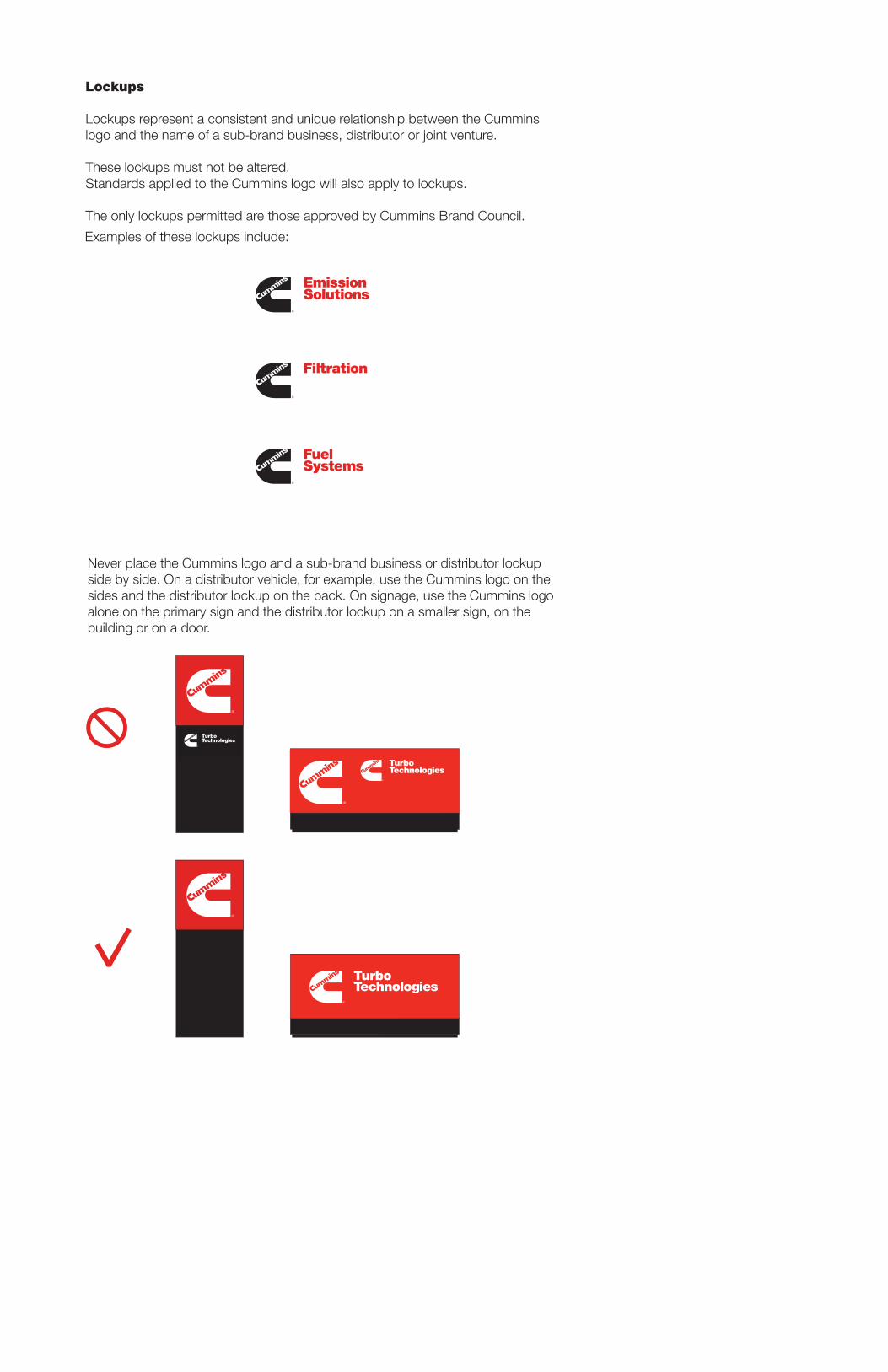
Lockups
Lockups represent a consistent and unique relationship between the Cummins logo and the name of a sub-brand business, distributor or joint venture.
These lockups must not be altered.Standards applied to the Cummins logo will also apply to lockups.
The only lockups permitted are those approved by Cummins Brand Council.These are the lockups currently approved for use:
Sub-brand businesses:
North Americandistributors:
SouthernPlains
Northeast
PowerSystems
Mid-South
Northwest
Cumberland
RockyMountain
WesternCanada
Metropower
Bridgeway
West
Atlantic
NPower
PowerSouth
EasternCanada
CalPacific
CentralPower
Mid-StatesPower
Examples of these lockups include:
Never place the Cummins logo and a sub-brand business or distributor lockupside by side. On a distributor vehicle, for example, use the Cummins logo on the sides and the distributor lockup on the back. On signage, use the Cummins logo alone on the primary sign and the distributor lockup on a smaller sign, on thebuilding or on a door.
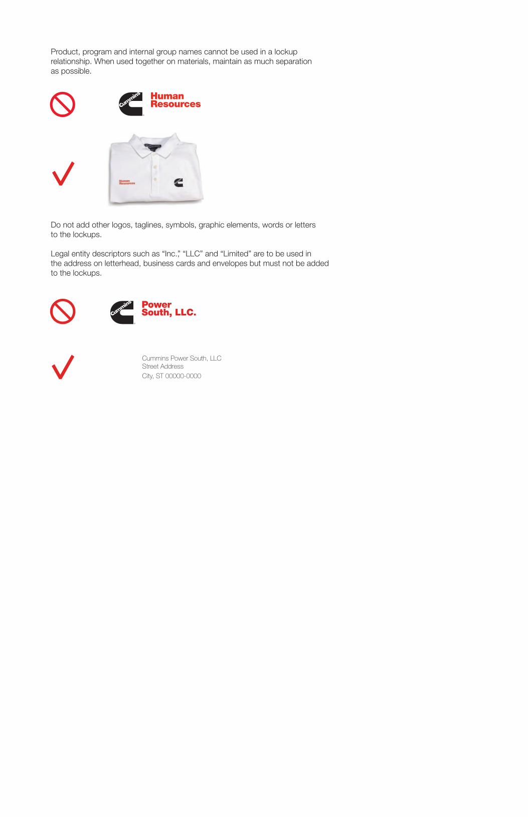
Product, program and internal group names cannot be used in a lockup relationship. When used together on materials, maintain as much separation as possible.
Do not add other logos, taglines, symbols, graphic elements, words or letters to the lockups.
Legal entity descriptors such as “Inc.,” “LLC” and “Limited” are to be used in the address on letterhead, business cards and envelopes but must not be added to the lockups.
Cummins Power South, LLC Street Address
City, ST 00000-0000
HumanResources
PowerSouthTechnical Services
TechnicalServices
Never place the Cummins logo and a sub-brand business or distributor lockupside by side. On a distributor vehicle, for example, use the Cummins logo on the sides and the distributor lockup on the back. On signage, use the Cummins logo alone on the primary sign and the distributor lockup on a smaller sign, on thebuilding or on a door.
Product, program and internal group names cannot be used in a lockup relationship. When used together on materials, maintain as much separation as possible.
Do not add other logos, taglines, symbols, graphic elements, words or letters to the lockups.
Legal entity descriptors such as “Inc.,” “LLC” and “Limited” are to be used in the address on letterhead, business cards and envelopes but must not be added to the lockups.
Cummins Power South, LLC Street Address
City, ST 00000-0000
HumanResources
PowerSouthTechnical Services
TechnicalServices

Color Standards
In order to build a strong association with the color red, we must use the colorboldly, consistently and frequently.
The approved red for use on all Cummins materials is Pantone 485.
The Cummins color palette is PMS (Pantone Matching System) 485red, black and white.
The Cummins logo may be printed in black or white but cannot be printed red.
PMS 485 red is the primary color for backgrounds and for sub-brand business and distributor names used with the Cummins logo.
The approved color combinations for use of the Cummins logo are:
White on PMS 485 red.
White on red provides better contrastbetween the logo and backgroundthan black on red.
This is the preferred color combinationfor most applications.
White on black.
White on black provides maximum contrastbetween the logo and background. Black isa versatile color that is most effective as abackdrop for other colors.
This is a secondary color combination.
Black on white.
Black on white provides maximum contrastbetween the logo and background. White is the base for most printed materials and is a practical color for vehicles.
This is a practical color combination.
Black on red.
Black on red provides less contrastbetween the logo and background. This combination may be used to complement some color combinations.
This color combination is acceptable but not preferred for most applications.
Red, black and white may be used in the combinations shown below.
Pantone® 485
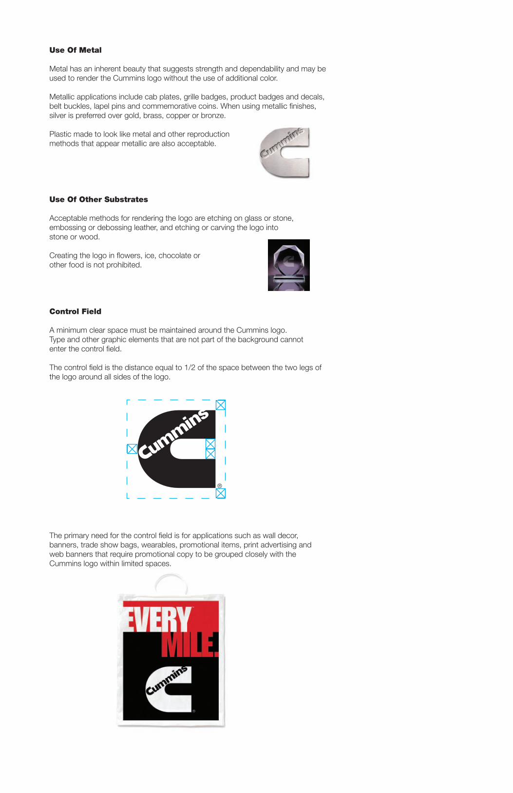
Use Of Metal
Metal has an inherent beauty that suggests strength and dependability and may be used to render the Cummins logo without the use of additional color.
Metallic applications include cab plates, grille badges, product badges and decals, belt buckles, lapel pins and commemorative coins. When using metallic finishes, silver is preferred over gold, brass, copper or bronze.
Plastic made to look like metal and other reproduction methods that appear metallic are also acceptable.
Use Of Other Substrates
Acceptable methods for rendering the logo are etching on glass or stone, embossing or debossing leather, and etching or carving the logo into stone or wood.
Creating the logo in flowers, ice, chocolate or other food is not prohibited.
Control Field
A minimum clear space must be maintained around the Cummins logo. Type and other graphic elements that are not part of the background cannot enter the control field.
The control field is the distance equal to 1/2 of the space between the two legs of the logo around all sides of the logo.
The primary need for the control field is for applications such as wall decor, banners, trade show bags, wearables, promotional items, print advertising and web banners that require promotional copy to be grouped closely with the Cummins logo within limited spaces.
TM
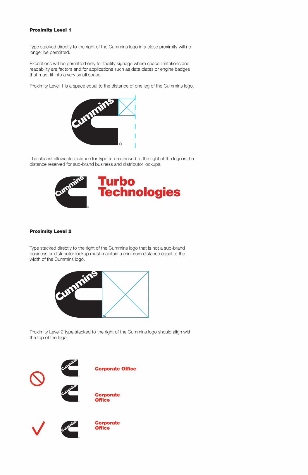
Proximity Level 1
Type stacked directly to the right of the Cummins logo in a close proximity will no longer be permitted.
Exceptions will be permitted only for facility signage where space limitations and readability are factors and for applications such as data plates or engine badges that must fit into a very small space.
Proximity Level 1 is a space equal to the distance of one leg of the Cummins logo.
The closest allowable distance for type to be stacked to the right of the logo is the distance reserved for sub-brand business and distributor lockups.
Proximity Level 2
Type stacked directly to the right of the Cummins logo that is not a sub-brandbusiness or distributor lockup must maintain a minimum distance equal to the width of the Cummins logo.
Proximity Level 2 type stacked to the right of the Cummins logo should align with the top of the logo.
Corporate Office
CorporateOffice
CorporateOffice