Embed Size (px)
Citation preview

Corey Rowland
AP Drawing Portfolio
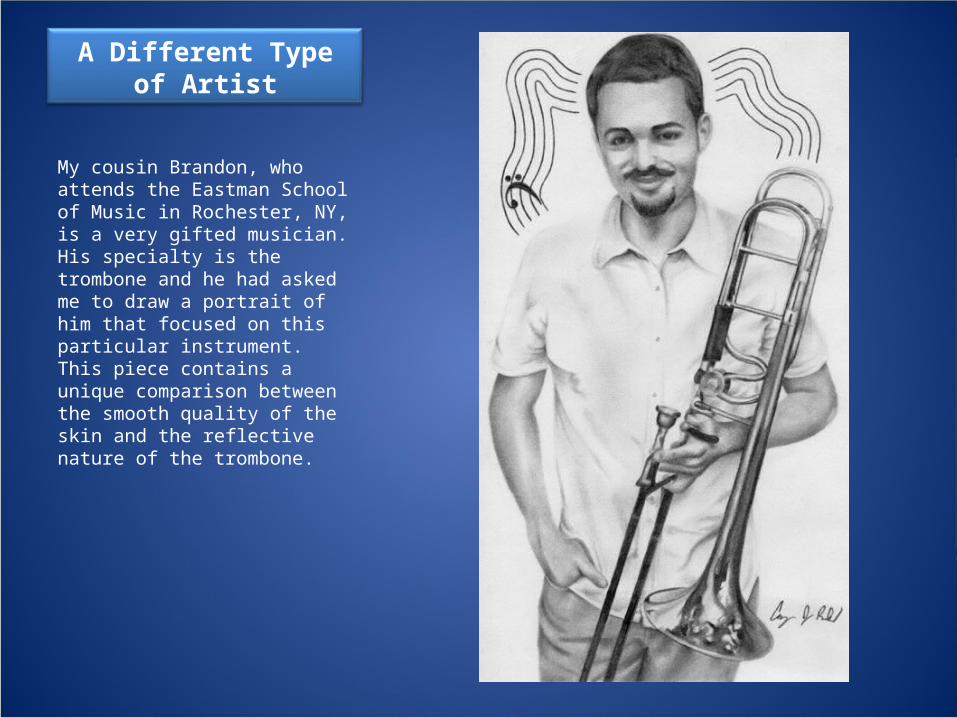
A Different Type of Artist
My cousin Brandon, who attends the Eastman School of Music in Rochester, NY, is a very gifted musician. His specialty is the trombone and he had asked me to draw a portrait of him that focused on this particular instrument. This piece contains a unique comparison between the smooth quality of the skin and the reflective nature of the trombone.
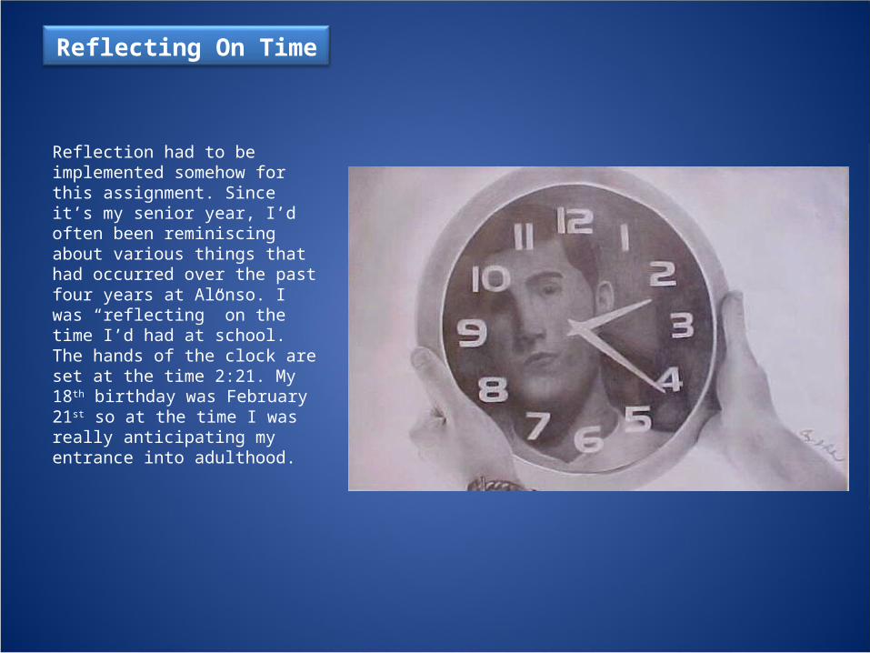
Reflecting On Time
Reflection had to be implemented somehow for this assignment. Since it’s my senior year, I’d often been reminiscing about various things that had occurred over the past four years at Alonso. I was “reflecting” on the time I’d had at school. The hands of the clock are set at the time 2:21. My 18th birthday was February 21st so at the time I was really anticipating my entrance into adulthood.

Get On the Ground
The inspiration for this piece derived from a humorous game that many students at my school had been playing at the time. The point of the game was to somehow distract a person so that they look away and when they look back, you have your hand in the position demonstrated in the drawing. No matter where that person was standing at the time, they would then HAVE to sit on the ground for 10 seconds. I attempted to mimic the effect of a camera by making my hand very crisp and clear while making the remainder of myself very blurry and unfocused.

Jenna Still One
While I was focusing on figure drawing, my little sister Jenna often acted as my subject. In this one in particular, I mainly focused on the face. For each drawing in this series I used a different medium to widen my experience. Graphite is without a doubt my most comfortable medium, but here I purposely gave the shading more of a “sketchy” look to be different.

Jenna Still Two
The second in my figure drawing series, I experimented with charcoal in this sketch. My main focus was the folds in the shirt as well as successfully representing the odd position of the body.

Jenna Still Three
I again tested my ability to represent clothing realistically in this sketch. The medium, brown Prismacolor, was also very interesting work with.

Jenna Still Four
This sketch is my favorite of this figure drawing series. I really enjoy using the color of the paper as the medium tone and then adding shadows and highlights with the black and white Prismacolor. The direction in which the lights source is coming from creates the large contrast between the shadows and highlights in the folds of the dress.

Suburban Scurry
The primary purpose of this piece was to test my technical drawing skills. I have always thought my car to be fairly unique, so I wanted to feature it in one of my pieces. The reflection of myself on the driver’s door not only creates an interesting image but it also symbolizes how many people in my neighborhood and school have come to know me as “the kid who drives the striped MINI Cooper.”
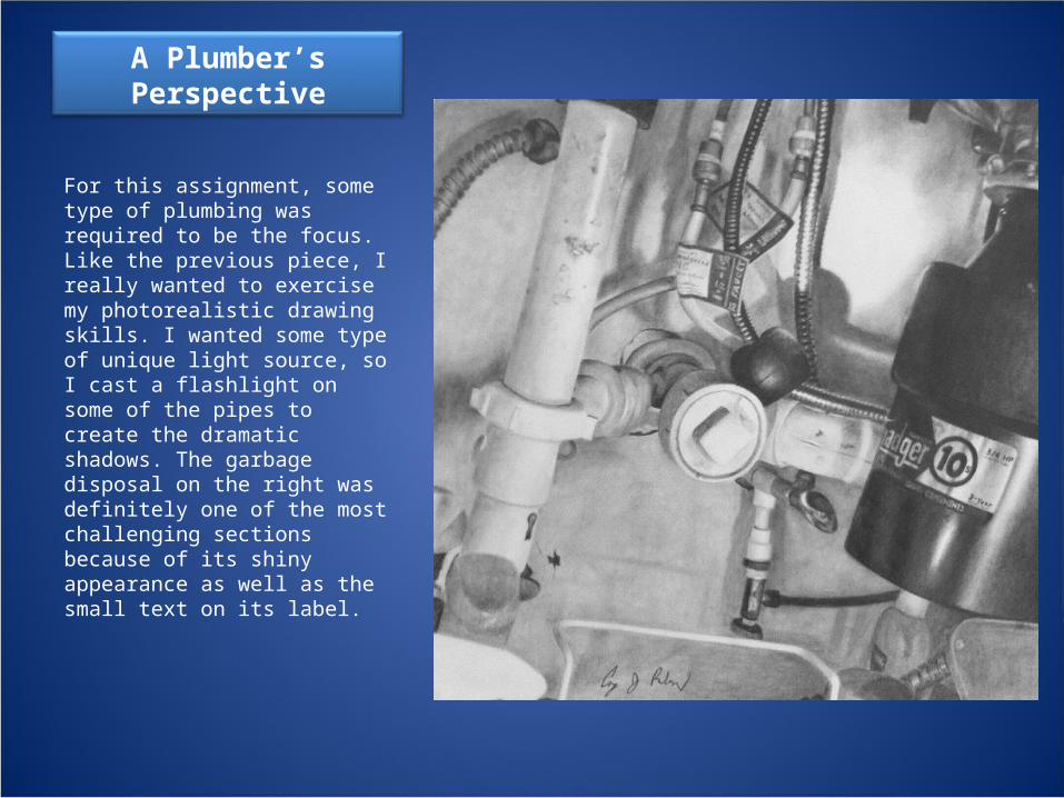
A Plumber’s Perspective
For this assignment, some type of plumbing was required to be the focus. Like the previous piece, I really wanted to exercise my photorealistic drawing skills. I wanted some type of unique light source, so I cast a flashlight on some of the pipes to create the dramatic shadows. The garbage disposal on the right was definitely one of the most challenging sections because of its shiny appearance as well as the small text on its label.

Vans Variety
I added to the simple still life piece in this drawing. I particularly enjoyed this piece because of the diversity that the media offered. Each medium has its own characteristics. Charcoal, for example, is easily smudged or blended. Prismacolor pencils are more precise but can not be blended. The marker was combined with a crosshatching technique and creates a more cartoon-like look. The graphite is probably the most versatile of the four, having the ability to be either precise if needed or easily smudged.

Benevolentia Semper
Since around he time of my 18th birthday, I have gained a large interest in getting a tattoo. For months now I have tried to think of an image that conveys an idea that will always be central in my life. I finally came up with the Latin phrase “Benevolentia Semper, which translates to “Kindness Always.” This image represents the importance of constant benevolence in my life. I strongly believe and will always believe in simply treating people amiably. The two hands grasping each other symbolizes is idea.
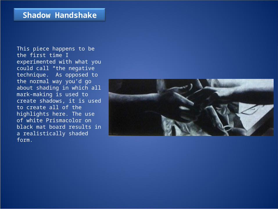
Shadow Handshake
This piece happens to be the first time I experimented with what you could call “the negative technique.” As opposed to the normal way you’d go about shading in which all mark-making is used to create shadows, it is used to create all of the highlights here. The use of white Prismacolor on black mat board results in a realistically shaded form.
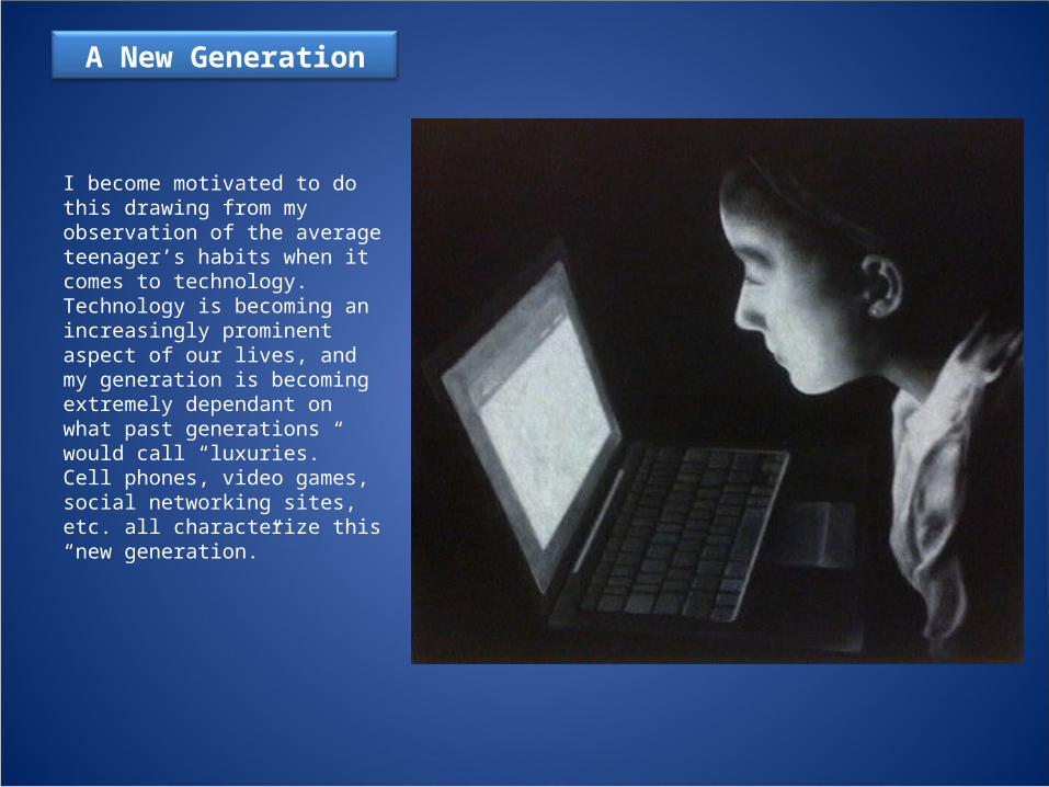
A New Generation
I become motivated to do this drawing from my observation of the average teenager’s habits when it comes to technology. Technology is becoming an increasingly prominent aspect of our lives, and my generation is becoming extremely dependant on what past generations would call “luxuries.” Cell phones, video games, social networking sites, etc. all characterize this “new generation.”

Shielded Eyes
Trying to expand on my Concentration, I wanted to play with the classic image of a person on the run with a search light cast on them, and their reaction of shielding their eyes from the blinding light. This general image can be seen in several prison break films. I used black and white Prismacolor on colored paper for this sketch.

7-11 Snapshot
Until this year, I had never experimented with hatching very extensively. I wanted to make the image appear fairly realistic, but at the same time stylized. The various textures of the subject matter definitely provided a challenge (the bricks, metal , etc). I walked around my local 7-11 to find an interesting subject, and I settled on the payphone. The abstractly shaped shadow is actually my own shadow cast by the sun.
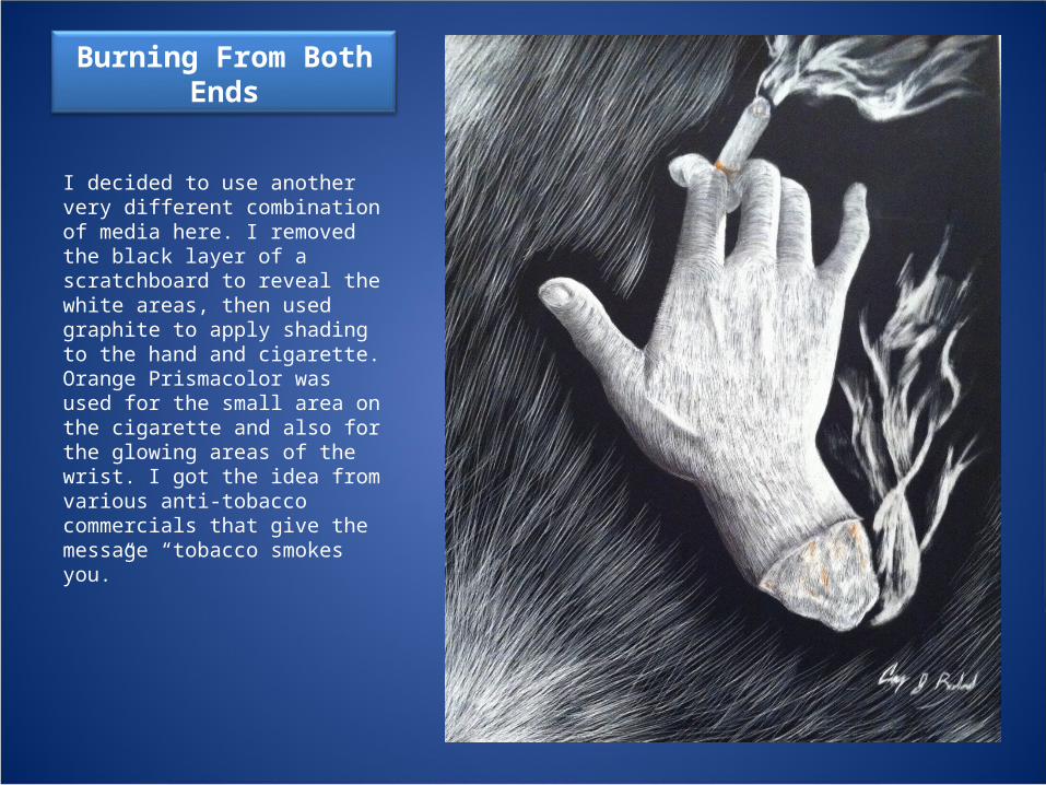
Burning From Both Ends
I decided to use another very different combination of media here. I removed the black layer of a scratchboard to reveal the white areas, then used graphite to apply shading to the hand and cigarette. Orange Prismacolor was used for the small area on the cigarette and also for the glowing areas of the wrist. I got the idea from various anti-tobacco commercials that give the message “tobacco smokes you.”

A Girl With Kaleidoscope Eyes
As anyone who I’m acquainted with would know, I happen to be a huge Beatles fan. I’ve never been able to name a single favorite song, but the song “Lucy in the Sky with Diamonds” has always held my interest primarily because of the detailed visuals that the lyrics create in the listener’s head. The song describes a surreal world, and at certain points a “girl with kaleidoscope eyes is mentioned.” My goal for this piece was to create a visual interpretation of what her eyes could look like.

A Non Utilitarian Drink
Glass has always been one of the most challenging things for me to draw realistically because of its transparent/shiny appearance as well as its characteristic of refracting light. When combined with a semi-transparent liquid as well, it becomes even more difficult.

Birthday Wish
Continuing my focus on the interaction of light with human skin, I took a moment we’ve all experienced and manipulated it. Making the boy’s skin orange and adding the abstract coming from his mouth gives the scene a surreal flavor. Prismacolor was used for the candle, boy and abstract forms, and acrylic paint was used for the background.

Amy In Blue Jeans
In this work, I aspired to create an image that looked very realistic but at the same time stylized. Oil pastels served as an interesting medium, and in some areas I also applied small amounts of water to help with blending. After the water dried, I went back with the pastels to create the detailed areas such as the belt, hair, shoes and face. The effect of foreshortening was also supposed to be implemented, which the legs clearly demonstrate.

Heated Heart
I’ve always thought that thermal vision makes 3-dimensional forms look very cool. So for this piece, I wanted to mess around with that. The warm colors of course represent the areas with the most light hitting them, and the cool colors are where the shadows lie. I also thought I’d create a cool shape with the contrast of the warm and cool colors, so I used my hands to form the heart on my chest. Coincidentally, other heart shapes were created, such as the red and yellow one underneath the right hand’s shadow and also the yellow one on the left wrist.
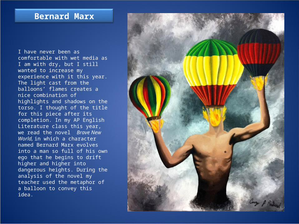
Bernard Marx
I have never been as comfortable with wet media as I am with dry, but I still wanted to increase my experience with it this year. The light cast from the balloons’ flames creates a nice combination of highlights and shadows on the torso. I thought of the title for this piece after its completion. In my AP English Literature class this year, we read the novel Brave New World, in which a character named Bernard Marx evolves into a man so full of his own ego that he begins to drift higher and higher into dangerous heights. During the analysis of the novel my teacher used the metaphor of a balloon to convey this idea.

Neon Campfire Story
This is probably one of my most stylistically unique pieces to date. I attempted to create the “holding-flashlight-under-chin-for-a-campfire-story” effect, but with a different spin on it. The green hue is meant to form the look of a neon light. I tore green construction paper into small pieces, glued them all down, and added the highlights/shadows with Prismacolor pencils. I had never attempted this technique before and I enjoyed experimenting with it.