Embed Size (px)
Citation preview
Copyright © 2012, Oracle and/or its affiliates. All rights reserved. Insert Information Protection Policy Classification from Slide 13
1

Copyright © 2012, Oracle and/or its affiliates. All rights reserved. Insert Information Protection Policy Classification from Slide 13
Responsive Web Designin Application Express using HTML5 and CSS3Shakeeb Rahman@shakeebPrincipal Member of Technical StaffOracle Application Express #orclapex
2

Copyright © 2012, Oracle and/or its affiliates. All rights reserved.
Software Developer
Shakeeb Rahman
Intern at Oracle in 2006Joined APEX team in 2009Projects I have worked on
– Oracle Store– APEX– Oracle Cloud
First talk at Oracle OpenWorld
3
3

Copyright © 2012, Oracle and/or its affiliates. All rights reserved.
Program Agenda
The Web Today
Mobile App vs Responsive App Responsive Web Design APEX 4.2 Features Demos Is Responsive Right for you?
4
4
Copyright © 2012, Oracle and/or its affiliates. All rights reserved.
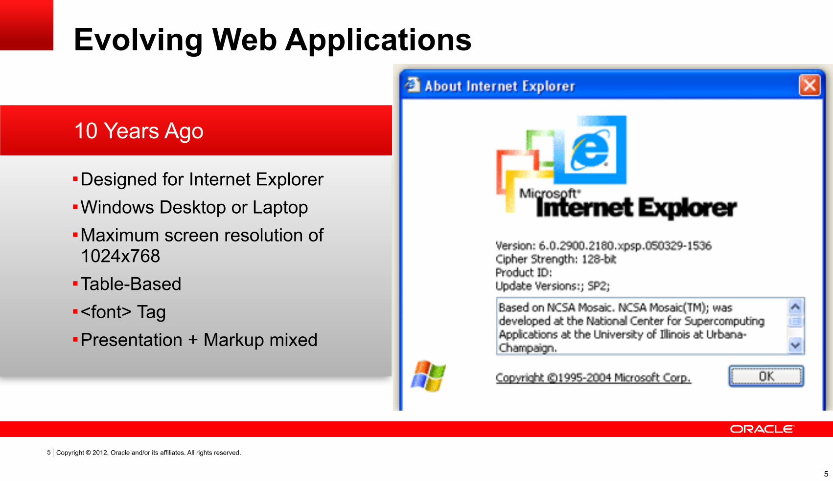
10 Years Ago
Evolving Web Applications
Designed for Internet ExplorerWindows Desktop or LaptopMaximum screen resolution of 1024x768
Table-Based<font> TagPresentation + Markup mixed
5
5
Copyright © 2012, Oracle and/or its affiliates. All rights reserved.
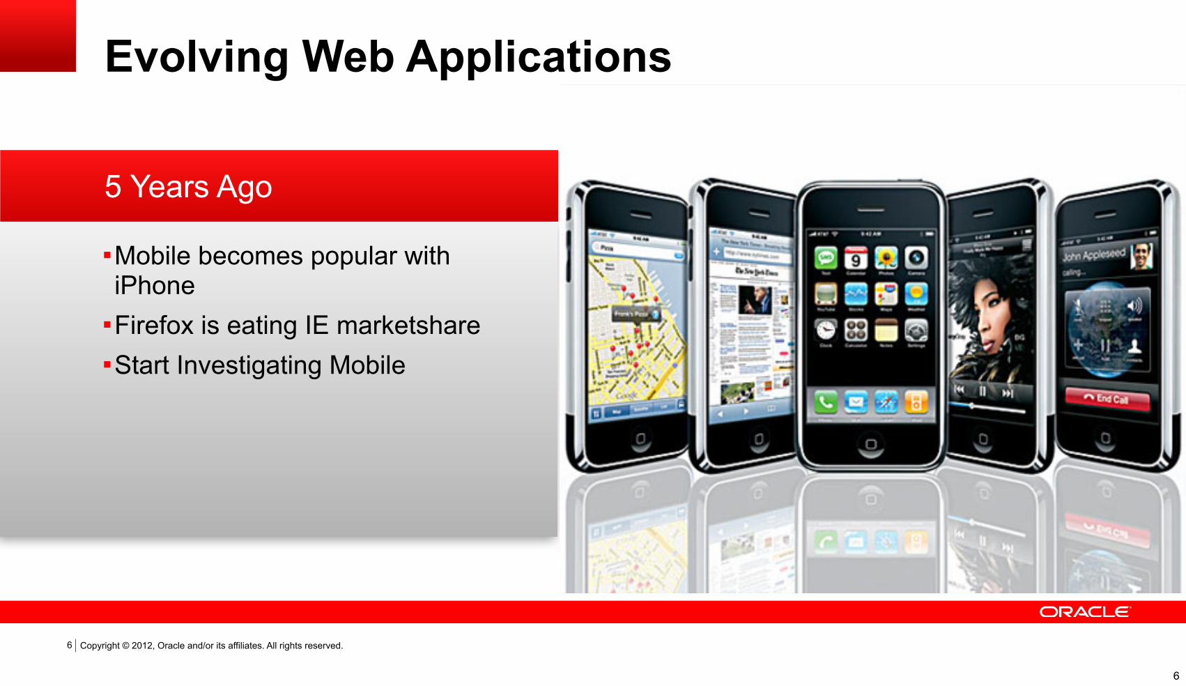
5 Years Ago
Evolving Web Applications
Mobile becomes popular with iPhone
Firefox is eating IE marketshareStart Investigating Mobile
6
6

Copyright © 2012, Oracle and/or its affiliates. All rights reserved.
Today
Evolving Web Applications
Many DevicesMany PlatformsMany Screen sizesMany ResolutionsMany BrowsersMany Many Variables
7
7

Copyright © 2012, Oracle and/or its affiliates. All rights reserved.
Enterprise gone Mobile
Evolving Web Applications
Mobile is not just for personal useEnterprises have embraced mobile
AgilityCost savings Improve productivity
8
8

Copyright © 2012, Oracle and/or its affiliates. All rights reserved.
Symantec2012 State of Mobility Survey
“71% of organizations are already using or planning to use custom mobile applications”
9
9
Copyright © 2012, Oracle and/or its affiliates. All rights reserved.10
Everyone is doing it. How can you?
10
Copyright © 2012, Oracle and/or its affiliates. All rights reserved.
Native Apps?
11
11

12
12

Copyright © 2012, Oracle and/or its affiliates. All rights reserved.
Native Apps?
13
13

Copyright © 2012, Oracle and/or its affiliates. All rights reserved.
Dedicated Mobile Web Apps?
14
14

Copyright © 2012, Oracle and/or its affiliates. All rights reserved.
Dedicated Mobile Web app
• Fast
• Looks Native
• Optimized for Mobile
•Duplicate Code
• Less Functionality
•Not Optimized for Tablets
15
15

Copyright © 2012, Oracle and/or its affiliates. All rights reserved.
Dedicated Mobile Web Apps?
16
16

Copyright © 2012, Oracle and/or its affiliates. All rights reserved.
Well, let’s look at the requirements.
17
17

Copyright © 2012, Oracle and/or its affiliates. All rights reserved.
Enterprise Application
The Business Requirement
Work on Desktop, Mobile, TabletsSimilar UISingle Code LineSame DevelopersNo New Technology
18
18
Copyright © 2012, Oracle and/or its affiliates. All rights reserved.
Responsive Web Design (RWD)
19
19

Copyright © 2012, Oracle and/or its affiliates. All rights reserved.
Responsive Web Design (RWD)
20
an approach to web design in which a designer intends to provide an optimal viewing experience—
easy reading and navigation with a minimum of resizing, panning, and scrolling—across a wide
range of devices (from desktop computer monitors to mobile phones). (Wikipedia)
20

Copyright © 2012, Oracle and/or its affiliates. All rights reserved.
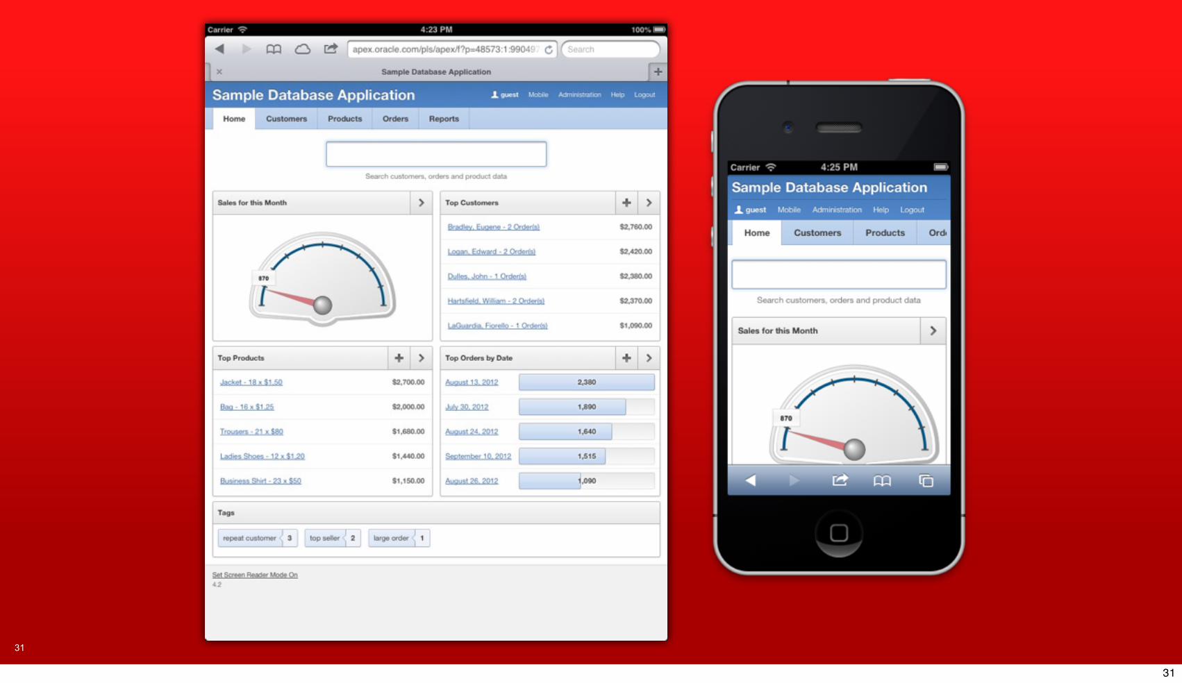
Same HTML. Same Application Logic.
Different User Experience.
21
21

22
22

23
23

24
24

25
25

26
26

27
27

28
28

29
29

30
30
31
31

32
32

33
33

Copyright © 2012, Oracle and/or its affiliates. All rights reserved.
How does it work?
34
34
Copyright © 2012, Oracle and/or its affiliates. All rights reserved.
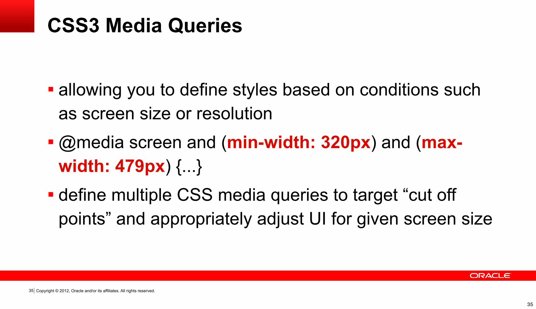
CSS3 Media Queries
35
allowing you to define styles based on conditions such as screen size or resolution
@media screen and (min-width: 320px) and (max-width: 479px) {...}
define multiple CSS media queries to target “cut off points” and appropriately adjust UI for given screen size
35
Copyright © 2012, Oracle and/or its affiliates. All rights reserved.36
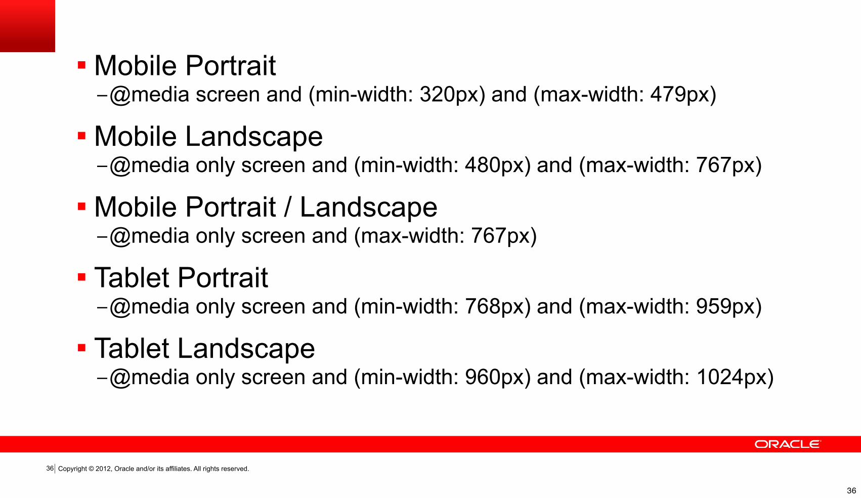
Mobile Portrait–@media screen and (min-width: 320px) and (max-width: 479px)
Mobile Landscape–@media only screen and (min-width: 480px) and (max-width: 767px)
Mobile Portrait / Landscape–@media only screen and (max-width: 767px)
Tablet Portrait–@media only screen and (min-width: 768px) and (max-width: 959px)
Tablet Landscape–@media only screen and (min-width: 960px) and (max-width: 1024px)
36

Copyright © 2012, Oracle and/or its affiliates. All rights reserved.
CSS3 Responsive Utility Classes
37
Easily hide / show content depending on device type
37

Copyright © 2012, Oracle and/or its affiliates. All rights reserved.
Grid Layout
38
Using a grid makes it easier to align and lay out page components
Media Queries can then easily shift or reposition these components
38

Copyright © 2012, Oracle and/or its affiliates. All rights reserved.
Example Grid
39
39

Copyright © 2012, Oracle and/or its affiliates. All rights reserved.
Sounds technical. Do I have to do this manually?
40
40

Copyright © 2012, Oracle and/or its affiliates. All rights reserved.
NO!APEX handles all of this for you.
41
41

Copyright © 2012, Oracle and/or its affiliates. All rights reserved.
APEX 4.2 Support for Responsive Web Design
Grid Layout for Regions and Items
Theme 25
42
42

Copyright © 2012, Oracle and/or its affiliates. All rights reserved.
Grid Layout
APEX 4.2 Support for Responsive Web Design
Declarative way to lay out regions and items on a page
Possible to do complex layouts without manual css overrides
Compatible with popular grid frameworks such as twitter bootstrap, 960 gs, etc.
43
43

Copyright © 2012, Oracle and/or its affiliates. All rights reserved.
Fully Responsive Theme
APEX 4.2 Support for Responsive Web Design
Uses custom flexible grid up to 2560px wide
Mobile, Tablet, Desktop support Icon ButtonsRetina Display CompatibleModernizr
44
44

Copyright © 2012, Oracle and/or its affiliates. All rights reserved.
Fully Responsive Theme
APEX 4.2 Support for Responsive Web Design
SCSS BasedRespond.js for RWD in older IE One Sprite (and one for Retina) Icons
45
45

Copyright © 2012, Oracle and/or its affiliates. All rights reserved.
Demo: Convert Existing App to
Responsive App
46
46

Copyright © 2012, Oracle and/or its affiliates. All rights reserved.
Demo: Sample DB Application Walk Through
47
47

Copyright © 2012, Oracle and/or its affiliates. All rights reserved.
Is Responsive Right for you?
Responsive Full Experience Single Code Line Web UI
48
Mobile Limited Utility New Mobile Codeline Pseudo Native UI
48

49
49

Copyright © 2012, Oracle and/or its affiliates. All rights reserved.
Q & A
50
50

Copyright © 2012, Oracle and/or its affiliates. All rights reserved.
@shakeebblog: apex.shak.us
51
51

Copyright © 2012, Oracle and/or its affiliates. All rights reserved. Insert Information Protection Policy Classification from Slide 13
52

Copyright © 2012, Oracle and/or its affiliates. All rights reserved. Insert Information Protection Policy Classification from Slide 13
53