Embed Size (px)
Citation preview
1
Chapter 13
The Use of Control Charts in Healthcare
William H. Woodall
Department of Statistics
Virginia Tech
Blacksburg, VA 24061-0439
Benjamin M. Adams
Department of Information Systems, Statistics and Operations Management
University of Alabama
Tuscaloosa, AL 35487-0226
James C. Benneyan
Center for Health Organization Transformation
Northeastern University
Boston, MA 02115-5005
and
VISN 1 Engineering Resource Center
Veterans Health Administration
Boston, MA 02130-4817
Synopsis
Statistical process control (SPC) charts are increasingly being used in
healthcare to aid in process understanding, assess process stability, and
identify changes that indicate either improvement or deterioration in
quality. They are used in hospital process improvement projects, by
accrediting bodies and governmental agencies, and for public health
surveillance. We provide an overview of common uses of SPC in
healthcare and some guidance on the choice of appropriate charts for
various applications. Implementation issues and more advanced SPC and
related methods also are discussed.
Keywords: Cumulative sum chart; funnel chart; risk adjustment; Six
Sigma; statistical process control; variable life adjusted display.
To appear in:
Statistical Methods in Healthcare, F. Faltin, R. Kenett, F. Ruggeri, eds., Wiley, 2011
2
13.1. Introduction
Continuous improvement of healthcare systems requires the measuring and
understanding of process variation. It is important to eliminate extraneous process
variation wherever possible, while moving well-defined metrics toward their target
values. In healthcare, most performance metrics are of the lower-the better or higher-the-
better variety. Examples of important variables in healthcare involve lab turnaround
times, days from positive mammogram to definitive biopsy, waiting times, patient
satisfaction scores, medication errors, emergency service response times, infection rates,
mortality rates, numbers of patient falls, post-operative lengths of stay, “door-to-needle”
times, counts of adverse events, as well as many others. Careful monitoring and study of
such variables often can lead to significant improvements in quality. For example,
monitoring infection rates, as discussed by Morton et al. (2008), can provide insights
leading to improved standardized cleaning procedures or the early detection of new
outbreaks.
Within this context, statistical process control (SPC) charts are very useful tools
for studying important process variables and identifying quality improvements or quality
deterioration. A control chart is a chronological time series plot of measurements of
important variables. The statistics plotted can be averages, proportions, rates, or other
quantities of interest. In addition to these plotted values, upper and lower reference
thresholds called control limits are plotted. These limits are calculated using process data
and define the natural range of variation within which the plotted points almost always
should fall. Any points falling outside of these control limits therefore may indicate that
all data were not produced by the same process, either because of a lack of
standardization or because a change in the process may have occurred. Such changes
could represent either quality improvement or quality deterioration, depending on which
control limit is crossed. Control charts are thus quite useful both for monitoring if
processes get worse and for testing and verifying improvement ideas.
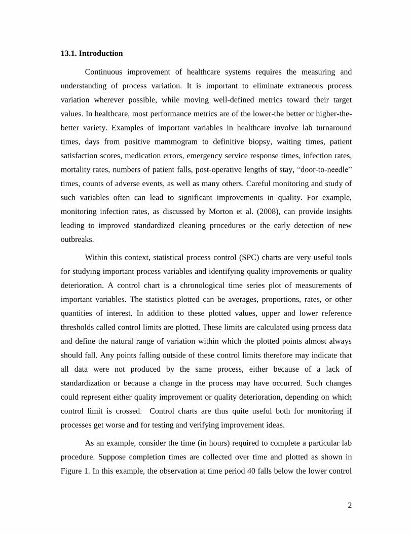
As an example, consider the time (in hours) required to complete a particular lab
procedure. Suppose completion times are collected over time and plotted as shown in
Figure 1. In this example, the observation at time period 40 falls below the lower control
3
limit, thereby formally signaling a process change. During the time of this study, an
improvement project resulted in a new standardized operating procedure implemented at
time period 31. This control chart provides statistical evidence that the new procedure
did, in fact, change the lab processing times for the better. The amount of improvement
(here, reduction) in both the duration average and variation can be quantified from the
plotted values that occur after time period 31. New control limits now could be calculated
based on these improved values and the process monitored to ensure these quality gains
are maintained.
403530252015105
17.5
15.0
12.5
10.0
7.5
5.0
Observation
Ind
ivid
ua
l V
alu
e
_X=10.21
UCL=16.40
LCL=4.031
Lab Processing Times
Upper Control Limit
Lower Control Limit
Figure 13.1: Example of a control chart to verify a process improvement, here in
laboratory processing times.
In process improvement projects such as the above example, the control limits
typically are calculated initially based on a historical set of data. For another example one
could consider the proportion of Caesarean section deliveries in a hospital each month for
the past three years. Initially, the control limits are used to assess the stability of the
process and to identify unusual events (outliers). Once the analyst is confident the data
4
reflect a stable process (points falling within the control limits and showing no clearly
non-random patterns), the parameters of the statistical model used to determine the
control limits are estimated. These control limits then are used for on-going monitoring
as new data are collected and plotted. The retrospective analysis of historical data is
referred to as Phase I; whereas the prospective monitoring of future data is referred to as
Phase II. Essentially one checks whether the process historically was stable and
consistent (“in statistical control” in SPC terminology) in Phase I and, if so, checks
whether the process continues to behave consistently or whether any process changes are
evident (“out of control” in SPC terminology) in Phase II.
Analysts have many types of control charts at their disposal. An appropriate
choice of control charts depends on the type of data being analyzed, the behavior of the
data, and the assumed underlying probability distribution used for modeling. Appropriate
chart and sample size selection often is difficult for practitioners due to the subtleties
involved, but the correct choice is essential for meaningful results to be obtained. Since
computer software is typically used for control chart generation, in this chapter most
calculations are not discussed in detail. Many software options exist, a common choice
being MINITAB (www.MINITAB.com). Version 16 of MINITAB also includes tutorials
for the proper selection of control chart methods.
Readers can find detailed information on control charting assumptions, formulas,
and implementation (but with an engineering focus) in Montgomery (2008). Several more
practitioner-focused books cover SPC for healthcare applications along with detailed case
studies; see, e.g., Hart and Hart (2002) and Carey (2003), with a comparison and
discussion of these two books given by Woodall (2004). Advice on the selection, design,
and performance of control charts in healthcare applications was given by Benneyan
(1998a, 1998b, 2006) and Mohammed et al. (2008). Winkel and Zhang (2007) covered
some more advanced control charting methods used in healthcare, as well as the basic
control charting methods. Examples of healthcare process improvement projects
involving SPC were reviewed by Thor et al. (2007).
5
13.2. Selection of a Control Chart
13.2.1 Basic Shewhart-type charts
The choice of which control chart to use depends on the type of data to be plotted.
The most common types of data therefore need to be understood in order to identify the
most appropriate control chart. All data can be classified as either continuous (variable)
or discrete (attribute). Numerical measurements that can assume any values over some
defined range are referred to as continuous, or variables, data. Examples include patient
waiting times, times between adverse events, and blood pressure measurements. Even
though these variables are always rounded in practice, in theory an infinite number of
values between any two possible values also are possible, and thus such data usually are
treated as continuous variables. If several samples are collected during each time period,
e.g., twenty emergency department waiting times for each day for a month, then an X
and S-chart combination may be required. The statistic X (read “X-bar”) represents the
sample mean and S represents the sample standard deviation. The X chart is used to
monitor the mean of process whereas the S chart monitors process variation or
inconsistency. An example of an X chart is given in Chapter 16. If only individual
continuous measurements are available at each time period, e.g., systolic blood pressure
readings for a patient taken once a day for a month, then use of a X-chart (“individuals”)
typically is recommended. This type of chart is also illustrated in Chapter 16.
As discussed further in Chapter 14, quantitative variables data contain much more
information than “attribute” data, which are based on counts or rates of a particular event
of interest. Thus it is not advisable to convert quantitative data into attribute data, such as
for waiting times recording only whether or not each time met a given standard. This
unfortunately was done in several published case studies on the use of Six Sigma in
healthcare, with an unnecessary resulting loss of information and an associated loss in the
ability to detect important process changes. See Chapter 14 for further discussion of this
practice.
Continuous variables are usually modeled with probability distributions such as
the normal, lognormal distribution, or exponential distribution. These probability
distributions form the basis for mathematically establishing valid control limits. The X ,
6
S, and X control charts are most appropriate for normally distributed data, which are
symmetric and bell-shaped when plotted on a histogram. If the data are skewed, such as
for lognormal or exponential distributions, then the usual X or X chart may not perform
well. From a practical perspective, this is more important if a small sample size is used to
calculate the average at each time period. In such cases, exact limits can be computed
from knowledge of the appropriate probability distribution, which usually requires a
skilled analyst. More simply, an appropriate normalizing transformation can be used and
the transformed data then simply used with a conventional X or X chart. For example,
for lognormal data taking the logarithm of all measurements transforms them to being
normally distributed, whereas raising exponential data to the power 0.2777 is one of
several normalizing transformations. An example where this latter transformation was
used is given in Chapter 16.
In contrast to continuous data, attribute data most often involve counts (e.g., the
number of falls per day), proportions (e.g., the proportion of patients receiving the correct
antibiotic), or rates (e.g., the number of falls per 1000 patient-days). The Poisson
distribution typically is an underlying assumption in the construction of charts for counts
and rates. The corresponding control charts are the c-chart (counts) and the u-chart
(rates), respectively. Generally the use of rates is more informative and conventional than
counts, especially when the opportunity for adverse events varies over time. Examples
include monthly falls per 1000 patient days or catheter infections per 1000 device-use
days, where the number of patients at risk or device use days vary over time. A second
type of attribute data is the proportion or percent of a fixed number of cases for which an
outcome of interest occurs. An example is the percent of similar surgeries that result in a
post-operative infection. In such cases, the binomial probability distribution usually is
assumed to be appropriate and p-charts can be used.
In some cases the outcome of interest is known for each individual patient, e.g.,
whether or not each surgical patient developed a particular type of infection. Each case
then is a Bernoulli random variable, or equivalently a binomial variable with a sample
size of one. As an alternative to the p-chart, one can plot the total number of patients until
the infection occurs, with an assumed underlying geometric distribution. This is referred
7
to as a g-chart by Benneyan (2001), who explored their detection performance and
variations at length. Although charts based on Bernoulli and geometric data are very
useful in healthcare applications they are rarely included in standard statistical software.
An exception is the Electronic Infection Control Assessment Technology (eICAT)
software package, with information available at www.eicat.com.au/. Szarka and Woodall
(2011) provided a detailed review of charts for monitoring Bernoulli processes.
Many sources exist to which the reader can turn for additional information on the
selection of an appropriate control chart. We recommend Adams (2007), Montgomery
(2008), Benneyan (2008), Lee and McGreevey (2002), and Winkel and Zhang (2007), in
particular.
The charts discussed thus far in this chapter are referred to as Shewhart-type
control charts, after Walter Shewhart. the inventor of the control chart. The estimated
control limits usually are placed at plus and minus three standard deviations of the plotted
statistic above and below a center line, which is placed at the estimated mean of the
statistic. Three sigma limits are used so that it is unlikely that a plotted point would fall
outside the control limits if the process remains stable. Importantly, one should not
overreact to each random movement in a plot of a statistic over time since this leads to
wasted time and resources. One should seek to react to only true process changes. Control
charts help separate such natural random process variation, referred to as “common cause
variation”, from unusual variation caused by influences on the process to which some
action is required. These influences are referred to as “assignable causes” in the SPC
literature.
13.2.2 Use of CUSUM and EWMA charts
An important distinction between Shewhart and some other types of control charts
is that in the Shewhart charts the decision of whether the process is stable is made based
on only the most recent information, unless supplementary rules are used, such as
signaling if eight consecutive plotted values are all on the same side of the centerline or if
two out of three consecutive values are beyond the same two-sigma limit. Runs rules can
increase the ability of the chart to detect sustained process shifts, but can also increase the

8
number of false alarms. Common supplementary rules are discussed in several of our
recommended references. In particular, we recommend the discussion in Montgomery
(2008). In contrast, cumulative sum (CUSUM) and exponentially weighted moving
average (EWMA) charts are based (in different ways) on past data. While a bit more
advanced to use and interpret, CUSUM and EWMA charts can detect small and
moderately sized sustained changes in quality on average much more quickly than
Shewhart charts although they tend to be poorer at detecting one-time or short-term
spikes.
Details of the construction of EWMA charts are given in Chapter 16 along with
an example. To illustrate the construction of a CUSUM chart, suppose we wish to
monitor the mean of a normally distributed random variable X with individual and
independent observations, X1, X2, X3, … observed over time. We assume that these
measurements have been standardized by subtracting the in-control mean and dividing by
the standard deviation in order to have unit variance and in-control mean of zero. If the
smallest shift in the mean in either direction that we want to detect quickly is δ standard
deviations in size, then the following two sets of cumulative sum statistics, Xt+ and Xt
-,
are plotted over time:
Xt+
= max (0, Xt-1+ + Xt – δ/2),
and (1)
Xt- = min (0, Xt-1
- + Xt + δ/2), t = 1, 2, 3, …,
where X0+
= X0-
= 0 and the index t indicates the time period. The upper part of the
CUSUM chart is designed to detect increases in the mean and the lower part is designed
to detect decreases in the mean. An out-of-control signal is given as soon as Xt+
> h1 or Xt-
< h2, where the values of the thresholds h1 > 0 and h2 < 0 are selected to ensure a
reasonably long average time between false alarms. Frequently the values = 1 and h1 =
-h2 = 4 or h1 = -h2 = 5 are used.
9
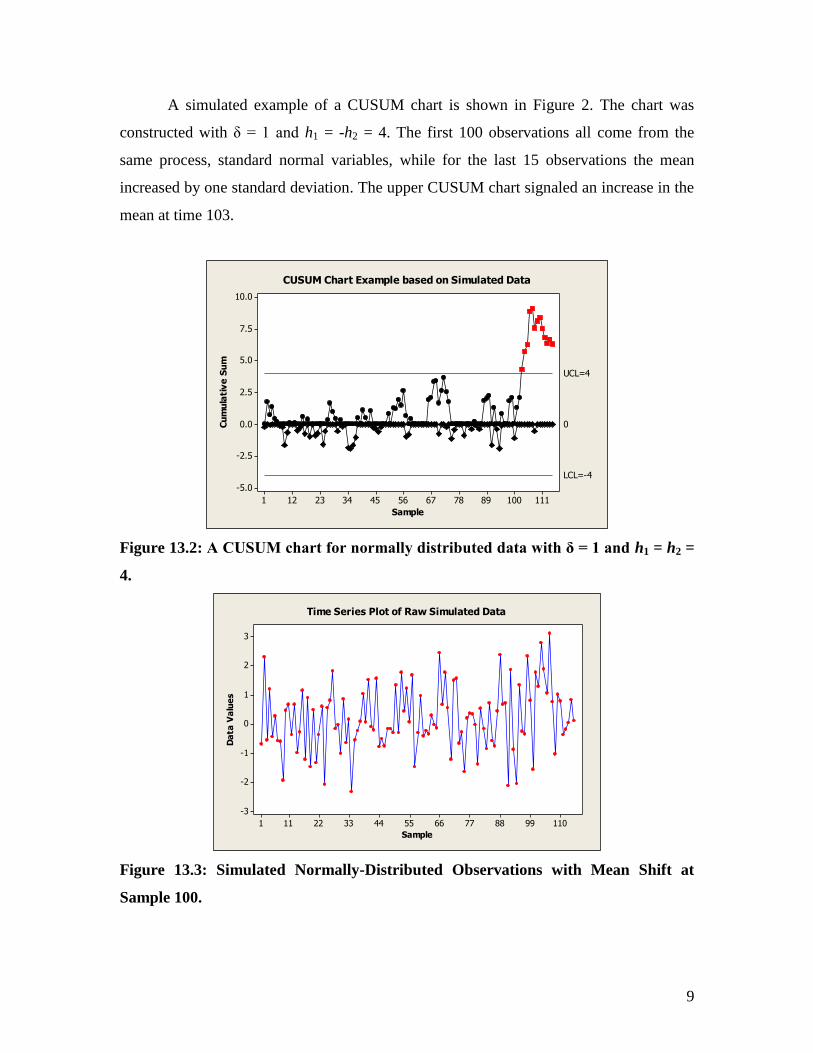
A simulated example of a CUSUM chart is shown in Figure 2. The chart was
constructed with δ = 1 and h1 = -h2 = 4. The first 100 observations all come from the
same process, standard normal variables, while for the last 15 observations the mean
increased by one standard deviation. The upper CUSUM chart signaled an increase in the
mean at time 103.
11110089786756453423121
10.0
7.5
5.0
2.5
0.0
-2.5
-5.0
Sample
Cu
mu
lati
ve
Su
m
0
UCL=4
LCL=-4
CUSUM Chart Example based on Simulated Data
Figure 13.2: A CUSUM chart for normally distributed data with δ = 1 and h1 = h2 =
4.
1109988776655443322111
3
2
1
0
-1
-2
-3
Sample
Da
ta V
alu
es
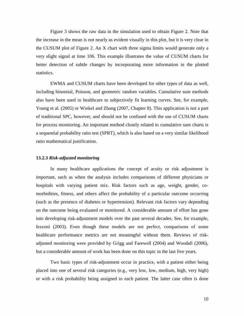
Time Series Plot of Raw Simulated Data
Figure 13.3: Simulated Normally-Distributed Observations with Mean Shift at
Sample 100.
10
Figure 3 shows the raw data in the simulation used to obtain Figure 2. Note that
the increase in the mean is not nearly as evident visually in this plot, but it is very clear in
the CUSUM plot of Figure 2. An X chart with three sigma limits would generate only a
very slight signal at time 106. This example illustrates the value of CUSUM charts for
better detection of subtle changes by incorporating more information in the plotted
statistics.
EWMA and CUSUM charts have been developed for other types of data as well,
including binomial, Poisson, and geometric random variables. Cumulative sum methods
also have been used in healthcare to subjectively fit learning curves. See, for example,
Young et al. (2005) or Winkel and Zhang (2007, Chapter 8). This application is not a part
of traditional SPC, however, and should not be confused with the use of CUSUM charts
for process monitoring. An important method closely related to cumulative sum charts is
a sequential probability ratio test (SPRT), which is also based on a very similar likelihood
ratio mathematical justification.
13.2.3 Risk-adjusted monitoring
In many healthcare applications the concept of acuity or risk adjustment is
important, such as when the analysis includes comparisons of different physicians or
hospitals with varying patient mix. Risk factors such as age, weight, gender, co-
morbidities, fitness, and others affect the probability of a particular outcome occurring
(such as the presence of diabetes or hypertension). Relevant risk factors vary depending
on the outcome being evaluated or monitored. A considerable amount of effort has gone
into developing risk-adjustment models over the past several decades. See, for example,
Iezzoni (2003). Even though these models are not perfect, comparisons of some
healthcare performance metrics are not meaningful without them. Reviews of risk-
adjusted monitoring were provided by Grigg and Farewell (2004) and Woodall (2006),
but a considerable amount of work has been done on this topic in the last five years.
Two basic types of risk-adjustment occur in practice, with a patient either being
placed into one of several risk categories (e.g., very low, low, medium, high, very high)
or with a risk probability being assigned to each patient. The latter case often is done
11
through a logistic regression model, as described in detail in Chapter 16. If, for example,
30-day mortality rates following surgery are of interest then a predicted mortality rate is
obtained for each patient. The Bernoulli outcomes and the predicted mortality rates can
be used as input into the risk-adjusted CUSUM charts of Steiner et al. (2000). These
charts have been used in a number of applications, including monitoring cardiac surgery
results. Taseli and Benneyan (2008, 2010) developed similar types of risk-adjusted
SPRTs and investigated their detection performance. As another example, Axelrod et al.
(2006) discussed the use of a Poisson hazards based risk-adjusted CUSUM chart in
monitoring the performance of organ transplant centers.
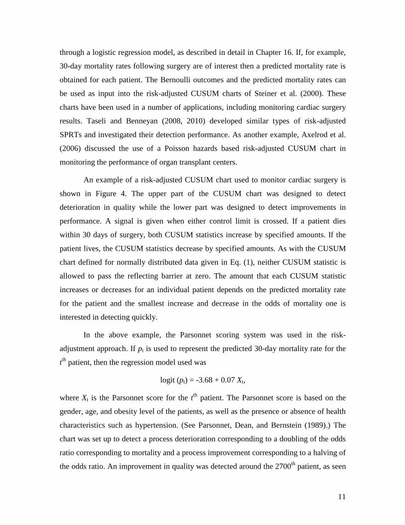
An example of a risk-adjusted CUSUM chart used to monitor cardiac surgery is
shown in Figure 4. The upper part of the CUSUM chart was designed to detect
deterioration in quality while the lower part was designed to detect improvements in
performance. A signal is given when either control limit is crossed. If a patient dies
within 30 days of surgery, both CUSUM statistics increase by specified amounts. If the
patient lives, the CUSUM statistics decrease by specified amounts. As with the CUSUM
chart defined for normally distributed data given in Eq. (1), neither CUSUM statistic is
allowed to pass the reflecting barrier at zero. The amount that each CUSUM statistic
increases or decreases for an individual patient depends on the predicted mortality rate
for the patient and the smallest increase and decrease in the odds of mortality one is
interested in detecting quickly.
In the above example, the Parsonnet scoring system was used in the risk-
adjustment approach. If pt is used to represent the predicted 30-day mortality rate for the
tth
patient, then the regression model used was
logit (pt) = -3.68 + 0.07 Xt,
where Xt is the Parsonnet score for the tth
patient. The Parsonnet score is based on the
gender, age, and obesity level of the patients, as well as the presence or absence of health
characteristics such as hypertension. (See Parsonnet, Dean, and Bernstein (1989).) The
chart was set up to detect a process deterioration corresponding to a doubling of the odds
ratio corresponding to mortality and a process improvement corresponding to a halving of
the odds ratio. An improvement in quality was detected around the 2700th
patient, as seen
12
by the plotted data reaching the lower limit, and the two CUSUM chart statistics then
were reset to zero before monitoring was continued.
0 500 1000 1500 2000 2500 3000 3500
0
2
4
6
CU
SU
M X
t+
0 500 1000 1500 2000 2500 3000 3500-6
-4
-2
0
Number of Patients
CU
SU
M X
t-
Figure 13.4: An Example of a Risk-Adjusted CUSUM Chart (Reprinted with
permission from Journal of Quality Technology ©2006 American Society for Quality. No
further distribution allowed without permission.)
The risk-adjusted CUSUM chart of Steiner et al. (2000) is a generalization of the
Bernoulli CUSUM chart of Reynolds and Stoumbos (1999). Under the Reynolds and
Stoumbos (1999) and Leandro et al. (2005) framework there is a constant probability p0
of an adverse event occurring when the process is stable and detecting a sustained shift to
an out-of-control value p1 is of primary interest. Ismail et al. (2003) and others
recommended a scan method in this situation that signals as soon as the number of
adverse events in the last m Bernoulli trials exceeds a specified value. Joner et al. (2008)
showed, however, that the Bernoulli CUSUM chart was more effective.
Sometimes a variable life adjusted display (VLAD) is used instead of plotting a
risk-adjusted CUSUM chart. In the case of monitoring mortality rates, this chart would be
a plot over time of the sum of the predicted number of deaths minus the observed number
of deaths. The vertical axis is frequently labeled “statistical lives saved” and the
horizontal axis is the number of patients. A related risk-adjusted metric often used in
13
practice is a ratio of the observed over expected number of outcomes, or the O/E ratio. If
the VLAD shows an increasing trend (or if O/E < 1), then performance is better than
indicated by whatever risk-adjustment model is used. A decreasing trend (or O/E > 1)
conversely indicates performance poorer than would be expected by the model. The risk-
adjusted CUSUM method also can be used in the background to signal when
performance seems to reflect more than simply random variation, as recommended by
Sherlaw-Johnson (2005). The book produced by the Clinical Practice Improvement
Centre (2008) explains in detail the use of VLADs in the monitoring of healthcare
outcomes in Queensland, Australia.
13.3. Implementation Issues
13.3.1 Overall process improvement system
The use of control charts is most beneficial as a component within an overall
well-structured quality improvement program. We support the use of the Six Sigma
process design strategy and its Define-Measure-Analyze-Improve-Control (DMAIC)
process improvement strategy. The history and principles of Six Sigma were reviewed by
Montgomery and Woodall (2008). There are quite a few books available on the use of Six
Sigma in healthcare applications, e.g., Bisgaard (2009) and Trusko et al. (2007). In
addition, Chapter 15 is devoted to this topic.
Most hospitals in the United States are accredited and evaluated by the Joint
Commission (formerly the Joint Commission on Accreditation of Healthcare
Organizations, or JCAHO), which evaluates each hospital‟s compliance with federal
regulations including their internal processes aimed at continuously improving patient
outcomes. The Joint Commission is a private, not-for-profit organization that operates
accreditation programs for a fee to subscriber hospitals and other healthcare
organizations. Over 17,000 healthcare organizations and programs are inspected for
accreditation on a three year cycle, with periodic unannounced inspections. A few smaller
accrediting organizations also exist, most notably the European DNV organization that
began accrediting U.S. hospitals in 2008. Accreditation by one of these organizations is
required by many states as a condition of licensure and Medicaid reimbursement. In
14
2009 the Joint Commission Center for Transforming Healthcare
(www.centerfortransforminghealthcare.org/) was established to help solve critical
healthcare safety and quality problems. The use of lean and Six Sigma methods is said to
be an important component of this center‟s efforts. In our view a greater focus on process
improvement is necessary.
13.3.2 Sampling issues
The benefits of control charting can be compromised if the quality of collected
data is poor. Ensuring that variables are carefully defined and that the measurement
system is accurate are key components of the Six Sigma approach. With any
improvement project, one must carefully consider what data to collect, with the purpose
of the project driving data collection decisions. In order to characterize emergency
department waiting times, for example, one must decide how often to collect data and
how large each sample should be. If the variation within the day is to be understood, then
samples would need to be taken frequently, say every hour. If only the longest waiting
times for each day are of interest then sampling could be restricted to known peak periods
of emergency department admissions.
Biased sampling should be avoided whenever possible. As an example, healthcare
data collected for insurance purposes in the U.S. can produce bias if there is any
“upcoding” to justify higher payments. Generally the choice of what variables to measure
and how often to collect data is decided to ensure that important magnitudes of changes
in quality levels can be detected in a reasonable amount of time for that particular
application. When possible, samples also are collected in such a way that process changes
are most likely to occur between (rather than within) samples, in order to maximize
detection power. This practice often is referred to as “rational subgrouping” in the
industrial SPC literature and is particularly important when computing control limits in
the Phase I use of SPC described earlier.
13.3.3 Violations of assumptions
All control charts are most effective under their specified statistical assumptions.
As discussed in Chapter 16, a standard assumption is that all data collected over time are
15
independent. This means, for example, that there is not a tendency for large values to
follow other large values and for small values to follow other small values, i.e., there is
no positive autocorrelation. With positive autocorrelation some types of charts, such as
the X-chart with limits based on the moving ranges, will produce a large number of false
alarms.
Checking for autocorrelation and selecting an appropriate control chart is
important for understanding the behavior of a process over time. If autocorrelation or
systematic seasonal variation, such as a day-of-the-week effect, exists but in the
particular setting is considered “unnatural” variation, then it should be removed or
reduced if possible. If this is not possible or if the autocorrelation is considered part of the
natural process, such as with a daily bed census, then Phase II monitoring becomes more
complicated and special-purpose control charts should be used. Winkel and Zhang (2007,
Chapter 4) and Montgomery (2008) discussed the use of control charting with
autocorrelated data. One commonly recommended approach is to use a times series
model to predict one time period ahead and to then plot the one-step-ahead forecast errors
on a control chart. If the correct time series model is fitted then these forecast errors,
sometimes referred to as residuals, are independent random variables.
Numerous other ways exist by which distributional assumptions can be violated.
As one of several examples, some count data may exhibit more variability than they
would under a Poisson model. This is referred to as overdispersion, and another
probability model such as a negative binomial distribution should be used. In other
applications where there are more zeros in count data than expected under the Poisson
model, a zero-inflated Poisson distribution could be used. Within most Six Sigma
programs there usually is an individual available who is designated as a “Master Black
Belt” who can provide expert guidance when such statistical complications arise.
13.3.4 Measures of Control Chart Performance
If basic chart selection and sample size guidelines are followed and all
assumptions are reasonable, then control charts will perform well. SPC researchers use
several metrics to investigate detection performance and develop sample size guidelines.
16
The most common performance metric is the average run length (ARL), which is the
average number of plotted points until the control chart generates an out-of-control
signal. Control limit formulae are set so that the in-control ARL, ARL0, is sufficiently
large. For example, the ARL for an X chart with 3 standard deviation control limits is
roughly 370 plotted points. This is the average number plotted values between false
alarms. Conversely, low ARL values are desirable to quickly detect true sustained
process shifts. When samples are collected periodically, if there are m cases between
samples and samples are of size n, then a related important metric is the average number
of items (ANI) until a signal, where here ANI = ARL x (n + m). For charts such as the g-
chart, the number of cases between plotted points varies, so the average number of
(Bernoulli) observations until a signal (ANOS) is used, where here ANOS equals the
ARL divided by the probability that the event being monitored occurs in one of the
Bernoulli trials.
Shewhart-type chart limits often are selected so that the false alarm probability
per sample is a specified value α, such as 0.001, for example. If the in-control parameters
of the process are assumed to be known, then ARL0 = 1/α. As mentioned earlier, standard
three standard deviation control limits most often are used with Shewhart-type charts,
which for normally distributed continuous data results in = 0.0027. For charts based on
attribute data the discrete nature of the underlying distributions usually makes it
impossible to obtain a false alarm rate of exactly any given value of α, and the limits are
set to obtain as close a value as possible. For EWMA, CUSUM, and other more advanced
charts, computing the ARL or any of the other performance measures is more
complicated, so the practitioner needs to rely on published values.
If outbreaks or problems to be detected with control charts are temporary, not
sustained over time, then the usual metrics for evaluating control chart performance are
not valid. For discussion of this situation and additional metrics, such as power and the
probability of successful detection, the reader is referred to Fraker et al. (2008).

17
13.4. Certification and Governmental Oversight Applications
Control charts are increasingly being used by certification bodies and
governmental agencies in order to assess hospital performance. The Joint Commission‟s
ORYX initiative, for example, integrates outcomes and other performance measurement
data into its accreditation process. These performance data are analyzed with control
charts and “target analysis”. The control chart analysis is used to assess stability of
processes whereas target analysis, introduced in 2009, is used to assess the performance
of the healthcare provider relative to relevant standards. A process can be stable and in
“statistical control”, but still with overall poor performance compared to other providers,
so both types of analyses are required. This distinction is similar conceptually to the dual
use in manufacturing of control charts to assess stability and process capability analysis
to assess compliance to specifications. Lee and McGreevey (2002) reviewed the control
charting approaches used by ORYX, while a description of target analysis can be found
in JACHO (2010).
The healthcare regulator in England is the Care Quality Commission.
Spiegelhalter et al. (2011) described this commission‟s methods for rating, screening, and
surveillance of healthcare providers. The surveillance methods used are somewhat
complicated and not straightforward applications of standard control charts. First, each of
the many input data streams are standardized to be approximately normally distributed
with a mean of zero and a standard deviation of one. After some accounting for variance
components and using some robust estimation, p-values are calculated based on CUSUM
charts and false discovery rate (FDR) methods are used to identify the providers with the
most outlying performance. The p-values are the probabilities of obtaining CUSUM
values as large as the ones obtained given that the process is stable at the overall average.
Roughly 200,000 CUSUM charts are used as part of this surveillance system, which
produces about 30 alerts per quarter. More information about these methods can be
obtained from Care Quality Commission (2009).

18
13.5. Comparing the Performance of Healthcare Providers
Although not a control chart, there is another type of increasingly common
charting activity but that should be used with some caution. When comparing the rates of
adverse events among a number of healthcare providers, perhaps risk-adjusted, it is
becoming more common to order the providers from the one with the lowest rate to the
one with the highest rate. Confidence intervals then are used to identify any providers
with significantly different performance, in a statistical sense, from the average overall
rate. This type of plot, sometimes called a league table, can easily be misinterpreted since
much of the ordering reflects only random variation. Being located at the 25th
percentile
is not necessarily different, in the sense of statistical significance, from being at the 75th
percentile. It is a misuse of statistics, however, to place undue importance on the
numerical ordering of providers since much of the variation is random. The ordering will
vary considerably from one reporting period to another.
These types of charts are used, for example, in the semiannual reports provided to
participating sites by the National Surgical Quality Improvement Program (NSQIP). For
further details and examples, a sample NSQIP report is available at
acsnsqip.org/main/resources_semi_annual_report.pdf. Also note that risk-adjustment
models are contained in this report for a large number of surgical outcomes.
As a better approach, funnel plots (Spiegelhalter, 2005a, b) are more informative
than league tables. In a funnel plot the rate of interest is plotted on the Y-axis and the
number of patients treated is plotted on the X-axis. Confidence interval bands drawn on
the plot take a funnel shape as illustrated in Figure 5. Providers corresponding to points
outside the confidence bands are outliers with performance that may be statistically
different from the overall average performance. In this case, two of the hospitals have
statistically significant MRSA rates below the lower confidence band. Study of these
hospitals‟ procedures and processes could lead to understanding ways to also lower rates
at other hospitals.
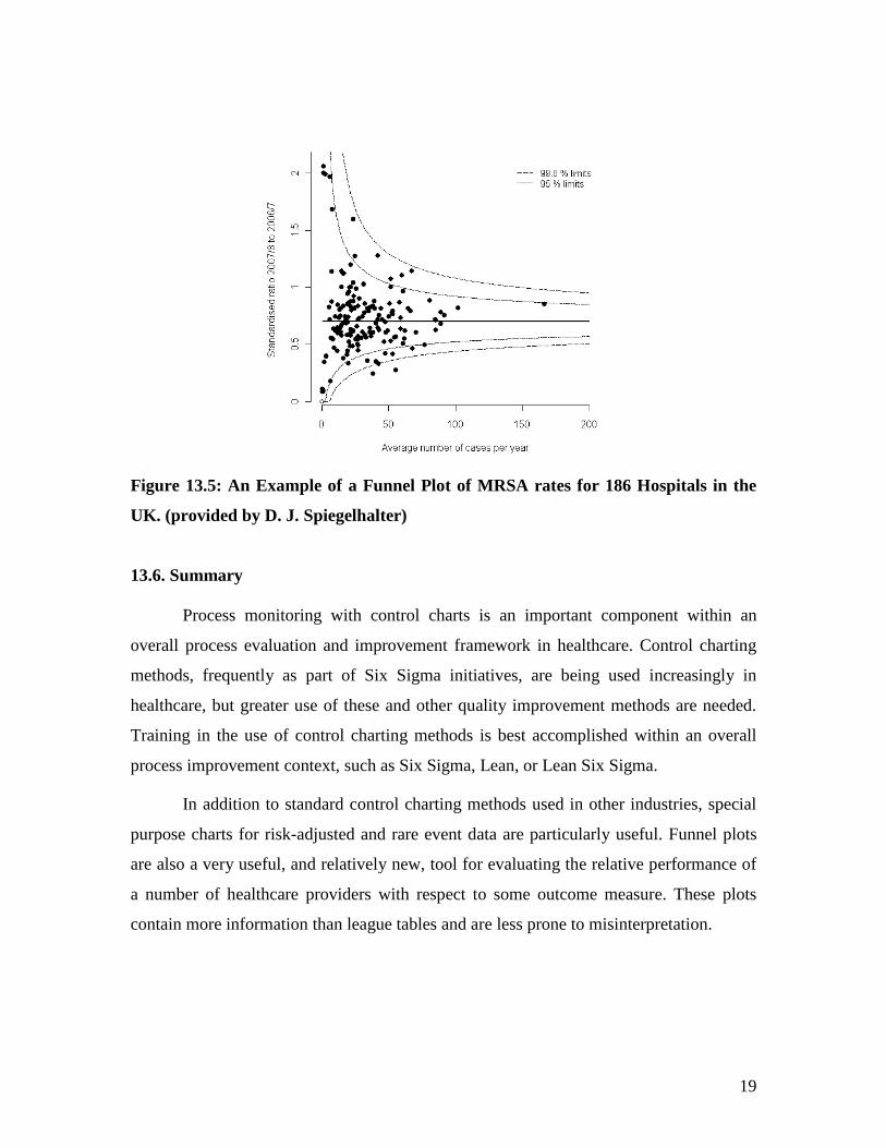
19
Figure 13.5: An Example of a Funnel Plot of MRSA rates for 186 Hospitals in the
UK. (provided by D. J. Spiegelhalter)
13.6. Summary
Process monitoring with control charts is an important component within an
overall process evaluation and improvement framework in healthcare. Control charting
methods, frequently as part of Six Sigma initiatives, are being used increasingly in
healthcare, but greater use of these and other quality improvement methods are needed.
Training in the use of control charting methods is best accomplished within an overall
process improvement context, such as Six Sigma, Lean, or Lean Six Sigma.
In addition to standard control charting methods used in other industries, special
purpose charts for risk-adjusted and rare event data are particularly useful. Funnel plots
are also a very useful, and relatively new, tool for evaluating the relative performance of
a number of healthcare providers with respect to some outcome measure. These plots
contain more information than league tables and are less prone to misinterpretation.

20
References
B.M. Adams, Selection of Control Charts, Encyclopedia of Statistics in Quality and
Reliability, 1, 432-438 (2007).
D.A. Axelrod, M.K. Guidinger, R.A. Metzger, R.H. Wiesner, R.L. Webb, and R.M.
Merion, Transplant center quality assessment using a continuously updatable, risk-
adjusted technique (CUSUM), American Journal of Transplantation, 6, 313-323 (2006).
J.C. Benneyan, Statistical quality control methods in infection control and hospital
epidemiology, Part 1: Introduction and basic theory, Infection Control and Hospital
Epidemiology, 19, 194-214 (1998a).
J.C. Benneyan, Statistical quality control methods in infection control and hospital
epidemiology, Part 2: Chart use, statistical properties, and research issues, Infection
Control and Hospital Epidemiology, 19, 265-277 (1998b).
J.C. Benneyan, Performance of number-between g-type statistical control charts for
monitoring adverse events, Health Care Management Science, 4, 319-336 (2001).
J.C. Benneyan, Discussion of „Use of control charts in health-care and public-health
surveillance‟ by W. H. Woodall, Journal of Quality Technology, 38, 113-123 (2006).
J.C. Benneyan, The design, selection, and performance of statistical control charts for
healthcare process improvement, International Journal of Six Sigma and Competitive
Advantage, 4, 209-239 (2008).
J.C. Benneyan, R.C. Lloyd, and P.E. Plsek, Statistical process control as a tool for
research and healthcare improvement, Quality & Safety in Health Care, 12, 458-464
(2003).
S. Bisgaard, (ed.), Solutions to the Healthcare Quality Crisis: Cases and Examples of
Lean Six Sigma in Healthcare, ASQ Quality Press, Milwaukee, WI, 2009.
Care Quality Commission, Following up mortality „outliers – a review of the programme
for taking action where data suggest there may be serious concerns about the safety of
patients, 2009. Available at http://www.cqc.org.uk/_db/_documents/Following_up_mortality_outliers_200903244704.pdf
R.G. Carey, Improving Healthcare with Control Charts: Basic and Advanced SPC
Methods and Case Studies, ASQ Quality Press, Milwaukee, WI, 2003.
Clinical Practice Improvement Centre, VLADs for Dummies, Wiley Publishing Australia
Pty Ltd, Milton, Queensland, 2008. (Request for a free copy can be sent to
21
S. E. Fraker, W. H. Woodall, and S. Mousavi, Performance metrics for surveillance
schemes, Quality Engineering, 20, 451-464 (2008).
O. Grigg and V. Farewell, An overview of risk-adjusted charts. Journal of the Royal
Statistical Society A, 167, 523-539 (2004).
M.K. Hart and R.F. Hart, Statistical Process Control for Health Care, Duxbury, Pacific
Grove, CA, 2002.
L. Iezzoni (ed.), Risk Adjustment for Measuring Health Care Outcomes, 3rd
Edition,
Health Administration Press, Chicago, IL, 2003.
N.A. Ismail, A.N. Pettitt, R.A. Webster, „Online‟ monitoring and retrospective analysis of
hospital outcomes based on a scan statistic. Statistics in Medicine, 22, 2861-2876 (2003).
JACHO, Target analysis methodology for assessing hospital performance on the aligned
CMS/Joint Commission national hospital quality measures (Core Measures), 2010. http://www.jointcommission.org/NR/rdonlyres/43939EDD-34A6-44EF-AA00-
1A56C1760EFA/0/TARGET_ANALYSIS_METHODOLOGY.pdf (accessed on 6/11/2010).
M.D. Joner, Jr., W.H. Woodall, and M.R. Reynolds, Jr., Detecting a rate increase using a
Bernoulli scan statistic, Statistics in Medicine, 27, 2555-2575 (2008).
G. Leandro, N. Rolando, G. Gallus, K. Rolles, and A.K. Burroughs, Monitoring surgical
and medical outcomes: The Bernoulli cumulative SUM Chart. A novel application to
assess clinical interventions. Postgraduate Medical Journal, 81, 647-652 (2005).
K. Lee and C. McGreevey, Using control charts to assess performance measurement data,
Journal on Quality Improvement, 28, 90-101, 2002.
M.A. Mohammed, P. Worthington, and W.H. Woodall, Plotting basic control charts:
Tutorial notes for healthcare practitioners, Quality and Safety in Health Care, 17, 137-
145 (2008).
D.C. Montgomery, Introduction to Statistical Quality Control, 6th
Edition, John Wiley &
Sons, Inc., Hoboken, NJ, 2008.
D.C. Montgomery and W.H. Woodall, An overview of Six Sigma, International
Statistical Review, 76, 329-346 (2008).
A.P. Morton, A.C.A. Clements, S.R. Doidge, J. Stackelroth, M. Curtis, and M. Whitby,
Surveillance of healthcare-acquired infections in Queensland, Australia: Data and lessons
from the first 5 Years, Infection Control and Hospital Epidemiology, 29, 695-701 (2008).
V. Parsonnet, D. Dean, and A. D. Bernstein, A method of uniform stratification of risks
for evaluating the results of surgery in acquired adult heart disease, Circulation, 779
(Supplement 1), 1-12 (1989).
22
M.R. Reynolds, Jr. and Z.G. Stoumbos, A CUSUM chart for monitoring a proportion
when inspecting continuously, Journal of Quality Technology, 31, 87-108 (1999).
L.H. Sego, M.R. Reynolds, Jr., and W.H. Woodall, Risk-adjusted monitoring of survival
times, Statistics in Medicine, 28, 1386-1401 (2009).
C. Sherlaw-Johnson, A method for detecting runs of good and bad clinical outcomes on
variable life-adjusted display (VLAD) charts, Health Care Management Science, 8, 61-
65 (2005).
D. J. Spiegelhalter, Funnel plots for comparing institutional performance, Statistics in
Medicine, 24, 1185-1202 (2005a).
D. J. Spiegelhalter, Handling over-dispersion of performance indicators, Quality and
Safety in Healthcare, 14, 347-351 (2005b).
D. Spiegelhalter, C. Sherlaw-Johnson, M. Bardsley, I. Blunt, C. Wood, and O. Grigg,
Statistical methods for healthcare regulation: Rating, screening and surveillance, to
appear in the Journal of the Royal Statistical Society – Series A (2011).
S.H. Steiner, R.J. Cook, V.T. Farewell, and T. Treasure, Monitoring surgical performance
using risk-adjusted cumulative sum charts, Biostatistics, 1, 441-452 (2000).
J. L. Szarka, III and W. H. Woodall, A review and perspective on surveillance of high
quality Bernoulli processes, under review (2011).
A. Taseli and J.C. Benneyan. Cumulative sum charts for heterogeneous dichotomous
events. Industrial Engineering Research Conference Proceedings, 1754-1759 (2008).
A. Taseli and J.C. Benneyan. Non-resetting sequential probability ratio tests for
heterogeneous dichotomous events, under review (2010).
J. Thor, J. Lundberg, J. Ask, J. Olsson, C. Carli, K.P. Härenstam, and M. Brommels,
Application of statistical process control in healthcare improvement: Systematic review,
Quality and Safety in Health Care, 16, 387-399 (2007).
B.E. Trusko, C. Pexton, J. Harrington, and P. Gupta, Improving Healthcare Quality and
Cost with Six Sigma, FT Press, 2007.
P. Winkel and N.F. Zhang, Statistical Development of Quality in Medicine, John Wiley &
Sons, Inc., Hoboken, NJ, 2007.
W.H. Woodall, Review of Improving Healthcare with Control Charts by Raymond G.
Carey, Journal of Quality Technology, 36, 336-338 (2004).

23
W.H. Woodall, Use of control charts in health-care and public-health surveillance (with
discussion), Journal of Quality Technology, 38, 89-104 (2006).
A. Young, J.P. Miller, and K. Azarow, Establishing learning curves for surgical residents
using cumulative summation (CUSUM) analysis, Current Surgery, 62, 330-334 (2005).


![DESIGNING COMPOSITES FOR ENERGY …€¦ · following the style of the materials selection charts of Ashby [6]. The energy data are plotted against composite or material strength](https://img.pdfslide.us/doc/110x75/5b8903c27f8b9a851a8c995b/designing-composites-for-energy-following-the-style-of-the-materials-selection.jpg)