Embed Size (px)
Citation preview
Sara Gradara 1
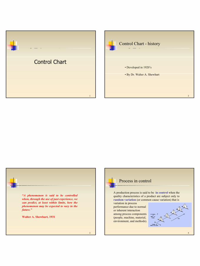
1
Control Chart
2
Control Chart - history
• Developed in 1920’s
• By Dr. Walter A. Shewhart
3
“A phenomenon is said to be controlledwhen, through the use of past experience, wecan predict, at least within limits, how the phenomenon may be expected to vary in the future.”
Walter A. Shewhart, 1931
4
Process in control
A production process is said to be in control when the quality characteristics of a product are subject only to random variation (or common cause variation) that isvariation in process performance due to normal or inherent interaction among process components (people, machine, material, environment, and methods).
Sara Gradara 2
5
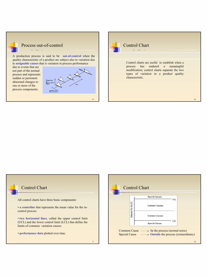
Process out-of-control
A production process is said to be out-of-control when the quality characteristic of a product are subject also to variation due to assignable causes that is variation in process performancedue to events that are not part of the normal process and represents sudden or persistent abnormal changes to one or more of the process components.
6
Control Chart
Control charts are useful to establish when a process has endured a meaningful modification; control charts separate the two types of variation in a product quality characteristic.
7
Control Chart
All control charts have three basic components:
• a centerline that represents the mean value for the in-control process
• two horizontal lines, called the upper control limit (UCL) and the lower control limit (LCL) that define the limits of common variation causes.
• performance data plotted over time.
8
Common Cause In the process (normal noise)Special Cause Outside the process (extraordinary)
Control Chart
Sara Gradara 3
9
They represent the “voice of the process”.
Control charts provide the evidence of stability that justifies predicting process performance.
Control Chart
Control charts let you know what your processes can do:you can set achievable goals.
10
Control charts identify unusual events. They pinpoint fixable problems and potential process improvements.
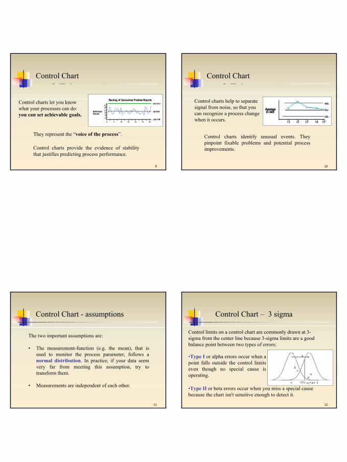
Control Chart
Control charts help to separate signal from noise, so that you can recognize a process change when it occurs.
11
Control Chart - assumptions
The two important assumptions are:
• The measurement-function (e.g. the mean), that is used to monitor the process parameter, follows a normal distribution. In practice, if your data seem very far from meeting this assumption, try to transform them.
• Measurements are independent of each other.
12
Control Chart – 3 sigma
•Type I or alpha errors occur when a point falls outside the control limits even though no special cause is operating.
Control limits on a control chart are commonly drawn at 3-sigma from the center line because 3-sigma limits are a good balance point between two types of errors:
•Type II or beta errors occur when you miss a special cause because the chart isn't sensitive enough to detect it.
Sara Gradara 4
13
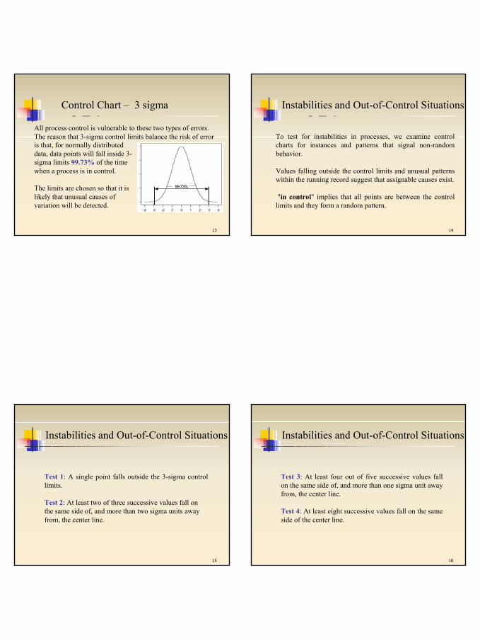
All process control is vulnerable to these two types of errors. The reason that 3-sigma control limits balance the risk of error
43210-1-2-3-4
99.73%
is that, for normally distributed data, data points will fall inside 3-sigma limits 99.73% of the time when a process is in control.
The limits are chosen so that it is likely that unusual causes of variation will be detected.
Control Chart – 3 sigma
14
To test for instabilities in processes, we examine control charts for instances and patterns that signal non-random behavior.
Values falling outside the control limits and unusual patterns within the running record suggest that assignable causes exist.
"in control" implies that all points are between the control limits and they form a random pattern.
Instabilities and Out-of-Control Situations
15
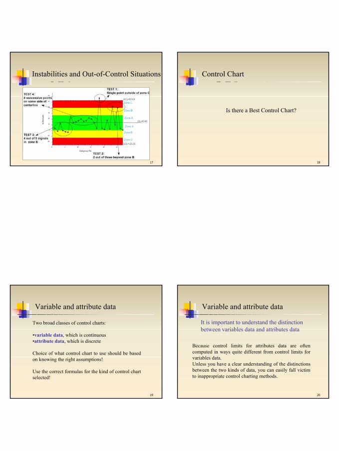
Test 1: A single point falls outside the 3-sigma control limits.
Test 2: At least two of three successive values fall on the same side of, and more than two sigma units away from, the center line.
Instabilities and Out-of-Control Situations
16
Test 3: At least four out of five successive values fall on the same side of, and more than one sigma unit away from, the center line.
Test 4: At least eight successive values fall on the same side of the center line.
Instabilities and Out-of-Control Situations
Sara Gradara 5
17
Instabilities and Out-of-Control Situations
18
Control Chart
Is there a Best Control Chart?
19
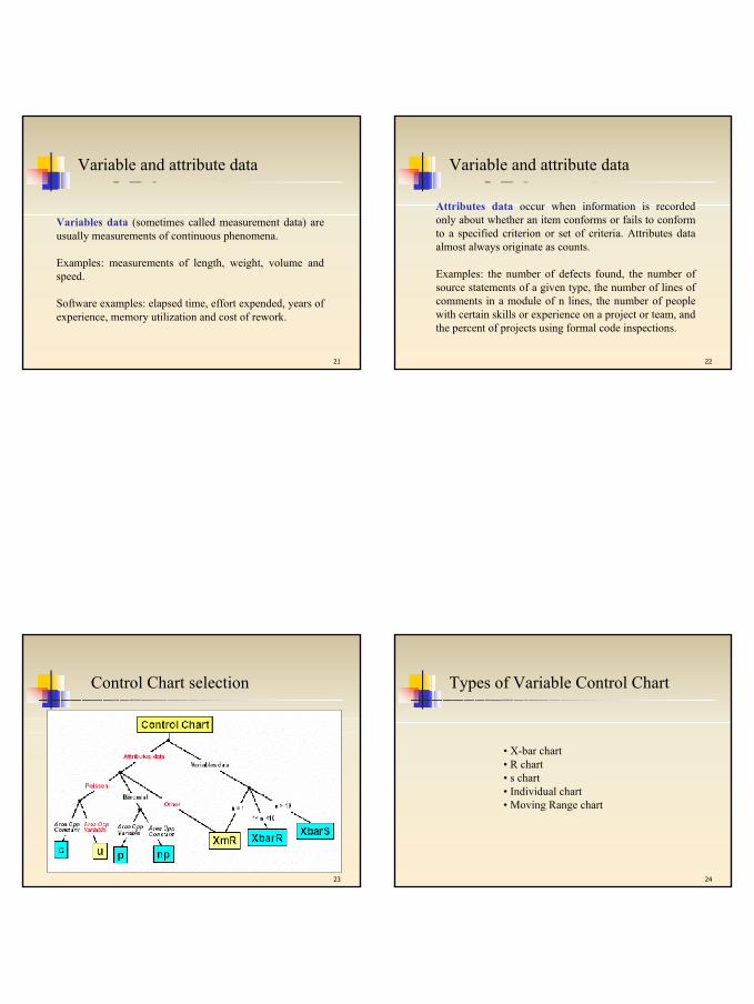
Two broad classes of control charts:
•variable data, which is continuous•attribute data, which is discrete
Choice of what control chart to use should be based on knowing the right assumptions!
Use the correct formulas for the kind of control chart selected!
Variable and attribute data
20
Because control limits for attributes data are often computed in ways quite different from control limits for variables data.Unless you have a clear understanding of the distinctions between the two kinds of data, you can easily fall victim to inappropriate control charting methods.
It is important to understand the distinction between variables data and attributes data
Variable and attribute data
Sara Gradara 6
21
Variables data (sometimes called measurement data) are usually measurements of continuous phenomena.
Examples: measurements of length, weight, volume and speed.
Software examples: elapsed time, effort expended, years of experience, memory utilization and cost of rework.
Variable and attribute data
22
Attributes data occur when information is recorded only about whether an item conforms or fails to conform to a specified criterion or set of criteria. Attributes data almost always originate as counts.
Examples: the number of defects found, the number of source statements of a given type, the number of lines of comments in a module of n lines, the number of people with certain skills or experience on a project or team, and the percent of projects using formal code inspections.
Variable and attribute data
23
Control Chart selection
24
• X-bar chart• R chart• s chart• Individual chart• Moving Range chart
Types of Variable Control Chart
Sara Gradara 7
25
• X-bar chart: based on the average of a subgroup. Subgroups of 2 to 30 samples may be used when computing the control limits for the X-bar chart when based on the range.
• R chart: takes into account the range of a subgroup. Subgroup sizes may be as small as 2 or as large as 30.
• S chart: takes into account the standard deviationof a subgroup. There is no limit to the subgroup size.
Types of Variable Control Chart
26
• Individual chart: displays each value. A subgroup size isused to compute the limits, with value of 2 being most common, although the subgroup size may be as large as 30.
• Moving Range chart: takes into account the moving range of a process. It is used to control variability of processes which do not form natural subgroups.
Types of Variable Control Chart
27
Notation for Variable Control charts
n: size of the sample (collection of observations, sometimes called a subgroup) chosen at a point in time
m: number of samples selected
= average of the observations in the i-th sample (where i = 1, 2, ..., m)
= grand average or “average of the averages (this value is used as the center line of the control chart)
ix
x
28
Notation and Values
= range of the values in the i-th sample
= average range for all m samples
µ is the true process mean, usually unknown but it can be estimated by averaging a large number (for example 20) of samples mean obtained when the process is in control
σ is the true process standard deviation, usually unknown but it can be estimated from a large sample of data collected while the process is in control
R
)min()max( iii XXR −=iR
Sara Gradara 8
29
X-bar charts
“The process mean is changed during
the observation period?”
30
mXXXX m+++
=L21
• Let be the set of observations
divided into samples.
}{ mXXX ,......,1=
X-bar charts
•For each sample compute the average
and the mean average
{ }inii xxX ,......,1=
nxxxX inii
i+++
=L21
31
X-bar charts
Lower Control Limit:
Center Line:
Upper Control Limit:
RAXX x 23 −≅− σ
is normally distributed with mean, µ, and standard deviation, . (Central Limit Theorem)nx /σσ =
iX
X
RAXX x 23 +≅+ σ
is a constant based on the subgroup size.2A32
R charts
“Is the dispersion of the values observed in the
samples due to the presence of exceptional
causes?”

Sara Gradara 9
33m
RRRR m+++=
L21
• Let be the set of observation
divided into samples.
}{ mXXX ,......,1=
R charts
•For each sample the range is
and the range average is
iX
)min()max( iii XXR −=
34
R charts
Lower Control Limit:
Center Line:
Upper Control Limit:
R
RDR R 33 ≅− σ
RDR R 43 ≅+ σ
and are constants based on the subgroup size. 3D 4D
35
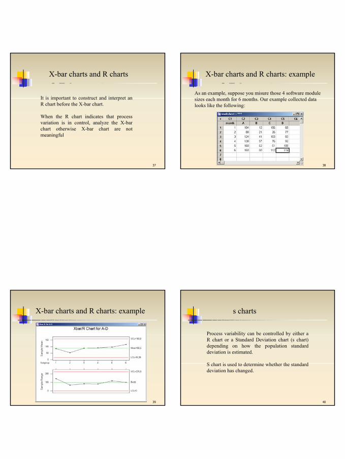
X-bar charts and R charts
X-bar chart is typically used in conjunction with R chart.In fact, since the sample range is used to construct the X-bar chart, it is essential to examine an R chart first (to be sure that the process variation is stable).
36
X-bar charts and R charts for a process out-of-control
Sara Gradara 10
37
X-bar charts and R charts
It is important to construct and interpret an R chart before the X-bar chart.
When the R chart indicates that process variation is in control, analyze the X-bar chart otherwise X-bar chart are not meaningful
38
As an example, suppose you misure those 4 software modulesizes each month for 6 months. Our example collected data looks like the following:
X-bar charts and R charts: example
39
X-bar charts and R charts: example
40
s charts
Process variability can be controlled by either a R chart or a Standard Deviation chart (s chart) depending on how the population standard deviation is estimated.
S chart is used to determine whether the standard deviation has changed.
Sara Gradara 11
41
∑=
=m
iiS
mS
1
1
• Let be the set of observations
divided into samples.
}{ mXXX ,......,1=
s charts
•For each sample the standard deviation is
and the average is
iX
1
)(1
2
2
−
−=∑=
n
xxS
n
jiij
i
42
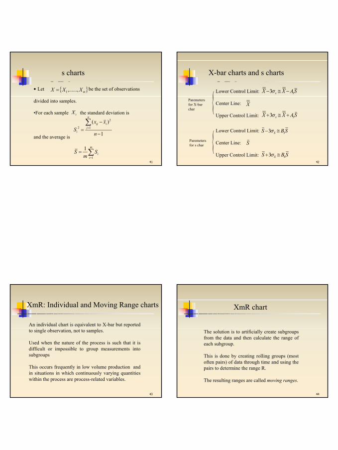
X-bar charts and s charts
Lower Control Limit:
Center Line:
Upper Control Limit:
SBS S 33 ≅− σ
S
SBS S 43 ≅+ σ
Lower Control Limit:
Center Line:
Upper Control Limit:
SAXX x 33 −≅− σ
X
SAXX x 33 +≅+ σ{
{
Paremetersfor X-bar char
Paremetersfor s char
43
XmR: Individual and Moving Range charts
An individual chart is equivalent to X-bar but reported to single observation, not to samples.
Used when the nature of the process is such that it is difficult or impossible to group measurements into subgroups
This occurs frequently in low volume production and in situations in which continuously varying quantities within the process are process-related variables.
44
The solution is to artificially create subgroups from the data and then calculate the range of each subgroup.
This is done by creating rolling groups (most often pairs) of data through time and using the pairs to determine the range R.
The resulting ranges are called moving ranges.
XmR chart
Sara Gradara 12
45
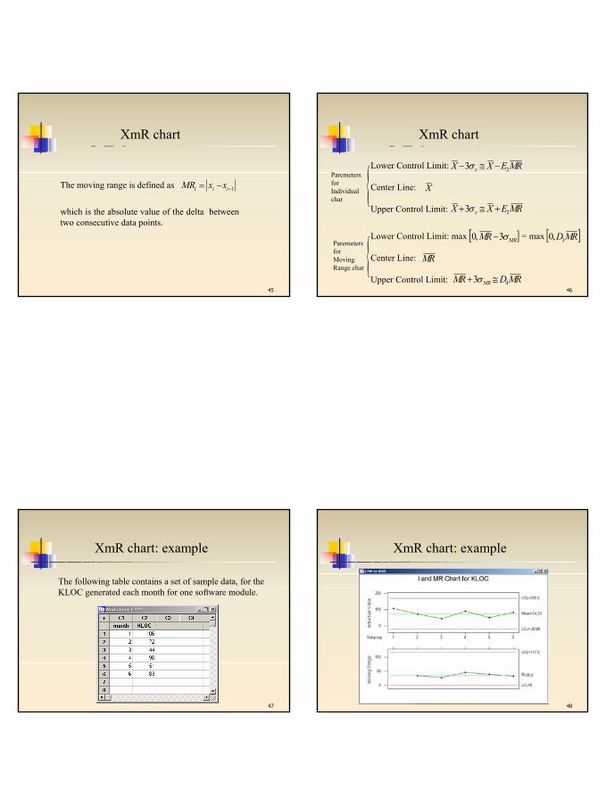
The moving range is defined as 1−−= iii xxMR
which is the absolute value of the delta between two consecutive data points.
XmR chart
46
Lower Control Limit: max = max
Center Line:
Upper Control Limit:
RM
][ MRRM σ3,0 −
Lower Control Limit:
Center Line:
Upper Control Limit:
RMEXX x 23 −≅− σ
X
RMEXX x 23 +≅+ σ{
{
ParemetersforIndividualchar
ParemetersforMovingRange char
RMDRM MR 43 ≅+ σ
][ RMD3,0
XmR chart
47
The following table contains a set of sample data, for the KLOC generated each month for one software module.
XmR chart: example
48
XmR chart: example
Sara Gradara 13
49
Attribute control charts arise when items are compared with some standard and then they are classified as to whether they meet the standard or not.
The control chart is used to determine if the rate of non-conforming products is stable and detect when a deviation from stability has occurred.
Attribute Control Chart
50
The argument can be made that a LCL should not exist, since rates of nonconforming product outside the LCL is in fact a good thing; we WANT low rates of nonconforming product.
However, if we treat these LCL violations as simply another search for an assignable cause, we may learn from the drop in nonconformities rate and possibly permanently improve the process.
Attribute Control Chart
51
• p chart• np chart• c chart• u chart
Types of Attribute Control Chart
52
• p chart: a chart of the percent defective in each sample set. The sample size may vary.
• np chart: a chart of the number defective in each sample set. The samples have the same size.
• c chart: a chart of the number of defects per unit in each sample set
• u chart: a chart of the average number of defects in each sample set
Types of Attribute Control Chart
Sara Gradara 14
53
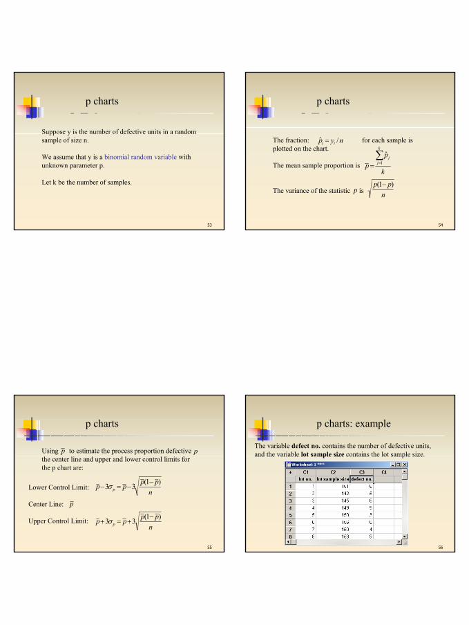
p charts
Suppose y is the number of defective units in a randomsample of size n.
We assume that y is a binomial random variable with unknown parameter p.
Let k be the number of samples.
54
p charts
The fraction: for each sample is plotted on the chart.
The mean sample proportion is
The variance of the statistic is npp )1( −
nyp ii /ˆ =
k
pp
k
jj∑
== 1
ˆ
p
55
p charts
Lower Control Limit:
Center Line:
Upper Control Limit:
pn
pppp p)1(33 −
−=− σ
npppp p)1(33 −
+=+ σ
Using to estimate the process proportion defectivethe center line and upper and lower control limits forthe p chart are:
p p
56
p charts: example
The variable defect no. contains the number of defective units, and the variable lot sample size contains the lot sample size.
Sara Gradara 15
57
p charts: example
58
np charts
It can be used when the sample are of equale size, n.
In the same way of the p chart: andk
ppn
k
jj∑
== 1
ˆ
Lower Control Limit:
Center Line:
Upper Control Limit:
pnn
ppnpnpn p)1(33 −
−=− σ
nppnpnpn p)1(33 −
+=+ σ or 0 if UCL<0
59
np charts: example
The variable defect no.contains the number of defective units, and the lot sample size is 500.
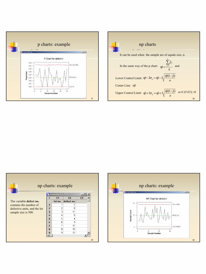
60
np charts: example
Sara Gradara 16
61
c charts
c charts are used to chart count of defects where the area of opportunity for a defect is constant.
Es: defects per 1000 feet of base material in a roll of plastic film produced. The area of opportunity could be a physical area (defect/1000ft), a product such as scratches per monitor, an amount of time such as broken spindles per day or any combination of these area of opportunities.
62
c charts
The Poisson probability distribution provides a good model for the probability distribution for the number of defects.
If possesses a Poisson probability distribution with parameter , then and .
Observe over a reasonably large number, , of equally spaced points in time and use , the average value of to estimate .
c
cλ λ=)(cE λσ =c
c kcc
λ
63
c charts
Lower Control Limit:
Center Line:
Upper Control Limit:
c
ccc c 33 −=− σ
ccc c 33 +=+ σ
k
cc
k
ii∑
== 1
So the center line and upper and lower control limits for the c chart are:
The average value of is:c
64
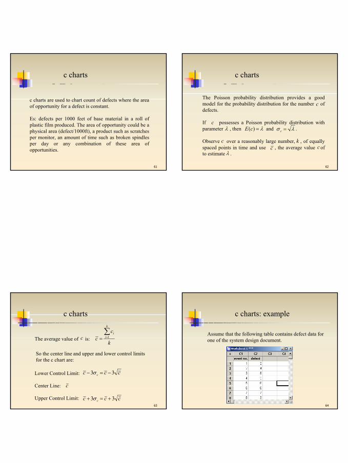
c charts: example
Assume that the following table contains defect data forone of the system design document.
Sara Gradara 17
65
c charts: example
66
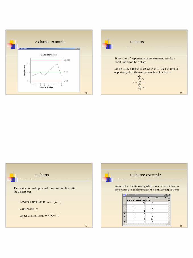
u charts
If the area of opportunity is not constant, use the u chart instead of the c chart.
Let be the number of defect over the i-th area of opportunity then the average number of defect is
iu
∑
∑
=
== k
ii
k
ii
a
uu
1
1
ia
67
u charts
The center line and upper and lower control limits forthe u chart are:
Lower Control Limit:
Center Line:
Upper Control Limit:
u
iauu /3−
iauu /3+
68
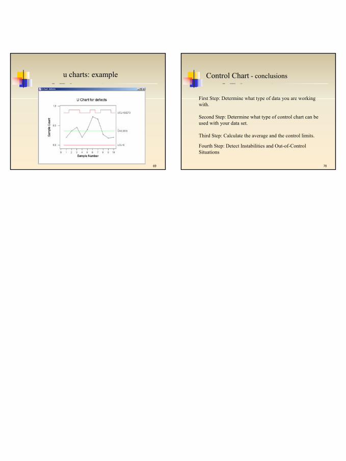
u charts: example
Assume that the following table contains defect data for the system design documents of 8 sofware applications
Sara Gradara 18
69
u charts: example
70
Control Chart - conclusions
First Step: Determine what type of data you are working with.
Second Step: Determine what type of control chart can be used with your data set.
Third Step: Calculate the average and the control limits.
Fourth Step: Detect Instabilities and Out-of-Control Situations