Embed Size (px)
Citation preview
CONTENTS PAGE ANALYSIS
NME Top Of The PopsTeen Now
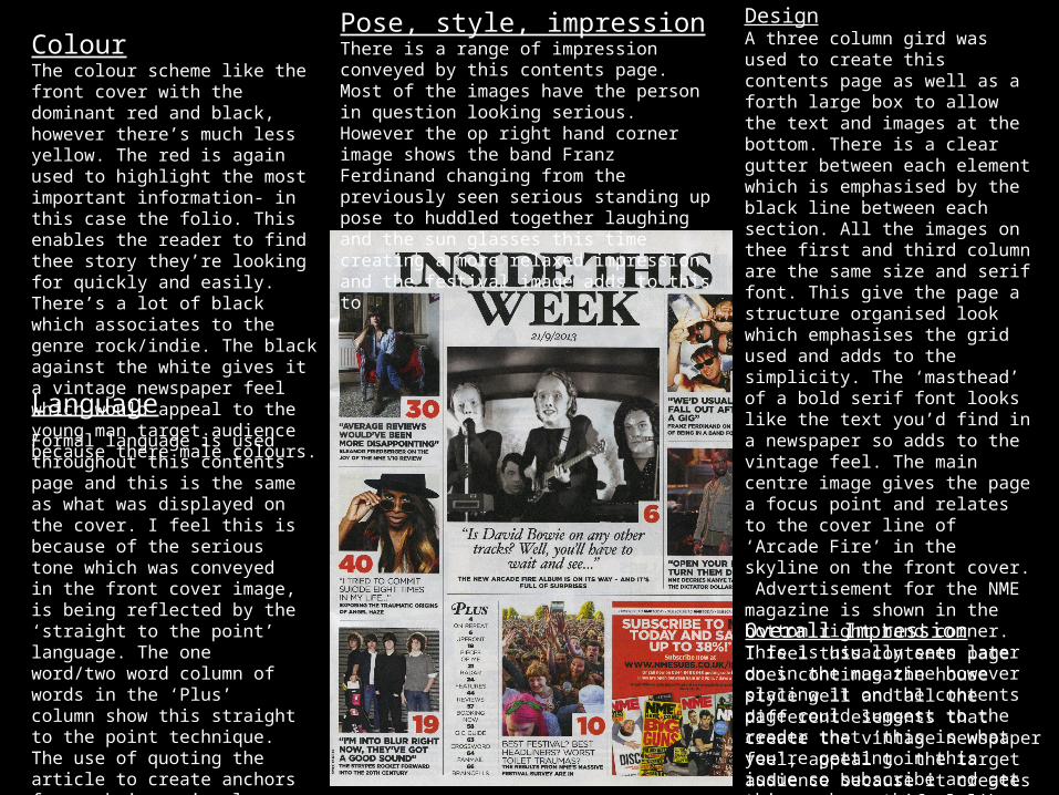
ColourThe colour scheme like the front cover with the dominant red and black, however there’s much less yellow. The red is again used to highlight the most important information- in this case the folio. This enables the reader to find thee story they’re looking for quickly and easily. There’s a lot of black which associates to the genre rock/indie. The black against the white gives it a vintage newspaper feel which would appeal to the young man target audience because there male colours.
DesignA three column gird was used to create this contents page as well as a forth large box to allow the text and images at the bottom. There is a clear gutter between each element which is emphasised by the black line between each section. All the images on thee first and third column are the same size and serif font. This give the page a structure organised look which emphasises the grid used and adds to the simplicity. The ‘masthead’ of a bold serif font looks like the text you’d find in a newspaper so adds to the vintage feel. The main centre image gives the page a focus point and relates to the cover line of ‘Arcade Fire’ in the skyline on the front cover. Advertisement for the NME magazine is shown in the bottom right hand corner. This is usually seen later on in the magazine however placing it on the contents page could suggest to the reader that ‘this is what you’re getting in this issue so subscribe and get this each month’
LanguageFormal language is used throughout this contents page and this is the same as what was displayed on the cover. I feel this is because of the serious tone which was conveyed in the front cover image, is being reflected by the ‘straight to the point’ language. The one word/two word column of words in the ‘Plus’ column show this straight to the point technique. The use of quoting the article to create anchors for each image is clever as it gives the reader a taster of what’s inside and persuades them to want to find out more
Pose, style, impressionThere is a range of impression conveyed by this contents page. Most of the images have the person in question looking serious. However the op right hand corner image shows the band Franz Ferdinand changing from the previously seen serious standing up pose to huddled together laughing and the sun glasses this time creating a more relaxed impression and the festival image adds to this to
Overall ImpressionI feel this contents page does continue the house style well and all the different elements that create the vintage newspaper feel, appeal to the target audience because it creates a more grown up feel like there age group
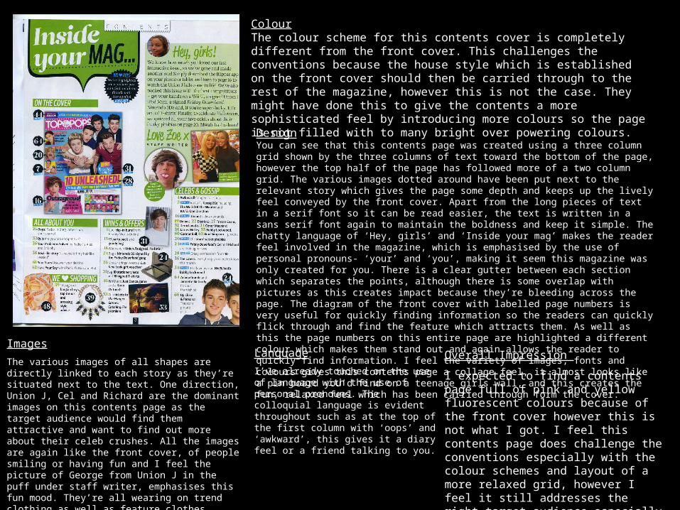
ColourThe colour scheme for this contents cover is completely different from the front cover. This challenges the conventions because the house style which is established on the front cover should then be carried through to the rest of the magazine, however this is not the case. They might have done this to give the contents a more sophisticated feel by introducing more colours so the page is not filled with to many bright over powering colours.
DesignYou can see that this contents page was created using a three column grid shown by the three columns of text toward the bottom of the page, however the top half of the page has followed more of a two column grid. The various images dotted around have been put next to the relevant story which gives the page some depth and keeps up the lively feel conveyed by the front cover. Apart from the long pieces of text in a serif font so it can be read easier, the text is written in a sans serif font again to maintain the boldness and keep it simple. The chatty language of ‘Hey, girls’ and ‘Inside your mag’ makes the reader feel involved in the magazine, which is emphasised by the use of personal pronouns- ‘your’ and ‘you’, making it seem this magazine was only created for you. There is a clear gutter between each section which separates the points, although there is some overlap with pictures as this creates impact because they’re bleeding across the page. The diagram of the front cover with labelled page numbers is very useful for quickly finding information so the readers can quickly flick through and find the feature which attracts them. As well as this the page numbers on this entire page are highlighted a different colour which makes them stand out and again allows the reader to quickly find information. I feel the variety of images, fonts and colours gives this contents page a collage feel, it almost looks like a pin board you’d find on a teenage girls wall, and this creates the fun, relaxed feel which has been carried through form the cover.
Images
The various images of all shapes are directly linked to each story as they’re situated next to the text. One direction, Union J, Cel and Richard are the dominant images on this contents page as the target audience would find them attractive and want to find out more about their celeb crushes. All the images are again like the front cover, of people smiling or having fun and I feel the picture of George from Union J in the puff under staff writer, emphasises this fun mood. They’re all wearing on trend clothing as well as feature clothes stories which appeals to teenage girls as they want to look fashionable.
Language
I’ve already touched on the use of language with the use of personal pronouns. The colloquial language is evident throughout such as at the top of the first column with ‘oops’ and ‘awkward’, this gives it a diary feel or a friend talking to you.
Overall Impression
I expected to find a contents page full of pink and yellow fluorescent colours because of the front cover however this is not what I got. I feel this contents page does challenge the conventions especially with the colour schemes and layout of a more relaxed grid, however I feel it still addresses the right target audience especially with the informal chatty language and images.
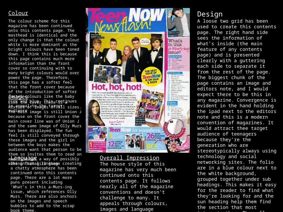
ColourThe colour scheme for this magazine has been continued onto this contents page. The masthead is identical and the only change is that the colour white is more dominant as the bright colours have been toned down. I think this is because this page contains much more information than the front cover so continuing with to many bright colours would over power the page. Therefore, this page has a softer feel that the front cover because of the introduction of softer pastel colours like the baby pink and blue. This continues to appeal to the target audience
DesignA loose two grid has been used to create this contents page. The right hand side sees the information of what’s inside (the main feature of any contents page) and is presented clearly with a guttering each side to separate it from the rest of the page. The biggest chunk of the page contains an image and editors note, and I would expect there to be this in any magazine. Convergence is evident in the hand holding the ipad next to the editors note and this is a modern convention of magazines. It would attract thee target audience of teenagers because they’re the generation who are stereotypically always using technology and social networking sites. The folio are in a blue colour next to the white background, grouped together under sub headings. This makes it easy for the reader to find what they’re looking for and the sun heading help them find the section that most interests them. The yellow puff stands out on the page and informs the audience when the next issue is on sale, trying to persuade them to buy it again. There is still a variety of fonts and sizes which continues the house style established on the cover.
ImagesLike the cover there is a mixture of images of all sizes. The main image is still Union J because on the front cover the main cover line was of Union J and the same image of Olly Murs has been displayed. The fun feel is still conveyed through these images and the girl in between the boys makes the audience want that person to be them so invites them to read on and find out a way of possibly making that girl them.
LanguageThe informal language creating a chatty atmosphere has been continued onto this contents page. There are a lot more puns present including ‘What’s in this a-Murs-ing issue, which references Olly Murs. There are also anchors on the images and speech bubbles to add to the scrap book theme.
Overall ImpressionThe house style of this magazine has very much been continued onto this contents page. It follows nearly all of the magazine conventions and doesn’t challenge to many. It appeals through colours, images and language